CSS Doom Lasers
Introduction and Niels's World of Obsessions
The host introduces Niels to the CSS Day audience, and Niels opens by cataloguing his eclectic obsessions—from web standards and oscilloscopes to Lego, receipt printers, Bluetooth reverse-engineering, and astrophotography. He frames the talk around how these periods of genuine curiosity send him down unexpected rabbit holes, setting the tone for the wild technical adventures ahead.
The Quest for a Laser Clock and the Oscilloscope Discovery
Niels explains his fascination with laser projectors after seeing Seb Delisle's talk on recreating the vector-display Asteroids arcade game. Unable to afford a laser projector, he realises an oscilloscope can steer an electron beam in the same way to draw vector shapes. He introduces the CSS clock concept, showing how negative animation delays allow a hand's animation to start at any point in time.
Generating X/Y Waveforms from SVG and CSS Animations
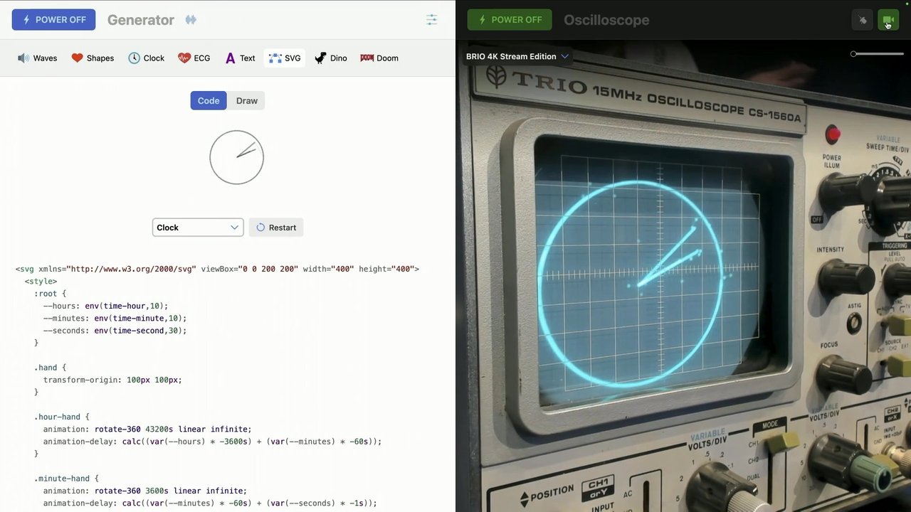
Niels walks through the technical pipeline for driving the oscilloscope: SVG shapes are injected into the DOM, then sampled 30 times per second using getPointAtLength and a computed transform matrix to extract raw X and Y coordinates, which are output as a two-channel audio signal via the Web Audio API. Because the SVG lives in the DOM with CSS animations applied, every frame of animation is captured for free at each sample.
Live Oscilloscope Demo and the Explosion
Niels attempts a live on-stage demo of the clock and an Asteroids recreation running on a real oscilloscope, battling video lag throughout. He then recounts how, on the very evening he first got everything working, the oscilloscope exploded—forcing him to frantically unplug everything and leaving the project without a display to test against.
Building an Oscilloscope Simulator from Memory on a Train
Stranded without a working oscilloscope, Niels builds his own simulator during a five-hour train journey entirely from memory. He deep-dives into phosphor physics, Euler integration of electron velocity, and P31 phosphor persistence before concluding he only cares how it looks—not the underlying physics. The simulator proves invaluable for safely testing new signal generators before the repaired scope arrives.
From Oscilloscope Lines to CSS Doom: Core Architecture
After showing Doom's wireframe rendering on the oscilloscope, Niels describes the leap to a fully CSS-rendered version of the game. He explains the guiding architectural principle: JavaScript handles only game logic and DOM element creation, while the renderer—almost entirely CSS—uses thousands of divs, 3D transforms, and custom properties to handle all visual output.
Wall Positioning with CSS Trigonometry and 3D Transforms
Niels walks through how CSS Doom positions walls in 3D space using raw start and end coordinates extracted from the WAD game file, passed as custom properties. CSS trigonometry functions (atan and sqrt) calculate each wall's width and rotation angle on the fly, eliminating the need for JavaScript pre-calculation. He also covers how non-square sector floors are handled using clip-path with the new CSS shape() function.
Lighting, Textures, and the CSS Rendering Pipeline
Niels explains how Doom's per-sector light levels are stored as custom properties and inherited by all child surfaces, with brightness applied via CSS filter. Dynamic effects like pulsating pillars are achieved by using @property to register the light custom property as a number, enabling smooth animated transitions between levels. Original Doom textures extracted from the WAD file are mapped to surfaces using background-image driven by data attributes.
Movement, Doors, Sprites, and Fireballs
Niels covers player movement—rather than moving the player, the entire world transforms around a static camera using just four CSS custom properties—and shows spectator mode as a near-zero-cost scene transform override. He explains how billboarding keeps sprites facing the player, describes door transitions as simple height animations, and details how stepped CSS background-position animations bring sprite sheets to life. Fireballs are DOM elements that travel through space using standalone CSS translate animations and remove themselves via animationend events.
Weapon Animation, Responsive Design, and Multiplayer
Niels demonstrates seamless weapon bobbing by keeping the animation permanently running in a paused state and resuming it on player movement, avoiding the snap-back artefact. He shows how CSS anchor positioning solves the responsive layout challenge of aligning the gun to a wrapping status bar. The segment closes with a mention of the multiplayer feature splitting a single browser window across two screens, and a pointed reminder that a button should be a button, not a div.
CSS Flamethrower and the Laser Projector Live Demo
Niels reveals a CSS-controlled flamethrower purchased from AliExpress as a bonus rabbit-hole project, though stage fire restrictions prevent a live demonstration. He then connects a laser projector via WebUSB—reusing the same XY coordinate system built for the oscilloscope—and live-demonstrates the clock, the Dino game, Asteroids, and an ambitious attempt at running CSS Doom on the laser, bringing the talk full circle.
Q&A: Build Time and What the Clock Sounds Like
The host fields two rapid audience questions: Paul asks how long CSS Doom took to build, and Niels admits the initial walking prototype took one day while finishing the full game took four weeks. Peter then asks what the oscilloscope clock sounds like, and Niels answers simply: static.
Our next speaker has nerves of steel. Anything can happen up until the last minute. He's bold, kind, adventurous, fun, incredibly smart, and it's been a joy to bump into needles at men in many conferences throughout the years. As you can see from the setup around me, which is a health and safety hazard, I still haven't tripped though.
As you can see from we're about to have the best thing since an espresso after lunch. Please welcome to the stage, Niels. Thank
you so much. So hi. I'm Niels. It's so good to be back here on on this stage at CSS day. I wanna talk about some of the projects that I did the last two years or so And upfront I'm gonna say that they are a bit, say out there.
Oh wait. Alright. So you've probably seen the CSS DOOM game upstairs. Maybe even played it and and that is something that I created and and originally I never intended to create DOOM in CSS because that's insane.
But but but here we are. Oh oh, PPK. Did we update the code of conduct? Because I think shooting attendees in the back with a rocket launcher is maybe frowned upon. I think we shouldn't do that. Oh sorry. Okay.
Yeah and I can do now. It's fine. It must be in two to five. Yeah. People will live. So CSS Doom is just a small part of the whole story and if it kind of was an accident that that that happened and the side to to a completely different project and that's kind of just as unhinged and and I want to start with that story. So I get obsessed sometimes.
Well not sometimes, often. And it's not the unhealthy kind of obsessions but but kinda periods of genuine interest and focus and and that often leads to to ideas and rabbit holes and and sometimes unexpected and sometimes weird and wonderful results. I get obsessed by web standards but also Northern Lights and Lego and clocks and user agent streams and astrophotography and oscilloscope and receipt printers, reverse engineering Bluetooth devices.
And videos about watch repair, the evolution of Geminiq languages, dBikes control stage lights and pyrotechnics, and browser compatibility for the year 2000, and the space shuttle Challenger accident report, and how browser parses HTML, and the history of writing, and typography, and getting annoyed that the proper use of the EM desk now makes you look like an AI bot, and and making remote controls Lego cars, and how barcodes and QR codes work, and and so much more.
But mostly about the web and how I can use the web beyond the edges of the browser window. I fell in love with the web back in 1994 and it's been pretty much a constant in everything that I create. But lately my obsession has been making a laser clock.
Ever since since I've seen a talk by Seppi Delisle, I I I've been fascinated by laser projectors. And I knew nothing about how they work but I didn't even know if I could connect them to the web. But Seb did explain in his talk about some of the issues that he ran into recreating the classic game, Asteroids from, 1979.
Now that original game used a special display system called the QuadraScan, and it uses a CRT, but instead of pixels, it steered the electron beam directly to draw these vector shapes. Now before you get excited about me showing a laser clock, they are expensive. And it's not like my name is Sepp Lee Delisle who probably has a couple of spare ones stacked up behind his couch, but but in the back of my mind, I kept thinking that estradiates came. And I kind of figured that that an oscilloscope could function in pretty much the same way as that quadra scan display system.
And they are really cool too. I just love the aesthetic. It feels like you've wandered into the lab of a mad scientist and I just the knobs and the displays and and if you think of it, it's literally just a small particle accelerator that that sends electron about the quarter of the speed of light and it's pointed right at your face.
And there's only a very thin layer of phosphor between you and the face melting beam of electrons. But of course, we want to use web technology for creating our clock. So this part of the talk is titled, how I used CSS animations to draw a clock on an oscilloscope.
Wait. That's actually not accurate. A better title would be how I use web audio to blow up a nineteen eighties oscilloscope and almost cast a fire. Yeah that would be more appropriate.
So before I tell that story, I wanna take a minute and and just let's think of what a clock really is. And I don't mean philosophically. It's a circle and three lines. And and on the web, we can use SVG for that. And it's for simple shapes, vectors, like that asteroids game.
Now if we want to animate our clock, we can use CSS for that. And we can animate the hands and rotate them over time. So so let's look at our hand. It does a full rotation about forty three thousand two hundred and seconds, like two twelve hours. And the default position is at the top.
Now that's midnight or noon and and we want the hand to be, in this case, we want to be at ten. There. So the animation starts at the top and it takes ten hours to reach the position that we want. But we want to start at ten. So we can do that by setting an animation delay.
An animation delay set to negative ten hours because then it's not a delay but it acts like the animation started back in the past, like ten hours ago, and now ten hours later it's at the right position. I love negative animation delays. It's Now we need to draw that shape on the scope.
So the phase melting electron beam is steered or or better deflected by two electrically charged plates like the x and the y plates. And by deflecting the beam vertically and horizontally, we can trace the image that we want and and if you do that multiple times per second, our image appears. So we need to generate two signals.
One for x, one for y. And it needs to trace the image that we want to draw. So so for the clock face, let's start with the clock face, we need a circle. This is that circle. When you need some high school math to do to do this, turns out my math professor was right all along all those years ago. I was going to need math later in life.
So this is that circle. And if you look closely, it actually starts to make sense. We just make a waveform directly from the x and the y coordinates of of the circumference of the circle. And we can make any shape with that method. Every shape can be expressed in that two channel signal.
Even triangles, which we're gonna need because we're we need to have three lines and a triangle is three lines. And this is then what our clocks look like. And if you look closely at the red signal, you can see that sinus wave we saw from the circumference of the circle and then you have the three triangles that are the hands that are being drawn out from the center to the clock face.
Now how do we get now the coordinates? Now we start with our SVG and inject that into the DOM. And with all of the CSS transforms and animations applied, then we can use get total length and get point at length APIs to get the raw coordinates.
And then we apply the compute transfer matrix and we end up with an array of numbers. I make it sound easy but it actually isn't that difficult. So if we plot those numbers, we get again those same shapes. We get the sinus wave and the three triangles.
And we do this 30 times per second and because the SVG exists in the DOM, we just get all the CSS animations for free. Every time we sample the shapes, we capture the current state of the animation. So we get a different wave every time we capture and it captures every frame of the animation. So CSS animations on the oscilloscope.
Now I built a web app for this and it does exactly this. Has a small editor which you can use to edit your SVGs and and CSS and it will just inject that into the DOM. It will sample the geometry and 30 times per second and it output the waveforms using web audio. So we connect the computer's audio output to the x and y channel on the scope and then hopefully we get this.
I This is a recording, but I brought it with me. And I wanna try if we can do the same thing, actual in real life and that's always kind of tricky because now I am, at the mercy of the demo gods. Let let let's just see how it goes.
Let's turn it on at first. And I'm just going to turn that on and then that on. Right. And then So this is a simulator, and I'm going to turn on camera. And let's see.
So this is a clock on an oscilloscope. And it's it's really cool. It's not power efficient because it's it's terrible.
It's terrible. But but just I love this. We can do so much more with this. We we can run basically any SVG or CSS animation on this. For example, we have this.
Oh, that's the animation. You were thinking it's going to explode. No, it's fine. It's fine. And basically, I decided to also recreate that asteroids game because you can run CSS and JavaScript as well and and Oh, there's something going wrong. Let's go back.
I I am terrible at this and I'm seeing it through the video and it's a delay and it's I'm dead. Oh, fuck. Oh, nice. It's it's terrible. And Well, I did some other things as well, but So when I started building this, that was in the evening, and I just had had it working.
And then something happened. At this point, the oscilloscope decided to explode. This is just the aftermath. It was I was busy finding the power plug and and and scrambling to to to get my phone to film it and at the same time, unplugging everything and I realized probably it it should If it doesn't I I don't want I don't want it to send thousands of film back to my computer and let It was fine. It was fine.
I I did not get electrocuted, but the scope was dead. So what now? Well, redundancy. I I may have overreacted here, but I'm I'm getting ahead of myself.
My scope has exploded. I have a signal generator to finish but no way to actually continue until I get my scope repaired or find a replacement. And I find myself on a train to be on Telerund. I have nothing to do. It's a five hour ride and I I decide to build my own oscilloscope simulator like you do.
And what I really want is a nineteen eighties oscilloscope with all of the faults and limitations and we want to replicate how the phosphor works on a real scope and what we really want is a physics simulation of the electron beam and how it's deflected by the electrostatic x and y plates and I have to do it from memory because I it exploded like literally an hour after I got it working. And this is where things go off the rails.
I did a deep dive into how scopes work like electromagnetic force and acceleration and velocity and dampening and Euler integration of how velocity moves the beam and overshoot amplitude decay. And we haven't even talked about energy deposition based on beam velocity and the p 31 phosphor physics, like phosphor saturation and phosphor persistent and beam dwelling at direction changes that causes brighter dots on the screen.
And I was about to calculate how electrons are exciting the phosphors and and I realized that I I have a life and I don't care about any of this. So apparently there was an end to the rabbit hole for me and as it turned out, I only care about how it looks.
Does it look like it's the same as a real scope? Yeah. Great. And with the simulator in place, it did allow me to create some other generators. Fully tested and, on on the simulator and and once the scope got repaired, they just worked. So let's try this one.
I have to warn you, I am terrible at this. I'm getting nervous now.
I wasn't before the talk but now I'm I'm just No I have to keep going now. I've never gotten this far. Sorry, just Oh no no. Okay. Never mind. And then I thought Then I thought, what else can I do?
And the obvious answer to that question is of course, doom. Because that's the answer to every question. So I created doom. And you can just walk around and and it just works.
Okay. Oh, I'm stuck. And this was a lot of fun to create because it's it's like nostalgia. I I played this game growing up and I spent countless hours just running around these levels.
So that was incredibly fun. Now we have this game, Doom, on our oscilloscope and it looks great if you keep in mind that we're just generating lines and encoding that with audio and then showing an old dumb device without any computing power and and using technology that's 80 years old.
It's great but it isn't the real Doom game. You can move around and that's pretty much it. But we do have all this data. We know where the walls are and where the floors and ceilings are so I started thinking. We could project those walls with CSS three d transforms.
We could add textures. Within a day, I I I had something where you could walk around and eventually I started adding more and more like doors and pickups and enemies and fireballs and This isn't fully CSS of course.
And there is a considerable bit of JavaScript ported from the original original game, but the renderer is almost 100% CSS. Why? Well, JavaScript should only do what only JavaScript can do.
And CSS can do this. So yeah. So the next question would probably be, are you crazy? So there was just a small layer of JavaScript that does basically, does nothing more than just create DOM elements and then sets classes and custom properties.
Every wall, every floor, every ceiling is a div. Simple divs that are three d transforms. And we're not using JavaScript to to position every diff. Instead, the JavaScript extracts the raw coordinates from the Doom game file, the WAT file and those raw coordinates are passed to CSS as custom properties.
So these are all the divs that are level one. And this is one of the smaller levels. And and we insert this in the DOM and then we let CSS handle the rest. And all the complicated math is done by CSS.
It's actually not that bad especially compared to the other math that I needed for the scope simulator. It basically boils down to the theorem of Pythagoras and the whole reason is that Doom isn't actually a three d game. It's it's like more than like two and a half d. It's a flat map with heights. It's not a full three d scene and that's also why it translates so well to CSS.
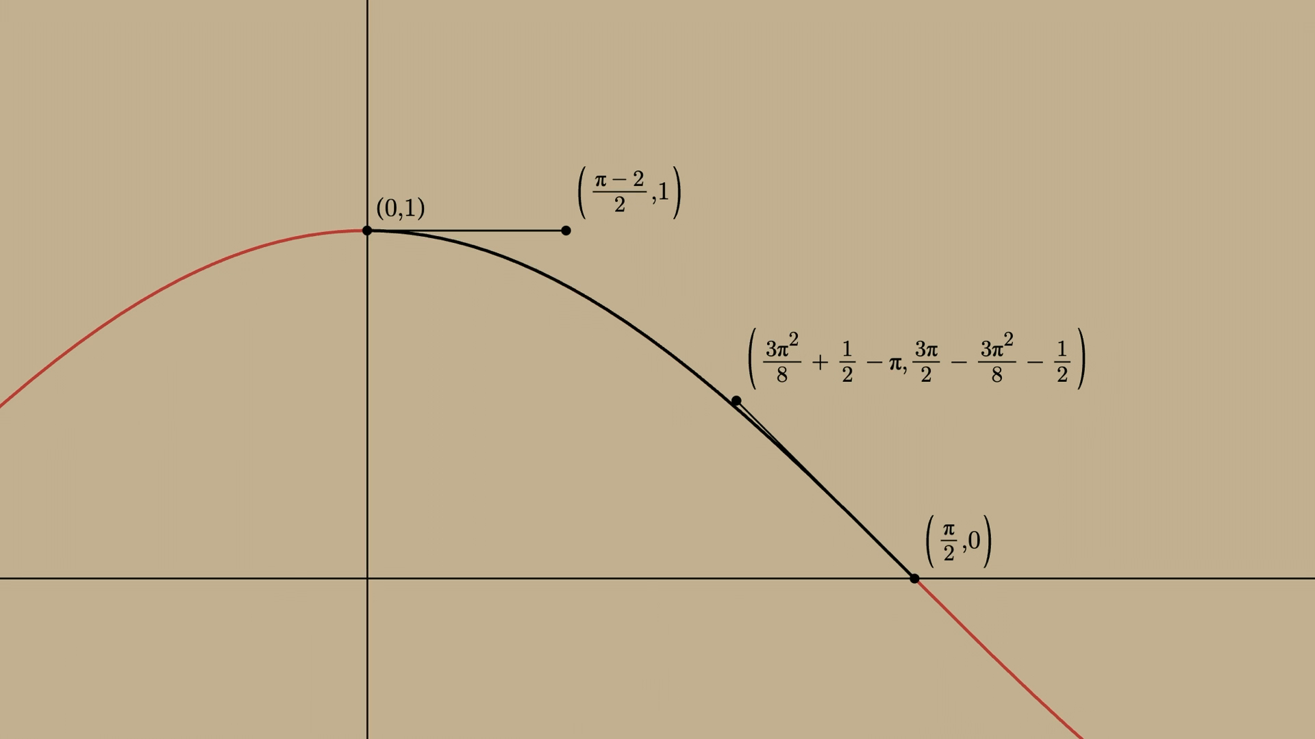
So this is our top view. We start with our start coordinates and end coordinates and what we want to do is position our wall on those start coordinates and then we need to set a width and rotate it on the angle between the start and end coordinates. And the width is just the longest side of the triangle which is the square root of x squared plus y squared and the angle is the inverse tangent of y divided by x.
Even despite that I had this in high school, this took the most time of the project. So great. Everybody with me? Yeah? Yeah? Just nod and pretend it's fine. It's fine. In our CSS it looks like this. So thanks to the relatively new trigonometry functions, we can now just calculate the width and the angle that we need.
And no need for JavaScript anymore to to pre calculate everything. Now we're just setting custom properties straight from the Doom game file, the WAT file and CSS does all the rest. And so we simply set the div or the width and also the height which you can calculate from the ceiling and the floor positions and we positioned it in three d space using transform with translate three d and and finally, you rotate it using the angle that we calculated. And we do that for every wall in our scene, which can be a couple of thousands.
It's fine. And of course, ceilings and floors too. They are also just square divs and and use the same positioning calculations except that we need to rotate it so it's flat on the floor. Now this works if you have a square sector. A sector is like a group of walls and a floor and a ceiling that belong to each other.
But as you've seen, we can place walls at arbitrary angles. So rooms are not by definition squares and diffs are. So how are we dealing with these kinds of floors? So these are two sectors. One one is a simple octagon and the other is a polygon with a hole cut out of it.
And and these are diffs too. Diffs with a clipping path. Fantastic. This involves a whole bunch of extra math to calculate that that path but that's JavaScript and it's not really feasible to do that in CSS. And a little bit of JavaScript is what we're just going need in the renderer.
But we pre calculate that and we set it as a clipping path And CSS does the actual rendering. Now simple shapes like octagons have been possible for a while now but now the shape function is relatively new and that allows you to describe the path in a human readable format. Thanks to Even Art, you can actually basically describe two paths.
And one to cut off the edges and one to cut out the middle. Now, if we turn around and and look at the lighting, the lighting of the scenes, you can see two things. First, we're standing on a light platform looking at a dark room with another light room in the distance.
And those are all static lights. So the light level is stored in the game file and and we do not calculate that on the spot. That makes our lives a lot easier. We can just pull that out and set it as a custom property. You can also see that that the floors and the ceilings have the same shape and the same lighting level.
That's because the lighting is set on the sector, not on a specific surface. So ceilings, floors, and walls are grouped into sectors like I've said, and the light is on the sector. But sectors are not always room sized. And if you look at the stairs for example, then then you can see that the the ceiling above the stairs has the same lighting as the stairs themselves.
That's because these are also sectors. Not the stairs together, but every single step of the stairs is a separate sector with its own floor and and and own ceiling. And if we set the light for the whole sector, so the ceiling also gets the lighter is is the same brightness as the steps.
Now, how do we set the light level? It's a custom property on the sector itself and then the property is inherited down to the individual services within that sector. And then we apply a brightness filter on every surface, which browsers think is delightful. But that's all we need to do.
So we are lighting a whole scene with a filter on every element. Now you can also see here like, there's two pillars that have a slight pulsating lighting effect. These effects are also per sector and defined in the Doom game file. There are a couple of different ones which are a little more than animating brightness.
And we can do that in CSS. So the pillar has a simple class which we can run, use to run an infinite animation that changes the light custom property. Now some of you will immediately say, you can't do that. That's true because CSS does not know what a custom what the light custom property is.
So we need to tell it that. So it is a number so now we can have fluid transitions between, the light levels. And if we want to change the animation, we only have to change a class. Let just let CSS does what it does best.
Now let's look at another important part of Doom that is, the textures. They are just the original image files that I extracted from the Doom bot file and converted to PNGs and there are lots of them and they're pretty tiny compared to modern standards. And every wall, ceiling, or floor just has a data texture attribute which tells us which texture we are using and and we just create a file that just loads all the correct background images based on the texture value.
Now wish we could use Etr here but as Kevin, the YouTube guy showed that that is not allowed. Then we got wait. No, isn't supposed to. Let's reload. Yeah. All right.
Here we go. Wait. We we could do that. Need a version where every service is cut. Sure? It's fine. Okay. We're back.
So at this time, we've been walking around the world, but but how do we actually do that? Or of course there's JavaScript involved here. We need keystroke, mouse events, touch events, gamepad buttons and then lots more JavaScript because we need collision detection and it's all running in a game loop, JavaScript game loop.
And there is no camera in CSS that we can move around. So so instead we move the world. So we don't walk through the world but the world moves around us like it's shoot. So the game sets four simple custom properties and that's all the renderer needs to know.
So whenever the player moves, the properties are updated and and CSS moves the world using c using transform three d and rotate y. And we don't need to recalculate all the walls and floors and ceilings. We would just move the world as as a whole. The world itself is static. And if we zoom out a bit, we can actually see this.
The world rotates around us and if we move up the stairs, world moves down and the player is static at the same position. If we move back down, the world moves back up and CSS gives us this for free. What you're seeing right now is spectator mode. It's built into CSS doom and and this cost cost literally nothing.
It's it's just a small override of the scene transform and we add an initial translate to to move the camera a bit back and up and then rotate it down. That's all it is. And and maybe you've also noticed that sprites and such as barrels and and and pickups are are always directed at the player. And this is called billboarding and from above, that's clearly visible.
And that is something that CSS will do for us. We already have the player angle for the rotation of the scene. So we can just reuse that to rotate every object to make it just appear straight on. Now let's look at doors.
So from from this angle, it gives us a very good look at the door so let let's open it. Yeah. I I wish I could show some interesting code here but but, no. My apologies for for the terrible joke here. I was going to replace it but I ran out of time.
But doors are really boring. Just transition between two heights. The offset is defined by the game file. You set a custom property and and when we generate the file, the the door and that that's all there is to it. The difficult part is all in the game loop and that needs to do collision detection and make sure that the enemies cannot see through the doors but that's not interesting.
The renderer actually doesn't need to know anything about that except when the door opens and when it closes and all it does is just set a door state attribute. Now the next thing we should talk about is sprites. We have all kinds of objects that we can pick up like barrels that we can shoot and of course monsters and these are all two d animated images.
For example, for enemies, have images, for walking from different viewpoints and and shooting and dying and exploding and and and all of these images are combined into one large sprite sheet and now that image is way larger than the div that it contains and and here you can see the whole sprite sheet. And the yellow box is the active sprite You and can see the selection of the sprite within the sheet constantly changing.
So if you use, we use background position to show the correct angle or action. By clever orientation of the images and changing the background position, we can have sprites fully animated. One important detail is that we're using stepped animations, which in case of this helmet, we are stepping over four possible positions.
And that gives us the appearance of the helmet pulsating, which in reality is just the image moving around. And it looks really good. Again, fully automatic and powered by CSS. Now, fireballs. Fireballs are also animated and and billboarded, just like other sprites, but they're special, because they are flying through space using a simple CSS animation.
Whenever a monster launches a fireball, a new diff is added to the DOM with a couple of custom properties such as the start point and the calculated endpoint and the time needed to reach the destination. And then we just let CSS run that animation and it's incredibly effective. We don't need to update the position from the game look. Just CSS does it for free.
And if you look closely here, you you can see we're using the standalone translate, property, not transform, and that's for a very good reason and that is billboarding, because if we were to use transform property, we can't have the animation and have the billboarding at the same time because they would override each other.
So using the standalone transform properties, we can animate them without having the billboarding overridden. So the animation controls the positioning and the player angle controls the rotation. Now we do need to tell the renderer when there's an impact to remove it. Perhaps even mid flight and then show the explosion sprite. By the way explosions and bullets impact are just also simple sprites created by the JavaScript layer that runs for a couple of frames and then remove themselves from the DOM by listening to animation they literally fire and forget.
So let's talk a little bit about another animation technique that is used throughout this project. That is when the player is moving around you can see the weapon bob around. And that's a nice little CSS animation. But originally, we just applied the animation when the player was moving using a class on the viewport.
And it works but the illusion kind of breaks when you stop moving because the weapon then snaps back to the original default position. And to solve this, the solution is here to to always run the animation but by default have it, in a paused state. So it is paused somewhere on that animation and we don't care where. And whenever the player is moving, we just set the state to running. And it will continue from the last point it stopped.
So the transition between walking and and stopped is now seamless. Now one last thing that I wanted to show you because this is the web. CSS DOOM is responsive and that creates some other challenges because the gun we have here needs to be aligned to the top of the status bar. So when the status bar wraps over two or even three rows, we need to move the gun upwards.
So anchor positioning to the rescue. The sturdy bar is the anchor and we just make sure that the bottom of the gun is anchored to the top of the status bar. Now I don't think the the spec authors thought of this when they created the spec, but I I love it. So yeah, that is just some small details of how CSS DOOM works and then it grew in quite quite a bit since that first proof of concept and I've added multiplayer support which you can play yourself upstairs. Not now, later.
Which basically, it renders two scenes in one browser window, which is then split over the two screens. And it's amazing that it actually works. We're pretty close to the limit of what a browser can do and everything you've seen so far is just thousands of divs.
Probably less than a react app but but still. It's thousands of divs and some CSS. But there's one exception. This is a button. As it should be.
And if I can do that in Doom, what excuse do you have? A div is not a button. Right, Manuel? Uh-huh. Yeah. So is this useful? No?
Yeah, yeah, absolutely. Yes. But don't do it. CSS was never intended to do this and But I'm amazed how performant this actually is. CSS is awesome. But but but not every browser will do this well. We're definitely finding the limits and there are some issues in Chrome which will probably be solved eventually and some rendering issues in Safari as well and it's quite playable still.
The best browser for this kind of brutal rendering punishment has been Firefox, which also hasn't been perfect but pretty close and bugs will be filed and I've been told that Jake and Brahms will personally fix them this afternoon so I'm perfect. So this was a nice side quest.
A rabbit hole inside of a rabbit hole but why stop here? Am I going to build a version of CS Doom that runs on CSS CPU emulator? No. No. Is there more to the story? Well, I got distracted for a bit. I created a CSS flamethrower on a train.
I I I saw this on AliExpress and it's really cheap. AliExpress cheap and flamethrowers, it's not a great combination, but there was this button and I I I bought it. I figured I had a couple of weeks before it got got back home and and I had plenty of time to prepare my wife that I needed it for for work.
But then I got back from Berlin and it was there on my coffee table and I had some explaining to do. Yeah. I cannot show it here on stage. I know. I know. Apparently, church burned down earlier this year in Amsterdam. Not not because of me. Not because of me. And I've been told that under no circumstances, I'm allowed to set fire to the stage.
So sorry. But I traded a little video. I just And yes, I still wanna make that laser clock.
And I figured if I can buy six oscilloscopes in a flamethrower, I could buy a laser projector as well. And as it turns out, connecting it to the web is relatively simple using web USB. Relatively simple. But it just expects x and y coordinates. And we already have that for oscilloscope.
So who wants to see CSS animations on a laser projector? Alright. Let's load up the clock. Here we have the clock. And now I can And it works. And because we now have this running on the same generator as the oscilloscope, we can do all that other stuff too. Like, I can run the Dino game.
Did I hear somebody requesting DOOM? Well, yeah. I can do asteroids. That that that works really well. And I'm I'm not trying to avoid running Doom on the oscilloscope because that that would be awesome.
But it it it Doom is a little bit complicated. There's lots of lines and the laser projector can't handle that many, but I can try. Let's try that. Yeah.
This is just a lot lots of fun. And so thank you for listening to me. I thank you oh, wait a minute. Let's do this. Yeah. Thank you so much.
Thank you. That was incredible. We have one minute, I think.
One more question.
One more question. Paul asks, how long did it did it take to build Doom? Please don't say a week.
It so so the first concept, like walking around the level without the actual game running. I'm I'm kind of embarrassed to say that that took a day. Oh. Humble bride. But that that's that's because I had the data and it's literally just a thousand of diffs that you have to generate and and and position.
That that's not the complicated part. Then I took four weeks to finish the game. Not a big step. No.
The truth comes out eventually. We one quick question. Peter, from Peter, what does the clock sound like? Quick.
What the clock sounds like?
Yeah. Mimic it.
Just static.
Fantastic. Please find Niels after. Round of applause. Thank you.
Thank you.
People
- Seb Lee-Delisle
Technologies & Tools
- Chrome
- CSS Doom
- Firefox
- getPointAtLength
- getTotalLength
- P31 phosphor
- QuadraScan
- React
- Safari
- SVG
- WAD file
- Web Audio API
- Web USB
Standards & Specs
- CSS 3D transforms
- CSS @property
- CSS anchor positioning
- CSS animations
- CSS clip-path
- CSS custom properties
- CSS negative animation delay
- CSS shape()
- CSS stepped animations
- CSS trigonometry functions
Concepts & Methods
- Billboarding
- Euler integration
- Pythagorean theorem
- Sprite sheet
Organisations & Products
- AliExpress
- Asteroids
- Doom