Modern UI Patterns

Introduction and the AI Elephant in the Room

Una is introduced as a CSS Working Group member and Chrome DevRel engineer. She opens by acknowledging AI as the defining challenge facing the web industry, prompting her to rethink not just how to build modern UI patterns, but what to build and why — shifting focus toward the quality and purpose of user experiences.

Five Key UX Principles for Premium Web Experiences

Una outlines her journey from engineering back toward design thinking, describing how she worked with UX researchers to define five principles for high-quality web experiences: respecting user preferences, reducing noise, implementing natural interactions, providing guided navigation, and adapting to form factor. She argues the web already has the tools to match app-quality experiences.

Respecting User Preferences: Advanced Color Theming

Una explores deep theming techniques beyond basic prefers-color-scheme, including a custom CSS light-dark function using custom properties and style queries to enable font-weight switching without native color-scheme support. She then demonstrates the newly cross-browser contrast-color function and shows how combining it with style queries enables fully dynamic, personalized macro and micro color theme systems.

Reducing Noise: Scroll State Queries and the Hidey Bar

Una introduces the principle of reducing interface noise, illustrating how obtrusive banners can consume nearly 40% of screen real estate. She demonstrates the 'hidey bar' pattern — a header that disappears on scroll and reappears on scroll-up — built with scroll state queries instead of JavaScript. She also showcases a navigation shrinking pattern by Z Hassan that uses scroll state to collapse icons into dots for a more refined experience.

Scroll-Driven and Scroll-Triggered Animations

Una covers scroll-driven animations as a tool for progressive enhancement, highlighting examples of animated headers and a lesson-plan app that reveals detail as the user scrolls deeper. She notes scroll-driven animations are becoming an interop priority and introduces the newly landed scroll-triggered animations in Chrome 146 as a complementary capability.

Layered UI: Popovers, Anchor Positioning, and Tooltips

Una examines layered UI patterns and how the popover API handles semantics, focus management, light-dismiss, and viewport collision for free. She walks through building polished tooltips with CSS triangle connectors, anchor positioning with fallback flipping, and container queries to keep visual connector arrows properly oriented when popovers flip direction. She also introduces the border-shape property as a modern alternative for geometric tooltip arrows.

Interest Invokers: Hover Tooltips and Accessibility Trade-offs

Una introduces the interest invoker API, which opens popovers on hover, keyboard focus, or long-press on mobile. She walks through implementation on her own blog's internal links as a progressive enhancement, shares UX tips on tuning the interest-delay-start for snappiness, and demonstrates stacking multiple popovers on one element. She then raises an open standards debate about the interest button pseudo-element default on touch devices, arguing it should be opt-in rather than a blanket default.

Natural Interactions: Animations, Morphing, and View Transitions

Una covers techniques for making interfaces feel alive and responsive: button press scaling, motion blur approximation with Gaussian blur, spring-like easing with the linear function, and staggered animations using sibling-index. She showcases morphing with scoped view transitions in Chrome 147, demonstrating a feedback button morphing into a form and a copy-to-clipboard icon fade, and shows how directional view transitions can animate counter values up or down to reflect meaningful state changes.

Adapting to Form Factor: Touch Gestures and Swipe Patterns

Una addresses the gap between desktop development and mobile experience, arguing it contributes to the web feeling janky. She demonstrates swipe-to-close menus built with scroll snapping and overscroll areas as a CSS/HTML-native gesture API her team is actively developing. She closes with a rallying call to raise expectations for the web, use its modern capabilities, and focus on the 'little big things' that make experiences feel human and premium.

Q&A: Reduced Motion, Tooltip Flipping, and Scroll State Queries

The host fields audience questions for Una. Topics include how to handle prefers-reduced-motion without eliminating animation entirely, whether anchor positioning should auto-flip tooltip properties, whether has-interest-source has an equivalent for click popovers (answered: popover-open), and how scroll-state scroll-bottom and scroll-top can be combined to persist or toggle styles based on scroll direction.

So any cool CSS feature that you have seen recently have almost certainly been touched by them. You have very likely seen their wonderful demos they do for work, but her passion goes beyond that. From podcast, videos, talks, and their own blog, she's a pillar of our CSS community and a member of the CSS working group, the Open UI community group, and representing the Google Google Chrome team, our sponsors. Yuna. Give a round of applause, please.

Thank you. Wow. Thank you. Hi, everyone. How are you feeling? Yeah. This is an awesome event. I feel so grateful to be here on this stage in front of some of my heroes in this industry, and I'm gonna talk to you today about modern UI patterns. There's gonna be lots of modern CSS tips and tricks, but I really wanna think about user experience in this talk.

So let's talk about the elephant in the room, which no one has talked about yet on stage. It's, you know, that which must not be named. It's AI. This is something that is happening to our industry. There is so much change right now, and that change is scary. I've really been thinking about what does this mean for us as developers? What does it mean for us as creatives?

What does it mean for us as people who love the web ecosystem and love this community? And I've really been digging into this. Like, you know, what do people care about today? How does this affect what we do, how we build? And I feel like this has really, had me thinking about, you know, why do I come up here on stage and and give these talks? You know, I used to talk a lot about how to build modern UI patterns, how you can reduce your, scripting workload, how you can make things more efficient and performant.

But I think it's really important to understand how to build. In today's era, I think it's almost more important to know what to build or even why you're making the decisions that you're making when you are building. And so this is what I wanna drive today a little bit, a conversation about how do you know when you're making a really high quality web experience?

How can you measure that? How do you know that what you're making is going to have a great user experience for somebody else? And for me, I feel like this was a bit of a journey that I've gone on recently where I have a background in design and development, but throughout my career, I've really been focusing a lot more on the engineering side of it and a lot less on the design thinking and interaction design side of it.

So this was a challenge for me where I wanted to dig into what does this mean? What is a good user experience? And so I started going in a bit of a exploration myself, really following a lot of interaction designers, design engineers, folks who I don't already have as a part of my community. Because there's a lot of folks here who I learn from every day. I remember seeing Lia Vru on stage in 2012 in Prague, and I was like, oh, that's so cool.

Front end is awesome. I wanna do that. I wanna dig in there. Like, I learned so much from Adam and Bramis, and a lot of the people are sitting here today and were on stage today. You know, I'm not gonna name every single name, but honestly, so many of you have really, created this industry and impacted it so much. But I wanted to dig beyond that and people who weren't already in my circle.

So I started exploring what does that look like. And here are just some of the design engineers and tools that I've been looking into. I took a course by Miel Kowalski. I've also been working with our UX research team and trying to figure out, like, how do you define a quality user experience? What makes a web experience feel premium?

So we've identified these five key UX principles that kind of outline, this journey. And so the first one is really about respecting user preferences. I'll I'll dig into all of these. The second is about really maximizing content and reducing noise, simplifying the user experience. The third is all about implementing natural interactions where you can. The fourth is guiding your user, providing guided navigation in this digital space, which is hard to navigate.

It's just a flat screen. And the fifth is really adapting to the form factor from which your user is using your site. So this all lets you create more Appy experiences. And I feel like we have sort of, as a web community, have accepted that the web is just a little bit jankier than an app. And it does not have to be that way because we have the tools.

We have the web capabilities. We've shipped so many great things to the browser that we can build better on the web. Yeah. We can. So the first point is all about respecting user preferences, and, that includes things like theming and motion, thinking about the user's context, so time, place, light levels, letting the user really codesign the experience with you.

I used to give a talk about, this idea of the new responsive and different vectors and axises of what responsive design really means. And this is really about the user being a part of the design journey and designing with you, being responsive to the user. So I know that we're all familiar with, you know, preference queries, first color scheme, we learned a lot about today, first contrast, first reduced motion when you have animation, first reduced transparency.

We all do this. Right? Right? We all do this. Okay. Good. Just checking. And we learned yesterday too from Sarah's great talk all about theming and, first color scheme with light dark. But I'm gonna show you some fun little tips and tricks on how you can leverage this to go even deeper with with these capabilities. So just as a quick recap, first, have to set your color scheme. You can have dark.

You can have light. You can set color values with light dark. So you could here, I'm changing, the background to light pink, or I could have it black when it's dark. You can do things like this, like changing the color of that title from purple to white. But what you can't do is this. Like, this is not a thing.

You can't do something like seven hundred and four hundred for the font weight. And so as we learned yesterday, color scheme would enable this capability. But luckily, while we don't have color scheme in every browser, I do work with some smart people who found a way around this without the requirement for color scheme that you can use today in some browsers and hopefully others soon.

This is Brahmas, who you saw speak yesterday, and this is my favorite photo of him from last time he was on the stage. So you can use CSS custom functions. And please upvote because I feel like there's so much utility with functions and especially if. But what you essentially do is you create a couple of on off values, right, some Boolean values.

So you would have in your root value this scheme custom property. You can name it anything you want. You would essentially set it to light at first, and then you would have your prefers color scheme media query here where you would update the scheme to dark when you had the preference media created. So now you can target these custom properties that you created in your function. You can create add function, create your own custom light dark function, so dash dash light dark.

You have your light value. You have your dark value. And the result would be if we've we've seen a lot of style create demos here too. If the style query is dash dash scheme dark, then set this value to the dark value. Else, set it to the light value. So the usage is very similar to the light dark function, but it's your own custom light dark function where you can set 700 or 400 and actually use this today in a browser where you could, you know, change the color scheme here from dark to light.

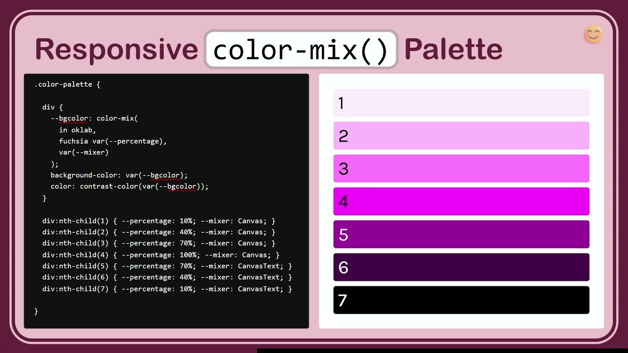
And then in this little iframe, I have that applying to, this little text here where it's gonna be a thicker font weight. So cool. That's a fun fun start. But we can get even deeper with contrast color, which recently landed in all stable browsers with Chrome being the latest to implement this. And I think that this opens even more doors for color theming for us. So the simple usage is you first would have some kind of color that you're testing against.

In this case, I'm testing against the button background color, and then I'm going to set the color on the button to button background, using contrast color to get a value back that's either black or white. So it's gonna be testing against this button background. Here, you could see it's, white on the maroon. It's gonna be, black on the yellow.

Again, darker values, you're gonna see white. And then lighter values, you see black. So this is a great start, but it is also very limited. You only get white or black. However, we can leverage this like a boolean value and then use that to create any color scheme we want and color theme we want. So in order to do this, we'd first have to create a custom property, contrast color, give it a syntax, initial value, and then we can actually leverage this value, use contrast color against a background here. And once we do that, we can set that to the variable contrast color.

We're gonna get either black or white, but then we can use that with style queries to say, if the style of contrast color is white, set this to lemon chiffon instead of white or whatever color you wanna pick. Else in a dark theme, if that color is black, set it to indigo. So this gives us the ability to create any kind of theme system we want.

You do have to test all the color yourself. Right now, the contrast color function uses the WCAG two contrast algorithm, which there's a possibility that'll expand in the future, but for now, it's limited to that contrast algorithm, and it's limited to just black and white. But you can try this out yourself, do the testing yourself. If you're unhappy also with some of those middle ground colors, you can create your own color systems and make this really dynamic.

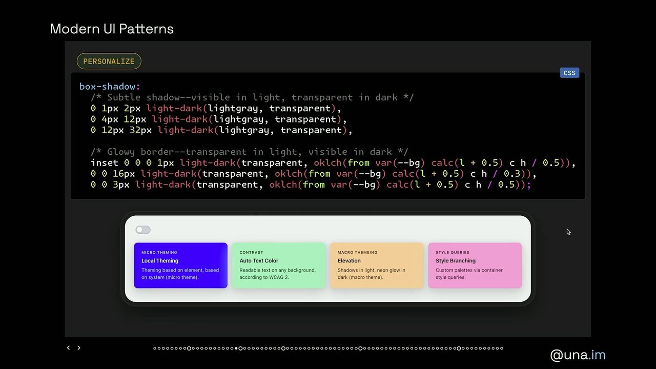
So, we can take that even a step further, and you can use things like light dark for things that aren't just color by, using a little bit of clever transparency. So in this case, I wanted to have like a neon glowy border on a dark background and a subtle little shadow on a light background. Like, this is a common thing that design systems will do to make cards sort of stand out from their page.

And so we can leverage light dark giving us, you know, first value in a light theme or second value in a dark theme by using transparent. So we have this box shadow, which has six values, but only the first three are visible in a light theme, and only the second three are visible in a dark theme. So what we can do with this is set box shadow to light dark, give it a color value.

So in a light theme, looks like this. You've got your shadow defined here, and then, it'll be transparent for the sort of inset glowy border on a light theme. And then when we set it to a dark theme, we sort of get the opposite where you don't see that gray shadow because, well, you wouldn't really see it anyway.

It might be kinda awkward depending on the color you used. And then we're using, relative color syntax to create this, like, a neon glow that uses the color value from the card background itself. So this is kind of how I'm imagining the future of color theming. And, you know, I'll tell you a secret. This actually works on all browsers today.

So I tested this in Safari. Tested it in Firefox, but because you don't really need at function and if for this, you can just do this with style queries, light, dark, and contrast color. You can do this entire color theming system today. It is baseline newly available, and I've had a blog post in my drafts for, like, three months.

I've been waiting for style queries to ship and then had a bunch of events. So I owe you a blog post, but this is possible today. The future is now. We can really create these these personalized color themes with these, like, micro themes and macro themes. The macro theme being, do you have, you know, what's the color of the page? How do you do your shadows?

And the micro theme will be, like, you know, I'm in a dark theme, but not every card is gonna have light text. You might have a card with dark text because it's a lighter card on a darker theme and vice versa on the light theme. So this gives you a lot of different permutations and a lot of control over what you can do for theming.

Oh, no. What's that? Okay. Subscribe. I don't want to subscribe. Let's oh. Hold Hold on. Sometimes I can actually click on this. If I click, it'll change to the next slide. This doesn't always work, but sometimes this is like when I'm bored and rehearsing the deck. I'm like, oh, little mini game. That's a pro tip for speakers.

Create mini games inside of your decks. Okay. I'm not getting it today, but I did get it earlier. So the second principle is reducing noise because we all hate these obtrusive pop ups and banners that obscure the screen, ask you for your newsletter, eliminate visual clutter and application borders, and keep the interface clean and focused. So here's an example of a web experience that frustrates me. First, when you go to any website, it's like, hey.

Download our app immediately. I don't wanna download a bunch of apps. I wanna use this on the web. So I wanna close that. And then this one, this is Google Photos. There was, like, a big banner, and then underneath the banner, there's also, like, a secondary action bar. And these don't go away when you scroll. They don't go away.

They just sit there. And I was like, how much space is actually taking up on the screen? And it turns out it's almost 40% of the entire screen real estate on my new fancy iPhone is covered by these borders, which is very frustrating. But, actually, we're in the EU, so let me make you feel more at home. It looks more like this first, and then you see most of your screen covered up by obtrusive borders and hunters.

So we can fix this with a couple of lines of CSS, and this is a pattern that I love because it's a really great progressive enhancement. I use this as a progressive enhancement on my site without changing the current experience. So this is called a hidey bar. As you scroll, it goes away. And then when you start to scroll up, it comes right back.

And you used to have to do a lot of annoying JavaScript to do this. Now all you need are scroll state queries. Oh, who here has heard of scroll state queries? Who here has used them? Okay. A couple people. Scroll state queries are awesome. And if I would have any wish list, also, that's for browser vendors here. Heard there's a couple of browser vendors here.

Scroll state queries are just they enable so many awesome experiences on the web. Adam Argyle, my former colleague, did so much work on scroll state queries and really has some great articles and talks about them. But there are a couple of different scroll state queries. There's stuck for when something is in a sticky state. There's snapped for when things are moving into a snapped position, like, for example, in a carousel.

There's a scrollable state query when something has scrolls, so you can do scroll indicators. And then there's scroll state scroll, which is the newest one to ship in, it's currently Chrome only, but I'm gonna show you a couple of progressive enhancements that you can do with it. And this lets you identify scroll direction and if there has been a scroll. This one is awesome.

So first, you'd have to set up your container query with container type scroll state, and that's gonna be on my HTML because I wanna set this on the entire page. Right? Then we can do a couple of things. So first, the way that my page on my, blog was organized is I had a header, and it was positioned relative next to the rest of my page, like the main part of my page, the nav and the main body.

So right now, if you're on the site and you're in non supported browser, you would just have to scroll all the way back to the top to see the header. I didn't wanna change the architecture of this at all. I didn't wanna have any kind of weird, experience for unsupported browsers because right now it's only in one browser engine.

So I updated this from relative to sticky when a scroll began. So that's what I'm do oh, that's what I'm doing here. What I'm doing is I'm setting at container once we've set up the container here. And then I'm using scroll state scrolled none to essentially say there has not been a scroll yet. Then I can negate that with not.

And so if there hasn't not been a scroll, that means there has been a scroll. Right? So then I'm gonna convert this to position sticky. I'm gonna give it a position at the top and then give it this trans transition of translate and give it time. Alright. So that's the first step. So now once there has been a scroll, it's gonna be position sticky. Then I'm gonna be using scroll state scrolled bottom so that when I scroll towards the bottom, I'm translating this up zero negative a 100% so it's outside of the viewports.

And when I scroll back upward to the top with scroll state scroll top, then I'm gonna translate this back to zero zero at the top of the page. This So is a way that we can start to leverage some of these modern features to enable these better UX patterns without changing the current user experience or degrading it in any way.

So I really, really love scroll state queries. And as I was exploring this a little bit more too, I really like this pattern from a z Hassan where on his personal blog, he was exploring also these just really cute icons. But as you scroll down, we're not completely getting rid of this navigation bar. We're kind of shrinking it to make more room in that little section as you're scrolling.

And this can also be done in the same way using at container scroll state scrolled. As you're scrolling to the bottom, what we're gonna do is essentially change this from the SVG view to a little dot view. So add a little bouncy animation, and it just, like, feels a lot more premium. It feels like a lot more of a quality thought through UI that a human really created and thought about.

So you can also do this with scroll driven animation, which is going to be interop this year. Right? Yes? Okay. Good. I'm seeing some head shaking. This enables so many great experiences on the web, you know, entire page transitions and scroll driven animations, also smaller effects. What I really liked also was this example from Oscar Poweka of this sort of progressive app.

So, like, as you scroll, you might be at the top and you wanna see an overview of, you know, this is like a lesson plan here. But as you scroll down, you might wanna drill into more details and tips and sources. And so I like the thinking behind this, what you see as you engage more with the app as you're entering into this app space more. And I I feel like that's a good example.

This is another one from BrahMis where as you scroll, you can just add these different animations to different parts of the header. And so, you know, you might have adjust info or shrink the name or add the shadow to the header. And here, we're just leveraging scroll driven animations with the animation timeline of scroll between, zero and a 150 pixels.

As So you're scrolling, we're sort of seeing these things move. And again, exciting that this is going to be available in all browsers soon soon. One newer feature that just landed in Chrome one forty six is scroll triggered animations. And I think that this is something that we all have seen on the web. We've won this on the web.

It lets you create time based animations that trigger at a scroll point and lets you leverage the viewport to set up this animation. So that's that's gonna be awesome to see take off in the future. So another way to sort of minify your UI or really focus on the most important things is by leveraging layered UI and layered UI patterns on top of the rest of your page.

But there are a lot of considerations to get right with layered UI. Like, you gotta get the semantics right. You gotta get the visual design. Think about what that looks like, the interactions, right, like how you're animating in the layered UI, how is it responsive to the rest of the page UI. So there's a lot of considerations here, and popover helps us with a lot of those.

Like, it helps us with a lot of the affordances and the experiences that you used to have to do a lot of scripting to enable. You get free light dismiss. You get the escape key bindings. You get the focus management. And we learned about popover yesterday in Jake's talk, which was an excellent talk. And so, you know, you get also just this, like, collision with the viewport just basically for free with just position, try, flip, block. So let's take a look at some of the design of this. Right? So one thing that, you almost always wanna do with tooltips is create some kind of visual indicator connector between the invoker, which in this case is this button, and the, popover itself.

So the way that we often create CSS triangles today, it's a bit of a hack, but it is by doing a border with most of it being transparent and either the top or the bottom or a piece of it getting a color. So the border top color here would be the same as the tooltip background that I wanna do.

So we can create that. I've position area this, given it a position area at the top. And then when this is flipping to the other direction, we have to keep taking into account, what about that little connector visual? So if I don't do this, you know, you can imagine that as this is gonna flip, this is gonna stay at the bottom.

And you just have this whole thing translated. And that's not what you want. So we can use a container query, an anchored container query, with anchored fallback flip block because I'm letting the browser do it for me. And you can also bring your own position areas. You can bring your own, custom positions. But in this case, I'm just gonna set that container, anchor it, fallbackflip block, and then I'm gonna change the position area of the tooltip itself. But, also, I'm gonna update the border top color and border bottom color to redesign or style this little triangle.

And then lastly, something that Jake had mentioned in his talk was one nice thing about these, tooltips is that as you move, you know, you kinda can get this effect where they stay on the screen. And if you have something like this, like, visual little triangle, you also have to keep that into account. So what you can do is create another anchor on the button, give it an anchor name.

This will be an explicit anchor and calling it invoker, and then set the position anchor of invoker on that little before pseudo element with the triangle. That way, it's going to be connected to an anchor to and following the invoker as you move throughout your design. There's also another new capability in town called border shape.

We also just learned about shape from Eric's talk. If you actually look at the code here, it looks crazy, and I am not him. I can't read this. But this essentially is a way to write directionality. Right? So you have your shape. You can use custom properties in here, which I'm doing. I have the direction, the arrow's height, the width.

Also, I'm updating the corner radius here. You can move the position. You can flip this to the top to the right. Like, I I built a little mini tool for myself so I can just get the output that I wanted to create the demo. But you can use shape within border shape to also create new, geometric UI for your elements.

It doesn't have to all be boxes and divs these days. And what's really cool about this is, like, you get all of the built in features that you would expect of something that follows the shape of your UI. So even if I toggle this, like, this is real inset and outset UI, and, like, shadows follow it. You don't need clip mask, which would hide the shadows.

You can have outlines and focus. And this goes way beyond something you can do with quarter shape. Like, you can make the shape any way you want. You saw the, tool from Temeni Afif also in Eric's talk. Temeni's done so much cool stuff with shape, and it's just so exciting to see. So anyway, is a powerful feature.

This is another way that you can create that little visual sort of anchor arrow when you're creating tooltips. But another thing you have to think about too is how are you transforming and animating. Right? So we just don't want to appear. So first, you're going to have your content. You're going to have your animation. You're going to have your border shape, which I'm just going to give it a variable, but it's going to look like that CSS output earlier. And then a transform origin, and this is gonna animate up. So if we are opening this where the tooltip is animating up, we're gonna have an animation where it's going sort of translating up a little bit and having some opacity come in.

And the opposite is gonna happen when it's animating down. So we're gonna update the animation name in this anchored container query, update the shape, update the transform origin, all the all the good stuff that we want as we are, you know, thinking about these details of the UI. There's a lot of considerations. So this is where I wanna talk about interest invokers.

Has anyone here heard of interest invokers? Okay. Got a couple, but a lot of people haven't. Have you ever seen, you know, a hover invoke tooltip? Have you ever been on social media or GitHub or literally anywhere on the entire web has these? So interest invoking is essentially opening up a popover or an element based on interest. And so that means either a hover effect or on keyboard if you tap into it.

Or right now on mobile devices, when you use this API, if you do a long press, it'll appear in the context menu. This is an API that, is currently going through a bit of discussion. It is shipped currently in Chrome. There might be some changes. But this is a way to get a lot of complex behavior, and especially getting the accessibility of these things right.

Like, this behavior is really complex. I we talked to a lot of teams at big companies who said they spent like six months with a team of three engineers full time trying to get this right. And then they weren't even sure if they got the accessibility right. So there's been so much work that was done in Open UI and in what working group and in CS's working group to make sure that we're landing a lot of these components right.

And this is one of those that has particularly challenging design. So interest invokers work with interest four instead of popover target or command invoker. You And do the same thing where you hook it up to the ID of the popover. This could be a regular auto popover. It could be a different type of popover like hint. But, yeah, you can open them.

So like I said, not available cross browser yet. There is a polyfill available for the interaction on on keyboard and on mouse. The polyfill does not work on the mobile long press interaction. So you can use these what's interesting is not just with buttons, but also with links. So in this example, I'm currently now adding these to all of my internal links on my site.

Because, like, as I start writing talks, I just, like, wanna make more demos and do things and do more projects. So I've got it up here open. But in this example, I've got this link where I have, this contrast color piece of text and then a link where it goes to internal blog. And then I'm giving it an interest for, giving that a name. And then at the end of my document, I'm gonna have my popovers.

This is the popover hint, it doesn't close other popovers that are open. I'm connecting with an ID. And then I can have just like all of the content that I want in there. And this is also like as I scroll, gonna move around and, adjust. So this is another progressive enhancement where currently the experience on my site isn't going to change.

If you're reading my blog, you see a link, it'll look the exact same. But if you have a, a browser that does support interest invokers, you'll be able to either tab or hover over it and see a little bit of a link preview, which I think is cool. I'm all about progressive enhancement. A couple of UX pro tips for using interest invokers.

The default user agent style is zero point five seconds, but I think that's a little bit slow. And, also, this is a tip from Emil Kowalski who, had mentioned, like, hey. If you're already interacting with an action bar, you don't wanna delay on every single item. And that's the default. So you just wanna delay maybe initially so you don't initially accidentally trigger the interest invoker.

But then you might wanna update that to zero so it feels very snappy. Sometimes the best animation is no animation or fast animation, a minimal animation. So you can do this also with, you know, some CSS. It's pretty, pretty easy to do. One line code. Love that. But what we're looking for here is if the parent has something that has interest, which is has interest source, then on the interest invokers, update the interest delay start to zero point five seconds.

Just remove it. So that's, like, one way that you can implement this kind of pattern, one of those little big things that I think really makes a difference in our UIs. You can also do, multiple popovers on the same element. So this is an example, from YouTube where you have these two little icon buttons. You have tooltips, but you can also click through and see this popover show up with notifications.

You might have rich content in there. And the reason why it's not closing when this other little tooltip opens is because that is a hint popover, and that essentially says, don't close other popovers while I'm open. So you can have multiple popovers appearing on the same button. So in this case, I've got the popover target for the actual auto popover, which is notifications, div, which would have the notifications, and then also an interest for for this little tool tip for notifications.

So you can, like, multistack things and have multifunctional popovers. Last year at CSS Day, we talked about this, and we talked about one of the big challenges in implementing this API, which was, well, what do you do on touch devices? We presented a couple of examples and ideas, and ultimately, we settled on this idea of an interest button pseudo element where you would be able to, get a visual representation of, like, that little eye.

That's what it looks like today, which if you clicked on it, would open the interest invoker. So this is the current solution for interest invokers. But if you look at something like this, like, was added to Canary, and I I opened my demos. I was like, that doesn't look good. Oh, we're gonna ship that like that? And then, you know, I'm thinking about, well, what about toolbars that are even more complex?

Like, this is the Google Docs toolbar where you might even have, like, a submenu. And can you imagine having a separate icon that shows that there's an interest invoker after every single one of those, like, just for a little tool tip? And, you know, you might say, oh, we'll just style the title attribute, but that's not always enough.

Because, what if I wanted something like this where I might have more complex information where I have, like, this bolded Google account and then my name and my email that are styled differently, like, we we I think this should be an opt in feature. There's currently a big discussion about it. So that's why I wanna talk about it.

And this is the current user agent style too. So a user would have to know that, this is what was currently resolved on. Currently, it was resolved on, if you have a touch device, a device that, doesn't have hover, then you'll show the button. So it won't be on desktop devices.

It'll only be on touch devices that you'll get this interest button by default as a user agent default. So that means that the user has to know that this is this precise media query that is a negation media query. If at media hover, hover none, then show it, else inline block for the display. And then also all these other styles.

And and this is my worry about shipping this as a default only on touch devices because people don't always test. You know? Sometimes, we you know, they don't always test on mobile devices, and then you get a little surprise, surprise. And then people are like, what's going on? Is this a bug? So this is what it looks like on Blue Sky right now if you use interest invokers on the app.

And, you know, there's there's been some discussion about this is better for accessibility and availability of this, but I think this is a worse accessibility experience. It's cluttering up the UI. So, anyway, if you have thoughts on this, while this was resolved yesterday, I added it to my talk to point you all to this beautiful issue here where it would be great to hear from the community and what you all think about how this should be implemented. Because I do think interest button is a good idea.

I think that we should have it, but I think it makes more sense in some cases than others. I don't think it makes sense as a default for everything. So I think it should be opt in. And, that's the the lovely issue number thirteen nine eighty. Can you believe there's been, like, over 14,000 issues in the working group? That's crazy. So go talk to people.

Anyway, that's our little France. Let's talk about UX patterns. So I'll go through these next two together. This is all about implementing natural interactions and providing guided navigation for your users. I I think that this is one of, like, the biggest things you could do to make your app feel, like, really premium and high quality and, like, app like.

So you can morph animations between states and provide stateful feedback. That's important. So your user knows that there was some feedback. Using view transitions between page views is also another way to make things feel really fluid. Intentional animation, the use of intentional animation to really guide your user's attention, and interactions that respond to user actions.

They feel like they have a say. They know what happened. They they get some response. I love this this little example from Tubic Studio because it's just so smooth. It just is such a beautiful website, and it feels like there is really a response to the user interacting with this screen. And you can see things moving between the pages within the pages. Like, I just think this is a really beautiful UI.

I wanna see more creativity like this on the web. And this is another example from Dribbble. One of the things I'm trying to be intentional about also is following designers who aren't necessarily developers and kind of getting their view on interaction design, like how they're thinking about user experience from high level. Because sometimes I think we get, like, really caught in the, you know, what's possible in, like, this sphere of web capabilities.

But, it's been interesting to kind of explore this space a little deeper. So just some general animations tips. You always wanna provide some visual feedback, but don't overdo it. Definitely be mindful of the type of feedback and the speed of the feedback for your users. You wanna animate from the source. So I showed some with the invoker.

Use natural easings. Like, we don't have real spring easings on the web, unfortunately, but you can approximate physics with the linear easing function. Also, just know that interaction is going to trigger user attention. So you can use that for good or for evil. Like, if I go over here and I wave, like, where are you looking? Probably at me, not on the the screen.

I don't know. Don't look at me. Also animating between states for better perceived performance so your user feels like there's something happening while they're waiting for a response. And then also thinking about natural motion and how people interact physically with their devices. So this is another really cute example. I love this designer, UE five forty, and I just wanted to recreate this little bubbly tool tip.

Like, I thought it was so clever that she had this little background that became the visual connector between the tooltip and the invoker. And so this is using just orchestrated animations. We have animations happening at different rates. You know, like the little bubble is kind of bouncing after the tooltip settles. But there's a lot of ways that you can create these sort of orchestrated animations, taking inspiration from design that's out there and just kind of recreating it to see how it's made and to kind of dig deep and explore that a little bit more.

There's also a couple of little big things that you can do that make UI feel a little bit more alive. This is just such a simple pattern where as you click on a button, it just scales down slightly so it feels like I'm pressing it. I wouldn't do anything more than 0.5 for the scale, but it's a really easy way to make a UI feel responsive, like responsive to you, to the user.

Another thing that you can do is add some blur as you're animating. So these don't have blur now. I'm gonna turn it on. And now I have a little bit of blur in the middle of this interaction, and it feels like it's coming from somewhere. It's doing something. One thing that is missing from the platform, I know that Adam has an open issue for this, is motion blur on the web. There's no current way to get this sense of movement from and to a place on the web.

You can only just, like, do a general Gaussian blur, which doesn't get you the full way there, but it does something. And I'm I like motion blur a lot, especially in this space of interaction design and quality on the web. So with linear, like, again, I I'm not gonna read this, but I am so into building mini tools right now to help me build demos. So I've I've been, like, taking this course, right, where I'm learning, like, React Motion and the way that, designers are talking about motion with, like, stiffness, damping, mass, velocity.

So wanted I to just, like, build a little mini tool for how to, like, convert that into the web language of CSS, and and we can do that. Like, we can we can use the tools to make the tools, to make the UIs. So this is just, a really complex animation timing function, but you can you can simplify this definitely with easing curves.

A couple of other, like, little eye candy things. Studio Co has some really beautiful designs as well. What I really like about how they design is they do a lot of this nice orchestration where you see staggered animations. You see these effects kind of come in really intentionally. You're guiding the user with what's moving in. Like, you're bringing that attention.

And I really like a lot of these stagger things, which you can do with sibling index in CSS. And, again, this could be a progressive enhancement where you're applying these, like, subtle animation delays to enable animations to trigger in an order that brings your attention to it. So for example, like here, I just have this animation delay where I'm using sibling index.

I'm multiplying it by point zero five seconds as the delay, and then I'm starting the entire animation two point two seconds later. That's what gives me, like, a little bit of a. You know, that's what it sounds like to me when I see this. Right? You too? No? Just me? You get this for free with scroll driven animation.

So so here is just a scroll driven animation where I have, like, a couple of little chips coming in. And this is just translating up from the bottom of the page where I'm doing an opacity and a translate as things are appearing in. So essentially, I'm just like doing a animation, appear, animation timeline is view, and the animation range is from the entry to 25%.

And so you kinda like get this for free because all those lines are coming in at their own rate, which is kind of nice. So SDA is awesome. Can't wait to have it cross browser. Another thing you should be aware of is, like, the direction of the scroll. Right? So in this case, this is a scroll triggered animations demo where as these cards are animating in, I want them to come in from the side of the screen that I am watching them, like, enter from.

So you can do that with, again, scroll state queries and scroll state scrolled, the best scroll states query, where first I'm going have them animate from the bottom. And I'm using just this amount to update it from 50 pixels to negative 50 pixels as the thing that is translating here in the key frame. And then I'm just gonna change that using scroll state scroll top to the negative value so it's reversing this.

Also, this little thing that says scrolling down and scrolling up, that's also a scroll state, scrolled media query or container query that's updating the content based on the scroll direction. So you could, like, do all this stuff with CSS. CSS is so cool. Right? Okay. Good. Another way to guide users are patterns like this.

So this is a table of contents that has a little scroll indicator to show you where you are in this wider, article, like in this page. And I think this is, again, a nice progressive enhancement that you can use to make, the user feel like they could understand and navigate this page a little bit better. Like, oh, look. See, I told you I added it to my site, that little top bar.

So you can do this by bringing your own scroll markers with scroll target group auto. And this is one of those things that I just think is such a nice, like, small addition that makes a difference. So in this example, I've got these sections, the intro, section one. These are all little anchor links within the page. And, there's gonna be IDs throughout the page that link to them.

Right? That's the setup. Then the parent of this little sidebar group is going to get scroll target group auto. So now these are all going to be little scroll markers themselves so you can apply target current to the scroll markers. And you might also notice I have this little pointer hand here. So as I'm scrolling, that pointer is updating, moving, shifting in addition to the style of that link itself.

And what we're doing here is I like to call this follow the leader or dynamic reinquering. So we're updating the position anchor is what we're doing here. So anchor positioning is technically in every browser, but it's technically also not baseline. That's a fun one. There's just enough browser inconsistencies and, like, some open bugs that it is not baseline yet, but it is in every modern browser.

So take with that what you will when you decide what to use. So dynamic re anchoring is this pattern where I'm going show this on hover now where you set this position anchor and explicit anchor on this little follower element. It's like a little magnifying glass that magnifies where the user is in this bar. And then when you hover over any possible anchor, so any of those possible icon buttons, it moves.

So the anchor name is going to update to hovered, and then you've got the position anchor of the follower that's going to follow it. So I'm also using a little bit of JavaScript here to do the default anchors. So if I, am not hovering on any of the potential anchors, it'll snap to that little possible anchor that I've saved in the state. But this is a nice little small cute thing.

So you can combine that with some of the other things like multi anchors. So I've got these tooltips. And those tooltips will also respect the positioning of the viewport. And you can do all of these, like, little hover things with anchoring and, like, all these nice little effects. And I'm getting these femoral tooltips and positioning things. And, I've got the position try fallback, so it does it all by default. And, you do need some JavaScript to preserve that state, but this is, like, all pretty much done in CSS, which is pretty cool. And morphing animations are another really cool thing that you can do now with view transitions.

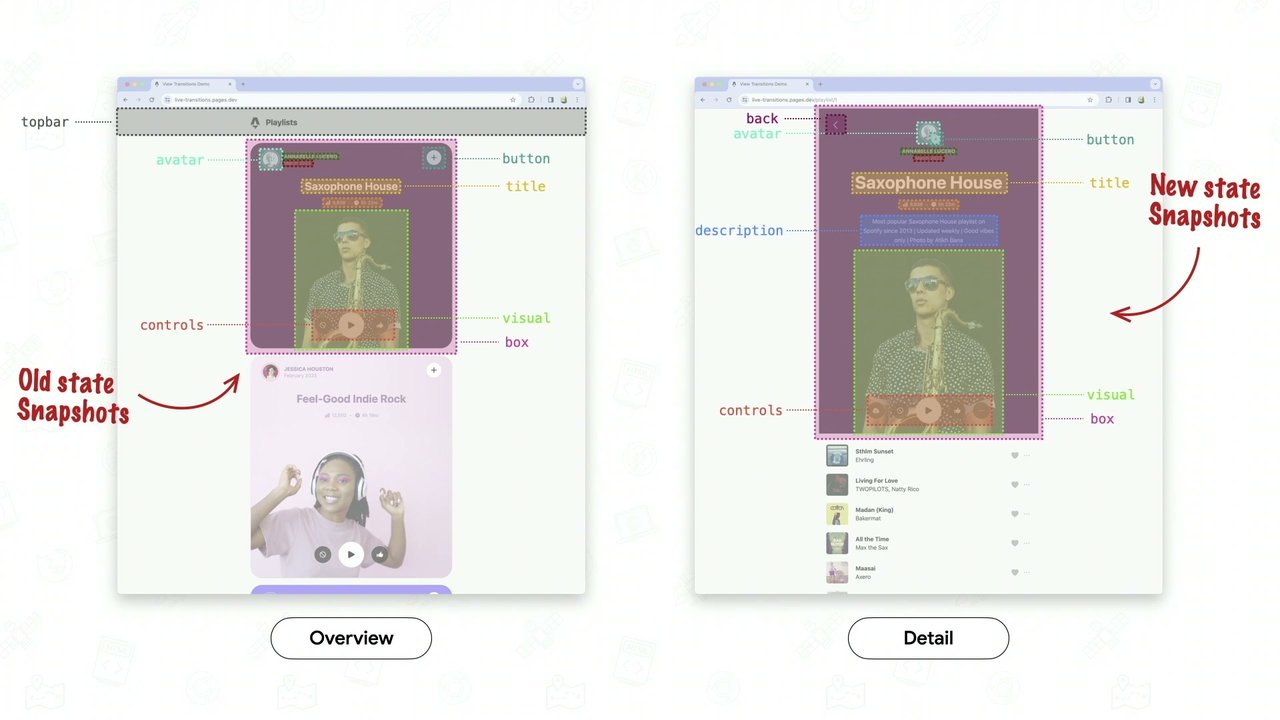
And we heard all about view transitions from Brahmas yesterday. He's definitely the expert in the space. I always, like, ping him when I run into issues with view transitions, which is awesome. But, this is, like, something that we see all over the web, another way to make things feel nice and smooth. And particularly what I think is nice is that we now have scoped view transitions in Chrome one forty seven.

So as you learned yesterday, you can now start a view transition on an element and not on the document. So you don't have to block the entire page while an animation is running. And, you can have things running in subtrees and have multiple animations happening at the same time. So this is perfect for microinteractions and morphing animations.

This I think is a really great example of the utility of microinteractions and morphing within a UI. It's by Aditya Sur, and it's a, payments overview. Like, what did I spend this month? And when you click into one of those dates, it expands and morphs and gives you more information about what exactly you're looking at, what those icons are, how much you spent.

I think that this is a great example of how we can leverage these tools and techniques to really improve user experience and guide users. So, I like I said, I took this course by Emil Kowalski. And one of the demos here, this is all done in in React Motion in the course. But I was like, hey. I could do that with CSS and and a little bit JavaScript with view transitions. So it's, this feedback button that morphs into the feedback form. So to build this, we essentially wanna show one and not the other. We give them both the same view transition name.

We want them to morph into each other. And then, we capture these as separate layers so they animate. And you can just do this kind of stuff without having to install React Motion. You can build it with view transitions and guide your user, and this is like a fully functional form. Hello. I mean, that's not fun it's not it's not hooked up to anything. It's a demo.

Why do I say that? Another, like, little big thing is is feedback for users. So this is a copy to clipboard button example, also from that course. But it's a simple fade in and fade out interaction that you can create with view transitions. So it's just doing a little, And we have these two animations, the fade in and the fade out.

Right? And then we have this view transition old and new on the icon, and we're fading it out. We're fading it in. There's gonna be a little bit of a delay so that the fade animation can complete before the new one starts. Then we're easing it, and it's all it's just nice to do this with few transitions.

It's it's a beautiful, very complex, but very powerful UI. Another example that I like here is this this little interaction with a a retweet button. But what I like about this is that the numbers go up when they when they move back to, two eighty four, and it goes down when it moves up to two eighty five.

So this small subtle thing I think makes, again, a big difference, like that that effect. So to create this, we wanna store a direction variable in the root, and then we wanna update that based on the view transition. So here we have view transitions like sliding in and out, we also want to update the direction as we're doing the translation for the key frame slide out, slide in.

And we can update that value in JavaScript based on the toggle. And you can make these things that don't just morph from one to the other with a, crossfade, but, like, can actually move between each other, move between the values. So the last bit that I'll be quick about is adapting to the form factor. This is one where you really you know, we design on a desktop usually, and we build things on a desktop, and we test things usually in dev tools on a desktop.

And, I think that this gets us a lot of the way there, but there's still a piece of this where you don't really get that look and feel of when you're navigating the web. I think this definitely contributes to why the web feels a little bit jankier than apps is, I think, the way that we test things and build things.

But there's so many things that we can do with these modern capabilities to really, like, leverage touch based intuitive interactions. And, you know, there's also these things that we need to consider, like minimum touch target sizes, adapting the layout to the and the UI pattern to the form factor of your users. But one of these things is, like, with menus.

Right? So when you open a menu, often on desktop, have to find the close button. We don't like this. I don't even think this toggles. Like, it's a little icon. You have to find it. And it's not such a big deal when you're already used to using a mouse or even a keyboard to navigate. But on touch devices, like mobile devices, you usually can just swipe it away. Right? People are used to being able to toggle things open and close, like the different pages and sidebars and items here.

One of my colleagues, Philip, is here who absolutely despises that you can't do this by default on the web. So shout out to him wherever he is. I agree. I think this is a pattern that should be possible on the web, and it is. I mean, you can leverage, you know, scroll snapping and just scroll for this. So this is an example of, like, a very simple way to have free free swiping on the web, and that's by creating scrollers. We love scrollers.

Scrollers don't always have to be a bad thing. So in this case, this entire UI is a scroller. If you landed on the page, and didn't have this scroll into view style, it would look like this. And you'd have, like, a big scroll bar all the way across the bottom. But because I'm setting this up by immediately scrolling into this main section, I can have a scroller that has some overscroll, some area on the left side, and then you can just swipe it close. And it's using, you know, scroll behavior smooth and scroll snap type of x mandatory, and then hiding the scroll bar.

So it can be as simple as using scrollers to get free swipeability. But we're working on making this easier. So something that our team right now is working on is overscroll areas. And this is essentially built in gesture behavior in HTML and CSS. So right now, it is spec like this where, you have overscroll container as the attribute that you set on the overscroll area, and then you use command invokers to toggle the overscroll area.

So you hook it up with the ID. You set the command to toggle overscroll, and you set that up on a button. So this button has to exist right now. There's a lot of open discussion and questions. I think this is a really interesting API. If you wanna start getting involved in, like, providing your opinion on the web platform and standards, like, one has a couple of open questions. One is, do you need to have a button tied to it? Can we use, underlying ARGET actions?

Another is, how do we design this? Like, what about responsive design? So Brahmas, for example, just wrote a big issue about, hey. I think this should be in CSS, and this should be possible to change in CSS. And there's a lot of valid points and a lot of great discussion right now around overscrolling gestures and the future of this.

But the whole idea is that we want the web to feel more high quality and fluid and have all these capabilities built in instead of relying on, you know, third party tools or adding a bunch of scripting or figuring out what the right patterns are, I think that there's a lot that we can do to continue moving the platform forward. And it's come a long way.

It's been really, really cool to see how far the web ecosystem has come in the last few years, and there's there's even more we can do. So let me wrap up with these key UX principles. The first is to respect user preferences, which, again, we're all doing. Right? Yes. Good. I hear yes. Maximizing the content and reducing noise where we can.

I know you can't always do this thing with cookie banners. I do think you could minimize them a little bit, but there are patterns that we can do, like reducing the top and bottom bars and, like, making sure that we're focusing on most important content, implementing natural interactions that look and feel smooth and are inspired by physics, provide guided navigation for your user as they navigate through your application to help them understand where they're going and where they're coming from, and then adapting to the form factor of your user and their device. User experience is more important than ever, I think, in this current state of the web.

I think that having some design background and interest is going to be more valuable than it's ever been, and I'm excited to see this grow in our industry. And also the web is more capable than ever. Like I said, we've shipped a lot of great features in the platform, and now it's time to use them and make better user experiences with them. We can we can do better.

Raise your expectations for the web. I think that the web is the best medium to build on right now. Right? Yeah. It is. And I think that a lot of people in this room can set the trends and set the tone for what's possible on it. So think about the little big things that bring it all to life, make it feel more human, make it feel better, make it feel more high quality.

And thank you so much. I've got demos here. There's a link. You can follow me. Again, I promised you a blog post, so follow the RSS. Follow me on Blue Sky at Twitter. You can follow Chrome DevRel. New features are on developer.chrome.com, stuff that's stable. Not web.dev. And that's all I got for you. Thank you. I appreciate you.

That

was incredible. Thank you. Please join us. Me. Just me.

Okay. Should sit here? Here? Oh, okay.

That one, please. So I was just moving it. We've got time for a couple of questions. This one. That was a great talk.

Thank you. I'm so sweaty now. Sorry. Me too. It is hot up here.

Matthias asks, so many animations, maybe too many for users preferring reduced motion. Where would you draw the line between disabling animations completely and keeping some?

Oh, that's a great question. I mean, we would always say on the team, like, prefers reduced motion doesn't mean no motion. It means reduced motion. So think about how you're helping your users understand that there was an action. Like, that's so important. You might still wanna do, like, a little bit of an opacity change or a smaller animation versus just no animation.

And, again, being thoughtful with where and when the animation is. I didn't really talk about it much today, but there's also a lot that you can do with animation timing. So making things feel like smooth and snappy and fast where you're maybe in, like, a dashboard, but maybe if you're doing a more, you know, scrolling telling immersive experience, you can have slower animation.

So there's a lot of it depends. This is why I encourage you all to, like, break outside also of your bubble if you aren't in this design space, like, see what people are talking about when they're learning about and, like, discussing because I think it's really important to continue to try to expand our worlds more. Like, it's more important than ever to try to expand your world and not, like, be in a silo.

You know? It's it's tough out there. But anyway, there's a there's a lot of stuff with animation.

Yeah. It's not black and white. There there's a medium happy a gray area, happy medium that we can definitely spend some time finding. Alan asks, in your tool to to pardon? In your tooltip examples, you use flipbook but still have to set some top bottom stuff. Should be more automatically should more be automatically flipped?

It is usually flipped automatically. It depends on the UI. I forgot what the exact demo was. I think I might have updated position area. Maybe I didn't have to do that. I don't know. Find me after. I don't remember what the exact demo was. But, yes, it it does change some properties on all properties. So for the most part, it'll flip it automatically, but it doesn't use position area. It uses different positioning.

So it depends on how you're building it. But, yes, like, the default positioning will change. If you have anything that's fancier, like the animation or the, like, tooltip thing, you definitely have to update that. And I I think I have to just revisit because I also have, like, the demos in CodePens. So maybe I

Yeah. That's you're gonna be this you're this evening. Right?

Here. You're work fine.

Please do find Una Una if you want to have a look at that example in particular.

Yes.

Danny asks, will we see a interest dash source equivalent for normal popovers click?

There is one, popover open. So you can use popover open.

Someone who didn't add their names asks, in your examples, you have used a scroll state query to check for scroll bottom. Is there a start or an end keyword to keep the behavior when you when the scroll direction changes?

To keep the behavior. What do you mean by that?

I think because you I think that the users scroll state query to check for scroll bottom, I wonder I think they're wondering if what is the opposite of that.

Scroll top.

Oh, it'll be the top. Okay. So it's quite it's like, is that a start or end keyword to keep the behavior when the scroll direction changes? I think

what they might be asking is, like, can you set a style that applies on scroll bottom that stays for a while and doesn't change on scroll top? Yeah. Sure. You just don't override it on scroll top. In all my examples, I changed them, so they were opposites. But you could, like, apply a custom property or a style that like, if you set a custom property like the space toggle idea, like, turn something on and off, like, in theory, you should be able to do that.

It depends on how you set it up initially. So there's a lot of it depends for this question. I'm not even sure if I'm answering the real question.

But then again, please do come find you now. And and we can clarify that because I probably I'm also and possibly, I'm misreading it. This was we don't have time for more questions. Please give a big round of applause for you, and thank you.

Modern UI Patterns

Una Kravets

Headshot of Una Kravets, a smiling woman with long, curly dark hair, wearing a patterned top, and holding a microphone.

LAB DAY

A stylized wordmark spelling "LAB DAY" using black rectangular blocks.

.break::after {

  • 16:15 | Una Kravets
  • 17:10 | Adam Argyle

Google

AG Grid

Logos for Google and AG Grid. A stylized 'X' icon within a square border.

.break::after {

  • 16:15 | Una Kravets
  • 17:10 | Adam Argyle

Google AG Grid

A stylized 'CSS DAY' logo is displayed in the top right corner. A small, abstract logo is next to the text 'AG Grid' at the bottom.

.break::after {

  • 16:15 | Una Kravets
  • 17:10 | Adam Argyle

MODERN UI PATTERNS:

Building a great UX with next-gen CSS

Una Kravets una.im

Google Chrome DevRel

@una.im

Modern UI Patterns

MODERN UI PATTERNS:

Building a great UX with next-gen CSS

Una Kravets ♥ una.im

Google Chrome DevRel

@una.im

Modern UI Patterns

@una.im

An illustration of a small dog, possibly a chihuahua, dressed in a grey elephant costume with large pink-lined ears and a trunk.

Modern UI Patterns

A dog in a grey elephant costume with the face of Lord Voldemort superimposed on its head.

Modern UI Patterns

@una.im

The slide displays two main visual elements. On the left is an illustration of a person with blue-grey skin and large, round, pinkish-grey elephant ears, emerging from a dark background. On the right, a large, stylized green letter 'A' is shown against a dark grey background.

Modern UI Patterns

AI

@una.im

Modern UI Patterns

AI

Modern UI Patterns

AI

@una.im

Modern UI Patterns

How to build

@una.im

Modern UI Patterns

WHAt to build

@una.im

Modern UI Patterns

Why to build

@una.im

Modern UI Patterns

Why to build

Modern UI Patterns

Why to build

@una.im

Modern UI Patterns

Why to build

Modern UI Patterns

Why to build

@una.im

Modern UI Patterns

Why to build

Modern UI Patterns

Why to build

@una.im

Modern UI Patterns

@alxui_ux

@una.im

Screenshot of a payment modal interface. It displays a wallet balance, options to select between different credit cards (masked numbers shown) with a toggle, and options to add cash with preset amounts ($50, $100, $300).

Modern UI Patterns

Screenshot of a voice chat interface showing a list of users with avatars and a 'Join Now' button.

Modern UI Patterns

Screenshot of a UI component for a "Price Range" filter, featuring a dual-handle slider, input fields for 'From' and 'To' prices ($1,860 and $2,720 respectively), and 'Apply' and 'Cancel' buttons.

Modern UI Patterns

Running

Feel the endorphins! Get a quick energy boost.

Get Started

@alxui_ux

@una.im

A white card with rounded corners, titled 'Running', displays a black icon of a running shoe with motion lines. Below the title, text reads "Feel the endorphins! Get a quick energy boost." A dark button with rounded corners says "Get Started". Below the card, a series of pagination dots are visible, with two mouse cursors hovering over some of the dots, indicating interaction.

Modern UI Patterns

11 of 15

@alxui_ux

@una.im

A user interface component for navigation, featuring a circular left arrow button, a central pill-shaped element displaying the text "11 of 15", and a circular right arrow button. A mouse cursor is positioned over the right arrow button, which is visually highlighted.

Share

Screenshot of an application's share dialog, showing options to allow anyone with a link to access or to invite specific users by entering their email.

Modern UI Patterns

Screenshot of a mobile application payment interface. It displays a wallet balance of $34.00, options for payment modes including two linked credit cards (one ending in 6756, the other in 4632 which is selected), and a section for adding cash with predefined amounts ($50, $100 selected, $300) and an 'Add Cash' button.

Modern UI Patterns

Screenshot of a 'Voice Chat' user interface showing multiple user avatars and a 'Join Now' button.

Modern UI Patterns

@alxui_ux

@una.im

Screenshot of a modern UI pattern showing a price range filter with a dual-handle slider, input fields for 'From' and 'To' prices ($1,880 and $2,720 respectively), and 'Apply' and 'Cancel' buttons. A mouse cursor is hovering over one of the slider handles.

Modern UI Patterns

Running

Feel the endorphins! Get a quick energy boost.

@alxui_ux

@una.im

A user interface example showing a running shoe icon, the word 'Running', descriptive text, and a 'Get Started' button.

Modern UI Patterns

@alxui_ux

@una.im

A screenshot of a UI pattern showing a minimalist pagination component with left and right arrow buttons surrounding the text '1 of 15'.

Modern UI Patterns

  • Design System: 75%
  • Urgent
  • In Progress

@alxui_ux

@una.im

A UI pattern example showing a card with a progress bar for 'Design System' at 75% completion, assigned to three user avatars, and status tags for 'Urgent' and 'In Progress'.

Modern UI Patterns

  • @alxui_ux
  • @azhassan_
  • @opawica
  • Emil Kowalski
  • @yui540
  • Tubik Studio
  • AntonSKV
  • @Studiyoco
  • @AdityaSurl1
  • Aurelien_Gz
  • userinterface.wiki
  • Nitish Khagwal

@una.im

Modern UI Patterns

  • @alxui_ux
  • @azhassan_
  • @opawica
  • Emil Kowalski
  • @yui540
  • Tubik Studio
  • AntonSKV
  • @Studiyoco
  • @AdityaSur11
  • Aurelien_Gz
  • userinterface.wiki
  • Nitish Khagwal

@una.im

Modern UI Patterns

Key UX Principles

  1. Respect user preferences

Modern UI Patterns

Key UX Principles

  1. Respect user preferences
  2. Maximize content, reduce noise

@una.im

Modern UI Patterns

Key UX Principles

  1. Respect user preferences
  2. Maximize content, reduce noise
  3. Implement natural interactions
  4. Provide guided navigation
  5. Adapt to the form factor

Modern UI Patterns

Appy experiences

Modern UI Patterns

Appy experiences

@una.im

Modern UI Patterns

PERSONALIZAZE

icess

  • 1. Respect user pref
    • Respect user preferences (theming, motion)
    • Think about the user's context
    • Users co-design the experience with you

@una.im

Modern UI Patterns

PERSONALZE

1. Respect user preferences

  • Respect user preferences (theming, motion, etc.)
  • Think about the user's context
  • Users co-design the experience with you

Modern UI Patterns

PERSONALIZE

1. Respect user preferences

  • Respect user preferences (theming, motion, etc.)
  • Think about the user's context
  • Users co-design the experience with you

@una.im

Modern UI Patterns

PERSONALIZE

1. Respect user preferences

  • Respect user preferences (theming, motion, etc.)
  • Think about the user's context
  • Users co-design the experience with you

Modern UI Patterns

PERSONALIZE

  1. prefers-color-scheme: light or dark theme
  2. prefers-contrast: higher contrast between adjacent colors
  3. prefers-reduced-motion: minimized animation or motion
  4. prefers-reduced-transparency: solid layers over translucent effects

Modern UI Patterns

PERSONALIZE

  1. prefers-color-scheme: light or dark theme
  2. prefers-contrast: higher contrast between adjacent colors
  3. prefers-reduced-motion: minimized animation or motion
  4. prefers-reduced-transparency: solid layers over translucent effects

@una.im

Modern UI Patterns

prefers-color-scheme
light-dark()

light-dark()

Baseline 2024 NEWLY AVAILABLE

A visual display of browser support for the light-dark() function, showing icons for Chrome, Edge, Firefox, and Safari, each marked with a checkmark indicating compatibility.

Modern UI Patterns

PERSONALIZE

body {
  color-scheme: dark;
  background: light-dark(lightpink, black);
}

.title {
  color: light-dark(purple, white);
  font-weight: light-dark(700, 400);
}

Modern UI Patterns

body {
	color-scheme: light;
	background: light-dark(lightpink, black);
}

.title {
	color: light-dark(purple, white);
	font-weight: light-dark(700, 400);
}

Modern UI Patterns

body {
  color-scheme: light;
  background: light-dark(lightpink, black);
}
.title {
  color: light-dark(purple, white);
  font-weight: light-dark(700, 400);
}
A code editor interface displaying CSS code. The `light-dark` function calls for the `background` and `font-weight` properties are underlined with a wavy red line, indicating an error or invalid syntax.

Modern UI Patterns

body {
  color-scheme: light;
  background: light-dark(lightpink, black);
}

.title {
  color: light-dark(purple, white);
  font-weight: light-dark(700, 400);
}
A screenshot showing CSS code in an editor, demonstrating `color-scheme` and `light-dark()` functions for responsive styling.

Modern UI Patterns

body {
  color-scheme: dark;
  background: light-dark(lightpink, black);
}

.title {
  color: light-dark(purple, white);
  font-weight: light-dark(700, 400);
}

Modern UI Patterns

PERSONALIZE

body {
	color-scheme: dark;
	background: light-dark(lightpink, black);
}

.title {
	color: light-dark(purple, white);
	font-weight: light-dark(700, 400);
}
A screenshot of a dark-themed UI with a button labeled "PERSONALIZE" and a code editor window displaying CSS code. The `font-weight` property in the CSS code, `light-dark(700, 400);`, has a wavy underline, indicating an error or an unsupported feature.

Modern UI Patterns

Luckily I work with some smart people who found a way around this without color-scheme()

@una.im

A photograph of a person giving a presentation on stage, standing next to a podium with a laptop. The podium has "CSS DAY" written on it.

Modern UI Patterns

Luckily I work with some smart people who found a way around this without color-scheme()

@una.im

An illustration of a man with an animated microphone speaking at a podium with a laptop displaying a graphic.

Modern UI Patterns

PERSONALIZE

Luckily I work with some smart people who found a way around this without color-scheme()

@una.im

An illustration depicts a person with their arms outstretched, standing next to a stylized podium with a laptop. The podium incorporates a geometric pattern similar to the CSS Day logo.

Modern UI Patterns

Luckily I work with some smart people who found a way around this without color-scheme()

@una.im

A demonstration of a modern UI pattern, featuring a button labeled "PERSONALIZE" and a UI component with a geometric pattern on its sides, which appears to be interactively changing its theme or style. A male speaker is composited into the slide, standing next to the UI component and gesturing.

Modern UI Patterns

PERSONALIZE

CSS custom functions

(@function)

@function 62

❌ Limited availability

@una.im

Browser compatibility icons for Chrome, Edge, Firefox, Safari, and Opera.

Modern UI Patterns

PERSONALIZE

CSS custom functions

(@function)

  • @function
  • 👍 62
  • Limited availability

@una.im

A prominent display of the text "( @function )" with the "@function" part highlighted in purple/pink with a glow effect, enclosed by white brackets. Below, a dark rectangular box titled "@function" displays a thumbs-up icon followed by "62", indicating positive feedback or votes. Below this, an icon resembling an intertwined knot precedes the text "Limited availability". To the right of "Limited availability", browser compatibility icons are shown: Chrome and Edge display green checkmarks indicating support, while Firefox and Safari display red 'x' marks indicating lack of support.

Modern UI Patterns

PERSONALIZE

@function --light-dark(--light, --dark) {
  result: if(
    style(--scheme: dark): var(--dark); else: var(--light)
  );
}

:root {
  --scheme: light;
}

@media (prefers-color-scheme: dark) {
  --scheme: dark;
}
.title {
  font-weight: --light-dark(700, 400); /* usage */
}

@una.im

Modern UI Patterns

PERSONALIZE

@function --light-dark(--light, --dark) {
	result: if(
		style(--scheme: dark): var(--dark); else: var(--light)
	);
}

:root {
	--scheme: light;
}

@media (prefers-color-scheme: dark) {
	--scheme: dark;
}
.title {
	font-weight: --light-dark(700, 400); /* usage */
}

Modern UI Patterns

PERSONALIZE

@function --light-dark(--light, --dark) {
  result: if(
    style(--scheme: dark): var(--dark); else: var(--light)
  );
}

:root {
  --scheme: light;
}

@media (prefers-color-scheme: dark) {
  :root {
    --scheme: dark;
  }
}
.title {
  font-weight: --light-dark(700, 400); /* usage */
}

@una.im

Screenshot of a code editor displaying CSS code. The code defines a custom function named `--light-dark` that takes two arguments, `--light` and `--dark`, and returns one based on the current `--scheme` variable. It also shows a `:root` selector setting `--scheme` to `light` by default, and an `@media (prefers-color-scheme: dark)` query that overrides `--scheme` to `dark`. Below, there is a `.title` class using the `--light-dark` function for its `font-weight` property. A button-like label with the text "PERSONALIZE" is visible above the first code block, and "CSS" labels are visible in the top right corner of each code block.

Modern UI Patterns

PERSONALIZE

@function --light-dark(--light, --dark) {
  result: if(
    style(--scheme: dark): var(--dark); else: var(--light)
  );
}

:root {
  --scheme: light;
}

@media (prefers-color-scheme: dark) {
  --scheme: dark;
}
.title {
  font-weight: --light-dark(700, 400); /* usage */
}

Modern UI Patterns

PERSONALIZE

@function --light-dark(--light, --dark) {
	result: if(
		style(--scheme: dark): var(--dark); else: var(--light)
	);
}

:root {
	--scheme: light;
}

@media (prefers-color-scheme: dark) {
	--scheme: dark;
}
.title {
	font-weight: --light-dark(700, 400); /* usage */
}
A slide showing two blocks of CSS code. The first block defines a custom CSS function `--light-dark` and sets up a color scheme using CSS custom properties and a media query. A "PERSONALIZE" label is positioned above this code block. The second code block demonstrates the usage of the `--light-dark` function for font-weight.

Modern UI Patterns

PERSONALIZE

@function --light-dark(--light, --dark) {
	result: if(
		style(--scheme: dark): var(--dark): else: var(--light)
	);
}
:root {
	--scheme: light;
}

@media (prefers-color-scheme: dark) {
	:root {
		--scheme: dark;
	}
}
.title {
	font-weight: --light-dark(700, 400); /* usage */
}

Modern UI Patterns

PERSONALIZE

@function --light-dark(--light, --dark) {
	result: if(
		style(--scheme: dark): var(--dark); else: var(--light)
	);
}

:root {
	--scheme: light;
}

@media (prefers-color-scheme: dark) {
	--scheme: dark;
}
.title {
	font-weight: --light-dark(700, 400); /* usage */
}

Modern UI Patterns

PERSONALIZE

@function --light-dark(--light, --dark) {
  result: if(
    style(--scheme: dark): var(--dark); else: var(--light)
  );
}

:root {
  --scheme: light;
}

@media (prefers-color-scheme: dark) {
  --scheme: dark;
}
.title {
  font-weight: --light-dark(700, 400); /* usage */
}
Screenshot of two code editor panes displaying CSS code examples. The first pane defines a custom CSS function `--light-dark` and sets up light and dark color schemes using `:root` and `@media (prefers-color-scheme: dark)`. A 'PERSONALIZE' label is visible next to this code block. The second pane shows an example of using the `--light-dark` function for the `font-weight` property within a `.title` CSS rule.

Modern UI Patterns

PERSONALIZE
@function --light-dark(--light, --dark) {
	result: if(
		style(--scheme: dark): var(--dark); else: var(--light)
	);
}

:root {
	--scheme: light;
}

@media (prefers-color-scheme: dark) {
	:root {
		--scheme: dark;
	}
}
.title {
	font-weight: --light-dark(700, 400); /* usage */
}

@una.im

Modern UI Patterns

PERSONALIZE

@function --light-dark(--light, --dark) {
  result: if(
    style(--scheme: dark): var(--dark); else: var(--light)
  );
}

:root {
  --scheme: light;
}

@media (prefers-color-scheme: dark) {
  --scheme: dark;
}
.title {
  font-weight: --light-dark(700, 400); /* usage */
}

The slide displays two code blocks. The first block defines a custom CSS function for light/dark mode switching and sets root and media queries for scheme preference. The second block shows the usage of this custom function for font-weight. A button labeled "PERSONALIZE" is visible above the first code block.

Modern UI Patterns

PERSONALIZE

@function

/* body { color-scheme: dark; } */

This title is bold on the light background and narrow on the dark one. Go edit the body color-scheme to show them, Una.

@una.im

A presentation slide with "Modern UI Patterns" at the top left. A button labeled "PERSONALIZE" is shown. The prominent central text reads "@function". A code block, styled like an editor, displays commented-out CSS: `/* body { color-scheme: dark; } */`, with a wavy underline annotation under `body { color-scheme: dark; }`. A rectangular text box on the right contains instructions related to text display on different color schemes. The text "@una.im" is at the bottom right.

@function

PERSONALIZE

body { color-scheme: dark; }

This title is bold on the light background and narrow on the dark one. Go edit the body color-scheme to show them, Una.

A button labeled 'PERSONALIZE' is in the top left. A code block displays 'body { color-scheme: dark; }'. A dark rectangular box, resembling a device screen or iframe, contains text describing font weight changes based on color scheme.

Modern UI Patterns

PERSONALIZE

@function

body { color-scheme: light; }

This title is bold on the light background and narrow on the dark one. Go edit the body color-scheme to show them, Una.

@una

A presentation slide with the title "Modern UI Patterns" featuring a large text "@function". Below it is a CSS code snippet `body { color-scheme: light; }`. To the right, a text box explains that "This title is bold on the light background and narrow on the dark one. Go edit the body color-scheme to show them, Una." A "PERSONALIZE" button label is also present.

Modern UI Patterns

@function

body { color-scheme: dark; }

This title is bold on the light background and narrow on the dark one. Go edit the body color-scheme to show them, Una.

@una.im

A presentation slide with a dark theme, featuring a CSS code snippet in a rounded box and an explanatory text box on the right. The code shows 'body { color-scheme: dark; }'.

Modern UI Patterns

@function

body { color-scheme: dark; }

This title is bold on the light background and narrow on the dark one. Go edit the body color-scheme to show them, Una.

@una.im

A button labeled "PERSONALIZE" is in the top left. An input field resembling a code editor displays CSS. A text box on the right contains explanatory text. A mouse cursor is present.

Modern UI Patterns

contrast-color()

Recently landed in all stable browsers 🎉

contrast-color()

Baseline 2026 NEWLY AVAILABLE

A UI component showing browser compatibility status for `contrast-color()`, indicating support with checkmarks for Chrome, Edge, Firefox, and Safari.

Modern UI Patterns

.button {
	background: var(--button-bg);
	color: contrast-color(var(--button-bg));
}

This demo will work in Chrome 147+, Safari 26+, and Firefox 146+. The initial text on the purple button will be white in supported browsers.

#b5005a

Screenshot of a UI demonstration. On the left, a "PERSONALIZE" button is visible, alongside a code block displaying CSS rules for a button, including `background: var(--button-bg);` and `color: contrast-color(var(--button-bg));`. A mouse cursor is hovering over `var(--button-bg)`. On the right, a demonstration panel shows browser compatibility notes, a set of circular color swatches (yellow, orange, maroon, pink, lime green, teal, purple, black), and the hex value `#b5005a` displayed for the selected purple color. Below these are two purple buttons labeled "Subscribe" and "Get Started".

Modern UI Patterns

PERSONALIZE

.button {
  background: var(--button-bg);
  color: contrast-color(var(--button-bg));
}

This demo will work in Chrome 147+, Safari 26+, and Firefox 146+. The initial text on the purple button will be white in supported browsers.

#b5005a

Subscribe

Get Started

@una.im

A slide demonstrating UI patterns. On the left, a "PERSONALIZE" button is displayed above a CSS code block showing the usage of the `contrast-color` function for setting button text color based on background. On the right, a white panel shows a live demo interface with text indicating browser compatibility, a row of circular color swatches representing a color palette, a hex color code for the currently selected color, and two interactive buttons labeled "Subscribe" and "Get Started".

Modern UI Patterns

PERSONALIZE

.button {
	background: var(--button-bg);
	color: contrast-color(var(--button-bg));
}

This demo will work in Chrome 147+, Safari 26+, and Firefox 146+. The initial text on the purple button will be white in supported browsers.

#b5005a

Subscribe

Get Started

@una.im

A screenshot of a presentation slide demonstrating Modern UI Patterns. The slide includes a button labeled "PERSONALIZE" and a CSS code block defining button styles with `background` and `contrast-color` properties. On the right, a UI demo window shows a color picker with circular color swatches (yellow, orange, maroon, pink, light green, teal, purple, dark grey), displaying the hex code #b5005a for the currently selected purple color. Below the color picker are two rounded rectangular buttons labeled "Subscribe" and "Get Started", both colored maroon with white text.

Modern UI Patterns

.button {
	background: var(--button-bg);
	color: contrast-color(var(--button-bg));
}

This demo will work in Chrome 147+, Safari 26+, and Firefox 146+. The initial text on the purple button will be white in supported browsers.

A screenshot of a presentation slide showing a CSS code example and a UI demo panel. The code block defines a .button class using CSS variables for background and contrast-color() for text color. The UI demo panel displays a row of nine color swatches (yellow, orange, maroon, pink, light green, teal, blue, purple, black) with the purple swatch currently selected, a hex code input field showing `#b5005a`, and two buttons, 'Subscribe' and 'Get Started', demonstrating dynamic text color for contrast. The 'Subscribe' button is purple with white text and a mouse cursor hovering over it. A 'PERSONALIZE' button with a golden border is also visible on the dark background of the slide.

Modern UI Patterns

PERSONALIZE

.button {
	background: var(--button-bg);
	color: contrast-color(var(--button-bg));
}

CSS

This demo will work in Chrome 147+, Safari 26+, and Firefox 146+. The initial text on the purple button will be white in supported browsers.

#facc15

Subscribe

Get Started

A user interface demo showing CSS code and its effect. On the left, a code editor displays a CSS rule for a button using CSS variables and the contrast-color function. On the right, a white modal window features a color picker with several circular color swatches, a text field showing the hex code "#facc15", and two buttons labeled "Subscribe" and "Get Started". A "PERSONALIZE" button is visible at the top left.

Modern UI Patterns

PERSONALIZE

.button {
	background: var(--button-bg);
	color: contrast-color(var(--button-bg));
}

This demo will work in Chrome 147+, Safari 26+, and Firefox 146+. The initial text on the purple button will be white in supported browsers.

#1a7a8b

Subscribe

Get Started

@una.im

A slide illustrating modern UI patterns. On the left, there's a button with a golden outline labeled "PERSONALIZE". Below it is a CSS code block defining the background and color for a `.button` class using CSS variables and a `contrast-color` function. On the right, a white UI demo panel is presented, featuring a paragraph about browser compatibility, a row of selectable circular color swatches, a text input displaying the hex color code "#1a7a8b", and two buttons labeled "Subscribe" and "Get Started".

Modern UI Patterns

.button {
    background: var(--button-bg);
    color: contrast-color(var(--button-bg));
}

CSS

This demo will work in Chrome 147+, Safari 26+, and Firefox 146+. The initial text on the purple button will be white in supported browsers.

#ff85c4

@una.im

A slide showing a CSS code snippet on the left and a mobile UI preview on the right. The CSS code defines styles for a `.button` class using CSS variables and the `contrast-color` function. The UI preview demonstrates a color picker with various colored circles (yellow, orange, pink, light green, teal, purple, dark purple), a text field showing the hex code `#ff85c4` (corresponding to the selected pink color), and two buttons labeled "Subscribe" and "Get Started". Above the CSS, there's a "PERSONALIZE" button.

Modern UI Patterns

PERSONALIZE

.button {
  background: var(--button-bg);
  color: contrast-color(var(--button-bg));
}

This demo will work in Chrome 147+, Safari 26+, and Firefox 148+. The initial text on the purple button will be white by calculated contrast.

#facc33

Subscribe

Get Started

@una.im

A demonstration of modern UI patterns featuring a CSS code snippet for button styling and a UI component for color personalization with color swatches and example buttons.

Modern UI Patterns


@property --contrast-color {
	syntax: "<color>";
	initial-value: white;
	inherits: true;
}

.card {
	--bg: var(--sq-demo-color);
	--contrast-color: contrast-color(var(--bg));
}

.card-label {
	color: if(
		style(--contrast-color: white): lemonchiffon;
		else: indigo;
	);
}
    

Works in Chrome 147+ and Safari 26+

contrast-color() only

@una.im

A screenshot of a mobile UI. At the top, a color picker displays a hex code (#6c1a7b) and a row of circular color swatches. Below, two identical card components are shown, each with a deep purple background and white text that reads "DESIGN SYSTEMS", "Dynamic color tokens", "March 13, 2024", and a "CSS" badge. The second card also includes the label "Custom palette via style query".

Modern UI Patterns

PERSONALIZE

@property --contrast-color {
  syntax: "<color>";
  initial-value: white;
  inherits: true;
}

.card {
  --bg: var(--sq-demo-color);
  --contrast-color: contrast-color(var(--bg));
}

.card-label {
  color: if(
    style(--contrast-color: white): lemonchiffon;
    else: indigo);
}

CSS

Works in Chrome 147+ and Safari 26+.

#6c1afb

contrast-color() only

  • DESIGN SYSTEMS

    Dynamic color tokens

    March 13, 2026

    CSS

Custom palette via style query

  • DESIGN SYSTEMS

    Dynamic color tokens

    March 13, 2026

    CSS

A 'PERSONALIZE' button is at the top left. Next to a CSS code block, there is a blue 'CSS' badge. A UI screenshot on the right displays a series of colorful circular swatches, a purple hex code, and two identical cards. Each card contains 'DESIGN SYSTEMS', 'Dynamic color tokens', 'March 13, 2026', and a 'CSS' tag. The top card section is labeled 'contrast-color() only' and the bottom card section is labeled 'Custom palette via style query'.

Modern UI Patterns


@property --contrast-color {
	syntax: "<color>";
	initial-value: white;
	inherits: true;
}

.card {
	--bg: var(--sq-demo-color);
	--contrast-color: contrast-color(var(--bg));
}

.card-label {
	color: if(
		style(--contrast-color: white): lemonchiffon;
		else: indigo;
	);
}
    

Works in Chrome 147+ and Safari 26+.

Selected color hex code: #6c1afb

contrast-color() only

DESIGN SYSTEMS

Dynamic color tokens

March 13, 2026

CSS

Custom palette via style query

DESIGN SYSTEMS

Dynamic color tokens

March 13, 2026

CSS

A code editor displays CSS code defining a custom property `--contrast-color` and its usage in styling card elements, including a conditional `color` property using `if(style(--contrast-color: white): lemonchiffon; else: indigo;)`. Adjacent to the code, a mobile phone-like interface shows a color picker with a row of colored circles (yellow, orange, red, pink, light green, dark green, blue, dark blue, white/grey), with a purple color selected and its hex code #6c1afb displayed. Below the color picker are two identical purple cards, both labeled "DESIGN SYSTEMS", "Dynamic color tokens", "March 13, 2026", and a "CSS" tag. One card is under a heading "contrast-color() only" and the other under "Custom palette via style query".

Modern UI Patterns

@property --contrast-color {
  syntax: "<color>";
  initial-value: white;
  inherits: true;
}

.card {
  --bg: var(--sq-demo-color);
  --contrast-color: contrast-color(var(--bg));
}

.card-label {
  color: if(
    style(--contrast-color: white): lemonchiffon;
    else: indigo;
  );
}
A button labeled "PERSONALIZE" is displayed. On the right, a screenshot of a mobile application interface demonstrates dynamic color theming. It shows browser compatibility for Chrome 147+ and Safari 26+, a color palette with a selected purple color (#6c1afb), and two purple cards. The first card, under "contrast-color() only", displays "DESIGN SYSTEMS", "Dynamic color tokens", "March 13, 2026", and a "CSS" badge. The second card, under "Custom palette via style query", shows identical content.
olor(var(--bg));
white): lemonchiffon;

#6c1afb

contrast-color() only

DESIGN SYSTEMS

Dynamic color tokens

March 13, 2026

CSS

Custom palette via style query

DESIGN SYSTEMS

Dynamic color tokens

March 13, 2026

CSS

Screenshot of a split interface showing a code editor on the left and a UI demonstration on the right. The UI demonstration includes a color swatch with hex code #6c1afb, and two purple cards, each detailing 'Dynamic color tokens' with a 'CSS' tag. The top card is labeled 'contrast-color() only' and the bottom card is labeled 'Custom palette via style query'.

Modern UI Patterns

CSS

@property --contrast-color {
  syntax: "<color>";
  initial-value: white;
  inherits: true;
}

.card {
  --bg: var(--sq-demo-color);
  --contrast-color: contrast-color(var(--bg));
}

.card-label {
  color: if(
    style(--contrast-color: white): lemonchiffon;
    else: indigo);
}

Works in Chrome 147+ and Safari 26+.

#c1fc81

contrast-color() only

DESIGN SYSTEMS

Dynamic color tokens

March 13, 2026

CSS

Custom palette via style query

DESIGN SYSTEMS

Dynamic color tokens

March 13, 2026

CSS

@una.im

The slide shows a code editor on the left displaying CSS code, and a simulated mobile phone interface on the right. The mobile interface features a horizontal row of color swatches acting as a color picker, with a light green color (#c1fc81) currently selected. Below the color picker are two identical rectangular cards with light green backgrounds, each containing text about 'DESIGN SYSTEMS' and 'Dynamic color tokens'.

Modern UI Patterns

PERSONALIZE

@property --contrast-color {
  syntax: "<color>";
  initial-value: white;
  inherits: true;
}

.card {
  --bg: var(--sq-demo-color);
  --contrast-color: contrast-color(var(--bg));
}

.card-label {
  color: if(
    style(--contrast-color: white): lemonchiffon;
    else: indigo);
}

Works in Chrome 147+ and Safari 26+.

#1e293b

contrast-color() only

DESIGN SYSTEMS
Dynamic color tokens
March 13, 2026

CSS

Custom palette via style query

DESIGN SYSTEMS
Dynamic color tokens
March 13, 2026

CSS

A slide demonstrating CSS code on the left and its visual output in a mobile UI mock-up on the right. The CSS code defines a custom property `--contrast-color` and styling for `.card` and `.card-label` using `contrast-color()` and `style()` functions. The mobile UI shows a color picker with several colored circles, a selected dark blue color (#1e293b), and two identical cards titled "Dynamic color tokens." The cards illustrate how the text color changes based on background using `contrast-color()` and a custom palette.
--bg));
emonchiffon;

Custom palette via style query

  • DESIGN SYSTEMS
  • Dynamic color tokens
  • March 13, 2026
  • CSS (tag)
A screenshot of a user interface showing two identical content cards on an orange background, within a larger white frame. The left side of the slide displays a code snippet.

Modern UI Patterns

@property --contrast-color {
  syntax: "<color>";
  initial-value: white;
  inherits: true;
}

.card {
  --bg: var(--sq-demo-color);
  --contrast-color: contrast-color(var(--bg));
}

.card-label {
  color: if(
    style(--contrast-color: white): lemonchiffon;
    else: indigo;
  );
}

Works in Chrome 147+ and Safari 26+.

#ffa464

contrast-color() only

DESIGN SYSTEMS

Dynamic color tokens

March 13, 2026

CSS

Custom palette via style query

DESIGN SYSTEMS

Dynamic color tokens

March 13, 2026

CSS

A screenshot showing a code editor on the left displaying CSS code for custom properties and conditional styling. On the right, a screenshot of a mobile device UI demonstrates dynamic color tokens with a color picker displaying a range of colors, a selected orange color, and two content cards styled using the CSS code.
<section class='slide-text'> <h3>Modern UI Patterns</h3> <p>PERSONALIZE</p> <pre><code data-lang='css'>box-shadow: /* Subtle shadow--visible in light, transparent in dark */ 0 1px 2px light-dark(lightgray, transparent), 0 4px 12px light-dark(lightgray, transparent), 0 12px 32px light-dark(lightgray, transparent); /* Glowy border--transparent in light, visible in dark */ inset 0 0 0 1px light-dark(transparent, oklch(from var(--bg) calc(l + 0.5)

Modern UI Patterns

PERSONALIZE
box-shadow:
	/* Subtle shadow--visible in light, transparent in dark */
	0 1px 2px light-dark(lightgray, transparent),
	0 4px 12px light-dark(lightgray, transparent),
	0 12px 32px light-dark(lightgray, transparent),

	/* Glowy border--transparent in light, visible in dark */
	inset 0 0 0 1px light-dark(transparent, oklch(from var(--bg) calc(l + 0.5) c h / 0.5))),
	0 0 16px light-dark(transparent, oklch(from var(--bg) calc(l + 0.5) c h / 0.3))),
	0 0 3px light-dark(transparent, oklch(from var(--bg) calc(l + 0.5) c h / 0.5)));

MICRO THEMING

Local Theming

Theming based on element, based on custom (micro theme)

CONTRAST

Auto Text Color

Readable text on any background, according to WCAG 2

MACRO THEMING

Elevation

Shadows in light, neon glow in dark (macro theme)

STYLE QUERIES

Style Branching

Custom palettes via container

A code editor screenshot showing CSS `box-shadow` properties, followed by a grid of four cards illustrating UI patterns: Micro Theming, Contrast, Macro Theming, and Style Queries.
light-dark(transparent, oklch(from var(--bg) calc(...)))

CONTRAST

Auto Text Color

Readable text on any background, according to WCAG

MACRO THEMEING

Elevation

Shadows in light, neon glow in dark (macro theme)

A screenshot of a code editor showing CSS code. Below the code, three UI cards are displayed; the left card is partially visible and blue, the middle card is light green, and the right card is light orange.

Modern UI Patterns


    box-shadow:
    /* Subtle shadow--visible in light, transparent in dark */
    0 1px 2px light-dark(lightgray, transparent),
    0 4px 12px light-dark(lightgray, transparent),
    0 12px 32px light-dark(lightgray, transparent);

    /* Glowy border--transparent in light, visible in dark */
    inset 0 0 0 1px light-dark(transparent, oklch(from var(--bg) calc(l + 0.5) c h / 0.5)),
    0 0 16px light-dark(transparent, oklch(from var(--bg) calc(l + 0.5) c h / 0.3)),
    0 0 3px light-dark(transparent, oklch(from var(--bg) calc(l + 0.5) c h / 0.5));
  

MICRO THEMING

Local Theming
Theming based on element, based on system (micro theme).

CONTRAST

Auto Text Color
Readable text on any background, according to WCAG 2.

MACRO THEMING

Elevation
Shadows in light, neon glow in dark (macro theme).

STYLE QUERIES

Style Branching
Custom palettes via container style queries.

A screenshot of a code editor displaying CSS properties for box-shadow and inset, using light-dark functions. Below the code, there are four rectangular cards, each illustrating a UI concept: Micro Theming (Local Theming), Contrast (Auto Text Color), Macro Theming (Elevation), and Style Queries (Style Branching).

Modern UI Patterns

box-shadow:
/* Subtle shadow--visible in light, transparent in dark */
	0 1px 2px light-dark(lightgray, transparent),
	0 4px 12px light-dark(lightgray, transparent),
	0 12px 32px light-dark(lightgray, transparent);

/* Glowy border--transparent in light, visible in dark */
inset 0 0 0 1px light-dark(transparent, oklch(from var(--bg) calc(l + 0.5) c h / 0.5)),
	0 0 16px light-dark(transparent, oklch(from var(--bg) calc(l + 0.5) c h / 0.3)),
	0 0 3px light-dark(transparent, oklch(from var(--bg) calc(l + 0.5) c h / 0.5));

MICRO THEMING

Local Theming
Theming based on element, based on system (micro theme).

CONTRAST

Auto Text Color
Readable text on any background, according to WCAG 2.

MACRO THEMING

Elevation
Shadows in light, neon glow in dark (macro theme).

STYLE QUERIES

Style Branching
Custom palettes via container style queries.

A slide titled "Modern UI Patterns" displays CSS code for `box-shadow` properties that use `light-dark()` functions to create subtle shadows in light themes and glowing borders in dark themes. Below the code, a graphical representation of a mobile UI with a toggle switch shows four colored cards, each illustrating a UI pattern: "Micro Theming" (local theming), "Contrast" (auto text color), "Macro Theming" (elevation with shadows/glow), and "Style Queries" (custom palettes). A "PERSONALIZE" button is also visible at the top of the UI example.

Modern UI Patterns

box-shadow:
	/* Subtle shadow--visible in light, transparent in dark */
	0 1px 2px light-dark(lightgray, transparent),
	0 4px 12px light-dark(lightgray, transparent),
	0 12px 32px light-dark(lightgray, transparent),

	/* Glowy border--transparent in light, visible in dark */
	inset 0 0 0 1px light-dark(transparent, oklch(from var(--bg) calc(l + 0.5) c h / 0.5)),
	inset 0 0 0 16px light-dark(transparent, oklch(from var(--bg) calc(l + 0.5) c h / 0.3)),
	inset 0 0 0 3px light-dark(transparent, oklch(from var(--bg) calc(l + 0.5) c h / 0.5));

MICRO THEMING

Local Theming

Theming based on element, based on system (micro theme).

CONTRAST

Auto Text Color

Readable text on any background, according to WCAG 2.

MACRO THEMEING

Elevation

Shadows in light, neon glow in dark (macro theme).

STYLE QUERIES

Style Branching

Custom palettes via container style queries.

A presentation slide with a dark background displays a title, a "PERSONALIZE" button, and a code editor-like window showing CSS code. Below the code, there is a white rectangular UI element with a toggle switch on its top left corner. Inside this element are four colored cards (blue, green, orange, and pink), each detailing a UI concept.

Modern UI Patterns

box-shadow:
  /* Subtle shadow--visible in light, transparent in dark */
  0 1px 2px light-dark(lightgray, transparent),
  0 4px 12px light-dark(lightgray, transparent),
  0 12px 32px light-dark(lightgray, transparent);

  /* Glowy border--transparent in light, visible in dark */
  inset 0 0 0 1px light-dark(transparent, oklch(from var(--bg) calc(l + 0.5) c h / 0.5)),
  0 0 16px light-dark(transparent, oklch(from var(--bg) calc(l + 0.5) c h / 0.3)),
  0 0 3px light-dark(transparent, oklch(from var(--bg) calc(l + 0.5) c h / 0.5));

CSS

MICRO THEMING

Local Theming
Theming based on element, based on system (micro theme).

CONTRAST

Auto Text Color
Readable text on any background, according to WCAG 2.

MACRO THEMING

Elevation
Shadows in light, neon glow in dark (macro theme).

STYLE QUERIES

Style Branching
Custom palettes via container style queries.

A slide showcasing a dark-themed UI concept with a CSS code editor and four conceptual cards. The code editor displays CSS rules for box-shadow and glowy borders using `light-dark()` and `oklch()` functions for adaptive styling. Below the code, four distinct cards are presented: "Micro Theming" (Local Theming), "Contrast" (Auto Text Color), "Macro Theming" (Elevation), and "Style Queries" (Style Branching), each describing a modern UI pattern.

Modern UI Patterns

box-shadow:
  /* Subtle shadow--visible in light, transparent in dark */
  0 1px 2px light-dark(lightgray, transparent),
  0 4px 12px light-dark(lightgray, transparent),
  0 12px 32px light-dark(lightgray, transparent);

/* Glowy border--transparent in light, visible in dark */
inset 0 0 0 1px light-dark(transparent, oklch(from var(--bg) calc(l + 0.5) c h / 0.5)),
0 0 16px light-dark(transparent, oklch(from var(--bg) calc(l + 0.5) c h / 0.3)),
0 0 3px light-dark(transparent, oklch(from var(--bg) calc(l + 0.5) c h / 0.5));

MICRO THEMING

Local Theming

Theming based on element, based on system (micro theme).

CONTRAST

Auto Text Color

Readable text on any background, according to WCAG 2.

MACRO THEMING

Elevation

Shadows in light, neon glow in dark (macro theme).

STYLE QUERIES

Style Branching

Custom palettes via container style queries.

@una.im

An interface displaying CSS code examples for `box-shadow` and `inset` properties, showing `light-dark()` and `oklch()` functions for theme-responsive styling. Below the code, four distinct conceptual cards are presented, detailing 'Micro Theming', 'Contrast', 'Macro Theming', and 'Style Queries'. A 'PERSONALIZE' button and a toggle switch are also visible on the interface.

Modern UI Patterns

box-shadow:
	/* Subtle shadow--visible in light, transparent in dark */
	0 1px 2px light-dark(lightgray, transparent),
	0 4px 12px light-dark(lightgray, transparent),
	0 12px 32px light-dark(lightgray, transparent);

	/* Glowy border--transparent in light, visible in dark */
	inset 0 0 0 1px light-dark(transparent, oklch(from var(--bg) calc(l + 0.5) c h / 0.5)),
	0 0 16px light-dark(transparent, oklch(from var(--bg) calc(l + 0.5) c h / 0.3)),
	0 0 3px light-dark(transparent, oklch(from var(--bg) calc(l + 0.5) c h / 0.5));
  • MICRO THEMING
    Local Theming
    Theming based on element, based
    on system (micro theme).
  • CONTRAST
    Auto Text Color
    Readable text on any background,
    according to WCAG 2.
  • MACRO THEMING
    Elevation
    Shadows in light, neon glow in
    dark (macro theme).
  • STYLE QUERIES
    Style Branching
    Custom palettes via container
    style queries.
Screenshot of a code editor displaying CSS for `box-shadow` and a `glowy border` using `light-dark` and `oklch` functions. Below the code is a UI element resembling a mobile device or card, containing a toggle switch and four feature cards labeled 'Micro Theming', 'Contrast', 'Macro Theming', and 'Style Queries'.

Modern UI Patterns

box-shadow:
	/* Subtle shadow--visible in light, transparent in dark */
	0 1px 2px light-dark(lightgray, transparent),
	0 4px 12px light-dark(lightgray, transparent),
	0 12px 32px light-dark(lightgray, transparent),

	/* Glowy border--transparent in light, visible in dark */
	inset 0 0 0 1px light-dark(transparent, oklch(from var(--bg) calc(l + 0.5) c h / 0.5)),
	0 0 16px light-dark(transparent, oklch(from var(--bg) calc(l + 0.5) c h / 0.3)),
	0 0 3px light-dark(transparent, oklch(from var(--bg) calc(l + 0.5) c h / 0.5));

MICRO THEMES

  • Local Theming
  • Theming based on an element. Based on system (macro theme).

CONTRAST

  • Auto Text Color
  • Readable text on any background, according to WCAG 2.

MACRO THEMES

  • Elevation
  • Shadows in light, neon glow in dark (macro theme).

STYLE QUERIES

  • Style Branching
  • Custom palettes via container style queries.

@una.im

Modern UI Patterns

PERSONALIZE


/* Subtle shadow--visible in light, transparent in dark */
box-shadow:
	0 1px 2px light-dark(lightgray, transparent),
	0 4px 12px light-dark(lightgray, transparent),
	0 12px 32px light-dark(lightgray, transparent);

/* Glowy border--transparent in light, visible in dark */
box-shadow:
	inset 0 0 0 1px light-dark(transparent, oklch(from var(--bg) calc(l + 0.5) c h / 0.5)),
	0 0 16px light-dark(transparent, oklch(from var(--bg) calc(l + 0.3) c h / 0.3)),
	0 0 3px light-dark(transparent, oklch(from var(--bg) calc(l + 0.5) c h / 0.5));
    

MICRO THEMING

Local Theming

Theming based on element, based on system (micro theme)

CONTRAST

Auto Text Color

Readable text on any background, according to WCAG 3

MACRO THEMING

Elevation

Shadows in light, neon glow in dark (macro theme)

STYLE QUERIES

Style Branching

Custom palettes via container style queries

@una.im

A presentation slide illustrates "Modern UI Patterns" with a CSS code example for responsive shadows and borders using light-dark() and oklch() functions.

Below the code, four conceptual cards describe: MICRO THEMING (Local Theming based on element/system, depicted with a settings icon), CONTRAST (Auto Text Color for WCAG 3 readability), MACRO THEMING (Elevation with shadows in light/neon glow in dark), and STYLE QUERIES (Style Branching for custom palettes via container queries, depicted with a magnifying glass icon).

Modern UI Patterns

PERSONALIZE

box-shadow:
  /* Subtle shadow--visible in light, transparent in dark */
  0 1px 2px light-dark(lightgray, transparent),
  0 4px 12px light-dark(lightgray, transparent),
  0 12px 32px light-dark(lightgray, transparent),

  /* Glowy border--transparent in light, visible in dark */
  inset 0 0 0 1px light-dark(transparent, oklch(from var(--bg) calc(l + 0.5) c h / 0.5)),
  0 0 16px light-dark(transparent, oklch(from var(--bg) calc(l + 0.5) c h / 0.3)),
  0 0 3px light-dark(transparent, oklch(from var(--bg) calc(l + 0.5) c h / 0.5));

MICRO THEMING

Local Theming
Theming based on element, based on system (macro theme)

CONTRAST

Auto Text Color
Readable text on any background, according to WCAG 3

MACRO THEMING

Elevation
Shadows in light, neon glow in dark (macro theme)

STYLE QUERIES

Style Branching
Context queries via container style queries

@una.im

A presentation slide titled "Modern UI Patterns" displaying CSS code for `box-shadow` properties, demonstrating subtle shadows and glowy borders using `light-dark()` and `oklch()` functions for adaptive styling. Below the code, four colored conceptual blocks are arranged horizontally, discussing "MICRO THEMING" (Local Theming), "CONTRAST" (Auto Text Color), "MACRO THEMING" (Elevation), and "STYLE QUERIES" (Style Branching).

Modern UI Patterns

PERSONALIZE

box-shadow:
    /* Subtle shadow—visible in light, transparent in dark */
    0 1px 2px light-dark(lightgray, transparent),
    0 4px 12px light-dark(lightgray, transparent),
    0 12px 32px light-dark(lightgray, transparent),

    /* Glowy border—transparent in light, visible in dark */
    inset 0 0 0 1px light-dark(transparent, oklch(from var(--bg) calc(l + 0.5) c h / 0.5)),
    0 0 16px light-dark(transparent, oklch(from var(--bg) calc(l + 0.3) c h / 0.3)),
    0 0 3px light-dark(transparent, oklch(from var(--bg) calc(l + 0.5) c h / 0.5));
MICRO THEMING

Local Theming

Theming based on element, based on system (macro theme)

CONTRAST

Auto Text Color

Readable text on any background, according to WCAG 2

MACRO THEMING

Elevation

Shadows in light, neon glow in dark (macro theme)

STYLE QUERIES

Style Branching

Custom palettes via container style queries

A diagram illustrating four key UI pattern concepts: Micro Theming, Contrast, Macro Theming, and Style Queries, each with a brief explanation.
<section class='slide-text'><h3>vy border--transparent in light, visible in dark *</h3><pre><code data-lang='css'>box-shadow: 0 0 1px light-dark( transparent, oklch(from var(--bg) calc(l + 0.1)) ); /* Note: The 'x' and truncated lines in the original image are ambiguous and have been interpreted for common CSS usage. */ </code></pre><ul><li><p><strong>MICRO THEMING</strong></p><h4>Local Theming</h4><p>Theming based on element</p></li><li><p><strong>CONTRAST</strong></p><h4>Auto Text Color</h4><p>Readable text on any background,</p>
vy border--transparent in light, visible in dark *
> ◊ ◊ 1px light-dark(transparent, oklch(from var(-
>x light-dark(transparent, oklch(from var(--bg) ca
< light-dark(transparent, oklch(from var(--bg) cal

MICRO THEMING

Local Theming

Theming based on element, based on system (micro theme).

CONTRAST

Auto Text Color

Readable text on any background, according to WCAG 2.

MACRO THEMEING

Elevation

Shadows in light, neon glow dark (macro theme).

A screenshot of a code editor interface displaying CSS code. Below the code, three content cards present topics: 'Micro Theming: Local Theming', 'Contrast: Auto Text Color', and 'Macro Theming: Elevation'.
/* heavy border--transparent in light, visible in dark */
  1px light-dark(transparent, oklch(from var(--...));
  light-dark(transparent, oklch(from var(--bg) ca...));
  light-dark(transparent, oklch(from var(--bg) cal...));
  • MICRO THEMING

    Local Theming

    Theming based on element, based on system (micro theme).

  • CONTRAST

    Auto Text Color

    Readable text on any background, according to WCAG 2.

  • MACRO THEMEING

    Elevation

    Shadows in light, neon glow dark (macro theme).

A code editor snippet displays CSS-like code for a transparent border that is visible in dark mode. Below the code, a user interface section features a toggle switch and three rectangular cards. The first card is purple, labeled "MICRO THEMING". The second card is green, labeled "CONTRAST". The third card is brown, labeled "MACRO THEMEING".
vy border--transparent in light, visible in dark *
> ◊ ◊ 1px light-dark(transparent, oklch(from var(-...
> x light-dark(transparent, oklch(from var(--bg) ca...
< light-dark(transparent, oklch(from var(--bg) cal...

MICRO THEMING

Local Theming

Theming based on element, based on system (micro theme).

CONTRAST

Auto Text Color

Readable text on any background, according to WCAG 2.

MACRO THEMEING

Elevation

Shadows in light, neon glow dark (macro theme).

A UI component is shown with a toggle switch in the top left. Below this, three rounded rectangular cards are displayed horizontally. The first card has a blue background, the second a green background, and the third an orange background.

Modern UI Patterns

box-shadow:
	/* Subtle shadow--visible in light, transparent in dark */
	0 1px 2px light-dark(lightgray, transparent),
	0 4px 12px light-dark(lightgray, transparent),
	0 12px 32px light-dark(lightgray, transparent);

/* Glowy border--transparent in light, visible in dark */
inset 0 0 0 1px light-dark(transparent, oklch(from var(--bg) calc(l + 0.5) c h / 0.5)),
0 0 16px light-dark(transparent, oklch(from var(--bg) calc(l + 0.5) c h / 0.3)),
0 0 3px light-dark(transparent, oklch(from var(--bg) calc(l + 0.5) c h / 0.5));

MICRO THEMING

Local Theming

Theming based on element, based on system (micro theme).

CONTRAST

Auto Text Color

Readable text on any background, according to WCAG 2.

MACRO THEMEING

Elevation

Shadows in light, neon glow in dark (macro theme).

STYLE QUERIES

Style Branching

Custom palettes via container style queries.

The slide shows a code editor displaying CSS for `box-shadow` and `inset` properties, demonstrating "Subtle shadow" and "Glowy border" techniques using `light-dark()` and `oklch()` functions. Below the code, there is a UI component with a toggle switch, followed by four cards describing "MICRO THEMING (Local Theming)", "CONTRAST (Auto Text Color)", "MACRO THEMEING (Elevation)", and "STYLE QUERIES (Style Branching)".

Modern UI Patterns

A screenshot of a code editor displaying CSS code, overlaid with a pop-up modal titled "WELCOME TO THE WEBSITE" which is a newsletter subscription form.

Modern UI Patterns

box-shadow:
  /* Subtle shadow-- */
  0 1px 2px light-dark(hsl(220 30% 0% / 0.5), hsl(220 30% 90% / 0.5)),
  0 4px 12px light-dark(hsl(220 30% 0% / 0.3), hsl(220 30% 90% / 0.3)),
  0 12px 32px light-dark(hsl(220 30% 0% / 0.5), hsl(220 30% 90% / 0.5));

  /* Glowy border-- */
  inset 0 0 0 1px light-dark(hsl(220 30% 90% / 0.5), hsl(220 30% 0% / 0.5)),
  0 0 16px light-dark(hsl(220 30% 90% / 0.3), hsl(220 30% 0% / 0.3)),
  0 0 3px light-dark(hsl(220 30% 90% / 0.5), hsl(220 30% 0% / 0.5));

WELCOME TO THE WEBSITE

Subscribe to our newsletter for exclusive deals you'll probably ignore!

*By clicking anything, you agree to receive 47 emails per day

@una.im

A slide showing a CSS code example for box-shadow properties on the left, and a screenshot of a modal pop-up on the right. The pop-up is titled "WELCOME TO THE WEBSITE" and contains text encouraging newsletter subscription with deceptive phrasing like "exclusive deals you'll probably ignore!" and a disclaimer stating "*By clicking anything, you agree to receive 47 emails per day". It includes an email input field labeled "Enter your email (we'll sell it)" and two buttons: "Yes! I love saving money! 😊" and "No, I prefer paying full price 🤑". A "PERSONALIZE" button is also visible on the slide.

Modern UI Patterns

box-shadow:
    /* Subtle shadow--v2 */
    0 1px 2px light-dark(hsl(200 50% 95%) 0.5, hsl(200 50% 10%) 0.5),
    0 4px 12px light-dark(hsl(200 50% 95%) 0.3, hsl(200 50% 10%) 0.3),
    0 12px 32px light-dark(hsl(200 50% 95%) 0.5, hsl(200 50% 10%) 0.5);

/* Glowy border--transparent */
    inset 0 0 0 1px light-dark(hsl(200 50% 95%) 0.5, hsl(200 50% 10%) 0.5),
    0 0 16px light-dark(hsl(200 50% 95%) 0.3, hsl(200 50% 10%) 0.3),
    0 0 3px light-dark(hsl(200 50% 95%) 0.5, hsl(200 50% 10%) 0.5);

CSS

WELCOME TO THE WEBSITE

Subscribe to our newsletter for exclusive deals you'll probably ignore!

Enter your email (we'll sell it)

Yes! I love saving money! 🤑

No, I prefer paying full price 🤑

*By clicking anything, you agree to receive 47 emails per day

@una.im

A screenshot of a presentation slide showing CSS code examples for `box-shadow` and a `glowy border`. Prominently featured is a satirical pop-up window titled 'WELCOME TO THE WEBSITE' asking for a newsletter subscription, with an email input field labeled 'Enter your email (we'll sell it)' and two buttons: 'Yes! I love saving money!' and 'No, I prefer paying full price'. A small disclaimer states '*By clicking anything, you agree to receive 47 emails per day'. Below the pop-up, two small UI component cards are visible, one featuring 'MICRO Theming Local Theming'.

Modern UI Patterns

2. Reduce noise

  • Avoid pop-ups/banners that obscure the screen.
  • Eliminate visual clutter and application borders.
  • Keep the interface clean and focused.

@una.im

Modern UI Patterns

REDUCE NOISE

2. Reduce noise

  • Avoid pop-ups/banners that obscure the screen.
  • Eliminate visual clutter and application borders.
  • Keep the interface clean and focused.

Modern UI Patterns

REDUCE NOISE

  • 185px (17%)
  • 685px (61%)
  • 250px (22%)
A screenshot of the Google Photos mobile application interface, displaying a grid of photo albums such as "Zena 1st Bday" and "Nordic.js 2025". The app header shows "Photos" and typical navigation icons. A persistent banner at the bottom prompts the user to "Get" the app for a better experience, stating "It's better in the app. Never miss a shared photo." Vertical braces with text annotations are overlaid on the right side, indicating the height and percentage of screen space occupied by different UI elements: the top header and navigation (185px, 17%), the main content area with photo albums (685px, 61%), and the bottom app promotion banner (250px, 22%).

Modern UI Patterns

A screenshot of the Google Photos mobile application interface is shown. The interface features a top app bar with a menu icon, "Photos" title, search icon, plus icon, and three-dot menu icon. Below it, a secondary tab bar has "Albums" and "Most recent photo" options. The main content displays a grid of photo albums with titles like "Zena 1st Bday," "Nordic.js 2025," "Chromies @ I/O'24," and "CSS Day 2024." At the bottom, a banner promotes the app with the text "It's better in the app. Never miss a shared photo." and a "Get" button, alongside a close icon. On the left, annotations highlight the vertical height of these UI sections: the top app bar and secondary bar are marked as 185px (17%), the main photo grid content is 685px (61%), and the bottom banner is 250px (22%). In the top-left corner of the slide, there's a green oval button with the text "REDUCE NOISE."

Modern UI Patterns

A slide featuring two side-by-side mobile application screenshots. The left screenshot shows a photo gallery app with a top navigation bar, photo grid content, and a bottom banner promoting the app. Annotations on the left side indicate vertical measurements: 185px (17%) for the top UI elements, 685px (61%) for the main photo content area, and 250px (22%) for the bottom banner, with a label "REDUCE NOISE" pointing to the top section. The right screenshot displays the same photo gallery app but with a "Cookie & Privacy Preferences" dialog box overlaid in the center, presenting options to "Accept All", "Reject All", or "Customize Settings".

Modern UI Patterns

Hidey-bar pattern: relative to sticky header

Home Blog Speaking About RSS

This demo works in Chrome 144+

This is content is the sibling of the relatively-positioned header.

Lorem ipsum dolor sit amet consectetur adipisicing elit. Laboriosam expedita eveniet eum culpa esse? Explicabo veniam possimus dignissimos minima. Natus incidunt delectus animi suscipit quaerat. Culpa blanditiis ab facere eum!

Veniam tempore numquam error. Delectus accusantium voluptatem obcaecati velit, perferendis culpa sit vitae labore corporis saepe ducimus cum architecto repudiandae voluptatum in est, minima, nobis molestias tempore? Sequi, saepe eligendi!

Reiciendis similique labore maiores velit, quo aut ullam sit ad, quibusdam vitae odit corrupti aspernatur cupiditate nostrum suscipit qui omnis animi blanditiis accusantium, officia obcaecati earum dicta repellendus. Quos, ducimus.

Possimus aliquid minima, repellat a eligendi ipsum ex dolores maiores assumenda animi.

@una.im

Screenshot of a web page interface demonstrating a 'hidey-bar' UI pattern, with a 'REDUCE NOISE' button. The page displays a navigation menu, a heading 'This demo works in Chrome 144+', and placeholder text.

Modern UI Patterns

Hidey-bar pattern: relative to sticky header

Screenshot of a webpage demonstrating a hidey-bar user interface pattern. The page displays a sticky header with navigation links such as Home, Blog, Speaking, About, and RSS. A button labeled "REDUCE NOISE" is visible at the top left of the content area. The main content area contains placeholder text and a scrollbar on the right.

Modern UI Patterns

Hidey-bar pattern: relative to sticky header

REDUCE NOISE

@una.im

A screenshot of a web page demonstrating a "hidey-bar" UI pattern. The page displays a header with navigation links including Home, Blog, Speaking, About, and RSS. A green pill-shaped button labeled "REDUCE NOISE" is prominently displayed within the content area. The main part of the page contains multiple paragraphs of placeholder text.

Modern UI Patterns

Hidey-bar pattern: relative to sticky header

REDUCE NOISE

Atque fugit earum porro et molestias laborum similique iste exercitationem hic. Voluptatum perspiciatis modi ad ipsam rerum error deserunt, rem necessitatibus dolor earum totam quisquam laborum sunt iusto beatae distinctio sint ipsa?

Commodi animi, nobis voluptas eveniet aspernatur ut ratione eligendi modi, voluptatibus eos reiciendis blanditiis accusantium necessitatibus illo deleniti facere inventore cupiditate repellendus sed, soluta aperiam quas fugiat. Mollitia, delectus? Similique!

Lorem ipsum dolor sit amet consectetur adipisicing elit. Laboriosam expedita eveniet eum culpa esse? Explicabo veniam possimus dignissimos minima. Natus incidunt delectus animi suscipit quaerat. Culpa blanditiis ab facere eum!

Veniam tempore numquam error. Delectus accusantium voluptatem obcaecati velit, perferendis culpa sit vitae labore corporis saepe ducimus cum architecto repudiandae voluptatum in est, minima, nobis molestias tempore? Sequi, saepe eligendi!

Reiciendis similique labore maiores velit, quo aut ullam sit ad, quibusdam vitae odit corrupti aspernatur cupiditate nostrum suscipit qui omnis animi blanditiis accusantium, officia obcaecati earum dicta repellendus. Quos, ducimus.

Possimus aliquid minima, repellat a eligendi ipsum ea dolores maiores assumenda animi perspiciatis placeat accusamus modi amet vero, quas, impedit blanditiis est! Recusandae ...

A UI demonstration showing a scrollable white content area with rounded corners on a dark background. A green button labeled "REDUCE NOISE" is positioned above the content area. The content area displays placeholder text and has a visible scrollbar.

Modern UI Patterns

Hidey-bar pattern: relative to sticky header

Screenshot of a web page demonstrating a "hidey-bar" pattern. The page displays a sticky header with navigation links (Home, Blog, Speaking, About, RSS) at the top, and a long scrollable content area filled with placeholder text. A vertical scrollbar is visible on the right side of the content area, indicating its scrollable nature.

Modern UI Patterns

Hidey-bar pattern: relative to sticky header

A screenshot of a mobile-like web page demonstrating a "hidey-bar" pattern. The page displays a sticky header with navigation links (Home, Blog, Speaking, About, RSS) and placeholder Lorem Ipsum text content below, along with a vertical scrollbar indicating scrollable content.

Hidey-bar pattern: relative to sticky header

esse? Explicabo veniam possimus dignissimos minima. Natus incidunt delectus animi suscipit quaerat. Culpa blanditiis ab facere eum!

Veniam tempore numquam error. Delectus accusantium voluptatem obcaecati velit, perferendis culpa sit vitae labore corporis saepe ducimus cum architecto repudiandae voluptatum in est, minima, nobis molestias tempore? Sequi, saepe eligendi!

Reiciendis similique labore maiores velit, quo aut ullam sit ad, quibusdam vitae odit corrupti aspernatur cupiditate nostrum suscipit qui omnis animi blanditiis accusantium, officia obcaecati earum dicta repellendus. Quos, ducimus.

Possimus aliquid minima, repellat a eligendi ipsum ea dolores maiores assumenda animi perspiciatis placeat accusamus modi amet vero, quas, impedit blanditiis est! Recusandae consequuntur aliquam ex tempore rem ullam unde.

Atque fugit corporis dolores laborum similique iste exercitationem hic. Voluptatum perspiciatis modi ad ipsam rerum error deserunt, rem necessitatibus dolor earum totam quisquam laborum sunt iusto beatae distinctio sint ipsa?

Commodi animi, nobis voluptas eveniet aspernatur ut ratione eligendi modi, voluptatibus eos reiciendis blanditiis accusantium necessitatibus illo deleniti facere inventore cupiditate repellendus

A slide demonstrating a hidey-bar pattern with a button labeled "REDUCE NOISE" and a scrollable content area displaying placeholder text.

Modern UI Patterns

Hidey-bar pattern: relative to sticky header

adipisicing elit. Laboriosam expedita eveniet eum culpa esse? Explicabo veniam possimus dignissimos minima. Natus incidunt delectus animi suscipit quaerat. Culpa blanditiis ab facere eum!

Veniam tempore numquam error. Delectus accusantium voluptatem obcaecati velit, perferendis culpa sit vitae labore corporis saepe ducimus cum architecto repudiandae voluptatum in est, minima, nobis molestias tempore? Sequi, saepe eligendi!

Reiciendis similique labore maiores velit, quo aut ullam sit ad, quibusdam vitae odit corrupti aspernatur cupiditate nostrum suscipit qui omnis animi blanditiis accusantium, officia obcaecati earum dicta repellatque. Quos, ducimus.

Scroll State Queries

  • stuck
  • snapped
  • scrollable
  • scrolled
Container scroll-state queries 👍 58

Limited availability

Please, browser vendors, ship these next

@una.im

Screenshot of a dark-themed UI demonstrating a "hidey-bar pattern". On the left, a scrolling content area with lorem ipsum text is visible, with a green "REDUCE NOISE" button near the top left. On the right, a section discussing "Scroll State Queries" includes a box titled "Container scroll-state queries" with "Limited availability" text. Below this, icons for Chrome, Edge, Firefox, Safari, and another browser are displayed, some with green checkmarks and others with red crosses, indicating varying levels of browser support. At the bottom, a 🙏 praying hands emoji is shown next to a request for browser vendors to ship features.

Modern UI Patterns

REDUCE NOISE

Hidey-bar pattern: relative to sticky header

Scroll State Queries

  • stuck
  • snapped
  • scrollable
  • scrolled

Container scroll-state queries 58

  • Limited availability

Please, browser vendors, ship these next 🙏

@una.im

A screenshot of a mobile phone interface displaying a document with scrolling placeholder text, demonstrating the hidey-bar pattern. Below the text "Limited availability", a row of browser logos (Chrome, Firefox, Safari, Edge, Opera) is shown, with some icons crossed out or partially colored, indicating varying levels of browser support for scroll state queries.

Modern UI Patterns

REDUCE NOISE

Hidey-bar pattern: relative to sticky header

  • Scroll State Queries
    • stuck, snapped, scrollable, scrolled
  • Container scroll-state queries ⬆️ 58
    • Limited availability ❌ 🌍 🌊 🌸 🍎 🌀

Please, browser vendors, ship these next 🙏

@una.im

A screenshot of a mobile UI component showing a scrollable white card containing placeholder Lorem Ipsum text, illustrating a hidey-bar pattern.

Below the scrollable card are navigation dots.

Modern UI Patterns

REDUCE NOISE

Hidey-bar pattern: relative to sticky header

Scroll State Queries

  • stuck
  • snapped
  • scrollable
  • scrolled

Container scroll-state queries 50

Limited availability

Please, browser vendors, ship these next 🙏

@una.im

A diagram illustrates a mobile phone-like interface with a header and a scrollable content area displaying placeholder text, demonstrating a 'hidey-bar pattern'. Below, icons for Chrome, Firefox, Safari, Edge, and Opera are displayed with an 'X' or a checkmark, indicating limited browser compatibility for container scroll-state queries.

Modern UI Patterns

Hidey-bar pattern: relative to sticky header

REDUCE NOISE

adipiscing elit. Lorem ipsum expedita eveniet eum culpa esse? Explicabo veniam dignissim omnis minima. Natus incidunt delectus animi suscipit quaerat. Culpa blanditiis id beatae sunt. Veniam tempore numquam error. Delectus accusantium voluptatem obcaecati velit, perferendis culpa ut vitae labore corporis officia! Molestias quam distinctio tempora, molestias voluptatem, officiis repudiandae voluptatem in est, minima, nobis molestias tempore? Sequi, saepe eligendi! Reiciendis similique labore maiores vel, quo aut ullam sit ad, quibusdam vitae odit corrupti aspernatur cupiditate nostrum suscipit qui omnis animi blanditiis accusantium, officia obcaecati earum dicta.

  • Scroll State Queries
    • stuck, snapped, scrollable, scrolled
  • Container scroll-state queries 📈58
  • Limited availability
  • Please, browser vendors, ship these next 🙏

@una.im

A diagram illustrating the "hidey-bar pattern" with a simulated user interface. The UI shows a header containing a button labeled 'REDUCE NOISE' and a scrollable content area filled with placeholder text below it. Below the text describing scroll state queries, browser logos for Chrome, Edge, Firefox, Safari, Opera, and Samsung Internet are displayed to indicate limited availability.

Modern UI Patterns

Hidey-bar pattern: relative to sticky header

Scroll State Queries

  • stuck
  • snapped
  • scrollable
  • scrolled

Container scroll-state queries 👍 58

Limited availability

Please, browser vendors, ship these next

@una.im

A dark-themed slide demonstrating UI patterns. On the left, a UI component features a "REDUCE NOISE" button and a scrollable text area with placeholder text, illustrating a hidey-bar pattern. On the right, a section discusses "Scroll State Queries." Below it, a card titled "Container scroll-state queries" shows "Limited availability" and a row of browser icons indicating compatibility: Chrome, Edge, and Firefox have green checkmarks for support, while Safari has a blue compass icon with a red X, and Opera has a red X, indicating limited or no support. A praying hands emoji accompanies the call to action.

Modern UI Patterns

Hidey-bar pattern: relative to sticky header

REDUCE NOISE

html {
	container-type: scroll-state;
}

header {
	/* Check if there has been a scroll */
	@container (not scroll-state(scrolled: none)) {
		/* convert to sticky pos & add transition */
		position: sticky;
		top: 0;
		transition: translate 0.3s;
	}

	/* Hide when you scroll down */
	@container scroll-state(scrolled: bottom) {
		translate: 0 -100%;
	}

	/* appear when you scroll back up */
	@container scroll-state(scrolled: top) {
		translate: 0 0;
	}
}
The slide demonstrates a "Hidey-bar" UI pattern, showing a scrolling text content area on the left and CSS code for implementing this pattern on the right. A green button labeled "REDUCE NOISE" is also visible.

Modern UI Patterns

Hidey-bar pattern: relative to sticky header

REDUCE NOISE

html {
	container-type: scroll-state;
}

header {
	/* Check if there has been a scroll */
	@container (not scroll-state(scrolled: none)) {
		/* convert to sticky pos & add transition */
		position: sticky;
		top: 0;
		transition: translate 0.3s;
	}
}

/* Hide when you scroll down */
@container scroll-state(scrolled: bottom) {
	translate: 0 -100%;
}

/* appear when you scroll back up */
@container scroll-state(scrolled: top) {
	translate: 0 0;
}
A screenshot of a mobile website interface showing a blog post with a header and lorem ipsum content, demonstrating a hidey-bar pattern. A button labeled "REDUCE NOISE" is present. A code editor displays CSS code using `@container scroll-state` to implement the hidey-bar functionality, making the header sticky and translating it based on scroll direction.

Modern UI Patterns

Hidey-bar pattern: relative to sticky header

html {
	container-type: scroll-state;
}

header {
	/* Check if there has been a scroll */
	@container (not scroll-state(scrolled: none)) {
		/* convert to sticky pos & add transition */
		position: sticky;
		top: 0;
		transition: translate 0.3s;
	}
}

/* Hide when you scroll down */
@container scroll-state(scrolled: bottom) {
	translate: 0 -100%;
}

/* appear when you scroll back up */
@container scroll-state(scrolled: top) {
	translate: 0 0;
}
Screenshot of a webpage demonstrating a hidey-bar header pattern with a "REDUCE NOISE" button and navigation links, shown alongside CSS code for implementing the pattern in a code editor labeled 'CSS'.

Modern UI Patterns

Hidey-bar pattern: relative to sticky header

REDUCE NOISE

Home Blog Speaking About RSS

html {
  container-type: scroll-state;
}

header {
  /* Check if there has been a scroll */
  @container (not scroll-state(scrolled: none)) {
    /* convert to sticky pos & add transition */
    position: sticky;
    top: 0;
    transition: translate 0.3s;
  }
}

/* Hide when you scroll down */
@container scroll-state(scrolled: bottom) {
  translate: 0 -100%;
}

/* appear when you scroll back up */
@container scroll-state(scrolled: top) {
  translate: 0 0;
}
A screenshot of a mobile phone display showing a web page. The web page includes a "REDUCE NOISE" button and a header with navigation links: Home, Blog, Speaking, About, and RSS. To the right, a code editor displays CSS code, demonstrating the `scroll-state` container query used to implement the hidey-bar pattern for the header.

Modern UI Patterns

Hidey-bar pattern: relative to sticky header

This demo works in Chrome 144+

This is content is the sibling of the relatively-positioned header

html {
  container-type: scroll-state;
}

header {
  /* Check if there has been a scroll */
  @container (not scroll-state(scrolled: none)) {
    /* convert to sticky pos & add transition */
    position: sticky;
    top: 0;
    transition: translate 0.3s;
  }
}

/* Hide when you scroll down */
@container scroll-state(scrolled: bottom) {
  translate: 0 -100%;
}

/* appear when you scroll back up */
@container scroll-state(scrolled: top) {
  translate: 0 0;
}
A mobile phone-like interface displaying a web page with a navigation header and scrolling content. Next to it, a code editor shows CSS code using `@container scroll-state` to implement a "hidey-bar" pattern for the header, making it sticky and responsive to scroll direction. A small "CSS" label is visible in the top right of the code editor.

der

;

/* a scroll */
e(scrolled: none)) {
    /* add transition */
}
;

/* n */
scrolled: bottom) {

}

/* back up */
scrolled: top) {

}

@una.im

Screenshot of a code editor showing CSS code.
<section class='slide-text'> <pre><code data-lang='css'> /* ... (code continues above) ... */ @container (scroll-state: scrolled none) { /* ... code within this block, above the following line ... */ /* A selector, possibly '.ion-group' */ /* A property, partially visible, ending in 'rty' */ /* ... code within this block, below the previous line ... */ } /* ... (code continues) ... */ var(--bg)); /* A property value, possibly for a CSS custom property */ /* ... (code continues) ... */ ): lemonchiffon; /* A property value, possibly for a background color */ /* ... (code continues
<section class='slide-text'><h3>Modern UI Patterns</h3><p>Hidey-bar pattern: relative to sticky header</p><p>This demo works in Chrome 114+</p><p>This is content that is the sibling of the relatively-positioned header.</p><pre><code data-lang='css'>html { &amp;container:type(scroll-state); } header { // Check if there has been a scroll @container (not(scroll-state(scrolled:none))) { // Convert to sticky position &amp; add transition position: ssticky; top: 00; transition: ttranslate @3s; } // Hide

Modern UI Patterns

Hidey-bar pattern: relative to sticky header

This demo works in Chrome 144+


html {
  container-type: scroll-state;
}

header {
  /* Check if there has been a scroll */
  @container (not scroll-state(scrolled: none)) {
    /* convert to sticky pos & add transition */
    position: sticky;
    top: 0;
    transition: translate 0.3s;
  }
}

/* Hide when you scroll down */
@container scroll-state(scrolled: bottom) {
  translate: 0 -100%;
}

/* appear when you scroll back up */
@container scroll-state(scrolled: top) {
  translate: 0 0;
}
  

A green button-like element labeled "REDUCE NOISE" is present on the top left of the slide.

A screenshot of a mobile webpage demonstrates a hidey-bar pattern. The header contains navigation links (Home, Blog, Speaking, About, RSS) and is followed by scrollable body text.

A CSS code block on a dark background displays the implementation for the hidey-bar pattern, utilizing container queries for scroll state with the scroll-state and container-type properties.

Modern UI Patterns

Hidey-bar pattern: relative to sticky header

html {
	container-type: scroll-state;
}

header {
	/* Check if there has been a scroll */
	@container (not scroll-state(scrolled: none)) {
		/* convert to sticky pos & add transition */
		position: sticky;
		top: 0;
		transition: translate 0.3s;
	}
}

/* Hide when you scroll down */
@container scroll-state(scrolled: bottom) {
	translate: 0 -100%;
}

/* appear when you scroll back up */
@container scroll-state(scrolled: top) {
	translate: 0 0;
}
Screenshot of a mobile application interface with a scrollable list of text and a green button labeled "REDUCE NOISE" at the top. A mouse cursor points to text within the list. Next to it, a code editor displays CSS code demonstrating a hidey-bar pattern using container queries and scroll-state to make a header sticky and hide/show it based on scroll direction.

Modern UI Patterns

Hidey-bar pattern: relative to sticky header

html {
  container-type: scroll-state;
}

header {
  /* Check if there has been a scroll */
  @container (not scroll-state(scrolled: none)) {
    /* convert to sticky pos & add transition */
    position: sticky;
    top: 0;
    transition: translate 0.3s;
  }
}

/* Hide when you scroll down */
@container scroll-state(scrolled: bottom) {
  translate: 0 -100%;
}

/* appear when you scroll back up */
@container scroll-state(scrolled: top) {
  translate: 0 0;
}
A screenshot of a mobile phone interface displaying lorem ipsum text, illustrating a scrollable content area. Next to it, a CSS code block demonstrates how to implement a 'hidey-bar' pattern using `@container` queries based on `scroll-state` to make a header sticky and then hide/show it on scroll.

Modern UI Patterns

Hidey-bar pattern: relative to sticky header

html {
  container-type: scroll-state;
}

header {
  /* Check if there has been a scroll */
  @container (not scroll-state(scrolled: none)) {
    /* convert to sticky pos & add transition */
    position: sticky;
    top: 0;
    transition: translate 0.3s;
  }
}

/* Hide when you scroll down */
@container scroll-state(scrolled: bottom) {
  translate: 0 -100%;
}

/* appear when you scroll back up */
@container scroll-state(scrolled: top) {
  translate: 0 0;
}

A screenshot of a mobile webpage interface. The top header includes a 'REDUCE NOISE' button and navigation links: Home, Blog, Speaking, About, RSS. The main content area shows placeholder text. To the right, a code editor displays CSS code, labeled 'CSS', demonstrating the hidey-bar pattern using container queries and scroll-state properties to manage a sticky header's appearance and disappearance.

Modern UI Patterns

Hidey-bar pattern: relative to sticky header

REDUCE NOISE

html {
	container-type: scroll-state;
}

header {
	/* Check if there has been a scroll */
	@container (not scroll-state(scrolled: none)) {
		/* convert to sticky pos & add transition */
		position: sticky;
		top: 0;
		transition: translate 0.3s;
	}
}

/* Hide when you scroll down */
@container scroll-state(scrolled: bottom) {
	translate: 0 -100%;
}

/* appear when you scroll back up */
@container scroll-state(scrolled: top) {
	translate: 0 0;
}
A green pill-shaped button labeled "REDUCE NOISE". A screenshot of a mobile phone interface displaying a long, scrollable web page. The page has a header with navigation links: Home, Blog, Speaking, About, and RSS. The main content area shows placeholder text. To the right, a code editor displays CSS code that implements a "Hidey-bar" pattern for a sticky header, using `@container` queries with `scroll-state` to manage visibility based on scroll direction (scrolled: none, scrolled: bottom, scrolled: top).

Modern UI Patterns

Hidey-bar pattern: relative to sticky header

REDUCE NOISE

adipisicing elit. Laboriosam expedita eveniet eum culpa esse? Explicabo veniam possimus dignissimos minima. Natus incidunt delectus animi suscipit quaerat. Culpa blanditiis ab facere eum!

Veniam tempore numquam error. Delectus accusantium voluptatem obcaecati velit, perferendis culpa sit vitae labore corporis saepe ducimus cum architecto repudiandae voluptatum in est, minima, nobis molestias tempore? Sequi, saepe eligendi!

Reiciendis similique labore maiores velit, quo aut ullam sit ad, quibusdam vitae odit corrupti aspernatur cupiditate nostrum suscipit qui omnis animi blanditiis accusantium, officia obcaecati earum dicta repellendus. Quos, ducimus.

html {
	container-type: scroll-state;
}

header {
	/* Check if there has been a scroll */
	@container (not scroll-state(scrolled: none)) {
		/* convert to sticky pos & add transition */
		position: sticky;
		top: 0;
		transition: translate 0.3s;
	}
}

/* Hide when you scroll down */
@container scroll-state(scrolled: bottom) {
	translate: 0 -100%;
}

/* appear when you scroll back up */
@container scroll-state(scrolled: top) {
	translate: 0 0;
}

@una.im

A presentation slide demonstrating a 'Hidey-bar pattern'. The slide features a split layout: on the left, a simulated web page or document with placeholder text and a green button labeled 'REDUCE NOISE'; on the right, a code editor displaying CSS code that implements the hidey-bar pattern using `@container` queries and `scroll-state`.

Modern UI Patterns

Hidey-bar pattern: relative to sticky header

REDUCE NOISE
html {
  container-type: scroll-state;
}

header {
  /* Check if there has been a scroll */
  @container (not scroll-state(scrolled: none)) {
    /* convert to sticky pos & add transition */
    position: sticky;
    top: 0;
    transition: translate 0.3s;
  }
}

/* Hide when you scroll down */
@container scroll-state(scrolled: bottom) {
  translate: 0 -100%;
}

/* appear when you scroll back up */
@container scroll-state(scrolled: top) {
  translate: 0 0;
}

@una.im

A screenshot of a mobile phone interface displaying a long scrollable text article. Beside it, a code editor displays CSS code for a hidey-bar pattern, utilizing container queries with scroll-state to make a header sticky and translate it based on scroll position (bottom or top).

Modern UI Patterns

Hidey-bar pattern: relative to sticky header

html {
	container-type: scroll-state;
}

header {
	/* Check if there has been a scroll */
	@container (not scroll-state(scrolled: none)) {
		/* convert to sticky pos & add transition */
		position: sticky;
		top: 0;
		transition: translate 0.3s;
	}

	/* Hide when you scroll down */
	@container scroll-state(scrolled: bottom) {
		translate: 0 -100%;
	}

	/* appear when you scroll back up */
	@container scroll-state(scrolled: top) {
		translate: 0 0;
	}
}
A slide split into two main sections. On the left, a UI mock-up resembling a phone screen shows a header containing a "REDUCE NOISE" button and a body of scrollable text below it. On the right, a code editor displays CSS code with a "CSS" badge in the top right corner of the code section.

Modern UI Patterns

REDUCE NOISE

Hidey-bar pattern: relative to sticky header

html {
  container-type: scroll-state;
}

header {
  /* Check if there has been a scroll */
  @container (not scroll-state(scrolled: none)) {
    /* convert to sticky pos & add transition */
    position: sticky;
    top: 0;
    transition: translate 0.3s;
  }
}

/* Hide when you scroll down */
@container scroll-state(scrolled: bottom) {
  translate: 0 -100%;
}

/* appear when you scroll back up */
@container scroll-state(scrolled: top) {
  translate: 0 0;
}
Screenshot of a smartphone displaying a web page with a header containing navigation links (Home, Blog, Speaking, About, RSS) and scrolling text content. The header is shown in both its visible and hidden states, demonstrating a "hidey-bar" pattern where it disappears on scroll down and reappears on scroll up. The screenshot illustrates the CSS code example for this pattern.

Modern UI Patterns

Hidey-bar pattern: relative to sticky header

html {
	container-type: scroll-state;
}
header {
	/* Check if there has been a scroll */
	@container (not scroll-state(scrolled: none)) {
		/* convert to sticky pos & add transition */
		position: sticky;
		top: 0;
		transition: translate 0.3s;
	}
	/* Hide when you scroll down */
	@container scroll-state(scrolled: bottom) {
		translate: 0 -100%;
	}
	/* appear when you scroll back up */
	@container scroll-state(scrolled: top) {
		translate: 0 0;
	}
}
A screenshot of a mobile phone-like interface on a white background, displaying a scrollable list of text content. A CSS code block is displayed next to it.

Modern UI Patterns

Hidey-bar pattern: relative to sticky header

  • Home
  • Blog
  • Speaking
  • About
  • RSS
html {
	container-type: scroll-state;
}

header {
	/* Check if there has been a scroll */
	@container (not scroll-state(scrolled: none)) {
		/* convert to sticky pos & add transition */
		position: sticky;
		top: 0;
		transition: translate 0.3s;
	}
}

/* Hide when you scroll down */
@container scroll-state(scrolled: bottom) {
	translate: 0 -100%;
}

/* appear when you scroll back up */
@container scroll-state(scrolled: top) {
	translate: 0 0;
}
Screenshot demonstrating a 'Hidey-bar' UI pattern. On the left, a simulated web page shows a header with navigation links (Home, Blog, Speaking, About, RSS) and sample text content, along with a 'REDUCE NOISE' button. On the right, a CSS code editor displays code using `container-type: scroll-state` and `@container` queries to make the header sticky, hide it when scrolling down, and show it when scrolling up.

Modern UI Patterns

REDUCE NOISE

Hidey-bar pattern: relative to sticky header

html {
  container-type: scroll-state;
}

header {
  /* Check if there has been a scroll */
  @container (not scroll-state: scrolled(none)) {
    /* Convert to sticky pos & add transition */
    position: sticky;
    top: 0;
    transition: translate 0.3s;
  }
}

/* Hide when you scroll down */
@container scroll-state(scrolled: bottom) {
  translate: 0 -100%;
}

/* Appear when you scroll back up */
@container scroll-state(scrolled: top) {
  translate: 0 0;
}

@una.im

Screenshot of a mobile phone interface displaying a blog page with navigation links (Home, Blog, Speaking, About, RSS) and placeholder text, illustrating a responsive header that hides and shows based on scroll direction.

Modern UI Patterns

REDUCE NOISE

Hidey-bar pattern: relative to sticky header


html {
    container-type: scroll-state;
}

header {
    /* Check if there has been a scroll */
    @container not scroll-state(scrolled: none)) {
        /* Convert to sticky pos & add transition */
        position: sticky;
        top: 0;
        transition: translate 0.3s;
    }

    /* Hide when you scroll down */
    @container scroll-state(scrolled: bottom) {
        translate: 0 -100%;
    }

    /* Appear when you scroll back up */
    @container scroll-state(scrolled: top) {
        translate: 0 0;
    }
}

@una.im

A presentation slide demonstrating a 'hidey-bar' UI pattern. On the left is a simulated mobile web browser interface showing a blog post with a navigation bar at the top that includes "Blog," "Speaking," "About," and "RSS" links. On the right, a CSS code block illustrates how to implement this pattern using `container-type: scroll-state` and `@container` queries to control the `translate` property of the `header` element based on scroll direction.

Modern UI Patterns

AI: It really pushes the limits of what I can communicate and makes it waaay more fun to craft expressive interactions:

just to see what people are building and it always sparks me to build something too:

Over the years I noticed my imagination expands with what I can actually prototype: that's why I always keep my eye open to new tools and exploring technology: I like to think of it as ...ving more brushes in my canvas to paint

@azhassan_

@una.im

Two blurry images in polaroid-style frames, possibly depicting cats or similar animals.

Modern UI Patterns

I've been playing A LOT with prototyping with AI. It really pushes the limits of what I can communicate and makes it waaay more fun to craft expressive interactions.

I have a daily ritual of checking X (Twitter) just to see what people are building and it always sparks me to build something too.

Over the years I noticed my imagination expands 'I can actually prototype. that's why ... keep my eye open to new tools and

@azhassan_

@una.im

Two small photographs of cats peeking from the bottom edge of a text box.

A horizontal navigation bar with five icons: a house, an easel, a gallery, a paw print, and a person.

Modern UI Patterns

driven by curiosity

I've been playing A LOT with prototyping with AI: It really pushes the limits of what I can communicate and makes it waaay more fun to craft expressive interactions.

I have a daily ritual of checking X (Twitter) just to see what people are building and it always sparks me to build something too. years I noticed my imagination expands

@azhassan_

@una.im

A white rounded rectangular card, representing a UI element, is centered on a purple background. A drawing of a cat icon is next to the heading "driven by curiosity" on the card. Four small icons, depicting a wrench, a paint palette, an image, and a person, are arranged horizontally at the bottom center of the white card.

Modern UI Patterns

@azhassan_

@una.im

A screenshot of a UI from a personal blog, featuring a white, rounded-rectangle card on a purple background. The card is titled 'driven by curiosity' next to a simple cat illustration, and contains two columns of placeholder text. Above the card, a green button says 'REDUCE NOISE'. Below the card, a horizontal navigation bar displays four icons: a house, a painter's palette, a star, and a person's profile.

Modern UI Patterns

@azhassan_

@una.im

A screenshot of a UI element featuring a "REDUCE NOISE" button and a card with the title "driven by curiosity" and two columns of text with small icons, demonstrating a modern UI pattern.

Modern UI Patterns

REDUCE NOISE

Hidey Action Bar

Scroll down. The bar minimizes when scrolled; button is active.

<a href="#" class="nav-item">
    <svg>...</svg>
    <span>Profile</span>
    <div class="dot" aria-hidden="true"></div>
</a>
.nav-item {
    /* styles */
}
@container scroll-state(scrolled bottom) {
    width: var(--smaller-dot-width);
}

svg { scale: 0; opacity: 0; ... }
.dot { scale: 1; opacity: 1; }

Lorem ipsum dolor sit amet, consectetur adipiscing elit. Sed do eiusmod tempor incididunt ut labore et dolore magna aliqua.

@una.im

A simplified user interface example of a 'Hidey Action Bar' is shown on the right side of the slide, featuring three navigation icons labeled "Search", "Home", and "Profile" beneath placeholder text.

Modern UI Patterns

REDUCE NOISE

HTML

<a href="#" class="nav-item">
	<svg>...</svg>
	<span>Profile</span>
	<div class="dot" aria-hidden="true"></div>
</a>

CSS

.nav-item {
	/* styles */
	@container scroll-state(scrolled: bottom) {
		width: var(--smaller-dot-width);
	}

	svg { scale: 0; opacity: 0; ... }
	.dot { scale: 1; opacity: 1; }
}

Hidey Action Bar

Scroll down. The bar minimizes when scrolled: bottom is active.

Lorem ipsum dolor sit amet, consectetur adipiscing elit. Sed do eiusmod tempor incididunt ut labore et dolore magna aliqua.

@una.im

Screenshot of a mobile application interface showing a "Hidey Action Bar" at the top that minimizes on scroll. The bottom navigation bar contains icons and labels for Home, Search, Alerts, and Profile.

Modern UI Patterns

<a href="#" class="nav-item">
    <svg>...</svg>
    <span>Profile</span>
    <div class="dot" aria-hidden="true"></div>
</a>
.nav-item {
    /* styles */
    @container scroll-state(scrolled: bottom) {
        width: var(--smaller-dot-width);
    }

    svg { scale: 0; opacity: 0; ... }
    .dot { scale: 1; opacity: 1; }
}
A slide showing two code panels on the left (HTML and CSS) and a screenshot of a mobile application UI on the right. The mobile UI displays a dark-themed app with a scrolling content area containing multiple placeholder text blocks. At the bottom of the mobile UI is a navigation bar with icons for Home, Search, Alerts, and Profile. The Home icon is highlighted. The code panels illustrate how an HTML navigation item is styled with CSS, including a conditional change based on scroll state to transition between an SVG icon and a small dot.

Modern UI Patterns

REDUCE NOISE

<a href="#" class="nav-item">
  <svg>...</svg>
  <span>Profile</span>
  <div class="dot" aria-hidden="true"></div>
</a>
.nav-item {
  /* styles */

  @container scroll-state(scrolled: bottom) {
    width: var(--smaller-dot-width);

    svg { scale: 0; opacity: 0; ... }
    .dot { scale: 1; opacity: 1; }
  }
}

Ut enim ad minim veniam, quis nostrud exercitation ullamco laboris nisi ut aliquip ex ea commodo consequat.

Duis aute irure dolor in reprehenderit in voluptate velit esse cillum dolore eu fugiat nulla pariatur.

Excepteur sint oc • • • • it non proident, sunt in culpa qui officia deserunt mollit anim id est laborum.

@una.im

A presentation slide showing HTML and CSS code examples on the left, demonstrating a navigation item and its styling. On the right, a screenshot of a mobile-like user interface with lorem ipsum text, depicting a scrolling content view, possibly illustrating the UI pattern implemented by the code.

Modern UI Patterns

REDUCE NOISE

<a href="#" class="nav-item">
  <svg>...</svg>
  <span>Profile</span>
  <div class="dot" aria-hidden="true"></div>
</a>

HTML code example.

.nav-item {
  /* styles */
}
@container scroll-state(scrolled: bottom) {
  width: var(--smaller-dot-width);
}
svg { scale: 0; opacity: 0; ... }
.dot { scale: 1; opacity: 1; ... }

CSS code example.

@una.im

Modern UI Patterns

Scroll-driven animation

REDUCE NOISE

Scroll-driven animations 👍 33

Limited availability

#Interop2026

@una.im

A green pill-shaped tag labeled "REDUCE NOISE".

A dark rectangular box shows details for "Scroll-driven animations" with a thumbs-up icon next to the number 33. Below this, "Limited availability" is shown alongside browser logos with support indicators: Google Chrome (checkmark), Microsoft Edge (checkmark), Mozilla Firefox (checkmark), Apple Safari (cross mark), and another blue circular browser icon with a white compass or arrow (checkmark).

Modern UI Patterns

REDUCE NOISE

Scroll-driven animation

Scroll-driven animations

33 likes

Limited availability

#Interop2026

@una.im

Browser compatibility status showing Chrome, Edge, Firefox, Safari, and Vivaldi are compatible, while Opera is not.

Modern UI Patterns

Screenshot of a mobile application by Oskar Pawida, depicting a lesson plan interface. The app shows an overview section, followed by tabs for 'Details', 'Tips', and 'Sources', with three large, highlighted content cards below these tabs.

Create beautiful header animations

A screenshot of a mobile application interface within a smartphone frame. The app shows a lesson screen with the title 'Lesson for today' and a goal stating 'I will be able to Create beautiful header animations'. It includes tabs for 'Details', 'Tips' (currently selected), and 'Sources', followed by multiple placeholder content blocks. The app's creator is attributed as Oskar Pawica.

Modern UI Patterns

Screenshot of a mobile application interface, resembling a lesson plan or progressive app, featuring a top navigation bar, tabbed content sections, and a series of elongated, rounded content blocks.

Modern UI Patterns

REDUCE NOISE

Oskar Pawica | O_Pawica

@una.im

Screenshot of a mobile phone application interface. The app displays 'Lesson for today' as its main title, with tabs for 'Details', 'Tips', and 'Sources'. The 'Details' tab is selected, showing a list of five stacked, purple, rounded rectangular placeholder content blocks. The phone's status bar shows the time '14:40', network, and battery icons. A distinct button element is located in the top left of the slide frame.

Modern UI Patterns

REDUCE NOISE

Lesson for today

Oskar Pawica | O_Pawica

@una.im

A screenshot of a mobile phone application interface displaying a lesson plan. The app shows the time as 14:40, a title "Lesson for today", an objective "I will be able to Create beautiful header animations", and details like "Duration - 15 minutes" and "Planned for Jan 13th". Below this, there are tabs for "Details", "Tips", and "Sources", with "Details" currently selected, and three placeholder content blocks in purple.

Modern UI Patterns

A screenshot of a mobile application interface. The app displays a "Lesson for today" with the objective "I will be able to Create beautiful header animations". It features a tabbed navigation with "Details", "Tips", and "Sources", with "Tips" currently selected. Below the tabs are several placeholder content blocks. The app's design is attributed to Oskar Pawica.

Modern UI Patterns

REDUCE NOISEOskar Pawica | O_Pawica
Screenshot of a mobile application interface showing a 'Lesson for today' screen with tabs for 'Details', 'Tips', and 'Sources', and five blank content placeholders below.

Modern UI Patterns

Lesson for today

I will be able to Create beautiful header animations

Duration - 15 minutes

Planned for Jan 13th

  • Details
  • Tips
  • Sources

Oskar Pawica | O_Pawica

@una.im

A screenshot of a mobile application interface displayed within a phone frame. The app screen shows a lesson plan titled "Lesson for today" with an objective "Create beautiful header animations", a duration of "15 minutes", and a planned date of "Jan 13th". Below this, there are three tabs: "Details", "Tips", and "Sources", with "Details" highlighted. Three rectangular purple placeholders are visible below the tabs, indicating content for the "Details" section.

Modern UI Patterns

REDUCE NOISE

Lesson for today

I will be able to Create beautiful header animations

Oskar Pawlica | O_Pawlica

A smartphone screen mockup illustrating a lesson application interface. The screen displays a title "Lesson for today" and an objective "I will be able to Create beautiful header animations". Below this, three tabs are visible: "Details", "Tips", and "Sources", with "Tips" currently selected. Four light purple rectangular placeholder cards are shown beneath the tabs.

Modern UI Patterns

REDUCE NOISE

.info, h2, header, #button-edit, .bg {
  animation-timeline: scroll();
  animation-range: 0 150px;
}

.info {
  animation: adjust-info linear both;
}

.info h2 {
  animation: shrink-name linear both;
}

header {
  animation: add-shadow linear both;
}
...
A screenshot of a mobile user interface, featuring a profile header for "Bramus Van Damme, Developer Relations Engineer". Below the header are several empty rectangular content blocks and small navigation icons at the bottom right. A CSS badge is visible at the top right of the UI screenshot.

Modern UI Patterns

REDUCE NOISE

.info, h2, header, #button-edit, .bg {
    animation-timeline: scroll();
    animation-range: 0 150px;
}

.info {
    animation: adjust-info linear both;
}

.info h2 {
    animation: shrink-name linear both;
}

header {
    animation: add-shadow linear both;
}
...

@una.im

A screenshot of a mobile user interface displaying a profile screen. The header features a circular profile picture, the name "Bramus Van Damme", and his title "Developer Relations Engineer". Below the header are several rectangular content placeholder blocks and navigation icons at the bottom right. Abstract city skyline illustrations are visible at the top of the header.

Modern UI Patterns

.info, h2, header, #button-edit, .bg {
  animation-timeline: scroll();
  animation-range: 0 150px;
}

.info {
  animation: adjust-info linear both;
}

.info h2 {
  animation: shrink-name linear both;
}

header {
  animation: add-shadow linear both;
}
...
A slide demonstrating modern UI patterns, featuring a code editor on the left displaying CSS code for scroll-driven animations, and a mobile application screenshot on the right. The application shows a user profile header for "Bramus Van Damme, Developer Relations Engineer" with an avatar and illustrative building outlines, followed by a feed of content cards. Small navigation icons are visible on the right edge of the app interface.

Modern UI Patterns

.info, h2, header, #button-edit, .bg {
	animation-timeline: scroll();
	animation-range: 0 150px;
}

.info {
	animation: adjust-info linear both;
}

.info h2 {
	animation: shrink-name linear both;
}

header {
	animation: add-shadow linear both;
}
...
A split-screen view showing a code editor on the left displaying CSS code and a mobile application UI on the right. The mobile UI shows a profile header with a circular profile picture of Bramus Van Damme, his name, and title "Developer Relations Engineer". Below the header are several empty rectangular content blocks. On the bottom right of the mobile UI, there are small icons including a data transfer icon, a house icon with "1/2", and an information icon.

Modern UI Patterns

.info, h2, header, #button-edit, .bg {
  animation-timeline: scroll();
  animation-range: 0 150px;
}
.info {
  animation: adjust-info linear both;
}
.info h2 {
  animation: shrink-name linear both;
}
header {
  animation: add-shadow linear both;
}
...
A dark-themed code editor window on the left displays CSS code. On the right, a mobile application UI features a profile header for "Bramus Van Damme, Developer Relations Engineer, bramus he/him," with a profile picture and an edit icon. Below, a scrollable list of rectangular content blocks is visible, along with a scrollbar and small icons at the bottom right of the app UI.

Modern UI Patterns

.info, h2, header, #button-edit, .bg {
	animation-timeline: scroll();
	animation-range: 0 150px;
}

.info {
	animation: adjust-info linear both;
}

.info h2 {
	animation: shrink-name linear both;
}

header {
	animation: add-shadow linear both;
}

...
A split-screen slide showing CSS code on the left and a mobile UI preview on the right. The code demonstrates scroll-driven animations for elements like '.info', 'h2', and 'header'. The UI preview shows a profile page for "Bramus Van Damme, Developer Relations Engineer" with scrollable content below a header that would animate according to the CSS shown.

Modern UI Patterns

.info, h2, header, #button-edit, .bg {
	animation-timeline: scroll();
	animation-range: 0 150px;
}

.info {
	animation: adjust-info linear both;
}

.info h2 {
	animation: shrink-name linear both;
}

header {
	animation: add-shadow linear both;
}
...
A slide demonstrating UI patterns, split into two main sections. The left section shows a screenshot of a code editor displaying CSS code, with a "REDUCE NOISE" button and a "CSS" tab. The right section displays a screenshot of a mobile application profile page for "Bramus Van Damme, Developer Relations Engineer," featuring a circular profile picture, biographical text, and multiple content blocks below, along with navigation icons at the bottom.

Modern UI Patterns

REDUCE NOISE

Just landed in Chrome 146:

Scroll-triggered animation

@una.im

A button-like UI element with the text "REDUCE NOISE".

Modern UI Patterns

REDUCE NOISE

Step 2: Diamond

Now, the visual rotates 45 degrees, turns red, and scales up. Let's scroll some more

Step 3: Expansion

This is all done using CSS scroll-driven

A dark gray user interface element with rounded corners, simulating a scrollable window. Inside, a bright green rectangle is positioned. A button labeled 'REDUCE NOISE' is at the top left. A scrollbar is visible on the right side of the window.

Modern UI Patterns

REDUCE NOISE

Step 3: Expansion

This is all done using CSS scroll-driven animations. You can set a time-line to trigger to play the animation. Here, the box widens and turns green. Keep scrolling

Step 4: Dot

Screenshot of a dark themed UI demonstration. A main dark gray rounded rectangular frame contains two main sections. On the left is a lighter gray square area with a central purple dot. On the right, dark gray text describes a "Step 3: Expansion" animation, explaining it uses CSS scroll-driven animations where a box widens and turns green. A vertical scrollbar is visible on the far right edge of the main frame, indicating scrollable content. Below the visible content, "Step 4: Dot" is partially visible.

Modern UI Patterns

REDUCE NOISE

Step 3: Expansion

This is all done using CSS scroll-driven animations. You can set a timeline-trigger to play the animation. Here, the box widens and turns green. Keep scrolling

A presentation slide featuring a dark interface with a central dark gray rounded rectangle, simulating a UI card. Inside the card, a small rounded button labeled "REDUCE NOISE" is in the top left corner. On the left side of the card, a green rectangular box is shown, illustrating an expanding element as described by the text.

Modern UI Patterns

REDUCE NOISE

Layered UI

@una.im

Modern UI Patterns

  • REDUCE NOISE

Layered UI

A green, pill-shaped button contains the text "REDUCE NOISE".

Modern UI Patterns

REDUCE NOISE

Layered UI

Modern UI Patterns

  • REDUCE NOISE
  • Semantics

Layered UI

Modern UI Patterns

REDUCE NOISE

Semantics

Visual design

Layered UI

@una.im

Modern UI Patterns

REDUCE NOISE

Layered UI

  • Semantics
  • Visual design
  • Interactions

@una.im

Modern UI Patterns

Popover

Baseline 2025 NEWLY AVAILABLE

<button popovertarget="my-tooltip">
	<p aria-hidden="true">?</p>
	<p class="sr-only">Open Tooltip</p>
</button>

<div id="my-tooltip" class="tooltip popover">
	<p>I am a tooltip with more information.</p>
</div>
#my-tooltip {
	inset: auto;
	position-area: top;
	position-try: flip-block;
}

I am a tooltip with more information. I am a tooltip with more information. I am a tooltip with more information. I am a tooltip with more information.

A screenshot of a development environment demonstrating the Popover UI pattern. On the left, two code editor panes are shown. The top pane displays HTML code for a button that triggers a popover element. The popover div is defined with `id="my-tooltip"` and contains a paragraph of text. The bottom pane displays CSS code for `#my-tooltip`, setting `inset`, `position-area`, and `position-try` properties. Above the code, icons for Chrome, Edge, Firefox, and Safari are displayed with checkmarks, indicating browser compatibility for the feature. On the right, a dark mobile phone-like interface shows a question mark icon, and directly above it, a rectangular popover tooltip containing the repeated text: "I am a tooltip with more information."

Modern UI Patterns

Popover

Baseline 2025 NEWLY AVAILABLE

Browser support: Chrome, Edge, Firefox, Safari (all supported).

<button popovertarget="my-tooltip">
  <p aria-hidden="true">?</p>
  <p class="sr-only">Open Tooltip</p>
</button>

<div id="my-tooltip" class="tooltip" popover>
  <p>I am a tooltip with more information.</p>
</div>
#my-tooltip {
  inset: auto;
  position-area: top;
  position-try: flip-block;
}
A screenshot of a code editor interface demonstrating a popover UI pattern. On the right side, a mobile phone-like device displays an interactive example where a question mark icon triggers a tooltip. The tooltip contains the text: "I am a tooltip with more information. I am a tooltip with more information. I am a tooltip with more information. I am a tooltip with more information." The left side shows corresponding HTML and CSS code for the popover.

Modern UI Patterns

Popover

Baseline 2025 NEWLY AVAILABLE

Indicates broad browser support for Popover, including Chrome, Edge, Firefox, Safari, Samsung Internet, and Opera.

<button popovertarget="my-tooltip">
	<p aria-hidden="true">?</p>
	<p class="sr-only">Open Tooltip</p>
</button>

<div id="my-tooltip" class="tooltip" popover>
	<p>I am a tooltip with more information.</p>
</div>
#my-tooltip {
	inset: auto;
	position-area: top;
	position-try: flip-block;
}

A screenshot of a code editor interface on the left, displaying HTML and CSS code examples for a popover component. On the right, a live preview pane shows a grey circular button with a question mark icon. Above this button, a dark grey tooltip with rounded corners is displayed, containing the text "I am a tooltip with more information." repeated several times.

Modern UI Patterns

/* REDUCE NOISE */
button {
	anchor-name: --invoker;
}

.tooltip {
	container-type: anchored;

	/* arrow */
	&::before {
		content: '';
		border: solid transparent;
		border-top-color: var(--tooltip-bg);
		position-anchor: --invoker;
		position-area: top;
		...
	}

	@container anchored(fallback: flip-block) {
		position-area: bottom;
		border-top-color: transparent;
		border-bottom-color: var(--tooltip-bg);
	}
}

@una.im

A code editor displays CSS demonstrating anchored tooltips with an arrow. To the right, a simulated mobile device screen shows a purple circular button with a question mark, over which a mouse cursor hovers, indicating the target for the tooltip.

Modern UI Patterns

button {
  anchor-name: --invoker;
}

.tooltip {
  container-type: anchored;

  /* arrow */
  &::before {
    content: '';
    border: solid transparent;
    border-top-color: var(--tooltip-bg);
    position-anchor: --invoker;
    position-area: top;
    ...
  }
}

@container anchored(fallback: flip-block) {
  position-area: bottom;
  border-top-color: transparent;
  border-bottom-color: var(--tooltip-bg);
}
A dark-themed code editor on the left displays CSS code for creating an anchored tooltip. On the right, a simulated mobile UI shows a button labeled "REDUCE NOISE" with a green border. Above this button, a purple tooltip with a question mark icon appears. The tooltip contains text about lavender and fuchsia, a grandmother's garden, and whispered secrets of love and resilience. The code defines styling for the tooltip, including its arrow and how it behaves with `flip-block` fallback, particularly changing the border colors to style the triangle.

Modern UI Patterns

button {
  anchor-name: --invoker;
}

.tooltip {
  container-type: anchored;

  /* arrow */
  &::before {
    content: '';
    border: solid transparent;
    border-top-color: var(--tooltip-bg);
    position-anchor: --invoker;
    position-area: top;
    ...
  }
}

@container anchored(fallback: flip-block) {
  position-area: bottom;
  border-top-color: transparent;
  border-bottom-color: var(--tooltip-bg);
}
The slide displays a split layout. On the left is a code editor showing CSS code for a button and a tooltip, using `anchor-name`, `container-type: anchored`, and conditional styling with `@container anchored`. On the right, a mobile phone UI preview features a horizontal slider, a question mark icon, and a purple tooltip displaying text. The tooltip's arrow points upwards from the question mark icon.

Modern UI Patterns

REDUCE NOISE
button {
	anchor-name: --invoker;
}

.tooltip {
	container-type: anchored;

	/* arrow */
	&::before {
		content: '';
		border: solid transparent;
		border-top-color: var(--tooltip-bg);
		position-anchor: --invoker;
		position-area: top;
		...
	}
}

@container anchored(fallback: flip-block) {
	position-area: bottom;
	border-top-color: transparent;
	border-bottom-color: var(--tooltip-bg);
}
A dark-themed UI shows a CSS code editor on the left and a mock mobile device screen on the right. The device screen displays a horizontal slider at the top with a purple thumb, and a small purple question mark icon acting as an invoker button at the bottom. A cursor hovers over the question mark.

Modern UI Patterns

Just landed in Chrome 147: border-shape

Screenshot of a UI demonstrating a tooltip generator with controls. On the left, a preview displays a pink tooltip with a downward arrow on a checkered background. The right panel contains controls for 'Arrow Side' (set to 'Bottom'), 'Arrow Position', 'Arrow Size (Height)', 'Arrow Width (Half)', 'Corner Radius', and 'Border Width'. A 'Copy CSS to Clipboard' button is also visible.

Modern UI Patterns

Just landed in Chrome 147: border-shape

.tooltip {
  /* Dimensions */
  width: 200px;
  height: 150px;
  box-sizing: border-box;

  /* Variables for Shape */
  --r: 10px;
  --ap: 50%;
  --ah: 10px;
  --aw: 10px;

  /* Visuals */
  background: #ff007f;
}
Screenshot of a web application demonstrating a tooltip generator. On the left, a pink tooltip with a custom pointer generated using the border-shape property is shown against a transparent checkerboard background. The tooltip displays the text "Tooltip generator with border-shape". On the right, a code editor shows the corresponding CSS code for the tooltip, including dimensions, custom properties for shape variables, and background color. The "Show CSS" tab is active.

Modern UI Patterns

Just landed in Chrome 147: border-shape

REDUCE NOISE

Controls

Show CSS

line by calc(var(--aw) * -1) var(--ah), line by calc(var(--aw) * -1) calc(var(--ah) * -1), hline to var(--r), curve to left calc(100% - var(--r) + var( --ah)) with left calc(100% - var(--ah)), vline to calc(100% - var(--r)), curve to var(--r) top with left top; /* Fallback */ clip-path: shape(from var(--r) 0, hline to calc(100% - var(--r)), curve to right var(--r) with right top, vline to calc(100% - var(--r) + var(--ah)), ah)),

Copy CSS to Clipboard

A screenshot of a web application demonstrating the 'border-shape' CSS property. The application's dark interface features a section with a pink, speech bubble-shaped tooltip displaying "Tooltip generator with border-shape" against a checkered transparent background. Another section shows a code editor with "Controls" and "Show CSS" tabs, where the "Show CSS" tab is active and displays CSS code. A green "REDUCE NOISE" button is visible in the top left, and a "Copy CSS to Clipboard" button is below the code.

Modern UI Patterns

Just landed in Chrome 147: border-shape

A screenshot of a web-based tool demonstrating the `border-shape` CSS property. On the left, a "Tooltip generator with border-shape" displays a custom-shaped tooltip against a checkerboard background. On the right, a code editor shows the CSS code for generating the tooltip's shape, including `clip-path` and `border-shape` properties. The interface also includes "Controls" and "Show CSS" tabs, and a "Copy CSS to Clipboard" button.
<section class='slide-text'><h3>Modern UI Patterns</h3><button>REDUCE NOISE</button><h3>Just landed in Chrome 147: border-shape</h3><p>Tooltip generator with border-shape</p><nav><ul><li>Controls</li><li>Show CSS</li></ul></nav><pre><code data-lang='css'>/* * ———!) x,aw ———!) calc(var(———an) + var(———r) + var(———r)); * )!) hline to var(———r): (100% - (var(———r) + var(———an) + var(———r))); * )!) curve to left calc(100% - (var(———r) + var(———

Modern UI Patterns

Just landed in Chrome 147: border-shape

Tooltip generator with border-shape

--ah: 10px;
--aw: 10px;

/* Visuals */
background: #ff007f;
border-width: 2px;
border-style: solid;
border-color: #99004c;

/* Padding added to compensate for Arrow Height
*/
padding-bottom: 10px;
display: flex;
align-items: center;
justify-content: center;
Screenshot of a dark-themed UI demonstrating the border-shape CSS property. On the left, a pink speech bubble tooltip with an arrow pointing upwards, displaying the text 'Tooltip generator with border-shape', is shown over a transparent checkerboard background. On the right, a code editor interface displays the CSS code used to style the tooltip, including custom properties for arrow height and width (`--ah`, `--aw`), background color, border properties (width, style, color), and flexbox properties for centering.

Modern UI Patterns

Just landed in Chrome 147: border-shape

Tooltip generator with border-shape

/* Dimensions */
width: 200px;
height: 150px;
box-sizing: border-box;

/* Variables for Shape */
--r: 10px;
--ap: 50%;
--ah: 10px;
--aw: 10px;

/* Visuals */
background: #ff007f;
border-width: 2px;
border-style: solid;

@una.im

A UI demonstration showing a pink tooltip-like shape with a checkered background on the left, labeled "Tooltip generator with border-shape". On the right, a code editor interface is displayed with the "Show CSS" tab active, presenting CSS code defining dimensions, shape variables, and visual styles for the border-shape.

Modern UI Patterns

Just landed in Chrome 147: border-shape

Screenshot of a UI application for generating tooltips using CSS border-shape. The interface displays controls for adjusting arrow side, position, size, width, corner radius, and border width. On the left, a preview of a pink tooltip with a checkered background is shown. The "Arrow Side" dropdown menu is open, displaying options "Bottom", "Top", "Left", and "Right", with "Left" currently highlighted.

Modern UI Patterns

Just landed in Chrome 147: border-shape

Screenshot of a user interface tool for generating tooltips with custom border-shapes. The tool features controls for adjusting the arrow side (Right is selected), arrow position, arrow height and width, corner radius, and border width. A preview of the tooltip with an arrow pointing right is shown on the left.

Modern UI Patterns

A demonstration of modern UI patterns featuring a green "REDUCE NOISE" button, a dark gray breadcrumb navigation with "Root > Documents > Projects" labels, and a dark gray "Toggle Gap" button.

Modern UI Patterns

REDUCE NOISE

Root > Documents > Projects

Toggle Gap

https://cdpn.io/pen/debug/ByzYMvb#

@una.im

A user interface demonstration on a dark background showing several UI components. At the top left, a green pill-shaped button is labeled "REDUCE NOISE". Centered, a breadcrumb navigation component is displayed with three segments: "Root", "Documents", and "Projects". The "Projects" segment is highlighted with a purple outline and an arrow-shaped right edge, indicating it is the active selection. A mouse cursor hovers over the "Projects" segment. Below the breadcrumb, a rectangular button is labeled "Toggle Gap". At the bottom center, a series of small, interconnected circles with one larger, highlighted circle, likely indicating progress or pagination, is visible.

Modern UI Patterns

https://cdpn.io/pen/debug/ByzYMVb#

@una.im

A demonstration of modern UI patterns featuring geometric interface elements. It includes a button labeled "REDUCE NOISE", a chevron-shaped segmented navigation with "Root", "Documents", and "Projects" where "Documents" is highlighted, and another button labeled "Toggle Gap".

Modern UI Patterns

REDUCE NOISE

Toggle Gap

https://una.im/poly-shape-ui

@una.im

A UI demonstration showing a dark interface with several interactive elements. These include a "REDUCE NOISE" toggle button, a navigation component with "Root", "Documents", and "Projects" (where "Documents" is highlighted), and a "Toggle Gap" button. A timeline or progress indicator is visible at the bottom.

Modern UI Patterns

.content {
  animation: animate-up 0.1s ease-in forwards;
  transform-origin: bottom;
  border-shape: var(--arrow-at-bottom);
  /* ... */
}

@container anchored(fallback: flip-block) {
  .content {
    animation-name: animate-down;
    transform-origin: top;
    border-shape: var(--arrow-at-top);
  }
}

I am a tooltip with more information. I am a tooltip with more information. I am a tooltip with more information.

A UI demonstration showing a tooltip component. On the left, CSS code for animating and shaping the border of a content element, including a fallback for a container query. On the right, a simplified smartphone interface displaying a purple question mark icon, and below it, a purple tooltip with an upward-pointing arrow containing descriptive text.

Modern UI Patterns

.content {
	animation: animate-up 0.1s ease-in forwards;
	transform-origin: bottom;
	border-shape: var(--arrow-at-bottom);
	/* ... */
}

@container anchored(fallback: flip-block) {
	.content {
		animation-name: animate-down;
		transform-origin: top;
		border-shape: var(--arrow-at-top);
	}
}

I am a tooltip with more information. I am a tooltip with more information. I am a tooltip with more information.

A dark-themed code editor displays CSS code. To its right, a stylized mobile phone-like frame contains a purple tooltip with a question mark icon, and an upward-pointing arrow at its bottom edge.

Modern UI Patterns

REDUCE NOISE

.content {
	animation: animate-up 0.1s ease-in forwards;
	transform-origin: bottom;
	border-shape: var(--arrow-at-bottom);
	/* ... */
}

@container anchored(fallback: flip-block) {
	.content {
		animation-name: animate-down;
		transform-origin: top;
		border-shape: var(--arrow-at-top);
	}
}
A simulated smartphone interface displays a dark screen with a purple circular element containing a question mark, and a mouse cursor hovering over it. This visually demonstrates the CSS animation for a UI pattern.

Modern UI Patterns

.content {
  animation: animate-up 0.1s ease-in forwards;
  transform-origin: bottom;
  border-shape: var(--arrow-at-bottom);
  /* ... */
}

@container anchored(fallback: flip-block) {
  .content {
    animation-name: animate-down;
    transform-origin: top;
    border-shape: var(--arrow-at-top);
  }
}

I am a tooltip with more information. I am a tooltip with more information. I am a tooltip with more information.

A code editor displays CSS code for animating and styling a content element, specifically for an 'animate-up' and 'animate-down' effect with different `transform-origin` and `border-shape` variables. On the right, a mobile phone-like frame demonstrates a tooltip. The light purple tooltip, with an arrow pointing down, contains the text "I am a tooltip with more information. I am a tooltip with more information. I am a tooltip with more information." and is positioned above a purple question mark icon.

Modern UI Patterns

.content {
	animation: animate-up 0.1s ease-in forwards;
	transform-origin: bottom;
	border-shape: var(--arrow-at-bottom);
	/* ... */
}

@container anchored(fallback: flip-block) {
	.content {
		animation-name: animate-down;
		transform-origin: top;
		border-shape: var(--arrow-at-top);
	}
}

I am a tooltip with more information. I am a tooltip with more information. I am a tooltip with more information.

A dark-themed code editor displays CSS code. Above the code, a green button labeled "REDUCE NOISE" and a "CSS" tag are visible. To the right, a smartphone screen shows a user interface with a purple tooltip containing text, positioned above a purple question mark icon.

Modern UI Patterns


.content {
  animation: animate-up 0.1s ease-in forwards;
  transform-origin: bottom;
  border-shape: var(--arrow-at-bottom);
  /* ... */
}

@container anchored(fallback: flip-block) {
  .content {
    animation-name: animate-down;
    transform-origin: top;
    border-shape: var(--arrow-at-top);
  }
}
  

I am a tooltip with more information. I am a tooltip with more information. I am a tooltip with more information.

On the left, a code editor displays CSS rules for animating a content element and adjusting its transform origin and border shape, with a "REDUCE NOISE" button and a "CSS" label above it. On the right, a representation of a mobile phone screen shows a purple tooltip with a question mark icon, containing text.

Modern UI Patterns

REDUCE NOISE

.content {
	animation: animate-up 0.1s ease-in forwards;
	transform-origin: bottom;
	border-shape: var(--arrow-at-bottom);
	/* ... */
}

@container anchored(fallback: flip-block) {
	.content {
		animation-name: animate-down;
		transform-origin: top;
		border-shape: var(--arrow-at-top);
	}
}

@una.im

A slide demonstrating UI patterns with CSS code and a visual example. On the left, a code editor shows CSS for animating a tooltip, including properties like `animation`, `transform-origin`, and `border-shape` for `.content` and within an `@container` query. A "CSS" label is visible next to the code. On the right, a simulated mobile device screen displays a purple question mark icon, and an active light purple tooltip with sample text "I am a tooltip with more information" is positioned below it. A series of small circles at the bottom indicates progress.

Modern UI Patterns


<!-- Interest invoker -->
<button interestfor="my-tooltip">
  <p aria-hidden="true">?</p>
  <p class="sr-only">Open Tooltip</p>
</button>

<!-- Popover -->
<div id="my-tooltip" class="tooltip" popover>
  <p>Lavender and fuchsia danced...</p>
</div>
    

A button labeled "REDUCE NOISE" is at the top left.

A code editor displays HTML code for an interest invoker button and a popover div.

On the right, a simplified mobile phone interface shows a purple question mark icon in the center.

Modern UI Patterns

REDUCE NOISE

<!-- Interest invoker -->
<button interestfor="my-tooltip">
	<p aria-hidden="true">?</p>
	<p class="sr-only">Open Tooltip</p>
</button>

<!-- Popover -->
<div id="my-tooltip" class="tooltip popover">
	<p>Lavender and fuchsia danced...</p>
</div>

@una.im

A small red rectangle with the text "HTML" and two small purple circular highlight markers (one containing the number "2") are present on the slide, appearing as annotations related to the code example.

Modern UI Patterns

REDUCE NOISE

<!-- Interest invoker -->
<button interestfor="my-tooltip">
	<p aria-hidden="true">?</p>
	<p class="sr-only">Open Tooltip</p>
</button>

HTMRL

<!-- Popover -->
<div id="my-tooltip" class="tooltip popover">
	<p>Lavender and fuchsia danced...</p>
</div>

2

@una.im

Modern UI Patterns

<!-- Interest invoker -->
<button interestfor="my-tooltip">
  <p aria-hidden="true">?</p>
  <p class="sr-only">Open Tooltip</p>
</button>
<!-- Popover -->
<div id="my-tooltip" class="tooltip popover">
  <p>Lavender and fuchsia danced...</p>
</div>

HTML

Lavender and fuchsia danced in the twilight. Sarah gazed at the inky sky. This was her grandmother's garden, a connection through time. The colors whispered secrets of love and resilience, a heritage more precious than any gem.

@una.im

Modern UI Patterns

REDUCE NOISE

<!-- Interest invoker -->
<button interestfor="my-tooltip">
	<p aria-hidden="true">?</p>
	<p class="sr-only">Open Tooltip</p>
</button>

<!-- Popover -->
<div id="my-tooltip" class="tooltip popover">
	<p>Lavender and fuchsia danced...</p>
</div>

@una.im

A small red rectangular label with the text 'HTML' is positioned to the right of the first code block. A purple circular icon with a question mark in the center appears to the right of the code example.

Modern UI Patterns

REDUCE NOISE

<!-- Interest invoker -->
<button interestfor="my-tooltip"
  aria-hidden="true">?</p>
<p class="sr-only">Open Tooltip</p>
</button>

<!-- Popover -->
<div id="my-tooltip" class="tooltip popover"
<p>Lavender and fuchsia danced...</p>
</div>

An annotation label "HTHL" is vertically placed next to the HTML code. A purple circular annotation marker with the number 2 inside is shown to the right of the code example.

Modern UI Patterns

REDUCE NOISE

<!-- Interest invoker -->
<button interestor-my-tooltip>
  <p aria-hidden='true'>?</p>
  <p class='sr-only'>Open Tooltip</p>
</button>

<!-- Popover -->
<div id='my-tooltip' class='tooltip popover'>
  <p>Lavender and fuchsia danced...</p>
</div>

Annotation: The text "CTRL" is shown next to the `interestor-my-tooltip` attribute. A purple circle with the number "2" inside is next to the `id='my-tooltip'` attribute.

@una.im

Modern UI Patterns

<!-- Interest invoker -->
<button interestfor="my-tooltip">
  <p aria-hidden="true">?</p>
  <p class="sr-only">Open Tooltip</p>
</button>

<!-- Popover -->
<div id="my-tooltip" class="tooltip" popover>
  <p>Lavender and fuchsia danced...</p>
</div>
A button labeled "REDUCE NOISE" is displayed in the top left. A code editor panel shows HTML code for an "Interest invoker" button and a "Popover" div. On the right, a simulated mobile phone screen displays a small purple circular button with a white question mark icon at its center.

Modern UI Patterns

<!-- Interest invoker -->
<button interestfor="my-tooltip">
  <p aria-hidden="true">?</p>
  <p class="sr-only">Open Tooltip</p>
</button>

<!-- Popover -->
<div id="my-tooltip" class="tooltip" popover>
  <p>Lavender and fuchsia danced...</p>
</div>
A simulated smartphone screen displays a small purple circle containing a question mark.

Modern UI Patterns

Interest Invokers

Interest invokers 👍 30

Limited availability

Browser compatibility shown for: Chrome, Edge, Safari, Firefox, Opera, Brave, Vivaldi, and another browser.

Polyfill available

A dark rectangular UI component titled "Interest invokers" shows an icon indicating limited availability and a row of browser icons (Chrome, Edge, Safari, Firefox, Opera, Brave, Vivaldi, and one additional browser) with green checkmarks for supported browsers and red 'x' marks for unsupported browsers.

Modern UI Patterns

REDUCE NOISE

<p>Yesterday I wrote about
  <a href="/contrast-color"
     interestfor="--color-contrast">
    <code>contrast-color()</code>
  </a>, a new feature landing in Chrome 147...
</p>

<div class="link-preview popover--hint"
     id="--color-contrast">
  <img src="..." alt="">
  <div class="meta">
    <h2>Automated accessible text with...</h2>
    <p class="date">Mar 12, 2026</p>
  </div>
</div>

contrast-color() beyond black & white

Published on March 13, 2026

Yesterday I wrote about contrast-color(), a new feature landing in Chrome 147 (already in Firefox and Safari). This feature takes any color and returns either black or white, whichever provides the highest contrast against the input color. Originally the feature was specced to test against a list of color options.

@una.im

Modern UI Patterns

REDUCE NOISE

<p>Yesterday I wrote about
  <a href="/contrast-color"
    interestfor="--color-contrast">
    <code>contrast-color()</code>
  </a>, a new feature landing in Chrome 147...
</p>

<div class="link-preview" popover="hint"
  id="--color-contrast">
  <img src="..." alt="">
  <div class="meta">
    <h2>Automated accessible text with...</h2>
    <p class="date">Mar 12, 2026</p>
  </div>
</div>

contrast-color() beyond black & white

Published on March 13, 2026

Yesterday I wrote about contrast-color(), a new feature landing in Chrome 147 (already in Firefox and Safari). This feature takes any color and returns either black or white, whichever provides the highest contrast against the input color. Originally the feature was specced to test against a list of color options.

@una.im

Screenshot of a presentation slide showing HTML code for a link preview on the left and a blog post preview card on the right discussing the contrast-color() CSS function.

<section class='slide-text'> <h3>Modern UI Patterns</h3> <p><strong>REDUCE NOISE</strong></p> <pre><code data-lang='html'>&lt;p&gt;Yesterday I wrote about &lt;a href=&quot;/contrast-color&quot; interestfor=&quot;--color-contrast&quot;&gt; &lt;code&gt;contrast-color()&lt;/code&gt; &lt;/a&gt;, a new feature landing in Chrome 147... &lt;/p&gt; &lt;div class=&quot;link-preview&quot; popover=&quot;hint&quot; id=&quot;--color-contrast
<section class='slide-text'> <h3>Modern UI Patterns</h3> <p>REDUCE NOISE</p> <pre><code data-lang='html'>&lt;p&gt;Yesterday I wrote about &lt;a href="/contrast-color" interestfor="--color-contrast"&gt; &lt;code&gt;contrast-color()&lt;/code&gt; &lt;/a&gt;, a new feature landing in Chrome 147... &lt;/p&gt; &lt;div class="link-preview" popover="hint" id="--color-contrast"&gt; &lt;img src="..." alt=""/&gt; &lt;div class="meta"&gt; &lt;h2&gt;Automated accessible text with contrast-color()&lt;/h2&gt; &lt;p class="date"&gt;Mar 12, 2026&lt;/p&gt; &lt;/div&gt; &lt;/div&gt;</code></pre> <div class="article-content-display"> <h4>contrast-color() beyond black &amp; white</h4> <p>Published on March 13, 2026</p> <p>Yesterday I wrote about <code>contrast-color()</code>, a new</p> <div class="link-preview-card"> <h5>Automated accessible text with contrast-color()</h5> <p>Mar 12, 20

Modern UI Patterns

REDUCE NOISE

<p>Yesterday I wrote about
  <a href="/contrast-color"
    interestfor="--color-contrast">
    <code>contrast-color()</code>
  </a>, a new feature landing in Chrome 147...
</p>

<div class="link-preview" popover="hint"
  id="--color-contrast">
  <img src="..." alt=""/>
  <div class="meta">
    <h2>Automated accessible text with...</h2>
    <p class="date">Mar 12, 2026</p>
  </div>
</div>

contrast-color() beyond black & white

Published on March 13, 2026

Yesterday I wrote about contrast-color(), a new feature landing in Chrome 147 (already in Firefox and Safari). This feature takes any color and returns either black or white, whichever provides the highest contrast against the input color. Originally the feature was specced to test against a list of color options,

@una.im

Screenshot of a development environment displaying HTML code on the left and a blog post preview on the right, discussing the `contrast-color()` CSS function.

Modern UI Patterns

<p>Yesterday I wrote about
  <a href="/contrast-color"
     interestfor="--color-contrast">
    <code>contrast-color()</code>
  </a>, a new feature landing in Chrome 147...
</p>

<div class="link-preview" popover="hint"
     id="--color-contrast">
  <img src="..." alt="">
  <div class="meta">
    <h2>Automated accessible text with...</h2>
    <p class="date">Mar 12, 2026</p>
  </div>
</div>

contrast-color() beyond black & white

Published on March 13, 2026

Yesterday I wrote about contrast-color(), a new feature landing in Chrome 147 (already in Firefox and Safari). This feature takes any color and returns either black or white, whichever provides the highest contrast against the input color. Originally the feature was specced to test against a list of color options,

Screenshot of an HTML code editor on the left, displaying code that uses `contrast-color()` within a link and defines a popover for a link preview. On the right, a screenshot of a blog post snippet titled 'contrast-color() beyond black & white', which discusses the `contrast-color()` function and its behavior.
<p>Yesterday I wrote about
	<a href="/contrast-color"
		interestfor="--color-contrast">
		<code>contrast-color()</code>
	</a>, a new feature landing in Chrome 147...
</p>

<div class="link-preview" popover="hint"
	id="--color-contrast">
	<img src="..." alt=""/>
	<div class="meta">
		<h2>Automated accessible text with...</h2>
		<p class="date">Mar 12, 2026</p>
	</div>
</div>

contrast-color() beyond black & white

Published on March 13, 2026

Yesterday I wrote about contrast-color(), a new feature landing in Chrome 147 (already in Firefox and Safari). This feature takes any color and returns either black or white, whichever provides the highest contrast against the input color. Originally the feature was specced to test against a list of color options,...

A split-screen view showing HTML code on the left for a link and a popover, and the rendered content of that popover, simulating a blog post preview, on the right.

Modern UI Patterns

<p>Yesterday I wrote about
  <a href="/contrast-color"
     interestfor="--color-contrast">
    <code>contrast-color()</code>
  </a>, a new feature landing in Chrome 147...
</p>

<div class="link-preview" popover="hint"
     id="--color-contrast">
  <img src="..." alt=""/>
  <div class="meta">
    <h2>Automated accessible text with...</h2>
    <p class="date">Mar 12, 2026</p>
  </div>
</div>

contrast-color() beyond black & white

Published on March 13, 2026

Yesterday I wrote about contrast-color(), a new feature landing in Chrome 147 (already in Firefox and Safari). This feature takes any color and returns either black or white, whichever provides the highest contrast against the input color. Originally the feature was specced to test against a list of color options,

A split-screen view showing a code editor on the left with HTML code for a link preview, and on the right, a rendering of a blog post titled 'contrast-color() beyond black & white' that appears to be generated by the code.
<section class='slide-text'> <h3>Modern UI Patterns</h3> <button>REDUCE NOISE</button> <pre><code data-lang='html'>&lt;p&gt;Yesterday I wrote about &lt;a href=&quot;/contrast-color&quot; interestfor=&quot;--color-contrast&quot;&gt; &lt;code&gt;contrast-color()&lt;/code&gt; &lt;/a&gt;, a new feature landing in Chrome 147... &lt;/p&gt; &lt;div class=&quot;link-preview&quot; popover=&quot;hint&quot; id=&quot;--color
<section class='slide-text'><h3>Modern UI Patterns</h3><p>REDUCE NOISE</p><pre><code data-lang='html'>&lt;p&gt;Yesterday I wrote about &lt;a href="/contrast-color" interestfor="--color-contrast"&gt; &lt;code&gt;contrast-color()&lt;/code&gt; &lt;/a&gt;, a new feature landing in Chrome 147... &lt;/p&gt; &lt;div class="link-preview" popover="hint" id="--color-contrast"&gt; &lt;img src="..." alt="..."&gt; &lt;

Modern UI Patterns

REDUCE NOISE

[interestfor] {
	interest-delay-start: 0.3s;
}

.parent:has(:interest-source) [interestfor] {
	interest-delay-start: 0s;
}

Protip from Emil Kowalski ->

B / I / U

Delay on each item (default)

B / I / U

Initial delay only

Two mobile UI examples showing formatting bars with 'B', 'I', 'U' options. The top example shows a default behavior with a cross icon, indicating "Delay on each item (default)". The bottom example shows a modified behavior with a checkmark icon, indicating "Initial delay only".

Modern UI Patterns

REDUCE NOISE


[interestfor] {
    interest-delay-start: 0.3s;
}

.parent:has(::interest-source) [interestfor] {
    interest-delay-start: 0s;
}

Protip from Emil Kowalski →

Delay on each item (default)

Initial delay only

A dark-themed slide features a code editor-like section on the left and two UI component examples on the right. The code section, labeled "CSS", displays CSS rules related to `interest-delay-start`. The right side shows two similar UI elements, each containing a set of 'B', 'I', 'U' buttons, typical for text formatting. The top UI example has an 'X' icon below it. The bottom UI example has a checkmark icon below it.

Modern UI Patterns

REDUCE NOISE

[interestfor] {
    interest-delay-start: 0.3s;
}

.parent:has(:interest-source) [interestfor] {
    interest-delay-start: 0s;
}

Protip from Emil Kowalski ->

Delay on each item (default)

Initial delay only

@una.im

A white mobile UI mock-up on a dark background displays two similar formatting toolbar components. Each component contains three buttons labeled 'B', 'I', and 'U' (Bold, Italic, Underline). The upper component has an 'X' icon below it, indicating a delay on each item. The lower component has a checkmark icon below it, indicating an initial delay only. To the top left, there is a green pill-shaped button with the text "REDUCE NOISE".

Modern UI Patterns

REDUCE NOISE

[interestfor] {
	interest-delay-start: 0.3s;
}

.parent:has(::interest-source) [interestfor] {
	interest-delay-start: 0s;
}

Protip from Emil Kowalski ->

Delay on each item (default)

Initial delay only

@una.im

The slide demonstrates CSS code for controlling animation delays in UI elements. The left side features a CSS code snippet. The right side shows a mobile phone screen with two examples of a rich text editor UI containing 'B', 'I', 'U' formatting options. The top example has an 'X' icon with text "Delay on each item (default)", while the bottom example has a checkmark icon with text "Initial delay only". A "REDUCE NOISE" label or button is also visible.

Modern UI Patterns

Multifunctional popovers with Popo

REDUCE NOISE

CSS CSS CSS

for s{for]{

Delay on each item (default)

Emil Kowalski ->

Initial delay only

<div class="action-bar">
	<button>button</button>
	<popov popovertarget="notifications"
		interestfor="tooltip"
		notifications
	</button>
</div>
<!-- Notifications -->
<div notifications popovertarget="notifications-popover-div">
</div>
<!-- Tooltip -->
<div tooltip popovertarget="tooltip-popover-div">
	notifications
</div>
Screenshots of UI elements demonstrating text formatting controls (Bold, Italic, Underline), checkboxes, and text input fields, with labels like 'Reduce Noise', 'Delay on each item', and 'Initial delay only'. Multiple overlapping code snippets demonstrating HTML structure for action bars, buttons, popovers, notifications, and tooltips.

Modern UI Patterns

REDUCE NOISE

Multifunctional popovers with popover=hint

<div class="action-bar">
    <button
        popovertarget="notifications"
        interestfor="tooltip--notifications"
    >
        notifications
    </button>
</div>

<!-- Notifications -->
<div id="notifications" popover>...</div>

<!-- Tooltip -->
<div id="tooltip--notifications" popover="hint">
    Notifications
</div>
A simplified smartphone screen displaying a bell icon and a microphone icon at the top. A mouse cursor points to the bell icon.

Modern UI Patterns

Multifunctional popovers with popover=hint

REDUCE NOISE

<div class="action-bar">
	<button
		popovertarget="notifications"
		interestfor="tooltip--notifications"
	>notifications</button>
</div>

<!-- Notifications -->
<div id="notifications" popover>...</div>

<!-- Tooltip -->
<div id="tooltip--notifications" popover="hint">
	Notifications
</div>
A screenshot of a mobile application interface showing a notification bell icon and a search bar with a microphone icon at the top. Below, two popovers are open simultaneously: a large dark gray popover with a bell icon and text "Your notifications live here Subscribe to your favorite channels to get notified about their latest videos.", and a smaller tooltip popover above the microphone icon saying "Search with voice". In the top right corner of the code snippet area, there is a small button labeled "CSS".

Modern UI Patterns

Multifunctional popovers with popover=hint

REDUCE NOISE

<div class="action-bar">
  <button
    popovertarget="notifications"
    interestfor="tooltip--notifications">
    notifications
  </button>
</div>

<!-- Notifications -->
<div id="notifications" popover>....</div>

<!-- Tooltip -->
<div id="tooltip--notifications" popover="hint">
  Notifications
</div>

Example Popover UI Content:

  • Notifications
  • Your notifications live here
  • Subscribe to your favorite channels to get notified about their latest videos.

An HTML code snippet demonstrating the use of `popovertarget` and `popover="hint"` attributes for creating interactive UI elements.

A screenshot of a mobile application interface showing a dark-themed notifications popover with a bell icon and descriptive text.

Modern UI Patterns

REDUCE NOISE

Multifunctional popovers with popover=hint

<div class="action-bar">
	<button
		popovertarget="notifications"
		interestfor="tooltip--notifications">
		Notifications
	</button>
</div>

<!-- Notifications -->
<div id="notifications" popover>...</div>

<!-- Tooltip -->
<div id="tooltip--notifications" popover="hint">
	Notifications
</div>

A screenshot showing a code editor displaying an HTML snippet on the left, next to a label "CSS". The HTML code defines a button that triggers a popover for notifications and is associated with a tooltip. On the right, a dark-mode mobile phone UI is depicted. Inside the phone, a notifications screen is shown with a bell icon. A small tooltip labeled "Notifications" hovers above the bell icon, and a larger popover with a bell icon and text: "Your notifications live here. Subscribe to your favorite channels to get notified about their latest videos." is also visible, illustrating the functionality described by the code.

Modern UI Patterns

Multifunctional popovers with popover=hint

<div class="action-bar">
  <button
    popovertarget="notifications"
    interestfor="tooltip--notifications">
    Notifications
  </button>
</div>

<!-- Notifications -->
<div id="notifications" popover>...</div>

<!-- Tooltip -->
<div id="tooltip--notifications" popover="hint">
  Notifications
</div>

From the UI screenshot: Notifications, Your notifications live here Subscribe to your favorite channels to get notified about their latest videos.

Screenshot of a mobile application interface on a dark background. It shows a notification popover with a large bell icon and text describing its purpose. Above the popover, an action bar with a bell icon, microphone icon, and settings gear icon is visible.

Modern UI Patterns

REDUCE NOISE

Multifunctional popovers with popover=hint

<div class="action-bar">
	<button
		popovertarget="notifications"
		interestfor="tooltip--notifications"
	>
		notifications
	</button>
</div>

<!-- Notifications -->
<div id="notifications" popover>...</div>

<!-- Tooltip -->
<div id="tooltip--notifications" popover="hint">
	Notifications
</div>

A screenshot of a mobile application interface showing a notification popover. The top bar has a bell icon, a down arrow icon, and a gear icon. Below this, a popover originates from the bell icon, displaying a larger bell icon and the text: "Your notifications live here Subscribe to your favorite channels to get notified about their latest videos." A small "Notifications" tooltip is also shown above the popover, associated with the bell icon.

Modern UI Patterns

REDUCE NOISE

A blurred photograph of a large room filled with people attending an event serves as the background. In the foreground, a green pill-shaped button is labeled 'REDUCE NOISE'.

Modern UI Patterns

@una.im

A photograph shows a crowded indoor event space. Many people are gathered, and in the background, two large white signs hang, both displaying "CSS Help Desk" and one also says "powered by Google." Overlaid on the image in the top left is a green pill-shaped tag that reads "REDUCE."

<section class='slide-text'><h3>Modern UI Patterns</h3><p><code>REDUCE NOISE</code></p><p><code>::interest-button</code></p><h4>contrast-color() beyond black & white</h4><p>Published on March 13, 2026</p><p>Yesterday I wrote about <code>contrast-color()</code>, a new feature landing in Chrome 147 (already in Firefox and Safari). This feature takes any color and returns either <code>black</code> or <code>white</code>, whichever provides the highest contrast against the input color. Originally the feature was specced to test against a list of color options, but this didn't make the final cut for the v1 spec. However, there are ways you can

Modern UI Patterns

::interest-button

Text Formatting Buttons

Delay on each item (default): B / U

Initial delay only: B / U ✔️

Icon-Enhanced Buttons

Delay on each item (default): BⓄ / ⒾⓄUⒾ

Initial delay only: BⓄ / ⒾⓄUⒾ ✔️

A slide demonstrating UI button patterns, comparing two delay behaviors: "Delay on each item (default)" and "Initial delay only". It shows two types of button sets: one with basic text formatting options (B, /, U for Bold, Italic, Underline) and another with similar options enhanced with small circular and information icons (BⓄ, /, ⒾⓄ, UⒾ). Each delay behavior is indicated by an 'X' or a checkmark, respectively. At the top, there is a "REDUCE NOISE" button and a label "::interest-button".

Modern UI Patterns

A screenshot of the Google Docs application interface, displaying a document with an active toolbar, file menus, and document tabs on the left sidebar.

Modern UI Patterns

REDUCE NOISE

A screenshot of the Google Docs word processing application interface. It shows a document titled "Untitled document" with its complex toolbar, including file menus, formatting options, and buttons for "Share" and "Upgrade". A tooltip "Print (⌘P)" is displayed over the print icon. A left sidebar displays "Document tabs" with "Tab 1" selected, and below the main toolbar, contextual chips like "Templates", "Meeting notes", "Cover image", and "Email draft" are visible.

Modern UI Patterns

Screenshot of the Google Docs interface, showing the document editor, a detailed toolbar with various formatting and editing options, a tooltip for "Spelling and grammar check", a "Document tabs" sidebar, and a "REDUCE NOISE" button at the top left.

Modern UI Patterns

Screenshot of a document editor interface, resembling Google Docs, featuring a toolbar, document tabs, and a prominent 'REDUCE NOISE' button.

Modern UI Patterns

A screenshot of the Google Docs interface is displayed. In the top left of the slide, a green button reads "REDUCE NOISE". The Google Docs interface features an untitled document, a detailed toolbar with various menus and formatting options, including 'Share' and 'Upgrade' buttons. Below the main toolbar are suggestion chips for 'Templates', 'Meeting notes', 'Cover image', and 'Email draft'. A left sidebar shows 'Document tabs' with 'Tab 1' highlighted.

Modern UI Patterns

  • REDUCE NOISE
  • Checklist menu
Screenshot of the Google Docs interface, showing the document editor, a sidebar with document tabs, and the main toolbar. A 'REDUCE NOISE' button is highlighted in the top left, and a tooltip for a 'Checklist menu' icon is visible in the toolbar.

Modern UI Patterns

Screenshot of the Google Docs application interface, showing the document formatting toolbar with a tooltip "Line & paragraph spacing" displayed when hovering over the corresponding icon.

Modern UI Patterns

REDUCE NOISE

Google Account

Una Kravets

@gmail.com

Screenshot of Google Docs interface, displaying document editing tools, tabs, and an open tooltip over the user profile.

Modern UI Patterns

Screenshot of a document editing application resembling Google Docs, displaying an 'Untitled document' with a toolbar, document tabs sidebar, and a visible tooltip for 'Increase font size (⌘-Shift+.)'.

Modern UI Patterns

REDUCE NOISE

::interest-button {
  content: "ⓘ" / "";
  display: if(media(hover: hover): none; else: inline-block);
  color: inherit;
  background-color: transparent;
  box-sizing: border-box;
  min-inline-size: 24px;
  min-block-size: max(24px, 1lh);
  margin-inline-start: 0.25em;
  align-content: center;
  text-align: center;
  user-select: none;
  cursor: help;
  margin-block: min(-24px, -1lh);
}

@una.im

A green pill-shaped button labeled 'REDUCE NOISE' is displayed. A code editor shows CSS code for `::interest-button` with a wavy underline indicating a potential issue on the `display` property line.

Modern UI Patterns

REDUCE NOISE

::interest-button {
  content: "ⓘ" / "";
  display: if(media(hover: hover): none;else: inline-block);
  color: inherit;
  background-color: transparent;
  box-sizing: border-box;
  min-inline-size: 24px;
  min-block-size: max(24px, 1lh);
  margin-inline-start: 0.25em;
  align-content: center;
  text-align: center;
  user-select: none;
  cursor: help;
  margin-block: min(-24px, -1lh);
}

Modern UI Patterns

REDUCE NOISE

::interest-button {
  content: "ⓘ" / "";
  display: if(media(hover: hover): none:else: inline-block);
  color: inherit;
  background-color: transparent;
  box-sizing: border-box;
  min-inline-size: 24px;
  min-block-size: max(24px, 1lh);
  margin-inline-start: 0.25em;
  align-content: center;
  text-align: center;
  user-select: none;
  cursor: help;
  margin-block: min(-24px, -1lh);
}

A code editor screenshot displaying CSS for a custom button element. Above the code, a green rounded rectangular button with white text "REDUCE NOISE" is visible.

Modern UI Patterns

REDUCE NOISE

::interest-button {
  content: "ⓘ" / "";
  display: if(media(hover: hover): none;else: inline-block);
  color: inherit;
  background-color: transparent;
  box-sizing: border-box;
  min-inline-size: 24px;
  min-block-size: max(24px, 1lh);
  margin-inline-start: 0.25em;
  align-content: center;
  text-align: center;
  user-select: none;
  cursor: help;
  margin-block: min(-24px, -1lh);
}

@una.im

A screenshot of a code editor displaying CSS code for an `::interest-button` pseudo-element. Above the code block, a green pill-shaped button with the text "REDUCE NOISE" is visible.

Modern UI Patterns

REDUCE NOISE

::interest-button {
  content: "ⓘ" / "";
  display: if(media(hover: hover): none; else: inline-block);
  color: inherit;
  background-color: transparent;
  box-sizing: border-box;
  min-inline-size: 24px;
  min-block-size: max(24px, 1lh);
  margin-inline-start: 0.25em;
  align-content: center;
  text-align: center;
  user-select: none;
  cursor: help;
  margin-block: min(-24px, -1lh);
}
Screenshot of a presentation slide displaying CSS code for an `::interest-button` pseudo-element. A button labeled 'REDUCE NOISE' is shown in the top left corner.

Modern UI Patterns

Screenshot comparing two social media feed UIs side-by-side. The left UI displays more detailed interaction indicators with multiple user avatars for likes and follows. The right UI shows a simplified version with fewer explicit icons and consolidated text for interactions.

Modern UI Patterns

REDUCE NOISE

github.com/w3c/csswg-drafts/issues/13980

Modern UI Patterns

REDUCE NOISE

github.com/w3c/csswg-drafts/issues/13980

@una.im

Modern UI Patterns

GUIDE USERS

  • 3. Implement natural interactions

  • 4. Provide guided navigation

    • Morphing animations between states (& stateful feedback)
    • Transitions between page views
    • Intentional animations to guide user attention
    • Interactions that respond to user action

@una.im

Modern UI Patterns

Fragments 15–20

A screenshot of a user interface, presented as an example of modern UI patterns. The interface includes a left sidebar with a button labeled 'GUIDE USERS'. A top navigation bar contains options such as 'Explore', 'Timeline', 'Map', 'Collections', a 'files' logo, a search bar, 'About', and 'Sign up'. The main content area features a stack of layered tabs or folders, with titles like 'Lexical Interruptions', 'Concord Variants', 'Ink Displacement', 'Referent Ghosts', 'Varnell Collection', 'Peripheral Entry', 'Duplicated Silence', 'Margin Events', 'Subject Drift', 'Reverse Index', 'Obscured Provenance', 'Undated Persuasions', and 'No Verified'. Small text descriptions and dates are visible within some of the tabs.

Repository of Remnants

Tubik Studio

Screenshot of a dark-themed website interface titled 'Repository of Remnants'. The interface displays a vintage black and white photograph of people in a library or archival setting, overlaid with various physical archival documents like library cards and envelopes. A blue informational card describes a 'Reading Area' and a yellow 'Download' button is visible.

Modern UI Patterns

Screenshot of a dark-themed user interface concept, resembling a file management or data organization tool, featuring colorful, overlapping folder-tab-like elements with various labels such as 'Lexical Interruptions', 'Varnell Collection', and 'Subject Drift'. A navigation bar is visible at the top with options like 'Explore', 'Timeline', and 'Map', along with a 'GUIDE USERS' button on the left sidebar. The bottom of the slide displays 'Tubik Studio' and '@una.im'.

Modern UI Patterns

  • GUIDE USERS

dribbble.com/AntonSKV

Screenshot of a mobile application interface showing a checkout success page. A stylized shopping bag with a 'q' like logo is central. Below it, text reads "Well Done! You can go back to the Main page." At the bottom, a section labeled "Your cart:" displays an image of a smartwatch, "40mm", and "$650".

Modern UI Patterns

GUIDE USERS

dribbble.com/AntonSKV

@una.im

A screenshot of a mobile application interface showing a grid of six watches with prices and brand names. Above this, a rounded rectangular button with the text "GUIDE USERS" is shown.

Modern UI Patterns

GUIDE USERS

dribbble.com/AntonSKV

@una.im

A screenshot of a mobile application interface, specifically a product detail page. The page features a minimalist design showcasing a gold-cased watch with a white face and brown leather strap, identified as "Heritage 1959", with its price ($650) and details such as "Japanese Quartz Movement" and "40mm polished stainless steel". Navigation elements and an "ADD TO CART" button are also visible.

Modern UI Patterns

Screenshot of a mobile application interface demonstrating a shopping cart interaction. The app features a clean, minimalist design with a shopping bag icon animating in the center, displaying a stylized brown '2' or 'G' logo. Text visible includes 'Well Done!' and 'Your cart:'. The app navigation has a menu, a logo, and a search icon.

Modern UI Patterns

GUIDE USERS

dribbble.com/AntonSKV

@una.im

Screenshot of a mobile application UI showing a successful completion screen. The screen features a large stylized 'Q' logo, which appears to animate from a padlock icon, above a "Well Done!" message, text stating "You can track your order in the 'My Orders' section.", a "CHECKOUT" button, and a "skip" link.

Modern UI Patterns

dribbble.com/AntonSKV

@una.im

A Dribbble shot showcasing a mobile UI pattern. It features a large, rounded white card or modal element centered on a light grey background, with a small, pill-shaped button labeled 'GUIDE USERS' positioned above it.

Modern UI Patterns

GUIDE USERS

Some animation tips

  • You always want some visual feedback, but don't overdo it
  • Animate from the source (ie. invoker)
  • Use natural easings (you can approx. physics with linear())
  • Interaction triggers user attention
  • Animate between states for better perceived performance
  • Think about natural motion

Modern UI Patterns

GUIDE USERS

Some animation tips

  • You always want some visual feedback, but don't overdo it
  • Animate from the source (ie. invoker)
  • Use natural easings (you can approx. physics with linear())
  • Interaction triggers user attention
  • Animate between states for better perceived performance
  • Think about natural motion

@una.im

Modern UI Patterns

GUIDE USERS

Some animation tips

  • You always want some visual feedback, but don't overdo it
  • Animate from the source (ie. invoker)
  • Use natural easings (you can approx. physics with linear())
  • Interaction triggers user attention
  • Animate between states for better perceived performance
  • Think about natural motion

GUIDE USERS

Some animation tips

  • You always want some visual feedback, but don't overdo it
  • Animate from the source (ie. invoker)
  • Use natural easings (you can approx. physics with linear())
  • Interaction triggers user attention
  • Animate between states for better perceived performance
  • Think about natural motion

@una.im

Bubbly tooltip

Design inspo: @yui540

A user interface demonstration showing a "Bubbly tooltip" appearing above a circular question mark icon that a mouse cursor is hovering over, indicating interaction. Below the tooltip, the text "Design inspo: @yui540" is displayed.

Modern UI Patterns

Animate from the source

GUIDE USERS

CSS

.tooltip {
	transition:
		opacity 0.1s ease, transform 0.4s var(--spring),
		width 0.4s ease, display 0.4s allow-discrete;
}

&:popover-open {
	/* open state */
	@starting-style {
		/* initial styles */
	}
}

.invoker {
	/* styles */
	&::before {
		/* ... background bubble ... */
		transition: transform 0.6s var(--spring);
	}

	&:interest-source::before {
		transform: translateY(-80%) scale(0.65);
	}
}

Bubbly tooltip

Design inspo: @yui540

@una.im

A simulated mobile phone screen demonstrates a "Bubbly tooltip" appearing above a circular icon, illustrating the animation of a UI element. The slide also presents CSS code snippets that define transition properties for `.tooltip` and `.invoker` elements, including opacity, transform, width, display, and a background bubble effect.

Modern UI Patterns

Animate from the source


.tooltip {
  transition:
    opacity 0.1s ease, transform 0.4s var(--spring),
    width 0.4s ease, display 0.4s allow-discrete,
    overlay 0.4s allow-discrete;
}

&:popover-open {
  /* open state */
  @starting-style {
    /* initial styles */
  }
}

.invoker {
  /* styles */
}

  &::before {
    /* ... background bubble ... */
    transition: transform 0.6s var(--spring);
  }

&:interest-source::before {
  transform: translateY(-80%) scale(0.65);
}
  

Design inspo: @yui540

@una.im

A presentation slide featuring CSS code demonstrating UI animation patterns. On the right, a simplified smartphone interface displays a question mark icon, suggesting a tooltip or interactive element, with design inspiration attributed to @yui540.

Modern UI Patterns

GUIDE USERS

Animate from the source

.tooltip {
  transition:
    opacity 0.1s ease, transform 0.4s var(--spring),
    width 0.4s ease, display 0.4s allow-discrete,
    overlay 0.4s allow-discrete;
}

&:popover-open {
  /* open state */
  @starting-style {
    /* initial styles */
  }
}

.invoker {
  /* styles */
  &:before {
    /* ... background bubble ... */
    transition: transform 0.6s var(--spring);
  }
  &:interest-source::before {
    transform: translateY(-80%) scale(0.65);
  }
}

Bubbly tooltip

Design inspo: @yui540

@una.im

A presentation slide demonstrating UI animation patterns. The left side displays a code editor showing CSS for a `.tooltip` with various transitions, a `&:popover-open` state, and an `.invoker` element with a `::before` pseudo-element for a "background bubble" effect. The right side shows a mobile phone screen mockup with a "Bubbly tooltip" displayed above a question mark icon, attributed as "Design inspo: @yui540."

Modern UI Patterns

Animate from the source

GUIDE USERS

.tooltip {
  transition:
    opacity 0.1s ease, transform 0.4s var(--spring),
    width 0.4s ease, display 0.4s allow-discrete,
    overlay 0.4s allow-discrete;
}

&:popover-open {
  /* open state */
  @starting-style {
    /* initial styles */
  }
}

.invoker {
  /* styles */
  &::before {
    /* ... background bubble ... */
    transition: transform 0.6s var(--spring);
  }
}

&:interest-source::before {
  transform: translateY(-80%) scale(0.65);
}

Design inspo: @yui540

@una.im

A presentation slide showing a code editor on the left and a mobile phone mock-up on the right. The code editor displays CSS rules for elements like `.tooltip`, `.invoker`, and `:popover-open`, with a small 'CSS' badge in the top right. On the right, the mobile phone mock-up has a white screen showing a central question mark icon and the text 'Design inspo: @yui540' below it.

Modern UI Patterns

Animate from the source

GUIDE USERS

CSS

.tooltip {
	transition:
		opacity 0.1s ease, transform 0.4s var(--spring),
		width 0.4s ease, display 0.4s allow-discrete,
		overlay 0.4s allow-discrete;
}

&:popover-open {
	/* open state */
	@starting-style {
		/* initial styles */
	}
}

.invoker {
	/* styles */
	&::before {
		/* ... background bubble ... */
		transition: transform 0.6s var(--spring);
	}

	&:interest-source::before {
		transform: translateY(-80%) scale(0.65);
	}
}

Bubbly tooltip

Design inspo: @yui540

@una.im

A screenshot of a mobile phone interface displaying a 'Bubbly tooltip' above a question mark icon.
--spring),
screte,

Bubbly tooltip

Design inspo: @yui540

A UI element showing a light grey speech bubble tooltip labeled "Bubbly tooltip" positioned above a circular icon that contains an inverted lightbulb symbol, which is connected to the tooltip by a small line.

Modern UI Patterns

GUIDE USERS

Animate from the source


.tooltip {
  transition:
    opacity 0.1s ease, transform 0.4s var(--spring),
    width 0.4s ease, display 0.4s allow-discrete,
    overlay 0.4s allow-discrete;
}

&:popover-open {
  /* open state */
  @starting-style {
    /* initial styles */
  }
}

.invoker {
  /* styles */
  &::before {
    /* ... background bubble ... */
    transition: transform 0.6s var(--spring);
  }
  &:interest-source::before {
    transform: translateY(-80%) scale(0.65);
  }
}
    

Bubbly tooltip

Design inspo: @yui540

@una.im

A presentation slide showing a code editor on the left with CSS code, and a smartphone-like screen on the right demonstrating a "Bubbly tooltip" UI pattern. The code defines transitions for a tooltip and an invoker element, including a background bubble effect.

Modern UI Patterns

  • GUIDE USERS
  • Animate from the source

.tooltip {
  transition:
    opacity 0.1s ease, transform 0.4s var(--spring),
    width 0.4s ease, display 0.4s allow-discrete;
  overlay 0.4s allow-discrete;
}

&:popover-open {
  /* open state */
}

@starting-style {
  /* initial styles */
}

.invoker {
  /* styles */
}

&::before {
  /* ... background bubble ... */
  transition: transform 0.6s var(--spring);
}

&:interest-source::before {
  transform: translateY(-80%) scale(0.65);
}
  

Design inspo: @yui540

@una.im

A white mobile phone interface mock-up displays a question mark icon and the text "Design inspo: @yui540".

Modern UI Patterns

GUIDE USERS

Click Me

Battle of the blur

Apply Animation Blur

Trigger Toast

The toast will appear at the bottom of this area.

button:active {
  scale: 0.95;
}
@keyframes lil-blur-and-move {
  0% { ...; filter: blur(0px); }
  50% { ...; filter: blur(8px); }
  100% { ...; filter: blur(0px); }
}

@una.im

Two mobile UI mockups are displayed side-by-side, demonstrating UI patterns. The left mockup shows a button with text "Click Me" and a heart icon. Above it, there are two pill-shaped labels, one visible as "GUIDE USERS". The right mockup features a title "Battle of the blur", a toggle switch labeled "Apply Animation Blur", a button "Trigger Toast", and a text note "The toast will appear at the bottom of this area." Below these UI examples are two code blocks showing CSS snippets related to button scaling and keyframe animations for a blur effect.

Modern UI Patterns

Guide Users

Click Me (button)

button:active {
  scale: 0.95;
}

Battle of the blur

Apply Animation Blur (toggle switch)

Trigger Toast (button)

Message Sent
Your changes have been successfully saved (ID: 7)

Message Sent
Your changes have been successfully saved (ID: 8)

@keyframes lil-blur-and-move {
  0% { ...; filter: blur(0px); }
  50% { ...; filter: blur(8px); }
  100% { ...; filter: blur(0px); }
}

@una.im

Two smartphone-like UI mockups are displayed side-by-side, each accompanied by a CSS code snippet. The left mockup features a light pink screen with a red button labeled "Click Me" that includes a heart icon. The CSS code below it shows `button:active { scale: 0.95; }`. The right mockup displays a white screen with the title "Battle of the blur", an "Apply Animation Blur" toggle switch, a "Trigger Toast" button, and two dark toast notifications stating "Message Sent Your changes have been successfully saved". The CSS code below it defines an `@keyframes lil-blur-and-move` animation that manipulates `filter: blur()` from 0px to 8px and back to 0px.

Modern UI Patterns

GUIDE USERS

Click Me

button:active {
    scale: 0.95;
}

Battle of the blur

Apply Animation Blur

Trigger Toast

Message Sent

Your changes have been successfully saved (ID: 12).

Message Sent

Your changes have been successfully saved (ID: 13).

@keyframes lil-blur-and-move {
    0% { ...; filter: blur(0px); }
    50% { ...; filter: blur(8px); }
    100% { ...; filter: blur(0px); }
}

@una.im

Two smartphone UI examples demonstrating modern UI patterns. The left example shows a button labeled 'Click Me' with a heart icon and accompanying CSS code for a `:active` state scale transform. The right example, titled 'Battle of the blur', features a toggle switch for 'Apply Animation Blur', a 'Trigger Toast' button, and two toast notifications indicating 'Message Sent' with changes successfully saved. Below these UI elements, CSS keyframe code defines an animation named `lil-blur-and-move` that transitions filter blur from 0px to 8px and back to 0px.

Modern UI Patterns

GUIDE US

button:active {
  scale: 0.95;
}

Battle of the blur

Apply Animation Blur

Trigger Toast

Message Sent. Your changes have been successfully saved (ID: 15).

Message Sent. Your changes have been successfully saved (ID: 15).

@keyframes lil-blur-and-move {
    0% { ...; filter: blur(0px); }
    50% { ...; filter: blur(8px); }
    100% { ...; filter: blur(0px); }
  }

@una.im

A demo UI on the left features a large white rounded rectangle with a red "Click Me" button, and a small "GUIDE US" tab above it. On the right, another demo UI titled "Battle of the blur" displays a toggle switch for "Apply Animation Blur", a "Trigger Toast" button, and two identical "Message Sent" notification toasts indicating successful saving of changes.
<section class='slide-text'><h3>Modern UI Patterns</h3><h4>Spring to CSS <code>linear()</code> Generator</h4><p>Use Motion style spring physics to generate an approximated CSS easing function.</p><h5>Spring Configuration</h5><ul><li>Stiffness: 100</li><li>Damping: 10</li><li>Mass: 1</li><li>Velocity: 0</li></ul><h5>Animation Preview</h5><p>CSS <code>linear()</code></p><h5>Code Output (CSS)</h5><pre><code data-lang='css'>animation-timing-function: linear(0.0279, 0.0773, 0.1455, 0.2253, 0.3134, 0.405

Modern UI Patterns

Spring to CSS `linear()` Generator

Use Motion-style spring physics to generate an approximated CSS easing function.

Spring Configuration

  • Stiffness: 100
  • Damping: 10
  • Mass: 1
  • Velocity: 0

Animation Preview

  • CSS `linear()`
  • <motion.div />
  • Replay button

Code Output

Tabs: CSS, React Motion

animation-timing-function: linear(0.0278,
0.0779, 0.1453, 0.2253, 0.3134, 0.4059,
0.4995, 0.5914, 0.6793, 0.7615, 0.8366,
0.9037, 0.9623, 1.0122, 1.0535, 1.0864,
1.1114, 1.1291, 1.1403, 1.1457, 1.1462,
1.1426, 1.1355, 1.1259, 1.1144, 1.1017);

Copy button

Screenshot of a web application tool titled "Spring to CSS `linear()` Generator". The interface is divided into sections for "Spring Configuration" with sliders for Stiffness, Damping, Mass, and Velocity; an "Animation Preview" showing two animated circles representing CSS `linear()` and a React Motion component with a Replay button; and a "Code Output" section displaying generated CSS code for `animation-timing-function` with a Copy button.

<section class='slide-text'><h3>Modern UI Patterns</h3><h3>Spring to CSS <code>linear()</code> Generator</h3><p>Use <strong>Motion-style</strong> spring physics to generate an approximated CSS easing function.</p><p><strong>Spring Configuration</strong></p><ul><li>Stiffness: 100</li><li>Damping: 10</li><li>Mass: 1</li><li>Velocity: 0</li></ul><p><strong>Animation Preview</strong></p><p><strong>Code Output</strong></p><pre><code data-lang='css'>animation-timing-function: linear(0.0270, 0.0779, 0.1453, 0.2253, 0.3134, 0.

Spring to CSS `linear()` Generator

Screenshot of a web application designed to convert spring physics parameters (stiffness, damping, mass, velocity) into an approximated CSS `linear()` easing function. The interface includes adjustable sliders for spring configuration, an animation preview showing two animated circles (one using CSS `linear()`, the other ``), and a code output area displaying the generated CSS `linear()` function values.

Spring to CSS `linear()` Generator

Screenshot of a web application for generating CSS `linear()` easing functions from spring physics parameters, with sliders for stiffness, damping, mass, and velocity, an animation preview, and code output.

Spring to CSS linear() Generator

Screenshot of a web application designed to generate CSS easing functions from spring physics. The interface includes a "Spring Configuration" section with sliders for Stiffness, Damping, Mass, and Velocity. An "Animation Preview" section shows two animated dots, one labeled "CSS linear()" and the other "<motion.div />", with a "Replay" button. A "Code Output" section displays the generated CSS `linear()` function values and also has a tab for "React Motion", along with a "Copy" button.

Spring to CSS `linear()` Generator

Screenshot of a web application titled 'Spring to CSS `linear()` Generator'. The interface features a 'Spring Configuration' section with sliders and input fields for Stiffness, Damping, Mass, and Velocity. An 'Animation Preview' section displays two animating circles, one labeled 'CSS linear()' and the other '<motion.div />', with a 'Replay' button. A 'Code Output' section shows a CSS code block for `animation-timing-function: linear(...)` with multiple values, and tabs for 'CSS' and 'React Motion', along with a 'Copy' button.

Spring to CSS `linear()` Generator

Use Motion-style spring physics to generate an approximated CSS easing function.

Screenshot of a web application designed to convert spring physics parameters into an approximated CSS `linear()` easing function. The interface includes sliders for adjusting Stiffness, Damping, Mass, and Velocity, an animation preview showing two animating circles (one for CSS `linear()`, one for `<motion.div />`), and a code output section displaying the generated CSS.

Modern UI Patterns

Two mobile application screenshots demonstrating modern UI patterns. The left screen shows a calorie tracking app featuring a red panda character eating, displaying "Calories 2,515" and nutritional details. The right screen shows a sleep tracking app with the same red panda character sleeping in a bed, displaying sleep duration "4h 21min" and set wake-up/bed times. Both apps use engaging illustrations and clear data visualization.

Modern UI Patterns

GUIDE USERS

@Studiyoco

A screenshot of a mobile application interface for sleep tracking. The app displays an illustration of a red panda sleeping in a bed, and information showing "4h 21min" of sleep, along with sections for "Wakeup" and "Bed Time" both set to "1:00". A navigation bar at the bottom features a prominent "Sleep" button.

Modern UI Patterns

GUIDE USERS

@Studiyoco

@una.im

Three mobile application screenshots showcasing UI patterns and a red panda character. The first screenshot shows a red panda eating a sandwich, illustrating a calorie and macronutrient tracking interface with a total of 2,515 calories, along with carbs, protein, fats, and heart rate data. The second screenshot depicts a red panda sleeping in bed, demonstrating a sleep tracking interface showing 4 hours and 21 minutes of sleep, with options for wake-up and bed times, and an energy level indicator. The third screenshot is a blurred image of the red panda surrounded by multiple water bottles, suggesting a hydration tracking feature.

Modern UI Patterns

Three mobile app screenshots displaying UI patterns for a health tracking application featuring a red panda character. The first app tracks calories, showing a red panda eating at a table. The second app tracks sleep time, with a red panda sleeping in a bed. The third app tracks water intake, with a red panda drinking from a glass and a display of multiple water glasses indicating progress. A label "GUIDE USERS" is also visible.

Modern UI Patterns

GUIDE USERS

@Studiyoco

@una.im

Screenshot of a mobile application interface showing a sleep tracker. The top half features an illustration of a red panda character sleeping in a bed. Below the illustration, text indicates "4 h 21 min" for sleep duration, followed by two circular progress indicators, each displaying "100". The app has a bottom navigation bar with a prominent central button.

Modern UI Patterns

GUIDE USERS

sibling-index()

scroll-target-group 20
Limited availability

dialog[open] > * {
  animation: entry-animation 0.6s
             var(--subtle-spring) forwards;

  /* 0.2s delay, then stagger w/sibling-index() */
  animation-delay:
    calc(sibling-index() * 0.05s + 0.2s);
}

@una.im

A screenshot showing a white dialog box with rounded corners. Inside, there's a button labeled "View Order Summary" and below it, a row of five small circular icons.

Modern UI Patterns

GUIDE USERS

sibling-index()

scroll-target-group 20

Limited availability

dialog[open] > * {
  animation: entry-animation 0.6s
    var(--subtle-spring) forwards;
  /* 0.2s delay, then stagger w/sibling-index() */
  animation-delay:
    calc(sibling-index() * 0.05s + 0.2s);
}

View Order Summary

Modern UI Patterns

GUIDE USERS

sibling-index()

scroll-target-group 20

Limited availability

dialog[open] > * {
  animation: entry-animation 0.6s
    var(--subtle-spring) forwards;
}
/* 0.2s delay, then stagger w/sibling-index() */
animation-delay:
  calc(sibling-index() * 0.05s + 0.2s);
}
A button labeled 'GUIDE USERS'. An infinity symbol icon is shown next to 'scroll-target-group'. Browser compatibility icons indicate Chrome, Edge, and Firefox support (checked), while Safari does not (marked with an 'X'). On the right, a white card UI element displays a button labeled 'View Order Summary', with a mouse cursor hovering over it.

Modern UI Patterns

sibling-index()

dialog[open] > * {
  animation: entry-animation 0.6s
    var(--subtle-spring) forwards;

  /* 0.2s delay, then stagger w/sibling-index() */
  animation-delay:
    calc(sibling-index() * 0.05s + 0.2s);
}

Order Confirmed

Your payment was successful and your order is being processed.

Order Number: #BK-9921

Total: $124.50

A dark-themed slide with a title "Modern UI Patterns". On the left, a conceptual UI section features a button labeled "GUIDE USERS" and two interactive components. The first component is labeled "scroll-target-group" with a '20' and an infinity icon, followed by several small browser icons (Chrome, Edge, Firefox, Safari) with checkmarks or crosses. The second component is labeled "Limited availability" with a diamond icon. Below these, a CSS code snippet demonstrates the use of `sibling-index()` for animation delays. On the right, a mobile application screen displays an "Order Confirmed" message with a green checkmark icon, followed by text confirming payment, order details (#BK-9921), and total amount ($124.50), with a "Done" button at the bottom.

Modern UI Patterns

sibling-index()

scroll-target-group 20

Limited availability

dialog[open] > * {
    animation: entry-animation 0.6s
        var(--subtle-spring) forwards;
}

/* 0.2s delay, then stagger w/sibling-index() */
animation-delay:
    calc(sibling-index() * 0.05s + 0.2s);
A slide demonstrating UI patterns, showing a code snippet on the left and a UI mock-up on the right. The left side includes text "sibling-index()", "scroll-target-group", and a CSS code block defining animation properties and delays. Below "scroll-target-group" are icons representing different web browsers. The right side displays a white, rounded rectangular UI element, possibly a mobile screen or dialog, containing a button labeled "View Order Summary" with a mouse pointer hovering over it.

Modern UI Patterns

GUIDE USERS

sibling-index()

scroll-target-group 20

Limited availability

dialog[open] > * {
	animation: entry-animation 0.6s
		var(--subtle-spring) forwards;
}

/* 0.2s delay, then stagger w/sibling-index() */
animation-delay:
	calc(sibling-index() * 0.05s + 0.2s);
}

A code example on the left demonstrating CSS for animating UI elements using `sibling-index()`. On the right, a mobile application screenshot displays an "Order Confirmed" dialog with a green checkmark, indicating a successful transaction. Below the "scroll-target-group" feature, several browser icons (Chrome, Edge, Firefox, and Safari) are displayed, indicating compatibility statuses.

Modern UI Patterns

sibling-index()

scroll-target-group

👍 20

Limited availability

dialog[open] > * {
    animation: entry-animation 0.6s
        var(--subtle-spring) forwards;

    /* 0.2s delay, then stagger w/sibling-index() */
    animation-delay:
        calc(sibling-index() * 0.05s + 0.2s);
}

Order Confirmed

Your payment was successful and your order is being processed.

Order Number #BK-9921

Total $124.50

A presentation slide with a dark background. On the left, there is a code editor displaying CSS code related to animation delays and staggering using `sibling-index()`. Above the code, there's a feature card labeled "scroll-target-group" with a "20" count and "Limited availability", along with a row of browser icons (Chrome, Firefox, Safari, Edge, Opera) showing compatibility status with checkmarks and crosses. On the right, a screenshot of a mobile UI shows an "Order Confirmed" dialog with a green checkmark, confirming a payment, and displaying an order number and total amount, with a "Done" button at the bottom.

Modern UI Patterns

GUIDE USERS

sibling-index()

scroll-target-group 20

🔥 Limited availability

dialog[open] > * {
  animation: entry-animation 0.6s
    var(--subtle-spring) forwards;

  /* 0.2s delay, then stagger w/sibling-index() */
  animation-delay:
    calc(sibling-index() * 0.05s + 0.2s);
}
A UI component displays a feature named 'scroll-target-group' with browser compatibility icons for Chrome (supported), Edge (supported), Firefox (supported), and Safari (unsupported/experimental). Below it, a code editor shows CSS rules for animating dialog elements using `sibling-index()` to create staggered entry animations. To the right, a white rounded rectangle, resembling a mobile dialog or card, contains a button labeled 'View Order Summary'.

Modern UI Patterns

GUIDE USERS

Scroll-driven animations


@keyframes appear {
	from {
		opacity: 0;
		transform: translate(0px, 50px);
	}
	to {
		opacity: 1;
		transform: translate(0px, 0px);
	}
}

li {
	animation: appear linear both;
	animation-timeline: view();
	animation-range: entry 0 cover 25%;
}
  
  • Career Growth Leadership
  • Interviews Productivity

@una.im

Modern UI Patterns

GUIDE USERS

Scroll-driven animations

@keyframes appear {
  from {
    opacity: 0;
    transform: translate(0px, 50px);
  }
  to {
    opacity: 1;
    transform: translate(0px, 0px);
  }
}

li {
  animation: appear linear both;
  animation-timeline: view();
  animation-range: entry 0 cover 25%;
}
  • Software Architecture
  • UX
  • Soft Skills
  • Psychology in Tech
  • AI
  • Job Security
  • New Trends
A UI element resembling a scrollable container displaying various topic tags such as 'Software Architecture', 'Soft Skills', 'Job Security', 'New Trends', 'UX', 'Psychology in Tech', and 'AI'. A mouse cursor is visible within the container, hovering over 'Psychology in Tech'.

Modern UI Patterns

GUIDE USERS

Scroll-driven animations

@keyframes appear {
  from {
    opacity: 0;
    transform: translate(0px, 50px);
  }
  to {
    opacity: 1;
    transform: translate(0px, 0px);
  }
}

li {
  animation: appear linear both;
  animation-timeline: view();
  animation-range: entry 0 cover 25%;
}

@una.im

A screenshot of a mobile phone interface displaying interactive tags or "chips." The chips contain text labels such as "Career Growth," "Leadership," "Interviews," "Productivity," "Software Architecture," "UX," "Soft Skills," "Psychology in Tech," "AI," "Job Security," and "New Trends." The interface illustrates elements appearing from the bottom, controlled by scroll-driven animations.

Modern UI Patterns

Scroll-driven animations

GUIDE USERS

@keyframes appear {
  from {
    opacity: 0;
    transform: translate(0px, 50px);
  }
  to {
    opacity: 1;
    transform: translate(0px, 0px);
  }
}
li {
  animation: appear linear both;
  animation-timeline: view();
  animation-range: entry 0 cover 25%;
}
  • Career Growth
  • Leadership
  • Interviews
  • Productivity
  • Software Architecture
  • UX
  • Soft Skills
  • Psychology in Tech
  • AI
  • Job Security
  • New Trends
A slide demonstrating scroll-driven animations with a CSS code example on the left and a mock user interface on the right showing a grid of clickable topic tags.

Modern UI Patterns

GUIDE USERS

Scroll-driven animations

@keyframes appear {
  from {
    opacity: 0;
    transform: translate(0px, 50px);
  }
  to {
    opacity: 1;
    transform: translate(0px, 0px);
  }
}

li {
  animation: appear linear both;
  animation-timeline: view();
  animation-range: entry 0 cover 25%;
}

@una.im

A screenshot of a mobile phone displaying a vertical list of text-based "chips" or items, such as "Career Growth", "Interviews", "Software Architecture", and "Soft Skills", animating into view as if driven by a scroll action.

Modern UI Patterns

GUIDE USERS

Scroll-driven animations

@keyframes appear {
  from {
    opacity: 0;
    transform: translate(0px, 50px);
  }
  to {
    opacity: 1;
    transform: translate(0px, 0px);
  }
}

li {
  animation: appear linear both;
  animation-timeline: view();
  animation-range: entry 0 cover 25%;
}
A stylized dark gray mobile phone frame is shown on the right, displaying a vertical scrollbar. A mouse cursor is visible within the phone's display area.

Modern UI Patterns

GUIDE USERS

Scroll-driven animations

@keyframes appear {
  from {
    opacity: 0;
    transform: translate(0px, 50px);
  }
  to {
    opacity: 1;
    transform: translate(0px, 0px);
  }
}

li {
  animation: appear linear both;
  animation-timeline: view();
  animation-range: entry 0 cover 25%;
}

@una.im

A stylized smartphone UI on the right displays a vertical scrollbar and a grid of interactive tags. Visible tags include Career Growth, Leadership, Interviews, Productivity, Software Architecture, UX, Soft Skills, Psychology in Tech, AI, Job Security, and New Trends.

Modern UI Patterns

GUIDE USERS

Direction-aware scroll-triggered animations

html { container-type: scroll-state; }

@keyframes slide-in {
  from { opacity: 0; transform: translateY(var(--amt)); }
  to { opacity: 1; transform: translateY(0); }
}

.card {
  animation: slide-in 0.6s ease-out forwards;
  --amt: 50px;

  trigger-scope: --reveal;
  timeline-trigger: --reveal view() entry 0% exit 100%;
  animation-trigger: --reveal play-forwards;
}

@container scroll-state(scrolled: top) {
  .card {
    --amt: -50px;
  }
}

Demo Cards

  • Card 9: Animate in.
  • Card 10: Animate in.
  • Card 11: Animate in.
The slide displays a code editor on the left and a mobile application UI on the right demonstrating scroll-triggered animations. The mobile UI shows a vertically scrollable list of cards labeled "Card 9", "Card 10", and "Card 11", each with the text "Animate in.". A button or status indicator labeled "Scrolling Up ↑" is visible at the top right of the scrollable area.

Modern UI Patterns

GUIDE USERS Direction-aware scroll-triggered animations

html { container-type: scroll-state; }

@keyframes slide-in {
  from { opacity: 0; transform: translateY(var(--amt)); }
  to { opacity: 1; transform: translateY(0); }
}

.card {
  animation: slide-in 0.6s ease-out forwards;
  --amt: 50px;

  trigger-scope: --reveal;
  timeline-trigger: --reveal view() entry 0% exit 100%;
  animation-trigger: --reveal play-forwards;
}

@container scroll-state(scrolled: top) {
  .card {
    --amt: -50px;
  }
}

@una.im

Screenshot of a mobile application interface showing a vertical list of cards. A button at the top reads "Scrolling Up ↑". Multiple cards are visible, labeled "Card 5" and "Card 6" with "Animate in." text below them. A mouse cursor hovers over one of the cards.

Modern UI Patterns

GUIDE USERS

Direction-aware scroll-triggered animations

html { container-type: scroll-state; }

@keyframes slide-in {
  from { opacity: 0; transform: translateY(var(--amt)); }
  to { opacity: 1; transform: translateY(0); }
}

.card {
  animation: slide-in 0.6s ease-out forwards;
  --amt: 50px;
  trigger-scope: --reveal;
  timeline-trigger: --reveal view() entry 0% exit 100%;
  animation-trigger: --reveal play-forwards;
}

@container scroll-state(scrolled: top) {
  .card {
    --amt: -50px;
  }
}
A screenshot of a mobile user interface demonstrating scroll-triggered animations. On the right, a vertical list of three cards is visible, labeled "Card 10", "Card 11", and "Card 12", each with the text "Animate in." At the top right of the scrolling area, a badge indicates "Scrolling Up ↑". The left side of the slide displays CSS code for implementing these animations.

Creating a scroll-spy with 2 lines of CSS

Screenshot of a blog post webpage demonstrating a table of contents with a scroll-spy feature.

Modern UI Patterns

GUIDE USERS

<ul class="parent">
  <li><a href="#intro">Introduction</a></li>
  <li><a href="#one">Section one</a></li>
</ul>

<div id="intro">Introduction</div>
<div id="one">Section one</div>
.parent {
  scroll-target-group: auto;
}

a:target-current {
  /* styles for active TOC link */
}

.pointer-hand {
  position-anchor: --active-target;
}
A slide demonstrating a "Modern UI Pattern" using two side-by-side panels. The left panel shows HTML and CSS code snippets. The right panel displays a simulated web page with a table of contents on the right side of the main content (lorem ipsum text). In the table of contents, "Section 1" is highlighted, indicating it is the currently active section.

Modern UI Patterns

<ul class="parent">
  <li><a href="#intro">Introduction</a></li>
  <li><a href="#one">Section one</a></li>
</ul>

<div id="intro">Introduction</div>
<div id="one">Section one</div>
.parent {
  scroll-target-group: auto;
}

a:target-current {
  /* styles for active TOC link */
}

.pointer-hand {
  position-anchor: --active-target;
}

beatae rerum. Quam ducimus libero dolorum nemo molestiae repudiandae nesciunt tempore vero, nostrum deleniti possimus labore aspernatur suscipit id cumque voluptate commodi delectus fugiat? Ut, obcaecati cum?

Odio incidunt ratione, blanditiis laudantium, eveniet repudiandae minus animi accusamus ducimus, asperiores similique? Aperiam ipsa accusantium beatae totam vitae. Accusamus ullam asperiores cumque officia sequi error at ducimus! Nemo, unde.

Section 1

Lorem ipsum dolor sit amet consectetur adipisicing elit. Expedita quibusdam itaque cumque? Mollitia, tempore. At laudantium quod, asperiores quae eius unde autem, soluta eos sapiente ducimus consequuntur ex!

@una.im

The slide demonstrates "Modern UI Patterns" with a section labeled "GUIDE USERS." It is split into two main areas. On the left, there are two code blocks: one for HTML and one for CSS, showing the structural and styling code. On the right, a simulated web page displays placeholder text content alongside a navigation sidebar. The sidebar includes links for "Introduction", "Section 1", "Section Two", and "Third Section." The "Section 1" link in the navigation is visually highlighted, corresponding to the "Section 1" heading visible within the main content of the web page.

Modern UI Patterns

<ul class="parent">
  <li><a href="#intro">Introduction</a></li>
  <li><a href="#one">Section one</a></li>
</ul>

<div id="intro">Introduction</div>
<div id="one">Section one</div>
.parent {
  scroll-target-group: auto;
}

a:target-current {
  /* styles for active TOC link */
}

.pointer-hand {
  position-anchor: --active-target;
}

beatae rerum. Quam ducimus libero dolorum nemo molestiae repudiandae nesciunt tempore vero, nostrum deleniti possimus labore aspernatur suscipit id cumque voluptate commodi delectus fugiat? Ut, obcaecati cum?

Odio incidunt ratione, blanditiis laudantium, eveniet repudiandae minus animi accusamus ducimus, asperiores similique? Aperiam ipsa accusantium beatae totam vitae. Accusamus ullam asperiores cumque officia sequi error at ducimus! Nemo, unde.

Section 1

Lorem ipsum dolor sit amet consectetur adipisicing elit. Expedita quibusdam itaque cumque? Mollitia, tempore. At laudantium quod, asperiores quae eius unde autem, soluta eos sapiente ducimus consequuntur ex!

Screenshot of a UI demonstrating "Modern UI Patterns". The UI displays two code panels, one labeled "HTML" and another labeled "CSS," alongside a simulated document preview. The document preview shows body text and a vertical navigation list. In the navigation, "Section 1" is visually highlighted, indicating it is the active link or current scroll position. A button labeled "GUIDE USERS" is also present at the top left.

Modern UI Patterns

A button labeled "GUIDE USERS" is present above the code examples.

HTML Code

<ul class="parent">
    <li><a href="#intro">Introduction</a></li>
    <li><a href="#one">Section one</a></li>
    <!-- ... more sections ... -->
</ul>

<div id="intro">Introduction</div>
<div id="one">Section one</div>
<!-- ... more content divs ... -->

CSS Code

.parent {
    scroll-target-group: auto;
}

a:target-current {
    /* styles for active TOC link */
}

.pointer-hand {
    position-anchor: --active-target;
}

Web Page Preview Content

The preview shows a scrollable document. On the right, a navigation sidebar contains links:

  • Introduction
  • Section 1
  • Section Two
  • Third Section (active)

The main content area displays the heading "Third Section" followed by lorem ipsum text.

Screenshot showing code examples and a live web page preview. The left side displays an HTML panel with code for navigation links and corresponding content divs, and a CSS panel defining styles for scroll-target-group and active links. The right side shows a rendered web page with a scrollable content area. A navigation sidebar indicates "Third Section" as the currently active link, which corresponds to the visible "Third Section" heading in the main content.

Modern UI Patterns

HTML

<ul class="parent">
    <li><a href="#intro">Introduction</a></li>
    <li><a href="#one">Section one</a></li>
</ul>

<div id="intro">Introduction</div>
<div id="one">Section one</div>

CSS

.parent {
    scroll-target-group: auto;
}

a:target-current {
    /* styles for active TOC link */
}

.pointer-hand {
    position-anchor: --active-target;
}

The slide is split into two main sections. On the left, HTML and CSS code examples are displayed, demonstrating how to create scroll-target navigation. On the right, a simulated web page section shows a scrollable content area with a fixed navigation sidebar. The sidebar displays links to 'Introduction', 'Section 1', 'Section Two', and 'Third Section'. A pointer-hand icon and a small purple arrow are next to 'Section 1', while 'Section Two' in the navigation is highlighted in purple text. The main content area displays placeholder text and a visible heading 'Section Two' at the bottom.

Modern UI Patterns

GUIDE USERS

<ul class="parent">
    <li><a href="#intro">Introduction</a></li>
    <li><a href="#one">Section one</a></li>
</ul>

<div id="intro">Introduction</div>
<div id="one">Section one</div>
.parent {
    scroll-target-group: auto;
}

a:target-current {
    /* styles for active TOC link */
}

.pointer-hand {
    position-anchor: --active-target;
}

Ratione quae reiciendis illum sint pariatur!

  • Introduction
  • Section 1
  • Section Two
  • Third Section

Quam saepe voluptate dolores quisquam? Cumque officiis, incidunt cum perferendis quam nobis error consequuntur deleniti in placeat dignissimos inventore ipsam? Aut officia sequi cupiditate amet dignissimos ipsam et adipisci tempore?

Exercitationem voluptatum vero beatae rerum. Quam ducimus libero dolorum nemo molestiae repudiandae nesciunt tempore vero, nostrum deleniti possimus labore aspernatur suscipit id cumque voluptate commodi delectus fugiat? Ut, obcaecati cum?

Odio incidunt ratione, blanditiis laudantium, eveniet repudiandae minus animi accusamus ducimus, asperiores similique? Aperiam ipsa accusantium beatae totam vitae. Accusamus ullam asperiores

The slide displays code examples on the left and a simulated web page on the right. The left side shows HTML code for an unordered list of navigation links and corresponding div sections, and CSS code defining styles for a scroll target group, an active target link, and a pointer hand. The right side shows a simulated web page with a sidebar navigation containing links for 'Introduction', 'Section 1', 'Section Two', and 'Third Section'. An arrow and a small hand icon point to 'Section 1', indicating it is the currently active link. Below the navigation, there is placeholder text.

Modern UI Patterns

GUIDE USERS

<ul class="parent">
    <li><a href="#intro">Introduction</a></li>
    <li><a href="#one">Section one</a></li>
</ul>

<div id="intro">Introduction</div>
<div id="one">Section one</div>
.parent {
    scroll-target-group: auto;
}

a:target-current {
    /* styles for active TOC link */
}

.pointer-hand {
    position-anchor: --active-target;
}

Demonstration of Scroll-Linked Navigation

A screenshot of a web page demonstration, showing a white content area with lorem ipsum text and a navigation sidebar. The navigation sidebar lists "Introduction," "Section 1," "Section Two," and "Third Section," with "Section 1" highlighted and indicated by a yellow pointer emoji. Two labels, "HTML" and "CSS," are visible on the dark background to the left of the content area.

Modern UI Patterns

GUIDE USERS

HTML

<ul class="parent">
  <li><a href="#intro">Introduction</a></li>
  <li><a href="#one">Section one</a></li>
</ul>

<div id="intro">Introduction</div>
<div id="one">Section one</div>

CSS

.parent {
  scroll-target-group: auto;
}

a:target-current {
  /* styles for active TOC link */
}

.pointer-hand {
  position-anchor: --active-target;
}

architecto nobis facere tempora maiores magni id voluptatem doloribus ipsam repellat voluptates. Ratione quae reiciendis illum sint pariatur!

Quam saepe voluptate dolores quisquam? Cumque officiis, incidunt cum perferendis quam nobis error consequuntur deleniti in placeat dignissimos inventore ipsam? Aut officia sequi cupiditate amet dignissimos ipsam et adipisci tempore?

Exercitationem voluptatum vero beatae rerum. Quam ducimus libero dolorum nemo molestiae repudiandae nesciunt tempore vero, nostrum deleniti possimus labore aspernatur suscipit id cumque voluptate commodi delectus fugiat? Ut, obcaecati cum?

Odio incidunt ratione, blanditiis laudantium, eveniet repudiandae minus animi accusamus ducimus,

Screenshot showing HTML and CSS code examples alongside a rendered web page preview. The preview displays a document with placeholder text and an embedded navigation list, where "Section 1" is visually marked as the active link demonstrating scroll-target-group functionality.

Modern UI Patterns

GUIDE USERS

<ul class="parent">
  <li><a href="#intro">Introduction</a></li>
  <li><a href="#one">Section one</a></li>
</ul>

<div id="intro">Introduction</div>
<div id="one">Section one</div>
.parent {
  scroll-target-group: auto;
}

a:target-current {
  /* styles for active TOC link */
}

.pointer-hand {
  position-anchor: --active-target;
}

architecto nobis facere tempora maiores magni id voluptatem doloribus ipsam repellat voluptates. Ratione quae reiciendis illum sint pariatur!

Quam saepe voluptate dolores quisquam? Cumque officiis, incidunt cum perferendis quam nobis error consequuntur deleniti in placeat dignissimos inventore ipsam? Aut officia sequi cupiditate amet dignissimos ipsam et adipisci tempore?

Exercitationem voluptatum vero beatae rerum. Quam ducimus libero dolorum nemo molestiae repudiandae nesciunt tempore vero, nostrum deleniti possimus labore aspernatur suscipit id cumque voluptate commodi delectus fugiat? Ut, obcaecati cum?

Odio incidunt ratione, blanditiis laudantium, eveniet repudiandae minus animi accusamus ducimus,

Screenshot of a presentation demonstrating web development concepts. The left side displays HTML and CSS code examples, while the right side shows a simulated web page with text content and an interactive table of contents, highlighting 'Section 1' with an arrow.

Modern UI Patterns

GUIDE USERS

Anchor positioning

Anchor positioning 👍 214

Limited availability

  • Chrome: Limited support
  • Edge: Limited support
  • Firefox: Limited support
  • Safari: Limited support

(though technically it's in every browser)

@una.im

A presentation slide about anchor positioning in UI patterns. It features a card indicating "Limited availability" for anchor positioning, with a thumbs-up icon followed by "214". Below this, a row of browser icons for Chrome, Edge, Firefox, and Safari are displayed, each marked with an 'X' indicating limited support.

Modern UI Patterns

GUIDE USERS

Anchor positioning

  • Anchor positioning 214
  • Limited availability

(though technically it's in every browser)

@una.im

The slide includes browser compatibility indicators. Next to "Anchor positioning", a checkmark and several colored browser icons are shown along with the number 214. Next to "Limited availability", a red 'X' and several browser icons are displayed, some of which appear greyed out or crossed through, suggesting partial or no support.

Modern UI Patterns

GUIDE USERS

Anchor positioning

Anchor positioning ⬅️ 214

Limited availability (Chrome, Edge, Firefox, Safari, Opera)

(though technically it's in every browser)

@una.im

Modern UI Patterns

GUIDE USERS

CSS
.follower {
  /* anchor the follower element */
  position: fixed;
  position-anchor: --hovered;
}

.possible-anchor:hover {
  /* update the active anchor */
  anchor-name: --hovered;
}

A screenshot of a mobile phone display showing a horizontal toolbar with five icons at the bottom. From left to right, the icons are: a person, a pushpin, an at symbol (@), an envelope, a pen, and a briefcase. The at symbol (@) icon is highlighted with a transparent, rounded rectangular overlay, suggesting a hover or active state, demonstrating a follower element's behavior.

Modern UI Patterns

GUIDE USERS

.follower {
  /* anchor the follower element */
  position: fixed;
  position-anchor: --hovered;
}

.possible-anchor:hover {
  /* update the active anchor */
  anchor-name: --hovered;
}
A mobile phone screen shows a horizontal toolbar with six icons at the bottom. From left to right, the icons are: a person, a pin, an at-symbol (@), an envelope, a pen, and a briefcase. The at-symbol icon is highlighted with a transparent, rounded overlay, indicating a hover or active state, demonstrating a dynamic re-anchoring effect.

Modern UI Patterns

GUIDE USERS

Multi-anchors!

  1. Dynamic re-targetting for "bubble"
  2. Ephemeral tooltips using:
    • position-area
    • position-try-fallbacks
    • popover=hint
    • [interestfor]

(Touch of JS to preserve active state since we're re-anchoring with :hover)

A screenshot of a mobile phone interface displaying a horizontal row of navigation icons at the top, including a person, a flag, an at symbol, an envelope, a pen, and a briefcase. The at symbol icon is highlighted with a transparent oval overlay.

Modern UI Patterns

GUIDE USERS

Morphing animations

@una.im

Modern UI Patterns

GUIDE USERS

Scoped view transitions are now in Chrome 147+

@una.im

Screenshot of a mobile application interface. It displays a "Today" section with a "Game of the Day" card for an app called "Dragonic - Fairy tale world," featuring an image of a dragon statue and a "GET" button.

Modern UI Patterns

GUIDE USERS

Scoped view transitions are now in Chrome 147+

@una.im

Screenshot of a mobile application interface for a game called 'Dragonic'. It displays a stylized image of a dragon statue on a building. The interface includes a 'GET' button and text 'Dragonic Fairy tale world', demonstrating a view transition effect where the content morphs seamlessly.

Modern UI Patterns

GUIDE USERS

Scoped view transitions are now in Chrome 147+

This view transition morphs seamlessly from the list card. Notice how the rounded corners become square as it hits the top of the screen.

About this Game

By using the View Transitions API with unique view-transition-name tags for the background, text, and footer, we can create a layered animation that feels native.

Lorem ipsum dolor sit amet, consectetur adipiscing elit. Sed do eiusmod tempor incididunt ut labore et dolore magna aliqua. Ut enim ad minim veniam, quis nostrud exercitation.

@una.im

Screenshot of a mobile application interface demonstrating a view transition. The screenshot shows a game's detail page, likely from an app store, with an app named "Draganic" and a "GET" button. The top bar of the phone interface displays "9:41" and "5G".

Modern UI Patterns

GUIDE USERS

Scoped view transitions are now in Chrome 147+

A screenshot of a mobile application's "Today" screen. It displays "MONDAY, JANUARY 6" and "Today" as headings. Below, a "GAME OF THE DAY" section features "Dragonic" with a large image of a dragon statue on a building. At the bottom, a small banner for "Dragonic - Fairy tale world" is shown with a "GET" button.

Modern UI Patterns

GUIDE USERS

Scoped view transitions are now in Chrome 147+

A screenshot of a mobile phone interface showing two application cards. The top card features a grayscale image of a large building with a dragon sculpture, overlaid with a notification bubble for "Dragonic Fairy tale world" and a "GET" button. The bottom card is titled "MAJOR UPDATE Cyber City" over a soft, colorful gradient background.

Modern UI Patterns

GUIDE USERS

Scoped view transitions are now in Chrome 447+

This view transition morphs seamlessly from the

A label 'GUIDE USERS' is displayed on the left. On the right, a screenshot of a mobile phone screen shows an app store page. The page features a large, colorful gradient sphere as its central image, with the title 'MAJOR UPDATE Cyber City' at the top. Below the sphere, a smaller card displays 'Cyber City Tactical RPG' along with a 'GET' button. A close button ('X') is in the top right corner. Partial text at the bottom describes the transition: 'This view transition morphs seamlessly from the...'

Modern UI Patterns

GUIDE USERS

Scoped view transitions are now in Chrome 447+

$el.startViewTransition()

Example of a view transition:

MAJOR UPDATE

Cyber City

Tactical RPG

This view transition morphs seamlessly from the...

A screenshot of a mobile application displaying an update for the game 'Cyber City'. The app features a large, colorful, iridescent sphere on a gradient background. Below the sphere, a smaller game icon is shown alongside the text 'Cyber City Tactical RPG' and a 'GET' button.

Modern UI Patterns

A screenshot of a calendar interface for December 2025, used for tracking monthly payments and subscriptions. It shows a total monthly spend, and a pop-up reveals details of individual subscriptions like Spotify, Notion, and Perplexity when a specific date is selected.

Modern UI Patterns

GUIDE USERS

A screenshot of a calendar-based expense tracking application interface. The main part of the screen displays a calendar for December 2025. On the first Friday of the month, a detailed breakdown of expenses is shown, including items like Spotify, Notion, and Perplexity, with their respective monthly costs and a subtotal. The interface also presents options for "Monthly" and "Yearly" views, and a "Total: $60" at the top right.

Modern UI Patterns

A calendar user interface is displayed, showing December 2025. It highlights monthly subscription costs, with a pop-up detail for December 5th showing Spotify ($9.99), Notion ($15.99), and Perplexity ($16.99), totaling $42.97. Above the calendar, 'Monthly' and 'Yearly' options are visible along with a 'Total: $60'. In the top left corner of the slide, there is a button labeled 'GUIDE USERS'.

Modern UI Patterns

Screenshot of a user interface demonstrating a calendar-based expense tracker for December 2025. It highlights a day with details of monthly subscriptions for Spotify, Notion, and Perplexity, showing individual prices and a daily total, and an overall monthly total of $60.

Modern UI Patterns

Payments Overview for December, 2025

  • Spending options: Monthly, Yearly
  • Total monthly spending: $60

Detailed view for a specific day (Friday) showing subscription costs:

  • Spotify Monthly: $9.99
  • Notion Monthly: $15.99
  • Perplexity Monthly: $16.90
  • Total for this day's items: $42.97

Attribution: @AdityaSur11, @una.im

A screenshot of a calendar-based finance tracking application interface. The interface displays spending for December 2025, with options to view monthly or yearly totals. A total of $60 is displayed for the month. A detailed pop-up, associated with a specific day (likely a Friday), lists individual subscription costs: Spotify ($9.99), Notion ($15.99), and Perplexity (with a strikethrough on $16.90), totaling $42.97. A cursor is seen pointing at the strikethrough price for Perplexity.

Modern UI Patterns

Screenshot of a modern UI pattern displaying a calendar-based payments overview for December 2025, showing recurring expenses for services like Spotify, Netflix, and Pandora.

Modern UI Patterns

GUIDE USERS

@AdityaSur11

@una.im

Screenshot of a calendar-style payments overview UI, dated December 2025. The UI includes monthly and yearly view toggles, a total amount of $80, and dates with circular indicators, with the 5th of December highlighted.

Modern UI Patterns

GUIDE USERS

UI concept: A monthly payments overview for December 2025, displaying a calendar grid with daily expenses for services like Spotify ($11.00), Netflix ($15.00), and others, with an option to toggle between monthly and yearly views and a total of $80.

@AdityaSur11

@una.im

A UI design mock-up showing a calendar interface for a monthly spending or subscription tracker application.

Modern UI Patterns

GUIDE USERS

/* Show only one of two */
#feedback-form, .open #feedback-btn {
  display: none;
}
/* Give both the same v-t-name, because */
/* we want to morph the one into the other */
#feedback-form, #feedback-btn {
  view-transition-name: --feedback;
}
/* Capture the parent as a separate layer, */
/* so it animates too */
#parent {
  view-transition-name: --feedback-parent;
}

Demo inspired by Emil Kowalski

A screenshot of a mobile UI showing a rounded rectangular button labeled "Feedback" within a larger white rounded rectangle, simulating a phone screen.

Modern UI Patterns

GUIDE USERS

CSS

/* Show only one of two */
#feedback-form, .open #feedback-btn {
	display: none;
}

/* Give both the same view-transition-name because */
/* we want to morph the one into the other */
#feedback-form, #feedback-btn {
	view-transition-name: --feedback;
}

/* Capture the parent as a separate layer, */
/* so it animates too */
#parent {
	view-transition-name: --feedback-parent;
}
...

Demo inspired by Emil Kowalski

@una.im

A screenshot of a mobile phone interface showing a simple feedback form. The form has a heading "Feedback", a multi-line text input field, and a blue button labeled "Send feedback".

Modern UI Patterns

/* Show only one of two */
#feedback-form, .open #feedback-btn {
	display: none;
}

/* Give both the same v-t-name, because */
/* we want to morph the one into the other */
#feedback-form, #feedback-btn {
	view-transition-name: --feedback;
}

/* Capture the parent as a separate layer, */
/* so it animates too */
#parent {
	view-transition-name: --feedback-parent;
}
...

Demo inspired by Emil Kowalski

@una.im

A screenshot of a mobile phone UI on the right, displaying an active feedback form with a text area containing "hello!" and a "Send feedback" button below it.

Modern UI Patterns

GUIDE USERS

button span {
  view-transition-name: --icon;
}

::view-transition-old(--icon) {
  animation-name: fade-out;
}

::view-transition-new(--icon) {
  animation-name: fade-in;
  animation-delay: 0.15s;
}

::view-transition-old(--icon),
::view-transition-new(--icon) {
  animation-duration: 0.3s;
  animation-timing-function: ease;
}
Screenshot of a mobile phone interface demonstrating a UI interaction, with a small square icon and a mouse cursor pointing at it.

Copy to Clipboard Button Example

A screenshot showing a white background with a gray button in the center. The button has an icon depicting two overlapping squares, symbolizing a copy action. A mouse cursor hovers over the button.

Modern UI Patterns

GUIDE USERS

button span {
  view-transition-name: --icon;
}

::view-transition-old(--icon) {
  animation-name: fade-out;
}

::view-transition-new(--icon) {
  animation-name: fade-in;
  animation-delay: 0.15s;
}

::view-transition-old(--icon),
::view-transition-new(--icon) {
  animation-duration: 0.3s;
  animation-timing-function: ease;
}

@una.im

A smartphone screen showing a white app interface with a small gray circular button containing an icon, illustrating a copy-to-clipboard interaction.

Modern UI Patterns

GUIDE USERS

button span {
  view-transition-name: --icon;
}

::view-transition-old(--icon) {
  animation-name: fade-out;
}

::view-transition-new(--icon) {
  animation-name: fade-in;
  animation-delay: 0.15s;
}

::view-transition-old(--icon),
::view-transition-new(--icon) {
  animation-duration: 0.3s;
  animation-timing-function: ease;
}

@una.im

Screenshot of a mobile phone display with a white screen, showing a small square icon in the center that resembles a copy or duplicate symbol. This visually represents the icon mentioned in the accompanying CSS code for view transitions.

Modern UI Patterns

button span {
  view-transition-name: --icon;
}

::view-transition-old(--icon) {
  animation-name: fade-out;
}

::view-transition-new(--icon) {
  animation-name: fade-in;
  animation-delay: 0.15s;
}

::view-transition-old(--icon),
::view-transition-new(--icon) {
  animation-duration: 0.3s;
  animation-timing-function: ease;
}
A code editor pane displaying CSS code for view transitions, alongside a simulated mobile device screen showing a copy-to-clipboard icon as a UI example.

', -1 = down, toggled in JS */
le-out;

le-in;

alc(var(--d) * -10px));

alc(var(--d) * 10px));
A split screen view showing code on the left and a UI demonstration on the right. The right side displays a white background with a retweet icon next to the number 284, with a mouse cursor hovering over it.

Retweet Button with Animated Count

A screenshot of a user interface element, featuring a light green oval button. Inside the button is a retweet icon (two arrows forming a square pointing left), followed by the number 284.

Modern UI Patterns

GUIDE USERS

CSS

:root { --d: 1; } /* * 1 = up, -1 = down, toggled in JS */

::view-transition-old(f) {
  animation: .15s both slide-out;
}

::view-transition-new(f) {
  animation: .15s both slide-in;
}

@keyframes slide-out {
  to {
    opacity: 0;
    transform: translateY(calc(var(--d) * -10px));
  }
}

@keyframes slide-in {
  from {
    opacity: 0;
    transform: translateY(calc(var(--d) * 10px));
  }
}
A screenshot displaying a code editor on the left with CSS code for `::view-transition` and `@keyframes` animations, alongside a mobile UI on the right showing a retweet icon and the number 284.

Modern UI Patterns

GUIDE USERS

CSS

:root { --d: 1; } /* * 1 = up, -1 = down, toggled in JS */
::view-transition-old(f) {
	animation: .15s both slide-out;
}
::view-transition-new(f) {
	animation: .15s both slide-in;
}
@keyframes slide-out {
	to {
		opacity: 0;
		transform: translateY(calc(var(--d) * -10px));
	}
}
@keyframes slide-in {
	from {
		opacity: 0;
		transform: translateY(calc(var(--d) * 10px));
	}
}
A screenshot of a mobile device showing a simple white interface with the number '284' and an icon in the middle, demonstrating a UI transition effect. A pill-shaped button-like element labeled 'GUIDE USERS' is shown at the top left of the code panel.

Modern UI Patterns

5. Adapt to the form factor

  • Leverage touch-based intuitive interactions
  • Consider minimum touch target sizes
  • Adapt the layout and UI pattern
A multi-layered smartphone screen graphic illustrating adaptive design principles. Labels 'GUIDE USERS' and 'ADAPTIVE DESIGN' are positioned above the phone screen.

Modern UI Patterns

ADAPTIVE DESIGN

5. Adapt to the form factor

  • Leverage touch-based intuitive interactions
  • Consider minimum touch target sizes
  • Adapt the layout and UI pattern

@una.im

Modern UI Patterns

ADAPTIVE DESIGN

Screenshot of an application dashboard interface. The dashboard features a left sidebar with user profile information (Una Kravets, Product Designer) and navigation links (Dashboard, Projects, Messages with a count of 3, Settings, Log Out). The main content area displays a welcome message ("Welcome back, Una.") and two analytics cards showing "84% Growth" for analytics and "1.2k Active Users".

Modern UI Patterns

Screenshot of a minimalist dashboard user interface labeled "ADAPTIVE DESIGN". The dashboard features a header with "Dashboard" text, a hamburger menu icon, and a "UK" user icon. Below, it shows a welcome message "Welcome back, Una." and two data cards: "ANALYTICS 84% Growth" and "ACTIVE USERS 1.2k Online now."

Modern UI Patterns

ADAPTIVE DESIGN

A screenshot of a dashboard application interface with a dark blue sidebar navigation and a light grey main content area. The sidebar features a user profile for "Una Kravets, Product Designer" and navigation links for "Dashboard", "Projects", "Messages" (with an unread count of 3), and "Settings", followed by a "Log Out" option. The main content area displays a "Welcome back, Una." greeting and two data cards showing "ANALYTICS 84% Growth" and "ACTIVE USERS 1.2k Online now".

Modern UI Patterns

ADAPTIVE DESIGN

Dashboard

Welcome back, Una.

Here is what's happening with your projects today.

  • ANALYTICS: 84% Growth
  • ACTIVE USERS: 1.2k Online now

UK

@una.im

A screenshot of a simple, minimalist dashboard user interface. It shows a hamburger menu icon being clicked by a mouse cursor at the top left, a welcome message, and two data cards below it. The first card displays "ANALYTICS 84% Growth" and the second "ACTIVE USERS 1.2k Online now".

Modern UI Patterns

ADAPTIVE DESIGN

A screenshot of a minimalist dashboard user interface displaying analytics and active users data.

Modern UI Patterns

ADAPTIVE DESIGN

.page {
  display: flex;
  scroll-snap-type: x mandatory;
  scroll-behavior: smooth;

  /* visually hide scrollbar */
  scrollbar-width: none;
}

// Setup: Scroll to content & inert menu
content.scrollIntoView({
  behavior: "instant"
});
menu.setAttribute('inert', '');

Swipeable menu

codepen.io/una/pen/arZ7wvt

  • Click the button or swipe left to see the menu.
  • You can also close the menu by swiping it away, hitting the esc key, or clicking the close button.
  • A link to test the tab nav.

@una.im

A screenshot of a mobile application interface showing a "Swipeable menu". The interface displays a white card with text instructions on a dark background, illustrating how to interact with the menu.

Modern UI Patterns

ADAPTIVE DESIGN
.page {
	display: flex;
	scroll-snap-type: x mandatory;
	scroll-behavior: smooth;

	/* visually hide scrollbar */
	scrollbar-width: none;
}
// Setup: Scroll to content & inert menu
content.scrollIntoView({
	behavior: "instant"
});
menu.setAttribute('inert', '');

Close X Dashboard Settings (Hamburger menu icon)

Swipeab

codepen.io/una/pe...

Click the button or

You can also close

esc key, or clicking

A link to test the ta

@una.im

A screenshot of a mobile-like web interface on the right shows a demo titled "Swipeab" with navigation elements, a Codepen URL, and instructions for interaction.

Modern UI Patterns

ADAPTIVE DESIGN

.page {
	display: flex;
	scroll-snap-type: x mandatory;
	scroll-behavior: smooth;

	/* visually hide scrollbar */
	scrollbar-width: none;
}
// Setup: Scroll to content & inert menu
content.scrollIntoView({
	behavior: "instant"
});
menu.setAttribute('inert', '');

Swipeable menu

codepen.io/una/pen/azZJbWL

Click the button or swipe left to see the menu.

You can also close the menu by swiping it away, hitting the esc key, or clicking the close button

A link to test the tab nav.

Screenshot of a mobile interface demonstrating a swipeable menu, alongside CSS and JavaScript code snippets.

Modern UI Patterns

ADAPTIVE DESIGN

.page {
    display: flex;
    scroll-snap-type: x mandatory;
    scroll-behavior: smooth;

    /* visually hide scrollbar */
    scrollbar-width: none;
}
// Setup: Scroll to content & inert menu
content.scrollIntoView({
    behavior: "instant"
});
menu.setAttribute('inert', '');

Swipeable

codepen.io/una/pen

Click the button or

You can also close esc key, or clicking

A link to test the ta

The slide is split. The left side displays two code blocks: one CSS block defining `.page` styles including `scroll-snap-type`, `scroll-behavior`, and `scrollbar-width`, and one JavaScript block showing `content.scrollIntoView` and `menu.setAttribute('inert', '')`. The right side shows a simulated mobile browser or application interface demonstrating the "Swipeable" UI pattern, with a heading "Swipeable", a Codepen link, and instructions on interaction.

Modern UI Patterns

ADAPTIVE DESIGN

.page {
	display: flex;
	scroll-snap-type: x mandatory;
	scroll-behavior: smooth;

	/* visually hide scrollbar */
	scrollbar-width: none;
}
// Setup: Scroll to content & inert menu
content.scrollIntoView({
	behavior: "instant"
});
menu.setAttribute('inert', '');

Swipeable menu

The slide displays a split layout. On the left, two code blocks are shown: one for CSS demonstrating scroll-snap properties and hiding scrollbars, and one for JavaScript showing how to scroll an element into view and set an 'inert' attribute. On the right, a screenshot of a mobile-first web application interface is presented, titled 'Swipeable menu'. It includes a hamburger menu icon, a Codepen URL (codepen.io/una/pen/azZJbWL), and textual instructions such as "Click the button or swipe left to see the menu" and "You can also close the menu by swiping it away, hitting the esc key, or clicking the close button", along with a link to test tab navigation.

Modern UI Patterns

ADAPTIVE DESIGN

.page {
  display: flex;
  scroll-snap-type: x mandatory;
  scroll-behavior: smooth;

  /* visually hide scrollbar */
  scrollbar-width: none;
}
// Setup: Scroll to content & inert menu
content.scrollIntoView({
  behavior: "instant"
});
menu.setAttribute('inert', '');

Swipeable UI Example

Close X

Dashboard Settings

Swipeab

codepen.io/una/pe

Click the button or

You can also close

esc key, or clicking

A link to test the ta

@una.im

A presentation slide featuring a dark-themed code editor on the left and a light-themed mobile UI simulation on the right. Above the code editor, an orange badge reads "ADAPTIVE DESIGN". The left side displays two code snippets: a CSS block with properties like `display: flex;`, `scroll-snap-type: x mandatory;`, `scroll-behavior: smooth;`, and `scrollbar-width: none;`; and a JavaScript block demonstrating `content.scrollIntoView()` and `menu.setAttribute('inert', '');`. The right side, depicting a phone-like screen, shows a user interface with "Close X" and "Dashboard Settings" buttons at the top, a hamburger menu icon, a large title "Swipeab", a CodePen URL, instructional text on closing the UI, and a link. A mouse cursor is positioned within this UI.

Modern UI Patterns

ADAPTIVE DESIGN

.page {
  display: flex;
  scroll-snap-type: x mandatory;
  scroll-behavior: smooth;

  /* visually hide scrollbar */
  scrollbar-width: none;
}
// Setup: Scroll to content & inert menu
content.scrollIntoView({
  behavior: "instant"
});
menu.setAttribute('inert', '');

Swipeable

codepen.io/una/pen/QWWYXLK
Screenshot of a code editor displaying CSS and JavaScript code snippets. On the right, a mobile-like UI demo shows a 'Swipeable' panel with a header "Close X Dashboard Settings", and instructional text on how to interact with it.

Modern UI Patterns

ADAPTIVE DESIGN

.page {
	display: flex;
	scroll-snap-type: x mandatory;
	scroll-behavior: smooth;

	/* visually hide scrollbar */
	scrollbar-width: none;
}
// Setup: Scroll to content & inert menu
content.scrollIntoView({
	behavior: "instant"
});
menu.setAttribute('inert', '');

Swipeable menu

codepen.io/una/pen/azzJbWL

Click the button or swipe left to see the menu.

You can also close the menu by swiping it away, hitting the esc key, or clicking the close button

A link to test the tab nav.

Screenshot of a mobile user interface showing a "Swipeable menu". The screenshot includes instructions on how to interact with the menu by swiping or clicking, and a Codepen URL for the demo.

Modern UI Patterns

ADAPTIVE DESIGN

.page {
    display: flex;
    scroll-snap-type: x mandatory;
    scroll-behavior: smooth;

    /* visually hide scrollbar */
    scrollbar-width: none;
}
// Setup: Scroll to content & inert menu
content.scrollIntoView({
    behavior: "instant"
});
menu.setAttribute('inert', '');

Swipeable menu

@una.im

A screenshot of a mobile application interface demonstrating a 'Swipeable menu' on the right side.

Modern UI Patterns

ADAPTIVE DESIGN

Future: Overscroll Areas

<div id="container" overscrollcontainer>
	<ul id="menu">
		<li><a href="/home">Home</a></li>
		<li><a href="/settings">Settings</a></li>
	</ul>
	Some content.
</div>

<button
	commandfor="menu"
	command="toggle-overscroll"
	id=btn>
	Toggle Menu
</button>
A screenshot of a mobile application menu, showing a user profile for "Alex Johnson" and navigation links for Dashboard, My Profile, Settings, and Logout.

Modern UI Patterns

ADAPTIVE DESIGN

Future: Overscroll Areas

<div id="container" overscrollcontainer>
    <ul id="menu">
        <li><a href="/home">Home</a></li>
        <li><a href="/settings">Settings</a></li>
    </ul>
    Some content.
</div>

<button
    commandfor="menu"
    command="toggle-overscroll"
    id=btn>
    Toggle Menu
</button>
Web Menu Design
The Role of the Side Menu in Modern Web Design

Try swiping right on the main content area (or scrolling horizontally) to reveal the menu!

Screenshot of a mobile interface displaying an article titled 'The Role of the Side Menu in Modern Web Design', illustrating an example of a web menu.

Modern UI Patterns

ADAPTIVE DESIGN

Future: Overscroll Areas

<div id="container" overscrollcontainer>
	<ul id="menu">
		<li><a href="/home">Home</a></li>
		<li><a href="/settings">Settings</a></li>
	</ul>
	Some content.
</div>

<button
	commandfor="menu"
	command="toggle-overscroll"
	id=btn>
	Toggle Menu
</button>

The Role of the Side Menu in Modern Web Design

A slide showing HTML code on the left and a screenshot of a mobile web page on the right. The HTML code demonstrates an overscroll container and a button. The screenshot displays an article about "Web Menu Design" and "The Role of the Side Menu in Modern Web Design".

Modern UI Patterns

ADAPTIVE DESIGN

Future: Overscroll Areas

<div id="container" overscrollcontainer>
	<ul id="menu">
		<li><a href="/home">Home</a></li>
		<li><a href="/settings">Settings</a></li>
	</ul>
	Some content.
</div>

<button
	commandfor="menu"
	command="toggle-overscroll"
	id="btn">
	Toggle Menu
</button>

A mobile application interface screenshot is displayed on the right. The app's header shows "Web Menu Design" next to a hamburger icon. The main content of the screen is an article with the prominent title "The Role of the Side Menu in Modern Web Design". The article includes introductory text, an instruction to swipe right to reveal the menu, and a section starting with "1. User Profile & Account Management".

Modern UI Patterns

Future: Overscroll Areas

<div id="container" overscrollcontainer>
	<ul id="menu">
		<li><a href="/home">Home</a></li>
		<li><a href="/settings">Settings</a></li>
	</ul>
	Some content.
</div>
<button
	commandfor="menu"
	command="toggle-overscroll"
	id="btn">
	Toggle Menu
</button>
Web Menu Design
A slide demonstrating UI patterns, featuring an HTML code snippet on the left showing an overscroll container and a button to toggle a menu. On the right, a screenshot of a mobile UI displays an article about "Web Menu Design" with a hamburger menu icon at the top left.

Modern UI Patterns

ADAPTIVE DESIGN

Future: Overscroll Areas

HTML

<div id="container" overscrollcontainer>
	<ul id="menu">
		<li><a href="/home">Home</a></li>
		<li><a href="/settings">Settings</a></li>
	</ul>
	Some content.
</div>
<button
	commandfor="menu"
	command="toggle-overscroll"
	id="btn"
>
	Toggle Menu
</button>

@una.im

A mobile application interface showing a menu titled "Menu" with user information (Alex Johnson, alex.johnson@example.com) and navigation options including Dashboard, My Profile, Settings, and Logout.

Modern UI Patterns

ADAPTIVE DESIGN

Future: Overscroll Areas

<div id="container" overscrollcontainer>
    <ul id="menu">
        <li><a href="/home">Home</a></li>
        <li><a href="/settings">Settings</a></li>
    </ul>
    Some content.
</div>

<button
    commandfor="menu"
    command="toggle-overscroll"
    id="btn">
    Toggle Menu
</button>

Web Menu Design

@una.im

Screenshot of a mobile interface showing a side menu concept with text explaining the role of the side menu in modern web design.

Modern UI Patterns

Future: Overscroll Areas

<div id="container" overscrollcontainer>
  <ul id="menu">
    <li><a href="/">Home</a></li>
    <li><a href="/settings">Settings</a></li>
  </ul>
  Some content.
</div>

<button
  commandfor="menu"
  command="toggle-overscroll"
  id="btn"
>
  Toggle Menu
</button>

CTRL

Web Menu Design

The Role of the Side Menu in Modern Web Design

A side menu, often called a "navigation drawer" or "hamburger menu," is a common UI pattern used to house navigation and other actions without cluttering the main interface. Click the (s) icon in the top-left corner to see it in action.

Try swiping right on the main content area (or scrolling horizontally) to reveal the menu!

  1. User Profile & Account Management
    One of the most common use cases for a side menu is to provide a dedicated...

@una.im

Screenshot of a mobile phone interface demonstrating a web menu design. The screen displays a header with the title 'Web Menu Design' and a hamburger menu icon in the top left, followed by explanatory text about the role and usage of side menus, and a numbered list item.

Modern UI Patterns

ADAPTIVE DESIGN

Future: Overscroll Areas

HTML

<div id="container" overscrollcontainer>
	<ul id="menu">
		<li><a href="/home">Home</a></li>
		<li><a href="/settings">Settings</a></li>
	</ul>
	Some content.
</div>

<button
	commandfor="menu"
	command="toggle-overscroll"
	id="btn">
	Toggle Menu
</button>
Web Menu Design
The Role of the Side Menu in Modern Web Design

A side menu, often called a "navigation drawer" or "hamburger menu," is a common UI pattern used to house navigation and other actions without cluttering the main interface. Click the (=) icon in the top-left corner to see it in action.

Try swiping right on the main content area (or scrolling horizontally) to reveal the menu!

  1. User Profile & Account Management

    One of the most common use cases for a side menu is to provide a dedicated...

@una.im

A mobile phone UI mockup illustrating a side menu design, displayed next to HTML code for implementing an overscroll area and a toggle menu button.

Modern UI Patterns

ADAPTIVE DESIGN

Future: Overscroll Areas

CTRL

<div id="container" overscrollcontainer>
	<ul id="menu">
		<li><a href="/home">Home</a></li>
		<li><a href="/settings">Settings</a></li>
	</ul>
	Some content.
</div>
<button
	commandfor="menu"
	command="toggle-overscroll"
	id="btn">
	Toggle Menu
</button>

Web Menu Design

The Role of the Side Menu in Modern Web Design

A side menu, often called a "navigation drawer" or "hamburger menu," is a common UI pattern used to house navigation and other actions without cluttering the main interface. Click the (s) icon in the top-left corner to see it in action.

Try swiping right on the main content area (or scrolling horizontally) to reveal the menu!

  1. User Profile & Account Management

    One of the most common use cases for a side menu is to provide a dedicated...

A screenshot of a mobile UI displaying a "Web Menu Design." The screen shows a top navigation bar with a hamburger menu icon and the title "Web Menu Design." Below the navigation, text explains "The Role of the Side Menu in Modern Web Design," detailing navigation drawers and hamburger menus, and instructs users to swipe to reveal the menu. It also lists "1. User Profile & Account Management" as a common use case.

Modern UI Patterns

ADAPTIVE DESIGN

Future: Overscroll Areas


<div id="container" overscrollcontainer>
  <ul id="menu">
    <li><a href="/Home">Home</a></li>
    <li><a href="/settings">Settings</a></li>
  </ul>
  Some content.
</div>

<button
  commandfor="menu"
  command="toggle-overscroll"
  id="btn">
  Toggle Menu
</button>

Annotation: The attribute 'overscrollcontainer' in the code block is marked with 'CTRL', indicating it is a custom control attribute.

@una.im

Screenshot of a mobile phone displaying a web page titled 'Web Menu Design'. The page features a main heading 'The Role of the Side Menu in Modern Web Design' and explains the concept of navigation drawers (hamburger menus) for organizing content and actions. It suggests swiping right on the main content area to reveal the menu and lists 'User Profile & Account Management' as a common use case for a side menu.

Key UX Principles

  1. Respect user preferences
  2. Maximize content, reduce noise
  3. Implement natural interactions
  4. Provide guided navigation
  5. Adapt to the form factor

Modern UI Patterns

Key UX Principles

  1. Respect user preferences
  2. Maximize content, reduce noise
  3. Implement natural interactions
  4. Provide guided navigation
  5. Adapt to the form factor
@una.im

Modern UI Patterns

Key UX Principles

  1. Respect user preferences
  2. Maximize content, reduce noise
  3. Implement natural interactions
  4. Provide guided navigation
  5. Adapt to the form factor

Modern UI Patterns

User experience is more important than ever.

@una.im

Modern UI Patterns

The web is more capable than ever.

@una.im

Modern UI Patterns

Raise your expectations for the web.

@una.im

Modern UI Patterns

Think about the little big things that bring it all to life.

@una.im

Modern UI Patterns

https://linktr.ee/una

Stay in the know 👀

Demos: codepen.io/collection/myqqRY

Personal

Chrome DevRel

@una.im

QR code linking to Una's online presence and resources.

Modern UI Patterns

Stay in the know 👀

Demos: codepen.io/collection/myqqRY

Personal

Chrome DevRel

https://una.im
QR code linking to una.im.

Modern UI Patterns

https://una.im/

Stay in the know 👀

Demos: codepen.io/collection/myqqRY

Personal

Chrome DevRel

QR code linking to una.im

Modern UI Patterns

Stay in the know 👀

https://linktree.com/una

Demos: codepen.io/collection/myqqRY

Personal
Chrome DevRel

@una.im

QR code linking to the speaker's Linktree.

Modern UI Patterns

https://una.im/

Stay in the know 👀

Demos: codepen.io/collection/myqqRY

Personal

Chrome DevRel

@una.im

A QR code linking to una.im.

Modern UI Patterns

https://linktr.ee/una.im

Stay in the know 👀

Demos: codepen.io/collection/myqqRY

Personal

Chrome DevRel

@una.im

A QR code links to a page for una.im.

The title 'Stay in the know' is accompanied by an eyes emoji.

Modern UI Patterns

https://una.im/

Stay in the know

Demos: codepen.io/collection/myqqRY

Personal
Chrome DevRel

@una.im

Modern UI Patterns

Stay in the know 👀

https://codepen.io/collection/myqqRY

Demos: codepen.io/collection/myqqRY

Personal

Chrome DevRel

@una.im

A QR code and an emoji depicting two eyes are displayed next to the phrase "Stay in the know".

Modern UI Patterns

Stay in the know 👀

https://una.im/

Demos: codepen.io/collection/myqqRY

Personal

Chrome DevRel

@una.im

A QR code is displayed.

Modern UI Patterns

Stay in the know 👀

Demos: codepen.io/collection/myqqRY

Personal

Chrome DevRel

@una.im

QR code linking to https://una.im/.

People

  • Adam Argyle
  • Aditya Sur
  • Bramus Van Damme
  • Emil Kowalski
  • Lea Verou
  • Oscar Poweka
  • Temani Afif
  • z Hassan

Technologies & Tools

  • anchor positioning
  • border-shape
  • contrast-color
  • CSS custom functions
  • CSS scroll markers
  • CSS sibling-index
  • interest invokers
  • light-dark()
  • linear easing function
  • overscroll areas
  • Popover API
  • React Motion
  • relative color syntax
  • scoped view transitions
  • scroll driven animations
  • scroll snap
  • scroll state queries
  • scroll triggered animations
  • style queries
  • view transitions

Standards & Specs

  • prefers-color-scheme
  • prefers-reduced-motion
  • WCAG

Concepts & Methods

  • dynamic re-anchoring
  • progressive enhancement

Organisations & Products

  • Bluesky
  • Chrome
  • CSS Working Group
  • GitHub
  • Open UI
  • WHATWG