Forging Our Own Paths

Introduction and CSS Offset Path Overview

Speaker A introduces Eric Meyer, highlighting his iconic CSS reset, books, articles in A List Apart, and his influential web components article. Eric takes the stage and introduces the concept of CSS offset path using a solar system information file as a motivating example, noting that transforms and rotates have long made such effects possible but offset path makes them significantly easier. He establishes the talk's theme by citing State of CSS survey data showing 69% of respondents had never heard of offset path despite it being widely available for over four years.

Offset Path Fundamentals: Values, Syntax, and Offset Distance

Eric surveys all available offset path values and walks through the formal syntax, noting its complexity due to human-readable background-positioning syntax. He highlights two key rules: only transformable non-inline elements can be placed on a path, and path elements create a stacking context. He then introduces offset distance, explaining how length units, percentages, calc functions, and CSS custom properties can all be used to position elements along a defined path.

The Ray Function: Angles, Sizes, and Origins

Eric explains the ray() function, showing how it takes an angle value along with optional size keywords (closest-side, farthest-corner, sides, etc.) and a background-position value to set the ray's origin within the containing block. He demonstrates using a CSS custom property with a range slider to interactively move an element along a ray, notes the ray function is approaching baseline widely-available status, and walks through the various size keywords and flexible value ordering the function supports.

Live Browser Demo: Ray Behavior and Size Keywords

Eric switches to a live browser demo to illustrate ray behavior, showing how farthest-corner controls distance rather than direction, how the default origin sits at the center of the containing block rather than the top-left, and how the sides keyword stops the ray when it intersects any edge. He demonstrates the contain keyword intended to keep animated elements within their containing block, expresses frustration that browser implementations appear inconsistent, and explores the effect of square elements on the behavior.

Offset Anchor: Controlling the Element's Attachment Point

Eric introduces the offset-anchor property, clarifying it is distinct from CSS anchor positioning. He explains that offset-anchor defines the point within (or outside) an element that attaches to the path, making it possible to use top-left, center, percentage values, or even negative coordinates to place the anchor point outside the element entirely. He previews how negative offset-anchor values will be used in a later labeling example.

Functional Path Values: inset, rect, xywh, polygon, path, and shape

Eric demonstrates six different functional values for offset-path — inset, rect, xywh, polygon, path, and shape — all producing the same diamond path shape, letting attendees compare their syntax. He notes rect's unique support for rounded corners via the round keyword, introduces the shape function as a more human-readable alternative to SVG path d-attribute syntax, and uses a checkbox hack to toggle the offset-rotate property, showing how to suppress automatic rotation as elements travel along a path.

Offset Rotate, Ellipses, Overflow, and the Solar System Effect

Eric covers the offset-rotate property in detail, demonstrating the auto value that keeps the element's y-axis perpendicular to the path and showing how adding a degree offset tilts the element while still tracking the path. He introduces ellipse paths and notes that rotating the whole ellipse requires using path or shape functions. He then reveals how setting overflow to hidden on the containing block hides animated elements that venture outside it, explaining this is the exact technique used to create the planetary orbit animations shown earlier.

Box-Edge Keywords and Animated Labels

Eric explains the box-edge keywords — content-box, padding-box, border-box, and margin-box (Safari only) — which let elements animate along the actual edges of a containing block's box model. He walks through how he constructed animated diagnostic labels using generated two-em wide divs with negative offset-anchor values to create dot-and-tail indicators, and finishes with a 'move, twirl, and flare' sparkle animation triggered on the content-box edge, showing the minimal markup required.

Sparkly Buttons and Immersive Button Environments

Eric applies the sparkle effect to real button elements, noting the accessibility-conscious choice to use actual button elements rather than styled divs. He then demonstrates a more immersive effect where SVG fish animations run behind buttons at z-index minus one, creating the impression of the button as an environment — culminating in the crowd-pleasing 'belly flop' animation. He attributes the effect entirely to the shape() function and shows how three value changes in a single shape definition switch between animations.

Scroll-Driven Animations with Offset Path

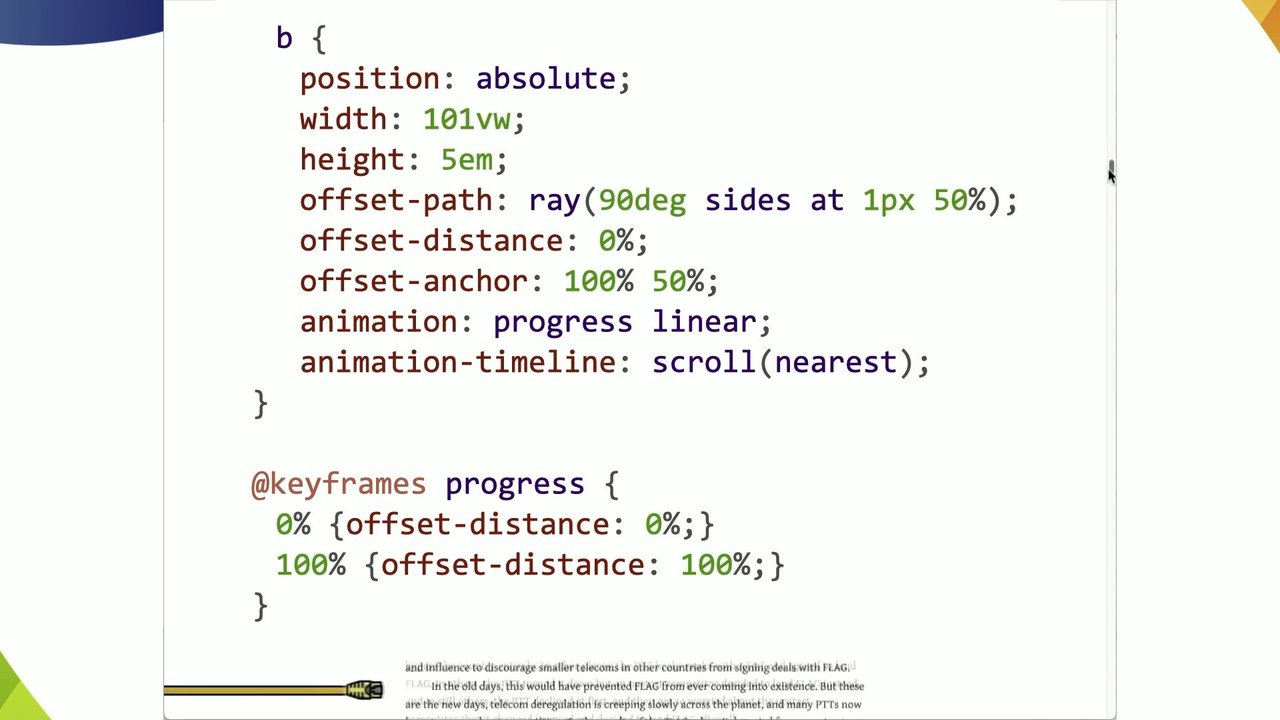
Eric introduces scroll-driven animations paired with offset path, using a copy of Neal Stephenson's 'Mother Earth Mother Board' article on meyerweb.com as a canvas. He animates a decorative b element along a ray to indicate reading progress, driven by a scroll timeline. He then reveals a more complex wiggly progress-indicator shape built with the shape() function — also available as a compact SVG path() value — and adds a second view-based scroll timeline that animates a sailing ship only when the relevant section is in view.

URL References to SVG Paths and the Dash-Offset Technique

Eric demonstrates pointing offset-path at SVG path elements by ID using URL references, animating arrowheads along SVG diagram paths. He explains the classic stroke-dashoffset drawing technique for the arrow tails and shows how to retrieve exact path lengths via the browser console. He then identifies a key limitation: SVG units translate to CSS pixels at a fixed 1:1 ratio, so shrinking the SVG does not scale the path. His solution is converting pixel-based paths to percentage-based shape() values, and he introduces Temani Afif's SVG-to-CSS Shape Converter tool that automates this calculation.

Clip Paths, Positioning Quirks, and Path Alignment Gotchas

Eric explores the interaction between clip-path and offset-path, showing how using the same value for both properties yields different results depending on whether the animated element is inside or outside its containing block, and how setting position: relative makes the div the containing block for the offset path. He then highlights a subtle but important gotcha: offset paths inherit the shape of a reference path but not its position, meaning moved SVG reference elements will cause the animated element to travel the same shape from a different origin — a misalignment that is not automatically corrected.

Missing Features and Ideas for the CSS Working Group

Eric outlines features he believes are missing from the offset path specification: a mechanism to automatically align an offset path's origin with its reference SVG element's position, a way to scale CSS path() unit values proportionally when an SVG resizes, and dedicated browser developer tools analogous to Firefox's polygon editor that would allow visual editing of path points with live animation preview. He closes by reflecting on the expanded landscape of motion tools available to web developers and encourages the audience to use them to make pages more alive and whimsical.

Q&A: Responsive Paths, JavaScript APIs, DOM Elements, Tooling, and Syntax

Speaker A facilitates audience questions covering: using shape() percentages as the best current approach for responsive offset paths when SVGs rescale; unknown status of JavaScript APIs for comparing pointer coordinates with offset paths; using box-edge keywords to follow DOM element edges without a separate path; awareness rather than tooling as the primary barrier to adoption, though tooling would help with complex shapes; calc() support in offset-distance but not in size keywords like closest-side; consistent behavior of negative offset-distance values; animating ::before and ::after generated content on paths (yes, but not on SVG sub-elements); and a final unclear question deferred for in-person follow-up.

You already heard their name earlier today, Emmanuel's talk, and I am certain their famous CSS reset has been in a code base you've worked on at least once in your life. At least on mine, it has happened for sure. They have published books. They have wrote so many articles in iconic publications like A List Apart. They've been in conferences all over the world.

And and and, of course, their blog is a timeless resource, and recently, their web components article made rounds everywhere, particularly my work site. We absolutely adored it. Less lasers this time, less doom, but probably a lot more wonder is coming up. Eric, thank you. Please welcome Eric to the stage.

Thank you. I'd like to thank Peter for putting me on after lasers and doom. Toss her. So hi. Actually, it's interesting. Some of the things that that Neil's talked about are gonna show up in here. And also, Brahmas made a made a reference to this today. So we're gonna see how this goes.

So for example sorry, not Bromis. Patrick, somehow I get those two mixed up all the time, probably because they're on all the same calls with me. Imagine a solar system information file basically. Just a little list of planets and moons of the inner solar system anyway. And here's the markup for that.

There's not a lot to it. But then imagine we take all this text and we bring it to life. Now, like I say, Patrick showed this of thing earlier. And this has been possible for a while now. Right? We can use transforms and rotates to offset the transform into this and that and the other thing.

But it's a lot easier now. It's a lot easier to do this thanks to offset path. We can use paths, okay, which are baseline widely available and have been for over a year and a half in the widely available category. Offset path has been supported, as you can see here, for, more than four years, like by the three major engines.

And I wanna talk about it today because in the last state of CSS survey, reminder, fill out the state of CSS survey, for this year. But last year's, when, people were asked, if they'd ever heard of Offset Path, 69% of people said they'd never heard of it. Right? And I have to assume that people who take the state of CSS survey, much like people in this room, know a bit about CSS. And yet, 69% had never heard of it.

Another, basically 20% had heard of it but never used it. So I'd like to explore today with you, the offset path to get an idea of what, some of your options are, and there are a lot of options. These are all the values you can use.

Right? Though one of them isn't widely or, even newly available. We'll get to that. And the formal syntax for this goes on roughly forever because it has, you know, all of these functions that that have to be mentioned. Oh, that's interesting.

And some of them, for example, some of the things that that you can do here require the background positioning syntax, which is always that there it just went past. It's complicated because the values are human readable. So that makes them complicated. But anyway, there are two things that I wanna call your attention to here about offset path.

The first is that you can put any transformable element onto a path That excludes elements that are generating inline boxes. So if you wanna put a hyperlink on a path, you have to change its display box. It can't be inline. It has to be inline block or block or something. The second is that when an element is placed on an offset path, it creates a stacking context.

So if you're trying to be clever with z index, in addition to putting things on paths, be careful. Like, just sort of check your work, as I should have with the transition a couple slides ago. The thing is even with all these path types, and I will talk about the path types here in a moment, it doesn't do a lot of good if you can't put them like place elements somewhere along the path that you are defining.

So thus we have offset distance. Right? So to define a distance, you can use a length unit, you can use percentages, or you can use a calc function value, or for that matter, you can actually use a variable. K? So you can do things like this.

The first example here is the default, which gets you a zero distance. The default is not zero. I just want to be clear about that. But you basically get zero distance. But then with that variable, you could set yourself up a little slider so that you can change it, so that you can provide some kind of interactive way to change the distance along the path.

In addition to things like calculating, I want something five m plus five m past 50%, that's how I'm gonna do it. If I want something exactly at 50%, I can do that. Or I can use JavaScript to change the value of a custom property, a variable, and move the thing around using just a range element and a tiny bit of JavaScript.

And I'm just gonna say right now, I I heard Sarah Sarah's question and answer. Sorry about the inline JavaScript attribute. I'd made it that made this made this slide clearer. In production, you'd wanna attach an observer instead. But anyway, so these linear paths that are being shown that that I was showing are in fact rays with the ray function.

K? And at its simplest, array function value takes an angle value. You can add a few more bits, especially to place the to especially to be able to place the origin within the containing block. Alright? And in fact, the defaults work out like this.

If you don't specify a position or a keyword size or say or add the contain keyword, Basically, your ray will be at an angle, but the origin will be in the center of the containing block. Alright? And, the length of the ray will be the distance to the closest side. We'll get to that in a minute. And then, like I say, you can have a BG position, a background position, which is where you can do things like center or center center or top left or center 50%, etcetera, so on and so forth.

This particular function I'm gonna say is not actually baseline widely available yet. But it will be by the end of next month at the latest. It's baseline newly available, where by newly available, they mean two years and five months at this moment. And then it'll be two years and six months, two and a half years, thirty months, baseline widely available.

Okay. These are the size keywords that you can use, in addition to closest side, closest corner, etcetera, etcetera. And sides. I like sides. Just I don't know. I like the way it sounds. And you don't have to stick to a particular order with these either. Okay? This is the way I wrote the rays in the example. Right? I said 90 degrees.

I want you to go 90 degrees. And I want you to start at zero x 50% y in the containing block, which puts it in the center left. I could have said center left, but, I was feeling concise. But any of these value patterns would work just as well. You don't have to start with the angle. You don't have to start with the position.

You can however it makes sense to you to write these, as long as you have at and then the background position, those have to go together. Right? You can't just put at wherever you want. But, yeah, any of these would work. Okay. So let's go see some of this in our browser. Whoo. Let's see if I can okay.

New. Hold on. There. Oh, I could get the latest version of Nightly, but I'm not going to right now. Okay. So oh, you can't see it. My bad. There you go. Rays.

So I'm gonna be driving it from here because I didn't really think this through. Yeah. So we can make the rays go all the way to the end. And you can see that I started that, the top one there, it's going 75 Sorry. 95.71 degrees, just magic number.

Farthest corner, 95.71 degrees is why it's pointing into the farthest corner. The farthest corner keyword does not help with that. That is only setting the distance from the origin to the farthest corner from the origin. K? I had to work out the magic the number of degrees to make it actually point there.

Okay. And I I bring all that up so that you don't just put in, you know, ray farthest corner and wonder why it's not pointing into the farthest corner. Anyway, so, yeah, at zero zero. So it started at zero zero. And then the second one there goes to basically the same corner, but I I pick sides rather than farthest corner.

In this case, those turn out to be the same distance. But then there's this one, which I started at 050%, the one the the middle one, which, starts at the yeah. The left. Where's this frigging arrow? Come on, mister mouse. There you go. And so let's see.

Are you gonna there. So that visualizes that ray, that that line that just drew in. Okay? So that should hopefully persist long enough, right, to go there. Now notice the fourth one where I said ninety five point seven one degrees far this corner, but I didn't give it an origin.

Remember what I said. The default origin is the center of the containing block. It it's not the top left, so they're not it's not like a background in that way. Right? Backgrounds kinda default up into the top left. Rays don't. Got me. But the distance is to the farthest corner.

Yes. It happens to be pointing into the farthest corner, but that is that it's only gonna go that far. Now, the last one where I changed the magic number to a random magic number by subtracting 50 degrees. That's still going the distance is the farthest corner.

It's just not going there because the ray doesn't point there. So once again, a little bit of visualization. You can see the circle essentially goes through the farthest corner, which would be either of the core any of these corners really because it starts in the center. The farthest corner is, at that point, any corner. But you can see how it goes through there.

But the ray it's actually following is the one that goes up into the right, which is why you end up there. Okay. So when it comes to these keywords, you know, things can get a little weird. So with this one, for example, I I've changed the magic number. The ray is now 91.71 degrees because I just subtracted four degrees because I felt like it.

Okay? But that farthest corner distance, the ray is still as long as the distance from the origin to the farthest corner despite the fact that the ray is not pointing there anymore. So if we take this along, it actually goes just a little bit outside of the containing block as do some of the some of these others, not all of them, but some of them.

Now sides, which is the last one that I really wanna focus on, basically says, go until you hit a side. Any of the sides. Doesn't matter. Okay? Which is why that last one goes out until it reaches exactly that side that it the ray happens to be intersecting and stops. If we were to increase the degree so that it intersected with the bottom, then it would stop at that bottom edge, right, where the ray intersects a side.

Okay. That's all fun. But then there is have I gone to the next one? Yes. Then there's the contain keyword. And I'm gonna tell you right now, I think there might be browser bugs. Either that or I don't get it. Either that or it's badly designed. One of the three.

I'm sure it's not that I misunderstood it. No. That couldn't be it. The idea, as far as I can tell, is that the thing that you're animating along the the path is supposed to be contained within its containing block. So that, for example, the last one there would go until its edge met the edge of the containing block and then it would stop. And there's there's like math described to do that, but it involves like half the longest like half of whichever is larger, the height or the width, which is not gonna get you that result.

Like that that's not gonna work. So it kind of doesn't and I find that frustrating. I also don't have a fix other than to tell you this is a thing. It may frustrate you. Be careful. Sorry. Sometimes that that's all we have. Now, I suppose if you had perfectly square things, maybe it would work out. We can hope.

But anyway, and then there was one more thing I wanted to show you before we go back to the slides. Yeah. Which is what happens if you do in fact set things to be I keep doing that.

Stop that. What happens if you make them square and it seems like it works, but I'm not entirely sure. There might be pixel rounding errors. Right? So anyway. But you might have also noticed that I I changed how those are associated with the the paths. Right? Because sometimes you want a different anchor point.

All of the, the first three examples that I was showing, the anchor point was the top left of the element that was being offset along the path. And, well, we sometimes you want a different anchor point. So enter offset anchor, which is, in my opinion, not really part of anchor positioning. It sounds like it, but it's not.

It's just defining a point inside or actually even outside of the element that's being put along the path. Right? So it defines that point as the anchor for that element that is attached to the path and then can be moved along it using offset distance. Right? So I've gone to movies now.

In this example, we can get any of these values could be used to get the effect that we saw before. So anchor zero zero or 00% or top left. There's probably other variants I didn't think of. And then to center the the the anchor, I just said offset anchor center, but I could have done the any of these as well. Those would have worked.

And as I say, you can also use negative values to put the anchor point outside of an element, which we'll see in just a bit. So that is one path type down. Just a few more to go. So let's continue with the functional values there in that center column.

Here is the same path shape expressed six different weights. I hope that's legible. Sorry. In the back. I made them large ish. Anyway, so the path element, which is actually a span element that I gave a clipping mask to turn it into a hollow diamond, is animated along a path from zero to 100% in four seconds.

Then it pauses for a second before starting over. That's just by setting the the key frame points. Right? So you've got an inset function. Excuse me. You have an inset function that defines the offsets from the top right bottom left TRBL.

Keeps you out of trouble. Old school call out. Thank you very much. But inset zero, inset 10px, inset 30px, then inset another 10px. The second one there is a rectangle, which defines the offset from the top and then the offset from the left and then the offset from the top and then the offset from the left because that's how the rect function works.

I don't know why. The x y w h function. Who's used x y w h? Okay. Other than you, Kevin. YouTube guys. Anyway right. So I didn't see any hands and that does not surprise me in the slightest. Okay. There's one. Awesome. Anyway, x y w h, you set the first two value the first two bits are the x y coordinates of the top left and then the WH are the width and height.

It's kind of like a SVG rect. And then I have a polygon and a path, which I'm just using a straight bit of SVG path d attribute value stuff in a quote because you have to quote them. And then the shape function, which Niels was just talking about, which does not actually take quotes.

I quoted it at first, and it didn't work, I couldn't figure it out. And then I realized, oh, you don't actually quote it, which is essentially a more human readable version of the SVGD path, whatever you wanna get the path syntax. There is a kind of nifty thing that's buried in, hidden in the rect function, which is that it will accept a round value to round the corners.

The other ones don't do that. Right? I could have recreated that with a path and shape functions, but let's let's let Rect have its moment in the sun. K? Where it it kind of stands out, shines. You may have noticed though that the diamond rotates unless you turn that off. So I've done a thing here where I'm suppressing the rotation by checking using a checkbox hack.

So when it's not checked, the diamond turns. When it is checked, the diamond does not turn because you might want one or the other. I don't know. And that's all thanks to the offset rotate property. K? The default value of which is auto, which gets you a behavior where the path element's y axis is kept perpendicular to the path with the up y pointing to the outside of the path.

Okay? So kinda like this. This is offset auto or offset rotate auto, which is what I would you know, what we would wanna use as a default. K? And that basically, it puts an arrow, in this case, on a line. You can also add an you can add a degree value to your auto, which basically means do the automatic thing except rotate it. So if we change this to auto, 45 degrees, then the arrow will proceed along the path and rotate as as it goes along the path, but it will always be pointing 45 degrees away from the path.

Why you wanna do this, I don't know. But if you do, there you have it. So here we have that arrow, which is, again, a span with a clipping path to turn it into a turn it into an arrow. And these are the same shape in various ways, except the polygon, I admit, is just sad.

But there were only so many points I was willing to type in after well, honestly, there were only so many points I was willing to calculate and then type in. But, yeah, if we suppress the rotation, then the arrow points that way. And if we don't, then it follows the path.

You might also notice there's an ellipse function in there. And yes, you can have real ellipses, which you or ellipses, if you prefer, which you can describe in various ways. Although if you wanna rotate ellipses, then path and shape are the way to go. It's you want to sort of start at a point but have the whole thing the whole ellipsis path rotated, that's where you wanna go.

And one of the things that has been happening here as I've been talking is that not only have I been suppressing rotation, but also at some points hiding the overflow. Overflow by default is visible. And that's what I've been doing so far. But in this example, if we set overflow to hidden, then the thing that goes along the path doesn't appear it's hidden when it goes outside of its containing block.

So now you know how Brahma's or sorry, Patrick and I did it again. Now you know how Patrick and I did our solar systems. And I actually I promise, we actually did not coordinate that ahead of time. So thanks, Patrick, for stealing my thunder on that one. But They're following circular paths.

That's it. For scientific accuracy, I should have used ellipses, but I didn't. Okay. So it's pretty straightforward to do. Alright. So that's really all of the center column covered.

Although, I'm not gonna cross shape off the list just yet because I wanna come back to it. So how about those keywords on the left? None, you could probably figure out what that does, I'm hoping. Offset path none, I I think you know where that's going. But those others, you can actually animate stuff in relation to the edges of the containing block, and not just the outer edge, but, like, the various edges.

So here, you can visually attach a label to each of the content, padding, and border boxes and then animate around them. Margin box is on the list and Safari will do that for you, but the other two browsers don't allow that yet. But imagine being able to animate something that goes along the edges of the margin. The diagnostic styles would be really really cool.

And here's how those labels work. K? Before each of those div each of those labels is a little div. I could have gone with other things, but not label in this case. I generated a two m wide box and put little backgrounds in it that creates a little line in the circle, a little dot, a tail if you wanna if you prefer.

Right? And gave it a width, in this case, two m. And then I set the offset anchor to be a little less than two m outside the left edge of that div. Remember, was talking about how you can use a negative anchor, offset anchor to put something outside. In this case, I calculated it to say to be, okay, minus two m for the width of the box, but then the little tail dot doesn't go all the way Like, I need to bring the anchor point in so it's in the middle of that little dot. Make sure they stay upright with a zero degree rotate and then animate. Could also make the size of that little circle tail viable or variable, excuse me, by throwing in a a a custom property. We could do something like this for extra fanciness.

Right? Where they go along the edges and then they like throw out little bits so that the boxes don't overlap each other. Probably should have messed with the z indexes, so that the tails went below the padding box label, but oh, well. And what magic makes this possible? Nothing to do with offset paths. Really tedious math and trial and error to figure out exactly where in each of those animation, like, timelines the corners need to, like the tails need to come out and then come back in.

That's it. Sorry. K. So let's try something slightly more magical. Here, I'm going to animate along the content box, so along the edge of the content box with a slightly off center anchor. Right? I gave a a an anchor position of 60%, 60%, a swift animation and a move and a twirl and a flare.

And this is what the move, twirl, and flare do. Right? The move goes from 20% to 35%. The twirl goes like 50 times or whatever. I don't know. Zero to 1,800 degrees. You you do the math. And then the flare brings it from no size to 40 size and then back down. And offsets are magic.

It's up there in the top, top right.

Wee.

This is all the markup that took. And it didn't even have to be an inline SVG. Could have made it an external one. But it was a small dev SVG that inlining it seemed fine, so that's what I did. And we could apply that effect to anything like these buttons. Right? We could even have the buttons create changes so that the, you know, that changes the path or, prevents them from spinning or slows the whole thing down.

Right? These are literal button elements. They are not divs that are made buttons because I I knew what Niels was gonna say. Right? In this case, I started out like I did with the ponies, but the sparkle with the sparkle SVGs inline, but that got repetitive because I've got like four of these things.

So or three of these things. So I made them external. Like I said, that really simplified the markup. And yeah, now I have sparkly buttons. Might be a little overdone, but in some UIs, I can see where you might wanna call attention to a button and people have already learned to ignore changes of color when it comes to buttons, but have they learned to ignore sparkles yet?

I ask you. Probably not. But that's not all we're limited to. We can make the environments more like or the buttons more like environments in which things happen. Right? Here, I have some SVGs, that are being animated along paths, but I set them to a z index of minus one, so they get drawn behind their containers. Then if you change the path, right, This is my favorite bit.

Belly flops. It just cracks me up every time. It's like, whoo. Okay. This is the markup. That's it. And there's probably better ways to have done this, but, I don't care. This was good enough. So here's how the paths are defined. Right? I said shape would come back.

So these guys are on this path, and that's what the path looks like. I can explain why if you want afterwards. So if you put that path against one of the buttons, you can see what they're doing. And then when we change it, all I have to do is change three values in that shape value. I just have to change how big those jump arcs are.

Shape syntax is kind of bonkers, and I more than kind of love it. I really do. The downside is that shape as a function is only newly baseline as of five months ago. K? So it won't be baseline widely available for another two years. But if you're using these as progressive enhancements, which I hope you are, you might be able to get away with that.

But anyway, so that's shape. We'll get to URLs here in just a bit. But this is my copy of Neil Stephenson's Mother Earth motherboard. It's hosted on myerweb.com, which I originally did because it wasn't available anywhere online. I had to dig it out of the web archive. And I wanted to do some typography experiments.

So we can talk about the typography stuff some other time. But for now, what if we used a path element to indicate progress as you go through the article. K? I'm just animating along a ray. That's pretty much it.

I mean, I'm using a scroll tie you know, a scrolling timeline, a view timeline, whatever you wanna call it, to drive a path to animation, but that's all there is to it. K. So this is set up as a b element because it's decorative or decorative, which defines the wire. It's animated from left to right based on the scrolling progress.

You can cancel me over the b later if you want. I don't care. And you might look at this and say, okay. But I've been able to do this with, like, transform, translate. I could do that without offset paths. And you could. Right? With you could you could do it with a you could do this. But my question is, could you do this?

And this is the shape that I used. Could also be done as an SVG path using a path function, which is more widely available. Remember I said the shape function is baseline newly available as of five months ago? The, path function is baseline widely available as of, like, four years ago.

And it would be a lot more compact, but because I find the shape syntax so much easier to read, I prefer to use it particularly in in situations like this. And we could also turn off that the sort of the side to side of the the, plug head just by, you know, offset rotate zero degrees. There you go.

Whichever one you prefer. Could do either one of those. And if that isn't enough, we could also spice up a piece of the design by adding another scroll timeline. This one's based on whether or not that bit of the page is in view because the section is about the ship, the Lalla Rook, which that is that. And here's the CSS I employed.

I decided to use a sheet this time instead of array. Could have been either one. Once again, though, the animation timeline is linked to the scrollings but it's only when that bit is in view. So the boat only sails when she's in sight. K? And, according to the artist who painted it, yes, that is the actual boat. Okay.

That's probably enough shape for now, although it'll probably come back. Let's see what we can get with URLs. So consider this markup. This is mostly SVG. It's contained in a section, but it's mostly SVG. And I have some paths with IDs and some more of those decorative b elements.

And then we can give those those decorative b's offset paths by pointing at the IDs of the bits of the SVG that have the IDs. Right? And then animate them as well with whatever animation you like. And then with these animations, to trace, sketch, and and fade background, we can turn an ordinary SVG into something a little more dynamic.

So each of those arrowheads is one of those b elements. Their tails are being drawn using the classic dash offset array or whatever you call it that Chris Coyer and a lot of other people have used. And the fills are animated because you can do that with CSS. You can you can style most inline SVG attributes using CSS, including things like c x, c c y, r, x, y, width, height, etcetera, etcetera.

Like, at this point, there are very few things about SVG that you cannot directly manipulate with CSS and specifically CSS animations, as long as the SVG is in line. External SVGs are still mostly untouchable. There are proposals to help address that, but we're not there yet. Okay? Anyway, in case you haven't used the dash offset hack, here are the basics. I use variables to keep from having to rewrite the animation three or four times.

You basically you just need to know how long each of those paths is is pretty exactly. And how did I get those path length values? I use the browser console. There is JavaScript that will tell you exactly exactly how many pixels long each path is. I rounded. So anyway, trouble does manifest itself though if the size of the SVG changes. Right? The SVG was made smaller, but the arrows aren't keeping up.

That's because SVG paths are expressed in SVG units, and SVG units are translated to CSS at at an exchange rate of one pixel per unit. That's it. So that h eight forty up there in the SVG means move 840 units horizontally to the right, which to CSS means move 840 pixels horizontally to the right.

And that's what that particular error had did even though the SVG had been shrunk. It still was going 840 pixels because that's what it knows. So what to do? Well, turning this into a percentage path using shape, it's pretty straightforward. I mean, the original image is a thousand pixels by a thousand pixels. So 840 units of that is 84%, a 160 units is 16% and that's pretty easy.

The letter paths were a little more complex though. And you might ask, how long did it take me to work out those numbers? It took me less than a week. In fact, it took me about ten seconds because Taimania Fief's SVG to CSS Shape Converter, which you paste in a path and it gives you a shape that is completely based on percentages.

Now it's not perfect, because unless you're lucky, it you don't have like, you have to figure out where to start from, but all the rest of it has been calculated for you, and I'm okay with that. Right? Way better than having to do all that math myself. So there are some interesting interactions with clip paths.

You can use a clip path as an offset path basic well, the kind of path you could use as a clip path, can use as an offset path, is what I'm trying to say. Use the same value for both properties. You could even put it in a custom property. The thing is that clip paths clip. So any bits of the path element that stick outside the clipping path will be clipped off.

So the first one here, there's no clipping. Or sorry. There is clipping to make it round, but the span is outside of the div. The second one, I put the span inside the div. It is actually following exactly the same path as the first one. You just can't see it because it's been clipped. But the third one there, I set the enclosing div to position relative, which made it the containing block for the offset path.

And now it's following the outside, basically, of that circle. But the parts of it that would stick outside are being clipped off. It's, I mean, I could see where that would be maybe a useful effect. It's sure. I clipped off half the diamond, but still works.

I also want to point out this is what those paths look like. And some of you, particularly the more designer minded, might be squinting at the screen right now, trying to figure out why those circles don't quite line up. The answer is because they don't. K. Because offset paths well, I'm gonna explain why.

Sorry. Let me explain why. I don't want don't mean to leave you hanging. The fact is that the offset paths take the size and shape of their reference paths, but not necessarily their position. Okay? So in the first three examples, I've got I've got these diamond spans that are following their paths.

But then in the second set of three, exactly the same thing is happening except I've moved the SVGs that are being being used as the references for those paths. They don't line up anymore because the offset path is like, okay, starting from where I start, I'm gonna follow this path that's been defined for me. But there isn't like a way for you to say, okay, but right, make your start be where the path is.

And you can overcome it. Sure. I could have I could have changed where, the the offset path start from, maybe positioning that at the same, extent that I did the SVGs, but it isn't an automatic thing like rotation is. Okay. And with that, we've covered the kinds of paths. So what's missing? Because there are some things that are missing in my opinion.

Well, I mean, we just saw and I complained a little bit about how path elements don't have a way to automatically jump to the SVG element that defines our path. I think there should be a way to do that. Here are two proposals, you know, maybe with offset position, which I didn't even cover because I honestly don't get it.

Like, I can make examples that it demonstrates what it does and I don't understand why it exists. So anyway, also I wouldn't have really had time, but, maybe we could, do do something like this. Say the offset position should be like, go to your shape. Go to the thing.

Go to the path. Go to the thing that defines your path and and and move there. Or maybe adding a keyword to the offset path itself. I don't you know, I'm I'm open. I'm an ideas guy. Anyway, here's another thing that I think is missing. As we saw, these two values are equivalent. Right? Exactly equivalent. The units become pixels.

There should be a way to make the CSS path value scale similarly to changes in the SVG size. Mean, SVGs inherently scale. That is their whole point. We should be able to do to somehow in the CSS say, okay. Well, if the SVG changes from its intrinsic size, you also need to scale your pixels so that they're the correct size.

Maybe an auto scale p keyword? I don't know. Once again, I'm an ideas guy. And especially since path values like, path values are a lot more compact than shape values. They're harder to read, but they're much more like as humans, but they're much more efficient. So some way to scale their units, excuse me, would be really, really handy.

So upstairs, I saw last night someone to put this up there, and I a 100 agree. Also paths. Like, think they're kind of linked together. If you've ever used fire Firefox's Polygon Editor, which this is showing an example of here, you know how useful a good bit of tooling can be in a browser. So how about something similar for paths?

Right? It could look something like this or, you know, probably way better. Again, idea this guy. But some way being able to see the points of the path and then be able to adjust them and see the value update, and if that were paired with animation tools so that you could see the animation of the thing that you're animating along that path and then maybe adjust it a little bit so that it goes exactly where you want it to go and then be able to copy the final value, that would be amazing.

That would be fantastic. So at any rate, looking at the clock, I see that time has continued to march on as it does and that our time together is drawing to a close. So I hope that what you've taken from this is that there are a lot more powerful options now for placing and moving HTML elements. And this is, I think, a time for reevaluating what we can do to make our pages a little more alive, right, a little more whimsical, I grant you that there is the risk of overdoing it. There's absolutely the risk of things flying all over the place. But maybe if we could make butterflies fly around instead of, you know, calls to action and cookie notices, that would be nice.

You know, we have all these options and in the worlds words of doctor Carol Jeanne Faier, what a time to be alive. Right? Because we have this new landscape of tools, of things that we can do, to make just pages more interesting. And, I would really like to see us take advantage of of that new sort of reality.

So those are some examples of things that we could do. And I just wanna say, thank you very much for joining me on this journey along this path. Thank

you so much. That was excellent. Join me, please.

Oh, thank you.

We've got a few questions from the audience.

Okay.

Khalil asks, what is the best way to create responsive offset path when the SVG rescales?

Yeah. That's That is an excellent question. And I really think the shape value is the best way because you can have everything as percentages. SVG doesn't support percentages. It wasn't designed for that sort of thing. CSS does because it was designed for that sort of thing.

So, yeah, it's it's really the only thing I think we have right now, short of the working group listening to me and giving us a thing that allows for that kind of responsiveness.

Yep. Fair enough. Robert asks, are there JavaScript APIs to compare other pointer coordinates with offset paths? Would be helpful to implement video progress sliders with an interesting shapes.

I don't know.

Yeah. And that's fine. Well, we can figure out later.

Yeah. Hopefully. I don't know.

This one is from Sasha. Can you specify a regular DOM element, div, button, etcetera, to be used as the offset path, or do you have to always define a separate path that replicates the same shape?

You can do it as long as you want to follow one of the, like, content or padding or border or margin in Safari edges. Otherwise, no. You you need to like, if you're doing something more fancy, you need to specify the actual path. But as long as you just wanna follow the edge, then you just use one of those keywords in your set.

Yep. Brett asks, do you think the lack of usage is directly related to the lack of debugging tools as tooling can speed up development?

No. I think the lack of usage is due to the lack of awareness. Now I think among those who have tried it, there's probably it's probably only been used a little bit because of the lack of tooling. And for doing anything beyond the the the most basic, I think, it it does get complicated.

I have an advantage in that I can hand author SVGs, right, so that I can sort of think in those ways. The Shape syntax helps a lot, in my opinion, because you can do things like move 30% in a horizontal line. And then from there, I want an arc that is this shape and it has this control point or whatever.

Right? Like, you can get your you can get a lot closer to where you wanna be using that kind of syntax than training yourself to read the SVGD attributes syntax, which I there's still stuff I have to look up. It's it's not meant for humans, the SVG syntax.

So, yeah, I think I think that's a lot of it.

It's also it can be quite intimidating.

I mean, yeah. If you're if you're trying to do something like make dolphins jump Mhmm. Or whatever, you you do have to sort of like, jeez, how am I gonna do this? Do I, like, open up Figma? I don't know. Whatever. Some kind of vector program to, like, sketch these out and then maybe figure out how to animate those to see if it's what I want. And then I figure out how to turn the CSS. And did it turn out the way I thought it would?

And if it didn't, what am I gonna do? Yes. And I think tooling would help a lot with that with getting over that particular hurdle.

Yeah. Yeah. Woody asks, can you use a calc in the ray distance?

Yes. Yeah? But wait. The distance, as in

In the ray.

The distance keywords, like closest side? No. You can't you can't do that there. You can do it in the you can do it in the the offset distance. And I I guess you could calculate the, degrees as well. But those closest side, farthest side, closest corner, farthest corner sides, those are keywords.

As far as I'm aware, you cannot calculate them.

Alright. Someone who forgot to add their name asked, do negative values work consistently too? As work on? Do negative values work consistently too?

As far as I found, they work consistently. Yeah. And you can actually use them on distance as well. If you use a negative value on distance, then it let's say you do negative 20%. It will basically start at the 80 of the path, I believe, and then wrap around. So as far as I'm aware, there isn't a way to do, like, the negative animation delays where you pretend that it's already in progress or not in progress.

Anyway, yeah, there's probably room for growth there.

I should have followed because they followed up with a question. Can you animate generated content on the before or after over an offset path?

Yes, I have done it. Yeah. Unfortunately, you can't generate content on SVG subelements like Rect, which really ticks me off because I had a thing that I wanted to do with the CSS Day logo where I followed each one of those, but there was no way to, like, for each rect, make a before. And then, yeah, I was annoyed.

Anyway.

And the final question is, can OffsetPath and its bodies also be used somehow to position a longer path?

I'm not sure I understand the question entirely. So I'm going to say whoever asked that question, please come find me.

Yes.

And we will I'll see if we can understand it. We'll see who the buddies.

We'll see who the buddies mentioned are.

There

you is it's a once in a lifetime opportunity to be ask asking things to Eric in our break that that is coming up. A immense source of knowledge as you can see. We don't have any more questions, so please give a round of applause for this fantastic speaker. Thank you.

Forging Our Own Paths
Eric Meyer

A headshot of Eric Meyer, a man with a beard and glasses, holding a plush shark toy.

LES DAY

A logotype forming the name 'LES DAY' from black rectangular blocks.

.now {

14:50 | Eric Meyer

.now {

14:50 | Eric Meyer

A presentation slide with a blue header bar displaying '.now {' on the left and the CSS DAY logo on the right. The main content area shows the schedule entry '14:50 | Eric Meyer'. A grey footer bar contains the Google, AG Grid, and an 'X' icon logos.

.now {

14:50 | Eric Meyer

CSS Day

.now {

14:50 | Eric Meyer

Logo for CSS Day.

.now {

14:50 | Eric Meyer

Forging Our Own Paths

14:50 | Eric Meyer

CSS Day

12 June 2026

Forging Our Own Paths

CSS Day

12 June 2026

igalia

Forging Our Own Paths

The Solar System

  1. Mercury ... Fleet as its namesake
  2. Venus ... Cry HAVOC!
  3. Earth ... Where (almost) all our stuff is
    1. Moon
  4. Mars ... Canal-free since 4.5 billion BC
    1. Phobos
    2. Deimos

<ol id='system'>
	<li value='0'><img src='solar/sun.svg' alt='Sun'/><span>The Solar System</span></li>
    <li id='mercury'><img src='solar/mercury.svg' alt='Mercury'/><span>Mercury</span><p>Fleet as
        its namesake</p></li>
    <li id='venus'><img src='solar/venus.svg' alt='Venus'/><span>Venus</span><p>Cry HAVOC!</p></li>
    <li id='earthmoon'>
        <img src='solar/earth.svg' alt='Earth'/><span>Earth</span><p>Where (almost) all our stuff
        is</p>
        <ol>
            <li><img src='solar/moon-full-moon.svg' alt='Moon'/><span>Moon</span></li>
        </ol>
    </li>
    <li id='mars'>
        <img src='solar/mars.svg' alt='Mars'/><span>Mars</span><p>Canal-free since
            4.5 billion BC</p>
        <ol>
            <li><img src='solar/asteroid-2.svg' alt='Phobos'/><span>Phobos</span></li>
            <li><img src='solar/moon-waning-gibbous.svg' alt='Deimos'/><span>Deimos</span></li>
        </ol>
    </li>
</ol>
    

The Solar System

  1. Mercury ... Fleet as its namesake
  2. Venus ... Cry HAVOC!
  3. Earth ... Where (almost) all our stuff is
    1. Moon
  4. Mars ... Canal-free since 4.5 billion BC
    1. Phobos
    2. Deimos
<ol id='system'>
	<li value="0"><img src='solar/sun.svg' alt="Sun"><span>The Solar System</span></li>
	<li id='mercury'><img src='solar/mercury.svg' alt="Mercury"><span>Mercury</span><p>Fleet as
	its namesake</p></li>
	<li id='venus'><img src='solar/venus.svg' alt="Venus"><span>Venus</span><p>Cry HAVOC!</p></li>
	<li id='earthmoon'>
		<img src='solar/earth.svg' alt="Earth"><span>Earth</span><p>Where (almost) all our stuff
		is</p>
		<ol>
			<li><img src='solar/moon-full-moon.svg' alt="Moon"><span>Moon</span></li>
		</ol>
	</li>
	<li id='mars'>
		<img src='solar/mars.svg' alt="Mars"><span>Mars</span><p>Canal-free since
			4.5 billion BC</p>
		<ol>
			<li><img src='solar/asteroid-2.svg' alt="Phobos"><span>Phobos</span></li>
			<li><img src='solar/moon-waning-gibbous.svg' alt="Deimos"><span>Deimos</span></li>
		</ol>
	</li>
</ol>

The Solar System

  1. Mercury ... Fleet as its namesake
  2. Venus ... Cry HAVOC!
  3. Earth ... Where (almost) all our stuff is
    1. Moon
  4. Mars ... Canal-free since 4.5 billion BC
    1. Phobos
    2. Deimos
<ol id="system">
    <li value="0"><img src="solar/sun.svg" alt="Sun"><span>The Solar System</span></li>
    <li id="mercury"><img src="solar/mercury.svg" alt="Mercury"><span>Mercury</span> <p>Fleet as its namesake</p></li>
    <li id="venus"><img src="solar/venus.svg" alt="Venus"><span>Venus</span> <p>Cry HAVOC!</p></li>
    <li id="earthmoon">
        <img src="solar/earth.svg" alt="Earth"><span>Earth</span> <p>Where (almost) all our stuff is</p>
        <ol>
            <li><img src="solar/moon-full-moon.svg" alt="Moon"><span>Moon</span></li>
        </ol>
    </li>
    <li id="mars">
        <img src="solar/mars.svg" alt="Mars"><span>Mars</span> <p>Canal-free since 4.5 billion BC</p>
        <ol>
            <li><img src="solar/asteroid-2.svg" alt="Phobos"><span>Phobos</span></li>
            <li><img src="solar/moon-waning-gibbous.svg" alt="Deimos"><span>Deimos</span></li>
        </ol>
    </li>
</ol>

An HTML code example demonstrating an ordered list structure for the solar system, including planets, their descriptions, and nested lists for moons, with image tags for each celestial body.

The Solar System

  1. Mercury ... Fleet as its namesake
  2. Venus ... Cry HAVOC!
  3. Earth ... Where (almost) all our stuff is
    1. Moon
  4. Mars ... Canal-free since 4.5 billion BC
    1. Phobos
    2. Deimos

<ol id="system">
<li value="0"><img src="solar/sun.svg" alt="Sun"><span>The Solar System</span></li>
<li id="mercury"><img src="solar/mercury.svg" alt="Mercury"><span>Mercury</span> <p>Fleet as its namesake</p></li>
<li id="venus"><img src="solar/venus.svg" alt="Venus"><span>Venus</span> <p>Cry HAVOC!</p></li>
<li id="earthmoon">
<img src="solar/earth.svg" alt="Earth"><span>Earth</span> <p>Where (almost) all our stuff is</p>
<ol>
<li><img src="solar/moon-full-moon.svg" alt="Moon"><span>Moon</span></li>
</ol>
</li>
<li id="mars">
    

The Solar System

  1. Mercury ... Fleet as its namesake
  2. Venus ... Cry HAVOC!
  3. Earth ... Where (almost) all our stuff is
    1. Moon
  4. Mars ... Canal-free since 4.5 billion BC
    1. Phobos
    2. Deimos
<ol id="system">
    <li value="0"><img src="solar/sun.svg" alt="Sun"><span>The Solar System</span></li>
    ...
</ol>

Animate Upright Captions

One second equals one... hour day week month year

Cry HAVOC!

Fleet as its namesake

Where (almost) all our stuff is

Canal-free since 4.5 billion BC

  • Time periods to scale
  • Not all distances to scale
  • Sizes not at all to scale
A stylized diagram showing several celestial bodies. From top to bottom, there is a yellow striped planet (Jupiter-like), a red mottled planet (Mars-like), and a stylized yellow sun. To the right, there is an Earth-like planet and a small, reddish, cratered planet or moon. Each celestial body has an associated text label. Interactive controls for animation, upright display, captions, and a time scale (hour, day, week, month, year, with week selected) are at the top of the slide. Text disclaimers regarding scaling are present in the bottom left.

Animate (checked), Upright (checked), Captions (checked)

One second equals one... hour, day, week (selected), month, year

  • Cry HAVOC!
  • Fleet as its namesake
  • Where (almost) all our stuff is
  • Canal-free since 4.5 billion BC

Time periods to scale

Not all distances to scale

Sizes not at all to scale

A conceptual diagram on a black background depicts a solar system. A cartoon-style sun is on the left, with several planets to its right. A yellow striped planet is labeled "Cry HAVOC!". A red patterned planet is labeled "Fleet as its namesake". Further right, a small blue/green Earth-like planet and a smaller white moon-like body are grouped and labeled "Where (almost) all our stuff is". To the far right, a small red patterned planet is labeled "Canal-free since 4.5 billion BC". At the top left, three checkboxes are labeled "Animate", "Upright", and "Captions", all appearing checked. At the top right, radio buttons are labeled "hour", "day", "week", "month", "year", with "week" selected, following the text "One second equals one...". At the bottom left, a legend states: "Time periods to scale", "Not all distances to scale", "Sizes not at all to scale".
  • Animate (checked)
  • Upright (checked)
  • Captions (checked)

One second equals one... hour, day, week, month, year (week selected)

  • Cry HAVOC!
  • Fleet as its namesake
  • Where (almost) all our stuff is
  • Canal-free since 4.5 billion BC

Time periods to scale
Not all distances to scale
Sizes not at all to scale

A stylized diagram featuring a yellow sun-like object and several planets or celestial bodies against a black background. The bodies include a striped planet, a reddish planet, an Earth-like planet with a moon, and another reddish planet. Each body has a text caption next to it.

Animate Upright Captions

One second equals one... hour day week month year

Cry HAVOC!

Fleet as its namesake

Where (almost) all our stuff is

Canal-free since 4.5 billion BC

Time periods to scale
Not all distances to scale
Sizes not at all to scale

A simulated solar system or celestial map on a black background. It features a large yellow sun-like object, a striped yellowish planet (Jupiter), a red-orange mottled planet (possibly Mars or Mercury), a blue and green planet (Earth), and a smaller red planet with visible features. Each planet has a descriptive text label next to it.

Solar System Time Scale Simulation

Interactive controls are displayed at the top left and top right of the slide:

  • Animate checkbox is checked.
  • Upright checkbox is unchecked.
  • Captions checkbox is checked.

A set of radio buttons allows selecting the time scale for the simulation, where one second equals one:

  • Hour (unchecked)
  • Day (unchecked)
  • Week (checked)
  • Month (unchecked)
  • Year (unchecked)

Labels associated with celestial bodies:

  • Fleet as its namesake: Located near the innermost planet (likely Mercury or Venus).
  • Cry HAVOC!: Located near a striped, yellow planet (likely Jupiter or Saturn).
  • Where (almost) all our stuff is: Located near Earth and its Moon.
  • Canal-free since 4.5 billion BC: Located near a small red planet (likely Mars).

Notes on scaling, located at the bottom left:

  • Time periods to scale
  • Not all distances to scale
  • Sizes not at all to scale

A diagram depicting a portion of a solar system against a black background. The Sun is central, surrounded by several planets of various sizes and colors, including one with a moon. Each celestial body is accompanied by a rotated text label providing a humorous or descriptive caption. UI controls are visible at the top for simulation settings.

Browser Compatibility Information

A screenshot of a web page section showing browser compatibility information, including a note about general availability and links to "Learn more" and "See full compatibility".

offset-path

Baseline Widely available

This feature is well established and works across many devices and browser versions. It's been available across browsers since March 2022.

* Some parts of this feature may have varying levels of support.

A screenshot of a web page displaying information about the `offset-path` CSS property. The top section indicates the "Shapes & Graphics" category. Below this, a bar chart visualizes several percentages, including 9.5%, 20.9%, and a prominent 69%, along with other segments showing 14%, 23%, and 44%. User engagement metrics are displayed as "4,758" users and "5" feedback items. A green box below states "Baseline Widely available" with checkmarks next to icons representing Chrome, Edge, Firefox, and Safari browsers.

Shapes & Graphics

Feature: offset-path

Baseline Widely available

This feature is well established and works across many devices and browser versions. It's been available across browsers since March 2022.

Some parts of this feature may have varying levels of support.

  • 69% of surveyed users had never heard of offset-path.
  • Approximately 20.9k users had heard of it but never used it.
  • Other support/usage percentages shown: 14%, 23%, 44%.
  • Additional data points: 9.5k, A 4,758, O6.

Learn more | See full compatibility | Report feedback

Screenshot of a user interface displaying information about the CSS `offset-path` property, including a progress bar or bar chart illustrating compatibility or usage statistics across different browsers (Chrome, Firefox, Safari, Edge) and a checkmark indicating "Baseline Widely available" status.

Shapes & Graphics

offset-path

Baseline Widely available

This feature is well established and works across many devices and browser versions. It's been available across browsers since March 2022.

Some parts of this feature may have varying levels of support.

Compatibility data: 53%, 23%, 44%

Additional usage data: 9.5%, 20.9%, 69%

User count: 4,758

Screenshot of a web development tool showing compatibility data for the CSS 'offset-path' feature, including progress bars, browser icons, and usage percentages.

offset-path

  • none
  • content-box
  • padding-box
  • border-box
  • margin-box
  • fill-box
  • stroke-box
  • view-box
  • ray()
  • inset()
  • rect()
  • xywh()
  • circle()
  • ellipse()
  • polygon()
  • path()
  • shape()
  • url()
  • Covers all SVG shapes, such as <rect/>, <circle/>, and <path/>

offset-path

  • nt-box
  • ng-box
  • e-box
  • n-box
  • box
  • ray()
  • inset()
  • rect()
  • xywh()
  • circle()
  • ellipse()
  • polygon()
  • path()
  • url()
    • Covers a
    • shapes,
    • <rect/>,
    • and <path>

offset-path

  • none
  • content-box
  • padding-box
  • border-box
  • margin-box
  • fill-box
  • stroke-box
  • view-box
  • ray()
  • inset()
  • rect()
  • xywh()
  • circle()
  • ellipse()
  • polygon()
  • url()
  • Covers all SVG shapes, such as <rect/>, <circle/>, and <path/>

offset-path

Initial value
none
Applies to
transformable elements
Inherited
no
Computed value
as specified
Animation type
by computed value type
Creates stacking context
yes

offset-path

Applies to
transformable elements
Creates stacking context
yes

yes

offset-path

  • none
  • content-box
  • padding-box
  • border-box
  • margin-box
  • fill-box
  • stroke-box
  • view-box
  • ray()
  • inset()
  • rect()
  • xywh()
  • circle()
  • ellipse()
  • polygon()
  • path()
  • shape()
  • url()
  • Covers all SVG shapes, such as <rect/>, <circle/>, and <path/>

offset-distance

Baseline Widely available

This feature is well established and works across many devices and browser versions. It's been available across browsers since September 2022.

Learn more See full compatibility Report feedback

Initial value 0
Applies to transformable elements
Inherited no
Percentages refer to the total path length
Computed value for <Length> the absolute value, otherwise a percentage
Animation type a length, percentage or calc();
Screenshot of a web page detailing the CSS property `offset-distance`. It features a compatibility banner indicating wide browser support with icons for Chrome, Edge, Firefox, and Safari, all showing green checkmarks. Below this is a table providing specifications for the property, including its initial value, what it applies to, inheritance, how percentages are interpreted, its computed value, and animation type.

offset-distance: 0;

offset-distance: 50px;

offset-distance: 50%;

offset-distance: calc(50% + 5em);

offset-distance: var(--off-dist);

Five horizontal lines are shown, each representing a path. On each line, a green hourglass-shaped marker is placed at a different position corresponding to the `offset-distance` value displayed next to it. The marker's positions demonstrate distances of 0, 50 pixels, 50 percent, a calculated value of 50 percent plus 5 ems, and a variable value.

offset-distance: 0;
offset-distance: 50px;
offset-distance: 50%;
offset-distance: calc(50% + 5em);
offset-distance: var(--off-dist);
A diagram illustrating the CSS `offset-distance` property, showing five horizontal paths. Each path has an 'X' marker positioned according to the adjacent CSS value: 0, 50px, 50%, calc(50% + 5em), and var(--off-dist).
offset-distance: 0;
offset-distance: 50px;
offset-distance: 50%;
offset-distance: calc(50% + 5em);
offset-distance: var(--off-dist);
Five horizontal lines, each with an 'X' marker positioned at a different point along the line, visually demonstrating the effect of the `offset-distance` property with various values. The first 'X' is at the start, the second at 50 pixels, the third at 50% of the line, the fourth slightly past 50%, and the fifth at the end.
offset-distance: 0;
offset-distance: 50px;
offset-distance: 50%;
offset-distance: calc(50% + 5em);
offset-distance: var(--off-dist);
A series of five horizontal lines, each illustrating the effect of a different `offset-distance` value. Each line has an 'X' marker whose position along the line corresponds to the `offset-distance` value displayed next to it. Arrows indicate direction along the path. The values shown are 0, 50px, 50%, calc(50% + 5em), and a CSS variable `--off-dist`.
offset-distance: 0;
offset-distance: 50px;
offset-distance: 50%;
offset-distance: calc(50% + 5em);
offset-distance: var(--off-dist);
A diagram shows a horizontal path with small tick marks and arrows at each end. Above the path, a small "X" marker is positioned at different points for five lines, each illustrating a different CSS `offset-distance` value.
offset-distance: 0;
offset-distance: 50px;
offset-distance: 50%;
offset-distance: calc(50% + 5em);
offset-distance: var(--off-dist);
A diagram demonstrating the CSS `offset-distance` property, consisting of five horizontal lines, each representing a path. For each path, a small marker (shaped like an 'X' or a double chevron) is positioned along the line, illustrating the effect of the corresponding `offset-distance` value. The markers show positions at 0, 50 pixels, 50 percent, a calculated value (50% + 5em), and a variable-defined distance along their respective paths.

offset along a path to objects in space.

A horizontal number line representing an offset, labeled "offset along a path to objects in space." The line has tick marks ranging from 0 to 7, in increments of 0.5.

off factor objects time = 0

0.0

0.5

1.0

The slide displays a horizontal range or timeline with markers at 0.0, 0.5, and 1.0. A label "off factor objects time = 0" is placed at the start of the range.
<input type="range" value="67" ...
A light blue slide with a dark blue curved shape in the top-left corner and a small, light brown triangular shape in the top-right corner.
ray(<angle> [at <position>] [<size-keyword>] [contain])
ray(<angle> at center closest-side )
  • farthest-corner
  • sides

Baseline 2024 NEWLY AVAILABLE

Since January 2024, this feature works in all major engines. However, this feature might not work in older devices.

Learn more See full compatibility

ray(<angle> [at <position>] [<size-keyword>]
ray(<angle> at center

<bg-position>

  • closest-side
  • closest-corner
  • farthest-side
  • farthest-corner
  • sides

✓ Baseline 2024 NEWLY AVAILABLE

Since January 2024, this feature works across the latest devices and browser versions. This feature might not work in older devices or browsers.

Learn more See full compatibility Report feedback

ray(<angle> [at <position>] [<size-keyword>] [contain])
ray(<angle> at center             )
             <bg-position>
  • closest-side
  • closest-corner
  • farthest-side
  • farthest-corner
  • sides

Baseline 2024 NEWLY AVAILABLE

Since January 2024, this feature works across the latest devices and browser versions. This feature might not work in older devices or browsers.

Learn more See full compatibility Report feedback

ray() Function Syntax

ray(<angle> [at <position>] [<size-keyword>] [contain])

Options for at <position>:

  • at center
  • <bg-position>

Options for <size-keyword>:

  • closest-side
  • closest-corner
  • farthest-side
  • farthest-corner
  • sides

✅ Baseline 2024 NEWLY AVAILABLE

Since January 2024, this feature works across the latest devices and browser versions. This feature might not work in older devices or browsers.

Learn more See full compatibility Report feedback

ray(<angle> [at <position>] [<size-keyword>] [contain])
ray(<angle> at center        closest-side
              <bg-position>   closest-corner
                          farthest-side
                          farthest-corner
                          sides

Small icons representing various web browsers are displayed next to the "Report feedback" link, indicating compatibility information.

Baseline 2024 NEWLY AVAILABLE

Since January 2024, this feature works across the latest devices and browser versions. This feature might not work in older devices or browsers.

Learn more See full compatibility Report feedback

ray(<angle> [at <position>] [<size-keyword>] [contain])
ray(<angle> at center closest-side )
  • <bg-position>
  • closest-side
  • closest-corner
  • farthest-side
  • farthest-corner
  • sides
A small visual indicator shows icons for Chrome, Edge, Firefox, and Safari browsers, suggesting compatibility information.
offset-distance: 0;
offset-distance: 50px;
offset-distance: 50%;
offset-distance: calc(50% + 5em);
offset-distance: var(--off-dist);
Five horizontal lines each with an 'X' marker, visually demonstrating different offset-distance values along a path.
ray(90deg at 0 50% sides)
  offset-distance: 0;
ray(90deg sides at 0 50%)
  offset-distance: 50px;
ray(at 0 50% sides 90deg)
  offset-distance: 50%;
ray(at 0 50% 90deg sides)
  offset-distance: calc(50% + 5em);
ray(sides at 0 50% 90deg)
  offset-distance: var(--off-dist);
ray(sides 90deg at 0 50%)
ray(90deg at 0 50% sides)
ray(90deg sides at 0 50%)
ray(at 0 50% sides 90deg)
ray(at 0 50% 90deg sides)
ray(sides at 0 50% 90deg)
ray(sides 90deg at 0 50%)

Browser time!

A screenshot of a computer desktop with a blue, wave-patterned background, showing a web browser window at the top.
Screenshot of a macOS desktop with a blue, patterned wallpaper.

Rays

Screenshot of a web browser displaying a blue background with a pattern of concentric circles.
ray(95.71deg farthest-corner at 0 0)
ray(95.71deg sides at 0 0)
ray(95.71deg farthest-corner at 0 50%)
ray(95.71deg farthest-corner)
ray(45.71deg farthest-corne...
A screenshot of a web browser demonstrating five examples of the CSS `ray()` function. Each example shows a small profile picture with a line extending from it, illustrating the ray effect. The last two examples are partially obscured.
  • ray(95.71deg farthest-corner at 0 0)
  • ray(95.71deg sides at 0 0)
  • ray(95.71deg farthest-corner at 0 50%)
  • ray(95.71deg farthest-corner)
  • ray(45.71deg farthest-corner)
The slide displays a list of different ray configurations. Next to each list item is a small profile picture of a person's face, from which a thin line extends to the right, visually representing a ray.
  • ray(95.71deg farthest-corner at 0 0)
  • ray(95.71deg sides at 0 0)
  • ray(95.71deg farthest-corner at 0 50%)
  • ray(95.71deg farthest-corner)
  • ray(45.71deg farthest-corner)

A horizontal blue progress bar is displayed near the top of the slide. The slide demonstrates the visual output of 'ray' functions. Several thin gray lines, representing rays, extend across the white background. Small images of a man's face are positioned along these rays, some appearing partially translucent, rotated, or duplicated, illustrating the effects of the different 'ray' function parameters.

  • ray(95.71deg farthest-corner at 0 0)
  • ray(95.71deg sides at 0 0)
  • ray(95.71deg farthest-corner at 0 50%)
  • ray(95.71deg farthest-corner)
  • ray(45.71deg farthest-corner)
Screenshot of a web page demonstrating different ray calculations. The page shows several horizontal gray containers, each illustrating a "ray" with a line and a small headshot image placed along the ray's path. A "Next" button is visible in the top right corner of the web page.
  • ray(95.71deg farthest-corner at 0 0)
  • ray(95.71deg sides at 0 0)
  • ray(95.71deg farthest-corner at 0 50%)
  • ray(95.71deg farthest-corner)
  • ray(45.71deg farthest-corner)

Multiple semi-transparent, faded images of a man's face are animated and positioned next to several of the ray examples, demonstrating the visual effect of the ray property.

  • ray(95.71deg farthest-corner at 0 0)
  • ray(95.71deg sides at 0 0)
  • ray(95.71deg farthest-corner at 0 50%)
  • ray(95.71deg farthest-corner)
  • ray(45.71deg farthest-corner)

An illustration demonstrating different "ray" configurations. Diagonal gray lines extend from the left across the screen, with small, semi-transparent images of human faces positioned along these lines at various points, appearing to be projected or animated according to the ray parameters listed.

  • ray(95.71deg farthest-corner at 0 0)
  • ray(95.71deg sides at 0 0)
  • ray(95.71deg farthest-corner at 0 50%)
  • ray(95.71deg farthest-corner)
  • ray(45.71deg farthest-corner)
A series of five examples demonstrating different 'ray' parameters, each line of code accompanied by one or two semi-transparent, ghost-like face images illustrating the visual effect of the ray.
  • ray(95.71deg farthest-corner at 0 0)
  • ray(95.71deg farthest-corner at 0 0)
  • ray(95.71deg farthest-corner at 0 50%)
  • ray(95.71deg farthest-corner)
  • ray(45.71deg farthest-corner)
A web browser window displays a page titled "Progress" from `localhost:8000/rays1.html`. The page shows several lines of text beginning with "ray(...)" and three small, tilted, rectangular images of different men's faces are overlaid on these text lines. A "Next" button is visible in the top right corner of the page content.
  • ray(95.71deg farthest-corner at 0 0)
  • ray(95.71deg sides at 0 0)
  • ray(95.71deg farthest-corner at 0 50%)
  • ray(95.71deg farthest-corner)
  • ray(45.71deg farthest-corner)

A "Next" button is in the top right of the displayed web content.

Screenshot of a web browser displaying a local HTML file named "rays1.html".

The webpage shows five distinct examples of 'ray' definitions. Each example is presented as a line of text, formatted like a code snippet, describing properties such as degrees, 'farthest-corner', 'sides', and specific positions (e.g., 'at 0 0', 'at 0 50%'). To the left of each ray definition is a small, slightly tilted profile picture of a man. The last two profile pictures overlap slightly.

  • ray(95.71deg farthest-corner at 0 0)
  • ray(95.71deg sides at 0 0)
  • ray(95.71deg farthest-corner at 0 50%)
  • ray(95.71deg farthest-corner)
  • ray(45.71deg farthest-corner)

Five lines of ray function examples, each preceded by a small circular avatar. The avatar for the last example is partially obscured by another small, rotated image.

CSS `ray()` Function Examples

  • ray(95.71deg farthest-corner at 0 0)
  • ray(95.71deg sides at 0 0)
  • ray(95.71deg farthest-corner at 0 50%)
  • ray(95.71deg farthest-corner)
  • ray(45.71deg farthest-corner)
Screenshot of a web browser displaying examples of the CSS `ray()` function. The page shows several rectangular boxes, each containing a line of text. Small, polygonal headshot images are overlaid on the examples, connected by thin lines, illustrating the `ray()` function's effect.
  • ray(95.71deg farthest-corner at 0 0)
  • ray(95.71deg sides at 0 0)
  • ray(95.71deg farthest-corner at 0 50%)
  • ray(95.71deg farthest-corner)
  • ray(45.71deg farthest-corner)
Small circular images of faces are placed next to each line of text. Thin gray lines extend diagonally from some of the text, visually representing the rays.
  • ray(95.71deg farthest-corner at 0 0)
  • ray(95.71deg sides at 0 0)
  • ray(95.71deg farthest-corner at 0 50%)
  • ray(95.71deg farthest-corner)
  • ray(45.71deg farthest-corner)

Next ▶

A screenshot of a Chrome browser displaying a webpage. The webpage content shows several lines of text, each describing a 'ray' function with parameters, such as 'farthest-corner' or 'sides'. Next to each of these descriptions is a small, square image of a person's face, from which a faint line (ray) extends, illustrating the described function. A 'Next' button is visible in the top right corner of the webpage content.
  • ray(95.71deg farthest-corner at 0 0)
  • ray(95.71deg farthest-side at 0 0)
  • ray(95.71deg farthest-corner at 0 50%)
  • ray(95.71deg farthest-corner)
  • ray(45.71deg farthest-corner)
The slide displays five examples of `ray()` functions, each accompanied by a visual line representing the ray. Small headshot images are placed along some of these lines, with one image rotated. A "Next" button is visible in the top right corner.
  • ray(95.71deg farthest-corner at 0 0)
  • ray(95.71deg sides at 0 0)
  • ray(95.71deg farthest-corner at 0 50%)
  • ray(95.71deg farthest-corner)
  • ray(45.71deg farthest-corner)
A series of five examples demonstrating the CSS ray() function. Each example shows a gray rectangular area with a line of text above it. Within these areas, colored lines extend at specific angles, and small images of faces (e.g., Charlie Sheen, Emilio Estevez, Sylvester Stallone) are positioned and rotated, illustrating the effects of the ray() function's parameters on gradient direction and origin points.
  • ray(95.71deg farthest-corner at 0 0)
  • ray(95.71deg sides at 0 0)
  • ray(95.71deg farthest-corner at 0 50%)
  • ray(95.71deg farthest-corner)
  • ray(45.71deg farthest-corner)
Several small profile images of men, likely actors or comedians, are positioned next to some of the text lines. One of the profile images is rotated diagonally. Thin green lines are drawn extending from the text 'ray' in several examples.
  • ray(95.71deg farthest-corner at 0 0)
  • ray(95.71deg sides at 0 0)
  • ray(95.71deg farthest-corner at 0 50%)
  • ray(95.71deg farthest-corner)
  • ray(45.71deg farthest-corner...)
Screenshot of a Chrome browser window displaying a local web page titled 'Progress'. The page shows several horizontal gray bars, each illustrating a different 'ray' function definition. Next to each bar is a small circular image of a man's head. Lines extend from some of these images, visually representing the 'rays' across the gray bars, with one ray ending in a rotated square image of a person's head.
  • ray(95.71deg farthest-corner at 0 0)
  • ray(95.71deg sides at 0 0)
  • ray(95.71deg farthest-corner at 0 50%)
  • ray(95.71deg farthest-corner)
  • ray(45.71deg farthest-corner
A web page displaying five examples of CSS `ray()` functions. Each example is shown as a grey bar with descriptive text, accompanied by a small, tilted image of a person's head, illustrating the direction or end-point of the ray.

CSS ray() function examples

ray(95.71deg farthest-corner-at 0 0)
ray(95.71deg sides at 0 0)
ray(95.71deg farthest-corner at 0 50%)
ray(95.71deg farthest-corner)
ray(45.71deg farthest-cornes...
Screenshot of a web browser demonstrating the CSS ray() function with several code examples. Each example is associated with a small profile picture, and a mouse cursor is hovering over the last visible code snippet.

Progress - localhost:8000/rays1.html

  • ray(95.71deg farthest-corner at 0 0)
  • ray(95.71deg sides at 0 0)
  • ray(95.71deg farthest-corner at 0 50%)
  • ray(95.71deg farthest-corner)
  • ray(45.71deg farthest-cornes)
A screenshot of a web browser displaying an interactive demonstration of CSS `ray()` functions. Each function example is shown on a separate line, accompanied by a small avatar image and a visual line representing the ray. A mouse cursor is pointing at the last example.

Progress

Screenshot of a web browser displaying a demo of CSS ray() functions. The page shows multiple text lines with varying ray() parameters, each accompanied by a profile picture, one of which is being interactively manipulated with a cursor.

CSS ray() Function Demonstration

  • ray(95.71deg farthest-corner at 0 0)
  • ray(95.71deg sides at 0 0)
  • ray(95.71deg farthest-corner at 0 50%)
  • ray(95.71deg farthest-corner)
  • ray(45.71deg farthest-corner...)
Screenshot of a web browser displaying a demo page for CSS `ray()` function examples. Each example includes a small profile icon and the `ray()` function call. A mouse cursor with an attached icon is hovering over one of the examples.
  • ray(95.71deg farthest-corner at 0 0)
  • ray(95.71deg sides at 0 0)
  • ray(95.71deg farthest-corner at 0 50%)
  • ray(95.71deg farthest-corner)
  • ray(45.71deg farthest-corner)
A series of images demonstrating CSS ray() functions. The first image shows a man's face clipped by a shape defined by 'farthest-corner at 0 0'. The second image shows the man's face clipped by a shape defined by 'sides at 0 0'. The third image shows the man's face clipped by a shape defined by 'farthest-corner at 0 50%'. The fourth image shows the man's face clipped by a shape defined by 'farthest-corner'. The fifth image shows two instances of the man's face, both clipped by an angled shape, with the front face rotated and partially visible, and the second face largely obscured behind it.

Interactive Demo of Ray Function Parameters

ray(95.71deg farthest-corner at 0 0)
ray(95.71deg sides at 0 0)
ray(95.71deg farthest-corner at 0 50%)
ray(95.71deg farthest-corner)
ray(45.71deg farthest-cornes...
A screenshot of a Google Chrome web browser displaying an interactive demo. The page shows several variations of a `ray()` function call, each presented as a list item with a small circular avatar to its left. Overlaid on the content are blue lines and a large white circle, visually demonstrating the effect of the different `ray()` parameters, particularly involving a "farthest-corner" concept. A mouse cursor is visible hovering over the last item.

Demonstration of CSS ray() Function

ray(95.71deg farthest-corner at 0 0)
ray(95.71deg sides at 0 0)
ray(95.71deg farthest-corner at 0 50%)
ray(95.71deg farthest-corner)
ray(45.71deg farthest-cornes)

A screenshot of a web browser displaying a live demonstration of CSS ray() function variations. The page lists several ray() definitions with different parameters, each accompanied by a small profile picture and a line extending from it. A large white circle overlay visualizes the "farthest-corner" concept discussed.

  • ray(95.71deg farthest-corner at 0 0)
  • ray(95.71deg sides at 0 0)
  • ray(95.71deg farthest-corner at 0 50%)
  • ray(95.71deg farthest-corner)
  • ray(45.71deg farthest-corner)
A diagram illustrating different ray patterns. A large red circular arc is shown. Multiple grey and green lines, representing rays, emanate from a central point, some extending to the edges of the arc. Small images of five different men's faces are placed next to some of the text lines and along the rays, one of which is rotated.
  • ray(95.71deg farthest-corner at 0 0)
  • ray(95.71deg sides at 0)
  • ray(95.71deg farthest-corner at 0 50%)
  • ray(95.71deg farthest-corner)
  • ray(45.71deg farthest-corner)
A diagram illustrating different ray configurations within a circular area, marked by a red arc and green lines. Each ray configuration text is accompanied by a small image of a person's face.
  • ray(95.71deg farthest-corner at 0 0)
  • ray(95.71deg sides at 0 0)
  • ray(95.71deg farthest-corner at 0 50%)
  • ray(95.71deg farthest-corner)
  • ray(45.71deg farthest-corner)
A diagram illustrating 'ray' calculations, with five text labels on the left, each describing a ray's parameters. Lines connect these labels to small rectangular images of five different men's faces positioned vertically on the right side. A large red arc sweeps from the bottom left to the top right of the diagram. One face image is tilted.

Web Page: Progress

  • ray(95.71deg farthest-corner at 0 0)
  • ray(95.71deg sides at 0 0)
  • ray(95.71deg farthest-corner at 0 50%)
  • ray(95.71deg farthest-corner)
  • ray(45.71deg farthest-corner)
Screenshot of a web browser displaying a web page with code examples related to a 'ray' function. An arc graphic extends from the bottom center, curving upwards and right, with lines connecting five ray code snippets to corresponding profile pictures/avatars positioned along the arc.

Progress

  • ray(91.71deg farthest-corner at 0 0)
  • ray(91.71deg sides at 0 0)
  • ray(91.71deg farthest-corner at 0 50%)
  • ray(91.71deg sides at 0 50%)
Screenshot of a web browser displaying a local development page titled 'Progress' at `localhost:8000/ray2.html`. The page showcases four examples of CSS `ray()` function declarations, each accompanied by a small circular profile picture of a man. 'Previous' and 'Next' navigation buttons are visible on the page, which has a background pattern of blue concentric arcs.
  • ray(91.71deg farthest-corner at 0 0)
  • ray(91.71deg sides at 0 0)
  • ray(91.71deg farthest-corner at 0 50%)

Progress

  • ray(91.71deg farthest-corner at 0 0)
  • ray(91.71deg sides at 0 0)
  • ray(91.71deg farthest-corner at 0 50%)
  • ray(91.71deg sides at 0 50%)

Screenshot of a web browser displaying a local development page with a horizontal slider. Below the slider, four lines of text demonstrate different ray function configurations, each accompanied by a small circular image of a man's face.

  • ray(91.71deg farthest-corner at 0 0)
  • ray(91.71deg sides at 0 0)
  • ray(91.71deg farthest-corner at 0 50%)
  • ray(91.71deg sides at 0 50%)

Four small circular images of a man's face, each appearing next to a list item.

Progress

Previous Next

  • ray(91.71deg farthest-corner at 0 0)
  • ray(91.71deg sides at 0 0)
  • ray(91.71deg farthest-corner at 0 50%)
  • ray(91.71deg sides at 0 50%)

Screenshot of a web browser displaying a web page titled "Progress". The page shows an interactive demonstration of CSS ray functions. Each line lists a ray function, such as 'ray(91.71deg farthest-corner at 0 0)' and 'ray(91.71deg sides at 0 50%)'. Next to each function call is a small circular avatar image, illustrating the effect of the ray. The interface includes "Previous" and "Next" navigation buttons, and a horizontal progress bar.

Demonstration of CSS `ray()` Function Variations

  • ray(91.71deg farthest-corner at 0 0)
  • ray(91.71deg sides at 0 0)
  • ray(91.71deg farthest-corner at 0 50%)
  • ray(91.71deg sides at 0 50%)
Screenshot of a web-based demo tool displaying four variations of the CSS `ray()` function. Each function call is shown next to a small circular profile picture, illustrating the visual effect of the respective ray function on clipping or path definition.
ray(91.71deg farthest-corner at 0 0)

ray(91.71deg sides at 0 0)

ray(91.71deg farthest-corner at 0 50%)
  • ray(91.71deg farthest-corner at 0 0)
  • ray(91.71deg sides at 0 0)
  • ray(91.71deg farthest-corner at 0 50%)
  • ray(91.71deg sides at 0 50%)
Visual examples demonstrating the `ray()` CSS function, where each line of code is paired with a small, semi-transparent image of a human face, illustrating how the ray function transforms or clips the image based on the specified parameters like 'farthest-corner' and 'sides' at different positions.
ray(91.71deg farthest-corner at 0 0)ray(91.71deg sides at 0 0)ray(91.71deg farthest-corner at 0 50%)ray(91.71deg sides at 0 50%)
Four small, semi-transparent illustrations of a person's face, each preceding a line of code demonstrating the 'ray' function.

localhost:8000/rays2.html

Screenshot of a Chrome web browser displaying a page from `localhost:8000/rays2.html`. The page features a list of four entries, each with a circular profile photo and a line of code-like text defining `ray()` functions with parameters like `farthest-corner` and `sides`. Navigation buttons for 'Previous' and 'Next' are also visible.
ray(91.71deg farthest-corner at 0 0)
ray(91.71deg farthest-corner at 0 0 contain)
ray(91.71deg sides at 0 50%)

Progress

Screenshot of a web browser displaying four examples of the CSS `ray()` function, demonstrating its behavior with and without the `contain` keyword, each accompanied by a small avatar image.

Examples of CSS `ray()` function with `contain` keyword

  • ray(91.71deg farthest-corner at 0 0)
  • ray(91.71deg farthest-corner at 0 0 contain)
  • ray(91.71deg sides at 0 50%)
  • ray(91.71deg sides at 0 50% contain)
A web page displaying a list of four examples demonstrating CSS `ray()` functions. Each example shows a small circular avatar next to a line of code for a `ray()` function, with two examples using `farthest-corner` and two using `sides`, and half of them including the `contain` keyword, illustrating their visual effect.

Progress

  • ray(91.71deg farthest-corner at 0 0)
  • ray(91.71deg farthest-corner at 0 0 contain)
  • ray(91.71deg sides at 0 50%)
  • ray(91.71deg sides at 0 50% contain)
Screenshot of a web browser (Chrome) displaying a demo page. The page shows four examples, each featuring an identical avatar image next to a CSS ray() function definition, illustrating different path and containment properties.

Ray() Function Examples with `contain`

Browser URL: localhost:8000/rays.html

  • ray(91.71deg farthest-corner at 0 0)
  • ray(91.71deg farthest-corner at 0 0 contain)
  • ray(91.71deg sides at 0 50%)
  • ray(91.71deg sides at 0 50% contain)
A screenshot of a web browser displaying a demo page with a light blue background pattern. The page shows four list items, each starting with a small circular avatar image of a man, followed by a line of CSS ray() function syntax. The examples demonstrate different parameters for ray() including 'farthest-corner', 'sides', and the 'contain' keyword.
  • ray(91.71deg farthest-corner at 0 0)
  • ray(91.71deg farthest-corner at 0 0 contain)
  • ray(91.71deg sides at 0 50%)
  • ray(91.71deg sides at 0 50% contain)

Screenshot of a web browser displaying four examples of CSS `ray()` function syntax, each accompanied by a small avatar image.

  • ray(91.71deg farthest-corner at 0 0)
  • ray(91.71deg farthest-corner at 0 0 contain)
  • ray(91.71deg sides at 0 50%)
  • ray(91.71deg sides at 0 50% contain)
Four visual examples, each demonstrating a CSS ray function. Each example features an image of a man's head, which appears to be clipped or shaped according to the ray function parameters. The first two examples use an image of a man with dark hair. The last two examples use an image of a man with lighter hair.
  • ray(91.71deg farthest-corner at 0 0)
  • ray(91.71deg farthest-corner at 0 0 contain)
  • ray(91.71deg sides at 0 50%)
  • ray(91.71deg sides at 0 50% contain)
Four identical small circular headshot images of a man are displayed, each preceding one of the text lines.

Progress

Interactive navigation controls include a "Previous" button, a horizontal slider, and a "Next" button.

  • ray(91.71deg farthest-corner at 0 0)
  • ray(91.71deg farthest-corner at 0 0 contain)
  • ray(91.71deg sides at 0 50%)
  • ray(91.71deg sides at 0 50% contain)

A web page displaying a technical demonstration. At the top is an interactive progress bar with "Previous" and "Next" buttons and a slider control. Below this, four examples of 'ray' function syntax are listed. Each example is accompanied on its right by an identical small circular image of a man's face, likely illustrating the effect of the ray function or a related concept.

  • ray(91.71deg farthest-corner at 0 0)
  • ray(91.71deg farthest-corner at 0 0 contain)
  • ray(91.71deg sides at 0 50%)
  • ray(91.71deg sides at 0 50% contain)

Four identical profile pictures of a man's face, each positioned to the right of one of the listed code examples.

ray(91.71deg farthest-corner at 0 0)
ray(91.71deg closest-corner at 0 0 contain)
ray(91.71deg sides at 0 50%)
Three circular cutouts of a man's face are visually integrated into the CSS code snippets. In the first line, a face obscures part of the word 'farthest-corner'. In the second line, a face obscures part of the word 'closest-corner'. A third face is partially visible below the third line of code, appearing to obscure part of a subsequent, unwritten line.
ray(91.71deg farthest-corner at 0 0)
ray(91.71deg farthest-corner at 0 0 contain)
ray(91.71deg sides at 0 50%)
  • ray(91.71deg farthest-corner at 0 0)
  • ray(91.71deg farthest-corner at 0 0 contain)
  • ray(91.71deg sides at 0 50%)
  • ray(91.71deg sides at 0 50% contain)
Screenshot of a Chrome web browser displaying a web page with four examples of CSS `ray()` function syntax. Each example is accompanied by a small profile picture of a man. The top two examples have a smiling expression, while the bottom two have a more serious expression.
ray(91.71deg farthest-corner at 0 0 contain)
ray(91.71deg sides at 0 50%)
ray(91.71deg sides at 0 50% contain)
A screenshot of a development interface showing three lines of code using a `ray()` function, each preceded by an identical avatar image of a man's face.
ray(91.71deg farthest-corner at 0 0)
ray(91.71deg farthest-corner at 0 0 contain)
ray(91.71deg sides at 0 50%)
ray(91.71deg sides at 0 50% contain)
A screenshot showing four instances of a person's headshot image, each associated with a line of code demonstrating different 'ray' layout properties.
ray(91.71deg farthest-corner at 0 0)
ray(91.71deg farthest-corner at 0 0 contain)
ray(91.71deg sides at 0 50%)
ray(91.71deg sides at 0 50% contain)
Four small headshot images of a man's face, each displayed to the left of a corresponding ray calculation expression, illustrating the output of each expression.
  • 1.71deg farthest-corner at 0 0)
  • 1.71deg farthest-corner at 0 0 contain)
  • 1.71deg sides at 0 50%)
  • 1.71deg sides at 0 50% contain)
Four screenshots, each displaying a man's face (likely Jim Carrey) visually demonstrating different CSS gradient or shape properties. The images show the effects of `farthest-corner` and `sides` values, with and without the `contain` keyword, on the rendered shape of the face.
  • ...1.71deg farthest-corner at 0 0)
  • ...1.71deg farthest-corner at 0 0 contain)
  • ...1.71deg sides at 0 50%)
  • ...1.71deg sides at 0 50% contain)
Four small images of a man's face. The first two images show the man with a neutral expression. The last two images show the same man with a puzzled or slightly annoyed expression.
ray(91.71deg farthest-corner at 0 0)
ray(91.71deg farthest-corner at 0 0 contain)
ray(91.71deg sides at 0 50%)
ray(91.71deg sides at 0 50% contain)
Four small circular images, each depicting the same man's face with slightly varying expressions, are vertically aligned on the right side of the slide. Each image is positioned next to a line of text describing a 'ray' function, indicating an association.
ray(91.71deg farthest-corner at 0 0)
ray(91.71deg farthest-corner at 0 0 contain)
ray(91.71deg sides at 0 50%)
ray(91.71deg sides at 0 50% contain)

Four circular headshot images of a man, each placed beside a line of code. The man's expressions vary slightly across the images, from a curious look to a more pensive or slightly displeased expression, possibly illustrating different outcomes or reactions to the code examples.

ray(91.71deg farthest-corner at 0 0 contain)
ray(91.71deg sides at 0 50%)
ray(91.71deg sides at 0 50% contain)
Three small profile pictures are displayed next to the code snippets, each associated with a line of code.
ray(91.71deg farthest-corner at 0 0)
ray(91.71deg farthest-corner at 0 0 contain)
ray(91.71deg sides at 0 50%)

Three visual examples, each featuring an image of a man's face warped or clipped by a ray shape, demonstrating the effect of the CSS ray() function with different parameters: 'farthest-corner at 0 0', 'farthest-corner at 0 0 contain', and 'sides at 0 50%'.

ray(91.71deg farthest-corner at 0 0)
ray(91.71deg farthest-corner at 0 0 contain)
ray(91.71deg sides at 0 50%)
ray(91.71deg sides at 0 50% contain)
Four small profile images of a man's face demonstrating different effects of the ray functions.
ray(91.71deg farthest-corner at 0 0)
ray(91.71deg farthest-corner at 0 0 contain)
ray(91.71deg sides at 0 50%)
ray(91.71deg sides at 0 50% contain)
Four illustrative images of a man's face, each associated with a line of code demonstrating different positioning or containment properties.
  • ray(91.71deg farthest-corner at 0 0)
  • ray(91.71deg farthest-corner at 0 0 contain)
  • ray(91.71deg sides at 0 50%)
  • ray(91.71deg sides at 0 50% contain)

Four examples of a ray function being applied to faces, showing two different faces each with and without a 'contain' parameter. The first two examples feature a man with a beard, while the last two examples feature a man with glasses. The faces appear slightly blurred or in motion, demonstrating the effect of the ray function with different parameters.

ray(91.71deg farthest-corner at 0 0)
ray(91.71deg farthest-corner at 0 0 contain)
ray(91.71deg sides at 0 0)
ray(91.71deg sides 0% contain)
Four examples demonstrating the CSS ray() function. Each code snippet is accompanied by a semi-transparent, slightly rotated image of a man's face, illustrating how different configurations of the ray() function (using 'farthest-corner', 'sides', and 'contain' keywords) affect the positioning or path of an element.
  • ray(91.71deg farthest-corner at 0 0)
  • ray(91.71deg farthest-corner at 0 0 contain)
  • ray(91.71deg sides at 0 50%)
  • ray(91.71deg sides at 0 50% contain)
Four small headshot images of a man, each associated with a line of code.
ray(91.71deg farthest-corner at 0 0 contain)
ray(91.71deg sides at 0 50%)
ray(91.71deg sides at 0 50% contain)

Three code examples, each accompanied by a small circular profile picture of a man. The images appear to demonstrate the visual effect of the associated CSS ray() function variations.

Browser time!

offset-anchor

  • Initial value: auto
  • Applies to: transformable elements
  • Inherited: no
  • Percentages: relative to the width and the height of the element's reference box
  • Computed value: for <length> the absolute value, otherwise a percentage
  • Animation type: a position

Baseline Widely available

This feature is well established and works across many devices and browser versions. It's been available across browsers since August 2023.

Learn more See full compatibility Report feedback

offset-anchor

Initial value auto
Applies to transformable elements
Inherited no
Percentages relative to the width and the height of the element's reference box
Computed value for <length> the absolute value, otherwise a percentage
Animation type a position
Screenshot of a web documentation page detailing the CSS property `offset-anchor`.

Baseline Widely available

This feature is well established and works across many devices and browser versions. It's been available across browsers since August 2023.

Learn more See full compatibility Report feedback

offset-anchor

Browser compatibility icons with green checkmarks are displayed for Chrome, Edge, Firefox, and Safari, indicating the feature is widely available across these browsers.

ray(95.71deg farthest-corner) offset-anchor: 0 0;
ray(95.71deg side) offset-anchor: 0% 0%;
ray(95.71deg farthest-corner) offset-anchor: top left;
ray(95.71deg farthest-corner)
ray(45.71deg farthest-corner)
Examples of CSS offset-path and offset-anchor properties, demonstrated by small profile images positioned along ray paths.
ray(91.71deg offset-anchor: center;
ray(91.71deg offset-anchor: center center;
ray(91.71deg offset-anchor: 50% 50%;
ray(91.71deg sides at 0 50% contain)
Four small profile pictures of a man's face are shown, each associated with a line of CSS code. The varying opacity and implied positioning of these images illustrate the effect of different `offset-anchor` property values and ray function parameters.
ray(91.71deg f offset-anchor: center;
ray(91.71deg offset-anchor: center center;
ray(91.71deg offset-anchor: 50% 50%;
ray(91.71deg side offset-anchor: 50%;
Four small, circular images of a man's face, each positioned to the left of a CSS code example. The face appears to be the same person.

offset-path

  • none
  • content-box
  • padding-box
  • border-box
  • margin-box
  • fill-box
  • stroke-box
  • view-box
  • ray()
  • inset()
  • rect()
  • xywh()
  • circle()
  • ellipse()
  • polygon()
  • path()
  • shape()
  • url()
  • Covers all SVG shapes, such as <rect/>, <circle/>, and <path/>
  • inset(0 10px 30px)
  • rect(0 390px 170px 10px)
  • xywh(10px 0, 380px 170px)
  • polygon(10px 0, 390px 0, 390px 170px, 10px 170px)
  • path("M 10,0 L 390,0 390,170 10,170 Z")
  • shape(from 10px 0, line to 390px 0, line to 390px 170px, line to 10px 170px, close)
span {
    offset-distance: 0%;
    offset-anchor: center;
    animation: move 5s linear infinite;
}
@keyframes move {
    0% {offset-distance: 0%;}
    80%, 100% {offset-distance: 100%;}
}
The slide presents six different CSS `offset-path` function values used to define shapes, and a CSS code block demonstrating how to animate an element along a path using `offset-distance` with keyframes.

Different Shape Definitions and CSS Animation

  • inset(0 10px 30px)
  • rect(0 390px 170px 10px)
  • xywh(10px 0px 380px 170px)
  • polygon(10px 0, 390px 0, 390px 170px, 10px 170px)
  • path("M 10,0 L 390,0 390,170 10,170 Z")
  • shape(from 10px 0, line to 390px 0, line to 390px 170px, line to 10px 170px, close)
span {
  offset-distance: 0%;
  offset-anchor: center;
  animation: move 5s 1s linear infinite;
}
@keyframes move {
  0% {offset-distance: 0%;}
  80%, 100% {offset-distance: 100%;}
}
A slide demonstrating six different ways to define a rectangular shape using CSS functions like inset, rect, xywh, polygon, and path syntax, arranged in a 2x3 grid. Below this, a CSS code block defines styles for a span element including offset-distance, offset-anchor, and an animation named 'move'.

Shape Definition Examples

  • inset(0 10px 30px)
  • rect(0 390px 170px 10px)
  • xywh(10px 0px 380px 170px)
  • polygon(10px 0, 390px 0, 390px 170px, 10px 170px)
  • path("M 10,0 L 390,0 390,170 10,170 Z")
  • shape(from 10px 0, line to 390px 0, line to 390px 170px, line to 10px 170px, close)

CSS Animation Example

span {
  offset-distance: 0%;
  offset-anchor: center;
  animation: move 5s 1s linear infinite;
}
@keyframes move {
  0% {offset-distance: 0%;}
  80%, 100% {offset-distance: 100%;}
}
The slide presents six gray rectangular boxes, each demonstrating a different CSS function or property for defining shapes: inset, rect, xywh, polygon, path, and shape. Above each box is a small red diamond icon. The 'inset' example visually highlights the 10px top/bottom and 30px left/right inset values with dashed green lines. Below these boxes, a CSS code block defines a span element with `offset-distance` and `offset-anchor` properties, and an `animation` property referring to `@keyframes move`, which animates `offset-distance` from 0% to 100%.
  • inset(0 10px 30px)
  • rect(0 390px 170px 10px)
  • xywh(10px 0px 380px 170px)
  • polygon(10px 0, 390px 0, 390px 170px, 10px 170px)
  • path("M 10,0 L 390,0 390,170 10,170 Z")
  • shape-from(from 10px 0, line to 390px 0, line to 390px 170px, line to 10px 170px, close)
span {
	offset-distance: 0%;
	offset-anchor: center;
	animation: move 5s 1s linear infinite;
}

@keyframes move {
	0% { offset-distance: 0%; }
	80%, 100% { offset-distance: 100%; }
}
A diagram illustrating six different CSS shape functions: inset(), rect(), xywh(), polygon(), path(), and shape-from(). Each function example is visually represented by a geometric shape (rectangles or polygons) with accompanying dimension labels (e.g., 10px, 30px, 170px, 390px) indicating offsets and sizes. Below these diagrams is a CSS code block defining a span element with offset properties and an associated @keyframes animation named 'move'.

inset(10px 30px)

rect(0 390px 170px 10px)

xywh(10px 0px 380px 170px)

polygon(10px 0, 390px 0, 390px 170px, 10px 170px)

path('M 10 0 L 390 0 L 390 170 L 10 170 Z')

shape(from 10px 0, line to 390px 0, line to 390px 170px, line to 10px 170px, close)

span {
	offset-distance: 0%;
	offset-anchor: center;
	animation: move 5s 1s linear infinite;
}
@keyframes move {
	0% { offset-distance: 0%; }
	80%, 100% { offset-distance: 100%; }
}
Six diagrams illustrating different CSS shape definitions: `inset`, `rect`, `xywh`, `polygon`, `path`, and `shape` functions, each showing a rectangular or polygonal shape with dimensions indicated by dashed lines and labels.

CSS Shape Definitions and Animation

The following examples illustrate different CSS functions for defining shapes:

  • inset(0 10px 30px): Defines an inset shape with 0px from top, 10px from right, 30px from bottom, and 10px from left.

  • rect(0 390px 170px 10px): Defines a rectangular shape with top at 0px, right at 390px, bottom at 170px, and left at 10px.

  • xywh(10px 0px 380px 170px): Defines a rectangular shape starting at x=10px, y=0px, with a width of 380px and height of 170px.

  • polygon(10px 0, 390px 0, 390px 170px, 10px 170px): Defines a four-point polygon at coordinates (10,0), (390,0), (390,170), and (10,170).

  • path("M 10,0 L 390,0 390,170 10,170 Z"): Defines a shape using an SVG path string, moving to (10,0) then drawing lines to (390,0), (390,170), (10,170), and closing the path.

  • shape(from 10px 0, line to 390px 0, line to 390px 170px, line to 10px 170px

inset(10px 30px)
rect(10px 390px 170px 10px)
xywh(10px 0px 380px 170px)
polygon(10px 0, 390px 0, 390px 170px, 10px 170px)
path("M 10 0, L 390 0, L 390 170, L 10 170 Z")
shape(from 10px 0, line to 390px 0, line to 390px 170px, line to 10px 170px, close)
span {
    offset-distance: 0%;
    offset-anchor: center;
    animation: move 5s 1s linear infinite;
}
@keyframes move {
    0% { offset-distance: 0%; }
    80%, 100% { offset-distance: 100%; }
}
A slide illustrating six different CSS shape definitions: inset(), rect(), xywh(), polygon(), path(), and shape(). Each is shown within a box with dimension lines indicating their pixel values. Below these examples is a CSS code block defining an animation for offset-distance using @keyframes.
inset(0 10px 30px)
rect(0 390px 170px 10px)
xywh(10px 0px 380px 170px)
polygon(10px 0, 390px 0, 390px 170px, 10px 170px)
path("M 10,0 L 390,0 390,1

inset(0 10px 30px)

rect(0 390px 170px 10px)

xywh(10px 0px 380px 170px)

polygon(10px 0, 390px 0, 390px 170px, 10px 170px)

path("M 10,0 L 390,0 390,170 10,170 Z")

shape(from 10px 0, line to 390px 0, line to 390px 170px, close)

span {
    offset-distance: 0%;
    offset-anchor: center;
    animation: move 5s linear infinite;
}
@keyframes move {
    0% { offset-distance: 0%; }
    80%, 100% { offset-distance: 100%; }
}

Six diagrams illustrate different CSS shape-defining functions: inset, rect, xywh, polygon, path, and shape. Each diagram shows a dashed outer boundary representing a container, and an inner dashed line depicting the shape defined by the respective function, along with dimensional annotations. Below these diagrams is a CSS code snippet demonstrating offset-path properties and a keyframe animation.

CSS Shape Functions Examples and Animation

Examples of different CSS shape function syntaxes:

  • inset(10px 30px)
  • rect(0 390px 170px 10px)
  • xywh(10px 0px 380px 170px)
  • polygon(10px 0, 390px 0, 390px 170px, 10px 170px)
  • path("M 10,0 L 390,0 390,170 10,170 Z")
  • shape(from 10px 0, line to 390px, line to 390px 170px, line to 10px 170px, close)
span {
  offset-distance: 0%;
  offset-anchor: center;
  animation: move 5s linear infinite;
}
@keyframes move {
  0% { offset-distance: 0%; }
  80%, 100% { offset-distance: 100%; }
}
Six diagrams illustrating different CSS shape functions: inset(), rect(), xywh(), polygon(), path(), and shape(). Each diagram visually shows how the function arguments define the shape's dimensions and offsets, using labels like "10px", "30px", "170px", and "380px" to indicate measurements from various edges or for width/height.

inset(10px 30px)

rect(0 390px 170px 10px)

xywh(10px 0px 380px 170px)

polygon(10px 0, 390px 0, 390px 170px, 10px 170px)

path("M 10,0 L 390,0 L 390,170 L 10,170 Z")

shape(from 10px 0, line to 390px 0, line to 390px 170px, line to 10px 170px, close)

span {
	offset-distance: 0%;
	offset-anchor: center;
	animation: move 5s linear infinite;
}
@keyframes move {
	0% { offset-distance: 0%; }
	80%, 100% { offset-distance: 100%; }
}
Six diagrams illustrating different methods for defining shapes using CSS and SVG functions. Each diagram visually represents a shape (rectangle or quadrilateral) with dashed borders and annotated dimensions (e.g., 10px, 30px, 170px). A small diamond icon is shown within or on the boundary of each shape, indicating an anchor or origin point.

CSS Shape Functions

  • inset(10px 30px)
  • rect(10px 390px 170px 10px)
  • xywh(10px 8px 380px 170px)
  • polygon(10px 0, 390px 0, 390px 170px, 10px 170px)
  • path('M 10,0 L 390,0 390,170 10,170 Z')
  • shape(from 10px 0, line to 390px 0, line to 390px 170px, line to 10px 170px, close)
span {
  offset-distance: 0%;
  offset-anchor: center;
  animation: move 5s linear infinite;
}
@keyframes move {
  0% { offset-distance: 0%; }
  80%, 100% { offset-distance: 100%; }
}

Six diagrams illustrate different CSS shape functions (inset, rect, xywh, polygon, path, shape), demonstrating their syntax and the resulting geometric shapes with indicated dimensions and coordinates.

CSS Shape and Path Definitions

  • inset(0 10px 30px)

  • rect(0 390px 170px 10px)

  • xywh(10px 0px 380px 170px)

  • polygon(10px 0, 390px 0, 390px 170px, 10px 170px)

  • path("M 10,0 L 390,0 390,170 10,170 Z")

  • shape(from 10px 0, line to 390px 0, line to 390px 170px, line to 10px 170px, close)

span {
  offset-distance: 0%;
  offset-anchor: center;
  animation: move 5s 1s linear infinite;
}
@keyframes move {
  0% {offset-distance: 0%;}
  80%, 100% {offset-distance: 100%;}
}
The slide displays six rectangular boxes, each illustrating a different CSS shape or path definition (inset, rect, xywh, polygon, path, shape). Each box shows a dashed green border outlining the shape, with green text annotations indicating dimensions like 10px, 30px, 170px, 370px, and 390px. A red diamond icon is centered within each shape. Below these examples is a CSS code block defining `span` styles with `offset-distance`, `offset-anchor`, and `animation` properties, and a `@keyframes move` rule for animating `offset-distance`.

CSS Shape Functions and Animation

The slide illustrates various CSS shape functions, often used for `clip-path` or `shape-outside` properties, with their visual dimensions highlighted:

  • An inset shape defined by inset(10px 0 30px 10px), indicating an inner rectangle with 10px offset from the top, 0 from the right, 30px from the bottom, and 10px from the left, resulting in a shape of 390px width and 170px height.
  • A rectangle defined by rect(0 390px 170px 10px), where the first value is the top offset (0), second is the right (390px), third is the bottom (170px), and fourth is the left (10px). This results in a shape of 390px width and 170px height.
  • A rectangle defined by x-y-width-height using xywh(10px 0px 380px 170px), where 10px is the x-coordinate, 0px is the y-coordinate, 380px is the width, and 170px is the height.
  • A polygon defined by polygon(10px 0, 390px 0, 390px 170px, 10px 170px), outlining a rectangular shape by specifying four corner points.
  • A path defined by an SVG path string: path('M 10 0 L 390 0, 390 170 10 170 Z').
  • A shape defined by a more human-readable syntax: shape(from 10px 0, line to 390px 0, line to 390px 170px, line to 10px 170px, close).

Following these shape definitions, a CSS code block demonstrates `offset-distance` and `animation` with `keyframes`:

span {
  offset-distance: 0%;
  offset-anchor: center;
  animation: move 5s 1s linear infinite;
}
@keyframes move {
  0% { offset-distance: 0%; }
  80%, 100% { offset-distance: 100%; }
}
Six diagrams illustrating different CSS shape functions (inset, rect, xywh, polygon, path, shape) with their respective dimensions and offsets highlighted visually. Below these diagrams, a CSS code block demonstrating animation with `offset-distance` and `keyframes` is displayed.

CSS Shape and Motion Path Examples

  • inset(10px 30px)
  • rect(0 390px 170px 10px)
  • xywh(10px 0px 380px 170px)
  • polygon(10px 0, 390px 0, 390px 170px, 10px 170px)
  • path("M 10,0 L 390,0 390,170 10,170 Z")
  • shape(from 10px 0, line to 390px, line to 390px 170px, line to 10px 170px, close)
span {
    offset-distance: 0%;
    offset-anchor: center;
    animation: move 5s 1s linear infinite;
}
@keyframes move {
    0% {offset-distance: 0%;}
    80%, 100% {offset-distance: 100%;}
}
Six diagrams demonstrating different CSS shape definitions are arranged in a 2x3 grid. Each diagram shows a dashed-line rectangle with specific dimensions and offsets indicated by labels such as "10px", "30px", "170px", "390px", and "380px".
inset(10px 30px)
rect(10px 390px 170px 10px)
xywh(10px 0px 380px 170px)
polygon(10px 0, 390px 0, 390px 170px, 10px 170px)
path("M 10 0, L 390 0, L 390 170, 10 170 Z")
shape(from 10px 0, line to 390px 0, line to 390px 170px, line to 10px 170px, close)
span {
    offset-distance: 0%;
    offset-anchor: center;
    animation: move 5s linear infinite;
}
@keyframes move {
    0% {offset-distance: 0%;}
    80%, 100% {offset-distance: 100%;}
}
A slide demonstrating CSS `offset-path` values. It features six diagrams arranged in two rows of three, each visually representing a shape defined by a different CSS function (`inset()`, `rect()`, `xywh()`, `polygon()`, `path()`, and `shape()`) along with their respective syntax and dimensions. Below these diagrams, a CSS code block illustrates `offset-distance` animation using `@keyframes`.
  • inset(10px 30px)
  • rect(10px 390px 170px 10px)
  • xywh(10px 0px 380px 170px)
  • polygon(10px 0, 390px 0, 390px 170px, 10px 170px)
  • path('M 10 0 L 390 0, 390 170, 10 170 Z')
  • shape(from 10px 0, line to 390px 0, line to 390px 170px, line to 10px 170px, close)
span {
  offset-distance: 0%;
  offset-anchor: center;
  animation: move 5s linear infinite;
}
@keyframes move {
  0% { offset-distance: 0%; }
  80%, 100% { offset-distance: 100%; }
}
Six diagrams, each showing a rectangular shape with dashed lines indicating dimensions and positions (e.g., 10px, 30px, 390px, 170px), illustrating different CSS shape functions: `inset()`, `rect()`, `xywh()`, `polygon()`, `path()`, and `shape()`.
inset(0 10px 30px)
rect(0 390px 170px 10px)
xywh(10px 0px 380px 170px)
polygon(10px 0, 390px 0, 390px 170px, 10px 170px)
path("M 10,0 L 390,0 L 390,170 L 10,170 Z")
shape(from 0px 0, line to 390px, line to 390px 170px, line to 10px 170px, close)
span {
	offset-distance: 0%;
	offset-anchor: center;
	animation: move 5s 1s linear infinite;
}
@keyframes move {
	0% { offset-distance: 0%; }
	80%, 100% { offset-distance: 100%; }
}

Six diagrams illustrating different CSS shape functions: inset, rect, xywh, polygon, path, and shape. Each diagram shows a rectangle with dashed lines and labels indicating dimensions like 10px, 390px, and 170px that correspond to the parameters of the shape function. Below these diagrams is a CSS code block demonstrating an offset-distance animation.

CSS Clip-Path Function Examples

  • The inset(0 10px 30px) function defines an inset rectangle with a top offset of 10px and a bottom offset of 30px.
  • The rect(0 390px 170px 10px round 50px) function defines a rounded rectangle with a top offset of 10px, a width of 390px, a height of 170px, and a corner radius of 50px.
  • The xywh(10px 0px 380px 170px) function defines a rectangle using an x-offset of 10px, a y-offset of 0px, a width of 380px, and a height of 170px.
  • The polygon(10px 0, 390px 0, 390px 170px, 10px 170px) function defines a polygon by a series of coordinates.
  • The path("M 10,0 L 390,0 390,170 10,170 Z") function defines a path using SVG path syntax.
  • The shape(from 10px 0, line to 390px 0, line to 390px 170px, line to 10px 170px, close) function defines a shape with explicit line commands.
span {
	offset-distance: 0%;
	offset-anchor: center;
	animation: move 5s 1s linear infinite;
}
@keyframes move {
	0% {offset-distance: 0%;}
	80%, 100% {offset-distance: 100%;}
}
A grid of six diagrams demonstrating different CSS clip-path functions. Each diagram shows a gray rectangle and a dashed green border representing the clipping path. Green text labels indicate dimensions and offsets for each path, and red diamonds mark anchor points. The examples include inset, rect (with rounded corners), xywh, polygon, path, and shape functions. Below the diagrams is a CSS code block defining an animation for `offset-distance` on a `span` element.

CSS `offset-path` Examples

  • inset(0 10px 30px)
  • rect(0 390px 170px 10px round 50px)
  • xywh(10px 0px 380px 170px)
  • polygon(10px 0, 390px 0, 390px 170px, 10px 170px)
  • path("M 10,0 L 390,0 390,170 10,170 Z")
  • shape(from 10px 0, line to 390px 0, line to 390px 170px, line to 10px 170px, close)
span {
  offset-distance: 0%;
  offset-anchor: center;
  animation: move 5s 1s linear infinite;
}
@keyframes move {
  0% {offset-distance: 0%;}
  80%, 100% {offset-distance: 100%;}
}
The slide displays six rectangular boxes, each illustrating a different CSS `offset-path` definition with a dashed green path. Dimensions like 10px, 390px, 170px, and 30px are labeled. The first box shows an `inset` path. The second box shows a `rect` path with `round 50px` corners. The third box shows an `xywh` path. The fourth box shows a `polygon` path. The fifth box shows a `path` defined using SVG syntax. The sixth box shows a `shape` defined with lines and a close command. Below these examples, a CSS code block defines styles for `span` and an `@keyframes` animation named `move`.

Shape Definition Examples

  • inset(0 10px 30px)
  • rect(0 390px 170px 10px round 50px)
  • xywh(10px 0px 380px 170px)
  • polygon(10px 0, 390px 0, 390px 170px, 10px 170px)
  • path("M 10,0 L 390,0 390,170 10,170, Z")
  • shape(from 10px 0, line to 390px 0, line to 390px 170px, line to 10px 170px, close)

section:has(~form input:checked) article span {
	offset-rotate: 0deg;
}
The slide shows six rectangular boxes, arranged in two rows of three. Each box contains a code snippet demonstrating a different way to define a shape, and a small red diamond icon at its bottom center. The top-middle box, displaying `rect(...)`, has a green dashed outline, indicating it is currently selected. Below these boxes, there is a checked checkbox labeled "Suppress rotation" followed by a CSS code block that defines `offset-rotate: 0deg;` based on the checkbox's state.

inset(0 10px 30px)

rect(0 390px 170px 10px round 50px)

xywh(10px 0px 380px 170px)

polygon(10px 0, 390px 0, 390px 170px, 10px 170px)

path("M 10,0 L 390,0 390,170 10,170, Z")

shape(from 10px 0, line to 390px 0, line to 390px 170px, line to 10px 170px, close)

section:has(~form input:checked) article span {
	offset-rotate: 0deg;
}
Six rectangular boxes, each containing a CSS shape function definition. A red diamond icon is shown at the top-left of each box. One box, defining 'rect(0 390px 170px 10px round 50px)', has a green dashed outline. A mouse cursor points to a checked checkbox labeled "Suppress rotation" below the boxes.

inset(0 10px 30px)

rect(0 390px 170px 10px round 50px)

xywh(10px 0px 380px 170px)

polygon(10px 0, 390px 0, 390px 170px, 10px 170px)

path("M 10,0 L 390,0 390,170 10,170, Z")

shape(from 10px 0, line to 390px 0, line to 390px 170px, line to 10px 170px, close)

☑ Suppress rotation

section:has(~form input:checked) article span {
	offset-rotate: 0deg;
}

Six light gray rectangular boxes are arranged in two rows of three. Each box displays a CSS shape function or path definition and contains a small red diamond at the bottom center. The box displaying "rect(0 390px 170px 10px round 50px)" is highlighted with an additional green dashed outline. Below the boxes, a checkbox labeled "Suppress rotation" is checked, with a mouse cursor pointing to its label. Below this is a CSS code block.

inset(0 10px 30px)

rect(0 390px 170px 10px round 50px)

xywh(10px 0px 380px 170px)

polygon(10px 0, 390px 0, 390px 170px, 10px 170px)

path("M 10,0 L 390,0 390,170 10,170, Z")

shape(from 10px 0, line to 390px 0, line to 390px 170px, line to 10px 170px, close)

Suppress rotation

section:has(~form input:checked) article span {
	offset-rotate: 0deg;
}
A slide demonstrating various CSS shape functions. Six rectangular boxes display code examples for `inset()`, `rect()`, `xywh()`, `polygon()`, `path()`, and `shape()`. Each box has red diamond-shaped markers at its corners. The `rect()` example box is highlighted with a green dashed border. Below the boxes, a checkbox labeled 'Suppress rotation' is shown, with a cursor hovering over it.

inset(0 10px 30px)

rect(0 390px 170px 10px round 50px)

xywh(10px 0px 380px 170px)

polygon(10px 0, 390px 0, 390px 170px, 10px 170px)

path("M 10,0 L 390,0 390,170 10,170, Z")

shape(from 10px 0, line to 390px 0, line to 390px 170px, line to 10px 170px, close)

Suppress rotation

section:has(>form input:checked) article span {
	offset-rotate: 0deg;
}

A 2x3 grid of six rectangular boxes, each demonstrating a CSS shape function. Most boxes feature a small, rotating red diamond at their top-left corner. The top-middle box, demonstrating the rect function, also has a dashed green outline representing a rounded rectangle, with rotating red diamonds at its top-left and top-right corners. Below the grid, a checkbox labeled "Suppress rotation" is shown with a mouse cursor hovering over it.

offset-rotate

Baseline Widely available

This feature is well established and works across many devices and browser versions. It's been available across browsers since September 2022. Learn more See full compatibility Report feedback

Initial valueauto
Applies totransformable elements
Inheritedno
Computed valueas specified
Animation typeas <angle>, <basic-shape> or <path>()
A compatibility box indicates that the feature "offset-rotate" is widely available across Chrome, Edge, Firefox, and Safari, having been available since September 2022. A table details the property's initial value, applicability to transformable elements, inheritance status, computed value, and animation type.
offset-rotate: auto;
A diagram showing a curved path. Four red triangular elements are positioned along the path, each enclosed in a square with a crosshair. The triangles are rotated to align with the tangent of the path, illustrating automatic rotation along a curve.
offset-rotate: auto;
A diagram showing a curved, dashed green path. Several red arrow shapes are positioned along the path, each rotated to align with the path's direction at that point, illustrating the effect of `offset-rotate: auto;`.
offset-rotate: auto;
A diagram showing a dashed green path with several red arrow shapes moving along it. Each arrow is centered within a light grey square with crosshairs. The arrows rotate automatically to align with the direction of the path at each point.
offset-rotate: auto;
A diagram illustrating the CSS property offset-rotate: auto; shows a dashed green curved path with five red arrow shapes positioned along it. Each arrow is centered in a light grey square with a crosshair and automatically rotates to point in the direction of the path as it progresses along the curve.

offset-rotate: auto;

A diagram illustrates the CSS `offset-rotate: auto;` property. A curved path is depicted with multiple red arrow icons moving along it. Each arrow is shown within a square bounding box with crosshairs, and all arrows are automatically rotated to align their direction with the tangent of the curved path at their respective positions.
offset-rotate: auto 45deg;
A diagram showing a curved black path with a dashed green line. Four red arrow shapes are positioned along this path. Each arrow is enclosed in a square outline with a central crosshair. The arrows are consistently rotated 45 degrees clockwise relative to the direction of the path. The first arrow points right and slightly down, the second points further down and right, the third points mostly down, and the fourth points down and left.

Shape Definition Examples

Circle: circle(90px at center)

Ellipse: ellipse(90px 90px at center)

Polygon: polygon(290px 100px, 263px 163px, 200px 190px, 137px 163px, 110px 100px, 137px 37px, 200px 10px, 263px 37px)

Path: path("M 290,100 A 90 90-180 1 1 290,99")

Shape (arc): shape(from 290px 100px arc to 290px 99px of 90px cw large)

A grid of five examples demonstrating different methods to define geometric shapes. Each example box contains a text definition and a small red inverted triangle (arrow) that represents the resulting shape. Below the grid, there is a checkbox labeled "Suppress rotation".

circle(90px at center)

ellipse(90px 90px at center)

polygon(290px 100px, 263px 163px, 200px 190px, 137px 193px, 110px 180px, 37px 200px 10px, 100px, 137px 37px, 200px 10px, 263px 37px)

path("M 290,100 A 90 90 180 1 1 290,99")

shape(from 290px 100px, arc to 290px 99px of 90px cw large)

The slide shows five gray rectangular boxes, each demonstrating a red arrow shape defined using a different method. The first box shows an arrow created with `circle(90px at center)`. The second box shows an arrow created with `ellipse(90px 90px at center)`. The third box shows an arrow created with `polygon` using a list of coordinates. The fourth box shows an arrow created with a `path` SVG definition. The fifth box shows an arrow created with `shape(from 290px 100px, arc to 290px 99px of 90px cw large)`. Below the boxes, there is a checkbox labeled "Suppress rotation".
  • circle(90px at center)
  • ellipse(90px 90px at center)
  • polygon(290px 100px, 263px 163px, 200px 190px, 137px 183px, 110px 137px, 137px 70px, 200px 10px, 263px 37px)
  • path("M 290,100 A 90 90 180 1 1 290,99")
  • shape(from 290px 100px arc to 290px 99px of 90px cw large)

Suppress rotation

Five diagrams demonstrate different methods of defining shapes. Each diagram shows a dashed outline of a shape (three circles, one ellipse, one polygon) with a red arrow pointing along its perimeter. The definitions include `circle`, `ellipse`, `polygon`, `path`, and `shape from arc`. A checkbox labeled 'Suppress rotation' is also present.

Examples of Shapes and Paths

  • A circular path defined by: circle(90px at center)
  • An elliptical path defined by: ellipse(90px 90px at center)
  • A polygon path defined by:
    polygon(290px 100px, 263px 163px,
    200px 190px, 137px 163px,
    110px 100px, 137px 37px,
    200px 10px, 263px 37px)
  • An arc path defined by: path("M 290,100 A 90 90 180 1 1 290,99")
  • An arc shape defined by: shape(from 290px 100px, arc to 290px 99px of 90px cw large)
  • Suppress rotation
A grid of five examples, each depicting a dashed green path with a red arrow tracing its direction. The top row shows paths defined as a circle, an ellipse, and a non-circular polygon. The bottom row shows paths defined as an SVG arc and a shape arc. All arrows are shown rotating along their respective paths. A checkbox at the bottom is labeled 'Suppress rotation'.

Shape and Path Definitions

  • circle(90px at center)
  • ellipse(90px 90px at center)
  • polygon(290px 100px, 263px 163px, 200px 190px, 137px 183px, 110px 100px, 137px 37px, 200px 10px, 263px 37px)
  • path("M 290,100 A 90 90 180 1 1 290,99")
  • shape(from 290px 100px, arc to 290px 99px of 90px cw large)

Suppress rotation

A grid of five examples demonstrating different methods for defining geometric shapes and paths. Each example shows a dotted outline of a shape (a circle, an ellipse, or an irregular polygon) with a small red arrow positioned along its perimeter, implying movement along the path. Below the examples, there is a checkbox labeled 'Suppress rotation'.
  • circle(90px at center)
  • ellipse(90px 90px at center)
  • polygon(290px 100px, 263px 163px, 200px 190px, 137px 163px, 110px 100px, 137px 37px, 200px 10px, 263px 37px)
  • path("M 290,100 A 90 90 180 1 1 290,99")
  • shape(from 290px 100px, arc to 290px 99px of 90px cw large)

Suppress rotation

A grid of five examples demonstrating different types of paths and shapes, each with a dashed green outline and a red arrow moving along its perimeter. The top row shows a circle, an ellipse, and a hexagon. The bottom row shows two examples of a circular path defined by different methods. Below the examples, a checked checkbox is labeled "Suppress rotation", with a mouse cursor hovering over it, indicating the arrows maintain a fixed orientation.

circle(90px at center)

ellipse(90px 90px at center)

polygon(290px 100px, 263px 163px, 200px 190px, 137px 163px, 110px 100px, 137px 37px, 200px 10px, 263px 37px)

path("M 290,100 A 90 90 180 1 1 290,99")

shape(from 290px 100px, arc to 290px 99px of 90px cw large)

The slide displays five examples of different drawing commands. Each example shows a dotted green shape (a circle, an ellipse, a polygon, a path-defined curve, and an arc-defined shape) within a rectangular box, with a red arrow pointing rightward along its perimeter. Below these shape examples, a checkbox labeled 'Suppress rotation' is checked.

  • circle(90px at center)
  • ellipse(90px 90px at center)
  • polygon(290px 100px, 263px 163px, 200px 190px, 137px 190px, 110px 137px, 100px 73px, 137px 37px, 200px 10px, 263px 37px)
  • path("M 290,100 A 90 90 180 1 1 290,99")
  • shape(from 290px 100px, arc to 290px 99px of 90px cw large)
The slide displays five panels, each demonstrating a different method of defining a path or shape, with a red arrow animated along its dashed green outline. The shapes include a circle, an ellipse, an irregular polygon, a path defined by an SVG arc command, and a circular arc. Below the examples, a checkbox labeled "Suppress rotation" is shown.

circle(90px at center)

ellipse(90px 90px at center)

polygon(290px 100px, 263px 163px, 200px 190px, 137px 163px, 110px 100px, 137px 37px, 200px 10px, 263px 37px)

path("M"290,100 A 90 90 180 1 1 290,99")

shape(from 290px 100px, arc to 290px 99px of 90px cw large)

Suppress rotation

Five examples of geometric shapes, each outlined with a dotted green line and featuring a red arrow icon that appears to rotate along the path. The examples demonstrate different methods of defining shapes, including a circle, an ellipse, a polygon, and two circular paths. Below the bottom examples, a checked "Suppress rotation" checkbox is visible.

  • circle(90px at center)
  • ellipse(90px 90px at center)
  • polygon(290px 100px, 263px 163px, 200px 190px, 137px 163px, 110px 100px, 137px 37px, 200px 10px, 263px 37px)
  • path("M 290,100 A 90 90 180 1 1 290,99")
  • shape(from 290px 100px, arc to 290px 99px of 90px cw large)

Suppress rotation

Five distinct drawing examples are displayed, each in its own box. Four boxes show a dashed green circular or elliptical path with a small red arrow pointing along the path. The fifth box shows a dashed green polygon path with a red arrow. Below the examples, a checkbox is labeled "Suppress rotation", which controls the orientation of the arrow.

  • circle(90px at center)
  • ellipse(90px 90px at center)
  • polygon(290px 100px, 263px 163px, 200px 190px, 137px 163px, 110px 100px, 137px 37px, 200px 10px, 263px 37px)
  • path("M 290,100 A 90 90 180 1 1 290,99")
  • shape(from 290px 100px, arc to 290px 99px of 90px cw large)

A grid of five rectangular panels, each demonstrating a different method of drawing a shape. Each panel contains a dotted green outline of a shape, along with a small red arrow indicating clockwise rotation along its perimeter. The top row shows a circle, an ellipse (visually a circle), and a polygon approximating a circle. The bottom row shows a path and a shape with an arc, both of which result in a circle. Below these panels is a checkbox labeled "Suppress rotation".

circle(90px at center)

ellipse(90px 90px at center)

polygon(290px 100px, 263px 163px, 200px 190px, 137px 183px, 110px 100px, 137px 37px, 200px 10px, 263px 37px)

path("M 290,100 A 90 90 180 1 1 290,99")

shape(from 290px 100px, arc to 290px 99px of 90px cw large)

Suppress rotation

The slide displays five distinct panels, each showing a dashed green path (representing a circle, an ellipse, a polygon, or an arc) with a red arrow moving along the path. Below these panels is a checkbox labeled "Suppress rotation".

circle(90px at center)

ellipse(90px 90px at center)

polygon(290px 100px, 263px 163px, 200px 190px, 137px 163px, 110px 100px, 137px 37px, 200px 10px, 263px 37px)

path("M 290,100 A 90 90 180 1 1 290,99")

shape(from 290px 100px, arc to 290px 99px of 90px cw large)

Suppress rotation

Five rectangular panels, each illustrating a different method for defining a shape using a dotted green line. Each panel includes a small red arrow that typically rotates along the path. Panel 1 shows a circle, defined as 'circle(90px at center)'. Panel 2 shows an ellipse, defined as 'ellipse(90px 90px at center)'. Panel 3 shows an irregular seven-sided polygon, with a static arrow, defined by specific coordinates. Panel 4 shows a path resembling a circle, defined as 'path("M 290,100 A 90 90 180 1 1 290,99")'. Panel 5 shows an arc resembling a circle, defined as 'shape(from 290px 100px, arc to 290px 99px of 90px cw large)'. Below the panels is a checkbox labeled 'Suppress rotation', suggesting a control for the arrow's rotational behavior.

  • circle(90px at center)
  • ellipse(90px 90px at center)
  • polygon(290px 100px, 263px 163px, 200px 190px, 137px 163px, 110px 100px, 137px 37px, 200px 10px, 263px 37px)
  • path("M 290,100 A 90 90 180 1 1 290,99")
  • shape(from 290px 100px, arc to 290px 99px of 90px cw large)

☑ Suppress rotation

The slide displays five examples of geometric shapes or paths, each containing a red arrow. The first example shows a dashed green circle. The second shows a dashed green ellipse. The third shows a dashed green octagonal polygon. The fourth shows a dashed green circular path defined by SVG path data. The fifth shows a dashed green circular shape defined by an arc. Below these examples, a checkbox labeled "Suppress rotation" is present, with a mouse cursor positioned over it, indicating it is checked.

circle(90px at center)

ellipse(90px 90px at center)

polygon(290px 100px, 263px 163px, 200px 190px, 137px 163px, 110px 100px, 137px 37px, 200px 10px, 263px 37px)

path("M 290,100 A 90 90 180 1 1 290,99")

shape(from 290px 100px, arc to 290px 99px of 90px cw large)

Suppress rotation

Six examples demonstrate different ways to define circular or elliptical paths, each with a dashed green outline and a red arrow indicating direction. The examples include defining a circle, an ellipse, a polygon approximating a circle, a path using an arc, and a shape using an arc. Below the examples is a checkbox for "Suppress rotation".

ellipse(90px 180px at center)

path('M 290,100 A 90 180 180 1 1 290,99')

ellipse(180px 90px at center)

path('M 380,100 A 180 90 180 1 1 380,99')

shape(from 380px 100px, arc to 380px 99px of 180px 90px cw large rotate -45deg)

path('M 380,100 A 180 90 -45 1 1 380,99')
  • Suppress rotation
  • Hide overflow

A grid of three examples demonstrating ellipse and arc paths. Each example shows a drawn path or ellipse, represented by a thin line, often with a dashed outline showing the full ellipse if the path is only a segment. A small red arrow is positioned along each path, indicating direction or a specific point.

  • The first example illustrates a tall, narrow elliptical path.
  • The second example illustrates a wide, flat elliptical path.
  • The third example illustrates an arc, representing a segment of a rotated ellipse.

ellipse(90px 180px at center)

ellipse(180px 90px at center)

shape(from 380px 100px, arc t 380px 99px of 180px 90px c large rotate -45deg)

path('M 290,100 A 90 180 180 1 1 290,99')

path('M 380,100 A 180 90 180 1 1 380,99')

path('M 380,100 A 180 90 -45 1 1 380,99')

Six visual examples demonstrating different ellipse and arc drawing commands, each with a corresponding text label. Each example shows a dotted green path with a small red arrow indicating direction.

  • The first example shows a tall, narrow vertically oriented ellipse.
  • The second example shows a wide, flat horizontally oriented ellipse.
  • The third example shows a short, rotated arc, part of an ellipse.
  • The fourth example shows two overlapping tall, narrow vertically oriented ellipses.
  • The fifth example shows a short arc, part of a horizontally oriented ellipse.
  • The sixth example shows a short, rotated arc, part of an ellipse, similar to the third example but with different parameters.

Ellipses and Paths

ellipse(90px 180px at center)

ellipse(180px 90px at center)

shape(from 380px 100px, arc to 380px 99px of 180px 90px clockwise large rotate -45deg)

path('M 290,100 A 90 180 180 1 1 290,99')

path('M 380,100 A 180 90 180 1 1 380,99')

path('M 380,100 A 180 90 -45 1 1 380,99')

Six examples demonstrating different ways to define elliptical shapes and paths. Each example shows a dotted green ellipse or arc with a red arrow indicating the path direction, alongside its defining code snippet.

  • The first example shows a vertically oriented ellipse defined by ellipse(90px 180px at center).
  • The second example shows a horizontally oriented ellipse defined by ellipse(180px 90px at center).
  • The third example shows an ellipse rotated by -45 degrees, defined by a shape function description starting at 380px 100px and arcing to 380px 99px with radii of 180px 90px.
  • The fourth example shows a path forming a vertically oriented ellipse using the SVG arc command: path('M 290,100 A 90 180 180 1 1 290,99').
  • The fifth example shows a path forming a horizontally oriented ellipse using the SVG arc command: path('M 380,100 A 180 90 180 1 1 380,99').
  • The sixth example shows a path forming an ellipse rotated by -45 degrees using the SVG arc command: path('M 380,100 A 180 90 -45 1 1 380,99').

Path and Shape Examples

  • ellipse(90px 180px at center)

  • ellipse(180px 90px at center)

  • shape(from 380px 100px, arc t 380px 99px of 180px 90px c large rotate -45deg)

  • path('M 290,100 A 90 180 180 1 1 290,99')

  • path('M 380,100 A 180 90 180 1 1 380,99')

  • path('M 380,100 A 180 90 -45 1 1 380,99')

A grid of six examples, each showing a red arrow following a green dotted path. The paths illustrate various ellipse and arc definitions, including vertical, horizontal, and rotated ellipses and arcs, some defined by CSS functions and others by SVG path commands.

Ellipse and Path Examples

ellipse(90px 180px at center)ellipse(180px 90px at center)shape(from 380px 100px, arc to 380px 99px of 180px 90px c large rotate -45deg)path('M 290,100 A 90 180 180 1 1 290,99')path('M 380,100 A 180 90 180 1 1 380,99')path('M 380,100 A 180 90 -45 1 1 380,99')
The slide displays a 2x3 grid of six examples demonstrating different ways to draw and animate ellipses and arcs. Each example shows a dashed green shape with a small red triangle moving along its path. The top-left example shows a vertically oriented dashed green ellipse, tall and narrow. The top-middle example shows a horizontally oriented dashed green ellipse, wide and flat. The top-right example shows a dashed green arc, which is part of a larger ellipse rotated by -45 degrees. The arc starts at the top right and curves towards the bottom left. The bottom-left example shows two intersecting vertically oriented dashed green ellipses. The bottom-middle example shows a horizontally oriented dashed green ellipse, similar to the top-middle example. The bottom-right example shows a dashed green arc, part of a larger ellipse rotated by -45 degrees, similar to the top-right example.

Examples of Ellipse and Path Definitions

  • ellipse(90px 180px at center)

  • ellipse(180px 90px at center)

  • shape(from 380px 100px, arc to 380px 99px of 180px 90px large rotate -45deg)

  • path('M 290,100 A 90 180 1 1 290,99')

  • path('M 380,100 A 180 90 1 1 380,99')

  • path('M 380,100 A 180 90 -45 1 1 380,99')

Options:

  • Suppress rotation
  • Hide overflow

The slide displays six examples of drawing ellipses and elliptical arcs, arranged in a 2x3 grid. Each example consists of a text box containing a definition and a dotted green shape demonstrating the output. The top row shows an upright oval ellipse, a horizontal oval ellipse, and an elliptical arc rotated 45 degrees. The bottom row shows three more elliptical arcs, with the last one also rotated. At the bottom, there are two checkboxes labeled 'Suppress rotation' and 'Hide overflow'.

ellipse(90px 188px at center)

ellipse(180px 90px at center)

shape(from 380px, 100px, arc to: 380px 99px of 180px 90px cw large rotate -45deg)

path('M 290,100 A 90 180 180 1 290,99')

path('M 380,100 A 180 90 180 1 380,99')

path('M 380,100, A 180 90 -45 1 380,99')

  • Suppress rotation
  • Hide overflow
A grid of six boxes, each demonstrating a different elliptical path or shape definition with a dotted line and a red arrow indicating direction. The top row shows definitions for 'ellipse' with varying dimensions and a complex 'shape' definition including an arc and rotation. The bottom row shows 'path' definitions using 'M' (moveto) and 'A' (arc) commands, with differing parameters affecting the shape and orientation of the ellipses. Two checkboxes below the grid are labeled 'Suppress rotation' and 'Hide overflow'.

ellipse(90px 180px at center)

ellipse(180px 90px at center)

shape(from 380px, 100px, arc to: 380px 99px of 180px 90px cw large rotate -45deg)

path('M 290,100 A 90 180 180 1 1 290,99')

path('M 380,100 A 180 90 180 1 1 380,99')

path('M 380,100, A 180 90 -45 1 1 380,99')

  • Suppress rotation
  • Hide overflow

The slide displays a 2x3 grid of six examples demonstrating different ways to define shapes and paths. Each example box contains a code snippet and a corresponding visual representation of the path or shape as a dotted line, often with an arrow indicating its start and direction.

  • Top left: Shows a vertically elongated ellipse.
  • Top middle: Shows a horizontally elongated ellipse.
  • Top right: Shows a wide arc, part of an ellipse, starting and ending near the top, with an arrow indicating a clockwise direction.
  • Bottom left: Shows a narrow, vertically oriented closed ellipse path, starting and ending at its lowest point.
  • Bottom middle: Shows a wider, horizontally oriented closed ellipse path, starting and ending at its lowest point.
  • Bottom right: Shows a single, rotated open arc forming part of an ellipse, starting at the top and sweeping clockwise downwards.
  • Below the examples are two checkboxes labeled 'Suppress rotation' and 'Hide overflow'.

ellipse(90px 180px at center)

ellipse(180px 90px at center)

shape(from 380px 100px, arc to 380px 99px of 180px 90px clockwise large rotate -45deg)

path('M 290,100 A 90 180 1 1 290,99')

path('M 380,100 A 180 90 180 1 1 380,99')

path('M 380,100 A 180 90 -45 1 1 380,99')

The slide displays six examples of shapes and paths, arranged in a 2x3 grid. Each example is contained within a light blue rectangular box with a red border and features a dotted green path with a small red arrow indicator.

  1. A tall, narrow, vertically oriented elliptical arc, partially clipped at the top and bottom edges of its box.
  2. A wide, flat, horizontally oriented complete ellipse, fully contained within its box.
  3. A tall, narrow elliptical arc, rotated diagonally and partially clipped at the top and bottom edges of its box.
  4. A complex path resembling a figure-eight or infinity symbol, formed by two overlapping elliptical arcs, extending beyond the top and bottom edges of its box.
  5. A wide, flat, horizontally oriented complete elliptical path, fully contained within its box.
  6. A wide, flat elliptical path, rotated diagonally and fully contained within its box.
  • ellipse(90px 180px at center)

  • path('M 290,100 A 90 180 180 1 1 290,99')

  • ellipse(180px 90px at center)

  • path('M 380,100 A 180 90 180 1 1 380,99')

  • shape(from 380px 100px, arc to 380px 99px of 180px 90px cw large rotate -45deg)

  • path('M 380,100 A 180 90 -45 1 1 380,99')

Controls:

  • Suppress rotation: unchecked
  • Hide overflow: checked
The slide displays six examples, arranged in a 2x3 grid, illustrating different ways to define and draw ellipses using `ellipse` and `path` commands. Each example shows a code snippet and its corresponding shape drawn with a green dashed line inside a light blue rectangular container with a thin red border. Small red triangular markers indicate the start/end points of paths. In the top row: The left box shows a tall, narrow ellipse centered in its container, generated by `ellipse(90px 180px at center)`. The middle box shows a wide, flat ellipse centered in its container, generated by `ellipse(180px 90px at center)`. The right box shows a wide, flat ellipse rotated by -45 degrees, generated by `shape(from 380px 100px, arc to 380px 99px of 180px 90px cw large rotate -45deg)`. In the bottom row: The left box shows a tall, narrow ellipse, similar to the top-left example, generated by `path('M 290,100 A 90 180 180 1 1 290,99')`. The middle box shows a wide, flat ellipse, similar to the top-middle example, generated by `path('M 380,100 A 180 90 180 1 1 380,99')`. The right box shows a wide, flat ellipse rotated by -45 degrees, similar to the top-right example, generated by `path('M 380,100 A 180 90 -45 1 1 380,99')`. Below the examples are two interactive controls: an unchecked checkbox labeled "Suppress rotation" and a checked checkbox labeled "Hide overflow." A mouse cursor hovers over "Hide overflow".

ellipse(90px 180px at center)

path('M 290,100 A 90 180 1 1 290,99')

ellipse(180px 90px at center)

path('M 380,100 A 180 90 1 1 380,99')

shape(from 380px 100px

Animate Upright Captions

One second equals one... hour day week month year

Cry HAVOC!

Fleet as its namesake

Where (almost) all our stuff is

Canal-free since 4.5 billion BC

  • Time periods to scale
  • Not all distances to scale
  • Sizes not at all to scale

A simulation of a solar system on a black background. It features a yellow sun-like object and four planets, each with a text label. A yellow planet is labeled "Cry HAVOC!", a red planet "Fleet as its namesake", a blue-green planet with a small grey moon "Where (almost) all our stuff is", and another red planet "Canal-free since 4.5 billion BC". At the top left, three checked checkboxes are visible next to the labels "Animate", "Upright", and "Captions". At the top right, a control labeled "One second equals one..." displays five radio buttons next to options "hour", "day", "week", "month", and "year", with the radio button next to "week" selected.

Interactive Solar System Simulation

One second equals one...
  • Cry HAVOC!
  • Fleet as its namesake
  • Where (almost) all our stuff is
  • Canal-free since 4.5 billion BC
  • Time periods to scale
  • Not all distances to scale
  • Sizes not at all to scale
A diagram of a solar system with a central yellow sun and four planets orbiting it along circular, dotted paths. The innermost planet is red-brown, the second is yellow-orange, the third is blue-green, and the outermost is red. Text labels are placed near each planet.

Fleet as its namesake

Cry HAVOC!

Where (almost) all our stuff is

Canal-free since 4.5 billion BC

  • Time periods to scale
  • Not all distances to scale
  • Sizes not at all to scale
An interactive diagram of a solar system with a yellow sun at the center and four planets orbiting it on dashed green circular paths. Interactive controls are visible at the top: checkboxes for "Animate", "Upright", "Captions", and radio buttons to set simulation speed, with "week" currently selected (options: hour, day, week, month, year). The innermost planet is reddish-brown. The second planet is green with stripes. The third planet is blue-green with a small grey moon orbiting it. The outermost planet is reddish-orange with dark spots.

Fleet as its namesake

Cry HAVOC!

Where (almost) all our stuff is

Canal-free since 4.5 billion BC

Time periods to scale
Not all distances to scale
Sizes not at all to scale

A diagram of a solar system with a sun at the center and four planets orbiting it in concentric dashed circles. A reddish-brown planet is labeled "Fleet as its namesake." A yellow and green striped planet is labeled "Cry HAVOC!" A blue and green planet with a small white moon is labeled "Where (almost) all our stuff is." A small reddish planet is labeled "Canal-free since 4.5 billion BC."

Simulate ◯ Bright ◯ Captions

One second equals one... ◯ hour ◯ day ◯ week ◯ month ◯ year

These planets in scale

Zoom out all at scale

A diagram of the solar system shows the Sun at the center with four planets orbiting it in concentric circular paths. The planets, appearing to be Mercury, Venus, Earth, and Mars, are depicted as small colored circles along dashed white orbital paths.

Småland Största Stjärna

  • Animate
  • Bright
  • Captions

One second equals one:

  • hour
  • day
  • week
  • month
  • year
A diagram illustrating a solar system. A yellow sun is at the center, orbited by multiple planets along dotted circular paths. The planets visible are Mercury, Venus, Earth with its moon, Mars, Jupiter, and Saturn with rings.

Fleet as its namesake

Cry HAVOC!

Where (almost) all our stuff is

  • Time periods to scale
  • Not all distances to scale
  • Sizes not at all to scale

A diagram of a simplified solar system with the Sun at the center. Planets orbit along dashed circular paths. A small red planet, likely Mercury or Mars, is labeled "Fleet as its namesake". A green planet, likely Earth, is labeled "Cry HAVOC!". A larger blue-green planet with a moon, also likely Earth, is labeled "Where (almost) all our stuff is".

  • Animate (checkbox)
  • Upright (checkbox)
  • Captions (checkbox)

One second equals one:

  • hour (radio button)
  • day (radio button)
  • week (radio button)
  • month (radio button, selected)
  • year (radio button)

Planet Descriptions:

  • Fiery as its namesake
  • Cry HAVOC!
  • Where (almost) all our stuff is
  • Canal-free since 4.5 billion BC

Notes on Scale:

  • Time periods to scale
  • Not all distances to scale
  • Sizes not at all to scale
A diagram representing a solar system. A yellow Sun is at the center, surrounded by four concentric, dashed-line circular orbits. Four planets are shown along these orbits: an inner red-orange planet with the caption "Fiery as its namesake", a second brownish-yellow planet with the caption "Cry HAVOC!", a third blue and green planet (Earth-like) with a small moon and the caption "Where (almost) all our stuff is", and an outermost small red planet with the caption "Canal-free since 4.5 billion BC".

Controls: Animate, Upright, Captions

Time Scale: One second equals one hour, day, week, month, year

Orbital Elements:

  • Cry HAVOC!
  • Fleet as its namesake
  • Canal-free since 4.5 billion BC
  • Where (almost) all our stuff is

Notes:

  • Time periods to scale
  • Not all distances to scale
  • Sizes not at all to scale
A diagram illustrating a solar system model with a central sun-like object and several smaller planetary bodies orbiting it along concentric dashed paths. The orbiting bodies are labeled with text such as "Cry HAVOC!", "Fleet as its namesake", "Canal-free since 4.5 billion BC", and "Where (almost) all our stuff is". Interactive controls for "Animate", "Upright", and "Captions" are visible in the top-left, along with a time scale selector in the top-right reading "One second equals one... hour day week month year". Disclaimers in the bottom-left state "Time periods to scale", "Not all distances to scale", and "Sizes not at all to scale".

Controls:

  • Animate (checked)
  • Upright (checked)
  • Captions (checked)

One second equals one:

  • hour
  • day (selected)
  • week
  • month
  • year

Planetary descriptions:

  • Innermost planet: Fleet as its namesake
  • Second planet: Cry HAVOC!
  • Third planet (Earth-like): Where (almost) all our stuff is
  • Outermost planet: Canal-free since 4.5 billion BC

Notes on scale:

  • Time periods to scale
  • Not all distances to scale
  • Sizes not at all to scale
A diagram of a simplified solar system with a yellow sun at the center and four stylized planets orbiting it in concentric dotted green circles. Text labels are associated with each planet, and a control panel for animation and time scale is present at the top.
  • Animate
  • Upright
  • Captions

One second equals one... hour ...day ...week ...month ...year

  • Cry HAVOC!
  • Fleet as its namesake
  • Where (almost) all our stuff is
  • Canal-free since 4.5 billion BC

Time periods to scale

Not all distances to scale

Sizes not at all to scale

A diagram of a solar system model showing the Sun at the center with four planets orbiting it along dotted circular paths. Each planet has a humorous caption.

offset-path

  • none
  • content-box
  • padding-box
  • border-box
  • margin-box
  • fill-box
  • stroke-box
  • view-box
  • ray()
  • inset()
  • rect()
  • xywh()
  • circle()
  • ellipse()
  • polygon()
  • path()
  • shape()

url()

Covers all SVG shapes, such as <rect/>, <circle/>, and <path/>

offset-path

Keywords

  • none
  • content-box
  • padding-box
  • border-box
  • margin-box
  • fill-box
  • stroke-box
  • view-box

Shape Functions

  • ray()
  • inset()
  • rect()
  • xywh()
  • circle()
  • ellipse()
  • polygon()
  • path()
  • shape()

URL Function

  • url()
    • Covers all SVG shapes, such as <rect/>, <circle/>, and <path/>

offset-path

  • none
  • content-box
  • padding-box
  • border-box
  • margin-box
  • fill-box
  • stroke-box
  • view-box
  • ray()
  • inset()
  • rect()
  • xywh()
  • circle()
  • ellipse()
  • polygon()
  • path()
  • shape()
  • url()
  • Covers all SVG shapes, such as <rect/>, <circle/>, and <path/>
border-box padding-box content-box
<div id="b1">content-box</div>
<div id="b2">padding-box</div>
<div id="b3">border-box</div>
Diagram illustrating the CSS box model with three nested rectangular boxes. An outermost blue box represents the border-box, a middle green box represents the padding-box, and an innermost red box represents the content-box. Labels "border-box", "padding-box", and "content-box" are positioned above their respective boxes. Below the diagram, HTML code defines three div elements with IDs b1, b2, and b3, each containing text corresponding to the content-box, padding-box, and border-box.
<div id="b1">content-box</div>
<div id="b2">padding-box</div>
<div id="b3">border-box</div>
A diagram illustrating the CSS box model with nested colored boxes. The innermost light pink box contains three lines of code. Surrounding the light pink box is a reddish-pink hatched area (padding), followed by a green hatched area (border). A solid blue area representing the margin is visible on the far right. A label 'content-box' with a black line points to the outer edge of the reddish-pink hatched area, encompassing both the light pink box and the reddish-pink hatched area.
<div id="b1">content-box</div>
<div id="b2">padding-box</div>
<div id="b3">border-box</div>
An illustration of the CSS box model with layered rectangles representing the content box (light pink), padding box (red), and border box (green/blue). A label in the top right, partially obscured, reads "content-box".
<div id="b1">content-box</div>
<div id="b2">padding-box</div>
<div id="b3">border-box</div>
Visual representation of the CSS box model with layered, diagonally striped rectangles in pink, red, green, and blue behind the code snippets.
  • border-box
  • padding-box
  • content-box
<div id="b1">content-box</div>
<div id="b2">padding-box</div>
<div id="b3">border-box</div>
A diagram illustrating the CSS box model, showing four nested rectangular layers. The outermost layer, blue, represents the margin. The next layer, green with diagonal stripes, is labeled 'padding-box' (representing the padding). Inside that is a red layer with diagonal stripes, labeled 'border-box' (representing the border). The innermost layer, solid light pink, is labeled 'content-box' (representing the content area). The labels are partially obscured but legible.
<div id="b1">content-box</div>
<div id="b2">padding-box</div>
<div id="b3">border-box</div>
A diagram illustrating the CSS box model with nested colored layers. The innermost light pink layer represents the content box, surrounded by a red striped layer for padding, which is then surrounded by a green striped layer for the border. A purple striped layer, partially visible on the far right, represents the margin. A label "content-box" with an arrow points to the innermost pink layer.
<div id="b1">content-box</div>
<div id="b2">padding-box</div>
<div id="b3">border-box</div>
A diagram illustrates the CSS box model with nested colored rectangles. An innermost light pink box contains the HTML code. This box is surrounded by a red striped area (representing padding), which is then surrounded by a green striped area (representing the border). A blue striped area (representing margin) is partially visible on the far right, outside the green box.
<div id="b1">content-box</div>
<div id="b2">padding-box</div>
<div id="b3">border-box</div>

A diagram illustrating the CSS box model with nested rectangles. The innermost light pink rectangle contains the displayed HTML code. Surrounding it is a red striped area representing padding, then a green striped area for border, and a blue striped area for margin on the right. A label "content-box" with an arrow points to the top boundary of the red (padding) area.

<div id="b2">padding-box</div>
<div id="b3">border-box</div>
A diagram illustrating the CSS box model with four nested colored rectangular layers. The innermost is a white box, representing the content box. Surrounding it is a pink layer labeled 'padding-box'. Surrounding the pink layer is a green layer labeled 'border-box'. The outermost layer shown is blue and unlabeled, representing the margin. A partially visible blue horned character with fangs is in the bottom right corner of the slide.
<div id="b1">content-box</div>
<div id="b2">padding-box</div>
<div id="b3">border-box</div>
A diagram illustrates the CSS box model with three nested rectangular boxes. The innermost red box represents the content-box, the middle green box represents the padding-box, and the outermost blue box represents the border-box. HTML code defining these div elements is overlaid on the diagram. To the right, a legend lists "content-box," "padding-box," and "border-box," each with a line pointing to its corresponding box in the diagram.
<div id="b1">content-box</div>
<div id="b2">padding-box</div>
<div id="b3">border-box</div>
  • content-box
  • padding-box
  • border-box
A diagram illustrating the CSS box model with three nested, colored rectangles. The innermost red rectangle represents the content-box, the middle green rectangle represents the padding-box, and the outermost blue rectangle represents the border-box. Labels for each box are connected to the corresponding rectangle.
section div[id^="b"]::before {
	content: '';
	position: absolute;
	width: 2em;
	top: 0;
	bottom: 0;
	right: 100%;
	background:
		linear-gradient(black, black) center / 100% 1px no-repeat,
		radial-gradient(circle at 4px 50%, black 3px, transparent 4px);
}
section div[id^="b"]::before {
	content: '';
	position: absolute;
	width: 2em;
	top: 0;
	bottom: 0;
	right: 100%;
	background:
		linear-gradient(black, black) center / 100% 1px no-repeat,
		radial-gradient(circle at 4px 50%, black 3px, transparent 4px)
}
section div[id^="b"] {
  position: absolute;
  padding: 0.33em;
  border: 1px solid gray;
  background-color: #FFFFF;
  text-align: center;
  font-size: 2em;
  animation: 10s 2s move linear;
  offset-anchor: calc(-2em + 6px) 50%;
  offset-rotate: 0deg;
}
Two lines of CSS code, `offset-anchor` and `offset-rotate`, are highlighted in yellow.
section div[id^="b"] {
	position: absolute;
	padding: 0.33em;
	border: 1px solid gray;
	background-color: #FFFF;
	text-align: center;
	font-size: 2em;
	animation: 10s 2s move linear;
	offset-anchor: calc(-2em + 6px) 50%;
	offset-rotate: 0deg;
}
section div[id^="b"] {
  position: absolute;
  padding: 0.33em;
  border: 1px solid gray;
  background-color: #FFF;
  text-align: center;
  font-size: 2em;
  animation: 10s 2s move linear;
  offset-anchor: calc(-1 * var(--standoff-size) + 6px) 50%;
  offset-rotate: 0deg;
}
order-box
The slide shows a white background with a horizontal blue bar at the bottom. A white rectangular box containing the text "order-box" is positioned on the left side, partially overlapping the blue bar.

padding-

padding-box

A white slide with a solid blue bar across the bottom. In the bottom right corner, a small, semi-transparent rectangular label contains the text 'padding-' on one line and 'padding-box' on the line below.
  • border-box
  • padding-box
  • content-box
A diagram illustrating the CSS box model with three nested rectangles. The innermost red rectangle represents the content-box, surrounded by a green rectangle representing the padding-box, which is then surrounded by a blue rectangle representing the border-box. Labels for "border-box", "padding-box", and "content-box" are positioned near their respective boxes.
  • border-box
  • padding-box
  • content-box
Diagram illustrating the CSS box model with three nested rectangular boxes. The outermost box is blue and labeled "border-box". Inside it is a green box labeled "padding-box". The innermost box is red and labeled "content-box".
@keyframes c-b {
  15%, 95% {offset-anchor: 50% 50%;}
  33%, 50% {offset-anchor: calc(96% + var(--standoff) + 4px) 50%;}
  83.3%, 95% {offset-anchor: calc(4% - var(--standoff) - 4px) 50%;}
  100% {offset-anchor: 0 0;}
}
@keyframes c-b-before {
  0%, 81.5% {width: 0;}
  83.3%, 95% {width: var(--standoff);}
  100% {width: 0;}
}
@keyframes c-b-after {
  0%, 31% {width: 0;}
  33%, 50% {width: var(--standoff);}
  51.5%, 100% {width: 0;}
}
keyframes c-b {
animation-name: move, twirl, flare;

@keyframes move {

Offsets are magic.

@keyframes move {
    0% { offset-distance: 20%; }
    100% { offset-distance: 35%; }
}

@keyframes twirl {
    0% { offset-rotate: 0deg; }
    100% { offset-rotate: 1800deg; }
}

@keyframes flare {
    0% {
        width: 0px;
        height: 0px;
        offset-distance: 25%;
    }
    50% {
        width: 40px;
        height: 40px;
        offset-distance: 50%;
    }
    100% {
        width: 0px;
        height: 0px;
        offset-distance: 75%;
    }
}

<section>
    <img src="i/friendship-magic.jpg" alt="">
    <svg xmlns="http://www.w3.org/2000/svg"
         fill="currentColor"
         viewBox="0 0 28 28">
        <path fill-rule="evenodd"
              clip-rule="evenodd"
              d="..." />
    </svg>
</section>
    
<section>
  <img src="i/friendship-magic.jpg" alt="">
  <svg xmlns="http://www.w3.org/2000/svg"
    fill="currentColor"
    viewBox="0 0 28 28">
    <path fill-rule="evenodd"
      clip-rule="evenodd"
      d="..."/>
  </svg>
</section>
<section>
  <img src="i/friendship-magic.jpg" alt="">
  <svg xmlns="http://www.w3.org/2000/svg"
       fill="currentColor"
       viewBox="0 0 28 28">
    <path fill-rule="evenodd"
          clip-rule="evenodd"...
Screenshot of HTML and SVG code.

Slow down!

Don't spin!

Change paths!

A div!

Four horizontal button-like elements with text labels. The third element, "Change paths!", has rounded corners, while the others have sharp corners.

Slow down!

Don't spin!

Change paths!

A div!

The slide displays four horizontally arranged elements resembling buttons or labels. The third element, containing the text "Change paths!", is highlighted in pink with rounded ends. The other three elements are light blue with black borders.
  • Slow down!
  • Don't spin!
  • Change paths!
  • A div!
Four interactive button-like elements are displayed horizontally. The first element, "Slow down!", and the last element, "A div!", each have a small yellow starburst icon next to the text.
A div!
Three UI elements are shown. From left to right: a rounded rectangular button labeled 'Don't spin!', a rounded rectangular button labeled 'Change paths!' with a mouse cursor hovering over it, and a rectangular box labeled 'A div!'.
<label>
	<input type="checkbox" id="slow">Slow down!
	<img src="i/sparkle.svg" alt="">
</label>
  • Slow down!
  • Don't spin!
  • Change paths!
  • A div!
A snippet of HTML code is displayed at the top. Below it are four rectangular interactive buttons with text labels, the third of which has a small sparkle icon next to it.
<label>
    <input type="checkbox" id="slow">Slow down!
    <img src="i/sparkle.svg" alt="">
</label>
  • Slow down!
  • Don't spin!
  • Change paths!
  • A div!
Four rectangular button-like interface elements are shown below an HTML code snippet.
<label>
    <input type="checkbox" id="slow">Slow down!
    <img src="i/sparkle.svg" alt="">
</label>
  • Slow down!
  • Don't spin!
  • Change paths!
  • A div!
A code snippet showing HTML for a label containing a checkbox, text, and an image. Below the code, four rectangular button-like elements are displayed horizontally. From left to right, they read "Slow down!", "Don't spin!", "Change paths!", and "A div!". Each label text is accompanied by a small starburst sparkle icon. The "Change paths!" button is visually emphasized with a pink background.
<label>
	<input type="checkbox" id="slow">Slow down!
	<img src="i/sparkle.svg" alt="">
</label>
  • Slow down!
  • Don't spin!
  • Change paths!
  • A div!
A screenshot of HTML code showing a label containing a checkbox, text "Slow down!", and an image tag for 'sparkle.svg'. Below the code, there are four rectangular buttons: "Slow down!", "Don't spin!", "Change paths!" (highlighted in purple), and "A div!".
  • Slow down!
  • Don't spin!
  • Change paths!

Slow down!

Don't spin!

Change paths!

The slide displays three rounded rectangular buttons with text labels: "Slow down!", "Don't spin!", and "Change paths!". Above each button, small, dark SVG elements are animated along paths.
<label>
	<input type="checkbox" id="slow">Slow down!
	<img src="i/dolphin3.svg" alt="">
	<img src="i/dolphin2.svg" alt="">
	<img src="i/dolphin2.svg" alt="">
</label>
<label>
	<input type="checkbox" id="nospin">Don't spin!
	<img src="i/dolphin3.svg" alt="">
	<img src="i/dolphin2.svg" alt="">
	<img src="i/dolphin2.svg" alt="">
</label>
<label>
	<input type="checkbox" id="newpath">Change paths!
	<img src="i/dolphin3.svg" alt="">
	<img src="i/dolphin2.svg" alt="">
	<img src="i/dolphin2.svg" alt="">
</label>
A screenshot displaying HTML code alongside its rendered output. The code defines three labels, each containing a checkbox input, text ("Slow down!", "Don't spin!", "Change paths!"), and three image tags pointing to dolphin SVG files. Below the code, three rounded, pill-shaped buttons with the corresponding text are shown, appearing to be the interactive elements generated by the HTML.
<label>
    <input type="checkbox" id="slow">Slow down!
    <img src="i/dolphin3.svg" alt="">
    <img src="i/dolphin2.svg" alt="">
    <img src="i/dolphin2.svg" alt="">
</label>
<label>
    <input type="checkbox" id="nospin">Don't spin!
    <img src="i/dolphin3.svg" alt="">
    <img src="i/dolphin2.svg" alt="">
    <img src="i/dolphin2.svg" alt="">
</label>
<label>
    <input type="checkbox" id="newpath">Change paths!
    <img src="i/dolphin3.svg" alt="">
    <img src="i/dolphin2.svg" alt="">
    <img src="i/dolphin2.svg" alt="">
</label>
A screenshot displaying HTML code and its rendered output. The code defines three HTML label elements, each containing a checkbox input and three SVG image tags (dolphin3.svg, dolphin2.svg, dolphin2.svg), followed by text. Below the code, three pill-shaped buttons are shown as the rendered output: "Slow down!", "Don't spin!", and "Change paths!". The "Slow down!" button is highlighted in pink, while the others are grey.
offset-path: shape(from 2.5vmax 60%,
	hline by 1%,
	arc by 5% -21.05% of 5% 21.05% small ccw,
	arc by 25% 0% of 10% 23.16% small cw,
	hline by -10%,
	arc by 5% 21.05% of 5% 21.05% small ccw,
	arc by 5% -21.05% of 5% 21.05% small ccw,
	arc by 25% 0% of 10% 23.16% small cw,
	hline by -10%,
	arc by 5% 21.05% of 5% 21.05% small ccw,
	arc by 5% -21.05% of 5% 21.05% small ccw,
	arc by 25% 10% of 10% 23.16% small cw
);
  • Slow down!
  • Don't spin!
  • Change paths!

A code block defines a CSS offset path using custom 'hline' and 'arc' commands. Below the code are three buttons labeled "Slow down!", "Don't spin!", and "Change paths!".

offset-path: shape(from 2.5vmax 60%,
  hline by 1%,
  arc by 5% -21.05% of 5% 21.05% small ccw,
  arc by 25% 0% of 10% 63.16% small cw,
  hline by -10%,
  arc by 5% 21.05% of 5% 21.05% small ccw,
  arc by 5% -21.05% of 5% 21.05% small ccw,
  arc by 25% 0% of 10% 63.16% small cw,
  hline by -10%,
  arc by 5% 21.05% of 5% 21.05% small ccw,
  arc by 5% -21.05% of 5% 21.05% small ccw,
  arc by 25% 10% of 10% 63.16% small cw
);
  • Slow down!
  • Don't spin!
  • Change paths!

A code snippet defines an 'offset-path' shape using 'hline' and 'arc' commands with percentages and direction keywords like 'ccw' and 'cw'. Below the code, three rounded rectangular buttons are displayed. From left to right, they read: "Slow down!", "Don't spin!", and "Change paths!". Small, dark, stylized figures resembling dolphins or fish are depicted jumping above the buttons, illustrating the defined path. Multiple figures appear above the "Change paths!" button, suggesting an active animation or changing path.

offset-path: shape(from 2.5vmax 60%,
    hline by 1%,
    arc by 5% -21.05% of 5% 21.05% small ccw,
    arc by 25% 0% of 10% 63.16% small cw,
    hline by -10%,
    arc by 5% 21.05% of 5% 21.05% small ccw,
    arc by 5% -21.05% of 5% 21.05% small ccw,
    arc by 25% 0% of 10% 63.16% small cw,
    hline by -10%,
    arc by 5% 21.05% of 5% 21.05% small ccw,
    arc by 5% -21.05% of 5% 21.05% small ccw,
    arc by 25% 10% of 10% 63.16% small cw
);

Three sets of two small leaping dolphin illustrations are positioned above three interactive buttons: "Slow down!", "Don't spin!", and "Change paths!". Above the "Change paths!" button, a black line traces a path resembling a series of connected arches.
offset-path: shape(from 2.5vmax 60%,
	hline by 1%,
	arc by 5% -21.05% of 5% 21.05% small ccw,
	arc by 25% 0% of 10% 63.16% small cw,
	hline by -10%,
	arc by 5% -21.05% of 5% 21.05% small ccw,
	arc by 5% -21.05% of 5% 21.05% small ccw,
	arc by 25% 0% of 10% 63.16% small cw,
	hline by -10%,
	arc by 5% -21.05% of 5% 21.05% small ccw,
	arc by 5% -21.05% of 5% 21.05% small ccw,
	arc by 25% 10% of 10% 63.16% small cw
);

Slow down!

Don't spin!

Change paths!

offset-path: shape(from 2.5vmax 60%,
  hline by 1%,
  arc by 5% -21.05% of 5% 21.05% small ccw,
  arc by 25% 0% of 10% 63.16% small cw,
  hline by -10%,
  arc by 5% 21.05% of 5% 21.05% small ccw,
  arc by 5% -21.05% of 5% 21.05% small ccw,
  arc by 25% 0% of 10% 63.16% small cw,
  hline by -10%,
  arc by 5% 21.05% of 5% 21.05% small ccw,
  arc by 5% -21.05% of 5% 21.05% small ccw,
  arc by 25% 10% of 10% 63.16% small cw
);

Slow down!

Don't spin!

Change paths!

Mother Earth Mother Board
Neal Stephenson // Wired Magazine // 12.01.96

IN WHICH the hacker tourist ventures forth across the wide and wondrous meatspace of three continents, acquainting himself with the customs and dialects of the exotic Manhole Villagers of Thailand, the U-Turn Tunnelers of the Nile Delta, the Cable Nomads of Lan Tao Island, the Slack Control Wizards of Chelmsford, the Subterranean Ex-Telegraphers of Cornwall, and other previously unknown and unchronicled folk; also, biographical sketches of the two long-dead Supreme Ninja Hacker Mage Lords of global telecommunications, and other material pertaining to the business and technology of Undersea Fiber-Optic Cables, as well as an account of the laying of the longest wire on Earth, which should not be without interest to the readers of Wired.

Screenshot of a webpage displaying Neal Stephenson's article "Mother Earth Mother Board", with the title text stylized to appear like a circuit board.

Screenshot of Wired Magazine article: Mother Earth Mother Board by Neal Stephenson
Screenshot of a digital article titled 'Mother Earth Mother Board' from Wired Magazine, dated 12.01.96.

Screenshot of Wired Magazine: "Mother Earth Mother Board" by Neal Stephenson, dated 12.01.96

Screenshot of an article from Wired Magazine.

keep the number of individual wires as low as possible and find clever ways to fit more information onto them. This requires more ingenuity than you might think – wires have never been perfectly transparent carriers of data; they have always degraded the information put into them. In general, this gets worse as the wire gets longer, and so as the early telegraph networks spanned greater distances, the people building them had to edge away from the seat-of-the-pants engineering practices that, applied in another field, gave us so many boiler explosions, and toward the more scientific approach that is the standard of practice today.

Still, telegraphy, like many other forms of engineering, retained a certain barnyard and improvised quality until the Year of Our Lord 1858, when the terrifyingly high financial stakes and shockingly formidable technical challenges of the first transatlantic submarine cable brought certain long-simmering conflicts to a rolling boil, incarnated the old and new approaches in the persons of Dr. Wildman Whitehouse and Professor William Thomson, respectively, and brought the conflict between them into the highest possible relief in the form of an inquiry and a scandal that rocked the Victorian world. Thomson came out on top, with a new title and name—Lord Kelvin.

Everything that has occurred in Silicon Valley in the last couple of decades also occurred in the 1850s. Anyone who thinks that wild-ass high tech venture capitalism is a late 20th-century California phenomenon needs to read about the maniacs who built the first transatlantic cable projects (I recommend Arthur C. Clarke's book How the World Was One). The only things that have changed since then are that the stakes have gotten smaller, the process more bureaucratized, and the personalities less interesting.

Those early cables were eventually made to work, albeit not without founding whole new industries in the process.

  • consequently, people who
  • arrangement as often needed to
  • in charge
  • called "club" arrangement as
  • in charge.
  • chance of the called "club"
  • imbalance
  • didn't exist. If in bandwidth
  • imbalance
  • the system
  • monopolies in bandwidth
  • nothing was
  • the system
  • monopolies flowing and
  • nothing was
  • tion, but also
  • opportunity. In
  • some such working lifetime,
  • state-of-the-
  • investors in working lifetime,
  • conditions of the state of the
  • be
  • investors. In for any other
  • conditions of the capacity to

Ad asable-
ore using it to
win. As long
them click
esman would
request is
You keep one
send back a
World Wide
time, all of

everything along
them to get
esman would
way to make
are using it to
what if you do
of them clicks
that will carry
the request is
prevent
send back a
receive the first
chattle

are using it to
their services, as
them to get
common loss in
my way to make
but if you do
that will carry
agreement
once the first
way to make
services is to
solution lies in

  • earth. This may
  • was not
  • favors a few
  • s are about to
  • me common
  • ould not be a
  • ved and
  • es, in other
  • e cultural
  • globe-trotting
  • o have gone
  • mputer could
  • favorite

key?

  • e companies
  • of them and
  • apply FLAG's
  • the companies
  • since will be
  • them and
  • to make sure
  • the project
  • since will be
  • they need to
  • make sure
  • would.
  • project
  • they need to
  • the industry
  • would.
  • In those days,
  • along, and as
  • the industry
  • In those days,
  • along, and as

...and time.
probably trailed
was published a
...were
important in 1858
...copper
...a copper
important in 1858

...and technology
downspout
...technology
...like a
...be seen
could be seen
cable laying.
...seen
...and there
cable laying.
Atlantic

...and there
conspicuous.
...itself
...of itself.
...just
...Let's just
...and
Newfoundland.
...just
managed to
...good
On a good
really hushed
...good
really hushed
warehouse,

  • r. An observer
  • s flowing by
  • Morse code
  • he cable in the
  • d using
  • and Professor
  • ssed off at
  • - and they
  • up being
  • nd eventually
  • d a
  • built to Lord
  • He bought a
  • umerous
  • for the
  • s life tooling
  • ting Dukes and
  • middle of
  • per happened
  • e ends of
Screenshot of a blank or empty application interface, featuring a thin vertical dividing line, a mouse cursor, and a blinking text cursor. A small yellow-orange decorative element is visible in the top right corner.

Eight years after Whitehouse tried the first, a second transatlantic cable was built to Lord Kelvin's specifications with his patented mirror galvanometers at either end of it. He bought a 126-ton schooner yacht with the stupendous amount of money he made from his numerous cable-related patents, turned the ship into a floating luxury palace and laboratory for the invention of even more fantastically lucrative patents. He then spent the rest of his life tooling around in the British Isles, off Biscay, and western Mediterranean, frequently hosting dukes and parliamentarians, and openly boasted on the Lord's tendency to stay in the middle of polite conversation to screw out long chains of equations on whatever piece of paper happened to be handy.

Kelvin went on to design and patent other devices for extracting bits from the ends of cables, and other engineers went to work on the problem, too. By the 1920s, the chore of translating electrical pulses into letters had been largely automated. Now, of course, humans are completely out of the loop.

The number of people working in cable landing stations is probably about the same as it was in Kelvin's day, but now they are merely caretakers for machines that process bits about as fast as a billion telegraphers working in parallel.

THE HACKER TOURIST TRAVELS TO THE LAND OF THE RISING SUN. Technological wonders of modern cable stations. Why Ugandans could not place telephone calls to Seattle. Trawlers, tickler chains, teredo worms, and other hazards to undersea cables. The immense financial risks involved—why cable owners do not care for the company of fishermen, and vice versa.

35° 37.690' N, 139° 46.328' E
KDDI Cable Landing Station, Ninomiya, Japan

Whether they are in Thailand, Egypt, or Japan, modern cable landing stations have much in common with each other. Shortly after touching down in Tokyo, we were standing in KDDI’s landing station in Ninomiya, Japan. I’ll describe it to you.

A surprising amount of space in the station is devoted to electrical gear. The station must not lose power, so there are two separate, redundant emergency generators. There is also likely to be a transformer to supply the power to the cable itself. A network of optical fibers is delicate enough to be disrupted by a single photon. Yet it consumes a lot of power. For a big transatlantic cable, one or more repeaters, spaced every few dozen nautical miles, for a total of something like 10,000 watts. The equipment...

An illustration of a cable connector.

Eight years after Whitehouse tried the first, a second transatlantic cable was built to Lord Kelvin's specifications with his patented mirror galvanometers at either end of it. He brought a 120-ton schooner yacht with the stupendous amount of money he made from his numerous cable related patents, turned the ship into a floating luxury palace and laboratory for the invention of even more fantastically lucrative patents. He then spent the rest of his life tooling around the British Isles, France, Italy, and Western Mediterranean, frequently hosting Dukes and Continental scientists who all commented on the Lord's tendency to stay in the middle of polite conversation to screw out long strings of equations on whatever piece of paper happened to be handy. Kelvin went on to design and patent other devices for extracting bits from the ends of cables, and other engineers went to work on the problem, too. By the 1920s, the chore of translating electrical pulses into letters had been largely automated. Now, of course, humans are completely out of the loop. The number of people working in cable landing stations is probably about the same as it was in Kelvin's day. But now they are merely caretakers for machines that process bits about as fast as a billion gigaplers working in parallel.

THE HACKER TOURIST travels to the Land of the Rising Sun. Technological wonders of modern cable stations. Why Ugandans could not place telephone calls to Seattle. Trawlers, tickler chains, serede worms, and other hazards to undersea cables. The immense financial stakes involved—why cable owners do not care for the company of fishermen, and vice versa.

35° 37.697' N, 139° 46.328' E
KDD Cable Landing Station, Ninomiya, Japan

Whether they are in Thailand, Egypt, or Japan, modern cable landing stations have much in common with each other. Shortly after touching down in Tokyo, we were standing in KDD's landing station in Ninomiya, Japan. I'll describe it to you. A surprising amount of space in the station is devoted to electrical gear. The station must not only power itself, but there are two separate, redundant emergency generators. There is also likely to be a transformer to supply power to the cable. There are rack of optical filters to delicately streams of light into various colors of light to boost the signal. A rack of repeaters, spaced every few miles, for up consuming a lot of power. For a big transatlantic cable, one or ... for a total of something like 10,000 watts. The equipment.

A small line drawing of a cable connector or end piece.

an undersea connection will be laid from LA, CA to Yokohama, Japan. The first leg, from LA to Hawaii, will be complete by 2017. The second leg, from Hawaii to Japan, will be complete by 2018. The overall arrangement will also allow AT&T; to put in place what it calls 'the largest sub-sea cabling project in recent years.' The new equipment racks, much like expected parents wallpapering the nursery, will include both the partnership which has now managed to get its foot in that particular bone and is rapidly gaining the experience and contacts needed to compete with AT&T; in the future. In addition, an undersea connection will be laid from LA, CA to Yokohama, Japan, which will make for a close connection between FLAC and the mainland new cable. The new arrangement will end an equal footing as far as FLAC is concerned, but the overall strategic direction has already been made by AT&T;: by setting up this link to land FLAC, it has given us over a choice of a new connection. The situation that now exists between AT&T;, which used to be the only company big and experienced enough to put together a major international cable, and Keryx, which has now managed to get its foot in that particular bone and is rapidly gaining the experience and contacts needed to compete with AT&T; in the future.

Hazards

Dr. W. B. M. Whipsnhouse and his 5-foot long induction coils were the first hazard to destroy a submarine cable but hardly the last. It sometimes seems as though every force of nature, every flaw in the human character, and every biological organism on the planet is engaged in a competition to see which can sever the most cables. The Museum of Submarine Telegraphy in Porthcurno, England, has a display of wrecked cables bracketed to a slab of wood. Each is labelled with its cause of failure: some of which sound dramatic, water crypto, some look; trawler mad, speculative earthquake, submarine volcano, bad core, cable worm. Most, I am told, perished core with bite, every replaced by bacteria. The Introduction told us like a bad fisherman, a bit like with a rag-ripped shell that it was like a buzz saw to cut through wood – or through submarine cables. Cable companies learned the hard way, early on, that it likes to eat gecko parches, and subsequent cables received a helical wrapping of copper tape to stop it.

A modern cable needn't be severed to stop working. More frequently, a fault in the insulation will allow seawater to leak in and reach the copper conductor that carries power to the repeaters. The optical fibers are fine, but the repeaters stops working because its power is severed, and other chemical interactions can eat away the cable and chemistry.

Screenshot of an article about early global telecommunications infrastructure and business models

Screenshot of an article.

Mother Earth Mother Board

Screenshot of an article from Wired Magazine.
offset-distance: 100%;}
Screenshot of a document or code editor displaying a CSS snippet for `offset-distance`.
b {
  position: absolute;
  width: 101vw;
  height: 5em;
  offset-path: ray(90deg sides at 1px 50%);
  offset-distance: 0%;
  offset-anchor: 100% 50%;
  animation: progress linear;
  animation-timeline: scroll(nearest);
}

@keyframes progress {
  0% {offset-distance: 0%;}
  100% {offset-distance: 100%;}
}
An illustration of an Ethernet cable connector is visible in the bottom left corner.
b {
  position: absolute;
  width: 101vw;
  height: 5em;
  offset-path: ray(90deg sides at 1px 50%);
  offset-distance: 0%;
  offset-anchor: 100% 50%;
  animation: progress linear;
  animation-timeline: scroll(nearest);
}

@keyframes progress {
  0% {offset-distance: 0%;}
  100% {offset-distance: 100%;}
}
b {
	position: absolute;
	width: 101vw;
	height: 5em;
	offset-path: ray(90deg sides at 1px 50%);
	offset-distance: 0%;
	offset-anchor: 100% 50%;
	animation: progress linear;
	animation-timeline: scroll(nearest);
}

@keyframes progress {
	0% {offset-distance: 0%;}
	100% {offset-distance: 100%;}
}

and influence to discourage smaller telecoms in other countries from signing deals with FLAG.
FLAG: In the old days, this would have prevented FLAG from ever coming into existence. But these
are the new days, telecom deregulation is creeping slowly across the planet, and many PTTs now

A small image of an Ethernet cable is positioned below the code and text.

Mother Earth Mother Board

Neal Stephenson // Wired Magazine // 12.01.96

IN WHICH the hacker tourist ventures forth across the wide and wondrous meatspace of three continents, acquainting himself with the customs and dialects of the exotic Manhole Villagers of Thailand, the U-Turn Tunnelers of the Nile Delta, the Cable Nomads of Lan Tao Island, the Slack Control Wizards of Chelmsford, the Subterranean Ex-Telegraphers of Cornwall, and other previously unknown and unchronicled folk; also, biographical sketches of the two long-dead Supreme Ninja Hacker Mage Lords of global telecommunications, and other material pertaining to the business and technology of Undersea Fiber-Optic Cables, as well as an account of the laying of the longest wire on Earth, which should not be without interest to the readers of Wired.

Information moves, or we move to it. Moving to it has rarely been popular and is growing unfashionable; nowadays we demand that the information come to us. This can be accomplished in three basic ways: moving physical media around, broadcasting radiation through space, and sending signals through wires. This article is about what will, for a short time anyway, be the biggest and best wire ever made.

Wires warp cyberspace in the same way wormholes warp physical space: the two points at opposite ends of a wire are, for informational purposes, the same point, even if they are on opposite sides of the planet. The cyberspace-warping power of wires, therefore, changes the geometry of the world of commerce and politics and ideas that we live in. The financial districts of New York, London, and Tokyo, linked by thousands of wires, are much closer to each other than, say, the Bronx is to Manhattan.

Today this is all quite familiar, but in the 19th century, when the first feeble bits struggled...

An Ethernet cable plug. A dense block of text, resembling an excerpt from a document or article.

The original

planned to co British Teleco far as Japan, a FLAG and SEA and til The com entirely differe telecommunica juggernaut of Baby Bell with offices a short in trenches in

British Teleco FLAG and SEA Kessler Marke developed a so since there ar retired and no titled "World" US$4,500 but maintaining hi system.

In the la slated for the Kessler The Uni 200,000 circui number of cir 20,000 circuit titled Cables h always been PTTs (Post, Te clubs." The do most of the in slated Traditio the proposed don't work for construct the end up collec those telecom them whateve

An illustration of a network cable with a modular connector at one end.

from path(some shape)

smooth by with
smooth by with
smooth by with
smooth by with
smooth by with
smooth by with
smooth by with
smooth by with
smooth by with
smooth by with
smooth by with
smooth by with
smooth by with
smooth by with
smooth by with
smooth by with
smooth by with
smooth by with
smooth by with
smooth by with
A wavy line illustration is at the bottom of the slide.
offset-path: shape(
    from 0% 50%,
    smooth by 5vw 0 with 2.5vw -17%,
    smooth by 5vw 0 with 2.5vw -17%,
    smooth by 5vw 0 with 2.5vw -17%,
    smooth by 5vw 0 with 2.5vw -17%,
    smooth by 5vw 0 with 2.5vw -17%,
    smooth by 5vw 0 with 2.5vw -17%,
    smooth by 5vw 0 with 2.5vw -17%,
    smooth by 5vw 0 with 2.5vw -17%,
    smooth by 5vw 0 with 2.5vw -17%,
    smooth by 5vw 0 with 2.5vw -17%,
    smooth by 5vw 0 with 2.5vw -17%,
    smooth by 5vw 0 with 2.5vw -17%,
    smooth by 5vw 0 with 2.5vw -17%,
    smooth by 5vw 0 with 2.5vw -17%,
    smooth by 5vw 0 with 2.5vw -17%,
    smooth by 5vw 0 with 2.5vw -17%,
    smooth by 5vw 0 with 2.5vw -17%,
    smooth by 5vw 0 with 2.5vw -17%
);

An ongoing survey is an example of what I have in mind. This particular survey is being carried out by a survey ship carrying out survey work in the Atlantic Ocean. The survey is done by a system known as a multibeam echo sounder, which transmits sound from the ship to the bottom, and measures the time it takes for the echo to return. The sound pulses are transmitted in a fan shape, so that a large area of the bottom is covered with each pulse. The system generates a dense grid of soundings, usually 10 meters square, from which a chart is made. The chart is then processed to produce an electronic chart of the bottom. The chart is then used to plan the ship's track. This means that the survey ship must be backed up along the trackline and then traversed sideways, until a way around the obstruction is found. The proposed route is adjusted and the survey continues.

This is by way of illustration, and a number of examples. The general scheme of using many data layers, usually from different instruments, to construct complex, sometimes contradictory, 'pictures' of reality that are not necessarily visible to the naked eye. The survey began in 2003 with an initial phase on a relatively small number of sites in the Sargasso Sea, and a good deal of other data as well. For example, in water less than 2,000 meters deep, we also use sidescan sonar to generate analog pictures of the bottom - these look something like black and white photographs taken with a strong light source, with the exception that shadows are white instead of black. It is possible to scan the same area from several different directions and then digitally combine the images to make something that looks just like a photo. This may provide crucial information that would never show up on the survey - for example, a dense pattern of anchor scars indicates that this is not a good place to lay a cable. The survey ship can also drop a flowmeter that will provide information about currents and tides.

The results of all this, in the case of the FLAGG survey, was about a billion data points for the bathymetric survey alone, plus a mass of sidescan sonar pings and other documentation. The tapes and the plots filled a room about 3 meters square all the way to the ceiling. The quantity of data involved was so vast that to manage it on paper, while it might have been theoretically possible given an unlimited resources, was practically impossible given that FLAGG is run by means of only two people

offset-path: shape(
    from 0% 50%,
    smooth by 5vw 0 with 2.5vw -17%,
    smooth by 5vw 0 with 2.5vw -17%,
    smooth by 5vw 0 with 2.5vw -17%,
    smooth by 5vw 0 with 2.5vw 17%,
    smooth by 5vw 0 with 2.5vw -17%,
    smooth by 5vw 0 with 2.5vw 17%,
    smooth by 5vw 0 with 2.5vw -17%,
    smooth by 5vw 0 with 2.5vw 17%,
    smooth by 5vw 0 with 2.5vw -17%,
    smooth by 5vw 0 with 2.5vw 17%,
    smooth by 5vw 0 with 2.5vw -17%,
    smooth by 5vw 0 with 2.5vw 17%,
    smooth by 5vw 0 with 2.5vw -17%,
    smooth by 5vw 0 with 2.5vw 17%,
    smooth by 5vw 0 with 2.5vw -17%,
    smooth by 5vw 0 with 2.5vw 17%);

There has been a lot of fuss in the last few years concerning the 50th anniversary of the invention of the computer. Debates have raged over who invented the computer: Atanasoff or Mauchly or Turing? The only thing that has been demonstrated is that, depending on how you define computer, any one of the above, and several others besides, can be said to have invented it.

Oddly enough, this debate comes at a time when stand-alone computers are seeming less and less significant and the Internet more so. Whether or not you agree that “the network is the computer,” a phrase Scott McNealy of Sun Microsystems recently coined, you can’t dispute that moving information around seems to have much broader appeal than processing it. Many more people are interested in email and the Web than were interested in databases and spreadsheets.

Yet little attention has been paid to the historical antecedents of the Internet—perhaps partly because these cable technologies are much older and less accessible and partly because many Net people want so badly to believe that the Net is fundamentally new, is seen as old and bad, and so many people assume that the communication is strictly analog and have just now been upgraded to digital.

This overlooks much history and totally misconstrues the technology which carried telegraphy, which is as purely digital as anything that goes on inside your computer. The first cables were designed that way because the hackers of a century and a half ago understood perfectly well why digital was better. A single bit of code passing down a wire from Porthcurno to the Azores was apt to be in sorry shape by the time it arrived, but precisely because it was a bit, it could easily be abstracted from the noise, then recognized, regenerated, and transmitted anew.

The world has actually been wired together by digital communications systems for a century and a half. Nothing that has happened during that time compares in its impact to the first exchange of messages between Queen Victoria and President Buchanan in 1858. That was so impressive that a mob of celebrants poured into the streets of New York and set fire to City Hall.

It’s tempting to observe that, so far, no one has gotten sufficiently excited over a hot new Web page to go out and burn down a major building. But this is a little too glib. True, that mob in the streets of New York in 1858 was celebrating the ability to send messages across the Atlantic. But, if the network is the computer, then in retrospect, those torch-bearing New Yorkers could be seen as celebrating the joining of the small and primitive computer that was the North American telegraph system to the small and primitive computer that was the European system, to form The Computer, with a capital C.

At that time, the most

2.5vw -17%,
2.5vw 17%,
2.5vw -17%,
2.5vw 17%,
2.5vw -17%,
2.5vw 17%,
2.5vw -17%,
2.5vw 17%,
2.5vw -17%,
2.5vw 17%,
2.5vw -17%,
2.5vw 17%,
2.5vw -17%,

the entrenched instead of the

If the next be the single designed to be companies that make a whole

Eventually, knowledge—a big chore for sidescanned words, will or

The one barriers that cable layers in out and travel

Hackers do a lot worse travel agents,

The most

offset-path: shape(
    from 0% 50%,
    smooth by 5vw 0 with 2.5vw -17%,
    smooth by 5vw 0 with 2.5vw 17%,
    smooth by 5vw 0 with 2.5vw -17%,
    smooth by 5vw 0 with 2.5vw 17%,
    smooth by 5vw 0 with 2.5vw -17%,
    smooth by 5vw 0 with 2.5vw 17%,
    smooth by 5vw 0 with 2.5vw -17%,
    smooth by 5vw 0 with 2.5vw 17%,
    smooth by 5vw 0 with 2.5vw -17%,
    smooth by 5vw 0 with 2.5vw 17%,
    smooth by 5vw 0 with 2.5vw -17%,
    smooth by 5vw 0 with 2.5vw 17%,
    smooth by 5vw 0 with 2.5vw -17%,
    smooth by 5vw 0 with 2.5vw 17%,
    smooth by 5vw 0 with 2.5vw -17%,
    smooth by 5vw 0 with 2.5vw 17%
);
A light brown wavy line graphic is partially visible at the bottom right, illustrating the path defined by the code.
offset-path: shape(
  from 0% 50%,
  smooth by 5vw 0 with 2.5vw -17%,
  smooth by 5vw 0 with 2.5vw -17%,
  smooth by 5vw 0 with 2.5vw -17%,
  smooth by 5vw 0 with 2.5vw -17%,
  smooth by 5vw 0 with 2.5vw -17%,
  smooth by 5vw 0 with 2.5vw -17%,
  smooth by 5vw 0 with 2.5vw -17%,
  smooth by 5vw 0 with 2.5vw -17%,
  smooth by 5vw 0 with 2.5vw -17%,
  smooth by 5vw 0 with 2.5vw -17%,
  smooth by 5vw 0 with 2.5vw -17%,
  smooth by 5vw 0 with 2.5vw -17%,
  smooth by 5vw 0 with 2.5vw -17%,
  smooth by 5vw 0 with 2.5vw -17%,
  smooth by 5vw 0 with 2.5vw -17%,
  smooth by 5vw 0 with 2.5vw -17%,
  smooth by 5vw 0 with 2.5vw -17%);

Instead of the circuits that the telecasts are stuck on, the only living circuits that seem to be on the Computer are in distant Earth. This may be the single biggest drag on the growth of the Computer, because Mother Earth was not designed to be a motherboard. There is so much water and so much dirt. Water favors a few companies that know how to lay cable and have the ships to do it. These companies are about to make a whole lot of money.

Eventually, though, new ships will be built. The art of clock control will become common knowledge - after all, it comes down to a numerical simulation problem, which should not be a big chore for the ever expanding Computer. The floors of the oceans will be surveyed and mined and processed for every last sand ripple and anchor scar. The physical challenges, in other words, will only get easier.

The one challenge that will then stand in the way of the Computer will be the cultural barriers that have always hindered cooperation between different peoples. As the globe-trotting cable layers in Papa Doc's demonstrate, there will always be a niche for people who have gone out and traveled the world and learned a thing or two about its ways.

Hackers with ambitions of getting involved in the future expansion of The Computer could do a lot worse than to power down their PCs, buy GPs receivers, place calls to their favorite travel agents, and devote some time to the pursuit of hacker tourism.

The motherboard awaits.

Decorative illustration of a light blue circuit board pattern with wavy lines and circles, extending across the bottom of the right-hand text section.

offset-path: shape(
  from 0% 50%,
  smooth by 5vw 0 with 2.5vw -17%,
  smooth by 5vw 0 with 2.5vw -17%,
  smooth by 5vw 0 with 2.5vw -17%,
  smooth by 5vw 0 with 2.5vw -17%,
  smooth by 5vw 0 with 2.5vw -17%,
  smooth by 5vw 0 with 2.5vw -17%,
  smooth by 5vw 0 with 2.5vw -17%,
  smooth by 5vw 0 with 2.5vw -17%,
  smooth by 5vw 0 with 2.5vw -17%,
  smooth by 5vw 0 with 2.5vw -17%,
  smooth by 5vw 0 with 2.5vw -17%,
  smooth by 5vw 0 with 2.5vw -17%,
  smooth by 5vw 0 with 2.5vw -17%,
  smooth by 5vw 0 with 2.5vw -17%,
  smooth by 5vw 0 with 2.5vw -17%,
  smooth by 5vw 0 with 2.5vw -17%,
  smooth by 5vw 0 with 2.5vw -17%,
  smooth by 5vw 0 with 2.5vw -17%
);

The twentieth century much falsely and idly misconstrues the technology. The first cables carried telegraphy, which is as purely digital as anything that goes inside your computer. The cables were designed that way to excuse the builders of a century and a half ago understood perfectly well why digital was better. A single bit of code passed between Porthcurno and Penzance to the Azores was apt to be in as surer shape by the time it arrived, but precisely because it was a bit, it could easily be abstracted from the noise, then recognized, registered, and transmitted anew.

The world has actually been wired together by digital communications systems for a century and a half. Nothing that has happened during that time compares in its impact to the first decade of digital communications. The Internet is not new, and its history provides the best link. That was impressive that a mob of celebrants poured into the streets of New York and set a new trend. It's tempting to observe that, so far, no one has gotten sufficiently excited over a flashy new web page to go out and burn down a major building. But this is a little too glib. True, that mob in the streets of New York in 1858 was celebrating the ability to send messages quickly across the Atlantic. But, if the network is the computer, then in retrospect those torch-bearing New Yorkers could be seen as celebrating the joining of the small and primitive computer that was the European telegraphic system to the small and primitive computer that was the European system, to the Computer with a capital 'C'.

At that time, the most important components of these Computers – the CPUs, as it were – were tense young men in starched collars. Whenever one of them stepped out to relieve himself, The Computer went down. As good as they were at their jobs, they could process bits only so fast, so The Computer was very slow. But The Computer has done nothing since then but get faster, become more automated, and expand. By 1870, it stretched all the way to Australia. The advent of analog telephony plunged The Computer into a long dormant phase during which it grew enormously but lost many of its computer-like characteristics.

But The Computer is fully digital once again, fully automatic, and faster than hell. Most of it is in the United States, because the United States is large, free, and made of dirt. Long-waves eliminates troublesome borders. Freeness means that anyone is allowed to patch in new circuits onto The Computer. Dirt makes it possible for anyone with a backhoe to get in on the game. The Computer is striving mightily to grow beyond the borders of the United States, into a world that promises even vaster economies of scale – but most of that world isn't made of dirt, and most of it isn't free. The lack of freedom stems both from bad laws, which are grudgingly giving way to deregulation, and from monopolies willing to do all manner of unsavory things in order to protect what's left.

Even though FLAG's bandwidth isn't that great by 1990 telecom standards, and even though some of the companies involved in it are, in other senses, guilty of monopolistic behavior, FLAG really is going to help blow open bandwidth and weaken the telecom monopolies.

offset-path: shape(
  from 0% 50%,
  smooth by 5vw 0 with 2.5vw -17%,
  smooth by 5vw 0 with 2.5vw 17%,
  smooth by 5vw 0 with 2.5vw -17%,
  smooth by 5vw 0 with 2.5vw 17%,
  smooth by 5vw 0 with 2.5vw -17%,
  smooth by 5vw 0 with 2.5vw 17%,
  smooth by 5vw 0 with 2.5vw -17%,
  smooth by 5vw 0 with 2.5vw 17%,
  smooth by 5vw 0 with 2.5vw -17%,
  smooth by 5vw 0 with 2.5vw 17%,
  smooth by 5vw 0 with 2.5vw -17%,
  smooth by 5vw 0 with 2.5vw 17%,
  smooth by 5vw 0 with 2.5vw -17%,
  smooth by 5vw 0 with 2.5vw 17%,
  smooth by 5vw 0 with 2.5vw -17%,
  smooth by 5vw 0 with 2.5vw 17%,
);

...you want to make your customers happy. You want them to get their millions of bytes from the States in some reasonable amount of time. The only way to make this happen is to provision more concurrent links to the cables linking Japan to the States. But if you do this, you will all carry a much greater amount of traffic. The outgoing half will carry a miserable trickle of packets. Its bandwidth is to be shared. The intergovernmental agreement, which has been the basis of the international telegraph business ever since the first cables were laid, doesn't work anymore.

This, in combination with the havoc increasingly wrought by callback services, is weird, bad, hairy news for the telecom monopolies. Marzoggliano believes that the solution lies in some sort of bandwidth arbitrage scheme, but talking about that to an old time telecast is like discussing feminine investments to an old codger who keeps his money under his mattress. "The cable system is breaking down," Marzoggliano says.

Somewhere between 50° 54.20062' N, 1° 24.97272' W and 50° 54.20675' N, 1° 26.95470' W Cable Ship Monarch, Southampton, England

John Marzoggliano, if this is conceivable, lays even more frequent flyer miles, to even more parts of the planet, than the cable layers we met on Tao Island. He lives in London, his office is in Amsterdam, his territory is Europe, he works for a company headquartered in Bermuda that has many ties to New York metropolitan area and that does business everywhere from provision more routes to New York, provisioning, and Singapore, but even if the schedule occasionally takes him to Tokyo, and he fantasizes not just getting away from it all for a few days and think about something - anything - other than submarine cables, the last time this feeling came over him, he made inquiries with a tourist bureau in Ireland that referred him to a quiet, out-of-the-way place on the coast, a stately home that had been converted to a seaside inn, an ideal place for him to go to get his mind off his work. Marzoggliano flew to Ireland and made his way overland to the place, checked into his room, and began ambling through the building. The first thing he saw was a display case containing surplus of various types of 19th century submarine cable; it was labeled that at the time of its commission this had been the captain of The Great Eastern, the first of the great deep-sea cable laying ships.

The Great Eastern got that job because it was by a long chalk the largest ship on the planet at the time - so large that its other commissions had made it a laughingstock. The Iproce Goose of its day. The second generation of long range submarine cables, designed to Lord Kelvin's specifications after the debacle of 1857, were thick and heavy. Splicing segmenting together in mid-ocean had turned out to be problematical, so there were good reasons for wanting to make the cable in one huge piece and simply laying the whole thing in one go.

It is easier to splice cables now and getting easier all the time. Coaxial cables of the last few

An illustration of a curving cable with a connector at one end.

offset-path: shape(
  from 0% 50%,
  smooth by 5vw 0 with 2.5vw -17%,
  smooth by 5vw 0 with 2.5vw 17%,
  smooth by 5vw 0 with 2.5vw -17%,
  smooth by 5vw 0 with 2.5vw 17%,
  smooth by 5vw 0 with 2.5vw -17%,
  smooth by 5vw 0 with 2.5vw 17%,
  smooth by 5vw 0 with 2.5vw -17%,
  smooth by 5vw 0 with 2.5vw 17%,
  smooth by 5vw 0 with 2.5vw -17%,
  smooth by 5vw 0 with 2.5vw 17%,
  smooth by 5vw 0 with 2.5vw -17%,
  smooth by 5vw 0 with 2.5vw 17%,
  smooth by 5vw 0 with 2.5vw -17%,
  smooth by 5vw 0 with 2.5vw 17%,
  smooth by 5vw 0 with 2.5vw -17%,
  smooth by 5vw 0 with 2.5vw 17%,
  smooth by 5vw 0 with 2.5vw -17%,
  smooth by 5vw 0 with 2.5vw 17%,
  smooth by 5vw 0 with 2.5vw 17%);

The hacker tourist does not bother with the pillar but rather with what is underneath it a network of artificial caves, carved into the sandstone, resembling something not unlike what would be a planet's first dungeons. Because it's a hell and this is Egypt, the caverns are ripe and dry and forth a little bulbous bush in the right hand) can be well lit – electrical conduit has been run in and light fixtures bolted to the ceiling. The walls of these caves have niches that are just the right size and shape to contain piles of scrolls, so this is thought to be the site of the Library of Oxyrhynchus. This conjecture has replaced the last suspicion, the Temple of Serapis, which was a confluction of theories and was only proposed by people who liked to read heavy monographs, which explains why the whole complex was sacked and burned by Christians in 391.

It is all rather discouraging, when you use your imagination (which you must do constantly in Alexandria) and think of the brilliance that was here for a while. As convenient as it is for information to come to us, libraries do have a valuable side effect: they force all of the smart people to come together in one place where they can interact with one another. When the information goes up to Sames, those people go their separate ways. The synergy that joined them together created the lighthouse, for example – that, the world has been embalming.

The second library is in no way a library at all, and the first is an intersection. Roads and intersections are both interfaces, empty spaces, interoperating between both the interior and the hacker tourist. But one can argue that the intermittent, consistent presence is arguably more interesting than some old pillar that has been walled off and embalmed by a historical society. How can an interaction remain in one place for 2,500 years? Simply, both the roads that run through it must remain open and active. The interaction will cease to exist if sand drifts across it, or is overrun, or if someone puts up a building there. In Egypt, where yesterday's wonders are so much building materials, nothing is more obvious than that humans have been busily piling up building everywhere they possibly can for 2,500 years, so it is remarkable that no such thing has happened here. It means that everyone who apportions has gone out and tried to dig up the street or to start putting up a wall. He has been flattened by traffic, arrested by cops, shoved away by enraged donkey cart drivers, or otherwise put out of action. The existence of this intervention is proof that a certain pattern of human activity has endured in this exact place for 2,500 years.

When the hacker tourist has tired of contemplating the profound significance of intersections (which, frankly, doesn't take very long) he must turn his attention to – you guessed it – cable reels. This turns out to be a much richer vein.

30° 58.319 N, 29° 49.531 E
Alexandria Tillbooth, The Desert Road, Sahara Desert, Egypt

As we speed across the Saharan night, the Tropic of Conversation has...
...King. Our
...bubbly whorl
...ering wheel

An illustration of a snake slithering, with text fragments beside it.

Earth Board

The words 'Earth Board' are styled with a circuit board pattern inside the letters, resembling a printed circuit board.
2.5vw -17%,
2.5vw 17%,
2.5vw -17%,
2.5vw 17%,
2.5vw -17%,
2.5vw 17%,
2.5vw -17%,
2.5vw 17%,
2.5vw -17%,
2.5vw 17%,
2.5vw -17%,
2.5vw 17%,
2.5vw -17%,
2.5vw -17%,
2.5vw 17%,
2.5vw -17%,
2.5vw 17%,
2.5vw -17%,
2.5vw 17%,
2.5vw -17%,
2.5vw 17%,
2.5vw -17%,
2.5vw 17%,
2.5vw -17%,
2.5vw 17%,
2.5vw -17%,

the entrenched

instead of the

If the new

be the single

designed to be

companies that

make a whole

Eventual

knowledge—

big chore for

sidescanned

words, will on

The one

barriers that

cable layers in

out and travel

Hackers

do a lot worse

travel agents,

The most

  • The result is on the
  • banner then
  • easily.
  • present the
  • glass The [illegible]
  • aspiration
  • thinner than
  • glass tube, the
  • pointed pin,
  • ends, it forms
  • Ascension Island.
  • pizza, Amazing!
  • glass tube, here
  • ends, it forms
  • pizza, Amazing!
  • and other the
  • thin it gets,
  • it was in store
  • result of exactly
  • and other moving
  • Moving
  • it is stretched
  • functioning. I'm
  • it's all done in
  • body different.
  • Moving
  • jumper wires,
  • functioning. I'm
  • only difference
  • cabinets which
  • jumper wires
  • Relays clock.
  • pizza. All the
  • cabinets with
  • output in the
  • Relays clock.
  • reads characters
  • long attempt.
  • output in the
  • open the unit.

will now, to night.

The building is made of black corridors, generalized dirt, limited maintenance. Urinals alone were profoundly wrong- fashioned, wreaking so on. Litter and debris have found their way in, like Stealth fighters or songbirds, but they're not. the stairs. A bright warning light shines on the building, casting a moment of illumination. A huge, dust-fogged window allows people to look inside the scene. In the background, demure garments hang.

In the main cable station, handsets for telephones

...limited manufacturing, urinals alone profoundly wrong, fashioned wrong, and so on. Litter and have found their like Stealth fighters, songbirds but have built on the stairs. A bright warning light thrown through the building, casting a yellow glow. At this moment, a huge dust-fogged windows where people are bustling fills the scene. In the shade, in their demure garments.

In the middle of the cable station, his two handsets for telephone, his prayer and facing towards a slightly older, who has just arrived. FLAG and SEAS is the building's number. A few empty

Screenshot of a text discussing the ship Lalla Rook

A screenshot of text from an article or document.

same thing and governments, would guess, anxious, ignor small number

If you tu one of the wi book peddler planet, happe

The Lalla Rookh

When William around on his sidetracked in disappointing compass.

At the ti and letting it rope, plus a le

The Lalla Rookh

When William Harrison’s chronometer around on his first voyage, he was sidetracked in Boston by a disappointing performance from his compass.

At the time, a ship’s speed was measured by and letting it out behind the boat. A knotted rope, plus a less-than-accurate sandglass, gave time. The US Navy adopted it in 1836, and simply didn’t have the same issues. A a separate website reports that the system could be done only by taking the average of three days, leading to a host of other today’s problems.

In keeping with this, Sir William Thomson, Lord Kelvin, replaced it with a much more accurate heavy weight that was then allowed to fall, apparently quickly, into the water. Sailors would reel it in by turning a large wheel.

The first patent for it went to Dental hygiene, then, has never and wrapping it in parchment with a ribbon was.

	line by 20vw 0);
	100%;
	linear,
	linear;
	view();
...
    line by 20vw 0);
100%;
    linear,
    linear;
    view();

The Lalla Rookh

When William
around on his
sidetracked in
disappointing
compass.

At the ti
and letting it
rope, plus a le
time. The US
and simply di
a separate we
be done only
days, leading
today's proble

In keepin
Kelvin replace
heavy weight
apparently qu
reel it in by tu

The first
Dental hygien
and wrapping
exerts only li

line by 20vw 0);
100%;
linear,
linear;
view();

so on. Litter an have found the like Stealth fi songbirds but the stairs. A b warning light building, cast moment, a hu dust-fogged w people are bu scene. In the demure garm

In the m cable station, handsets for t prayer and fa slightly older FLAG and SEA building's nu

A few en same thing an governments would guess, anxious, igno

	line by 20vw 0);
	100%;
		linear,
		linear;
	view();

generalized d... limited maint... urinals alone ... profoundly w... fashioned wro... so on. Litter a... have found th... like Stealth fi... songbirds bu... the stairs. A b... warning light... building, cast... moment, a hu... dust-fogged w... people are bu... scene. In the ... demure garm...

In the m... cable station,... handsets for t... prayer and fa... slightly older ... FLAG and SEA... building's nu...

The slide displays a code snippet on the left and a block of text on the right.
#Lalla-Rookh {
  position: relative;
  img {
    max-height: 5em;
    offset-path: shape(
      from 50% 100%, line by 20vw 0);
    offset-anchor: 75% 100%;
    animation: progress linear,
               --bob linear;
    animation-timeline: view();
  }
}

@keyframes --bob {
  0% {rotate: -1deg;}
  10% {rotate: 1deg;}
  20% {rotate: -1deg;}
  30% {rotate: 1deg;}
  40% {rotate: -1deg;}
  50% {rotate: 1deg;}
  60% {rotate: -1deg;}
  70% {rotate: 1deg;}
  80% {rotate: -1deg;}
  90% {rotate: 1deg;}
  100% {rotate: -1deg;}
}

offset-path

  • none
  • content-box
  • padding-box
  • border-box
  • margin-box
  • fill-box
  • stroke-box
  • view-box
  • ray()
  • inset()
  • rect()
  • xywh()
  • circle()
  • ellipse()
  • polygon()
  • path()
  • shape()
  • url()
    • Covers all SVG shapes, such as `<rect/>`, `<circle/>`, and `<path/>`

offset-path

  • none
  • content-box
  • padding-box
  • border-box
  • margin-box
  • fill-box
  • stroke-box
  • view-box
  • ray()
  • inset()
  • rect()
  • xywh()
  • circle()
  • ellipse()
  • polygon()
  • path()
  • shape()
  • url()
    • Covers all SVG shapes, such as <rect/>, <circle/>, and <path/>
<section>
  <svg xmlns="http://www.w3.org/2000/svg"
       width="1000" height="1000" viewBox="0 0 1000 1000"
       role="img" aria-labelledby="css-logo-title css-logo-description">
    <title id="css-logo-title">CSS Logo</title>
    <desc id="css-logo-description">A purple square with
          rounded corners and the letters CSS inside in white</desc>
    <path id="bg" fill="#639" d="..." />
    <path id="C" fill="#fff" stroke="#639" d="..." />
    <path id="S1" fill="#fff" d="..." />
    <path id="S2" fill="#fff" d="..." />
  </svg>
  <b id="BGspark"></b>
  <b id="Cspark"></b>
  <b id="S1spark"></b>
  <b id="S2spark"></b>
</section>
@keyframes trace {
  10% {offset-distance: 0%; opacity: 0;}
  10% {offset-distance: 0%; opacity: 1;}
  99% {offset-distance: 100%; opacity: 1;}
  100% {offset-distance: 100%; opacity: 0;}
}
@keyframes sketch {
  10% {stroke-dashoffset: var(--pathLength);}
  90% {stroke-width: 2px;}
  99%, 100% {stroke-dashoffset: 0; stroke-width: 0;}
}
@keyframes fadeBG {
  0%, 70% {fill: transparent;}
  100% {fill: var(--fillColor);}
}
A horizontal line with three small purple arrowheads. A small purple triangle is centered at the bottom of the slide.

CSS

Logo for CSS: white text 'CSS' on a rounded purple square.
A diagram showing the letters "CSS" formed by green lines with blue arrowheads indicating the path direction. The letters are contained within a larger rounded rectangular outline.

CSS

A large purple square with rounded corners, displaying the text "CSS" in white.
A white slide background with decorative abstract shapes in the corners: a dark blue curve in the top left, a green triangle in the bottom left, and a gold triangle in the top right. In the center, two small grey arrowheads point right near the top, and one small grey arrowhead points up near the bottom.
A diagram illustrating animated SVG paths, with two intertwining purple lines, one forming a loop and the other ending in an arrowhead, all within a partial outline of a rounded rectangle.

CSS

A logo featuring the letters CSS in white on a purple rounded square background.
A diagram featuring several purple curved lines with arrowheads, depicting winding paths, along with a straight horizontal line at the bottom that also has arrowheads at its left end. The lines appear to be animated.

CSS

A logo for CSS, featuring the letters CSS in white on a purple rounded square.
A diagram showing several green lines with arrowheads on a white background, illustrating different curved paths. A large U-shaped path with rounded corners starts at the top right, descends, curves, and ends pointing right. To its left are three smaller, open curved paths, each with an arrowhead.
An illustration depicting the letters "CSS" formed by outlined paths, with small arrows indicating the direction of drawing for each letter. The letters are enclosed within a larger rounded rectangular path, also with arrows, illustrating a drawing or animation effect.

CSS

A large purple square with rounded corners displays the text "CSS" in white letters.
A diagram showing two curved paths with arrowheads. One path starts from the bottom left and curves upwards to the right. The other path starts from the top right and curves downwards to the left. Several small triangular shapes are also visible on the slide.
[d] {
  639;
  width: 2px;
  stroke-dasharray: var(--pathLength) var(--pathLength);
  stroke-dashoffset: var(--pathLength);
  animation-name: sketch, fadeBG;
}

#C {
  --pathLength: 1432px;
}

/* Another custom property declaration from a separate rule is partially visible below */
--pathLength: 3794px;
sharray: var(=pathLength) var(=pathLength);
shoffset: var(=pathLength);
=name: sketch, fadeBG;

length: 3794px;
color: #639;

#C {
  ==pathLength: 1432px;
}
#S1, #S2 {
  ==pathLength: 1541px;
  or: #EEE;
}
#C {
  --pathLength: 1432px;
}
#S1, #S2 {
  --pathLength: 1541px;
}
A screenshot of a web browser's developer tools interface. The main panel displays CSS code defining custom properties for path lengths for elements with IDs `#C`, `#S1`, and `#S2`. Below the main content, the developer tools navigation is visible, with the "Console" tab highlighted.
  length: 3794px;
  color: #639;
}
#S2 {
  color: #FFF;
}

#C {
  --pathLength: 1432px;
}
#S1, #S2 {
  --pathLength: 1541px;
}
Screenshot of browser developer tools displaying CSS code in the style editor or inspector panel. The "Console" tab is highlighted at the bottom.
#C {
  --pathLength: 1432px;
}
#S1, #S2 {
  --pathLength: 1541px;
}
Screenshot of a browser's developer tools showing CSS code in the Style Editor panel.
An illustration showing a horizontal line followed by a single right-pointing arrow icon and a double right-pointing arrow icon, likely demonstrating SVG elements.
A minimalist line drawing depicting the outline of an elephant's head and trunk, with two small purple triangles in the bottom right corner.
Illustration of a rounded rectangle containing the outline of the letters CSS.

CSS

Logo for CSS, featuring white text 'CSS' on a purple rounded square background.
<path id="bg" fill="#639"
d="M0 0
H840
A160 160 0 0 1 1000 160
V840
A160 160 0 0 1 840 1000
H160
A160 160 0 0 1 0 840"
<path id="bg" fill="#639"
d="M0 0
  H840
  A160 160 0 0 1 1000 160
  V840
  A160 160 0 0 1 840 1000
  H160
  A160 160 0 0 1 0 840
  ...
<path id="bg" fill="#639"
	d="M0 0
	H840
	A160 160 0 0 1 1000 160
	V840
	A160 160 0 0 1 840 1000
	H160
	A160 160 0 0 1 0 840
	V0 Z" />
svg {
	width: 400px;
	height: 400px;
}
<path id="bg" fill="#639"
	d="M0 0
	H840
	A160 160 0 0 1 1000 160
	V840
	A160 160 0 0 1 840 1000
	H160
	A160 160 0 0 1 0 840
	V0 Z" />
svg {
	width: 400px;
	height: 400px;
}
<path id="bg" fill="#639"
      d="M0 0
      H840
      A160 160 0 0 1 1000 160
      V840
      A160 160 0 0 1 840 1000
      H160
      A160 160 0 0 1 0 840
      V0 Z" />

svg {
  width: 400px;
  height: 400px;
}
A160 160 0 0 1 0 840
V0 Z" />
arc to 0% 84% of 16% smal
vline to 0%
);
}
%,viline
% / 1.06%
%
0.86% /
% 11.83%
    8.7%, curve by -0.64% -4.03% with 0.68% -1.45%/
    -3.8%, curve by -2.24% -1.08% with -0.4% -0.72%/-1
    -1.08%, curve by -2.94% 3.51% with -1.96% 0%/-2.94
    by 3.25% 4.54% with 0.02% 2.49%/0.99% 3.51%, curve
    with 2.92% 1.14%/6.64% 3.08%, curve by -8.61% 17.6
    7.15%/1.26% 18.08%);
}
% ,line 0.7%,curve by -0.64% -4.63% with 0.08% -1.45% /
% /1.06% -3.8%,curve by -2.24% -1.08% with -0.4% -0.72%/-1
75% -1.08%,curve by -2.94% 3.51% with -1.96% 0%/-2.94
0.86%/ by 3.25% 4.54% with 0.02% 2.49%/0.99% 3.51%,curve
57% 11.83% with 2.92% 1.14%/6.64% 3.08%,curve by -8.61% 17.6
7.15%/1.26% 18.08%);
}
An abstract graphic composed of dark grey, rounded rectangular blocks arranged in a complex pattern on a white background, representing "letter paths" or a stylized logo.

CSS Generators

SVG to CSS Shape Converter

an SVG shape created with one or multiple elements into a CSS Shape. You will get a responsive code shape() function.

implementation that works with images and supports below. You can add as many paths as you want!

8-8.9-12.5-16.4-22.3-17.8c-11.9-1.7-23.1,5.4-32.2,13.2c-9.1,7.8-17.8,16.8-29.3,20.3c-20.5,6.2-41.7-7.4-63.1-7.5C38.7,27,24.8,33,15.2,40,9.1,45.4,3.7,51.6,0.3,58.8-3.1,66-1.5,73.5,4,80.1,7.9,86.2,16.6,91,24.1,96.3,32.8,13.6,72.1,5.9,100.9-15c27.4-19.9,44.3-54.9,47.4-88.6c0.2-2.7,0.4-5.3,0.5-7.9C204.8,38,203.9,27,199.6,18.9z"/>
Q211 90 237 105 Q260 119 232 137 Q201 153 205 121 z' />
A logo for "CSS Generators" where "CSS" is stylized, followed by a description and an SVG path code snippet. This appears to be a screenshot of the SVG to CSS Shape Converter tool.

CSS Generators

SVG to CSS Shape Converter

This tool will convert an SVG shape created with one or multiple `<path d="...">` elements into a CSS Shape. You will get a responsive code made with the new `shape()` function.

It's a single-element implementation that works with images and supports gradient coloration!

Paste your SVG paths below. You can add as many paths as you want!

<path
d="M199.6,18.9c-4.3-8.9-12.5-16.4

CSS Generators SVG to CSS Shape Converter

This tool will convert an SVG shape created with one or multiple `<path d=...>` elements into a CSS Shape. You will get a responsive code made with the new shape() function.

It's a single-element implementation that works with images and supports gradient coloration!

Paste your SVG paths below. You can add as many paths as you want!

<path
d="M199.6,18.9c-4.3-8.9-12.5-16.4-22.3-17.8-11.9-1.7-23.1-5.4-32.2-13.2c-9.1-7.8-17.8-16.8-29.3-20.3c-20.6-6.2-41.7-7.4-63.1-7.5C38.7,27.2,24.8,33.1,15.2,43.3c-3.5,3.8-38.2,
-0.1,99.4,40.6,116.2C32.8,136.7,12.8,159.9,100.9-15.2C27.4-19.9,4.4,0.5,4.8,47.4-8.8C6.0-2.7,0.4-5.3,0.5-7.9C204.8,38.2,03.9,27.8,199.6,18.9Z">
<path d="M205.121 Q211 90 237 105 Q260 119 232 137 Q201 153 205.121 Z">
</div> <div class="shape"> OR <svg class="shape"></svg>
.shape {
    aspect-ratio: 1.491;
    clip-path: shape(from 88.64% 18.9%, curve by -9.84% -18.76% with -1.74% -3.38% / -5.87% -9.31%,...);
    background: linear-gradient(60deg in hsl, #f75292, #55334F);
}

css-generators.com/svg-to-css

A screenshot of the "CSS Generators SVG to CSS Shape Converter" web tool. The tool shows an input area for SVG path data, a display of a generated red blob-like shape, and an output section containing CSS code with `clip-path` and `background` properties, along with a "Copy the CSS" button.
  • <span> outside <div>
  • <span> inside <div>
  • div {position: relative;}
div {
  clip-path: circle(50%);
}
span {
  offset-path: circle(50%);
}

Three light grey rectangular containers with red borders are arranged horizontally. Each container features a black circle. The first two containers display complete black circles with the labels "span outside div" and "span inside div" respectively. The third container shows a black circle that is partially clipped in the bottom right corner, revealing a small red L-shaped area, and is labeled "div {position: relative;}". Below these containers, a CSS code snippet is presented.

<span> outside <div>

<span> inside <div>

div {position: relative;}

div {
  clip-path: circle(50%);
}
span {
  offset-path: circle(50%);
}
Three identical diagrams are shown, each featuring a solid black circle centered within a rectangular frame. These diagrams illustrate the effects of CSS `clip-path` and `offset-path` on a span element depending on its relationship to a div element and the div's positioning.
  • <span> outside <div>
  • <span> inside <div>
  • div {position: relative;}
div {
  clip-path: circle(50%);
}
span {
  offset-path: circle(50%);
}
A diagram illustrating CSS `clip-path` and `offset-path` properties with three rectangular div elements. Each div contains a black circle. The first div shows a green dashed circle indicating an `offset-path` that extends beyond the div's boundaries, with a small, partially clipped red triangle visible at the bottom right. The second div also shows a green dashed circle for `offset-path`, which is fully contained within the div's circular `clip-path`. The third div shows a black circle that is clipped into a perfect circle, with a small red triangle visible inside the clipped area.
<rect x="0" y="0" width="100"
      height="100" id="rect" />
offset-path: url("#rect");
<circle cx="50" cy="50" r="49"
        id="circ" />
offset-path: url("#circ");
<rect x="0" y="0" width="100"
      height="100" id="rect" />
offset-path: url("#circ");
svg {top: 10px; left: 20px;}

The slide displays three pairs of visual examples, each demonstrating the `offset-path` CSS property applied to SVG shapes. In each example, a small red diamond indicates a point along a defined path. The bottom row of examples shows the effect of applying `svg {top: 10px; left: 20px;}` CSS to the entire SVG container, shifting its position.

  • Top-left: A black square with a red diamond precisely at its top-left corner.
  • Top-middle: A black circle with a red diamond positioned along its top-right circumference, slightly outside the circle's edge.
  • Top-right: A black square with a red diamond located near its center-right edge.
  • Bottom-left: A black square that has shifted down and to the right, with the red diamond still at its top-left corner relative to the square.
  • Bottom-middle: A black circle that has shifted down and to the right. The red diamond is now inside the top-right quadrant, illustrating that the offset path's origin remains relative to the original, untransformed position of the reference path.
  • Bottom-right: A black square that has shifted down and to the right, with the red diamond still near its center-right edge relative to the square.
<rect x="0" y="0" width="100"
height="100" id="rect" />
offset-path: url("#rect");
<circle cx="50" cy="50" r="49"
id="circ" />
offset-path: url("#circ");
<rect x="0" y="0" width="100"
height="100" id="rect" />
offset-path: url("#circ");

svg {top: 10px; left: 20px;}

svg {top: 10px; left: 20px;}

svg {top: 10px; left: 20px;}

<rect x="0" y="0" width="100"
      height="100" id="rect" />
offset-path: url("#rect");
<circle cx="50" cy="50" r="49"
      id="circ" />
offset-path: url("#circ");
<rect x="0" y="0" width="100"
      height="100" id="rect" />
offset-path: url("#circ");
svg { top: 10px; left: 20px; }
A 2x3 grid of examples demonstrating the CSS `offset-path` property with SVG shapes and a moving red diamond icon. The top row shows three scenarios: 1. A dark grey square with a red diamond on its top-left corner. The associated code defines a rectangle and uses `offset-path: url("#rect");`. 2. A dark grey circle with a red diamond on its right edge. The associated code defines a circle and uses `offset-path: url("#circ");`. 3. A dark grey square with a red diamond on its top-center edge. The associated code defines a rectangle but uses `offset-path: url("#circ");`, showing the diamond following the circle's path despite the square's presence. The bottom row shows three visually identical examples to the top row, each with an additional CSS snippet `svg { top: 10px; left: 20px; }`, implying a demonstration of `offset-path` behavior when the SVG container itself is shifted.
<rect x="0" y="0" width="100"
	height="100" id="rect" />
offset-path: url("#rect");
svg { top: 10px; left: 20px; }
<circle cx="50" cy="50" r="
<rect x="0" y="0" width="100"
	height="100" id="rect" />
	offset-path: url("#rect");
<circle cx="50" cy="50" r="49"
	id="circ" />
	offset-path: url("#circ");
<rect x="0" y="0" width="100"
	height="100" id="rect" />
	offset-path: url("#circ");
<rect x="0" y="0" width="100"
	height="100" id="rect" />
	offset-path: url("#rect");

svg (top: 10px; left: 20px;)

<circle cx="50" cy="50" r="49"
	id="circ" />
	offset-path: url("#circ");

svg (top: 10px; left: 20px;)

<rect x="0" y="0" width="100"
	height="100" id="rect" />
	offset-path: url("#circ");

svg (top: 10px; left: 20px;)

A grid of six diagrams demonstrating SVG offset-paths. Each diagram shows a dark gray shape (either a square or a circle) and a smaller diamond icon positioned along that shape's path. The top row shows three different configurations of offset-paths. The bottom row shows visually identical configurations to the top row, but the entire SVG container for each example is shifted 10px down and 20px right.
<rect x="0" y="0" width="100"
height="100" id="rect" />
offset-path: url("#rect");

svg {top: 10px; left: 20px;}

<circle cx="50" cy="50" r="49"
id="circ" />
offset-path: url("#circ");

svg {top: 10px; left: 20px;}

<rect x="0" y="0" width="100"
height="100" id="rect" />
offset-path: url("#circ");

svg {top: 10px; left: 20px;}

<rect x="0" y="0" width="100"
height="100" id="rect" />
offset-path: url("#rect");

svg {top: 10px; left: 20px;}

<circle cx="50" cy="50" r="49"
id="circ" />
offset-path: url("#circ");

svg {top: 10px; left: 20px;}

<rect x="0" y="0" width="100"
height="100" id="rect" />
offset-path: url("#circ");

svg {top: 10px; left: 20px;}

Offset Path Demonstrations

<rect x="0" y="0" width="100"
      height="100" id="rect" />
offset-path: url("#rect");
<circle cx="50" cy="50" r="49"
        id="circ" />
offset-path: url("#circ");
<rect x="0" y="0" width="100"
      height="100" id="rect" />
offset-path: url("#circ");
<rect x="0" y="0" width="100"
      height="100" id="rect" />
offset-path: url("#rect");
<circle cx="50" cy="50" r="49"
        id="circ" />
offset-path: url("#circ");
<rect x="0" y="0" width="100"
      height="100" id="rect" />
offset-path: url("#circ");
The slide displays six panels, each illustrating SVG `offset-path` behavior with code and visual output. The top row shows three examples where a red diamond graphic follows a path defined by an SVG element, with both the visual path and the diamond aligned. 1. A black square, defined by a `` with `id="rect"`, and a red diamond following its square path using `offset-path: url("#rect")`. 2. A black circle, defined by a `` with `id="circ"`, and a red diamond following its circular path using `offset-path: url("#circ")`. 3. A black square, defined by a `` with `id="rect"`, but a red diamond following a circular path as defined by a *different* `id="circ"` element using `offset-path: url("#circ")`. The bottom row shows the same three code examples, but visually, the SVG elements (the black shapes) have been moved to a new position on the canvas. However, the red diamonds continue to follow the paths defined by the *original*, untransformed positions of the reference SVG elements, demonstrating that `offset-path` references the definition of the path, not its rendered position. 1. A black square is shown offset from its original position, but the red diamond continues to follow the path of a square at the original top-left position. 2. A black circle is shown offset from its original position, but the red diamond continues to follow the path of a circle at the original top-middle position. 3. A black square is shown offset from its original position, but the red diamond continues to follow the path of a circle at the original top-right implied position.

offset-path

  • none
  • content-box
  • padding-box
  • border-box
  • margin-box
  • fill-box
  • stroke-box
  • view-box
  • ray()
  • inset()
  • rect()
  • xywh()
  • circle()
  • ellipse()
  • polygon()
  • path()
  • shape()
  • url()
  • Covers all SVG shapes, such as <rect/>, <circle/>, and <path/>

What's Missing?

CSS Offset Path and Position Examples

<rect x="0" y="0" width="100"
      height="100" id="rect" />
offset-path: url("#rect");

svg {top: 10px; left: 20px;}
<circle cx="50" cy="50" r="49"
        id="circ" />
offset-path: url("#circ");

svg {top: 10px; left: 20px;}
<rect x="0" y="0" width="100"
      height="100" id="rect" />
offset-path: url("#circ");

svg {top: 10px; left: 20px;}
<rect x="0" y="0" width="100"
      height="100" id="rect" />
offset-path: url("#rect");

svg {top: 10px; left: 20px;}
<circle cx="50" cy="50" r="49"
        id="circ" />
offset-path: url("#circ");

svg {top: 10px; left: 20px;}
<rect x="0" y="0" width="100"
      height="100" id="rect" />
offset-path: url("#circ");

svg {top: 10px; left: 20px;}
offset-path: url("#rect") in-place;
offset-position: use-shape;
A grid of six panels, each illustrating CSS offset-path behavior. Each panel displays a black SVG shape (square or circle) with a small red diamond indicating a point on the path, alongside corresponding HTML/CSS code. The top row shows three examples: a square element following a square path, a circle element following a circle path, and a square element following a circle path. The bottom row repeats these three examples, with the red diamond seemingly showing a slightly different interpretation of the path's starting point, likely influenced by the 'in-place' and 'use-shape' properties listed below the grid.
offset-position: use-shape;
<rect x="0" y="0" width="100"
      height="100" id="rect" />
offset-path: url("#rect");
<circle cx="50" cy="50" r="49"
      id="circ" />
offset-path: url("#circ");
<rect x="0" y="0" width="100"
      height="100" id="rect" />
offset-path: url("#circ");

offset-path: url("#rect") in-place;

offset-position: use-shape;

The slide presents six visual examples demonstrating CSS `offset-path` and `offset-position` properties with SVG shapes. The top row shows three code snippets (two for SVG rectangles, one for an SVG circle) with their corresponding `offset-path` CSS, each paired with a black shape (square or circle) and a red diamond indicator. The red diamond's position changes based on the `offset-path` definition. The bottom row displays the same three visual results without the accompanying code. Specifically, the first example (top and bottom left) shows a black square with the red diamond at its bottom-right corner. The second example (top and bottom middle) shows a black circle with the red diamond near its top-left edge. The third example (top and bottom right) shows a black square with the red diamond also near its top-left edge, referencing a circle as its offset path. Below these examples, two CSS property statements are shown: `offset-path: url("#rect") in-place;` and `offset-position: use-shape;`.
<rect x="0" y="0" width="100"
      height="100" id="rect" />
offset-path: url("#rect");
<circle cx="50" cy="50" r="49"
        id="circ" />
offset-path: url("#circ");
offset-path: path("M 10,0 L 390,0 390,170 10,170 Z");
-path: path("M 10,0 L 390,0 390,170 10,170 ...
-path: shape(from 10px 0, line to 390px 0,
       to 390px 170px, line to 10px 170px, close)
<path
  d="M0 0
    H840
    A160 160 0 0 1 1000 160
    V840
    A160 160 0 0 1 840 1000
    H160
    A160 160 0 0 1 0 840
    ..."
>
offset-path: shape(
  from 0 0,
  hline to 840px,
  arc to 1000px 160px of 160px cw,
  vline to 840px,
  arc to 840px 1000px of 160px cw,
  hline to 160px,
  arc to 0px 840px of 160px cw,
  ...
)
<path
  d="M0 0
  H840
  A160 160 0 0 1 1000 160
  V840
  A160 160 0 0 1 840 1000
  H160
  A160 160 0 0 1 0 840
  Z" />
offset-path: shape(
  from 0 0,
  hline to 840px,
  arc to 1000px 160px of 160px cw,
  vline to 840px,
  arc to 840px 1000px of 160px cw,
  hline to 160px,
  arc to 0px 840px of 160px cw,
  close);

better way of debugging animations

novel animation

Image of two yellow sticky notes. The top sticky note has a red circular sticker and contains the handwritten text "better way of debugging animations". A second sticky note is partially visible beneath it, showing the handwritten text "novel animation".

Web Developer Tools: Inspecting HTML and CSS

Screenshot of a web browser displaying an article about a KitchenAid stand mixer, with the browser's developer tools open at the bottom. The developer tools show the HTML structure on the left side of the panel, with an `` tag containing an `` tag for the mixer currently selected. The right side of the panel displays the CSS rules applied to the selected element, showing properties like `text-decoration-thickness`, `text-underline-offset`, `text-decoration-color`, and `color`. The Rules tab is active.
The slide has a white background with decorative, abstract shapes in some corners: a dark blue curved shape in the top left, an orange and yellow geometric shape in the top right, and a green geometric shape in the bottom left.

Examples of CSS shape functions for defining paths:

  • inset(0 10px 30px)
  • rect(0 390px 170px 10px)
  • xywh(10px 0px 380px 170px)
  • polygon(10px 0, 390px 0, 390px 170px, 10px 170px)
  • path("M 10,0 L 390,0 390,170 10,170 Z")
  • shape(from 10px 0, line to 390px 0, line to 390px 170px, line to 10px 170px, close)

In the browser developer tools, a selected <span> element has the following CSS rules:

offset-path: path("M 10,0 L 390,0 390,170 10,170 Z");
position: absolute;
top: 0;
left: 0;
background: hsl(0, 100%, 50%);
height: 30px;
width: 30px;
clip-path: polygon(evenodd, 50% 0, 100% 50%, 0 50%, 25% 50%, 75% 50%, 50% 0);
offset-distance: 0%;

Screenshot illustrating CSS Shape Functions and a Path Editor

Six grey rectangular areas are displayed, each containing a text label and a red diamond indicator. The text labels show different CSS shape functions: `inset(0 10px 30px)`, `rect(0 390px 170px 10px)`, `xywh(10px 0px 380px 170px)`, `polygon(10px 0, 390px 0, 390px 170px, 10px 170px)`, `path("M 10,0 L 390,0 390,170 10,170 Z")`, and `shape(from 10px 0, line to 390px 0, line to 390px 170px, line to 10px 170px, close)`. The 'path' shape example is highlighted with a blue dotted outline and circular control points at its corners, indicating an interactive editor in use. Below these shape examples, a screenshot of browser developer tools is visible, showing the 'Inspector' and 'Rules' panels. The HTML panel displays a selected `<span>` element, and the Rules panel shows CSS properties for that element, including `offset-path: path("M 10,0 L 390,0 390,170 10,170 Z")`, matching the highlighted path example.
  • Inset(0 30px)
  • rect(0 390px 170px)
  • xywh(0px 0px 380px 170px)
  • polygon(10px 0, 390px 0, 390px 170px, 10px 170px)
  • path("M 10,0 L 390,0 390,170 10,170 Z")
  • shape(from 10px 0, line to 390px 0, line to 390px 170px, line to 10px 170px, close)

Browser Developer Tools - Elements and Styles Panel

<!DOCTYPE html>
<html lang="en">
<head>...</head>
<body>
    <section class="flex">
        <article>...</article>
        <article>...</article>
        <article>...</article>
        <article>...</article>
        <article class="flex">
            <span class="shape-path">...</span>
            <span class="shape-path" style="offset-path: path('M 10,0 L 390,0 390,170 10,170 Z');"></span>
            <code></code>
        </article>
        <article>...</article>
        <article>...</article>
    </section>
</body>
</html>
element {
}
span {
    offset-path: var(--p, path('M 10,0 L 390,0 390,170 10,170 Z'));
}
span {
    position: absolute;
    left: 0;
    top: 0;
    width: 100%;
    height: 30px;
    clip-path: polygon(evenodd, 50% 0, 100% 50%, 50% 100%, 0 50%, 25% 25%, 50% 0);
    offset-distance: 0%;
}

The slide displays a grid of six boxes, each illustrating a CSS shape or path function with an associated diamond icon. Below this, a screenshot of browser developer tools shows the HTML Elements panel on the left and the CSS Styles panel on the right. In the Styles panel, the offset-path CSS property value path('M 10,0 L 390,0 390,170 10,170 Z') is highlighted and circled, indicating an active inspection.

Browser Developer Tools for Visualizing and Editing CSS Paths

A screenshot of a web browser's developer tools, demonstrating CSS path definitions and editing. The upper section displays six examples of CSS shape functions (inset, rect, xywh, polygon, path, shape), each showing coordinates or path data and outlining a rectangular shape. The lower section shows the "Styles" panel within the developer tools, highlighting the `offset-path` CSS property for a `span` element, which includes a visual editor icon next to the path value, indicating interactive path manipulation. Other CSS properties like `clip-path` and `position` are also visible.

Inspecting CSS Offset Path Properties in Developer Tools

Screenshot of a web browser showing a demonstration of CSS `offset-path` properties. The page displays six rectangular areas labeled with different path definitions like `inset`, `rect`, `xywh`, `polygon`, `path`, and `shape`. The 'path' example, defined by an SVG path string, is currently selected and highlighted with a bounding box and control points. Below, the browser developer tools are open to the 'Elements' and 'Rules' panels, where the `offset-path` property for the selected element is visible and highlighted, with a visual editor icon next to the path value.

CSS Shape Functions and Offset Path

Examples of CSS shape functions:

  • inset(0 10px 30px)
  • rect(0 390px 170px 10px)
  • xywh(10px 0px 380px 170px)
  • polygon(10px 0, 390px 0, 390px 170px, 10px 170px)
  • path("M 10,0 L 390,0 390,170 10,170 Z")
  • shape(from 10px 0, line to 390px 0, line to 390px 170px, line to 10px 170px, close)

Browser Developer Tools Example:

<span class="code-path"><code class="code-path">path("M 10,0 L 390,0 390,170 10,170 Z")</code></span>
element {
}
article:nth-of-type(5) {
  & span {
    offset-path: path("M 10,0 L 390,0 390,170 10,170 Z");
  }
}
span {
  position: absolute;
  top: 0;
  left: 0;
  background: hsl(0, 100%, 50%);
  height: 30px;
  width: 30px;
  clip-path: polygon(evenodd, 50% 0, 100% 50%, 50% 100%, 0 50%, 50% 0);
  offset-distance: 8px;
}
The slide displays a grid of six examples of CSS shape functions (inset, rect, xywh, polygon, path, and shape), each shown within a light grey box with a small diamond icon. Below these examples, a screenshot of a browser's developer tools (likely Chrome DevTools) is shown. The developer tools display the HTML structure of a `` element containing a `path` definition and the associated CSS styles for that ``, including `offset-path`, `position`, `top`, `left`, `background`, `height`, `width`, `clip-path`, and `offset-distance`. A small red square is visible on the webpage, indicating the element being styled by these CSS properties.
A simple analog clock face with hour and minute hands showing approximately 5 o'clock.
<svg height="1000" width="1000" viewBox="0 0 1000 1000">
	<circle cx="500" cy="500" r="495" stroke="#555" stroke-width="5" fill="none" id="rim" />
	<circle cx="500" cy="500" r="20" stroke="#555" stroke-width="0" fill="#555" />

	<g id="hour" fill="#222">
		<rect x="0" y="0" width="30" height="350" />
		<circle cx="15" cy="295" r="25" />
	</g>

	<g id="minute" fill="#000">
		<rect x="0" y="0" width="24" height="450" />
		<circle cx="12" cy="395" r="24" />
	</g>

	<g id="second" fill="#A00">
		<rect x="0" y="0" width="10" height="500" />
		<circle cx="5" cy="445" r="23" />
		<circle cx="5" cy="445" r="10" fill="#222" />
	</g>

	<rect x="0" y="0" width="10" height="30" fill="#333" id="mark" />
	<use href="#mark" />
	<use href="#mark" />
	<use href="#mark" />
	<use href="#mark" />
	<use href="#mark" />
	<use href="#mark" />
	<use href="#mark" />
	<use href="#mark" />
	<use href="#mark" />
	<use href="#mark" />
	<use href="#mark" />
</svg>
An analog clock face with hour, minute, and second hands, displayed alongside its SVG code implementation.
<svg height="1000" width="1000" viewBox="0 0 1000 1000">
    <circle cx="500" cy="500" r="495" stroke="#555" stroke-width="..."/>
    <circle cx="500" cy="500" r="20" stroke="#555" stroke-width="0".../>

    <g id="hour" fill="#222">
        <rect x="0" y="0" width="30" height="350" />
        <circle cx="15" cy="295" r="25" />
    </g>

    <g id="minute" fill="#000">
        <rect x="0" y="0" width="24" height="450" />
        <circle cx="12" cy="395" r="24" />
    </g>

    <g id="second" fill="#A00">
        <rect x="0" y="0" width="10" height="500" />
        <circle cx="5" cy="445" r="23" />
        <circle cx="5" cy="445" r="10" fill="#222" />
    </g>

    <rect x="0" y="0" width="10" height="30" fill="#333" id="mark".../>
Partial view of an analog clock face with hands, generated by the SVG code shown.

<svg height="1000" width="1000" viewBox="0 0 1000 1000">
	<circle cx="500" cy="500" r="495" stroke="#555" stroke-width="5" fill="none" id="rim" />
	<circle cx="500" cy="500" r="20" stroke="#555" stroke-width="0" fill="#555" />

	<g id="hour" fill="#222">
		<rect x="0" y="0" width="30" height="350" />
		<circle cx="15" cy="295" r="25" />
	</g>
	<g id="minute" fill="#000">
		<rect x="0" y="0" width="24" height="450" />
		<circle cx="12" cy="395" r="24" />
	</g>
	<g id="second" fill="#A00">
		<rect x="0" y="0" width="10" height="500" />
		<circle cx="5" cy="445" r="23" />
		<circle cx="5" cy="445" r="10" fill="#222" />
	</g>

	<rect x="0" y="0" width="10" height="30" fill="#333" id="mark" />
	<use href="#mark" />
	<use href="#mark" />
	<use href="#mark" />
	<use href="#mark" />
	<use href="#mark" />
	<use href="#mark" />
	<use href="#mark" />
	<use href="#mark" />
	<use href="#mark" />
	<use href="#mark" />
	<use href="#mark" />
</svg>
  
The slide shows an analog clock face on the left, with an hour hand, minute hand, and second hand, indicating a time of approximately 4:25:40. On the right, SVG code is displayed, defining the elements of the clock, including its rim, center, hour, minute, and second hands, and the marks on the clock face.
g {
	--hourStart: 15;
	--minStart: 30;
	--speed: 60s;
	--start: 0%;
	offset-path: url(#rim);
	offset-anchor: 5px -50px;
	animation: rim var(--speed) infinite linear;
}
#second {
	animation-timing-function: steps(60);
}
#minute {
	--start: calc(var(--minStart) * (100% / 60));
	offset-anchor: 12px -100px;
	animation-duration: calc(60 * var(--speed));
}
#hour {
	--start: calc((var(--hourStart) * (100% / 12)) + (var(--minStart) * (100% / 720)));
	offset-anchor: 15px -200px;
	animation-duration: calc(720 * var(--speed));
}
@keyframes rim {
	from {offset-distance: calc(var(--start) + 75%);}
	to {offset-distance: calc(var(--start) + 175%);}
}
An analog clock face with a brown rim and black hour markers. The hour hand is short and thick, pointing just past the 3 o'clock position. The minute hand is longer and thinner, pointing at the 8 o'clock position. A thin red second hand points just past the 7 o'clock position.
svg > use {
	offset-path: url(#r1m);
	offset-anchor: 5px -25px;
}
&:nth-of-type(1) { offset-distance: calc(8.33333% * 1); }
&:nth-of-type(2) { offset-distance: calc(8.33333% * 2); }
&:nth-of-type(3) { offset-distance: calc(8.33333% * 3); }
&:nth-of-type(4) { offset-distance: calc(8.33333% * 4); }
&:nth-of-type(5) { offset-distance: calc(8.33333% * 5); }
&:nth-of-type(6) { offset-distance: calc(8.33333% * 6); }
&:nth-of-type(7) { offset-distance: calc(8.33333% * 7); }
&:nth-of-type(8) { offset-distance: calc(8.33333% * 8); }
&:nth-of-type(9) { offset-distance: calc(8.33333% * 9); }
&:nth-of-type(10) { offset-distance: calc(8.33333% * 10); }
&:nth-of-type(11) { offset-distance: calc(8.33333% * 11); }
A clock face with hour and minute hands at approximately 7:15, displayed alongside CSS code defining offset paths and distances for SVG elements.
svg > use {
	offset-path: url(#rim);
	offset-anchor: 5px 25px;
}

& :nth-of-type(1) { offset-distance: calc(8.333333% * 1); }
& :nth-of-type(2) { offset-distance: calc(8.333333% * 2); }
& :nth-of-type(3) { offset-distance: calc(8.333333% * 3); }
& :nth-of-type(4) { offset-distance: calc(8.333333% * 4); }
& :nth-of-type(5) { offset-distance: calc(8.333333% * 5); }
& :nth-of-type(6) { offset-distance: calc(8.333333% * 6); }
& :nth-of-type(7) { offset-distance: calc(8.333333% * 7); }
& :nth-of-type(8) { offset-distance: calc(8.333333% * 8); }
& :nth-of-type(9) { offset-distance: calc(8.333333% * 9); }
& :nth-of-type(10) { offset-distance: calc(8.333333% * 10); }
& :nth-of-type(11) { offset-distance: calc(8.333333% * 11); }
A simple analog clock face with no numbers, showing marks for each hour. The hour and minute hands are both pointing to the 3 o'clock position.
A simple illustration of a green hilly landscape under a blue sky, with two small clouds and a tiny object on the left hill.
img[src*="bus"] {
	offset-anchor: bottom center;
	offset-path: url(#ground);
	animation: moving 25s 0s linear infinite,
		butter 0.33s ease-in-out infinite;
}
A cartoon-style landscape featuring a bright blue sky, green rolling hills, two small white clouds, a red and yellow biplane flying in the upper left, and a small grey bus driving up a hill on the lower left. Overlaid on the lower right corner of the green hills is a semi-transparent code block displaying CSS rules, seemingly related to animating the bus.
Blue sky with stylized white clouds at the bottom left.
A blue sky with cartoon-like white clouds at the bottom.
An illustration of a bright blue sky with stylized white clouds along the bottom. The top portion of the slide is white.
Illustration of a blue sky with white, cartoon-like clouds at the bottom.
An illustration depicting a light blue sky with four stylized white clouds outlined in black. Two larger clouds are clustered together in the upper-middle, with two smaller clouds floating below them, one to the left and one to the right.

Dank je wel

je bent

Dank je dat je erbij bent

Thank you for joining me

People

  • Chris Coyier
  • Neal Stephenson
  • Temani Afif

Technologies & Tools

  • clip-path
  • CSS custom properties
  • ellipse()
  • Figma
  • Firefox Polygon Editor
  • inset()
  • JavaScript
  • offset-anchor
  • offset-distance
  • offset-path
  • offset-position
  • offset-rotate
  • path()
  • polygon()
  • ray()
  • rect()
  • scroll timeline
  • shape()
  • stroke-dashoffset
  • SVG
  • SVG to CSS Shape Converter
  • view timeline
  • xywh()

Standards & Specs

  • CSS Baseline

Concepts & Methods

  • Checkbox hack
  • Progressive enhancement
  • Stacking context

Organisations & Products

  • A List Apart
  • Internet Archive
  • State of CSS

Works

  • Mother Earth Mother Board