What the color?!

CSS Color's Big Questions: Talk Introduction and Scope

Lea Verou opens by inviting the audience to reflect on the confusion surrounding recent CSS Color developments, asking why so many new color models exist and whether developers should bother with them. She frames the talk around a series of real-world mysteries — why OKLCH behaves unexpectedly at full lightness, why printed colors look washed out, why screens cannot reproduce a bright highlighter yellow — and promises to answer all of them. She also clarifies scope, noting the talk will not cover dark mode or the biology of vision, but will include the background needed to make the CSS-relevant material comprehensible.

RGB Origins: How Screens Work and Where Hex Colors Come From

Lea traces RGB color back to the first color screens in 1954, explaining that each pixel is made of three single-color light sources — red, green, and blue — each controlled independently like a dimmer. She explains that the 0–255 range and hexadecimal notation emerged directly from 8-bit hardware constraints, as the era demanded colors be specified in binary as close to the metal as possible. She then introduces device RGB and its core flaw: the same coordinates produce different colors on different screens because each display's primaries vary, setting up the need for something better.

Standardized Color Spaces and the Concept of Color Gamut

Lea introduces standardized RGB color spaces — sRGB, Display P3, Rec. 2020, Adobe RGB, and ProPhoto — which map specific coordinates to measurable, display-independent colors rather than raw hardware values. She reveals that all legacy CSS color functions (hex, rgb(), hsl(), hwb()) are defined within the sRGB gamut, meaning they do not exploit the wider range of modern screens. The segment concludes with a clear definition of color gamut as the set of colors a device or profile can represent, illustrated with a triangular gamut diagram, and explains why projectors lose so much color range under ambient light — a gamut reduction of around 80% by volume.

What Browsers Get Wrong: Gamut Clipping vs. Proper Gamut Mapping

Lea explains what happens when an out-of-gamut color is rendered: hardware clips overflowing values to zero or one, often producing a wildly different result — a yellow turning red, or a light color becoming garish and over-saturated. She contrasts clipping with proper gamut mapping, which preserves lightness and hue by reducing chroma to bring a color into range, and demonstrates a playground built during browser standards discussions where multiple algorithms were evaluated. Lea argues that browsers defaulting to clipping is a widespread and serious problem that affects far more everyday scenarios than developers realize, and she makes addressing it a central theme of the rest of the talk.

Perceptual Uniformity, Delta E, and RGB's Usability Failures

Lea introduces perceptual uniformity — the property that equal coordinate distances correspond to equal perceived color differences — and demonstrates that RGB lacks it dramatically, with color pairs of identical coordinate distance appearing wildly different to the human eye. She illustrates the practical consequence through a live color-matching game, showing how RGB requires frustrating multi-parameter fiddling with no clear hill to climb. Using an extended analogy to old-style faucets with separate hot and cold knobs versus modern single-handle designs, she argues that RGB exposes hardware internals rather than matching how humans naturally think about color — as a core hue with modifiers like lightness and saturation.

From HSL to OKLCH: Polar and Perceptually Uniform Color Spaces

Lea introduces polar color spaces, which represent color using a hue angle, a chroma axis, and a lightness axis, contrasting them with the rectangular RGB cube. She explains why HSL, despite being polar, still fails perceptual uniformity — two colors with the same HSL lightness value can look completely different in brightness, making it useless for reliable tint generation or contrast calculations. She then traces the evolution from CIE LAB (1976) through LCH to the modern OKLab and OKLCH, explaining that the 'OK' prefix signals bug fixes over LAB — particularly the blue-to-purple interpolation problem — and notes that gamut is the critical missing dimension in any comparison of these spaces.

The Dynamic Color Palette Dream: Vision, Failures, and Chroma Obsession

Lea shares her long-running goal of enabling dynamic color palettes in CSS — where a design system defines a few key colors and lightness levels, and all tints are generated automatically rather than hard-coded. She walks through her failed attempts to use OKLCH lightness manipulation to build such palettes, showing that the results are visually broken: hues shift, colors become unexpectedly saturated or desaturated, and a magenta becomes red. Lea then reveals a data-driven investigation into popular design systems (Tailwind, Open Props, Adobe Spectrum), where she found the same mysterious chroma curve recurring across all of them — and describes the obsession with reverse-engineering its secret formula.

The Gamut Clipping Revelation: Why OKLCH Palettes Break

Lea describes the key realization: every time she increased lightness in OKLCH, the color silently went out of gamut, and browser clipping was corrupting the result into something unrecognizable. She demonstrates with an interactive app that the in-gamut region of OKLCH is a surprisingly small and irregular shape that shrinks to a single point at maximum lightness, meaning any non-gray accent color will inevitably go wildly out of gamut as lightness rises — sometimes even beyond the ProPhoto gamut, which is wider than human vision. A second app shows side-by-side comparisons of clipped, gamut-mapped, and color-mixed results, confirming that proper gamut mapping recovers the intended color far better than either approach.

Implementing Gamut Mapping in CSS: Workarounds, None Values, and the Road Ahead

Lea explores whether gamut mapping can be implemented directly in CSS, walking through several approaches: iterative HSL saturation clamping, exploiting the CSS 'none' keyword to combine color components from two sources via color-mix(), and a recursive CSS @function — which currently fails due to a spec bug. She shows that for typical design-system chroma values the CSS workarounds approximate proper gamut mapping well enough to be useful, but acknowledges they are far too convoluted to distribute in production. Lea closes with a call to action: browser vendors prioritize features based on developer demand, so the most powerful thing attendees can do is loudly and publicly advocate for native CSS gamut mapping support.

There is a much better informed and nicer face about to open itself to you. So friends, Romans, countrymen, lend Lia Veru your ears. Lia Veru, give it up.

Hello, everyone. Wow, Bruce, that was a very fancy introduction. So it's so great to be back. This is one of my favorite conferences. I just love that it's all about CSS. I love how well organized it is. I just love being here, so this is great. Now, let's get on to color.

So raise your hand if you have been confused around all these developments in CSS Color in the last few years. Why why do we need all of this stuff? What are they good for? Should I care? Can't I just use HexColors? That's what my designer's giving me. Why should I worry about all this? So hopefully, if I do my job right, this talk is going to answer some of these questions.

When I started preparing this talk, my goal was to answer all of these questions and explain everything there is to explain about CSS Color. Turns out this was an ambitious goal, but hopefully I've covered enough ground. So, this is for you if maybe you've tried to use these new fancy OKLCH color models that have all these articles about them. And at first they seemed kind good, like yes, it's predictable, I can change the hue, the saturation or chroma doesn't change, I can change the lightness.

And then it was like, wait a second. Why is this white and this black, but if I increase the chroma even slightly, then it's not. It's something else. Like what is this? How is this 100% lightness? This should be white, right? So stay tuned and this talk will answer this question.

Also, will answer big some of life's big existential questions such as, why are my colors so washed out when I print something when they looked so bright on my screen? Or why is it that when I tried to match this bright yellow from my highlighter on a color picker on a screen, it didn't work and I couldn't find any combination of red, green, and blue or whatever you were using to actually match this.

Or why was the t shirt I bought a different color than what it looked like on the e shop? And I mean, this goes both ways. Sometimes it's not the color you hoped you would get, and sometimes you get a better color than you hoped you would get. So this is a dress I bought recently from Amazon.

And it turned out that actually, when opened it, it was my favorite color. This exact shade of turquoise is my favorite color. It is a color you cannot reproduce on a screen. I have not measured it with a spectrophotometer, which is the proper way to verify this. But I'm 99% sure that this is not a color you can reproduce on a screen properly.

And later in this talk we'll explain why. But in general, bright turquoises are notoriously hard. So it goes both ways. Sometimes you get a better color than what you wanted, but you wouldn't be able to tell. And also, it will explain why when you're projecting something you have a ton of lights around the screen, you can't see anything.

So yeah, let's get the lights down. Thank you so much. What this talk is not about, and these are not the only things it is not about, but some of the things it's not about. It's not about dark mode. I'm not going to touch on dark mode at all. Sarah is doing an entire talk about it. You should go to her talk.

It is not going to be about the physics or the biology of color. Like wavelengths, cones, human cones in your eyes and things like that. There's a very interesting talk somewhere about these concepts, but this is not the one. Because I wanted to keep it tightly related to things that you can use in CSS.

Things that are related. Things that are relevant to what we do. That said, there will be some background. Because to understand all of this, we first need to go back to the beginning. And the beginning was always RGB color spaces. Mean, not super far back to the beginning. Not before we had color screens.

But when we first got screens with color, which was surprisingly 1954. As early as that, believe it or not. I mean, obviously they looked a lot different. Surprisingly, they looked brighter than you might expect. And many people have this mental model that a screen is basically an array of these magic light bulbs that somehow produce millions of different colors. Like, you know, they have a white state, they have a gray state, they have a magenta state, or whatever.

All of these possible colors. The reality is, essentially each pixel is like three little light bulbs that can only display one color. Either red, green, or blue. And imagine that these light bulbs, each of them came with a little dimmer. And you could adjust these dimmers differently for each color.

That is what gets us all the different colors that we see. And different screens have different architectures, but essentially, this mechanism has remained largely unchanged since the first color screens since the first color screens in the fifties. Like, we turned all the dimmers down to produce black, we just turned the red one to produce red and so on.

This is yellow. And this you probably can't see it on the slide, but these are different. So now there are a lot of these light bulbs in digital screens. If you think about the HD or even worse, the four worse, better. The four k screens that we have today, that is a lot that is several millions of these tiny light bulbs.

And even back then, it was hundreds of thousands. So back before we could have proper processing power and proper graphics cards, things needed to be very, very efficient. Especially a computation that applied to every single pixel, that was very expensive. We needed to be fast.

That was the top priority. So when we needed to specify a color, it had to be as close to the metal as possible. Like basically exactly specifying the levels of the dimmers down to the binary. Each of these had eight bit supported eight bits, 256 states.

And that is where the range that we that we learned that RGB goes from zero to 255. That's where it comes from. That's where the hex colors come from. They're just a compact way to write binary. It's basically that if you use hex, you can compress four digits of binary into one digit of hex. But it's basically a way to represent binary.

So hex colors came from this era where we needed to be so efficient that we were essentially specifying the colors in binary based on the hardware that the screen understood. It had several problems. The advantage was obviously performance. It was super fast. I mean, for the standards of the time, what you could do back then.

But every screen supported different capabilities. And when you use device RGB, which is what this is called, basically when you just throw coordinates on the screen, you get a different color on each screen. And that is why if you haven't taken any extra care to account for this, then you see different colors for the same coordinates.

This is a general point. This is not about CSS, which we will get to very soon. So, people often discuss RGB as if there is the one RGB and they're like, oh, this is RGB, these coordinates. Or like, I hope this is like RGB, whatever. And they exchange hex colors. And like, you can copy a hex code from one application to another. And it's like, nobody talks about what does this mean.

Because there are many different RGBs. So there's the device RGB, which is the close to the metal what the hardware understands, which is actually a different range depending on the hardware. What we've learned is zero to two fifty five.

But actually modern p three screens support 10 bits per component. Why? Because they have a wider range of colors they can represent. So if it was still eight bits, we would get big jumps between them. So they support 10 bits per component. So if we were actually representing it in device RGB, which we cannot do in CSS, we don't have access to that.

But if we could, it would actually look more like this for a p three screen. Instead of two fifty five, it would go up to ten twenty three. Which is why instead we're switching towards using a zero to one range, even when we are using RGB. Or a zero to 100%, you might see it. And that abstracts away at least one factor.

Like that abstracts away the bit depth. But it still means different things on different screens, because the primaries are different. The intensities of the red, green and blue are different across screens. So this is why we got standardized RGB spaces. So what is a standardized RGB space? And now the first one I think was sRGB. Or definitely the most popular one.

So instead of being tied to hardware and just throwing raw RGB values at the screen, These color spaces not only use zero to one ranges, but also each triplet of coordinates corresponds to a specific measured color. And as long as your display can't show that color, it will be the same color across every display. So you can see here how the device RGB coordinates that are the same across both of them, even though we're seeing a completely different color.

Actually, are we seeing? Yes, you can actually see the difference there. It's a bit less than it is on my screen but you can. See what lowering the lights can do? So as you can see, even though they have the same coordinates in device RGB, they have different coordinates in sRGB. And some of you may have noticed something else which we'll come back to very shortly.

And then we have other spaces. We have display P3, which is wider. We have Rec twenty twenty, even wider. There is others, Adobe RGB, ProPhoto. ProPhoto is so wide that it encompasses the entirety of human vision. And actually its primaries cannot be seen by the human eye. CSS does support that. You know, if you ever wanted to to be fancy.

So all legacy CSS colors are actually in sRGB. People assume that if they use red, then it is their screen's brightest red. That it will basically throw one hundred percent zero zero at the screen. That is not the case. It is sRGB red. Which I suspect most of you probably have a reasonably high end screen. It will be more grayish than the maximum red that your string can reproduce. Same with text, same with the RGB function, same with the HSL function.

And yeah, who remembers the HWB? Has anyone ever used HWB? Ever? Like outside of a demo. Yeah, no hands. I've used it but only for demos and and ColorJS and things like that. So, yeah, anyway, HWB also these are very simple transformations over an RGB space.

And in CSS, they're defined to be over sRGB. So, people have been using this fact to say, oh, but you cannot do white gamut colors with these functions. Technically, you can. It's just very annoying. And I do not recommend it.

Which is why I did not include it though as a pro or con of these. So, I said that some of you might have noticed something else. When we converted the p three magenta to sRGB, we got these weird values. They're out of range.

They're bigger than one? How how can we have a dimmer that goes more than a 100%? How can we have a dimmer that goes below 0%? Like, is it sucking voltage out of the atmosphere somehow? So this is how we represent colors that are out of out of gamut. And each RGB space has a gamut attached to it.

So, the gamut is the range of displayable colors. And it basically depends on the primaries, on the brightness of your pure red, pure green and pure blue, since every other color that you produce is basically a linear addition of those. So, the brighter these are, the bigger your gamut.

Which is why often we represent gamuts as this triangle. This is a very very abstracted representation. But it's basically trying to show where the gamuts stand relatively to each other. The gradient behind is not accurate in any way. It's just there to show you roughly where are the blues, where are the reds, where are the greens.

That is the only thing it's good for. So if any component is outside zero to one, the color is out of Gammut. You can even use this in relative color syntax to do fancy things with out of Gammut colors. Why would you want to do that? Gammut explains color gamut explains why when you print something it's much more washed out. It it all makes sense when you see the actual gamut of a printer.

Printers use CMYK, so their gamut is not a triangle because they have more components. But it's basically it's way smaller even from sRGB, even from a MacBook the MacBook Air to 2013 that I've been using in these slides as an example of a laptop with a very small color space. I actually used to have that laptop in twenty thirteen.

And at some point I discovered how small its gamut was and I was horrified. And ever since I downloaded its color profile and I've been keeping it around just for these types of demos. And it also explains the projector thing. Why can't we can we not see anything when there's a lot of ambient light around the projection?

So it having a lot of light around the projection decreases its gamut by down to about a sixth, depending on the light obviously and the details. But a sixth by volume, that is a huge decrease. It's like 80 something percent. So, that is very, very important.

And as we will see later throughout this talk, I think it's one of the most important things that have to do with CSS Color today. So we've seen how when we convert a color, an RGB color, to a certain RGB space and it's out of gamut, it will have values outside of the zero to one range.

What happens if we try to render these colors? Like, suppose we throw them on the screen, we render them. Like, how should we render them? So, there are multiple things you could do there. This is an example of an sRGB out gamut color.

It is not tremendously well, I suppose it is quite out of gamut, but yeah. And if you just throw the coordinates at the screen without doing anything else to them, the screen will just clip them. I mean, think of it that way. It has a certain number of bits. You are sending a number of bits that is higher.

What is it going to do? It's going to overflow. It's going to reject it. So if negative, basically the way that the hardware does it is it just converts it to zero. And if it's over one, it clips it to one. Or, I mean, the maximum. Whatever that is. So, this is where a process called gamut mapping comes in.

Because as you can see, what we had and what we ended up with when we clipped was significantly different. So, the second swatch is actually mapped to preserve hue and lightness as much as possible. And as you can see, what we actually had here was kind of a yellow and we ended up with a red when we clipped. Guess which one browsers actually do today?

Yep. Browsers do clipping. And one of my goals with this talk is to get people to realize how important it is to stop doing clipping and to actually do it properly. Because there's this widespread belief that, oh, getting out of gamut is something that just happens in edge cases when you do weird shit.

No. It happens all the time and I'm gonna show you this. So there's multiple different ways to gamut map. So basically, most gamut mapping algorithms focus around preserving some aspect of the color. Usually, want to preserve first the lightness, because if we change the lightness too much, you could end up having accessibility problems as well. And that is a big problem with clipping, because you often end up with colors that have a wildly different lightness.

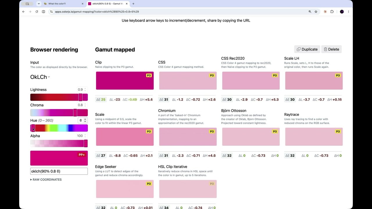
And secondarily, we try to preserve the hue. Usually the chroma is the one the chroma saturation is the one that is most tolerant of changes. Like the color still preserves its general characteristics. You can visit this page on that URL and play with sliders here. Ignore the gradients, like this color picker is not designed for these ranges. But basically, you can see how we started with a color that had 90% lightness.

That is a fairly light color. And clipping gets us this. That is not a 90% lightness color. And now, there's many different algorithms with different characteristics, different performance. This is a playground that many standards people collaborated on when we were discussing gamut mapping and what gamut mapping algorithms should browsers implement.

Many were proposed that made different trade offs of quality of the result, performance and so on. But generally, anything, anything is better than clip, as you can see. And you can like play around with the sliders. I mean, clipping, there are some very rare cases where it can be good. It can preserve chroma when you're very close to the gamut, but you're just slightly outside.

But when you're significantly outside then it has very poor results. RGB color spaces, all of them, have another problem which is called lack of perceptual uniformity. Which sounds fancy. But it's simpler than it sounds. Bear with me. So it basically means, any color space, including RGB, is basically a three-dimensional coordinate space, right?

And colors are points on that space. So, as you know from geometry, when you have a three-dimensional space, you can use Euclidean distance to get a measure of the distance between the two colors. Now, perceptually uniform color spaces, that means something.

That distance actually correlates with how different the colors actually look. In RGB, and other spaces that are not perceptually uniform, that difference is not very meaningful. Like both of these color pairs have the same distance in RGB, 0.87. But they're actually significantly Their differences are significantly different.

Which you can see by using a measure called delta E. And same here. All of these are Each step has the same distance in terms of coordinates. But the perceptual difference is much more significant, right? The first and the second color look quite relatively similar.

The where and the third the third and the fourth as well. Whereas the second and the third have a much bigger difference. And that is why it is not a good idea to use RGB for gradients and generating color palettes or measuring proximity and doing things like that. This I think is even more dramatic.

Look at that. It's like 19 versus 40. And you can see it with your eyes as well. Right? So, these the only problems with RGB? No. There is also a usability issue. As you may have found, I don't know if you remember when you were starting and you weren't very familiar with RGB and you were trying to match a certain color, like adjust the color, make it lighter, write the color that kind of approximates what you had in mind. So I've made this little color game where you can select a color space and then try to match a random color.

And I find that RGB, it is always much harder. Like, you kind of you kind of go a certain way, then it's like, no, need to go that way. Oh, no, I actually need to go like the other way. And it's like you keep fiddling.

And I'm sure eventually, you get it, But it's not a nice experience. There is no hill climbing there, I got it. That was actually fairly fast. See, it's it's Stockholm syndrome. If you spend enough time with a bad UI, you get used to it. But it's a little bit like that. Like you it does not good UIs kind of progressively guide you towards your goal. Bad UIs, you tweak one parameter and other parameter breaks. Can you think of any other similar UI you may have used?

So totally different domain, but taps or faucets, depending on which country you live in, have the same problem. There is the older faucets which have two different knobs. One for hot water and one for cold water. And they also these knobs affect basically how much water of that temperature is coming out of the tap.

So one of them gets you more or less hot water, and the other one gets you more or less cold water. So what happens if you want a certain flow and a certain temperature, which is usually your use case? You have to tweak them endlessly until you find the right spot. And of course, then you cannot save it.

Contrast that with newer taps that have separate controls for these two things. So you turn it to select the temperature, and you move it up and down to select the flow. And if you find the right temperature, you can still turn it off and it remembers the temperature because it is a different setting. It's the angle. But mainly, it actually follows the user's mental model.

It's designed around the user goal. And this is something that permeates good UIs versus bad UIs in every domain. From color to faucets. Like, good UIs are designed around what are people actually trying to do with this. Bad UIs are designed around what is my implementation?

What is my hardware? I'll just expose this directly because that's easy. Like the second faucet has to do more work. Internally, it still works like the first one. It has to translate what you've selected into levels of cold and hot. It just doesn't put that that burden on the user. Because for this kind of mechanical computation, it's machines that are much better than us.

So RGB has exactly that problem. Because of its hardware origins, because it was designed around how screen hardware worked, it does not take into account how humans think about color. Like if I asked you to describe this color to the person next to you, actually let's take a minute and do that.

Can you describe this color to the person next to you? Suppose you were talking to your, like, partner and telling them I want you to buy a t shirt of that color. Alright. So I'm sure there were many different descriptions. And there have been studies on this. And they all find different, slightly different adjectives.

But basically, the way that humans describe color is either some kind of name like top or whatever. Or leather or whatever. Or when it's described as a system it's like a core hue, a core color and modifiers. Like light muted brown, or dark beige.

Or like light brown or whatever. Or lighter, darker, muted, bright, things like that. It is never ever about 60% red and a little bit less green and even less blue, but combine them like you're combining lights, not like you're combining paints.

Like nobody ever says that. So, when you're using RGB to specify color, you have to do the mental translation, just like when you're using the older faucet. You have to think in terms of how humans think and translate it into the RGB coordinates. I mean, yes, we have tools for that. But there are always cases where you need to tweak coordinates.

When you need to create variations, when you need to dynamically do something. Or even just when reading code to understand what's going on there. I mean, you don't always have a preview. So to solve this problem, we got polar color spaces. So why do we call them polar? Because they have an angle. The angle represents the hue.

So instead of having this is in contrast to rectangular color spaces like RGB, which are shown like a cube. So, polar color spaces have an angle that shows what is the the core type of this color.

And then Okay. And then another coordinate. Another coordinate usually that controls how gray the color is or how bright it is. In HSL it's called saturation.

And then a third one that controls how light and dark it is. And CSS supports several of these with different characteristics. And we will soon see what these characteristics are. So HSL sounded really good at first.

It's a very old color space. It's a very simple transformation over RGB. Very simple math. Could even be done in old hardware. But it means nothing. Like the coordinates mean nothing when you're comparing different hues or different saturations. Like, just to give you an example, both of these have a lightness of 50%. That makes no sense.

These are not equally light colors. Which means you cannot depend on the lightness meaning anything. You cannot use it to create tints and shades, you cannot use it for contrast calculations, nothing. So, enter perceptually uniform color spaces, which are very old. Some of them are really old, like starting from 1976 with LAB.

But it's only recently that we were able to use them in CSS. So, what is a perceptually uniform color space? It's basically it doesn't have the problem I showed you earlier. The distance between coordinates is the perceptual distance. It's basically what you see. And the polar coordinates like hue or chrome and lightness actually mean the same thing. You can tweak lightness across the space and the theory is it means the same thing.

And also, in HSL there are cases where if you increase the lightness, perceptually you're also decreasing the saturation, things like that. Or sometimes you change the hue, it changes the perceptual hue. In these spaces, the polar coordinates are orthogonal. Like if you change the hue, it only changes the actual quality of the color. If you change the chrome, it only changes how gray it is. If you change the lightness, it only changes how light or dark it is.

Again, big asterisk there with a big caveat. But why? Before we get to the caveat, why? Why would we do that? Obviously, to create nicer interpolation, nicer gradients, nicer transitions, you know this stuff. To make it easier to create dynamic palettes, color palettes or ramps where you have like a core accent color, and you create tints that are lighter or darker and you can skin entire components.

That was the theory we were sold at least. And other dynamic computations like generating a contrasting color that's automatically contrasting. Like just as an example, it is not the focus of this talk. But even though contrast color just became baseline, if you can depend that the likeness of a color space actually means something, you could maybe you disagree with the user agent's value.

Or maybe you want a fallback for browsers that go, where contrast color is not supported. Whatever it is, you can actually decide on your own threshold. And as you can see, here I've picked 0.7, which favors white a little bit more. And there are cases where it can produce better results, depending on the specifics.

Let me see if I can find one of these cases. Like for example, I think the white is much easier to read there. Woah, even worse there. So, there you can make your own choices. That means it must be a lightness you can depend on. Imagine if you were doing this with HSL.

You can do it. HSL does support relative color syntax. But imagine doing that with HSL. Yellow and blue would get the same color. Another question that people frequently ask is, why do we need the okay versions? What does that mean about lab and LCH? Are they the crap versions? So, I mean, they were very good when they came out for what they were. They are generally perceptually uniform.

Generally, they do have a bug around blues. So if you notice when you go from white to blue in LAB, you're getting purple in the middle. This is a known problem with with LAB. That was exactly why Okay Okay LAB was designed.

It is Okay LAB is basically LAB with some bugs fixed. And the Okay LAB version is much better than both of these. So just as a summary. It is each of these spaces does have its pros and cons.

But one of the things that is missing from this table is gamut. And that is the big pain point. And I stumbled on this problem, I've been trying to solve this problem of creating dynamic color ramps for a very long time, very, very long time. Because basically it really bothers me that today we have to do all of this to define colors for a website.

Most of these are generally programmatically generated with some tweaking, but still we have to do it, we need to include all of this just to have colors that we can depend on. And then because we don't have primitives in CSS to go from one to the other, everything's hard coded. And my vision is it would be so great if all we needed was basically define our levels, define our key colors.

Like what would you use as an accent color? What's the peak saturation? Like if you had to color a primary button with the brightest color in the scale, what would it be? And it doesn't even need to be in the scale. And then if just given these, I wanna be able to generate these. So can we do that?

Like, my vision is that basically the design system, the page would define its core colors and its likeness levels, and then each component would define how these are allocated. And you can do that if if this actually worked. Like, the story we were told is, you know, you change the lightness in an OKLCH color and you get something with the same characteristics, just lighter or darker.

It should work in theory, right? And doesn't it look really beautiful? You can even clamp to the lightness to have certain constraints, like, you know, the icon I wanted. I do want to use the accent color mostly, but I still want to make sure it's not super light, and things like that. And then variations become cheap. All you have to do is change an accent color and the component just adapts. They can even be created on the fly.

I have a brand color. I'm going create a variation. Today, all these variations have to be hard coded because they require there's such a combinatorial explosion. I'm not even going to cover nested callouts. So, I tried to do that, and this was the result. These 10 to 90 are not lightnesses.

They are these abstracted lightnesses. They are basically these levels that I showed you there. And you know, if you glance at it without looking too carefully, it kinda doesn't look too bad. But then you try to use it on an actual element, like on an actual component, on an actual call out, and all the horror. It's actually kinda more decent there.

But it's they're basically some of them are extremely bright. Some of them have changed hues. Like, look at this purple. It became pink here. Look at this gray. It basically became like a dark like a desaturated blue cyan or something. The magenta became red.

It's just totally not what like, this is unusable beyond a demo. Right? You cannot use this on an actual production website. And it it for for the longest time, I it drove me crazy. Why didn't it work? The question haunted me why? Why it should work? What is it? It became an obsession.

I even built a website to get data from popular color palettes that were tweaked by a designer to notice patterns in the data. And you can access it as well. This is the URL. You can click, for example, on Tailwind. And you can see charts of where the different color swatches stand on each coordinate. You can even tweak the coordinates yourselves.

I'm not going to cover hue. Sometimes the hue changes itself. But the main thing, the thing that obsessed me the most, is chroma. There is a certain shape, a certain curve that goes kind of like this, that you see over and over again in almost all of them. Like let's go to wide open props. Same curve. Open color.

Very similar curve, just kind off. Of Alder Tailwind, very similar curve. Adobe Spectrum, kind of a similar curve. Right? So I thought that the key to succeeding at this task was to manage to to unlock the secrets of this this curve.

There there there must be a secret like formula there. I gaslit myself about what chroma means, even. I was thinking, you know, maybe what we actually want is not just to change the lightness.

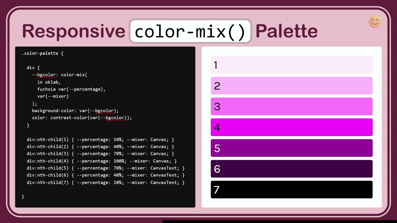
We think we want to change the lightness, but what we actually want is also to lower the chroma. And I started looking, like, often people will create dynamic color palettes by mixing white and black. It does prevent the super saturated problem that we saw earlier, but it creates the opposite problem that they're often very washed out.

And we have no guarantee about each tint. Like, we cannot use color mix to create a color palette and end up with like 40 or 50, for example, having a predictable lightness that we can use in computations. It's only relative to the key color, just like HSL. And so then, some of my early experiments, which you can see here, let's see this loading.

Some of my early experiments, which you can see here involved, maybe we just need to combine the two approaches. Like, maybe we have the color mix color, and the color with the modified lightness, and then we just like find the perfect mix between them. It sort of worked.

It worked better than just plain color mix because it gave it some saturation. There was no ideal mix. There was no value that gave you what you wanted for every possible color. It was just slightly better. And one day, it dawned on me. After an embarrassingly long time of trying to figure this out, I noticed there's this color picker component that I've built, and you can access it as well.

And I noticed that whenever I increased the lightness, the color got out of gamut. Any and that held true for any accent color. Let's go here, sRGB even. At some point, will get out of gamut. Guaranteed. So I built an app to explore this hypothesis, like could the problem be gamut again?

Could it be gamut clipping showing its nasty little head? So, I built this app that lets you move along OKLCH and see how the gamut actually adapts. And here's the thing. If you show all the colors and you just try to create a hue wheel, then it kind of looks nice, and you've seen a lot of demos, you might have seen a lot of demos with this sort of thing, but then you go lighter and it's like, what? This is the perceptually uniform space I was promised?

This is not perceptually uniform. How is this color the same lightness as this? I mean, this is supposed to be a slice of constant lightness. And it made no sense, but it all becomes clear if you actually clip, if you actually hide the out of gamut colors. So the out the in gamut colors are actually a much smaller shape, and it becomes much much much smaller at the edges.

At a 100%, it's only a single point, And that point gives you weight. Anything outside of it is clipped or mapped. And if you're not doing mapping, you're going to get the wrong color. So, there is this widespread belief that if you don't do weird things, you're not going end up with out of gamut colors.

And that is, as you can see, patently not true. Pick any accent color here, any of them, any, like with whatever chroma you want, and make sure it's in gamut, and increase the lightness. Whoops, you're out of gamut now. The only thing that changes is when you get out of gamut. But you will eventually get wildly out of gamut.

The p p plus here means outside pro photo. And remember pro photo is is wider than human vision. So we're not even talking about a small difference. You will get wildly out of gamut. And to test this hypothesis further, I built this other little app, where you can see what the browser is doing.

You can select different colors. You can see what the browser is doing, which is clipping. So these two are going to be the same visually. And then how does it look with gamut mapping? And as you can see, yeah, it's not perfect. Yes, you still need to do some tweaking. But boy, it's so much better. Like you don't get this weird super saturated light tint.

And you can also see how grayed out the color mix version is. And there is and here is the mixed the mixed one, because I I didn't give up on that idea completely, I still tried it out. Still doesn't work. And you can click on different colors here and see what happens.

But in general, the gamut mapped version is always way, way better. In some cases it's basically there. In other cases it made quite a little bit of tweaking but it's basically there. And look at color mix how it's also giving you a different hue sometimes, again the blues. So, when we talk about perceptually uniformed faces, when we talk about device independence, when we talk about orthogonal orthogonal coordinates, all of that is when you're in gamut.

When you go out of gamut, it's the wild west. All of these fly out of the window. So, it is extremely important to do proper gamut mapping, so you get a color that maintains some guarantees about what you were trying to do. So then, once I realized that gamut mapping is the solution, is the answer, and it gets you like 90% of the way there, my next thought was, can I do it in CSS?

Can I implement this in CSS? Because obviously I can do it in ColorJS, but who wants to to have to do that? I wanted to have dynamic tins. Like this is my life's mission. I need to be able to create dynamic tints. So, it must be possible to do in CSS. The first thing you need to keep in mind is no matter the lightness and the hue, there will always be a chroma that brings the color in gamut.

No combination of lightness and chroma or chroma and hue has this property. But for chroma, there is always a value that is in gamut. Like let's go here, for example, we can just reduce the chroma and it's in gamut. And whatever color you have, there is a value that is out of gamut. So basically, most gamut mapping algorithms just try to find what's the maximum chroma that still has this property, that still maintains in gamut. And some of my early attempts may have been, shall we say, convoluted. This is real code that I thought at some point that I would ship.

I did not ship it, thankfully. I got to my senses. It was basically it looks insane, but there was a logic to it. I was actually trying to match the gamut boundary by combining different functions. Like, I had multiple functions and I was using max and min to combine them, to basically add them together.

But eventually I realized there is a simpler way. What if we just take the color, convert it to HSL, clamp its saturation, convert it back, then replace the lightness we want and repeat until it settles. So I tried that. And it settles surprisingly fast.

Like, it takes four or five iterations usually. But then I thought, this works when you need to set a certain tint, like when you have the lightness already. Because look here, we are actually setting the lightness. Like we have a fixed lightness that we're setting back. Here we're using OKLCH to get a relative color that sets that particular lightness. What if we don't have the lightness and all we have is a color that we need to gamut map?

So, there is a slightly different variation of that where we basically convert to HSL, clamp, then do this weird trick with color mix. So to replace the original hue and lightness into that color, convert it to OKLCH, and then plug the the hue and lightness back in. And you might be puzzled at this point, But bear with me. So, slight detour.

There is one of my So I proposed relative color syntax back in 2016 or so. And it got implemented and it gave us all these abilities, yay. I recently kept coming across cases where you actually want to combine more than one color. So I proposed relative color syntax with two colors. It got accepted by the working group.

It's not there yet. It's not even in the spec. So what can we do until then? It won't work for every case, but for some cases there is a workaround. And the workaround is based on non values. So non values were originally designed to represent grayscale colors. Like if you convert a grayscale color to HSL or any other polar format, it will automatically get a none for the hue.

But you can actually use none yourself for any component. And what does it mean? It means when you interpolate that color, the none gets the value of the other color there. Whatever value the other color has in that component, it gets that. And if that's also none, it still gets none. So as you can see, if we mix this with zeros, we get a gray. Like if we mix this magenta with zeros.

If we mix this magenta with the same lightness and none, we get a darker version of that color. And we can use that, because we can take a color, we can use relative color syntax to replace some of its coordinates with none, and then we basically get a color that has essentially little holes where these components used to be, and then when you color mix them, these holes get values.

So, that's basically where this that basically allows you to combine components from two different colors using color mix. Just make sure you do not incur any space conversion. They both need to be in the same color space. Because if you convert a color that has none to a different color space, you usually lose the none's and they become zero's and you get a completely different color.

So, important to convert them to that color, the color space you're mixing in before replacing it with none. And you can also do linear variations, like 30% of that component and 70% of the other by nesting color mixes or doing things like that. So, that's basically what this is based on.

It just combines the components of these two colors. And that also settles relatively fast. So, thought, is there something there? And plugged it into the gamut mapping playground. For the types of colors that we usually have when we're doing design systems, which don't go above 0.4 chroma, it worked pretty well. It worked as well as the other much fancier algorithms.

So, the problem is, it is very hard to distribute something like this. If you can express the tint with a relative color modification, then you can just pass it around and you tell people, just use OKLCH from your accent color and then use this variable. And magic, you get a tint. But when it's multiple nested functions, it's very awkward.

So I thought, when we have function, can we use that function? I tried to do that. In fact, tried to do a recursive thing where it called itself. It did not work. Turns out recursive at function, not a thing right now. But it is considered recursive even if the value itself has gone through the same function.

So even if I When I wrote it as two separate functions, because I'm calling gamut map iteration over the same value and then basically wrapping it, still doesn't work. The good news is it's a bug in the spec. It will be fixed. Bad news is it doesn't work right now even in Chrome. So, bottom line of this is, yes we have workarounds.

But damn we need gamut mapping. We need it to work. We need to be able to not have to do all this stuff. So go out there and ask ask browsers to do this because that's the only thing that works. If they hear developers requesting something, they prioritize it. Trust me. That is the biggest thing you can do to get something prioritized. Complain loudly.

That was it. Thank you so much.

What the color?!

Lea Verou

.css-day {
  date: 'June 11 & 12 2026';
  location: 'Amsterdam'
}

#identifier-sponsors

  • Google
  • AG Grid

selector-sponsors

  • 9ELEMENTS
  • Polypane

Stylized 'CSS-DAY' logo.

Portrait photo of Lea Verou smiling.

A solid blue horizontal bar.

LIA VERU

.now {

09:30 | Lea Verou

.now {

09:30 | Lea Verou

Event: CSS DAY

Sponsors: Google, AG Grid

Stylized CSS DAY logo in the top right corner.

Google logo in the bottom left corner.

AG Grid logo in the bottom center.

now {

09:30 | Lea Verou

Logo for CSS Day, composed of connected rectangular blocks.

.now {

Lea Verou

09:30

.now {

09:30 | Lea Verou

A stylized logo for CSS Day is in the top right corner.

What the color?!

by Lea Verou

CSS WG, CSS Color co-editor, Color.js co-founder

lea.verou.melea@verou.mecolorjs.io

Related CSS color concepts: lab, OKLCH(), color(srgb), gradient, color-mix(), lch, p3, rec2020, hue.

What the color?!

by Lea Verou

CSS WG, CSS Color co-editor, Color.js co-founder
lea.verou.melea@verou.mecolorjs.io

Examples related to CSS Color functions: lab(), color(rec2020), hwb(), color(display-p3), linear-gradient in okLCH long, color display-p3.

A background with a gradient transitioning through multiple colors, overlaid with semi-transparent CSS color function code examples.

What the color?!

by Lea Verou

CSS WG, CSS Color co-editor, Color.js co-founder

lea.verou.melea@verou.mecolorjs.io

The background design of the slide features various CSS code snippets related to color functions and color spaces, such as `color()`, `lab()`, `display-p3`, and `srgb`, illustrating the topic of advanced CSS color.

What the color?!

by Lea Verou

CSS WG, CSS Color co-editor, Color.js co-founder

Keywords visible in the background related to color spaces and functions: lab(), color rec2020, oklab, hsl none none n, gradient in oklab, lch, color display-p3, color(display-n3).

A slide with a blue to red gradient background. Various CSS color function names and color space terms are scattered across the background. The main title and speaker details are displayed on a tilted white banner in the center.

What the color?!

by Lea Verou

A presentation slide displaying a web page within a browser frame. The web page features a vibrant rainbow gradient background. The main title "What the color?!" is prominently displayed, and the speaker's name and affiliations are presented on a white, diagonal banner. Various CSS color function names like `color-mix`, `hwb()`, and `oklch()` are subtly integrated into the gradient background.
  • lab()
  • color rec2020
  • color()
  • oklab()
  • hsl none none n
  • color(srgb)
  • oklch
  • color display-p3
  • gradient in oklab
  • oklch
  • ab()
  • color(r
  • linear-gradient in oklch longer hue
  • color-mix
  • color display-p3
A slide visually demonstrating CSS color functions and concepts with text superimposed on a colorful gradient that transitions through various hues and saturations.

CSS Color Functions and Gradients

  • wb()
  • oklch()
  • ab()
  • color display-p3
  • oklab()
  • color rec2020
  • color (srgb)
  • gradient in oklch()
  • lab()
  • linear-gradient in oklch longer hue
A slide demonstrating CSS color spaces and gradients. The background is a horizontal color gradient transitioning from purple on the left, through green and yellow, to red on the right. Various text labels referring to color functions and color spaces are overlaid on the gradient.

lab()

color(rec2)

linear-gradient in oklch longer hue

color-mix

hwb()

color(display-p3)

oklch()

ab()

color(rec20)

oklab()

color(srgb)

color display-p3

A horizontal color gradient transitions from purple and blue on the left to red, orange, and yellow on the right. Various CSS color function names and color space references are overlaid on the gradient.

What the what?!

  • lch()
  • oklch
  • lab()
  • hwb()
  • color() with display-p3 and rec2020
  • color-mix()
  • Demonstration of gradients in oklab and oklch with longer hue

http://localhost:8000/demos/whatthewhat/what.html

Screenshot of a web browser displaying a demo page. The page features a vibrant horizontal color gradient transitioning from yellow-green on the left to blue-green on the right. Overlaid on this gradient are numerous CSS color function names and color space identifiers in white text. A large, yellow 'dizzy' emoji with swirling eyes is prominently displayed in the center of the page.

Exploring CSS Color Spaces and Functions

  • hwb()
  • display-p3
  • oklch()
  • lab()
  • color() with rec2020
  • linear-gradient in oklab
A horizontal color gradient transitions from red on the left to green on the right. Three emoji-like illustrations are centered on the gradient. From left to right: a yellow face with spiral eyes and a wavy mouth (confusion); a yellow face with a winking eye and a slight smirk (understanding); and a yellow happy face that appears to be melting (ease/satisfaction).
  • lab()
  • color(rec2)
  • linear-gradient in oklch longer hue
  • color-mix
  • hwb()
  • display-p3
  • ab()
  • th()
  • sec20
  • color
  • oklab()
  • srgb
  • color display-p3
The slide features a horizontal linear gradient background, transitioning from magenta on the left, through orange and yellow in the center, to bright green on the right. Three large yellow emoji faces are centered on the slide: a dizzy face with swirling eyes, a winking face with a wavy mouth, and a melting face.

What the Color Models Mean

1ch, or display-p3
gradient in oklab
lab()
hwb()
oklch
color(re
    ver hue
    -p3)
oklch()
color srgb 2020
oklab()
A browser window displaying a presentation slide. The slide features a horizontal gradient background from purple to green. On this background, various CSS color-related code snippets are displayed. In the center, there are three large yellow emoji faces: a dizzy face with swirling eyes, a winking face with a wavy mouth, and a melting face.

color-mix

  • color(display-p3)
  • hwb()
  • b()
  • oklch()
  • rec20
  • color display-p3
  • gradient in oklablch
A slide demonstrating CSS color functions and color spaces, featuring three emoji faces. From left to right: a dizzy face with swirling eyes, a winking face with a wavy mouth, and a melting happy face.

OkLCH

Screenshot of an OkLCH color picker interface with sliders for Lightness, Chroma, and Hue, displaying a grey color with values oklch(50% 0 0).

LCh

  • Brightness 0.5
  • Chroma (0–0.4) 0
  • Hue 0
A screenshot of a color picker interface, likely for an LCh or OKLCH color model. It displays three horizontal sliders: one grayscale for brightness, one color gradient for chroma (from purplish-blue to magenta/red), and one color gradient for hue. The brightness slider is set to 0.5, and both the chroma and hue sliders are set to 0.

LCh

Lightness

0.5

Chroma (0 – 0.4)

0.09

Hue

0

Screenshot of a color picker interface displaying LCh (Lightness, Chroma, Hue) color model parameters with three interactive sliders. The top slider shows a gradient for Lightness, the middle for Chroma with a range of 0 to 0.4, and the bottom for Hue.

LCh

  • Lightness: 0.5
  • Chroma (0–0.4): 0.12
  • Hue: 0
Screenshot of a color picker interface for the LCh color model, showing sliders for Lightness, Chroma, and Hue. The Lightness slider displays a black to white gradient, and the Chroma slider shows a purple gradient from desaturated to saturated.

LCh

Screenshot of a color tool displaying LCh color model parameters with sliders for lightness and chroma, showing gradients of green.

LCh

Screenshot of a web application showing LCh color model parameters with sliders for lightness, chroma, and hue.

LCh Color Model Interface

Screenshot of a web-based color picker interface for the LCh color model. It displays horizontal sliders for adjusting Lightness (0.5), Chroma (0.12), and Hue (76), along with corresponding color gradients for each property.

LCh

Screenshot of a color picker interface for the LCh color model, featuring horizontal sliders for brightness, chroma, and hue, along with their numerical values.

LCh

Brightness (0-1): 0.5

Chroma (0-0.4): 0.102

Hue: 76

A screenshot of a color picker interface displaying LCh color model parameters. It shows three horizontal sliders with values for Brightness (0.5), Chroma (0.102), and Hue (76). The Brightness slider illustrates a gradient from dark to light, the Chroma slider shows a gradient from muted to saturated color, and the Hue slider displays a segment of the color spectrum.

LCh

Screenshot of the "whatthecolor" web application, showing an interface for the LCh color model with sliders for brightness, chroma, and hue, along with their current values.

LCh

Screenshot of a user interface for adjusting LCh color model parameters. It displays a slider for Lightness (0-1), currently set to 0.64, and a slider for Chroma (0-0.4), currently set to 0. A third parameter, likely Hue, is partially visible with a value of 76.

LCh color model

  • Lightness (0-1): 1
  • Chroma: 0
  • Hue: 76
Screenshot of a color picker interface displaying LCh color model parameters. It shows three sliders: one for Lightness (0-1) with a gradient from black to white, currently set to 1; one for Chroma with a gradient showing increasing saturation, currently set to 0; and one for Hue with a color spectrum gradient, currently set to 76.

LCh

Lightness (0-1): 0

Chroma: 0

Hue: 76

Screenshot of a color picker interface displaying LCh color model controls. It shows three input fields: Lightness (0-1) with a gradient bar from black to white and a value of 0; Chroma with a solid dark green color bar and a value of 0; and Hue with a value of 76.

LCh

Lightness (0–1): 0.55

Chroma (0–0.4): 0

Hue: 76

Screenshot of an interface for the LCh color model, displaying two horizontal sliders with associated numerical input fields. The top slider, labeled 'Lightness (0-1)', shows a grayscale gradient from black to white, with its handle positioned at approximately 0.55. The bottom slider, labeled 'Chroma (0-0.4)', displays a color gradient from desaturated colors to saturated red, with its handle set to the far left, indicating a chroma value of 0. A third input field shows the value '76', likely representing the Hue.

LCh

Screenshot of a color adjustment tool interface displaying LCh color parameters with sliders for Lightness, Chroma, and Hue.

LCh

Lightness (0-1): 0.93

Chroma: 0.03

Hue: 76

Screenshot of a user interface for adjusting LCh color values, featuring three horizontal sliders for Lightness, Chroma, and Hue. Numerical input fields display the current values as 0.93 for Lightness, 0.03 for Chroma, and 76 for Hue (partially visible). A cursor is positioned on the Lightness slider.

s/whathecolor/#slide2

LCh

Lightness: 1

Chroma: 0.037

Hue (0-360): 165

Screenshot of a color picker interface displaying LCh color values, with gradient sliders for Lightness, Chroma, and Hue.

LCh

Brightness: 1

Chroma (0–0.4): 0.332

Hue: 165

Screenshot of a color picker interface for the LCh color model. It displays sliders for Brightness, Chroma, and Hue. The Brightness slider shows a gradient from dark green to light green. The Chroma slider shows a gradient of light green tones, with a slider handle indicating a value of 0.332. The Hue value is 165.

LCh

Screenshot of a color adjustment interface displaying LCh color model parameters, with sliders for Brightness and Chroma.

OkLCh

  • Lightness: 1
  • Chroma: 0.332
  • Hue: 165

PP+

oklch(100% 0.332 165)

A web application interface for an OkLCh color picker. It features three horizontal sliders for 'Lightness' with a black-to-white gradient, 'Chroma' with a muted green-to-cyan gradient, and 'Hue' with a full spectrum rainbow gradient. Each slider displays a numerical value to its right. Below the sliders, a large light greenish-blue color swatch is displayed, next to a "PP+" button. At the bottom, a text input field shows the CSS color function string "oklch(100% 0.332 165)".

What the h@!l is a color space anyway?

A screenshot of a web browser displaying a web page. The web page shows a silver laptop with a diagonal rainbow gradient on its screen, next to a printed sheet of paper with the same diagonal rainbow gradient, placed on a wooden surface, illustrating a comparison of colors on screen versus in print.

What the color?!

localhost:8002/leaverou/talks/whatthecolor/#slide3

A MacBook Pro displays a vibrant rainbow gradient on its screen. To its right, a printed sheet of paper shows a similar rainbow gradient on a wooden surface. A mouse cursor hovers over the printed paper. The laptop has 'MacBook Pro' written below its screen.
Screenshot of a web browser window displaying a blank white page, with browser navigation controls and tab elements visible at the top.

Not As Pictured

Screenshot of a web browser displaying customer reviews discussing product color accuracy issues, with review titles like "Color not as pictured" and "Color is not accurate".

oxiululy Women's Vintage Dot V-Neck Cap Sleeve Casual Pockets Swing Tea Dress OX296

Screenshot of an Amazon product page displaying a turquoise dress.

amazon.com

A screenshot of the Amazon.com website displaying a product page for a light blue women's dress.

Dorly Women's Vintage Dot V-Neck Cap Sleeve Casual Pockets Swing Tea Dress

Screenshot of an Amazon.com product page displaying a blue/turquoise V-neck dress, along with product details, pricing, and purchase options.

Amazon.com: Women's Vintage Dot V-Neck Cap Sleeve Casual Party Swing Tea Dress

Screenshot of an Amazon.com product page for a Women's Vintage Dot V-Neck Cap Sleeve Casual Party Swing Tea Dress, featuring a large image of the dress in a light blue/turquoise color, along with product details, price, and color options.

Screenshot of an Amazon.com product page for a women's dress

A screenshot of a web browser displaying the Amazon.com website, showing a product page for a light blue women's vintage dress. The page displays the product image, title, price, and various options like color swatches and sizes.
A projector displays a vibrant digital artwork on a wall in a dimly lit room. The artwork depicts a man with dark, curly hair and a serious expression, wearing a dark jacket, set against a background of swirling cosmic or fiery patterns in shades of blue, purple, red, and orange.

What the color?

Screenshot of a web page comparing projector image quality. On the left, a bright living room with a barely visible projected image of a person, labeled "Projector - Daytime". On the right, the same room is dark, showing a vibrant, clear projection of a movie scene with a person and a colorful nebula background, labeled "Projector - Nighttime".

What the coach?

A browser window displays two side-by-side images illustrating the impact of ambient light on a projector. The left image, labeled 'Projector - Daytime', shows a brightly lit living room with sunlight streaming in, and a projector casting a very faint, almost invisible image of a person onto the wall. The right image, labeled 'Projector - Nighttime', shows the same living room in darkness, with the projector casting a vibrant, clear image of a character from a movie or game onto the wall.

What the coach?

Screenshot of a web browser displaying a comparison of projector performance. The left panel shows a bright living room with a faint projected image, labeled 'Projector - Daytime'. The right panel shows the same room dark, with a clear, vibrant projected image, labeled 'Projector - Nighttime'.

What this talk is not bout

  • Dark mode (go to Sara's talk!)
  • The physics of color (wavelengths etc)
  • The biology of human vision

What this talk is not bout

  • Dark mode (go to Sara's talk!)

What this talk is not bout

  • Dark mode (go to Sara's talk!)
  • The physics of color (wavelengths etc)
  • The biology of human vision

RGB

color spaces

A screenshot of a web browser showing three horizontal bars at the top of the content area, colored red, green, and blue from left to right, illustrating RGB color spaces.

RGB

color spaces

A screenshot of a web browser window displaying the text "RGB color spaces" on a dark background. The browser's tab area above the main content shows distinct red, green, and blue colored sections.
The slide features a black background with a wide red bar spanning the top, followed by a smaller green bar to its right.

First color CRT (1954)

Modern high-end P3 LCD

An old wooden television, labeled 'First color CRT (1954)', with a rounded screen and control knobs on the right side. The knobs are labeled 'COLOR TN', 'VHF', 'UHF', 'BRIGHTNESS', and 'CONTRACY' (likely Contrast), with '1954' printed below them. To its right, a modern flat-panel monitor, labeled 'Modern high-end P3 LCD', with a thin black bezel and a white screen, and a mouse cursor visible on its display.

First color CRT (1954)

Modern high-end P3 LCD

A comparison of display technologies. On the left, a vintage wooden television with a curved screen, labeled "COLOR TN". A magnified circular inset shows the CRT's subpixels as a scattered pattern of red, green, and blue dots. On the right, a modern flat-panel monitor with a rectangular screen. A magnified circular inset shows the LCD's subpixels as vertical stripes of red, green, and blue.

First color CRT (1954)

Modern high-end P3 LCD

An image comparing two display technologies. On the left, an illustration of an old television set with a circular magnified view of its screen showing a pattern of alternating red, green, and blue dots, labeled "First color CRT (1954)". On the right, an illustration of a modern flat-panel display with a circular magnified view of its screen showing vertical stripes of red, green, and blue, labeled "Modern high-end P3 LCD".

First color CRT (1954)

Modern high-end P3 LCD

RED:

GREEN:

BLUE:

SCALE:

The slide compares display technologies. On the left, an illustration of a vintage CRT television with a light blue screen. A circular magnified inset reveals its subpixel structure: scattered dots of red, green, and blue. On the right, an illustration of a modern flat-panel LCD monitor also with a light blue screen. A circular magnified inset shows its subpixel structure: vertical stripes of red, green, and blue.

Below the displays are four interactive sliders. The first is labeled RED: with a red gradient, its handle is positioned towards the right (high value). The second is labeled GREEN: with a green gradient, its handle is positioned towards the far right (maximum value). The third is labeled BLUE: with a blue gradient, its handle is positioned towards the far right (maximum value). The fourth is labeled SCALE: with a grayscale gradient, its handle is positioned centrally.

First color CRT (1954)

COLOR TN

Modern high-end P3 LCD

RED:

GREEN:

BLUE:

SCALE:

An image comparing two display technologies. On the left is a vintage, brown wooden television set with a curved screen, labeled "First color CRT (1954)". On its right side, a small label reads "COLOR TN". On the right is a sleek, modern flat-panel monitor, labeled "Modern high-end P3 LCD". Both the CRT and LCD screens appear completely black, as if displaying a black image or turned off. Below these displays are four horizontal slider controls. The first slider is labeled "RED:" and shows a gradient from dark red to bright red. The second slider is labeled "GREEN:" and shows a gradient from dark green to bright green. The third slider is labeled "BLUE:" and shows a gradient from dark blue to bright blue. The fourth slider is labeled "SCALE:" and shows a gradient from black to white.

First color CRT (1954)

Modern high-end P3 LCD

RED:

GREEN:

BLUE:

SCALE:

The slide compares two display technologies. On the left, a vintage color CRT television from 1954 displays a solid yellow screen, with a magnified circular inset revealing its pixel structure as a patterned arrangement of red and green dots. On the right, a modern high-end P3 LCD monitor displays a solid yellow screen, with a magnified circular inset showing its pixel structure as vertical stripes of red and green. Below the displays, four interactive color control sliders are shown: a red slider set to a high intensity, a green slider set to a high intensity, a blue slider set to a minimum (black), and a grayscale slider set to a mid-range value.
DecimalBinary
R2551111 1111
G00000 0000
B1401000 1100

rgb(255, 0, 140)

A large solid magenta color swatch.

rgb(255, 0, 140)

DecimalBinary
R2551111 1111
G00000 0000
B1401000 1100

A large magenta color block demonstrating an RGB color value.

RGB Color Representation

The application displays the color rgb(255, 0, 140) and its component breakdown:

Component Decimal Binary
R 255 1111 1111
G 0 0000 0000
B 140 1000 1100
Screenshot of a web application showing a large magenta color swatch alongside a breakdown of its RGB decimal and binary values.
DecimalBinary
R2551111 1111
G00000 0000
B1401000 1100

rgb(255, 0, 140)

A screenshot of a web application running in a browser, which displays a large magenta color block. To its right, a table shows the color's RGB components: Red (R) is 255 (1111 1111 in binary), Green (G) is 0 (0000 0000 in binary), and Blue (B) is 140 (1000 1100 in binary). Below the color block, the corresponding CSS rgb function is displayed: rgb(255, 0, 140).

(255, 0, 140)
A magenta colored rectangle corresponding to the RGB value (255, 0, 140).

RGB to Hex Conversion Example

Given an RGB color:

rgb(255, 0, 140)

Component Decimal Binary Hex
R 255 1111 1111 0xFF
G 0 0000 0000 0x00
B 140 1000 1100 0x8C

The resulting Hex color is: #FF008C

Binary to Hexadecimal Mapping

Binary Hex
00000
00011
00102
00113
01004
01015
01106
01117
10008
10019
1010A
1011B
1100C
1101D
1110E
1111F
A large magenta-colored swatch, representing the color rgb(255, 0, 140) or #FF008C.

RGB to Hex Color Conversion

The color specified as rgb(255, 0, 140) converts to the hexadecimal value #FF008C.

Breakdown of RGB decimal, binary, and hex values
ChannelDecimalBinaryHex
R2551111 11110xFF
G00000 00000x00
B1401000 11000x8C
Binary to Hexadecimal conversion chart
BinaryHex
00000
00011
00102
00113
01004
01015
01106
01117
10008
10019
1010A
1011B
1100C
1101D
1110E
1111F

A large pink color swatch, representing the color rgb(255, 0, 140) or #FF008C.

Decimal Binary Hex
R 255 1111 1111 0xFF
G 0 0000 0000 0x00
B 140 1000 1100 0x8C

rgb(255, 0, 140)

= #FF008C

Binary → Hex

Binary Hex
00000
00011
00102
00113
01004
01015
01106
01117
10008
10019
1010A
1011B
1100C
1101D
1110E
1111F
A large pink-magenta color swatch.

Same coordinates, different colors

localhost:8002/awesomecss/whatisthecolor/#device-rgb-2

Macbook Air 2013

Macbook Pro 2026

A comparison of two laptop screens showing identical vertical color bars. The screen on the left, labeled "Macbook Air 2013", displays colors that appear less vibrant compared to the screen on the right, labeled "Macbook Pro 2026", which shows more saturated colors.

Same coordinates, different colors

URL: whatthecolor/#device-rgb-2

MacBook Air 2013

Macbook Pro 2026

Two laptops are displayed side-by-side: a MacBook Air 2013 and a Macbook Pro 2026. Both screens display a series of vertical color bars. Although the same RGB input (coordinates) is applied to both, the colors appear differently. The MacBook Air 2013 shows bars of light blue, dark blue, magenta, gray, and white. The Macbook Pro 2026 shows bars of red, yellow, green, light blue, dark blue, magenta, gray, and white, demonstrating the difference in color rendering across devices.

Same coordinates, different colors

Macbook Air 2013

Macbook Pro 2026

A slide titled "Same coordinates, different colors" shows two laptop illustrations side-by-side. On the left, a silver Macbook Air 2013 displays a test pattern of vertical color bars in red, yellow, green, cyan, blue, magenta, and gray. On the right, a darker gray Macbook Pro 2026 displays the same test pattern of vertical color bars. The colors on the Macbook Pro 2026 appear richer and more saturated compared to those on the Macbook Air 2013, with reds, greens, blues, and gray tones visibly deeper.
Two laptops are displayed side-by-side. The left laptop, a Macbook Air 2013, shows a pattern of vertical color bars (red, green, blue, yellow, cyan, magenta, grey) on its screen. The right laptop, a Macbook Pro 2026, shows the exact same pattern of vertical color bars, but the colors appear more vibrant and saturated compared to the left screen, illustrating the difference in color reproduction between the two models.

Standardized RGB spaces to the rescue!

  • Macbook Air 2013

    60% of sRGB gamut, 8 bits/channel

    R G B

  • Macbook Pro 2026

    P3 gamut, 10 bits/channel

    R G B

Two illustrations of laptop screens are shown side-by-side. The left screen, labeled "Macbook Air 2013", displays a solid, slightly duller magenta color. The right screen, labeled "Macbook Pro 2026", displays a more vivid magenta color, visibly different from the first.

Standardized RGB spaces to the rescue!

Macbook Air 2013
60% of sRGB gamut, 8 bits/channel

R G B

Macbook Pro 2026
P3 gamut, 10 bits/channel

R G B

The slide shows a comparison between two laptop screens, visually represented by two rectangles. The left rectangle, labeled 'Macbook Air 2013', displays a darker, more muted magenta color. The right rectangle, labeled 'Macbook Pro 2026', displays a brighter, more vibrant magenta color. Below each rectangle are the letters R, G, B, indicating color channels.

Standardized RGB spaces to the rescue!

Macbook Air 2013
60% of sRGB gamut, 8 bits/channel

Macbook Pro 2026
P3 gamut, 10 bits/channel

R G B R G B

An illustration comparing two laptops. On the left, a silver Macbook Air 2013 displays a bright pink color on its screen. On the right, a black Macbook Pro 2026 displays a deeper magenta color on its screen. Below the laptops is a table with headers R, G, B, R, G, B, and an empty row of cells, likely intended to show corresponding color values for each laptop.

Standardized RGB spaces to the rescue!

Macbook Air 2013
60% of sRGB gamut, 8 bits/channel

Macbook Pro 2026
P3 gamut, 10 bits/channel

RGBRGB
Device RGB (raw)255010210230408
A silver Macbook Air 2013 and a darker Macbook Pro 2026 are shown side-by-side, both displaying a magenta color on their screens. Below the laptops, a table compares the raw R, G, and B values for that magenta color across both devices.

Standardized RGB spaces to the rescue!

Comparison of Device RGB (raw) values for different Macbooks
Macbook Air 2013
60% of sRGB gamut, 8 bits/channel
Macbook Pro 2026
P3 gamut, 10 bits/channel
RGBRGB
Device RGB (raw)255010210230408
An illustration comparing two laptop screens, each displaying a solid magenta color. The screen on the left, representing a "Macbook Air 2013", shows a lighter magenta. The screen on the right, representing a "Macbook Pro 2026", shows a deeper, more vibrant magenta.

Standardized RGB spaces to the rescue!

Macbook Air 2013
60% of sRGB gamut, 8 bits/channel
Macbook Pro 2026
P3 gamut, 10 bits/channel
R G B R G B
Device RGB (raw) 255 0 102 1023 0 408
A comparison between two laptop illustrations demonstrating different color space capabilities. The left laptop is a silver Macbook Air 2013. The right laptop is a darker Macbook Pro 2026.

Standardized RGB spaces to the rescue!

Macbook Air 2013
60% of sRGB gamut, 8 bits/channel

Macbook Pro 2026
P3 gamut, 10 bits/channel

Macbook Air 2013 Macbook Pro 2026
R G B R G B
Device RGB (raw) 255 0 102 1023 0 408
Device RGB 1 0 0.4 1 0 0.4

Two laptop computers are shown, each displaying the same magenta color on their screen. The left laptop is a Macbook Air 2013 with a silver casing. The right laptop is a Macbook Pro 2026 with a darker casing. Below the laptops is a table comparing raw and normalized Device RGB values for both devices, showing different raw values due to different bit depths, but the same normalized values for the same perceived color.

RGB space!

A partial screenshot of an application window. The top of the window shows a tab bar with a purple icon and a menu icon. The main content area displays a large heading, partially visible as "RGB space!". Below the heading, there's a white icon resembling a document or folder, with the numbers "13" over "70" next to it, and a stack of five dots below.

Standardized RGB spaces to the rescue!

Macbook Air 2013 Macbook Pro 2026
R G B R G B
(raw) 255 0 102 1023 0 408

Two laptop illustrations are shown side-by-side. On the left is a Macbook Air 2013, described as having 60% of sRGB gamut and 8 bits/channel, displaying a magenta color on its screen. On the right is a Macbook Pro 2026, described as having P3 gamut and 10 bits/channel, displaying a deeper, more vibrant magenta color on its screen. Below these, a table compares the raw R, G, B values for these two colors, showing R: 255, G: 0, B: 102 for the Macbook Air 2013 and R: 1023, G: 0, B: 408 for the Macbook Pro 2026.

Standardized RGB spaces to the rescue!

Comparison of RGB values across different display types and color spaces
Macbook Air 2013
60% of sRGB gamut, 8 bits/channel
Macbook Pro 2026
P3 gamut, 10 bits/channel
RGBRGB
Device RGB (raw)255010210230408
Device RGB100.4100.4
sRGB0.91240.275510.500371.093-0.2267-0.1501
Two stylized laptop images are shown above the table: on the left, a light pink Macbook Air 2013, and on the right, a darker pink Macbook Pro 2026.

Standardized RGB spaces to the rescue!

Macbook Air 2013 (60% of sRGB gamut, 8 bits/channel)

Macbook Pro 2026 (P3 gamut, 10 bits/channel)

Macbook Air 2013Macbook Pro 2026
RGBRGB
Device RGB (raw)255010210230408
Device RGB100.4100.4
sRGB0.91240.275510.500371.093-0.2267-0.1501
A visual comparison demonstrating the need for standardized RGB spaces. Two stylized laptop outlines are shown at the top. The left laptop, labeled 'Macbook Air 2013', contains a pink color swatch. The right laptop, labeled 'Macbook Pro 2026', contains a more vibrant red-magenta color swatch, visually demonstrating how the same Device RGB values (as shown in the accompanying table) can render differently on displays with varying gamuts and bit depths.

Standardized RGB spaces to the rescue!

Macbook Air 2013
60% of sRGB gamut, 8 bits/channel

Macbook Pro 2026
P3 gamut, 10 bits/channel

Macbook Air 2013Macbook Pro 2026
RGBRGB
Device RGB (raw)255010210230408
Device RGB100.4100.4
sRGB0.91240.275510.500371.093-0.2267-0.1501

Two laptop illustrations, a Macbook Air and a Macbook Pro, both displaying a magenta color on their screens. Below them is a table comparing raw, normalized, and sRGB color values for the two different devices.

Standardized RGB spaces to the rescue!

Macbook Air 2013
60% of sRGB gamut, 8 bits/channel
Macbook Pro 2026
P3 gamut, 10 bits/channel
RGBRGB
Device RGB (raw)255010210230408
Device RGB100.4100.4
sRGB0.91240.275510.500371.093-0.2267-0.1501
Display P30.84280.325680.49946100.4
Rec.20200.773060.406510.522670.892020.28070.42666
Two illustrations of laptops. One, labeled 'Macbook Air 2013' with '60% of sRGB gamut, 8 bits/channel', shows a magenta screen. The other, labeled 'Macbook Pro 2026' with 'P3 gamut, 10 bits/channel', shows a deeper magenta screen.

Standardized RGB spaces to the rescue!

Macbook Air 2013
60% of sRGB gamut, 8 bits/channel
Macbook Pro 2026
P3 gamut, 10 bits/channel
R G B R G B
Device RGB (raw) 255 0 102 1023 0 408
Device RGB 1 0 0.4 1 0 0.4
sRGB 0.9124 0.27551 0.50037 1.093 -0.2267 -0.1501
Display P3 0.8428 0.32568 0.49946 1 0 0.4
Rec.2020 0.77306 0.40651 0.52267 0.89202 0.2807 0.42666
A table comparing RGB color values across different color spaces (Device RGB, sRGB, Display P3, Rec.2020) for two different laptop displays: a Macbook Air 2013 and a Macbook Pro 2026. The slide includes small illustrations of each laptop, with their screens showing a pink color representation; the Macbook Air's screen is a muted pink, while the Macbook Pro's screen is a more vibrant pink.

All legacy CSS colors are in sRGB

  • red is sRGB red, not your screen's brightest red

14/70

Screenshot of a partial application interface, likely a browser or tool, displaying the fraction 14/70 and a vertical ellipsis.

All legacy CSS colors are in sRGB

sRGB red, not your screen's brightest red

#ff0000

All legacy CSS colors are in sRGB

  • red is sRGB red, not your screen's brightest red
  • Same with #ff0000
  • Same with rgb(255 0 0) or rgb(100% 0% 0%)
  • Yup, hsl(0 100% 50%) too
  • Sorry HWB, we forgot about you again. Yes, hwb(0 0 0) too!

All legacy CSS colors are in sRGB

  • red is sRGB red, not your screen's brightest red
  • Same with #ff0000
  • Same with rgb(255 0 0) or rgb(100% 0% 0%)
  • Yup, hsl(0 100% 50%) too
  • Sorry HWB, we forgot about you again. Yes, hwb(0 0 0) too!

range!

15/70

An icon resembling a document or file is displayed next to the numbers 15/70.

Standardized RGB spaces to the rescue!

Macbook Air 2013
60% of sRGB gamut, 8 bits/channel
Macbook Pro 2026
P3 gamut, 10 bits/channel
RGBRGB
Device RGB (raw)255010210230408
Device RGB100.4100.4
sRGB0.91240.275510.500371.093-0.2267-0.1501
Display P30.84280.325680.49946100.4
Rec.20200.773060.406510.522670.892020.28070.42666
Two laptop illustrations, labeled "Macbook Air 2013" and "Macbook Pro 2026", each displaying a magenta color swatch. Below them is a table detailing RGB color values for a specific magenta shade across different color spaces and device types.

Color gamut

Range of displayable colors

  • Depends on the primary (red, green, blue) so often a triangle on the spectrum
  • All RGB spaces (device dependent and standard) have one
A 3D diagram illustrating color gamuts, showing two triangular color spaces labeled "P3" and "sRGB" nested within a larger color spectrum.

Color gamut

Range of displayable colors

  • Depends on the primaries (red, green, blue) so often shown as a triangle on the spectral locus
  • All RGB spaces (device-dependent and standardized) have one
  • If any component is outside [0,1] = out of gamut color
A diagram illustrating color gamuts on a CIE chromaticity diagram, showing the sRGB and P3 gamuts as triangles within a broader spectral locus indicated by a color gradient. The sRGB gamut is a smaller triangle nested within the larger P3 gamut. A label "2013 MacBook Air" is present, likely indicating a device's display characteristics.

Color gamut

Range of displayable colors

  • Depends on the primaries (red, green, blue) so often shown as a triangle on the spectral locus
  • All RGB spaces (device-dependent and standardized) have one
  • If any component is outside [0,1]
    = out of gamut color
A diagram showing a CIE 1931 chromaticity diagram with two color gamut triangles labeled P3 and sRGB, with text "2013 MacBook Air".

Color gamut

Range of displayable colors

  • Depends on the primaries (red, green, blue) so often shown as a triangle on the spectral locus
  • All RGB spaces (device-dependent and standardized) have one
  • If any component is outside [0,1] = out of gamut color
A diagram illustrating color gamuts within a spectral locus. It displays two triangles, one labeled "P3" and the other "sRGB," representing different color spaces. The diagram is also associated with "2013 MacBook Air," likely indicating the display gamut for that specific device.

Color gamut

Range of displayable colors

  • Depends on the primaries (red, green, blue) so often shown as a triangle on the spectral locus
  • All RGB spaces (device-dependent and standardized) have one
  • If any component is outside [0,1] = out of gamut color

A diagram illustrating color gamuts on a CIE 1931 chromaticity diagram. It shows a horseshoe-shaped spectral locus with a color gradient. Two triangles, representing color spaces, are overlaid: a larger triangle labeled 'P3' and a smaller inner triangle labeled 'sRGB'. The P3 gamut is attributed to a '2013 MacBook Air'.

CMYK (Uncoated)
A color gamut diagram is shown, with a horseshoe-shaped spectrum of colors from blue to magenta to cyan. Two triangles, one outlined in white and one in black, are superimposed on this spectrum, representing different color gamuts. A white dot is visible within the white triangle. The text "CMYK (Uncoated)" is positioned near a region within the color spectrum, indicating a specific printer's color gamut. Below the diagram, a photograph displays a printed sheet of paper with a diagonal rainbow gradient, lying on a wooden surface.

Projector - Nighttime

A dark room at night, with a projector mounted on the ceiling. The projector displays a vibrant, stylized image of a man with curly hair against a background of blue, purple, and orange cosmic patterns. The room contains a sofa, coffee table, and media console, and a window shows a starry night sky.
  • Projector - Daytime
  • Projector - Nighttime
A split-screen screenshot of a web application demonstrating projector performance in different lighting conditions. The left panel shows a living room during the daytime, with a faint, washed-out projection of a person's face on the wall. The right panel shows the same living room at nighttime, with a vibrant, clear projection of a sci-fi character on the wall.

It's all about that gamut
'bout that gamut
'bout that gamut
such trouble ♫

It's all about that gamut

'bout that gamut

'bout that gamut

such trouble 🎵

Screenshot of a web browser displaying the slide content.

So what happens if we try to render an out of gamut color?

rgb(150% 0 -100%)

  • Clipped: N/A
  • Mapped: N/A
Screenshot of a web browser displaying a web page. On the left, a large yellowish-green rectangle is shown, labeled "PP+". Below the rectangle is the CSS code `rgb(150% 0 -100%)`. An arrow points from the color swatch and code to the right side of the screen. On the right, two text labels, "Clipped" and "Mapped", each with a box containing "N/A".

rgb(150% 0 -100%)

  • Clipped: N/A
  • Mapped: N/A
A yellow-green color swatch is displayed with a red "PP+" label on it. An arrow points from the color swatch towards two text labels, "Clipped" and "Mapped", each accompanied by a gray "N/A" box.

What the color?!

The CSS rgb() function is used to specify a color with values that are out of the standard 0-100% range: rgb(150% 0 -100%).

This original color, labeled PP+, demonstrates two ways browsers handle out-of-gamut colors:

  • Clipped: The color is clamped to the nearest in-gamut value, resulting in a red color.
  • Mapped: The color is mapped to an in-gamut color, resulting in a yellow-green color.
A presentation slide demonstrating how out-of-gamut RGB colors are handled. On the left, a text input shows `rgb(150% 0 -100%)` next to a yellow-green rectangle labeled 'PP+'. An arrow points to the right where two results are shown: a red rectangle labeled 'Clipped' and a yellow-green rectangle labeled 'Mapped'. The slide simulates a browser interface with the title 'What the color?!' and URL 'localhost:8002/leaverou/talks/whatthecolor/#slide21' visible in the tab bar.

Handling Out-of-Gamut RGB Colors

An initial yellow-green bar labeled PP+ represents an input color defined by rgb(150% 0 -100%).

This input leads to two different outcomes:

  • A result described as Clipped.
  • A result described as Mapped.
A diagram illustrating the effect of out-of-gamut RGB color values. On the left, a horizontal yellow-green bar is labeled 'PP+'. Below this bar, the CSS color function 'rgb(150% 0 -100%)' is shown. An arrow points to the right, indicating two different visual outputs. The top output is a red rectangle labeled 'Clipped'. The bottom output is a yellow-green rectangle labeled 'Mapped'.

Color Gamut Handling Comparison

This slide illustrates two ways to handle an out-of-gamut color value defined as rgb(150% 0 -100%):

  • Clipped: Out-of-gamut values are clamped to the maximum or minimum allowed, which can significantly change the resulting color.
  • Mapped: Out-of-gamut values are adjusted (mapped) to the nearest in-gamut color while attempting to preserve visual characteristics like hue and lightness.
A diagram demonstrating color handling. On the left, a chartreuse-yellow rectangular color swatch is shown, labeled "PP+". Below it, an input field displays the text "rgb(150% 0 -100%)". A black arrow points from this original color to two resulting color swatches on the right. The top right swatch is red and labeled "Clipped". The bottom right swatch is a chartreuse-yellow (similar to the original) and labeled "Mapped".

Color Gamut Handling Example

A color defined using rgb(150% 0 -100%) can be processed in two ways:

  • Clipped: The out-of-gamut components are clamped, resulting in a red color.
  • Mapped: The color is adjusted to fit within the gamut while preserving perceived hue and lightness, resulting in a yellow-green color.
A diagram illustrating color space handling. A yellowish-green color swatch labeled 'PP+' is shown above the CSS color function rgb(150% 0 -100%). An arrow points from this input to two output color swatches on the right: a red swatch labeled 'Clipped' and a yellowish-green swatch labeled 'Mapped'.

Color Gamut Mapping Example

Initial color with label PP+: rgb(150% 0 -100%)

Result when Clipped.

Result when Mapped.

A diagram illustrating color gamut mapping. An initial yellow-green color swatch labeled 'PP+' and its corresponding RGB value `rgb(150% 0 -100%)` are shown on the left. An arrow points to two outcome swatches on the right: a red swatch labeled 'Clipped', and another yellow-green swatch labeled 'Mapped'.

Gamut Mapping Playground

Screenshot of a web application titled 'Gamut Mapping Playground' within a browser window.

Gamut Mapping Playground

Screenshot of a web application called "Gamut Mapping Playground" showing different gamut mapping methods for an OklCH color. The application displays input color controls for Lightness, Chroma, Hue, and Alpha, alongside various mapped color output panels for methods like Clip, CSS, CSS Rec2020, Scale LH, Chromium, Björn Ottosson, and Raytrace, each with delta values indicating color differences.

Gamut Mapping Playground

Screenshot of a web application for gamut mapping.

Gamut Mapping Playground

Screenshot of a web application titled "Gamut Mapping Playground," displaying various color mapping algorithms and their results for a given Oklch color, with interactive sliders for lightness, chroma, hue, and alpha.

Gamut Mapping Playground

A screenshot of a web application interface titled "Gamut Mapping Playground." The left side, labeled "Browser rendering," shows an input color in OkLCh color space with sliders for Lightness, Chroma, Hue, and Alpha, along with a color swatch displaying the input color. The right side, labeled "Gamut mapped," presents various color gamut mapping algorithms (e.g., Clip, CSS, CSS Rec2020, Scale, Chromium, Björn Ottosson, Scale LH, Edge Seeker, HSL Clip Iterative, Raytrace). Each algorithm is represented by a resulting color swatch and associated numerical values for color difference (ΔE, ΔL, ΔC, ΔH).

Gamut Mapping Playground

A screenshot of a web-based "Gamut Mapping Playground" tool. It shows an input color defined by OkLCh (Lightness, Chroma, Hue, Alpha) sliders, and a series of output color swatches resulting from different gamut mapping algorithms (e.g., Clip, CSS, CSS Rec2020, Scale LH, Scale, Chromium, Björn Ottosson, Raytrace, Edge Seeker, HSL Clip Iterative). Each mapped color swatch is accompanied by delta values (ΔE, ΔL, ΔC, ΔH) indicating the color difference from the original.

Gamut Mapping Playground

A screenshot of a web application titled "Gamut Mapping Playground," displaying controls for color properties (Lightness, Chroma, Hue, Alpha) and comparing the results of various gamut mapping algorithms (Clip, CSS, CSS Rec2020, Scale LH, Chromium, Björn Ottosson, Raytrace, Edge Seeker, HSL Clip Iterative) with delta E, L, C, H values.

Gamut Mapping Playground

A screenshot of a web application interface named "Gamut Mapping Playground". It presents an interactive tool for comparing various color gamut mapping algorithms. The interface displays different mapping methods like Clip, CSS, CSS Rec2020, Scale LH, Scale, Chromium, Björn Ottosson, and Raytrace, each showing a color swatch and numerical values representing changes in lightness, chroma, and hue. On the left, there are sliders for adjusting lightness, chroma, hue, and alpha values for an input color.

Gamut Mapping Playground

Screenshot of a web application called "Gamut Mapping Playground," demonstrating and comparing various color gamut mapping algorithms and their effects on color values.
<section class='slide-text'> <h3>Gamut Mapping Algorithms</h3> <p>Use keyboard arrow keys to increment/decrement, share by copying the URL</p> <h4>Browser rendering</h4> <p>Input</p> <p>The color as displayed directly by the browser.</p> <p>OkLCh</p> <ul> <li>Lightness: 0.9</li> <li>Chroma: 0.8</li> <li>Hue (0-360): 6</li> <li>Alpha: 100</li> </ul> <p>oklch(90% 0.8 6)</p> <h4>Gamut mapped</h4>

Gamut Mapping Comparison Tool

A screenshot of a web application demonstrating various gamut mapping methods. On the left, input controls for OkLCh color values (Lightness, Chroma, Hue, Alpha) and a browser rendering of the input color oklch(90% 0.8 246). On the right, a grid displays the results of ten different gamut mapping techniques (Clip, CSS, CSS Rec2020, Scale LH, Scale, Chromium, Björn Ottosson, Raytrace, Edge Seeker, HSL Clip Iterative), each showing a mapped color swatch, a P3 compatibility indicator, and corresponding ΔE, ΔL, ΔC, ΔH values.

Color Gamut Mapping Tool

Screenshot of a web application displaying an interactive tool for color gamut mapping. The interface shows an input color defined in OkLCh with adjustable sliders for Lightness, Chroma, Hue, and Alpha. Below this, various gamut mapping algorithms are presented in a grid, each showing a resulting color swatch (with a P3 or P3+ indicator) and numerical differences (ΔE, ΔL, ΔC, ΔH) from the original input color. The mapping methods include Clip, CSS, CSS Rec2020, Scale LH, Scale, Chromium, Björn Ottosson, Raytrace, Edge Seeker, and HSL Clip Iterative.

Gamut mapped

Screenshot of a web application demonstrating various color gamut mapping algorithms. On the left, controls for OkLCh color values (Lightness, Chroma, Hue, Alpha) are shown. The right side compares different mapping methods like Clip, CSS, CSS Rec2020, Scale, Chromium, and Raytrace, each with a color swatch and numerical color difference values.

Gamut Mapping Playground

Screenshot of a web application titled "Gamut Mapping Playground" displayed in a web browser.

Perceptual uniformity

color(srgb 0 0 0) color(srgb 0.5 0.5 0.5) color(srgb 1 1 1)

Three horizontal color blocks are displayed to demonstrate perceptual uniformity. From left to right, the blocks are black, a mid-gray, and white. The black block is labeled with color(srgb 0 0 0), the mid-gray with color(srgb 0.5 0.5 0.5), and the white block with color(srgb 1 1 1). The visual appears to show the mid-gray as perceptually lighter and closer to white than to black.

Perceptual uniformity

color(srgb 0 0 0)

color(srgb 0.5 0.5 0.5)

color(srgb 1 1 1)

Three rectangular color swatches arranged horizontally, demonstrating a progression from black to white. From left to right, the swatches are black, a middle grey, and white. Each swatch is labeled with its corresponding sRGB color value.

Perceptual uniformity

color(srgb 0 0 0)

color(srgb 0.5 0.5 0.5)

color(srgb 1 1 1)

Three adjacent rectangular color swatches, showing black, a mid-tone gray, and white.

Perceptual uniformity

color(srgb 0 0 0) color(srgb 0.5 0.5 0.5) color(srgb 1 1 1)

Three horizontal color swatches demonstrating perceived luminance differences in the sRGB color space. From left to right: black (srgb 0 0 0), a mid-grey (srgb 0.5 0.5 0.5), and white (srgb 1 1 1). The mid-grey swatch appears darker than perceptually halfway between black and white.

Perceptual uniformity

Comparison of color differences:

  • From color(srgb 0 0 0) to color(srgb 0.5 0.5 0.5):
    • Euclidean distance (d): 0.87
    • Delta E (ΔE): 39.74
  • From color(srgb 0.5 0.5 0.5) to color(srgb 1 1 1):
    • Euclidean distance (d): 0.87
    • Delta E (ΔE): 33.41
A diagram showing two adjacent horizontal gray gradient bars. The first bar transitions from black (color(srgb 0 0 0)) to a mid-gray (color(srgb 0.5 0.5 0.5)). An arrow above this transition is labeled with "d: 0.87" and "ΔE: 39.74". The second bar transitions from the mid-gray (color(srgb 0.5 0.5 0.5)) to white (color(srgb 1 1 1)). An arrow above this transition is labeled with "d: 0.87" and "ΔE: 33.41".

Perceptual uniformity

Comparing color differences in sRGB:

  • From black (color(srgb 0 0 0)) to mid-gray (color(srgb 0.5 0.5 0.5)):
    • RGB distance (d): 0.87
    • Perceptual difference (ΔE): 39.74
  • From mid-gray (color(srgb 0.5 0.5 0.5)) to white (color(srgb 1 1 1)):
    • RGB distance (d): 0.87
    • Perceptual difference (ΔE): 33.41
A horizontal bar divided into three sections: black, mid-gray, and white. Arrows indicate the transition between black and mid-gray, and between mid-gray and white. Numeric labels show that the RGB distance (d) between both color pairs is 0.87, but their perceptual differences (ΔE) are 39.74 and 33.41 respectively.

color(srgb 1 0.5 1)

color(srgb 1 0 1)

color(srgb 0.5 0 1)

color(srgb 0 0 1)

Four horizontal color bars demonstrating different shades of purple and blue, each labeled with its corresponding sRGB color function.
  • Transition from color(srgb 1 0.5 1) to color(srgb 1 0 1):
    • d: 0.5
    • ΔE: 11.96
  • Transition from color(srgb 1 0 1) to color(srgb 0.5 0 1):
    • d: 0.5
    • ΔE: 25.67
  • Transition from color(srgb 0.5 0 1) to color(srgb 0 0 1):
    • d: 0.5
    • ΔE: 11.02
A horizontal bar displays four distinct color segments in a gradient from purple to blue. The first segment is a lighter purple, followed by a vibrant magenta, then a deeper purple, and finally a deep blue. Arrows indicate transitions between adjacent color segments. Above each transition, the 'd' value (distance) is 0.5, and the calculated Delta E (ΔE) values are 11.96, 25.67, and 11.02 respectively. The sRGB color values for each segment are listed below the bar: `color(srgb 1 0.5 1)`, `color(srgb 1 0 1)`, `color(srgb 0.5 0 1)`, and `color(srgb 0 0 1)`.

Color Interpolation and Perceptual Difference in sRGB

The slide demonstrates color interpolation using color(srgb ...) values and the corresponding perceptual color difference (ΔΕ) for equal steps (d: 0.5).

  • From color(srgb 1 0.5 1) to color(srgb 1 0 1): ΔΕ is 11.96 for a d: 0.5 step.
  • From color(srgb 1 0 1) to color(srgb 0.5 0 1): ΔΕ is 25.67 for a d: 0.5 step.
  • From color(srgb 0.5 0 1) to color(srgb 0 0 1): ΔΕ is 11.02 for a d: 0.5 step.

A horizontal gradient bar transitioning from a purplish-pink on the left to blue on the right, segmented into three parts. Each segment displays an interpolation step (d: 0.5) and its corresponding Delta E (ΔΕ) value, illustrating the non-uniform perceptual differences in sRGB interpolation.

The slide illustrates varying perceptual color differences (ΔE) for uniform nominal steps (d: 0.5) in sRGB color space, demonstrating that sRGB is not perceptually uniform.

  • Between color(srgb 1 0.5 1) and color(srgb 1 0 1), the nominal difference is d: 0.5, and the perceptual difference ΔE is 11.96.
  • Between color(srgb 1 0 1) and color(srgb 0.5 0 1), the nominal difference is d: 0.5, and the perceptual difference ΔE is 25.67.
  • Between color(srgb 0.5 0 1) and color(srgb 0 0 1), the nominal difference is d: 0.5, and the perceptual difference ΔE is 11.02.

A screenshot of a web page displaying a horizontal color gradient bar that transitions from a light purple to a vivid magenta, and then to a deep blue. The bar is segmented with arrows and labels showing calculated nominal color distances (d) and Delta E (ΔE) values for each segment. Below the bar, the sRGB color definitions for the segment boundaries are listed.

red

rgb(100% 50% 0%)

yellow

A browser window displays three large, horizontally aligned color blocks: red, orange, and yellow.

Perceived Color Differences in RGB Gradient

  • Leftmost color: Red
  • Middle color: rgb(100% 50% 0%)
  • Rightmost color: Yellow

Transition from Red to rgb(100% 50% 0%):

  • Distance (d): 0.5
  • Perceived Color Difference (ΔE): 19.51

Transition from rgb(100% 50% 0%) to Yellow:

  • Distance (d): 0.5
  • Perceived Color Difference (ΔE): 40.93

A horizontal color bar demonstrating a gradient. The bar is divided into three sections: red on the left, an orange-brown in the middle, and yellow on the right. Arrows indicate transitions between the red and middle section, and the middle and yellow section. Labels below the colors are "red", "rgb(100% 50% 0%)", and "yellow". Numerical values above the transitions show "d: 0.5, ΔE: 19.51" between red and the middle color, and "d: 0.5, ΔE: 40.93" between the middle color and yellow.

RGB Color Difference Comparison

  • Transition from red to intermediate color rgb(100% 50% 0%): d: 0.5, ΔE: 19.51
  • Transition from intermediate color rgb(100% 50% 0%) to yellow: d: 0.5, ΔE: 40.93

A horizontal color gradient bar divided into three segments: red on the left, an orange-like color in the middle, and yellow on the right. Arrows point from red to orange, and from orange to yellow. Each segment transition is annotated with 'd: 0.5' and a 'ΔE' value, specifically 'ΔE: 19.51' for the red-to-orange transition and 'ΔE: 40.93' for the orange-to-yellow transition. The middle color is labeled as rgb(100% 50% 0%) below the bar.

Usability

Screenshot of the web application "whatthecolor.com" which presents a color guessing game interface with a target color, a user's guess area, and sRGB color adjustment sliders.

Usability

Screenshot of the whatthecolor.com website, an application for guessing colors. It shows a target color (a muted purple) and a grid for 'Your guess'. Below are sRGB controls including a 'Red' slider set to 0.5.

Usability

Screenshot of a web browser displaying 'whatthecolor.com', a color-guessing game interface. The game shows a 'Color to guess' panel (a shade of purple-grey) and an empty 'Your guess' panel, along with a timer, a proximity meter, and color sliders for sRGB values, specifically 'Red' with a value of 0.5.
Screenshot of a color matching game interface showing a progress or score display of 26 out of 70.

Usability

Screenshot of the "whatthecolor.com" web application, a color matching game showing a target color swatch, a guess area, and sRGB color sliders for Red, Green, and Blue.

Usability

Screenshot of a web browser displaying a color-matching game called "What the color?". The game interface shows a target color, a user's guess area, a timer, and RGB sliders for adjusting the guess.

Usability

Screenshot of a web browser showing the "whatthecolor.com" color matching game. The game displays two color swatches ("Color to guess" and "Your guess"), a proximity score, and sRGB sliders for adjusting Red, Green, and Blue values.

Usability

Screenshot of a web application called "whatthecolor.com" displaying a color matching game. The game shows a 'Color to guess' and 'Your guess', with a proximity score, and sRGB sliders for Red, Green, and Blue to adjust the guessed color.

Usability

Screenshot of a web application called "whatthecolor.com" displaying a color guessing game. It shows a target color and a user's current guess, with RGB sliders to adjust the guess. A proximity bar indicates the accuracy (87% shown), and a timer is visible.

Usability

Screenshot of a web browser showing a color guessing game called 'whatthecolor.com'. The game displays two color swatches labeled "Color to guess" and "Your guess", a proximity bar showing 96% match, and sRGB sliders for Red, Green, and Blue values to adjust the guessed color. The current guessed color is rgb(59% 42% 50%).

Usability

Screenshot of the 'What the color?' web application, a color guessing game with RGB sliders for input.

What the code?

Screenshot of a web browser displaying an image of Peter Griffin from Family Guy trying to adjust window blinds with a stick.
Screenshot of a web browser displaying an image or animated GIF. The image depicts Peter Griffin from Family Guy pulling aggressively at the cords of window blinds, which appear to be broken or tangled. Text overlays 'THEMETAPICTURE.COM' and 'Global HD' are visible within the image.

What the color?

Screenshot of a web browser displaying an illustration of Peter Griffin from Family Guy, using a slingshot to pull on and break horizontal window blinds. The browser's address bar shows a local development URL.
Two chrome faucets are displayed side-by-side within a web browser window. On the left is an older-style faucet with two separate cross-handle knobs. On the right is a modern single-lever mixer faucet.
A close-up of a modern, polished chrome single-handle faucet with a blue and red indicator on the handle. A small portion of another chrome faucet is visible on the left.

What the color?

A screenshot of a web browser displaying two different styles of chrome-plated water faucets on a white background. On the left is an older, taller kitchen faucet with a curved neck and two cross-handle controls. On the right is a more modern, single-lever kitchen faucet with a wider base and a single flat handle.
A screenshot of a web page displaying two types of chrome-plated faucets. On the left is an older style faucet with two separate cross-handle knobs for hot and cold water. On the right is a modern single-lever mixer faucet.
Screenshot of a web page displaying two types of kitchen or bathroom faucets. On the left is a traditional faucet with two separate handles for hot and cold water and a curved spout. On the right is a modern single-lever mixer faucet.

What the css?!

Image of two different types of faucets: an older two-handle faucet with separate hot and cold cross-handles on the left, and a modern single-lever mixer faucet on the right.
An image displaying two different types of chrome faucets. On the left is a traditional two-handle faucet with separate cross-shaped handles for hot and cold water. On the right is a modern single-lever mixer faucet.

What the color?

Two images of chrome faucets are displayed. On the left is a traditional kitchen faucet with two separate cross-handle controls for hot and cold water. On the right is a modern single-lever faucet.

What the color?

A screenshot of a web browser displaying two images of chrome faucets. On the left is a traditional two-handle faucet, and on the right is a modern single-lever mixer faucet.

What the color?

A web browser interface displaying two images of chrome-plated faucets on a light background. The faucet on the left is a traditional two-handle design with a curved spout. The faucet on the right is a modern single-lever mixer faucet.
A close-up image of a modern chrome kitchen or bathroom faucet with a single lever handle. The handle has small blue and red dots indicating cold and hot water.
A screen displaying two chrome faucets against a white background. On the left is a traditional two-handle faucet with a curved spout and separate hot and cold cross-shaped handles. On the right is a modern single-lever mixer faucet.

What the colors...

Screenshot of a web page displaying two chrome-plated sink faucets. The left faucet is a traditional design with separate hot and cold handles. The right faucet is a modern single-lever mixer tap.

What the color?

Screenshot of a web page showing two different styles of chrome-plated sink faucets. One is a traditional two-handle faucet with a curved spout and cross-shaped handles. The other is a modern single-lever mixer faucet with a wider base and a flat, ergonomic handle.

Humane Colors

Screenshot of a web browser displaying a web page titled 'Humane Colors' with a large grey rectangle in the center.

Humane Colors

Screenshot of a web browser displaying a web page with a large, centered light grey rectangle on a white background.

Humane Colors

A screenshot of a web browser displaying a page titled "Humane Colors". The page features a single gray rectangular box centered on a white background.
Screenshot of a web browser showing a blank white page. Browser navigation controls and a profile icon are visible at the top.

Human Colors

Screenshot of a web browser displaying a web page with a large, central grey rectangular block.

Humane Colors

Screenshot of a web page titled "Humane Colors" displaying a large light grey rectangular block.

Humane Colors

Screenshot of a web browser displaying a webpage titled "Humane Colors" with a single grey rectangle in the center.

Human Colors

Screenshot of a web browser showing a webpage. The webpage displays a rectangular light grey color swatch with the text "Light muted brown" below it.

"Light muted brown" "Dark beige" "Ligh"

A large rectangular color swatch displaying a light, muted brown or dark beige color.

rgb

“Light muted brown” “Dark b

“About 60% red, a little less

A large rectangular color swatch of a light muted brown color, with the text 'rgb' overlaid on it.

rgb(62.5% 45.8% 37.5%)

"Light muted brown" "Dark beige" "Light brown"

"About 60% red, a little less green and even less blue" — No-one, ever

A screenshot of a web browser displaying a webpage. The page shows a large gray rectangular color swatch with the RGB percentage values inside it. Below the swatch, various human-readable color descriptions and a statement critiquing RGB descriptions are listed.

Humans Colors

rgb(62.5% 45.8% 37.5%)

  • "Light muted brown"
  • "Dark beige"
  • "Light brown"

"About 60% red, a little less green and even less blue" — No-one, ever

A rectangular box filled with a muted brown color, representing the color described by the RGB values.

Awesome Colors

Screenshot of a web browser displaying a page about colors. The main content shows a grey color swatch labeled with its RGB percentage values (62.5% red, 45.8% green, 37.5% blue), followed by various human-readable color descriptions like "Light muted brown," "Dark beige," and "Light brown," and a comment about how colors are described.

rgb(62.5% 45.8% 37.5%)

"Light muted brown" "Dark beige" "Light brown"

"About 60% red, a little less green and even less blue" — No-one, ever

A rectangular box displaying a muted brownish-grey color.

rgb(62.5% 45.8% 37.5%)

"Light muted brown" "Dark beige" "Light brown"

"About 60% red, a little less green and even less blue" — No-one, ever

A rectangular color swatch displaying the color represented by rgb(62.5% 45.8% 37.5%).

Polar color spaces

HSL HWB LCH OKLCH

A large circular color wheel displays a continuous spectrum of hues. A smaller, lighter inner circle is present, and a circular marker on the outer edge points to a blue-green color.

Polar color spaces

  • HSL
  • HWB
  • LCH
  • OKLCH
A color wheel displays a continuous gradient of hues, from green to yellow, orange, red, purple, and blue. A small circular selector highlights a light blue hue on the left side of the wheel.
  • HSL
  • HWB
  • LCH
  • OKLCH
A color wheel displaying a full spectrum of hues, from green and yellow to red, purple, and blue. A circular selector is positioned on a teal color within the wheel.

Polar color spaces

  • HSL
  • HWB
  • LCH
  • OKLCH
A circular color wheel displaying a full spectrum of hues, with a light blue-green section highlighted.

Polar color spaces

  • HSL
  • HWB
  • LCH
  • OKLCH
A color wheel showing a gradient of colors around a central circle, illustrating the spectrum of hues in a polar color space.

Polar color spaces

  • HSL
  • HWB
  • LCH
  • OKLCH
A color wheel illustrating a spectrum of hues.

HSL

HWB

LCH

OKLCH

A color picker interface is displayed. Four color space options are listed: HSL, HWB, LCH, and OKLCH, with HSL currently selected or highlighted. A large color wheel shows a full spectrum of hues. A small, light teal circle on the outer edge of the color wheel indicates the selected hue. Below the color wheel, a horizontal gradient slider displays variations of the selected teal color, from dark to light, with a vertical marker indicating a specific lightness/darkness value.

HSL

HWB

LCH

OKLCH

oklch(73.751% 0.22626 355.54)

A color picker interface is displayed, featuring a large circular color wheel that represents a spectrum of hues and saturation. A small circular selector is positioned on a vibrant magenta-purple color within the wheel. To the right, a large rectangular swatch shows the currently selected magenta-purple color, with a "P3" label in its upper right corner, indicating the color gamut. Below the color wheel, a horizontal gradient bar illustrates a range from black to the selected magenta-purple, and then to a lighter shade of magenta.

HSL HWB LCH OKLCH

hsl(359.81 65.804% 73.005%)
A color picker interface demonstrating polar color spaces. It features a color wheel for hue and saturation, a large rectangular swatch displaying the selected color (a reddish-pink with the value hsl(359.81 65.804% 73.005%)), and a horizontal lightness gradient bar. HSL is currently the active color space option, highlighted at the top.

HSL

Fast to compute from RGB but...

hsl(60 100% 50%)

hsl(240 100% 50%)

A yellow rectangular color swatch is shown next to a blue rectangular color swatch, illustrating HSL colors.

HSL

Fast to compute from RGB but...

hsl(60 100% 50%)

hsl(240 100% 50%)

Two large rectangles, one yellow on the left and one blue on the right, each with their corresponding HSL color values displayed beneath them.
hsl(60 100% 50%)hsl(240 100% 50%)
Two rectangular color swatches. The left swatch is yellow and the right swatch is blue. Below them are their respective HSL color codes.

Perceptually uniform color spaces

Lab, OKLab, LCH, OKLCH, ...

A circular diagram representing a color space at L=75 lightness. It shows a color wheel with horizontal axes labeled -a and +a, and vertical axes labeled -b and +b. An arrow labeled 'Chroma' points from the center outwards, and an arrow labeled 'Hue' indicates rotation around the circle.

Perceptually uniform color spaces

Lab, OKLab, LCH, OKLCH, ...

A circular diagram illustrating a color plane for L=25 in a perceptually uniform color space. The diagram shows a spectrum of colors arranged radially and circularly. The horizontal axis is labeled from -a to +a, and the vertical axis from -b to +b. An arrow labeled "Hue" curves around the circle, indicating the direction of hue change. An arrow labeled "Chroma" points radially outwards from the center, indicating increasing chroma (saturation).

Perceptually uniform color spaces

Lab, OKLab, LCH, OKLCH, ...

A circular color diagram illustrates a slice of a perceptually uniform color space at a constant lightness level, L=75. The diagram shows a spectrum of colors arranged in a circle, representing 'Hue'. An arrow pointing from the center outwards is labeled 'Chroma', indicating increasing color saturation. The axes are labeled '+b' (yellow-blue axis, vertical), '-b' (blue-yellow axis, vertical), '+a' (red-green axis, horizontal), and '-a' (green-red axis, horizontal).

Perceptually uniform color spaces

Lab, OKLab, LCH, OKLCH, ...

A circular color diagram representing a cross-section of a perceptually uniform color space at a lightness value of L=25. The diagram shows a color wheel with axes labeled -a, +a, -b, and +b. An arrow indicates 'Hue' as a circular path around the center, and another arrow points from the center outwards, labeled 'Chroma', representing color intensity or saturation.

Perceptually uniform color spaces

Lab, Oklab, LCH, OKLCH, ...

A color wheel diagram for a perceptually uniform color space at a lightness level of L=75. The diagram features a circular gradient of colors, showing the distribution of hues and chroma. It is marked with axes -a, +a, -b, +b. An arrow indicates "Hue" along the circumference, and another arrow points radially outwards for "Chroma".

Perceptually uniform color spaces

Lab, OKLab, LCH, OKLCH, ...

A circular color diagram illustrates a cross-section of a perceptually uniform color space at lightness L=25. The diagram shows a gradient of colors arranged by hue around the circle and by chroma from the center outwards, with axes labeled +b, -a, +a, and -b.

Perceptually uniform color spaces

Lab, OKLab, LCH, OKLCH, ...

  • Coordinate distance = perceptual distance
A circular diagram illustrating a cross-section of a color space at L=50 (lightness 50). It shows horizontal axes labeled +a and -a, and vertical axes labeled +b and -b. Arrows indicate "Hue" along the circular perimeter and "Chroma" radially from the center. The circle displays a gradient of colors, visually representing how hues and chromas are organized in this space.

Perceptually uniform color spaces

Lab, OKLab, LCH, OKLCH, ...

  • Coordinate distance = perceptual distance
A circular color diagram, representing a cross-section of a color space at L=50 (lightness 50). The horizontal axis is labeled from -a to +a, and the vertical axis from -b to +b. Colors transition from green (top-left) to yellow (top-right), red (bottom-right), and blue (bottom-left) around the circle. An arrow points outwards from the center, labeled "Chroma", and a curved arrow indicates the circular direction, labeled "Hue".

Perceptually uniform color spaces

  • Lab, OKLab, LCH, OKLCH, ...
  • Coordinate distance = perceptual distance
A circular color diagram illustrates a cross-section of a color space at L=75 (lightness level 75). The horizontal axis is labeled from -a to +a, and the vertical axis from -b to +b. A radial arrow indicates "Chroma" extending from the center, and a curved arrow along the circumference indicates "Hue". The circle displays a smooth gradient of colors, representing the different hues and chromas at this specific lightness level.

Perceptually uniform color spaces

  • Lab, OKLab, LCH, OKLCH, ...
  • Coordinate distance = perceptual distance
  • Polar coords mean the same thing across the space
A circular color diagram illustrating a color space at a lightness level L=75. It shows axes labeled +a, -a, +b, and -b, with arrows indicating the directions of Hue and Chroma.

Perceptually uniform color spaces

Lab, Oklab, LCH, OKLCH, ...

  • Coordinate distance = perceptual distance
  • Polar coords mean the same thing across the space
A circular diagram illustrating a color space, likely Lab or Oklab, at L=25. It shows a color wheel with axes labeled -a, +a, -b, +b, and arrows indicating Hue (circular) and Chroma (radial).

Perceptually uniform color spaces

Lab, OKLab, LCH, OKLCH, ...

  • Coordinate distance = perceptual distance
  • Polar coords mean the same thing across the space
A circular color diagram labeled L=75 shows a color wheel. The horizontal axis is labeled -a on the left and +a on the right. The vertical axis is labeled +b at the top and -b at the bottom. An arrow curving around the top right quadrant points to Hue. An arrow pointing from the center towards the bottom right is labeled Chroma. The diagram illustrates how hue and chroma vary across a slice of the color space at a constant lightness (L=75).

Perceptually uniform color spaces

Lab, OKLab, LCH, OKLCH, ...

  • Coordinate distance = perceptual distance
  • Polar coords mean the same thing across the space
A circular diagram illustrates a cross-section of a color space at L=25, showing hue as angular rotation and chroma as radial distance. Axes are labeled +a, -a, +b, -b.

Perceptually uniform color spaces

Lab, Oklab, LCH, OKLCH, ...

  • Coordinate distance = perceptual distance
  • Polar coords mean the same thing across the space
  • Polar coords are orthogonal
A circular color wheel diagram displaying a cross-section of a color space at a constant lightness level, L=75. The diagram is mapped with a horizontal axis from -a to +a and a vertical axis from -b to +b. A radial arrow indicates "Chroma", representing color saturation from the center outwards, and a circular arrow indicates "Hue", representing the color angle around the circle. The colors smoothly transition around the circle, illustrating the continuous spectrum of hues at this lightness and varying chroma levels.

Perceptually uniform color spaces

Lab, OKLab, LCH, OKLCH, ...

  • Coordinate distance = perceptual distance
  • Polar coords mean the same thing across the space
  • Polar coords are orthogonal
A circular color diagram showing a cross-section of a color space at L=25. The diagram has axes labeled +b, -b, +a, and -a, with colors ranging from green-yellow (+b, -a) through red (+a) to blue-purple (-b). Arrows indicate 'Hue' as a circular path around the center and 'Chroma' as a radial path from the center.

Perceptually uniform color spaces

Lab, OKLab, LCH, OKLCH, ...

  • Coordinate distance = perceptual distance
  • Polar coords mean the same thing across the space
  • Polar coords are orthogonal
A circular color diagram showing a slice of a perceptual color space at L=50 lightness. The horizontal axis is labeled -a to +a, and the vertical axis is labeled -b to +b. An arrow indicates 'Hue' around the circumference, and another arrow indicates 'Chroma' radially outwards from the center.

Perceptually uniform color spaces

Lab, OKLb, LCH, OKLCH, ...

  • Coordinate distance = perceptual distance
  • Polar coords mean the same thing across the space
  • Polar coords are orthogonal
A circular color diagram illustrates a color space at L=75, showing axes labeled +a, -a, +b, -b. Arrows indicate 'Hue' as a circular direction and 'Chroma' as a radial direction from the center.

Perceptually uniform color spaces

Lab, Oklab, LCH, Oklch, ...

  • Coordinate distance = perceptual distance
  • Polar coords mean the same thing across the space
  • Polar coords are orthogonal
A diagram showing a circular color wheel with a lightness value of L=50. The horizontal axis represents the 'a' component (ranging from -a to +a, green to red), and the vertical axis represents the 'b' component (ranging from -b to +b, blue to yellow). Arrows indicate that 'Hue' changes along the circumference of the circle and 'Chroma' changes radially from the center outwards.

Perceptually uniform color spaces

Lab, Oklab, LCH, OKLCH, ...

  • Coordinate distance = perceptual distance
  • Polar coords mean the same thing across the space
  • Polar coords are orthogonal
A circular color wheel diagram, labeled with L=75 at the top left, showing a slice of a color space. The diagram features a central point and concentric rings, with a gradient of colors radiating outwards. Axes are labeled '+b' at the top, '-b' at the bottom, '-a' on the left, and '+a' on the right. An arrow indicates 'Hue' as a circular direction, and another arrow indicates 'Chroma' as a radial direction from the center to the edge.

Perceptually uniform color spaces

Lab, Oklab, LCH, OKLCH, ...

  • Coordinate distance = perceptual distance
  • Polar coords mean the same thing across the space
  • Polar coords are orthogonal
A circular diagram representing a 2D slice (L=50) of a color space, showing the 'a' and 'b' axes with colors transitioning from green/yellow to red/magenta to blue/cyan. Arrows indicate 'Hue' changing circularly and 'Chroma' changing radially from the center.

Perceptually uniform color spaces

Lab, Oklab, LCH, OKLCH, ...

  • Coordinate distance = perceptual distance
  • Polar coords mean the same thing across the space
  • Polar coords are orthogonal

A circular color diagram representing a slice of a color space at a fixed lightness L=75. The diagram shows a gradient of hues arranged in a circle, with chroma increasing radially from a gray center. Arrows indicate Hue changing around the circle and Chroma increasing outwards. The axes are labeled -a, +a, -b, and +b.

Perceptually uniform color spaces

Lab, Oklab, LCH, Oklch, ...

  • Coordinate distance = perceptual distance
  • Polar coords mean the same thing across the space
  • Polar coords are orthogonal

A circular diagram representing a slice of a color space at L=25, showing hue as a circular dimension and chroma as a radial dimension. The axes are labeled +b, -b, +a, and -a.

Perceptually uniform color spaces

Lab, OKLab, LCH, OKLCH, ...

  • Coordinate distance = perceptual distance
  • Polar coords mean the same thing across the space
  • Polar coords are orthogonal
A circular color diagram showing a slice of a color space at L=50 lightness. It features axes labeled -a, +a, -b, +b, with a radial arrow indicating 'Chroma' and a circular arrow indicating 'Hue' around the perimeter.

Perceptually uniform color spaces

Lab, OKLab, LCH, OKLCH, ...

  • Coordinate distance = perceptual distance
  • Polar coords mean the same thing across the space
  • Polar coords are orthogonal
A circular color diagram at L=75 lightness, showing a cross-section of a perceptually uniform color space. The horizontal axis is labeled from -a to +a, and the vertical axis from -b to +b. An arrow points radially outwards labeled "Chroma," and a curved arrow indicates the direction of "Hue" around the circle.

Perceptually uniform color spaces

Lab, OKLab, LCH, OKLCH, ...

  • Coordinate distance = perceptual distance
  • Polar coords mean the same thing across the space
  • Polar coords are orthogonal
A circular diagram illustrating a cross-section of a color space at L=25. The diagram shows how Chroma increases radially from the center and Hue changes angularly around the circle. The axes are labeled -a, +a, -b, and +b.

Perceptually uniform color spaces

Lab, Oklab, LCH, OKLCH, ...

  • Coordinate distance = perceptual distance
  • Polar coords mean the same thing across the space
  • Polar coords are orthogonal
A circular diagram representing a color space, with axes labeled L=25, +b, -b, +a, and -a. Arrows indicate Hue moving circularly and Chroma moving radially.

Perceptually uniform color spaces

Lab, Oklab, LCH, OKLCH, ...

  • Coordinate distance = perceptual distance
  • Polar coords mean the same thing across the space
  • Polar coords are orthogonal
A circular color diagram illustrates a 2D slice of a perceptually uniform color space at lightness L=75. It shows horizontal (+a, -a) and vertical (+b, -b) axes. Arrows indicate Hue as the angle around the center and Chroma as the radial distance from the center.

Perceptually uniform color spaces

Lab, OKLab, LCH, OKLCH, ...

  • Coordinate distance = perceptual distance
  • Polar coords mean the same thing across the space
  • Polar coords are orthogonal
A circular diagram of a color space at lightness L=25. It illustrates hues around the perimeter and chroma increasing from the center. The axes are labeled from -a to +a horizontally and -b to +b vertically. Arrows indicate "Hue" as the angle around the circle and "Chroma" as the radial distance from the center.

Why?

  • Interpolation (gradients! transitions!)
  • Dynamic palettes/ramps
  • Other dynamic computations (e.g. contrasting colors)

Why?

  • Interpolation (gradients! transitions!)
  • palettes/ramps

Why?

  • Interpolation (gradients! transitions!)
  • Dynamic palettes/ramps
  • Other dynamic computations (e.g. contrasting colors)

Custom contrast-color()?

--l-threshold: 0.7;
--color1: oklch(from var(--color) sign(clamp(0, var(--l-threshold) - 1, 1)) 0 none);
--color2: contrast-color(var(--color));

OkLCh

Lightness (0-1): 0.53

Chroma: 0.2

Hue: 180

oklch(53% 0.2 18

A code block shows CSS custom properties defining two colors. Two green buttons are labeled "--color1" and "--color2". Below, three sliders allow adjustment of Lightness, Chroma, and Hue for an OkLCh color, currently set to 0.53, 0.2, and 180 respectively. A large green color swatch is displayed with a "P3+" label.

Custom contrast-color()?

--l-threshold: 0.7;
--color1: oklch(from var(--color) sign(clamp(0, var(--l-threshold) - 1, 1)) 0 none);
--color2: contrast-color(var(--color));
  • --color1
  • --color2

OkLCh

Lightness (0-1)

Value: 0.56

Chroma

Value: 0.2

Hue

Value: 180

oklch(56% 0.2 18

A user interface showing OkLCh color adjustments with three sliders for Lightness, Chroma, and Hue. A large green color swatch is displayed, labeled P3+. Two buttons labeled --color1 and --color2 are also visible.

Custom contrast-color()?

--l-threshold: 0.7;
--color1: oklch(from var(--color) sign(clamp(0, var(--l-threshold) - 1, 1)) 0 none);
--color2: contrast-color(var(--color));

OkLCh

  • Lightness
  • Chroma
  • Hue (0-360)

oklch(51% 0.186

A UI showing sliders for Lightness (current value 0.51), Chroma (current value 0.186), and Hue (current value 190). To the right, a large color swatch displays the current color, labeled P3+. Two smaller green boxes are labeled --color1 and --color2.

Custom contrast-color()?

--l-threshold: 0.7;
--color1: oklch(from var(--color) sign(clamp(0, var(--l-threshold) - 1, 1)) 0 none);
--color2: contrast-color(var(--color));

Outputs for the defined colors: --color1, --color2

OkLCh color parameters:

  • Lightness: 0.46
  • Chroma: 0.173
  • Hue (0-360): 237

Computed OkLCh value: oklch(46% 0.173

A screenshot of a web application demonstrating custom color contrast logic. It features a code snippet defining CSS custom properties `--l-threshold`, `--color1`, and `--color2`. Below the code, there are interactive sliders for adjusting "OkLCh" color parameters: Lightness, Chroma, and Hue. A large color swatch labeled "P3+" displays the current color, with its Oklch value also shown.

Custom contrast-color()?


--l-threshold: 0.7;
--color1: oklch(from var(--color) sign(clamp(0, var(--l-threshold) - 1, 1)) 0 none);
--color2: contrast-color(var(--color));
    

OkLCh

  • Lightness (0-1): 0.55
  • Chroma: 0.173
  • Hue: 237

oklch(55% 0.173)

A demonstration of color contrast features. The slide displays a code block defining CSS custom properties for a contrast threshold and two contrast-adjusted colors. Below, three interactive sliders allow adjustment of Lightness, Chroma, and Hue for an Oklch color, with their current numerical values displayed. A large blue color swatch, labeled 'P3+', represents the chosen base color. Two additional blue rectangles on the right are labeled '--color1' and '--color2', demonstrating the output of the contrast function.

Custom contrast-color()?

--l-threshold: 0.7;
--color1: oklch(from var(--color) sign(clamp(0, var(--l-threshold) - 1, 1)) 0 none);
--color2: contrast-color(var(--color));

--color1

--color2

OkLCh

  • Lightness: 0.55
  • Chroma: 0.173
  • Hue: 237

oklch(55% 0.173)

A screenshot of a web browser displaying a demonstration of CSS color functions. The interface shows interactive sliders for adjusting Lightness, Chroma, and Hue values for an OkLCh color. A large blue color swatch, labeled "P3+", displays the resulting color.

Why OkLab/OkLCH? What's wrong with Lab/LCH?

Why OkLab/OkLCH? What's wrong with Lab/LCH?

Ahem...

Why OkLab/OkLCH? What's wrong with Lab/LCH?

Ahem...

linear-gradient(to right in srgb,white,blue)
linear-gradient(to right in lab,white,blue)
linear-gradient(to right in oklab,white,blue)
The slide visually demonstrates the differences in color interpolation between sRGB, Lab, and OkLab color spaces through three horizontal gradients. The first gradient, using srgb, transitions smoothly from white to blue. The second gradient, using lab, shows a noticeable purple hue in the middle as it transitions from white to blue. The third gradient, using oklab, also transitions smoothly from white to blue, similar to srgb, without the purple shift seen in lab.
Color space(s)UsabilityDevice independencePerceptual uniformity
Device RGB1/5No1/5
Standardized RGB spaces
sRGB, Display P3, Rec.2020, ProPhoto, ...
1/5Yes1/5
sRGB polar spaces
HSL, HWB, HWB, ...
4/5Yes1/5
Lab2/5Yes4/5
LCH5/5Yes4/5
OKLab2/5Yes5/5
OKLCh5/5Yes5/5
A table comparing various color spaces based on Usability, Device independence, and Perceptual uniformity, with ratings typically from 1/5 to 5/5 or indicated by 'Yes'/'No'.
Color space(s)UsabilityDevice independencePerceptual uniformity
Device RGB1/5X1/5
Standardized RGB spaces
sRGB, Display P3, Rec. 2020, ProPhoto, ...
1/51/5
sRGB polar spaces
HSL, HWB, HSL, ...
4/51/5
Lab2/54/5
LCH5/54/5
OKLab2/55/5
OKLCh5/55/5
A table comparing various color spaces based on their usability, device independence, and perceptual uniformity.

Dynamic color ramps?

Screenshot of a web browser interface showing a URL `localhost:8080/css-day/dynamic-color-ramps` and a tab with a rainbow color gradient. Below the browser interface, the main slide content displays the question "Dynamic color ramps?".

Dynamic color ramps?

Screenshot of a web browser showing a colorful bar at the top, followed by the text "Dynamic color ramps?" on a gray background. The browser URL indicates a local demo related to dynamic color ramps.

Imagine if instead of all this...

:root {
	--color-red-95: #fffdef /* oklch(96.667% 0.01632 22.08) */;
	--color-red-90: #ffdedc /* oklch(92.735% 0.03679 21.966) */;
	--color-red-85: #ffb8b6 /* oklch(84.803% 0.08289 20.771) */;
	--color-red-80: #fdbf90 /* oklch(76.801% 0.13322 20.052) */;
	--color-red-70: #f3676c /* oklch(68.914% 0.17256 20.646) */;
	--color-red-60: #dc3146 /* oklch(58.857% 0.20512 20.223) */;
	--color-red-50: #db3052 /* oklch(48.733% 0.19311 18.413) */;
	--color-red-30: #8a132c /* oklch(41.17% 0.1512 16.771) */;
	--color-red-20: #631323 /* oklch(33.297% 0.11288 14.847) */;
	--color-red-10: #3e0913 /* oklch(24.329% 0.08074 15.207) */;
	--color-red-05: #2a040b /* oklch(19.016% 0.06394 13.71) */;

	--color-orange-95: #fffee6;
	--color-orange-90: #ffdfca;
	--color-orange-85: #ffb8b4;
	--color-orange-80: #ff9266;
	--color-orange-70: #f46a45;
	--color-orange-60: #cd491c;
	--color-orange-50: #9f3501;
	--color-orange-30: #802700;
	--color-orange-20: #601b00;
	--color-orange-10: #3c0c00;
	--color-orange-05: #280600;

	--color-yellow-95: #fef3cd;
	--color-yellow-90: #ffe495;
}
Screenshot of a browser window displaying CSS code defining color variables.

Imagine if instead of all this...

:root {
  --color-red-95: #fff0ef /* oklch(96.667% 0.01632 22.08) */;
  --color-red-90: #ffdedc /* oklch(92.735% 0.03679 21.966) */;
  --color-red-80: #ffb8b6 /* oklch(84.803% 0.08289 20.771) */;
  --color-red-70: #fd8f90 /* oklch(76.801% 0.13322 20.052) */;
  --color-red-60: #f3676c /* oklch(68.914% 0.17256 20.646) */;
  --color-red-50: #dc3146 /* oklch(58.857% 0.20512 20.223) */;
  --color-red-40: #b30532 /* oklch(48.737% 0.19311 18.413) */;
  --color-red-30: #8a132c /* oklch(41.17% 0.1512 16.771) */;
  --color-red-20: #631323 /* oklch(33.297% 0.11208 14.847) */;
  --color-red-10: #3e0913 /* oklch(24.329% 0.08074 15.207) */;
  --color-red-05: #2a040b /* oklch(19.016% 0.06394 13.71) */;

  --color-orange-95: #fff0e6
  --color-orange-90: #ffdfca
  --color-orange-80: #ffbb94
  --color-orange-70: #ff9266
  --color-orange-60: #f46a45
  --color-orange-50: #cd491c
  --color-orange-40: #9f3501
  --color-orange-30: #802700
  --color-orange-20: #601b00
  --color-orange-10: #3c0d00
  --color-orange-05: #280600

  --color-yellow-95: #fef3cd
  --color-yellow-90: #ffe495
}
A screenshot of CSS code defining multiple color variables for red, orange, and yellow hues, with `oklch` comments for the red colors.

We just needed this...

:root {
  /* L levels */
  --l-90: 0.97;
  --l-80: 0.88;
  --l-70: 0.76;
  --l-60: 0.66;
  --l-50: 0.56;
  --l-40: 0.47;
  --l-30: 0.38;
  --l-20: 0.29;
  --l-10: 0.19;
}
/* Key colors */
--color-red: oklch(54% 0.24 25);
--color-orange: oklch(74% 0.19 58);
--color-yellow: oklch(88% 0.2 95);
--color-green: oklch(69% 0.24 139);
--color-cyan: oklch(69% 0.15 205);
--color-blue: oklch(56% 0.24 260);
--color-indigo: oklch(50% 0.27 275);
--color-purple: oklch(57% 0.27 292);
--color-magenta: oklch(60% 0.25 10);
--color-gray: oklch(54% 0.04 250);
}

We just needed this...

:root {
  /* L levels */
  --l-90: 0.97;
  --l-80: 0.88;
  --l-70: 0.76;
  --l-60: 0.66;
  --l-50: 0.56;
  --l-40: 0.47;
  --l-30: 0.38;
  --l-20: 0.29;
  --l-10: 0.19;

  /* Key colors */
  --color-red: oklch(54% 0.24 25);
  --color-orange: oklch(74% 0.19 58);
  --color-yellow: oklch(88% 0.2 95);
  --color-green: oklch(69% 0.24 139);
  --color-cyan: oklch(69% 0.15 205);
  --color-blue: oklch(56% 0.24 260);
  --color-indigo: oklch(50% 0.27 275);
  --color-purple: oklch(57% 0.27 292);
  --color-magenta: oklch(60% 0.25 10);
  --color-gray: oklch(54% 0.04 250);
}

Imagine if instead of all this...

:root {
	--color-red-95: #fff0ef /* oklch(96.607% 0.01632 22.08) */;
	--color-red-90: #ffdedc /* oklch(92.735% 0.03679 21.966) */;
	--color-red-80: #ffb8b6 /* oklch(84.803% 0.08289 20.771) */;
	--color-red-70: #fdf8f0 /* oklch(76.801% 0.13322 20.052) */;
	--color-red-60: #f3676c /* oklch(68.914% 0.17256 20.646) */;
	--color-red-50: #dc3146 /* oklch(58.857% 0.20512 20.223) */;
	--color-red-40: #b30532 /* oklch(48.733% 0.19311 18.43) */;
	--color-red-30: #8a132c /* oklch(41.17% 0.1512 16.771) */;
	--color-red-20: #631323 /* oklch(33.297% 0.11288 14.847) */;
	--color-red-10: #3e0913 /* oklch(24.329% 0.08074 15.207) */;
	--color-red-05: #2a040b /* oklch(19.016% 0.06394 13.71) */;

	--color-orange-95: #fff0e6
	--color-orange-90: #ffd7ca
	--color-orange-80: #ffb094
	--color-orange-70: #ff9266
	--color-orange-60: #f46a45
	--color-orange-50: #cc4d1c
	--color-orange-40: #9f3501
	--color-orange-30: #882700
	--color-orange-20: #601b00
	--color-orange-10: #3c0c00
	--color-orange-05: #280600

	--color-yellow-95: #fef3cd
	--color-yellow-90: #ffe495
	...
}
Screenshot of a web browser displaying CSS code defining color variables for red, orange, and yellow hues with varying lightness levels, using hex and oklch color values.

We just needed this...

:root {
	/* L levels */
	--l-90: 0.97;
	--l-80: 0.88;
	--l-70: 0.76;
	--l-60: 0.66;
	--l-50: 0.56;
	--l-40: 0.47;
	--l-30: 0.38;
	--l-20: 0.29;
	--l-10: 0.19;
}
/* Key colors */
--color-red: oklch(54% 0.24 25);
--color-orange: oklch(74% 0.19 58);
--color-yellow: oklch(88% 0.2 95);
--color-green: oklch(69% 0.24 139);
--color-cyan: oklch(69% 0.15 205);
--color-blue: oklch(56% 0.24 260);
--color-indigo: oklch(50% 0.27 275);
--color-purple: oklch(57% 0.27 292);
--color-magenta: oklch(60% 0.25 10);
--color-gray: oklch(54% 0.04 250);
}

Components own their styling

I am a callout

Some people like to call me an alert, or an admonition. I'm chill either way.

.callout {
  --color-bg: oklch(from var(--accent-color) var(--l-95) c h);
  --color-border: oklch(from var(--accent-color) var(--l-80) c h);
  --color-icon: oklch(from var(--accent-color) clamp(var(--l-30), 1, clamp(var(--l-70))) c h);
  --color-heading: oklch(from var(--accent-color) var(--l-30) c h);
  --color-text: oklch(from var(--accent-color) var(--l-10) c h);
}
A browser screenshot displaying a web page with the heading "Components own their styling". Below the heading, there is an example "callout" component with an information icon. The callout contains a bold title "I am a callout" and body text "Some people like to call me an alert, or an admonition. I'm chill either way.". Further down, a code block shows CSS for the '.callout' class, defining custom properties for background, border, icon, heading, and text colors using oklch functions based on an '--accent-color' variable and lightness values.

Components own their styling

I am a callout
Some people like to call me an alert, or an admonition. I'm chill either way.

.callout {
	--color-bg: oklch(from var(--accent-color) var(--l-95) c h);
	--color-border: oklch(from var(--accent-color) var(--l-80) c h);
	--color-icon: oklch(from var(--accent-color) clamp(var(--l-30), 1, clamp(var(--l-70)))) c h);
	--color-heading: oklch(from var(--accent-color) var(--l-30) c h);
	--color-text: oklch(from var(--accent-color) var(--l-10) c h);
}
A screenshot of a web page displaying a title "Components own their styling", followed by a callout component with an information icon and text "I am a callout" and "Some people like to call me an alert, or an admonition. I'm chill either way.". Below the component is a CSS code block defining custom properties for `.callout` using `oklch` color functions, `var` for accent color, and `clamp` for lightness values.

Components own their styling

I am a callout

Some people like to call me an alert, or an admonition. I'm chill either way.

.callout {
  --color-bg: oklch(from var(--accent-color) var(--l-95) c h);
  --color-border: oklch(from var(--accent-color) var(--l-80) c h);
  --color-icon: oklch(from var(--accent-color) clamp(var(--l-30), 1, clamp(var(--l-70))) c h);
  --color-heading: oklch(from var(--accent-color) var(--l-30) c h);
  --color-text: oklch(from var(--accent-color) var(--l-10) c h);
}
A callout component is shown with an 'info' icon, a heading, and body text. Below it, a code block displays CSS for a `.callout` class, defining custom properties like `--color-bg`, `--color-border`, `--color-icon`, `--color-heading`, and `--color-text` using `oklch` and `var` functions.

Variations become cheap

Combinatorial explosion no more!

  • .danger.callout {
      --accent-color: var(--color-red);
    }

    Beware: This is a danger callout

  • .warning.callout {
      --accent-color: var(--color-yellow);
    }

    Warning: This is a warning callout

  • .success.callout {
      --accent-color: var(--color-green);
    }

    Success: This is a success callout

  • .brand.callout {
      --accent-color: var(--color-brand);
    }

    Brand: This is a brand callout

Four examples demonstrating how CSS variables can create variations for UI callout components. Each example displays a CSS code snippet defining an accent color, paired with a visual representation of the corresponding callout box. The callouts include: a red danger callout with an exclamation mark icon, a yellow warning callout with a triangular exclamation mark icon, a green success callout with a checkmark icon, and a purple brand callout with an information icon.

...and can be created on the fly

Combinatorial explosion no more!

.bsky.callout {
	--accent-color: #0a7aff;
}
.magenta.callout {
	--accent-color: var(--color-magenta);
}
The slide demonstrates two callout components. The first callout, colored light blue, features a blue butterfly icon followed by the text "Bsky" and "Because why not?". The second callout, colored light pink, features a magenta heart icon followed by the text "Magenta" and "Because why not?". To the left of these callouts are two corresponding CSS code blocks. The top code block defines a `.bsky.callout` with `--accent-color: #0a7aff;` (blue). The bottom code block defines a `.magenta.callout` with `--accent-color: var(--color-magenta);`.
Key color 90 80 70 60 50 40 30 20 10
gray
red
orange
yellow
green
cyan
blue
indigo
purple
magenta

A grid of color swatches demonstrating color scales. The rows are labeled with key colors: gray, red, orange, yellow, green, cyan, blue, indigo, purple, and magenta. The columns are numbered 90 through 10. Each cell displays a variation of the key color, progressing from a lighter shade at 90 to a darker shade at 10.

We just needed this...

:root {
  /* L levels */
  --l-90: 0.97;
  --l-80: 0.88;
  --l-70: 0.76;
  --l-60: 0.66;
  --l-50: 0.56;
  --l-40: 0.47;
  --l-30: 0.38;
  --l-20: 0.29;
  --l-10: 0.19;
}
/* Key colors */
--color-red: oklch(54% 0.24 25);
--color-orange: oklch(74% 0.19 58);
--color-yellow: oklch(88% 0.2 95);
--color-green: oklch(69% 0.24 139);
--color-cyan: oklch(69% 0.15 205);
--color-blue: oklch(56% 0.24 260);
--color-indigo: oklch(50% 0.27 275);
--color-purple: oklch(57% 0.27 292);
--color-magenta: oklch(60% 0.25 10);
--color-gray: oklch(54% 0.04 250);
}
The slide displays two side-by-side CSS code blocks. The left block defines CSS custom properties for "L levels" (`--l-90` through `--l-10`) with numerical values. The right block defines CSS custom properties for "Key colors" (`--color-red` through `--color-gray`) using the `oklch()` color function with lightness, chroma, and hue values.
Key color908070605040302010
gray
red
orange
yellow
green
cyan
blue
indigo
purple
magenta
A grid of color swatches demonstrating color scales. Each row represents a 'Key color' (gray, red, orange, yellow, green, cyan, blue, indigo, purple, magenta), with ten variations for each color. The columns, labeled 90 through 10, show abstracted lightness levels for each key color, progressing from lighter to darker shades.
Key color908070605040302010
grayCallout
redCallout
orangeCallout
yellowCallout
greenCallout
cyanCallout
blueCallout
indigoCallout
purpleCallout
magentaCallout
A grid displays color swatches, organized into rows for ten key colors: gray, red, orange, yellow, green, cyan, blue, indigo, purple, and magenta. Each row shows nine shades of the key color, ranging from a lighter tone (labeled 90) to a darker tone (labeled 10). A 'Callout' button appears at the end of each color row. Some color progressions within rows exhibit noticeable hue shifts, such as purple appearing more pink at lighter shades, and variations in perceived brightness.

Key Color Scale Evaluation

A screenshot of a web application displaying a grid of color scales. The grid has rows labeled with key colors: gray, red, orange, yellow, green, cyan, blue, indigo, purple, and magenta. Columns are labeled with numbers from 90 to 10, representing different shades or lightness levels. Each cell within the grid contains a color swatch. At the end of each color row, there is a 'Callout' button. The scales visually demonstrate color variations, with some rows exhibiting unexpected hue shifts across the scale, such as purple turning pink, gray shifting to a desaturated blue, and magenta becoming red.

Color Scale Grid

The grid displays key colors and their variations across a numerical scale.

  • Column headers: 90, 80, 70, 60, 50, 40, 30, 20, 10.
  • Row headers (Key colors): Gray, Red, Orange, Yellow, Green, Cyan, Blue, Indigo, Purple, Magenta.
  • Each row also includes a "Callout" button in the final column.

A grid of colored squares demonstrating ten different color scales. Each horizontal row corresponds to a 'Key color' listed on the left, showing nine variations ranging from a lighter tone (under column '90') to a darker, more saturated tone (under column '10').

Color Palette Scales

A screenshot of a web interface displaying a color palette scale. It features a grid with 'Key color' labels (gray, red, orange, yellow, green, cyan, blue, indigo, purple, magenta) on the left, and numerical intensity labels (90 through 10) across the top. Each row shows a gradient of shades for its key color, ranging from lighter to darker. A 'Callout' button is present at the end of each color row.

Failed OKLCH Color Scales

The slide presents a grid of color scales with the following labels:

  • Key colors: gray, red, orange, yellow, green, cyan, blue, indigo, purple, magenta.
  • Scale values: 90, 80, 70, 60, 50, 40, 30, 20, 10.

Each row also includes a "Callout" button.

A visual table displaying ten rows of color scales. Each row corresponds to a key color (gray, red, orange, yellow, green, cyan, blue, indigo, purple, magenta), showing ten square color swatches that transition from a lighter shade (labeled 90) to a darker shade (labeled 10). The speaker highlights that these OKLCH scales exhibit issues like hue shifts (e.g., purple appearing pink, gray shifting towards a desaturated blue/cyan, and magenta appearing red in darker values) and overly bright tones.

Why?

The word "Why?" with multiple layers in rainbow colors behind the white text, creating a 3D effect.

Why?

Screenshot of a web browser displaying the word "Why?" with a retro, rainbow-colored shadow effect.

Hues

NamePalettesHues
red
Hue
9
100%
opencolor
openprops
tailwind
P3 tailwind-v4
material
spectrum
primer
carbon
webawe-some
25.2 ±5
20.2 – 29.5
σ = 2.7
blue
Hue
9
100%
opencolor
openprops
tailwind
tailwind-v4
material
spectrum
primer
carbon
webawe-some
256 ±8
248 – 263
σ = 5
green
Hue
9
100%
opencolor
openprops
tailwind
P3 tailwind-v4
material
spectrum
primer
carbon
webawe-some
149 ±4.7
144 – 160
σ = 3.6
A table displaying a comparison of color palettes for red, blue, and green hues from various design systems including opencolor, openprops, tailwind, material, spectrum, primer, carbon, and webawe-some. Each row shows the number of palettes, percentage, nine example color swatches, and the calculated average hue value with a standard deviation. Two swatches, "tailwind-v4" for red and green, are marked with "P3".

Research on color palettes

Screenshot of the palettes.colorjs.io website, displaying tables of data related to various color palettes and their hue properties.

Research on color palettes

Screenshot of the palettes.colorjs.io website, displaying a table of various color palettes (e.g., Open Color, Tailwind CSS, Material Design) with data on hues, neutrals, steps, and levels. Below the table, there are visual representations of red, blue, and green hues, showing color swatches from different palettes along with numerical hue values.

Tailwind CSS v4

Screenshot of the palettes.colorjs.io website, displaying an interface for analyzing Tailwind CSS v4 color palettes. It shows summary data for hues, neutrals, steps, and levels, along with controls for OklCh Lightness and Chroma settings.

THIS PAGE: Tailwind CSS v4

Screenshot of a web application displaying three charts related to color palettes in the OkLCh color space. The charts visualize Chroma, Lightness, and Hue values for multiple color swatches or palettes. The first chart plots OkLC values. The second chart plots OkLCh Chroma against OkLCh Lightness. The third chart plots OkLCh Hue against OkLCh Lightness.

Tailwind CSS v4 Color Palette Analysis

Website: palettes.colorjs.io/palettes/tailwind-v4/?space=oklch

  • Open Color
  • Open Props
  • Tailwind CSS
    • THIS PAGE: Tailwind CSS v4
      • Charts
      • Tints & Shades
  • Material Design
  • Adobe Spectrum
  • GitHub Primer
  • IBM Carbon
  • Web Awesome
A screenshot of a web application displaying color palette analysis charts. The left side shows a navigation menu with various color palettes. The main content area features three line charts, each plotting different OkLCh color properties for various color swatches, many labeled "P3" (indicating P3 gamut). The top chart shows OkLCh Lightness against a numerical scale (likely color shade from 100 to 900). The middle chart plots OkLCh Chroma against OkLCh Lightness, displaying distinct curves for different color swatches. The bottom chart shows OkLCh Hue against a numerical scale (likely color shade from 0 to 900).

Open Props

Screenshot of the Color.js web application, displaying color palette information for Open Props. The interface includes a table detailing color properties (Hues, Neutrals, Steps, Levels, Step), a sidebar listing various color systems (such as Open Color, Tailwind CSS v4, Material Design), and controls for OkLCh Lightness and Chroma, within a section labeled 'Charts'.

Open Color: Open Props

A screenshot of a web page from palettes.colorjs.io, a tool for analyzing color palettes in the OkLCh color space. The page displays three line charts: the top chart plots OkLCh Lightness (y-axis) against a numerical scale (x-axis), the middle chart plots OkLCh Chroma (y-axis) against OkLCh Lightness (x-axis), and the bottom chart plots OkLCh Hue (y-axis) against a numerical scale (x-axis). Each chart contains multiple colored lines, with each line representing a different color within various palettes. A navigation menu on the left side lists different color systems and palettes, including "Open Color", "Tints & Shades", "Tailwind CSS", "Material Design", "Adobe Spectrum", "GitHub Primer", "IBM Carbon", and "Web Awesome".

OkLCh Charts

Screenshot of a webpage displaying color palette charts. The page includes a navigation sidebar on the left with links such as "Open Color," "Open Props," and "Charts." The main content area features two line charts. The top chart shows OkLCh Lightness (y-axis) against an index (x-axis), with multiple colored lines representing different color palettes decreasing in lightness. The bottom chart shows OkLCh Chroma (y-axis) against OkLCh Lightness (x-axis), with multiple colored lines representing different color palettes forming bell-shaped curves.

OKLCh Color Palette Analysis

This page from palettes.colorjs.io displays an analysis of various color palettes in the OKLCh color space. A navigation sidebar on the left lists several color systems, including:

  • Open Props
  • Tailwind CSS
  • Tailwind CSS v4
  • Material Design
  • Adobe Spectrum
  • GitHub Primer
  • IBM Carbon
  • Web Awesome

The main content area features three charts visualizing OKLCh properties:

  • A line graph showing OKLCh Lightness across steps.
  • A line graph plotting OKLCh Chroma against OKLCh Lightness.
  • A line graph illustrating OKLCh Hue across steps.
Three interactive line graphs are displayed on a webpage, analyzing the OKLCh color properties of various color palettes. The top graph shows how OKLCh Lightness decreases across palette steps for multiple color systems. The middle graph plots OKLCh Chroma against OKLCh Lightness, where each color palette is represented by a unique curved line, often peaking in chroma at mid-lightness levels. The bottom graph illustrates the changes in OKLCh Hue across palette steps for different palettes.

OkLCh Charts

OkLCh Lightness

OkLCh Chroma

OkLCh Hue

The slide displays three line charts visualizing aspects of the OkLCh color space. The top chart, titled "OkLCh Lightness", plots multiple colored lines with OkLCh Lightness on the Y-axis (0-1) against an unlabeled horizontal axis with numerical steps 1 through 8; the lines generally show a decreasing trend. The middle chart, titled "OkLCh Chroma", plots multiple colored lines with OkLCh Chroma on the Y-axis (0-0.2) against OkLCh Lightness on the X-axis (0-1), displaying distinct, often parabolic curves. The bottom chart, titled "OkLCh Hue", is largely cut off but shows multiple lines, presumably representing hue values.

Tailwind CSS Color Palettes

Screenshot of the palettes.colorjs.io website, a color palette generator, displaying various color scales and hues for Tailwind CSS, including sections for Charts and Tints & Shades.

OkLCh Charts

Screenshot of a web page titled 'OkLCh Charts' from palettes.colorjs.io. The page displays a navigation menu on the left with options like 'Tailwind CSS', 'Material Design', and 'Adobe Spectrum'. The main content area features two line charts. The top chart plots OkLCh Lightness on the y-axis against an unlabeled x-axis (likely color steps), showing multiple colored lines representing different color palettes. The bottom chart plots OkLCh Chroma on the y-axis against OkLCh Lightness on the x-axis, also with multiple colored lines illustrating how chroma varies with lightness for various palettes. A third chart section for 'OkLCh Hue' is partially visible at the bottom.

Adobe Spectrum

Screenshot of a web-based color palette tool displaying information about Adobe Spectrum, including data on hues, neutrals, steps, and levels, with controls for OkLCh Lightness and Chroma values.

Adobe Spectrum Color Palettes: OkLCh Color Space Analysis

Screenshot of a web page displaying three line charts analyzing the Adobe Spectrum color palette in the OkLCh color space. The top chart shows OkLCh Lightness, the middle chart displays OkLCh Chroma across OkLCh Lightness, and the bottom chart shows OkLCh Hue.

GitHub Primer

Screenshot of a web page titled 'GitHub Primer', showing options for color palettes and tints & shades, with a navigation menu on the left listing different color systems such as Open Color, Tailwind CSS, and Adobe Spectrum.

GitHub Primer

Screenshot of a web application named 'GitHub Primer', displaying a color palette tool. The page shows a table with color system parameters (Hues, Neutrals, Steps, Levels) and two line graphs depicting OkLCh Lightness and OkLCh Chroma values across steps.

Maybe we are all misled about what chroma means?

Perhaps we do want lower chroma as we go lighter and we think we just want higher lightness?

CSS IS AWESOME

Illustration of a woman with teal, purple, and pink hair, wearing a black t-shirt that says "CSS IS AWESOME." She is looking up and to the right with a thoughtful expression, her finger on her chin. A thought bubble next to her contains text.

Maybe we are all misled about what chroma means? Perhaps we do want lower chroma as we go lighter and we think we just want higher lightness?

An illustration of a woman with blue and purple hair, wearing a black t-shirt that says 'CSS IS AWESOME', looking thoughtfully at a speech bubble containing text.

Maybe we are all misled about what chroma means?

Perhaps we do want lower chroma as we go lighter and we think we just want higher lightness?

An illustration of a woman with blue and purple hair, wearing a black t-shirt that reads "CSS IS AWESOME", with a thought bubble expressing a question about chroma and lightness.
Partial screenshot of a user interface. The top bar shows a user profile icon and a menu icon. Below it, a numerical progress or item count is displayed as '47/70' next to a generic document icon.

Color Mix Scales

Key color 90 80 70 60 50 40 30 20 10
gray Callout
red Callout
orange Callout
yellow Callout
green Callout
cyan Callout
blue Callout
indigo Callout
purple Callout
magenta Callout
A grid demonstrating color mix scales. Each row represents a 'Key color' (gray, red, orange, yellow, green, cyan, blue, indigo, purple, magenta), while columns are labeled with numbers 90 through 10. The color swatches in each row show a gradient from a very light tint (under 90) to a progressively darker shade (under 10), illustrating variations in lightness or mix ratios for each key color. Each row also includes a 'Callout' button.

Color Mix Scales

Screenshot of a web application displaying color scales, showing different key colors like gray, red, orange, yellow, green, cyan, blue, indigo, purple, and magenta, each with a range of ten tints/shades labeled from 90 to 10.

Early experiments mixing the two

Screenshot of a web browser displaying a color palette generation tool called 'Live Colors' at live-colors.verou.me. The tool shows various color inputs (e.g., red, orange, yellow, green, blue, purple) and an array of accent color swatches derived from them.

early experiment mixing the two

Screenshot of a web browser showing a page from whathecolor.com titled "early experiment mixing the two".

Early experiments mixing the two

Screenshot of a web application titled "live-colors.verou.me" which displays a color palette tool. It shows inputs for various colors like Red, Orange, Yellow, Green, Aqua, Blue, Purple, Magenta, and Neutral. Below the inputs, there is an "Advanced" section with a slider labeled "Absolutize". Further down, there's an "Accent colors" section showing gradients for red and orange colors.

Early experiments mixing the two

Screenshot of a web application named live-colors.verou.me displaying various color palettes with different percentages of color mixing.

Early experiments mixing the two

A screenshot of the live-colors.verou.me web application, a color palette tool. It displays a header with primary color swatches (Red, Orange, Yellow, Green, Aqua, Blue, Purple, Magenta, Neutral) and an 'Accent colors' section showing grids of color variations (0% to 100%) for red, orange, yellow, and green.

Early experiments mixing the two

A screenshot of a web application titled 'live-colors.verou.me' displaying a grid of color swatches. The swatches are organized into rows for different color families (Green, Aqua, Blue, Purple, Magenta, Neutrals) and columns representing percentages from 0% to 100%, demonstrating various color mixes.

Early experiments mixing the two

live-colors.verou.me

A screenshot of a web application titled 'live-colors.verou.me', an experimental color palette tool. The interface displays input fields for nine base colors (Red, Orange, Yellow, Green, Aqua, Blue, Purple, Magenta, Neutral) with their oklch values. Below these, an 'Advanced' section features two horizontal sliders labeled 'Absolutize' and 'Tintify'. The bottom part of the application shows generated accent color palettes for each base color, with shades ranging from 0% to 100%.

ch(69% 0.15 205)

OkLCh

Screenshot of a color picker interface demonstrating the OkLCh color space, with sliders for Lightness, Chroma, and Hue, a large color swatch showing a teal color within the P3 gamut, and the corresponding oklch CSS function output.

OkLCh

Screenshot of an interactive color picker interface for the OkLCh color space, showing sliders for Lightness, Chroma, and Hue, with numerical inputs for each value. A large rectangular swatch displays the selected color, labeled 'P3', and a text input below shows the CSS function `oklch(69% 0.15 205)`.

OkLCh

Screenshot of an OkLCh color picker tool with sliders for Lightness, Chroma, and Hue, displaying a selected color swatch labeled P3, and the corresponding CSS oklch() function output.

OkLCh

Screenshot of a web application demonstrating the OkLCh color space, featuring sliders for Lightness, Chroma, and Hue, with numeric input fields for each. A large color swatch displays the current color, and a text input shows the oklch() CSS function output.

OkLCh

Screenshot of a web application displaying an OkLCh color picker with sliders for Lightness, Chroma, and Hue, an output color swatch, and the color value.

apps.colorjs.io/gamut

Screenshot of a web application for visualizing color gamuts. It features controls for OkLCh color values (Lightness, Chroma, Hue) and a circular plot displaying the selected color within a color gamut, with options to show different gamuts like sRGB and P3.

apps.colorjs.io/gamut

Screenshot of the ColorJS web application, a tool for exploring color gamuts. It features interactive sliders for Lightness, Chroma, and Hue within the OkLCh color space, and a circular diagram visualizing the boundaries of sRGB, P3, and Rec2020 color spaces. A light blue color, specified as `oklch(77% 0.2 240)`, is selected and highlighted.

apps.colorjs.io/gamut

Screenshot of a web application for exploring color gamuts. The interface displays sliders for Lightness, Chroma, and Hue of an OKLCh color on the left. On the right, a circular diagram visualizes a color gamut as a vibrant, irregular polygon, showing the current selected color as a blue point within it. The diagram includes angular and radial markers for hue and chroma.

apps.colorjs.io/gamut

Screenshot of a web application for exploring the OkLCh color space and color gamuts. The left panel features sliders for Lightness, Chroma, and Hue, a blue color swatch, and color string display. The right side displays a large circular hue wheel with polygonal outlines representing color gamuts, like sRGB and P3, overlaid.

OKLCh

Screenshot of a web application for visualizing the OKLCh color space. It features sliders for adjusting Lightness, Chroma, and Hue, and displays the resulting color in an input field. On the right, a large circular color wheel visualizes the color space with hue angles marked.

apps.colorjs.io/gamut

Screenshot of the ColorJS.io gamut visualization web application. It displays OKLCh color controls with sliders for Lightness, Chroma, and Hue, alongside a color wheel showing a gradient of colors. Options to paint colors and show gamuts for sRGB, P3, Rec2020, and ProPhoto color spaces are visible.

apps.colorjs.io/gamut

Screenshot of a web application for visualizing and manipulating colors in the OkLCh color space. It features sliders for Lightness, Chroma, and Hue, and a large circular hue wheel displaying the color gamut with a selected color point. Controls for color painting and gamut display options (sRGB, P3, Rec2020, ProPhoto) are also visible.

apps.colorjs.io/gamut

Screenshot of the web application apps.colorjs.io/gamut, a color gamut visualization tool. It features a large circular color wheel displaying a spectrum of hues, marked with angles h=0°, h=90°, h=180°, and h=270°. To the left, there are sliders for adjusting Lightness, Chroma, and Hue values. Below the sliders, controls for selecting various color spaces like sRGB, P3, Rec2020, and ProPhoto are visible. A hand cursor hovers near the center of the color wheel.

apps.colorjs.io/gamut

A screenshot of a web application displaying an OkLCh color picker and gamut visualization tool. The interface includes sliders for Lightness, Chroma, and Hue, along with a large circular color wheel showing a slice of the OkLCh color space. A selected color point is marked, and options are visible to toggle gamut boundaries for various color spaces like sRGB, P3, Rec2020, and ProPhoto.

apps.colorjs.io/gamut

A screenshot of the Color.js Gamut web application. The interface displays an OkLCh color picker with sliders for Lightness, Chroma, and Hue, currently set to a light blue color. On the right, a circular diagram visualizes a color space, with hue marked in degrees from 0 to 270, showing the selected light blue color as a central dot. Below the color sliders, there are options to paint and show gamuts in various color spaces including sRGB, P3, Rec2020, and ProPhoto.

apps.colorjs.io/gamut

Screenshot of the Color.js gamut visualization tool, displaying OkLCh color sliders for Lightness, Chroma, and Hue, alongside a 2D circular plot showing a slice of a color gamut with a selected color point.

apps.colorjs.io/gamut

Screenshot of the Color.js gamut visualization tool, showing OkLCh color space controls for lightness, chroma, and hue, alongside a circular representation of a color gamut with a light blue dot indicating the selected color.

ColorJS Gamut Tool displaying OkLCh color space

Screenshot of the ColorJS web application showing a color gamut visualization. On the left are sliders for Lightness, Chroma, and Hue in the OkLCh color model. On the right, a circular color wheel displays a colorful, irregular shape representing a color gamut, with a light blue circle highlighting the currently selected color within that gamut.

apps.colorjs.io/gamut

Screenshot of the ColorJS Gamut web tool, showing controls for Lightness, Chroma, and Hue in the OkLCh color model, alongside a circular visualization of a color gamut where a light blue color is selected.

apps.colorjs.io/gamut

Screenshot of a web application displaying a color gamut viewer. The application shows controls for OkLCh color values (Lightness, Chroma, Hue) and a circular diagram illustrating the color gamut for different color spaces, with a highlighted area representing the current color's gamut.

apps.colorjs.io/gamut

Screenshot of the Color.js web application for visualizing color gamuts. The interface displays OkLCh color sliders for Lightness, Chroma, and Hue, alongside a circular color picker that shows a color gamut with a highlighted area and a selected color point.

apps.colorjs.io/gamut

Screenshot of the Color.js web application, displaying an OklCh color picker with sliders for Lightness, Chroma, and Hue, alongside a circular visualization of the color gamut.

Screenshot of pps.colorjs.io/gamut tool

Screenshot of the ColorJS.io gamut visualization tool showing OkLCh color space controls for Lightness (0.62), Chroma (0.148), and Hue (196). A radial chart visually represents the color gamut with an active color point highlighted.

Paint colors in: sRGB P3 Rec2020 All

Show gamut: sRGB P3 Rec2020 ProPhoto

h=270°

A semi-circular diagram illustrating a color gamut visualization, showing a gradient from blue to purple within a larger grey area with concentric dashed lines, indicating a hue of 270 degrees.

Paint colors in:

  • sRGB
  • P3
  • Rec2020
  • All

Show gamut:

  • sRGB
  • P3
  • Rec2020
  • ProPhoto

h=270°

A gray, semi-circular shape is shown, likely representing a portion of a color gamut at a hue angle of 270 degrees.

color-mix()

Clipped (P3) + color-mix()

Screenshot of a web application comparing the CSS `color-mix()` function with and without P3 gamut clipping. It displays two horizontal gradients of color swatches, one labeled 'color-mix()' and the other 'Clipped (P3) + color-mix()'. Numeric labels (10-80) are beneath the swatches, and 'P3' labels appear on some swatches, indicating colors within the P3 gamut. A slider at the top shows '50%'.

apps.colorjs.io/tints

A screenshot of a web application for generating and comparing color scales using various methods like Raw, Clipped (P3), Gamut mapped (sRGB), Gamut mapped (P3), and color-mix(). The interface includes controls for Lightness, Chroma, and Hue, and displays color swatches with labels indicating gamut status (P3+ or P3).

apps.colorjs.io/tints

Screenshot of a web application named 'colorjs.io/tints' which allows users to generate and compare color scales. The application features an OKLCh color picker with sliders for Lightness, Chroma, and Hue, alongside a display of the current color value. Below this, multiple color scales are presented, illustrating different generation methods: Raw, Clipped (P3), Gamut mapped (sRGB), Gamut mapped (P3), and color-mix(). Each scale shows a gradient of blue/purple tones with numerical labels and indicators for gamut status (P3, PP+, PP).

apps.colorjs.io/tints

A screenshot of the apps.colorjs.io/tints web application, which provides tools for generating and comparing color scales. On the left, there are controls for adjusting Lightness, Chroma, and Hue, with a color swatch showing oklch(60% 0.25 10). A palette of hues is also visible, with a cursor hovering over a magenta swatch. On the right, several horizontal color scales are displayed, comparing "Raw", "Clipped (P3)", "Gamut mapped (sRGB)", "Gamut mapped (P3)", and "color-mix()" options, each showing a series of color swatches and gamut indicators like P3 or PP+.

apps.colorjs.io/tints

Screenshot of the colorjs.io/tints web application, displaying color scale generation based on OKLCh color space. Controls for Lightness, Chroma, and Hue are visible, along with a selected purple color swatch. Several generated color scales are shown, including 'Raw', 'Clipped (P3)', 'Gamut mapped (sRGB)', 'Gamut mapped (P3)', and 'color-mix()', each demonstrating a gradient of purple hues with numerical labels and indicators for P3 gamut compatibility or out-of-gamut colors.

apps.colorjs.io/tints

Screenshot of the apps.colorjs.io/tints web application, showcasing controls for OKLCh color parameters (Lightness, Chroma, Hue) and multiple generated color scales. The scales include Raw, Clipped (P3), Gamut mapped (sRGB), Gamut mapped (P3), and color-mix(), each displaying a gradient of colors with numerical steps and gamut indicators like 'PP+' or 'P3'.

apps.colorjs.io/tints

A screenshot of the colorjs.io/tints web application, an interactive tool for generating color scales. The interface displays controls for adjusting lightness, chroma, and hue, with a blue color currently selected. Below, several generated color scales are shown, categorized by methods such as "Raw," "Clipped (P3)," "Gamut mapped (sRGB)," "Gamut mapped (P3)," and "color-mix()." Each scale consists of ten shades of blue, numbered from 10 to 90, with some individual color swatches labeled with "P3" or "PP+" indicating gamut. On the far right of each scale, there are text previews for "Heading" and "Paragraph" using the generated colors.

apps.colorjs.io/tints Application

Screenshot of a web application from apps.colorjs.io/tints. The application features sliders for Lightness, Chroma, and Hue to define a base color, and generates multiple color scales based on different methods: Raw, Clipped (P3), Gamut mapped (sRGB), Gamut mapped (P3), and color-mix(). Each scale displays a series of color swatches with labels indicating their gamut status like P3 or P3+.

apps.colorjs.io/tints

Screenshot of a web application for generating and comparing color scales in different color spaces and gamut mappings, including OKLCh, Raw, Clipped (P3), Gamut mapped (sRGB), Gamut mapped (P3), and color-mix(). It shows sliders for Lightness, Chroma, and Hue, and multiple horizontal color scales with numbered steps and indicators like P3, P3+, and PP+, demonstrating how colors are rendered and clipped within various gamuts, along with examples of text on those colors.

Out of gamut is the Wild West

  • No perceptual uniformity*
  • No device independence*
  • No orthogonality*
A horizontal bar displays a gradient of colors from red, orange, yellow, green, blue, indigo, to violet, visually representing a color spectrum or gamut.

Out of gamut is the Wild West

  • No perceptual uniformity*
  • No device independence*
  • No orthogonality*

* even in spaces that generally have these properties

Browser tab title: Out of gamut is the Wild West

Browser URL: http://localhost:8000/demos/sRGB-DCI-P3-out-of-gamut-is-the-wild-west/

Out of gamut is the Wild West

  • No perceptual uniformity*
  • No device independence*
  • No orthogonality*

* even in spaces that generally have these properties

A screenshot of a browser window showing several tabs, an address bar with a URL, and browser controls.

Implementing gamut mapping in CSS?!

There is always a chroma that brings the color in gamut

we just need to find it

OkLCh

Lightness: 0.69

Chroma: 0.15

Hue: 205

P3

oklch(69% 0.1!

Screenshot of a web interface demonstrating an OkLCh color picker. It features three horizontal sliders labeled Lightness, Chroma, and Hue, each with an associated numerical input displaying values 0.69, 0.15, and 205 respectively. To the right, a large rectangular color swatch displays the selected color, with a yellow badge indicating 'P3'.

There is always a chroma that brings the color in gamut

we just need to find it

OkLCh

Lightness (0–1): 0.25

Chroma (0–0.4): 0.15

Hue: 205

oklch(25% 0.1!

A color picker interface with three horizontal sliders labeled Lightness, Chroma, and Hue, each showing a current numerical value (0.25, 0.15, and 205 respectively). Next to the sliders, a large dark blue color swatch with a small red "PP" label is displayed.

There is always a chroma that brings the color in gamut

we just need to find it

OkLCh

  • Lightness: 0.25
  • Chroma (0-0.4): 0.052
  • Hue: 205
  • Color display type: P3
  • Current color value: oklch(25% 0.0

An interactive user interface displaying three sliders for Lightness, Chroma, and Hue to adjust an OkLCh color. A large color swatch on the right shows the resulting dark teal color, labeled "P3", indicating it is within the P3 color gamut.

There is always a chroma that brings the color in gamut

we just need to find it

OkLCh

Lightness: 0.25

Chroma: 0.063

Hue: 240

oklch(25% 0.0

An interactive color picker interface displaying OkLCh color parameters: Lightness, Chroma, and Hue, each with an associated slider and numerical input. A large color swatch shows the selected color, labeled P3, with its oklch color value partially visible below.

Screenshot of a web browser with a solid orange content area and navigation controls.
--c-90-max: max(min(0.246,
    max((0.55 / (103 - h) + 0.015),
    (1 / (h - 106) + 0.031) * ((170 - h) / abs(170 - h)))
    ), min(0.053, 0.8 / abs(h - 180) + 0.008),
    0.037 - sqrt(abs((h - 330) * 0.00001))
);

--steps-90: (round(down, (var(--l-90) - 1), 0.1) / 0.1);
--c-90: min(c * (1 - var(--steps-90) * 0.15), var(--c-90-max));
--tint-90: var(--l-90) var(--c-90) h;

/* Used like: */
background: oklch(from var(--color) var(--tint-90));
--c-90-max:
  I
  max
  ), min(
    0.037 -
  );
--steps-90:
--c-90: min
--tint-90:

/* Used like
background:

Desmos Calculator: https://www.desmos.com/calculator/mpx57mwtgv

  • (0,0.021),(1,0.021),(2,0.021),(3,0.021),(4,0.02) (360 element list)
  • min(0.246, max((((1)/(x-106)) + 0.032) ⋅ sign(x-196)))
  • min(0.053, (8)/(abs(x-180)) + 0.008)
  • 0.037 - √(abs((x-330) - 0.0001))

Screenshot of a Desmos online graphing calculator displaying multiple mathematical functions plotted on a coordinate plane. The graph shows a blue line with two sharp peaks, one prominent around x=100 and a smaller one around x=330. Another green line is flatter. Red data points are plotted, appearing to follow the curve defined by the functions.

--c-90-max: max(min(0.246,
  max((0.55 / (103 - h) + 0.015),
  (1 / (h - 106) + 0.031) * ((170 - h) / abs(170 - h)))),
  min(0.053, 0.8 / abs(h - 180) + 0.008),
  0.037 - sqrt(abs((h - 330) * 0.00001))
);

--steps-90: (round(down, (var(--l-90) - 1), 0.1) / 0.1);
--c-90: min(c * (1 - var(--steps-90) * 0.15), var(--c-90-max));
--tint-90: var(--l-90) var(--c-90) h;

/* Used like: */
background: oklch(from var(--color) var(--tint-90));
Code snippet showing CSS custom properties used for color calculations and setting a background with `oklch` color function.
--c-90-max:
  I max
), min(
  0.037 -
);
--steps-90:
--c-90: min
--tint-90:

/* Used like
background:
Screenshot of the Desmos graphing calculator application. The graph displays several complex mathematical functions plotted as colored lines, forming sharp peaks and valleys across the x-axis from 0 to 400. The equations for these functions are visible in the left panel of the calculator, including expressions like `min(0.246, max(((1/(x-106))+0.032) * sign(x-106) ...))`, `min(0.053, (0.8/(abs(x-180))+0.008))`, and `0.037 - sqrt(abs((x-330) - .00001))`. The Desmos URL for this graph is https://www.desmos.com/calculator/mpx57mwtgv.

0 iterations

--set-l: .97 c h;
--clamp-s: h clamp(0, s, 100) l;
--color: oklch(70% 0.16 205);
--color-90: oklch(from var(--color) var(--set-l))
A user interface shows controls for iterations with a current value of 0, and a "Callout" button with a star icon. To the left of a code block are two rectangular color swatches, one teal and one light blue.

1 iterations

--set-l: .97 c h;
--clamp-s: h clamp(0, s, 100) l;
--color: oklch(70% 0.16 205);
--color-90-1: oklch(from var(--color) var(--set-l));
--color-90-1-hsl: hsl(from var(--color-90-1) var(--cl
--color-90: oklch(from var(--color-90-1-hsl) var(--se

A user interface element displays a numerical counter showing '1', flanked by a decrement button '-' on the left and an increment button '+' on the right, next to the word 'iterations'.

A light blue button labeled 'Callout' features a star icon.

Three stacked, left-pointing arrow shapes, each in a different shade of blue or teal, are positioned on the left side of the slide, likely representing steps or iterations.

- 5 + iterations

--set-l: .97 c h;
--clamp-s: h clamp(0, s, 100) l;
--color: oklch(70% 0.16 205);
--color-90-1: oklch(from var(--color) var(--set-l));
--color-90-1-hsl: hsl(from var(--color-90-1) var(--clamp-s));
--color-90-2: oklch(from var(--color-90-1) var(--set-l));
--color-90-2-hsl: hsl(from var(--color-90-2) var(--clamp-s));
--color-90-3: oklch(from var(--color-90-2-hsl) var(--set-l));
--color-90-3-hsl: hsl(from var(--color-90-3) var(--clamp-s));
--color-90-4: oklch(from var(--color-90-3-hsl) var(--set-l));
--color-90-4-hsl: hsl(from var(--color-90-4) var(--clamp-s));
--color-90-5: oklch(from var(--color-90-4-hsl) var(--set-l));
--color-90-5-hsl: hsl(from var(--color-90-5) var(--clamp-s));
An interactive counter displaying "5" with minus and plus buttons, labeled "iterations". A light blue button with a star icon is labeled "Callout". Next to the first code block, a vertical stack of horizontal color bars shows a gradient of blue-green colors, transitioning from darker at the bottom to lighter at the top, representing color variables generated by the code.

- 1 + iterations

--color-lh: oklch(from var(--color) 1 none h);
--clamp-s: h clamp(0, s, 100) l;
--color: oklch(97% 0.16 205);

--color-1-hsl: hsl(from var(--color) var(--clamp-s...
--color-mapped: color-mix(in oklch, var(--color-1...
Three rectangular color swatches with arrow-like tips pointing towards the code block. From top to bottom, the swatches show a light grey, a light aqua, and a slightly darker aqua color.

5 iterations

Callout

--set-l: .97 c h;
--clamp-s: h clamp(0, s, 100) l;
--color: oklch(70% 0.16 205);
--color-90-1: oklch(from var(--color) var(--set-l));
--color-90-1-hsl: hsl(from var(--color-90-1) var(--clamp-s));
--color-90-2: oklch(from var(--color-90-1) var(--set-l));
--color-90-2-hsl: hsl(from var(--color-90-2) var(--clamp-s));
--color-90-3: oklch(from var(--color-90-2-hsl) var(--set-l));
--color-90-3-hsl: hsl(from var(--color-90-3) var(--clamp-s));
--color-90-4: oklch(from var(--color-90-3-hsl) var(--set-l));
--color-90-4-hsl: hsl(from var(--color-90-4) var(--clamp-s));
--color-90-5: oklch(from var(--color-90-4-hsl) var(--set-l));
--color-90-5-hsl: hsl(from var(--color-90-5) var(--clamp-s));

An interactive counter displaying the number 5, flanked by decrement and increment buttons. A teal button labeled 'Callout' with a star icon. To the left of the first CSS code block, a vertical stack of five teal color swatches demonstrating a color progression. To the left of the second CSS code block, a vertical stack of six teal color swatches, continuing the color progression. The two CSS code blocks define color variables using `oklch` and `hsl` functions, illustrating iterative color adjustments and gamut mapping.

2 + iterations

--color-1h: oklch(from var(--color) 1 none h);
--clamp-s: h clamp(0, s, 100) l;
--color: oklch(97% 0.16 205);

--color-1-hsl: hsl(from var(--color) var(--clamp-s));
--color-1: color-mix(in oklch, var(--color-1-hsl) 0%,
--color-2-hsl: hsl(from var(--color-1) var(--clamp-s)
--color-mapped: color-mix(in oklch, var(--color-2-hsl)
A code block demonstrating CSS color functions and custom properties. Several light blue chevron-shaped elements are aligned vertically to the left of the code, with their tips pointing towards different lines of CSS code, illustrating a sequence of operations.

- 1 + iterations

--color-lh: oklch(from var(--color) 1 none h);
--clamp-s: h clamp(0, s, 100) l;
--color: oklch(97% 0.16 205);

--color-1-hsl: hsl(from var(--color) var(--clamp-s));
--color-mapped: color-mix(in oklch, var(--color-1-hsl), var(--color-1-...
A white rectangular color swatch aligns with the first code line `---color-lh`. Two light blue rectangular color swatches align with the `---color` line. Two more light blue rectangular color swatches align with the `---color-1-hsl` line.

Relative color syntax with 2 colors?

--color: oklch(
  from var(--color-1) var(--color-2)
  1 c2 h
);

Relative color syntax with 2 colors?

--color: oklch(
  from var(--color-1) var(--color-2)
  l c2 h
);

Relative color syntax with 2 colors?

--color: oklch(
  from var(--color-1) var(--color-2)
  1 c2 h
);

CSS WG approved but not yet specced

none values

rgb(50% 50% 50%)hsl(none 0% 50%)

Two gray color swatches are displayed side by side with an arrow pointing from the first to the second, illustrating the conversion of a grayscale RGB color to an HSL color using `none` for the hue.

none values

rgb(50% 50% 51%)hsl(240 1.0101% 50.5%)
Two gray rectangles are shown side-by-side. An arrow points from the left rectangle to the right, illustrating a conversion between the colors. Color values in rgb and hsl formats are displayed below the respective rectangles.

none values

rgb(50% 50% 50%)hsl(none 0% 50%)
Two gray color swatches, with an arrow pointing from the left swatch to the right.

none is awesome

--color: oklch(0.6 0.3 350);
--img: linear-gradient(to right in oklab,
    var(--color), oklab(0.5 0 0));
--img2: linear-gradient(to right in oklab,
    var(--color), oklab(0.5 none none));
Two horizontal bars demonstrating color gradients. The top bar is a solid magenta-like color. The middle bar shows a gradient from the magenta-like color to a dark gray. The bottom bar shows a gradient from the magenta-like color to a lighter gray. These illustrate the CSS code blocks provided.

none is awesome

--color: oklch(0.6 0.3 350);
--color2: oklch(0.8 0.2 80 / 50%);
--img1: linear-gradient(to right in oklch,
	var(--color), var(--color2));
--img2: linear-gradient(to right in oklch,
	oklch(from var(--color) none c h / alpha),
	oklch(from var(--color2) l none h / none));
Four horizontal color bars are shown to the left of the CSS code. The top bar is a solid magenta, followed by a solid yellow bar. Below these, there is a linear gradient from magenta to yellow, and finally, a linear gradient from magenta to an orange-brown color.

Emulate multi-color RCS with none

--color: oklch(0.6 0.3 350);
--color2: oklch(0.8 0.2 80 / 50%);
--mix1: color-mix(in oklch, var(--color), var(--color2));
/* oklch(from var(--color1) var(--color2)
   l c calc((h + h2)/2) / alpha) */
--mix2: color-mix(in oklch,
  oklch(from var(--color) none c h / alpha),
  oklch(from var(--color2) 1 none h / none));
Four horizontal color swatches on the left, from top to bottom: a magenta-purple, a pale yellow, a reddish-orange, and a slightly darker reddish-orange. These correspond to the CSS custom properties `--color`, `--color2`, `--mix1`, and `--mix2` defined in the code example.
...);
...
...
...clamp-...
...olor-1.
Screenshot of a web browser displaying a code editor showing CSS code, with line numbers 63 and 70 visible.

- 6 + iterations

ch(from var(--color) 1 none h);
amp(0, s, 100) l;
97% 0.16 205);

hsl(from var(--color) var(--clamp-s));
r-mix(in oklch, var(--color-1-hsl) 0%, var(--color-1h));
hsl(from var(--color-1) var(--clamp-s));
r-mix(in oklch, var(--color-2-hsl) 0%, var(--color-1h));
--color-3-hsl: hsl(from var(--color-2) var(--clamp-s));
--color-3: color-mix(in oklch, var(--color-3-hsl) 0%, var(--color-1h));
--color-4-hsl: hsl(from var(--color-3) var(--clamp-s));
--color-4: color-mix(in oklch, var(--color-4-hsl) 0%, var(--color-1h));
--color-5-hsl: hsl(from var(--color-4) var(--clamp-s));
--color-5: color-mix(in oklch, var(--color-5-hsl) 0%, var(--color-1h));
--color-6-hsl: hsl(from var(--color-5) var(--clamp-s));
--color-6: color-mix(in oklch, var(--color-6-hsl) 0%, var(--color-1h));
--color-mapped: color-mix(in oklch, var(--color-6-hsl) 0%, var(--color-1h));
To the left of the right code block, a vertical stack of wave-shaped color swatches is shown, visually representing the output of the color mixing operations defined in the CSS code.

Gamut Mapping Playground

apps.colorjs.io/gamut-mapping

Screenshot of a web application titled "Gamut Mapping Playground," displaying various color sliders for lightness, chroma, hue, and alpha, along with different gamut mapping algorithms like Clip, CSS, CSS Rec2020, Scale LH, Scale, Chromium, Björn Ottosson, Raytrace, Edge Seeker, and HSL Clip Iterative.

Color Gamut Mapping Playground

A screenshot of a web application demonstrating various color gamut mapping algorithms. The interface displays a chosen color in OkLCh format with sliders for lightness, chroma, and hue, alongside multiple panels each illustrating a different gamut mapping technique with its resulting color swatch and delta E values.

Color Gamut Mapping Comparison Tool

A screenshot of a web-based color tool. The left panel, labeled "Browser rendering", features controls for defining a color using OkLCh sliders for Lightness, Chroma, Hue, and Alpha, along with a color swatch showing the current input. The right panel, labeled "Gamut mapped", displays a grid of various color gamut mapping algorithms. Each algorithm shows a resulting color swatch (marked "P3") and associated color difference metrics (ΔE, ΔL, ΔC, ΔH). The displayed methods include Clip, CSS, CSS Rec2020, Scale LH, Scale, Chromium, Björn Ottosson, Raytrace, Edge Seeker, and HSL Clip Iterative.

Gamut Mapping Playground

A screenshot of a web application for color gamut mapping. On the left, an OkLCh color picker with sliders for Lightness, Chroma, Hue, and Alpha, displaying a blue-purple color with a value of oklch(90% 0.52 254). On the right, multiple sections present color swatches demonstrating various gamut mapping algorithms, including Clip, CSS, Chromium, Björn Ottosson, and Raytrace. Each swatch is accompanied by delta values indicating color differences.

oklch(90% 0.47 254) - Gamut mapping

Screenshot of a web application for color gamut mapping, showing an OkLCH color input with sliders for Lightness, Chroma, Hue, and Alpha, alongside various color swatches demonstrating different gamut mapping algorithms and their resulting delta E values.

Screenshot of a Color Gamut Mapping Playground

Screenshot of a web application demonstrating various color gamut mapping methods for an OkLCh color. The interface displays an input color on the left under "Browser rendering" and then different mapped results under "Gamut mapped" using algorithms such as Clip, CSS, CSS Rec2020, Scale LH, Scale, Chromium, Björn Ottosson, Raytrace, Edge Seeker, and HSL Clip Iterative, each showing the resulting color swatch and delta E values.

Gamut Mapping Playground

Screenshot of a web application showing color sliders for Lightness, Chroma, Hue, and Alpha, alongside various gamut mapping algorithms like Clip, CSS, CSS Rec2020, Scale LH, Chromium, Björn Ottosson, Raytrace, Edge Seeker, and HSL Clip Iterative, with their respective delta values.

Near future: Recursive @function?

@function --gamut-map(--color <color>, --i <integer>: 1) returns <color> {
	--color-lh: oklch(from var(--color) 1 none h);
	--clamp-s: h clamp(0, s, 100) 1;
	--color-hsl: hsl(from var(--color) var(--clamp-s));
	--color-mapped: color-mix(in oklch, var(--color-hsl) 0%, var(--color-lh));
	result: if(
		style(--i: 0): var(--color-mapped);
		else: --gamut-map(var(--color-mapped), calc(var(--i) - 1))
	);
}
A glowing lightbulb icon.

Gamut Mapping Playground

A screenshot of a web application titled "Gamut Mapping Playground" displaying interactive color controls and various gamut mapping algorithms.

Near future: Recursive @function?

@function --gamut-map(--color <color>, --i <integer>: 1) returns <color> {
  --color-lh: oklch(from var(--color) 1 n );
  --clamp-s: h clamp(0, s, 100);
  --color-hsl: hsl(from var(--color) --clamp-s);
  --color-mapped: color-mix(in oklch var(--color-hsl) 0%, var(--color-lh));
  result: if(
    style(--i: 0): var(--color-mapped),
    else: --gamut-map(var(--color-mapped), calc(var(--i) - 1))
  );
}
A lightbulb icon is next to the heading. A large red 'X' symbol overlays the central portion of the code block, indicating a problem or invalid syntax with the highlighted code.

Attempt No 2

@function --gamut-map-iteration(--color <color>) returns <color> {
	--color-lh: oklch(from var(--color) 1 none h);
	--clamp-s: h clamp(0, s, 100) l;
	--color-hsl: hsl(from var(--color) var(--clamp-s));
	result: color-mix(in oklch, var(--color-hsl) 0%, var(--color-lh));
}

@function --gamut-map(--color <color>, <integer>: 1) returns <color> {
	--color-1: --gamut-map-iteration(var(--color));
	--color-2: --gamut-map-iteration(var(--color-1));
	--color-3: --gamut-map-iteration(var(--color-2));
	--color-4: --gamut-map-iteration(var(--color-3));
	result: --gamut-map-iteration(var(--color-4));
}
An illustration of a lightbulb next to the title. A large red 'X' is overlaid on two CSS `@function` code blocks, indicating that the code presented is incorrect or failed.

github.com/w3c/csswg-draft

[css-mixins] Custom function evaluation prevents nesting #13943

tl;dr

  • No nesting allowed rn,
  • but it will be fixed
Screenshot of a GitHub issue page in the `w3c/csswg-drafts` repository. The issue is titled "[css-mixins] Custom function evaluation prevents nesting #13943". The description visible mentions "substitution context" and preventing "recursion" in custom functions. Labels such as "Closed Accepted as Obvious Bugfix" and "css-mixins-1" are visible on the right.
An illustration of a cartoon character with wide eyes and an open mouth, commonly known from the "All the things!" meme. The left panel shows one character against a yellow starburst background, holding a small object resembling a broom or brush. The right panel shows three identical characters in a row with a plain white background.

Gamut mapped scales

Key color 90 80 70 60 50 40 30 20 10
gray
red
orange
yellow
green
cyan
blue
indigo
purple
magenta
A grid displaying color scales. The left column lists key colors: gray, red, orange, yellow, green, cyan, blue, indigo, purple, and magenta. The top row shows values from 90 down to 10. Each cell in the grid contains a solid color swatch, demonstrating a spectrum of shades for each key color across the given scale.

Thank you!

Colorverse:

Come say hi!

A browser-like interface frames the top of the slide, featuring a rainbow gradient. Icons accompany the contact information: a waving hand, a chain link, a purple Mastodon logo, a pink envelope, and a blue butterfly logo (Twitter/X).

Thank you!

💡 Slides at talks.verou.me/whathecolor. Made with InspireJS.

Colorverse:

👋 Come say hi!

Technologies & Tools

  • color-mix()
  • ColorJS
  • contrast-color
  • Hex Colors
  • Open Color
  • Open Props
  • Relative Color Syntax
  • Tailwind

Standards & Specs

  • Adobe RGB
  • CMYK
  • Device RGB
  • Display P3
  • HSL
  • HWB
  • LAB
  • LCH
  • OKLab
  • OKLCH
  • ProPhoto RGB
  • Rec. 2020
  • RGB
  • sRGB

Concepts & Methods

  • Color Gamut
  • Delta E
  • Gamut Clipping
  • Gamut Mapping
  • Perceptual Uniformity
  • Polar Color Space

Organisations & Products

  • Adobe Spectrum