WCAG 2.2 – What it Means for Designers
Introduction
Julie and Zoe welcome attendees and introduce the topic of WCAG 2.2, explaining the need for a new version.
Why WCAG 2.2?
The new version expands accessibility support to three major groups: people with cognitive or learning disabilities, people with low vision, and individuals using mobile devices or touchscreens.
Summary of Changes
Zoe summarizes the nine new success criteria and two updates in WCAG 2.2, emphasizing their relevance to designers.
3.2.6 Consistent Help
Julie discusses the importance of consistent help channels, explaining that they should be displayed uniformly across the site for easy access.
Meeting 3.2.6
Suggestions are provided for reviewing and ensuring consistency in help features within design systems and live products.
3.3.7 Redundant Entry
Zoe emphasizes the significance of avoiding redundant information entry, particularly for users with cognitive issues or those using assistive technologies.
Meeting 3.3.7
Designers are encouraged to review existing flows, identify areas requiring repetitive information, and explore redesign options or auto-population solutions.
2.4.12 Focus Not Obscured
Julie explains the requirement for a visible focus indicator for sighted keyboard users, discussing both the AA and AAA levels and providing examples.
2.4.1.1 Focused Appearance
Zoe discusses the criteria for making focus indicators easy to see, including contrast and size requirements, and recommends offset indicators for simplification.
Meeting 2.4.1.1
Designers are advised to review focus states in design guidelines, ensuring sufficient thickness, contrast, and offset for optimal visibility.
2.5.8 Target Size Minimum
Julie highlights the importance of minimum target sizes for interactive elements, addressing users with low dexterity and those using mobile devices in unstable environments.
2.5.7 Dragging Movements
Zoe explains the requirement for providing single-pointer alternatives for dragging movements, focusing on users with dexterity issues and those using assistive technologies.
3.3.7 Accessible Authentication
Julie discusses the complexities of accessible authentication, explaining the need for non-cognitive alternatives or helper tool support for authentication methods that rely on cognitive tests.
Meeting 3.3.7
A call to action encourages designers to review authentication flows, consider alternative methods, and engage in discussions with security teams to find workable solutions.
Conclusion
Zoe and Julie conclude the session, offering a quick reference guide and slides for attendees and inviting further discussion and feedback.
Hi everyone.
Thanks so much for coming along.
As we said, yeah, what it means for designers, WCAG 2.
2.
To get right into it, is my clicky on?
It is.
There we go.
Why is there even another version of WCAG?
We already had WCAG 2.
1.
This is continuing the work of 2.
1 in order to expand the range of people who are getting support from our Web Content Accessibility Guidelines.
Three major groups, supported by this.
People with cognitive or learning disabilities, people with low vision, and pretty much anybody who has a disability who is using a mobile device or a touchscreen is broadly what we're considering here with these changes.
So in summary, there's basically nine new success criteria.
And two updates, so we had a 4.
1.
1 parsing level A criterion removed.
Developers in the room, big sigh.
And then a rename of, 2.
5.
5 target size to enhanced.
So those were two little updates, but the rest of the nine success criteria are very relevant to designers, are either driven by design or have, implications for designers.
I'll dive right into our first one, which is 3.
2.
6 consistent help at the level A.
Level.
This is one which in our past six months of trying to work through, as 2.
2 has become ratified, we've been tracking as it is and testing it out on our clients, just to see, is anyone going to need to make any radical changes really quick or are we going to be okay?
This is one where we have not found any body already failing this.
So there is a good chance that you will be able to go to your boss and say, tick, I am already passing one of the criteria, which was only added last month.
Help channels should be displayed in the same way and in the same place across your site to make it easy for people to find help when they need it.
An example would be if you had a chat channel for help and support, and you had that linked in your header.
It should always be in the same position in your header across every page, and it should say, have the same name and appearance.
You wouldn't call it let's chat on one page and chat with us on another page.
Super simple to pass this one, which is why it's at that level A.
Another example would be FAQs.
Again, if they're in the footer always, then people know where to find that.
If they're like, oh, I saw a link to a footer, earlier, I need help now, they can go back to where they last saw it and say, oh yeah, that's, in the place where I'm expecting that.
This helps people or anyone who's finding it difficult to locate help, which is often overlapping with the people who were having difficulty using the product in the first place.
They are going to find it difficult to find the help, so we make it as easy as we can.
People with chronic fatigue, people, with cognitive issues or who experience shutdown in particular when they face barriers.
So we want to make this as easy as possible, and as always with accessibility, this gives us a benefit to everybody as well.
No one really likes hunting for the help.
What you could do right now to meet 3.
2.
6, this is obviously a really easy criteria to meet if you are designing from scratch, but if you are looking at products or experiences which have already been built, you will need to do a review of all of your help features, in your, both your design systems and in your live products.
You're just looking for consistency, really.
And if you find any inconsistencies, tell your developers to change that.
And that brings us to our next Level A criterion, which is 3.
3.
7, Redundant Entry.
So this is all about not forcing your users to re enter the same information twice while performing a task.
Nobody likes repeating themselves.
Nobody likes repeating themselves.
Nobody likes repeating themselves.
So this benefits everyone, but in particular, users with cognitive issues or those that find it difficult to memorize.
People who are relying on keyboard or switch control or their voice to navigate on a screen.
These particularly benefit from this criterion.
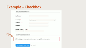
So we have an example of how this looks in practice.
So something that you've probably seen quite often on a, like an e commerce site, you get to the, billing part and instead of having to re enter all of your billing information again, there's a nice little checkbox there that says my shipping information is the same as the billing.
One tick, you're not forcing the user then to have to re enter the same information.
Lovely, this is a pass.
There are a few exceptions to this criteria, so if the user closes a session or navigates away from that task, then this criterion wouldn't apply.
And certain situations like creating a new password, you're often asked to revalidate that, entering it a second time.
That's more of a security scenario and so this criterion is not applicable in that situation.
So what can we do now as designers to meet this?
Review your existing flows and see which areas in the flows are requiring users to submit information.
Are they asked repeatedly for the same information?
If so, can you redesign that flow so that's removed, and that repetition is removed?
If not, have a chat with your devs, about ways to auto populate information that's already been entered.
Like little checkbox, copy and paste, or select.
These are great ways to reduce or remove the repetition, forced on users sometimes that we see.
Next, I've got a pair of criteria.
We have 2.
4.
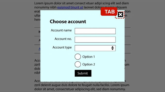
12, focus not obscured, minimum, which is at level AA, which says that sighted keyboard users should always know where they are on a page because the focus indicator is not fully hidden.
At the AAA level, We have focus not obscured enhanced.
You should always know where you are on the page because the focus indicator is never hidden at all.
And so it's just a stricter rule at the AAA level.
Again, this is one where a lot of websites and web products, this would never be a problem in the first place.
But it happens, and that's why there is, in fact, a criteria for it.
This helps anybody who is a sighted keyboard user.
Or anyone who's using switch control, voice input, or anything that's basically not a mouse that you can wiggle and see where your cursor is or where everything is.
People with attention issues who may get interrupted partway through a process and come back and think, where was I up to?
Anyone with memory issues or limited vision that just makes it harder to keep track of where you are in a process.
For a really basic example here, this would be what we are seeing here is two products, one of which has, orange outline focus indicator around the one which is currently receiving keyboard focus.
That focus indicator is partly covered up, as is all of the product stuff, by a little subscription doodah thingy, whatever they call those.
So this would pass because you can see which one of these has the focus, but it would fail at AAA because it is partially covered up.
So the exact same thing, passing double A, failing triple A.
Problem areas that we've seen with this so far is any sticky header and footer content, which is always tricky for accessibility, those GDPR cookie pop ups, non modal dialogues, floating content, sub menus.
Any content that is sitting over other content can potentially be a problem point for this.
I have the most basic example that I could find or build.
I have three buttons on this page, A, B, and C, in different locations.
When you cover it up, button A passes.
Yeah, I had to, I couldn't think of a really good example for why there would be a fixed bit of content in the middle of the page to cover up button B.
So I just pretended.
So button B will fail.
You can't get at that button.
Or if the focus is on it, and there's a focusing indicator around it, how would you know?
You would look away, come back and think, where's my focus?
I don't know.
Button C passes.
Thanks.
At AA level, because the focus indicator would stick out from around there.
However, you can get around this and make everything pass if you make it so that content, the user can get rid of it.
If the user has control over what floating content is present, then you're okay.
If they lose their track of where their focus is, they can get rid of that and go, aha, there it is, it's on button B or button C.
As always, with accessibility, giving users control, is often, the best thing to do.
Let people solve their own problems.
Don't restrict it or try and be paternalistic and decide for people how they ought to interact.
Right now, what you can do to meet 2.
4.
13 on an existing product is a five minute keyboard test.
In a few browsers, just navigate using the tab key.
You should be able to see where your keyboard focus is.
If you find any problems with that, then it's possible you could design a way for it, but scroll padding from, is a nice CSS property that's new and relatively well supported, or is there some way to get rid of and close that floating content?
And you should be fine, theoretically.
Probably.
Oh, sorry, I was just going to say, this is, you'll notice in this, nowhere in any of this does it say that focus indicator has to be easy to see.
Only that it's technically possible to see it.
Which brings us to this criteria.
Enter, focused appearance.
Much contested.
Probably the reason why the delay in publishing the latest WCAG version occurred.
There's been various iterations of this.
But on the positive side, it's a lot simpler now to implement than it was.
Previously, you need a math degree to understand how to implement it, so yeah, good for us.
So 2.
4.
1.
1, AAA requirement, it's, making sure that your users find the focus indicator easy to see.
How do you make something easy to see?
Good contrast, big enough.
Size requirement is for it to be at least as large as a 2 CSS pixel thick perimeter surrounding the component.
And the contrast must be at least 3 to 1 contrast ratio between the unfocused state and the focused state.
I've got some examples of this in practice, so we have the unfocused button there.
The focus indicator is a red outline around the entire component, the entire button.
It's two CSS pixel thick, that's a tick.
For the contrast, that red focus indicator against the white background is 4.
4.
1.
4.
4 to 1 contrast ratio, above the minimum requirement of 3 to 1, so that's a tick.
However, you may notice that red focus indicator is, sitting next to the grey outline of the button.
And so what we recommend, in order to easily pass this criterion, is offset, indicator.
Then you're only having to address one adjacent color, that white background.
So this is the easiest way to implement and pass this criterion.
It's not the only way, but if you're gonna use any other styles such as dashed or inset, the focus indicator, use a gradient or just have a focus indicator on, part of the component, that's fine, but there will, you, there will be a requirement to do some calculations.
So if you love math, knock yourselves out.
I personally don't have to like doing calculations.
So just keep it simple.
What can designers do now to implement this?
So review your components and your design guidelines for your focus states.
Make sure that they're easy to see by, making sure that they're thick enough, at least two CSS pixels thick.
Solid outline around the whole component, and enough contrast between the unfocused and focused states, so at least three to one offset, and then you're only addressing one adjacent color for contrast.
Similar but different, we're now getting into target size minimum.
And this is the one that's related to the criteria that had a name change at the AAA level.
This one sets a minimum target size.
It is at the level AA level, I will never stop saying that, level AA level, interactive elements need to be big enough or far apart enough to be able to easily activate.
And the reason we need this is because some people have low dexterity, they may have a tremor, they may be using a tool that does not actually give them much precision, they might be using, parts of their body that do not have precision, they may have large hands.
I'm, I have a tiny, hands with a tiny pinky finger and even sometimes I'm like this on my phone, trying to tap something.
This criteria is meant to alleviate that problem.
And people using mobile phones in unstable environments, like on a rickety old bus or something, like any kind of like situational kind of thing will, be helpful here.
The way to meet this criteria, we've got a couple of ways.
One is to make sure that the control itself is 24 pixels by 24 pixels minimum.
Another way, if you can't manage that.
Is to increase the distance between the controls.
If you can't get the control itself to be larger, you can then measure from the outside edge, the far outside edge, all the way over to the next outer edge of the next control.
And that can be taken up by control and space.
As always, this is something that is a lot easier to pass if you are designing something from scratch, if you are trying to retrofit this as a solution, it is probably going to be a bit fiddly.
Generally our recommendation anyway is to go with the AAA requirement for this one, which is 44 by, it's either 44 or 48 pixels, but basically because that is actually in line with Google and Apple's human interface guidelines.
And we find that to be a more useful target size, but if you're in a bit of a situation where you are trying to meet these criteria with a product that you can't change too much, these are your options.
There are some exceptions.
If you have a target inside, like it's a text link in the middle of a paragraph, obviously that is not going to work.
If the presentation is essential or legally required as a common WCAG exception.
In this case, I would think something like a map, if you've zoomed out and there's many small targets around, you can't space those out, they must be in the location where they are.
Or, again, this is useful if you are retrofitting your accessibility.
If there is another element on the page that does the same task, and meets the minimum target size, then not all of the controls that do that task, have to meet the same minimum size.
It's not a great lot of exceptions, but it's what we've got to work with.
As always, it's the WCAG we have, not the WCAG we wish we had.
And that brings us to our next AA level requirement, which is dragging movements.
So any dragging movements, should also be able to be done with a single pointer, such as a button.
We did have a slide on what a dragging movement was, totally unnecessary.
We all know what the four steps of a dragging motion is, so anyway.
Who this is particularly geared towards helping is users with, dexterity issues or low dexterity, such as users with tremors.
Users are reliant on head pointers or eye gazing tools to navigate a screen, or using the voice to, navigate.
And then, most people with disabilities who are using, like a touch screen device.
It's particularly helpful, for these types of users.
We've got an example here of a typical loan calculator.
There's a slider which you can increase, used to increase and decrease the amount you'd like to borrow, and the amount of time you'd like to pay it back over.
Sliding motion, dragging motion, but if you notice on the screen, there's also an alternative method.
There are minus and plus buttons, so with one touch, users can actually perform the same functionality as that dragging motion of the slider.
So this is a pass.
Another example is a Kanban board, so you can, drag the, tickets.
I'm just looking at Simon, hoping we have an up to date screen grab.
It looks familiar, and you can drag the, ticket into different columns, so you can drag it over to trash, or fixed, or ready for client.
But there is an alternative way of performing this functionality.
Not necessarily in the same, interface there.
That's not a requirement, as long as there is another way to perform the same functionality.
And in this case, there is.
So if you, go into the ticket itself, there's a column that you can use a little drop down, a single pointer, you can actually change the column that this ticket is in.
So this is another pass.
So what can we do now as designers?
Review your flows.
See if there are any, if there's any dragging functionality within any of your flows.
If there is, there a way to complete that same action without having to drag?
Is there a single pointer alternative?
If not, then provide one, such as a button.
That's how we can meet this now as designers.
So we're getting to our last one, which is the fiddliest and most annoying, in my opinion.
3.
3.
7 Accessible Authentication Minimum.
Again, we have these paired criteria.
So at level AA, we have a minimum.
If authentication, and we're talking, logins or any kind of user authentication, relies on a cognitive test, then you should also provide a non cognitive alternative.
Or allow helper tools to be used.
At the AAA level, our enhanced version, users should be able to authenticate without any cognitive tests at all.
What's a cognitive test?
Remembering information, although things like your name, your username, and your password are not considered memory reliant information, whether or not that's true, I am dubious, but okay, it's got an exception.
I think, everyone would have howled if they'd said, no, that's a cognitive test and everyone's logins would just be completely inaccessible.
Transcribing content, so your version 2 capture where you're trying to copy things or repeat a word.
Doing calculations or math, no one likes doing that anyway.
Solving puzzles like these ones where you have to drag a little thing along or, ridiculous.
No one likes these anyway, but we do need to be secure, it's very important.
Is a CAPTCHA a cognitive test?
Yes, it is.
Version 3 requires identification of objects, which can be culturally dependent, can be dependent on, memory and perception.
Version 2 requires literacy and transcription skills.
But, Captcha is a cognitive test, but Google got an exception for object recognition at level AA.
Your Captchas are safe, which I'm sad about.
I am still annoyed that Google got this exception, but I understand you can't just get rid of everybody's spam blockers in one hit, right?
That, Lord knows what would happen.
It's bad enough with AI as it is.
You can use instead cognitive, non cognitive alternatives if you do have a cognitive test currently.
Standard username password is not considered a cognitive method.
Biometrics, because that's to do with your physicality, not your cognitive issues.
And magic links, this kind of here, you, I've given you a link, it must be yours because I sent it to some place which has been previously authenticated.
Helper tools.
Any kind of, don't disable copy paste support, we see this a lot and we don't know why.
Spammers are not using copy paste to, to infiltrate your website.
They have more sophisticated tools.
Password managers, let people use them.
They're so good, everybody should have one.
Don't make people without, with disabilities go without this tool.
Platform support for two factor authentication, where you have the kind of one where I know iOS does this, you get sent the code, and then it says to you, did you want to paste this in?
And you're like, yes, thank you.
I don't want to have to type that.
Non cognitive.
Difference between our AA and AAA level is pretty much version 3 capture.
Is, it.
There is also an exception for personal content recognition.
I've only come across this once, and I didn't think to grab a screen grab, but I was offered a range of three pictures, and it said which one of these is the user profile picture that you uploaded three days ago.
And so I had to choose off of that.
I do not know enough about security to know if that's actually a good method, but it's allowed at AA, so we'll roll with it.
Generally I feel that this is the criteria of all of them where I think there's going to be a lot of testing the boundaries of what's allowed and what's possible.
This is something where I really genuinely believe that, and I always am in favor of usability testing by people with disabilities.
I think for this one, it's going to be essential.
You really need to check.
Is what we think is going to work, actually going to work?
What if somebody forgets their password?
You can't just fall back to an inaccessible method.
If somebody fails version 3 capture, what's the fallback?
It can't be version 2.
So good luck.
And let us know.
We are really keen to hear from people what your experiences are in implementing this.
We want to know, what are the best practices for this?
We don't know yet.
We are still figuring it out.
And send screen grabs.
Yes, and send us screen grabs.
Take screen grabs of all of your weird cognitive tests.
We love them.
This helps, literally everyone, but people with memory difficulties, people with language or literacy barriers, people with attention difficulties, and people with mobility and motor skill issues.
You are attempting to block spammers and bad actors from your resources, not people with disabilities.
And I think if you keep that in mind as you go through this, trying to implement this criteria, I think that will get you a really long way, is thinking, who am I actually trying to block here?
What you can do now is, oh, you're gonna enjoy this, go through your existing flows that require authentication.
It's gonna be so much fun.
If a cognitive, is a cognitive test required?
If not, if you're just doing a user password kind of thing, okay, great, awesome.
If you do have a couple of tests involved is there an alternative that you can provide people?
Can people use helper tools?
Can they talk to someone to get access?
If not, chat with your security team first.
Check with them and say, look, what is actually going to work for us in this situation?
Because these are the constraints that I have to work with.
See how you go.
And as I said, tell us.
We're so interested to see how this is going to play out.
I make it sound like I think it's bad, I think it's good, but I just don't know at this point in time.
I think it's a little early to tell.
So that's quite a lot to retain, I feel like we've just cognitively dumped everything on you.
So we've created this lovely little quick reference guide for designers, it's a one page guide.
I was going to say, don't take a photo because You can just download it.
And our slides are there as well.
But yeah, thank you so much for listening and we would love to chat.
Many of the new WCAG 2.2 criteria have implications for designers – think graphics, focus states and interaction. Find out what it all means for your work as a designer.
