What’s New in CSS in 2023
Introduction to New CSS Features
Discussion begins with an overview of the speaker's experience with Stack Overflow and leads into a topic about the latest CSS features now supported by all major browsers, highlighting CSS nesting in Firefox.
Container Queries and Media Queries
A deep dive into container queries, their significance for web development, and how they differ from traditional media queries by allowing styles based on parent container properties, significantly benefiting component libraries.
Advancements in Color Spaces and Trigonometric Functions
The speaker discusses new capabilities in CSS for handling wide gamut color spaces, mixing colors, and implementing trigonometric functions directly in CSS for more complex animations and design systems.
Enhancements in Selectors and Styling
Introduction of advanced nth-child selectors, and the newly added support for custom accent colors, enabling better OS integration, along with individual transform properties for more efficient animations.
Dynamic Viewport Units and CSS Layers
Exploration of dynamic viewport units to adapt better to varying device screens, and the utilization of CSS layers for solving specificity issues within applications, especially when integrating UI libraries.
Native CSS Nesting
Details on the now universal support for CSS native nesting, its compatibility with container queries, and how it simplifies writing more maintainable code similar to what developers have been doing with preprocessors.
Partially Supported Features and Future Directions
Covers partially supported features like scoped styles and the ':has' selector, enhancing the power of CSS selectors for complex styling conditions, along with a mention of ':where' and ':is' selectors for readability and specificity control.
Scroll-based Animations and Popovers
Introduction to the possibilities with scroll-based animations in CSS, view transitions, and the advancements that allow for native popovers and tooltips without the need for JavaScript libraries, focusing on ease of use and accessibility.
Modernizing Form Elements and Conclusion
Discussion on the latest in stylizing select menus natively with CSS, moving away from custom components, and concluding with a wrap-up of discussed features and encouragement for developers to explore more.
Additional Resources and Closing Remarks
The speaker provides resources for further learning, announces the posting of slides, promotes their newsletter and podcast, and thanks the audience for their interest in the new CSS features.
Luckily I joined Stack Overflow in 08, so that gave me a little bit of a headstart there.
So yeah, I want to chat to you about, all the new CSS features that we have to play around with now.
I gave a version of this talk earlier in June and.
Since then, Firefox added support for CSS nesting.
So that's available in all major browsers now.
And it feels like the pace of change is amazing.
There's new stuff coming out every, every month.
So what can we actually use today, in all the major browsers.
Safari, Edge, Chrome, and Firefox.
Container queries, so these have been coming for a long time.
I remember actually, Rachel Andrews talk here at Web Directions, ages ago, where she talked about how container queries weren't actually currently possible to do, even though it was a much requested feature, for web developers, but since then there were, refactoring projects of the core browser engines and, things changed and they actually became possible and now we can actually use them, in browsers, which is pretty cool.
As far as media queries, where we're used to, doing queries based on the, page itself, container queries, great for component libraries and stuff like that, where we can actually write queries, based on other, elements.
And you can see here, if you resize, we have these reusable components that, change based on the container.
We've got wide gamut color spaces now.
So color, there's all sorts of new stuff to play around with.
Previously we mainly had, sRGB, which is sometimes referred to as stupid RGB.
And I guess what are color spaces?
You could go into this for ages, but.
Essentially, we want a range of, different colors, that we can, achieve.
And, with sRGB, I guess the possibilities of colors, are much less than some of the other color spaces.
And displays these days, whether it's your phone or your, MacBook, they have really good displays and we can now actually start taking advantage of those great displays by using a variety of different color spaces, in CSS on the web.
You can also mix colors now.
This is very, reminiscent of, doing painting and stuff like that, but you can actually do that in code now if you want to, mix, a bunch of colors together, maybe, for a design system.
So you have a bit of consistency there.
We've got a trig functions in CSS now, so you can do sine, cos, tan, just natively, and, they can be used in a few different, animation, examples.
If this plays, so you can do some really interesting stuff here.
This is a code pen that I found.
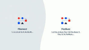
We can use advanced nth child selectors now.
So you can see those examples up there.
So you can do, yeah, interesting, things.
If you've got a, tile.
A collection of elements.
You can have really specific rules for different, different styling of those elements.
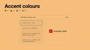
Accent colors.
So now you can actually integrate with the OS a lot more.
Operating system wide, you can customize, colors.
And that's fine when you're in native apps previously, that didn't extend through to actual, web apps.
So now you can actually access that in CSS.
So we can build really nice, UIs that kind of match the operating system preferences.
So that works for check boxes, radio buttons, range sliders, and progress elements.
Individual transform properties.
So this is really useful to not repeat yourself, and especially if you're doing animations and stuff like that.
Previously, you had to combine them all in the one rule, which meant that if you only wanted to change the scale or the rotation, you would have to specify all of them.
And so you'd have to figure out what the values were going to be for all of them.
Whereas now you can just change the actual one that you want to change.
So dynamic viewport units.
So I've now got more ways to, to express that.
I've got these units: SVH, LVH, and you can see examples there of, of what they represent, because we've got so many different devices and, scroll areas and, previously without dynamic viewports, we had to do all sorts of funky guesses and calculations, and then the design would invariably break on some weird device that you're like, do people actually use this device.
And then you had to tweak it, around.
Whereas now, you can have a small viewport height and width, for the, the smallest active viewport size, largest and, dynamic.
CSS layers.
So I've actually used this in production, and it's been, really useful.
I was trying to integrate a design system and, I guess a UI library, and, was running into all sorts of problems with specificity.
But the great thing about CSS layers is that you can actually import, for example, your whole component library and place it on its own layer.
And that way, any of the actual styles that you've got in your application, can have a higher specificity, even if, that UI component library has really specific, selectors in that.
So you can see here.
A graphic of, what you could do as far as different, different layers.
There's a whole hierarchy of how, that's evaluated and, how the important selector, changes that.
And so in the example before that was just a very simple, example where I got one layer, but you can have multiple layers.
You can have layers for your reset.
You can have layers for layout component, and you can kinda figure out how you want, to architect that.
So really flexible options for architecting applications and preventing unwanted style collisions.
Native CSS nesting, we've now got this across all the browsers.
So previously, we might've done it with Saas and post CSS plugins, but now, we can do it natively in browsers, no translation required, pretty similar syntax to what we're used to there.
And it also works with container queries.
So you can see there that we've got a, a container query, within that card rule.
All right.
So now onto a few features that are partially supported.
We've got scoped styles, yeah, preventing, unwanted collisions again, really great to have this natively, as opposed to resorting to, stuff like BEM.
We've got the has selector, and I think this is really exciting because, it gives us all this different flexibility, so here you might have a row in a table that has… or there might be a star element in that row and then you can be like, if that row has a star, then, I want to change the, type style of the title.
But there are so many different combinations that you can use with the :has selector.
So here's an example where you've got a grid layout and you can actually, have different rules for cards that don't have images, and different rules for cards that do.
So in this example, you might want the, the image to have, the card image to span two, grid rows as opposed to one.
And here's another practical example, if you have a button, but then, there's a little SVG icon, in the button, which is a pretty common use case.
You might want to apply different styling rules to the buttons, but only in that case, you don't want to affect cases where, you don't have an icon in the button.
So really powerful when you're building component libraries and you want consistent rules but you've got a lot of different permutations.
Now, has is an unforgiving selector.
That means that if you have, something invalid in there, it will not use the whole rule so you can see, on the above, that's pretty standard.
That doesn't work.
And so likewise, the, below does not work as well.
However, you can use :where to be more forgiving.
So if you wrap it in a where selector, that will work.
And so that leads onto where and is, and these aren't actually new in 2023.
They got introduced in 2021, but, I came across them the other day.
And I thought they were worth mentioning, because :is is a really cool, way of improving readability.
So you can take something like the top that's really long winded and you can condense it into the bottom.
And before I move on to scroll based animations, the cool thing about where as well is the specificity is always zero.
You might have cases where you want to use selectors like the not selector, but the not selector increases specificity and you're like, Oh, it would be a nice looking rule, but now, it's going to override potentially all these other styles, okay, I'll just won't use not, but now you can use where and just wrap it.
And then, you're not going to run into any specifity issues there.
So cool to have in our toolkit.
So scroll based animations in CSS.
So there are so many examples on X and, the example kind of web.dev and whatnot.
So I've included a couple of examples here.
This is an Apple CoverFlow, example, all implemented in pure CSS without any JavaScript.
Think back in the day, you'd have to get a jQuery JS plugin and, heaps of stuff, on the page, whereas this is just native.
And we've all seen these kind of reading progress indicators.
So again, you can now do that natively in CSS, all based on the scroll position.
And people are getting really creative with some of the things they do, so here's an example where as you scroll, the actual figures pop out of the frame and, some alternatives, with these kind of layer based examples here, you can do interesting reverse scrolling layouts, like so.
And view transitions.
So you could cover this in an entire talk.
And luckily there is tomorrow by Phil Nash, at 1215.
Be sure to check that out, and he'll dive deep into that, but here's just a little taste of some of the stuff that, you can do with view transitions, which is really cool.
Initial letter is another one that allows you to, provide interesting kind of typography styling like so.
And popovers.
So previously we had to rely on JavaScript libraries to handle popovers.
I remember when I worked at Qantas, we had a little price graph, to show where the, when the fares were cheaper and it was like, Oh, it'd be really cool to, hover over a bar chart and you'd have this little, pop up tool tip with a bit more information.
And then we're like, Oh, what if they're at the bottom of the page and then they hover over it.
If we always display it below the, bar chart item, then it's not going to appear on the page.
And it's Oh, there's this really cool library that does all this logic.
And so if it's at the bottom of the page, gets the scroll position and the viewport size, and then it puts the tool tip on the top.
And if you hover over at the top, the, pop up comes below.
And if you hover at the bottom of the page, the pop up comes up at the top and, it was doable, but it required libraries and a lot of additional overhead.
So now we're going to be able to have a way of doing this natively with a lot less code, so it's in Chrome, Safari technology preview at the moment.
And there's support for a top layer.
So you don't have to manage Z index.
So when you open a popover or a dialogue, you're promoting that element to a special, special layer.
So you get that for free.
So this, this is great for modals and all of that as well.
You get light dismiss behavior for free.
If you click outside an element, it gets removed.
I remember having to write custom code for this more times than I care to remember.
And default accessibility for, the popover target and the popover itself.
And this means you can also animate display now.
And so here's an example of, of what you can write for a popover.
So we can see here, we've got modals and you can click to dismiss and they've got all that functionality just for free out of the box, no component library required.
Text wrap balance is a way to make blocks of text, appear a bit more aesthetically pleasing and it really only works for, or it's works best for small blocks of text, for example, headings like this, where you've got maybe three lines or something like that.
And so anchor positioning.
So this is what I alluded to earlier, around the tool tip.
So you can now do this, automatically as you've got all these fallbacks here, all that logic that I was talking about, what if it's at the bottom.
What if it's off screen.
So you can just specify those fallbacks in CSS natively.
No JavaScript required.
And finally, Select Menu.
We can now actually custom style select menus.
So here's an example of, all of the variations you can achieve.
And I'm sure designers will come up with some very creative, ways to extend that and push that to the limits.
Which I think we'll all enjoy.
No more custom components, and, spending several sprints on building, building a simple select menu.
And so here's some code of, what that can look like.
And I've only just covered some of the stuff that's there, there's heaps more stuff to dive into.
I put a list of links up here, the developer.chrome blog is always great, they post really great articles there, and web.dev has a lot of stuff as well, and I'll also post the slides, for this later.
So you can refer to that as well.
And yeah, I publish a newsletter and podcast up here at my, website.
So yeah, I'll post the slides up there later.
And yeah, if you want to receive more stuff like that, then feel free to subscribe there.
So that's, that's a taste of what's, new in CSS and, yeah, thank you.
Another year, another tranche of CSS features we can all use!
Discover new CSS properties we can start using today, such as dynamic viewport units, individual transform units, the popover API, and more.