CSS Container Queries: Reshaping the Way We Approach Responsive Web Design
Evolution of Responsive Web Design and Introduction to CSS Container Queries
Trung Vo opens the talk by discussing the evolution of responsive web design and introduces the concept of CSS container queries. He highlights the challenges faced with media queries in component-based architecture.
History of Responsive Web Design
Trung provides a brief history of responsive web design, tracing back to the early days of mobile-specific sites and the introduction of the iPhone, leading to the creation of responsive web design principles.
Personal Background and Contributions
Trung shares his background in the Angular community, his contributions to open-source projects, and his professional work with Ascenda.
Media Queries and Their Limitations
He talks about the widespread use of media queries over the past decade, their limitations, and how they have evolved with Flexbox, Grid, and JavaScript frameworks.
Introduction to CSS Container Queries
Trung introduces CSS container queries, explaining their basic principles and how they differ from media queries in adjusting styles based on container space.
Practical Use Cases and Demonstrations
Several practical use cases and demonstrations are provided, showing how container queries can solve layout challenges that media queries can't.
Technical Aspects of Container Queries
Trung delves into the technical aspects of container queries, including container types, syntax, and their application in modern web design.
Real-world Implementation Examples
Detailed examples of implementing container queries in real-world projects, including a music player interface, are provided to illustrate their practicality and effectiveness.
Browser Support for Container Queries
Discussion on the current state of browser support for CSS container queries and the future potential of these technologies in web development.
Conclusion and Future of Web Design
Trung concludes the talk by reflecting on the rapid changes in web design and development, and the potential for container queries to revolutionize responsive design. He encourages the audience to explore and embrace these new technologies.
After Melbourne and, welcome, thanks for touring this room.
There's, two rooms, thanks for staying in this room.
so today, really happy to be here and, discussing about the evolution of responsive web design and also introducing the exciting concept of CSS container query.
I hope you heard about it, but you, don't, then no worries.
So let's get started with something we all familiar with, and that is media query.
So in the past 10 years, probably you've been using media query to set up some logic so that to adjust the style based on different screen sizes.
For example, you might want to change from a three column grid layout into just a single column grid layout when there's less space, so that it looks good on both desktop and mobile.
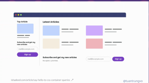
and then in, in today's component based architecture and design system UI component, we're likely to build reusable components.
For example, I have the newsletter here and probably with the architecture, like component based architecture, I just built a single newsletter component and wanted to place it in two places, in the sign out and at the bottom of the page.
And it's if you use media query, possibly you might not be able to do it because it sticks to a single screen size.
And then here, we have two places using the same component.
And then you might come up with, a different variant of the same component.
So that defeats the, benefit of reusability.
And you might want to do, adding classes and then whatever, yeah.
You can make it work, but I'm just saying, there might be a way that, let's say, if this new [???] component can be adapted where it lives, which is the idea.
And we introduced the concept of container query where it is the ability for you to saying, I want my component to restyle itself based on the space available, where it lives.
And in this screenshot, I hope it's clear enough, I hope it's clear enough.
So in the, in the grid, you have a card and then the card is rendering from top to bottom.
And when the user is looking into it from a really wide space, you might want the card to be, not really top to bottom because it's going to be really big.
So it's changing to a landscape kind of layout, and yep, Container Query is gonna help us to do all of that, and we'll look into it today.
So the outline today, we look into a bit, the history of responsive web design.
Because Container Query, in the end, is really simple to use, really.
but then I will give you all of the information you need to know about Container Query, for sure, and then we'll see the browser support for Container Query.
first, I'm the, my name is Trung, as Mark was saying, I'm building some open source projects in the Angular community, that's why, if you are still doing Angular today, maybe you know my name, but if not, then, maybe not.
Ah, then I work for Ascenda, a Singapore based company, and then we simplify loyalty for bank, global, payment and merchant around the world.
And I also organizing the two group of Angular enthusiasts in Vietnam and in Singapore, supported tech in community in the two countries.
And so let's go back to the year 2000, whereas mobile browsing was quite limited because it's just the browser on mobile at that time was, the capability was limited, right?
So that was leading to the development of one of the mobile specific websites like m.facebook.Com.
Or m.youtube.Com.
It's still existing today.
You can try on desktop for sure.
It's still, you can access it.
And then, in 2007, there's a significant milestone.
The iPhone was introduced, and then, because an iPhone has offering the desktop like browsing experience, and also the touch interface was really nice.
So there's a lot more people start to use the phone to browse the web.
Instead of, using the laptop, yeah, instead of using a PC.
But then, even though you see that, it's nice and all, but this kind of zooming in and zooming out and rotating, it's not an ideal.
So that's really crucial to provide optimized and friendly user experience on mobile.
And so in 2010, that is the groundbreaking article named Responsive Web Design from Ethan.
And I guess that's where responsive design was coming out, like the invent of responsive web design.
And it's like outlining the three fundamental principles to build a website like fluid grid, flexible image, and CSS media query.
Interestingly, Ethan was citing John, which is one of the web organiser, web direction organiser, and thanks John [audience applauds] for the early contribution to the web.
And since 2010 until now, there's just so many things happened, there's media query becoming a standard, then Flexbox and Grid was introduction, and then we had the wave of JavaScript component based framework.
And so in 2021, then there's a CSS containment module has been dropping and it is setting the foundation so that all of the container query we are seeing today has met enable.
So I'm not really like into this, containment module because it's really deep.
So we are just talking about CSS container query and it's made available on Valentine's Day this year, 2023 on [???]. So today we look into, some example from a music player, not just another music player.
That's something I built.
There's a signup and there's the main content.
And so we look into, it's getting interesting when I get a GitHub issue from an user saying, the button, the link to my social was wrapping when he is using on a smaller screen because when you're playing music you tend to put it on like half of the screen size So don't put it full screen and then that's how it look ideally on desktop the width is nicely put in and it doesn't have any issue at all It's the width is like six seven six seven six pixel And so the wrapping issue was really happened because I was putting a flex Into the container and I just say flick wrap and wrap basically.
So when there's not enough space, it is gonna wrap into a new line.
Yeah.
Okay.
So we a little bit more, and then it's gonna wrap a little bit more, until it's like covering the media, which we don't want.
That's the code.
Anyone still write angular code at the back?
Okay.
There's some, at least one.
Yeah.
Awesome.
Fantastic . But the, code is gonna be very similar anyway, so it's just a div, right?
I put a div outside of all the links.
So the link is basically, there's an icon and there's a text.
So there's four of them and they're just the deep wrap, all of them just like container.
So just so you know, and we, I like, like I mentioned, I put a flag and then flag wrap.
And the easiest to fix the problem is like just, maybe you introduce the horizontal scroll on the button.
But when I try, it doesn't really work.
I remove the flex wrap, and then I try.
The thing doesn't break, but then it just also doesn't shrink as I wanted.
Because I guess I was, styling the thing, the layout with flex and grow and then with 100 percent and all.
So it doesn't really work, and I just, yeah, I just don't spend enough time to invest.
And so I say, okay, let's do something.
Okay, actually, I try until I was putting a horizontal scroll on the whole thing.
It's not the only one.
And so I, come up with a solution.
Simple, right?
You hide the text when this content is reaching to a certain width, for sure.
And then because you don't have the ability to say, okay, I want to hide the text when my container reach to that width.
So I matching it with a media query.
So I, calculating.
And when the screen is reaching to this width specifically, I hide the text.
I hide the span.
Easy.
The number here doesn't really matter, so you don't have to read it.
And then, at a certain point, even, hiding the text doesn't really work.
It still keeps breaking.
And I decided to hide the whole thing.
Yeah, If the content reaches a certain width, and then the media, I use media query, so I need to calculate the media.
So it's rigged to a certain width.
I just say, okay, hide the whole thing.
Hide the whole button.
Yeah.
So in summary, initially, it looks good on a 1090 pixel viewport.
And then below that, I just hide the text.
And below that, anymore, I'll just hide the whole thing, technically.
Couldn't be more simple.
But Dave said yesterday on the Hive talk.
so the catch number one is I, forgot that, for some user, I might adding more content into this area.
And because I was just has the assumption that, this, until this width, then, just hide the thing.
But now in order to fix it, I need to put the bigger number into the, width.
But then it's like affecting all of the user for sure.
And then for some users, if they don't see the upgrade button, then suddenly we hide the text when there's still enough space, which is not good.
And as catch number two, let's say now that's a really common requirement where you have a resignable signup and then you hide the text up to the point.
And then now you can shrink the signout a little bit, but then the content now, actually, I have enough space to bring back the text.
But once again, because we're targeting the screen size, then nothing is going to change, for sure.
Yeah, you know it.
So we can introduce, resizeObserver, but yeah, we're not going to do it.
for this simple stuff.
So we introduce CSS container query, and really, it's, oh actually, sorry, before I move to the next stuff, I changed some of the slides last night, so yeah, it's not good to change last minute.
But before I get to the next point, I just wanted to introduce, RangeQuery.
sometimes I have really a problem with saying, min-width and max-width, because min-width and max-width is inclusive, so it's including the value we say.
to the next breakpoint, you might need to minus one, or you need to plus one.
And then, now, we have something called RangeQuery, which is really cool.
You just use the size.
It makes things so much easier, really, at least for me.
And so things like min-width and max-width, now you can use the equal sign as well.
So that's really solved the problem.
But it's, it's been stable in 2022, but probably not every single user had upgraded it.
So for sure, if you wanted to use it, let You know, add in the PostCSS plugin, and it will transform it, this kind of syntax, back to the old syntax, and then you still can use it.
But from this moment onward, I just use the sign, so that, I hope it's easier for you, easier for me.
Look into the code again, I'll just say, I put, now it's a, the container query stuff is coming.
I have the container already, I want it to be my container, so I say container-type of inline-size.
That's important.
container-type is really important.
Because when we work with media, there's only one thing.
There's only one screen, one viewport, that's it.
But for container, there could be multiple down up the tree.
So you need to find the div you want it to be a container and you set the container-type.
And then you can start to query it.
So when you use @container to query, you just look for the closest container that you define.
So if the up, div, you don't have it, then just look for the next one.
And so the code is similar.
I'm just still using, span and display none and the whole thing display none.
The number is going to be smaller because now I'm only looking into my div, my container.
That's it.
And so that is the result after I, I chained all of that, so it's a container, that's the thing, and then, I, shrink to the level where the button, the text is disappearing.
And now I shrink the signup again, and then the button is appearing, without ResizeObserver.
So it's really cool, yeah, it's really cool.
So when we're comparing, the syntax of container query and media query, it looks quite similar, really, it's just the same thing.
Just change to to, from @media to @container.
And then inside you have the logic that you have, that you want, and I changed it to the size so I hope it's clearer now, not min-width, max-width.
with just one more step you need to do is to define the, container-type, or just define container.
So that's really, once again, it's two steps.
The first thing you need to do a container-type.
You can optionally give it a name, if you want to, or you can use a container, like a shorthand property.
To do the two thing.
So how is it gonna look?
It's okay, you can do it, can you tie normal, like size in light size and you can give you the name as I want.
So I, okay.
You can give it multiple names.
I haven't found use case for multiple name, but for sure that's, that should be, and then you can use container to, shorten two thing together.
So containers are inline-size, as I mentioned, in 90% of the case, we will think about it as a width.
inline and block is it's relating to a logical property, which is not something I know about, know, I'm not an expert, and I'm not sure I'm qualified to talk about it, but it's relating to, the direction of the text depends on the language and all, so in 90 percent of the case, in English, when we design a website, text flow from the left to right, inline-size, meaning just the width, yeah, think about it this way, easier, and I, left to right, everybody, And container size is more like, it's gonna look into both inlines and block axis, which is both the width and the height.
Yeah, I hope it's clear.
And the container-type normal, it's like by default, but it's not for container size query.
It is for something we call, container style query.
effectively mean, technically you can say, if my parent has a background color wrap, I would do something.
But at the moment, it's really any like initial phase on development.
So you can only query for this like kind a CSS variable and custom probably like that.
Like the theme, you pass it in and then inside you can query it, but now it's available.
Yeah, definitely.
So the second step after you you find the deep, you know what is a container and you just query it and style thing.
So the syntax, you can use, add container and the condition, max-width, min-width, or you can use the size, and then it can, combination of and, or, not, and, or.
Yeah, but most of the time, as we work with media query and we, I think 90 percent of the case we use like media query max-width, min-width.
Rarely we have min-height and max-height, so I suppose, when we do container, we look into the width as well.
That should be the case.
the second use case is going to be a bit more common.
Now I've solved everything, I've solved the problem with the link wrapping and all.
And so now the second problem is the card suddenly it looks too big.
It doesn't break, it looks too big.
and you can see only two cards in, the, window, which is a bit small.
that's how it looks on the desktop when it's properly, rendered.
But, really, when we apply all of the knowledge that we know just now, maybe it's too fast, I learned it for a few hours, a few days, but just now was just 20 minutes, but like, when I pair it with the grid, it works really well.
So the whole grid, come back to say, just say, the whole thing here, I don't use any kind of media query, I just use one single line of code, called grid template column, and repeat with minmax.
And then it's going to shrink and it's going to wrap the thing into the next line if it's need to.
If, I hope you all know about that, it's really helpful.
And so to render the thing, so now I don't need Angular code anymore, I just React, right?
it's just a div of grid and then inside there's just so many cards, that's it.
And if you wanted to know about the difference between auto-fill and auto-fit, it's more like auto-fill is let's say we have a thousand pixel width.
And then you say, okay, repeat min, max, like 200 pixel.
And then you can fit like five, but it's only 24.
It doesn't expand to fit the field, the last available space.
The fit is going to fit all of it in.
Like you have three items and then the width is still like a thousand.
Then this is going to be a bit bigger.
The field is going to be like, stay the same size as you were expecting.
I think it's only for the first row.
So, yeah, don't take my word on that.
So now, like the styling of the card now is a bit different.
So I didn't put the container-type because you think about it, we has the big grid and each card is going to be its own container.
So the code here is only for styling the card.
by default, the character is going to be like display flex, direction of column, which means there's an image, there's a text, and there's a text.
That's it.
And then when things get a bit bigger, I change the direction to row, which means now the image is going to be on the left, then the text, and then I have the flex-basis.
Like 0 0 64 is grow, shrink, and then basis.
So basflex-basis like setting the width for the element that you don't want it to, wrap to the next line or something.
So I just say 64px.
And then I have a new kind of landscape card already.
And for the title, I use something called the container query unit.
So there's a few of them, but yeah, once again, probably we use CQW, stand for container query width.
Probably most of the time, and let's say you have a 300 pixel kind of container, then one CW, CQW is 3px, then 8, CWQ here is like 24, there's more, there's CQH, CQI, CQB.
But then now, after we apply this, new code of CSS, just a few more lines, you can see there's, there's more items can render inside the same window.
Not that the massive one that we see before.
And I was trying a little bit more with, grid auto-fit and auto-fill, and it's worked really well.
So auto-fill once again, because it's gonna expand the whole item to fill the space, so on the first row, I only have two items.
I'm just saying there's only two items, for sure.
And that's like a feature album.
Then the second row, I have three items all the time.
And then come below, there's the grid that I had.
And so it's gonna expand, as you can see.
And then it's using the same component, using the same card component.
I didn't modify anything.
It's just there's certain more CSS inside.
You don't need to introduce a new flag or, a new prop called a feature cap to have this kind of rendering on the first row.
Now, it's just based on the container.
that's how it looks after all, right?
You can shrink it a little bit, and then it's going to adapt, and then it's a bit nicer.
The image is going to be bigger.
And what is really huge, the whole image becoming a background, and yeah, I think that's, there's only four variants, so the default one, then, yeah, then the landscape, yeah.
I show you the code.
Talk too much.
So the card, as I show you guys, there's a display flag, and in Angular we have something we call, it's add hot, it's we render a proper thing into DOM, so I just say, that's a container, okay, I don't have the mouse here, so it's a bit tricky, is it like this?
Sorry, I forgot to enable, so this Just set a container on the host.
It's gonna, making each card a container, and then go down a little bit.
So that is for WDC 2023, yeah?
And then, by default, I have the card, and just, I still use min-width and max-width.
but then, if the width is bigger, then I set the cover a little bit bigger, as you can see.
Zoom in a bit.
And then, when the min-width is, really huge, then I say the card cover now is taking the whole screen.
Quite easy, So yeah, that's a whole, code for, making this really nice and all, component that can adapt to its own width.
Really nice.
Oh yeah, just now I show you.
The other thing is like when we're putting all of them together, you have this thing.
And if go into the website, the link is here, you need to authenticate with your Spotify.
I promise I don't do anything with your data.
It just needs to render into the UI.
For sure.
And then you can click into the WDC 2023 here, the link here.
And, I'm playing Taylor Swift.
Yeah, and all of that just to highlight all of the code here using the same component.
There's no modification.
Just there's a CSS bit to change it.
And then it's rendered into the grid.
And if I shrink it a little bit.
And I shrink it to, until the point where it's really small, a little bit more, more.
So all of them is going to look the same.
Yeah, just no different.
The same component, anyway, and you can see here the link on the top kind of working as we're expecting, yeah?
Okay, in optimal.
there's a lot more, really, there's a lot more use case, but CSS container query is really just something new, so there might not be, all of the possibilities we think of, but there's a few more.
From Ahmed, Yeah, from Ahmed, there's a collection here.
Yeah, so there's play button, there's a pagination, which is cool, there's the article, the card.
All of that looks really cool.
So you can take a look and see how, Container Query can really help on the day to day work.
We move to the browser support.
And as I mentioned, Container Query has been supporting since Firefox, 1.
10, 1.
110.
Since the, Valentine's Day, so it's quite sweet, the, rest of the things, see, there's a lot of check means we're supporting, since February this year, you can start to use container query everywhere, but it's just that we need to, give the browser, the user some time to upgrade their browser, and it might not be the case, could be six months, could be a year, It could be a bit longer, but then if you just couldn't wait, then you can use something like polyfill.
So the web has been, changing so much.
Like I think in 1991 you do, yeah, that's HTML.
And then you style thing next to it, you don't have CS at all.
You do attribute to style thing.
And then gradually we have CSS so that you can start to, know, [???] your code into CSS and it's gonna be reused at all.
And we are here in 2023.
And really, I think 2023 is really exciting for me.
maybe for you guys as well, but yeah, just saying for me, because I don't have a long career on the web development, but like for 10 years, seeing there's so much change, I do converting table into, like float with CSS.
There's a lot of side projects when I was in high school, I don't know, university, for 30 bucks each project.
So seeing all of this possible, has other than, CSSFlag and Grid, we have clamp, which is really cool.
:has is going to be rolled out really soon.
Then style query is coming.
Next thing is like something we wanted to have from SCSS for too long.
Now you should have it really quickly.
And so really, once again, container query, two step, you find a container, you find it, then you query it.
It's pretty simple.
This new feature really can embrace not just engineer.
I guess it's going to embrace like designer as well when they design the component.
It's not going to be redesigned for pre defined viewport anymore.
It could be just pre designed component so that it can be flexible and adapt to its own width.
And, I just couldn't remember how many times I have been pushing a lot of requirements from designer team saying, oh, if we do it with JavaScript, then it's going to be slow.
Our app is going to be slow.
We don't want it.
But now I think we have the right tool for it.
So with that, thanks so much.
The slide you can find here in the link and you can scan the QR code.
So maybe you can keep this slide for a few seconds.
Thank you.
Thanks so much.
Thank you.
The rise of component-based architecture has brought new challenges to web developers, including the need for more granular control over layouts within individual components. While media queries have been a cornerstone of responsive web design for over a decade, they fall short when it comes to solving layout issues at the component level. Enter CSS container queries, a new tool that allows developers to style components based on their available space within a containing element. With container queries, we can use the same component everywhere, but it’s restyling itself to fit best within the UI where it lives.
In this talk, we will explore the capabilities of container queries and how they can be used to achieve complex layouts without the need for heavy scripting or ResizeObserver hacks. We will cover the different container types, including inline-size and size, and showcase real-world examples of container queries in action with flexbox and grid.