Baking Accessibility into Your Design System

Introduction
Simon, an accessibility design manager at Atlassian, introduces himself and shares his personal connection to accessibility due to his own non-visible disabilities. He emphasizes the importance of accessibility by highlighting the significant number of Australians and people globally who identify as having a disability.
The Importance of Accessible Experiences
Simon explains how accessible experiences benefit not only people with permanent disabilities but also those with temporary or situational limitations. He argues that accessibility should be an integral part of the design process, comparing it to an essential ingredient in a cake.
Atlassian's Design System and Team Structure
Simon outlines the structure of Atlassian's design system team, which consists of four mission-driven teams focusing on UI foundations, maker experience, and accessibility. He emphasizes the importance of a dedicated team or individual responsible for driving accessibility initiatives.
Education and Awareness
Simon discusses the importance of educating the team about accessibility through training, sharing personal stories of customers with disabilities, and conducting empathy sessions. He also highlights the significance of understanding WCAG guidelines and emphasizes that continuous learning is crucial in the field of accessibility.
Conducting an Audit
Simon explains how Atlassian conducted an audit of their design system to evaluate its current accessibility level and identify areas for improvement. He suggests various starting points for an audit, including reviewing tab order, testing with a screen reader, and assessing color contrast. He recommends choosing an audit scale that aligns with the team's capacity and priorities.
Focusing on Foundations
Simon emphasizes the significance of establishing strong foundations in the design system to achieve accessibility at scale. He outlines the key aspects of flexibility, scalability, and maintainability for foundation elements. He also highlights the role of design tokens or primitives in delivering accessibility benefits to product teams.
Color System
Simon explains how Atlassian revamped their color system to meet WCAG guidelines, ensuring color contrast compliance and providing flexibility for themes like dark mode. He provides a specific example of addressing color contrast issues in actionable elements while maintaining visual consistency.
Spacing System
Simon discusses Atlassian's spacing system built on an 8-pixel base unit. He highlights how consistent spacing improves readability, touch target size, and responsive design, contributing to a more accessible experience.
Engineering Foundations
Simon touches upon the engineering team's focus on addressing accessibility within components, emphasizing the importance of early detection of accessibility issues. He highlights the adoption of automation tools and procedures, including linting tools, accessibility insights plugin, and a custom pipeline tool called MiloBot.
Documentation and Design Annotations
Simon emphasizes the importance of clear and accessible documentation. He discusses the development of design annotations to guide makers on accessibility considerations, encouraging early identification of accessibility requirements and fostering better design decisions.
Key Takeaways
Simon reiterates that accessibility must be considered in every step of the design system development process. He emphasizes the empowering role of foundations, code practices, and documentation in enabling product teams to make informed accessibility decisions. He encourages starting small and celebrating any accessibility improvements achieved.
Future Plans
Simon shares Atlassian's future plans for their accessibility journey, including collaborating with foundation teams, enhancing component accessibility, improving testing processes, refining accessibility documentation, and enriching design annotations.
Acknowledgments and Conclusion
Simon expresses gratitude to the design system team and emphasizes the collective effort in driving accessibility initiatives. He concludes by reminding listeners that even small improvements contribute to building a more inclusive and accessible digital world for all.
Awesome, thanks Jess.
Hi everyone, I'm excited to be here.
I'm Simon, my pronouns are he, him, and I'm an accessibility design manager at Atlassian and I'm fortunate enough to work with some awesome people that make up our Atlassian design system team.
For me, accessibility has always been one of those areas, within my design career that I've found deep value within, both within the impact that it can provide to people, but obviously also the learning opportunities that it provides to teams as well.
I myself, I have non visible disabilities of ADHD and dyslexia.
I frequently, face some cognitive challenges, when, working with particular products and services as well.
And so when building those solutions, and solving problems with our team, I do draw on my own experiences, but I also draw on those within my, personal circles, my family, my, my friends, colleagues, and also all of the customers that I've been fortunate enough to speak with at various companies over the years and remembering their stories and their challenges that they face when interacting with all of the tools that we build on a daily basis.
The thing is, I also know that I'm not alone.
When we look at this number, there's around, 20 percent of Australians who identify as a person with a disability in our own backyard.
So that's around one in six people.
And this study indicates that number is only going to grow over time, especially with many factors including one being our ever aging population as well.
And I know that if any of us were in a team priority planning session, a customer segment base of 20 percent would not get ignored.
When we zoom out, and look globally, that number jumps to up around, 1 billion people worldwide, which is around 15 percent of the worldwide population.
And this study really emphasizes this example that if that was market, if that was a market share, it would be the size of the United States, Brazil, Pakistan, and Indonesia combined.
Collectively, those individuals have around about 13, as consumers, 13 trillion Australian dollars, available.
And when we then, start to even look at this a bit broader, this doesn't even count everyone that can benefit from accessible experiences as well.
When we start, looking at the split between, permanent, temporary, and situational, disabilities, accessible experiences can have you know, multiple improvements to many people that are using our tools.
And so why do we find ourselves or our customers working with less than ideal solutions?
And often that's because accessibility is treated as this separate piece.
Different to, our main sort of delivery lines.
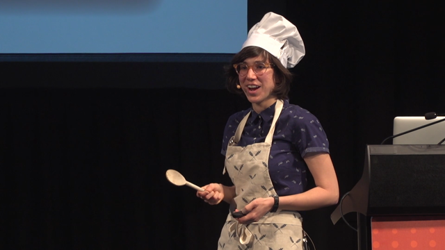
And so if a product or a service was a delicious cake like this one, and accessibility was that egg that you would mix in, within that cake, you wouldn't just drop.
You would not put an egg on top of that cake of a finished product.
You would purposely bake it in, from the start.
Mix it in.
And Brad Frost, the author of Atomic Design, and he once referred to as a design system as a multifaceted layer cake.
And just like Brad, I love a good food analogy.
I want to invite you along to get baking together today, and along the way I'm going to share some baking tips with you as well.
If you haven't baked a cake before, the, way to make a layer cake, it's all about having the right ingredients, okay?
Having them ready at the right time, getting those measurements perfect.
Monitoring the temperatures, and, removing any of those unexpected sort of layered domes that you may experience as well.
And obviously not skipping any steps within your recipe.
And each layer of that cake is made separately.
Some, it might be a sponge, some parts maybe the cream that you're mixing in, and it comes together as a beautiful, delicious experience.
Much like your design system as well, it can be a delicious experience.
So each layer is an individual piece of the design system and that is built to, be maintained separately.
But, when we say it comes together as a cohesive whole.
And this can be anything from the people in your team, the foundations of your color system, typography, spacing, your guidance, just to be able to name a few.
Very sisimilar.
Solid, designed accessibility, program is like a layer cake as well.
It's built from the, bottom up.
A simple way of looking at this is, the, bottom being your platform teams, and then above that would be all of your product teams and across multiple layers, and then building up to the customer.
And it's with that similar focus of, People, tools, scalable solutions.
It allows for accessibility to work so naturally within a design system approach of focusing on, baking in those foundations.
So we know that our design system, Atlassian, plays a key role in being able to help us achieve our accessibility goals.
Design system brings, design and engineering improvements at scale.
And we believe that it's able to do the same, in providing accessibility improvements at scale as well.
So what does our design system, look like?
So to give you context, our Atlassian design system team, we support over 18 products.
We have around 4,000 designers and front end developers, to service and over 30,000 app vendors who deliver, custom value to, millions of end customers, globally.
And We wouldn't be able to service this without our team.
And our first step into baking accessibility into our design system, it was really looking at our team structure.
So we are made up of four mission driven teams.
Two teams focus on our UI foundations, so things of color, spacing, typography.
And this allows us, those team members to go deep into those foundation solutions.
One team is focused on what we refer to as our maker experience.
So our makers are our designers, content designers, engineers, within our product teams.
And we view our design system as a product.
And so this team specifically takes a service design approach in how we can evolve our design offering, internally to those makers.
And, then finally we have a team focused on accessibility.
And this is the team that I sit within, alongside with our product managers, our product manager, engineering and design team members as well.
And while accessibility is the responsibility of everyone across our design system team, our team is specifically focused on building out the foundations.
So in design, content and engineering.
With the aim to be able to help our entire design system team and other platform and product teams, across Atlassian.
And so having those four focused, specific missions has really empowered our teams, to have higher autonomy as well.
But then also, within that time we've, also seen, a noticeable increase in the impact that we're able to provide, across Atlassian.
So first baking tip for today, your team structure will be something that you need to, make sure that it reflects, and supports the goals of your business.
So no matter the size of your team.
Ensure that a portion of your team, an individual, someone is empowered and has the ability to focus on critical areas like accessibility.
Next step for us was around, focusing on education and awareness of accessibility as we started to bake it in.
Getting that shared understanding, of our people and identifying where, there were those knowledge gaps that existed within the team, but then also looking at the flip side of the individuals who had previous experience to be able to, share that, broader.
This first looked at, training formats, for us, both across, design and engineering.
Either focusing on the, fundamentals of accessibility, exposing our team to some personal stories, with our customers and how they navigate, through our products with various assistive technologies, et cetera.
And also running empathy sessions where we would have team members using AT and, them working through our products or within our components as well.
Added to this, there were more craft specific training sessions, so across design, engineering, and content.
So for example, we ran sessions, that focused on inclusive design principles, usability testing, and more as well.
And our view is that this is no different, to the required security or privacy training that we have team members do.
Those topics aim to have team members operate effectively and reduce risks, so accessibility training, in our eyes, should be treated no differently.
Now, with understanding guidelines, this was the next area that we, focused on.
And so getting familiar with WCAG was, a must with us and personally I find, the WCAG's quick reference guide is a great way, especially when you're getting started, to help with any, reviews or audits that you may be, conducting, but then also it's a great way to just remind yourself that as you and your team are learning, discuss those learnings openly, to create that conversation.
And so with any of the training or guidelines, nobody expects us to be experts from day one and to be able to recite everything.
And so I personally, remember like when I first started working, and focusing on accessibility within design years ago, it was daunting and at times it still is daunting.
But like with anything, we're just reminding our team and ourselves that we're always learning, and each step forward, no matter how small that is an improvement.
With a well informed team, our next sort of logical step was conducting an audit.
And an audit of our design system allowed us to evaluate the current accessibility level.
And it also helped us gain that scope for our improvements as well.
So when we started our audit, it gave us a way of obviously finding, log issues.
Sorry, it allowed us to find issues and start to log those and start to make those improvements to our current state.
And this gave us that baseline, this was our way of working towards resolving these, and we could base those on different priorities or crafts as well.
And the approach to an audit can vary.
I know some previous talks have touched on, their approaches as well, and ours was really no different.
So this could have been us starting at looking just through our initial, design files, areas of development, or even our documentation.
And so our initial audit, this included a mix of both, manual and automated testing for our components, while also utilizing some of our QA testers as well to be able to assist with, any accessibility improvements, that they would notice.
And so it was that thought of leaning of team, leaning on people outside of our own team to be able to help us through that audit process.
And there's a number of, examples, starting points for you if you were to look at, conducting that audit yourself.
Looking through your tab order, testing with the screen reader, or reviewing your colour contrast, within your system.
When testing, for your tab order, some common questions that you should be asking yourself is, tab through that experience, and your components, and does it expect, does it behave as expected?
Can your user, tab through that experience in the same way that a sighted user using a, mouse, or track pad, could as well.
Are there skip links that are appearing?
Are the focus states are there, if the screen resizes down, are there, is there suddenly hidden content for the user to, navigate through and looking for that offscreen content as well?
Using a screen reader.
This was actually a really good time for us to run those empathy sessions and include team members within getting comfortable with, navigating and using a screen reader for the first time for some of them.
And as you're going through that process, asking yourself those questions of, are the instructions clear?
Can you use the screen reader to navigate your product?
Is there appropriate alt text that is appearing on your images or your icons?
Are there custom controls being used?
And if they are, can I interact with those, while I'm using the screen reader as well?
These are just, some of the, high level questions.
And then to look at supporting users with low vision, look at reviewing your color contrast as well.
And so this looks at examining, the contrast between the foreground and background colors, meeting, making sure that it meets the appropriate, accessibility standards that your business is aiming for.
And, you can do this with a number of different plugins within your browser, the Axe Extension or Accessibility Insights, or if you're in Figma, Stark is a great plugin to, to be able to utilize as well.
And at the same time, this is also then looking at your readability, between your, text and visual elements, to make sure that they're, meeting the appropriate compliance standards.
When, another baking tip, a recommendation when you're looking at your audit, you decide on the scale, how much and what works for your team amongst your other sort of priorities.
So this could be you focusing on a single component and taking that through the whole audit process, related components or your form fields, for example, and just focusing on that, components by theme, or you could decide to do the whole library as well.
An audit will take some time, and picking a path that works, for you and your team is just really a sensible sort of direction forward.
Remember it's about just making those small accessibility improvements rather than trying to wait for that perfect time to be able to do everything if it doesn't suit.
For us, the next sort of, phase after team and education and audit done was really focusing on our foundations.
Across our design system, our focus, has been on establishing our strong foundations.
And this is beyond accessibility, but the foundations play a key role in helping us achieve, that scale of accessibility.
We're currently on a multi year journey of hardening our foundations and there's a huge amount of value that can be unlocked from, those, foundations, features like dark mode, improvements to our responsive design, and of course, accessibility, benefits as well.
And the foundations are really just that first step of many of helping us build towards, important features that we aim to offer.
And so as a design system, we are building for such a large product suite.
Whether this be foundations of our color system, or components, even just like a text field, we need to make sure that they're flexible, scalable, and maintainable.
For flexibility, we need to make sure that this is working with the likes of Confluence, Jira, and Trello, and beyond.
All very different products, all unique experiences.
All have, different accessibility requirements for users.
With scalability across our products, there's always new experiences being designed, and created by our makers and potentially new products, coming into the product suite as we continue to grow.
And finally, our design system team, needs to be able to support those makers and in a timely and effective manner as well.
They, that they can continue to deliver effectively.
And so with each foundation, we look at each of these as a mini subsystem.
So these are, interconnected, with purpose and, function of each of our foundations as a whole.
And so see these as the ingredients of your cake.
And so with each of those foundations, accessibility is carefully considered from all the crafts that are involved in building those out, giving those benefits, to our product teams and they're delivered through, our use of design tokens or primitives.
And so with the concept of foundations in mind, I'd like to just talk through, some high level of examples of, where we focused, to be able to support some of our accessibility goals.
And, we'll start off with color.
Around this time last year, we launched a revisited color system, that adheres to appropriate WCAG guidelines for us.
And so this was a very thoughtful and complex sort of exploration from one of our foundation teams, taking into consideration, our product team needs, and balancing that with, cohesion that we need to land on, across multiple products and making sure that we can provide that confidence in how we address, color contrast.
And so with our refreshed palette, we've been able to ensure confidently, that we're meeting with CAG AA, standards, within different contrast ratio.
Now, the other area that this has provided some benefits for us is around the flexibility.
So this has enabled us to, launch different themes like, light and dark mode.
But additionally, as we've gone through testing with end customers, we've been able to have that confidence that we've addressed a number of our issues as well as being able to, provide solutions for photophobia and other color blindness as well.
And so with this color foundation, work, it gives us our makers that confidence, whether they're in Figma or within code, that the colors that they're working with meet the desired guidelines across the business.
But, more importantly, they're providing more accessible products for our end customers.
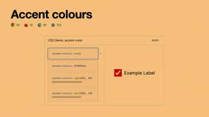
So an example of, a colour contrast issue that we noticed from our initial audit, it was identified that actionable elements, things like text inputs, radio buttons and check boxes were not meeting the correct three to one colour contrast against their backgrounds.
And so within our, explorations, we didn't just focus on addressing, the issues within the audit, but we also needed to take into consideration how we balance those improvements, within our current visual language of our products as well.
So on the left, you can see that, the original state of our input fields, they have a two pixel border, and the contrast we only had was a one to three, ratio, which obviously wasn't suitable.
And we switched our color, to be of a high contrast, and darker against the white background and similar, for dark mode as well.
However, when we started taking this into some of our product screens, it did feel that it was, distracting at certain situations and finding that balance of, addressing an accessibility requirement while also maintaining our visual standards for, products as well.
And so we, explored this by simply just, decreasing our border to be one pixel.
So it's still meeting that color contrast requirement, but we've also been able to address the design concerns that we encountered as we were, working with our different product teams.
And this might seem like a very straightforward, example, but, many factors were needed to be taken into this solution.
The improvements were able to be shipped through our color system, through our design tokens, and it's from these foundations that allowed us to ship a very simple accessibility improvement at scale.
Another foundation we focused on is around our spacing.
Building off a 8 pixel base unit and, The main foundation of our spacing system has been our spacing scale as well.
The scale is limited to a set of values, that can be used, to layout UI elements, in a consistent way, while also making sure that we can create a harmonious and accessible experience for our customers, while also providing, Improvements for our internal makers.
And as a foundation, our spacing tokens, these reduce, a number, of inconsistencies, of spacing that exists, between elements on a page layout.
Giving our makers more time, to focus on more complex areas, within their design work as well.
And so the foundation also then helps us unlock improvements to our responsive and reflow experiences across our product suite.
So the proper spacing has allowed us to maintain readability, interact with element separation or selection, so touch points for example, as well as then providing that consistent user experience across different screen sizes as well.
And shifting gears, there were a few areas, of focus for our engineering team, as well when it came to baking in accessibility.
Obviously one was, addressing component improvements, related to accessibility, including semantics, ARIA and role attributes, focus management, keyboard navigation, and, much, much more.
However, there was also a focus on other foundations, because we know that it's extremely costly and time consuming for accessibility issues to be discovered further down the delivery lifecycle.
So for us and the team, our Eng team put a real focus on education, tooling, and procedures.
And one focus has been on automation.
Wanting to shift away from that mindset that this is the final validation, whether something is accessible or not.
And I love that our team refers to this as education over automation.
Teach a person to fish, right?
So automated testing, tools don't necessarily always guarantee accessibility.
They don't test for all functionality.
Not everything's going to be caught while using them.
For example, there may be, keyboard interactions that don't get picked up.
So it just doesn't mean don't use them.
It just means that it's, a complementary effort, from your team as well.
And it's that point there that, we really focused on.
One.
No one tool is going to be able to cover all of our needs and all our, and all tools are not necessarily going to be able to capture every, accessibility issue.
And to touch on, some of the foundations, when we were talking code, the first one, being that we, look to improve, linting tools.
These were, put in place to be able to capture code quality standards, and, as everything progresses through our CI pipeline.
Additionally, we saw the adoption of, an accessibility Insights browser plugin, across our engineering community to be able to help with, explorations and, that knowledge sharing.
And, finally, the team also focused on, improving our procedures and, how code works through the system, really focusing on, how we operate as a system.
And, so the, team looked at building, an internal pipeline tool, it's called MiloBot, it's named after one of our team members, and this has been added, to, our Bitbucket and, this will perform a static analysis, on updated code, and look to, detect any potential impacts to accessibility.
So it's slightly different to a linting tool.
Its main purpose is that it will, what it will look to do is flag an update and suggest for an accessibility review from a human, whether that's someone within the team, QA testing, whatever that may be, just to ensure that we've got those accessibility, we're not introducing any more accessibility problems into our main code base.
As we've gone through, we've also made sure that we've, begun, working on our design system foundations and components to our documentation as well.
We're wanting to make sure that, we improve our overall documentation on our decisions and guidance as well.
This is looking at, whether this is part of, a particular component or our overall guidance.
And this was picked up on a separate audit that we conducted, on Atlassian dot design.
And we're working towards, revised documentation there as well.
Oh, there we go.
And a final foundation, to touch on has been around, experience.
We know that our design system should be able to provide the best possible maker experience, for those that are consuming and working within the system.
And so this is how, how people come to us for accessibility support, how we're evolving our design tokens, or even establishing an annotations library to be able to assist with that exploration of, design, to dev handoff.
And design annotations, are crucial, into accessibility.
They ensure that all users, including those with disabilities can, effectively access and understand and engage with, the content that our makers are creating.
And additionally, they've also been able to encourage a lot of our makers to question their design decisions, earlier in the process, highlighting accessibility requirements sooner than later.
Just a few months ago, we built out our own library, and launched this to a pilot group of makers, internally, to be able to help with that education, uplift across design.
And.
For longer term, the view that we're having for this is having that information integrated within our components within Figma, bridging that gap as much as we can, between product and content designers and being able to, understand those accessibility experiences.
And there was a great, presentation from Sam from the Intopia team yesterday on, annotations, which I highly recommend.
As you can see, as a very quick sort of snapshot of these foundations, this is where accessibility can be considered with every single step.
And it's a must have for us within our team as we're shifting everything across.
It's just not the responsibility of us within the accessibility team.
We're happy there to be able to provide guidance, but we understand it's a group of bakers in a kitchen working together.
Our team's had, some great success within the last 12 months, building out these foundations, it's allowed us to address a number of critical issues, both for our teams and to, and customers as well.
And so through, through that process of, education and audits and team structure and foundations, we've been able to provide that confidence for our makers as they're making decisions.
Now, there was also a lot of things that I, touched on very highly, very quickly, sorry.
I wanted to make mention of, our broader team have delivered fantastic, presentations over the years that went into, a lot more detail, that I've been able to touch on, both from design and engineering, and so these could be everything from our design system vision, establishing our color system, implementation of design tokens, and primitives, et cetera as well.
So scan the QR code, take a photo, and, watch those, at your leisure.
Now, it's important to remember just because you have, your design system ends up being accessible, doesn't mean that your products are going to be accessible.
How those pieces are put together, that responsibility does sit outside of the design team's responsibility.
But your foundations, your code practices, your documentation, these all empower those teams to be able to make well informed decisions.
And there's a lot that I've covered scratching the surface there.
The important thing, please just start small.
Any improvements that you can make within your design system, any learning opportunities that you can have, are going to allow for more accessible experiences for all.
The future for our, accessibility journey, we're focusing on working with our foundations teams, building on some of those, we're focusing on typography at the moment, within the accessibility team, we're working towards enhancing the accessibility of our components, focusing on some priority components as well, we're also looking at improving our overall automated and manual testing, streamlining, development processes.
Improvements of our accessibility documentation and enhancing our design annotations as we see that is a key for the design community.
And all of this is, working out, helping us work together to get to our goal of making sure that we can deliver high quality and accessible solutions for all customers.
You'll be able to, stay on top of all our updates at alassian dot design as we start shipping those out.
And finally, I just wanted to say a massive thank you to the people that I get to work with every single day as part of our design system team.
It's an absolute privilege to work with such passionate and knowledgeable people who, build with their hearts and, aim to, improve our system, and obviously aim to, improve our products and improve the experiences for all of our customers.
Thank you and happy baking.
Building accessibility into design systems from the beginning is crucial but often seen as too complicated.
Within this session, we’ll explore methods with design, tooling, and user research to show how you can build an inclusive design system from the beginning.