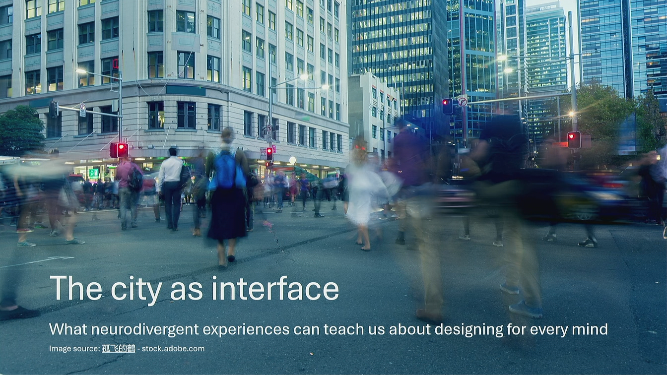
The city as interface: What neurodivergent experiences can teach us about designing for every mind
The hidden cost of catching a train
Fatemeh Aminpour opens with a train journey complicated by scrolling departure boards, unclear announcements, time pressure and nowhere to rest. She shows how these demands can prevent neurodivergent people from travelling at all, excluding them from activities beyond the station.
Neurodivergent experiences reveal design assumptions
Aminpour compares neurodivergent users to indicator species whose experiences reveal problems in the wider environment. She introduces a study in which 15 neurodivergent adults led walking tours through meaningful places in Sydney, showing researchers what supported or hindered their participation.
Give people the next step, not the whole map
Participants describe the difficulty of remembering routes, interpreting abstract maps and distinguishing similar buildings. Aminpour connects their preference for landmarks and continuous guidance to digital onboarding: provide the next action where people need it instead of expecting them to remember an entire journey.
When moving through a space demands constant vigilance
Crowds, delivery bikes, sudden bells and bright lights turn a Devonshire Street footpath into a sequence of unpredictable encounters. Aminpour explains how constant vigilance consumes energy intended for the destination, then asks participants to identify where their own products demand similar attention.
Consistency and maintenance are accessibility work
Uneven paving and slippery surfaces require some participants to manage balance consciously, drawing further on limited attention. Aminpour describes an injury involving displaced tactile indicators and argues that accessibility depends on maintaining consistent conditions over time.
Sensory load accumulates across the whole journey
Aminpour uses the Devonshire Street Tunnel to show how layered noise, flickering light, heat and enclosure compound earlier demands. She urges designers to assess cognitive load across the whole experience, including what users already carry when they reach an otherwise clear screen or form.
Regulatory landscapes: Design places to recover
Participants reveal sophisticated strategies for finding calmer routes, sheltered parks and places to rest, which the study calls regulatory landscapes. Aminpour argues that reducing demands must go hand in hand with providing recovery resources, including digital flows that preserve progress and offer calm routes back from mistakes. She invites the audience to identify where their designs offer the equivalent of a bench.
Build predictability, sensory clarity and recovery into the structure
Aminpour challenges the assumption that users arrive fresh, focused and ready to complete a perfect happy path. She identifies predictability, sensory clarity and recovery as foundational design properties that benefit both neurodivergent and neurotypical people. These qualities require early structural decisions, alongside the essential checks performed in accessibility audits.
Three questions for designing for every mind
Aminpour closes by asking designers to examine the demands they impose, the recovery resources they provide and the decisions they can make from the beginning. She returns to the city metaphor to show how interfaces can support participation or quietly turn people away.
Okay. Good morning, everyone. It's my pleasure being here today. So today, I would like you I would like to go through this report that Steve was actually referring to and see how it translates to US design. And you let me know how actually it translates.
I want to start with a train trip. You know, you're catching a train from central, somewhere new, and you don't have your phone with you, it's dead. It happens to a lot of us usually. And, you know, you know your station, but sorry, your train stopped but you don't really know the platform.
And you are supposed to find the tram the platform from a Pancove scrolling screen there. They are all organized based on the three line the yeah, the train lines and you don't have your phone with you, so you can't actually know which train line is that.
So just say that you found the platform, you ask from somebody in transport information, and you know, you work it out. You get to the platform, but you're not done yet. Because this platform sends trains to several different destinations.
So you're back to the scrolling screen. And guess what? There has been track work you didn't know about. And this is a real quote from someone in our study. The announcement about it was not intelligible to anyone. So a train pulls in, and is it yours?
You know, you only have one minute to figure out that is, you know, if it's your train. And if you lose this one, the next one, you know, doesn't necessarily go to your station, and you lose around twenty minutes, you and you don't have that energy to spare. You're exhausted and there is nowhere to sit.
And even if it's your train and you can't figure it out in one minute, there is no quiet carriage on this train. And we all know what that means. Now, most of us have had a version of a back trip like this, you know, a frustrating day on the network. But for Norwegian people that I work with, this is not just a bad day. This is why they didn't go in the first place. Because they decided that this trip wasn't worth the cost.
So they stayed at home and missed the thing that they were traveling towards. I'm interested in that cost, you know, a kind of cost that you can't really see. So this is not a wheelchair, this is you can't see a cane, you can't see crutches. It's all happening in the mind of the person. And when you see a meltdown, the emotions, it's just too late.
So I would like to argue today that the CT is an interface, and like any other interfaces, they are designed by neurotypical people. We assume that it works like the same way for everyone. But right now, for a lot of neurodivergent users, it's not working. There is a concept in ecology called indicator species, An organism whose condition tells you something about the health of the whole system.
You know, they are more sensitive to the environment. So if they are struggling, there is something wrong going on with the system. Not with them. So, you know, they are not the problem, they are just a signal. I want to suggest that neurodivergent people function the same way in a design environment. You know, they experience acutely the cost that poor design imposes on everyone, but just at a high intensity.
When space is cognitively overwhelming, you know, it's unpredictable, it offers no way to rest, They hit the the wall first and the hardest, but the wall is there for everyone. You have you have probably designed for edge cases, you know, the one with the slow Internet, the one with smaller screen, the one who doesn't read instruction.
So what we we tend to call age cases are those users whose need make the systems assumptions more visible. Neurodivergent people do the same for cognitive and sensory design. So when when we are designing for them, are actually designing for a whole for a whole range of how human minds work.
We are not just designing for a minority. Okay. And there are a lot of them. Current estimates suggest around one in five people are neurodivergent. And the number is growing, not because something is going wrong with us, it's just because we are finally getting better at something that has been always there.
And this means in Greater Sydney, we have around one million neurodivergent people. Okay. So I'll just give you a brief overview of what we did in this study and then I'll go through the findings. We wanted to know what neurodivergent adults were managing the CT, how they managed the CT in real time, in real places.
So we asked 15 neurodivergent adults to take us on walking tours, you know, in areas that were meaningful to them within the City Of Sydney local government area. And we asked them to talk about these spaces, you know, what's going what works well, what doesn't work well. And we had two interviewees, one autistic and one with ADHD.
So one was, you know, exceptionally good listener, the other one made sure that nobody ran out of things to say. So some participants were quite verbal. You know, they were detailed, they were precise, literally unstoppable. They could tell you exactly what's going on with an intersection from three different points of view and with historical context sometimes.
Others couldn't easily express themselves, But they could show us, you know, this working format made it made those experiences visible. Okay. So let me tell you what we found. When Norwegian people navigate a city like Sydney, they are not simply just going somewhere from a to b.
They're managing three overlapping demands, Usually, simultaneously and continuously. And I walk to I want to walk us through each of those in order that you usually meet on a single trip. And let's watch how they stack.
Okay? It starts before you've gone anywhere, you know. Just say that you need to go to get somewhere new, somewhere unfamiliar as part of the city. How would you navigate if you don't have your Google Maps with you? The city offers some way finding infrastructure, you know, like static maps like this one, but and there's a problem with that.
They assume you can hold a sequence of steps in your head and execute them as you're actually managing a live environment at the same time. For many neurodivergent people, that assumption simply doesn't hold. What works instead is continuous real time feedback, like an arrow on your Google Maps that updates as you go.
Because here is what we learn about how neurodivergent people actually navigate. One participant told us, if I read a map, I wouldn't remember. I have to keep referring to what's on the map. All my sensory intake is slower than everybody else. And street names? Largely useless, you know, if you think visually landmarks.
One participant described it beautifully, you know, the path reveals itself, slowly it comes up. Which raises a fair question about why so much of our wayfinding infrastructure is designed around things that doesn't work, like street names, like abstract maps, and so little around the things that actually work, like landmarks.
Now, imagine that you arrived, you know, the Financial District say, and you're standing in, and I'm quoting a participant here, a weird bunch of building that doesn't have anything written on them. So the signage is full, the buildings look the same, and your phone tells you that you're here, but here looks identical to there.
So what's the cost? Many of our participants did extensive research before they've gone anywhere. You know, they researched the route, they researched the entrances, they checked Google Maps images to get familiar with the building. Like forty four you know, they spend forty five minutes of preparation to avoid to avoid a wrong turn.
That could actually cost us two days of recovery from getting lost. I'm not exaggerating. I'm just quoting participants. So how would that translate to UX design? The static map, in a city is similar to the onboarding process that gives you all information at once and assumes that you can actually hold it, you know, you can remember it all.
Or the interface that shows you where you are, but not what to do next. And the system that, you know, hands you a whole map, but what you need is just a single signal saying this way. So good way finding in a city or in an interface, it doesn't ask you to hold the whole journey.
It gives you the next step exactly where you need it. So say you've solved that, you know you you know where you're going, now you actually have to move through the space to get there. And imagine that this is one of the footpaths that you regularly use. This is Devonshire Street and, you know, it runs alongside a light rail stop.
And the light rail comes from comes from an entertainment court and goes to Central. And it means that on, know, on an event day, like a game at the stadium, the footpath gets flooded with people coming off the light rail. So you cross to the other side of the street, you know, to avoid that crap.
The other side has clubs with drunk people outside, at night and cafes with queues in the morning. And delivery bikes will have been squeezed off a one lane road and have nowhere else to go except legally ambiguously the footpath. And when they come, they come with bells, you know, loud, close and sudden. Actually, type of bell that is designed to startle.
And it lands very harshly on a nervous system that cannot filter it away as a background. And lights. They're bright, facing lights at your eye level. So there is no good option here actually, only a choice between types of unpredictability. For most people this requires only a small adjustment, like it's a slight annoyance.
But for neurodivergent people in our study, this required constant scanning, you know, anticipating trajectories, calculating gaps. One participant actually described it as being on the edge the whole time. So it's a vigilance problem and vigilance is expensive.
You know, it can consume the cognitive energy that you actually need to do the thing that you came to do. And this is not a personal issue, you know, this is a design issue. Someone decided that this was this is fine. You know? But the cost of that decision lands on someone's nervous system that cannot filter it away as a background.
Armored or virgin participants using this footpath could not stay present in the environment. They had to stay vigilant the whole time. So my question is, where in your product are you asking users to be vigilant instead of present? Okay. So may I ask you to turn to a person next to you and just discuss the answer to this question about it can be a product, a system that you design know, any kind of interfaces or could be a part of the city that you have experienced. Okay. I'll give it two minutes and we'll continue after that.
Okay. Thanks, everyone. We will come back to that question, like, in twenty minutes, and we will pick up where we left off. Okay. We will follow-up on that. So the surface itself, participants talked a great deal about where we where we walking down, uneven paving, loose gravel, or tiles that get slippery in the rain.
They were referring to them as sources of real anxiety and physical discomfort. And there is a reason for that that I think is underappreciated because some North American people, they have more postural sway. They have higher rates of joint hypermobility.
They actually refer to themselves as clumsy, But you all know what it means. So balance is not a given for these participants, know. It's something that's being actively managed. Which means an inconsistent surface isn't just a minor inconvenience. It's actually another thing that's drawing from the same cognitive account that we're talking about. So every unexpected change on the foot is attention spent. So when someone is fatigued, and they usually are, you know, at the end of this trip that I'm explaining, the account, that cognitive account is depleted.
So they don't really have anything left. And it means that it actually increases the rate of falling, the rate of tripping over. And here is the detail that actually I find most instructive. Those tactile ground surface indicators that you can see, you know, they exist for a reason, they exist for accessibility.
And that's the entire purpose. You know, they get slippery in red but worse, you know, they they are they are designed at a stand standard height, you know. And that standard height, that standard, it doesn't increase the risk of falling, know, it doesn't impose any risk.
But see that paving joint? Yeah. So those tactile indicators that have been placed on this paving joint, if that paving joint shifts, those individual markers stick up. And then that's something that can cause you trip over.
And one of our participants tripped over this and broke their ankle. So it's not just, you know, how we design something, also how we maintain something over time. So the main lesson here is about consistency, you know.
The working surface is substrate, it's just the layer that you're not supposed to have to think about. But it's inconsistently can costs users attention that they actually rather spend on what they actually came to do. So far, you know, you found your way here, you navigated the footpath, and neither of these were free.
Now, add the sensory environment on top. And here is the thing that most people get wrong about sensory accessibility. They think about it as an individual irritant, like one loud noise or one bright light. If you remove that irritant, you know, you're fine. So you solved the problem. But this is not what our participant described.
What they described was accumulation. Okay, so picture this tunnel as part of your journey. You know, this is the Devonshire Strip Tunnel and it actually it's placed at the end of the Devonshire seat that I was talking about earlier. On its own, in isolation, you perhaps manage it fine, you know. But you're not arriving fresh, you know.
You have already spent the morning's cognitive budget finding your way and dodging delivery bikes. So now you step into this. Even on its own, you know, it represents an accumulation of sensory demands. One participant described it like, even from a long way away, the sound gets really intense.
It comes from all directions. So you have music from those buskers, you have the sound of footpath, you have conversations, and sometimes people bring their skateboards and you can imagine, you know, the rattling sound of the wheels running on those very small tiles. And they are all bouncing off hard surfaces And noise, you know, it's not just simply that the tunnel is loud, you know, the noise is layered. It's asynchronous.
It's coming from different directions. There is no pattern to it. So the brain cannot filter it away as background. Now, add the lighting, that flickers and reflective surfaces. So it creates a visual field that the eye could never settle on. Now, add the heat, add the smell, the enclosure, and, you know, there is no clear exit.
There is one way in, one way out. So you need to actually go through the whole tunnel. So the question is not, is this space loud or is this space too bright? The question is, can someone's nervous system predict it? Because if it cannot be predicted, it cannot be backgrounded.
And if it cannot be backgrounded, it has to be processed consciously and effortfully every single second. Okay. You might talk about cognitive load in UX all the time, usually at the level of a single screen.
Could be, you know, you're like, is this form too long or is this label confusing or is this button clear? What our participants are describing is cognitive load at the level of the whole session, you know, the whole journey. So your screen might be perfectly clear, you know, your form might be beautifully designed, but the question that actually determines whether someone can use it is, what is the person already carrying by the time they reach it? So not just in cities, in design in general.
Okay. So far, I have told you the story about the cost, you know, about the band and about what the city takes. But if if if it, you know, if it was the whole story, it was very simple and quite depressing that cities are hard for Nurembergian people, so you know, cities cities shouldn't be hard.
But that's not what we found. The most important thing that we learned from this study was that participants were not simply encountering barriers. We did not meet passive victims of bad design. We met experts. Every single participant had developed a sophisticated, personal, highly intelligent system for managing the city.
You know, they knew which backstreet was calmer, cooler, and had that street art that they liked to look at. So they chose it instead of going through a noisy main road. And they knew which park was buffered from the road and which one just looked green but sat next to a four lane of traffic.
And they knew which corner or which open space let them watch the world without the world watching them back. So they were not enduring the city, they were working it. And we gave this a name. We call them regulatory landscapes. So the idea is this, the same that imposes these three demands in way finding, navigation and sensory overload, is also the same city that, contains those resources to recover from them.
And neurodivergent people, out of necessity, became highly skilled at identifying and deploying those resources. So a bench is not just a bench, it's the thing that makes the next twenty minutes possible. And a backstreet is not just a slower route, it's actually an active act of self regulation.
It's quieted, cooler with a bit of public art to rest your mind on. So this is a person participating in the CT on terms that work for their own nervous system. And this actually completely changes the whole design problem. Most accessibility work actually, focus on rightly reducing the demand.
You know, making way finding clear, making movement more predictable, bringing the sensory load down. That work is essential and nothing I'm about to say replaces it. We absolutely still need to fix that tunnel, know, the signage, the monkey footpath.
But reducing demand is just half the work. Because no matter how good the design, moving through a city still cost you something. There will always be load. So the other half of the job is to provide resources so people can use those resources to recover from that load.
And, you know, I want to be clear about one thing because it's easy to miss, you know. These recovery resources, you know, somewhere to sit, somewhere to step out over the intensity, a toilet that you can count on, and somewhere to get food when your energy drops, they are not luxurious, they are not nice to have.
One participant said it plainly, it takes a lot of energy to get your shit organized and get out of the house. I want to make the most of that and be gone for a long time. So leaving the house is expensive. It costs energy that most people will never have to count. So once she's out, she needs to be able to stay out.
And if you take those recovery resources away, you've shortened how long that person can be part of public life. So recovery is access. And recovery points in the CT, they have direct equivalents in the systems that we design. You know that better, you know.
If you look at your own products, where in your flow can you use a pulse without losing their spot? And when someone is halfway through a long form, can they pause, you know, can they breathe and come back or does leaving, I mean starting over? And when someone takes a wrong turn, like a mistake or a dead end, what happens?
Do they get a clear calm way back or there is an error message that implies that this system is not designed for someone who falters? And when the experience gets intense, like a checkout, like an onboarding, like a high stake decision, is there anywhere to step back from intensity without abandoning the task?
So these are recovery points and not all products have them. Okay. So I would like to get back to that conversation that you are having with the person right next to you and see where is the bench. You know, think about the point in your design that, you know, the customer the consumer is just experiencing overload.
Are you offering a bench next to that? Okay. We give it another two minutes. Thanks everyone. Let's let's leave it off. Okay. So let's continue with the rest of presentation and and then we can have this conversation later after this, you know, during the brunch. Okay. So we designed the happy happy path quite beautifully, know.
And we designed it for a user here who arrives fresh, focused, fully equipped, and we expect the user to move smoothly from start to finish. And the design for that user because that user is usually easy to imagine. That's that's usually us, you know, on a good day, perhaps testing our own product. Architects are like that and I hope that UX designers doing better. So the user is that because that user is usually frequently fictional. You know, the real user is tired, is distracted by a child, you know, or if they don't take a big notification on their phone or their own racing thoughts.
They are halfway through on a bad day and with the fractional attention that we assume when we are designing the product. And that user doesn't need the happy path to be prettier. They need somewhere to pause when the path gets really hard. Designing recovery points is not designed only for neurodivergent people.
Think about who benefits from a safe draft or you can undo this or you know, a checkout that lets you leave and come back with your cart intact. So everyone would benefit from that. Okay. Let me pull this together. Because I have been telling a story about cities but it was never only about cities.
Everything that we found in streets, know, in Sydney's streets and public open spaces, They were pointing us to these three properties that determine whether a neurodivergent person can participate. One is predictability. Can I anticipate what happens next?
Can the environment be trusted not to surprise me at every single second? Sensory clarity. Is the information I need clear and legible? Or is it buried under clutter, noise, and confusing signals? And recovery. When the load builds up and it always builds up, is there somewhere to pause, reset, and continue?
So these are urban design principles that are properties of any system that human being, they have to move through under cognitive load, like a footpath, like a train station, like a checkout flow, like an onboarding sequence. Could be a government form.
And this is why I want to retire a particular way of thinking about neuro inclusion, the checklist way. Because this version, talks about inclusion usually, a step near the end. You know, you design the thing like the building, like the product, could be a service, and then before lunch, someone comes in to run the accessibility audit.
You know, they add alt text, they check their contrast ratio, they add captions. They are all essential work, but they are just bolted on. They are appended to a finished product. By which point, the bend, so to speak, has nowhere left to go.
Because predictability is not a thing that you can add at the end. You know, it's a property of how the whole system is structured. And sensory clarity is not a coat of paint, You know, it's in the bones of the layout. And recovery, as we've seen, has to be designed into the flow, not just something that you can squeeze in later.
So neuro inclusive is a structural quality and like any structural quality, it has to be decided early or not at all. And these qualities are not minority preferences, they are close to universal. You know, when we tested these qualities with both neurodivergent and neurotypical people, they all valued this.
You know, they all value the predictable layout, the calm sensory environment, and the place to pause. So this is never a trade off. You are not sacrificing the experience of many to accommodate a few. The qualities that the neurodivergent nervous system requires are the qualities that make the system better for everyone.
You know, neurodivergent people just feel the absence first. They are the indicator species. If it works for them, it works better for everyone. Okay, I want to leave you with three questions, you can carry back to whatever you are working on. The first, what demands are you placing on people?
You know, is it vigilance? Is it memory? Is it sensory overload? You know, the tolerance that the person may not have to spare. Not on a good day, you know, with full attention, but on an ordinary day, that the person is tired, distracted or halfway through a bad day. So where does your designer assume a capacity that it has no right to assume?
What resources are you giving back is the second one. You know, when a person hits the wall, makes a mistake, loses their thread, gets overwhelmed, what does your system offer them? Is it a dead end or a clear, calm way back? So find the moments where the loads pick up and see whether you're actually offering a bench bench anywhere near them.
And the third, what would it mean to design this in from the beginning rather than assume it away? Not as an audit at the end, not as a checkbox, you know, before lunch, but as a part of the structure. Just decide it early. When it still costs you almost nothing if you if you do it well.
Okay. I started by saying that the city is an interface, and I want to end by saying that the reverse is also true. You know, the interfaces that you design, they're like cities. You know, you move through them, you navigate, you orient, you tire, you recover, or you don't.
You know, you participate or you're quietly turned away. So if you design for neurodivergent people, you're designing for a whole range of how human minds work and you're not narrowing your audience. Okay? You're designing something more people can actually use comfortably. And this is me And that's that's my LinkedIn profile, and you can find a lot of information on that if you would like to. Thank you very much.
Technologies & Tools
- Tactile ground indicators
Concepts & Methods
- Indicator species
- Edge cases
- Neurodivergence
- Walking interviews
- Wayfinding
- Real-time feedback
- Onboarding
- Vigilance
- Postural sway
- Joint hypermobility
- Sensory accessibility
- Cognitive load
- Regulatory landscapes
- Self-regulation
- Recovery points
- Happy path
- Predictability
- Sensory clarity
- Neuroinclusive design
- Accessibility audit
Organisations & Products
- Google Maps