Get speedy with responsive images automation
Hello, everyone.
I'm so excited to be here at lazy load conference 2022.
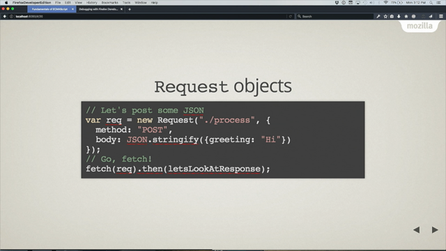
This is an image, right?
This image has the attributes src, alt, width and height.
But if we add the srcset attribute, it becomes a responsive image.
So we can provide a standard resolution image for regular display, and a double resolution image for retina displays.
But what if we had to support many different browser sizes and different devices?
What is the ideal image size we need to serve to our users?
We need to resize our images and serve them at the most appropriate intrinsic size, which can be calculated with an image width in CSS pixels, times device pixel ratio of the device.
Some examples.
If an image is three 320 CSS pixels wide on a retina display it's ideal intrinsic width is 640 image pixels.
If an image is 360 CSS pixels on a super retina display its ideal intrinsic width is 1080 pixels.
Another way to provide different sources for responsive images is to list all the available sources with the 'w' descriptor.
In this way you can specify the intrinsic width of each image in the list.
And with the sizes attribute you can define how wide is this image using any CSS length and different media queries.
Yet another way to do that is to use the X descriptor and provide the source for each image based on the device pixel density.
Then wrap everything in the <picture> tag and provide the sources for other media queries using the <source> tag.
This is a longer notation, but it's useful to cap image fidelity to two, which is something that I'm going to explain later on.
Unfortunately, there, isn't an easier way to write HTML code for our responsive images, and we have to deal with this complexity.
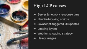
On a slightly different note, how we can optimize the Largest Contentful Paint of our web site?
There can be different causes of high LCP.
There can be high server and network response time, a render blocking scripts, a JavaScript triggered UI updates, loading layers hiding the content while it is loading.
It can depend on your fonts loading strategy, or you might just have heavy images.
Let's deep dive into heavy images and see what can be the cause there.
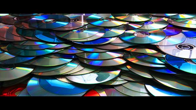
We could have heavy images because we are using old formats like JPEG, PNG, or GIFs, instead of using modern image formats, like WebP, AVIF or JPEGXL.
Or it could be because we have oversized images that are just too big.
Let's deep dive into that.
If we have oversized images, it could be because we just provided one large image for larger screens instead of using responsive images.
Or we are using responsive images, but we optimize our images for a standard design resolutions, instead of optimizing based on our users real device, screen width, and pixel ratios.
Let me show you some surprising data we found when analyzing user screen widths and pixel ratios from Google analytics.
You can see that we have a lot of mobile there.
All of these resolutions are mobile.
Then we have these three resolutions from devices that are desktop devices, and only this one, which is a tablet in portrait mode.
So how we can optimize for our users most used devices?
User driven optimization requires having the most camera resolutions and pixel ratios extracted from our Google analytics-we already have that-then we will have to analyze the width of our images at every resolution.
We will need to calculate their optimal intrinsic width at every resolution, we will have to choose some intrinsic width to serve images at because of course we cannot provide the resized images for every given resolution.
We will have to produce the HTML tags for the images.
And finally, we will have to test that the intrinsic size, which gets downloaded by the browser at every resolution is the one we expected.
This is a very long task and it can be mindblowing even for the most experienced front-end developer and the chances to get a wrong result are extremely high.
And what do humans do when a task is hard, long, and repetitive?
We automate it.
With the automator I'm going to present now we can analyze the width of our images at every resolution.
We can calculate the optimal intrinsic size for that image.
The choice of some intrinsic sizes is not yet automatic and probably it makes sense to do it consciously.
We can generate the HTML tag for our responsive images, and we can test the intrinsic size of the images downloaded by the browser at every resolution.
One last thing, fidelity capping.
Remember all of these devices with the pixel density higher than 2?
A couple of years ago, Twitter published a study stating that limiting image fidelity to two would improve latency by 32% on those devices with no perceived quality loss.
This tool allows us to cap image fidelity to 2.
If we do that, pages with many images will load much faster.
Ladies and gentlemen met the responsive images automater.
The automator does three things.
It extracts the dimension of the images from your web pages.
It generates the HTML code for your responsible images and it tests to make sure that browsers will download, the correct image at every resolution.
Now it's finally time for a demo.
What we're going to do is to start with the homepage of web.dev to optimize that image, which leads to a case study page.
And on the case study page, we are going to optimize the big hero image.
Let's start with the extract function, which extracts the image information from your webpage.
This is the workflow-we need to provide a couple of configuration files, one for the images, and one for the resolution we want to optimize for.
Both files can be provided in both JSON or Excel format as you prefer.
The responsive images automator, will use those files to analyze your webpages and produce a data file in Excel format.
This is the images JSON configuration file I used, which has the page URL, the image name, just as an ID, the image CSS selector, a flag to stat if we want to cap fidelity to two for that specific image and optionally an image template URL.
If you use an image server, which resizes your images on the cloud, like imgix in this case.
As I told you, this field is optional, and if you don't provide it the Automater will just use placeholder images.
The resolution's configuration file is just that-it needs three columns, usage, viewportWidth and pixelRatio.
Then we run the command `npm run extract` and see what happens.
It opens a web browser, navigates to the provided URLs, analyzes the images provided at every resolution and produces an Excel data file.
The data file has three columns here, copied from the resolutions XSL.
The image width both in CSS pixels and in the view port width unit, the current intrinsic width which is the width of the image downloaded at the given resolution, the currently rendered fidelity of that image.
Meaning how many actual pixels there are in the image, CSS pixels in the image.
The render to ideal pixel ratio, which is just the number that it should be as close as possible to one, and also an evaluation as a string, which tells us if the image is okay, too big, slightly too big, et cetera.
Finally, there is an expression of how much bandwidth we are wasting for that specific image, which also takes into account the usage of that specific resolution.
After that there is a calculation of the ideal intrinsic width, just to give you an idea of how wide should it be your ideal image.
And this is the column you have to fill manually, which already has some proposed values you can play with.
The remaining columns are the same formula as we saw before, but calculated on the values of the chosen column to help you choose the best intrinsic width later on.
Let's now jump into the second step-generate, which allows us to generate the HTML code for your images.
The workflow is we modify and save the data file that I've just shown you, run the generate command, and it will create the HTML code for each one of the images in our config.
Let's start from here.
Chosen intrinsic width is the column where we need to put values.
The colors also tell us something.
Green means good.
And red means bad.
So the first one we need to change is that 692, the easiest way to change it is to copy the ideal intrinsic width, from the column on the left, everywhere to go green and get a 'good' in the evaluation column.
We also copied that 1,116 in these two rows and we are on green.
Notice we use only three resized images instead of the six we use before, which means that we will improve the CDN cache hit ratio.
And you can see the total wasted bandwidth is less than 5% compared to the 28% we had before.
Now we can do the same for the hero image, which data are contained in another tab, we can go fast forward there and everything is green except the last one, which is used by less than 1% of our users.
So it's fine.
Let's save everything and run the NPM run, start command.
So save this, go to the terminal, run the command.
It opens two routes.
I can browse to, one per each image.
Browsing to the home.
We can see the rendered image and the code for that image, which uses the picture tag because we want to cap fidelity to 2.
And in the hero image route, the image and the code for the hero image, which uses the regular image tag with a single source app in this case.
Now to the last step-test.
We need to test the HTML code to make sure that browsers will download the expected resized images at any given resolution.
Testing works like that.
You need to specify your requirements in a JS file, pass it to this tool, which analyzes the pages, go through the test cases and produce a result that can be okay or a KO.
And since we have the test cases defined in our Excel data file, we can even generate the JavaScript test files automatically.
Let's see how it works.
Starting from the NPM run build tasks command.
In this VS code, integrated terminal I will launch the buikd task command and we can see two new files appear, which I can open and format automatically.
In each of those files you can see, we test the expected intrinsic width of the image against all resolutions and pixel ratios.
Now we can go ahead and launch the NPM run tasks command.
To do that.
we need to have the server running.
So make sure NPM run start is active in another tab.
Then run the test command.
It will go to all the test cases and oh, it looks, we have one test failing.
Why is the test failing?
It says that when the viewport width is 1366 on a regular display, the expected intrinsic width was 1242, but we downloaded the 1600.
We can go into the Excel file and see what's the cause of this failure and the resolution 1366, the ideal intrinsic width is the same, but we are expecting 1242, but the browser won't download it, because it's poor.
It instead download the bigger image, which is 1600.
So our expectations were wrong and we just can save the Excel file, regenerate the tests and run them again.
This time, all tests are green.
This can be be mind blowing can't it?
So you might be thinking "what's in it for me"?
When we applied these optimizations on an e-commerce website, we got an image weight resolution of 55% on product listing page and 30% on product details pages.
The Largest Contentful Paint was reduced by 17% on product listing pages.
And by 13% on product detail pages.
And with the automator, you get a huge time saving because doing these optimizations could take at least one day of development time and you can do it in 30 minutes and testing could take at least two hours while here you can do it in just5 minutes.
What a big boost, right?
So if you are convinced like Fry here, you can start using the responsive image automator today, which is open source on GitHub.
This is the repo, and make sure you press the star button.
So you get notified on updates.
Let's wrap.
The responsive images automator gives us an easy way to calculate the optimal image size for your images.
It can generate the HTML automatically for your responsive images.
It can check the outcome with automated tests.
We can improve performance, SEO and UX.
You can automate your workflows and ultimately save a lot of time, and money.
That's all for me today.
If you have any questions, please reach out to Verlok on GitHub or Twitter, and also find me as an anreasverliccchi on LinkedIn.
Bye.
Responsive images done right can lower your website LCP and be a money saver. But do them right can be complex and require lots of math and considerations.
In the latest years I spent a lot of my time as performance architect helping e-commerce teams getting them right, and I’ve finally managed to automate all the optimisation process, in a customer-driven way.
In this talk I’ll explain best practices, bring data, and show you how my open-source automated tool works for you to use it.