Developing a Shared Language for Designers and Engineers
Shared Language Starts with People
Mandy Michael introduces the communication gap between designers and engineers and frames shared language around three elements: people, guidelines, and tooling. She argues that alignment begins when colleagues share their context, constraints, and reasoning while recognizing the person behind every decision.
Listening, Respect, and Space to Reflect
Michael describes her Frontend Foundations team at Octopus Deploy and credits her partnership with designer Carolina for making cross-disciplinary work effective. She advocates listening to learn rather than win, approaching disagreement with curiosity, and giving people time to reconsider decisions.
From Personal Alignment to Design Systems
Michael encourages designers and engineers to explore overlapping interests, such as color and algorithms, so they can appreciate one another’s expertise. She then shows how design systems scale shared understanding, provided their guidance balances useful constraints with room to test and iterate.
Guidelines as a Decision-Making Compass
Michael explains how audience-specific guidelines help teams make consistent decisions without prescribing every step. She examines shared goals, naming conventions, contribution models, and communication guidelines that bridge design and code while keeping distributed contributors aligned.
Audits and Automation Keep Systems Aligned
Michael turns to the tooling and processes needed to preserve alignment at scale. She uses spreadsheets to audit components, tokens, documentation, and Figma-to-code parity, then applies automation to repeatable work such as synchronizing icons and design tokens.
Connecting Figma to Production Code
Michael demonstrates Figma Code Connect, which exposes real design-system code in Dev Mode and maps Figma variants to component properties. She explains how the connection improves handoff, exposes naming inconsistencies, and presents security and repository-access tradeoffs between the UI and CLI workflows.
Mapping Components with the Code Connect CLI
Michael walks through CLI setup, framework support, access tokens, exact Figma node URLs, and AI-assisted property mapping. Using avatars, nested instances, and a text-field prefix, she demonstrates both straightforward and conditional mappings, then covers publishing, debugging, and automation.
AI-Assisted Handoff and the Work of Alignment
Michael demonstrates Cursor using Figma’s MCP server to recreate a product form with the team’s actual components and tokens, while noting that generated code still requires review. She concludes that conversation, documentation, automation, and connected tooling progressively close the gaps between people, teams, design, and code.
Hi, everybody. It's really good to be here. I normally work remotely from home over in Perth and my entire team is in the East Coast or in New Zealand. So this is the most peopling I've done in a while, particularly adult peopling because the rest of the time I'm like negotiating with my toddler. So this is going to be really fun for me.
I will say just on the topic of communication and stuff, I think since having my child, it's really made it clear how easy it is for communication and meaning to get lost, even if you think that you're being clear. It's not something I think I understood as much until I had a toddler. So that's been very good communication training.
I feel like I've gone up a level since then. But don't worry, that's all I'm going to say about my child. There will be another picture of my dog at the end, though, because that's obligatory. So what I'm going to talk about today is developing a shared language for designers and engineers. And this can be really tricky because we kind of think differently.
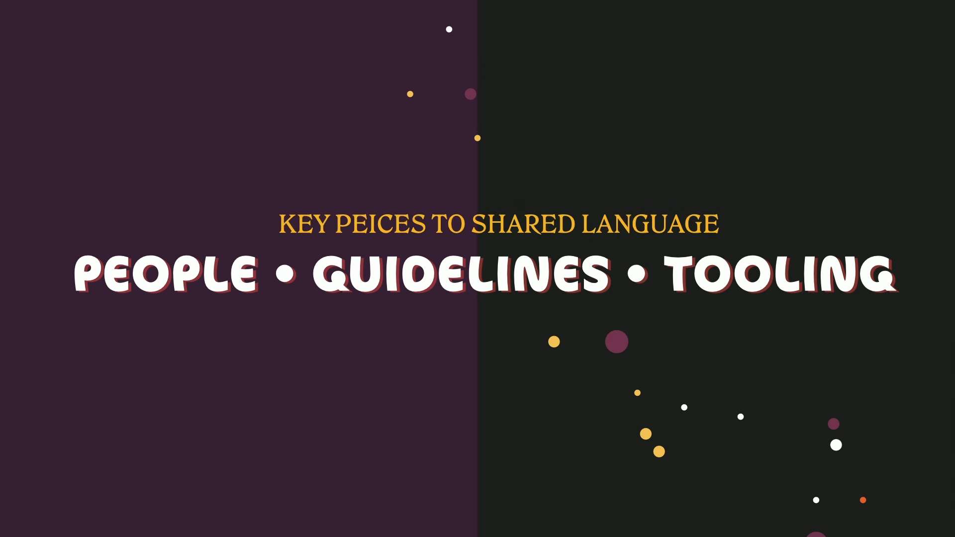
We might describe things differently. And what you think something might be might mean something completely different to somebody else. For me, I think when it comes to developing a shared language, there are three key pieces and you need all of them for it to be successful. The first one is people, then guidelines, and then tooling.
But they don't all play the same role. People and guidelines are what create alignment. They're about that shared understanding and forming those clear foundations. And then I think that tools help to reinforce the language and they also help us to spot when things fall out of sync. So before I can talk about tooling, I'm going to start with the people and the principles that keep that stuff together.
We'll talk about tools at the end. So when it comes to people, the most important thing that I think I'm going to say today is to remember that behind every decision, there is a person doing the best with what they know. And that also applies if you're using AI, at least right now, because someone's made the decision.
To do that. It's not really about just ticking a box, it's about the relationships that you build. Now, what we don't want to do is force agreement for people, we want to build understanding because once you can understand somebody else's perspective, everything gets a lot easier. So it kind of starts with sharing your context, your constraints and the reasons behind your decisions.
And that's how you can start from move from working around each other to working with each other. For me, this has been a constant in all of the roles that I've been in that learning to understand why people work the way they do and why they make the decisions they make. And I have absolutely not gotten this right every time.
I'm sure if you spoke to some of my ex-colleagues, they would definitely say that I was difficult sometimes. But that's something that you have to continue to work at and try. What matters most is that you put effort in to try and understand people, not that you get it right every single time. No one is expecting you to be perfect.
So everything that I'm going to share today is from years of conversations, of compromises, and also those moments when you're with someone and you go, oh, I get it now, which I'm sure a lot of you have experienced. This is the same with my current team. So I'm Mandy. I'm the lead engineer on the Frontend Foundations team at Octopus Deploy, which if you don't know, it's like a piece of software that helps you to automate complex deployments.
And I work on the Frontend Foundations team, which is responsible for a few things, one of which is the design system, which is what I'll be talking about today, because I think it fits nice in with a shared language. I did want to show my whole team because they're all like the best, but because we're talking about designers and engineers, it's very important that I mention Carolina, who some of you might be familiar with. She's a really amazing Australian-based designer.
This is very important because when you're talking about a shared language, you can't do it in isolation. It requires both design and engineering. And she also, when I talk about guidelines, she basically wrote them all with some very minor input from me. So important that I bring her up and I will mention her again. I've been very lucky at Octopus Deploy.
Working with Carolina has been really easy. No drama stories to share. We have a really, really solid relationship. But in other teams, I've found that it's not always been so easy and developing that shared language and understanding required a lot more listening before we were able to get to building solutions. So when it comes to people, I think this is where you have to start. You have to intentionally try to understand where somebody's coming from, not just wait for your turn to speak, especially when things get a little robust.
At this point, the best thing that you can do is pause, really listen to what the person is saying. And this is very difficult for a lot of people. Our brains are usually like most of the way through figuring out what we want to say next before the person has finished speaking. But when you slow down and you take time to actually listen to the other person, that's where you'll find things start to change.
So what I think essentially comes down to is having respect and curiosity. And this goes a long way, especially when you go into a conversation looking to learn not to win. And when you do this, you'll find that your curiosity in these situations will open a lot more doors than your certainty about your opinion ever will.
But if you are struggling to agree, and you will, because that's inevitable, remember that you don't always need to have an answer straight away. It's okay to say, I need some time to think about that. Let me get back to you. I know that everybody wants to closure and to gavel decisions and there's priorities and deadlines and all of that stuff, I get that.
But when you give people space to reflect, that's when a perspective shift can happen. If you don't give them that space, it's really hard to get that change. So giving them that space is what allows them to reach alignment and that shared understanding. It might be a little bit slower at first, but over time, your team will speed up.
Because people start to feel heard. And the principal engineer in our team, Tom, he's really good at this. I've noticed he'll often come back after a discussion and he'll say, oh, I thought about what you said and those were some really good points. I've changed my mind. Yes, I agree. We should go ahead and do this, yada, yada.
Or he'll go, I thought about what you said. Those are good points and XYZ, but have you also thought about this? And I think that's what makes him such a great principal engineer because I feel like I've been heard, he's gone away and thought about it and he's come back with some good points. Sometimes the best response you can give in these situations is just a little bit of time.
When you lead with listening, respect and you make that space to reflect, that's when understanding and alignment starts to form the foundation of your shared language. Once you take the time to really hear someone, you start to see why they work the way they do and the constraints that they're bound by. And if you reach a point where you're an engineer or you're a designer and you don't really understand what's going on with the other person, you never get into alignment.
What I would suggest is find something in their realm that interests you. A good example of this is is color. Color balances creative expression with the logic of systems and algorithms. So it is a good place where you can come together and find something to appreciate from each other's work. While it might not seem interesting to you, like if you're an engineer or a designer, vice versa, there are always areas that you can find overlap and interest in.
The algorithms talk was a great one yesterday of tying designs and algorithms together. I think the reason that Carolina is so easy to work with and that it's so drama free, it's the best, is because she respects me and my skill and my experience and I respect her. This is very, very important.
You will not succeed if you don't go in with respect. No one is expecting you to know everything about design or engineering. Just that you appreciate that they are valuable. If you cannot do that, you'll have a really hard time. At the end of the day, we're all solving the same problem just from different angles. However, to keep that understanding and alignment as you grow across teams, projects, products, whatever, you need a bit of structure.
And that's where guidelines and systems come in. Because it's one thing to align two people, but it's another thing to align like 50 of them. So that's where something like a design system can be really helpful. It's a tool basically that captures your shared understanding and gives everything direction. Now, you might have a design system.
People might be using it. Yay. Maybe they're not. Or maybe they're using it in ways that you didn't expect. And that usually happens because your guidelines are either too loose or they're too rigid. People look to design systems for direction. They expect it to guide them. To give them clarity and to give them confidence. But there is a catch with that.
People don't just use systems, they will interpret them. And a design system is not just a library of parts, it is a language of itself. And if that language is not clear, people will fill the gaps in themselves. All of the opinions that you bake into it will shape whether it succeeds or fails. And as it scales, that impact is only going to get bigger.
Finding that middle ground between too loose or too rigid can be difficult and is not always easy. Sometimes teams worry that too many constraints will limit creativity. Other times people just have different ideas about what something should be. And when that happens, it's really easy to get stuck in the details, to spend more time debating all of the specifics than actually building. The trick is knowing when to zoom out and focus on the things that really matter.
Sometimes the only way to move forward is to build it first, test it and iterate it once you know how people are going to use it. This does not mean that you should go full YOLO and just do whatever. I'm not saying you shouldn't do discovery or anything like that, just that you don't need to have the answer to everything before you start. So for example, we're rebuilding our forms components at the moment, annoying that the form spec's not ready yet, but that's another discussion. And we did some discovery in an audit and we found that there's probably some areas that we haven't covered, but we weren't sure if people were doing things because they had to or because they didn't really think about it.
So we got some feedback, we loosened some constraints and we tightened some constraints and everybody gave their input and we've moved on. Because the goal is not to perfect every single detail, it's to move towards your own goal, whatever that might be. But then the question becomes, what is the goal? And I think there are a few simple things that you can do to keep everybody grounded.
That's where you start to look at things like guidelines and a shared sense of what success might look like. What this does is give your team something to aim for, even while everything else is taking shape. But it is important to remember that guidelines aren't about control. They're more like anchors. They're principles to help people make consistent, thoughtful decisions, even when you are not in the room.
So when Carolina and I started our octopus about a year ago, it was around the same time, there were a few things that were missing from their design system. Their UI patterns needed some work, they're still ongoing. Things like naming conventions, contribution guidelines, and communication were some others that we decided we needed pretty upfront. And each of these serve a different purpose, but they all follow the same core principles.
They're written for their audience, they're usable, and they make sure people can make better decisions, which I know is very vague and fluffy and not super helpful, but what I mean by that is, for example, writing for your audience. Guidelines don't need to be generic. Some of our guidelines are for designers or for engineers because there are some differences that need to apply.
But others can apply to both. I think to write a good guideline, there are a few things that can help. The first is that every good guideline starts with a shared goal, which is essentially the problem you're trying to solve. This will obviously vary. And it can apply to big things like accessibility, like what specification do you want to apply to?
A UI pattern, like what are you trying to achieve with your select component or your forms in general? And it can also be small things like maybe deprecation guidelines or component behavior. But it is the most important decision that you will make when you start developing that language. It gives everyone, both designers and engineers, a reason to care and something to focus on.
And it's clear about what they should expect. But it's not a set of instructions, it's a compass. You should show what good looks like, not a step-by-step recipe, because that is too rigid. This will leave room for flexibility and creativity while keeping the intent clear. And then you can go in and layer in any detail.
So you can start with the why, like the goal, the intent, or the concept. The how, which might be like a design approach and some design foundations, and then the what, which might include some technical behavior. And this will help bridge that gap between design and code. And you can build on that over time. Again, you don't have to get it right the first time.
You can add detail or remove detail if you find that it's not working. One that I think is really important for shared language, which Carolina wrote about, is the naming conventions. I'm not going to tell you what to put in naming conventions because I think that varies between companies. I'll sit under the contribution guidelines, which essentially outline how engineers and designers can contribute to our design system.
We have like a hybrid model. So our team are custodians of the design system and we encourage other teams to contribute. That model only works because everyone's using the same naming conventions and the same names for things, essentially the same shared language. It's what keeps our contributions consistent, whether they come from Figma or from code. I've linked these at the end of my talk.
You can go and read them. There's also some links to some resources we used when we were deciding on what ours were. But essentially, you're giving people suggestions and ideas on how to do this. The other one that was really important for us were the communication guidelines because I feel like this is where design systems often live or die. You're not communicating well and communication also helps to reinforce your shared language because that's how you're presenting it.
So Carolina wrote these as well and they basically just make sure that our conversations and our updates are using that shared language and because our comms all happen in Slack, Ours are in Slack in our design system channel. It keeps the conversations consistent, easy to read, and most importantly, to act on. And that is both from the person doing the comms, because in my experience, comms has traditionally been the hardest thing for engineers to do, but also for people who are reading the comms.
They know what to expect. They understand the format, and they can keep an eye on it. So you can go and check out all of my resources at the end for specifics on how to write these. It is going to vary between companies and your situation, but there's some really good tools out there for doing that. So we've talked about listening, respecting people, that curiosity, very important, and guidelines to help capture that understanding and give us structure and something to refer back to.
But the last thing is tooling. Basically the systems and the processes that will help us scale because it does not matter how good your relationships and your guidelines are, if your tools don't support to support that alignment, it's going to be really hard to keep that alive. So maybe this is the less glamorous part or the fun part, I'm not really sure.
It depends on what you're into, but this is where we get to keeping things organized because understanding is really great, but systems have a lot of moving parts. And the first thing is spreadsheets. Lots of spreadsheets. They're how you make sense of what you've got. We've been doing a lot of spreadsheets lately, lots of auditing and aligning, reviewing components, tokens, naming conventions and patterns to get a clear picture of the situation that we're in.
It's not glamorous work. You can use AI a bit to help with this, but frankly, I think spreadsheets still have a place, at least for now. This helps us identify what needs improvements and maybe where our guidelines are slipping a bit. For example, we're auditing our design system at the moment. Is it in Figma? Is it in code?
Does it have documentation? Does it match between Figma and code? Is the documentation good or does it suck? Is it in the right place? All of these kinds of things. This is a team effort. It requires both design and engineering, both to see the full picture and to act on the outcomes.
We were at a conference at GitHub, someone from GitHub was speaking and they brought up a spreadsheet and Carolina was like, that's like our spreadsheet. Everybody's doing spreadsheets, they're still cool. Once you've done the manual work of auditing, that's where automation becomes your best friend. It's essentially going to reinforce your alignment.
It takes those repeatable, consistent processes and makes them reliable. Anywhere you have patterns that don't change often, automation removes that decision fatigue and ensures that things roll out the same way every single time. We've automated things like adding and updating icons and the design tokens because these things don't really change.
It's just format-wise, it's the same. You can use GitHub Actions or something like that to whatever fits into your tooling. But this just ensures that things that are shared between Figma and code, like icons and design tokens, are the same in those situations rather than deviating.
This also means that you don't have anybody double handling or manual interventions, but it works really well. It's not about replacing people, it's about supporting them because we want people to focus on the important things. Not fixing all problems. So while spreadsheets and automation are really good at surfacing those problems and trying to keep things consistent, it doesn't help with the problem that design and code are completely separate.
This is a challenging problem to solve. This is where Figma Code Connect comes in. I just want to say this is not a sales pitch. I don't work for Figma. The fact that they're sponsoring is a complete coincidence. It's just a tool that I think is really neat. So I'll play a little video. This is Figma with a component from our component library.
And you can click on it and then go to explore component behavior. And then when you scroll down, you can see a little bit of code there. And that's code from our design system that we wrote. For our component. There's also this connect components, this is the code connect UI. You can see it a little bit better here, but when you change the properties in Figma or the variants, it will update the code according to the selections that you made.
And this works in the component playground as well. It's just that it's easier to see side by side here. It essentially brings your code directly into Figma's dev mode. And there's a couple of things that I have found are really useful here. For starters, it speeds up handoff because developers can copy the actual code you want them to use, not the shit that it generates and guesses from, like the actual useful stuff that you want them to use straight from Figma.
It also helps to strengthen that shared language by aligning names and properties, which I'll talk a little bit more about in a sec. It keeps design and code in sync because if you want this functionality to work, you need to make sure things are connected and aligned. If you use Figma's MCP server, the generated code that it uses will use your real component code as well rather than just guessing.
Before I jump into some things about this, I'm going to pause on the shared language and handoff because this is where Code Connect really shines. It literally links the variance and properties from Figma to your component props and code. If it doesn't exist in one of those places, you can't connect it, which means that you can't get the functionality.
I think this is really good. This actually surfaced a few areas that we'd made mistakes. Really done example, I was trying to connect up divider and in Figma it was called type, and in code it's called orientation. And it doesn't mean that you can't connect them, you still can, but I was like, well, these should be using the same thing, why are they different?
So it really highlighted some places we needed to improve and helps to enforce that consistency. So there are two ways that you can use it. There's the UI, which has been around for like a month or something, it's pretty new, or the CLI. The UI is simpler, you can connect it up to GitHub and then connect things automatically, It does say you can copy a manual file path, but I haven't really seen much value of that and I'll show you why in a sec.
The problem with connecting it up to GitHub is that it currently requires full read access to your repo. We have a large mono repo, so that's not going to happen. I have been told that they are allowing you to upload a NPM package for public, which I think comes out this week and then maybe in a few weeks, private NPM packages will come next.
So I'll definitely have to check that out. Because of the security stuff, we use the CLI, but I will show you how to view the UI in case your repo is separate. This is another component in our component library. If you scroll down in dev mode, you can see the code connect section. If you click connect components, you get this UI.
If you connect it to GitHub, you will be able to search to fill in those connections. The reason there is an error here is because I've not connected it up to GitHub and it doesn't have the context to be able to generate the code like you saw in the previous example, which is unfortunate, but I'm hoping that with the npm package we'll get this resolved. So that's the UI.
It's not really working for us, which is why we use the CLI. It supports major JavaScript frameworks, React, Vue, Angular, also supports SwiftUI and HTML as well if you're just using HTML and a few others. Once you're set up, it's got some additional features you can use. There's custom passes for unsupported frameworks, there's storybook integration, and there's a template API that you can use to customize how components render in dev mode.
Setup. Is really easy. You can install the package. I added the save dev in thing, 'cause just last week, it didn't work if you didn't add save dev, whereas it was working without it before, so I don't know if they changed something, but it was having problems. You can also run the interactive setup.
For this, it'll ask you for your Figma file, your codebase path, your framework, and it'll then generate a starter config for you. You have to set up an access token, but it's really easy to do. Figma docs explain how to do that. You can then use the AI prop mapping tool because of course there's AI. It tries to match Figma's components to your code automatically.
It's all right. It's really good for simple things. I'll show an example in a sec. Good if you're new, but frankly, I think it's faster to just do it manually. Once you have all that set up, you can start connecting up a component. One really important thing is when you connect your component, so in this case, Avatar, to the Figma component, the node URL has to be exact or it will not work and it will throw an error. If you go to publish and you get an error, it's probably because of that.
So when it comes to mapping props, this is an example of one that AI does really well at. When they match, it's pretty effortless. The Figma enum is size, and then the code property is size, and you just map it accordingly. And that's how it knows how to map the properties and which bits of code to show.
Another example is if you've got a nested instance, which is essentially components inside components in Figma. There's a function for this nested props. Getting the names right is very important. As you can see, there's an emoji there. If you have spaces, you need to copy it exactly or it will not work. If it changes, it will break, which did happen to us last week.
If you don't know if something is a nested instance, Figma will tell you. If you have design view, it'll literally say it's a nested instance. If you only have dev mode, it'll be listed under a separate heading. So here, Avatar Primitive is the nested instance. And if you set this up correctly, when you go into the component playground and you play with the properties, you'll find that it will render whatever the value is from the Figma props into your code.
It does get a little bit more complex in some situations. This is an example of a text field with a has prefix boolean. The prefix can either be an icon or a string. With this, when we go over to our code, the prefix boolean bit can be whatever you want.
When you set up the Figma boolean for has prefix, you map that to true or false, as you would expect. If it's false, the code prefix is undefined and it won't render anything in the code example. If it's true, you then need to get the nested instance in our case, which is form element prefix. Then you get the enum type, which is a text or an icon, and then you can pass in the value of whether it's a string or the icon instance which we've set up.
That'll let you search for all of the icons that you allow. It is a little bit trickier to get your head around, but it doesn't take very long, and once you've done that, it's pretty easy to roll out everywhere. Then you can publish it pretty easy. It'll either work or it won't. If it throws you an error, it's probably your node URL that's wrong. If you get an error in the UI, it's because your prop mapping is incorrect.
It's not that hard to debug either. There are some bugs at the moment, so if you really can't figure it out, I would go check the GitHub issues because some things they've fixed and then you just publish and it's all good. You can also automate this. We've automated it for our icons because they're the same every time, so that's part of our automation as well.
When it comes to picking, it really depends on what you can do for us. As I've explained, we've done the CLI, but I will keep an eye on the UI. Because it is easier, it's language agnostic, and designers can connect things up as well. Just quickly to wrap up, I'll show you the MCP server. Once you've connected everything, it makes the AI output for the MCP server much better. This is a page in our product.
This is a really bad form that I threw together with our components. I just copy the prompt. Go to this is cursor, which I've allowed connection through the MCP server. There's my rules sync file for my form stuff for our front end. Paste the prompt in. I sped this up because I don't want to wait the AI.
It took about two minutes, but it felt like forever in the video. So I sped it up. I just accepted it all and didn't even check because YOLO. But you can see it's using our components, our tokens and all of those kinds of things. It's a bit, and then it puts it in the page. The annoying thing about this, it works great, but it looks exactly like the design. But I had padding in that page, and the AI ripped it out.
That was my bad for not reviewing the code. But it works pretty well, and I think this is a really good way to help people spit out front-end code that you really want and like. So I think this is pretty cool and I think this will really help people, especially if you're working with a lot of backend engineers that are trying to do front end, it can really help them get the front end code out exactly how you want.
But I think what excites me about this most isn't just the technology, I think it's what it represents. Every new feature, every bit of automation, every piece of shared language, it's all helping us close the gap between people, between teams, and between code and design. Because at the end of the day, that's what we're trying to do. We're never going to have perfect alignment.
That's totally okay. What matters, I think, is that we're moving together, that we're sharing what we're learning, that we're tightening the gaps, and we're using the tools available to us to bring those things closer so that it scales with us and we have that understanding. So whether it's through conversation, documentation, or tooling, every connection point of that counts. Alignment and understanding isn't just going to happen by accident.
It requires effort, and we design it like one piece at a time. So thank you very much. You can find all of my resources at the QR code on GitHub. Please feel free to reach out to me on Blue Sky or Frontend Social on Mastodon, or I'll be around, especially if you want to talk about Jell-O. Thank you.
People
- Carolina
- Tom
Technologies & Tools
- AI
- Figma
- GitHub Actions
- Figma Code Connect
- Dev Mode
- MCP server
- CLI
- NPM
- JavaScript
- React
- Vue
- Angular
- SwiftUI
- Storybook
- Template API
Standards & Specs
- HTML
Concepts & Methods
- Design Systems
- Naming conventions
- Contribution guidelines
- Communication guidelines
- Design tokens
- AI prop mapping
Organisations & Products
- Octopus Deploy
- Frontend Foundations
- Slack
- GitHub
- Cursor