Dear Designer… Sincerely, the Development Team
Introduction
Jo Minney, a web agency owner and engineer, discusses user interface (UI) and user experience (UX) design, specifically focusing on usability and common pain points developers encounter when working with designers. The talk is based on a presentation she gave to the Australian Graphic Design Association.
UI vs. UX
Jo explains the difference between UI and UX using a cake analogy. She highlights that while UI focuses on the visual aspects (the icing), UX considers the overall experience, including usability (cutting and transporting the cake). Both are essential for a successful product.
Common Design Pain Points
Jo outlines some of the biggest pain points developers experience with designs, including poor color choices, inadequate iconography, and poorly designed forms.
Justifying Text on the Web
Jo advises against justifying text on the web, explaining that the jagged edge on the right side aids readability and improves user experience.
Color Choices and Accessibility
Jo emphasizes the importance of accessible color choices, cautioning against relying solely on color to convey information. She points out that many users have contrast sensitivity or colorblindness, making alternative visual cues crucial.
Icons and Clarity
Jo stresses that icons should supplement, not replace, text labels, particularly for less common actions. She highlights the need for clear and universally recognized icons, especially for diverse audiences.
Forms and Placeholders
Jo delves into the common pitfalls of form design, specifically the misuse of placeholders as labels. She provides several reasons why this practice hinders accessibility, usability, and user experience, offering alternative design solutions that maintain both aesthetics and functionality.
Tools for Improved Usability
Jo introduces three valuable tools for designers and developers: - whocanuse.com: Evaluates color contrast and simulates vision impairments for accessibility testing. - Golden Ratio Typography Calculator: Helps determine optimal content width based on font size for improved readability. - Contrast Ratio Checker: Tests color combinations for headings and text against WCAG guidelines.
Beyond Accessibility: Page Load Speed
Jo shifts focus to factors beyond accessibility that influence usability, highlighting page load speed as crucial for SEO and user experience. She discusses the impact of font choices and layout shifts on loading times.
Design Considerations for Usability
Jo cautions against overusing full-screen hero images, particularly on mobile devices, and reiterates the ineffectiveness of homepage carousels. She encourages designers to prioritize user experience over design trends.
Developer Wishlist: Design Best Practices
Jo outlines three key requests developers have for designers: - Design for sensible screen sizes based on common viewport sizes. - Utilize dedicated UX design tools like Figma instead of relying on print-focused software. - Prioritize basic accessibility and usability principles, referencing resources like the Nielsen Norman Group blog.
The Importance of Communication
Jo concludes by emphasizing the significance of open communication between designers, developers, and clients throughout the web design process. She encourages early collaboration and proactive discussions about accessibility, usability, and technical feasibility to ensure successful and user-friendly websites.
Hi everyone, it's very exciting to be back again.
This is my second year speaking at Web Directions.
Did anyone catch my talk last year that was here?
Hey, I've got at least one person coming back again.
So I can't have done too badly last time.
So I actually was speaking about information architecture last year, which is the topic that I'm super passionate about.
The thing that I work in the most.
I'm going to tell you a little bit about my background.
So you heard a little bit about my story, but I think it's important to set the scene for the context of why this talk exists and it exists because I was asked by the Australian Graphic Design Association to prepare something for their event called 72 DPI a couple of years ago, and this event is basically for graphic designers, if you haven't been to one before, to get a heads up of what is like the coolest stuff that's happening in the digital space right now.
And maybe hear about topics that aren't necessarily things that they would always talk about at a graphic design event.
And it was like, cool.
However.
You are aware, that I am not a designer and they're like, yes, exactly.
That's why we want you to come and talk to us because we want to know what we don't know.
I was like, cool.
So the thing is that not only am I not a designer.
I also feel like a bit of an imposter because what I am, and this is just between us in this room and everyone that's on the live stream, is an engineer, which is like the opposite of a designer.
So my background is, I came from process engineering, like the most engineering you can get.
And then I moved into information science and then I moved into, being a product owner, and then I moved into software development and now I run a web agency.
At no point along there have I been, or would I ever call myself, a designer.
I do, however, partner with designers a lot.
Because I don't do graphic design, but I still need to make pretty websites.
How do I do that?
I hire people who are amazing designers, and I get them to do it.
And as a result of that, I have to work with them all the time.
And there are things that we see pop up again and again when we're working with designers.
And I was talking to some other people in my network, in development, and we were like, what would you like to see done better, from a design perspective?
And I thought that would be a cool talk to do.
So that's what I delivered to the Australian Graphic Design Association.
And I've summarized that for you today.
There is also a blog post that goes with this talk.
I've got a QR code at the, on the last slide that is going to link to it.
Sit back and relax and enjoy, all of the resources that I'm talking about today are on that blog post.
So you can go and hunt them down later.
But please don't judge me too hard for my slides and things, cause I'm sure that there are lots of very qualified designers in this room.
As stated, I am not one of them and clearly I like obnoxious colors.
Having got all of that out of the way, who do we have in the room?
Who are our content people?
Anyone here who like creates content?
Yeah, a couple, cool.
Designers, people that work on design and creating user interfaces.
Good.
That's good because they're the people that I wrote this talk for.
So excellent.
User experience.
So people who are more on creating the user experience side of it rather than the user interface side of it.
Yeah, cool.
And I think there was like quite a lot of crossover there, which is excellent.
Development, any developers?
Excellent.
Also, I like that, cause there's a lot of things I think you'll hopefully take away today about how you can communicate with designers as well and everyone else.
Anyone who's not any of those other things?
Cool.
All right.
I covered most of them then.
So I get this question a lot and I'm sure you've all heard it.
Isn't UI and UX just like a buzzword?
Isn't, doesn't that just mean like design?
And the answer is absolutely not.
So normally the people that I'm asking, getting asked this from are not designers.
They're not developers.
They are clients or people who work outside of our area of expertise.
And so this is how I like to explain the difference between user interface and user experience.
And I think it's important to make the distinction because what I'm talking about today is how we can make sure that we're making better choices in the user interface to support user experience.
And to do that, we're going to use Cake, because who doesn't like cake, right?
So which of these has a better user interface?
Do you think, which one is prettier ? Let's be real here.
It's the one on the left, right?
So if I was going to, get a wedding cake, I would probably go for the one that is prettier, right?
So in this analogy, I want you to think of like the user interface is like the icing, right?
So you can use the same icing, the same cake, but one of them is, looks a hell of a lot nicer than the other.
But it does still impact the user experience, right?
So if we think about trying to cut that beast there, has anyone tried to cut a wedding cake?
It's like hell, right?
You have to literally take it apart.
That's not good user experience.
Have you ever tried to refrigerate or transport a wedding cake?
So you can see how user interface, even on something as simple as a cake is really important.
Yeah.
So let me ask you a question, which of these would be a better solution if I told you that the cake was for a kid's birthday party, that birthday party was in a park and the mom had to transport the cake in the front seat of the car with a backseat full of toddlers, which of these two cakes is going to be more appropriate in that situation?
Yeah.
So I think it's really important to think about the context in which our user interfaces are being created.
So I just wanted to throw that out there, that the UX is focused on the user and the UI is more focused on what we actually see on the page.
So the reason why I talk about that is because today, most of what I'm going to be discussing is in the space of usability, right?
So usability being how easy or hard it is for someone to use something, that is what fundamentally everything about the web is about.
Developers, designers, UX people, we're all working towards the same end goal, make something people can use and interact with.
Yeah?
We all agree on that one?
Perfect.
So here is a really short list of the biggest pain points that the developers that I spoke to had.
So we're going to get these out of the way first and then I'm going to give you some examples because you're like, Oh.
I already knew all of these things.
They're easy.
You've all still done it though, right?
You've all still used fonts that are too small.
You've all still used color combinations that don't meet the basic accessibility guidelines and you've all left labels off of forms, right?
So let's have a look at some examples of what this might look like.
Before we do that though, justifying text on web.
Let's just talk really, quickly about justifying text on web, because I don't think I've got a slide on this, but justifying text is something that only designers do because it makes everything looks neat and that's it lines up on the left and right side.
Okay.
Please don't ever do that on the web because we rely on that jagged edge on the right hand side for readability.
So from a design perspective, yes, it looks nice when everything is like fitting in a box.
But it is really poor for readability and it is going to slow down how fast users can actually interact with your content.
That is bad user experience.
So I will show you a example of a great tool that I like for making sure that never happens.
So choices.
Color choices in particular.
I get this all the time where I am handed over a style guide or something like that.
And this is what I'm given to work with.
And can anyone read that?
Cause I can barely read it on the screen here.
I have quite poor contrast recognition, but so do more than half of the people over the age of 50.
Which means that most people over the age of 50.
Are going to struggle to read the text that's on this page.
On top of that, there is actually, I've got like a slightly different color there.
It says this poor excuse for a hyperlink is in like a pinky color.
And on a screen, yes, someone with average vision can identify that there is a different color there, but not everyone has average vision.
Loads of people are colorblind, especially men.
So just be aware that using color as the only way of identifying something is really risky.
So give us options, please.
And there's a reason that the underlined hyperlink, as much as it might seem like an outdated concept, there's a reason it still exists.
It's because it works, right?
It's a way of visualizing that something is a hyperlink without actually having to hover over it and see whether your cursor changes.
So using things other than color is really important for communicating information.
So if something is critical to usability, don't just use color to explain that.
So I am going to use, that example of the, hyperlink color and the text color here, a little bit later when I show you one of the tools that I love for testing, to make sure that we're making good decisions here.
Icons.
So we love icons.
Icons are a great way of communicating information, but they shouldn't be the only way of communicating information.
And these three icons are probably the exception to that rule.
So I would say the vast majority of people, so the, studies that we've done on the data that we've got shows that most people recognize the search icon now.
Most people recognize the home icon now.
And to a degree, most people understand the menu icon now.
Having said that, again, we have to think about our users.
One of these is the web directions website.
You can see they use it plus for their menu, right?
Can they get away with it?
Absolutely, because they're web directions, right?
They've got a very specific audience.
Can the aged care, myagedcare.
Gov.
Au, can they get away with just using a hamburger menu?
Probably not, because the people that are using that website don't know what a hamburger, hamburger menu is.
They probably don't even have their own smartphone, right?
So make sure that you are designing for your users and don't rely just on iconography to convey things.
And if you are relying on iconography, please make sure that your icons also have alt text on them.
Forms.
I love talking about forms.
So this is a really simple form structure.
So this is from a, a development perspective for those who doesn't know HTML, excellent, love that.
So you'll understand that the, the difference between a label, and an input and a placeholder, right?
So your placeholder should never be used to convey important information ever, right?
That is the purpose of the label or for additional texts and legends and things like that.
So please don't use your placeholder for labels.
This is good.
This example here is fine.
This is not as good.
And the reason for that is that the password being six characters is an important piece of information.
And that important piece of information is only being conveyed in this example by the placeholder, right?
Which means that if someone like me who struggles with contrast recognition is looking at this in, say, A high sunlight background.
There's a very good chance I'm not going to see that.
And I'm going to be mad when I put in my password and it says, no, this is not allowed.
This is even worse.
Not having a label at all.
And we've all seen this happen, right?
And we've probably all done it.
I know when I first started working in web development, I didn't realize how bad a problem this was, but we still come across this all the time.
So rather than tell you why you shouldn't do this, because I feel like you probably all already know.
I'm going to show you what's even worse, and then what's even worse than that.
So this was actually thrown out, by Google's web design team.
It was originally in the Google material design, sort of stuff.
And then it was thrown in the bin where it belongs.
Please don't do this for your forms and make sure that they have labels on them.
Make sure that your inputs are clear and obvious.
So I'm going to give you seven reasons why you should never do this in case someone ever says, oh, can we just put the labels inside?
I saw that once and it looked really cool.
Don't do it.
Okay.
So I'm going to read off my seven reasons to make sure that I don't forget any of them.
So the first one, obviously, rubbish for accessibility.
We can all agree on that, hopefully.
If you don't understand why they're rubbish for accessibility, then, there are loads of people here who can talk to you about all of the details about accessibility.
So I'm not going to go into it too much more.
But the second one is that disappearing text strains users short term recognition.
So frequently like multitasking, which is what we do.
How many, tabs do you have open on your computer if you went back to your desktop right now?
Like many, tabs, we're all multitasking.
So what happens if I go to another tab, come back to this page and I've already started typing something in or my cursor's inside that, I have to click away to identify what the label or like what the, what that form is actually asking me for.
Number three, it's hard to check that your responses are correct when you've already typed in your response and you can't see what the question was.
Number four, thank you for telling me that this format is incorrect and that my password is not passing these tests or that my email isn't correct.
But what is correct?
I don't know because I can't remember what the actual field was.
Number five, keyboard users.
So I, there were some developers in the room, how many of you use your keyboard to tab through forms?
Yeah, loads.
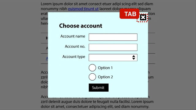
So when you tab through a form, if it is going to a form that's off the page and you're tabbing into it and there's no label there, how do you know what the form is?
Because that placeholder is already going to have disappeared.
Number six, eye tracking studies show that our eyes are actually drawn to empty fields.
So having no placeholder is actually better if you want people to fill out those fields faster.
And number seven is that they might assume that your placeholder suggestion is their answer and not fill it out.
Or they might assume that it's a default answer.
Assuming that you are making placeholders that are accessible.
So seven reasons not to do this.
You can throw them at the next person that asks you to do it.
Okay.
This is a better option if you do want something that is a little bit more, minimalist and you want to take up less vertical space, which is generally the reason why we get people giving us these designs that have the placeholder as the label.
But here's an example that I love, that I love sharing with people because the developer who came up with this, so in this example here, this is actually using a label, not using a placeholder.
So the label is inside the input itself.
It's just using positioning to do this.
And when you, have, when it's active or when you click inside it or when there's something in that field.
It moves up and raises up.
It looks really fun.
And the thing that I love most about this is that this, was introduced to me by a developer who had learned HTML and CSS two weeks before she implemented this, and I told her, no, you can't put placeholders in there.
And she was like, but that's my design.
And I was like, you're going to have to figure out a different way.
Okay.
And she was part of the SheCodesPlus program.
They're amazing.
They're teaching people to be full stack developers, but if she had two weeks of HTML and CSS under her belt and she could come up with this solution, there is no excuse for a designer to not also think out of the box and come up with a good solution that still is going to meet your needs and not have to deal with all of those other things that we talked about.
So this is still the gold star.
In form fields, and if you're not presenting your form fields like this, you need to be asking yourself why, and is your reason good enough for the challenges that it's going to pose to your users?
So I think I've covered form fields pretty, pretty swell now.
So we'll move on to the next thing, which is tools for how can we avoid those traps that I talked about earlier.
So the first one you've probably already come across it, but this is something that I really like to use.
It's a website called whocanuse.com.
So if you haven't tested this out before.
It's really neat because not only does it tell you about, the contrast and whether or not it meets the WCAG guidelines for, background and foreground text, you can also put two colors in and you can see how easy it's going to be for someone who's colorblind to identify the difference between those colors.
So you can see that someone that's green colorblind, the, that pink and the gray that were in that example that I gave, you cannot tell the difference between them if you're green colorblind.
So this is why it's really important not to use just color as an indicator for something being different.
So love Who Can Use, it gives you a whole list of different, like examples of different colorblindness and different, visions, like cataracts and stuff like that.
Check it out if you haven't already.
The next one is the Golden Ratio Typography Calculator.
If you haven't played with this, you are missing out.
It's the most fun ever.
Maybe that's just me being nerdy.
I'm not sure.
But the Golden Ratio Calculator, you basically put in your font size and your font, so it's got all of the Google fonts in there and a bunch of other common ones.
You put in your font size and then it will tell you based on the Golden Ratio, what is an ideal content width.
And the reason for that is that humans really struggle to read anything that's over, let's say approximately a hundred characters per line, because there is no golden number there, but if it's more than a hundred characters per line, it's going to really be a challenge for users to read.
So by limiting the content width, you can say, okay, I'm only going to have in this example, 76 characters per line, and it's always going to look nice and it gives you like a, whole bunch of different examples of what that ratio looks like in different scenarios.
Love this.
It's a really useful tool for designing for web.
And then the last one is this tool, which allows you to put like a heading or something over a photo, move it around to different parts of the photo.
You can change the background.
You can change the color.
Color of the text.
And I will tell you what, whether it meets the AA and AAA, WCAG guidelines for small and large text.
So there's three tools that I really like to use for making sure that we're avoiding some of those common usability traps, right?
What else hinders usability, not just accessibility.
Page load speed.
Page load speed is super critical, especially for SEO and as much as I don't enjoy SEO, it is super important if you want your website to be found by Google.
And you can get penalized for having poor page load speeds.
So what are some things that impact page load speeds?
Fonts.
So I'm going to read you some stats because I love a good stat.
So Google hosted fonts load faster than locally hosted WOFF fonts, if you know what that is, like web, fonts, of Open Sans.
Not always, but on average, a Google font is going to load faster than a locally hosted version of that same font.
Google hosted fonts outperformed the Adobe fonts by almost three.
When this was run, so this was in 2018, so it hasn't, it's not super recent, but you should check when you're using fonts, whether or not they are causing things to load slowly.
You can get even better performance loading fonts from your own CDN if you know what you're doing, but something that you should be aware of is that if you're designing for web, is that a license that you're using in Illustrator might not cover you for a website.
So please don't hand over like a UX design that is using the file that you've got hosted locally because you're doing it in Figma and that's fine.
You can use your own locally hosted fonts in Figma, but then you hand it over and the web developer is not actually able to use those fonts because you haven't communicated with them ahead of time.
And it's going to be astronomically expensive or even impossible to get a license to use that font on the web.
And then.
The like high volume e commerce, for example, it's really important that your website loads fast or you are literally losing money.
The second thing that I've got on here is layout shift.
And this is something that is often caused by fonts as well.
And you might be familiar with this.
So the first one's called Flash of Invisible Text or FOIT.
And the second one's flash of unstyled text.
And this happens again, when your fonts are slow to load.
So this is, again, something that is important to Google.
It's one of their core speed metrics.
But it also is just a rubbish user experience.
Nobody likes to see it.
And it's not impactful when it happens.
Or it is impactful, but in the wrong way.
Full screen hero.
So sure, this is great.
And then we put it into mobile and it's okay.
It's getting a bit cut off in the bottom there, but the problem is that a user at some point is going to push the limits because that's what they do.
And they're going to put a second line of text on there.
And then when we look at that on mobile.
That button at the bottom is now overlapping the road, right?
So full screen hero is a risky approach to design.
It's something that we've been pushing back on more and more.
And I would say if first of all, it's done to death, stop it.
Honestly, we can do better nowadays.
But if you have to do something like this to get some impact, consider, putting a box behind it or something like that so that you're not having to try and do 11 million different media queries just to make it work on every single screen size.
I often get asked to put homepage carousels on.
Has anyone seen this website before?
It's shouldiusacarousel.com.
I have it bookmarked, so that I can really quickly and easily send it to people.
Feel free to, to go right there.
I've put the QR code in for you and everything.
But I think the, not the next one, but the one after that sums it up pretty well.
Homepage carousels are great for telling the boss that you put it on the homepage.
And that is literally the only purpose that they serve.
They don't convert.
We know that they don't convert.
The data is out there.
We have proof.
I think we have evidence.
Please don't use a carousel on your homepage if you can possibly help it.
So what is our wishlist?
What are the things that as developers we want from designers?
What are the things that are the non negotiables for us?
So the first one is please make sure that when we're designing, for web, that we're doing it using sensible screen sizes.
So I've put, 1440 versus 2500, pixels, but I would say pixels or equivalent because something that, that you need to keep in mind is that like my Surface Pro laptop is not actually 1440 pixels.
It's actually much higher than that because it's a very high resolution screen, but it puts everything in 200%.
So what you're considering here is the viewport size and all of that information is publicly available about what the most common viewport sizes are, in your country, in the world.
So they're the ones that you should be designing for because, I work on a2500 pixel wide screen, but none of my customers are looking at it on that.
So make sure that you are designing for common screen sizes and make sure that you're doing it in a dedicated UX design tool.
This hopefully is not news to anybody, but if you are going to give me a design to implement and it's done using like Illustrator or God forbid, a PDF, and we're all going to laugh here.
But it's happened, right?
So make sure that if you are doing UX design, that you are using something like Figma, to do that.
And then lastly, make sure that you're on top of basic accessibility, if nothing else, and basic usability.
And my number one recommendation for, usability and accessibility resources, and education is the Nielsen Norman blog.
So if you haven't come across Nielsen Norman Group before, they do a huge amount of work in the UX research space.
And so much of the stuff that they do is just really easily digestible stuff.
Their newsletter is fantastic and it's a great way of keeping on top of what is the latest and greatest in UX research.
So I think really the biggest takeaway, if nothing else from my talk today, is that I would love you to think about how you can communicate more between the different people who are into, who are involved in creating a website, right?
Because it's not just the designer that is doing the concept designs.
It's not just the developer that's implementing them.
It's everyone that is involved in that process, right?
So if you're not educating your clients, for example, about the importance of accessibility right at the start, if you're implementing, let's say that you're a developer that also does design work, if they hand you a style guide that is going to limit you from being able to do things in an accessible way, you need to give them a heads up right at the start and say, Hey, this is something that we need to address now so that it doesn't come back to bite us later.
If you are a designer that is designing things, someone else is going to implement.
Talk to the people that are going to implement it before you talk to the client and say, Hey, do you like the concept designs I did?
Because there is nothing more frustrating than being super proud of a beautiful design, showing it to the client, having them sign off on it, and then giving it to the development team and them butchering it.
We don't want to butcher it.
That's not our goal here.
We would love to make it look as beautiful as you want it to look.
But the problem is that we can only do that if it's actually, if Implementable, if it's actually possible to do it.
So talk to us early and for the developers, talk to your designers early.
Don't put all of the onus on them.
Make sure that you are actually reaching out to them and being like, Hey, I know that you're working on the design here.
Is there any chance that we can just go through it and see if there's anything that I need to start researching now?
What are the fonts that we're going to be using?
These things that are the common pain points that we have, you can also take that step to go and talk to them and be like, Hey, how can we make sure that these aren't traps that we fall into later?
So if you would like to chat more with me about any of this stuff, that's where you can find me on the internet.
And that QR code goes to the blog post that is basically all of my rambling thoughts I've shared with you today, but much more orderly along with about 10 billion resources at the end.
So hopefully you have found something valuable that you can take away from today's talk.
I think we've got a little bit of time for questions.
Dear Designer,
We don’t want to make you cry. It’s not our intention to butcher the beautiful work you’ve done, and we know that you’ve poured your soul into creating something that truly represents the client (or your company’s) brand.
However… You are going to have to meet us halfway if you don’t want us to cry either!
That means understanding what things you do that are going to make your development team get a little bit stabby, or worse still – destroy all of your hard work by ‘improvising’.
Jo is here to share with you what she’s learned from working on both sides of the design-development divide, and how we can make the internet a nicer place for everyone!
