Annotating Designs for Accessibility
Introduction
Sam Hobson and Claire Webber discuss the importance of annotating designs for accessibility, highlighting the pitfalls and practical approaches to improve both product accessibility and design practices.
Accessibility in Design
The speakers emphasize that while accessibility is reflected in design elements like color contrast and affordances, it extends beyond visual aspects. They illustrate this with examples of insufficient color contrast ratios and poorly signified accordion patterns.
Beyond Visuals: Annotating for Accessibility
The conversation shifts to the importance of annotations in conveying non-visual accessibility considerations. Annotations are presented as a way to document functionality, interaction design, and user experience for individuals using various input and output methods, including keyboard navigation, screen readers, and assistive technologies.
Benefits of Annotations
Sam and Claire outline three key benefits of annotations: bridging the "assumptive gap" by fostering responsibility for accessibility, integrating accessibility discussions into handovers, and promoting embedded design critique for improved accessibility considerations during the design process.
Common Pitfalls and Solutions
The speakers address common pitfalls of annotation, such as over-annotation and the misconception that extensive coding knowledge is required. They advocate for starting small, focusing on essential HTML elements like headings and image alternative text, and gradually incorporating more advanced concepts like focus management and live regions.
Focus Management: A Practical Example
Using the example of focus management for keyboard and screen reader users, Sam and Claire demonstrate how annotations can communicate the intended focus order and transitions for dynamic content, ensuring a seamless and accessible user experience. They showcase this with the ABC News search results page, illustrating how annotations can guide focus for interactive elements like accordions and search bars.
Live Regions: Another Layer of Accessibility
The discussion extends to live regions, explaining their significance for screen reader users. They use the ABC News search bar to demonstrate how annotations can indicate the presence and behavior of live text updates, ensuring that dynamic content changes are announced to screen reader users without disrupting their focus.
Practical Implementation and Conclusion
Sam and Claire emphasize the importance of understanding team dynamics and starting with small, achievable annotations before tackling more complex concepts. They reiterate that accessibility is about people and their diverse needs, encouraging the audience to go beyond technical considerations and engage in accessible research and user testing.
Thank you.
We are, so we're here to talk about annotating designs for accessibility.
We're going to be taking a real critical look at the process.
What are the pitfalls that come in?
Why do people perhaps struggle with it sometimes?
What are the practical approaches that we can take to it to improve not only the accessibility of our products, but our design practice in general?
But one thing that always we get asked as accessibility professionals is, Hey Sam, can you review this for accessibility?
I've got some designs here for you.
Yeah, that's exactly right.
Thank you, Claire.
So we often receive these beautiful looking Figma files like the one on the screen here.
Very common looking design file to receive.
We have a couple of nicely laid out artboards.
And designers have poured time and attention into this, and they have asked us this difficult question.
Hey, can you review this for accessibility?
And as consultants, we think something in our heads when they ask us this question.
We think accessibility does live in the design.
And so we can review it for accessibility.
However, there is a limitation to that because accessibility doesn't only live in the design.
So the ways it lives in the design is in aspects like color contrast.
So here we have a download PDF button that has white text on a purple background that has an insufficient contrast ratio of 2.4 to 1.
So we could look at that and there is a criteria against which we assess it and we say that doesn't quite meet accessibility standards.
It's not going to be easy to see that button.
We think a lot about affordances in design, we see a lot of accordion patterns, accordions being a thing that you can click, or tap, or speak, and they open and shut, and we think a lot about how we signify the affordance of an accordion, and we can see this in a design and think, ah, there might be two things wrong with this, it might be that there's a lot of the contrast of the chevron, which indicates that the accordion is in fact, that pattern, is a bit low.
That doesn't meet the contrast requirements.
We can also think of someone has a limited field of view, that if they're just focusing on the left hand side where the label accordion is, they might not have enough visual affordance, no signified affordance that this is an accordion because they cannot actually see that chevron.
So this is some of the ways that it lives in the design.
Forms is another thing that's come up quite often in the last two sessions before ours, but it is a big sticky point.
It's the, place the user's interacting the most with us when they're filling in form controls.
Here, we've got a similar thing with our, layouts.
There's a lot of centered elements compared to right aligned elements.
Someone might miss those labels in the middle.
And like talks earlier today, there aren't really clear, visible labels on these fields.
The All Categories category box below has a temporary label, but once we start interacting with it, we're going to lose that context that we had before.
Similarly with the Search field, once we start interacting with that, we're going to forget what was there before, and we're relying on a lot of placeholder elements here.
A very common design pattern for a lot of product websites we've got advertisements, product cards, articles down below.
There's a lot of stuff going on here in this design, but we don't really have any clear headings to signify what is these groups of information we've got.
Some nice clear section headings that give us a big visual signifier of what kind of content we're going to come across would be great here, and it would help users of assistive technology navigating as well.
Also looking at this, it's potential that we might come across some images of text, where text is embedded in the image itself here, with that ad up on the screen there, but also those little product tiles.
Looking at it from a pure design perspective, it's very suspicious that we might have some images of text there.
People that need to adapt the system, use different settings and things like this, may miss out on that information or may not be able to view it.
In a way that they want to.
While accessibility does live in the design, all those aspects we could review quite clearly.
Yeah, it doesn't only live in the design.
And that's because accessibility also lives in how the design is conveyed.
And this is what we're going to talk about today.
So how we convey this other stuff is in the title of our talk.
It's through annotations for accessibility.
And what are annotations, Claire?
We can take two approaches to this conceptually.
It's a way of getting away from just that visual thinking.
There's a lot of visual stuff we do have to consider, but what about all that other less visually apparent aspects?
We need a way of thinking about it, communicating it.
So it's not forgotten about.
So design's not always about just how something looks.
That is an important part of it, but we need to think about the function of the design, how it's going to work, but not only how it's going to work for us, but how it's going to work for all of our users.
And just in terms of the functionality of annotation, like annotations themselves, that we're thinking of just a comments layer on our design.
There's going to be other areas where you're going to have a lot of more documentation on function and the visual aspects, but here, in terms of the term annotations, we're talking about that comments layer overlaying a design to document all those non visual aspects.
There's an example on the screen that's just a simple note.
And further documentation outside.
So we can clearly see what is the thing we need to know more about and what's the documentation for it.
But what are these less apparent things we keep alluding to?
What kind of things do we need to annotate?
We talked a lot about interaction design, we focus a lot on this, how we're going to interact with each component and the end experience of the user.
We need to bring these two things together, not just how they're interacting with it, but the benefit and the experience of the user.
And quite often as designers, this is very mouse and touch focused because that's how Quite a lot of us interact with the system, but we need to extend beyond that and think about how other people need to interact with the systems and those core accessibility principles.
So that includes things, other input types, not just mouse touch, but things like keyboards and keyboard like devices.
How are other people going to input usingsing their preference into your system that you're designing for.
Also includes outputs.
So anytime that there needs to be some kind of output to support assistive technologies, that may be things like text to speech or text to braille and other settings, like we mentioned in that other example.
So anyone that needs to use some kind of other view setting support, maybe they're using zoom or a different assistive technology that changes their visual experience of the design.
But annotations are still just more than instructions for the interaction, Sam.
Yeah, there are some, there's three kind of main benefits that we think about when we think about why do annotating for accessibility conceptually speaking.
And the first one is this concept of the assumptive gap.
So working as a designer previously, I've made terrible mistakes in producing inaccessible things.
And I have said once when someone has said to me, Oh, will this be accessible?
And I was like, Oh, it's using our design system, which I've heard someone talk about accessibility around.
And so of course it will be accessible.
This is what I'm talking about when I talk about the assumptive gap.
There is this assumption that someone else will do the accessibility work.
And as designers, we can make this assumption out of fear, out of time, out of lack of knowledge.
And developers similarly can do the same thing.
So they can say, I didn't receive this from the designers specifically, and therefore I'm going to implement it exactly as I see it, or exactly as I've always done it.
And this is the assumptive gap that annotations can start to bridge.
The second one is a really important one.
They write the discussion about accessibility into your process of handovers.
So this is really crucial, right?
We have this way of running handovers, which are, we send a design file across.
Sometimes we have a meeting with the developers and we talk through them.
We talk to our BAs and they break them down and things like that.
There is no requirement that accessibility is talked about in there.
And there is no kind of prescription for how accessibility is talked about in that process if it is talked about at all.
But annotations, they write this discussion into the process because they live on the file that everyone has to look at.
Yeah.
How common is it to forget the feedback you got in a design crit and then come back and it's gone.
Yeah, exactly.
And talking of design crits, I like this one a lot, appeals to my academic sensibilities maybe, but annotations are a form of embedded design critique.
So as you are annotating your own designs, you suddenly see the logistics or the logistical holes in your design, like how have I not included a heading here when I should have included a heading?
How does this suddenly not make sense when I need to consider another input type?
Something that might not have been as apparent when we're putting those designs together in Figma.
So they allow us as individual designers and also groups of designers to not only have a language for critique, but also to reflect on the suitability of our designs as part of our process.
And part of that, everyone carries their brick mentality.
Accessibility isn't someone else's job.
Someone else isn't going to do it.
Every person in a software development life cycle has a role to play, not just the designer or the developer you're handing it over to, but also the project manager, the tester, everyone working on the process has a little piece to contribute to accessibility.
So you're not in it alone.
But it's not someone else's job either.
Everyone has that little piece of play to contribute.
And when everyone is contributing, you learn from each other.
You're not going to know everything about accessibility all the time.
We're accessibility consultants and we don't know everything about accessibility all the time.
So learn from each other and work together to form that accessibility practice.
There are a lot of common pitfalls, as I mentioned before, that kind of, make annotations look like not a fun thing to do, or it is going to be a problem for the workflow of the team, but we'll address a few of these.
The first one that I personally hear a lot, and I'm sure Sam does too, is, that's going to take way too long, I don't have time for this.
And we hear you on this.
Definitely it's not good to put something into your way of working that slows you right down.
A certain slowness is good.
Don't take this as anti slowness.
But we hear you on this feeling like too much.
And we often say that this response can reflect two missteps in the application of annotations.
The first one is over annotation.
It's great to see people trying annotation, but sometimes when it can feel like too much or not work when you pick this up, it's because you or someone you might be working with has over annotated.
The result of this is that it can be received as overbearing.
If you're the designer and the developers receive something, which is just like a wall of design opinions about things that the developers work on, you might be annotating established patterns unnecessarily.
You might be annotating a native element, which is unchangeable and all the accessibility is largely baked into it.
You might be annotating a design system pattern, which doesn't work that way until the problem actually aligns with the component itself.
And also when you over annotate, it is poorly designed communication.
So not only does it take you a lot of time when you're annotating things unnecessarily, but it's received pretty poorly and so can lend to annotations not working.
Yes, we have a little bit of an example of this.
If you've thought about annotations before, perhaps you've gone into the Figma community and want to download a kit.
One of the first examples you might come across is their Twitter annotation kit.
It's pretty off putting as a designer when you see this.
It comes back to that problem.
Geez, that's going to take a long time.
There's a lot of stuff on the screen here all at once.
It's quite inconsistently done.
This is supposed to be an example of how to use the kit.
As a designer looking at this, is not the way that we want to be annotating the design.
Some things are labeled with an icon.
Sometimes it has a label.
The tab order is, marked up to a certain point, but then doesn't continue.
We have things labeled as buttons, links.
Some things are headings, perhaps some other things that we would like to see as headings aren't headings.
There's a lot of overlapping, intense communication going on here.
It's a lot of the main common navigation too.
I don't think you need to navigate, annotate up your header every time you design a new page.
It's a common component.
Yeah, and you have things on here like, why would you annotate something that could otherwise be implicit in the design?
So something like the tab order, which here are annotated by those little numbers and what looks like this kind of icon.
If that is reasonably assumed both by the way that the page will be developed and also the design implicates, it's over annotation in that sense.
The other thing that comes up a lot, particularly looking at that previous example, is a lot of HTML language in there.
Quite often as designers we hear, I don't know enough about code to annotate for accessibility.
Yeah, and that's a really valid thing to say.
It's not everyone's privilege as a designer to also have learned another trade another skill.
We think, or I think in particular, it's really important to know the materiality of the web as a designer, which is different from learning how to code.
So it's about knowing the components that are at your disposal and how they're supposed to work.
But other than that, in terms of the type of code you need to know, specifically HTML if we're talking about the web, it's just the basics really, it's the most important stuff that you actually need to be explicit about in your annotations, things like heading levels, do you know how many you have at your disposal and how to use them properly, and then knowing that sometimes images need alternative text or to be hidden entirely.
Other than that, we recommend that your annotations, in the spirit of sparking conversation, are gestural and generative.
Gestural, that is, they just talk about the kind of thing that you think might be a concern.
Annotations don't have to be complete.
This must do that.
They can just be like, I'm not sure what should happen here.
Annotation.
And generative in that they should just start a conversation.
So you don't want them to be overly prescriptive, this is the JavaScript you must use for this, if that tends to be what you know.
That doesn't lead to a lot of open discussion about how to solve an accessibility problem.
And otherwise, as we've been saying, this is about learning the fundamentals of other input and output methods.
What do people need to see?
How do they use the web in different ways?
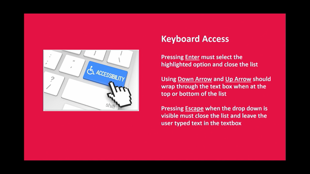
So we'll put it all together with an example, because it's been quite abstract so far, and we'll use, we'll jump into a difficult topic, perhaps, we'll use the topic of focus management and how designers must think about this thing called focus management.
So when we're talking about focus management, we're talking about keyboard users a lot.
We're talking about the fact that when keyboard users use the tab key to navigate a page, they can focus on interactive elements.
So links and buttons and form inputs, when you tab to it, it's said to have focus when that becomes something which is interactive.
Screen reader users are also implicated by this idea of focus management.
Screen reader users have a virtual cursor, among other many ways that they can use their screen reader, that can be navigated across useful elements on the page.
When something falls underneath the virtual cursor or within it, it has its focus in a similar way.
The order both users find information is determined when the page loads.
So we spoke before about that Twitter example, over annotating when something should be tabbed to.
When the page loads, the way that the page has been written, that tab order is determined determined.
However, when focus management, so a consideration of this, becomes important for designers is when content can be changed on the page after it has loaded.
So when dynamic content is added, then we need to design where focus goes.
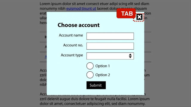
So we found a really great example of this in the ABC News search.
A search results page is a good example of this because there's a lot of dynamic, interactive stuff going on in one page.
So if we have a look at this design, we want to annotate it.
What kind of questions are we thinking about?
What interactive elements are there that are going to cause focus management issues.
We can see in the filter column on the side, we've got an accordion to show more filters.
What's going to happen when I activate that?
There's a clear all filters button.
Where's focus going to go when I start hitting that?
When I make a new search, what's going to happen?
There's a lot of questions we can start thinking about in terms of the dynamic content we have here.
So focusing on that refining results component first.
You can do this as like at a component level when you have things that are just interacting within the component.
So here we have our component laid out.
We've got a few different states that called enclosed, opened, when we've got the filters, the clear filters activated.
And we can start thinking about how that interaction is going to work.
We already plan out our interaction for mouse users, but we need to start thinking about that non visual aspect, how someone's going to navigate through.
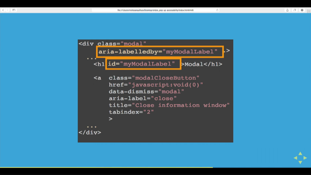
So in terms of just the functionality of annotations, we personally like to have just a small note on the screen that's perhaps numbered that goes off to further documentation.
You don't want to cover up your design with a bunch of text and annotations because it's going to be hard to then see those interaction points.
So here at our Show More Filters example, we can show where focus is going to go once we open the accordion.
So here it's going to go to the first newly revealed checkbox so that we can continue on with our task and start interacting with those other filters.
Then once we close it again using that show less, we want focus to go back where it come from.
We want to be back on that show more filters element.
Now we've got a circular navigation where we can complete our task.
Open it, continue interacting with our checkboxes, close it and go back where we started from again.
So for our clear all filters, this is a little bit less obvious what the user's task is going to be once they clear the filters.
They might want to go back and make new filters.
They might want to start looking at the results.
The important thing here is that you're managing the focus.
You don't want to leave it to chance or leave it to the browser.
It could go back up to the top of the page.
User would have to start again.
So here in the ABC example, they put focus at the start of the results panel.
That's the next thing in the focus order anyway.
A user can continue on or navigate backwards if they need to.
So the next example we're going to give is through a different topic.
So we just spoke about focus management, and now we're going to talk about live regions.
Live regions are primarily a consideration for screen reader users who have a spoken output or a refreshable braille output.
And live regions are a different but related tool to focus management.
When it comes to this design, we can go back to a different part of the component here, the search bar at the top, and there's some text underneath that's going to update when we make a new search term.
Here, currently, I've searched for ABC and it's showing search results for ABC.
This is some live text that's going to update when I make a change to the page.
It's something we need to consider for our live regions.
Coming through to this component, I've got two states, essentially, a positive search results and a negative search result, so something that's returned no results.
So both situations I need to know if I've made a successful or a negative search and then adjust for that.
So here I might start with going back to focus management.
What's going to happen with the focus itself when I make a search?
I want to stay there on the search box until I decide to move on.
And in terms of our little updated text there, I want that to be in a live region so it's then announced by the screen reader and they can know what the result of the search was.
Particularly for this example, perhaps it would have been a bit more helpful to have also the number of results included in this text so then we can refine it a bit more.
But this is a really good starting place in that we have our focus managed, any updating text is going to be announced to us.
But, what is practical in terms of annotations?
This is just one example, what's a practical starting place, Sam?
First and foremost, it's about understanding the culture, the system into which you're going to be proposing that annotations are a way of working.
It's understanding who are the teams that you need to tell about this being a thing that you want to try out, who might you need to consult.
What else might you need to understand about the way your development team works if you have quite a separation between design and development?
It's really about first and foremost understanding how will they be received, not just launching into doing annotations without checking how everyone else is going to receive them.
And one cool thing is just start small.
You don't have to do everything all at once when it comes to accessibility.
Just making one small improvement is going to be better than if you did nothing and left it all to that assumption further down the line, start with something you have a bit of experience with, your team has a bit of knowledge with, and just launch into it and try it out, and then build on that as you go.
If you're doing a lot of complex stuff at once, it's going to feel hard and, tricky to implement into your workflow, just start with one thing and then build upon that as it's successful.
It really helps build up the skills of your team too, particularly if you have a lot of people in your team that don't know a lot about accessibility.
If you're just building that knowledge up slowly, it really helps to uplift the skill of your entire team.
And starting small can look like this.
It can look like marking up the heading levels.
So in your design, you are often choosing a heading based upon a pre set font settings and size of a heading, and you're just placing it where it looks visually appropriate.
But we also need to be thinking about, what level of heading do we want, and how are we conveying this to our developers?
And knowing that you have six heading levels available, And, what they might be, and if they differ from say the visual size as well, which is quite common.
And then another basic way to start or a simpler way to start is to recognize the need for accessible names.
When do things need accessible names?
You might have a button whose content is an image, is an icon, for example, that needs an accessible name.
Image alternatives is something that's being talked about already, deciding when do you provide an image alternative, and how descriptive and what is the description of that image.
You can move into some more advanced things, focus order and focus management.
Some of the things we spoke about before and live regions, something I forgot to mention before the way that these two things differ is that focus order is when you intentionally move the keyboard or screen reader uses focus to something.
When that happens, they hear if they're using a screen reader or they feel on the braille display where that focus has been moved.
The difference with live regions is, that same announcement gets given to the screen reader user, but their focus is not moved.
So these are two more advanced concepts that you can think about annotating.
So in summary, everything, the premise of this is that we want to be communicating more than just the visual aspects of our design.
We're thinking about our interaction and our user experience for more than just a mouse inputs, and we're communicating that to our team in some way.
It's worth coming back to start small and achievable.
Rome wasn't built in a day.
We're not going to annotate literally everything in every design straight off the bat.
Just start with something achievable and see the success of that.
It helps build that confidence and morale on the team too.
If something works, you want to keep doing it.
If something's big and hard and it didn't work, No one's going to want to keep doing it and then build your skills and learn together as a team.
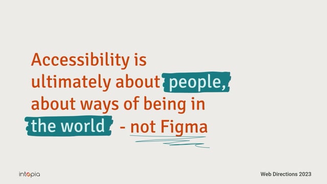
It's also important to remember this, like we've given quite a technical talk today that concerns itself with an incursion into a process, into changing the way that you work in Figma, but much like Figma kind of, abstracts the way that the web works, so too does annotations abstract the reality of accessibility work.
It's important to remember that accessibility is ultimately about people and about ways of being in the world, and not first and foremost about Figma.
There's been a lot of great talks already about accessible research.
This is something we also highly recommend to work with people with disabilities, in addition to considering the technical implications of your designs.
Claire?
So come say hi to us if you want to have a chat.
We're at the Intopia booth out near the main room.
We have some of our Connect usability participants available if you want to have a chat with someone with lived experience as well, there's plenty of spots open for tomorrow.
And.
Ask us any questions, if you don't get a chance to today, we're happy to chat about accessibility.
We could talk about it for the rest of our lives, all day, every day, and not get sick of it.
You can get in touch with me, if you like, on Twitter, at Claire L.
Weber, or just on LinkedIn.
Search up my name and you'll see me, hopefully.
And you can get in touch with Sam on the Intopia Twitter channel or Intopia on LinkedIn, or you can find our website in Intopia dot digital.
Thank you.
Nice.
Thank you so much.
In UI tools like Figma, digital designers can get stuck in a ‘visual-first’ way of thinking.
Learning how to annotate visual designs for non-visual and other less-apparent considerations is a vital and meaningful skill. Annotations not only help create a more inclusive and accessible end product, but they can help designers think through and critically reflect on accessibility throughout their process.
Claire and Sam will not only introduce designers to the ‘why’ and ‘how’ of annotating for accessibility, using their experience as accessibility consultants who’ve worked with all sizes of design team, they’ll take a critical and pragmatic look at how all designers and workflows can accommodate this skill.