Multicol and fragmentation
Introduction and Speaker Background
The session begins with a warm introduction of Rachel Andrew, highlighting her ability to simplify complex topics and her contributions to the CSS community. Rachel, now part of Chrome Developer Relations, shares her excitement about speaking to an audience passionate about CSS. She outlines her role and involvement with the CSS Working Group, setting the stage for a talk focused on various CSS features.
Exploring CSS Multicol and Fragmentation
Rachel Andrew introduces the CSS Multicol specification, explaining her role as an editor and the challenges faced in updating the spec. She discusses the unique behavior of Multicol compared to other layout methods like Flexbox and Grid, emphasizing its reliance on fragmentation. The segment delves into the historical context of Multicol and the importance of understanding fragmentation in CSS.
Understanding Fragmentation in CSS
Rachel explains the two types of fragmentation in CSS: block and line fragmentation. She focuses on block fragmentation, which occurs when content doesn't fit within a fragmentainer, such as a column or page. The discussion highlights the similarities between Multicol and paged media, emphasizing the role of fragmentation in both contexts and the challenges it presents for CSS specifications.
Challenges with Multicol and Fragmentation
Rachel discusses the difficulties in testing Multicol due to its reliance on fragmentation, which is inconsistently supported across browsers. She shares insights from her 2019 article on fragmentation properties and their browser support, noting improvements and ongoing challenges. The segment underscores the complexity of achieving consistent fragmentation behavior in CSS.
Improving Fragmentation with RenderingNG
Rachel highlights advancements in Chrome's handling of fragmentation due to the RenderingNG engine. She explains how the new engine improves the layout process by avoiding the slicing issues of the past, leading to better support for fragmentation properties. This segment showcases the technical improvements that enhance CSS layout capabilities.
Multicol and Print Use Cases
Rachel shifts focus to the practical applications of Multicol and fragmentation in print scenarios, such as generating PDFs with Headless Chromium. She emphasizes the widespread need for better print capabilities on the Web, noting the specifications available but underutilized due to lack of browser implementation. The discussion highlights the potential for CSS to improve print output.
CSS Paged Media Specifications
Rachel introduces the CSS Paged Media and Generated Content for Paged Media modules, which offer advanced print capabilities. She explains how these specs allow for content manipulation in headers and footers, and the potential for enhanced print styling. This segment underscores the untapped potential of CSS in print media.
Implementing Print Features in Browsers
Rachel discusses the implementation of print features in browsers, highlighting Chrome's support for certain properties. She explains the complexities of the page box model and the use of at-rules for content placement. The segment illustrates the gradual integration of print capabilities into browsers, enhancing the utility of CSS for print applications.
Advanced Print Features and Browser Support
Rachel explores advanced features from the Paged Media specs, such as page counters and generated content, which are supported in Chrome. She notes the lack of implementation in other browsers and the potential for these features to improve PDF generation. The discussion highlights the gap between specification and implementation in CSS print capabilities.
Design Requests and CSS Evolution
Rachel reflects on the evolution of CSS, driven by design requests that challenge existing capabilities. She discusses how past demands for print-like features have led to advancements like custom fonts and layout controls. This segment emphasizes the importance of community input in shaping the future of CSS.
Challenges in CSS Development
Rachel addresses the challenges faced by developers in implementing CSS features, noting the focus on improving developer experience rather than introducing entirely new capabilities. She highlights the need for community-driven innovation to push CSS beyond its current limitations, using examples like Grid and Flexbox to illustrate the potential for growth.
Innovations in Multicol Layouts
Rachel introduces ongoing work to enhance Multicol layouts by allowing columns to overflow in the block direction. She explains the potential applications for this feature, such as creating block direction carousels, and discusses the design challenges it presents. This segment showcases the forward-thinking developments in CSS layout techniques.
Gap Decorations and Layout Enhancements
Rachel discusses the introduction of gap decorations in CSS, which allow for visual separation between columns and rows in layouts like Grid and Multicol. She highlights the work done by Microsoft to implement these features and the potential they offer for more refined layout designs. This segment highlights the ongoing improvements in CSS layout aesthetics.
Bridging Paged Media and Web Design
Rachel explores the convergence of paged media and Web design, noting how modern applications often mimic paged experiences. She discusses the potential for CSS to incorporate print-like features in Web layouts, emphasizing the need for innovative design solutions that blend traditional and digital media.
Potential CSS Features: Page Floats and Column Spans
Rachel introduces the concept of page floats and column spans, which could enhance Multicol layouts by allowing elements to snap to column edges or span multiple columns. She discusses the potential use cases for these features and the challenges involved in their implementation. This segment highlights the speculative nature of CSS development and the need for community input.
Exclusions and Regions in CSS
Rachel revisits the concepts of exclusions and regions, which allow for more complex content flows around elements. She explains the historical context and challenges of implementing these features, noting the potential they offer for advanced layout designs. This segment underscores the ongoing exploration of CSS capabilities.
Community Involvement in CSS Development
Rachel emphasizes the importance of community feedback in driving CSS development, encouraging attendees to share their use cases and needs with the CSS Working Group. She highlights the role of surveys and issue tracking in shaping the future of CSS, urging developers to participate actively in the process.
Q&A: CSS Challenges and Future Directions
Rachel addresses audience questions about the relationship between print and Web design, the implementation of print features in browsers, and the future of CSS development. She discusses the challenges of aligning browser capabilities with print specifications and the need for continued innovation in CSS. This segment provides insights into the practical considerations of CSS development.
SH: Rachel has this ability to take some things that are very, very complex and then break them down into things that are palatable and easier to learn.
She did it with tables, she did it with Grids, she's done it with countless things. And there's an old ancient Roman saying that if you want to learn something really well, you have to interest Rachel Andrew in that, and then she'll teach you how to do it, like quantum physics, for example. She would break that shit down for you so that anyone can understand it. That's just how she is.
I'm thankful and proud that she's in our community because teachers like that are extremely valuable and I'm really glad that she's here with us today. Please give a warm welcome to Rachel Andrew.
RA: Hello. Well, I'm not sure what you say after an intro like that.
I feel like I'm part of the furniture here really as well. You know, this feels like my home conference, coming home to talk to people who care about CSS, about CSS, which is really cool.
Yeah. So these days I'm at Chrome.
I'm the Content Lead for Chrome Developer Relations, which means that me and my team publish to web.dev and developer.chrome.com, so if you've read anything there or if you're complaining about anything there, that's probably my fault and you can come and tell me about it later.
But that's what I do and I still keep up. Although my job doesn't really mean that I'm on the CSS team at Chrome, I'm kind of a bit of a hanger on because I'm still part of the CSS working group and still involved with these things and try and get involved where I can, particularly when it's the specific things that really interest me. And that's really where this talk goes. Because when PPK said: "Hey, do you fancy speaking this year?" I thought this is a really good audience to talk to about a bunch of related things. It's a talk that's going to go all over the place in terms of CSS features and there's a whole bunch of things that actually don't work anywhere that I want to talk about. This is the stuff that lives rent free in my brain. This is the stuff I think about when I go for a run. Yeah, no one ever talks about these things. So I'm going to. My subtitle for this was: 'Why we can't have nice things." And I'm going to start with Multicol.
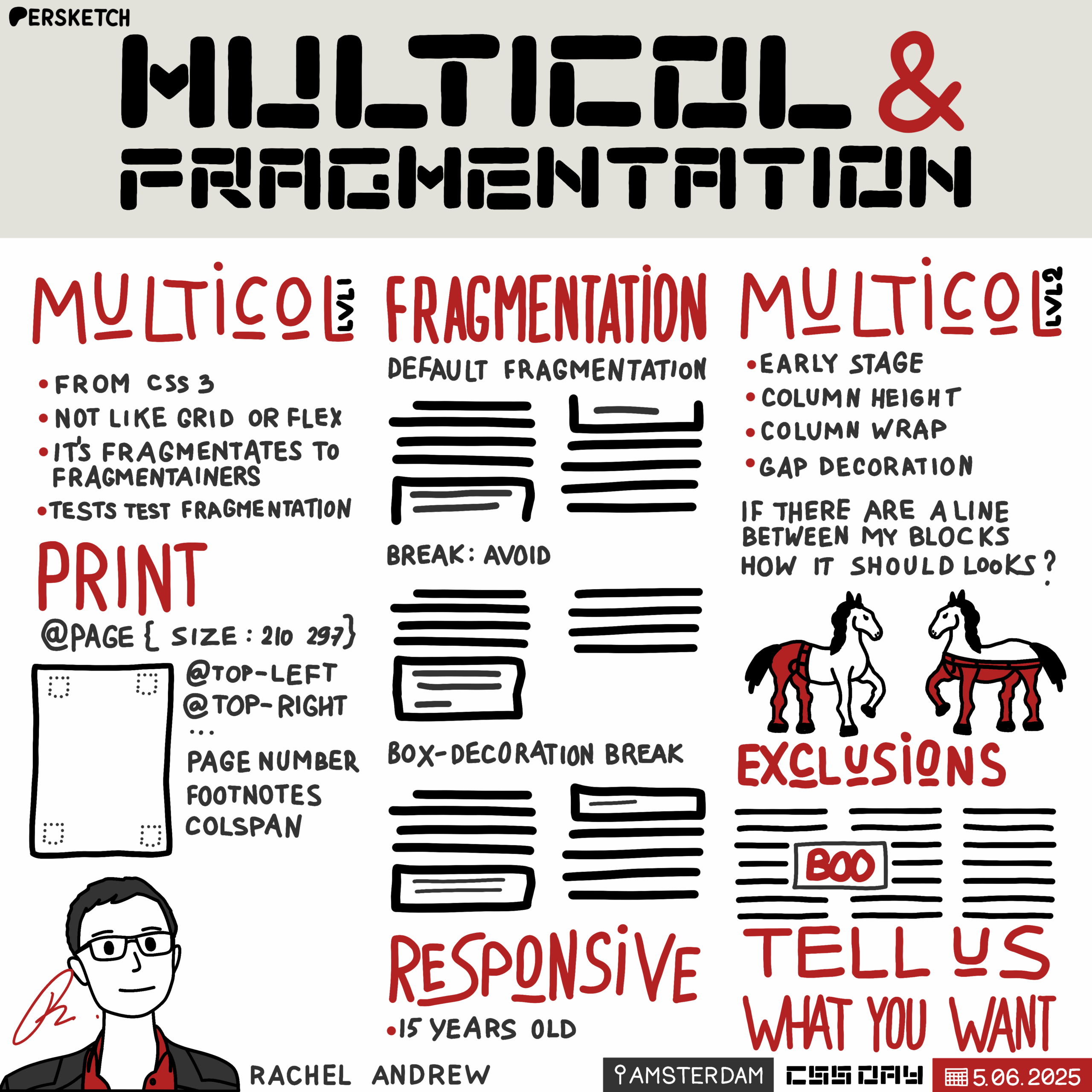
So I'm one of the editors of the Multicol specification, CSS multiple-column layout. And I got it, I think, because I was new to the CSS Working Group and nobody else really wanted it. And I'd already been poking around with sort of CSS for print, and so I was kind of someone who kind of understood that stuff. And so I ended up with it. Now, when I took it on, no one had touched it for years because Multicol was one of the original CSS3 specifications. It was one of the new things that happened after we got CSS3, we got Multicol, and so we sort of got it, and the spec was really just a stack of examples, and there were loads and loads of issues and actual resolutions that hadn't been edited in. So I started doing this kind of spelunking back into all of these working group issues and finding them and raising them and actually getting them fixed. We actually took it back from candidate recommendation to a working draft to do that work. So I kind of, I don't know, made the Web worse for a bit or something, I'm not sure. And it's now back at CR.
People here may have even been at the Frontier spec reading workshop I did with Multicol, which really helped. I think actually going through a spec from top to bottom, particularly with people who don't know it in depth, is really useful. That whole thing about explaining stuff and teaching stuff to people and you realize all the problems in the spec. So I think that's actually, as a spec editor, it's a really useful thing to do, is just to go through your spec line by line with a group of people and explain it. So the thing with Multicol is it doesn't behave like any of our other newer layout methods. So if you think about things like flexbox and grid, a flex or a grid container contains flex or grid items. Now, these are typically elements.
The spec does contain a way to fix up, say, a string of text that's a direct child of a flexor grid container so that the model works.
But essentially you've got a bunch of elements. They're direct children.
And it's those boxes that then engage in the formatting context, whether that's Flex or Grid.
Multicol doesn't do any of that. The direct children of multicol container retain the usual formatting context, but they're fragmented into the required number of columns.
So it's impossible to talk about Multicol without talking about Fragmentation.
So when we look at fragmentation, there's actually two kinds of fragmentation that happen in CSS - there's block and line fragmentation. Now, line fragmentation is essentially line breaking - it's what happens when you've got a string of text that wraps onto multiple lines.
That's not really what we're talking about when we talk about this kind of fragmentation.
We're talking about block fragmentation. It's what happens when you've got a block box like a paragraph, and it doesn't fit into the space left in one fragmentainer.
And a fragmentainer is one of those wonderful spec words, and it just means a single column or a single page.
So if we've got a bunch of boxes and break them into two columns.
So here I've got two fragmentainers on this page, and the last long paragraph is one block box and it's fragmented across the two columns.
Now, the only other place where something currently happens that's like multicol is when you print something. So if you print your HTML page or you turn it into a PDF, which is the same thing, you get fragments. Each page is a fragment, it's a fragmentainer. So you've got your regular layout and it's broken up into pages.
So multicol and printed things are basically the same.
So printed things in the spec are referred to as paged media.
They're pretty much the same thing in terms of how they are specified. And all of the stuff around fragmentation kind of matters to both.
There's not a lot actually in the multicol spec itself about fragmentation, because it's all deferred to the fragmentation spec. And most of the problems that people have with Multicol aren't really about Multicol at all., they're about fragmentation. And actually, as a spec editor, one of the things I need to do is sort out the test suite for my spec.
In order to make my spec an actual recommendation, one of the things I have to do is present a test suite and say: "Look, it's working. We've got two interoperable implementations of this." Now, the problem with the Multicol test suite is it's full of tests that are not testing multicol. They're using multicol to test fragmentation, because that's the sort of way to do it. I mean, you can test print things, but a lot of the time it's browsers who are like, "Oh, the browser crashes when we have this kind of fragmentation, or something happens." They're all jammed into the multicol test suite and I am still trying to go through them and work out what they all are.
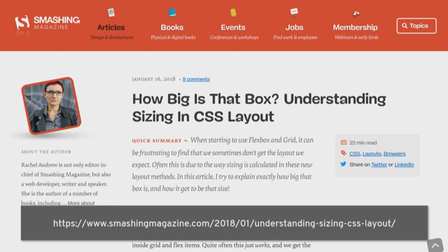
Now, fragmentation is somewhat fragmented in terms of browser support. So this is an article I wrote in 2019 for Smashing magazine and I went through all of the fragmentation properties and how they behave and had a look to see how well they worked.
It included a whole bunch of tests as codepens. So while I was doing this talk, I thought, "oh, you know what, I'll go back and have a look and see if any of them have got any better since 2019." There have been some improvements. I'm going to talk about them, but it's still a pretty sorry state.
So the fragmentation spec, it's for controlling breaks and it defines a bunch of properties to help control those fragmentation breaks.
So if you remember in the two column example, they had a box that was broken over the two columns. These properties help you sort of suggest to the browser how you'd like that to happen.
Now, none of these fragmentation properties could really be described as part of baseline. All of them are missing support for at least some of the values. No browser has perfect fragmentation.
So this is the browser support chart for break-inside. Now, this is one of the better supported properties and it's a bit of a mess, but one of the most useful values of break-inside, which is avoid - so 'break-inside: avoid' does have pretty good support. And what this does is it helps you control the situation where a box breaks across two columns or two pages.
So something like this... obviously this doesn't look great.
You've got a box there and it's broken across the two columns. This is a particular problem if you have something like a figure with a
Now you do have another option. Now if you're happy to have the box break, but you just don't want that kind of broken border look, which doesn't look too good, you can prevent the visual appearance of a fragmented box by completing the border around each fragment.
So you do that by using 'box-decoration-break: clone'.
And what this will do is tell the browser, the user agent, that you want to finish the border off around each of your fragments. And so you get something like this. So for some use cases that might look better - if it's just that you've got a decorated box or whatever, you might be happy for it to break, but you just want the border to wrap all the way around and look neat. Now this property was implemented by Firefox in Firefox 32. Very recently it shipped in Chrome with Chrome 130. So that's a bit of an improvement since that 2019 article, that's something that we can say has got better. There's still no support in Safari.
Safari supports a vendor prefixed version, but it's only for inline elements, so it doesn't help with our box issue, unfortunately. Now, just a little bit of a digression. This is one of the features missing in one browser that's highlighted on the new stats page that we've launched on Webstatus.dev. Now this is really interesting because it brings to life the data that we collected to do baseline. So the Web features data that the WebDX Community Group worked on is just this fantastic data set about support for features.
One of the things we've been able to do from that is to have a look at features that have two interoperable implementations, which means they're not experimental anymore. They're in two browsers.
We sort of figure they kind of work, but there's one browser which hasn't yet got it. So these are really good features to lobby for, because if there's a browser that hasn't got one of those features, you say, well, hang on, we've got - two browsers have done this. This isn't just a Chrome only thing or what have you. So this chart lets you - you can have a look and you can see the list of features if you select it. And you can see it over time as well, which is quite interesting, which browsers are shipping which features.
So yes, if you want a list of things to nag browsers about, this missing in one browser chart is a really good place to So fragmentation has typically been pretty hard for a browser to do, which is why it's in sort of such a mess really. Something that allowed a lot of improvements to fragmentation in Chrome was the work on RenderingNG - the new rewritten rendering engine.
I'm not going to go into a lot of details because there's some really good articles on developers.chrome.com if you like nerdy details about browsers.
So the way that Chrome was doing the fragmentation, so block fragmentation was essentially, it was laying everything out like an enormous long column. So in one long column, and then once it was all laid out. So after layout - was chopping it up as if you'd basically just chopped it up with scissors and then putting it into columns. Now you can imagine, because this happened after layout, this caused quite a few problems. It meant that making the - implementing the break properties was quite difficult, but you'd also get weird stuff where shadows would get sliced off. So the first example here, if you can see - the bottom of the shadow from the first column has ended up on top of the text in the second column. And that's because of this slicing. So with RenderingNG, the new engine, the shadows stay where they should be because we're not doing this sort of slicing up of a big block of stuff. So that's quite useful.
And so its from Chrome 102, which is when it shipped for fragmentation, a lot of things did start to improve. You didn't get these weird things that sometimes people would report to me as being a multicol problem and I'd be like, "oh no, that's the fragmentation. It's the way that it's working." As I say, if you want to get into the weeds of that implementation and if you want to know about fragmentation at a deep level, this was written by Morten Stenshorne, who is all things fragmentation at Chrome, and he went into actually what he did to implement that in Chrome. So if you like that kind of detail, it's a really good article. There are other articles as well about other parts of RenderingNG and the work that went into sort of modernize the engine. As I say, really interesting. I edited those and learned a lot as I was doing the edits about how these things worked.
So when RenderingNG happened, that enabled some of the other properties. So from Chrome 102 you can use 'break-before: avoid' and 'break-after: avoid' in multicol. So 'break-after: avoid' lets you control a situation where a heading becomes the last thing and then its text is separate from it. 'break-before: avoid' is helpful if you want to avoid a figure or something being broken away from preceding text that describes it. So it just helps you to sort of hint to the browser how you'd like that stuff to be managed when you're doing the breaking.
So people don't use Multicol very much on the Web. I'll get back to that in a bit. But where people do run into fragmentation problems is when they try and print things.
Now, when you think about printing, there's obviously - you can hit print on a Web page and see what you get out. And some people still do print Web pages apparently, but that's not the big use case. The thing that a lot of people are doing is using Headless Chromium to do things like create PDFs. Now, creating PDFs is a huge use case on the Web. Lots and lots of people have to do this. I used to be a PHP developer. I have done a lot of this.
People ask me, "well, we need to output invoices, we need people to be able to download packing slips." There's all of this stuff that goes on.
So people do a lot of printing, and it's not just needing a print style sheet from your browser. It's this kind of behind the scenes generating a PDF using Web technologies. Now, if you've ever tried to do this, if you've ever tried to do more than a fairly simple layout and print it, you'll find that it is a bit of a mess.
People are doing all sorts of wild things. This is another older article of mine where I looked into what people were actually doing to get round problems with print. And they're doing all kinds of things to get around these problems in the browsers. And so generating PDFs is a very, very common use case. And it's something that we have specifications for. We have specifications for page media, but they're just not implemented in browsers. So we don't do this very well. So the problems I've talked about, the fragmentation, the problems we have with multicol, are pretty much the same as with print. You'll have more or less the same problems when you print something, whether that's from the browser in a Web page or using something like Headless Chromium to print.
But when we're dealing with print, there's a bunch of other things from the Paged Media spec that really could help to control those experiences. Now there's a couple of specs of interest here. There's the CSS Paged Media module which deals with anything that is paged. So print things really. And there's the CSS Generated Content for Paged Media module, which is fascinating and has a bunch of really cool stuff in it. So these things should come into play whether you're using a print style sheet or whether you're using Headless Chromium to print, you should be able to reach for the features in these specs to be able to create really cool print stuff.
So, for example, perhaps you'd like to add some content to the header or footer of a page that you print from a browser. Now, say that might be a PDF.
Now, print user agents, we have user agents that are just designed for print. The one I'm most familiar with is called Prince. If you look that up, that is a user agent that outputs things for print, outputs PDFs, there's a few others. There's Antenna House is another big one. There are lots of people who are printing books with CSS. So the print user agents have been able to do this stuff for a very, very long time.
And it's starting to come into browsers. So the @page size, with the size descriptor that is now baseline newly available, it does have browser support. It lets you define the size of the page that you're printing to, which is probably less useful in most Web contexts. But if you're outputting PDF, say you're doing a packing slip, you might want to make that a certain size when it's printed out.
So you can do that. You can also define the size of the margin area.
Now, once you start to do print things, you have to forget everything you know about what a page is like on the Web and you have this new sort of page model to deal with. So that defines a page box, which is like your sheet of paper is the page box, and inside that is a page margin, a page border, page padding. So it's similar to the box model normally.
So when content's printed, it's fragmented into as many pages as it needs for all of the content. Now the page margin is split into these 16 boxes. We have fixed size corners and then we have these flexible margin boxes.
The content boxes in the flexible ones work a bit like when you have a flex-layout with flex: auto. So if you put a big thing in one of those flexible boxes, it will stretch out to fill the space taken by the others if there's nothing in there.
They're kind of flexible and they're still slightly weird when you're putting things in them as to exactly how big they're going to end up. But it's most similar to using flex-auto.
And you get content into those boxes with some very specific at-rules, one for each box. So you decide where you want your content and you use those to put it in. Now, once you've used your at-rule, then you use generated content to actually stick the content in. So this works in Chrome, and so here we're targeting right hand pages and we're putting in the content string 'my book', so that will appear - if your document became a 100 page printed book, on the right hand page, you would always have that string and you can style it just like other things in CSS.
We've also got some page counters which are pretty useful if you're printing out a long document. It's nice to be able to put what page that is. So you've got a predefined page counter which contains the current page.
So here I'm adding that to the bottom right corner.
There's also a predefined counter called pages, which is the total number of pages that the content will output to. So you can do things like page 3 of 10 and so on, which for documents people often want to do.
So you know that you've got all of the documents. So as I say this works in Chrome, it's Chrome only. But as I say the most common thing that we're seeing people do is using Headless Chrome to output PDFs. If you're doing that, you can use these margin properties right now and they work. So that can sort of improve your documents. So that's pretty cool. But the spec includes a huge amount of other stuff that no browsers have ever implemented. The print user agents have, but no browsers have. So, have a look at some of those because they're pretty interesting. And these again, all build on this generated content model. So the first of them is setting strings. Now, so if you look in a book, what they often do is print the current chapter title somewhere in the margin. So as you go through the book, there'll be the current chapter title will be there, and you get to a new chapter and then you get the new chapter title starts to be printed.
That can't be hard coded because you don't actually know how many pages you're going to end up with. You know, you change the page size, you end up with more pages or fewer pages. So that's something that can't be hard coded. You want to get that actually out of the content.
So that's what this does. It lets you add content from the HTML document. So in this case I'm getting the content of an h1, which is a Common thing to do when you're formatting a book as HTML, you'll make each chapter title an h1. So I'm looking for the h1, I'm getting that, and then I'm putting that into the margin as generated content.
I'm sure you'll cheer or something when that happens. So, yes. So again, generate content - we're taking something from the document, we're sticking it into the margins. Once you've got a document that's printed, references to other pages are usually indicated by using the page number in a print document. Now, obviously on the Web, we have the ability to use links, but you don't have that when you're printing. So when we're printing something, we want to put the number. And that's what this CSS will do.
The cross references let you target the page, figure out where it is, and when you print, you will show the page number. And when it's actually on the Web, you can just show that as a link.
And then we have footnotes. They're also part of the page media specifications. This is really neat. You can have something which is in a footnote, and then you can just put that down at the bottom of the page in the margin as a footnote. So these are all things that you'll be able to do if you use something like prints or Antenna House.
Now, although we know that PDF generation is something that a lot of people do, I raised bugs - I think one of them already had a bug - I raised bugs for the other couple of features. And you can see that we have like, 20 people want set strings, 33 cross references, and 13 for footnotes. And I kind of wonder why. Now, I've got a completely unproven theory about this, but, like, I'm up here, which is so I can spout these things.
I think we've just become trained in what the Web can't do.
Because back in the olden days, I worked as a developer for design agencies, and people sent me wild things to build, like, absolutely wild things, because the designers are trained in graphic design, they're not trained in Web design. And they'd ask for design patterns they knew about - and typographic and layout control.
And of course, I'd complained that these people didn't know what they were doing and they didn't understand the Web. But, you know, balancing headlines has only just become possible on the Web with 'text-wrap: balance'. You know, were these people, you know, back in the day, were they really being unreasonable to say, can we have balanced headlines? You know, unreasonable requests for controller fonts gave us things like sIFR. Who used sIFR? Loads of people use sIFR.
So for anyone who wasn't embedding tiny Flash movies in their Website in 2005, sIFR was like this terrifying way to let you use custom fonts. The script checked to see if JavaScript and Flash was installed, and then it went through the source of your page and it found each element you wanted sIFR'd. It turned them into Flash movies of the same dimensions, overlaid them on top of the original elements, and it added the original browser text inside as a Flash variable.
And then ActionScript would kind of draw the font and scale it so it fit inside the Flash movie. Utterly terrifying.
They were like, "don't use it for all of your text, just use it for headings". People used it for all of their text. This was bad. But it turned into the ability for us to have control of real fonts on the Web. And now we've got Variable fonts and we can do this precise control. So unreasonable design requests ultimately improved UI on the Web.
I went and asked on Bluesky whether people were still getting those requests for common print patterns that aren't possible. I think it was misinterpreted by most people, as: "do the designers you work with not understand the Web?" And people were saying, "Oh, only old designers think this." It's not so much age, though, it's "When were you trained?
When did you learn Web design?" Because responsive design is 15 years old. If you began designing for the Web in the last 15 years, and particularly if your training included Web design, which a lot of people's does now, you trained in a responsive world, that's a massive shift. The frameworks came along soon after.
Bootstrap is from 2011. This idea of taking somebody else's patterns and just reusing them, that's been going back a very long way. A lot of people, that's all they've ever been seeing. And perhaps I shouldn't be surprised because we're an industry who collectively chose "let's make three column layouts really hard" over the creativity of Flash. You know, there's a whole generation of us who very seriously called a three column layout with a footer the Holy Grail. It is not surprising that we've kind of codified our restrictions as being how things are.
I think this is also playing out in the fact that a lot of the new CSS stuff is essentially developer experience, or it's providing a better way to do something that we already do. Would a user of a Website, for instance, know they're using the new CSS Carousels over the JavaScript implementation. They probably wouldn't. And before all my colleagues start giving me side eye about this, it's not a bad thing.
There's definitely a call for making our jobs faster and easier and for making better ways to do more performant patterns.
But they don't bring us anything new. It's the faster horses of Web development. A lot of the requests from the community are basically this: "I want an easier way to do whatever". Even with something like grid and flex layout, nobody was asking for all the things that they do.
They just wanted to be able to line up their columns and have full height columns. What the community was asking for, the community wanted better floats, they got Grid. I don't know if that's okay.
So where printing and invoice generation is concerned, I think as with, sort of many other things, they end up in the hands of developers, the backend developers often, you know, as I say I was a PHP developer and I ended up doing a lot of this stuff and I think either people will reach for other technologies to do it or they'll just be like, "oh yeah, the Web's a bit rubbish. Printed stuff from the Web looks a bit rubbish." What a shame. What a shame that we can't create beautiful printed material from our Web applications when we have the specifications to do it. We have implementations with the print user agents that show us the way, but we've never really gone there with the Web. And while a lot of the patterns that we do see in print don't always translate to the Web, I think the only reason we haven't got others is just that there's lack of demand. People just assumed that, well, the Web doesn't really work like that, or maybe that it was just too hard.
But you know, container queries got a round of applause earlier and that was something that we for a long time thought that we couldn't do. And then things changed. So let's go back to multicol and talk about something that we are doing right now. A big reason people don't use multicol on the Web is because what happens is, you end up scrolling up and down. If you have too much content, you do this scrolling up and down thing. You don't want that. So if you add a height on your Multicol container, you end up scrolling side to side. You don't want that either, apart from very, very specific circumstances.
So we've started, and we've been talking about this for years at the CSS Working Group, in side conversations - "We should do multicol in the block direction". We've started to do that. It's very much in the early stages and you can try an implementation though, in Chrome Canary with experimental Web platform features.
And it kind of works like this. So we've got a column-height and a column-wrap property. If you set column-height to a length value, then the initial value of column-wrap as wrap will kick in and give you column rows. Those overflow columns will then start to be created in the block direction. If you give your columns a height but want to go back to the inline overflow for some reason, you can set column-wrap to 'nowrap' and you'll get the no wrapping behavior.
There's been some discussion as to whether we need column-wrap, but what it would do is let you sort of separate the column height from the height of the container, which I think may be useful.
There may be things you could do and ultimately we'd like to use the alignment properties to distribute the available space that's left.
And that's really - that's it. There's obviously a lot to work out in there to actually make that happen, but we'll be able to do this kind of thing. I can see this being used for kind of block direction carousel type layouts where you fill the whole page with columns and then page down and see the next. It does raise some design challenges, particularly with the way you can see it on this slide. You need to make sure it's obvious you should read one row at a time. So that really is a design thing you need to do. And the work being done on Gap Decorations should definitely help with that.
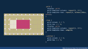
Now, this actually came out of multicol originally. The original Multicol spec had the column rule property shorthand, which is... essentially work like the border. It let you paint a rule between the columns. The new specification for gap decorations will add that. It will also let you add row rules for Multicol, so you'll be able to have rules between your rows. But it's also bringing the same functionality to other layouts like Flex and Grid, which has been a huge ask, "can we have lines between our grid columns" and so on.
So for multicol, here's how that might work. Really just the same as you would do with column-rule. And this actually works in Chrome Canary with experimental Web platform features turned on.
And then you can do the same sort of thing with Grid.
So this is an example from the spec.
This spec is a really good example of how a very simple ask, "Can I have lines between my boxes please?" becomes complicated because you might want it to look like this because as you see, when you've got a grid item that's spanning over two of those column tracks, the line is stopping, it's basically breaking behind it.
Now, that might be what you want to do, but actually you might want the line to look like it's going behind the item for whatever reason. So something a bit more like this, where you've got the gaps, you can actually see that the line is going behind the items is how it looks. So you have to make all these decisions when you're working on specs like this. Actually what do people want, what do they expect? And what options might they want to have as well? So the work on this has been done by the team at Microsoft. Kevin Babbitt is the spec editor for this. And as I say, these decorations have been a top ask for developers ever since we had Grid. So it's really exciting that that's sort of becoming part of the features in the browser.
And they're actually available in Canary. You can play around with - them these demos. The Microsoft Team have put a whole bunch of demos.
So with this one here, there's various decorations within the magazine layout. The Sudoku chart is done with these lines. There's also a little playground you can go and you can play around with it in Grid, Flex and Multicol. So, brand new, just out in Chrome Canary. Really good time to have a play and see if it does the sort of things that you want. This is something that's come up over and over again as a need. So definitely look out for that and have a play and see if it does the things that you want.
And the thing I think that is sort of going on, I've been sort of playing with this idea for a while, is that, you know, Multicol and the block- direction work with things like Scroll Snapping, Carousels and things, points to something. I feel like Paged Media and the Web are sort of becoming closer because when we talk about Paged Media, we're talking about pages, you know, so printed things, epubs, things that have defined pages. And so the Web is continuous media. You keep scrolling, more stuff comes, you keep scrolling.
But when you look at a lot of applications today, they very much are defining a screen. Even things like the very Web native scrollytelling type experiences where you're scrolling and you keep on scrolling through a story, they come to rest on a page, you move to the next page. Even though that's, you know, it's not the way you would do it in a book, but it's very paged, you know, so a book on the Web doesn't need to be like those awful page turny things that people use for their PDFs. I think there are Web ways of doing page things.
And so with that in mind, there's these other things that we do a lot in print that really do we want to do them on the Web?
So one of the things you see all the time in print, very common, you'll have multiple column layout in a magazine, two or three columns and you'll see that there is an image, maybe the author image or some box out which will have snapped to the top or bottom of a column.
And if there's not enough content in that column, there'll be a gap and then the item will be there at the bottom. Now, I imagine with multicol on the block direction, if you've got a page of columns, you may well say, "I've got an image. I don't want it stuck in the middle of a column.
I would like it at the bottom of the column." And of course you're not going to be able to do that by positioning it because you're not going to know how much stuff you've got. So I think this might be something that we could be interested in. We actually have a spec for this and I happen to be an editor of it, although I've not actually ever done anything with this spec. It was kind of again, one of these things...
the Working Group: "We need an editor, you know about paged stuff. You could edit that one." And I think it also needs a bunch of digging things out to be done. It's called Page Floats. Probably needs renaming, I don't know because they're kind of fragmentainer floats I guess. But it defines this type of ability. Print user agents do this already and they've extended the spec to add additional functionality, which is pretty cool because it means we do have implementations of this type of thing, just not in the browser. So I can see what Prince is doing here. So this is '-prince-float: snap;' So this is one of their vendor prefixed implementations of these sort of properties. And what happens if you use Snap is that if you've got say an image or some other blocks that you want to be at the top or bottom edge, it will basically snap to the nearest. So if it's nearer the top it'll go to the top and if it's nearer the bottom it'll go to the bottom. So that's just one of the things that you could be doing. As I say, I think where you've got a full set of columns, that might be something you want to do and also certainly would want to do that if you're printing. Something else the print user agents do is another multicol feature that we keep talk know if anybody wants, and that's 'column-span:
And we refer to it as a spanner.
Column span with an integer would let you span some columns.
Now, that could quickly get weird if it was in the middle of the set of columns. But I think if you were using page floats and you were snapping something to the bottom, then having it span over two columns seems perfectly reasonable. And you get things like this, which totally common in print media. This is actually from an issue that was raised on the CSS Working Group repository by Scott Kellum asking for basically this feature. So the image there on the top right is spanning over columns of text. As I say, long history of this sort of design being used in print. You can imagine how that could be responsive. It could change depending on how much space there was.
Maybe that's something that people want. And I think combined with some sort of page column floats could be really useful.
Now, it has to be said, as the spec editor for multicol, I'm kind of hesitant to suggest any changes to spanners because all of our pain with the spec tends to be with spanners.
The phrase 'a spanner in the works' could have really been designed for multicol because everything seems simple. The block-direction: overflow, fine. But then what happens if someone has a spanner which is bigger than the rows we are creating?
These are the sort of questions that we have to answer because even though obviously something terrible is going to happen, at least it should be specced, so that the terrible thing happens in exactly the same terrible way in every browser.
But spanners are hard. So it's kind of like if we're going to do this, there needs to be a need for it. Someone needs to really want this sort of thing for us to think about implementing it. And then talking about hard things that we don't really do, but maybe we could. There's a couple of features that I've talked about for a couple of years and every few months someone will pop up and say: "Has there been any progress?" And the first of Those is exclusions.
So, again, very, very common print.
If you open a magazine, you would be hard not to find this layout. It's very, very common - multiple columns, something stuck in the middle of them.
Again, these are actually from another issue that Scott Kellan raised. And I'm including these GitHub issue examples because this is the sort of stuff that we want to see. You know, raise the issue, show us the things that you want to do, especially when you've got examples. Tell us why you want to do them, tell us what it's stopping you doing. It doesn't need to be a very technical thing that you raise. It can just be, "I want something that looks like this and it's impossible." That's actually a good starting point, especially if you can tell us why. What is that use case that is driving you to want to do that? Really useful to know. Miriam pointed this out this morning. You can give feedback. You can also propose ideas. Please do. So you might not be interested in making a hole in the middle of your content - your columns, but on the Web, there's a very common use case.
This comes up every now and again. People want to float things as part of the Grid. They want it to be floated, but lined up with the Grid. You can do this with exclusions, because you can basically have both things as the child of the Grid. You can float that thing and then use exclusions to cause the content to wrap around it.
Exclusions as spec doesn't have any positioning of its own, you'd basically use Grid or whatever to do the positioning or absolute positioning, and then you'd use Exclusions just to kind of make the gap and make the content flow around it.
An early name for this was actually Positioned Floats, which is a good description of what you're really doing with it. This pretty simple use case - but if you want to float something kind of in the middle of a paragraph rather than to the top of the paragraph, that's something that Exclusions would allow. It was originally part of the CSS Shape specification and kind of got pulled out.
You could imagine how excluding something and then wrapping the text around the shape would be a really nice thing to do. Again, you see that in print design quite a lot. It was implemented in IE10, so there was a working implementation until Edge went Chromium and then I lost my nice way of doing a demo because now it's obviously gone. I don't know if there's enough demand to move forward with it, but it's another of those things that would be Interesting to see - there were certainly valid use cases for it.
Does anyone want it? I know a few people really want it, but more generally is that there? There's an issue which has been around for a very long time, that's 2018, that's a good place to go and add any use cases you've got.
The thing is, no one asked for Exclusions, obviously that's just like a made up name. What they're asking for and what typically you're asking for is "How do I do this thing?" And that's fine. Let the Working Group figure out actually where it belongs, which sort of technology would be used to actually make it work. We just want to see what the thing is, because all of those use cases I showed you people wouldn't look at and go, "Ah, that's an exclusions use case", unless you're me.
And then I'll wrap up with the other spec that people reasonably frequently ask me about and that's Regions. And this really brings us right back because I explained at the start that Multicol isn't like other layout methods because it keeps things in their normal sort of block and inline layout and just flows it through columns. Regions - that was the promise of Regions, but that you could have disconnected boxes and then flow that thread of content through them. It's an interesting tale.
This is an old 'Can I Use?' screenshot. It was implemented all over the place, including pre-Chromium Edge and then it was pulled out and removed because there were problems with the way that spec was designed.
The original spec basically assumed that you knew all the boxes, you knew exactly how many boxes you needed for all your stuff to go into. And the best it could say about the leftover content, which you'd be bound to have, was: "Oh, make a big box and just dump it all in there." Which obviously isn't ideal. No one's going to do that.
But it did predate the modern grid spec and things like the ability to create intrinsic rows to hold content.
But the other reason that it would be difficult is fragmentation, because... So here we sort of come full circle to where I started with multicol, because if you think that poor fragmentation in multicol is a nuisance, imagine what it'd be like if the boxes are completely disconnected and the heading is kind of over here and the content there. You'd need really, really solid fragmentation to be able to have a good job of doing something like Regions.
And so I think, you know, each thing that we get to do on the Web kind of stands on the shoulders of other things, you know, we can't have Regions without Fragmentation. And you know, there's other things like this that we need to implement for us to be able to move forward - the bigger things, the more shiny things. And I'm really interested in these core things.
I'm drawn to the behind the scenes stuff, the seemingly mundane.
I'm kind of a cheerleader for dull features that don't make the headlines, because I think it's in these things that we get the underpinnings of all the other stuff that we might want to do and we need to ask for them if we want to kind of move things forward.
It's really hard for us to build a business case to work on a feature if we don't have use cases and a business case is what is needed. A huge number of sites would benefit from better print implementation, but they're not asking for it maybe because they just assume that print on the Web is really, really bad. So better principle, better fragmentation. These things could also open the door for a whole load more stuff. So every few months someone finds one of these things I've written about and asks me and they'll say, "I've got a use case for all that." Great! Go to the Working Group issue and please write up your use case, show us it. And they never do because they just go away when I tell them it's not ready, it's not there.
And I think that's a real, real shame because unfortunately, those of us who work at browsers, we don't make new CSS for fun.
Our bosses aren't going to sort of pay us to lark about with the browser and do things that we think are a bit neat. We need to be able to show why that is needed, why the community want it. And sometimes when we show the need, we get to work on these things, on these things that are connective, that make the stuff we've already got even better. You know, last year I talked to you about reading-flow. That's something I've been gathering information about since before Grid shipped. And it's been a long, long road to get a solution that was acceptable and that we could get into browsers.
But that shipped. It shipped last month in Chrome 137.
The reading-flow and reading-order properties are now in Chrome and available. So we can get things into browsers, even these non shiny bits of connective tissue, if we know about them and if we know that you need them and we know there's demand. So I've kind of shown you a bit of my wish list today. Maybe yours is different, but please do let us know about it.
And just as a quick plug, the State of CSS survey is out - that is another way that you can come and tell us the things that you really care about and that you want to see. So please do go and fill that in.
Ask your friends to fill it in. I mean, the ones who like CSS, obviously, but, you know, bring them, get them to fill it in. Tell us what you want by all the different ways that you can, because it is really important and it does actually change the Web. So thank you very much.
And you'll find my slides at that URL.
Where shall I go? Should I go here?
SH: Testing, testing. Okay, thank you, Rachel.
We do have some questions for you. RA: Marvelous.
SH: Khalil asked: "Doesn't the Fragmentation/Slash/Multicol principle go against the Dao that was previously mentioned today because it's based in print?" RA: Yeah, you know, I think this is what this is. I mean, I think this stuff is very Web like, as well as, you know - so, the scrollytelling thing, I think, is a really good example of how we have a continuous flow, but we sometimes want to rest on a page.
And I think if we think of print design as being this very rigid thing, then, no, I don't think the Web is like that because the Web is not rigid. The Web is very fluid. But I think there's crossover there.
And also the nice thing about things like Multicol and also the sort of the basic idea of Regions was that you could take something that was well marked up, that was, you know, very accessible, was, you know, we weren't sort of fragmenting it into lots of boxes by having to wrap it all in divs to lay it out and then just lay it out in a very Web way. So I think there's definitely crossover there. I think there was a reaction against print design almost. We're like, "Oh, we're something very different. We don't want to be like print." But I think there are things that we can learn from those kind of layouts. There's stuff there that's hundreds and hundreds of years of history. And I think, don't throw it away. But how do we turn that into Web experiences, I think is what's interesting.
SH: What do we do now to get that back? So you mentioned the requests that we got that were coming from print that kind of made some progression on the Web.
What happens now that we don't get those same kind of requests from print? Where do we get them from. RA: I think it's by looking at the...
you know, I'm not a designer, but I'm still very interested in where these things come from. And I think it's not ruling stuff out. I think that what's happened is we've just started ruling stuff out. We're like, "Oh, that's a print thing. The Web doesn't do it." And in some cases that's probably exactly right. You know, the sort of pixel perfection, the "Oh, we know exactly how many words are on the line." The Web does not do and should never do. But that doesn't mean that you can't arrange your content in such a way that it flows around some element which is fixed. So I think it's not throwing things out and saying, "Oh, we can never do it." It's saying, "Well, actually, is there something of this that would make sense and still be the Web and still be Web design?" SH: Right, right. Dennis asks: "Why aren't there logical margin-at rules like for example, at-block-start: inline-end, or wouldn't it make sense for printed pages? And what about margin-at rules for columns in multi column layers?" RA: Right, yeah. So the print stuff, obviously you were dealing with physical media, so you do actually have a top, right, bottom, left. I mean, even if you're working in a vertical language, you still have the thing that you're holding.
Yes. Multicol is a bit weird. It's because it's so old.
So obviously we've got things like column-width and column-height and so they essentially have... they behave in the same way, they will behave logically. We don't have mappings for them yet. We probably should have mappings for them. It is a bit of an oddity and it's because of the age of it really. When we did Grid and Flexbox, that's when it all started that we started talking about block and inline size. Multicol is a bit of a relic.
It's very old at this point. So, yeah.
SH: Josh asks if you think those at-rules for each of the margin boxes should have been pseudo elements?
RA: I don't know. I mean, they are an odd thing. The print stuff is odd. I don't know whether they should have been pseudo elements. I mean, I don't actually even know the history of all of that because this stuff is all, again, pretty old. It's just that no one's ever implemented it in the browser.
Be interesting to dig into what all the thinking was. But yeah, so the implementations are all in the print sort of media place. SH: Do you have an idea why the browsers haven't caught up or have no ambition yet to catch up with say Prince? RA: Yeah, I don't know, it seems a shame and I think part of it is that people, you know, we sort of - print style sheets kind of fell out of fashion. They were like a big thing at one point because people did used to print stuff. It was very, very common that people would print Web pages.
And you know, remember when I was implementing stuff, people would come and be like, "Oh, this is printing badly" and you know... yeah, but I don't - people don't really talk about it so much anymore. And I think that this use case of using a headless browser to print, incredibly common but I don't think anyone's really thinking about it. And as I say, I think a lot of it is that it's often the back-end engineers who are doing that work. They're like, "Oh, you've got to make this print okay." And they're like, "Well it's going to look terrible, whatever." Or you get people who are just like building PDFs with some of the technological latex or whatever. So yeah, I think it really is just a not asking for it. You know, it's surprising how many people are doing this when you do ask. SH: Yeah, I've done it and we used the Prince formatter for it. RA: Yeah, well that's it. You could.. SH: Because you couldn't do it otherwise, what we wanted to do. RA: Yeah, you can use Prince.
DocRaptor is the company who actually have Prince as an API, so you can use it to do that kind of thing. SH: What's the next big thing for you? RA: Well as I say I want to get this Multicol stuff done. I think I am actually the blocker in progressing the Multicol stuff. So I need to get back to it. I've been busy.
There was Google io. It kind of burned up all of my life.
So yeah, so obviously I'd like to get that done. You know, I want to keep leaning on the reading-flow stuff and hopefully we can get that into some of the browsers. That's been a bit of a sort of a passion project of mine for many years that we should do this. So the fact that its now actually in Chrome, I don't want to kind of let up.
I'd like to make sure that we keep that going and hopefully find out if there's any problems. You know, it's new, there may be issues with it.
I'd like people to experiment with it. So, yeah, so they're the things I'm kind of. As I say, I'm a bit of a CSS hanger on at Chrome.
I'm supposed to be running my content team and doing that, so I enjoy getting to do this stuff and being part of that.
But, yeah, I'm still very excited about CSS. It's good.
SH: Well, Rachel, you mentioned that you felt a little bit like the furniture here at CSS Day, but I think all of us are pretty happy with that.
So we hope to see you back here next year. Thank you so much, Rachel Andrew, everyone. RA: Thank you.
- CSS Multi-column Layout Module
- CSS Fragmentation
- Flexbox
- Grid Layout
- Fragmentation Spec
- break-inside property
- box-decoration-break property
- Webstatus.dev
- RenderingNG
- break-before property
- break-after property
- Headless Chromium
- CSS Paged Media Module
- CSS Generated Content for Paged Media
- @page size descriptor
- @page margin at-rules
- Page Counters
- string-set property
- target-counter function
- float: footnote
- text-wrap: balance
- Variable Fonts
- column-height property
- column-wrap property
- CSS Gap Decorations Module
- row-rule property
- column-rule property
- Page Floats
- -prince-float: snap
- column-span:
- CSS Exclusions
- CSS Regions
- CSS reading-flow