Mapping Typography
Introduction
Scott Kellum introduces himself and the topic of mapping typography. He discusses his experience with dyslexia and how it shaped his understanding of reading as a process of decoding meaning from symbols.
Legibility vs. Readability
Scott explores the concepts of legibility (can I read this?) and readability (do I want to read this?). He presents a quadrant system to illustrate how these concepts intersect, providing examples like checks, newspapers, protest signs, and black metal logos. He emphasizes the importance of both legibility and readability in web design, highlighting the differences between UI/forms and editorial content.
Real-World Examples
Scott analyzes examples of how legibility and readability are addressed in various online platforms. He discusses Twitter's use of stylistic sets to improve character differentiation, Wikipedia's prioritization of legibility over readability, and the design choices behind Arial and Helvetica. He emphasizes how typeface selection can significantly impact readability.
The Multidimensional Nature of Websites
Scott introduces the concept of page size changes and the multidimensional nature of web design. He compares designing for print, where dimensions are fixed, to designing for digital, where devices and viewports vary greatly. He emphasizes the complexity of accommodating different screen sizes, display modes, and user preferences, leading to the need for design systems.
Typography as a Design System
Scott uses the analogy of a typeface as a design system, illustrating how individual components (letters) work together to create a cohesive whole. He highlights the importance of considering the overall impact of design systems and ensuring that they are more than just a collection of beautiful elements. He emphasizes the significance of conveying meaning through typography and how it can be achieved through proportion and scale.
Responsive Typography with Typographic Maps
Scott demonstrates how typographic maps can be used to create responsive typography that adapts to different screen sizes. He shows how headlines can be dynamically resized based on their width and how this approach can be applied to other elements like body copy. He introduces the concept of curved maps to achieve smoother and more visually appealing transitions.
Typographic Maps: Beyond Font Size
Scott explains that typographic maps can be used to control not only font size but also other typographic properties like line height, font weight, and font width. He emphasizes the importance of line height in creating a comfortable reading experience and demonstrates how it can be adjusted to complement different text sizes and line lengths.
Analyzing Real-World Website Typography
Scott analyzes typography on websites like The Los Angeles Times, GitHub, Heath Ceramics, and Stripe. He identifies areas where responsive typography could be improved and how typographic maps could provide a more elegant and consistent solution. He highlights the benefits of reducing code complexity and achieving higher design quality with typographic maps.
Implementing Typographic Maps with CSS
Scott explains how CSS animations can be used to implement typographic maps. He demonstrates how the easeInOut function can be leveraged to create curved transitions, and how keyframes can be defined to control the interpolation of different typographic properties. He provides code examples for implementing typographic maps on root styles and individual elements like headlines.
Beyond Typography: The Versatility of Interpolation
Scott showcases Lynn Fisher's website, which uses CSS interpolation to animate SVGs across different viewport widths. He highlights how this technique can be applied beyond typography to create dynamic and engaging web experiences. He emphasizes the power of controlling how styles interpolate to achieve high-fidelity designs with less complexity.
Design Workflow and Tools
Scott discusses the need for design tools that integrate scalable text components and typographic maps. He highlights Figma's plugin system as a potential solution and suggests integrating typographic maps directly into website builders. He concludes by emphasizing the importance of empowering designers with tools that simplify the creation of high-quality, responsive typography.
Thanks so much for having me.
I'm thrilled to be here.
Sydney has been absolutely beautiful.
And I'm excited to talk with you all about mapping typography.
So a little bit more about me.
This is me.
I am piecing together a design system with design components here.
And at a really young age, I was diagnosed with dyslexia.
And dyslexia is a reading disability.
And it made me think a lot about this question, what is reading?
So reading is coding.
And I don't mean writing code in VS Code or programming.
Reading is about, understanding meaning from various symbols and characters that are letters and then transferring those into some sort of understanding.
It's not, dyslexia is not about visually or optically inverting letters or flipping letters around.
It is about understanding these shapes and how they map to some sort of, meaning or understanding of those shapes.
When we think about reading, we think a lot about legibility, and legibility is about, can I read this?
And that's slightly different from readability, which is somewhat close to, do I want to read this?
But a facet of readability is also about, conveying meaning, how do I convey the intended meaning to my audience about comprehension.
And if we put these on some sort of chart, we could see some quadrants form and in the United States, we still use paper checks.
Yes, we think they are archaic as well, but, we don't want to mix these up.
We don't want money coming out of the wrong account or going into the wrong account.
So legibility is extremely important here, but readability is not.
We're not going to sit down on the couch and start reading through a checkbook.
On another corner of this quadrant, we have something that needs to be both legible and readable.
That's something like a newspaper or a magazine.
With that, we need to, be able to sit down on couch, but also understand accurately what information we are consuming.
A really interesting part of this a quadrant here is something that might be less legible but more readable.
For example, protest signs, we need those to come from the heart.
That is a personal message that we are sharing.
A lot of times those are handwritten, they aren't necessarily legible, but in a, they are also more readable in the sense that we want to read them because they are a personal message to our audience.
It's much more readable than something we might go and print at a print shop, because, we are getting our message across.
That is personal.
It's something we want to read.
An extreme example of this are maybe, black metal logos.
We cannot, this is extremely difficult to read.
This is.
It's not legible whatsoever, but we still might want to read it and we can instantly comprehend what it's trying to say.
On the web, we mostly focus in these areas.
So UI and forms, those need to be very legible.
They aren't necessarily something we'll sit on the couch with for a long period of time, but we need to understand exactly what those are saying.
Whereas editorial, we might spend more time, that needs to be a comfortable experience for us.
Twitter, recently got rid of verification, or the verification that we knew, towards, pay to play service.
And they had this issue of verification, fake accounts, things like that.
So in order To help fix this issue, they've created a stylistic set, so alternate characters, that I'm just toggling on and off right here, and you can see the difference between sort of the readability of the sort of flowing of letters, and then the ability to easily decipher the difference between I's and uppercase I's and lowercase L's.
This toggle to increase legibility, maybe at the detriment of readability, has helped with verification process.
So this is a really good example of where something that might not flow as elegantly in text is more legible to an audience.
And solves a problem.
Wikipedia, I find is not the most readable experience.
The line links can get quite long, but it's super dense information and they're presenting all of this information extremely clearly.
So they are opting for as legible exp or as, as clear of an experience as possible.
Maybe at the detriment to some readability.
We can look at this in typefaces themselves, so Helvetica and Arial are both very legible typefaces.
We can easily decipher what they mean, but in long paragraphs of text, their readability can suffer.
Arial was commissioned by Microsoft because they did not want to pay a license fee to monotype for Helvetica.
So instead they opted to, commission their own typeface, Arial.
And in doing so, they increased the readability of it in long text.
They did some certain things, like adding some humanist elements to their design, so you can see a more sloped leg of the uppercase R, slightly more open apertures in the E and the A, to create more flowing forms that read better in longer text.
And if we bring in more of a humanist Sans Serif, we can see just how open the apertures on the E and the A can be, along with the characteristic, sloped leg on the R.
So readability really helps us communicate.
And when we're going to focus on this, we're going to focus on, these areas.
So UI forms and editorial.
And inside of that Let's talk about the differences here.
With UI forms, dashboards, and feeds, we have multiple paths of communication and action.
We might see something and click into multiple different directions here.
Whereas with editorial, and landing pages, we have a single story or path of communication.
We are directing people along a single narrative, and as page size changes, the design implications of this change.
With UI forms, dashboards, the den, the density usually remains unchanged.
So as we have more screen real estate, we tend to put more things on that page to fill that up.
Maintaining a consistent density of information, whereas on editorial and landing pages, the density scales in proportion to the page.
So we often scale the story up to fill the real estate we have, and this is why we see responsive type applications more in these contexts.
Now, there's something else that I think goes often overlooked or under inspected, and that is page size changes.
This is a unique aspect to digital design, this is a unique aspect to web design, that is worth diving into a little bit more, because the shape of a website is multidimensional.
Now this sounds complicated, so I'll compare that to print.
When we're designing for print, we have two dimensions.
And we know exactly what these dimensions are.
And, an A4 piece of paper, we know exactly what that is, we can print that out, it's the same every single time.
And when we're designing for print, we are delivering the platform with the design.
We are shipping a magazine with a design printed onto it to every customer, every reader of that magazine.
When we are designing for digital, people are coming to that design with their own devices, with their own platforms.
And they see our design through a viewport, which, just like print, is two dimensional.
It has a width and a height.
But people come to this with different platforms, different devices.
And that design needs to adapt to multiple widths and multiple heights.
And there are dimensions beyond just length based dimensions.
We might have a dark mode and a light mode.
They might come to us with preferred font size, internationalization, there's scroll depth, different inputs.
All of these different things are factors that change this multi faceted, multi dimensional object that is a website.
When in 2012, so early responsive web design, I was working on the SB Nation redesign.
So this is over 300 different websites, that all needed to work with a new design framework.
And, we had, responsive sites, three different breakpoints.
We had all of these components, these article components, so we had, each one of them was styled differently.
There were feature articles, there were regular articles, there were video posts, fan posts, story streams, and each of these needed to fit into different parts of the layout.
So multiply breakpoints times layout positions times entry type and you get a lot of different components that needed to fit into this page.
So I think about 72 different components that needed to fit into this page.
This was a lot to style.
And all of you have all of this in your head as well when you are making responsive websites.
You all are thinking about these components in this multidimensional landscape.
So this may sound complicated, and it's because it is.
You all do this every single day.
You are incredible.
And we manage this complexity by creating systems.
We can call these design systems.
And here is an example of a design system.
Bear with me a little bit.
This is a case full of type.
And a type is a design system.
When I used to be a typeface designer, and when starting designing a typeface, like actually sitting down and making it, we started with these characters.
So we started with an H.
So there are straight lines here, and we figured out how these straight lines fit together.
With the O, we have round lines.
We figured out how that works.
Now with a D, we figured out how this straight line fits with this round line, and that works.
With the N, we figured out how these shapes work together, the O now rounds in a different proportion, and now this P, so the straight line in this round, fitting together again.
So all of these make for the building blocks of a broader system.
And now we move to test words.
So there's some outliers that still need to work within the rest of the system.
We have things like the lowercase a, the lowercase g, And the lowercase s, a little bit different from the initial, components we first saw, but they still need to work together in this system.
And we expand to ASCII character sets and larger character sets.
And now we have a single style.
That we need to expand again to multiple styles, so we could see, here's, Roslindale Italics, and we have a weight and an optical size axis here, and we could see that there's different quadrants where this scales into.
This can be visualized in multiple ways, so you could start to see the shape start, it's taking place, just website in its multi dimensional shape, looks, and, Gerrit Nordschzij did this wonderful illustration here.
Expanding on this, Stephen Nixon at Arrow Type, has a number, a huge array of different, axes in recursive, and he created this visualization at the top of this website, to showcase all of these different, different dimensions in which recursive can change and transform.
Roslindale is shaped a little bit differently.
So it has, a, it's shaped more like a triangular prism where the width axis goes away as the optical size axis changes.
And this is managed with design tooling.
Superpolator has been around for a very long time.
It's actually out of date as a lot of this technology can be now built into other design tools, like glyphs and, RoboFont.
But, anyway, Superpolator is, is a place where in the upper left hand corner you can see this gradient.
And that gradient is where type designers manage, this, interpolated design space, this multidimensional design space so that they can design, their typefaces.
Typefaces are, design systems and design systems need to be bigger than the sum of their parts.
Matthew Carter has this wonderful quote, that type is a beautiful group of letters, not a group of beautiful letters.
And, to make this more appropriate, I think, for this track, design systems are a beautiful group of components, or principles, or tokens, not a group of beautiful components.
So I want to take a little bit of time to think about the impact of our work here.
What is the sum of our parts?
What are we trying to showcase?
What are we trying to communicate with what we are creating?
We are, we're trying to showcase our product names, how much that product costs, what are we going to click on with a call to action in a headline to entice people into reading something that they might be interested in.
We often synthesize these, these intents with, tokens or, type scales, or various, aspects, utilities that can then be synthesized into these texts, these pieces of text with various meaning.
But how might we attach this meaning, proportion, scale directly to the text components themselves?
And I'll take a step back again and look at this old newspaper layout from the Times.
And we'll just look at the headlines here.
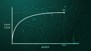
And see how they map onto a graph.
So as the headline width changes, so does the font size.
So we'll just try to draw some correlation between these.
And you can see a very clear correlation between headline width, the width of that headline, to the font size.
Now this is great.
We have flexible grids, fluid media.
Can we do something similar with our typography?
We have clamp, viewport width and container query units, so CQI is a lot like viewport width.
And we can, graph out the slope, so we plotted our points on a graph, and we can graph out a slope, doesn't have that curve in it, but, we can get something similar, we can take that, and then use that in our newspaper layout.
So that way, if, we want to put a headline in some different area of our layout we know exactly what size it should be.
It is automatically that size.
And we don't have to create a new component for it every single time.
Yeah, here's that, that equation to derive that font size.
If you don't want to do the math yourself, there are tools for this.
Utopia is an excellent tool for creating responsive sizing for websites.
And yeah, that equation is really similar to the one we came up with.
Great.
Here's a product page using something similar.
All of these headlines and product names are derived from a single product typographic map.
And that map looks like this.
Alright, so we've looked at those examples.
Let's take a look at something more, slightly more complex.
So The Atlantic has some beautiful, rich typography on this page.
They have headlines of multiple different sizes across multiple different break points.
And again, let's map this out onto a graph.
And instead of drawing a straight line through these, what would it look like if we created a curved line?
A more dynamic map here.
And what would happen if we changed that map in real time?
We could see what happens to our typography across our page.
So all these headlines are being driven by one map, one CSS rule set.
And we get responsive for free.
Let's see how this works.
All the text scales.
Alright, so that's how headlines work, and we've talked a lot about headlines.
What about the body copy?
What about our paragraphs on our page?
Could that work with a typographic map?
Because we're asking a lot from our text, we're asking for it to scale, now down to the size of a watch, or now foldables are out, what would a map for this look like?
Because ideally, the text does need to shrink down, but we want it to be as big as possible in as many places as possible.
We want that to be as big and readable as possible, but we also don't want the text to get cut off.
We don't want a word overflowing the edge of the screen.
So we do want it to shrink down, just in a specific way.
So we want some sort of curve, curved map.
And this is What I've come up with, as a map for our root font sizes.
So starting from incredibly small, but going up to a reasonable font size as quickly as possible.
And we've talked a lot about font size, but other, there are other aspects to typography.
There's font size, line height, font weight, and font width, or, let's throw in any interpolable property while we're at it.
And here is an example of one typographic map, not just using font size, but including font weight, font width, and some line height to create a much more rich and dynamic typographic palette, as it is rendered in this layout.
Talking about line height specifically because this is something really important that I want to focus on because it's something subtle that, really impacts the quality of your typographic output.
So this looks off.
You can see the headline and the text below.
The spacing is a little uncomfortable.
And as we increase the number of characters per line, we also want to increase the line height in proportion to it.
So I've just inverted the line height on both of these pieces of text, and it feels much better to me.
The Headline feels tighter, and the text feels loose enough to read comfortably.
Now let's look at some examples here of how other people typeset their pages.
So in this Los Angeles Times article, they have about three different breakpoints where this headline snaps down to a different size.
And this is how most editorial sites, manage their typography.
In this GitHub page, on the sign up form, the landing page for GitHub, they have one breakpoint here, and there's a really an opportunity to keep this call to action as big as possible for as long as possible.
Heath Ceramics, one of my favorite, e commerce sites, I think it is gorgeous, has some responsive typography here.
They use some viewport width units to scale this text down, So they spent a lot of time to finesse and make sure that this typography looks good.
But there are areas where the proportion scales somewhat inconsistently with the body text.
And then Stripe, you can clearly tell they, they spent a lot of time, making sure that this headline, here, on this landing page scales fluidly, and I love how when the screenshots pop in and out of place, the text responds to that, and gets bigger.
And all of these applications we can solve with typographic maps.
Do these with less code and create higher quality designs with typographic maps to define how our text flows through our layouts.
So just like that Stripe example, one CSS rule set without any breakpoints, there's breakpoints for the layout, but there are no breakpoints for the text, can define how these headlines look.
Grow and shrink to, to evoke, the headlineness, that they need to.
Or here's that Atlantic example again.
You could see this, shrinking and expansion of all these, of this layout and it works, and on all devices.
Or an e commerce site.
And we're only managing one CSS rule set for all of these different product names and headlines.
Alright, so that's great.
But, how do we implement these?
How do we create this curve here?
And this is something that we've really been dedicated to at TypeTura.
This is something that we've been, focused on, finding a solution to.
So we have really powerful interpolation tooling within CSS itself.
This has been around forever, we all have it, and that is in the form of CSS animations.
We have, this EaseInOut function, so that defines that animation timing function, can define the shape, that curve of our typographic map.
And then we can define where things interpolate from, so we don't have to do, we can use whatever units we feel comfortable with here, we don't have to go through a calculator to figure out, what the calc function is for this, and then figure out where things interpolate to.
So all of that can be built into CSS, and there are, now a few different CSS approaches to binding this to your context, as well as, JavaScript for, better browser compatibility.
Here's what a typographic map on the root styles would look like.
So instead of using an out of the box, easing function here, we're using a cubic Bezier function, to define what the typographic, the shape of that typographic map looks like.
Instead of defining a to keyframe, we just define the from keyframe, and then all of our styles interpolate from the from keyframe to the, just default CSS rule set.
Here's an example for a headline and I'll show this, what the result is in a second here.
And yeah, this also has a more complex, easing function for that headline.
So this is the result of those root styles in that headline that I just showed you.
We can create something that is rich and dynamic that scales down impossibly small and back up again.
Yeah.
And so we get something that looks like this if we extrude it out.
This is like the shape of our headlines.
This is the shape of our styles.
If we extrude them out as different widths, as they are rendered across different widths.
And we don't need to think about maybe breakpoint or layout styles for each of our different text components.
We can impart meaning directly to them.
These are a number of different styles that you could consolidate into one typographic map.
As opposed to having headlines for here, headlines for there.
One map can manage that all and manage how our text flows through our layouts.
We've talked a lot about typography here.
Lynn Fisher made this, delightful website, and this uses the exact same approach that I've been sharing so far.
And this has, not for typography at all, but for animating and changing, these SVGs, across the widths, viewport widths of her website.
So I love what she's done here with this approach.
It really shows that, hey, this isn't for just typography.
We can really make super dynamic, super engaging, responsive websites with, by interpolating styles and rule sets across viewport widths.
Alright, we've talked a lot about, what we can do, and how we might implement it, but what about design workflow?
We have the tech and we need the tools.
Ideally, it would be nice to have these this scalable text, these scalable text components, directly available to us in the design tools that we use today, where we could just scale things and move them around and they would work.
But for now, fortunately Figma has a really robust plugin system, we could make these components in Figma, and then apply them to our page, change up the settings and have those, change on the page itself.
We could also directly integrate some of these tools into, our pages.
So if you are configuring your pages, or creating some, website, builder, you can quickly, adjust how things look, because control over how styles interpolate is powerful, and we can create higher fidelity designs with less complexity when we impart our components with meaning.
We can dig deeper into why, and we can encode this meaning directly into our text components so that they can be more powerful in more places.
Thank you so much, hope you liked it.
Do we have time for questions?
Awesome.
The websites we make are multi-dimensional objects: the size and shape of them change with every device and browser they are viewed on.
We have lots of tooling to develop layouts for this multi-dimensional form, but one crucial element seems to have resisted our attempts at tooling: our typography. How does our typography maintain meaningful structure while flexing to this dynamic space?
In this talk, we’ll explore that problem. We will make a map of how text and typography behave on the web, and then take these maps and apply them using CSS animations.