Illustrating Balanced and Inclusive Teams
(upbeat music) - Hi everyone.
- Hello.
- Thank you so much for having us.
We're super excited to be here and like John said, we're here to talk to you a little bit about some of the steps that we've taken to make our illustration style more inclusive in the last year but before we do that, we just want to acknowledge one thing.
Something that you might be thinking, why are two of possibly the whitest people I've ever seen in my life up on stage talking about diversity and inclusion and that's a good question, but one thing that we learned is that changing how we all think about inclusion isn't just the responsibility of underrepresented people.
It's actually everybody's responsibility, and it's really just about kind of recognising when you're in a place of privilege, recognising when you're in a place of influence and taking advantage of that and being brand designers, we are actually in a position that has a lot more influence over these kinds of things than you might think. - So let's talk about brands for a second.
When I say brands, you might be thinking of something like this.
You might think that brands are really silly and shallow and maybe they don't have anything to do with these meaty topics like diversity and inclusion, but that just isn't the reality. The reality is that brands are influencing us every day. They're teaching us how we should perceive people like women.
How we should think about men, who do we perceive as high achievers? Who do we see as successful and innovative? They're teaching us about society before we're even old enough to go to school.
So before you're old enough to be taught how to think about the world formally, you're taught what to think about the world by brands.
And it's not that brands necessarily make each one of us either a good person or a bad person, because there's obviously a number of influences in our lives that are going to shape who we are, but they can help reinforce the status quo, or more hopefully, break the status quo and push us forward.
- So take for instance, the USA, our homeland. There's an almost equal distribution of men and women in our country.
But if you looked at our Congress, you would not necessarily know that.
And this isn't to say that the US Congress is imbalanced because brands don't prioritise diversity.
But what is does mean, we're a lot less likely to question it or maybe even notice it.
We're taught that that's the norm essentially. So if you're contributing to a brand in any way, if you're writing for a brand or you're designing for a brand, you are inherently shaping people's world views, whether you're aware of it or not.
- So one of the things that's great about Atlassian, it's a company that definitely does value diversity and inclusion.
In fact, we have people that are dedicated to this topic full-time.
We also have a really awesome and balanced team that we're on, and they're always open to having really great dialogues about inclusion, and they are there to help us push these efforts into every touchpoint that we work on.
These efforts wouldn't go nearly as far without this foundation.
It's given us a huge leg up when we're trying to tackle problems like these.
But even with so much support and the best of intentions, there are still stumbling blocks along the way. We learned a lot.
So we feel really grateful that we get to come here today and share some of those learnings, so maybe you guys can take these dialogues back to your own teams. - So when it came time for Atlassian to rebrand last year, we were prepared to incorporate this philosophy around inclusion, and this touched every part of our business beyond just illustration.
From more representative brand photography to things as granular as colour contrast and making sure that we're always thinking about accessibility standards and meeting them so that everyone can use our products. We really were ready to start thinking about how we can be a more responsible brand in every way.
- A huge part of this was the new illustration style. We chose to focus on illustration as a company for a few reasons.
So first of all, it has a lot more flexibility than something like stock photography to talk about really whimsical stories and really technical stories. With illustration, you can convey lots of different types of emotions using the same visual language. Over time, we're hoping that that can start to embody our brand personality really effectively and as a brand designer, that's a huge plus as well.
- Also, Atlassian is a company that is constantly talking about teamwork.
Illustration, as Trace mentioned, affords us so much more ability to depict people in non-cheesy ways. I'm sure you can think about all the stock photos with businessmen high-fiving, and that's what we're trying to avoid here.
While it's a huge opportunity, there's a tonne of challenges that come with it, and we definitely don't claim to have figured out a perfect formula.
But we have been thinking about it for a long time, and as you're going to see we've made a lot of the classic mistakes around this.
So hopefully you can keep this in mind and use it across any medium really.
It's doesn't have to be illustration.
Any place that you're depicting people, you can use these lessons.
- [Trace] So we have split them into five easy to remember, easy to use lessons, just kidding, it's not that easy to use these. These are pretty big topics.
The first one is that diversity and inclusion are not the same thing.
We're still learning about this all the time. Like really what are the differences in the work that we're doing.
It sounds like there's been a few talks so far at this conference that's addressed this topic. But we look at it this way.
They're measured in totally different ways. Anybody who's done a research project will know that you need quantitative and qualitative information to paint a full picture.
We think of diversity as kind of like quantitative information.
It's the number of underrepresented people in a company, on a team, or even in a single illustration. Inclusion, on the other hand, is whether or not these people feel included.
So the feeling side of that is what makes it more like qualitative information.
So being there is one thing, but how you feel there is another, and feeling like you belong is entirely different. - Right, it's super easy to fixate on that number, and count how many people of colour are on your team, or how many women are at your company, or how many of those women are in leadership positions, and these are all important numbers to keep tabs on, but it's only half the equation.
Because it doesn't matter how diverse your team is if people don't feel included.
What's cool about illustration is it really embodies both sides.
It can and should be both diverse and inclusive. Illustration is a place where we can exercise balanced representation.
- So we're going to talk about representation quite a bit in this presentation.
When we say representation, that's being able to see people like you in the teams that we depict. So to be represented, first of all, you need to be there. So that's how it relates to diversity.
But what you're doing there is just as important. Are you working as part of a team? Are you doing meaningful work? For an illustration language to be inclusive, it shouldn't limit any certain type of person into a certain role.
So we're going to discuss this a bit more in detail in one of our other points, but the point is here, you can't just call it a day after you get the numbers right.
So how many men, how many women, etc.
It's not an exact formula, it's a lot more about creating dynamic scenes and characters all engaged in meaningful work.
The hope is that someday, representation in brands and movies and media is going to generally translate into more real life people occupying these real life roles. - Simply put, This is so much easier said than done.
It really only happens, if everybody on your team or in your company is imbuing this responsibility into their specific job roles where they have the ability to.
This next point that we're going to get into is another hurtle that did not get resolved overnight. Something that is core to illustration is metaphor, relating one thing to something else, so a viewer can make a quick connection and hopefully be a little delighted along the way.
For illustration to work, it needs to be a very quick read, and it needs to be relatable. - So, if I show you this image of a lightbulb, what do you think of? I'm assuming y'all whispered quietly to yourselves an idea, thinking, maybe innovation, so you can't make this type of connection when you're illustrating people. That quickly becomes a stereotype, it's actually like the definition of a stereotype.
So, for instance, what does a CEO look like? Raise your hand if you can tell me what a CEO looks like. That's right, there isn't an answer to that. That was a trick question and you passed.
There definitely shouldn't be an answer to that. That's a big struggle as an illustrator.
So when I say, what does a developer look like? It's easy, just google it obviously.
Okay, this would be the result if you were to trust Google. It's a white man, preferably with a beard, I guess. This is disturbing for lots of reasons.
Google is essentially a reflection of our world's unconscious bias.
It's not making this stuff up.
It's pulling it from media that exists.
- This issue hits really close to home for Atlassian. Historically, we've been "For developers, by developers" for the longest time.
As a result of this, we had some pretty poor assumptions around who developers are.
This was made a little more complicated by relying on a common practise that I'm sure most of you in the audience are familiar with, personas. It's a way of categorising a large number of people and roles into a single archetype so we can make more efficient design and marketing decisions.
But when these personas influence the way we depict people and teams, they become a little bit problematic.
This isn't to say that personas are bad and we should all stop using them.
They definitely have a role in the design process. But they really have nothing to do with diversity or inclusion.
- It can feel pretty counterintuitive to throw away something like personas for huge design decisions like illustration, and you really shouldn't do that honestly. There's a way to use them, we just need to use them for what they're intended for.
So they're rooted in job descriptions and motivations. There's nothing in a persona that should imply someone's race or their gender or their ability.
We can really sum us this whole point in this sentence: "When it comes to diversity and inclusion, our audience is everybody." Anybody should be able to see themselves in the teams that we depict and anybody should want to use our products. That seems like pretty straight-forward.
So we've covered how there's no acceptable reason to exclude any type of person, but what does it look like to include them? Lesson number three is about representing balanced teamwork in some of the more superficial ways. How each individual is portrayed.
But before we talk about where we are, let's take a look back in time to where we've come from.
- For almost as long as Atlassian has been in business, we've been creating collaboration tools.
So we've been depicting teamwork for over 15 years. These early illustrations were coined as "meebles", and we still use that term today a lot.
You might say that these "meebles" are rather unoffensive. They're more humanoid than human.
That's largely true.
They're trying to avoid most issues around humanity. So they don't really have a gender or a race. They've really been stripped down to their lowest common denominator which is a head and a body and some icon to indicate the role that they have on their team. Can anyone tell me what role the second from the left guy has? - [Audience Member] Stakeholder.
- [Sara] You got it! - [Trace] That's the first audience that's ever gotten the answer to that.
- [Sara] Nicely done! I've heard butcher many times.
- [Trace] Commonly using butchers.
- [Sara] Jokes aside, this is an unintended consequence of avoiding any of these issues of race and gender. You basically default to white and male, most of the time. This gets a bit more problematic when you start to add more human characters.
- So we got to the point in our brand when we wanted to add a little more humanity and worth to our illustrations. We wanted to get a little more detailed in our storytelling as well.
So we added hair, facial features, and clothing. In order to not upset our very delicate colour pallette at the time which was part of our design system back then, we left all the skin uncolored, which is not a thing. So they were effectively white.
This was really well-intentioned I think at the time. It was incredibly naive, because not doing something as we all know, is actually still a design decision. - [Sara] Unfortunately, in an effort to try to move in the right direction, it's really easy to over correct into painfully stereotypical caricatures of race and age.
Thankfully, we kind of had a company-wide dialogue started around this time about "meebles" and it guided us away from stuff like this, thankfully, and into our next phases of "meebles" which was definitely a step in the right direction, but still we had a lot to learn. We had expanded our colour pallette quite a bit to include natural, real skin tones, but they weren't that real. They were very oversimplified.
Essentially, light, medium, and dark, which was not really dark at all.
We started to dabble in ways to show different cultures and gender expressions, but it was still extremely checked box approach.
- [Trace] But regardless of how big or little this step was visually, the real benefit of moving forward here, was that we were starting to have conversations within the company about what diversity really meant, and how it takes form in our illustrations. So we started talking about things that make people human, like gender expression, and age, and skills and ability, way more than we were before.
These conversations built lines of communication beyond the design team that would come to guide our next phase of work.
It got people wondering, "Why don't I see myself in any of these illustrations?" So let's fast-forward a little bit to our more recent brand refresh.
This was something we noticed happening at the time. It's still having a moment in the illustration world. That's using more fantastical skin tones to represent diversity or to represent teams. We wondered to ourselves during our early iterations if it was possible for us to go with this method, maybe incorporate our brand blue into our "meebles" and maybe avoid this issue and still show balanced teams somehow.
- It's really tempting to do this because it can sorta feel like you're eliminating a whole element. As designers, we're always trying to simplify the number of pieces that we have to manage.
So it's really tempting.
We definitely believe that there's probably a place for this stylistically, but it actually makes your job a lot harder to depict balanced groups.
It doesn't excuse the responsibility in any way. When you do stuff like this, you're sorta leaving it a lot more open to interpretation.
So somebody might look at this and just see five different shades of white.
So you have to be really careful that you're not falling back onto stereotypes to imply diversity.
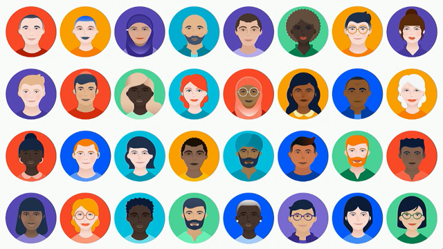
This is a sampling of our current set of "meebles" that we rolled out last year.
This is their avatar format.
Obviously, there are a tonne of factors that play when it comes to painting a full picture.
But the characters as they stand on their own are a huge foundational element to getting there.
For the first time, we've got a real range of skin tone that has so much more gradation between them. They actually have undertones that imply actual ethnicity. So we're not really relying on this binary light to dark approach anymore.
We're also using more subtle features to imply age, race, culture, and ability.
For instance, we don't rely on a single eye shape or a skin colour to represent somebody of Asian descent. Nor do we rely on only dresses to show somebody who identifies as a woman.
This same goes for all men in suits to represent leaders or developers in t-shirts.
Essentially, if you have a single go to way of depicting somebody, that's likely going to be problematic. Relying too heavily on one element is the fast track to making caricatures.
But if we stopped at things that can be easily seen like skin tone, we're still at risk of leaving people out. When we create narratives, at least at Atlassian, we're assigning roles to them and we're creating power dynamics between them.
- This is where it becomes so obvious that being balanced and inclusive isn't just quantitative.
It's not just checking boxes of underrepresented people, and everybody feeling good about themselves and going home. It's more complicated than that.
We're going to take a look at a couple of examples right now.
I've been told that I have a laser pointer, so I'm going to use it.
This first example is an early pass illustration, and it may not seem painfully obvious to some people in the room, but this would be considered an imbalanced illustration to us, and that's because right now there are two men and one woman.
Also, because the men are physically at the top of the pyramid.
It might seem like all you have to do is add another woman and then this would be a more balanced image. Unfortunately, that is not the case.
We now have an illustration that is more diverse, but not one that is more inclusive.
So something as simple as choosing to add that other woman again, at the bottom of the structure rather than the top, completely changes the power dynamics between these characters.
These things are subtle.
They're perceived things.
They're not necessarily hard and fast rules. It's going to take looking at the illustration and seeing what other people say about it, getting feedback. So it's now pretty easy to see that we've separated men from women.
Women are at the bottom of a literal pyramid which is not a good image to put out to the world.
So let's take a look at how we would fix this. - [Sara] That's better. - [Trace] That's a bit better.
Thank you Sara, she agrees.
We need to be thinking about these perceptions of our illustrations 'cause there's a good chance others are going to be.
It's really a pretty quick change.
But at the end of the day, it makes for a lot more inclusive image.
So let me give you another example.
This one's a real life example.
Recently, I was working on an illustration, and I was adding a character who has a physical disability. He's in a wheelchair.
It can be common, you might find, to add characters to an illustration who have a physical impairment only when their disability is the subject of the illustration.
That's extremely limiting.
Every character in an illustration should be playing an active role in the work being done.
In this case, it's especially important that somebody with a physical impairment is shown as an active and productive member of the team, because we're trying rebalance some of these more common societal depictions of these things.
So the same is true for showing characters that are underrepresented in any role, a female developer for instance.
If you're pigeonholing one type of person into a stereotypical function, you're actually adding to a societal idea of what that type of person is capable of.
So let's take a look at how this illustration played out. One of the more important tasks was going to be changing a giant broken lightbulb.
I promised I was going to use this.
There it is.
This is my first pass at it.
I thought to myself, "Trace, you're killing it, this is perfect." And I got feedback on it, and somebody asked me pretty quickly, "Well, are we saying that this person is fixing a broken lightbulb because he's in a wheelchair and somehow there's a relationship between those two facts about this character?" Was that what I was meaning to say with this illustration? We're asking people to search for meaning in illustration, that's what they're there for.
So it's our responsibility to kind of predict what people might see in them.
So, no, that was not what I was trying to say with this illustration.
But, if that's what people are reading, effectively, that's what I am saying.
You don't get to mediate that sort of conversation once you've put it out to the world.
Let's take a look at how we improved this.
We still want this character to feel very active in this story, but we need to rethink the narrative just a little bit to make it more inclusive. This is the result.
So all of this is why creating inclusive imagery is not a formula.
It's not something we can measure scientifically. It's something that is measured with your senses. At the end of that day, even if you follow a recipe perfectly, it might not taste good.
It might leave a bad taste in your mouth.
So you need to make adjustments.
The same is true for illustration.
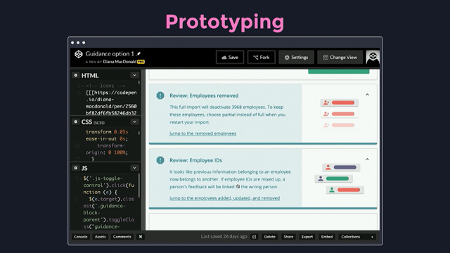
- So beyond communicating our thinking as broadly as possible once we do this work, we also try to design the toolkit in a way so that everybody can use it, non-experts included.
This is a screenshot of our illustration library as part of our design system.
All Atlassians have access to this, and they're encouraged to use the assets to create narratives on their own, whether that's speaking at a conference, or just finding an image to pair with their tweet.
But it's unrealistic to assume that everybody who uses these assets is going to go through the same level of rigour. We've taken this into consideration when building out the toolkit.
For instance, as you can see, all the "meebles" have a background colour.
So when you choose three or more together of the same colour, you are most likely going to create a balanced group. So if you choose a set of all purple background "meebles" or green background "meebles," you're more likely to have a balanced team.
Takes a little of the guesswork out of it.
This is a slide from our keynote template.
That allows Atlassians to assign a role or an action to a "meeble." So unlike our first iteration of "meebles," we're no longer pre-assigning icons to them to indicate their role, which means that any "meeble" can be a developer, or an IT professional, or a designer, or an admin. So while this definitely puts more responsibility on to the person creating the narrative, it no longer cements any preexisting biases that they might have had. - [Trace] So even though this is the last point of our talk, it really is the first step in making these kinds of changes in your own job or organisation.
So at Atlassian, we have this company value, "Open company, no bullshit." People feel very empowered to call out problematic things when they see them.
Trust us, they do a lot, and we're very thankful for it. Just like with any design work, it's going to be made better by getting out of your own head and history. As an individual, you only have your experiences to draw from.
We all have defaults and biases that we need to overcome, and the more experiences you hear out, the more you know what to include.
A huge bonus of getting feedback like this is that you're actually promoting inclusion within your own company, and getting people to think how to address it in their job function as well.
- So this kind of work, like any design system or brand, it's a journey and not a destination.
It's got to be constantly evolving.
Though we're pretty proud of our evolution so far, it's definitely not the last time we're going to be asking ourselves these questions.
We're going to be asking them, basically every day. We're going to change with the norms as they change. In fact, we already have a lot of areas that are top of mind that we're planning on addressing in the next iteration. So maybe we'll be back to tell you about them. - Wink.
- This is a huge topic.
This was a super brief run-through of it.
We're really passionate about it.
We could talk about it all day, so come chat with us at lunch, and enjoy the rest of the conference. Thanks for having us.
- Thank you.
(applause) (upbeat music)
The influence of brands on society can’t be underestimated. The technology industry in particular is extremely unbalanced when it comes to diversity, and there is little doubt that a lack of representation in tech brands plays a role — if people don’t see themselves represented in tech branding, it’s unlikely they’d consider tech a welcoming place to work.
As a member of the technology community, Atlassian realized its responsibility to depict a more diverse and inclusive vision of collaboration. The Creative Team addressed this opportunity in a number of ways as part of a major brand refresh and found that illustration could be an especially powerful tool to support their effort.
In this session, Sara and Trace from Atlassian, discuss their journey towards creating an illustration system that reflects more inclusive teamwork. They will share some of the challenges they’ve encountered in building a representative brand and lessons they’ve learned along the way.
Sara VanSlyke & Trace Byrd – Illustrating Balanced and Inclusive Teams
Sara and Trace will be talking about making illustrations more inclusive… first they want to acknowledge the irony of “two fo the whitest people you’ve ever seen, talking about diversity”. It’s not the job of minorities to promote diversity, it’s everyone’s responsibility.
In the US there is an almost exact 50% split between males and females in the population; but you wouldn’t know that to look at congress. This shapes peoples expectations, as do your own products regardless of whether you intend it.
When Atlassian rebranded in 2017, inclusion was part of the process and it was reflected in the illustration style. Atlassian uses a lot of illustration in its brand, so it’s quite powerful. It also has the same problems of stock photography – where there are easy-but-cheesy images to illustrate things like “teamwork”.
Lessons learned
- understand the difference between diversity and inclusion
- diversity is quantitative, people are represented
- inclusion is qualitative, people feel included
- challenge assumptions about your audience
- visual diversity
- conceptual inclusivity (eg. body language and power dynamics)
- communicate and empower
Illustration is a great chance to demonstrate representation. When showing people doing things, you can break the usual stereotypes about roles and who can have them.
Challenging assumptions was particularly difficult at Atlassian as it’s a company for developers, by developers. Atlassians are used to thinking the customer is really exactly just like them. But in reality when it comes to diversity and inclusion, the audience is everyone.
Visual diversity required Atlassian to lose the blue and white “meeples” (like the stakeholder) because although they were neutral in some ways, people mentally defaulted to white and male. An attempt to move to more human figures started with “no skin tone”, but that’s not a thing because it just defaulted to the default white background. Then there was a terrible over-correction to cartoonishly stereotyped images.
Ultimately they came to a nice set of subtly hinted illustrations, but people didn’t recognise themselves in them.
They tried using brand blues as skin tones, to avoid the entire problem. But it made groups look too homegenous and left it open to interpretation – including a default to white.
The current set of meeples strikes a more nuanced balance. Individual characters do have elements that define race, gender and so on. But they have a wide enough range to avoid stereotypes or homegenisation.
Composition can still create issues. In one example shown, the men were placed noticeably above women in the image, so even adjusting the number of people did not change the implied power dynamic. The fix was simple – swap a male and female figure so there was equality in the placement.
Action and role can still be difficult. An attempt to include a character in a wheelchair accidentally emphasised their disability and not their agency. The solution was to move the disabled character into a different role in the image.
Just creating design assets doesn’t mean everyone will know how to use them. The meeples are published at Atlassian for anyone to use. To remove guesswork, they assigned diverse groups to common background colours; so if in doubt just pick a set with the common background and it should be acceptably diverse. Also the icons for job/role are badges that can be added to any meeple, to avoid tying a particular person to a particular role.
Continuous improvement is better than delayed perfection. – Mark Twain