Even more accessible! What WCAG 2.1 means for designers
(cheerful rhythmic electronic music) (audience applauds) - Thanks, Josh, how good has Josh been today, introducing all of us? (audience applauds) I only met him today, and he already pulled my deepest, darkest secrets out of me, it's, ohh. Anyway, I am Allison Ravenhall, I am your friendly, neighbourhood digital accessibility sensei.
That's legit, I do have a black belt in karate. Do the accessibility or I will kick you in the head. (audience laughs) I work at Intopia, we're a digital accessibility agency. We will audit you, train you, consult with you, and help you make your stuff really good.
And I'm here to tell you how to make your stuff even gooderer, by whipping through a whole bunch of WCAG 2.1. Now, for those who are not in the biz, and aren't up with WCAG, it's the Web Content Accessibility Guidelines. This is the international standard published by the W3C. We've been working to version 2.0 since 2008, and in June this year, we've got a point-release. After 10 years! (audience claps) I finally have something new to talk about! I'm very excited, and I wanna bring you on this journey. But, oh my god, I said journey, I hate, I hate that word.
Anyway, sorry, moving on.
If you're using WCAG 2.0 right now as your standard, and you're like, what does this do to me? It doesn't do anything except add a bit more work. Everything you've done to date still applies. We still have the same impenetrable language in WCAG, it's still unreadable, we've just added more. So we've got 17 new success criteria, some of them are for the devs upstairs, unfortunately they don't get the benefit of my brilliance this time, but we'll catch up sometime. I am gonna try and whip through 10 of these, for you lovely people, in a very quick space. Keep up if you dare.
Alright, we're gonna start with an obscure one. And we're gonna ask you to define the data types of the form fields that you use to collect personal information from your users. That's a bit of a mouthful, but, anyway, anytime you're designing a form and you're asking for someone's personals, their name, their address, their contact details, their payment details, we've gotta be asking our devs to put an auto-complete attribute on that form field. We're getting lazy here, and we're asking our browsers to fill in our stuff for us.
So, it's good for me, 'cause I'm a lazy person, anytime that I start filling in a form and it goes, hey, you've done this before, do you wanna fill in with all this other rubbish? I'm just like, yes, two clicks, done, thank you very much. So, win for the lazy.
From an accessibility perspective, it's really, really good for people who can't remember, or mix up digits, like post codes.
Who can remember their post code within six months of moving into a new suburb, at precisely the time that you're filling in a lot of forms about your new address, right? Also, we're gonna have a win for people with limited mobility.
You know, people who it hurts to type, or it takes a very long time for them to fill in these forms, we auto-complete them, they're on their way, quick as you like, and they're gonna love you. So, tell your devs what you're asking for.
I mean, your labels should be pretty self-explanatory, but, you know, just in case.
I don't know why I put this up in this room. Surely you're all on board with responsive layouts by now, yes? Is anyone clinging to the fixed-width layout? Get out! (audience laughs) Responsive layouts are a thing, responsive layouts are awesome.
From an accessibility perspective in these new guidelines, what it means is that our websites should work even when a user has zoomed in their browser to 400%. When we zoom in that tight, everything gets really chunky and big and it's really readable, but we need to make sure with our responsive layouts that everything falls down nicely and becomes a very long column on the page. We don't wanna introduce a horizontal scroll bar. A lot of people will miss the fact that that horizontal scroll bar has been added, and they'll miss out on everything beside the fold as opposed to below it.
So, you do your responsive layouts properly, everything's going to fall down in a nice column and everyone will eventually be able to read down that very, very long webpage, and get all of your content. If you happen to be designing or building a website, or an app, or something, that uses keyboard shortcuts, you are setting up for the mother of all clashes with assistive technology.
One of the most common forms of assistive technology is a programme called a screen reader.
It's used by people who are severely vision impaired, or blind, and the entire input interface is via keyboard shortcuts, it's all key codes. And a lot of them are single-digit key codes. A for this, R for that, F for this, 1 for that. So, if you are defining your website to respond to those same key codes, someone's gonna lose. Either your site's gonna lose and not respond, or the assistive technology, more seriously, is going to not respond because your website's jumped in and intercepted that keystroke.
So make your keyboard shortcuts configurable, let people switch them off if they so choose. We need to define simple gestures! We're finally, finally talking about touch devices, and tablets, and stuff.
The previous version of WCAG, 2008, was the same year that the first iPhone came out. We didn't really have this concept of mainstream touch devices in our hand.
Of course, now we've got them everywhere.
I've even got on on my wrist, it's crazy.
So, when we're defining a touch environment with gestures, we have to be mindful of the fact that there are some people with less dexterity.
So, the example I have here is Google Maps, and the common interaction with Google Maps is to zoom in or out to see the level of detail that you like.
I tend to use the pinch, because I have two fingers, and I can reasonably coordinate them to work together to do the pinch in and out action.
There are people who can't.
Many, many people who can't.
So, Google, in their wisdom have applied a plus and minus button in the bottom-right corner which enables someone who may only be operating with a single digit, or with a wand, to do a single tap with a single digit.
So, by all means, go complex, have your twirls and swirls and your three fingers and your four fingers, and, I don't know what my hand's doing now, but have a simple alternative as well.
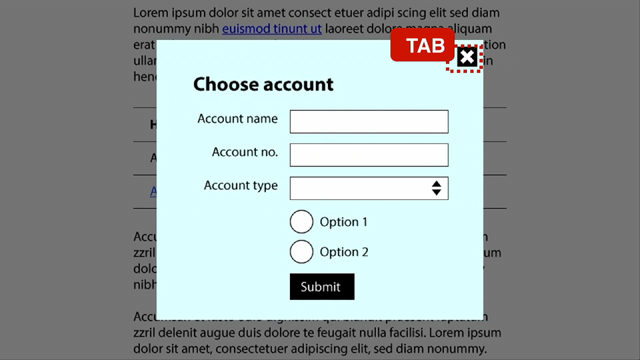
This one's fun, start your element labels with unbroken on-screen content.
This is a bit obscure, it's a bit specialist. So, I need to provide a little example here. And I'm gonna do that with my two friends, Adam and Stewart, they're both in the room. Hi guys! (speaker laughs) They're both my bosses.
It's going well! So, Adam up here is vision impaired, and he uses a screen reader like I just described to interact with his computer.
Stewart, for the purposes of this example, has carpal-tunnel syndrome, he has very painful hands and wrists, and does not interact with his computer physically.
He has a headset much like this thing that's sticking into my mouth, and he operates with a piece of software called Dragon, Naturally Speaking.
He issues commands to Dragon, and Dragon does the command on the computer on his behalf.
It's really nifty! So, when Adam and Stewart go shopping, and they both encounter a page which has multiple add to cart buttons, they look the same, but they're linked to five different products, right? Stewart can see, so Stewart has the benefit of being able to visually sort of go, I want that add to card button, whereas Adam doesn't. So Adam relies on his programme, it's called Jaws, so, hence the shark.
He's a happy shark! And happy shark announces "add to cart, five times." And Adam's like, "what? Which one, I don't know." He has to search around, he'll get it eventually. Maybe he might make a mistake, but it's a bit of a pain in the butt.
Stewart, on the other hand, ah, yeah, Adam's mad, okay. (speaker laughs) Sorry, Adam's mad.
Stewart on the other hand speaks into his microphone, he says "click, add to cart." Dragon says, "hey, there's five of those? "Which one would you like?" Stewart's like, "I'll have the third one, thanks very much," and Dragon's like, "cool beans, we're on our way." So, one guy's happy, one guy's sad.
What I've been recommending to this point, I've had to make a little bit of an adjustment. To this point, I've been saying, hey, why not insert the product name into the label that's in the code? I'm not asking the designers to change what's on the screen, heaven forbid, oh, wow.
Former dev here, so you know. (groans) It's pretty dangerous.
So, I get the developers to just squeeze in a little extra bit of context in the code, and it's possible for Jaws to pick that up and announce it without effecting the screen, it's really nifty. So, Adam now has context, he's like, "add the apple, add the banana, cherries, durian, eggs," I ran out of fruits beginning with E.
And then I realised afterwards, elderberries, ah! Anyway, Adam now knows exactly which button relates to which product, and he's happy.
Stewart says "click add to cart," because that's what he can see on the page. Dragon doesn't worry about what's on the page, Dragon has a look at what's in the code.
And because we've split up the phrase add to cart by chucking a different word in the middle, Dragon's like, "what?" "Dunno." So, now Stewart's the one that's cracked the sads. So, now, the solution! The new guideline says that when we're defining these contextual labels to help people using screen readers to actually get what's going on, keep the phrase on the screen together, and preferably at the start.
So, I haven't changed it, all I've done is switched the order a little bit.
Add to cart, apple.
Add to cart, banana, da-da-da.
So, Adam's on his way, Stewart now says "add to cart." Dragon is good at partial matching, so he's good. "Which one?", "Number three," yay! Everyone gets their apples.
Alright, motion! Motion is fun.
This is about devices that detect your motion, detect your motion, or you're using motion on it. That was really, I don't know, hands.
I love my Nintendo Switch, has anyone got a Nintendo Switch? They're totally fun.
Does anyone know what this screenshot is from? Zelda! Zelda: Breath of the Wild.
I have invested many hours in this bloody game, and I invested a lot of time in this particular stage. This thing drove me bananas, it's a tilt maze! The ball drops out at the middle, you have to actually tilt, physically tilt the Switch to manoeuvre the ball around the maze and get it off the platform on the other side.
It took me forever, I am uncoordinated! It sucked.
And I suspect that I am not the only person who has this trouble.
I would call myself reasonably able-bodied, if not coordinated.
But there are many people who would find this a blocker. There is just no physical way that they could have the fine motor control to manoeuvre this thing, and it was very, very precise.
So, fail.
On the other hand, Mario Kart, yes! The one game in the world that I am better at than my husband.
Don't tell him.
The primary steering control for Mario Kart is the joypad, which is considered an accessible input.
Tilt controls are available on Mario Kart, if you like, you can hold on to the Switch and drive like a five-year-old, and the cart will go around with you.
But it's an optional extra.
If you want it, you can turn it on.
If not, turn it off.
That would be a tick for me, so think about the way that you're adding motion into your designs. An exception, 'cause there's always an exception, there's a lot of exceptions in 2.1.
Just Dance, another fun game.
I would totally beat my husband at it if he played, but he just sits there, and I just dance alone. The whole point of Just Dance is to dance.
It's about motion, it's about movement, it's about tracking what I'm doing and whether I'm in time, usually not.
The idea of the whole game is motion.
If you took motion out of the game, you'd have Just Sit. So this is the one time where we can say, you know, motion is okay, but for the most part, really do think about how you're deploying it. Alright, here's my one sight gag.
Hey, there you go all, woo! Don't make users read like this.
This rule is called orientation, and it's for the benefit of those people who mount their devices, their tablets, or their Surface Pros on a stand out in front of them, and they don't have the capability whenever they want of moving out and turning it around. So, we need to enable people to turn things around, or have your programmes adjust. So, to respect the orientation of the device. So, don't make me tweet sideways.
Twitter only supports going sideways, oh, portrait, right? But, if you wanna go and complain about it, you can go into Facebook Messenger.
Facebook Messenger supports orientation and it will actually respect which way the device is turned right now.
I know that both of these examples are apps, and I know that I'm talking about the web content accessibility guidelines, some people may have noticed that.
This is gonna be a big app deal, and I know it's gonna be a big work deal for those apps. But, frankly, people don't care whether they're visiting your website or your app, all they wanna do is have it work.
So, take this one back and have a think about how your site may or may not work, depending on which way someone's holding their device. And don't assume it's gonna be one way or the other. Right, colour.
Can't have an accessibility talk without talking about colour.
Can we? No! And, this is my opportunity to troll you all! It's gonna be fabulous! Because I've created a form, and it's entirely in Comic Sans.
Yes.
Did you know Comic Sans ranks really well for readability for people with dyslexia? It's actually useful.
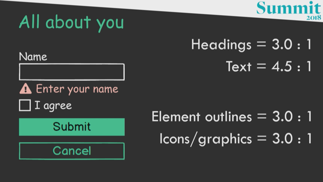
Don't knock it, no, I had to try it, it was beautiful. Right, so I've got a basic form, and there's some new things to do with colour contrast. So you may be aware in the current standard, we already have minimum standards for colour contrasts, making your colours really pop.
Making them visible for people with low vision, or people who are colorblind.
We need to really make our colours stand out a little bit, I could have had a few words with a few people who have presented already today, but, a bit too late.
Anyway, we already have the standard that headings need to have a minimum contrast of three to one, at double A is a higher standard if you like, and you are fabulous if you go to that, but I'll take three to one any day of the week. Similarly, text, four and a half to one, that's an existing standard, and you should already have your little calculators making sure that your body text is doing that thing.
Here's the new stuff, hold on to your hats, right? Element outlines, now, need to be at least three to one. What do I mean by an element outline? Well, on this form, I mean the outline of the text box. The outline of the check box.
The outline of the cancel button.
And, because the submit button doesn't have a border, per-se, the background of that submit button has to have a contrast of at least three to one. This is about enabling people to identify the shapes, and identify your controls.
Text is not the only important part of your page. You need to be able to see these things to identify them and to use them.
So, element outlines is a massive thing.
Icons and graphics are normally also conveying information. In this case, we have a warning icon about this error. Three to one now.
Yes, I'm excited.
Now, this is the one that might get you really going. State styles.
Hover, focus, error, selected, all of your styling which indicates those states need to be at least three to one.
So, now we have our cancel focus styling there, with the dotted outline, the check boxes just jumped into the check box.
The check boxes just jumped in to the check box. The tick markers jumped into the check box! And it needs to be at least a contrast minimum of three to one in order for people to see it. So, I look forward to all of the flaming afterwards, I look forward to all of the brand people going, "we can't possibly fit that into our brand palette!" I'll work with you, right? It's not impossible.
So, that's troll number one.
Troll number two, make interactive things big! Minimum touch targets.
This should not be a foreign concept for people in the app space.
The Google Material guidelines have had this for ages. The Apple app development guidelines have had this for ages.
We need to make touch targets big enough for people to hit. We don't wanna be stabbing at our phones 10 times and missing every time, that tiny little! It's usually the tool tips.
You know, those tiny little tool tip check marks, you know, the question marks, you're trying to figure out what this form's about, ugh! People with tremors, people with less fine motor control. We need to support these people to get on with their lives and not waste half their life trying to fill out your form 'cause you've got the tiny, tiny thing.
So, make your interactive things big.
I'm gonna give you a couple of outs though, 'cause you're probably thinking this through and going, "hang on, this is gonna be hard." There are some exceptions.
If you've got duplicate things on your site that do the same thing, so if you've got multiple things that go back to your homepage, only one of them has to meet the touch target minimum size. So you can have one big logo in your thing, and then lots of tiny ones everywhere else. If you're horrible.
You know.
But, at a minimum, one big one.
Inline link text would look really, really odd if you imposed a 44-pixel minimum height, wouldn't it? That'd look pretty sucky, your paragraphs are just gonna be, I'd be pinging you for readability.
Like, just going from one, you passed that thing, but not that thing.
So we're gonna give you a pass on inline links. You can keep the heights on those manageable. If it's a browser-controlled element, I'm not gonna expect developers to try and change the size of something that they can't control, I don't ask for impossible.
I really don't ask for impossible.
You may think I'm asking for impossible, but I try not to. And if the size of the element that you're building is essential, like you're mapping it to something real-world, and I don't know why, but you're projecting it on a screen as its real-world size, and that happens to be smaller? Okay, fine.
When would that happen, I have no idea, but good luck to you.
Tell your users in advance about timeouts.
You have made it, this is the last one! Yeah.
There are a lot of people in the world these days, and it seems like there's more and more everyday, who work with anxiety.
I am one of those.
Thankfully, it's not to do with being scared about timeouts, but there are some people who really do trigger off the idea of a time limit.
Or something coming closer, and failing to finish in time, that is a real thing.
So, rather than springing it on them in the last 30 seconds and going, "hey, you're about to get logged out!" And then they're frantically scrambling to find where do I save it, am I gonna lose my stuff, or how do I extend this? That's a real panic, I can joke about it, but for some people that is really debilitating. The earlier you can tell someone that a time limit exists, the more time they have to prepare for it, to adjust for it, to ask for help, to manage their time, and keep it all under control.
So, that is 10.
You've just learned about over half of the new WCAG 2.1 requirements.
We whipped through them in a hell of a hurry. There's way more to it than that, obviously, and I've got plenty to tell the devs as well. So, round them up and send them my way.
(cheerful rhythmic electronic music)
The W3C published its updated accessibility standard (WCAG 2.1) in June. What does it mean for designers? See how the new criteria affect layout and interaction design, including a shoutout to touchscreen devices (finally!)
WCAG is the Web Content Accessibility Guidelines. We’ve been working to 2.0 since 2008 and in June 2018 we got …. a point release. Yay! WCAG 2.1 adds 17 new success criteria over 2.0. It’s still unreadable, we’ve just added more…
Allison will run through ten of these new checkpoints.
“Define the data types of the form fields you use to collect personal information”
This means we need to have an autocomplete attribute, so the right stuff gets filled in. It’s not just convenient for all of us, it’s a massive win for people with limited mobility.
“Design responsive layouts”
…surely you’re already doing this?! But for accessibility your design should cope when a user zooms in by 400%. That’s a pretty big challenge, particularly when you realise you want to avoid scrollbars.
“Make keyboard shortcuts configurable”
Lots of apps set up their own shortcuts, but this seriously impacts people who use assistive technology. Let people switch them off.
“Define simple gestures”
This is the first version of WCAG to address touch devices. People with dexterity limits have trouble with complex gestures, including things people often take for granted like pinch-zoom. This is why Google Maps still has a +/- to go along with the touch gestures.
“Start element labels with contextual labels”
Basically make sure controls are differentiated. This needs to be a single piece of content. There are some odd tricks to the way this works so be sure to test across different tools like screenreaders and voice controls.
“Provide alternatives to motion functions”
As we get more motion-heavy interactions (think Nintendo Switch) this becomes more important. Zelda doesn’t give you an alternative to tilting the device to solve a puzzle; Mario Kart does give alternative controls! Be like Mario. The only exception is when motion is literally the only thing the interaction does, like a dance game.
“Don’t make users read sideways (orientation)”
Respect the orientation settings of an application. Some people mount devices in a stand, which means they can’t easily switch orientation. People have set orientation for a reason!
“Colour”
We already have a requirement for 3:1 contrast for headings and 4.5:1 for text. New:
element outlines, like form inputs and buttons 3:1
icons and graphics 3:1
state styles like hover, focus, error, selected 3:1
Disabled state is an exception – they can be pale, because making them have higher contrast makes them look interactive..!
“Make interactive things big”
44×44 css pixels is the minimum size for something you interact with. Make touch targets big enough to hit.
Exceptions: if there’s an equivalent that’s big (ie. it’s a duplicate control), inline line text, browser-controlled elements, or if the size of the thing is critical to work.
“Tell users in advance about timeouts”
Many people can’t fill out forms fast enough for your timeout. This includes people with anxiety triggered by time limits and deadlines. Don’t spring it on them with 30 seconds to go. Tell people as early as possible that a time limit exists.
That’s ten… you’ve learned over half of the new requirements!