(upbeat music) - Thank you so much for coming and thank you, Web Directions, for having me.
I'm so excited to be here with you all and explore your beautiful city.
Melbourne is awesome.
This is my first time in Australia and it's been absolutely fantastic so far.
I'm Sarah.
I'm a Design Engineer at Adobe.
They changed me title like a week ago, I don't know. I live in San Francisco and I'm somewhat of a hybrid. I'm a designer turned engineer turned design engineer, which basically just means I do whatever needs to be done that day.
I originally went to school for graphic design and then I transferred over to what's called, New Media Design at the Rochester Institute of Technology. At RIT we learned all about user interfaces and interaction design and 3-D and motion graphics and it's really at all the intersection of these things.
A lot of my classmates went to agencies and creative places like that.
We also had some brief exposure to code and I really fell in love with it.
I continued on my own, learning code, and I did a few internships where I did code and design until I graduated and took a job of software engineering at LinkedIn.
I ended up helping with the CSS Reich Architecture at some point, in the middle of all this JavaScript work which kinda made me miss that kind of design centric work where I live in the middle.
So after a year of that I decided to try out the more hybrid role where I get to take advantage of my varied background, which is how I ended up back at Adobe after my previous internship there. Design systems, in particular, have piqued my interest because they really embody the crux of the relationship we have between design and engineering operations. It's easy for people like me with hybrid skillsets to have an impact in lots of areas, so this talk has a little bit of technical content, so bear with me if you're unfamiliar with it and I'll try to simplify it as much as possible.
But, let's start with a brief history of the universe. So, way back when, designing interfaces was all about Photoshop.
Websites were really ornate and it was more about, how good are you at Photoshop than how effective is this interface.
We had glossy buttons, fancy borders, grunge backgrounds, I can't grunge backgrounds and all sorts of frivolity in our designs.
We sliced up our designs with like the knife tool in Photoshop and we handed them off to developers. And yes, I realise this is a bit ironic considering where I work, but we're just gonna roll with it. So, as flat design became, came into prominence we got new tools like Sketch NXD that made it much easier to create simple vector-based UI layouts.
Sketch also popularised the idea of symbols, small reusable parts that we can use to create our designs. So, along with new design tools a new philosophy of design became popular.
Brad Frost's atomic design principles got us thinking about our design in pieces and components instead of just the pages that we were used to.
We also got new CSS philosophies along those same lines like BEM and object-oriented CSS.
So now, we're no longer focused on individual static pages, but on systems of interfaces and this has been said way back in 2012 even.
So, around the same time development started along the same path.
It used to be that we created websites with some basic Symantec HDML and CSS and we sprinkled a bit of JavaScript on top of that for a little bit of interactivity and to an extent, that's still true.
But, we're not creating geo city sites and basic landing pages anymore.
We're creating rich interaction heavy applications. A lot of the logic that lived on the back end is now on the client side.
We get all the stuff rendered on the client side so we get like, nice transitions and smooth animations and stuff like that.
And, a lot of complexity we manage with components. The technology that's really helped to usher in that change is React, I love React.
React is a JavaScript development framework that's predicated on the idea that everything is a component. It was originally released in 2013 and since then we've gotten things like React Native which has made it even more ubiquitous.
React Native allows us to create mobile applications using React components and treat our components like a single source of truth for all of our final outputs. And, this component philosophy matches up so well with where design has been heading with symbols in Sketch that we've kinda just meshed our tools together. I mean, it's all together now.
We have things like React Sketch App from Airbnb that render coded components into Sketch so we can use that to build interfaces and vice versa.
And we're starting to finally get a concept of version control in our design applications through polygons like Abstract.
This means we get less of files called final final version two at it.PSD.
Developers have had this problem solved for years, so it's actually really exciting to see this in the design work flow.
So, essentially what we've seen here is that design and engineering have been on a collision course for years and that collision course gave us what we know today as design systems.
We've had this concept of shared styles and guidelines for pretty much ever.
There's even graphics manuals like New York subway one floating around from the 70s.
Many early style guides focused on brand styles like typography, colours, grids and sizes and that's still important today, but we're not designing the same things that we did 10 years ago and it's not all print anymore, so we have to evolve. Design systems today at their core usually consist of a UI component library in the form of design files and code and their associated documentation. The beauty of design systems is that they support money making initiatives, but don't directly make money. So, we can actually often open source them and share our knowledge.
We haven't quite gotten there at Adobe yet, but it's on the roadmap, keep an eye out.
And, one of the reasons why I recently started speaking at events like this is precisely because no one knows what the heck they're doing.
I mean, that's a bit of an exaggeration, but there are a particular set of problems that crop up when you hit a certain scale like Adobe.
Many of these companies like Shopify and Salesforce and Adobe are working on these problems internally simultaneously so events like these are a great way for us to connect and share what we've learned. Can I get a show of hands of how many people have a design system at their company? That's quite a few.
How many people actually work on or contribute to a design system? Almost the same, awesome.
So, for those of us that are unfamiliar a design system is a product that helps us scale our design practise.
At Adobe we try to think of our coded component libraries, design files and documentation website as kind of a holistic entity.
We used to think of these things separately and tried to roughly coordinate our releases, but our users don't differentiate them, so we decided neither do we.
There is no sticker shapes versus the website versus the library to our users.
It's all just Spectrum in its different states and Spectrum, like John said, is the name of our system. So, a quick note on scale.
When I'm talking about scale here I'm not talking about like deb ops things like QPS and serving, there's a gazillion users and being available all the time. We're talking about applying one thing to many contexts and not repeating ourselves, aka, keeping your designs DRY. And apart from just taking longer and being more expensive, duplication tends to lead to fragmentation, so when things aren't connected to a single source of truth, we kinda stop sharing things and things get out of date and this leads to one off changes and worse UX because when something works one way somewhere and then slightly different in another, it can get pretty confusing for your users and your developers internally as well.
And this makes it harder to onboard new users and employees and move around in your code base and your products. We have a bazillion products that link Adobe, so big clouds and stuff.
You've heard the horror stories probably about having 200 shades of blue on Facebook or GitHub and 100 different type styles and this happens way more easily than you think and it stems from not being connected to a single source of truth.
So, that gives us a general overview, but let's kinda dive deeper for a second.
In order to really understand what a design system is, we have to understand where it lives, in the product development process and the context of the problems that we're solving for.
Because a design system is really an organisational problem what you build relies entirely on the specific problems and historical issues that your organisation faces. How is your organisation structured? Are your designers embedded in product teams? Do you have a separate marketing org? What roles have you traditionally hired for? Do you have a user research department? What about content strategy? Do you have an accessibility team? What's the balance of designers to developers? The answers to these questions should inform the approach that you take with your design system, the roles that you're hiring for, your MVP, your roadmap should all be informed by your specific organisation. What are you starting with? What are the key objectives of your system? 'Cause a design system is run like a product, and the key here is that it's not a project. Projects are temporary.
They start and they end on certain dates with certain deliverables and then we move on to the next big thing.
Conversely, products have roadmaps.
They're staffed year round and they are maintained and tested and they grow.
They have managers and goals and they're tracked over time. The idea that an internal tool is a product is kind of a novel concept to a lot of orgs. You have to sell your execs on the vision before you ask for staffing, else you'll run into situations where HR thinks you're crazy when you ask for a PM to manage an internal tool that doesn't make any money, so. Let's step back for a minute here.
I keep using words like product, but I'd like to examine what that really means.
A lot of the narrative about design systems has focused on the idea of process and rightly so, but sometimes it's been talked about in a way that describes process as a product in and of itself.
We say things like design systems include things like a contribution model and a release project and it's a shared language and frankly, I think this language is a little bit harmful to newcomers.
When a newcomer comes in and asks things like, so, it's a component library, right? And, we're like, no, it's not just a component library and then we go on a long tangent about how design systems include people and process and output things. It's just, it's just confusing and I don't think it serves much purpose except to create tribal knowledge. So, like many disgruntled people on the internet, I wrote a long media post about it.
It's called, Distilling How We Think About Design Systems, and it actually got a fair amount of traction which tells me it may be I'm not the only one that's a little frustrated by this.
So, the analogy that I like to start with is a bottle of whiskey because I love whiskey and I like thinking of creating clarity as a distillation process.
So, let's take something really good like a limited edition of the Macallan.
When you think of a bottle of whiskey like this, what's the product? It's the whiskey, right.
But, what is it that makes that whiskey so good? You might say it's the quality of the water, the barley, the wood it was aged in.
What else? Was it the time that it was aged, the skill of the master distiller? Did it taste better because of the occasion that you were drinking for? Or, maybe because you knew it was pretty expensive? The resources like the soil and the master distiller and the operations like the ageing and the distillation process physically create an excellent whiskey. The emotion that the Macallan evokes in the consumer creates the experience.
So, we get this equation, resources plus operations outputs product and product plus emotion creates experience. So, the product is what people consume.
Your code, your sticker sheets, all of the documentation for your library and the experience is how it makes them feel.
Do people like using your design system? Do they feel it blocks their creativity or it's cumbersome? Are we meeting them where they live? And the operations are how it's made.
So, do you have a Slack Bot? Do you have a Slack support channel? Do you release every two weeks? How does all that stuff work? So, it's really a product and a product that has operations associated with it, often referred to as design ops, like John was saying earlier. The product is the part that people use and the operations are the parts that people engage in, like governance, how people contribute to your design system or your customer support strategy or your tooling, everything from webpack to your Sketch files or XD files.
But, none of it really matters as long as your team knows what the heck you're talking about, so. Spoiler.
Now that we've covered what the product is, what actually goes into it? What goes into your design system is also highly dependent on your org.
Here are some examples of what might go into a system as it grows and scales.
Usually you start with your basic styles, the smallest most individual, indivisible pieces of your UI, like your Atomic design calls, your atoms.
And then, as you grow you'll probably start adding more components like dropdowns and combo boxes and stuff and then you might move on to higher level things like workflow tooling and motion guidelines. It all depends on your needs.
Workflow tooling is actually a really interesting place right now, there's a lot of interesting things happening there.
But, we're talking about scale today so, let's just assume that we need the whole shebang.
We do at Adobe.
So, why do we even want a design system? Well, they let us iterate on products quicker because we're not spending extra time recreating assets. We can also code up prototypes super quick using the components and test our assumptions. They also help us create a stronger brand identity. Everyone knows what a Facebook button looks like and when we use the same definitions we start from common understanding when we're communicating and it helps us collaborate across multiple disciplines effectively. And then, weren't consistent user experiences usually a better one? In addition to those benefits, when a design system is adopted successfully it enables us to use it as a delivery mechanism for important goals.
Conversely, it can also be a single point of failure which is something to be aware of.
Our content strategy team is heavily invested in our design system because we envision our documentation site to really be where the design process at Adobe stems from.
The content on the website is incredibly important and the messaging in our components is, as well. We also strongly believe that our design system is absolutely integral to helping scale our inclusive design practise.
If our dropdown is accessible in the design system and products have adopted the dropdown from there, the dropdowns everywhere will be accessible. Conversely, if we ship a broken dropdown, then all of the dropdowns will be broken.
Design systems help designers become more efficient. When you can drag and drop the components you need into your Sketch or XD files mockups become much faster and it's easier to focus on harder problems like feature sets and interactions.
When we use our design system to simplify the workflow it opens up the opportunity to innovate on the way that we work.
There are tonnes of new tooling developments in this area and it's easy to envision more.
Companies like Airbnb have proven that it's possible to do things like generate working code from just a sketch of UI components using machine learning and AI. And more innovations are coming through in this area every day.
At Adobe we're trying to focus less on creating red lines to annotate our components because that's built into the system now and instead we're trying to onboard our designers into a new process we call, blue lining.
Blue lining is a mechanism that our head of Inclusive Design, Matt May, has been developing and it's a way to document accessibility details like reading, order and keyboard accessibility in our design mocks.
In addition to that we can document things like the voice interaction, how things are supposed to be read in the screen reader and all of our design system has the expected WCAG contrast ratios so we know that it's always gonna be compliant. So, let's talk more about how we do things at Adobe. Historically, like many design systems, ours started out organically as more of a visual style guide, but as we started to scale we started to add more and restructure the way that we do things.
That's our logo.
And, here's our unofficial logo, courtesy of our conduct strategist, Andy, that's my manager, Kevin. So, what scale exactly are we dealing with? I haven't really defined that.
Adobe has over 250 designers worldwide and that doesn't include the Marketing Department.
We have 124 fully branded products being sent to market, plus or minus 50 more for utilities, internal tools, things of data.
They say that like it's not anything, but that's like three companies.
And, that's available in four different colour themes from extra light to extra dark.
You might have seen this in applications like Photoshop and Lightroom.
And, that's available on six platforms like UWP Windows, macOS, Web Desktop, iOS, Android and Web Mobile and that's in built in multiple technical frameworks like React and CSS.
So, here's an example we like to give of our scale. This is our call to action button.
Pretty simple, right.
There's a piece of text with a pill shaped enclosure and when you click or tap on it, it does something. So, here at Adobe, a simple element like this button can have a grand total of 1080 permutations. Crazy right? Why? Well, it comes in a few variations like primary, secondary, warning.
Each also has a standard and quiet style for less intrusive designs, along with five interactive states like hover, down and keyboard focus and disabled.
A few themes from extra light to extra dark. And, all of that lives on six different platforms. So, all in all this leads to a lotta complexity. You can imagine why we need a system that can distil all of this into something we can work with and maintain. This is not design problem, just a design problem, but it's something that we believe takes these three parts moving together, design, engineering and operations. The way that we like to think about it is that we try to involve all three of these perspectives wherever we can in our process.
At the end of the day a design system is for everyone and should be built with all of their perspectives in mind. Now that we've talked about what kind of complexity we have, let's talk about what we've done so far to handle it and how we've evolved.
So, historically like most design systems, Spectrum started off as more as a visual style guide. It lived on a Dropbox folder that was released quarterly. It eventually got a website, become more official, but the two were continually out of sync.
We didn't have a clear process on when we'd be updating either of these or how often.
People were constantly asking, should I trust the website or the XD file and the club for the website was pretty much spaghetti burdened by designer and didn't actually use the real components. So, people ended up copying that code and we just got more spaghetti everywhere.
They were always wondering, is what I'm seeing up to date? Some element's patterns were only designed for desktop applications and not mobile or web.
A lot of our design resources were only available in one colour theme like this one from this time last year, actually.
And that meant that products that used the dark theme by default like Lightroom would be re-creating its designs from scratch, so we got more duplication and that gets more fragmentation.
Anyone who wanted to use Spectrum would be faced with questions like, can I use this for mobile? Does this work for my product? There's a tonne of variety in the types of products we offer here at Adobe.
Anything from analytics, which might feature tables and graphs to video editing software which might feature rich timelines and sliders and any one of those things might have different platform requirements. We realised that with a company of our size in order for people to adopt Spectrum we really need it to be something that people could trust.
So, we took a step back.
We raised the bar for what is considered kinogal for Spectrum and we set expectations for what each element pattern that goes into Spectrum needs to have in order to be considered official.
We call this our Inclusion Criteria.
This includes both design and documentation standards, for example.
Everything needs to work on all platforms that we support, on all four colour themes and it needs to have accessibility built in, which means that we partner with our inclusive design team as part of our process. They review our content and work with the technical teams to insure that we're in compliance.
And everything needs to come with usage guidelines along with UI kits showing the most common states and variations.
As part of this effort we re-launched our website in December and with that we established that the website is Spectrum.
It's our single source of truth.
We now release updates every two weeks and this is reflected with a simple change log, an easy to digest list.
We still have the Dropbox folder where our design resources live, but this is only updated at the time the site is released and it's archived and versioned every two weeks.
We actually have a script that goes through all of this stuff and automates it for us, so we just run that every two weeks and it puts all the changes into the document and releases to the website. So, now I'm showing what a typical element page looks like. This is our dropdown.
It features an interactive playground which you can see how it looks in various different platforms. An interactive one doesn't make much sense here because this is a native mobile version, so we show images instead.
It also comes with resources on the side, a downloaded UI kit in XD, links that, to frameworks that have implemented this on the right.
And then, play for a little bit, my colour theme. And we also have our anatomy here which allows us to have a common language when referring to parts of the dropdown and then all of our usage guidelines. There's a lotta content here, and our keyboard interactions which document how we sent screen reader users to work with the website and the components.
So, now you've seen part of the website.
I'd like to talk a little bit more about the challenges that we faced when building it.
When we first started working on the website we started with one main elements page, our intern actually created the template.
So, we made a basic template and then we figured out what parts we could break into sections.
For example, we had a partial for the keyboard interaction section called keyboardinteraction.handlebars, and that looked up key names from JSON and outputs the text that went with them.
It's very similar to Fred Frost's fractal system or pattern lib, whatever it's called.
This worked well for a while.
But our JSON ended up having to know a lot about the template that it went into.
As we started to scale and create new pages lots of small variations occurred and our templates became fairly brittle with ifs, elses and such and the general rule with development is that there shouldn't be a lot of logic in your templates. That should all be handled by your data.
So, we looked at our existing pages very granularly and instead of looking for common content we looked for common structure.
We saw a bunch of common recurring patterns that we could break into reusable parts.
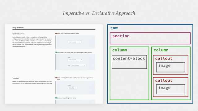
The solution that we came up with was to essentially componentize our page content into small units. We break our content up into small pieces and call them content types and we create a template for each of those things and the declarative approach is actually very similar to the approach that React takes where you describe the way that you want something to render and it just takes care of it for us.
So a content type is a small template that expects a certain structure.
Each content type, like callouts and image here has a consistent schema that's documented in our code repository.
What this allows us to do is to put these content types anywhere in the site without worrying which template is using it or where it's being nested.
So we don't have to create or maintain new templates often and designers can also reference this as well, so they know what's available to them when they're designing new pages on the website.
So, essentially what we're doing is describing what our page structure with JSON looks like and letting the templates loop through it and generate it all for us which is the declarative approach I mentioned.
This consistent structure also means that in the future we will be able to deliver this VS CMS like Netlify or contentpull more easily and be able to test the JSON against the expected scale.
And since we've actually made this we've actually took these small Lego pieces and created bigger content types from them so now these are are our base Lego pieces and then we have more sections that we use. The website is our main form of communication about the system, but let's talk about how the system itself is consumed.
Because there's so much variety in how we build at Adobe there are separate teams that create Spectrum components for various frameworks.
Right now we've pared it down to React, CSS and Native which includes Windows EWP, iOS OSX in Android. In the past there were more, but we recently standardised on React.
There's a bit of history behind that, but the crux of it is that React previously had a somewhat toxic open source licence, so legal bandit, but they've since corrected it, so we can use it again. The Spectrum design team which I'm a part of maintains relationships with those teams and we have a couple of tools to help support that.
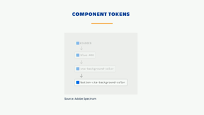
The first tool is called DNA.
DNA is essentially a collection of variables that the design team maintains.
A variable is a piece of data that's used in multiple places.
Data starts in our JSON format and it can be compiled to match the needs of various UI technologies used at Adobe.
These variables are consumed via NPM modules by the Spectrum frameworks like React and CSS. This allows us to insure a fair amount of consistency for free and when we change the value of a variable it will propagate everywhere.
You may have heard this mentioned in the community as design tokens, it's very similar.
So, here's an example of how a component design gets abstracted into our DNA system.
It's a checkbox.
So, we have a variable name for a piece of the design that can be represented with data, like a number or a colour.
Here it's a border radius.
And that maps to one of our global aliases. This gives us the ability to switch our component specific name without effecting other things that use the global value.
Other things might, like a dropdown might use the border radius small, all sorts of things. And that finally maps to final value that's output. So, the second tool that we use to support our relationship with the framework teams is our asset delivery pipeline.
So, you can imagine a company that's known for an image creation tool has a lot of images. Our assets and brand team is responsible for about 250,000 of them, that's just their job.
All they ever do is create icons, it's nuts. Photoshop alone needs 1400 icons.
So, keeping all of those organised, updated and delivered to the right place is a non-trivial job, which is what our asset pipeline is trying to solve. The asset pipeline is responsible for cataloguing and tracking our assets, storing them, supporting different workflows for the designers and developers using them and delivering them to wherever they're being consumed.
Once we have that in place we have the opportunity to do things in the future like validate that they're being used correctly and automate other parts of the design process.
So, once we raised the bar for Spectrum to be higher with the re-launch of our website with our inclusion criteria, we faced another challenge.
There weren't actually enough elements and patterns on the site for Spectrum to be that useful for product teams.
Basically, it took everything away because it hadn't been validated yet.
So, this is what Spectrum had around this time last year. Bunch of components, really, really well.
And those had to be vetted, so these are our new ones that we launched the website with that have been vetted across all of our inclusion criteria.
Although each of these have the guarantee of our new standards there's still only nine elements. Not that useful.
And, this is where we're at now.
We've made some progress since, but there's still some way to go, so we're desperately cranking out new pages.
But, we needed a way to grow faster and leverage all the stuff that we previously had while maintaining our quality standards.
So, this February we launched what's called Spectrum pre-cursors.
This is built in React using React Spectrum, so we're dogfooding our own product and what it is, it's a beta layer to Spectrum. It allows content that has not been vetted across all of the inclusion criteria to live in one place and be useful.
It's a platform for people to contribute back to the system so you can actually upload your own designs here from your own products and our team has access to an admin dashboard to moderate them.
It allows us to show as much content as we and the other teams have created without the expectation that it's gone trough the rigorous canonization process. It promotes transparency and shows everyone else what we're all working on which gives us a little bit more consistency built in.
And once a design is on pre-cursors it starts on the canonization journey and canonization is pretty demanding.
There's a lot that needs to go into it, so we're actually working on incentivizing contributions to things like this with a spot bonus.
We have a few relationships with existing apps for the sole purpose of getting more submissions to the pre-cursors to help us grow.
We exchange with teams by giving them extra support and they help us by contributing back to the system. We've also improved the way that we design through evolving how we do our documentation.
We start working on the documentation pretty early on now. We use Dropbox Paper while the actual element is still in the design phase because we've found that this can actually inform the design itself.
Initially, we started this work with just designers and that led to many surprises and more leg work down the road, so now we involve designers on our team and product teams, framework engineers and content strategists as early as possible. This has been incredibly valuable for us for getting input from various perspectives much earlier on in the process.
They often find all sorts of gotchas.
With design systems it's a little bit more expensive to fix your mistakes later down the road, especially if it's not connected to a single source of truth.
Apps are on their own release schedules, so updating in the middle of that or remembering to later may actually not be feasible for a lot of products. So, another part of our process is creating design resources or sticker sheets.
This is what our Dropdown UI looks like.
It's a lotta stuff.
This is the zoomed in view and the zoomed out view. This is tonnes of stuff.
You might be wondering how we create and maintain all of this.
We don't actually sit there and do it all by hand, thankfully, we generate all of these with a tool that we built.
So, the way that I view tooling is that process solves pain points, in this case, creating the sticker sheets and tooling supports process.
Whether that process is creating assets or building your own MPM modules it's solving a process problem. So, we have created some JavaScript code that generates SVGs, this whole sheet right here is one SVG and that gets imported into XD.
This SVG code is set up to render perfectly in both the web browser and in XD and initially it was meant to just be a production tool to reduce our manual labour, but it actually enabled us to catch a lot of edge cases and it proved to be really helpful in the design process itself, so we actually do this as soon as possible now and we use this to help iterate.
So, now finally, how do we measure our success? This is one of the areas that I think systems are really struggling with and there's no definitive answer yet.
In our case we needed a way to get product teams involved in an objective conversation about consistency. More than that, we needed a way to objectively assess whether Spectrum adoption is working across lots of very different products.
So, we're currently piloting our new initiative. It's called Spectrum Scorecards.
The concept arose out of conversations we had with Google, Spotify, Airbnb more.
And we looked at how the process was working over there at those companies and they came up with one that works for us.
We believe our model must be scalable which means it can be sustained across a large product portfolio like we have and unbiased.
Every product must be measured to the same numerical scale. It has to be inclusive, so product teams have to have a voice in the process and self-reflective. It has to allow us to assess our own effectiveness, not just product teams' implementations.
We're just as responsible for this as they are. And it has to be simple.
Every scorecard must be easy to understand and result in a single numerical score.
This model includes a questionnaire for product teams which we call self-assessment and this allows for products to engage with Spectrum.
They get to have a say in the process and an opportunity to self-reflect.
We get products on record telling us where they are with Spectrum and if they have plans to integrate down the road which is great to show our execs. The second part of this is the Spectrum assessment. Either one of our Spectrum designers does it or a trained designer outside of the team does. It rewards products that demonstrate consistency with our colour system, use Spectrum elements and icons and adhere to our inclusive design principles. This resulted in numeric score that's simple and we can track change over time.
We start by scoring work from various design teams and we'll apply this model to actual technical build for the future.
It's a way for us to assess Spectrum's own effectiveness in providing relevant and valuable materials and guidelines as well as the effectiveness of the product teams adopting Spectrum.
So, that's an example.
Currently these scores focus more on the basics of Spectrum like colours and fonts, but we plan on expanding that as soon as we can.
We plan on rolling the scores up into a dashboard to track for our execs and we're currently brainstorming ideas on how to beef up the process. I envision maybe some tooling that helps us lessen some of the manual parts of the process.
Maybe something that looks at a mock and is able to pick out all the Spectrum colours and see if they're compliant or even dif the various components across versions.
We might even create a GitHub Crawler to see how this plays out in code and test it there as well and we could track whatever versions each product as long as they're as well proved package like JSON. There is a lot of exciting developments in this area. So, as you can see our process is really important, why all three of these moving parts working together every step of the way.
We still have a lot of work to do in all of these areas, but we learned from many teams in this very community so we wanted to share our own side of the story. Thank you, everybody.
You can find me on Twitter.
(upbeat music)