Customizability in Design Systems
(upbeat music) - So I'm Sarah.
I'm a senior frontend developer at Atlassian. I work on our design system.
And today I'm gonna be talking about customizability in design systems.
It's always been a bit of a balance where you have to make this decision between how you want to constrain things and how flexible you want to be, and all of the challenges of maintaining that. So that's a little bit about what we're gonna talk about today.
Can I get a raise of hands? Who in the room is a designer? Ooh, okay.
I'm sorry in advance, there is code in this talk. You're gonna see it, it's gonna be good, it'll be great. How many developers? Okay, thank you. (chuckles) Hybrids then? Yeah, it's always awkward when I ask that because you already put your hands up 'cause you're always used to being forgotten. It's okay, I see you, I feel you.
So before I start for real, is there anybody in the audience that needs visual descriptions of the slides? Okay, cool.
So design systems, I'm not gonna go into a lot about what a design system is.
(audience member laughing) Stay for Alex's talk.
(audience member laughing) Yeah, but for the purposes of this talk, a basic understanding of design systems is a set of shared guidelines and components. It's a very simplified view of the world, but it's fine for now.
And customizability is the design of the options in our systems.
So how we design what can be flexible in our system. And this can mean things like flexibility in the presentation of our components, so how it looks and feels, or you might have flexibility in the behaviour of the component and what it does or the constraints it implements, or you might design flexibility in how it's meant to be used, so how strict the guidelines are about what can and can't go into the component and when and where a component should be used. Today, I'm mostly going to talk about how it looks and what it does.
Sorry, only so much time.
So we're really breaking this down into two parts: the flexible API, which is what a component does, and the theming, so how a component looks.
For anybody's who unfamiliar, an API is an application programming interface. Doesn't really matter.
It's how we interact and access the features of software. So it's basically like a UI for code.
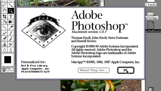
It's like in Photoshop, you know you can click a button, and do a thing, but you don't know everything behind the scenes.
The API is the buttons of our software.
So whereas we want to customise the way a component looks, we can employ the concept of theming.
So these are two separate sections I'm going to be talking about today.
Just to reiterate, flexible APIs are the built-in choices that we provide to our users.
These are options that let them fit our components to their use cases.
They're conscious decisions that we make and support in our system, whereas theming is the ability to skin or apply visual overrides to an application. The design system doesn't intimately understand a theme. It kind of just applies it.
So if we decide for our theme, we're going to make our primary colour bright green, the design system is just gonna go ahead and stick that colour wherever the primary colour is. So there's a lot of ways to enable flexibility. It's really important to understand where on this spectrum you want to fall and what kind of methods you're going to use to make sure that that's where you actually end up. So let's take a look at an example of how flexibility can actually appear.
Here's a basic modal, looks pretty straightforward. It's got a title, some content, some buttons. I assume that one of those buttons closes the modal. It does say Close, so.
But there's a lot of decisions that go into what about this basic modal can be flexible or not. So for example, do we wanna allow multiline titles? Do we want to have a set width for the modal or is that customizable? And if we have a customizable width, do we give them options for small, medium, large, or do we let them set the specific pixel or percentage value? And does the body of the modal only contain text, or is other content allowed? And even stuff like is the modal a set height or does the whole modal scroll on overflow, or does the content inside the modal scroll? There's a tonne of options here and I haven't really even begin to cover it. So that was a basic modal.
But here's a modal that's used when a user is about to perform a dangerous action, such as deleting something that's very important and you can't go back and undo.
And we see now that there's an icon next to the title, and that button down at the bottom has become red. So how did we get this? Did we specify that the icon should go to the left of the title and here's this icon and it should be red? Did we tell the button that now it should be red and the border colour should be less red? Or did we just say, "Hey, this is the danger modal, "and it should just render this way?" So those are all decisions about what can be flexible in your modals.
At Atlassian, our modals are pretty flexible because we have a lot of use cases for them. There's two different modals here, they're very different. One contains a form, one has a more marketing-type announcement and a call-to-action button.
These are very different, they're used differently, but under the hood, they're still just one modal. And here's another example.
This is actually from Trello, one of our other brands. It looks different because it's a different brand and it's got a Close button in the corner.
It's still a modal.
So those are examples of what flexibility can look like, but how do we make decisions about what we want to make flexible and why? As always, it depends.
You might have a lot of variability in your product offerings.
The example that I used to use at Adobe is we had an analytics software that's really heavy on data vis.
It's got a tonne of very granular features. And then we have Adobe Scan which is a mobile app that just scans things, does one thing.
And these things, there's a wide range of things our design system needs to account for, and we're just a couple people.
We can't design and implement everything, so we might need flexibility to cover those use cases. And it might mean that you also have stuff cross-platform you need to address on other platforms, and you might want to support legacy products or acquisitions, so products that don't look like your design system does by default, you might still want them to have your components under the hood.
So for Trello, Trello brand still looks like Trello, but we want to give them the opportunity to use our components and get all the benefits from those. And you might want to enable experimentation, whether this is just being able to A/B test things through your component's APIs.
So test what happens when you make your button blue or red. I don't know.
Or you might want to experiment with how a user interacts with the context awareness of your components. So a component in Jira might look very different to a component in Trello, and that might be a good thing. And you want to enable productivity.
The worst choice is the choice between having to go through all the work of contributing a change to a component that you really need to ship next week or having to write your own component from scratch. We don't want people to write their own components from scratch because those are things that they then have to maintain and they don't get our bug fixes and accessibility or updates.
So we really want partial adoption more than no adoption because that means we get to maintain our source of truth. We can track all these things that are making these overrides, and they're still receiving our bug fixes and accessibility. It gives us a way to track their usage and then talk to the teams about why they're overriding and help them find a solution, whether it's educating them about their best option or then adding a new feature back into the system. So let's talk about a few examples about where we've actually used this customizability and designed it into our system.
So here's our dynamic tables.
We're working on a redesign, it's in progress, so I'm just gonna share the process about how we're going about it.
Our original design dynamic tables were contributed by Jira, and it really met their needs well, but we ended up getting a lot of questions in our Slack channels and whatnot.
Well, does it do this? How do I make it do this? And it was actually something that was completely different than what was already implemented.
So we decided to actually do a full redesign, and we started by doing a bunch of research. One of our designers, Venn, he's awesome, love you Venn, he started by talking to all of the products about why they were using dynamic tables or why they weren't.
We actually have an internal application that tracks all of the usage of our components, so we're able to see who's using our components. And we documented all of these known use cases and we started doing a comparison with all these other design systems.
We looked at some of the accessibility guidelines out there, so the official accessibility guidelines, and we found that the way Jira was using tables should adhere to the data grid accessibility pattern because they were actually using it as a more spreadsheet-like functionality.
But the rest of our tables should have just been an HTML table, which is a completely different ARIA structure under the hood.
So based on these diversions, it actually made sense to keep the old Jira table, the old dynamic table design just for Jira and create a new version based on the HTML tables for everyone else.
This is still in progress, of course, but the interesting thing about this redesign is that we're designing the component's API at the very beginning in partnership with an engineer who's going to be building it.
This gives us really good clarity on what the different options will be and what they'll be named and such, which is great. And we'd like to be doing this all the time, but the reality is our design system is pretty mature. It's been around for a while, so most of the work we're doing is improvements. It's rare that we get to do these full redesigns or create new components, so this is a really great opportunity to experiment. Another time we've made decisions about flexibility was with our navigation.
Navigation at Atlassian is pretty complex.
And one of the original decisions that we made was making the navigation themeable by the end user. And by the end user here, I mean not the user of the design system, the user of the product.
Because some of our applications are meant to feel like internal tools to the company, it lets them change the colours of their navigation to match their branding.
So this is kind of similar to the way Reddit has their groups and they let you skin things to make it feel like you're home.
So whereas this is Bitbucket, Bitbucket's still gonna look like Bitbucket 'cause it's Bitbucket.org, a company's internal instance of Confluence might be themed to match their brand colours. With this theming, we originally accepted colours for the background colour and the text colour, but this allowed companies to create inaccessible colour combos, so we decided to rethink things.
And whereas we let these end users theme the navigation, originally, we didn't offer any flexibility to internal customers, and that turned out to be not so great because users didn't really know where they were. They were across all of our Atlassian products, but they didn't know which one they were in, and that was pretty confusing.
So while we were consistent, we weren't actually creating a better user experience. So we adopted the idea that we should be familiar over consistent. Originally, or global nav here basically looked the same, but we let Confluence experiment, and they added a recent items, so that is part of our global nav now on Confluence only, and it works really well for them, but it does break the consistency.
So our new navigation, please do not share. We've gone back and we've made it horizontal. It's better for everybody 'cause it's just better design. Sorry, I don't have a good reason. (chuckles) Users didn't really like the old one.
We had a lot of complaints about it from people in the design system, the design system users, and people who were using the products.
But the new version of the navigation is interesting because instead of accepting a background colour and a text colour, we've gone ahead and accepted a background colour and an accent colour, so the colour behind the button. This lets us doing things like generate the text colour so we can always maintain the best contrast ratio. So these are all really legitimate reasons to bring in flexibility, but what about situations when there's a lot of flexibility built into our system, but we're not really sure how it got there? It happens, we've all had it happen.
So when I tweeted this, it got like 700-something likes, which I'm not that popular, so that's more than I expected. It resonated and I wrote a talk about it.
Here we are, thank you for coming and sitting with me. So it says, "The longer I do design systems, "the more I feel like seeing a lot of very flexible APIs "is a red flag.
"It's another thing in Decision Debt land." I'm gonna paraphrase this thread later, but when I say decision debt here, I'm talking about the decisions that we put off making, and those decisions can kind of bite us in the butt because users will, they'll develop their own expectations if you don't tell them what to expect, and that might mean they expect you to support things that you don't have the capability to do.
So deciding not to make a decision is actually a decision, and it has consequences.
So how does this unexpected flexibility make its way into our system? Well, there's three main reasons, usually.
One, there's a validated use case for it.
This is like what happened with navigation and dynamic tables.
It's good, yay.
Two, developers love that shit.
I'm like, I'm gonna speak for all developers here, might not be true, but we love the creative challenge of designing APIs that let us cover as many use cases as possible.
It's really great for open source, and not super great for when you don't actually have a use case, and suddenly, you have a very flexible API that you need to support, and you're not reflecting the constraints in your design guidelines.
Three, it's where it gets really hairy.
Flexibility can get added because teams just really want these features.
And sometimes, it's easier to just go ahead and add the feature or make it more flexible, let them do the thing rather than going back to your designers and your PM and deciding is this a use case that we want to support in our system? Does it look like a bring your own option, fill it in yourself, or is it a new variant, is it a new component? And then going through all the contribution process for this, it's hard, it's really hard.
There's not a great solution.
The best way to avoid this is to just start constrained and build great relationships with your design system users so they feel comfortable coming to you and saying, "Here's an option I need," and you can say, "We will come back and think about that, "and in the meantime, here's a flexible option "for you to implement it on your own, "and let's talk about this once you've shipped." We pair designers and developers early if we can just so we have an understanding of what is and isn't part of our component's APIs.
And honestly, we have to be self-critical.
A lot of times, we do things because it's really cool and it's exciting, but it might not be the best solution. We've had situations where we've come up with really exciting APIs for things like theming, and then we realise that it was a really complicated thing, and though it could do all these really cool things, we didn't actually need it, and it actually made it harder for our users to use. So these are a little bit about customizability decisions and how they get made, but how do we actually implement this customizability? So we talked about how this is flexible APIs and theming. We'll start with flexible APIs.
I'm mainly going to be talking about React components 'cause we're mostly a React shop.
The basic way to enable options on your components is props. If you've worked in React at all, this is very, very familiar to you.
This is the basic way you use React.
You pass in options to your components, and those options do something with, and those components do something with those options. The problem with this is in more complex components, it can be really hard to reach those subcomponents. So if we have a select and that consists of a dropdown and it consists of an input and it consists of a search button, those are things that we have to create individual props for and it can get out of hand pretty quickly.
You might have a couple hundred props before you know it. And as you add features, those things might look like Booleans, like is dark mode equals true.
What happens when you get 100 of those and you have to do a bunch of switch statements within your component? It's hard to maintain and your components can become bloated.
So sometimes, we'll end up doing things like this. This is our tabs API where we've added a array prop. So we've added the ability to add your own tabs and your own labels and your own content instead of just giving it tab names and tab content and whatnot.
So here, we're actually saying this is the content component and you should use that one instead of your internal one. It's easy to write these initially, and they're pretty intuitive to use until they get to this point and more complicated as you start adding more flexibility within these advanced props.
They're pretty easy to type at the very beginning and they're easy to document because you can generate your prop tables in your components or in your documentation page. But these things can get pretty bloated because you're supporting all of these different use cases in one component, and it might end up affecting your performance. So the second way that you might implement a flexible API, and by the way, I'm not going into how you can actually implement things.
I'm just showing these basic ideas of different API patterns just so you can see the trade-offs.
This is directly from the IBM Carbon Design System's documentation. It's their tabs, so same thing, but they've given you, instead of this prop where you get to put in all of your tab information in an array, they give you a tabs component and they give you a tab component, and then you nest your content inside of those. So this is really cool if you want to be able to make changes to individual parts of your component. So I can drill down directly into the tab that I want and I say, "That tab, I want to be bold." It's really good for situations where you have a lot of these internal components and you want to be able to let users customise those, and it breaks up the concerns.
So you might end up having less like switch statements in your code, which could improve performance. The cons is that it's an additional API that you have to learn and maintain, and it could break your guidelines.
If somebody changed the order of your internal components, and those are not the way that you want them to render, it might break because your layout CSS doesn't support that, or it might just not look the way that you want to allow on your system.
So you're introducing a bunch of flexibility here that you may or may not want.
Another API pattern that's really interesting is the base/variants pattern.
This is something that Airbnb has been working on. They just talked about this at React Conf like last week, so I stole their slide, sorry.
It's really interesting because we have a lot of these very different variants in our system, so we also have things like our primary button, our secondary button, our warning button, and what they've done is they've taken these buttons and instead of making it one component and giving you an option to set it, they've actually made it multiple components and they've broken them out.
So this base button has zero design logic in it. It just is the functionality of a button and tells you where you can render things.
So here, it says you can render a icon on the left or right of the button, and each of those buttons then go and skin the base button. So it allows the system to evolve over time so they have to maintain each of these individual buttons, but they can add a different one.
And they actually let teams create new buttons if they need to, so they can adopt that flexibility in their own system.
So the cons here is that more file names means more API surface area to learn and maintain, same as the other one.
And it's interesting because it's actually more constrained because everything that is flexible in this pattern has to be defined in the base button.
So you can't just say, "I want to make a new button "and I want to create a bold text style." You have to have that option in the base button. So you can't just willy-nilly like customise anything you want, so it is still constrained.
And it's hard to make small changes with this pattern. You have to create an entirely new button any time you wanna make some small override. So this is another pattern.
This is the one that we're currently considering. This is from Uber's base UI library and it's called the overrides API.
It's pretty flexible.
It lets you do a lot of cool things.
It's interesting because it's consistent across the components, so it always is this overrides option.
And the overrides option has a list of components inside the system, so whereas in the compound components version, we had a tabs component and we had a tab component and maybe a tab panel component, here we have an input. There's a label.
There might also be a dropdown or something in there. So these small components become part of our API and we let users wholesale replace that component if they need to, so if they need a custom label, they pass in their own custom label component. If they wanna make a small visual change, we don't really like this a lot, but we give them that. And it's interesting because whereas with theming, they might be able to change the colour, with this method, they can actually change the way the CSS applies. So if they want to say our gradient, we're going to create a new gradient and use all of these different variables and concatenate that, they can do that, whereas with theming, probably not.
And attributes is really interesting because you get to be able to do things like send down like ARIA labels down to things that need it or test IDs to things that you need to hook into later. So you get a lot of flexibility and you get to drill down onto individual components really easily.
Keeping track of this is hard.
I really hope that when we implement this, it's clear that if somebody is using this pattern, they should have communicated with us first because these are things that may or may not already exist and you might be reimplementing things, or they're things that we want to add in later that we need to keep track of.
There's also performance trade-offs with this. One of the decisions that we're playing with is making this an immutable structure.
So instead of doing merges inside the component every time your component state changes, we're considering making the overrides object immutable, so you just render it once and it stays.
So these are all the different types that I've talked about, and they really fall along the spectrum of flexibility in different ways.
It's not super rigid as it is here, but I haven't covered all of 'em.
There's things like render props and hooks and replaceable components.
It's more here's the information that we use to render this component.
Now you can use that to render your own.
It's a different type of API.
So which one do you choose? Well, it really comes down to a spectrum of here are the set options and here is the ability to bring your own.
Do you wanna bring your own component, bring your own options, fill in the blank, whatnot? And it depends on things like do you want the ability to pass attributes to specific components within your component, or do you want the ability to move or include or exclude some of these individual components? Or even do you want the ability to replace them wholesale? So if I wanted the ability to replace them wholesale, I'd probability choose something like the overrides API or the compound components or the advanced props one.
If I wanted the ability to move them around, I'd choose compound components because then I can change the order of the components that they render in.
If I just want simple props, by all means, use simple props. It's the best one. (chuckles) And the interesting thing about this is even though we can add all of these constraints into our APIs, you don't really have to.
It might mean that you choose an API that allows your users to break the guidelines, and that might mean that you get a simple API that's easier to use and maintain, and that's probably better than having a really complex API that adds all these constraints about where text truncates, how long these things can be, what kind of specific components you can pass in. Stuff's hard, so maybe you choose to use something flexible that's easier to use and maintain.
General principles to go by, if you're going to choose one of these APIs, choose one or two.
So you might use basic props in conjunction with something like these compound components for more complex components or you might use advanced props and the overrides API in very special circumstances.
Just make sure that your users understand how they're going to customise a component and make that consistent.
All of these things are really dependent on your resources, so if you introduce all of this flexibility, it's interesting because you have this flexibility and that means that you have to maintain and try not to break all of these different combinations that come about, but you also are giving people the option to polyfill your system, so there's an interesting trade-off there.
It's just a matter of really who the people are on your team and what they're familiar with and how you're communicating with your customers. It's not easy to make that trade-off.
And APIs are kind of forever.
If you're going to introduce an API, you have to be prepared to maintain it 'cause breaking an API is a major breaking change, which means you have to push a big version and that means that customers have to upgrade and it can be really complicated.
So that's flexible APIs.
I know that's a lot, but the general concepts are choose the one that makes sense for you. Here are the different options.
So that's how we do that.
What about theming though? Like I really wanna make my button green.
That's really cool.
These are things that we're experimenting with. So we haven't shipped any of this stuff yet, so take it with a grain of salt.
The most common method of doing theming is just basic CSS overrides.
So this might look like something like passing in a dark style sheet and applying that globally, so dark-theme.css. It might mean that you use CSS-in-JS' abilities to override specific CSS properties, or you pass in your own class names or you add utility classes just to make little changes to your components. It's really, really, really flexible because you get the ability to change any single CSS property that you want.
But what if we want to constrain that to just a few different attributes? We don't want everybody to be able to change things like your animation duration or your, I don't know, background origin, like that stuff doesn't need to change. So we might introduce something like design tokens. Usually, a design token starts as JSON, something that's very cross-platform, and then it gets compiled to individual platform formats. So we might have CSS variables, we might have JavaScript variables, we might have things that you can use on iOS for Android. These are basically a palette of values that can be used across your products, and they help you create consistency and a single source of truth.
So if we wanted to create a design token for all of our greens and we found out that that green is not accessible with our red, we might be able to change that token value, and that will change across all of our apps, which is really powerful.
Here's an example of what they might look like. These are from the Heartwood Tokens.
They have a bunch of colours.
These are rendered as CSS variables right now, and these are just global things.
So if we wanted to override these things, how do we customise them? Well, one version is usually just doing CSS variables. We have the variable name and then we say in this other circumstance, like dark mode, change the value of that variable name, or and here's, and this is from the system UI documentation. They give you all of these different options and you have to adhere to their format and you can pass in a big option to your global theme and it will override this across your entire application. In React, it might look something like this. You have a dark theme object that changes all of those token values, and you pass it in and that gets passed down to all the components that are nested within this provider. So they are pretty flexible.
You can still override a lot of things, and it happens everywhere.
This is often where a lot of systems stop.
That's fine for a lot of use cases, but what if we want to get even more granular? Take, for example, this Trello button.
So with design tokens, we can now skin large portions of our applications by overriding these global variables like our colours and our text and our text sizes and all these things that we've defined at the global level. It's really useful for doing things like enabling dark mode or high contrast mode for accessibility.
But let's talk about Trello for a second.
Trello is one of our acquisitions and they have a really strong brand.
We don't wanna mess with that because it's one of the best things about their product. But they still want to adopt our components so they can get all the benefits and stop maintaining their own library.
So we could start by overriding our global tokens and bring in the Trello blue instead of the Atlassian blue and change out their font style to look like their type, but for example, this is the button for our call-to-action button.
In the Atlassian design system, our call-to-action button uses the primary colour design token, but Trello's call-to-action button uses a green, which is not the same as our primary colour. So if we just use global tokens, this would end up being the wrong colour because we want it to be this green instead of our primary colour.
So if wanna target just the button background, how do we do that? Well, we could do a CSS override, but that means we lose our ability to be cross-platform, and it's not part of the system anymore.
It's just this one-off change that they then have to maintain.
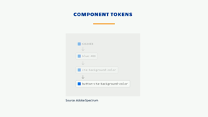
So a solution for this could be component tokens. This is one iteration, this is how Adobe does it. It gives you the ability to make changes without having to change it everywhere.
So using your global tokens changes it everywhere. Component tokens is local to the component, and this can be good and bad.
I don't know how many people have used a CSS style sheet and chosen to make a new class every time you wanted to change something because you were so afraid if you change the original one that it would break everything.
If you're doing that with component tokens, you should probably step back for a minute and figure out what's going on there.
It's good for targeting individual parts of a component, but it can get pretty complicated.
Button-cta-background-color is pretty straightforward, but what about when you wanna target it on the focus state? What about like in the spinner, the spinner's background colour? What about the spinner's background colour within the hover state on the warning variant? So you get these really long variable names and it's hard to, and it might actually vary across components too, so you might have like a different order of things on other components, and it's interesting.
If we want to use these component tokens across all of our components, we're gonna wanna be consistent somehow.
So I took a step back and I started thinking about how can we systemize the way our components look. This is a button.
It's got all of our variants, so we've got like a warning one, a danger one, we've got a link version, a primary button, a call-to-action button.
And then we have states that that button can be in. We have our focus state, our selected state, our hover state.
This is not all of 'em, it's just a subset. And then that button can also be in a spinner state, so a loading state, and it can also accept icons on the right or left. So if we take a step back and we think about this, we say the parts of this component is its skin, its visual properties, and we have its states, we also have its variants like our warning, primary, whatever stuff I just said, and we have our structure, so the ability to add icons and whatnot, and the padding within these buttons.
So the anatomy of a component becomes this idea of it can have a skin.
So these are the visual properties.
And then it has structural properties, so things like padding and margin, and these are things that affect how it lays out on the page.
So we can't change these things with confidence that we won't break something else because it might move it off the page or it might create an overflow somewhere.
Subcomponents, these are the smaller components that we talked about before.
So an input might have a label component or it might have a submit button or something. And states, these are the things that can change temporarily as the result of a user action or a change in the application state.
So hover, active, et cetera.
Variants, and these are a preset appearance option. So our primary, our call-to-action, our secondary, all of these things that we define as part of the design system.
So if we go back to our button, we look at it, we could say our skin might include things like the background colour and our border colour, and our structure might have things like our padding, our margin, our height.
Our subcomponents might have things like our spinner, our icon.
And our variants might be our danger, primary, link, subtle, et cetera.
And we have states like hover, active, focused, selected. So there's a lot of stuff that goes into this. And I really wanted to create a system that would work across all of our components and embed a lot of information about the component tokens inside of it.
So I came up with this basic object structure that nests pretty deep.
It includes at the top level, skin, structure, and subcomponents.
And then you are able to put in the visual attribute, so our background or a background.color, and then we give it the ability to override for specific states and variants.
So here, we're saying that in the warning variant on the button, it should be red, and if you're in the warning variant on a button and it's focused, it should be orange.
This was exciting to me until I realised if I really wanted to access these things, it looked like this.
This is horrible to type and remember over and over and over, and this might be the point at which you say, "Well, let's simplify this." Maybe it doesn't need to have that skin there. It could be just button.background.color.
Maybe it doesn't need variants or states.
It could just be color.danger.focus.
And that might work, but you actually get rid of a lot of this benefit of having this consistent token structure on your tokens. So I thought about it and I realised that because we have this really predictable token structure, we can actually traverse this object with a lot of confidence, and all we really need to access this token value is not the whole name of the token doing all that dot format and syntax, whatnot, we only really need to know the attribute that we're accessing and what variant or state we want to drill down on.
This allows us to keep our really descriptive structure, but it changes the API for getting token values from knowing the exact name of the token that we want and then having to maintain that under the hood and that being your public API that you can't change easily. We change that to be a simple function that just returns the value that we want.
And we use this just when we're generating our CSS right now.
So in the previous methods, when we reference the token variables, the names of our tokens became part of our API for the component, which means it's really hard to evolve those things and users have to learn those names and we have to maintain and version them, which is really complex.
This lets us abstract that all the way.
And that's cool because it's simpler, but we actually found a bunch more benefits as we dug in. Because we kept this consistent structure, we can actually embed extra information into our tokens. So for example, we've taken this and we've typed it via TypeScript.
And we could do things like say here are all the global states that can exist on any of the components in our system, and here are some special states specific to a button. And we say that every key within the states object in our button has to be one of these values. And this is interesting because it makes it consistent across all of our components so we don't have some components that say they're in a hover state versus a hovered state, and we know what are valid options to pass to the function that I showed earlier. So we get autocomplete and linting with this, which is really nice.
So we actually evolved our component tokens from being a group of options that we can override and customise to a way to define a cross-platform specification of how a component should look.
This is really interesting because it means that just because we define something in our schema, it doesn't have to be themeable.
It could be read-only.
So these component token structures actually become an internal concern of our system. And it's nice because this really complicated format that has all of these different keys is for use within the system and users don't directly interact with it.
We're still working out the exact method on how we want to use overrides with these tokens, but one of the initial approaches we've been trying is using a simple set token function for making small one-off changes.
For making sweeping changes like a component for Trello specifically, like checkbox, we've actually created a more simple object structure with a subset of tokens that's really easy to set, and that becomes our public API.
So we went over a few ways you can define your component APIs here and we went over thinking about theming, but let's get philosophical for a second.
Like we've gone really deep in the tech, but what can this look like? Well, we have that component structure.
It's very React-specific right now, that API, to interact with it.
We can make it cross-platform, and this is really interesting because we might be able to do things like generate components that are cross-platform, and we have a visual specification for how they should look. There's a lot of interesting things they could do to that. Inside of our components, we might try something like mapping this token structure to a finite state machine.
If you're familiar with finite state machines, that's cool. I'm not gonna explain it, sorry. (chuckles) You might be able to do things like a GraphQL selection of tokens.
So instead of these tokens being an object structure, maybe they're actually a database and we can do things like make searches on them, so if we want to do things like search for all of the focus states across all of our tokens and then see if those are all consistent and analyse them, we could do something like that because we have this consistent structure that we can traverse.
And one of the other really interesting things is tokens as an infrastructure for managing visual breaking changes.
A visual breaking change is something that because you've changed something in your system, even though the public API remains the same, so in the concept of SemVer, a major breaking change means your external API is changed. You might not change your API.
You might change the padding on something or the margin on something, and that might actually still break an application because you've pushed something off the page or you've created a scroll somewhere that you didn't expect it.
And it's not a SemVer breaking change, but it's a visual breaking change, and if we're using tokens to track all of these different values, it gives us a place to drill down on where those changes can happen, and we can track that and analyse that.
So if we know that our tokens, the one that we're changing is a skin token, we know that that won't affect the layout of things on the page, so we can change that without worrying about which users we're gonna break things for.
If we're using a structure token and we know that that might break things, so a margin token or a padding token, we can then look at all of the users that are using that token and ask them if this will break for them or give them a way to target their tests when they bring those things in.
So our component API becomes a source of truth, which is really interesting when you can do things like this.
This is from Drivy, they were acquired by Getaround, and they're doing this really awesome thing where they use their component API to generate their API. So they just pass in a bunch of options and they get this output.
So they don't actually have to build all these mobile screens whenever they need a new feature, which is really awesome.
So customizability, flexible APIs, things like your props, your compound components, your overrides API, and how you choose which one you want, and your theming, how you skin and override an application. Thanks, I hope you learned something today, and I hope you stay for Alex's talk. (laughs) (audience applauding) (upbeat music)
Maintaining the integrity of your design system is always about striking a balance between providing enough flexibility to meet your customer’s needs and introducing the right constraints.
This talk is about the process, thinking, and tooling behind the customizability in Atlassian’s design system, including how we support theming and customization of our react components.