Delivering a Web Experience in 10KB
(upbeat music) (applause) - Hello everyone, so yeah, I'm Hannah Malcolm, and as mentioned I work at Matter Solutions, in Brisbane. They're a full service digital agency, and I'm currently the only designer and developer there, so I get to do everything, which is fun.
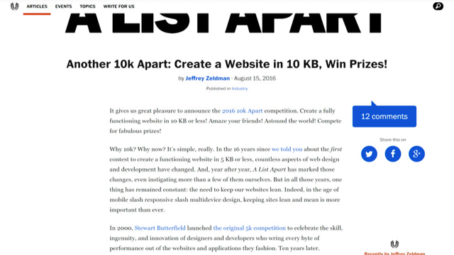
I've been working in the web industry since about 2005 and am still obsessed with the web at large. So, back in August last year one of my friends sent me a link to this A List Apart article. With the average size of a webpage growing larger every year, it certainly piqued my interest. Was it even possible to make a compelling web experience in less than 10 kilobytes. Several of the comments on the article posed this very question.
So I was like, yeah I'm pretty interested.
I thought, oh yeah, I'll read through the rules and things. And I found there we're several limitations that we're to be imposed.
It had to be compelling, well what does that even mean? Had to be responsive.
Had to work without JavaScript.
Now, I thought that was really interesting given the innovation and movement within the JavaScript space over the last few years. So I was like, okay? Every page load had to be under 10 kilobytes. You were allowed to lazy load additional content if you wanted to, however they would take that into account, the overall file size, and you were supposed to keep it as low as possible.
And everything had to be accessible as well. So I was like, yikes, that's kind of a tall order there. I was like alright, well, challenging limitations can actually be quite fun to work inside.
You've got very clear boundaries, and so, you have to creative within those.
So I thought alright, yeah, I'll give this a go. Yeah I think I can build something.
So, I promptly ran into the first problem.
This one.
The what on earth do I make, problem.
So there might have been several technical limitations, but creatively, anything was actually possible. So I sort of took a few days to think about things, and I was sitting at the train station with my sketch book, as you do.
And I began to wonder, maybe I could make a game. So I was just like, oh Hannah that's really funny. The idea seemed absurd at first, because well, the core experience has to work without JavaScript.
And 10 kilobytes is kind of restrictive in size. But, one of the things I have enjoyed building over the last few years, is dress up games. And I thought, is it possible to make one of those, without JavaScript? Actually yes, I could use the CSS checkbox hack. So, here we have my initial wireframes from my sketch book that I was working on.
Yeah, looks like we got a general sort of layout here and splash screen and my very messy writing with some notes.
I tend to work very small with my wireframes. The idea being that I can easily dispose of them if the idea is not working. And just try out different concepts.
So, the main challenge that I knew I would be facing with this idea, is keeping all the image assets within budget. Obviously 10 kilobytes is not much.
So I settled on the idea of using pixel art. Cause pixel art is traditionally from the early game development days, where file size was extremely limited, so it's lower in colours and everything that all sort of ties into it.
I thought okay, yup, let's try out a couple of concepts and stuff.
So I dove straight into actually defining a style for the pixel art.
And I came up with these initial concepts.
As you can see they are kind of sketchy and they are pretty small.
However, I actually found that these sprites were too large. So manual anti-aliasing was needed as you can see around the skin, which actually complicates the layering.
I also found that being a three quarter view, I would likely have to split some items into multiple layers.
Which then further complicates the layering. And more colours equals a larger file size. So I had to go back to the drawing board which is Photoshop. And I drew a few of my teammates.
So we have, Matt, Cameron, Rowan, and me, Drawn in this very flat pixel art style.
These are really tiny, I think the canvas was 16 by 34 pixels, with the main body of the sprites being about 10 pixels wide.
This style suited much better, like the props we're insanely easy to draw. There's no shadows so I don't have to worry about anti-aliasing.
And while the sprites are small, you can see there's enough definition between the different characters, to actually give them some kind of uniqueness. I also found that by using this base body which has no detail and whatnot, I can use it for different genders, and it works quite well. So I thought alright, I've decided on the sprite style, and I'm like, okay, let's get this into the browser to see if I could actually get this concept working. So I fired up Sublime Text and went straight into playing with HTML and CSS, to get this thing. So as you can see here, if you, we've got field sets with items sitting inside them. And if you click on the different options available, it changes the sprite at the top of the screen. So the way this works, is using the radio button hack, or checkbox hack, whichever one you want to say.
We have field sets, with items inside of those. Which comprised of a radio button and a label. The label itself has a section of a sprite image, associated with a pseudo-element, that is then positioned absolutely at the top of the form, stacked on top of each other. It sounds really complicated, and I was kind of like, uh, how did I get this working? But as you can see, it actually does work.
I also, like, because everything is done in a specific stacking order, like I have skin tones, and then hair, and then like pants and skirts and so on and so forth. I don't even have to change the z-index, everything is just the naturally stacking order of the elements, so it's even less code.
I was like, okay, yup, this idea is working, I'm like, I think I can do this.
So I though alright, let's complicate things and move it into PHP, so I can actually handle, you know processing of the form.
And Sass, because I don't like repetitively copying and pasting things, it's just really annoying. Yeah, I wrote some mixins in Sass, to manage the output of the sprite map.
I also set up like an entire build process for this, so I was like, I have a JSON file that has all of the coordinates for the sprite images that I can then read into Sass and PHP, so I don't have to do the work twice. (laughs) And I wrote this render function in PHP, so that I don't have to copy and paste the markup around, I just output the thing. The interesting thing with moving to Sass and PHP, is it's that it's much faster to make your CSS and your markup.
But it also means it's easy to bloat your CSS and markup. So running into the issue of your markup being larger than your CSS and images combined, is something I can honestly say I've never encountered before.
So that was a very interesting one to overcome. Sorry, I'll go back, I'm like half lost now. Yeah so, at this point I've got the page outputting, it's outputting just under, well actually I think it was just over 10 kilobytes, so I'm like, oh, this is a slight problem then. Cause I don't have many items, I'm like, alright, what do I need to do? So I had to go through and start cutting everything out. I cut out all of the wrapper elements around anything. I cut down class names, because I was using BEM, I do actually like BEM, cause it kind of made sense for me. But I cut the class names down to be about two characters. Anything that was single purpose was made into an id, so it could double as a target to switch between views and screens.
And the resulting output was, I think it was like 9.9 kilobytes.
I'm like, yes, it fits, it's like, I've succeeded. But, there was some problems.
Obviously character customization was very, very limited. I think I must have had about eight items or something to choose from, that's not really very usable. And going through cross-browser testing also highlighted another issue.
Where in Internet Explorer you can't set nearest neighbour interpolation for scaling the image, so it was really blurry. I thought okay, I know how to solve this problem, you know what scales nicely, SVG scales nicely. So I was like, I found this great tool as well, where you can upload a pixel art image, and it gives you an SVG back.
I was like, this is amazing, so I did that. I went through and minified the SVG, and plugged it in and everything.
Oh it scaled so wonderfully, I was like oh this is lovely. But even after minifying the SVG, it was like 6.68 kilobytes, which didn't nearly fit the budget that I had.
So I was like, aw no.
At this point in the project, it's like, I've got two very, very massive problems that affect the the user experience.
There's not much character customization, and the images look blurry, so, kind of defeating the purpose here.
And the file size is very limiting, so I can't really add anything more.
You can't just magically make the file size smaller. So, I went through the contest rules again, and I discovered actually you can.
I had forgotten to enable gzip. (laughs) So, after enabling gzip, and then going back to a PNG image that I upscaled in Photoshop. That brought the resulting page down to just over five kilobytes.
I'm like, oh yes, I've got this thing actually working, and I've got enough space so I can actually start doing some things.
So, here we have, I drew a bunch more props. This is the final sprite sheet that I built. There are 36 prop options here, just to give some variation, and I've got different colours for each hairstyle and whatnot.
These we're drawn at 100%, and then scaled up to 400%. I found that was actually quite a good size between different devices sizes, so it works well on mobile and tablet and desktop, and I don't have to go and resize it across any of them. So that was good, and it scaled reasonably well in Internet Explorer.
It's not perfect, but it was okay.
I saved this out, limiting the colour count down to 15 colours for entire sprite sheet, including transparency. And then ran it through a tiny PNG to remove any just unnecessary metadata.
That brought the core image asset down to 1.9 kilobytes. I thought, yes that just fits within my budget. Alright, so, then I went back to my initial wireframes, and I though, oh yeah, that nice splash screen that I, sort of, was thinking about.
So I mocked this up in Photoshop, and then moved it into the browser.
It kind of feels a bit luxurious, having a splash screen in a project where you're limited to 10 kilobytes.
But I did feel that it introduced the entire project nicely, and sort of, began that sort of user flow rather than just going here's a thing.
So I went ahead with that and implemented it. And I realised there was a couple of problems. Sorry, I'm just going to go back to here actually, cause I'm getting distracted.
On every page load, for the sprites they are exactly the same, like the first option within the field set is selected by default there is no variation. So I went and adjusted my render function, so that it would give some kind of randomization, and then you can get some hilarious results, like bearded ladies and everything, it's great. But yeah, at this point, like the project is kind of working, and I'm like, yay, it's working. So I took it to some of the meetups I attend, and one of the suggestions I had, was to add animations when you change clothes, like this. I really, really liked that suggestion, so I added two CSS animations.
One of them happens when you equip anything below the waist, the clothes move upwards.
And anything above the waist, like hair and tops, they move downwards to simulate how we actually put on clothes.
And I thought, that adds just a little bit of fun, so, that was quite cool.
And I kind of realised there was another gaping problem with this project.
How do you save the character? So, like it might look like there's one picture there right, but what happens if you right click on it, you get like, either the sprite image, or save page as, so it's really not very good for the user trying to actually save the thing. They would have to screenshot the page, it's just not ideal. So I spent some time, oh here we go, this is actually the main core experience of the thing. So where you can dress up your character.
Actually if you have a look at this, it's very similar to the original prototype I did. The only real difference is that I'm using thumbnails. Those are added in exactly the same way as the actual image, they're just pseudo-elements sitting on the label, using the before instead of the after.
And I've added some hover states, and just visual feedback, so you can see what's actually selected.
So here we have the screen for saving your actual pixel art character.
I went through and wrote some PHP, to manage the form submission, so that it loops through your form submission, cross-references all of the sprite choices, from the sprite images, copies that to a canvas using PHP's GD library, and returns a base-64 encoded image. So you actually get to save the image.
And I included a link to it in the download button as well, just to make it nice and easy.
And a start again button, so people could build more characters.
At this point, like the project is, like the front-end is complete and I'm really happy with it. And I guess the back-end of it is complete as well. And, the project itself, now outputs 8.6 kilobytes. So this is well within the limit of the project itself. I was pretty please with it, so I was like, alright, I think I'm ready to submit this thing. So, I pushed the repo to Github, filled out the form, read the rules again just to make sure.
Like I'm paranoid and have to read things five times over. I was like, hover over to the submit button, and I'm like, finally click it, and I'm like, yes, okay, I've entered the thing.
I completed the goal that I had of entering the contest, like that was the big thing for me, I actually did this. And then I sort of, I didn't really think to much more of it for the next little while. And then one morning, I got up and I checked my e-mails, as you do, and I was really shocked to have an e-mail to say that my entry had won best design. That was like, I jumped around my lounge room quite a bit that morning. (laughs) But, yeah, I was very honoured to get that. And obviously now a little bit of time has passed since completing this project.
And I like to go back and reflect on things a little bit, and I was sort of, I thought, would I change anything about this now? And the answer is definitely yes.
I think there's always room for improvement on everything that we build.
The text and the background colours are not really truly accessible.
If you check them, like there's just not enough contrast. I'm sure there may be some other accessibility issues that I could improve on as well.
The CSS specificity graph is kind of like all over the place.
But it's, 10 kilobytes right? I also ran this through Google's PageSpeed Insights, just for fun.
Cause I'm like it's 10 kilobytes, it's gotta do well, right? Actually it's got in the 90s on mobile and desktop, but there are actually improvements to be made for these 10 kilobytes, I could've inlined that CSS, and I forgot to set browser caching on the assets, whoops. (laughs) So I learned a lot from building this project. I learned that my process was actually really organic and fluid.
Like I was willing to pivot and change when I ran into things, and like, while several problems came up during the course of this project, each one of those things was actually able to be overcome. And the most important thing that I learned from this, is to challenge what I initially thought wasn't possible. Like, it's not possible to make a game without JavaScript. Yes, actually it was.
So, challenge what you think isn't possible. So, yes, thank you very much, I'm Hannah Malcolm. If you want to get the code for that, it's all on Github, and it's licenced under MIT, so you can like rip it apart, and do whatever you like with it.
And if you do anything with it, I'd love to see. (applause) (upbeat music)
With the average size of a web page growing larger every year, is it possible to deliver a compelling web experience in less than 10KB, without the need for JavaScript? Learn about the challenges and breakthroughs in designing and building an entry for the 2016 A List Apart Competition that ended up winning Best Design.