Advanced Responsive Typography
There was a time when pixels were pixels and even relative units such as em and rem were just comfortable abstractions of a base font size, that was usually 16 pixels. We became so familiar with this paradigm, we may have overlooked the potential of viewport units and calc expressions to provide a holy grail of responsive design techniques.
Mike will provide a general overview of unit types and values in CSS, with a specific focus on how viewport units, calc expressions and other computed values work. Armed with an understanding of how computed units are resolved in the browsers, you’re going to learn how to create a “pure function” in CSS that uses vw as a variable. Then we are going to learn how to apply this technique to a number of practical use cases including: min and max font sizes, advanced fluid typography, elastic widths and fluid modular scale headings and more. Each of these techniques can be used today and can be applied with progressive enhancement.
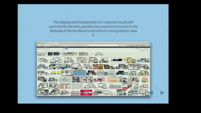
Fluid Type Calc Examples | madebymike
CSS values to know about…
- Specified value – what you write in the CSS
- Calculated value – what the result is expected to be
- Used value – what actually got used when all was done and rendered
Calc() can…
- add and subtract units with a similar type
- eg. 10px-3 is not valid
- multiply units by real numbers only
So with that crash course… responsive typography can be complex and jerky, with piles of media queries. You can smooth it out a lot at larger sizes by using things like viewport width units, which smoothly scale; but at small screen sizes they get too small.
So… You can set a base px width, then use vw above a minimum width.
html { font-size: 18px }
(media query min width 600px)
html { font-size: 3vw; }
How about a maximum font size? Calculate your media query… 18/(3/100) – use the value as the media query.
A chart is much easier to read than doing lots of calculations.
font-size: calc( 12px + (24-12) * (100vw – 400px) / (800-400);
Modular scale headings: eg. each heading 1.2 times the size of the previous level. That scale is the minor third, “endorsed by nature”.
These techniques are also great for icons and other scalable images.
This is all a bit hard to remember… so let’s forget everything we just learned and use Sass!
There is a Sass mixin, check Mike’s blog for the code or links.
Mike Riethmuller @MikeRiethmuller
Hey! I just uploaded slides from #WD15 replaced videos with interactive examples on @codepen https://slides.com/mikeriethmuller/wd15/ …https://codepen.io/MadeByMike/pens/tags/?selected_tag=wd15 …