A Modern History of Front-End Best Practices

Hello everyone.
this talk is called Ben Taylor's Modern History of Front End Best Practices.
All right, so the Web is old now.
Here's a quote from the Wikipedia article for the history of the World Wide Web.
Tim Berners Lee invented the World Wide Web in 1989, applying the concept of hyperlinks and all that cool stuff we love, uh, 1989.
That's a long time ago.
especially when we see JavaScript Frameworks released every year.
That's the same year Taylor Swift was born.
That's as old as I am.
The Web is a millennial and it's being roasted on TikTok by Zoomers.
Okay, so it didn't actually happen in 1989.
He came up with the idea in 1989 and then, he was an academic, so he took like a whole year to publish a proposal.
And then in 1990 that proposal got widely accepted and he came up with a prototype.
And really the Web started in like 1993 with Mosaic.
But let's say it was 1989.
All right, total segue.
Here's something weird.
when you give an ID to an element, the ID becomes a global variable.
Did anyone know this?
I.
Weird stuff, right?
That's weird.
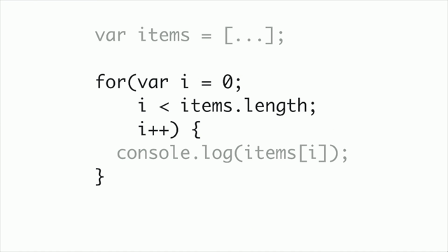
So what that means is you can just write hello as a variable name in your JavaScript and you get the element, it's getElementById, but you just write the ID straight in.
this is weird.
Here I'm setting the text of the element to be 'g'day'' and when I do that, the element is updated to have the text g'day.
as you would expect.
Here it is all together, we give the element an id.
That could be whatever I want, but if it's not a valid JavaScript identifier, then it won't work as a variable.
then, the text inside it I set to be g'day and even though the text was originally, hello, it's now g'day.
It's strange that every single element with an ID has its own global variable.
What happens if that clashes with your own names and scopes?
Why does getElementById exist if I can just do this, like maybe that's how I'm gonna write my Web apps from now on.
Why does my HTML leak out into my JavaScript namespace?
That's it's strange.
Why?
in 1990, whatever, someone at Microsoft thought this would be convenient.
so they added it to Internet Explorer.
back then it was really common for scripts and HTML to be tightly coupled.
You didn't have your script in a separate file.
You just put it on the same page.
Maybe it was in an onclick handler.
just right there.
and you gave the element an id, so why not access it with that id, it made sense and once Internet Explorer implemented it, all the other browsers had to add it, and then it got used a lot and now it's a Web standard.
but you might notice that the Web standard says, don't do this.
you should use getElementById.
So the whole Web is like this.
It's this chaos of layers and history and people doing their best.
practices of the past impact how we work today.
And the Web is made of weird stuff that really own, made only made sense in the original historic context.
More code was written in the last 10 years than was written this year.
That means that there's more legacy code out there than fresh, beautiful, modern, best practices.
One of the web's big strengths is that it's fully backwards compatible.
You can go and visit websites from the nineties and they work like they really work.
Like you can't do that with apps.
Like you can't do that with games.
It.
It all works on the Web, but that also means that nothing ever goes away.
We've still got stuff from the nineties that people thought was a good idea to add to Internet Explorer, so that means you are gonna have to learn it and understand it, and you're gonna have to maintain it.
I could do a whole talk on weird stuff from Internet Explorer, but let's not do that.
I'm gonna focus a little bit.
In 2007, apple released the iPhone and it totally changed the way people use the Web.
When the iPhone was released, you couldn't make apps.
it didn't have an app store, but you could use Safari.
and in fact, the developer docs included a guide for how to make Web apps for the iPhone, and this seems like a good place to start the iPhone.
In this time we saw the rise of software as a service and Web applications.
A lot of Web applications and a lot of Web standards were built during that 2007 to now period.
The company I work for Stile Education started around 2012, and there's code in our code base from that era.
can anyone relate to that code from 2012?
Yeah, a few people.
Where are the people from Atlassian?
So the iPhone came along at an interesting time in Web development.
Apple refused to support Flash, which was the main way to make app like Web applications.
But Web applications were becoming possible with just HTML, CSS and JavaScript.
You didn't need to embed Java or Flash anymore.
With mobile devices came small screens, and this was a problem for websites.
So the first best practice I'm gonna talk about is layouts.
Let's talk about best practices for layouts over the years.
The 960 grid system was introduced by Nathan Smith in around 2008.
When the Web started, most people had the same size screen.
And then different screen sizes and resolutions became, pos became common.
but if you built for one of those sizes, like 800 by 600, your website would just sit in the top left of the screen.
And bigger website, like bigger screens were just it looked weird.
And so people had this idea that you put the website in the middle of the screen.
Pretty wild, and, they picked the, the number 9 60, 960 pixels.
It was a pretty good, number to work with.
You would make your content 960 pixels wide and everything else was blank space.
This was an innovation at the time.
This grid was divided up into 12 columns and twelve's a great number.
It's divisible by 2, 3, 4, and six.
We should probably count in 12.
Ten's useless.
It's only five and two.
So with 2, 3, 4, and six, you could make complex layouts.
Here's a pretty complicated Layout.
So in this one, you can see the stuff at the top left has four columns that it takes up, and then there's a one column of navigation.
We've got six columns in the middle.
We've got at the bottom left, there's seven columns.
On the right, there's three columns.
That's really neat and it looks good.
So how would you do that?
A lot of divs is the answer.
We still do that.
but you would have a class for the container.
and that there is saying that's a 12, column wide container.
And then we have grid seven.
That means this is going to take up seven columns of the grid.
Prefix one that's saying put an extra column at the beginning.
And then inside that I've got it divided up into more grids, a two wide grid, a three wide grid, a two wide grid.
There's this stuff like Alpha and Omega, which was like a total flashback when I read it.
I think that just means get rid of the margin at the beginning and the end.
and then at the end we've got suffix one.
Okay.
So this might seem a bit familiar, um, but we had a problem with that.
With mobile devices came small screens.
the original iPhone had a resolution of 320 by 480.
That's so small.
At the time most computers had a resolution of about 1024 by 768.
So this was a problem for websites built with 960.
They would display small, like this zoomed out and you couldn't tap anything.
You couldn't read the text.
You had to zoom in.
And most people would just build a separate website for mobile.
But we didn't wanna do that.
We want one website.
So it was time for our grids to become responsive.
now Bootstrap didn't invent this idea, but I think it's a really great demonstration.
Mark Otto and Jacob Thornton.
A couple of Web developers at Twitter, r i p realized that they kept building the same stuff.
So they came up with the idea for Bootstrap, it was a Layout system and a set of components that could help you build a website fast.
In the process, they invented design systems, even though everyone hates the bootstrap look.
it was incredibly popular and to be honest, it still is.
In v1, they just used the 960 grid approach.
It was basically the same thing, but in V2 they added a responsive grid.
And this is a cool idea.
The way it worked is that the grid column widths, you can see in the column width column, would change depending on the size of the device that was viewing it.
and this was pretty neat.
this is a cool approach.
and they would use media queries for each size.
And they changed the size of the grid at certain breakpoints.
So we've got smartphones, portrait tablets, landscape tablets, default, large display.
this became a common best practice from then onwards.
and you can see that this approach looks really similar to the 960 grid approach.
We've got a container, then a row.
This of course total div soup, and span, offset4 cool.
This would be the same Layout on smaller devices, but the columns would get a bit smaller, and so things would squish up a bit.
It looked all right.
By version three in 2014, this grid was becoming more and more capable.
You could adjust how many columns an element took up depending on what device loaded the page.
See this class prefix bit that row, col-xs, col-sm.
Some people might have seen this stuff looks very tail windy.
this was, before that.
you can see here we have the xs and md options to decide how many columns to use on different devices.
So in this one we've got a row, and then that first column on a small device will take up 12, and then the second, um, one will take up six.
And on a medium sized device, it will take up eight and four.
So that'll put the two things right next to each other.
oh.
This sort of, approach can be hard to manage.
you need to do a lot of fiddly work with grids at every size and lots of class names, and it's all in the HTML anyway.
Flexbox killed grids is my opinion.
Now we have flexbox the elements in classes, it's too much work and people don't really use grids like this, or at least I don't.
I think that now that we have better primitives for Layout, we don't need something like column layouts.
We don't have to be restricted to that.
and those grids might still exist at the design stage, like that makes total sense.
But when you build it, you don't necessarily need it.
So iPhone had really cool apps like this app that makes your iPhone into a beer.
Yum, yum.
You don't see innovation like this anymore.
And Web devs were jealous.
We wanted to make cool apps with animation and dynamic behavior.
And so this next best practice, I'm gonna talk about dynamic Web apps.
A really popular best practice for making Web apps was decoration, which is a pattern made popular by jQuery.
jQuery, released by John Resig in late 2006, and soon became very popular.
In fact, right now, jQuery is on like 80% of websites.
80% of websites on the entire Web.
That's wild.
you can see up here that red line is jQuery and down the bottom here, this tiny little line is react.
I got a question.
hands up.
How many people here have jQuery in their code base?
That's why it's in 80% of websites.
So let's quickly look over how this works.
Let's say we've served some HTML.
here I've got, some text in a paragraph.
I've gotten a button, which I've put the class reveal on it, and I've got this other paragraph that's hidden and we want it to be displayed when you click show more.
So you have JavaScript that goes through and finds each selector and adds your JavaScript.
that was a weird sentence.
Let's delete that one.
The dollar sign, is the jQuery Library.
Yes.
Dollar Sign is a valid variable name in JavaScript and John Resig stole it.
here I've found all buttons that have a button reveal class.
Then, I've decorated them.
And you can see I've got this on click event.
it's on not addEventListener.
And I've got a function which has, is a callback.
and then I get the target of that click and I get the parent, which was that div element.
And then I find the hidden div and then I show it.
And this approach is really powerful.
It's performant.
It's like Server Side Rendering islands architecture.
But from 2008.
In fact, rendering your HTML Server side and then sprinkling in just a little bit of JavaScript, is becoming popular again.
and if you're interested in trying this out, hot wire and HTMX are two interesting JavaScript frameworks that take this approach.
But what about Ajax?
This was the best part about jQuery.
It was really easy to grab something from the Server and then update the page.
Let's say I had a form like this.
It's got a name input, and then it's got a message textarea.
I should have put a name on that.
This form won't work.
and we want to, a way to live update the page, not wait for a whole reload.
and so we use jQuery.
jQuery posts the data to the Server.
And the Server responds with some HTML, and then we put that on the page.
So you can see here, when you click the button, we do dollar dot post.
So post to the slash form endpoint, and then I'm gonna serialize the form as the data and on success, I'm gonna replace the form with whatever comes back from the Server.
And so the Server sends back this HTML.
Which is, post by Ben.
Hello Web Directions, and we chuck it in the page.
The big problem here is tight coupling between the front end and back end.
The Server has to render HTML fragments.
What if we want to change something somewhere else in the page?
It gets really unwieldy quickly.
And so let's talk about the next best practice.
Around this time, Ruby on Rails was really popular, and because Ruby on Rails was popular, everything it did was popular and an architecture called Model View Controller was really popular.
Model view controller.
The idea here is that the model is responsible for data and syncing.
The controller is responsible for orchestration between the view and the model, and the view is responsible for displaying the data from the model, and this approach was adopted by two really big libraries.
Angular js, released by Google in 2010 and a few months later, backbone by Jeremy Ashkenas.
These frameworks both used this MVC pattern, but I'm a bit more familiar with backbone, so I'm gonna talk about that one.
In backbone, the MVC is slightly different.
C stands for collection.
Here we have model view collection.
The idea is that a collection is like a group of posts or articles, something like that.
And then for each, item in the collection, you instantiate a view and you render that.
This is how it would work on the page.
so at the, bottom let's start there.
we've got the browser and the user triggers events.
and they go up to the view, and then the view figures out what to do with those events.
Like some text updated, and it sends that update to the model.
And then the model goes and syncs that data with the Server and the Server sends it back to the model, and then the data update goes back to the view, and then the view renders the HTML goes to the browser.
This is similar to how a lot of React apps work now, but it was a bit more complicated.
especially making sure that data was in sync across the whole app.
You would often just rely, resort to like manually updating the page.
Cuz we didn't really have this idea of in place updates and events were flying everywhere.
also sometimes it can feel like these labels and groupings were a bit arbitrary.
people are like, this is the model and this is the view.
it doesn't make any sense to me.
now we've got a bit different idea.
and hopefully, this is the react track, maybe you're a bit familiar with it.
we've got this idea of reactive components and we still have these different architectural parts, like models and controllers.
But instead of calling it all model or all controller, we invent different little architectural parts and specific tools for solving individual problems rather than trying to solve it all with one pattern.
So to make all these dynamic Web apps, we'll need to include code that someone else has written.
I can't build all these Web apps myself.
I love not writing code.
I also love deleting code.
so how are we gonna do that?
We're gonna need to include a vendor library, someone, something someone else has written.
and the way that you would do this, circa 2010, is you would download jQuery, you'd put it into your folder with all your JavaScript.
and then you'd put a script tag on the page and that would load jQuery, and that's pretty cool.
That works pretty well.
But what happened was there was some really cool, like other libraries, and I want all of them.
so I want underscore and I want masonry.
That's like the cool Layout that what was anyway.
And I want fabric cuz I want cool canvas stuff and I want popup cuz I wanna have these popups going on my screen.
and it just, there's so much going on.
can we speed up loading these?
yeah.
everyone's using jQuery.
We saw that 80% of websites.
So why don't we put it on a cdn?
and then if I load jQuery on my website and you load jQuery on your website and someone else's loads jQuery on their website, you just get to hit it from cache cuz it's the same url.
You can just go straight to cache, get jQuery get underscore, get masonry, get fabric.
That's great.
but we had a problem.
These loads would all block each other cuz HTTP 1.0.
The browser can only make three requests at once.
So we are loading jQuery, we're loading underscore, we're loading masonry, and then fabric is blocked.
It can't load, so we've gotta wait for jQuery to finish and it's pretty big.
and then, okay, jQuery's finished.
Now we can start loading popper.
And that's slow.
So we invented this idea of bundling.
Let's just put it all into one big bundle.
And conveniently, in 2009, Ryan Dahl had released Node js, and in 2010, Isaac Schluter released NPM and, NPM had some really good features and it was well loved because so many packages there, I love packages and people on the front end wanted all those packages.
So in 2014, a bunch of people built Webpack.
And there's some other technology that's similar, but let's just talk about Webpack.
And the way you do things is you'd use this, require syntax that Node had invented, and Webpack would read this and would figure out, okay, you want jQuery, let's chuck that in the page and you want underscore, let's put that in and masonry and fabric and popup and then don't worry about it.
It's, all gonna be there.
and oh, extra cool.
You don't have to download new versions of your libraries anymore.
You can just write it in here and we'll just, we'll do it part of the build process.
Super cool.
you can do npm run build.
This is incredible stuff.
And you've got just got the one JavaScript file.
It's all just, it all just loads, nothing, blocks.
It's great, but that JavaScript file is getting bigger and bigger.
It's, many megabytes now, what's going on?
and so then we need to not bundle With HTTP2 and HTTP3 we no longer have those request limits.
The browser can make hundreds of requests at once, and so why not use Web standards?
Browser support ES modules for imports natively.
This works in your browser today.
You can import dollar from vendor slash jQuery and the browser will make a request for that resource.
and then I've got, when you click a button, I'm gonna go import popper.
And that happens dynamically.
That doesn't happen at load time.
That import is a promise.
And I'm gonna wait for that to load.
And then once that loads, I can, run my event.
And so I'm no longer loading all these libraries when the page loads.
I can just load them when I need them.
And once again, I've just got one little import, which is nice.
is there a lesson here across all of these, across all of these best practices?
there's a lot of old code out there.
I think that's a lesson to learn.
and it we're just writing more and more of it.
Any code you write today, that's old code in two years.
Code you write tomorrow, that's old code.
The code you wrote yesterday, that's old, that's legacy code.
and the Web is pretty resilient.
Like everything you write is gonna work forever.
And someone's gonna have to maintain it.
And if it's not you, it's the juniors who are in the room.
If it's not them, it's the juniors that they'll train up.
so we've got these new primitives and they help us express these ideas a bit better.
Flexbox means we don't really need grid systems.
now that we've got native imports in the browser, we don't necessarily need all this bundling stuff.
it seems like we still need react, but maybe we can get rid of it.
We've got Web components now.
You should learn old stuff too.
Don't just learn the new stuff.
cuz you're gonna have to, you're gonna have to use the old stuff and it's gonna work forever.
Like the best JavaScript library is the one that ships with your browser.
it's already there.
You don't have to load it from the Web or, do whatever.
I'm Ben Taylor.
my Twitter handle is @taybenla.
It's still alive, it's still kicking.
I work at Stile.
our mission is to deliver a world-class science education for every student.
You can learn more about us on stileeducation.com, and I've got one more thing.
What do you think will happen in this example?
So both of these elements have the same id.
It's both 'hello'.
And you can do that.
you shouldn't do that, but you can do that.
and then I'm, I'm doing hello dot textContent.
I'm gonna do some or audience engagement.
Was anyone paying attention when I showed the Web standard?
cuz it says what the behavior should be.
does anyone remember, anyone think what it, what might happen?
Any ideas?
Come on.
Sorry.
[audience member] It's only changed the first one.
It only changes the first one.
That's a good guess.
[second audience member] It's, it changes both of them.
That's also a good guess.
Changes.
The second one changes.
The second one is also, strangely, a good guess.
Doesn't change any, is also a good guess.
of course this is browser dependent.
so in Firefox, it gets the first one.
So that is just an HTML element.
It's the first one.
in Chrome and Safari, they both implement the Web standard, which is that it returns a HTML collection, an array of elements.
so in that case it will fail because we're calling textContent on an array, which doesn't make sense.
and that's weird as well.
Like sometimes it's an element and sometimes it's an array, whatever.
Isn't that the most Web thing ever?
Questions.
Front-End development has changed a lot in the last 15 years. Browser compatibility has stabilised, browsers have added a *lot* of functionality, JavaScript has had a massive makeover and CSS has added lots of tools that make hard things easy. But in the middle, we wrote a lot of code – and you might have to read it.
In this talk I’ll go through a modern history of front-end best practices. We’ll look at how the tools available, and the constraints we had, impacted the way we built. Hopefully this will help you understand how we got where we are, and how to approach code (and browser APIs) that work in an old paradigm.