Practical tips to integrate inclusive design into your everyday work
Fairness Is Not the Same as Inclusion
Viv Dinh uses an unfair challenge from The Amazing Race and research with blind and low-vision viewers to show why equal treatment does not always produce an equitable experience. She defines inclusive design across disability, language, culture, age, technical fluency and lived experience, then introduces five everyday design patterns where teams can do better.
Make Icons and Images Understandable
Viv examines how unlabeled icons, meaningless filenames and decorative images create barriers for people using screen readers or living with cognitive impairments. She recommends visible labels, purposeful alt text, ARIA labels and explicit accessibility annotations so developers understand the intended behavior.
Give Users Control of Carousels
Viv demonstrates a carousel that a screen reader cannot detect and an autoplay experience that users cannot pause. She proposes manual controls, clear position announcements, generous touch targets, keyboard navigation and simpler alternatives such as stacked tiles.
Manage Focus Inside Modals
Viv shows how an unannounced modal can leave screen-reader focus stranded in the underlying page. She explains how clear close controls, logical focus order, focus trapping, background suppression and focus restoration make interruptions understandable and operable.
Create Predictable, Flexible Tiles
Viv compares a confusing product tile with one that announces its content in a deliberate sequence. She advises designers to simplify groupings, specify reading order, support flexible text and zoom, and define consistent focus behavior across screen sizes.
Write Clearly and Test the Experience Yourself
Viv connects her mother's early experience of learning English with the importance of plain, direct interface copy, translation-ready layouts and useful error messages. She closes by arguing that inclusive design grows from small intentional choices and challenges designers to learn their phone's screen reader by testing familiar digital products.
So for those of you who don't know me, my name's Viv, and I'm a principal product designer who's researched and designed for some of Australia's most recognized brands over the last ten years. Some of you may recognize me as a speaker at the twenty twenty one Design Conference Research, but some of some of you may also recognize me from a slightly less professional moment in my life crying on national television on The Amazing Race 2019.
Now, for any of you who's a Survivor fan here, you'd know that individual weight based challenges are adjusted according to a percentage of each contestant's body weight to make things fair. But in this case, the race producers didn't think to factor this in to the challenge. As you can see, I'm only standing at a hundred and thirty five centimeters tall, which isn't actually tall enough to stand behind this podium, and I had to carry the same amount of weight as everyone else in this challenge, which was a much higher percentage of my body weight, hence the tears.
And that's where our conversation begins today, inclusive design. Years ago, I researched and conducted interviews with low vision and blind users. The intent was to understand how blind and low vision users prefer to browse and interact with movies and TV shows at home. I had an assumption that as the level of visual impairment increased, the desire for a graphical user face decreased with a voice interface being favored. What I quickly learned was that all users want an inclusive experience, not an exclusive one.
The participants I interviewed desired a consistent experience regardless of visual impairment, and some suggested that having a graphical user interface gave them more confidence than having a voice only interface. One of my favorite quotes from a participant read, having accessibility is fantastic, but you don't want to make it inaccessible to other people, segregating people who are vision impaired to everyone else.
No visual on the screen excludes other members of my family, and I'm not sure how comfortable I am with this. So let me ask you a few questions. How often do you really think about someone navigating your product with a screen reader or someone whose first language isn't English or an older user who might struggle with small touch targets.
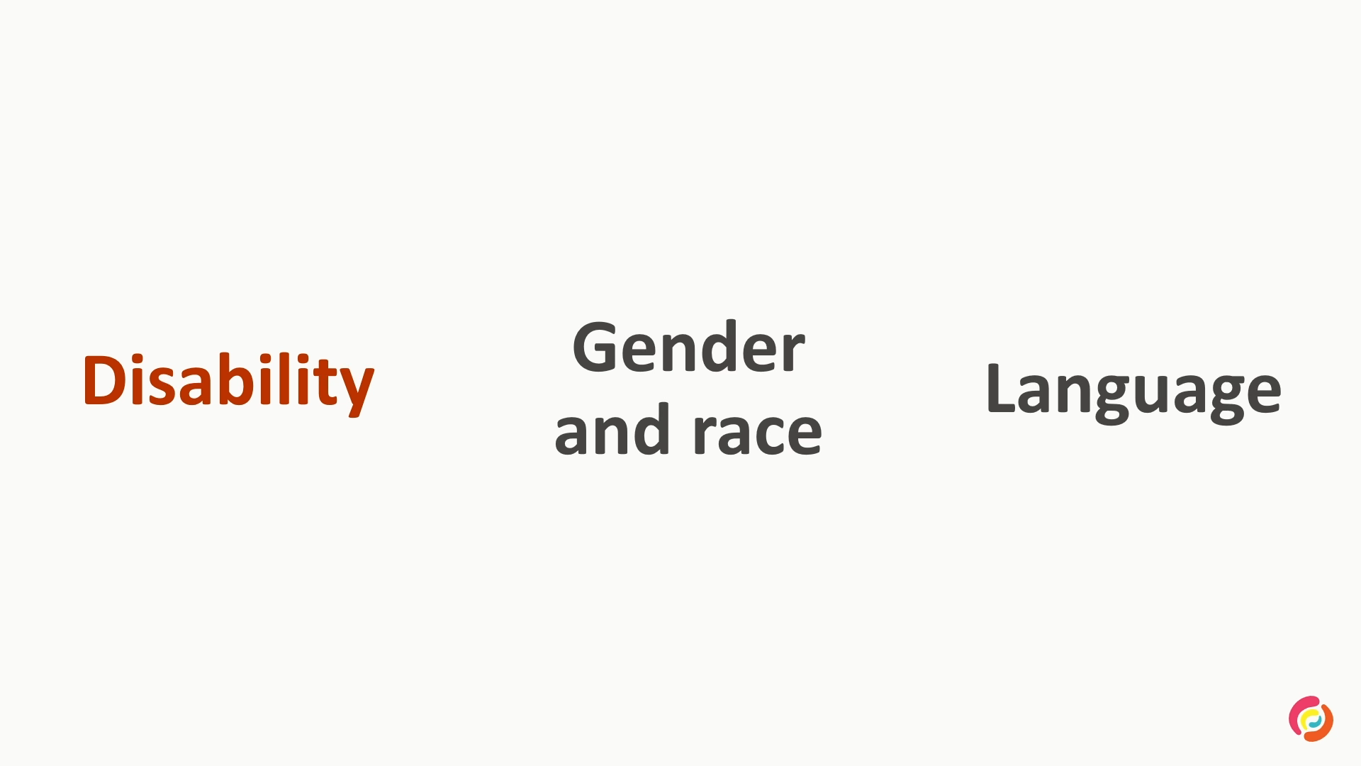
Inclusive design is the ability of a website, mobile app or electronics document to be easily navigated and understood by a wide range of users. It's about recognising the full spectrum of human diversity: disability, language, culture, age, tech fluency and lived experience, and asking ourselves, are we designing for everyone? Today, I want to give you practical tips to make your everyday work more inclusive and accessible, even if this isn't the primary focus for your organization.
I'll be going through five common design patterns, where they often go wrong, and how we can do better. I'll also be showing you some examples of a screen reader navigating through some apps. For those who aren't familiar, a screen reader is an assistive technology that converts text, buttons, images and other screen elements into speech or Braille for low vision and blind users.
So let's dive in. Number one, icons and images. They can enhance the UI, but only when users understand them. Years ago, I was working with an older gentleman who was our UAT tester. We designed a really clean, modern page complete with a meatball menu. You know the one, the three little dots that indicate more options in our table design.
We thought it was super intuitive and minimal, but when we handed it over for testing, he looked at the page and said, what's this? He had no idea that the three dots were clickable and insisted on the fact that we shouldn't be using icons without text labels. That moment stuck with me, because while we as designers may see the meatball menu as a common UI pattern, many non tech savvy users don't. For them, it's not obvious.
It's not even visible as an interactive element. This is a perfect example of where designers think that users will recognise and understand certain UI elements, but many don't. So what are some of the common issues? Users with low tech savviness or cognitive impairments often struggle to understand unlabeled icons. This can be due to memory and recall difficulties, reduced attention spans, difficulties with abstract thinking and increased cognitive load.
Icons and images often lack meaningful descriptions in the HTML, so the screen readers end up announcing unhelpful details such as the raw image file name. And decorative visuals can clutter the experience for screen reader users. Here's an example.
03, def 12D2, D84, f 527, d a a three, d 97, b 65 a 6,455 f 21 e 600And41 E36A400And82C1D14A43E four fed a PNG image. So
that was quite the mouthful, wasn't it? This is an example of a screen reader announcing an extremely long file name for a PNG image. So what can we do? Avoid icon only buttons unless the icon is very widely recognized, for example, a trash can equals delete. Ensure functional icons and buttons have meaningful text labels.
And provide your developers with the alt text for images and ARIA labels for icons directly in your designs. So alt text is a short description of an image that's added to the image's HTML code. It's used to provide context and meaning to the image for users who can't see it, such as those using a screen reader. On the other hand, an ARIA label is an accessibility attribute you can add to the HTML element, such as an icon, to give it a text description that the screen reader can announce, even if there's no visible text label on the page.
So along with asking your developers to use your specified alt text and ARIA labels on images and icons, you can also ask them to hide non informative visuals, like decorative icons or background images, from the screen reader. So here's an example.
Close button. Share button. Lamb kebab heading.
You can see in this example that the lab kebab image was hidden from the screen reader altogether since it adds no meaningful value to the user. Here's a very quick and lean example of how you can annotate your designs for Handover. The details you provide should be things that you can't actually see in the designs themselves, things like interaction, behavior, business rules, and accessibility requirements. I like to add these notes directly around my designs, but you could also capture the same details in a functional spec.
So for example, golden retriever playing with an orange ball on the grass as the alt text, or you could ask your developers to hide this image from the screen reader altogether. And for the ARIA label, the icon button should announce save article to favorites to the screen reader. Number two, carousels. They're everywhere, on home pages, in product galleries, on mobile apps. But when it comes to accessibility, they're often a nightmare.
So what are some of the common issues? They have poor or nonexistent keyboard support, the screen reader can't detect or interact with the content, there's no clear indication of which slide is active, Auto playing content with no pause or stop option. Small touch targets, making it hard to tap or swipe accurately.
And users rarely interact with the slides beyond the first view. Here's an example.
A card. Button. Learn more. My rewards. Learn more.
As you can see in this demo, the screen reader couldn't detect that the carousel existed at all. There was also no way to pause the autoplay, which can be especially challenging for users with cognitive impairments or memory difficulties. So what can we do? Design visible next and previous buttons with clear icons and labels. Show the position clearly, for example, two or five or use visual indicators. Make carousels manual by default or give the user the option to stop the autoplay so that they always control the pace.
Use subtle transitions to prevent motion sickness or cognitive overload, ensure tap targets are large enough, reduce the number of slides to make them more manageable, especially for screen reader users, And alternatively, avoid carousels where possible and explore alternative design patterns such as stacked tiles instead.
Too often, we rely on our developers to implement accessibility, but we should be accountable for this too. As part of your handover notes, ask them to implement full keyboard navigation, support focus indicators so users can see where they're navigating through the carousel, and clearly announce how many items are in the carousel. Here's a better example.
The summer I turned pretty, season three, included with prime, one of 10, button. The pickup, two of 10, button. Chief of War, season one, first episode three, three of 10, button.
As part of your handover, adding a few simple dot points can go a long way for accessibility. In this example, I've specified to hide the image from the announcement, announce the item as item x of x, read order, title, description, location, price, focus of the tiles go left to right, and ensure the entire tile is focusable and clickable via the keyboard.
Number three, modals. Modals, including alert pop ups, interrupt interrupt the main flow to demand attention, so they really need to be well designed for everyone. So what are some of the common issues? The focus doesn't move into the modal when it opens, and controls aren't keyboard accessible, so keyboard users can't interact with it.
There's no screen reader announcement, so users don't even realize a modal has opened at all. The background content stays readable, which adds noise and distraction. For users with low vision, high zoom, or small screens, modals can become unreadable or unscrollable. And they can also break task flow, which is especially challenging for users with cognitive disabilities.
Here's an example.
Notebooks. Notebooks. Vertical line. Cookie notice. Cookie notice.
You can see in this example that the modal wasn't announced to the screen reader, and the focus remained where the user was on screen at the time of the modal opening. So it only ends up announcing the content at the bottom of the modal, which is extremely confusing. So what can we do? Design large, clear, close buttons and label them clearly by adding close, not just an x.
Keep modals simple. One clear purpose, short content and minimal interaction required. Design a logical focus order and specify where focus should go when the modal opens. And avoid modals altogether for minor interactions. Use inline panels or expandable sections where possible.
You can then ask your developer to alert the user of the modal, trap keyboard focus inside the modal, tell them where to restore the focus for a screen reader when the modal closes, hide the background content, ensure all modal actions are keyboard accessible. Here's a better example.
Alert, we recommend that you upgrade to the latest version. Upgrade now. Upgrade now button. Upgrade later button. Container. Web dialogue. New big arch registered.
In this example, a native system alert appears on top of an app's modal. It announces itself. And once dismissed, the screen reader announces that a dialogue is open and focuses back onto the modal's title. Number four, tiles. Tile components show up everywhere as well, product grids, news lists, dashboards, search results and so on.
They often contain an image, a headline, text and one or more actions. But when poorly designed, they become frustrating or unusable for many users. So what are some of the common issues? Tiles can be very cluttered and have unclear groupings or vague content structure. This makes tiles very hard to scan, especially for users with ADHD or cognitive disabilities.
Screen readers follow the code order, which may not match the visual layout. This can confuse users if focus seems to jump around unpredictably. On the other hand, when the code order mirrors the visual layout, the reading order can also be confusing. And tiles can also break or truncate the content at higher zoom levels or smaller screens.
Text ends up overflowing, buttons disappear, or the tile height collapses. Here's an example.
Icon16wishlistdefault button. Find similar button. Icon16wishlist icons Patagonia. Women's Jackson Glacier Parker. Women's Jackson Glacier jacket. $699.95. $629.95.
You can see in this demo that the focus jumps around very unpredictably for the screen reader, and an appropriate ARIA label wasn't specified for the favorites icon. So what can we do? Group related content visually, use a consistent layout across tiles, Avoid unnecessary content, keep it scannable.
Design for flexible content lengths and text wrapping. Avoid hiding key information in tooltips or trunk hiding content that users need to see. Maintain a logical content hierarchy and design and spec the intended reading order. You should also avoid placing key information in unpredictable spots.
If the whole tile is clickable, make it visually obvious. And keep interactive elements tappable and visible across multiple screen sizes. You can then ask your developer to implement both hover and keyboard focus states for clickable tiles, test at 200% zoom and mobile breakpoints, and implement the intended reading order of the tile that you've specified.
So here's a better example.
Don Deli cuts country honey leg ham 100 grams. Item three of 12, $4.30, $43.0.00 per one kilogram. Special, pick any three for $10. Sponsored.
You can see in this example that the screen reader reads the content in a very specific order. It starts with the product name, then announces the item's position in the list by saying item three of 12, followed by the price. Next, it indicates that the pick any three for 10 is a promotion. It then ignores the Save to list and add button because the entire tile was clickable.
These are all things that should be specified directly in your designs when handing over to a developer. Last but not least, copy. Designers write too, and words are part of UX. When my mom first came to Australia at 13, she spoke no English and had to learn fast. She once told me about a moment at school when someone asked her if she wanted to eat a hotdog.
She was mortified. Australians eat dogs, and specifically, they have to be hot. It's a funny misunderstanding, but it's also a reminder language shapes experience. Whether it's an error message, a tooltip or a button label, the words we choose matter just as much as the visuals. Too often, I see designers overlook and rush the copy, leading to inconsistent messaging or leaving it to developers to decide what the copy should be. Common issues include copy with technical jargon that users don't understand, writing vague messages or using too many words, making messages lengthy and hard to comprehend, and not considering how language expansion will affect layouts. So what can we do?
Use copy that explains things in everyday plain language that all users will be able to understand. Keep content clear, short, and direct. This improves comprehension and keeps users engaged. Design for translations and avoid truncating or hard coding copy that might expand in other languages, Zoom, and screen sizes.
So languages like Thai, German, and French often expand significantly, so build in extra space to allow for this. And make sure you include all error messages in your design file or documentation. The other day, I was trying to register for a website and kept getting the same vague error message. Invalid information provided. Please check and try again.
After about 20 attempts and plenty of self troubleshooting, I finally gave up and emailed tech support. Turns out I hadn't done anything wrong at all. I just hadn't been uploaded into the system yet as a new member. This is only one example of frustrating error messages that weren't carefully considered, and I'm sure many of you can think of an example where you've been in that frustrating loop because of one poor error message. So as you can see, inclusive design doesn't have to be overwhelming. It's not about ticking every box or meeting every standard perfectly. It's about making very small, intentional choices that can make a big difference to the people who use what we create.
After researching with low and blind vision users, I started to learn how to use a screen reader on my phone. I've now added a shortcut on my phone, so with three clicks of my phone's side button, I can turn it on instantly. So here's my challenge to you. When you leave today, spend some time activating and learning how to use the screen reader on your phone.
Try navigating your company's Apple website or one of your favorites and notice what works well and where it falls short. And together, we can continue to learn, grow and design better, more inclusive experiences for everyone. Thank you.
Technologies & Tools
- graphical user interface
- voice interface
- screen reader
- assistive technology
- system alert
Standards & Specs
- Braille
- HTML
- ARIA label
Concepts & Methods
- inclusive design
- UAT
- meatball menu
- alt text
- functional specification
- carousel
- keyboard navigation
- focus indicator
- modal
- focus order
- focus trap
- tile component
- mobile breakpoint
- plain language
- language expansion
Works
- The Amazing Race
- Survivor