Word Design 101
(upbeat music) - Thanks so much for having me.
It's so exciting to see so many people excited about word art, hopefully as excited as I am.
It's not about word art.
We have a number of questions to ask today. And the first one that we want to ask is what is word design? Ah.
And how to use the magic button? What is word design.
Well, Josh, it's not about word art.
Word design is commonly referred to as UX writing. It's interface text, it's microcopy.
So basically, when we talk about word design, what we're talking about today is text that appears within your product interfaces. I wanna make the differentiation between that and marketing microcopy.
I feel these are very different things.
I do both of them and they use very different skill sets.
So if someone comes to you and says we need to persuade people to take up this new feature, can you write some microcopy for that in your next thing? Tell 'em you need to speak to a marketing person 'cause they're really different skill sets. So what we're talking about is not persuasive microcopy, but basically instructional microcopy to help people get through an interaction and get stuff done, which brings us to goals, the goals of word design.
There are basically three.
We want to help users get stuff done.
We want to help them achieve a goal that they have set or that someone set for them within your product.
That's number one.
Number two is don't confuse them. (laughs) That's definitely a goal.
With language, stuff gets crazy.
So we want to use plain English and we want to be clear.
And the third one is that we have to work with visual elements.
So obviously, we have interactive elements within the interface.
If people have vision, then they're going to be looking at visual elements as well as the text and trying to use both together.
We don't wanna create what is effectively a tautology. We don't wanna just be repeating what the interface is saying.
We need the words and the visualise to work together. But the words probably also need to work on their own, which is a bit of a challenge.
So what does word design look like? Usually, it looks like this.
Someone will create a mock-up and they'll come to me and say, oh, Georgina, can you just have a quick look at this? For the record, I don't work for Stripe.
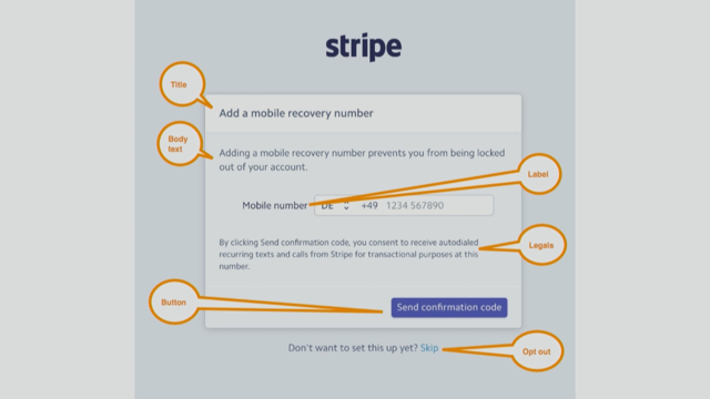
This is just a nice example that I found which I thought would be good for us to look at today. So this is a pretty standard screen that we see in digital products.
Nothing really complicated here apparently, right? Someone's written this and everything's fine. So this is what a problem tends to look like for me. How do you do it? How do you solve this problem? Well, do I have an answer for you.
It's called the process.
This is the process that I use when I'm faced with these kinds of problems, and it's got five steps, only five.
First one is your audience.
So obviously, wanna know who is the audience for this page that someone has come to you with or that you're designing yourself.
If we look at this page, I kinda think there's potentially two answers. Obviously, you guys, you're working in nice, big companies with nice, big research budgets.
They know their audiences.
They've segmented them.
Maybe you've got their pictures on the walls, you've got names of the different segments. You know what you're doing.
And them someone comes to you with something like this or comes to me with something like this, and it's like, oh, okay.
So how does this, how do your segments apply? I think this page is going to be shown to basically two kinds of users. One is someone who's signing up for the product for the first time and they're going through a sign-up process and this is part of that process.
The other one might be someone who's already a user and hasn't added a mobile recovery number.
Perhaps they log in one day and they see this page.
It's kind of like a popover.
So this is trying to prompt them to add a mobile recovery number.
I don't see this page as being in settings because it explains why you would add a mobile recovery number, and I kinda think you wouldn't need that text if this was part of the settings.
So I think there's two audiences.
Next question is the context, and that's looking at where are people coming from to get to this page, and what will they see afterwards? So for our new users who are signing up, we want to see all the pages they are experiencing before they get to this one. And from this page, they have three potential adventures, different adventures they can choose to go on. They can do this, they can opt out, or they can get this wrong.
So what do all those pages look like? We need to know because this is one page in what I would consider a bigger story, dare I use the word narrative.
That's for one user.
Then we have our other user who is the existing user who's just signed in and seeing this thing. We wanna see, again, what they've experienced before and what pages come after that.
So at this point, we know our audience and we know the context in which they're seeing this page.
And this is the point to pause a little and put a little footnote in our five-step process because we've got our personas and we've got all this information, but we wanna think about the emotion.
I always wanna think about how will people feel when they see this page. And when I first saw this page, I felt sad. (audience laughing) And I feel like if you're, so if you're signing up to use a product, you know you want to use that product, so you wanna rush.
I always wanna be like, oh God, I wish this was over.
I wish I was just using this product.
And this might be a step in that process that has added friction, it's a bit frustrating.
If you're an existing user and you've logged in because you know to achieve a goal within the product and you're presented with this unprompted, then you're probably gonna be a bit cranky as well. It's important to be realistic about those emotional things.
There are some people out there, and I have since become one of those people who is like yeah, maybe a recovery number's pretty handy. Actually, I might just add that.
But I think it's important to be realistic about the gut reaction that people have when they see the page that you're writing. And when you're knees deep in a design or flow or in a whatever, it's easy to kind of think of it as a journey like we saw this morning, where really, for people, it's a commute and it's an ugly, ugly commute.
So think about that emotion with the audience and the context.
Next step is your component specifications. That's a bit different than what you guys have been talking about today. So if you're writing something, it's good to systematise the components that you need to write so that every time someone in your organisation needs to create a page like this or something that looks like this, they're gonna go to your component specs and go, oh yeah, I need a title, body text, and button.
Great.
On this one, we have a label, we have some legal information, ooh, and we've got an opt out.
That opt out could become a component on its own so that every time someone is writing something that has an opt out, you can just drop that text in and everything's great.
So we can form this into like component specs. If you don't have that in your business now, it's a good time to start immediately on that, 'cause then you can all use it.
So we've got our brief, what is effectively our brief.
Audience, context, component specifications. Everything's cool.
We're ready to do something creative, and that is messaging.
Messaging is not writing.
It's not about the words.
It's about the message.
So what we wanna ask ourselves is what fundamental thing does this page need to say to the users? At its most basic, what does it need to say? There are two ways I think about explaining what messaging is to people who don't use messaging.
The first one is if you were going home on the train tonight, tired after a big, hard conference, and you're thinking about what you need to do on Monday, you might think, oh yeah, I've gotta do that, blah. And what you put in that space, that lazy thinking voice in your head is your messaging.
So you might think, oh yeah, that thing about like linking your phone to your account.
I've gotta do that.
Or the other way to do messaging is to think about explaining it to my mom.
My mom doesn't really, she uses the internet, but she's not very savvy.
So if I said to her, add a mobile recovery number, she'd be like what? She doesn't even have a mobile phone, so there you go.
But I would say, well, it's a thing about linking your phone to your account. So this is how messaging can look.
Link your phone to your account.
Then you'll never be locked out.
We'll also use your number, by the way.
As you can see here, this is taken from that first page that we saw. We've got three messages on that page.
This is the great thing about messaging.
It tells you if you've got more than one message to communicate. This is three.
It's primary, secondary, and tertiary messaging on a single page with a label and a big box there and a button and there's stuff going on.
So it's complicated.
Now that we know we've got three levels of messaging, we can think about how we're gonna communicate that visually and also through text.
This is it, fifth step of our process.
We're done, woo-hoo! No, there's a bit to go.
Refinement involves actually writing the text. This is where we get some tools going.
So tools that we use in refinement other than keyboards are house style guide and tone of voice guidelines. You may not know if you have a house style guide, but what that does from a writing perspective is tells you the tools of grammar, punctuation, those kinds of things that you use. And also, tone of voice guidelines from your marketing team can also be transferred probably in a light version for interface text.
So that first tool is gonna influence whether you use personal pronouns in your text. It's gonna influence how you punctuate things. All these things will play into the tone, the tone of the text that you're writing.
So that's the first thing.
Design guidelines are also helpful because we just saw we have three messages on this page. So design guidelines can help us work out if we can use a certain heading style to structure something a bit differently.
Do we actually need to split up this messaging a bit more? Do we need to split up the interactions a bit more? So design guidelines are gonna be really useful. Reading level calculators.
We're gonna come back to this in a minute, but reading level calculators help you ascertain how difficult or easy the text you have written is for people to read.
You can get a reading level calculator in Grammarly, but it's also in Word.
So if you do a spell check in Word, you will see reading statistics at the end, and one of those reading statistics is your reading level.
Easy.
IBM globalisation guidelines are great.
Google it now, bookmark it, rush home, read them tonight.
They are thrilling, they're compelling.
It's... (chuckles) (audience laughing) If you want, if you're having trouble reducing reading level, the IBM globalisation guidelines are gonna help you do that.
Also, if your product is being translated into different languages and you don't have a translator at the start of that process, which is the ideal, you want to use these guidelines because they'll help you write in plain English, which is gonna be most easily translated into different cultures, not just interfaces.
And last on the list are dictionary and thesaurus. So when you're writing, it's tempting to kinda go, oh, I think I'll look in the dictionary or I'll get the thesaurus out, but what you wanna do is write in simple English. So you don't need to get fancy words happening. I look in the dictionary if I'm like having one of those moments where you're like what am I even saying here and I need to check that I'm using a word in the right way, and the thesaurus is really to find simpler words. If I'm having trouble reducing my reading level, I'm like there's gotta be a simpler word in the thesaurus. And sometimes there is, sometimes there's not. So they really are the last resorts there.
So for refining this text, we've got our messaging, our primary and secondary messaging here, and we want to write it more simply and we need to meet all those component specifications. Here's how that might look.
Link your mobile to your account.
Link your mobile number so you can get into Stripe even if you forget your login.
Label is Mobile number, and the button is Send me a confirmation SMS. Here's how they look side by side, before and after.
Some important things to note here.
The first version is longer.
The words are longer.
They have more letters, they have more syllables, which makes them harder to understand.
The first one is written in the passive voice, the second one is written in the active voice. We mention Stripe in the second one, so we're bringing two sides of the conversation. And one really important thing here, which if you take nothing else away from this talk, please take this away, when you have a title and a button on the same screen, you want your button to answer your title.
So the title, link your mobile to your account, is more closed-ended than the first one, which is just add a mobile recovery number. It doesn't talk about your account, so the title is more closed-ended.
And send me a confirmation SMS indicates that by the time you do whatever it is on this page that needs to be done, you will be done with this task, whereas send confirmation code, the first one is a bit more open-ended and we're not so clear about how that's gonna pan out.
Like are we getting it done on this page or are there gonna be more steps? Like what's happening? Cool, so we've done the easy part.
Now it's legals.
Okay, so the legals read, By clicking Send confirmation code, you consent to receive autodialed recurring texts and calls from Stripe for transactional purposes at this number.
The Flesch-Kincaid reading level is grade 12, and that means that you have to be, basically have finished high school to be able to read and comprehend this easily.
And I know what you're thinking.
Lady, we're in Australia.
Everyone finishes high school.
But that's kind of not what reading level is about. So reading level basically tries to simplify things for everyone, for everyone in the world.
And we have a problem within technology in that everyone is very articulate, well-spoken, well-educated, but a lot of people out there are not.
Look around on Facebook and you'll quickly see that plenty of native English speakers are not particularly literate or they don't understand a lot of language. Another group is non-native English speakers. So obviously, products are globalised now and people are using products in English and they're not native speakers, which is great, but I'm also an ESL teacher as well as being a writer, and if you have learned another language, you will know that when you come at a language from the outside, you assess it very differently than a native speaker would.
Let me give you an example.
The word saving can be used as a gerund, which is a noun, or as a continuous verb.
An -ed verb like saved can be used as a past tense verb or as an adjective.
There's a lot of complication that native speakers don't even realise in the language, and so we have to account for people who are non-native speakers.
Make it easy for them.
The other thing we have to remember is that we have to make it easy for people like me who are intellectually compromised basically every day of their life.
Like your kids are screaming and you're trying to book a flight and get the times right, you're sick or tired or hungover and you're trying to do your banking.
Like you're on the tram, smooshed up against the window, trying to, I don't know, buy something on eBay.
How do you get these things right? We are compromised all the time intellectually, and so we wanna reduce the reading level.
It's not dumbing down the text.
It's making it easy to use and more accessible. So let's see how simple we can get them.
When you click Send, you give us permission to text and call you as we process payments on your account. It's below grade seven.
So we're aiming for grade seven.
If we can go lower, that's great.
Obviously, there's a point at which we simplify so much that we lose meaning and we don't wanna cross that line.
We need to find a balance there.
So here's our before and after in total.
We can see that the new text is shorter, and again, words are simpler, fewer characters, fewer syllables.
We're making things more explicit, but at the same time, we're reducing our detail where it doesn't need to be there.
One challenge that we would have with this is the legals, and we'd have to talk to the lawyers about that side of things.
But there are some things which are, we have tautology.
So tautology is where you say the same thing twice. And there is like, with the legals, they basically form a conceptual tautology in that you're putting in a phone number and then we're saying we'll call you at this number. Like we don't need to say that.
Obviously, we're gonna use that number.
What other number are we gonna use? You haven't given us another number.
So what we wanna do is try and reduce repetition and reduce the length of the text and also simplify what we're saying.
The other point I really wanna make with this is the one rule of writing interface text is don't write what you wouldn't say.
So I don't know about you, but I've never said autodialed recurring texts and calls for transactional purposes.
You may have, but that's not kind of natural language.
So this is our before and after.
That's it.
The process has five steps.
Audience, working out who's gonna see the page, and the context.
What did they see before and what are they gonna see afterwards? Then think about the emotion.
How will people feel? How will those individual human beings feel when they come to the page? And then you have to look at the component specs, and that's a great time, if they don't exist already, to write them out for your colleagues so that the person in the next team doesn't have to reinvent the wheel when they're building a new component that's like this. Then do your messaging, which is not writing. Think about my mom.
And then refine it using the tools that we looked at.
If you love writing interface text or hate writing interface text but have to do it for your job, which a lot of people do now, I have a little newsletter which I send most Mondays called The Word Design Doctor, and we take examples from the internet or things people send in, hot tips for writing about writing interface text.
So join us and we'd love to have you.
That's it, thanks! (audience applauding) (upbeat music)
They’ll learn how to use language globalisation guidelines; reading level calculators; and design, language, and brand style guides in the writing process. They’ll also learn the elements of tone of voice, the impact of grammar on emotional connection, when (and when not) to reach for the thesaurus, and more. In 20 minutes, we’ll unpack the challenge of word design in a pragmatic way that empowers participants to do it better, starting today.
Georgina Laidlaw – Word Design 101
‘Write interface text as if you were explaining tech to your Mum’ – words to live by with UX writer Georgina Laidlaw at #WDS18 pic.twitter.com/TDDDZBOWwK
— praxis (@hellopraxis) November 2, 2018
What is “word design”? No, it’s not about WordArt™. It’s microcopy – text that appears in your product interfaces. Not marketing microcopy, product microcopy.
Three basic goals:
- help users get stuff done
- don’t confuse people (use plain language, be clear)
- work with visual elements (don’t repeat what the interface is already saying, although the words do still need to work on their own)
Example: a screen used to collect a mobile phone number from a user.
The process
- audience – who is using this? what is their context?
- context – where are they and what’s happening, how are they feeling when they get to the page
- component specifications
- messaging – what is the page saying
- refinement – craft the actual text and refine it
Word Design 101 with Georgina Laidlaw #wds18 pic.twitter.com/MKo6NoUmXr
— Jean-Jacques Halans (@halans) November 2, 2018
In the case of the mobile phone number screen, the user may be a first-time user setting up their account; or a returning user trying to recover their account. Very different contexts – the new user is probably impatient, the returning user is probably stressed or cranky. The page is made up of components like title, label+input, legals, button, opt-out.
Messaging is not writing – it’s not about the words, it’s about the message. What fundamental thing does this page need to say to users?
Link your phone to your account.
Then you’ll never be locked out.
(We’ll also use your number, by the way.)
The page actually has three things to say.
Refinement tools include house style guides, voice and tone guidelines, design guidelines, reading level calculators, IBM Globalisation guidelines (which helps write translatable English).
Biggest tip to take away: When you have a title and a button on a screen, you want the button to answer the title. It makes it clear whether you are going to be finished when you are done with this page.
The hardest part to sort out is the legals. The reading score for the average bit of legal text is quite high. Many people don’t have the required reading level to confidently process it – non-native English speakers, people with lower education levels, distracted or otherwise intellectually compromised, etc can struggle. We are all contextually compromised on a regular basis! When you change legals you often have to get the resulting text vetted, but you can reduce repetition without removing key meaning.
A useful principle: don’t write things you wouldn’t say.
@georginalaidlaw | tinyletter.com/MelbourneWordSchool