Observability is for User Happiness
(upbeat music) - Alright, this is Observability is for User Happiness. My name is Emily Nakashima and I manage the engineering team at a small developer tool startup called honeycomb.io.
I have worked as an engineer, a number of different places, and they've worked kind of all over the stack, but I've usually focused very specifically on front end engineering and web performance once I really start to dive in and find my place. I have always been the front end engineer who loved to hang out with the ops team.
I think that's a little bit rare, but I found that front end and ops have a lot in common. We both love to nerd out about graphs.
We are both often underappreciated and of course we all love to blame it on the network all the time. And the other thing we have in common is that I think we all understand the production environment really, really well.
The folks who run our infrastructure have to understand production because they have to keep the system up. They have to keep it running and front end developers understand production because our work is so close to our users.
Our code is usually the one way that our users or customers are interacting with our systems.
And so we have to understand how our code is really working in the real world to know whether or not we're doing a good job.
But I had a hard time explaining that common ethos to people until I first heard Charity Majors, my boss say this, nines don't matter if users aren't happy.
This just kind of made my head explode.
It reminded me that whether we're working on infrastructure or backend code or front end JavaScript, we all have the exact same job.
We all wanna make the business successful by delivering the best possible user experience to our customers. None of our technical accomplishments really matter if our users can't use the product to do what they wanna do. So of course the next question that always follows is, how do we know our users are happy? And that is what this talk is all about.
I think that the simple answer to that is observability, but I think a lot of people hear this word and they just go, what? This is the word sounds totally made up when you hear it at first.
In particular, I know that in the monitoring community, when this word was first introduced, there was kind of a big debate about whether observability was just monitoring.
I think that debate has mostly been resolved now and we can kind of see the ways that they're different, but I think it's worth digging into a little bit in case you run across that same perception. The term observability originally comes from control theory. So we say an observable system is one whose internal state can be deeply understood just by observing its outputs. Of course, if you are someone who is a front end developer and you're writing client side code, I feel like you need to tweak that a little bit to get it to make sense in your universe.
So what I would say for myself as an observable client app is one who's user experience can be deeply understood just by observing its outputs.
And you notice an interesting thing when you look at that definition.
You'll notice that observability isn't a product. It isn't a job, it's a system property, just like performance is a system property. And if we think about the system properties that we know, an interesting thing about them all is that you can't buy them, right? There's a lot of vendors out there trying to tell you that observability is something you can buy, including probably my employer sometimes.
Don't tell them I told you this, but don't be fooled. Just like you can't buy any of these other properties on here, usability, observability, performance, reliability, accessibility, security, they all go together.
You can buy tools that help you get there just like you could buy a faster server that might help you be more performant, but you can't just go swipe your credit card and have this thing.
So just to recap what we're gonna cover today, this talk is all about how we get there to having observability.
I'm gonna talk a little bit about tooling because I think that that's a really important part of it. After that, I will talk about how to use observability to do performance optimization, which I think is the piece that people kind of find most interesting and most useful out of the gate. Fourth, we find that as people start this journey, they tend to run into the same questions over and over again.
So I want to address some of those directly. And then finally, since we're all about trying to optimise our user experience, I wanna look a little beyond performance.
And in that last section, I'm gonna talk through some of the other ways that we can use these tools to kind of directly optimise our user experience.
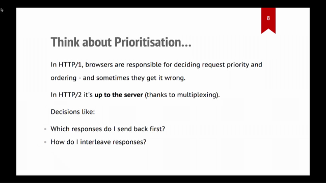
So first just to talk about tools for a minute. Some people in the community like to talk about this three pillars, framing for observability. So the pillars would be logs, metrics and traces. And I kind of disagree with this framing.
Just as I said, observability isn't tools and it isn't products.
I think that you can buy all three of these products and still not be able to answer the questions that you have about your systems, right? So I just wanna remind everyone, you don't have to go buy things to get observability. If you happen to have these three tools today, and you feel like you could answer all the questions about your system, great, don't change a thing. But if you are looking to change, I have a slide for you. Isn't that scarier than three pillars? I think so.
So I tried to just sort of make a map of the world of tools that tell you something about production.
We answer questions about production and user happiness and system behaviour with lots of different types of tools, on the right are sort of the more front end tools, on the left are sort of our more ops and backend tools. So you'll see I've got product analytics on there. I've got APM, session replay on the front end side, and then like our more traditional metrics of logs on the left side.
And I think if you sort of just draw an oval around that section there, I think that is the category of observability tools.
Those are the tools that are gonna tell you how customers are experiencing your system. And an interesting thing you notice is that a lot of those circles actually overlap, right? So you don't actually have to buy every tool. You just have to buy tools to shade in as much of the oval as you need to answer your questions.
I specifically wanna focus on two pieces in here today, and that's gonna be events and distributed tracing. Both because I think they're less well known than some of the other objects or items on here. But also because I think that they get you such a big portion of that observability oval at once. I think people often hear distributed tracing, and then they feel a little bit of an intimidation factor. So I wanna dig into it in a little more detail. I think it's not as bad as it sounds.
It can take some work to get started, but the concepts are actually really easy.
And so I wanna make sure you've got those concepts down before we dive into the kind of implementation details. The thing to remember is that tracing all started with logs. So here we've got our humble log line.
It looks like we did okay.
A request to slash and then it looks like a return 200, great success.
This is the basics, right? So how did we improve on this? How can we make it more useful? First of all, I would say if there's one tip you take away from this talk, number one tip is to use structured logs.
So what exactly is a structured log? If you look at these two log lines, these two log lines represent the same request. The top one is structured, the bottom one isn't. And the structured one has these key value pairs. So it could be fed into all kinds of different tools to new interesting analysis with.
The bottom one is definitely a lot shorter, but to make sense of it with a computer, the only way we can really do that is to use regular expressions.
And of course, what do we know about regular expressions? Regular expressions make people cry.
We don't wanna make people cry, structure your logs. Anyway, back to our log line.
Now that we've structured it, can we keep improving it a little more? To me the first thing that comes to mind is maybe we could get smart and we could stick a request ID on that log line. So this is great.
Now I can correlate my log for my web server to logs in other parts of my application.
If something goes wrong with a particular request, now I can just search through all my logs and I can look for that same idea everywhere and I can find out what went wrong.
I got my app server log up top, my database log down below.
Okay. That's pretty cool.
What is one more thing I might wanna know? I know when each of these events starts, 'cause I've got that date time stamp.
Maybe I wanna know a little bit more about timing. So maybe one cool thing I capture is how long each one of these requests took. So what if instead of just logging at the start of the operation, I could log at the end and then I can log the duration of each request. That would be even cooler.
Now we know the overall request took about 600 milliseconds, but the database query took only five milliseconds. So we know that some other part of our system is the slow part, not that database query.
And I wanna pause here and say that we've done this really cool thing.
Even just with those few fields, we have taken a log line and by structuring it and adding in the duration, we've turned it into an event. And to me events are the fundamental data unit of observability.
They tell us about each unit of work in our system and allow us to attach metadata to that so that we can start to assemble this really granular picture of what's happening in our system.
And one thing I do just wanna clarify, when I say events today, I'm not gonna be talking about DOM events.
I do come from a front end background so oftentimes those two concepts kind of overlap a little bit.
For the purposes of this talk, just forget that you've heard about DOM events entirely. Anyway, as we were saying, an event is a set of keys and values that describe a unit of work in your system. Often that unit of work is gonna be an http request, but it really depends on what's important to you and your system.
So if you, for example maintain a big data processing pipeline, you might not use this same units.
You kind of have to look at the work your system is doing and make the right call for yourself.
Anyway, back to our log line, we know that this request is a little slow and then we know that that one part of it was fast. So how do we figure out what else was slow? What if we have one of these events for every part of the request and we want to link them together by showing which event was caused by a later event. So here's the magic way we're gonna do that. We are going to establish parent child relationships between our events.
So by capturing this parent ID on the database event, and then having this span ID, unique ID on that request event, we can tie those two together and understand that that top one is the reason that we ran the bottom one. And of course you start seeing that and you go, oh, maybe there's a way I can visualise that that would be useful.
Once we know those parent child relationships, we can start drawing this out in a way that's really cool. So there we go.
We've got our app server on top and then, oh, look how it made that little call to the database. Perfect.
What if we did the same thing for all kinds of different operations in our system, not just for database queries? What if we did it for internal requests, expensive calculations, whatever we spawn a parallel operation.
All of a sudden we would build out this picture of exactly what was happening in our servers. And the slow pieces might just jump right out at us. So here we go.
It looks like database query was fast.
But before that, we had to do a call to this auth service and that was kind of slow.
Why was that slow? Oh, it looks like that has to call an external fraud service, which took almost half a second, which seems really slow. So now that we know that's slow, we can go, call the support team for the fraud service or whatever it is and try to figure out what's going on there or replace it with something else that's a little bit faster.
I just wanna say, I know most all of you have probably seen or used a product that has a visualisation like this. I'm spending some time on that because I think it's really useful to understand how these visualisations are modelled under the hood so that you can reason about them when you're starting to use them to debug stuff, because they'll tell you something really interesting. The thing that you'll notice when you start working with these, remember how I don't like those three pillars, it's because the three pillars are redundant, right? If you look closely, you saw that traces are just made up of structured logs, which are also called events. In the context of a trace also call an event a span. So you'll hear me use those two words interchangeably. So now that we think about it, traces and logs are basically the same thing. Traces are just made up of special logs that know how they relate to other logs.
And then remember how we put that duration and other metadata on those spans.
We can put metadata on any of them and it can be any metadata we want.
So all of a sudden those spans are carrying around their metrics too.
So the reason that I don't like these is because it's redundant.
If a log line can be an event or a span just by structuring it and metrics can be attached to events and traces are just spans with parent child relationships, it sure sounds like we can just use traces for everything. Great.
So if you remember this diagram, that's why that tracing circle is so big.
It is the one data model that can encapsulate all those other types of data together.
And I think that's really cool.
So to go back to our example, I know that there was a part of this that all of the senior engineers in the room probably sidelined.
Yep. That's right.
That duration.
Usually when you log you just write something and forget it. Like a log is an action that you take in the moment and then you never have to think about it again. You don't wait around until that operation has finished so that you can figure out how long it took and attach to that duration.
And I know that most of us probably don't wanna write a bunch of code to do that.
And so that's a problem that we solve by having a standard and by having a library.
The way they do that right now I think the best way is to use OpenTelemetry.
OpenTelemetry is an open standard around how to do this stuff.
And a lot of vendors Honeycomb included might have their own way to do this, but they're also supporting OpenTelemetry now. So this is the latest hotness in the world of distributed tracing.
If you've heard of OpenCensus and OpenTracing, it is the successor to both of those.
And most of its pieces are currently in beta, but there are a lot of people out there using it in production.
So I think it's ready for you to try it out if you're getting started with this stuff.
And the cool thing about OpenTelemetry is that it provides a vendor agnostic way to capture all that data that I was talking about.
And it should give you some APIs that make it easier than wiring all up yourself.
And then you can take that data and you can send it to the back end of your choice, whether it's a vendor or an open source product that you host yourself, you can send it anywhere and be able to look at it multiple tools if you really want to.
So most people who are using distributed tracing right now are using it as a server side tool, those folks on the left. But remember as the front end developer who likes to hang out with the ops and backend folks, of course, when I saw distributed tracing, what was my first thought? That's right, it was can we use this in the browser? I am a person who helps maintain a really complicated react app and we could make some traces that describe what happens in the browser when the page loads.
Maybe that would be really helpful to understand what's happening in that complicated react app. So of course, yeah, exactly.
That same visualisation is going to be really useful. Theoretically, we could draw that one big span at the top on page load, and then we could have spans for every time we fetch a sub resource.
We can have spans for when we're executing slow compute operations, like executing our big JavaScript bundle.
And then we can have spans for each user interaction and spans for when we're even rendering components to the screen.
We can just put together this whole picture of what's happening in our app.
It does take a fair amount of code to do what I just showed you in a real react app. I don't wanna go into the code line by line in this talk. So I'm gonna have a link to a tutorial in the end if you are interested in wiring up the stuff yourself, it's very doable, but it will take a little bit of custom code to do it.
Unfortunately, there is not yet a super popular industry leading library that would make this super easy. OpenTelemetry does have some APIs out there to stitch the traces together, but there isn't like a great auto instrumentation library that will just get you all that tracing stuff for free. So if you'd like to see the example code about how we do this, it'll be linked in that tutorial at the end.
But I will say once you put in that work, it's actually pretty satisfying to see these traces from the browser and real life.
In the super simple case, one of our browser traces might look just like this. This is a real trace from our system.
You'll see that each of these rectangles is gonna be a span or an event, that top span is the page load. And it's measured from navigation start to the window load event.
So it really is the whole life cycle of loading that page. And then we see that that initial page load triggered a sub resource request.
So that's that request underneath that.
Of course, the cool thing about modern browsers we don't have to wait for the page to load, just start requesting some resources.
And then of course we see that the user click a button after the page loaded so we can measure how long the event handler took.
And then that button looks like it was gonna take the user to a new page.
So you see us do that page unload event.
And that's the end of the trace.
That's the whole interaction that the user had with the page right there.
So when do we capture the spans? We just drew a bunch of them on screen.
There are probably other cases where we wanna do that. These are the cases when we capture spans.
First on page load, that's always gonna be our root span. Whatever users do, a single page app style navigation. So whenever we change the contents of the page with JavaScript and then update the URL using the history API, that's something we wanna capture a span of two, from the user's perspective it's basically the same thing as loading the page.
So we wanna make sure we're getting really good data about that.
And then of course, we also wanna capture any sort of meaningful user interaction.
So whenever a user clicks on something or does some sort of interaction with the page, like submitting a form, we wanna make sure we get that. We also wanna note errors.
We do actually still use a dedicated error monitoring tool just because we think the workflow tools are a little better, but it's certainly useful to have those errors in both places so you can cross reference. And then, like I said, we wanna make sure that we capture that page unload event, including how long it took to run all those unload handlers, just to make sure that there isn't some JavaScript that's gonna hang up the transition from one page to the next.
One trace of course there, by bringing all those things together, it's really gonna give this nice picture of the user's whole experience that they had on that page. And remember, like I was saying, when you use spans or events, each of those rectangles is this set of key value pairs. So we can draw it on screen, but we can also attach a bunch of other metadata to it. So these are the common pieces of metadata we're gonna attach.
One thing I didn't show in the first set of examples in the tracing world, each span is always gonna have a name or a type, which is gonna tell you exactly which part of your application that came from.
The exact name of that field differs a little bit from standard to standard, depending on whether you're using OpenTelemetry or something else.
But there's always gonna be some kind of type. You're always gonna give it a duration so that you know how wide to draw that rectangle on the screen. And then beyond that, you can add whatever metadata you feel is relevant to that particular action. So in the page load case, I'm gonna add things about the page.
It's gonna be our navigation timing metrics. It's gonna be the user agent, the device type, maybe like the window dimensions, other things about the client.
For that button click event, it's gonna be a little different.
It's gonna be things about that specific interaction. So it might be, what the content was of the button, where it was positioned on the page, what the user did when they interacted with it. So the event records everything you can pick up about a single interaction.
And then of course, when you think about it, you've collected all this data, can you do anything with it? Great. Yes.
All of the popular tracing backends won't just let you search for these individually, they'll let you do aggregated calculations on these fields. So I can look at a page load event, but I can also graph the load time across all similar page load events.
So here is a picture of what that looks like. This is a graph of how long all of my page load spans took over the course of a full year.
And you can see there's sort of that vertical stripe pattern that shows you that our product gets a lot more use during the week than on the weekends.
So those kind of white stripes that you see going through, the white stripes are where the weekends happen and you can see traffic kind of drop off.
And then you can see that there's that dark blue band at the bottom, which is telling you that most page loads happen in under three seconds.
But you can also see that there's a long tail of slow requests.
So up to 30 seconds long in the slowest case. Traces can get really complicated.
So we may get tonnes and tonnes of user interaction on a particular page.
This is an example of a user doing a complex series of interactions with our product, where they adjust the contents of a form, make some requests, and then repeat the process again. This particular trace you can scroll through for multiple pages.
I think it's like four or five pages long in the browser. And of course, these are interesting as one offs, but you can also see how you could use this format of data to answer the kind of bigger questions we love to answer or ask an answer about user happiness.
So you might be able to say, okay look, let's see which of my users had the fastest interactions with forum and which ones had the slowest interactions? How many converted on this page view? How many bounced? Is there a correlation between a particular animation running slowly and the user taking less time to interact with the page? It's all captured in this data.
You just need to have a tool to be able to kind of parse through it and help you those connections. So one thing I wanna note is you might look at that visual I just showed and go, hey, I've seen something like that before.
This stuff looks a lot like what you might get out of the browser network pin.
And I just wanna make sure that people have it super clear that there are some really important differences. The network panel has a lot more detail for one, but when you think about it, it's only gonna show you one person's request, typically your own request on your own browsers, or sorry your own data in your own browser. So in the world of performance metrics, this is basically synthetic data.
And for two, it's only focused on requests. It's not capturing those interactions with the page that we were capturing in the trace view.
Distributed tracing data isn't synthetic data, it's RUM data, real user monitoring.
So it's capturing real user metrics about production and we're capturing interactions that may not trigger requests.
So it's almost like combining the JavaScript developer tools pin with the request pin.
We can see both of those things combined together. We also don't wanna collect up quite as much data on the right as on the left, we have to send all this stuff over the network of course. And you know if you've ever tried to download the hard file that powers that network tools visualisation, those files get really, really big.
There are often many, many megabytes.
We don't wanna have to send all of that over the wire. And we don't want a bunch of user content or PII either. We're just sort of collecting the bare minimum of what we need for debugging.
So if you've used synthetic and RUM metrics in other contexts, you kind of know where each of these types shine. But if you haven't, I'll just recap.
The one on the right is gonna help you find out whether users are having a bad experience, potentially who those users are if there's anything that's different about them. It might not always be enough information to figure out exactly why things are slow.
And that's where I feel like the synthetic stuff really shine.
So oftentimes we'll use that visualisation on the right to go, oh, this is slow for this subset of users. And then we'll jump over to the developer tools on the left and we'll use that to figure out exactly like what's going on with the most complicated performance problems, really dig into the JavaScript side of it.
There is a little bit of overlap here with session replay products.
Some of them show you a visualisation that's a little like the one on the right.
If those are working for you out of the box, great, stick with it as long as you can.
I think that, in all of these cases, you should be sticking with the tool as long as it helps you answer questions.
All this stuff is working pretty well for us today but when we think about where we wanna go next and what we would want to add next, the thing we are focused on is adding slightly better internal instrumentation around capturing rendering metrics in our react app.
So we capture a lot about interactions.
We don't always know the effect that those interactions have on laying out the page, repainting, that kind of stuff. They try to capture it a couple of ways.
We're not super satisfied with any of them, but was this great blog post about how to do this from Conrad Erwin that I think it has some really good tips in it.
And I'm gonna include a link to this at the end. But if you wanna go in this direction and capture more information about rendering, this approach is the one I recommend this as a starting point.
So that's all the data we collect.
What do we actually do with all that data? My company is pretty small.
We only have about eight software engineers. Our web application traffic is good size, but it's not huge. So we're not doing the kind of niche optimizations that like a top 100 site might be.
We care about the experience of basically each individual customer and we are focused on remediating all the worst performance cases for our customers. I just wanna talk through one example of how we do that. Part of the value proposition of our product has always been fast query.
It's like, we want you to be able to iteratively explore your data.
So making the product feel fast is something that really matters to us.
The vast majority of our queries complete in under one second, but we heard some complaints from Honeycomb users about performance, it kind of surprised us. And actually when I say Honeycomb users, of course it was Honeycomb employees who complain the loudest.
Sometimes our internal users are our toughest customers. I know a lot of you know who that is.
So we started to dig into the actual numbers and we could see that the time to render a graph on screen you're replaced the spinner render a graph took longer than we'd like, often it was multiple seconds. So we thought, we wanna try and optimise this. What is a good target for that? Pick the number.
We decided on one second, which is pretty ambitious, right? We looked at a lot of ideas for how to make this interaction faster.
And the query loading strategy today use polling, right? So we were nerding out about how maybe we could replace polling with server push or WebSockets or something else that would speed up that client server interaction. But when we started looking at the data about our polling times, we noticed something right away. The polling interval is one second.
So right out of the gate, we knew our target is already shot.
The query would always take at least one second. And if it didn't complete within that first second, you'd have to wait another whole second.
So remember what we're trying to do is wait for the query result to be ready.
We have to then pull for it, fetch the JSON, process it, draw the graph and then the whole cycle has to complete before we can actually see the graph on the screen. So we knew the poll interval needed to be shorter than one second, but how much shorter did it need to be? Luckily we had instrumented our query times so we could see how long it should take.
So this is a chart of how long queries take to return from our query engine backends.
And if you look, you'll see that the median is about 400 milliseconds and then 25% of our queries are substantially faster and they are done within 200 milliseconds.
So we know that for at least half of our customers were waiting a half second longer than we need to for something that's already done.
So instead of launching into our weeks long project that we'd planned around web sockets, some of us were sad about this, some of us were happy, we just dropped the first two polling intervals from one second to 250 milliseconds.
And the cool thing about this change is, the entire change was 20 lines of code.
And instead of rolling out a new technology, we mostly just changed a few constants around. We had instrument in the JavaScript app to track how many pole iterations it took to load the graph. And we found that after this change, 90% of queries loaded within one poll interval and 94% loaded within two.
So we made 19 out of 20 queries 50% faster just by changing a set time out from 1,000 milliseconds to 250 milliseconds, which is great stuff.
This is the exactly the kind of win you want. There's a blog post about this on our website if you wanna read the details.
But the thing I love about this story, you don't have to read the blog post to know, there's two things about it that really jump out at me. One, it's a good reminder that it doesn't matter how fast your infrastructure and your backend services are. If you aren't passing those performance benefits onto your users.
So this was a case where we built something really fast and we just didn't make the experience of it fast. And the second one is like, I think that this story, this optimization feels a little silly.
We made our query experience twice as fast and it didn't take some exotic new algorithm. It just took basic arithmetic and the five line code change and some data.
But I think most of us stop and ask, is our instrumentation good enough to tell us whether we fixed every silly case like this in our own apps? The answer for most of us is probably no, we probably need more information than we have today. So we need to instrument some more.
And here's where I think tracing really shines. We have a regular product where our customers send data about their systems and then they query it. And then we send them answers.
Very simple architecture.
That was the product I just described.
So if you look at this diagram, that's our customer systems on the left.
They're sending us event data via their API. That's Honeycomb in the cloud on the right. And then of course our customers can query it from their browsers via the UI.
So that's a little customer laptop at the top talking to our cloud to query the data.
The first example was simple.
We also have a more secure version of this product. So customers can also use an encryption proxy and that's those boxes in the middle.
What that proxy is gonna do is it's going to encrypt all of their data, and then we only ever see the encrypted version on our servers.
So this product architecture is really interesting because the way the customer's browser interacts with it is a little different than what I showed you in that first example.
If you look at that laptop in the upper right corner, it's now actually making two different requests. First, it's making a request to our UI to get the encrypted data.
And then it's actually gonna make a request to the encryption proxy, to decrypt the data. And it's gonna combine those two things together in the browser.
The process of combining the UI code and the decrypted content is been in the browser so that the user can see that data but we can't, it's always obscured from us.
And the interesting thing about this architecture is that not many of our customers actually use it, but of course, the people who do are really important minority, they are our big customers who care a lot about security. So of course we care a lot about them.
And then everyone knows just how this one always goes. It's slow for just one team just using this architecture. This is an N equals one case, but it happened to be one that was very important to us because this was just a really important customer that we cared about very much.
And of course we had the problem where we can't reproduce it ourselves, but we hear it's slow for them, so we wanna make sure we solve it for them. We took a look at their page loads versus everyone else's and there wasn't really a difference we could see in the request time.
One of the pink lines on this graph is this specific customer.
But when you look, these numbers are so close together, you can barely even tell, it doesn't really make a difference.
This graph uses a log scale to make that clearer, but it was pretty close.
So we started looking at their traces for the query page. And as soon as we started doing that, the answer just jumps out at you right away. There's literally only two user interactions here on this trace.
They click two things that request data, and then we make all of these requests to fetch the data. I remember because they're on that secure architecture, they're actually gonna make double the number of requests. Firstly, get the encrypted data.
Then they need to make a request to decrypt it. And if you look at that kind of stair-step pattern that you can kind of guess that something is blocking each set of requests until the prior one completes. So at first I looked at this and I thought, oh no, maybe we broke our HTTP 2 set up and we're using HTTP 1.1, I'm running into the connection limit.
Nope, that's not what's happening at all.
It turns out that the JavaScript to manage all these requests was just really complicated. That of course, JavaScript is single threaded. So you see these little gaps between each group of requests is more JavaScript executes.
So that means that we were actually able to fix this problem by batching the request logic together so that there wasn't such a need to wait between requests. Make more requests at once, don't have to wait for that stair-step pattern. Again, it's a super simple problem with a simple solution, but with the wrong tools you could spend days trying to figure out exactly why it's slow for just this one customer when it's not slow for you. And you'll notice that we looked at two different types of data to do these two different optimizations. This is really pretty important I think.
A lot of us are used to using metrics like in that first case.
And I think that metrics are amazing for looking breadth first.
They are great for when the same problem affects lots of people.
So every person in the react app is seeing the same problem we're gonna find it really quickly with metrics. Many of us are finding though, as we move to architecture distributed systems that's less common.
We have these more complex failure modes and they might only affect a few people at a time. So tracing I think is an ideal tool for those cases. Anytime that you need to go deep or understand that one weird thing, tracing is usually the tool I wanna reach for. We find that as people get started with the observability, they often have the same question.
So I wanna answer some of those upfront.
Privacy is one that people always like to ask about after the talk.
And the one thing I'll say is just, don't collect up every piece of data that you can. If you are dealing with customer data for one, it's good to proxy it through your own infrastructure. So you can do data enrichment server side.
You don't wanna have to load all this stuff in the client just to be able to send it off to your event backend. I would also suggest before you attach metadata to an event or a span consider whether it'll truly be helpful for debugging and ask yourself if there's a less revealing piece of data that would be just as helpful.
So a good example is always people often wanna attach like customer name or customer email.
Sometimes you don't need that for debugging. Sometimes all you need is a unique ID, like a request ID or customer ID.
So that is a way to send less information, but make it just as useful for yourself on the back end. I think it's also really important to know the data retention policies for your vendors.
So if you're sending data before you need to delete data, cause you said something wrong by mistake, you should look into that ahead of time.
Just know what the process is.
If something gets in there that you need to take out. And finally remember that with GDPR and CCPA sending personal data like names or emails to the services can be more of a problem than it used to be. So talk to your compliance team and find out if you can be sending this stuff to your tools at all.
People also always ask about performance like they wanna know does doing this style of instrumentation slow down your app.
And there's kind of two parts to that answer. One is it doesn't need to, I think if you do this right, the overhead is probably just gonna be a couple of percent in the worst case, but embarrassingly enough, if you really go for it and instrument everything, you can actually slow down your app if you do it wrong. So we have done this once or twice to ourselves. You can just collect a lot of information if you don't look at what you're instrumenting and a couple of ways we've helped make sure that this code stays speedy is to batch requests together. For a complex interaction with a page, we might capture dozens of spans within a second. And we don't wanna just like make a request every time we capture one of those.
So we batch, we send all those requests at once and we also use the beacon API to make sure that we're sending that stuff in a nonblocking way. As a bonus, the beacon API is really good for that case where you're trying to send something on, unload it, make sure that the data still gets there, but you know, the best aspect of it is it's a lower priority than the request to like get data for your app or something like that.
And finally, if you really get up there and you have lots of volume, you're sending dozens and dozens of spans on every page load, it might be the time to look into sampling. Sampling is the way that you can kind of intelligently take the data you have and then take a representative sample of it and throw the rest out.
There's gonna be some great resources in the links that I'll add at the end, it can be a complex topic. It probably warrants its own talk.
So I won't go into it too much, but it's certainly a great approach to take if you need to. And finally, this is the really fun part to me. Observability is great for catching performance issues like that last one, but it's not just useful for debugging a performance. If we get back to the question of are our users happy, I think that we can understand a huge amount about how our overall design is doing with these same tools. So one specific category of this is detecting UX problems. Like these are things that aren't exactly errors like you don't throw a JavaScript error but they are funky states that the user gets into. And we wanna capture them when things get weird. So we have a single page react app.
And the common problem with these sorts of apps is that people will click around and all of a sudden they'll find that the UI looks a little weird or they click a button and the expected thing doesn't happen.
And I think a lot of us have learned to try to fix these kinds of JavaScript heavy applications by refreshing the page.
So we wanted to understand what circumstances were where people didn't trust our application and they chose to refresh.
The way we did this was to wire up JavaScript that sends an event every time someone presses Control + R or Command + R in the browser on our site.
And then we can look at the page and see where users refresh the most to kind of find those pages in the app where users don't trust.
We can even get an alert sent to Slack if they exceed a certain threshold, which might be assigned that we broke something. So not surprisingly the pages that we found that people refresh the most are always pages with lots of graphs on them.
Users get impatient for data.
They don't believe the graph and they try to refresh to see more data.
But one other one that was surprisingly common that we didn't expect was the team invites page. It turns out people who are onboarding new teammates often wanna see if they were able to get data in and then start using the app.
And that was a cue to us that we probably should show the state of the invite on the page and have it live update when the user first signs in and can successfully use the app.
Another related and super interesting thing that we've instrumented is rage clicking.
I think, if you haven't heard that name before, you probably can kind of guess what it is just based on the name.
You've probably had this experience yourself, you get frustrated and you just start randomly double-clicking or triple clicking elements in the UI to see if they're gonna do the thing that you hope that they'll do.
I first heard about this technique from Phillip Tellis and Nick Jensman a few years back.
I think it's really cool.
And the way that we've actually tried to measure this is whenever someone clicks an element like a button three or more times in rapid succession in under a second, you wanna record an event for that.
Whenever we look at these events, we can kind of see what page they were viewing, if there were JavaScript errors on the page, and then we can see the list of events that happened before that rage click so that we can try and get a sense of what they were doing that was so frustrating. A really common case we found that triggers rage clicks is UI elements that load data, but don't show a spinner. So people click on them and then they're not sure what's happening. So they just keep clicking to see if clicking more will make it work.
This kind of tracking has been really great for helping us find all those annoying cases in our UI and make sure we fixed it.
So there's also a use case for applying your observability tooling to more forward looking, product development and design.
So I also wanna tell you a story about how we did that. We had this sidebar in our product for a long time, for a couple of years in the early days.
And it shows you a historical list of each query you've ever run in the product.
And we found users didn't necessarily always know exactly what those entries in the sidebar meant, and they didn't always know how to use it.
So our designers started to think about redesigning it and he wondered what the best way was to change it. Would users rather have more space to just see their main content or would they want the sidebar to just go away? Would they maybe wanna see something more visual in the side bar? They weren't really sure.
So we tried to use some data to answer this question. Oh, there's the sidebar.
So one piece of data we were already capturing was the user's browser window height and width and screen height and width.
So here they are heat map.
This is the top is window height, window width, and then the bottom heat map is like the cross-product of those two things we did the same thing for the screen. And of course now that we have that data, we can use it to make one more calculation, which is the percentage of the current window that's taken, sorry, the percentage of the screen that's taken up by the current window.
You can see that the densest clustering is right about at 90%.
You can see that the median value was actually over like 0.85 so we know that browser and operating system Chrome typically takes up about two to 8% of the screen.
So something like a 95% number is the average value you get when a user has expanded that window all the way up. So what this graph tells us is that most of our users are making their windows pretty large to view our different screens to begin with.
And there's a specific point of nuance about this data that I don't want to get missed, which is that the capability we want is to be able to arbitrarily slice through this data.
Google analytics, for example, will tell you what the screen sizes are, that are being used on your site, but that's not really the piece of data that you wanna know.
You wanna be able to compare the screen size to the window size for the same users.
And then you also wanna understand how those numbers relate to the specific page that we're looking at. So here's the average screen usage broken down by type of page in our product. And once we look at this view, it comes through really clearly.
The window size for this page is the highest average window size for any page on our site by about 30,000 pixels.
And what this tells us is it really strongly suggest that users are resizing their windows even larger on this page to see their graphs even a little bit bigger. And that helped us understand how we should start thinking about the new sidebar when we redesigned it. Here's the new look.
If you look closely, you'll notice that we made that thumbnail graph slightly wider. We got rid of that text diff view, and then one more cool thing we did, we allowed this high bar to collapse to get out of the way. So you can just see this one giant graph if you'd rather. People resizing the browser window up was assigned to us that people really just wanna look really closely at those graphs and wanna see them as large as possible.
And so this is a nice design intervention driven by real user data to support that.
Obviously user research and user testing are still our gold standards.
We still do those.
We don't just use this technique, but this is another good way to start validating our hypothesis with data.
And then finally, once we did this to close the loop, we willing to look at our numbers again and go, did this change decrease the percentage of users who made their window larger on this page? And the answer was yes, a little, by a couple of percentage points.
This no longer became the largest window that people created in our product.
It wasn't a huge number, but it was enough to feel positive about the results. Make sure we didn't make it worse and then move on to our next iteration.
So a question you might be asking is if we can understand user experience in great detail through our performance data, are we not just doing product analytics? And the answer to that is like, yeah, maybe we are doing a little bit of product analytics here. I think that makes sense.
If you think about the larger arc that the performance community has been on, they've been moving more and more from these kinds of numbers that are meaningful to the browser toward numbers that are meaningful user perceived performance metrics.
As our apps have gotten more complicated, we have to come up with numbers that more closely approximate what the user is doing rather than using these kinds of standardised yard sticks in the browser.
All of these numbers have no meaning to us at all if we can't map them back to what the user is actually experiencing.
A cool trend that goes along with this, I've started to see more teams use the term product engineer instead of full stack engineer or front end engineer for people who are building customer facing products. And I really like that trend.
I think it does a really nice job of acknowledging that our most important engineering decisions deeply affect how users experience our product. And that's a huge part of the skill we bring to our jobs and making good choices for our users.
So I for one welcome our future where we're not siloed off into dev ops people and front end engineers and backend engineers, and more and more of us are just product engineers and together we're all working on creating a great user experience.
And my most important takeaway for you is that whenever you're looking at production data, you too are an observability practitioner.
So welcome to the club of observability practitioners. And I am so excited for us to start looking at this system property together and building a community around what it means for our web applications. All right, thank you for listening.
As I mentioned, all of those links are at this URL. If you could bit.ly/user-happiness, go check them out.
Everything I talked about is linked there.
And obviously find me online if you wanna ask questions, I love talking about this stuff.
Thank you so much.
Within the observability community, there’s a saying, “nines don’t matter if users aren’t happy,” meaning that 99.999% server uptime is a pointless goal if our customers aren’t having a fast, smooth, productive experience. But how do we know if users are happy? As members of the web performance community, we’ve been thinking about the best ways to answer that question for years.
Now the observability community is asking the same questions, but coming at them from the opposite side of the stack. What can we learn from each other? Emily will talk about how approaching web performance through the lens of observability has changed the way her team thinks about performance instrumentation and optimization. She’ll cover the nuts & bolts of how Honeycomb instrumented its customer-facing web app, and she’ll show how the Honeycomb team is using this data to find and fix some of its trickiest performance issues, optimize customer productivity, and drive the design of new features.
Observability is for User Happiness
Emily Nakashima, Director, Engineering Honeycomb.io
Nines don’t matter if users aren’t happy. – Charity Majors
So the question is how do we know if the users are happy?
An observable system is one whose internal state can be deeply understood just by observing its outputs.
For the web this is probably more like…
An observable client app is one whose user experience can be deeply understood just by observing its outputs.
These are things like usability, accessibility, performance, observability… You can buy tools that help you get there, but you can’t just swipe your credit card and get them delivered to you.
So this talk is about how you get there.
Emily has a much scarier graphic 😉 A range of tools are involved across the traditional concerns of frontend, backend and ops tools.
Distributed tracing sounds a bit scary but the concepts are reasonably easy. It started with logs.
If there’s one big tip today it’s to move to structured logs. Traditional logs in one-line format require a ton of regex to pull information out; while something with structured key/value pairs is much easier to work with. Also try to add request IDs everywhere so you can link different logs together.
127.0.01 – [12/Oct/2017 17:36:36] “GET / HTTP/1/1” 200 –
vs
{
  “upstream_address”: “127.0.0.1”,
  “hostname”: “my-awesome-appserver”,
  “date”: “2017-10-21T17:36:36”,
  “request_method”: “GET”,
  “request_path”: “/”,
  “status”: 200
}
So now you’ve gone from a single line log, into something that captures an event. Events are the fundamental data unit of observability – they tell us about units of work in our system.
Note that events do not mean DOM events in this talk! Events are often one http request, but it will depend on the work your system is doing.
This is why Emily’s diagram has such a large bubble for Distributed Tracing, it can encapsulate so much other data.
We can definitely do this – we can pull out spans for fetching the bundle or fonts, running the bundle, rendering components, etc. It does take some code – there’ll be a link at the end. There isn’t a popular library yet.
It is really satisfying once you’ve got this up and running.
- On page load
- On history state change (SPA navigation)
- On significant user actions
- On error (also send to error monitoring tools)
- On page unload
Bringing this information together builds a good picture of the user’s experience.
A typical example would be heat mapping the total page load duration over a long period.
Fundamentally browser network data is synthetic data not RUM (Real User Monitoring) data from your production environment. Also the network tab’s data is extremely dense; you don’t want Personally Identifying Information; and so on… so your own tracing can cut the data down so you aren’t handling lots of overhead.
Fast queries are really important for their customers – sub-second responses are good. But even so there was feedback that some queries blew out to multiple seconds.
They set a target of 1s, but found it was using polling set to 1s so it could never meet that. So they knew to shorten it; and they’d instrumented the response times and knew the median was about 411ms and many were faster.
So putting it all together, they dropped the polling intervale to 250ms. A 20 line code change instead of launching an entire project to implement an alternative. 19/20 queries were faster from that change.
- It doesn’t matter how fast your backend is if you don’t pass that benefit along to the user.
- The story feels almost silly – a little data and a small change had a big benefit – but do we have enough data to find all of these gains? Probably not.
They started looking at traces and the answer popped out – something was blocking data requests. It turned out the JS to manage the requests was complex; and being single-threaded it was delaying the requests. They batched the logic and improved performance.
- For breadth use metrics (a horizontal slice across traffic)
- For depth use tracing (deep cross section of a single interaction)
- Privacy – don’t collect every bit of data you can, question if you need every piece, choose the least sensitive options, avoid PII
- Performance (will this slow my app?) – done well it won’t. Batch requests, use the Beacon API for non-blocking send, use requestIdleCallback or setTimeout for slow calculations
- Sampling – if you have a really large amount of data, you can work with a representative sample
- Refresh/reload tracking – excessive reloads can indicate something is wrong. They tracked ctrl+r/cmd+r and found things like people hammering the user invite page.
- Rage clicking – you can guess what this means! Rapid re-clicking on a single element can indicate a high level of frustration. A common trigger – elements that load data but don’t show a spinner.
Honeycomb had a sidebar showing query history; but designers weren’t sure what users wanted there (if anything). They looked at data about the screen to window size ratio; and found users were making that page larger than any other screen in the app.
So they made the sidebar easier to read quickly; but also collapsible so people could tuck it away when they didn’t need it.
Then they went into the data again afterwards, to see if fewer people were increasing the screen size on that page – and there was a small improvement.
Emily likes the emergence of the term “Product Engineer” in preference to ‘full stack’ etc. It’s better if we are not all siloed away from each other.
When you look at production data, you too are an observability practitioner. Welcome to the club!