How To Draw, With CSS

You know this moment, when you open Facebook, Twitter, or CodePen, and see amazing CSS art that you wish you could do? Like this painting by Ben Evans? Or this by Lynn Fisher? Or these two beautiful pieces by Diana Smith? Me too.

So let's explore together, how to draw with CSS.

Today, we'll talk about inspiration and appropriation of our pieces, how to look at non-conventional shapes and re-create them and the essential tools to get you started.

But first let me introduce myself.

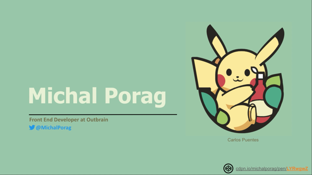
My name is Michal Porag.

Today I'm a front-end developer at Outbrain.

But until two years ago, I was an architect, of buildings, not software.

And I love technology, geek culture, cats, and most of all? Drawing! I've been drawing since I can remember myself, probably you will too.

Do you remember yourself when you were only five years old? Just drawing without thinking about it too much? Just taking a brush and paint and creating something out of your imagination.

Drawing is a form of art that is really easy to start with, and drawing with CSS is just as easy.

I will show you how.

Let's start with the most difficult part - inspiration.

If you don't have any idea what to create, for me, the easiest place to find inspiration is on Dribble.

Dribble is a social networking platform that is filled with amazing designers, sharing their work.

My favorite way around this website is to find a nice picture and write to the designers, asking them to recreate their work with CSS.

The best form of flattery is copying, so I never get no for an answer.

Just make sure to be polite, give credit and let them know, it's just for fun.

In our terminology, the re-creation process is called "appropriation".

You can see a great example in Louise Flanagan's CSS, re-creation of "Girl with a Pearl Earring" by Johannes Vermeer.

Or this appropriation that I created from the "In Alto" painting by Wassily Kandinsky.

The great thing about CSS is not only the ability to copy what you can see, but actually make it even more interesting and dynamic with code.

This is an interesting example of re-creating Mondrian's geometric concept with JavaScript and CSS.

What we can see here is a generator to take underlying math of the original painting, and create endless versions of the same artist's work, something that can be easily done in code, not so easy with paint.

Another way to improve images with CSS can be done with animations.

Like in this example, I created "Four Squares with Concentric Circles" by Kandinsky.

"Okay Michal, we believe you.

We have an idea and inspiration, but how do we start?" I will tell you.

A quick reminder: the common use of border-radius is to convert squares to circles by setting border-radius to 50%.

Another common use is to change the values of every corner separately.

Here is the mind blowing part: You can actually change the position of each axis of every corner of the square, independently, to gain more flexibility and create a better flow in your work.

Here comes an example.

Let's look at this shape we're trying to create.

To make it easier to understand the location of any point.

I like to imagine two lines, that's close the shape.

Let's look at the first point at the top.

It's controlled by the x-axis of the top right and top left corner.

We want to make sure that the angles complete each other and create a smooth line.

Also, we can see that the point is located exactly on the vertical axis we drew earlier.

So these two points for the radius is set to 50%, which creates the arc you can see at the top.

The second point is located here.

Is very similar to the first one, only that it's a bit lower on the x-axis that we drew earlier.

So I will adjust its y-axis of the right top corner to 55% and the right bottom to 45%.

In the previous example we saw how we can control the line with a single point.

Now we are going to see how we can change the curve by changing the border-radius of two points on the left border.

And by that even more complex curve without any additional shapes.

If you look on the blue and red points on the left, you can see they have a straight line between them.

We can get this resolved by changing the border-radius x-value on both left corners.

Now, the angles will not complete each other.

Instead they're creating a straight line between them and two arcs.

The bottom line is very similar to the left, and this is what we get.

Great! We created the shape that we wanted.

Woohoo! In addition to the shape creation, we should also angle positioning by using Flexbox grid or relative or absolute positions.

I prefer to use relative units, like percentage, view height, view width, view minimum, view maximum to make sure that the drawing will display well on any screen.

They also give us the ability to create really cool semi animations like this inspiring work by Lynn Fisher.

Another aspect in positioning is actually layering the elements on top of each other.

Here we can see that the tail is located behind all the other elements.

The body and the left ear are located above the tail, but behind the hand, the leg, and the head.

The head and the right ear are next.

After the ketchup bottle: hand, leg, and finally, the foot.

All the lines are connecting together beautifully.

Well done people, give yourself a pat on the back.

There is actually different trends when we're talking about CSS out.

One of my favorite is the one with only one div or no div style.

Check out this endless portfolio, by Lynn Fisher that is full with single div drawings.

This technique, focusing on using backgrounds and really brings the most out of CSS gradients and shadows.

In CSS, we have three types of gradients, linear, radial and conic.

My personal favorite is the conical radient.

It allows tons of possibilities we didn't have before, like creating a books library with only one div.

What you see is actually one div with before and after.

This is how the div will look without the before and after the pseudo element.

The before pseudo element creates the top of the library and the illusion of depth and the after pseudo element, the back face of the library.

Cool ha? This nine 3D patterns are all created in one evening of experiment on this subject, which is so cool . And surprise the most handful things you can create with conical gradient is not grapes.

It is triangles and arrows with only one div.

Conic gradients work on all modern browsers.

You can try it for yourself! Single div drawing is also a great example for interesting usage of box shadow.

The box shadow declaration consists of five parametres; shift right, shift down, blur, spread and colour.

The basic usage of box shadow is adding shadows to elements like this.

However, it has two hidden abilities.

The first is creating new shapes.

This shape can be located anywhere and we can set its background colour to any colour we want.

The second is increase or decrease the size of the new shape proportionally to the original shape size.

Okay.

Let's try to use this great tool to draw a kite.

This is what we want to achieve.

The HTML part consists of a body element that consists of a single div.

This is the last time we will see the HTML part.

The set up of our CSS will be declaration of 100 and view height for the body's element height and setting the background colour to sky blue.

So we will get this great light blue screen.

To display the div element we will set its width, height and background color.

I prefer to use view minimum unit for both width and height so the kite will be responsive for all screen sizes.

Next, we will centralize this div in the body area by using grid settings.

And now we get to the fun part, creating the kite shape.

For staters, we will create a green and yellow pyramid shape.

First, we need to add a background image declaration to the div set with conic gradients.

We didn't set any range to different colours.

So by default, the colour will be evenly distributed and combined.

Working with conic gradients allows us to use percentage value to represent degrees.

To make it easier to see.

I like to imagine two lines crossing the shape, one vertically, and one horizontally, and by that separating the shape into quarters.

To create the green triangle.

We want to look at the bottom right quarter.

We will add a red line that will represent the connection between the green area and the transparent area.

The line also causing the quarter into two parts.

Each representing 12.5% of the entire shape.

We can see that the green triangle range starts at 37.5% on the shape beginning.

Also, we can see that the range ends after 50%.

So the range of the green area is 37.5% to 50% form the starting line.

To finish creating the pyramid shape, we will need to create the yellow triangle part.

The logic here is same as before.

We know that the green triangle created by colouring range of 12.5% of the entire shape.

The yellow triangle will be the same, but starting 50% from the shape beginning.

And we did it.

The only problem here will be seen on chrome browsers, the triangles will seems to be a little bit pixelated.

To solve this issue.

I like to create a different variable set to 0.5%.

We will use this variable to separate the beginning points of each one of the colour areas.

You can see the difference here.

The next step will be fixing the location of our pyramid shape to the top of the div this can be done by changing the location settings of the conic gradient to 50% on the x-axis and 0% on the y-axis, however, now we have new problem.

We're not getting the pyramid shape anymore.

To solve this problem.

We need to change the background size of the pyramid and ta-da!.

Oh wait.

Oh no, a new problem arrived.

Now we have two pyramids instead of one.

What happened here is actually a repeating of the background itself, all over the lefted area.

We can easily solve it by adding a declaration of background-repeat; no repeat.

Great we finished the top pyramid.

Now let's create the bottom one.

First let's create one more conic gradient in our background image, declaration, and switch the colors from green and yellow to blue and red.

To make the change easy to see.

I am putting the conic gradient of the green and yellow pyramid in comment.

Next step is to turn the pyramid over.

We can do that by adding the start of the conic gradient declaration "from 0.5 turn", which means the background will be turned in half circle.

Now let's uncomment the green and yellow pyramid.

We can see that the two pyramids are located on top of each other.

And what we want to get is that the blue and red pyramid will appear at the bottom of the green and yellow pyramid.

We will move the blue and red pyramid by setting its background position, 50% in the x-axis and 100% percent in the y-axis.

And 50% in the x-axis and 0% in the y-axis to the green yellow pyramid.

And now we can remove the background colour.

Great, but one more adjustment to make the kite look more like ...well...a kite.

I want the shape to be more elongated.

It can be done in several ways.

My solution here will be to add a transform declaration.

And it's y-axis scale into 150% from its height.

Great!.

We have the kite shape.

Now we need to create the trail.

Let's start with creating before pseudo element.

We will set the background color to black and width and height to 20 view minimum.

We need to place the left top corner of the shape.

we are creating now to the same place as the kites bottom corner to make the shape look like a trail.

We need to remove its background colour and add a black border to the left and bottom sides.

And the creation of the shape can be done using border radius.

The next step is creating the small decorations on the trail.

I will start with adding an after pseudo element with a width and height set to 2 view minimum.

And setting the border radius to get to the decoration shape.

Now we can use the shadow box trick we saw earlier to create multiple copies of the decor with different colors and locations.

Okay.

One more last thing, let's give it a little bit of space with the three dimentional feeling.

I will add the kite transform declaration of rotate 3D of 1,1, and 280 degree.

So it will look like that.

And add animation and that is all.

We finish our drawing.

To sum up drawing in CSS has endless possibilities.

It's really easy.

And there are no limitation on what you can create.

I hope you enjoyed and got inspired to go and create cool stuff.

And I'm looking forward to see what you are going to build.

And if you created something cool or need any help to get started.

I'm available at LinkedIn ,Twitter or at this email.

Feel free to send me a message and thank you for listening.

Session Details

How To Draw
With CSS

Michal Porag

Front-end Developer
Outbrain

Photo style image of the sun setting over a lighthouse in Southwold, a quaint seaside town in England

Ben Evans       cdpn.io/ivorjetski/pen/xxGYWQG

A CSS drawing of a futuristic vehicle with sleek lines and angles

Lynn Fisher
a.singlediv.com

Two hand coded images by Diana Smith drawn in HTML& CSS. One resembles a video game character/avatar and is futuristic looking, with long flowing hair and a jewelled, ornate costume.The other (also hand coded in HTML & CSS) is a woman drawn in the style of an 18th Century oil painting. She poses in traditional portrait style, her gaze is slightly downward. She is wearing a pale blue off-the-shoulder ballgown, her blonde hair in pompadour style atop her head

Diana Smith     https://diana-adrianne.com/
  • Inspiration & appropriation
  • How to look
  • Must known CSS tools

Background image is a CSS drawing of a red racecar viewed from a bird's eye perspective

cdpn.io/michalporag/pen/rNOZaBg

Michal Porag

Front End Developer at Outbrain

@MichalPorag

cdpn.io/michalporag/pen/LYRwgwZ

Anime of the Pokemon character Pikachu nestled inside a broken egg and holding a ketchup bottle, by Carlos Puentes

A series of Michal's drawings, ranging from a detailed sketch of a large solitary tree, a perspective drawing of the interior of a building, a corner detail of a lived-in sofa and cushions, and and action cloesup shot of a crying baby's face on grid paper

@MichalPorag

Animated demo of the social networking platform Dribble, a platform where designers and artists share their work

Screenshot image of a script Michal might typically use to ask a fellow designer if she can use their work for her own creations in CSS. She emphasizes that she only does it for fun, not money, and that she will provide full credit to the designer. In this example, the designer of the Pikachu from the last slide, replies "Hey thank you! Sure, no problem."

Two side by side images of Dutch Golden Age painter Johannes Vermeer's: "Girl with a Pearl Earring". The image on the left is a CSS recreation of the original, created by Louise Flanagan

Louise Flanagan   Johannes Vermeer
	
                Michal Porag        Wassily Kandinsky
	

Two images of Russian abstract artist Wassily's Kandinsky's "In Alto" painting. The image on the left is Michal's re-creation of the original, pictured on the right

cdpn.io/michalporag/pen/mdOVKoz

Random Composition in Red, Blue, and Yelllow

Animated demo of Jean Fan's "Mondrian Generator", a generator tool created with CSS and HTML which creates an enless number of images called: "Random Composition in Red, Blue, and Yellow" by extracting the underlying math from Dutch artist Piet Mondrian's work. Beside the generator is a detail from a work by Mondrian's, who was known for his use of primary colours and abstract designs

                       Jean Fan               Piet Mondrian

jean.fan/mondrian-generator/

Demo of a CSS animation that Michal created with concentric squares and circles, drawing inspiration from Kandinsky's famous color study "Squares with Concentric Circles"

                     Michal Porag                Wassily Kandinsky
	
cdpn.io/michalporag/pen/mdOVKoz
border-radius: 50%;

image of a blue rounded rectangle with a dashed pink border

cdpn.io/michalporag/pen/JjEKEMV

image of a blue rectangle with a dashed pink border. The top left corner is rounded.

border-radius:   0%;
border-radius:   50% 0 0 0;
border-radius:   50% 50% 0 0;
border-radius:   50% 50% 50% 0;
border-radius:   50%;

cdpn.io/michalporag/pen/PoWzpYj

close up image detail in of the face of Carlos Puente's pikachu anime, with an accompanying demo explaining how various CSS axes and angles work to help us re-create the shape of his face

image of the shape we've just created in the demo overlaid on the original Fuentes pikachu anime sitting inside the broken egg holding a ketchup bottle, demonstrating that we have successfully re-created the shape of the original drawing's face

USE RELATIVE

% / vh / vw /vmin /max

Lynn Fisher- lynnandtonic.com/archive/2019/

Demo of the powerful creative potential of CSS using a semi-animation demo from artist Lynn Fisher. The demo features a static graphic of a woman's torso and shoulders, but with her head splitting in half to reveal a smaller woman pushing the halves of the head out on horizontal pulleys. As the head expands to fill the width of the screen, a range of other heads-within-the-head nested-style images are revealed, all in the same dimensions and all iconic of graphic design inspiration

image of our pikachu inspiration image with different parts of the image labeled with numbers

.tail {z-index: 1;}
.body, .left-ear {z-index: 2;}
.head, .right-ear {z-index: 3;}
.ketchup-bottle {z-index: 4;}
.hand {z-index: 5;}
.leg {z-index: 6;}
.foot {z-index: 7;}

a.singlediv.com

animation of scrolling through Lynn Fisher's portfolio of CSS Art

3 images each showing a different type of gradient as listed below

  • linear-gradient
  • radial-gradient
  • conic-gradient

cdpn.io/michalporag/pen/MWJeOjO

an image of a single div element styled with gradients to look like book shelves

cdpn.io/michalporag/pen/mdOVKoz

an image of a single div element styled with gradients to look like book shelves

cdpn.io/michalporag/pen/mdOVKoz

an image of a single div element styled with gradients to look like book shelves

cdpn.io/michalporag/pen/mdOVKoz

an image of a single div element styled with gradients to look like book shelves

cdpn.io/michalporag/pen/mdOVKoz

an image of 9 3D patterns

cdpn.io/michalporag/pen/mdOeeeb

an image of various purple arrows and pointers

cdpn.io/michalporag/pen/xxgVwjK

the can i use entry for conic gradients

box-shadow: shift-right shift-down blur spread color;
div {
	width: 35vmin;
	height: 35vmin;
	border-radius: 50%;
	background-color: red;
	box-shadow: 
	0 50px 10px 0 grey;
}

on the right, a red circle with a wide drop shadow

cdpn.io/michalporag/pen/ZELOZRd

div {
	width: 35vmin;
	height: 35vmin;
	border-radius: 50%;
	background-color: red;
	box-shadow: 
	0 100px 50px 0 grey,
	40vmin 0 0 0 gold;
}

on the right a red circle with a wide drop shadow, and to its righta yellow circle with no shadow

cdpn.io/michalporag/pen/ZELOZRd

div {
	width: 35vmin;
	height: 35vmin;
	border-radius: 50%;
	background-color: red;
	box-shadow: 
	0 100px 50px 0 grey,
	40vmin 0 0 10vmin gold;
}


div {
	width: 35vmin;
	height: 35vmin;
	border-radius: 50%;
	background-color: red;
	box-shadow: 
	0 100px 50px 0 grey,
	40vmin 0 0 -10vmin gold;
}

cdpn.io/michalporag/pen/oNBzZqL

	div:after {
	content: "";
	position: absolute;
	width: 2vmin;
	height: 2vmin;
	top: calc(20vmin - 1px);
	/*   background: #000; */
	left: calc(10vmin - 1px);
	border-radius: 100% 0 80% 0;
	 transform: rotateZ(30deg);
	box-shadow:
	1.5vmin 1vmin 0vmin 0vmin blue,
	4vmin 4vmin 0vmin 0vmin red,
	8vmin 6.5vmin 0vmin 0vmin green,
	12vmin 8vmin 0vmin 0vmin gold,
	-0.5vmin 3vmin 0vmin 0vmin blue, 
	2vmin 6vmin 0vmin 0vmin red, 
	6vmin 8.5vmin 0vmin 0vmin green,
	10vmin 10.2vmin 0vmin 0vmin gold;
}


picture of a kite

cdpn.io/michalporag/pen/ZELOZRd

<body> <div></div> </body>
body {
	height: 100vh;
	background-color: skyblue;
}
div {
	width: 10vmin;
	height: 10vmin;
	background-color: white;
}

body {
	height: 100vh;
	background-color: skyblue;
	display: grid;
	place-items: center;
}

image of a green and yellow “pyramid” shape

div {
	width: 10vmin;
	height: 10vmin;
	background-color: white;
	background-image: 
	conic-gradient(
		transparent, 
		green, 
		yellow, 
		transparent
	);
}

on the right a rectangle with a conic gradient background

image of a half green and half yellow “pyramid” shape, it's tip overlaid with a red circular arrow reading 360 degrees which correlates with the 100% percentage value in conic gradients

image of the green and yellow “pyramid” shape over laid with a two lines crossing the shape, one vertically and one horizontally, separating the shape into quarters. The four points of the two axes are labelled, from the top, 0%/100%, 25%, 50%, and 75%. These can now be used as a guide tracing the start to the end of the image.

image of the green and yellow “pyramid” shape overlaid with a grid highlighting the bottom right (green) quarter of the drawing, which overlays the right half of the pyramid. A red line is overlaid on the pyramid edge, subdividing it into two 12.5% areas of the quadrant, with the red line also delineating the border connection between the coloured pyramid area and the transparent area outside it.

image of the green and yellow “pyramid” shape overlaid with a curved red arrow pointing from the top of the shape to the red line showing the green colour's edge start. This lets us know the green portion of the image starts 37.5% from the beginning (top) of the shape

image of the green and yellow “pyramid” shape with the range of the green area highlighted via dotted red lines on its perimeter. These lines indicate the range of this area as 37.5% to 50% from the starting line

image of the green and yellow “pyramid” shape, this time with the yellow (left side) element area and percentage ranges highlighted. The yellow portion makes up 37.5% of the shape, the same as its other half, but it starts 65% from the top

.div {
	background-image: 
	conic-gradient(
		transparent 37.5%, 
		green 37.5% 50%, 
		yellow 50% calc(100% - 37.5%), 
		transparent calc(100% - 37.5%)
	);
}

on the right the image of a green and yellow “pyramid” shape with the area ranges applied in conic gradients

image of a green and yellow “pyramid” shape, with the right sloping edge pixelated

:root {
	--d: 0.5%;
}

on the right an image of a green and yellow “pyramid” shape, no longer pixelated

.div {
	background-image: 
		conic-gradient(
		transparent 
		calc(37.5% - var(--d)), 
		olive 37.5% 50%, 
		gold 50% calc(100% - 37.5%), 
		transparent 
		calc(100% - 37.5% + var(--d))
	);
}

image of a green and yellow “pyramid” shape, with the right sloping edge pixelated

on the left, image of a green and yellow “pyramid” shape, with the right sloping edge pixelated

on the right an image of a green and yellow “pyramid” shape, no longer pixelated

.div {
	background-image: 
		conic-gradient(
		at 50% 0%,
		transparent 
		calc(37.5% -var(--d)), 
		olive 37.5% 50%, 
		gold 50% calc(100% - 37.5%), 
		transparent 
		calc(100% - 37.5% + var(--d))
	);
}

on the right an image of a green and yellow “pyramid” shape cut off horizontally half way down left and right.

.div {
background-size: 100% 50%;
background-image: 
	conic-gradient(
	at 50% 0%,
	ֿtransparent 
	calc(37.5% - var(--d)), 
	olive 37.5% 50%, 
	gold 50% calc(100% - 37.5%), 
	transparent 
	calc(100% - 37.5% + var(--d))
	);
}

on the right, the image of the pyramid now repeated twice vertically inside the same rectangle.

.div {
	background-size: 100% 50%;
	background-repeat: no-repeat;
	background-image: 
	conic-gradient(...);
}

on the right, the image of the pyramid now no longer repeated twice but only half the desired size.

.div {
	background-size: 100% 50%;
	background-repeat: no-repeat;
	background-image:
	conic-gradient(
		at 50% 0%,
		transparent calc(37.5% - var(--d)), 
		red 37.5% 50%, 
		blue 50% calc(100% - 37.5%), 
		transparent calc(100% - 37.5% + var(--d))
		);
	/* conic-gradient(...) */;
}

on the right, a pyramid split vertically, half blue, half red

.div {
	background-size: 100% 50%;
	background-repeat: no-repeat;
	background-image:
	conic-gradient(
	  from 0.5turn at 50% 100%,
	  transparent calc(37.5% - var(--d)), 
	  red 37.5% 50%, 
	  blue 50% calc(100% - 37.5%), 
	  transparent calc(100% - 37.5% + var(--d))
	);
	/* conic-gradient(...) */;
}

on the right, the same blue/red pyramid, flipped vertically

.div {
	background-size: 100% 50%;
	background-repeat: no-repeat;
	background-image:
		conic-gradient(...), 
		conic-gradient(...);
}

the two pyramids, overlapping

.div {
	background-size: 100% 50%;
	background-repeat: no-repeat;
	background-position: 50% 100%, 50% 0%; 
	background-image:
		conic-gradient(...), 
		conic-gradient(...);
}

the two pyramids now making a 4 coloured diamond shape.

.div {
	background-size: 100% 50%;
	background-repeat: no-repeat;
	/* background: white; */
	background-position: 50% 100%, 50% 0%; 
	background-image:
		conic-gradient(...), 
		conic-gradient(...);
}

the background of the square now removed

.div {
	background-size: 100% 50%;
	background-repeat: no-repeat;
	background-position: 50% 100%, 50% 0%; 
	background-image:
		conic-gradient(...), 
		conic-gradient(...);
	transform: 
	scaleY(1.5);
}

the diamond shape squished horizontally.

.div:before {
	content: “”;
	position: absolute;
	width: 20vmin;
	height: 20vmin;
	background-color: black;
	top: 20vmin;
	left: 20vmin;	
}

the kite shape with a black rectangle to its lower right

.div:before {
	content: “”;
	position: absolute;
	width: 20vmin;
	height: 20vmin;
	/* background-color: black; */
	border-bottom: 0.5vmin solid black;
	border-left: 0.5vmin solid black;
	top: calc(20vmin - 1px);
	left: calc(20vmin - 1px);	
}

the rectangle now appears as an L-shape emerging from the bottom point of the kite.

.div:before {
	content: “”;
	position: absolute;
	width: 20vmin;
	height: 20vmin;
	/* background-color: black; */
	border-bottom: 0.5vmin solid black;
	border-left: 0.5vmin solid black;
	border-radius: 0 0 0 100% / 0 0 0 100%;
}

the L-shape is now a curve descending and to the right

.div:after {
	content: “”;
	position: absolute;
	width: 2vmin;
	height: 2vmin;
	background-color: black;
	top: calc(20vmin - 1px);
	left: calc(20vmin - 1px);	
}

kite with curved tail and small black rectangle directly beneath the kite

.div:after {
	content: “”;
	position: absolute;
	width: 2vmin;
	height: 2vmin;
	background-color: black;
	top: calc(20vmin - 1px);
	left: calc(20vmin - 1px);	
	border-radius: 100% 0 80% 0;
}

the small black rectangle is now leaf shaped

.div:after {
	content: “”;
	position: absolute;
	width: 2vmin;
	height: 2vmin;
	background-color: black;
	top: calc(20vmin - 1px);
	left: calc(20vmin - 1px);	
	border-radius: 100% 0 80% 0;
	box-shadow:
	    1.5vmin 1vmin 0vmin 0vmin blue;
}

the small black leaf shape is now repeated in blue further down the tail

.div:after {
	content: “”;
	position: absolute;
	width: 2vmin;
	height: 2vmin;
	/* background-color: black; */
	top: calc(20vmin - 1px);
	left: calc(20vmin - 1px);	
	border-radius: 100% 0 80% 0;
	transform: rotateZ(30deg);
	box-shadow:
		1.5vmin 1vmin 0vmin 0vmin blue,
		4vmin 4vmin 0vmin 0vmin red, 
		8vmin 6.5vmin 0vmin 0vmin green,
		12vmin 8vmin 0vmin 0vmin gold,
		-0.5vmin 3vmin 0vmin 0vmin blue, 
		2vmin 6vmin 0vmin 0vmin red, 
		6vmin 8.5vmin 0vmin 0vmin green,
		10vmin 10.2vmin 0vmin 0vmin gold;
}

the leaf shape is now repeated blue, red, green and yellow down the tail in pairs one to either side of the tail.

.div {
	background-size: 100% 50%;
	background-repeat: no-repeat;
	background-position: 50% 100%, 50% 0%; 
	background-image:
		conic-gradient(...), 
		conic-gradient(...);
	transform: 
	scaleY(1.5)
	rotate3d(1, 1, 1, 280deg);
}

the kite and tail are rotated to the right

the image of the kite with decorated tail.

.div {
	...
animation: 
	kite-animation 5s linear 2s infinite alternate;
}

@keyframes kite-animation {
	  0% { 
		transform: 
		translate(-10vmin, -5vmin) 
		scaleY(1.5) 
		rotate3d(1, 1, 1, 300deg);}
	  25% { 
		transform: 
		translate(-10vmin, -5vmin) 
		scaleY(1.5) 
		rotate3d(1, 1, 1, 295deg);}
	  50% { 
		transform: 
		translate(-10vmin, -5vmin) 
		scaleY(1.5) 
		rotate3d(1, 1, 1, 300deg);}
	  75% { 
		transform: 
		translate(-10vmin, -5vmin) 
		scaleY(1.5) 
		rotate3d(1, 1, 1, 305deg);}
	  100% { 
		transform: 
		translate(-10vmin, -5vmin) 
		scaleY(1.5) 
		rotate3d(1, 1, 1, 300deg);}
} 

the rotated kite animated rotating a small amount clockwise and counter-clockwise.

cdpn.io/michalporag/pen/vYyOaZE

Thank you for listening