Deep dive into ARIA
NMy name is Nick, but I've already been presented, so I'll just say I can be found on Twitter at @vroom V A V R O O M.
Love to chat about accessibility.
I need to say 20 minutes is not quite fully enough for a truly deep dive, but I'll cover a lot of the not so entry level topics that I've come across during audits over the years, or the developers have asked me, but I need to say there's no time for everything.
This presentation will get you started with concepts and code snippets, but I've also had to remove some attributes for brevity's sake.
Gerard Cohen gave a great intro to ARIA, and I hope you've seen his presentation already, but for those of you who haven't seen it, I'll cover a couple of points quickly.
ARIA, hopefully, you know those by now, it stands for the "accessible rich internet application".
It's a specification by the W3C and it defines a set of attribute names, roles, values to increase accessibility for assistive technologies.
Now we know that ARIA is a specification.
We know it increases accessibility for assistive technologies, but the first rule of ARIA is "don't use ARIA" unless you really, really need it.
There are times where it's needed.
And sometimes things aren't quite as straightforward as expected.
So that's what we're talking about here.
I'm going to explore some of the more advanced ARIA related topics that are problematics, which we see in audits over and over it.
So let's start with this.
It may seem quite basic, but let's put it right out there.
aria-role is just not a thing.
We have ARIA roles, of course, we just don't append the name, the word aria to the name of the role attribute.
So let's start here with live regions.
A live region is when we have a section of a page that acquires new or different content based on user input or anything else that happens.
Because the pages isn't reloaded, screenreaders don't have a way to know there's new content on the page.
If the assistive technology doesn't know there's new content while the new content might as well not exist.
So reloading the page would be a solution for that, but it would cause a whole bunch of problem because it would put the cursor at the top of the page and the place would be lost.
So here we have ARIA live to the rescue.
We can use that we can define a live area.
And by doing that we tell the assistive technology, "Hey, something changed on the page".
We can use three different values for that.
We can use 'off', we can use 'polite' or we can use 'assertive'.
Now, funny story, there was at one point a 'rude' value.
But it was removed from the specifications.
So we shouldn't use rude.
The off value means there as a container but it's not a live region so we can skip that, we can not use it at all.
So that leaves us with a choice of either polite or assertive.
We would use the polite value in nearly all situations.
With the polite value, when there's a change in content, the screen reader will finish doing what they're doing and then they will announce what's changed.
On the other hand, with the assertive value, it will stop what it's doing and announce the change immediately.
In other words, it interrupts the flow.
It's distracting.
It increases the cognitive load.
And unless something is about to break and requires immediate attention, don't rely on the assertive value of the live attribute.
So that's the nutshell of aria live.
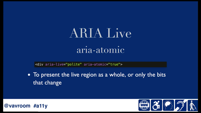
An attribute that can be used quite a bit with a live region is area-atomic.
This gives you control as to whether or not the entire live region is announced or only the bits that change.
You have to use that sparingly just like any other ARIA element and it doesn't hurt to try it with actual blind screenreader users to do usability testing once you've played with it.
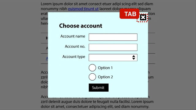
Moving right along expand and collapse sections, we're finding them just about everywhere.
As you probably realized by now the whole, there should rely on an actual button to trigger, expanding or collapsing.
What many don't realize is we use the area-expanded attribute on that button.
So.
Rather than applying area-expanded on the region that expands or collapses, we put it on the button.
This is a different thing than live region entirely because typically expand our collapsed content is already in the DOM.
So we don't need to notify that through a live region.
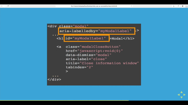
aria-describedby attribute, useful to associate an element with another one.
Typically we associate some text with an input generally used for programmatically associating error messages with an error's input.
Fairly straightforward.
Now, if you've used automated accessibility testing, you'll have come across this error message that talks about duplicate ID errors.
To be honest, duplicate IDs are one of these things that aren't a problem until they are a problem.
And the problem happens when we have the same ID used on different elements.
And we're relying on that ID for associating for example, an error message programmatically associated with the input.
If we have two different elements with the same ID, there's a risk that the actual error message is not going to be announced correctly because the screen reader won't know which element to reference which element to announce.
That said you could use two different IDs as a value of the aria-describedby attribute.
Both would be announced one after the other.
That can be useful for clarity of information about fields.
Like say you have a phone number, you have an area code and you can't really provide a visible label to make it clear what is what?
And then you need to append an error message on top of it.
If you use two different ID in the aria-describedby value, then it will announce that it's a phone and then it will announce the error message.
Couple of attributes that are often confused: aria-label and aria-labelledby.
Both of them are used to provide an element its accessible name.
Aria-labelledby by works in a similar way that aria-describedby works.
You need to separate you need a separate element to associate with it.
And the difference is that it acts as a labeling element, whereas aria-describedby isn't actually a label.
It provides more information.
The aria-labeledby element can be useful if you already have text on a page, to label as an input, but for some reason you can't use the actual label element for the attribute.
aria-label on the other hand is kind of a standalone.
The value of that attribute needs to be a text string.
It can be useful when for some reason you can't afford to have a visible label.
Obviously that's a design decision that I would fight because it has an impact on other users like speech to text users, and users with cognitive disabilities.
But that's another discussion for another time-we're talking ARIA.
So let's look at how we're using aria-label.
The text string.
Now how much text can you fit in an aria-label?
A lot, actually you can put several thousand characters it's actually more than is useful for a screen reader user.
So think in terms label, keep it clear, keep it concise.
One little gotcha for aria-label is that it may or may not be able to be translated by automated translation tools.
The support is getting better.
Absolutely.
Some people will say, oh, there's not a problem anymore, but we also have some other people that encounter problems.
So.
If you're expecting to provide translation through automated translation tool, you don't want to rely on, aria-label.
And finally one last gotcha about aria-describedby, aria-labelledby an aria-label.
They're not well-supported on many elements.
For example, if you put it on a div, on a span, on a paragraph, the support there is pretty much hit and miss.
You want to limit using them to interactive elements, buttons, links, et cetera.
To elements that have landmark role, to iframes, or to images.
So that's aria-describedby, area-labelledby, and aria-label.
Two elements that are confused very often-we have area-hidden and we have role presentation.
They're not quite the same thing.
aria-hidden hides the element it's supplied to from assistive technologies, whereas role presentation removes the semantic meaning of.
In my experience, role presentation is most useful when you're dealing with legacy markup that relies on tables for layout, and you need to hide the table semantics.
That happens quite a bit, especially with all older frameworks.
The other thing that is very useful for is if you're using SVG for an image and your image is decorative, and you want to hide the entire thing.
So you would use as svg role="presentation".
Now, remember I said earlier, you shouldn't use ARIA, if there's a non ARIA way to do something?
Well, there's an exception.
There's always an exception.
To define required fields we could use the HTML element, HTML attribute 'required'.
But there are many downfalls around that which means that using aria-required is actually still the better approach.
Breadcrumbs and workflow steps are a great way to visually indicate there are some ... where someone's at.
They aren't quite as easy for screen reader users though.
So this is where using the area-current attribute is useful.
There are several values we can use there.
The very basic value is true.
So aria-current equals true, but we can also use values such as 'page', 'step' 'location', 'date', or 'time'.
The word current, and then the value will be added at the end.
So for example, you might have current page being described, being announced.
You may have come across the area-roledescription, which is a bit playing with fire in some cases it can improve the experience and others, it will be causing problems.
For example, if you have a bunch of sections on your page, you might want to use area-roledescription to define what they are about.
A prime example here is HTML based slides where each slide is a section.
On the other hand, what you risk doing is providing really high cognitive load, because if you use that a lot it is going to be repeated and repeated and cause problems.
Another place that causes a big problem is if you use the attribute on the button element that really can break things completely.
So unless you know exactly what you're doing with it, which you're going to have to research don't use it, but when you do use it, run usability testing with blind screen video users to see if it works.
Okay.
Let's talk about aria-haspopup.
This indicates that a pop-up is available the, it seems straightforward, but...
Where it fails a little bit is that a lot of people refer to tool tips as pop-ups.
And in this context, tool tip is not a pop-up.
So let's avoid that confusion.
The aria-haspopup attribute should only be used to indicate there's a menu, submenu, or a button menu under ARIA 1.1, the acceptable values for that are menu listbox, tree, grid, and dialogue.
You can still use the true value for backwards compatibility, but that's not quite as useful.
So looking at an attribute that goes hand-in-hand with aria-haspopup is aria-controls.
It's used to create a relationship between elements.
So it's especially useful if the control and the controlled area are far apart in the in the DOM it allows you to jump from one to the other.
Another role you might come across and see often is role = dialogue.
It's used to indicate when you have a modal dialog.
Here is one where we have an HTML element the HTML dialog element, but it still isn't supported in too many browsers.
While you could use a polyfill using the role dialog is probably simpler alternative.
You still need to do all the usual things to make sure the modal is accessible.
For example, including trapping focus until the modal's closed and making borders, so it's easily visible in Windows high contrast, but this is not ARIA anymore.
We have role switch.
If we're doing toggles you may want to decide whether using a checkbox might be easier or more appropriate than a button, with role switch, but this is a tool that is available in your arsenal.
So basically we use button role = switch, and it says that it's a switch.
What you want to do though with that is using the aria-pressed attribute to indicate whether or not the toggle is pressed or not, what state it's in.
So you may want to implement a slider on your page.
This requires leveraging several ARIA elements to make it work.
You'll need more than just ARIA as well.
You'll need some JavaScript, good for keyboard focus management and so on and so forth.
You'll need to be able to update the values dynamically.
But first off, when you're having a slider, you put a div and you put a role of slider on it.
So far, so good.
Then you make sure it can be focused with keyboard.
So you apply a tabindex equals zero.
As an aside, you remember that you should not use positive tabindex values, right.
Right.
So then we want to give minimum and current values.
This is done using the aria-valuemin and aria-valuenow attributes.
And then you also want to give a maximum value.
You'll recognize the pattern.
It is.
aria-valuemax.
That's fairly straightforward with these items.
You will going to be able to provide the information needed, to know where the slider is at and people can interact with it . Finally let's talk about progress bars.
They're very similar to sliders, except that there's a few more attributes you can use.
One of them is aria-valuetext.
You provide information about the progress bar.
So if you have several steps, you can say-getting headache pills is step five.
You can do whatever text you want, but arian-valuerext will be helpful there.
You can also use aria-describedby and point to text element on the page to describe what's going on on the page.
This is especially useful with page loading status.
On page loading status, you can also use aria-busy on that progress bar, but don't rely on that only because it's not well-supported.
So some user might not get the information, so you want to really use belt and braces approach.
So, the other thing is aria-busy.
Okay.
So there you have it.
That was a really quick tour of some more finicky ARIA accessibility things.
Hopefully it was useful to you.
Please feel free to reach out on Twitter.
V a V R O O M [@vavroom].
I love to interact with folks and answer questions there.
Make a splash: Div(e) into ARIA
Nicolas Steenhout
Portrait of Nic Steenhout
Disclaimer
- No time for everything!
- Getting you started.
- Code snippets have some attributes omitted for brevity's sake
ARIA
Accessible Rich Internet Application
A specification from the W3C.
First rule of ARIA
Don't use ARIA.
Unless you really, really, REALLY need to.
Not a thing!
An owl with its head twisted upside down, looking really puzzled.
aria-roleARIA Live
<div aria-live="assertive">
Mama said don't be rude and interupt
</div>
ARIA Live
aria-atomic
<div aria-live="polite" aria-atomic="true">- To present the live region as a whole, or only the bits that change
aria-expanded
<button aria-expanded="true" aria-label="View more">- Apply to the triggering element
aria-describedby
<input aria-describedby="SomeID">
<p id="SomeID">Some text describing the input<p>- Requires a separate element's ID
- Useful to associate elements together programmatically
Error messages
Non unique ID
<input aria-describedby="someid">

<p id="someid">One thing</p>

<p id="someid">A different thing</p>
Two IDs as value of aria-describedby?
<h3 id="Phone">Phone</h3>
<label for="area">Area code</label>
<input id="area" aria-describedby="phone">
<label for="number">Number</label>
<input id="number" aria-describedby="phone number-err">
<p id="number-err">Number field can't contain letters.</p>
aria-labelledby
<input aria-labelledby="label1">

<p id="label1">Some label<p>- Requires a separate element's ID
- Useful if content already exists on the page
aria-label
<input aria-label="Some label">- Requires a text string
- Useful if content not already on the page
aria-label
       <input aria-label="Lorem ipsum dolor sit amet, consectetur
adipiscing elit. Curabitur viverra quam quis lobortis maximus.
Sed eget felis at sapien elementum commodo. Pellentesque et
luctus arcu. Praesent eget ex dui. ">
More than is useful for screen reader users!
aria-label
Maybe can't be automatically translated!
<label>If there's any chance of a user needing translation, the label element is better
Might or might not work
<div aria-describedby="randomid1">

<p aria-labelledby="randomid2">

<span aria-label="Some random stuff">
Not quite the same thing
aria-hiddenvs.
role="presentation"aria-hidden
- Hides the element and its content from assistive technology
role="presentation"
- Removes the semantic meaning of the element
<table role="presentation">Or
<svg role="presentation">Required fields
'aria-required' ARIA attribute
- Does not suffer from the downfalls of the "required" attribute!
aria-current
- Values: page, step, location, date, time, true, false
- If not "true", then will announce value: e.g "About us, link, current page"
aria-roledescription
- Can improve the experience - Good on <section>
- Can break the experience - Bad on <button>
aria-haspopup
<button aria-haspopup="menu">- Indicates a popup is available when activating an element
- Tooltips are NOT popups
aria-controls
<button aria-haspopup="menu" aria-controls="menu">- Creates a relationship between elements
- Particularly useful if elements aren't nearby in the DOM
- Can move directly from the control element to the controlled one
role="dialog"
<div role="dialog" aria-label="Modal name">- To indicate modal dialogs
- All aspects of modals still need to be implemented
role="switch"
<button role="switch" aria-label="Toggle me">- Used for toggles
- Checkbox vs button
aria-pressed
<button role="switch" aria-pressed="true" aria-label="Toggle me">- Used to indicate the state of a switch!
Sliders

- Leverages several ARIA elements
- Requires more than just ARIA! e.g. JavaScript, keyboard focus, etc
- Update values dynamically
Sliders
<div role="slider">Sliders
<div role="slider"
tabindex="0">
Sliders
<div role="slider"
tabindex="0"
aria-valuemin="0">
Sliders
<div role="slider"
tabindex="0"
aria-valuemin="0"
aria-valuenow="0">
Sliders
<div role="slider"
tabindex="0"
aria-valuemin="0"
aria-valuenow="0"
aria-valuemax="100">
Progress bar
- Similar to sliders
- But different!!! Additional attributes
Progress bar
Image of a progress bar at 68%
<div role="progressbar"
tabindex="0"
aria-valuemin="0"
aria-valuenow="62"
aria-valuemax="100">
62%
</div>
Progress bar
<div role="progressbar"
tabindex="0"
aria-valuemin="0"
aria-valuenow="5"
aria-valuemax="6"
aria-valuetext="Step 5: Getting headache pills">
Step 5: Getting headache pills
</div>
Progress bar
<div role="progressbar" tabindex="0"
aria-valuemin="0" aria-valuemax="100"
aria-busy="true"
aria-describedby="status">
</div>- Use for page loading status
aria-busy
- Poor support!
Thank you!
Nicolas Steenhout
By now you probably know the first rule of ARIA: Don’t use ARIA, unless you really need to. Because sometimes, we do need to use ARIA. But when should we use ARIA? And how should we use it? These questions can leave us high and dry!
This session is more than a simple overview of what ARIA is. It’s an in-depth exploration of common ARIA roles, states, properties, and techniques that we can use to increase the accessibility of our web pages or applications. Don’t fret, we’re not going to dive head first into cold and murky water!