CSS Aspect Ratio

Hello, everyone.
Thank you for taking the time to listen to my talk.
I do really appreciate it.
It's great conferences are still able to go ahead, even if it's a little bit differently to what we're accustomed to.
I have been enjoying Web Directions, hover all the same, and I'm excited to have the opportunity to present.
My talk is going to cover the CSS aspect-ratio property, which is part of the CSS Sizing 4 specification.
Now, currently that spec is in a working draft state, but it's worth keeping an eye on the progress, cause there might be some changes here and there.
A little on why we need this property, what we do now that sort of makes up for the properties' absence in the browsers, how it works in with the browsers intrinsic aspect ratios, and some sort of common use examples.
What I'd like you to come away from this talk with is newfound knowledge of aspect-ratio and how you can use it in the work you are going to be doing soon, or depending on your browser support, maybe even from today.
It feels appropriate to have an aspect ratio introduction before talking about the web-specific use cases.
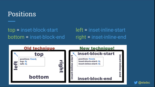
Now an aspect ratio is the ratio between the width and height of an element, and in our example here, those are 800 by 600.
The ratio is the lowest common denominator that describes an element, so for every unit of width, there will be an amount for its height.
So the lowest common denominator is 4 by 3.
In this example, for every 4 units of width, there's going to be 3 units of height.
Aspect ratios are typically displayed as "width:height." The two values can be anything that represents the dimensions, but there are a range of sort of common aspect ratios you'll come across when working with different types of media.
So 1:1 or a square, and that for every one unit of width, there's an equal value of height.
4 by 3 is typical of some screens and images.
Now 16 by 9 is probably one you're used to seeing when looking at videos or even a lot of screens now.
Now you aren't limited to its set aspect ratios, they're just common ones you're likely to encounter.
You can and likely will use any range of numbers, such as 1.6180:1, also known as the "golden ratio," said to be one of the most aesthetically pleasing ratios that's used in nature and design alike.
So now, aspect ratios are common working with designs, but we haven't had a native solution in CSS and responsive design.
There are JS libraries and even some CSS hacks that we will look at soon that have filled that gap until now.
Now there are many scenarios that you'll encounter a need for an aspect ratio while developing a site.
Some of those could be embedding a video.
We do this all the time and in doing so try to maintain an aspect ratio, even while supporting the many different resolutions.
If we try and embed an iframe with a similar approach that we take to images, we'll end up with something like this, a bit of a like squashed rectangle, not quite what we're after.
We'd have to either set a height, which is going to limit us, or use a library to resolve it.
Grid elements is another one - the grid is responsive to the screen, but we can't keep an aspect ratio like we might like.
We get what the browser deems to be the best size at the time.
Now that might be okay - the size that it decides - but if we had a specific use case such as a product gallery, it'd be nice to be able to define the aspect ratio and manage it ourselves.
A bit of a favorite: having a section of the site jump as responsive images load.
So if we go here and we're trying to figure out and all of a sudden the image loads and "Oh, now we've successfully subscribed forever." I know this one has sort of happened to me a bit when browsing.
You work your way back, you scroll back to where you were, you wait that little bit longer just to make sure you don't do it again, and this could be the difference between someone joining or not, and you've lost a potential user.
This effect is known as cumulative layout shift and it's caused by an iFrame embed of a video or image loading that causes a screen to jump.
Now that Layout Shift for Web Vitals should be less than 0.1 to ensure that users don't experience that jump, you will receive a lower score if it's higher than that, but even if the score isn't a big part of your process, it can cause frustrations for users as they experience this.
Now, thankfully ingenuity has always been a part of the web, and so we've figured out workarounds for these various situations.
If we needed an element to maintain an aspect ratio, we could use the padding-top hack.
This hack involved defining a padding-top value that is a percentage value of the desired ratio.
A parent container would define the width - and let's say that was 100%, that's pretty common - and then a padding-top value would be set on that.
But then we would have to have a child container that would be positioned absolutely to avoid the padding.
And while this worked, it was extra elements and a little bit unintuitive.
If we compare the percentages to the ratio - so if we wanted 16:9, like here - we would have a value of 56.25%.
If we wanted 4:3, we'd have to go down to 75%.
If we wanted 3:2 we would need 66.67, and for our 1:1 square is 100%.
But there's a disconnect there between the aspect ratio and the value we're using.
It's easy to modify that padding without realizing that you're having a negative effect.
There were also issues with content overflowing and the amount of wrapping that was required that we can see in the code example, but it was super clever and worked cross browser, so it's no surprise that we use it a lot.
If you needed to do this with video, you'd reach for a library such as FitVids created by Dave Rupert - a lightweight library that would monitor and adjust the size of video.
And again, that's great, but there's that resource intensiveness that comes with monitoring in video.
But what if we didn't need to use libraries and CSS hacks with the extra containers and the possibility of confusion? That's where we now find ourselves with the aspect-ratio property, and if this tweak demonstrates anything, it's the excitement for a native approach to aspect ratio without JS or maintaining a library.
It's one of the great things of the web: as developers, we find a need, and we fill that in the interim with these techniques, And then hopefully, browser vendors and spec writers notice this and add it to the browsers natively.
border-radius, videos, position: sticky, are all examples of where this has happened in the past.
The native solution arrives in CSS sizing for specification, which adds a new CSS property: "aspect-ratio".
This is not to be confused with the aspect ratio media query, which shares a similar name, but a very different purpose.
The formal syntax as defined in the spec is: aspect-ratio is the property, and then the acceptable values are auto or a ratio.
The aspect-ratio property can be set on any element that isn't an inline element, such as a span or anchor that doesn't have a block layout applied to it.
And the other exclusion is tables.
Auto is a keyword that's available on many CSS props, like width and height, and this is the initial value.
The ratio part, the second allowed value is part of the CSS Values and Units Module 4, and there's an important difference here to how we would normally show an aspect ratio defined.
So if for example, we define an aspect ratio of 16:9, it would look like this with the forward slash, so instead of a colon, we now are swapping to a forward slash and there's a few reasons why.
It would break CSS is a big one.
Colons are used for the declarations, which we can see in the rule here already.
But Jen Simmons, one of the spec authors tweeted that forward slash matched the aspect ratio media query, and consistency is better and makes a lot of sense.
I think also you might be getting used to writing forward slashes with CSS Grid Layout in a similar fashion.
Now, if we apply that to our container, the aspect ratio is much clearer.
It's definitely 16:9, and without needing extra containers in code.
So we've gotten rid of that second content div.
We've gotten rid of the padding hack and we're simply just applying "aspect ratio 16:9" . It's a nice win for clarity.
If we apply this to the video example from earlier, we now don't end up with this squashed video when the screen resizes.
We haven't needed any JavaScript to get here.
So as we go up and down, we can see that our video is maintaining that aspect ratio, and all we have to do is apply it onto the iframe.
Similarly, if we set an aspect ratio this time of 4:3 on the elements in our earlier grid, the "div" has that desired aspect ratio while still being responsive as the grid sizes.
So we're getting a little bit more creative control over how the grid will display each of the items.
Another tip that I saw Jen Simmons tweet is that: for a square aspect ratio or aspect ratio of 1:1 you can simply use 1.
So you're saving yourselves a couple of characters there - setting the value to order is the same as saying, "there is no preferred aspect ratio", unless there are replaced elements with an intrinsic aspect ratio.
So what is intrinsic aspect ratio? Best practices state that we should define a width and height on images again.
These values create that intrinsic or natural aspect ratio on replaced elements.
Replaced elements are elements whose representation is outside the scope of CSS, the contents will not be affected by the current document styles.
I found an easier way to understand this personally was to see the elements that are considered replaced.
So there they are.
This helped it click for me.
It's elements that we defined in HTML that become something else entirely.
Take video, for example.
We get the player elements that aren't specifically affected by these styles - that can be the progress scrubber, the play, pause buttons, closed captionings and volume.
Right? All of those are supplied by the browsers and differ per browser as well.
I've seen this called "natural aspect ratio" and "intrinsic ratio." Again, I find this clicks best when demonstrated.
Browsers take the width and height of, for example, an image and using those values calculate the aspect ratio for us.
Here's Firefox's implementation courtesy of MDN.
So we can see each of those replaced elements using the attributes selected to pull that data from our elements.
One of the benefits of elements having an intrinsic aspect ratio is, it solves the problem we saw previously - Cumulative Layout Shift.
If you add the width and height to an image, then you don't need to worry about setting the aspect-ratio property yourself as the browser will handle that for you, and then the browser already knows how much space it takes up.
So when it loads it doesn't push any of the buttons down and we don't cause people to sign up indefinitely.
Browser support for intrinsic aspect ratio is pretty good now.
So this is different to aspect ratio.
If you aren't supporting IE11, then it's worth setting the width and height on images now.
It means that the new aspect-ratio property is more for other elements, things that aren't images or replaced items that don't have that intrinsic aspect ratio already.
Now, while researching, I noticed there was an interesting statement that both the specification and MDN drew particular attention to.
Here's that sentence from MDN and the emphasis is theirs: "The aspect-ratio CSS property sets a preferred aspect ratio..." that sounds a little bit loose, doesn't it? If we compare that to MDNs definition of width: "The width CSS property sets an element's width." There's no ambiguity there, and this is an important part of understanding and avoiding pitfalls with aspect-ratio.
I think Chris Coyier put this best with this: "Maybe it's helpful to think of aspect-ratio as the weakest way to size an element?" Here's how aspect-ratio property can be affected by other dimension properties.
So if one width or height are set - so only one of them - aspect-ratio will calculate the missing value based on the value of aspect-ratio.
So we have our 800 example from before with an aspect ratio set of 4 by 3.
The browser knows now that the resulting height will be 600.
If both width and height a set - so in this example, the width and height are both set: 800 and 600, but the aspect-ratio we're requesting - the preferred aspect ratio - was 16 by 9.
In this scenario, the aspect-ratio will be ignored, as the natural aspect-ratio is 4:3, as determined by the width and the height, so they're going to win out in this scenario.
Minimum or maximum dimensions being set: so if the minimum or maximum dimension is set and they're the dimension that's applied, then the aspect-ratio will again be ignored.
Keep this in mind when using aspect-ratio and how they combine with the other dimensions if you're experiencing weird results.
Another potential "Gotcha" is overflowing content.
If the content is larger than the containing element that has an aspect-ratio, the container will grow to contain that content, thus breaking the aspect-ratio.
This feels like the right approach though, as in most cases, I think it would be worse to lose the content.
That said if you'd rather the content not force the container to grow, you can set them in height to 0, like the example here, and then the aspect ratio is applied.
The browser support for aspect-ratio is improving.
So this is the aspect-ratio property.
Whereas before we were looking at the width and height on elements.
Chromium-based browsers, meaning Edge, Google, Chrome, and Brave, as an example, have aspect-ratio support since version 88.
Firefox has support behind the feature flag: layout.CSS aspect- ratio enabled Safari: they've announced support in the Technology Preview version 118.
Again, you have to activate a flag to be able to use it, but that means that it is coming as part of Safari.
Google announced that along with Flex, Grid, position: sticky and CSS transforms that aspect-ratio would be a focus area for Web Compat 2021, and that's interesting because aspect-ratio is far more modern than a lot of those others like Flex, Grid, and position: sticky.
What it means to be part of Web Compat is that a focus will be put on resolving compatibility issues by Microsoft, Google, and Igalia as an example.
What is chosen to be focused on is decided by a few factors: MDN surveys, feature usage, state of CSS, web platform tests, and more.
aspect-ratio has been recognized as such a common use case that it's already been included.
As of this talk, only 27% of aspect-ratio tests passed, but we should see an increase there with less cross-browser issues.
Follow along with Web Compat 2021.
The post is linked in the bottom corner of the slide and see how this progresses.
But you can use it now, taking a progressive enhancement approach.
You could start using aspect-ratio in tandem with supports query and a reasonable fallback here would be something like the padding-top hack, combined with pseudo elements for browsers that don't yet support aspect-ratio.
So that covers our dive into the CSS aspect ratio property.
We looked at where we've come from with the padding hacks and JavaScript libraries, to where we're going with the aspect-ratio property.
The problem areas this solves for front-end will be huge and images and videos where it was difficult to get right before, become a lot more straightforward hopefully.
We looked at how the intrinsic or natural aspect ratio is different to the aspect-ratio property, but related and important, and examples of how this can help with Cumulative Layout Shift, responsive design, and a few of those other little gotchas.
I hope you have enjoyed my talk and it helps you with the future work you are doing.
Feel free to follow me on Twitter @antonjb.
Otherwise, I hope you enjoy the rest of Web Directions: hover, and hope that you're staying safe and healthy, and that one day soon we can do this all in person again.
Have you needed to maintain an aspect ratio in a layout? Perhaps 16:9 for a video or a 4:3 photograph. Was it more work than you would have thought? There’s JavaScript solutions or the Padding-Top hack that work, but there are sacrifices to these workarounds.
The frustration of maintaining a consistent width-height ratio is about to be solved with modern browsers supporting the CSS Aspect Ratio property. In this talk we look at what aspect ratio is, how we can use it in our code and the problems it’ll solve.