- Our next speaker is Wayne Thompson.
You will know him even if you don't know by person because you will have seen his typefaces so just imagine looking at Rugby League, McDonalds, Holden. He's a very prolific type designer, but he's also a hand letterer and I had the pleasure of joining him on a workshop awhile ago together with Jim O'Brien. So if you do see his workshops being advertised anywhere, please do make good use of it.
If you do know his hand lettering you will think that his embellishments, his furnishings, they're really all about making something elaborate and beautiful.
But his talk is about clarity of communication so, over to Wayne.
(audience applauding) - Thank you, good morning.
I'm here to talk about fonts.
Some stuff you possibly didn't know about fonts. Probably didn't know about fonts.
So you guys, I don't know exactly what you all do, but you've all, I imagine, work with fonts like everybody works with fonts at some point don't they.
So my name's Wayne, I design fonts for a living, it's my job.
It's something that took me a long time to get into that position, but I'm desperately, deeply in love fonts, so I do everything with fonts, I'm a font nerd. So I'm here to try and give you a bit of an insight into the background behind fonts and why perhaps you should or could pay a bit more attention to them. Firstly, what do I do? See if this works.
Just press the button.
I design fonts but I also teach people how to use them. So in this image, this is a picture of hand lettering workshop that I've run in Melbourne, this particular one. At this particular one it was compulsory to have a hipster beard and also a cool hat. I digress.
I run a lot of hand lettering workshops but most of my work, my primary corporate work is to do with designing and producing typing type faces, the kind that you find in your font menu.
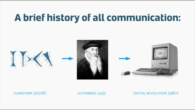
So I have a deep interest and a lot of experience in legibility and clarity of communication, that kind of thing. But I just thought I'd quickly start with a brief history of all communication which is not at all superficial. Starting from the cuneiform there in which somebody pressed a reed into some clay, right through Gutenberg who invented the printing press, well one of the people who is rumoured to have invented the printing press. Right through to the 1980's when some skinny guy in a garage soldered a few wires together and kind of change the world as we know it. So what actually is a font? Here's a few little graphics of some font files. You may be familiar visually with some of them. The three on the left Opentype, Truetype, and Type 1, they're the kind that live on your computer. Nowadays everything seems to be transitioning between there to cloud based typography so the one on the right, the Webfont icon, lives in the cloud rather than on your physical computer.
Who makes fonts? Anyone can make a font, I make lots of them. I'm still learning new stuff all the time.
I've been doing this since, kind of, the mid 1990's. But these days it's mostly big companies, big tech companies that make them plus a whole bunch of small foundries like myself.
Some in between, but mostly either big or really small. What's the process by which it's done? And this is a question I get a lot as well. How is it done? Well that's a screen of my software called Fontlab. That's where each, so I've highlighted there the capitol letters and the lowercase letters and each letter shape has a kind of a slot or a hole into which you know, you have to put the graphics.
I would make up an A shaped graphic and insert it into say the A hole.
(audience laughing) Didn't think that through did I? So that's part of the production process but I also have to think carefully about spacing or things like this might happen.
(audience laughing) A little nod to bad design there.
Or as my friend Clint says.
(audience laughing) His very name is a lesson in kerning he says. So these are the things that I have to think about and consider when designing and producing a typeface. So it's not just about making things look pretty, that's kind of my point, it's very much about functionality. Try to make sure that whoever's likely to be using this is going to be using it in the least intrusive manner, if that makes sense.
Here's a question I get a lot, how long does it take? Well how many characters are there in a font? Most people would look at that character set on the screen and think, oh that's the character set I could name. But most fonts that you use on your computer probably have a character set that's something more like this.
Not all.
But if you fair thinking about designing fonts, you kind of need this character set and sometimes more. And those three words on the right there, cafe, facade, pinata, are good examples, cafe in particular, when you really kind of need to be accurate about the way you type it, even though it's a word we use daily, it still derives from the French and the accent over the E kind of needs to be there if you're going to be any good at what you're doing. You can also add customised characters, as many as you'd like.
So so that's the standard languages character set and if you look down the bottom of that set you can see a lot of Russian characters, for instance, has the Cyrillic character set in it and a lot of fonts also have Greek and then you move into other languages like the Asian and Arabic languages which are outside my skillset.
What about numbers? A lot of people don't realise that the fonts that they're using often contain more than one set of numerals. Here's an example.
The standard numerals, the ones on the left there, you would use those in your reports, for instance, and there's an example underneath.
2011, 2012 where there's columns of figures that need to line up in order to add up accurately. So if I don't get that spacing right, those columns and figures misalign and the accountants get very upset with me. And you can see a problem in the number 2011 there on screen on the bottom left because one is a skinny character compared to say eight or nine or six, but it still has to take up a particular width. So typographically, 2011 was a very difficult year for me. (audience laughing) Because I kept seeing this come up over and over again and going, just move that spacing a little bit. But many fonts, and I designed this into a lot of my typefaces, have a second set of numerals or sometimes a third and a fourth set.
If you look at the right hand side there, they're what's known as non-lining numerals, sometimes called lowercase numerals and they have a separate purpose.
You can use them in columns and figures, but they're set with different widths and spacing so you'll see the one in the set on the right hand side there and see that it has a thinner kind of spacing width around it. The point of those numerals is to be used in continuous text like in that example, born in 1967 at 325 Smith Street, when the bulk of the legible, recognisable part of the numeral sits within the X height and so there's less visual interruption to the eye if you need to use text that contains a lot of numbers.
Another question that I get a lot is how much does it cost? Well it does vary from a few hundred dollars or a few thousand up to, well this.
I don't know if you can read that or not, but this is a real font quote that I got.
I had a client some time ago that said we want, I want you to help us design a font that's going to go on the entertainment systems of passenger aircraft. And they said, so conversely it needs to be able to basically go anywhere in the world, but they had, particularly they had a lot of Asian routes in their carrier service.
And they said to me, we wanna include Chinese and Japanese and Korean languages.
I said, ah look I don't do that stuff, but I'll find someone for you that does, but I do know that they have enormous character sets, a completely different writing system to ours. Yeah no worries, just get us a quote.
So I hunted around the world by email looking for someone that could do this and eventually found the preeminent Japanese, Chinese, and Korean font expert whose name is greyed out there because this was the quote that came back to me. $1,453,200 Australian dollars.
And I rang my client up and I said, look I've spent a lot of time and effort trying to track this, but I don't think you wanna know how much the cost is. And they said, look is it really out our range? I said it's way out of your range, even for an international company.
And the manager that I was talking to said, oh go on, tell me how much.
And I told him and there was just this silence. And eventually he said, yeah I don't think we'll be proceeding with that. And you can see underneath, I even emailed him very politely to try and check, just wanna make sure this isn't some kind of mistake. But look, I don't wanna scare you, my personal charges are much higher than that. No.
(audience laughing) An off the shelf font, if you want to use a font that you don't have currently on your computer and you find it on a website and you think, well I want to purchase that, usually, for most average users, a purchase font is available to be used on one to five personal computers. You can set that number higher according to the number of users that you need to cater for.
But most individual fonts, maybe 30, 40 dollars, and you can then use that font for the remaining term of your natural life. Things are drifting a bit towards web and cloud typography now.
Things are changing a little bit, type kit and all that kind of stuff, but that's still the kind of dominant model for the moment. But people say to me, why do you make custom fonts when I can buy one for $20 or $30 or basically download a lot of them for free? And this kind of gives an example, 'cause my corporate clients can use free stuff or they can't use, larger companies that are high profile can't use fonts that aren't legal because it can be very bad PR for them if they get called out. This is an example of if your business had, say 5,000 users and you can see the licence I typed in 5,000 users on the right there, for that family of fonts that comes in at around 10 grand, which is you know not to be sneezed at, but many larger companies will say to me, it's gonna cost us 10 grand anyway, can you do us a family of fonts that's to our own personal design and has certain features in it and works in a certain way and all this sort of stuff for less than that. So having got that far with fonts we might be tempted then to go okay 1.4 million Australian dollars or 10 grand or whatever, all this font licencing stuff's complicated, it's difficult, it's getting more complex every day. Many people, not unreasonably in my opinion, might go I'll just use this free one.
But I'm here to tell you a few things about free fonts and why they're probably not very good for you. Not in every case of course.
Here's one example You can see at the bottom of the screen the commercial font in words like souffle for instance, has an F F L letter combination.
And if you look closely at that F F L at the bottom, you can see that they're joined together.
This is what's known as a ligature.
The job or the point of a ligature is to solve a spacial relationships issue where particular letter shapes clash. F I and F L are the most well known ones, but other letter shapes depending on the font design sometimes clash as well, that can cause, it doesn't have to be necessarily a physical clash, it can cause spacing issues.
So font designers design a particular individual character that in this case the F F L is a single character and it's set in a separate place in the font and the software, most of the software that we use today is pre-programmed to recognise that and substitute the designed ligature for the three individual characters. Now if you look at the font on the top which is a free font that I downloaded, it didn't have those characters built into it, so you can see them in grey on the right, F F L and F I. And when I typed it and had automatic ligature replacement switched on in my software, which, in some software it's turned on by default. The font, it didn't have those characters in it, the software couldn't recognise it, so it just left a blank space instead.
And so you can see at the top there, souf and efgy. And a lot of people, this might happen to them, they go, I dunno what's going on here, there's something wrong with that font, there's something wrong with my computer, there's all too hard. It's not like a dialogue box pops up and says, hey man let's tell you what a ligature is and this is the reason why it's not displaying properly. Another problem you often get with poorly made fonts, free fonts, is spacing.
And this is a common example that I like to show is a font that's designed to imitate handwriting and it's got all sorts of horrible, hideous, difficult for me to look at spacing issues involved in it that I've highlighted there with blue circles. That's not actually all of them in that, just that one short sentence.
And so if I'm a user, as a designer, and I'm forced to use that font because my client has, you know, used it in their previous material and they've handed it on to me or whatever, I have to go through and manually space all of those poor issues of spacing so that it can read more sensibly and so that the design work that I do isn't embarrassing to me when it goes out there. But the other thing about free fonts that almost nobody knows is that they're usually not actually free at all. This is a screen or section of an end user licence agreement that comes with a free font from Lost Type and this is just one example.
And you can see that if you actually read it, I think, you know, how many of us, I know I updated my Apple OS on my phone the other day and there was this long winded thing and it said do you, and I just pressed agree, we all do that.
And fonts are the same thing.
How many of us, when we've got a font, have actually read a single user licence agreement? It's reasonably rare, it's getting more common thankfully. I can see one hand put up there, a couple.
'Cause they're all different.
Well in this particular case, this is a free font, free for personal use but not for commercial use and this is an important distinction and I, because I do a lot of teaching of students I try to explain the way, the pathway through this.
Because students it's quite common to go, I'll just use some free thing and then hand my assignment in and that's fine. And then suddenly the student graduates and people start saying to them, can you do this freelance work for me, and well I'll just use this font that's been on my computer for the last three years. Frighteningly common and I have actually seen people get into trouble like that when, you know, I'll do Auntie Barol's floral shop, but Auntie Barol's floral shop is so successful it becomes a franchise and suddenly it's interstate and perhaps over seas and it's still using some logo or some bit of design that was done illegally years ago.
Again, I'm not trying to scare you at all, I just want to make you aware that this is an issue. So with all of that in mind, how do you choose which font to use with all this difficult navigational landscape? We tend to think of fonts that we choose as an aesthetic choice, but for me it's all about functionality. In a simple demonstration you've got a screen like this where the lowercase type is clearly more visible or shape recognisable to the eye than capitol letters. This is why it's better not to use capitol letters in more than half a dozen words perhaps if you can avoid it. Or here's another cool example.
You can still read those words even though all the letters are jumbled.
Take note of the fact that the first and last letters of each word are still in the correct places and that kind of tells us something about the nature of the reading process I think.
That's a slogan from the billboard for a bed manufacturer by the way.
Or have you ever had this experience where you're driving down the highway, you've got someone in the car with you having a good old chat, or you've got music playing that you're really into and 20 miles has gone by and you realise you haven't actually been consciously watching the road. I know that happens to me a fair bit.
Not like in a dangerous way, but you just, your brain's doing other things and it knows how to drive, it knows how to follow the road because you've been doing it for years. Reading, the process of legibility in reading is kind of like this.
Familiar knowledge is being used subconsciously and another part of your brain or your consciousness can concentrate on other things at the same time. So now we know a little bit about the process of reading, let's apply it to our screens.
Here's an example of how some fonts display better on screen than others due to their shape.
So on the left is a sans serif font, an example this one in particular is called Helvetica. And you can see that the square letters, like capitol T for instance, would fit nicely into a pixel grid and display nice and crisply at very small sizes, obviously. Whereas a font like Garamond on the right, which is renowned for being poor to display on screens and that's one of the reasons why, it has strange angles and things that aren't optimised for screen, it was designed in the 1500's with no possible view towards what would happen to it 500 years in the future. So which font should you choose? Where here's a couple of good examples that would be available to every single person.
Georgia and Verdana were designed specifically for screen use.
They were designed as bitmaps first, designed using bitmaps on screen first and then the outline shapes built in afterward so they were kind of designed with bitmap display at their very core. These are just two suggestions, there are dozens of other, here's a few.
There's serif typefaces on the left.
Sorry just in case I wasn't clear, serif means the little feet and kind of wedgey bits on the end of letters, which are believed to aid legibility. And the ones on the right are sans serif, but they're all perfectly good choices.
There is one that I know you're possibly going to ask about. Arial.
So if I was to say to you, please don't use these ones. Here's some common ones that come up again and again. Some of them are pretty obvious Brush Script, Comic Sans, Hobo.
I once saw Comic Sans on a railway platform in Brisbane and it's a big warning sign that says, don't move beyond the yellow line.
It's very serious in tone I thought, dudes really? But the one at the top, the Arial, I just want to talk about quickly, 'cause Arial is so widely used and I would implore you, beg of you to try and avoid Arial if you can. It's an inferior copy of Helvetica, which itself was never designed for screen display originally. So Arial it doesn't go too well on screens, it's not especially legible, and if you use it, you just look like everybody else. So if you're one of those people whose company has Arial as their corporate font, I urge you to resign. (audience laughing) Right now.
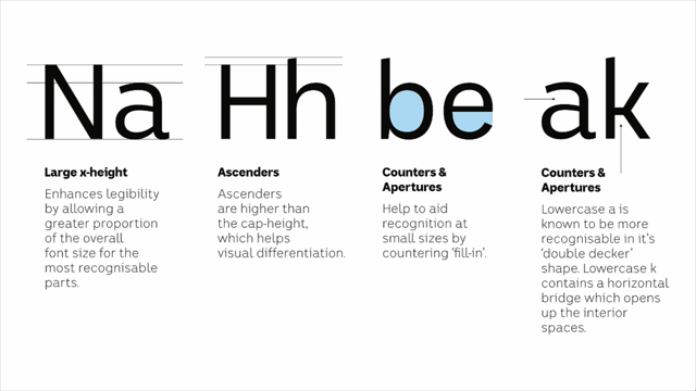
Do it by text message, because I don't see how you can live with yourself. Alright now just to expand on legibility a little bit. Here's another example of issues of legibility in typefaces and stuff that I kind of have to be aware of. So at the top there, Gill Sans, a typeface designed in Britain in the 1930's, and those four letters it reads like the world lill, but that's actually a capitol I followed by a lowercase I, followed by a lowercase L, followed by the numeral one on the top line there. And you can see how very similar they all are and there's clearly gonna be legibility, readability issues there. Or if you look at the font at the bottom, which is the same set of characters in the same order, you can see lowercase I, for instance, has that little horizontal hook at the top, helps them to become more distinguishable.
The L has a curve at the bottom and the number one also has a hook at the top. Sometimes one numbers have a baseline as well. And that type at the right is just the same thing but at smaller sizes to try and give an indication of how this can be a problem at reading sizes, rather than displayed massively on screen or some more common examples ones that I try to build into my fonts where I can, and I'm just gonna try and explain for various reasons, it's not necessarily because they're wrong, it might just be for accessibility reasons. The K on the top, for instance, has a little bridge in the middle and that helps to open up these kind of apertures top and bottom which makes it more visible at small sizes. The zero with the slash through it, good for passwords when you don't know if you're typing an O or a zero. If you look at that P and Q, look at the little spur on the top.
So a P and a Q are often almost a complete flip mirror image but dyslexics apparently one of the issues with dyslexia is that they can see letters flip so if you look at the second P and Q, the spur on the Q is thinner and a bit pointier, this is a subtle cue to help those people recognise them.
This one at the top's a really cool G, I love that G, very, very hot for that G.
But at very small sizes.
Yeah I'm a bit weird about letters like that. At very small sizes it filled in, there's counter spaces filled in and it just became more sensible to use a standard G shape. This Y at the bottom, I loved it, it looked great within the design that I was trying to put it in, but again at small sizes it could be mistaken for lowercase U. So couple more just to wrap up.
Things like E and S for instance, N and A they have what we call apertures and so if I was just to use my cursor to point to that bit in Helvetica there, that's like a harbour that a ship could sail in or out. That's called an aperture in a typeface.
And one of the things I like to try and do is open those apertures up more, in particular in S, you can see that's a much more open space rather than this difficult to get into kind of area or A doesn't curl all the way over, it's kind of more open.
For me that's also legibility feature, it helps them to be more recognisable at small sizes. So that's it for me.
I just wanted to give you a little insight into the minutia of my world of legibility. I don't know if we have time for any questions or not. (audience applauding) - Thank you Wayne for exciting us about typefaces. Now we know that a G can be hot.
- I hope you're all as excited as I am.
- I'm sure we are.
- Just like the stress at old man choreography. - One question, a souffle effigy, what does it taste like? (laughing) - Hot.
- What's your, I mean one serious question, what is your attitude to copy writing? Because you design typefaces and then people take them away and write stuff with it. So what's your relationship to that? - My attitude that typefaces and the text that's written with them are inextricably interlinked. It's, to me, you can't be a designer without being a good writer as well or without having a good sense of language. In particular spelling, but language construction, grammar, all that sort of stuff.
Some of you may know, there's a very famous case of American designer David Carson who was the art director of Ray Gun Magazine, I think maybe mid, late 90's, and he received from a contributor an article about the musician Brian Ferry and as he was designing the magazine, he was reading the article and he thought it was so poorly written that he printed the entire article in Wing Dings and sent the job to print that way as a little protest against the poor quality of the writing. And when asked about it by his bosses and interviewed about it, he said, well it was just really shit writing I don't see why it needed to actually be there. He actually sent it to print that way and ironically became really famous for it. Look in an answer to your question, I really believe that you can't be a designer without being at least a reasonable writer as well.
- Excellent, good answer.
Also if you're looking for a more lucrative job, Japanese typefaces, right.
- Yeah the training's pretty lengthy I think. - Alright, okay.
Thank you very much Wayne.
- No problem.
- Cheers.
(audience applauding)