(airy pop music) - I'm gonna take you through, well let me just start by saying think about the most frightening thing you've ever done. In fact, let's ask you all.
Let's start over here and we'll go around the whole room. (audience laughing) No.
This is one of the most frightening things I've ever done and I'm hoping that as I talk about it and go through it, it'll become apparent why it was so bloody frightening. But I was asked to design our national typeface. How do you capture your national identity in a font? That's what I was asked to do, originally.
So, I'm gonna take you through that process and at the end, I'm gonna try and finish with-- So I'm big on, those of you that met me, you know I'm big on jokes.
I love my sense of humour.
I'm gonna try and finish with what I consider to be the best font joke ever.
There's about four of them in the world.
Nah, there's more than that.
During this process, you'll see when we get there, but I came up with this joke about fonts, I thought oh this is the best font joke ever. And the best part about it is I couldn't use the joke. So anyway, we'll get to that.
First, a little bit about me.
How did I get here? How did I become the guy that they asked to design a font that represents a whole country? I certainly never represented my country in any sporting events when I was a kid.
So this is my one chance.
So, let's start with this.
This is a 1977 Letraset catalogue.
And this is the place where typefaces became, where I first really became aware of what a typeface was and how much they meant to me.
The story is that I had a family relative, now I live and work in New Castle, I grew up in New Castle, and I had a family relative in Sydney that was a designer, a graphic designer, in the 1960s and 70s.
And this family relative died and the art studio had to be wound up.
And my dad was the family member who volunteered to go and do that.
Do he just disappeared one weekend when I was a kid. I was maybe, I think from memory maybe 10 or 11 years old. And he came back one Sunday afternoon with his car full of stuff from an art studio.
And it was books, and pens, and pencils, and brushes, and inks, and all sorts of fantastic, arty kinds of goodies. And he said to me and my brothers, he said, "Look, this has all got to go to the dump.
"But before I take it do you want to have a look through it? "Is there anything you want?" So there was this fabulous cornucopia of art stuff. But I still remember coming across this book and it was the first time that I became aware that there was such a thing as different type faces. Now starting in a really kind of daggy place, because this book, I should have put an internal, a screen of the internal pages, but it's full of all those really crazy 70s font. Like the Goodies font.
Someone mentioned to me the Goodies font.
And I just became really enamoured with typefaces straightaway.
It never occurred to me that I could make it into a job. I just went through the rest of my high school years. And I went to uni and started doing a degree that what amounted to journalism.
It was a communications degree and it kind of morphed into design as I was going through uni and straight after uni. So I became a graphic designer.
And it became apparent to me that there weren't enough, like I didn't really have access to the type faces that I wanted.
A whole lot less available to us as designers back then than there are now, in the 1980s when I started. And I just really wanted access to more and better type. And it slowly dawned on me that I could start making type faces and customise the work that I was doing with type that did exactly what I wanted because I had built it myself.
During my first five or 10 years of working, I realised that I wanted to be a full-time font designer. I wanted to concentrate or specialise in type faces. There's no where in Australia that taught type design. There still isn't, anywhere.
You can't go to a type design school.
It's actually quite hard even to do overseas. You have to go either to Europe or the States. And there's only a couple of places, two or three places in the world where you can learn to do this at a professional level. So as a result, I'm completely self-taught. So I made my own job over a long period of time. It took me, I'm probably into nearly my 20th year of doing that from when first started to think, "Hang on mate, how do I make fonts," and started to look into it.
Just doing it a bit on the side while I was working full-time in agencies, to eventually leaving agency land in 2006 and going to work for myself full-time.
So, I often say to students who say, "Oh, how do you get really good at type design?" And I just say to them, "Just be a really stubborn bastard like me." It's a really good character trait to have because I just refuse to give into it, or refuse to give up.
But I did have to work really hard to find the information that I needed.
To learn how to do type face as well.
I don't live in a cool world of design.
I accidentally specialised in text type faces rather than display or other type faces.
And it's seriously anonymous work.
I often say that if I do my job properly, nobody should notice.
The point being that if you're reading a type face, you don't want some weird character to suddenly pop up that distracts you from the act of reading. So, it's not really a cool thing.
It's not something that gets up for awards at all. It's meant to be functional rather than fancy. Although, I did win a bike once.
When I was about 12, I painted this picture of a cricket, I was obsessed with cricket at the time.
Can anyone tell me who the cricket player is? See if my drawing's any good.
Allan Border? No, incorrect.
Close though, right era.
He said Greg Chappell? Excellent.
Greg Chappell is my hero.
So your prize is you get to buy my drinks later. (audience laughing) So today, as well as designing type faces as my full-time job, I also teach a lot.
I teach at university.
I teach communications and design students about typography. But I also run a lot of hand lettering workshops like this one, where it's compulsory to have a hipster beard if you attend.
(audience laughing) This one, ironically, was in Melbourne a couple years ago. But I do a lot of these.
In fact, I've got one coming up in New York City in June. June the 24th.
So, if you have any friends in New York that are interested in learning hand lettering, please let them know, 'cause I really need bums on seats. Okay.
Fascinating a guy as I am, let's talking the project rather than me.
So this is the brief.
There brief that I got from ABC.
Design your national type face.
I had a few meeting with them originally where they said. "We've got this project, "Are you interested in pitching for it?" And there were other, I did have some competitors. And I went though those first few meetings, and they said, "Okay, well here's the briefing document "that we're distributing around." it was like 13 pages long.
This long document, it was the most comprehensive brief that I've ever received for anything.
It was really well thought through.
It was obvious that the design team at the ABC had really done their homework and had done a lot of background work before even approaching me the first time.
The brief included really useful context with design leaders, people such as Hans Holschbach who was the designer behind the current Woolworth's brand, and is known as very much a design leader within Australia. They sent me a bunch of videos that shot for internal use only.
I wanted to show you snippets of them, but I'm not really allowed to.
But, they are designed, so people such Hans Hoschbach, Reg Mombassa, and really well known people in the Australian design scene.
And they said to them, "What does it mean, what's the Australian style? "What does it mean to be Australian in a visual sense?" They're trying to understand what the national character, or the national identity is, but from a design perspective. And for me to be able to watch that stuff, so each of these, there was about six or seven of these interviews, and they were each an hour long, and for me to watch these people talking about this was unusual in terms of a brief, but it was really super useful background context for me. But through this 13 page brief, it distilled down to three points, three general points. This has encapsulated my task.
How might the ABC create a more coherent experience for its users? I didn't think it was particularly incoherent. But when they took me through and I started to look at all the digital platforms and things, there was a lot of different type faces currently in use and any large organisation faces this issue having-- I saw presentations yesterday about design systems and things like that.
It is a big issue for big organisations.
Number two, how could this system encapsulate our multicultural and eclectic Australian identity and express a contemporary and relevant ABC? Number three, how can the ABC type face become a uniquely distinguished and recognisable master brand identity carrier? So, all that in a font.
I had absolutely no idea where to start.
After reading this and distilling it down to these three points, I thought, "I don't know, no idea." But I do remember thinking that I'm never gonna get a better commission than this, a better job than this, a better opportunity than this.
So, when I really thought it through, it came down to point number two mainly.
So point number one I think is reasonably easy. Whatever fonts you choose, you just have to apply them consistently.
And that's part of bigger design systems and all of that kind of stuff.
But for my personal part of it, was just to look into a type face that would be coherent almost no matter what I did. And I thought, "Well okay, "I'm all over that point number one." Point number three was also not so much my design brief. Or not so much my problem.
'Cause these fonts were part of a wider branding exercise. I was working along with a design team of I think a dozen people at the ABC.
So I already knew that my type face would have a flavour all of its own, so-- And it's unjudgeable.
How do you judge whether something your national character? So, point number two that leads into point number two. And I think the difficulty on that makes up for everything else anyway.
And I just remember thinking this actually. (audience laughing) Let's see if I can get this to play.
It's really important that you can see it.
Mesmerising, isn't it? You could just watch that over and over again. And this is just swimming through my head at three in the morning, you know? So I felt this really big responsibility.
So the first thing is okay right.
I've got to find a way to design a font that represents Australia in a sense.
The first thing I need to know is what our national character is.
What is our national character? So, like all quality researchers, the first thing that I did was ask Facebook. (audience laughing) Good start way.
Yup, worked really well.
And I got all sorts of really stupid stuff. As soon as people started to reply, I thought "Yeah, okay, I should have known better." But, I got stuff like this, it was educational in a sense.
Australia and Carn and Maaaate, all of that kind of stuff. Thongs, barbies, beaches, beer.
They're all this cliched idea of what Australia is. But there's some truth in it.
But some really good Australian words came out of it as well.
Now I've since started just collecting Australian words in the Notes app on my phone.
I've got this list of about 100 of them so far. I came across stuff like this, rip snorter and tightarse as one of my absolute favourite Aussie words. We were talking about this at dinner last night. Mullet, I'm pretty sure that's an Australian word. I always wanted a mullet.
I just wanted hair actually.
(audience laughing) Yair nah, yair nah, everyone know yair nah? Yair nah I agree with you, yair nah.
Whether you're agreeing or not, make up your mind. Knob, I love knob.
I love knob as a word.
Kangawallathump.
Has anyone ever heard kangawallathump? Maybe that's a regional thing.
It's this kind of fictional animal.
So it's kind of like drop bears.
And we were also talking about those fictional Australian, Australia's dangerous wildlife, and drop bears, and all that sort of stuff.
But just quickly, and I've added this since Sydney, did you know there's a dangerous Australian animal that really exists, and I never knew about until only a few months ago, and it's this.
Bush lobsters.
Did anyone know there were bush lobsters? I didn't know.
This really exists, it's a real thing.
This is a photo from the Gold Coast Times.
And in the Gold Coast hinterland, there are these creeks and small rivers.
And they're like crawchies or fresh water crayfish. And there's this particular breed of them that lives up in that area and sometimes they crawl out of the water and through the forest.
And you could be hiking along a trail and be confronted by this thing coming out of the bush. And I'm just like, "Really, bush lobsters? "That's cool but frightening, really frightening." I'm not convinced it's very big.
It looks very big in that photo.
But I don't think it's more than about four feet wide actually.
(audience laughing) Anyway, I'm still trying to work out what Australian-ism is. Or what the national character is.
Just getting back to Facebook, there were some interesting things that came out of it. So anyone know what this number is? The Don Brahman number, known as the Brahman number. So that was Donald Brahman's batting average across his career.
And one guy said to me, "That's Australia you know, 99.94." And I said to him, "You mean in a legend kind of way? Donald Brahman was a legend.
But he said to me, "No, no I didn't mean it that way. I meant in a close enough is good enough kind of way." (laughing) So all this Australian stuff's coming out is all this failure stuff.
And I'm oh, I don't think that's what I want to project. But it did start me thinking.
And I thought well okay, let's do some more research and look around.
And I just started poking around on the internet and Googling, "What does it mean to be Australian?" And I started reading things like Tim Winton for instance, who's known for his insights into the Australian character. Out of all that Facebook research, there was one phrase that came up, that was wide brown land. Now the phrase wide brown land would be familiar to all Australians.
It's kind of a reference to the inland, the desert, the lack of rainfall relative to other continents that we have.
So it's a unique Australian identifier.
The problem is almost all Australians live on the coast. I know I do.
And I don't particularly personally identify with wide brown land.
Going in there is great.
I love the centre of open space and all that. But it's not something that's my day-to-day life. Or that I feel represents me.
This image here, anything beach or coastal, I think represents most Australians in a way that's less cliche, and possibly more accurate than wide brown land.
So I started thinking that through and I said okay, inland, coastal, wide brown land, beach, all of that. Is there anything that's common to these? Or is there a unique identifier? And it did lead me into thinking about this sense of open space.
So here I am with another hindland image, but I'm referring to here is the sky.
Or what Tim Winton, the author Tim Winton, refers to as the impossibly open sky, dwarfing everything.
And I thought that was a lovely phrase.
I thought that pretty much describes what our sunny days, not that here in Melbourne you'd know what a sunny day is. But (laughs) all of the rest of Australia, sorry (laughs). Tim Winton also says Australia remains a place with more land than people, which I thought's another really good quote as well. So I kind of latched onto this idea of Australia being where we have space to burn.
We have this luxury, this sense of space.
I once heard, years and years ago, on a TV programme, and I can't even remember the context, but it was a Russian ballet director.
Director of the Russian ballet or something, who was referring to an Australian ballet dancer that he'd come across.
And he said, "I just couldn't understand what I was seeing "until I realised that they dance "to the space in the stage." And it was a reference to this idea that you grow up in this place where you don't have to worry about being crowded, if that makes any sense.
So, and of course anyone that lives in Europe or Asia, or has been to Europe or Asia, they often come back to Australia and they go, "You just don't understand how crowded it really is until, "or how uncrowded Australia is until you go there." So this idea of open space, in my view, it applies equally to outback landscape, as coastal environments, and it ties into this notion of connection to land. I think we all kind of, I think everyone around the world feels a connection to their country, where they grew up. But I think it seems particularly prominent in Australians. This idea of connection to land and the open horizon that comes with it.
Whether it's sea and sun or waves and dirt. So, through my research, cutting a long story massively short, it distilled down to a few elements.
I thought okay, proudly inclusive, I think that's fair to say about Australia. Larrikin element, Australians will know what I mean by that. For the overseas contingent here, Larrikin means that little bit of rat bag in all of us.
Rat bag there's another word you'll probably go, "What's a rat bag?" In fact, another conversation we had over dinner last night. But the open space one was the one that I could, I felt like I could latch onto that as a national characteristic, that had a tangible element to it that I could possibly put into a type face. So, quick side track.
Next stage I thought okay I've got this general, cloudy notion of national character.
What about other type faces for other countries? Let's have a look at some of them.
And again, there isn't many.
There's very few that I could find.
This is the one that I could find that was specifically designed to represent a country. Sweden Sans, designed by some Swedish designers for the Swedish government.
Now Sweden Sans has this apparently designed into it, this idea it's called Logan, which is L-A-G-O-N, which a Swedish word that means not too much and not too little, Which is very much a Swedish characteristic apparently. Don't get too big a head type of thing.
Also taken to mean balance.
And I put the capital Q there because I was talking to some Swedish people about this and they said, "Oh, that Q is so Swedish." I said, "How is it so Swedish?" And they said, "Oh, that thing down the middle, the tail. "It right in the middle.
"It's not on the right or the left.
"It's not too much and it's not too little." So slowly I'm piecing together, little snippets of information about how you can go about imbuing national character into a font.
The next one that I thought about was, I think I've missed one there somehow, the British Underground type face.
This was designed by Edward Johnston in about 1910, 1911, something like that.
And it was designed as a typeface that worked for transport systems.
It wasn't designed and meant to be uniquely British. It's become British because of the iconic nature of that imagery.
I've never been to England, but I know that, and I look at think that's really British.
The colour scheme helps a little bit there as well. So this is very much a British typeface and has a British vibe around it these days. There's an association that can't be overlooked. And similarly with Helvetica.
Anyone that knows the genesis of Helvetica knows it is designed by a Swiss, actually two guys who were Swiss.
And it's known to have very much the Swiss national character that oozes out of it.
And so they'd be characterised by things like precision and thriftiness.
Two very well known Swiss national characteristics. And Helvetica's very much like that.
It has no fancy stuff, no features that would attract attention to it or anything like that. But again, it wasn't intended to be that way. They didn't design it and say let's make this the definitive Swiss typeface. It's kind of become that way.
So, there's some more research that wasn't all that helpful for me.
So then I get to the point where I go okay, I've got to start drawing something.
I've got to start making up this font.
Where do I start? I had no idea.
Really had no idea.
But, here's another good lesson, you just start. You just start scribbling.
That one started with some stuff like this. I looked for Australian signifiers within letter shapes. Things like serifs shaped like Uluru.
Or this heavy baseline that connected all letters that represented a connection to land.
These were some of my really early scribblings. Now if you're looking at that and thinking, "I don't know about that, Wayne." Well, you'd be right because they were really dumb ideas. They just, that's not gonna work.
Can you imagine a font and I said, "Oh, that's Australian 'cause the serifs look like Ularu?" Like, "Dude, what the fuck is that?" That's what my reaction would be.
But you gotta start somewhere.
And it helps you to start thinking through other things. So, I thought long and hard about including these and I thought that's embarrassing I'm not gonna put that in. But I'm just trying to demonstrate the thought process and again I think this is another valuable lesson for students, is not to edit yourself.
Anyone that does writing will know that is a good principle. Don't edit yourself as you go.
Anyway, let's get onto some more sophisticated representations of how I started to think.
Okay, wide open space, connection to land, how can I build that into a font? So here's a few examples.
So, inclusiveness in the top left of the screen there. You can see that those, let's use my little laser pointer here, those openings there in the letters, so there in the S and there in the E, they're known as apertures in typographic panels. So I started to draw these letters that had these really open apertures.
And the idea was that I thought I could sell this on the idea that it's kind of wide open arms or inclusiveness in a way.
Eh, not sure.
The ABC worm, this thing is known as the worm to ABC. It's real name is Lissajous which is a French word which means something scientific about that particular, it's a wave shape of some kind.
And I had this idea that I could round the corners of some of the diagonal letters and it would be a visual reference to this. I thought I was on to something now.
I thought yeah, oh yeah, I'm starting to get somewhere here. Great, you beauty.
And in terms of connection to country and open space, I had to be more subtle about that.
So, here's a well know Sans serif font, Adelle Sans on the left.
And I had this idea that I could just widen it and widen the measure and it would have this generous proportions or this sense of being a bit more generous. And you can see that my initial drawings were much wider over the same letters than that. So, I started to just sketch all of this stuff. This is the sketch book that I documented all of this. I just bought a little sketch book and documented all of this.
In fact, I've got it here with me if anybody wants to have a look through it. Pages and pages and pages of silly stuff and notations and bits of stuff that I found in quotes and things that I've taped in there.
But there were a lot of rubbishy ideas in there. So, this is one of the first sketches that ultimately, this one, so these two here but particularly that one, ultimately is what the font largely came from that. It's a far cry from that but I can see it in the final result which you'll see in a bit. I can see the DNA of it.
I think, I hope.
So that from that point, sketching in a sketch book and trying to work it out.
I thought I need something that's got enough detail in it that I can take to the ABC and say here's my concept. I still hadn't even sold the concept to the ABC. I still hadn't even convinced them that, and I hadn't actually officially been awarded the job actually.
So, I started drawing all these letters.
And these are on tracing paper, A3 sheets of tracing paper. And you can probably see underneath there the ghost of others.
So there's a big stack of these.
Ultimately, I did about 40 of these A3 alphabets. Well, some were alphabets, some were a phrase. The home of Australian stories 'cause I wanted to contextualise it within words.
I like to start all of my stuff on paper.
I always draw on paper first.
So here's four, the full screen view of four of those sketches.
And you can see there are small variations. You can see this one's got kind of a serif on the bottom. This one's got a semi-serif.
You can see a little hook exit stroke on there in the A. And this one's totally sans serif, it has no serifs at all. And this one was a more modern, kind of a weedish interpretation as well.
But you can see the rounded corners on the diagonals. Clearly apparent there.
The wide measure is in there and the open apertures in the S and so on, and the E.
Those are really open shapes.
Also, it's worth taking note, see this double decker G shape? Everyone knows that there's a normal shaped G and this double decker text reading kind of G. That will come up later on.
So, I get to the point where I've got to go to the ABC in Sydney at Ultimo and present to this room full of people and tell them my concept.
So I had this pdf.
It was about 40 pages and it took me about 20 minutes to go through.
And when I got there, and I'm really busy setting up these students with a camera, they told me, "Oh yeah, we have to film this for ABC records. "We have to, ABC archives." I just thought thanks, no pressure, you beauty. Really, really frightening.
I hadn't still, I was yet to convince myself that wide brown land was a worthy concept for a typeface. Or that I'd managed to get it in there at all in any kind of meaningful way.
I was deeply apprehensive.
I was hopelessly nervous.
I felt that my concept was really, really undercooked. I was not confident at all.
But, I thought to myself, "I'm here, I'm not gonna turn around and walk out. "I just have to go through it and just hope for the best." I thought I had 50-50 chance at best.
But, as soon as it was over, my main contact took me aside and he said, "That was fantastic, it did everything it needed to do. "And right here on the spot, "we're giving you the green light to go ahead." I went, "Okay, all right, beauty, I think, "now I've got to actually do it." So we get to the first vectors.
The first digital outlines.
The first time I've taken it off paper and into any kind of digital format.
Bear in mind that up until this point it's been weeks and weeks and weeks.
I'm finally at the point where I can start to produce something tangible.
All the conceptualising is done, now it's just a matter of doing it.
But the thing is we've barely begun, that over the total life of the project we've still barely begun.
This was really, really long, the longest typeface project I've probably ever worked on.
So, this is the first alphabet that I produced. The first basic typeface.
It's not typeable yet.
It's just I used Adobe Illustrator to make vector outlines. You can see the wide measure, hopefully.
It's quite a wide, generously wide typeface. You can see the open apertures of the letters, and the S and the E, and all of that stuff that I talked about.
Even the rounded points are in there.
There and there and there.
The problem was, they did some early tests and it came up pretty short.
So this was a test screen that they sent me. They uploaded it to some test content and said this is the font here, and up here, and all through this is kind of a news article, and so on. And I looked and at first I thought, "Oh that's the coolest thing.
"It looks like real ABC stuff, "and there's my font right there on screen." But the problem was, when I really looked at it, it's got some, uhm, it lacks evenness of colour. That's a typographic term.
So if you were to look at a paragraph or a page of text and squint your eyes a little bit, you're looking for a nice even grey.
But, if you were to do that, you can probably see the G's in particular. See those little double decker lower case G's there. They're kind of bloby.
They create this dark blob.
That was one of the first problems.
So straightaway the double decker G, we knew had to go. I loved that G (laughs), I really do like that kind of G. I'm obsessed with trying to get one of those really nice G's, but you know.
And this was the beginning of a long period of testing. A long period of let's make this fall over and make adjustments and see how we go.
The strategic rounded shapes, these dudes, they also got dropped, which kind of surprised me.
That was my one direct reference to the ABC, and I thought that was something that could be a signifier for them in the future. And it was quite, I thought, quite a unique look as well. But the design team reasoned with me.
They said well that makes it kind of a display font rather than a text font.
Or a font for headings and attracting attention rather than something that's there for reading. And I thought yeah fair enough.
They were right, they were right.
It did reduce a little bit of screen crispness as well. So, rounds don't tend to represent on screens as nice as crisps corners and edges.
There's also this thing, if you look at that enlargement there, I had these tiny faceted corners.
And this was another, I hadn't mentioned it earlier on, but this was another idea that represents Australia because thick corners get eroded off over time. And Australia's the oldest continent in the world. Another one of those dodgy ideas that I had in my early sketch book.
But it got dropped as well because at small sizes, they were invisible anyway.
All they did was kind of soften those corners which partly what I wanted, but they wanted that really sharp, crisp look. And it felt that it aided legibility and I thought fair enough, it probably does. So, here's a little comparison because about this time, it's becoming apparent that my ideas around national identity and national character were mostly being compromised or dropped because they conflicted with legibility outcomes. And as we talked it through and did more an more tests, it became apparent that the legibility outcomes was the primary driver here, the main thing that we needed it to achieve. But there were a couple that remained.
The wide measure, the wider width than most. And here's a little comparison with Helvetica there, and the ABCSans font here.
And there's a small size version so that you can try and get a contextual reference on it. And those two stayed in because they were both legibility aides.
The open apertures help the letters to be recognised, or stopped them closing up in small sizes, very, very small sizes, and under course screen pixel grids.
So both were subtle but both really important. So, legibility rather than national identity was emerging as the primary driver.
And looking back, I think that the national identity thing kind me over the line at the beginning, but became less important as time went on.
Which was okay with me because function should trump form I think. Or substance should always win out over style I think. Very much a minimalist kind of guy.
So, as we went through this testing and retesting, all of the characters were examined microscopically. So, here's just the A, and there's six or seven separate outline versions of it there.
This is there to show you the minuscule differences between different versions of each letter.
Some letters went through more versions than others but A was one of those ones we'd shift if a little bit, see how it represented on screen, shift it a bit more, that kind of thing.
And we also had to start looking much more closely at legibility features that could be built into the typeface. So, here's an example of letter shapes.
And the shapes of which are specifically dictated by legibility considerations.
So, that Gill Sans on the left.
Gill Sans was a 1930s British typeface.
Those letters from left to right, are capital I, lowercase I, lowercase l, and number one.
Now, you can clearly see that there's legibility issues there.
I use the word illustrate to illustrate the difference. And so here we've got a little horizontal bar on the top of the lowercase I.
And we've got this hook on the base of the L. And we've got a horizontal bar on the top of the numeral one.
Sometimes numeral one can have a bar across the base as well.
And so, those shapes are there specifically to aide with legibility.
In particular, so this was 1930s, but it's a lovely typeface.
It's got beautiful rhythm and it's known as being quite good to read. But can you imagine passwords in that area there? This was designed in a time, well before passwords existed. So, more legibility features.
The zero with a slash through it is one that was asked for by the guys at ABC because they were worried about passwords was one that came up.
They were worried about zero and capital O being confused with each other. I've faced that personally trying to get passwords right. So they requested a diagonal stroke through it. But this also was later dropped.
I think probably rightly so because that creates a particular kind of look to it. Although I have actually seen it on TV since then, but I've also seen numbers, zeroes used without it. So, I'm not sure.
Originally they had me have the slashed zero in the standard zero keyboard position, but later it was moved to be come an alternate so it's accessible by users without being there under the zero keyboard key. Some other areas in which legibility features come out is so it's kind of easy for designers and type people to assume that legibility comes from letter shapes only. So the stuff, the little bar on the I and the hook on the L that I mentioned.
But there are a lot of other things that you can build into typefaces that aide its legibility. And here's a few examples.
Proportions and size relationships are tremendously important.
And legibility ultimately comes from a combination of all of these factors.
Some balance of all of them.
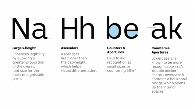
So you can see for instance that the lowercase, what we call the x-height, which is the height of the lowercase letters, is actually about three quarters of the total height. So, a font with a high x-height is known as being more legibile at small sizes because more of that available space is taken up with the action area.
Ascenders, you can see that in a lot of typefaces and in this one, the ascenders are slightly higher than the capital letters.
So, capital letters have a natural advantage because they're generally bigger shapes, they're always at the beginning of words.
We read left to right.
They don't need this kind of full size height as well. The big open counters, it's possible to have fonts where those counters are closed in or not as open. And that the aperture thing that we talked about as well. There's this little horizontal bridge in the K that helps to push the diagonal bits out.
So you'll know that standard K just kind of comes like that. But this helps to open up those negative spaces. Negative spaces really important feature of legibility. There's also some accessibility features built in as well. So, accessibility in typefaces, it probably means something a little bit different to the word accessibility in the web community. But definitely related.
So for people with reading difficulties, like things such as dyslexia, but there are others as well. They can flip letters, letters that are mirror images of each other can be problematic.
So we, even though this had to have some basic shapes, what we did do was we minimised the width of the spur there compared to this one.
Or a U and an Ne that can be flipped visually. We made sure that this join came up and joined the stem higher than it did there. So if I was to flip those and lay them over the top of each other, you'd see that they were relatively distinct shapes. All of this came out of round after round after round after round of testing that included screens, which I'm gonna show you in a minute, an accessibility expert, a reading and disability accessibility expert that was employed by the ABC, and all sorts of stuff like that.
It's also common these days in a font to include more than one set of numbers.
Some fonts actually have four separate sets of numerals. I included two, the two standard ones in this. So there's your, at the top, your standard numerals that you'll recognise. Here at the bottom, they're known as old style numerals. They're sometimes called lower case numerals. And the reason they exist is because they have better rhythm in reading text so that the eye doesn't jump up and down to capital height with like the same as capital letters in the middle of a sentence.
So, I personally really, really, really like these numerals. But ABC wanted to put those as the primary keyboard numerals and I had to include the bottom ones as alternates. And I was a little bit annoyed and bitter about that. Also I had this other things came up through testing as well, and this was one that I hadn't really considered.
But I call it the J and EQ dilemma.
Now I designed capital J that comes below the baseline because it allows for better spacing.
It means that if there's a letter before the J, it doesn't have this giant hook that pushes the previous letter away and creates this space there which I think is bad for rhythm.
So, I really like those.
And I also like this EQ with the tail that sticks below. But you can see they started sending me these examples of names that they wanted to crunch the space as much as possible.
So, poor old Jennifer Quimby, Associate Professor. I had to come up with an alternative J, and alternative EQ that were accessible through the font through manual accessible rather than under the standard keyboard places and positions. So, it went through a lot of onscreen testing. We spent a day with the accessibility expert, and the team, and the design team, and they collected together as many digital devices as they could.
We had desktops, we had tablets of all sizes, we had laptops, and we would upload a beta version of the font to some live content.
And one of their developers would run it live for us. And we could look at some test text and some live content on various different screens. Adjustments made on the spot and it allowed us to refine some of those shapes on a much more refined level. So, the final alphabet looks like this.
The final basic alphabet.
After all of that, we've come up with a sense, I've had people say to me, "Well after all that you've come up with this font "that looks like a million other Sans serif fonts." And it does and that's kind of the point.
But it's also unique in lots of different ways that I'm hoping comes through here.
You'll notice that I included the non-lining numerals only because I prefer them.
Bastard.
Have I mentioned that? I don't know if I've mentioned that.
So, from Illustrator to Fontlab.
So I've still got this single set of vector outlines, it's still not a working font yet.
It's a beta version.
After than, I then have to fill out the character set. And so that's a standard character set if you want your font to be able be used in any international way or in any languages. And obviously that applies to the ABC.
You'll see that there's a lot of accents that some of you will be familiar with some of them but not others. But there's also all sorts of stuff like standard fractions and currency symbols and millions of different punctuations that you will all have seen before.
But it did take ages.
Especially the kerning, where you have to set the spacing between individual pairs. So then it was time to generate other weights. So that was the original one there, the regular. So out of that I extrapolated a lighter weight, a bold, and a black weight.
And one of the tools that I used to extrapolate is this. And I'm hoping that plays automatically.
So this is a form of interpolation.
So Mike mentioned yesterday about variable fonts. This is the currently existing precursor to variable fonts where you can set parameters of the lightest end weight and the boldest end weight, and you can auto-generate, to an extent, any point in between.
It's not a perfect system, but it did help me to reduce the workload in some of those.
But interpolation doesn't work when you get other weights like this.
For instance, you can't generate an italic through interpolation.
They wanted a bold condensed version, which I still haven't seen in use anywhere, but I was required to produce it.
And there were these two weights at the bottom which were rounded like sausage ends to be used like a softer looking version of it to be used for children's programming.
There was also three weights of serif typeface which were designed as part of the whole family but for used for internal use.
So you won't see these out in public anywhere, but they were meant for internal documentation within the ABC.
The Serif and the Rounded share a common DNA and I'm hoping that this demonstrates it.
So, it's not like we take the Serif version and cut the serifs off and you've got a Sans. It doesn't work quite like that but I am hoping that the portions are shared and many of the legibility features are shared so that they can live together.
At the bottom out of the Serif typeface, I included a few of my favourite characters. I really was proud of those K's and that EQ. And here's my numerals, I love those numerals. Lowercase numerals, what you call them.
Have I mentioned that? Can't remember.
So, anyone's interested in the techo bits of how you produce a font, this is a screen for my software programme called Fontlab. And there's just this little hole for each keyboard character, regardless of how many characters you have. I've seen fonts that have over 10 thousand characters in them.
But this is a screen from the bold weight of the ABC font. Really tedious.
You can see that it comes in, each letter comes in as a vector outline.
It's got little bezier handles that help you to manipulate it, but I did all that manipulation elsewhere. I have to set the side bearings of every character. So that's this line here that decides how much space falls between them when you naturally type it and that's really tedious.
Then after that, once that's set, I have to do the kerning. So you can see this little number down here says 777. That means there's 777 kerning pairs in there. Or, to demonstrate, you can see that an O for instance, with a T has be manually dragged backwards so it tucks in underneath.
So that whenever you type that particular character combination, in that order, T and O, the font knows to track it inwards a little bit so that it maintains your reading rhythm.
So, we get to the fonts in use.
What happened once they were delivered and all of that sort of stuff? Here's the first place that I saw it, which was in the ABC's online mobile app.
So that was the rounded weights there, here, and in here. And I was like, "Oh my God, there's my font. "It's out there, it really exists." The next one to come along was the ABC mobile app, the ABC News mobile app that looked like this on an iPad and an iPhone.
I was thinking of just live plugging it in, but I won't do that.
And so this was here's me going, "Oh my God," on my own iPad in my own house and here's my font and it's this kind of really happy but also panicky moment. The next place I saw it was on the ABC's corporate website. So the About the ABC part of their website. It has since appeared on their News website which is here. Although curiously, and I'm not entirely sure of the reason for this, 'cause once I release it, I don't have control over what happens to it. But curiously, they've still got Arial.
Arial, uh, shutter.
I don't understand, I do understand, but Arial is, my understanding of Arial is it's known as not being especially legible. But maybe that's just amongst the world's type legibility nerds.
I mean you can read it, everyone can read Arial, but known as not being the most legible typeface in existence.
But this was great for me to see this-- Oh, when will I learn how to drive this thing? So, there it is there and across the top and in the headings, the blue headings here, and this sort of stuff.
But yeah, curiously Arial.
It's still that way as far as I understand. And only a month or so back it launched on the ABC News Channel.
So they did a news rebrand that had been a long time coming. And it involved my font.
And I'm obsessed with weather.
I love weather and here it is, my font in the weather. And that was kind of the pinnacle of life achievement for me.
(audience laughing) Some of the things I've been looking at and I like about it, and here's the standard numerals, not the up and downy ones. That's the technical term, the up and downy ones. I'm looking at these and I'm loving the look of them. I'm pretty proud of them.
So I'm suddenly interested in the finance news part of the broadcast.
It reminds me of something that a guy I used to work with, a guy named Daren used to say, 'cause we'd be talking about fonts we love, and he'd look at the eight for instance and he'd say, "You know, if I was an eight, "I'd want to have sex with that eight." (laughing) That was his way of saying that he really liked that eight. I'm like, "Dude, that's funny, I think, I'm not sure." This was taken at my brother's house.
It's got this fantastic, big, super high def, massive TV that's the size of a tennis court.
And it helped me to see it.
My own TV's a standard def and it wasn't really representing all that well. But it helped me to see that it was really going okay. So, it's really weird to see your work on TV every day. It's like a child that you send out into the world and you worry about then, but they have to look after themselves in a sense from then on.
And it's also being used in really large, as well as text environments as well.
So, it's a big ask of a typeface to be able to be used in these display ways, but also be able to be used in reading text in mobile apps and on the web.
So, all good, all good.
But there are some, an issue or two that's cropped up. I'll try to get through them really quickly. Just to give you a bit of an idea of some of the pitfalls that we can face.
The L, I.
Remember I was talking about kerning before. The L, I is a really common pair, and I've somehow buggered up the kerning in that. It's just not right.
You can see it here.
So, here in its natural environment, it's just too big. There's too much space in there.
And ironically those legibility features, the hook and the little bar on the top have actually made it much more difficult for me to space those two letters.
So, if they were just straight vertical bars, I'd be able to manually calculate that spacing perfectly. But there's a judgement involved here and it just looks too big.
And I even went back in after I delivered them all. I went back in and adjusted it and I still couldn't seem to get it right.
Here it is in the ultra bold weight as well. Can you see in that middle of rhythm of that reading that that just looks too big? I moved it in and then it suddenly looked to small. So, anyway, we can maybe adjust that in future. But once you see it, you can't un-see it.
And also, once I release it there's stuff that goes on that can be frustrating that I can't have any control over. So, here's one example.
This is where they're using the up and down, sorry, the full sized numerals.
And there's an example of it used in text.
And to me it's fine, you can read it.
It's all good.
But here's an example of if they used the correct numerals which are there in the font that they can access them if they want.
It just reads with better rhythm.
So, you know.
I'm not sure if I've mentioned that before, that I prefer the lower.
(audience laughing) Nothing better than a running gag, is there? This happens as well.
So here's a ligature that's been built into the typeface. Letters that naturally clash with each other need to be designed as separate individual characters that get auto-swapped.
And that's fine, until somebody sets your text with excess tracking or spacing in it.
But the ligature can't track itself and so you get stuff like this that just kind of looks weird.
Suddenly there's this close pair of characters in the middle.
But why you would put tracking in an italic, I don't know if that's an error or somebody's judgement , but I don't think it's good judgement if it is. So, what's been the response since it's been out there? Well, the response has been overwhelmingly positive. But that's no fun for me to talk about.
So I'm gonna talk about the negative stuff. I just want to touch on this briefly.
So Australians feel an overwhelming sense of ownership towards the ABC.
Naturally so, and rightly so.
I've grown up with the ABC, it's been in my home every single day of my life. So that means that public broadcasters naturally exist in a fairly politically sensitive environment. So it's no surprise there's been some poorly informed commentary around this. You know, waste of taxpayer money, that kind of thing. One example came from Chris Kenny, this guy here on Sky News where he did a segment called Media Malarkey where they had a panel and they said, "Oh, it's come out that ABC "spent a whole heap of money on this font." And he speculated wildly about the cost.
He said something like over 100 thousand dollars which is a wild overstatement.
He also said and I quote, "New Times Roman or Comic Sans, "none of that's good enough for the ABC." New Times Roman not Times, New Times Roman. (audience laughing) Get the name right, get your research.
Maybe they don't have researchers, maybe.
I don't know.
But it demonstrates that a lot of people, this is not a widely known field, and a lot of people will probably go, "Well, why do we need more fonts?" It's a question I get on aeroplanes when I'm talking to people a lot and that kind of thing. And I'm hoping that I've shown you why we do need more fonts or why they need to be done better.
On the right there is Senator James Patterson, Victorian Liberal Senator, who in Senate estimates chose to question Michelle Guthrie, the current head of ABC, about why ABC needed to spend money on a font. And Michelle Guthrie's answer was corporate. And like all corporations need to do this to ensure consistency of communication and ba, ba, ba. What Michelle Guthrie didn't say, and what she probably wouldn't know, let's face it why would she know unless somebody makes a specific point of arming her with this information, is that the money that ABC spent on this might have actually saved them money in the long run because a big organisation has to spend money on font licencing for large numbers of employees. It can be expensive, and often has to be renewed on an annual basis.
I'm not saying I'm necessarily cheaper than that. But definitely competitive.
So, that's some of the negative things.
But, this is my mum and she loved it.
(audience laughing) So, that's important to me.
So, I just want to quickly finish off with some stats. I just wanted to calculate out, just to give you an idea of the size and scale of this, just in a font.
September 2015, only a couple months ago, a bloody long time.
11 fonts in the family.
21 betas, so 21 beta versions where I'd have to change something and resupply a test version again.
Higher than I've ever done before.
Usually it goes to three or four.
4,345 characters.
30,000 plus kerning pairs where I have to manually set that tracking and kerning.
And the destination screens I don't know, but there's probably a hundred or so of them in this room right now.
There's 27 million Australians and most of us, a lot of us have more than one device.
So it's you know, there's no way to account for how it's going to travel on all of those screens. So conclusions.
What's been the outcome of this for me, personally? So, this has been nothing short of privilege to work on it. I didn't tell the ABC at the beginning, but I probably would have done it for free. (laughing) But I will be forever grateful to the design team at ABC because they recognised the value in having a font of this nature.
And the value for them, but also the value for me. They welcomed me into their team.
They always respected my professional experience. But they also weren't afraid to correct me when I was going a bit off course or a bit passed what their brief required.
And it was actually a truly collaborative experience with super high end professionals that work there. I think a lot of people have this idea that public institutions are full of these people who are just there for the superannuation and just show up at nine and go home at five. That was not my experience at all, in any way. People were passionate about design, and passionate about making the experience a good one for their users.
The big question is, "Does it contain the Australian national character?" After all of that.
I don't know, I have no idea.
I wish that I can answer that but I'm just too close to it and I have been since the first day I started working on it. But since I grew up with the ABC, I think that it's probably natural that the font's probably infused with a certain small amount of Aussiness, I think.
I think it probably had to be done by an Australian person. But you know I don't know.
I'd be interested in people's opinions about that. The wide brown land theme, I suppose that if it's there it's like ultra, super subtle.
But I do hope that I've contributed in some small way to the wider Australian culture, or will have over time. And if I've achieved that then to me that's been a success. Now, to finish off, the best font joke ever and if this falls flat then (laughs) maybe it's not that good a joke.
So, the context of this is, here it is here. Reverse italic.
I really wanted to be able to say this to the guys at ABC during production, but I just never got brave enough to because of the sensitivity around it. But I just wanted to say to them, "Hey I think we should, instead of doing a normal italic "which leans to the right, "we should reverse yours 'cause it leans to the left. "It's perfect for the ABC." (audience laughing) But, anyway.
One day maybe if I see them in the street I'll say that. But thank you for listening.
(audience applauding) (airy pop music)