Make me pretty
- Welcome back.
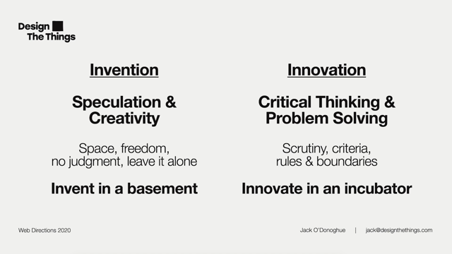
Design, as the increasingly overused phrase attributed to Steve Jobs puts it, may well be about how it works, but sometimes we overlook the first part of the quote. Design is not just what it looks like.
So today, Emma Carter, a user experience designer at Thought Works and author of the bestselling book Beyond the Logo, asks how much impact does visual aesthetics really have on user behaviour and overall product experience?
According to research you’re going to spend 10% more time looking at my speaker profile than reading my Bio, which is a little bit creepy.
65% of the population are visual learners and more than 500 million people use Instagram daily to like photos, comment and post stories. Visual design is in our DNA and it impacts our overall product experience.
The rise of design sprints, MVP’s and simply getting an idea out there as fast as possible to test and gain feedback is great to validate an idea. The continuous delivery of products ensures we are always testing and constantly delivering better experiences to customers. However, the visual design of products and software is often seen as just adding the lipstick. Some delivery teams don’t even have time to go back over products and add the polish to create a better experience for customers, yet 65% of the population are visual learners.
How much impact does the visual aesthetics really have on the user behaviour and overall product experience?
During the 20 minutes, I will walk you though the impact visual aesthetics has on the user behaviour and overall product experience. How brands like Uber use visual elements to optimise pages. You will leave knowing more about how our brains work and process visual elements. How visual elements guide users attention and how brands are boosting their revenue by combining their brand and key user interface design. All of which is vital for any successful product.
Make Me Pretty.
Emma Carter – UX Design & Product Lead – ThoughtWorks
Keywords: Visual design, aesthetic design, sensory design, visual cortex, psychological pleasure.
TL;DR: Emma shares the latest research in psychology and neurology to offer insight into how we process design elements. Through a range of examples, she demonstrates how good visual design can speed up data perception, help us retain data for much longer, trigger pleasure, guide our attention and make an app or website more accessible by using a universal user interface.
According to a Nielsen Norman study, when you were deciding to attend this talk you spent ten percent more time looking at Emma’s speaker profile than reading her bio. As visual designers, many of our decisions can come across to others as if we’re just making things look pretty, or that we love clean white space with a preference for particular images and colours. But visual design decisions can seriously impact UX and cause the user’s brain to work harder to connect dots and process information.
The way we design can help or hinder the user’s ability to find their way quickly, which in turn can increase or decrease a brand’s credibility, which affects profit margins and success or failure of products.
Visual design affects user behaviour and the overall product experience. It takes only 150 milliseconds for the brain to process an image and another 100 milliseconds to understand its meaning. Good visual design can speed up data perception, help us retain data for much longer, trigger pleasure, guide our attention and make an app or website more accessible by using a universal user interface, particularly when working across different languages (icons in particular are relevant here).
65% of the population are visual learners and nearly 500 million people use Instagram daily to post photos, comments, and stories. Visual design significantly impacts the overall product experience. The recent rise in popularity of design sprints, MVP, and the rush to test and validate an idea is helpful in gathering feedback but often means that visual design of a product is left until the last minute or misses opportunities for refinement. Budgets and time constraints mean teams don’t get the chance to polish and create a better product experience for customers, but 65% of the population are visual learners.
You have just 50 milliseconds before users make final judgements on a digital product. Ex: SaaS companies that offer free trials have to convince customers very quickly of their solution and value. Microsoft have calculated that they make eighty million dollars annually simply through using one particular shade of blue. Visual design matters!
Why does colour make such an impact? (Not only on the user, but on brand value and revenue)? Can visual design impact the user’s psychological state (for good or ill)?
Emma will cover:
- How our brains work
- The psychological impact of visual design
- Brand connection and how they are evolving digitally
- Aesthetic usability effect
How our brains work: We process sensory data in parallel as we interact with the world around us. Different regions of our brain are simultaneously activated through networks or neurons. This is called visual perception – the brain’s ability to make sense of what the eyes see. In the end, whatever we design visually comes down to how our brain sees and understands that information.
Forty percent of brain nerves are connected to the retina, and ninety percent of everything that comes to our mind is given by visual stimuli. Our brain can capture images that the eye sees for as little as thirteen milliseconds, ten times faster than a wink. This means that we’ve evolved to absorb visual information at an absurd speed. Vision is the sense that we most depend on in our daily lives. Despite advances in image processing and AI, the way our brains process images is vastly superior. Visual processing in the cortex occurs through two distinct streams of information.
One stream is the where pathway which recognizes the location of objects and the other is the what pathway which is involved in recognizing and identifying objects.
The visual cortex has a clear hierarchical arrangement. In the lower areas the most amount of light that comes through. This is where we process basic visual signals (ex: the orientation of a bar or the direction an object is moving). The neurons here respond mostly to input from one eye. As we work up the hierarchy into more complex responses, neurons respond to more complex visual features (ex: contours, textures, foreground or background object placement.)
At the top of this stream the information gets split into the what and where streams. In the what area there is part called the fusiform face area which specifically responds to faces. The where stream is involved in tasks like guiding eye movements and integrating vision with body position (ex: reaching for an object).
The bottom to top processing of our visual world may seem like a logical path, but we’re more complex.The bottom up approach would be too slow and ambiguous for us to survive. Instead, our perception relies largely on previous experiences and other top down mechanisms.
Ex: the gold/grey/blue/white dress image/perception of light and dark.
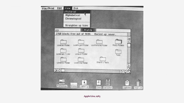
Our brains are constantly trying to make sense of what they see. When designing, whether for digital interfaces, advertising, software etc, we need to reduce visual stress and help users’ brains process the information faster. Lightspeed collaborated with a digital graphics agency to do a huge study on various visual aids. They conducted over seventy experiments, tested over 500 visuals, icons, charts and infographics, and worked with over 10 000 people across five different countries. They found that when designing icons, the more literal the visual, the better. Accuracy matters and icons literally have to be iconic. Simple one or two colour icons are processed far faster than more technical and brighlty colour images. We’ve seen this paring some and simplicity over the past fifteen years or so in the field of design more broadly.
Reduce Visual Stress: We don’t want to cause visual stress by cluttering the design and adding too many data points or unwanted design elements. Remember we have only fifty milliseconds before users have made their first judgement on our product. We need to ensure a good impression from the outset. We need to constantly test and refine our visual designs, particularly when launching new products or features.
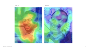
Ex: Uber spent a lot of time optimizing their landing page to improve UX through visual design. The original was a simple photo banner over a white background with a few icons and text. Uber used eye tracking heatmaps to gather and visualize data about which sections and elements of their landing page were capturing the most viewer attention. They found too much heat around an image on the old page due to the person in the image making direct eye contact with the viewer, so redirected this heat to the signup buttons on the new page by having the person gazing towards the buttons and thus drawing the visitors eye to this section. They also found that separating the sign up options from the headline cooled the attention to them.
Satisfying our senses and emotions As designers we try and create an emotional connection to the product we’ve created. Sociologist Edward Thorndike wrote a paper in the 20s called The Constant Error in Psychological Ratings and in it, coined the term: the halo effect.
There is a phenomenon that social psychologists call ‘the halo effect’. It means humans tend to assume that good-looking people have other positive qualities aside from their looks. – Edward Thorndike
Extrapolating this to digital products, people tend to believe that things that look better will work better, even if they aren’t actually more attractive or efficient.What is beautiful is usable.
Tractinsky, 2000. Users have a positive emotion response to visual design, which makes them more tolerant to minor usability issues. This is generally a plus, as you’ve already designed visually. But it also means we need to be careful in user-testing, ensuring we test the rough concepts before doing the hi-fi design.
Aesthetically pleasing design satisfies our senses and gives us pleasure.
- Vision is the most dominant sense in the majority of people Key elements for good visual design include: color, shape, pattern, line, texture, visual weight, balance, scale, proximity and movement. Using these elements well will help us achieve good visual aesthetics.
- Hearing: our ears are capable of perceiving a whole other level of aesthetic design. Being able to hear how a car engine works or hearing aural digital notifications impact our senses. Key elements in sound aesthetics design are loudness, pitch, beat, repetition, melody, pattern, and noise. Using them well will create enjoyable ‘music’ for our users.
- Touch: Skin is the largest organ in the human body. It helps us experience material aesthetics that are especially important for physical products.
As brands begin to explore more around AR and VR, we need to tap into all the senses to create great customer experiences. Some signs are so ingrained in our memories that we need only look at an image to hear the aural association in our minds (Ex: MGM’s Leo the Lion). But we need balance as some sounds can be very annoying to users
First impressions matter. When we perceive beauty with more of our senses we feel a deeper pleasure from the design. We need to create designs that are aesthetically pleasing, reduce visual stress, and tap into the senses to give our users pleasure from the start, which helps them form a bond with the design that sticks long beyond the initial interaction. Users’ expectations have evolved in tandem with the breadth of design and technology now available and now go beyond desire for functionality/usability. They want the experience to stimulate their senses and evoke a positive emotion. Aesthetic design is crucial in satisfying these needs, and is perceived as more usable, valuable, and friendly. (However there are still cases where usability must take priority. Ex: emergency equipment. Design for your audience.)
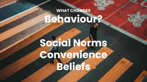
Really annoying when we can’t understand a product or navigate an app. Competition is fierce. But are the design decisions that we are making creating good and bad habits for our users?
Psychological Impact.
Nir Eyal’s customer engagement manual Hooked: How to Build Habit Forming Products describes various triggers designs can use to create more habit-forming online environments. Ex: constant notifications from social media apps infiltrate our minds and trigger neat freaks to view and clear them.
Social networking sites seek to embed themselves at the centre of the user’s emotional life. Instagram exploits the quiet anxiety that occurs when users fear a special moment will be lost forever
(Also known as FOMO!) This need to document and preserve is supported by app features that make poor quality images more attractive.
Users who find a product that alleviates their pain will form strong, positive associations with the product over time… These bonds cement into a habit as users turn to your product when experiencing certain internal triggers. – Nir Eyal, 2014
Interaction designs answer to our penchant for endlessly searching for novelty. – Nir Eyal
Endlessly refreshed content activates dopamine in using not to provide us with rewards for our efforts but to keep us searching by inducing semi-stressful responses that we call desire.
‘Mining’ dopamine in the human brain is a core technique for driving digital consumption – Gerald Moore
Gerald Moore has also done a lot of work around dopamine levels and suggests that repetitive behaviours that stimulate more dopamine hits (ex: scrolling, ‘liking’ a post) produce changes in the brain’s neural pathways which narrows attention and reduce the varieties of stimuli that feel good. He advocates for paying more attention to understanding the experiential and cultural implications of living in a digital society where design mechanisms constantly work to stimulate our brain to distract, lure, and entice us. As designers we need to be mindful of this.
Psychological pleasure can also be derived from completing a task or feeling in control and safe. This can be very tightly related to product usability but also how it looks. Using aesthetics plays a big role in giving users a sense of safety and control. The goal is to make a product look and feel simple and stable and guiding the user.
We can also trigger psychological pleasure by taking a sustainability angle. If the user feels they have contributed to a cause they are passionate about they are more engaged with the product. Ex: The Girlfriend Collective, who make leggings out of plastic and focus on the whole lifestyle of the product from production through to disposal. The result is that they have diverted six million post-consumer plastic water bottles and counting from landfill since inception. Employees in Vietnam are paid above minimum wage starting at 125% above the wage in the country. They also provide meals and healthcare to employees. They are tapping into the user pleasure from conscious consumption and their messaging focuses around triggering this pleasure.
Creating Brand Connection. How are brands combining branding with UI to extend beyond a surface level identity and actually solve customer problems.
Ex: Hotel Tonight, whose logo has boosted revenue by more than 10% annually. They help users find last minute hotel rooms and deeply discounted rates. They focused on creating a really simple UI where users could find and book a room in only three taps. But they made it too easy. In 2011 when they launched, two in every thousand customers were booking accidentally. The bookings were also non refundable. So the CEO decided to issue refunds, but this cut into profits by 4% They tried various solutions (ex: asking users to enter their initials before final confirmation but this felt clunky and corporate) and eventually one of the engineers came up with the solution for users to trace over the logo to confirm bookings. Adding an anti-pattern in (trace instead of tap) forced users to slow down and think before they booked. The logo went from simply being a brand icon but also a clever UI feature that dramatically increased revenues, not just through reducing refunds due to bookings made in error but also through the non-completed bookings dropping by 75%.
Sam Shank, CEO of HotelTonight says:
It’s become this iconic feature of HotelTonight…We now say, three taps and swipe to book a hotel tonight.
Pretty design can make users more forgiving of minor useability problems but not of large ones. If the user can’t find the product, the user can’t buy the product. Even great looking sites will have no revenue if they suffer from poor findability, or if the UI is too simple, or if the company needs to offer huge refunds.
Attractive + Functional. Form and function need to work together and designing an interface that’s attractive as well as function is worth resources. At the end of the day first impressions matter. Aesthetic design influences how people think and feel. It taps into the senses, influences how much pleasure we feel from the product; it reduces the processing load of our brains and reduces visual stress, making users more brand loyal and tolerant towards mistakes or failures. Think of the new Apple interface upgrade: Emma finds this super annoying. First impressions are not the only factor that matters, design also impacts our long term attitude toward brands. Good design should aim to keep strengthening the bond with the user over time.