- So, Andy Clarke has spoken at many of our conferences here in Australia, in Japan, in the U.S., in Canada, and of course in the United Kingdom. And, for anybody who's been really involved with the web, and web design over the last decade or a bit more, he certainly will be no stranger to you.
I think he's someone who many people who work on the web today, and many of the most influential people in design for the web, he opened all our eyes to the possibility of what real art directed, even though we didn't really call it that at the time, what a really art directed web could look like, he brought a sensibility and references to everything from hardboiled novels, the sort of Charlie novels of the 1950s, and other design influences from the Mod era and so on, and I think, some of his work at places like Zen Garden and elsewhere, which people have alluded to over the last couple of days, really did change how we imagined the web might look. So to talk to us today about the idea of art direction on the web, and then where we go from here, it is a great privilege and pleasure to introduce Andy Clarke.
(audience applauding) - Enough, honestly.
(audience laughing) You guys need to get out more.
It's actually really good to be back, yeah, you are right, this is my ninth Web Directions event, plus about, a dozen workshops, that we've done over the years, something like that, so yeah, we really love it here in Australia, really really love it. This has been a bit of a challenging trip for Sue and I though, we've spent the last six or so weeks avoiding spoilers for who won this year's Aussie MasterChef.
(audience laughing) It's no exaggeration to say that we've actually got two DVRs running at home, just in case our house, you know, happened to have a power cut, or something, Sue's Mum's recording it as well, yeah? It's our favourite programme, we learnt everything that we needed to learn about Australia from watching MasterChef.
That and Border Security.
(audience laughing) Enough holding back.
And, Ice Road Truckers as well, not Ice Road Truckers, Outback Truckers, no ice down here.
My slides for today are on the internet, for some reason, they're not on the screen. There they are, there we go, so I would actually love your feedback, my DMs are open. I studied Fine Art all those years ago, rather than Graphic Design so I'm largely self-taught, so I've always been slightly uncomfortable describing myself as a designer but I call myself a web designer, because, it's kind of what I've done, for the last, well, nearly 20 years, and I run a little studio where we make creative work for clients and for the web and for the past couple of years, I've been talking at conferences about how, I'm frankly disappointed, in what I see as the current state of design on the web, and I've been discussing what I believe, why I believe that design's been lacking in originality and personality and somehow, it's kind of been stripped of its soul.
Now not everybody feels the same way, Ethan Marcotte commented that, "There is an opportunity, "and a need, to set up better models for criticism "in our industry, but talk of the web's soul isn't it". And Scott Jehl, he added that for him, "The soul of a great site is broad, "fast access, and utility".
And that kind of comment, makes me really sad. But I'm not surprised because, accessibility and performance and usability, they all matter I do understand that, but they're not enough, not on their own, because the web isn't some utility, it's not a terminal that gives us answers to questions, you know it's not simply a platform for the digital products that we've become so infatuated with building. The web can, and I believe it should be, a vibrant medium for creative expression, in just the same way as print and other media. You know, what we do as web professionals, should be so much more than just the execution, the web should be both a creative melting pot and a proving ground for new ideas.
Whether we are broadcasting news or selling products, creative thought is as important as accessibility or performance or usability.
And I did feel like a bit of a lone voice for a long time, pining for conversations about creativity, and longing to see creative ideas expressed on the web. I tried really hard not to sound like some bad-tempered old man, you know, complaining that web design isn't as good as how I remember it from my day, right, because trust me, it wasn't.
You know back then we had guestbooks, (audience laughing) and hit counters and lots of little men constructing in GIFs.
And I feel lucky though, because I started working on the web at a time when we still challenged the very idea of what a website can be, and over the past year, I've found from articles and conference talks that there are people out there that share these concerns. Outside the industry from clients, I've heard that, people want to present themselves and what they do and sell differently, not for difference's sake, but because they've come to appreciate, that for a successful business or product, creative design is as important as responsiveness or research.
So, there's video of my talk on my website from last year and in it I spoke about the reasons why, I think design has been lacking in originality and personality, and somehow in soul. Because there's this fixation, that we have with designing digital products, and somehow, it means that we've forgotten that the web is a medium for communication, that's outside applications. Our infatuation with processes like atomic design and tools like pattern libraries and style guides can mean, that sometimes we lose sight of what we're ultimately making.
And then there's our, seeming unwillingness to take risks, for fear of criticism or failure.
And our reliance on research and testing means that we're simply delegating design decisions, and abdicating responsibility for what we make. You know, our failure to understand real art direction and why that matters as much on the web as it does in other media, including print. And that's what I'm here to talk about today, I want to talk about what art directors do, and how art direction itself can improve what we make for the web.
And what I'm gonna cover, applies just as much to promoting digital products, as it does to telling news stories.
And I'm gonna share some practical advice on how you can make designs that are more creatively satisfying without compromising the accessibility, or performance, or utility, that we should also be rightly concerned with. So what do you think of, when you hear the term art direction? Maybe, if you're a developer, you think about responsive images, you think about presenting alternative crops, or sizes, or orientations to several different screen sizes using the picture element, or the sizes attribute in HTML. These have become useful responsive design and art direction tools but there's more to web design than tools.
Perhaps, if you're slightly older, you might think about designers like Jason Santa Maria or Trent Walton who art direct their writing by giving every blog entry its own distinctive image and layout and typography, and this gets us closer to understanding art direction, but images and layout and typography are only the result of art direction not the meaning of it.
So, if art direction isn't exactly those things, what precisely is it? Now, in advertising, and on magazine covers, art direction can communicate an idea, or an opinion, through considered use of words and imagery. I'm just gonna leave this up there for a few minutes without comment.
Genius placement of the barcode.
So, in a sentence, "Art direction is the art of distilling an essential, "precise meaning or purpose from a piece of content", be that a magazine article, or, a list of reasons why people should use the coolest app from a hot startup, and then conveying that meaning or that purpose, better by using design.
And we don't hear about art direction on the web as much, for reasons that I'll discuss a little later. But it is well established in other media, perhaps most memorably being magazines and newspapers to a certain extent.
I'm not old enough to remember first-hand Alexey Brodovitch's work on Harper's Bazaar, from 1934 to 1958, and I'm not fashionable enough to have read Man About Town magazine or seen Tom Wolsey's work, but I do remember Neville Brody's artistic art direction for The Face magazine, I'm still inspired by this every day. And there's the Guardian newspaper, and, in particular, Mark Porter's redesign from 2010.
Magazines and newspapers have found the web challenging, for many business and technical reasons, and they also often struggle to bring the same levels of art direction to their websites as they have in their print editions.
Now one exception, is ProPublica, it's an independent, non-profit newsroom which is based in Manhattan, and I can better explain how art directors work with writers and with others to attract attention and then convey ideas and stimulate the emotions by talking about this story. This was art directed for the web by ProPublica's design director David Sleight, and it won a Pulitzer Prize, for explanatory reporting. Now, the next few slides show screenshots of this art directed web design and some people might find the images disturbing. This is a story of a woman who reported her assault to her local police department, only to be charged with a misdemeanour for false reporting. And the story's even more notable, because it's written by two journalists, which isn't unusual in itself, but instead of merging the two voices into one the editor kept them separate, and that's because one was reporting from the point of view of the woman, and the other, from the police. And in his role as the art director David recognised that the way the story was told across two timelines and with two alternating voices, made it more powerful so he emphasised them, and the woman's story uses specially commissioned illustrations whereas the police story, uses photography. And her story, is told on the left half of the page, and theirs is on the right, and the introduction and the epilogue are in the centre, and this is a more powerful story, because of its art direction.
So let's compare that to another piece from ProPublica, this time it's produced for the web by Emily Martinez and Rob Weychert, and it's about Joaquin Archivaldo Guzman Loera, who is better known as the Mexican drug lord El Chapo. This is a story about violence, and these specially illustrated, commissioned illustrations by Tim McDonagh, they communicate that violence with an intensity, that would have been difficult to achieve using photography. And then finally, there's this, there's Busted, which is an expose of false positives in police roadside testing kits.
The effects on people's lives from being falsely accused, after taking only cold medication, is told through the art direction, so for example, the testing kit in the header image, is intentionally small which adds scale to the devastating consequences of the accusations. Now the presentation of these stories and more, they share ProPublica's design DNA, there's visual consistency between them, because they are set using the same typeface, and they're set on the same grid.
But they feel entirely different, because art direction enhances the story, without getting in its way.
So I expect, that a good many of you are sitting there right now thinking what does that have to do with me? What does that have to do with the work that I do? Maybe, you think that art direction is some activity that's more suited to the print world, than it is to the web.
Some people might think of art direction as being somehow incompatible in a world of large or legacy CMS systems.
I don't think that's necessarily true, stories are stories, no matter where they're told or through what medium, so they might be thought-provoking like the ones published in ProPublica or they might be, just a story of your company, and why people should do business with you. It could be the story of your charity, why it supports a good cause, and why people should donate to it.
Or then there's the story of your startup, and the new app, and why someone should download it. With all of these stories there's a deeper message that goes beyond just telling the facts about what you do or what you sell, so go beyond the day-to-day of what your company does, and think about what that actually means for people. Your product, hopefully, does everything that you say that it does, but what does that actually mean in people's lives? Art direction is about understanding those messages and then deciding how best to communicate them through the organisation and presentation of words and visuals. So, is that something that's relevant for the web, well of course it is.
Art directors use design to help people better understand the significance of a piece of content, and that's as important on the web, as it ever was in print, in fact the basic principles of art direction haven't changed, between print and digital. And I'd go further, by saying that "Art direction is essential "to creating cohesive experiences across multiple channels", so that the meaning of your content, doesn't get lost in the gaps between devices and screen sizes. Now, former design director at the Guardian, Mark Porter, who I've had the great pleasure of working with and learning from, he said that, "When you do a newspaper redesign you're also designing "a website, pages for mobile devices and for apps. "Conceptually it all has to fit together "and it's all about having a visual identity for your brand "that works in print and also for other channels." Because, as well as helping someone establish a relationship with the content that they're reading, art direction can connect them, with the spirit of a publication.
And one of the most important tools, in demonstrating that spirit, is typography. And Mark also said, "Good editorial design is, firstly, "about making people want to read, "and then about telling stories".
And that truth applies as much for the web, if not more, than it does in editorial, typography is absolutely key, to a website's visual identity, because it conveys seriousness, or playfulness, or youthfulness.
But designs that are based on typography, are really difficult, not because good typography in itself is hard, but because typographic designs need really close collaboration between editorial and design, and that doesn't happen in many organisations. So I could spend a whole day, I do sometimes, talking about typography, but I'm gonna explain a few ways, that you can use type to emphasise the meaning of content. So, let's start with something simple.
Block quotes, and pull quotes, they're a really clear example of when designer and editorial collaboration can improve someone's understanding of a story, and we can move beyond ordinary quote marks, and then use other symbols, that reflect the content, or the personality, of the publication.
And quotes lead people's eye, into a story and we can represent that through design by using the grid to outdent the quotation and then a symbol, that literally points the way back in.
And we often use block quotes to draw attention, by contrasting them with the typography of our body copy, but by using the same size and typeface and weight, what we're saying essentially is that, these are equally as important.
Whereas in contrast, we can use a different type treatment and positioning to place a quotation at the centre of somebody's reading experience, and with Flexbox, and most excitedly with CSS Grid, we've now got the layout tools that enable us to place content visually, while still maintaining the most appropriate source order. We can allow quotations to subtly interrupt the reading experience by indenting them perhaps into the right-hand edge of the text.
Be a bit careful, if you indent them from the left, can this make it more difficult for the eye to find the start of the next line? And art director Neville Brody, he often used to use varying type sizes to emphasise certain words, and this can be particularly important in quotations. Quotes help make striking typographic designs, by creating focal points, and then leading someone's eye towards a call to action, but it takes collaboration between design and editorial to determine the length, and the number, and the placement, of these quotes.
Let's look at headlines.
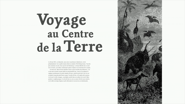
Headlines demonstrate hierarchy and they signal the importance of content but they can do so much more than just demand attention. They can help to really set the scene, so we can choose typefaces that reflect the subject matter, so this story about Jules Verne who was the author of Journey to the Centre of the Earth, we can enhance this by using a modern serif face, that might have felt just as at home in 1864 when this book was written.
And we don't always need to position headlines before the start of a story, placing a headline after the first few paragraphs turns them into a prologue.
This display typeface is based on a grid, and that echoes the grid that's created by using CSS columns. Or we can experiment using transforms to position a headline slightly outside the limit of the viewport, and use tight leading, and overlapping text, to turn that into a distinctive visual element. And they needn't be large to attract attention, instead we can combine small type with large amounts of whitespace, and this amount of whitespace feels luxurious, but we got to keep it in proportion, with the screen sizes across multiple devices. You know, we don't always need images to add visual interest to a design, deconstructed text can be even more interesting, so we can use SVG, the picture element, to make sure that everybody sees a design that's appropriate to their device.
Now, in magazine parlance, an introduction or, don't know what you'd call it, a lead paragraph, is often referred to as a standfirst, and we can use these standfirsts to do more than just introduce an article, the generous amount of whitespace between a standfirst and the article, that gives a reader some time to pause, they can take a breath, before they start to read. Or we can give a standfirst some visual prominence by making it the only center-aligned text on a page, and we can add an amount of leading which reflects its importance.
And standfirsts can come first, so we can position them above the headline and add borders between overlong lines of text, to draw a visual connection to the columns of text that come below.
Or we can create more of a contemporary magazine feel by using generous leading, and aligning the standfirst with the columns below, and we can emphasise its difference by aligning text to the right.
Or alternatively, we can separate it visually from the body copy by using uppercase letters, and then we can improve the legibility by loosening the leading.
Every element presents an opportunity to tell a story, through typography, and readers will reward the time that you spend designing type, with their attention. Every element, no matter how small, also presents us with an opportunity to be creative. So for example, drop caps, these things sit below the baseline, they're easy to accomplish with CSS so why, do we see them used so rarely on the web? We can adjust the size of drop caps across breakpoints on larger screens, and then we can utilise that extra space available by, pulling them out into the margins.
But why are we satisfied with just plain drop caps when we can add borders to visually connect them to the art direction or the content or the design of the publication? Or we can make a feature of this drop space, by replacing caps with symbols or with illustrations and this is a kind of modern twist on those religious texts, 1800 AD, and we can use CSS to wrap text around these irregular shapes.
Initial caps, on the other hand, they sit on, rather than below, the baseline, and we can either use the same typeface as the body copy or, something completely different, that reflects the content. And using drop caps in more than one paragraph, can help to break up large blocks of text, and it can also draw the eye to the start of the next section.
Or we can use pseudo elements to insert decorative caps and position them absolutely behind the content. We can use initial caps for more than indicating the start of the first paragraph, they can add personality to headlines too, so, experiment by using typefaces that contrast, perhaps by mixing a traditional serif cap with, maybe a more contemporary headline.
And in magazines and in newspapers you're also gonna often see the first three words of the first paragraph emphasised in some way, perhaps by making them bold or setting them in uppercase, and we might use pseudo class selectors to apply that same treatment to the entire first line. And that first line is gonna dynamically adjust in length and that makes it perfect for using in responsive designs. So I have always believed that to make inspired design decisions, we need to feel inspired, and, there's no better place to start looking, than at designers that we admire, especially those from outside the web.
And the fundamentals of typography, and layout, and image treatment, they're the same, whether we're working in print or on the web, but that doesn't mean that we can just apply print solutions to the screen.
Our challenges are very different, so if we're gonna avoid making retro designs that are just pastiches of past work, we need to look at other designers' work, and understand the principles that they used, and also, understand the context in which they were working. Now I know, that it's often said that the web isn't print, but there's not much difference between print and the web, unless we choose to make it that way.
Mark Porter said that, "Design is being in charge "of the distribution of elements in space", those elements being headlines, or text, or artwork, or whitespace.
Coincidentally, it was also at the Guardian that, in 1988, David Hillman introduced the first whitespace to a newspaper layout, because that had previously really only been restricted to magazines.
Now, when most people start developing a layout, they're gonna turn to a framework like Bootstrap, I'm sure that everybody's familiar with this 12-column even ratio grid.
Grids like this have underpinned website design since the days of 960.gs, anybody remember that? Oh dear, anybody here, apart from me and Ricky old enough to remember Blueprint before that? A few very old people in the room.
(audience laughing) It's OK, they'll wheel us some soup in, I'm sure during the afternoon.
Now, this grid has the potential to create an infinite number of layout combinations, and each one is gonna have its own distinct characteristics, so, a throwaway newspaper feeling from this layout comes, because of the lack of whitespace.
Whitespace and columns bring more of an editorial feel to a design.
And we can use images that bleed off the page, to make the design that's reminiscent of a quality print publication.
So if we've got an infinite number of layout combinations possible, can somebody please explain to me why this, (audience laughing) appears to be all we're capable of making, you know? I'm sure we've all seen the Power D sites, every effing Bootstrap website ever, or Jon Gold's famous tweet, that asks us which one of two layouts are we designing today? Now, I know, frameworks are an easy target, but the problem that we have with homogeneous design, doesn't step from Bootstrap's grid, instead, it comes from our lack of imagination and knowledge about how to use grid systems creatively. Even ratio symmetrical grids have been the foundation of design layouts for decades, they provide columns for structure in our content, but they don't inform us necessarily about how wide those columns should be, or the relationship between columns.
You know here, should our main content be eight columns wide, which is twice the width of the sidebar? Or, should the relationship between column widths be closer? You know my experience is decisions that most designers make are based really entirely on, guesswork.
But instead of guesswork we can use mathematical ratios, to inform our layout decisions and using ratios is particularly relevant to responsive design, and it's made even easier, by layout tools like Flexbox, and CSS Grid. So I doubt there's many people that haven't heard or seen of the golden ratio, one to 1.618, this is a naturally occurring ratio, it's been used in architecture and art and design for centuries. It offers more than just columns because we can use it to create a series of golden rectangles, we can take a rectangle that's got golden proportions and then carve out a square, and the space that remains is another golden rectangle, and we can carve out another square and yet another golden rectangle, and these spaces are perfectly proportioned containers for content, and they can suggest layout possibilities that we're unlikely to create using just guesswork. You know golden isn't the only ratio available to us, I'd recommend you take a good look at a tool called Gridset, to see what's possible.
And there's a close relationship between the golden ratio and Fibonacci numbers where each number is the sum of the two numbers that come before it, and we can create layouts, making squares whose size corresponds to those Fibonacci numbers.
So what looks at first to be a random arrangement of these squares, can quickly turn into a layout that's very distinctive, when compared to what we see on most of the web. Now, in reality, Bootstrap's 12 even columns, they're rarely used for much more than just alignment guides, but we don't have to work too hard to create distinctive layouts using Bootstrap's grid. I can think of very few applications that call for that 12-column grid, so the first step, is always to simplify, so we'll turn 12 into six more manageable columns, and this was the grid that was the foundation for our recent work on redesigning WWF UK's Fundraising pages. And we had two demands that we placed on our grid, we wanted four even columns, where we can combine into two or one, depending on the content, and then we needed a wider than average sidebar to hold the fundraising tools.
So with that in mind, we divided column one, and then added one of those new skinny columns to the width of column six, making this ample space for the fundraising tools. And using this approach, we've made a grid that's flexible and layouts that are easily responsive, this is the homepage for WWF's new fundraising website. What about that skinny column down the left-hand side? Well we leave that column empty, making the layout asymmetrical which adds to the visual energy and interest, and occasionally we pull content into that narrow column to give it emphasis like this map, of where the remaining 880 mountain gorillas live in the world.
And sometimes it indicates the start of new sections in more imaginative ways than just Bootstrap's full width fields, we used it here in the gorilla conservation timeline. Grid systems provide anchors for our content, but they don't contain the items on a page unless we make them, and the templates that we make, they can speed up layout production, they can give our designs consistency, but we must be careful not to make all pages, and therefore all websites, look alike.
There's no good reason why so many websites are indistinguishable from each other, when we use this grid imaginatively we can create any number of distinctive designs. And of course, whether we work mobile first, or desktop down, we can make layouts like this creatively responsive. Standards, best practise, they're all good things in the right context, and we can leverage familiarity with some types of content, and it's also important to keep that familiarity in mind, when we adjust our layouts across responsive breakpoints. And elsewhere, we can make full use of our imagination and add clarity to the content through expressive layout design.
And the possibilities for creativity in responsive web design really are endless, which makes it even more maddening, when we just see countless websites failing to live up to their creative potential, and most importantly, failing to add meaning to the content through carefully considered art direction and design. At the beginning of the year, I was fortunate enough to work with Smashing Magazine on some creative concepts for their anniversary relaunch, and during the design process we decided that a six-column, even ratio grid was the most flexible for presenting their editorial content, but sadly, the advertising that Smashing Magazine relies on is a really poor fit for this grid, because one column was too narrow, and two columns were too wide for the ads.
So the solution, was to use an alternative grid which was made from four even columns, and nowhere is it written that we have to use only one grid per page, in fact, combining two grids, to create what's known as a compound grid, is an established design technique that's rarely used on the web.
These four columns are perfectly proportioned for the advertising, but, the lines that are created by the four-column grid, also inform the size and the positioning of other elements, including the Smashing Conference promotions, that subtly interrupt the reading experience. And irregular shapes like this can help to draw attention towards parts of the layout, and most importantly, towards calls to action, so here we can use block quotes or pull quotes to make it abundantly clear where the reader should start or finish.
We could add a 100-pixel border to the bottom of a block quote or a pull quote to add interest, with zero impact on performance.
Or we could use CSS shapes to extend this feature image, into the content space, and then overlay a caption using SVG to create an irregular background. Or finally, we might combine CSS shapes with the ghost of type elements to literally sculpt unusually shaped columns of text. I love that stuff.
So so far, the grid examples that we've looked at, have all focused on the number and the width of columns, but that's only one dimension in layout design, the second dimension comes from what are known technically as horizontal fields, and the intersection of columns and fields create grid modules, and modular grids are another great way to create imaginative layouts.
A modular grid makes it easy to determine the format and the size of images.
We can choose type sizes that create lines with the most readable number of characters. And we can use grid modules to inform the depth of whitespace between elements.
Use this grid to create a series of page templates that are different enough from each other, to avoid repetition but they remain connected and familiar. And figure captions, they offer readers a meaningful explanation of an image, this is fabulous for accessibility, it's great for SEO, but nowhere is it written that captions must always be shown below an image, although it's mostly where we find them.
We could do something different by positioning a caption above the image, and this is really simple to do, just by reversing the flex direction.
Or we can change the direction from column to row and place a caption to the side of an image, and Flexbox makes it easy to align the caption's content to the bottom, or the baseline of that image too. But why stop there, let's use the modules in a modular grid to create a long vertical caption, and then add borders to emphasise the content. And a strong image needs an equally strong caption, and its areas like this, that designers can really put their mark on an image, on a design.
Or captions that we can design to complement the style of our images.
Or we can use the modular grid to crop images and then position and size the captions that we place over them.
David Hillman once wrote, "In its best form, "art direction involves the art director having a full "and in-depth understanding of what the magazine says, "and through design, influencing how it's said". Now this means that for many organisations, art direction is not easy to accommodate, because an art director needs to work closely with the editorial team, as they're responsible for organising and ordering content, and commissioning illustrations, or infographics, or photography.
In fact, art direction, and design, and editorial, should be equal partners.
In our industry, over the last few years, we've made some progress in bringing design and creative and technical teams together, but it's much less common to find web designers and developers who work directly with editorial teams, but I think the reason why we see so little art direction on the web goes deeper than that. When they're designing for digital media, art directors don't only direct visuals, they can shape a reader's experience of an article, or even, an entire publication, into one vision, and that vision is often deeply personal, and it reflects their interests, and their aspirations, for the publication. The most well known art directors put themselves into their work, it's opinionated, and it's recognisable, you can see their fingerprints on the work, and that goes counter to what we're so often told, that a web designer's need should come second to the needs of users.
Strong art direction on the web or anywhere else means trusting the instincts and the judgement of an individual art director, but lately, instinct has been replaced by research.
We've become so risk-averse that our judgement now takes second place to testing.
And to reduce our exposure to risk or failure even further, we've become dependent on processes like atomic web design, breaking design down into a set of predictable or repeatable patterns, we've turned simple style guides into complex design systems, and we've put pattern libraries at the centre of our creative processes.
Pattern libraries do help designers improve efficiency, you know, I spent a good deal of my time in Australia this time consulting with clients on how best to use them, and living style guides can help organisations maintain better consistency in their user experiences, and their visual identities across channels. But, "A cohesive experience needs more "than a guide to a library of patterns, "it needs a singular creative vision", and that can come from art direction.
Art direction can provide a strong set of design principles that are as applicable to digital channels, as they are to print, you don't need to look much further than Mark Porter's redesign of the Guardian in 2010, to see how content, design, and development teams, have followed his design principles, and unified readers' experiences across apps, news print, and the web.
So occasionally, I'm gonna hear designers argue that, popular processes like atomic design and tools including pattern libraries and style guides are somehow incompatible with art direction, because that demands flexibility, in order to be original. I don't agree, because I believe that to be truly effective those processes need art direction to make them meaningful, because, without art direction, even attractive atoms, and molecules, organisms, and templates, have little more than superficial looks to unify them. In the end, "Art direction is the gravity "that can pull atoms together".
So, the typefaces that I used during this talk, are all designed by the fabulous Dalton Maag, go and check them out.
Thank you so much for always making us so welcome in Australia.
(audience applauding)