Accessible SVGs
Hi, I'm here today to talk about creating accessible SVGs and how to apply these techniques practically to a real website.
Boring work disclaimer about the presentation, not reflecting views, et cetera of my employer.
What are SVGs?
What am I talking about?
SVGa or scalable vector graphics are an XML based mark-up graphics, markup language.
It has support for two dimensional graphics, interactivity and animation.
It's an open standard developed by the W3C and is currently undergoing an update to SVG version 2.0.
Here's a great example of what you can do with an SVG.
It's titled "responsive huggy laser panda factory", and it was developed by Sarah Drasner.
It's an interactive, animated and responsive industrial looking toy panda factory.
So there's so much amazing potential with SVG and it's being used a lot more on the web now.
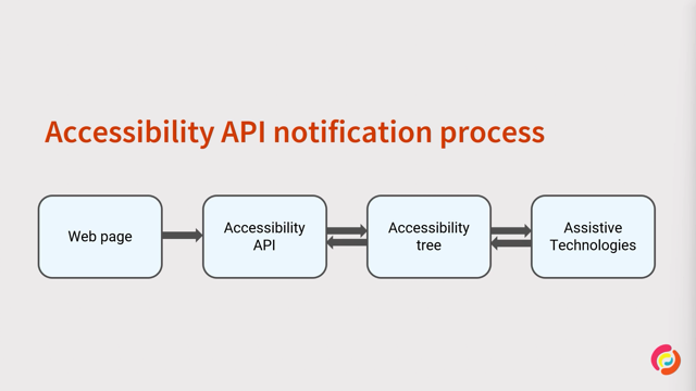
So, how does web content work with assistive technology?
Let's look at the accessibility tree.
Users of assistive technology are not really interacting directly with the page content.
They are presented with a page's accessibility tree.
So our native HTML elements are implicitly mapped to accessibility APIs.
For example, an image element will automatically be mapped to an accessibility node with a role of image and a label based on the alt attribute.
So ARIA is created by the W3C and it provides, it provides a standard that allows developers to set roles, states and properties on HTML elements.
So they can be mapped properly to the accessibility API.
Please note, just because you change the role of a div to a checkbox does not make it function in the browser like a check box.
You still have to wire up the functionality to make it behave like a checkbox as well.
So to see how things are mapped by the accessibility tree, you can open up dev tools in the browser and look for the accessibility tab.
The example you see here is Safari, Chrome and Firefox.
Each is inspecting the same SVG, but they all map it to a different role.
This is important to remember for later.
So a quick note before diving in.
The examples in this presentation were tested to work with the latest versions of NVDA with Chrome and Firefox, JAWS with Chrome and Edge, VoiceOver with Safari and iOS Safari.
Now let's look at a real website and break down the different types of SVGs and how we can make them accessible.
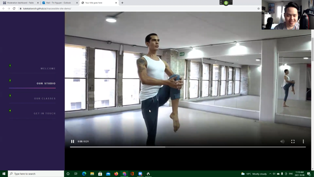
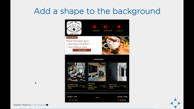
So here we have a fake code bean coffee, coffee house, brand website.
It's themed in a codey minimalistic style, mostly black and white.
There's a header with a logo and then three links with icons and then text underneath them.
Underneath the header is a big hero promo banner with a bunch of text an image and then a call to action.
There's also a section of locations below that with images, addresses and hours of operation.
Finally, in the footer, there's some contact and social media info.
So in terms of SVGs, we have a lot of them here-from the logo, the icons, et cetera.
So let's start with the logo.
This code theme logo looks pretty basic.
So let's start off with the basic, with the typical image element, plus the source and the alt attributes.
This example works everywhere, but there is a zombie Safari bug that was fixed in 2016, then resurfaced again in 2020, and now it's fixed again.
So in order to support the last couple of versions of Safari, you need to add role equals image to the element.
So.
Now, if we want to add a link to this image from the previous example, all we need to do is add the anchor tag around the image and update the alt text to reflect that it's going to the homepage.
And that worked everywhere.
In order to animate or change colors on the fly, in an image we need to inline the SVG directly into HTML.
To make an inline SVG accessible, we need to add the title element inside with a short title.
And anytime you add, have the title inside the SVG like that on hover, the titled texts will appear-as a tool tip.
Unfortunately with this, with this example, though, there were issues with both Firefox and NVDA Safari and VoiceOver.
VoiceOver maps the SVG to a diagram and won't recognize it.
And Safari maps it to nothing and won't recognize it.
To work around these bugs, we needed to add role equals image to the SVG so that they map to an image or graphic role.
So let's say we modified some colors for the holiday and want to add a description to account for the logo change, you know, say "happy holidays" or something.
You can add a description by adding the description element to the SVG, D E S C with the text inside.
But for some reason I couldn't find any browser/screenreader combo to read the description when I did it this way.
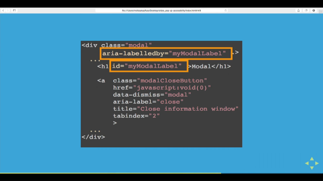
So what I needed to do in order to make this work was add aria-labeledby with the IDs of both the title and description.
And that's added to the SVG element.
I would say, we want to link that last example.
Unfortunately, just wrapping an anchor around the SVG did not work as expected.
So what I needed to do was add aria-label to the link with the text for the link, and then aria-hidden to the SVG.
And if you're still supporting IE11, you need to also add focasable equals false to the SVG because otherwise it'll create an extra tab stop.
That's for IE11.
So another fun thing that we can do with SVGs is we can animate them.
I know Val had is covering accessible animations, but a few things to note here are animations must be stoppable if they last beyond five seconds, and we should also respect the operating system setting for prefers reduced motion.
Now we can do that either via CSS or JavaScript, depending on how we created the animations.
In this case, the animation is less than five seconds.
And I added the JavaScript function to check the system setting.
So now that we've covered the logo from what I hope is every possible angle.
Let's look at this site again for some more SVGs to look at.
There are a bunch of icons used in this site.
Location, coffee beans the cart links in the header.
Phone and Twitter icons in the footer, and each one is implemented in a different way because they have different contexts on the page.
For starters, let's look at the decorative images.
We have three examples here, linked unlinked and a button.
Each case the icon is redundant to the text it's next to, so to hide these decorative icons, we can add aria-hidden to the SVG and it worked in each variation.
The next icon we'll address is the phone image.
From the footer, it's next to the phone number.
Since this image provides context to the content, we should give it alternative text.
Depending on the system generating our icon file, you may or may not need to add the title to the SVG, but please make sure the text makes sense in the context.
Next we need to add role equals image to the SVG.
And using the title in the SVGs in this case is actually pretty good because if your icons happen to be vague, it would, you know, it might help explain to users what it is.
So this video clip here shows the navigation next to the text and the header disappearing on small screens.
If an image is next to text, but it, but the text is not always there, especially in a link, we need to make sure that the link always has an accessible name.
We can do that by adding aria-label with the alternative text, to the SVG and aria-hidden to the span text.
Now here I have also have an icon only variation.
And for this one, we can add title, add a title inside the SVG with the alternative text.
In the footer, there is a Twitter icon with the hand next to the Twitter handle.
And it's all inside of a link.
So the icon is necessary because it provides context.
I was curious if there was a difference between using aria-label on the SVG or title inside of it.
Since we already know that by using title, we get a tool tip on hover, and that can be helpful in some cases.
Unfortunately the results were the same for each screenreader/browser combo.
So either method is accessible, is acceptable.
Although the site did not have a need for buttons, I wanted to test them anyways.
So I made these buttons with a cart icon plus with a plus sign on them, like an add to cart and similar to the previous example I wanted to test them in the same way, using both our aria-label or the title inside the SVG.
The aria-label version worked everywhere, but the version using title needed to have, aria-labeledby on the SVG link to the ID on the title element.
So what's left?
So we have this hero banner image.
Now hear me out.
What if we used SVGs for hero images?
I've been fighting an internal struggle on this.
Everything in me is saying, just make a code, but isn't an SVG code?
And I looked around at a bunch of major retailers and some of them have horrible like image mass, bad, alt prom like bad alt, no alt using background images.
So basically these things aren't being communicated accessibly.
So why not use an SVG that can be designed beautifully, marked up to be accessible, responsive.
It can zoom in and out to be larger without pixelating.
So it was worth a shot.
Let's see what happens with one I made.
The first thing I did was nothing because I wanted to see what would happen by default.
And what I found is text in SVGs is now traversable in every screenreader/browser combo I tested.
So that is a huge win.
One thing I noticed though it was, I did not hear the link announced as a link in Firefox.
I needed to add role equals link to the anchor to fix that.
While I was there, I set up some focus styles for it.
And there's no natural hierarchy inside of an SVG.
And since it looks likes page content, like, you know, that would have hierarchy, some heading or something like that, I added role equals heading and aria-level 2, to the fall special.
And just in case I added aria-hidden to the decorative image.
I never heard it announced, but I just wanted to be careful.
So let's put it all together and see how this all sounds.
The whole site in a screen reader [screenreader] heading level one.
Enter.
You are now in the browser's address bar.
To start testing this code and Web Directions presentation demo.
[?] landmark and graphic CodePen collection of accessible SVG logo examples.
Navigation landmark list with three items, link graphic locations, link graphic coffee beans, link cart, zero items out of list.
Main landmark fall special logo pumpkin spice coffee blend 1lb free.
plus one free coffee in store.
Link buy now valid 10 slash zero one slash 2111 slash 30 slash 21.
Subject to availability.
See store for details, terms and conditions.
Offer only available on pumpkin spice coffee bean blend while supplies last.
Heading level two locations, content info, landmark heading level three, contact info, graphic phone number (515) 123-4567.
Copyright 2021 heading level three.
Social links, link graphic Twitter @codebean.
[Heather] I think that sounds all right.
Right.
So I feel like I'm forgetting something though, right?
High contrast mode.
So obviously.
Viewing the site in Windows high contrast mode shows here that the logo and all of the icons have disappeared into the background, and need to be fixed.
On the bright side, since the hero image had a white rectangular box behind it behind the text, the it's all readable.
So we should probably take that same approach with the logo to ensure the branding stays intact.
So quite simply just adding in this case, a white filled rectangular box and making sure it's behind the text allows us to maintain the desired logo design.
Now for the icons, we'll need to use the media query for forced-colors, and I really wanted to use current-color for the fills and the strokes, because that way we would able be able to just add a few simple lines and be done.
Unfortunately, current-color isn't applying the way we expect it to because the spec had changed for it.
And browsers update updated to line up with it.
The long story short is this is going to change back in browsers soon because the spec has been revised to reflect the previously desired behavior of current-color.
But in the meantime, we can use system colors to ensure that everything looks the way that they should.
So for the Regular body text we can use canvasTexts and for the link items, we can use linkText, and then there are others for like buttons and backgrounds and stuff.
So takeaways.
Hide decorative images from screenreaders with aria-hidden, provide meaningful alternative text for content images, add roles to elements, to ensure they map properly to the accessibility API, provide focus styles for actionable elements and make sure images are not lost in high contrast mode.
Things change.
Often.
Test early, test often with various screenreader/browser combinations, different contrast modes, keyboard navigation, and of course with real users.
Finally resources and further reading from this presentation and hit me up on on Twitter, if you have any questions, thank you.
The Scalable Vector Graphic (SVG) is a preferred graphic format to use on the web today. Let’s see how the shift toward using SVG images will impact users of assistive technology (AT) & what you need to do to ensure a great experience for everyone! Attend this talk to learn how to implement accessibility in any type of SVG.