Unspoken Value of Design Systems
Introduction
Emily Pearce begins by highlighting the misconception that design is solely about aesthetics. She emphasizes the deeper role of design in organizing information for easy comprehension and designing teams around relevant problems. This introduction sets the stage for the importance of a well-structured design system in producing high-quality products.
The Octopus Deploy Design System
Emily introduces the Octopus Deploy design system and the company's investment in a dedicated team of designers and engineers. She explains the hybrid model adopted by Octopus Deploy, which combines aspects of centralized and federated models, allowing for both centralized control and contributions from feature teams.
Challenges Faced
Emily outlines the challenges she encountered upon joining Octopus Deploy, including complex user experience problems, outdated visual design, full-stack engineers unfamiliar with frontend solutions, inconsistent quality, and a lack of design influence. These challenges underscore the need for a robust design system to address organizational and product design issues.
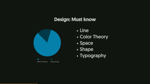
Finding a Starting Point: Foundations
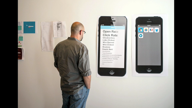
Emily explains how the design system provided a starting point by focusing on foundational elements like colors. She describes the introduction of a color system using design tokens to meet WCAG color contrast requirements, simplifying the color palette and improving developer understanding. This emphasis on foundations highlights the importance of addressing basic elements before tackling more complex components.
Shared Understanding of Quality
Emily discusses the process of defining and documenting quality standards for components within the design system. She describes the creation of checklists and documentation to establish a minimum bar for quality and ensure consistency across teams. This shared understanding of quality ensures that all components meet a certain standard and promotes reusability.
Sustainable Product Building
Emily addresses the challenge of unsustainable development practices and the accumulation of technical and UX debt. She introduces the concept of "Cane Toads" - components that multiply rapidly without proper oversight. This section emphasizes the need for a design system to promote sustainable development practices and prevent the proliferation of inconsistent components.
Combating Component Duplication and Gaps
Emily describes the problem of duplicate components being built by different teams and the challenge of identifying gaps in the design system documentation. She highlights the need for a mechanism to prevent redundant work and ensure comprehensive documentation.
Introducing Component Discovery
Emily introduces the concept of "Component Discovery" sessions, bringing together feature teams and the design system team to review existing and proposed components. These sessions facilitate knowledge exchange, identify gaps, promote reuse, and prevent the creation of unnecessary components, ultimately maximizing developer time and improving product quality.
Key Takeaways
Emily summarizes the key takeaways from her experience implementing the design system at Octopus Deploy. She emphasizes the role of a design system in guiding through complexity, establishing a shared understanding of quality, and promoting sustainable development practices. This concluding section reinforces the value of investing in a well-structured design system for long-term product success.
The Future of the Design System
Emily provides a glimpse into the future of the Octopus Deploy design system, highlighting its current state with existing components, documentation, and ongoing work on patterns. This section instills confidence in the continued development and evolution of the design system to meet the evolving needs of the organization and its products.
So, a common perception about design is that we're here to make things pretty.
However, design goes so much deeper.
Looking under the covers, it's about organizing information and doing so in a way that others can easily understand that information.
But then there's also another layer of design, which is organizing and designing teams around the right problems.
And then when these are done well, you can produce a really high quality product.
At Octopus Deploy, we invested in a team comprised of designers and engineers, and they were given the custodianship of a design system.
This right size investment is contributing to our shift to delivering a quality consistently.
It's changed how we design, how we think, and how we work together.
And on this journey, it's made me realize how powerful a design system is, and the value it's bringing to our organization.
But first, a little bit of context about how our teams are set up to support a design system.
Now, if you're not familiar with the management models around design systems, there are three.
There is a centralized model, a federated model, and a hybrid model.
A centralized model is when you have one team dedicated to looking after the design system.
They're responsible for building everything, the tooling, the components.
Everything.
Then you can have a federated model, so all your teams contribute to the design system, but there is no one clear owner.
And both of those models have pros and cons.
At Octopus Deploy, we have the hybrid model, which takes the best of the both of those worlds.
We have a centralized team who are responsible for the tools and the process, and they care deeply about making that design system easy to use for other designers and engineers.
But then we have all of our feature teams who contribute back into the system.
But they also consume.
So everybody's working on it.
It is a team sport.
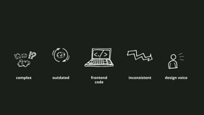
So a year and a half ago, I started this journey with this company, I joined this company, and was faced with very complex user experience problems.
Dated visual design, full stack engineers, which Amir talked to as well, unsure about implementing front end solutions.
I love my engineers, but I think full stack is a huge ask of them, especially when they're predominantly back end, and front end is actually quite daunting for them.
Teams are delivering inconsistent quality, and designers are really struggling to have a voice.
These organizational problems, take more than one approach to minimize or alleviate.
And this is the list of issues you get when you don't invest enough in design.
Things get messy, things get complex, quality is lacking, which can be incredibly uninspiring to work with, and it takes a lot of effort to clean up a mess.
As Amir said, it's fucking hard.
So how can a design system help?
So the first value I kind of uncovered was a design system really helped us find a starting point to guide us through that complexity.
We had these really big overwhelming experience problems and the complexity of these problems were partly due to the domain, so DevOps, and mostly because of the sheer amount of UX debt.
They had to design themselves into a corner.
Imagine each feature had been built slightly differently to have and how each feature included each component was slightly different.
So breadcrumbs appeared slightly differently, or they might, they weren't even there.
Who knows?
And then the workflows were slightly differently for each feature, and as you used each feature, you got a slightly different experience each time it was unfamiliar, which is a poor experience.
And our navigation was very deep, and still is, still working through this, due to the amount of menus, and then tabs, then buttons linking to pages, and on top of those links, If you're one of the lucky ones, it could take you to a very different section of the app.
So where does one start?
How do we get this product design going in the right direction?
The design system really helped us find that starting point.
Looking at the parts of a modern design system, it became very, very clear.
Our starting point was our foundations.
They desperately needed to be worked on before we could even entertain how we uplift our components.
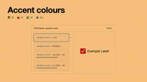
And so we started with our colors, we organized our colors, introducing a color system through the mechanism of design tokens.
And these colours were geared towards meeting the WCAG colour contrast requirements.
And so we were able to reduce the amount of colours in the system, so less colours, less code, and in a systematic way, which made it less difficult for engineers to understand.
And so we had the right amount of colours for the designers to use, and can happily report we have not needed to add another colour since, nor has an engineer snuck one in either.
So the acknowledgement of foundations.
It has had a really positive effect across the department and now we have an area called Foundations.
It's dedicated to this kind of thinking, getting our basics right, centred around the developer and designer experience.
So not only did we have a starting point, the parts of the design system alluded to what was next and how we mature.
Things that started to become clearer for our team and for the designers.
That complexity was starting to feel less complex as more was understood.
So next was components, and this is where, uh, my unspoken value number two came out.
Documenting our design system enabled us to have a shared understanding of quality.
But before we could arrive at a shared understanding of quality, first our team needed to arrive at an understanding of quality.
We started building out some of these components and came to the realisation that we didn't know what done looked like, nor what a high quality component looked like.
So we wrote those things down and considered everything you needed to know to have a top tier component.
We felt this was too much, so we reorganized this list and highlighted the minimum level of tasks for a component to be accepted into the design system.
We now understood done, and we had agreed to a minimum bar of quality.
Surprisingly, these items are actually very simple and easy.
For example, ensuring the component name was the same across our design tool Figma in our code.
And then the design system documentation.
Another example is a minimum level of documentation is the list of props, which is how we configure our components, and an image of the component.
This made it much less daunting for our team.
We templated our checklist so that any team building a component knew what the minimum level of quality was, and due to the list being quite simple, it wasn't hard for other teams to adopt this process.
Our component checklist has been a success, and now we have a handful of teams building components.
And this has brought us to a shared understanding of quality, hooray!
And now we have multiple team building components.
Yay, but maybe nay.
This brings me to my third unspoken value.
Design systems enable a culture of building products sustainably.
The company had a bit of a prior culture of churning out features with no regard with how it should be maintained or could be reused.
There was a bit of a false perception of building fast, and afterwards you turn around and now you have a hundred components that all work slightly differently.
Teams are struggling to understand how to reuse them in their next feature, which slowed them down and really impacted their ability to modernize the experience.
This created debt.
This is tech debt.
This is UX debt.
And we have lovingly named these components Cane Toads.
They can multiply very quickly when left unchecked.
So this led to a number of other problems.
Duplicate components.
Teams are building new components, but weren't taking the time to see if there were other components available to solve their problem.
We had a team arrive at the end of the quarter only to realize they had spent four weeks Building something that already existed.
So we gave the teams a tool called a component decision tree.
This really helped them walk through each component they were building.
It was to try and encourage them to slow down and stop and think about whether that component was really needed.
And this kind of helped, but something else was missing.
Problem number two, we had two designers, and they were making valid new components.
But it was the same component, but in two different teams, and they didn't realise they were building the same components.
And then we had our third problem, which is that we had gaps in the design system, and the documentation.
Our design system team, we didn't know what they were, and we really needed help understanding them and identifying them.
So remembering back to my hybrid model team structure, and our product features teams, Sorry.
And our product features teams.
Plus, we were, we're a fully remote company.
We're not privy to those hallways conversations where you're like, Hey, that sounds like something I'm working on.
We should catch up.
Doesn't happen when you're stuck at your computer at home.
We needed something else to help identify when we were working on the same component.
Or, already had a component that could be, that could solve their problem, and to help identify knowledge gaps.
This is where we introduce a component discovery.
It's a session where you bring all the components that you are working on, or wanting to change or add, and walk through with the design system team.
It was basically a sense check in the latter half of discovery or just about how new building your feature or thereabouts.
The advantage of this was the design system team had a great understanding of how change impacts the system.
What our existing components are, or at least the documented ones, and identified opportunities to either consolidate components or maximise reuse of that component.
The feature team has the in depth knowledge of the customer problem and how a particular feature works.
This session provided a great way to exchange knowledge, identify those gaps, but most importantly, capture what can be reused up front and connect the dots between what other teams were doing.
We are now maximizing our developers time and only building things we truly need.
We are, in fact, slowing down to ensure that we reinvest in components.
By doing this, the whole system is uplifted, not that one feature.
Each release of our software, delivers more value to our customers.
The design system is truly changing how our teams work.
Looking forward, I feel confident that our UX and tech debt won't grow any larger and will, in fact, shrink.
So looking back on what I've learnt, no matter how complex your experience is, a design system will guide you through that complexity by getting you to focus on the basics.
A design system will bring a shared understanding of quality so that no team is left behind when building designs.
And lastly, we can continue working in this way.
Building fast while creating mountains of UX and tech debt is not a sustainable pace.
A design system team helps, a design system helps establish good working habits that can continue long into the future.
So, here's what we've built so far, so it does exist.
There is examples of my work.
We have components, we have component lifecycle, and all these lovely things, and we're starting to build out our patterns.
So yes, thank you.
Walking through the journey Octopus Deploy is going through investing in a design system and the surprising ways it is helping our organisation mature.
Looking at how we developed an understanding of “What is a pattern?” vs “What is a component?” and how it’s leveling up our design quality and documentation chops.
Exploring our internal processes & cultural shift required to manage a component library and how our engineers are embracing and resisting our design system with a federated management model.