The future of web design part II: Variable Fonts
(lively music) - So, I should turn my clicker on.
I'm gonna talk about variable fonts and if you do follow me on Twitter already, you'll already know that I love variable fonts. I tweet about them all the time.
Sometimes I do long Twitter rants at midnight when I can't sleep 'cause I'm just laying in bed thinking about how totally amazing they are. So I'm gonna tell you all the things today about what I think makes variable fonts amazing. But also, the opportunities that they present for designers but also developers on the web and why I think they play an important role in the future of web typography and design. But also things like accessibility and user experience on the web.
Now before I go into it, a couple of things about me. I am a front end developer, I am also a development manager, I work at Seven West Media.
I'm on Twitter, you can follow me, mandy_kerr or on CodePen as mandymichael The reason I'm telling you this is I have a bunch of demos, they're all on CodePen.
I will tweet them out at the end of the presentation but otherwise you can just search me and have a look at them if you want.
So what's important to know about me is that I'm a developer, not a designer.
So I am going to talk a lot about fonts from the perspective of a developer, not from the perspective of a designer.
And Ben did a talk yesterday, for everyone who saw it, he made a comment and he said that, he's a developer that loves to design and that's how I view myself as well.
I have a huge appreciation for design and I spend a lot of time trying to figure out ways that we can best represent designs on the web and on the front end.
So I love experimenting with CSS in particular because I like trying to figure out ways to create interesting and creative visual designs. And I want, really, to push the boundaries of what we typically think is possible with code on the web.
And like Rachel has just shown, there is a lot of stuff that we can do now that we couldn't do many years ago.
So, in order to do this, I started making text effects. And I like to combine fonts and CSS in interesting ways to show how we can use real text to create these kinds of effects.
And it's real text, it's selectable, they're editable, they're searchable and they're accessible via screen reader. And what I think is really great about this kind of thing is that we can create more meaningful and creative layouts without having to use things like images, or SVG or Canvas or JavaScript.
So, because I started doing this kind of stuff, obviously fonts play a big role in text effects. There's a lot of different fonts up there, they play a part in how the effect is, I guess, portrayed. In about 2016, variable fonts were first announced. There's a great blog post about it.
They showed the width changing on a font and I saw those and were like, Ha, I could definitely use these in my text effects, I'm gonna have a play with them.
So, I started creating things like this.
This font is called Decovar, it's buy David Berlow. It's the first variable font I, no I lie, it's the second variable font I started to play with. And what this example showed for me was the unique opportunities that variable fonts provide us in comparison to traditional fonts on the web and I will get back to this a little bit later. But I just wanted to show you how I started with variable fonts.
I came very much from the text effects side of things. I wasn't thinking about all of the other benefits, which I am going to talk to you about but basically I came about the other opportunities that variable fonts give us, by researching them after doing this kind of thing. So, I want to get a couple of things out of the way. Support for variable fonts is actually really, really good. Just like Rachel was talking about, the browsers are actually moving really, really quickly with implementing this kind of thing.
This year Chrome, Firefox, Edge and Safari have all supported variable fonts.
The caveat on Firefox is that you need High Sierra on Mac in order to view them, it does rely on operating system support.
But at this point, I don't feel like there's any reason why you can't start using variable fonts.
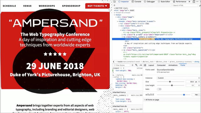
If you want to use variable fonts, there are a couple of places you can go to find them. Axis-Praxis is one, this is the first site I started using. The other one is v-fonts, v dash fonts and they just list a bunch of variable fonts, they've got sliders, you can play with them. One other thing I wanted to mention which, I literally just added this slide in because Rachel brought it up, there is a really, really amazing font inspector in Firefox. Ah, hang on, let's try that again.
You can inspect a variable font and there's a little panel there and you can go and play with your variable fonts and there's like, other font stuff that you can do. Firefox is doing really amazing things for variable fonts right now and you should definitely use it if you wanna have a play with that kind of stuff. So, on that note, I actually haven't told you what variable fonts are, so you might be a bit confused but that's okay, I'm gonna do that now.
Basically, in its simplest form, a variable font is one font file that acts like multiple fonts.
So where you might have had 10 different font weights or styles, like, a condensed version, this data, it now all exists in one file.
So we no longer have to reference 10 different things or five different things or however many you're using. We can just have one file and all that information exists in one.
And the way that it does this is with a different axis in the font.
So this is a weight axis and how this works is, inside the axis you can have all of your master weights. So there might be a 900, a 600, a 400, the standard kinda weights that we have online right now. But, the benefit of variable fonts is that we can interpolate between those values. So, let's say we have 100 to 900.
We have all of our standard weights, like, 400 and 900 but we also have access to all of the weights in between, so 101, two, three, four, five, six, seven, eight and so on and so forth until we hit 900.
And what is really great about this, aside from the additional variation that we have, is that we can animate between this kind of thing. So we can start to create smooth transitions between weights and styles.
But we're not just limited to a single axis. You can have thousands of axes in a variable font. I think I saw a number and it was like, 64,000. Don't quote me on that but there's a lot and I don't think we'll ever hit the full amount but what's really cool about this, and hopefully you can see in that image, is that you don't just have an individual weight and an individual width axis.
You actually can control all the combinations of that as well.
So you can have a narrow, heavy font and a light, wide font.
And this gives us a lot of different combinations to work with which we've not previously had access to. And because of the way that these are created with the interpolation, kind of algorithmically, I guess, they typically result in smaller file sizes. So where you might have had 10 fonts at say, 80 kilobytes each, you can now have one font at maybe 150 kilobytes.
So if we were to look at an example this is a variable font, it's got, I think it's 10, 10 weights there. In total, this variable font comes to 394 kilobytes, which seems like quite a lot but this particular font has a whole bunch of stuff in it, with ligatures and different characters and stuff for different languages.
And it has all these weights but it also has all of the other ones in between it as well. And all of that now, is just one rather than 10. If we were to use a standard font of this particular one, each font file individually is about 234 kilobytes each.
That will result in a combined file size of 2,324 kilobytes which is a lot of fonts and obviously we wouldn't want to load that many fonts on our page.
But this also assumes that all of those font weights exist, which they don't. So if we removed the ones that don't exist and just use, I think there's five there, that's still 1,154 kilobytes total and that's nearly three times the size of the variable font. Now I know that some of you are probably thinking, well I would never use 10 fonts in my site because you don't do that.
But the reason that we don't do that is because of the limitations of standard fonts. We can ignore those limitations with variable fonts and we can start to do things that are a little bit more interesting.
Because, variable fonts can improve the perceived and actual performance of our sites.
Because not only have we reduced the overall file size but we now only have one network request for all the weights and styles of our fonts. And while we have technology like Hub 2 and I know, you know, oh it's not a problem, people always tell me this.
But, the thing is, they're not mutually exclusive right? You can have one network request and you can have Hub 2 and you can enjoy the benefits of both of those things.
It's still a major technical advantage.
And in fonts, the sizes that I've just showed you were OTF fonts.
They weren't hugely compressed, they're kinda like the base format.
In fonts we have WOFF2 now which increases the compression and that further reduces the file size.
So bandwidth and performance issues, they start to become less of a problem for us. And as operating systems become more widely supported, in terms of variable fonts, we can look to improve the performance of our sites even more by using a variable system font as our fallbacks. So this is Helen Holmes and she wrote this amazing blog post, it's called Type is Your Right, and it's about creating beautiful, performant, web typography.
And in this post she introduced this concept of modifying your fallback font's styling to better match your custom fonts and what this does, is it starts to limit that flash of unstyled text or layout redraw that we often get when our fonts switch out.
Inspired by this, Monica Dinculescu created a font style matcher tool which demonstrates how this might work.
And essentially the way she does it, is by modifying the line height and the letter spacing to try and match them as closely as possible. Now, if our system fonts are variable fonts and they're designed with things like, weight and width and x-height, which is the height of the characters, we'll be more able to easily match our system fonts to our custom fonts by simply modifying the font itself rather than having to change things like line height and letter spacing.
Of course we can combine all those things together for even more control.
And what this does, is helps to create a smoother transition between our custom font and our system font. And if we combine this with something like the font-display property in CSS, we can use font-display swap.
What this does, is the fallback text is immediately rendered and then in the next available system typeface that we've specified in our font stack and then when the custom font loads it just swaps the custom font in.
So the problem with this at the moment is, we have stuff like this.
So we get this janky kinda redraw layout shifting which doesn't look very nice and is quite noticeable for users.
Using Monica's tool, we can reduce this kind of thing and make the layout redraw less noticeable. But if we were using variable fonts to do this and we had more control over the fonts, we will actually, I believe, get to a point where we never need to have invisible content and we won't have layout shifting again.
Now at the moment, we can't really do this, unfortunately. But, variable fonts are still very new, people are still experimenting with them and I do think that this will be something that we will be able to do in future and it's a huge benefit for us from a performance perspective and for usability and user experience.
So, given the performance benefits, if you wanna start using variable fonts now it's very, very similar to how we use variable fonts, ah, how we use standard fonts on the web.
So basically we use font-face, we set it up the same way we do standard fonts and for the most part it's pretty much the same, there are a couple of differences, the main one being how we define the variations for descriptors like font-weight and font-style and font-stretch, that kind of thing.
So where we might have previously set a font weight of 200 in one font face block and a font weight of 700 in another, now we just do this in one.
So what we do is, we specify our font-weight property and then instead of just defining one value, we specify a range, so, like 200 and 700 and that will give us all of the weights between 200 and 700 to use.
What is really important to note about this is even if the font itself can go up to a 900 font weight. If you say 200 to 700 you will not be able to use 900 in the variable font because you're limiting what is available.
So that is a little bit of a gotcha but something to keep in mind.
So once we've set up font-face exactly like we would do right now we just reference the font-weight property in our HTML and we pick the value that we want. But we don't have to do 400 or 900, we can pick 658 if we want to.
And this is how you do it for things like font weight and you should always use the existing properties when you want to do that, however; that example I showed you at the beginning with the text changing, that is not a preexisting style that exists in CSS so we need a new property and that property is called font-variation-settings. And what that does, is let us define as many named and custom axes as we need.
So in this example, I have a weight axis which is referenced with a character code of wght and then an associated value and then I have a comma and then I have a custom axis which is called inline and that's referenced with a four character code of INLI with an associated value.
Now, when the variable font is created if the designer decides to create a custom axis they choose what the code is and it's always represented in upper case and a named axis like weight, width, slant or optical size.
That is always represented in lower case, just in case you're wondering why they're different. So there is one other thing about variable fonts in CSS that I wanted to mention because it does come up when you're animating and transitioning things and that is, if you redefine font-variation-settings anywhere later on, like in a keyframe animation for example, you need to redefine all of them.
It's kind of like how transforms work.
So you can't just leave weight out and expect it to be there.
You need to reference each and every one.
So a way to get around this is by using CSS custom properties which are fairly new but they're really awesome. So basically you just set your custom properties somewhere in your CSS, however you wanna do that and then you reference the custom property name as your value instead.
And this is really, really useful if you're editing things with JavaScript, which I'll show you a bit later on.
So that's how you use variable fonts in CSS. Obviously this is only gonna work if the browser supports variable fonts.
If it doesn't support variable fonts we're gonna need to put fallbacks in because obviously we want our websites to look nice in the browsers that don't support them.
So the way that we do that, we set up our variable font just like I showed you already and then what we're gonna do is set up our fallback fonts and we just do that how we presently do it in our sites. I've got a 200 weight and a 700 weight here. The next thing we do is use something like feature detection which thankfully Rachel went into a lot of detail about, which was great.
The reason that this is, in my opinion for the best way to do it is, it's much more versatile, it's easy to see what your fallback is and what your variable fonts are and it just makes it easy to clean up down the track when you don't need to support them anymore. You can do it by using the font stack but that only works for things like weight and really specific cases, so you should do it with the feature detection instead. Now, as Rachel mentioned, obviously in this case, the fallback is not going to be as nice as my variation with my variable font but that's fine, it doesn't matter, it's an enhancement.
Things don't need to be the same in every single browser. So, with this in mind, we've solved some technical problems with performance, we know how to use them in browsers that support variable fonts and we know how to create fallbacks.
What I think is really great about this is when we're not limited by technical considerations and when we've solved those preexisting technical problems, we no longer need to trade off design for performance. So creativity can define our choices instead of technical ones.
And for me, the opportunity of variable fonts is, we're not just limited to typesetting whole pages, which is really good.
But, we can create editable, selectable, searchable text effects that can replace all those other things, like SVG and Canvas.
And I believe that if we can use the base foundation of the web, we always should.
There's nothing wrong with SVG or Canvas or JavaScript or any of those things but if we can just use text instead of images then we should because we get all of the out of box accessibility and usability with them.
Now, when I first started playing with variable fonts this was the first example that I made and it's alright. I was giving a presentation on text effects and this is all I had and I was like, this is not gonna cut it.
I need to do something way cooler than this so that everybody knows how amazing variable fonts are, just like I see them, so, I had a bit of a hard time with it if I'm being totally honest.
I was sitting down at my house and my husband was saying to me, "Oh you can do it, I believe in you." which is very nice (laughter) But, you know, that doesn't help me actually make a thing. So I played around for a bit.
I had a cup of tea, that's what I do and I made this example.
Now, some of you might have seen this because I tweet a lot and I share it around because I'm very proud of it.
I kind of surprised myself a bit with this example. Because, for me, this is really incredible. This is just text and CSS and this has never been possible with just text on the web before.
We would have had to have used SVG or Canvas or something like that in order to do this and I was very happy with this result because I think it is a really good example of the opportunities that we have with variable fonts. It's also a really excellent example of the animations that we can have with them.
So because variable fonts can have this interpolated range of values, we can start to create a fluid scale that we could use as developers in our code. Now I've called this Fluid Axis Variations because the abbreviation of that spells out fav which I thought was cool.
You don't need to call it this, this is just what I call it in my brain.
But we can use a number of techniques to create this animation.
You can use CSS animations, transitions and JavaScript as well for things like viewport size, scroll position or other APIs like the Sensor API. So I'm gonna show you how to do keyframes first. If we were to look at the grass example, this is it in its basic form without all the background clip and fancy CSS. But, it's fairly straight forward to use.
That's just the CSS that we need.
First what I wanna do is show you what the two axis look like separately. So I'm using two.
The first one is inline, it looks like this. This is it at 1000, which is the maximum value. It's kind of like a hedge.
And this one is skeleton worm and it has little nobbles, that's what I call them. Now with the little nobbles and inline, I was playing on Axis-Praxis and I noticed that when they were both 1000, they made little points, which to me, immediately looked like leaves and I was desperate to make a grass effect 'cause I'd seen a Photoshop tutorial and I was like, ah, I wanna do this! But I couldn't figure out how to do it.
So when I saw the little pointy things, I was very excited.
Now, the way that we go about making the animation, back to that original slide, just using a keyframe, I've called it grow because that's what I wanted to do, grow the text. We put our font-variation-settings at 0%.
I reference inline at 1000 and skeleton worm at 1000. The reason that I'm starting off at 1000 is because on CodePen, the first frame is the frame it uses for a preview and if I had that set at zero, it would just look like a normal boring font. So, that's why it's at 1000 but you can do it the other way if you want. Now, at 50% I wanted to get rid of the leaves, so it looked like it was growing, so I just set skeleton worm back to zero and then what happens is it just loops back around to 1000 so it does that sort of, growy thing.
Now the last bit is adding the animation property onto our h1, it's called grow.
I randomly picked four seconds.
I used linear easing.
and then I just made it run infinitely so it just looked like it was constantly growing. And that is pretty much the foundation of making that grass effect with variable fonts. Because really, the code bit's not the hard part. The hard part's actually making the font to do this. And I'm quite certain that this pointy effect was an accident, because of the way that the axes are interpolated between each other, it was an error in the interpolation but I kind of think of it as a happy accident because in the end I got to make something really cool out of it. And there are lots of cool things that you can do. This one is called Duos Writer, it's by Underware. This is cool right, because we would have had to have done SVG for this previously, but now we can just have normal text. This one's called Gingham.
This is just done on hover, which is nice, this was like, the second one that I made.
As you can see, it's all about weights.
Lots of examples of changing weight.
This one's called Decovar again.
Decovar has lots of different axes that you can do cool things with but you can also have emojis.
This is the cat emoji.
It is called Zycon.
It is by David Berlow again, he's made lots of cool fonts. And yeah, this font is pretty neat.
It was actually made about 10 years ago for a different spec, for like, an early version of variable fonts and then they just repurposed it once variable fonts became supported.
And they've got some really nice lizards that run up a wall and there's a man on a bicycle and, what else is there? There's heaps, there's an owl with weird eyes. It's really cool, you should have a play with that one. I don't think icon fonts are gonna make a comeback, if I'm being honest, but it is still fun to play with. Now this next one, I made especially for all of you on Halloween. This is really fun.
The obvious choice would have been to make it blood but I was like, no no, I'm not going to be obvious, I'm gonna make slime instead.
This is Chee by OHNO Type.
I have another example of Chee later.
The person who made this font added the drippy things specifically for Halloween and I was like, been following him on Twitter, watching what he's been doing in order to create it, it's really cool.
This is, this looked quite difficult to make. It's really all about the fonts.
We have the easy job as developers.
The font designer's got all the hard work to do. This one's also really cool.
It's called Wind.
I just added a bunch of text shadows onto it, just to make it look cool.
This has a 360 degree rotation and I think it's really neat because you could tie this into all sorts of things like time of day or device orientation and I think that would be super fun to play with. I also like this font because it's really different to all of the other variable fonts that are out there. So, they're cool right? They're nice effects? But what I think they demonstrate is that, as developers we can now control the font itself. It's like having an API to the font that we can manipulate. So this means that variable fonts allow typography on the web to be able to adapt to the flexible nature of our screens, our environments and our devices.
So we can start to design our typography to adjust to things like screen width and this might allow us to change the font weight, the width or the optical size to be more readable on larger or smaller screens. So where the viewport is wide we can have more detail and more refined fonts and when it's smaller, in a more confined space, we might look at reducing the width of the font or increasing the weight.
So, I'm gonna use JavaScript to do this.
You can, for some things, use the calc and the kind of fluid typography stuff that Mike Riethmuller has been doing or CSS locks from Tim Brown, but, it doesn't work for everything and if we wanna do some of these things we will need JavaScript.
So I'll use JavaScript as an example in this case. So let's say we wanted to match the font weight to the size of our screen like that example I just showed you, where, as the viewport gets smaller, the font weight gets heavier.
The problem that we have, is that we've got a font weight that's 200 to 900 and a browser viewport size of say, 320 pixels to 1440 pixels.
So we need to align these two sets of values that are both different ranges but also different measurements.
So we need to readjust the scales into something that's a little bit more usable.
Now first what we need to do is get the current viewport width, which we can do with something like window.innerWidth. Then we can create a new scale for the viewport. So rather than the pixel values, we need to convert it to something like zero to 0.99 which will be more like a percentage.
And we do this by taking the current window width, which we've just got, minus the minimum window size, divided by the maximum window size, minus the minimum window size.
So that might look something like 1024 minus 320 divided by 1440 minus 320.
And what that's gonna do is give us a value of 0.6. And then we can use this in order to determine what our font weight is going to be. So we take our viewport scale we multiply that by the minimum font weight minus the maximum font weight and then we add the maximum font weight on to that. So that might be 0.66 times 200 minus 900 plus 900. And this is gonna give us a new font weight of something like 438.
Now the last step is updating the value in our CSS. You can do this a few ways, however you update your CSS at the moment is fine. I am going to use my CSS custom property.
This is how you update a custom property with JavaScript. You specify the property name, which is dash dash weight and then you pass the value in.
What's really great about doing it this way is you don't have to worry about that whole, having to redefine other parts of the variable font, like the weight or the width or extra custom axes, you can just update the one that you want.
It just makes it a bit cleaner and easier to understand. So we can put this all together into a function and we can check for the window resize and then we can just update it whenever we need to. Now this is obviously in its simplest form. You can put whatever logic you want in this. You can make performance improvements.
But in its base format, this is how we can create this kind of, viewport size font styles.
Now obviously developers are only the people that do this, I know that but, what this means is that, regardless of what device you load this up on, whether it's a watch, a projector, a massive TV, your laptop, the font weight can be changed depending on the width of those devices.
So we could do this for all sorts of things like, for example, we could just change the width. So if we load it on a smaller screen it can be narrower. If we load it on a wider screen it can be wider. So we can start to change the way the font is loaded to fit into our available space.
And we can also change things like optical sizing to make it on larger screens you can view things the finer detail and it can be a lot more refined and then, on a smaller space, maybe we get rid of some of that detail because it's a bit harder to see.
But we can also take advantage of other events, like scroll position and do things like this. Bloop, this is my favourite example.
I spent more time figuring out what text to put in this than I did actually writing the code because it makes a huge difference to the effect. This is Chee, so it's the same one as that oozy text. You can even use device motion or the Sensor API to do stuff like this.
Yes, my phone is cracked (laughter) This is my life.
So, this uses the Device Motion API you can also use the Sensor API and if you're going to use the Sensor API, you can also do something like this which detects for ambient light.
So in low light you can make the font heavier so it's easier to read and in a more bright light it can be a bit lighter.
And what's really great about this, and Rachel mentioned about detecting different things with media queries, is that if we're able to recognise the environments that our users are in, then we can move towards better font legibility, readability and accessibility based on their current experience.
We can ensure a font has sufficient contrast against it's background and improve the reading experience. And this could also be useful for things like dark mode where you can change the weights and things like that based on whether or not they're in dark mode or standard mode or even in the nighttime view or custom theming that people have applied. And there's a lot of different things we can do, this one is detecting distance from the screen. As you can see, it kind of changes the size of things and it modifies the hierarchy or we can have it respond to audio input.
(hands clapping) Now, this could be really useful for things like voice recognition or when our conversational Uis or things like Google Home and Alexa are rendering your text on a page, we can start to visually represent the tone or intent of a person's input.
At the moment it's just text right and you often don't get any of the intention behind what someone is saying.
But if we can control the font, we can control how that text is rendered on the page when somebody's saying something.
So if they're really loud you could make it a bit more bold or if they're really soft you could make it really light, I don't do soft, but.
(laughter) For somewhere in the middle, we have a range now and we could do all sorts of things like maybe you could have it do some weird spiky thing if they're really angry or whatever.
There's opportunity here.
And because variable fonts give us that control over each of their elements, we can fine tune the characteristics of a font, whether it's weight, or optical size or some other custom axis.
We can maximise that legibility, readability and accessibility of our web site text and I think that is a really important part of designing for the web as we move forward.
I know that some of you are probably thinking, well those examples are really trivial and pointless and I will never do that in my site so why would I bother but I think these are demonstrations of the possibilities and I know that right now, you don't do those things but that's because we haven't had the opportunity to do it. This is a level of control that's unprecedented in our fonts and I think it's up to us to figure out how we can best use them for our users online. Now Jen Simmons introduced a concept called Intrinsic Web Design.
And what she talked about, is instead of making the content design driven, we can focus solely on making the design, content driven. And I mentioned earlier that when we're not limited by technical considerations, creativity can start to define our choices and that might seem contradictory to what Jen was saying, but I think our content can help to drive our creativity. So because we gain much more flexibility in our fonts, we have a lot more design opportunities.
So, designs which would have previously been impossible because they would have been a heavy burden on performance like having 11 different font weights or simply impossible due to the technical limitations, are completely possible now.
We're able to use content to convey meaning the same way print has been doing for decades. We can put emphasis on words and we can change things in a way that, maybe designers have been wanting to do for a long time but developers have been saying, no you can't. And the tone and intent of our words can be more effectively represented with less worry over the impact of things like loading too many fonts.
And we can combine it with things like CSS Grid and other technologies, that CSS in particular, has grown into over the past five years or so. Because, we've got more opportunities than ever to combine, create and present content on the web in more creative, meaningful and purposeful ways. And we can embrace the learnings of print and the growth and the exploration that they've had and start to represent those on the web as well. But we're not just limited to static, unmoving things, we can animate them and we can create things that are interactive.
For me, variable fonts are an opportunity.
We can start to do things, I had to sneak Jello in, isn't he cute? (laughter) He is the goodest.
Anyway sorry, getting distracted by my dog. I haven't seen my dog in two weeks so I'm a bit sad. We have to embrace...
I've totally lost my train of thought now.
That was a terrible idea! (laughter) We have to embrace CSS and the web and we need to create our designs in a way that best represents the content and do so in a performant and accessible way and variable fonts will allow us to do that. Because it's just a font and because the performance of variable fonts will be better, typically, we can start to do things like this.
This is using CSS Grid, there's also some blend modes in there.
For me I think we just need to stop thinking that something isn't possible and we need to start asking ourselves what can we do. We need to forget about all of those perceived limitations that we've become accustomed to over the past 20 years and we have to forget about the stuff we couldn't do in the past or even that we're doing right now. Because, like Rachel said, there has never been a better time to be creating for the web.
Whether you're a designer or developer or a font designer, now is the best time for us.
So what I'm hoping is that you'll spend a little bit of time experimenting, spend a bit of time thinking about what can be done, less on what can't, and embrace the opportunity that things like variable fonts have to offer. And because the browsers are moving quite quickly in implementing a lot of these new features, you can use them now.
Don't wait for another five years when everyone else has done things.
Take the opportunity to figure out what you can do and what you can create on the web to make the most of something like variable fonts. Thank you.
(applause) (lively music)
Lets explore the practicalities and possibilities of Variable Fonts on the web and what we can do to make the most out of them.
