Practical uses for Web Components
Good day.
This talk is about practical uses for Web Components.
It's a collection of stories about ways that I've used Web Components to help you think about how you could use Web Components.
Back in 2019, I was working at a company that had a legacy front-end code base.
Like many older apps, it had added layers of new techniques over the years.
In some places, it used jQuery decorators on server rendered pages.
In others, it would use Ajax with Server rendering to do partial updates to pages.
In newer parts, it would use a server rendered container with a React app embedded inside of it.
Then there were the nightmare pages.
These incorporated parts of all three of these styles.
It was really difficult to understand.
And we struggled with moving the code base forward.
What we wanted was a way to make small improvements as we went and modern frameworks didn't offer that.
It was their way or the highway.
Eventually we stumbled into Web Components.
This is a talk about the Web Components I built there, the Web Components I've built since, and why I think Web Components are an important part of the front-end toolkit.
In this talk, I'll go through some different examples of Web Components based off components I've built.
I'll talk about the specific problem they solve and the general problem you could solve with this kind of component.
I'm going to start with a quick overview of what Web Components are, and then continue with some practical implementations.
I won't cover the depths of Web Components, but we'll get a good overview.
Let's get into it.
We'll start by answering this question: What's a Web Component?
A Web Component is a custom element with a name that includes a dash in it.
This dash distinguishes custom elements from those built into the browser.
For example, here we have Ben dash spin, which is an element, that spins.
You create a Web Component by extending HTMLElement to create your own element class.
Then you use the global custom elements registry to define what the name of that element is.
That's it, that's the whole thing.
You can create a Web Component now!
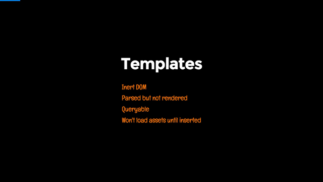
There's some related technology, like the template element, a template element, lets you write HTML without it being interpreted by the browser.
You can use this to create templates for your Web Components.
Here I've left the implementation details out, but let's imagine there's some CSS to make it spin.
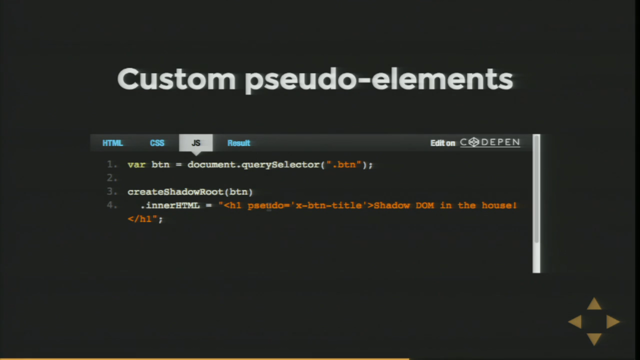
Another related technology is Shadow Dom.
A Shadow Dom is a scoped Dom that can be attached to an element to add private styles and implementation details.
This works similarly to how the browser implements its own elements.
Like how the video element has controls, but you can't see the inner HTML and style that implements them.
In this example, I attach a Shadow Dom to the spin element.
Then I get the template for that spin element and clone it.
This cloning is very performant.
Finally, I add that clone to the shadow root, which is the root node of my Shadow Dom.
I'll be using this boiler plate for constructing a Web Component throughout this talk.
There are many other ways you could do this.
You could construct it with document dot, create element calls with a third-party renderer or by directly setting the inner HTML.
Let's start with how my own interest in Web Components began.
We had expert authors who were writing content on our platform using mark down.
We wanted to introduce a way for those authors to write conditional content.
This content would show depending on what the user did on the page.
We couldn't let authors write their own JavaScript that could break the website or become a security vulnerability.
We ended up landing on letting the authors write sanitized HTML with Web Components used for the dynamic behavior.
Here's an example.
You can see here that when you select dog, one paragraph is visible, but if you select cat, a different thing is visible.
This doesn't require coding experience to understand, but it's not possible to make without JavaScript so that someone can write this themselves.
We're going to create a custom element that behaves like an if statement let's look at the HTML, the author would write.
Hey, you can see two inputs, one for cat and one for dog.
The set up is radio inputs with the same name.
So only one can be selected at a time.
Now we have the Web Components.
The idea is that the Ben dash, if element will show, if the input with the matching name and value is selected.
You can see here that because Web Components are just regular elements, we can mix them with other HTML, like a paragraph tag.
This concept is pretty flexible.
You could display images, videos, or any other HTML content.
You could even put more questions with their own.
If elements inside of these if elements.
The template I've written to implement these Ben dash, if elements only has two main parts.
First off the style element is used to hide the Ben if element by default, the host selector targets the hosting element, which will be our Ben if element.
It's perfectly normal to use a style element like this inside a template.
Since it gets put inside a Shadow Dom it is scoped to that Shadow Dom and will not style other elements on your page.
The second part is a slot element.
This is used for Web Components that can have child elements.
The slot is where the children go.
The children will not be part of the Shadow Dom.
They will be part of the regular "light" Dom.
For the JavaScript.
I've started with the boiler plate from earlier.
We create a if element that extends HTML element, we give it a Shadow Dom, and then we clone the Ben if template and put it inside the Shadow Dom.
Since we have two attributes name and value, we'll also add support for these.
The static observed attributes property is used to register attributes we want to receive updates about.
When those attributes have changed on the element, this attribute changed callback is called.
Here I'm just using it to set the attributes as properties of the object.
The final step is to change whether the element is displayed or not.
I'm doing this here by listening for change events on the document.
I attach this event listener in the connected callback, which is called when the element is connected to a Dom.
There's a corresponding disconnected callback that can be used to remove the EventListener.
The code here shows the element, if there is an element that matches this selector.
The selector will match any element with the corresponding name and value, which is checked.
And that's all the bits and pieces to implement an if statement with a Web Component.
What was really neat about this concept was that it let content authors experiment with dynamic behavior they normally wouldn't have access to within the constraints of markdown.
By opening up a limited amount of programming behavior, we saw combinations we couldn't have imagined at the time.
This makes me think about how limited writing articles on the internet is.
We still tend to write them like magazine articles, but we could be writing them with dynamic content-like programs, but that's for another talk.
The second big use I had for Web Components was building small utilities.
Think about the sorts of things you repeat all over your HTML, like timestamps or icons.
Turning these sorts of things into Web Components can make your HTML much tidier and help you decorate them with a little bit of JavaScript magic.
HTML doesn't let us invent our own semantics.
So it's common to mix implementation details in with our semantic HTML.
Here, the span and the SVG are being used to produce a particular rendered result, an icon.
In my experience, this sort of HTML is quite common.
If this was JavaScript, we would have created an icon helper function.
This helper I could abstract the implementation, allowing it to be easier to understand and more flexible.
Then if we wanted to switch from a library that uses a class for icons to another that uses SVGs, we could do that inside the helper.
We can create our own abstractions in HTML with Web Components.
Here, I've created my own element, Ben dash icon, which represents an icon and it has a single attribute name, which you can set to change the icon.
Let's go through how this could be implemented with Web Components.
To begin with.
I've defined a template element that has an SVG inside of it.
I could have also put a span here for the other way of rendering icons.
To change which icon is rendered.
We'll need to set the xlink:href.
So I've used an ID for the use element.
Since the ID is inside a template here, it won't conflict with the rest of the document.
Once it's rendered inside a Shadow Dom, it will be scoped, and so it can't impact the rest of the document there either.
For the JavaScript, we'll start with the boiler plate, defining the class and the custom element, cloning the template into the Shadow DOM.
Because we'll need a reference to the use element.
I've also used get element by ID to look it up in the Shadow Dom.
Being able to use ID in Web Components makes them quite simple to implement.
To make it so the element updates based off the name attribute, we'll need to set up the observed attribute static property, and the attribute changed callback.
This time we're observing the property name.
Inside the attribute change callback, I'm constructing the appropriate URL for the SVG and then setting it as an attribute on the useEL.
And the result is a plain button with some icon alignment issues.
Someone will need to sort out the CSS.
Not me though.
I've got another example to show you.
So, we've switched over all our little bits and pieces to Web Components, making our HTML better abstracted.
But there are also bigger utilities that we might have laying around.
The situation I've come across a few times is an old jQuery utility that forces an otherwise lightweight page to have a big jQuery download.
You can also see this with websites that use just a little bit of React - they need the whole React library.
Replacing those utilities with Web Components can help drop your page weight by removing external dependencies.
Carousels are exactly the kind of thing that ends up forcing you to have a jQuery dependency.
In this section, our goal is to build a really simple 'catousel' as a proof of concept.
To begin with, let's look at the HTML result.
Here the details of the carousel have been abstracted out to focus on the semantics.
You can say there is no unnecessary markup, like wrapping divs or buttons.
These are internal implementation details.
If we wanted to add customizations to this, we could add them as attributes or CSS variables.
But couldn't I do that with React or Vue or PrototypeJS?
You absolutely could.
And that's a choice you can make.
There are a number of benefits to using a Web Component instead.
The benefit of using a Web Component is that it is a web standard, not a framework or library.
You can use it inside any other framework, just the same as you would to render a native element.
Something that is really useful about Web Components is that they will work in plain HTML.
You don't need to set up a rendering context or run a framework.
You don't need to compile them or pack them.
You can, but you don't need to.
This template is going to be a bit more complex, but the building blocks are straightforward.
Here, I've added two buttons that sit either side of a slot element.
The slot element is where the children of the Web Component will live .To see what this looks like, let's introduce our boilerplate from before.
And this is what we'd see on a page with just this setup.
So this is obviously going to need some styling.
Using the host selector to target the Web Component itself, I've made it display flex.
So the children sit side by side.
Simply adding a container for the images will constrain them because the flex will apply to that container.
The images all sit directly inside this div, the slot is effectively replaced by the children.
It doesn't take up space in the DOM.
Now I want to style that container.
I've started here by selecting it with the images ID selector.
Flex shrink will make it so the container shrinks if all the children don't fit, then flex again to make the children, that's all of the cat pictures, side by side horizontally.
Finally, overflow scroll allows the user to interact with the carousel by scrolling it.
The cool thing about Web Components is that none of this styling will ever escape the Web Component, it's all scoped.
Already, this carousel is pretty useful and we haven't even added JavaScript.
To implement the JavaScript.
We'll first need to get each of the elements from the Web Component using ID everywhere makes this super easy.
To make the previous and next buttons work.
I'm scrolling the container by 100 pixels.
This keeps it super simple.
In a real implementation, you might do something more sophisticated, like snap to each image.
And that's it.
We've got a "catousel" that can be controlled with buttons.
It's a reusable component that can replace an existing carousel and be used in any website or web app, no frameworks required.
The final example I'll be talking about here is wrapping up APIs or libraries using Web Components.
Sometimes you might want to package up a little bit of user interface for customers, third parties, or even an internal team to use.
Imagine the 'like' button that Facebook launched a decade ago or Stripe's UI library for credit card processing.
Web Components are a great fit for this use case.
In this talk I've been using the Placekitten API quite a bit.
It's handy for creating placeholder images, especially if you like cats.
Let's wrap it up into a nice little Web Component.
This one's going to be a speed run because we've gotten pretty good at making Web Components so far, we'll start with a template that contains an image element that has an ID of image.
We'll use our standard boiler plate.
Then in the constructor, we'll make sure we grab a reference to the image element.
Then we'll monitor the width and height of the Web Component.
When that updated, we'll make sure the Placekitten URL is updated as well to match.
Done.
We've shipped a very useful Ben dash cat element that wraps the popular Placekitten API in a Web Component.
To help you think about how you might use Web Components, I'll reflect back over what I like about Web Components.
Web Components are a great way to abstract out the implementation details of HTML.
You can give your peers a nicer development experience and reduce the potential for bugs, plus all the other nice things that abstraction gives you.
Web Components are like helper functions for your HTML.
Web Components are a Web Standard, and this has a number of implications.
Because they're a Web Standard, they aren't going away.
They're going to work into the distant future.
Being a web standard also means you don't need to ship any extra JavaScript to make them work.
Using them isn't going to bloat it up your page with library JavaScript.
It's already part of the browser.
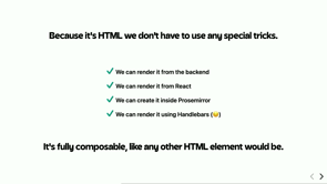
Web Components behave just like any other HTML element on the page.
That means they're compatible with every other existing framework.
You can interact with Web Components from jQuery or from React.
They're just elements.
Speaking of them just being elements.
That means you can write them as plain HTML.
You don't need to have a wrapper element and create a rendering context or anything tricky.
You just add them to the custom element registry.
That means you can use them on server render pages as well.
No hydration necessary.
Finally, Web Components are neat.
They're an extra tool in your front-end toolkit to solve some pretty common problems.
And that wraps up this talk.
Thanks heaps for listening and shoot me any questions you have here or on Twitter .Cheerio.
Web Components can feel like a bad fit for a JavaScript tech stack. If you’ve got a legacy codebase, you might be thinking about switching costs. Or you’re already running a modern stack and don’t see a need for them. But this shouldn’t be an either/or, you can have both!
Web Components work great as isolated improvements to your codebase. Their API is neat and tidy and doesn’t require a “big switch”. In this talk I’ll give an overview of Web Components and explore examples of how you can use Web Components practically in any codebase.