Overview of the Core Web Vitals metrics
Hi, everyone!
I'm really excited to talk about the Core Web Vitals today.
Specifically, I wanted to talk more about how we designed the metrics - our guiding principles, and how we applied them.
So first, I'm going to go over that background, and then I'm going to dive into each metric and explain it more deeply.
Finally, I'm going to cover a bit more of how we're thinking about what's beyond Core Web Vitals.
So first, what are Core Web Vitals?
They're metrics for web sites designed to bring a focus on the user experience.
We intend to keep these to a very small set, so that we don't divide developers' attention between too many things, and they all follow the same guiding principles.
First off, each metric should apply to all web pages.
It's really important to us to have broadly applicable metrics that can be shown in all sorts of tools and dashboards.
Second, each of the metrics directly measures a key aspect of the user experience.
Third, every Core Web Vital is measurable in the field so you can get the ground truth of what users experience on your site.
I want to dive more deeply into the second two principles.
First off, let's talk more about direct measures of user experience.
What does that mean?
There's a bit of subtlety here, but I think it's important to understanding what we decided to include.
A direct measure of user experience measures something the user can actually see or experience: things like how long it took for content to display on the page, or how long it took to respond to a user input.
They're different than indirect measures, which are often used as proxies for user experience.
I've listed some examples of these proxy metrics on the right.
Sometimes the proxies are points in time, leading up to something the user can see, like Time to First Byte.
Sometimes they're more measures of best practices like counts of unused bytes and unnecessary blocking requests.
We get a lot of questions about these proxy metrics - why not include them in Core Web Vitals?
Well, first there are a lot of them and each one might matter more or less for any particular web site.
For example, measures of image compression matter a lot more on image-heavy sites than they do on text-based sites.
Second, most of these metrics check whether a web site has employed certain best practices.
And while following best practices is great in general, a site can have a great user experience even if it doesn't follow best practices.
And best practices change over time as browsers and frameworks add new features, but good user experience usually doesn't.
We want to measure how the site is actually experienced by end users, regardless of these underlying technology choices.
So should you monitor proxy metrics?
We believe that you should dig into which ones are most applicable to your site's overall user experience and monitor those.
Recording things like bytes of JavaScript added on every commit can be super helpful for preventing regressions.
But when measuring success, we recommend tracking direct measures of user experience.
So that's where the Core Web Vitals are focused.
The second guiding principle I want to talk about is measuring in the field.
First, let's go over what measuring in the field is.
We use the term 'field data' to mean data that captures what real users experience as they browse your website.
This is also called Real-User Monitoring, or RUM for short.
Some examples of products that show field data are the Chrome User Experience Report and Google Analytics.
Field data is different from lab data, which generally comes from debugging tools.
Lab data can come from an actual device lab, like you might be tapping into when you use WebPageTest, or from a device you're using locally like the phone being tested in the picture.
One thing that's important to remember when looking at field data is that your site will have a lot of page loads, and that means there will be a lot of field data.
It will form a distribution, usually shaped with a long tail like this one.
On the left, you can see that a few users had a lightning fast experience - a few hundred milliseconds!
While on the right, a few users had a very slow experience, waiting several seconds.
But most of the page loads were around 1-2 seconds.
When we have a distribution like this, we usually report it as a single number, generally, a percentile.
For Core Web Vitals, we've chosen to look at the 75th percentile.
Why?
As you can see on the chart, it covers most of the page loads.
If the 75th percentile is good, most user experiences on the page are good.
And you can also see on the chart, most sites have a very long tail of slow experiences.
For sites that have less traffic, higher percentiles in this long tail can be really noisy, swinging up and down wildly from day to day.
We wanted to provide more stable and representative data for these sites, so we chose the 75th percentile to cover what most users experience on the site without too much variance.
If your site has enough traffic that they're stable, we definitely recommend looking at higher percentiles too, like the 95th to the 99th.
You want as many users as possible to have a great experience on your site!
Going back to lab tools, when you run a lab test in a tool like Lighthouse or WebPageTest, it's just going to give you one point on the curve.
And because the devices and networks of each user's site are different, there's no way to predict where on the real user curve that lab run will fall.
So lab tools can't perfectly predict what your 75th percentile will be.
But they do give you lots of deep debugging information and opportunities for improvement you won't be able to get from field data.
And you can set up lab tools to run in your continuous integration tests, which is one of the best ways to catch performance regressions early.
So while lab tools are super helpful, we recommend using them in conjunction with your field data to better understand where to focus.
So that sums up the guiding principles behind Core Web Vitals.
They're direct measures of user experience, measured in the field so that we can bring the focus on what real users are experiencing as much as possible.
So which user experience do we measure, exactly?
I'll walk through them one by one.
The most broadly used measure of web page experience is page load time.
People load a lot of pages on the web, and there are lots of great studies showing they want those pages to load quickly.
So our first metric is a measure of page load time.
Largest Contentful Paint.
But how did we arrive at that metric specifically?
Let's start with an example filmstrip of a web page loading.
First it's blank, and then a skeleton loads in, and then the text and images.
We think if that if we're going to focus on the user experience of this page, we really want to measure the fourth entry in the filmstrip, which shows when the main content is visible.
Let's talk through some existing metrics and where they show up on the filmstrip.
One really popular metric in web performance is First Contentful Paint.
The First Contentful Paint is the time at which the first text or image is painted to the screen during page load.
In this example, it corresponds to the second entry in this filmstrip.
It's a great metric because it shows when the page load starts to become visible to the user.
But for Core Web Vitals, we really wanted to start with just one page load metric, and have that metric focus and when the main content is loaded.
And First Contentful Paint occurs much too early for that.
Another loading metric is Speed Index, the average time at which visible parts of the page are displayed.
We love speed index - it corresponds really well to when the main content is loaded.
But all Core Web Vitals need to be measurable in the field.
It's not really feasible to implement speed index in a browser in a way that doesn't slow down page loads - that's why tools generally calculate it from a video instead.
So we wanted to find something similar, that would give us a good estimate of when the main content on the page was shown, but was fast enough to calculate in real time as every page loads.
Our biggest building block was the ability to know when each image and block of text in the viewport is painted to the screen.
So we took that and tried lots of different combinations - largest image paint?
The last text paint?
We built a tool that loaded several thousand web pages, and recorded filmstrips showing exactly where each variation of largest or last image or text paint occurred.
We looked at the differences between each metric variant, and the pages that were outliers, with really small or really large metric values.
We spot checked many sites and after a lot of analysis, we came to Largest Contentful Paint - the time when the largest image or text block on the page is painted, excluding background images.
We implemented it in Chrome and did a large-scale analysis, which showed that it worked well in practice.
We also did a correlation study with speed index, showing that it produces similar results for most web sites.
Here's how Largest Contentful Paint does on our filmstrip - it identifies the headline image as the largest, which lines up with when the main content was visible to the user.
Here's how Largest Contentful Paint does in our film strip -it identifies the headline image as the largest, which lines up with when the main content was visible to the user.
Overall, it generally does well at identifying when the main content on the page is visible.
So we were really happy that we found a good metric to encourage developers to display content to the user quickly.
But one problem we see when sites hyper-optimize showing content quickly is that they often do it at the expense of interactivity.
They push all the scripts to a giant block at the end, and then there can be a huge amount of work on the main thread from loading them all at once.
This makes the page slow to interact with.
We wanted a metric that would capture this, so that developers ensure their page is both fast and interactive.
The first attempt at an interactivity metric was Time to Interactive.
You can see on this diagram, as a page loads it has network requests (at the top) and JavaScript tasks running on the main thread.
Some of these are quick (in green) and some of them take longer (in orange).
Time to Interactive was intended to be an all-in-one metric that measured the main content loaded and the page becoming interactive.
It measures the start of the first 'quiet window' of 5 seconds with no long tasks and no more than two in-flight network requests.
But time to interactive isn't reliable in the field.
First, some pages never have a quiet window.
They continue to have background tasks right up until they're unloaded.
Second, the quiet window cannot be computed if the user taps or scrolls before it acts.
These problems mean that about half of all page loads in the field don't have Time to Interactive reported at all.
But we said that the problem we want to look at is main thread tasks blocking interactivity during load, right?
So why not just look at a metric that reports main thread time directly, like the longest task or the total blocking time?
The reason is that if a long task happened but it didn't interrupt the user, how do we know that's a bad thing.
Maybe the web page scheduled the work to do those tasks when the user wasn't interacting on purpose.
So we want to go back to the idea of directly measuring a user experience.
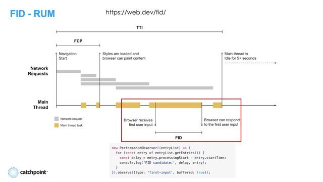
And that user experience is when the user clicks, taps, or presses a key, and the main thread is blocked by lots of scripts running.
So that's what First Input Delay measures - the time until the main thread is unblocked, and the browser can start to process the interaction.
Next, another user experience problem that we wanted to tackle.
A really frustrating part of the web today is when content shifts around, when you're trying to read it.
Or even worse, right when you're about to click on something.
So we worked to implement a metric that can surface when this happens.
It's called Cumulative Layout Shift.
I've gotten a lot of requests for a deep dive on how the metric works, so I'm going to cover it in more detail here.
If you don't find all the specifics I'm about to go over super interesting, don't worry.
There are tons of great tools to help you find and fix layout shifts on your site and you don't have to deeply understand how they're computed in order to improve the visual stability of your site.
To understand how it works, let's start by looking at what a layout shift is.
Here's an example of a single layout shift.
The blue image loads, and the text at the bottom of the page is shifted downward.
Each time an element on a page is shifted, we calculate a layout shift score.
The score looks at two things: how much of the page moved, and how far it moved.
Let's work through an example.
First, how much of the page moved?
We take the area of the screen where the element used to be, and the area of the screen where it is now, and combine them.
That's the impact region.
Then we divide that area by the area of the viewport, to get the impact fraction.
In this example, the impact fraction is about 0.4, or 40% of the viewport impacted.
Next, we look at how far the element moved.
Since the element moved downward, we look at the distance it moved down divided by the viewport height.
In this example, we get a distance fraction of about 0.25, meaning it shifted down about 25% of the viewport.
Now that we know how much of the page moved, and how far it moved, we compute a score.
The score is just these two fractions multiplied together.
So if one of them is small, the score will be lower.
That's because a big region only shifting a little bit or a small region shifting a lot isn't as bad of a user experience as a big region shifting a lot.
In this case, the score is 0.1, which is our threshold home for what can be considered "good".
And the metric is called Cumulative Layout Shift because if there are multiple layout shifts on the page, the scores of each are summed together into a cumulative score for the page load.
And one thing that's really important to us is that we capture the frustration users have when the content shifts around after the page is already loaded.
When they're trying to scroll through an article and the text shifts out of view, or when they're trying to click a link and it moves out from under their mouse.
So Cumulative Layout Shift measures the layout shifts throughout the whole lifetime of the page.
But for pages that are open a really long time, the layout shifts can add up a bit too much.
Here's an example that we saw pretty frequently when we did an analysis of pages that had high CLS scores and were open for a long time.
This page has an infinite scroller, and there's a footer at the bottom.
As the user scrolls, the footer shifts down every time new content comes in.
It's a little annoying, but if the user has a page open for several minutes, and the score continues to increase and increase, it's not infinitely annoying.
We thought there should be a cap on the score for experiences like this - they're not perfect, but the user frustration is captured in the first couple of shifts.
So we dove into a lot of different ways to address this in the metric.
And we came up with what is called the session window.
Here's an example of a timeline of a page.
Over time, you see various layout shifts happen.
Those are the blue bars, and their heights correspond to the score for each shift.
You'll notice that they're split into groups.
This is really common on web pages; you'll often get a burst of shifts when loading or scrolling or doing a single-page app transition.
A session window split these bursts into separate groups.
The splitting is pretty simple.
It makes a new session window every time there is a 1 second gap with no layout shifts.
But what about an infinite scroller with a constant stream of tiny layout shifts?
For that case, if there are no gaps, we cap the session at 5 seconds.
After we've split the layout shifts into sessions, we just take the session with the highest score.
You can read a lot more about how we decided on these numbers in the blog post I've linked in the slides.
But here are a couple examples to clarify how the windows work on web pages.
First, let's go back to our infinite scroller.
Every time that tiny bar at the bottom of the page gets pushed down for new content, there's a layout shift with score 0.01.
This happens once every 0.9 seconds, which means we'll never have a 1 second gap.
So the session window grows to its maximum size of 5 seconds during which there are 5 layout shifts.
These sum up to score of 0.05.
That's about half the threshold we consider good, so if this is the only type of layout shift on the page, the page still meets the "good" threshold.
Here's a different example.
This page has a small layout shift when it's loaded, as that little red promo bar at the top, shifts the content down.
Then the user scrolls down until they get an unsized image, and there's a big shift as the image loads in and the text below shifts down.
Since these shifts are more than one second apart, they're split into separate windows.
The score of the larger window is reported - in this case that's the score for the big shift during scrolling.
And that's how CLS is defined.
So to recap, Cumulative Layout Shift is the sum of the layout shifts during the worst period of shifts throughout the page lifetime.
And that's all three of the Core Web Vitals metrics.
In addition to the metrics, we also have recommended thresholds.
I wanted to talk a bit about these.
The idea behind the thresholds is to identify the best user content on the web.
And that's all three of the Core Web Vitals metrics.
In addition to the metrics, we also have recommended thresholds.
I wanted to talk a bit about these.
The idea behind the thresholds is to identify the best content on the web.
We base these thresholds on two things: User experience research about the ideal metric values and achievability of good scores in the real world.
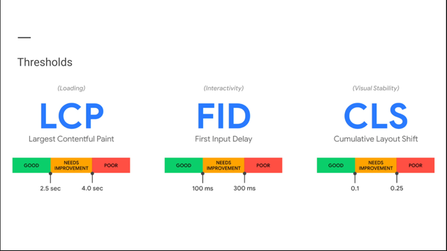
For Largest Contentful Paint, user experience research says that ideally a page would load in as little as 1 second.
But looking at the web today, even the very fastest web content doesn't consistently load in one second.
We find that the best content loads in about 2.5 seconds or less.
So that's where we set the threshold - a value attainable by the best web content, that is as close to what the user experience research recommends as possible.
For First Input Delay, a lot of user research says that a response to user input should happen in 100 milliseconds or less.
On mobile, about 75% of sites do meet this threshold for first input delay.
So it's a bit lenient.
But we didn't want to set a threshold lower than what we saw in existing research.
So we kept the 100 millisecond threshold even though most sites meet it pretty easily.
We plan to extend the responsiveness metric in the future to cover more of the user interactions in the page, which should make the threshold a bit harder to meet, but also cover more of the user experience.
For Cumulative Layout Shift, ideally there would be no layout shifts on the page, so the ideal score is zero.
But when we looked at what the best content of the web achieves today, we thought the 0.1 is a more achievable threshold.
So that about covers the Core Web Vitals.
But I wanted to cover another question we get a lot.
Do you really need only three metrics to measure everything in your website?
And the answer is that no - you know your product best, and a lot of the things you want to measure are product specific.
We thought a lot about that when designing the APIs for the metrics, and we worked to make them flexible to other use cases.
The element timing API, which powers Largest Contentful Paint can show you when any element on your page painted, and it can be useful for product-specific metrics or single-page app measurements.
The event timing API, which powers First Input Delay gives you timings on every event throughout the page's lifetime, so you can build metrics that expad far beyond loading interactivity.
And the layout instability API reports individual layout shifts that you can aggregate any way you like; you could report them only for scrolls or break them down by single-page app transitions.
If you want to learn more about the API design or the standardization process, please check out Nic and Nicolas' talk tomorrow, "What's new at the W3C Performance Working Group?" And that's what I wanted to cover on Core Web Vitals today!
To recap, our guiding principles for the metrics are that they apply to all web pages, directly measure user experience, and are measurable in the field.
The metrics are largest Contentful Paint, which reports when the main content was visible to the user, First Input Delay, which measures interactivity during load, and Cumulative Layout Shift, which measures unnecessary content shifts.
As we've worked on the metrics, we've worked hard on the underlying APIs that power them, to give building blocks to developers looking to write custom metrics for their own products.
Thanks everybody so much for listening.
The Core Web Vitals provide unified guidance that is essential to delivering a great user experience. Annie will talk about why and how these metrics were developed, how you can measure them on your site, and how they fit into the bigger picture of a product’s user experience.
Link to the web.dev resource page for:
Better layout shift metric