Measuring the Value of REA’s Design System
Introduction
Chris Stonestreet introduces himself and the topic of his presentation: the journey of REA's design system and how it demonstrates return on investment. He highlights the significance of design systems for designers, developers, and product managers.
REA Group Overview
Chris provides an overview of REA Group, Australia's leading digital property advertising company. He discusses its various brands, including realestate.com.au, realcommercial.com.au, Flatmates, and PropTrack, emphasizing their technology focus and people-centric culture.
ConstructKit: REA's Design System
Chris introduces ConstructKit, REA's design system, and its usage across different brands and platforms. He describes the system's evolution from a passionate side hustle to a dedicated team with a clear mission to enable better and faster product delivery.
What's Inside ConstructKit
Chris explores the components of ConstructKit, including its React web components, native components for iOS and Android, documentation, example app, and Figma library. He emphasizes the importance of a comprehensive system for streamlining development processes.
Design Tokens and Their Importance
Chris delves into the design tokens within ConstructKit, highlighting the effort put into maintaining consistent naming conventions across platforms to ensure a shared language between designers and developers.
Evolution of ConstructKit
Chris traces the evolution of ConstructKit from its early versions to its current state. He showcases the design system's growth and the importance of version control and documentation for tracking changes and providing historical context.
Internal Example App
Chris discusses the internal example app used to showcase native components on real devices. He explains its value for both developers and the design system team, facilitating testing and bug bashing sessions before releasing components to end users.
Unlocking Creative Vision
Chris addresses the misconception that design systems limit creativity. He illustrates how ConstructKit played a crucial role in REA's visual transformation, enabling a website refresh that aligns with the brand's personality.
The Creative Process
Chris outlines the creative process behind REA's visual rebrand, emphasizing the selection of the Pangea font and its connection to REA's commitment to environmental sustainability. He also discusses the revamped color palette, inspired by the Australian landscape.
Quantifying the Impact
Chris shifts focus to quantifying the impact of ConstructKit and demonstrating its return on investment. He outlines four key pillars for measuring success: engagement, efficiency, adoption, and speed to market.
Construction Worker: The ROI Tool
Chris introduces Construction Worker, an internal tool developed to calculate the hours saved by using ConstructKit. He explains its features, including snapshot and cumulative hours saved, version usage tracking, and contribution recognition.
Collecting System Data
Chris' colleague, Alice, provides a technical overview of how system data is collected for analytics. She describes the data structure, the use of GitHub APIs, and the process of parsing code to identify component usage.
Calculating Hours Saved
Chris concludes by explaining how the collected data is used to calculate hours saved. He emphasizes the importance of tracking time spent on component development and using historical data to calculate cumulative savings.
The Future of Design Systems at REA
Chris discusses the future direction of design systems at REA, highlighting the emergence of design system kits to meet specific needs within different brands. He emphasizes the importance of fostering collaboration and reducing duplication of effort.
Conclusion
Chris wraps up his presentation by thanking his team members and emphasizing the importance of open communication and sharing knowledge about design system ROI. He encourages the audience to connect with him for further discussions.
Perfect.
To begin with, thank you to the Web Directions team for allowing me to come along today and share a story with you.
But just a show of hands, who's a designer in the room?
Cool.
Who's a developer?
Who's a product manager?
Hey!
Represent.
Cool.
So today I'm just going to share a story with you.
That story is the journey of the REA's design system.
I've got to stop saying NIB's design system.
And what I'll share with you today is how we show our return on investment.
So we recently demonstrated that we've saved the company 300,000 hours of design and development time.
How we've helped to unlock creative vision.
And I'll share a little bit about what's actually inside of our system as well.
So yeah, for anyone who doesn't know what REA Group, is, it is the leading digital property, advertising company within Australia.
You're probably most familiar with realestate.com.au, it's a two sided marketplace, so people like you and me, we go onto the app and the website, look at properties, track properties, and then there's another side as well, where we have portals where agents can log in, manage those properties that get pushed down onto the consumer side.
That's the same kind of thing with realcommercial.com.au for the commercial real estate side of the business.
We have other businesses like Flatmates that helps people find shared accommodation.
And there's also another one called PropTrack as well.
PropTrack is the leading technology, part of the company that feeds all of the data into those experiences.
We have a vested interest in Asia and North America as well, and Real Estate Group I believe is really strong in their technology presence, in how they foster innovation and collaboration as well.
And this kind of sounds a little bit corny, but they do believe in people and that people culture.
You hear a lot about that in large enterprise companies, but without the good people you can't make good things.
So this is ConstructKit, that's the logo for the REA design system.
And across four of those brands, at any given time, it can be used by around about 58 designers from product design to design management.
Around about 319 developers use the design system across iOS, web, and Android.
So just going back in time, in 2018, the design system started like most design systems do.
It's just a bunch of passionate people getting together to reduce waste and reuse what's already available.
And if you're at that part in your journey, there comes a point where it's not sustainable, these side hustles burn out pretty quickly.
So there was a product manager who saw this as an opportunity to get buy in and to start growing the design system team.
And we've definitely grown a lot.
This is the current makeup of my squad.
We're a 13 headcount.
We have roles across product management, delivery.
There's, still strong growth in design, web developments, scaled as well, and we have four developers now in iOS and Android.
Every design system needs a really good mission, and this is our mission.
The language has changed over time as people in, within the team have come and gone, but the core, message stays the same.
And that's to enable REA brands to deliver better products faster by providing easy access to our design systems patterns, components, and tools, which is really important.
Ensuring a consistent and seamless user experience across all of the REA brands while aligning to the REA's group strategic objectives.
So how do we do this when we turn up to work?
We strive to provide a comprehensive system that streamlines our product development process, we promote collaboration and innovation, and we embed support into everything that we do to maximize the delivery scale.
And it's actually important to ladder up to the REA values as well when we're talking about a lot of this stuff.
What's inside of the system?
There's nothing really exciting in this part because thanks to the maturity of the design system landscape, there's a lot of material out there and that's why conferences like this exist today that can help anybody get started.
But what you're about to see is just the ongoing natural evolution of our design system that's constantly changing to meet our internal clients needs.
So when ConstructKit started, it was primarily a React based web design system.
And we have a mental model that the components are broad and generic.
Now what that means is that the components can be simple, sometimes complex depending upon what they are, but they should be able to be used across as many brands as possible.
And that comes with its pros and cons as well.
And what it actually means too when it comes to the design system, we leave the theming up to those separate brands to look after.
So we can build a red button, but if Real Commercial wants a blue button, they look after that theming using what's called an overriding function in the code base.
Last, whoops, that's a bit of a sneak peek to the next slide.
Last financial year, we actually, brought in a official native design system into the squad.
So with the success of the web design system, there was a small group of, once again, passionate people who got together to try and start the native design system because they already understood the benefits that the web design system brought to the table.
And we saw this happening and said, Hey, we probably should bring it into the fold and give it the love and attention that it needs to succeed.
So in October 2022, we brought the four native developers into the squad and started to grow that native design system offering.
So when we talk about design systems, we often talk about components or a React, sorry, a Figma library.
But this is our system.
This is what we look after.
I won't go into Figma because we all know what that is.
But like I said before, we have React web components.
For iOS, we use SwiftUI.
And for Android, we use Jetpack Compose.
Sorry, Kotlin with Jetpack Compose for Android.
We also have a test app, or an example app, which I'll show you in a moment.
We do have documentation inside of GitHub, and we also have our dedicated doc site.
So when it comes to Figma, like I said before, there's nothing new here that you can't already find on some of the publicly available design systems in the Figma community.
We have each component set up with guidelines inside for designers who choose to read the documentation in that environment.
And on the left hand side, you can actually see a whole bunch of libraries as well, where we have our web design system in different versions, we have our native design system sitting separately to that, and we keep the foundations separate to the core part of that design system.
So iconography and colors, they stay separate, so that they're not causing any conflict with each other.
So just good, housekeeping.
If you're starting, don't try and throw everything in one library.
Think about piecing it out.
As part of our foundations, we put a lot of effort into design tokens.
Now when I say the effort into design tokens, you can call a design token whatever you want to call it, as long as it makes sense to your end users.
But here we try to make sure that the naming convention matches all of those three platforms, so it's the same across web, iOS, and even Android.
And there's a really important reason behind this as well.
It's because we want to make sure that designers and developers are constantly speaking that same language.
You need to understand that at our company, sometimes there'll be a designer who'll be working with a web developer on a piece of work and then have to pivot and work with a mobile app developer.
So we don't want to cause any friction there between naming conventions of small things such as, tokens.
So this was, taking a bit of a step back in 2018.
This was the first cut of the design system.
It was version 0.
1.
0.
Nothing exciting, bare bones, but it served its purpose at the time.
And, a fun little fact that I didn't know about until I joined the company.
But in our changelog, part of our document, in our documentation website, we actually have version control.
So you can go back in time and see what the different parts of the design system look like, which is pretty cool.
And that's how I found that screenshot in the middle.
So this is our design system, in its current state.
Like I said before, we do have a mixture right now of documentation in our core doc site, but also inside of GitHub.
And there's a reason for that as well.
The documentation that sits inside of GitHub is mainly for our native developers.
And what we found in the last financial year, we had a goal, which was just deliver as many components as we could for the native design system and get them adopted.
We had metrics, deliver 12 native components and get them adopted.
We hit 12 and we got 10 of those adopted.
But there's that age old saying that a builder's house is never finished.
So we live in this bit of a hybrid state at the moment.
But the DocSite, which isn't public, I like actually keeping it a little bit secret.
It has everything that you need inside of it, as you can see in the demo.
There's search.
For easy navigation, you have built in light mode and dark mode, so for web components you're able to actually see what they look like in those different states using those foundations that I talked about.
What else do we have?
We have accessibility best practices.
I get hit up a lot about accessibility in design systems and a lot of people come to me in the company and say, Chris, what do we do about accessibility?
ConstructKit, the design system is meant to be helping with that.
And I point them to this documentation on this website because it explains to people that we can build things in small atomic approaches in an accessible manner, but how they're put together by product teams is not on us, but product teams need to be thinking about how that works with screen readers, tab navigation, that sort of stuff.
So we try to educate, other internal clients, like product managers or executives, who aren't core users of the design system.
There's, online videos that you can watch to get started, say as a web developer, and also contribution guidelines as well.
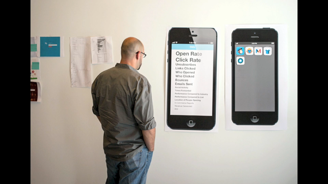
Like I said before, when I showed all those icons of the different software, we manage this internal example or a test app.
And this is a pretty cool piece of tech.
And the reason is, because anybody who, downloads and installs this internal app is able to see how native components work on real devices.
We've finished, recently talking to a whole bunch of native developers to try and understand, web, native developers to try and understand how do they use the design system.
And we learned some really key things from talking to them.
We found that they use the documentation website when they're in a presentation or in a team kind of workshop and the designers mock something up and it doesn't match the design system.
They're able to quickly pull up the design system doc site and show that it's incorrect.
But we found that they actually use the example app just to play more.
So we invest a lot of our time in making sure that this example app is maintained.
There's also a second reason why this example app is really important, because as a team, when we run QA sessions and bug bashing sessions, we're able to test out these components before shipping them out to our end users.
So that's what's inside of the system at a high level.
Let's talk a little bit about, unlocking creative vision.
So there's often a bit of a stigma around design systems where they can limit or inhibit creativity.
And that wasn't really the case, what I learned at REA, that REA's design system did play a key role in unlocking a visual transformation.
So this is the website from way back when, about two years ago.
It was functional, it did what it needed to do, but it hadn't visually been updated in about four to five years.
And the company was looking to give it a visual refresh to match the personality where the brand was headed.
And this is the website today.
And without the design system, a lot of what we see here today probably wouldn't have been possible.
Because we all know that with, design systems, when they're used, like I said, platform changes are really easy to make and everybody benefits.
So thanks to this, a lot of teams using parts or all of the design system, when we made changes at the foundation level, like I said, everybody benefited from it.
Because without investing in that single source of truth at a platform level, if your company is trying to do a visual rebrand, and every team's having to try and update their repos or the front end frameworks to match this visual rebrand that the designers mocked up, it's going to be very costly and very, painful for your developers.
So to share a little bit about this creative process that we went on, we took inspiration from the land, the lifestyle, and the moments around us.
We had a font problem, like most teams or companies probably experienced as well.
We had several different fonts in mainly the web experience that were getting rendered out.
museo sans, that sort of stuff.
So we went on a journey to select a new font, and we chose Pangea.
So we collaborated with a font foundry in Germany to design what is now called REA Pangea in our design system and also in our codebases as well.
It's a geometric sans serif font that we believe embodies the personality of the brand direction for REA.
Now what's interesting with this font too is it's now used across the web, the iOS app, and the Android app.
So it's across all of those three platforms.
But we didn't choose Pangea just because it sounds nice and the personality matches the brand.
There was another reason behind it as well.
And that's because 25 percent of Pangea's royalty fees go back into rainforest preservation and reforestation projects.
And that's also an important message as well because it shows our commitment to people and places and also our stance with our environmental sustainability.
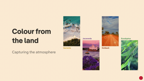
When it comes to choosing the color for our design system, we took inspiration from the land and atmosphere around us as well.
So we didn't just pick colors based off what we like from a random color generator.
There's a meaning behind the colors that we put inside of our design system.
So this is a snapshot of what the old color library looked at, looked like.
There's definitely a lot of gaps in the secondary palette, with accent and light, ranges.
Those white circles aren't filled out.
So this new color palette that we've, we've designed, has more of those gamut ranges.
So this is a screenshot of what our design system color palette looks like at the moment.
There is a lot more, if you were to scroll down and have a look at this.
But what we've chosen to do here is keep the core brand foundation colours.
So with that, larger range of gamut colors, it also helps teams now when they're doing data visualization to be able to use those, those more ranges of colors in their visual user interfaces.
The other benefit that the design system team brings to the table when we show our value is we're able to partner with real Commercial, RCA, and PropTrack PT to be able to help them set up their color library inside of Figma as well.
And that's something that's really important to share because we've got to remember that sometimes in these brands, within inside of our companies, there might just be one or two designers in there.
And those guys are pumped to be, under the pressure, pumped to get features out.
They don't have time to maintain this sort of stuff.
So we lend a hand, we work with them to set up their chronological colors and make sure they're all working, and that's another way that we provide value to the company.
And as you can see, it's really good with the Figma modes and variables.
This animated gif's not playing.
There we go.
As it toggles down on the left hand side, the design system is about three years old at this stage, visual identity is being rolled out, and we still have some inconsistencies that were happening, but when you start to apply some of these smaller changes to the design system, they don't really need much at an atomic level, but when you put them all together, the visual, coherence can be really impactful.
And obviously the great thing about having a design system as well, is it can stop people sitting in rooms debating what color should the box shadow be on a card.
And if you're actually finding that's happening in your company, you know you've got a problem, and you should start to design a design system.
Cool, so this is the meaty fun part.
This is where I, this is why I got into product management.
To quantify the impact, At REA, with our design system, we actually developed a tool to measure and show how our return on investment within our squad.
But before I show you inside of Willy Wonka's chocolate factory, quick question, who's actually ever Googled how do I show the return on design system or communicate the value of design system to business people?
You might find some tips and tricks in here that you could take away and apply in your workplace after today, if you're on that point of your journey.
So there's four pillars that I try to use when I measure the, the success of our design system, and I'll unpack some of these for you now.
The first is engagement.
So engagement is systems that are on the latest version, of the design system across any platform.
So when I say platforms, web, iOS, and Android.
We also have a dedicated support Slack channel.
So we try to funnel all of our internal users to go through that Slack channel.
And when we fulfill a request with a little emoji, we just hit it, pops up a little survey, we ask for some feedback, and we get a lot of good engagement through there as well.
We've, experimented with releasing via another dedicated Slack channel.
It's just called Megaphone.
Every time we make an announcement of a release, we push it through there.
We don't do what I'm about to say.
But if you're on the early parts of your journey, you can measure reactions.
That's a part of how you can get an engagement as well when you do announcements.
Efficiency.
This is about saving time, often measured in hours or days with product development, processes.
I'll unpack this one in a lot more detail in a second.
The third is adoption.
So this is subscriber engagement with those new releases that you may have published.
Last financial year, we experimented with releasing in Figma first.
So previously as a team, we would say we would make a release once there is something in code, it has documentation, and there is a component for it in a design software.
To our end users, that's perceived as slow.
So what we said to ourselves is, if we have something of value, ship it, and we can iterate on it later, even if it's not perfect.
And a web developer in my team, a few days ago said it's easier to add something in, rather than take something out, with breaking changes.
So it was really important to remember that as a squad.
There's another reason why we just decided to take this approach with releasing in Figma first as well.
We can start to understand if these components are helping outside of code repositories as well.
So these can be used in things such as vision prototypes, or prototypes that might be put in front of users for some user testing sessions.
And we know that we've been able to help there as well.
The other reason, which we don't do, and I wish we did more of, is leverage Figma's analytics.
By releasing something inside of Figma, we can actually see did people use it.
We get a lot of requests for components to be built and enhancements to components.
If we could release in Figma first, get something to a substance, a, portion, sorry, of our users, we're able to validate did they actually need that component rather than just wanting something from us.
The last pillar is speed to market.
This is what the business loves.
So this is about did, did projects get delivered quicker when using a combination of platform products.
So the design system is one of many platform products that teams can leverage to be able to go to market quicker.
And there was actually a product manager who crunched some numbers before my time, so I'm quoting him here.
But when the Experience Uplift team rebuilt that homepage, they also had a second goal, and that was to use technology from our tech radar to ensure that they're using the latest tech that the company's agreed on, which will help other teams federate into that homepage experience moving forward.
And the design system is a part of that.
To do a comparison of speed, they took a top down and a bottom up approach.
The top down was just looking at the data that was tracked by this team in things such as estimation sessions and story points.
And the bottom up was looking at actual delivery data.
So how long did that ticket actually take to get to done in Jira?
And what they found, to quote them, was projects using a combination of platform products were actually shipped 50 percent faster to market, requiring, fewer developer days.
So it went from about 240 developer days down to 60, which is fantastic.
And that was something that shows why we invest in these platform products.
So I'm going to talk to you a little bit more about efficiency.
We build a tool because everyone loves building software.
So we build an internal tool as a part of the Hack Day project, which is what we use to calculate our hours saved metric.
So inside of our doc site, we have under tools and analytics, and anyone in the company can come and see this data.
Construction worker gets run.
It was weekly, now it's fortnightly.
I think it's changing to maybe monthly because it's a manual process.
But the data is what we use to build out this front end dashboard.
There's two snapshot hours saved in this overview page.
We have cumulative hours saved and snapshot hours saved.
But you can also see at the top with the tab navigation, the three different platforms as well.
So when it comes to snapshot hours saved, that is essentially a smart way of saying what's being used in production right now.
What's inside of GitHub that's using the design system.
When it comes to cumulative hours saved, that's the total amount of time that we've helped save teams since the beginning of the design system, which was about four and a half, maybe five years ago now.
So even if a, system uses a component and then removes it, so for example, if, let's just say, if a developer two years ago inserts a button into their repository for a front end UI, and then a year later, take that out for whatever reason.
We've actually helped save them time, so we calculate all of those hours as well.
As we scroll down, we can see latest version usage at a high level overview as well.
How many teams are or systems are using the latest versions, or major latest versions.
I'll just go back to this one.
This one's actually been really helpful of late as well, because what we're able to do now is correlate a system back to a team.
Go and tap that team on the shoulder, and say, how might we help you upgrade?
And that's a part of the value that the design system brings to the table as well.
There's no secret sauce in how we do that mapping, it's painful, we just use a spreadsheet to do that.
Further down on the overview page, we have external contributions.
Now, this is something that we only released last year, and we had a goal last financial year, which was three contributions to the design, system.
Once we worked out how we're going to track it, we hit 30 pretty quick.
So I just moved the bar.
As a product manager, I feel like I could do that, and I said, yeah, let's hit 40, let's see how we go, and we did hit 40 contributions, or 43, to the design system in the financial year.
So now we thank, our internal users, in this case developers, for their contributions and recognize them on the design system as well.
Further down, we can see top systems overall that are using the design system, and which top components are actually being used, across all three platforms.
Now if I just quickly deep dive into one of the, platforms in the analytics page, the snapshot and our saves, at the top stays the same, but as we scroll further down we can see versions as well.
So versions is basically telling us which systems are on the major and minor, versions of ConstructKit, and once again it's just another data point that we can use to be able to correlate to a squad and go and help them upgrade to the latest version.
Further down the page, we have a list of the web repositories, and which ones are using the most components.
And then even further down the, below that, we just have a, dedicated web component list view.
So here we can see that text is being used more than button, and then icons, and then cards, and then stacks, for example.
When it comes to overrides, so just like in Figma, we can apply, overrides.
We have a, an API that's called a Dangerously Set Class Name.
So anytime someone, sorry, in Figma when you detach a component, we can't do the same in code.
We can actually track that as well.
So we can start to understand from a developer's perspective, why is that, why is that component being overridden.
And when it comes down to the changes data, every time we run Construction Worker, we're able to see which new systems are being added, which systems are being shut down for whatever reason, and start to see which components, are being removed.
Inside of changes as well, we can filter by date range, to see the hours saved that we calculate, which I'll show you a bit of the secret sauce in a moment, when it comes to this specific platform.
And this was actually really helpful because last financial year, there was a, an OKR in one of our technology layers for our company goals, which was to save 140,000 hours using platform products.
So I was able to use these numbers and feed that into that bigger, key result, for the company and show how we've been helping to move the needle.
So how do we actually get the data to build this stuff out?
This, the first question you need to ask yourself is, have you tracked the time?
If you have, great, use that.
So in JIRA, we track the time that we spend designing and building a component.
But in the earlier days, we just didn't have that information at hand.
So we would go back inside of GitHub, look at, PRs, issues, commands, and piece together a bit of a story about how long it took us to, build that component.
Now we know that's just an estimate and estimates aren't accurate, but at the time the goal was just to show the value of the design system.
So now what I'm going to do is press play and one of my colleagues, Alice, is going to tell us how she gets the information out of systems data.
She's best placed to talk about this because, once again, I'm a product manager, I'm not a developer, so this is her wheelhouse.
[Alice] Hi everyone, I hope you're enjoying Web Directions.
I'm just popping in to give you a high level overview of how we actually collect the system data for our analytics.
So on the right here you can see exactly the structure that we collect for each system.
So to go through that quickly, we have a name for each system, the construct kit version and where that version is defined.
So for things like monorepos, there could actually be multiple versions of that.
We then have the components that are being used in this system.
So for each component, we have the group's name, the hours saved, which is that time spent value and the exact components that are actually being used.
And then we also have the tags down the bottom.
So this just helps us determine whether a system is production or not.
So to get this data, we follow the steps on the left.
So the very first step is to perform a git, use the GitHub search, API We, we use this to find the systems that are using ConstructKit.
And we do that by finding all of the systems that define construct kit in a package dot json file.
Once we have that list of repos, we perform a shallow cone.
So this just gets a local copy of all of those systems on our machine.
Which allows us to be able to do something really powerful, use a grep command to search through those systems.
So we use grep to find the versions in the lock files, as well as all of the files that use components.
We then take those files using components, pass them through a Babel parser.
So the Babel parser is helping us find out exactly which components are being imported in those files.
So that's how we get this data on the right.
I'll pass back over to Chris.
[Chris] And I owe Alice a beer for helping me out to explain that.
I tried so many times and it just wasn't me.
So just to summarize, at the end now we have to do the math.
So we have our time spent for each component, for a component.
We look at how many systems are using that component and we can get our hours saved.
You times, you do the same process for all of your components in your library and that's what gives you that snapshot hour saved.
Now, remember when I said we have, cumulative hours saved?
That's where the, saved data, sorry, the changelog data becomes really important.
Every time we run this process, we look at what's changed, and we just keep adding that number to that cumulative, figure as well.
So just to wrap up, where the future of design systems are headed at REA, it's going into a really interesting space which I'm excited about.
Like I said before the design system is broad and generic at the moment, and what we're finding when we go and talk to our internal users.
That there's these sort of design system kits starting to spring up everywhere and at the enterprise level.
And that's just because we're not meeting the needs of what they want.
And what we're also finding too is that some of these design system or kits that are starting to be spun up have very similar components to what another brand is already creating.
So even though we're all under the same corporate umbrella, teams that sit very close to each other don't even know what they're doing on the other side.
And I believe that's the responsibility of the design system team to try and see how we can get these kits to grow.
Because we've actually seen one of these kits, it was the prop kit one down here, shut down about a year ago because they just couldn't support, the, sort of side hustle that they were doing for this design system.
That's me.
That's coming to an end now.
I do want to thank, some of my team members, past and present, for their contributions to this content.
They're a great team to work with and I'm always happy to try and talk with anybody who wants to learn about how to show your return on investment for design systems.
Thank you very much.
Thanks to the power of a progressive metrics approach, REA have recently hit a milestone of saving 300,000 hours of product design and development time via their design system, Construct Kit. It’s a really substantial return on investment for the business and a pivotal point in their four-year journey of building a next-generation design system.