Evolving the Australian Government Design System
Introduction
Jordan Overbye, an engineer at Thinkmill, introduces himself and the Agriculture Design System (AgDS), an open-source design system for the Australian Government Department of Agriculture, Fisheries and Forestries.
What is AgDS?
Jordan discusses AgDS, a shared language between content developers and design practitioners. Built using React and TypeScript, AgDS offers templates, patterns, and guidelines for building consistent user interfaces.
Introducing GOLD
The Government Open Language for Design (GOLD) is an open-source design system for building government products. This section covers GOLD's design language, usability, accessibility standards, and limitations.
The Journey of AgDS
Jordan outlines the three phases of AgDS development: Rebuilding GOLD for AgDS, extending AgDS to meet the export service's needs, and validating AgDS's accessibility and usability.
Phase 1: Rebuilding GOLD for AgDS
This phase focuses on AgDS's mission statement, design principles, technological underpinnings, and component library structure, including tokens, primitive components, and composite components.
Color Tokens in AgDS
Jordan delves into the implementation of color tokens in AgDS, covering background colors, foreground colors, and system colors, emphasizing the system's adaptability to light and dark palettes.
Primitive Components
This section explains the role of primitive components like the box component and style props in building layouts and components within AgDS, highlighting their flexibility and responsiveness.
Composite Components
Jordan showcases composite components in AgDS, emphasizing their simplicity and effectiveness in creating user interfaces based on the GOLD framework.
Phase 2: Extending AgDS
The second phase focuses on extending AgDS to meet the export service's needs, including developing new components, uplifting existing elements, iterating on components, and extending the color token schema.
External Resources & Influences
This section highlights the free resources, such as Authoring Practices Guides and design systems like GovUK, ReachUI, ReactARIA, and RadixUI, which influenced AgDS's development.
Phase 3: Accessibility Audit
The final phase covers the accessibility and usability audit conducted by Intopia. This involved testing components in isolation, evaluating page templates and the documentation site, and conducting usability sessions with users with specific accessibility requirements.
Usability Testing & Findings
Jordan shares insights from moderated usability testing conducted with users with specific accessibility requirements, highlighting both positive feedback and areas for improvement based on user observations.
What's Next for AgDS
The presentation concludes by outlining future goals for AgDS, including increasing adoption, iterating on the system, conducting further accessibility testing, and the potential for AgDS to serve as the foundation for a future version of GOLD.
Thank you for that lovely introduction, Jess.
Yes, so hello everyone.
I'm very excited to be here and thank you all for coming.
Speaking at my first conference ever.
Excited but a little bit nervous as well.
So yeah, let's get into it.
To get things started, my name's Jordan and I'm an engineer at a design and development consultancy called Thinkmill.
And for the last 18 months or so, I've been working on the Agriculture Design System, otherwise known as AgDS, which is an open source design system for the export service, which is part of the Australian Government Department of Agriculture, Fisheries and Forestries.
And as this is a public, open source project, I put the link here for anyone that's interested in checking that out.
And what's unique about AgDS is that it's really heavily based on the former Australian government design system, which was formerly known as AuDS.
And before we get too into it, I'd just like to give a special shout out to the AgDS team.
We are a pretty small group of designers and developers.
But I wouldn't be able to be here without all the hard work from the team.
So shout out to all the team members, past and present.
And so most of you in the audience probably have never heard of the export service before, or maybe not even the Department of Agriculture.
So let me talk about that briefly.
The Department of Agriculture are actually responsible for regulating, assuring and certifying agricultural exports to make sure that the exports, the, make sure the Australian exports meet the requirements of the importing countries.
So what the Export Service is responsible for is, it's a digital transformation initiative.
Designed to improve the experience of our exporters.
And the Export Service is building tools to support farmers and producers, as well as inspectors and vets working on the ground, as well as all the internal staff at the department, too.
And these tools that they're building consist of anything from simple informational websites to more complex web applications, and even some API integrations as well.
Now back to AgDS, and to give you all some visual context on what AgDS is, this is what's known as our kitchen sink example, which is essentially just a dump of all of the components in the system, in no particular order.
And this is a really great and easy asset to have, as it allows us to really simply see all of the components in the system at a glance.
And as you can see in this video, AgDS is a themable system with support for both the light and the dark palettes.
And I'm just using Storybook controls here to switch between the light palette and the dark palette.
And you can see how all the components respond nicely to that change there.
And I'm also using Storybook to switch between what we call the agriculture theme, which is the theme that we use in the export service, to the GOLD theme.
And we'll talk about what GOLD is in just a moment.
As you can see, AgDS is an open source component library that we built using React and TypeScript, and our consumers download that via NPM.
But at a higher level, it's really a shared language between content development and design practitioners.
We have templates, patterns, and guidelines for how to build common pages as well as common, compositions of components.
And for our designers, we also have components, tokens, templates, and documentation available to use in Figma.
And for our content folks as well, we have guidelines on how to create really clear and consistent content in the export service.
First up, let's discuss what GOLD is, as we saw in the video just before.
GOLD stands for the Government Open Language for Design and that is an open source design system for building government products.
It's designed to replace the former Australian government design system, which was being funded by the DTI up until 2021, when it was unfortunately decommissioned.
At its peak of popularity, GOLD and AuDS was used by a bunch of different government departments and agencies, Service Australia, Department of Health, and many more.
And if you're building a government product or design system, like, why would you want to choose GOLD?
It has a really clear and simple design language that is very suitable for government.
It was thoroughly researched and was widely used across government services, so there was quite a bit of a community built around GOLD.
And all the components and templates that were available had really high usability and accessibility standards as you'd expect from a government design system.
But no system is perfect and GOLD, is no exception there.
So when DTI, the DTI did commission, the design system, unfortunately the community engagement did slow right down after moving to their open source model.
So there is a slack group and open source GitHub repo, but it's not really that active anymore, unfortunately.
And, unfortunately, it lacked a bunch of components.
There was no patterns and the tooling was quite outdated as well.
And the export services primarily building, modern web applications.
It wasn't quite perfect, for our needs.
But, despite all this, we decided to take the aesthetics and the design principles of GOLD and extend that into AgDS, to meet the needs of the export service.
Now that I've introduced a little bit about what the department is, what the export service is, what GOLD is, what I'm going to be talking about today is really the journey of AgDS, which can be split up into three different phases.
The first being how, how AgDS has been, sorry, how GOLD has been rebuilt for AgDS, followed by how AgDS has been extended to meet the needs of the export service, which is still happening as it stands as the export service evolves.
And finally, how we validated the accessibility and usability of AgDS.
Phase one, the start of this project, rebuilding GOLD for AgDS.
One of the first things we did was write down our mission statement.
And one of our main goals was that it should be possible for AgDS to be used as the foundation of a future version of GOLD, if that ever happened.
And this mission was underpinned by one rule, that we would maintain the principles and visual language of GOLD, but we would only iterate if we saw a perceived user experience benefit or an accessibility benefit.
What we also did was document and publish our design principles early.
AgDS strives to support simplicity, usability, and inclusion, because people who use government services, they just don't really have another choice.
They can't go to an alternative service provider, because there's only one government.
GOLD was built quite a number of years ago, and technology has moved a long, way since then.
Personally, I like to view AgDS as a bit of a modern interpretation of GOLD.
All of our components and patterns and templates are built using React and TypeScript, and we use Emotion as well to do all of our styling, which makes it really easy for teams to incrementally adopt.
The design system components, they don't have to have an all or nothing approach.
We built our doc site and our patterns and our templates using Next.JS and Storybook, which has been amazing.
And we also make use of, Seek's open source Playroom, which is a prototyping tool you can use to build interfaces in the browser, which has been absolutely amazing for us.
A bunch of cool tooling and testing libraries as well.
And if anyone's interested in this, it is a public open source repo, so feel free to check it out.
And so let's take a look at how AgDS has been put together.
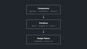
And there are really three levels to the AgDS component library.
So at the top we have things like buttons and accordions and a select, and these are typically components that you think of when you think of a design system.
But those components are really just compositions of our primitive components, and these are things like box, column, flex, text, etc.
And what's unique about these primitive components is that they have these things called style props, which allow us to interact with our design tokens, so typography, color, border, everything like that, in a way that's type safe and responsive as well.
So let's have a look at these three levels in a little bit more detail.
First up we have tokens, and I'm only going to cover color tokens today because everyone loves colors and, timing as well.
So here's a screenshot of the color token page, in GOLD.
And at the top we have four background colors, and sitting on each of the background colors are all of the foreground colors available.
And at the bottom we can see how all of these colors, adapt to the topic.
The dark palette.
So GOLD, like in some design systems, you have a light and dark mode, where the whole page is dark mode.
But in GOLD, only parts of the section, sections of the page are in the light or the dark palette.
And a little practical example of these colors in use is the GOLD button component, so on the left we have the button in the light palette and on the right we have the button in the dark palette.
So for background colors we have body, alt, shade, and shade alt.
Very, simple.
Body and body alt are used for the main and alternative backgrounds of a page, while shade and shade alt are used to differentiate or highlight certain, components on the page.
And as mentioned before, these four colors do adapt to the dark palette.
And so we can see in this video from the GOLD homepage how background colors are typically used.
So the header and the footer are in the dark palette and use the body background.
And then the main section of the page is in the light palette.
And then we use body and body alt to create like a highlighting or a striping effect to bring it to, to highlight certain sections of the page.
So next up we have foreground colors and for foreground colors.
It's very simple as well we have text muted and action and that's it and actions are used for things like links and buttons according any sort of like interactive component And again, these foreground colors do adapt to the dark palette.
GOLD also had an idea of system colors, which weren't really documented, but they are typically used to indicate system status.
So we had system, error, success, warning, and info.
And an example, oh, sorry, what's unique about system colors in GOLD, compared to foreground and background colors is that they do not adapt to the light or the dark palette.
The color is always the same between the two.
And as an example of these system colors, here is what the page alert component in GOLD looks like.
And you can see between the light and the dark palette version, the text color is changing, the background color is changing, but that red system alert color does not change.
So now that we understand how colors work in GOLD, let's take a look at how we've implemented this in AgDS.
AgDS requires you to wrap your application in a core component, and what you can do with the core component is you can pass your own theme to that, to override the theme.
And by default, the GOLD color scheme is used by default, not the agriculture theme.
And this small but nuanced technical decision really speaks to our original statement about AgDS being compatible with a future version of GOLD.
So if you were, building a government service and you wanted the same theme as GOLD but only really wanted to change the action colors, you could do something like this code snippet here.
And we don't want to use the GOLD theme in the export service, so what we do is we wrap that up in a package, called Ag branding, which contains the agriculture theme, so in every application, in the export service, they do something like this.
And as you can see here, AgDS has maintained support for the light and the dark palette.
So this is, Seek's Playroom tool.
We've got the code editor at the bottom and we've got the live preview up the top and we've just got a simple example of some components in the light and the dark mode.
And so what our core component is actually doing is It will add a bunch of CSS variables to the root, for, which specify all the colors that it needs for the light and the dark palette.
And then it will set itself to the light palette by default, so any component you use out of the box will just be in the light palette.
And then you can have sections, in the page in the dark palette.
And the way you do that is you use our primitive components which have, this palette prop.
And what that allows you to do is say, hey, all these child components I want to be in the, dark palette.
And how that's working under the hood is that when a palette prop is set, We just add some CSS variables to that element, saying, hey, this is the new action color that you need to use.
This is the new background colors that you need to use.
Because the browser works in a cascade, all those child elements automatically inherit that theme.
So this is great.
It doesn't rely on any React context or anything for theming.
It's a really simple solution, which has been great.
Finally, sorry, next up, let's talk about our primitive components.
So we offer a bunch of primitive components which make building layouts and components a breeze, and our most primitive component is the box component, which is really the foundation of everything.
By default, it renders a plain div, nothing fancy, but we can use these style props like background, etc.
to interact with our design tokens.
Style props are not just limited to color, as you saw there, but we can also interact with typographic components if we want to set font size or font weight, which is really cool.
And primitive components are also polymorphic.
So you can use the as prop to render a different element.
If you didn't want to div out of the box, you wanted a section, you could do something like this.
And this is really key to creating semantic and accessible HTML.
Style props are also responsive too.
If I wanted to create a component where on mobile, I was using the backgr the body alt background color, and then on desktop I needed to use the body background color, rather than writing a bunch of media queries, I can use this object syntax here as to say, hey, on the extra small breakpoint, please use the body alt color, and on our large breakpoint, please use the body color.
Under the hood the styled props will generate the media queries for us, which is great.
And not only are styles that map really nicely to our design token supported, but we can also support native CSS properties such as align-items, justify-content, flex gap, etc.
The ability of, doing this plus being able to map back out to our design tokens create this really powerful way of being able to style your components without ever having to leave JSX.
All of it is just done in this file, which is really, easy to maintain.
So finally, let's have a look at how the components work.
And GOLD had roughly 30 components ranging from anywhere from simple tables to buttons, to form inputs and grids.
And most of the components that you would need to build a simple informational website you could probably find in GOLD.
And as a really simple example of a component that was in GOLD that we've rebuilt is called Callouts.
It's really simple.
It has a title, a description, as well as some basic styling.
And if we look at the code for this component, it's just so simple.
We're using a stack to create a gap between the title and the description.
The stack also has some basic style props applied for the styling, like the border left, the background color.
We've also got like a high contrast outline prop, so when we're in Windows high contrast mode, we get the nice, transparent border there, with using a text component, which has some default typographic styles applied.
So yeah, really simple.
And to summarize this phase, at the end of this phase, all the components that were in GOLD were available in AgDS.
We had built a really solid foundation to a design system.
And as you can see here, a video from my colleague Nathan.
He's using Playroom to put together a really simple, informational based website page, in just a matter of minutes.
Thanks.
Which is really awesome to see.
However, we didn't have all the components that we needed to support the export service.
So we had to evolve.
And that brings us to our next phase, phase two.
Cool, so AgDS has constantly been evolving to meet the needs of the export service and other products in the department.
We've basically doubled the amount of components that were in GOLD, brought that into AgDS, while also documenting templates and patterns, which encourage high quality and inclusive and consistent interactions at scale across the export service.
So let's take a look at some practical examples of how we've extended AgDS.
And to give you an idea of some of the types of interfaces that AgDS is being used for, here is a video of a prototype, that we've built recently to mimic a pattern found in some internal applications.
So we've developed an AppLayout component which contains the header, the sidebar, the footer.
We've created a drop down menu component to support switching accounts as well as accessing all your account features.
We've extended the basic GOLD table component into something more that supports sorting, filtering, selecting.
Multiple items, paginating.
We've also developed a series of modal components.
So we have a modal and a draw component to display information to the user without them having to leave the page.
So while this type of UI is a little different to what GOLD was primarily being used for, you can see that we've worked really hard to try and, carry the design language across from GOLD, into these new, more interactive components, and we've also tried really hard to make sure that these highly interactive components are as accessible and usable for all types of users.
We've also uplifted components that were featured on the GOLD Docs site, but were never an actual, official component.
This screenshot from the GOLD website of a, the bottom of the button documentation page contains a little sub nav component that you can see in this section here.
We needed something very, similar in the export service, so we decided to uplift this into an official component for AgDS, which we've called sub nav.
And this is a screenshot of our documentation site for the sub nav page.
And in the first highlighted section here, you can see the code snippet for how this component would be used by a consumer.
In the second highlighted section, you can see how we've also used all of our components to build our documentation site.
So we try and dog food all of our components as much as possible, just to make sure everything we're building, is as good as it can be before it reaches our consumers.
We've also made small iterations to existing components that were in GOLD.
So on the left is the GOLD text input component, and on the right is the AgDS version.
And you can see we've just introduced an icon, as well as updated the font weight as well, which better improves the affordance that something went wrong.
And this actually came as the result of some accessibility testing we conducted.
And as you saw in the video before, we've also acquired really highly, complex, interactive components.
So we've built things like date pickers, combo boxes, tabs, autocompletes, et cetera.
So this is a small video of our date range picker component.
As you can see, it supports both text input as well as, support for the, calendar widget input as well.
We've also had to make some small changes to the color token schema too.
In the highlighted section is part of the main nav component.
And in GOLD, that strip of line you see there, that color was always the same as the action color.
But in the export service, we needed that strip to be a special color, so what we decided to do was extend the color token schema to support an accent token.
Another example of where we've extended the color token schema is our page alert component.
As you saw before, this is the GOLD page alert component.
And here is the AgDS version of the page alert component, which has been slightly redesigned.
The contrast is not so great on, on this screen, but We have, a muted color of the green and the red as the background.
And in order to do this, we've had to introduce, four new system colors.
We've got system error muted, system error success, et cetera.
And what's cool about, system colors in AgDS is that we've made them adapt to the light and the dark theme.
And this provides a much more consistent affordance of an experience of status by maintaining the same, contrast values between foreground and background colors.
This was our light color palette at the beginning of the project, very simple compared to some of the other design systems that have been featured on this track, and as this, as it stands today, this is our light, color schema right now.
As you can see, we've kept everything the same.
We've still got the original background, foreground system colors, but we've introduced the muted system colors, as mentioned, we've got accent, we've got selected and selected muted.
And this is all customizable by consumers as well.
So we've tried to make it easier for people to customize themes.
And so while developing all these new components, we relied pretty heavily on some really great free resources out there.
As an example, while I was building the tabs component, we were referring to the Authoring Practice Guides by WA ARIA, which go into really great detail about how all the keyboard interactions should work, how the focus management should work for the tabs component.
So that's, great.
But it is quite verbose and boring at times, so it's great to see like a more practical example out in the wild.
GovUK is great, but since we're in React land, I really like looking at ReachUI, ReactARIA, RadixUI, to name a few as they really care about accessibility too.
And this is a great segue into the last phase, the accessibility audit.
Prior to releasing the design system, beta last year, it was really important for us to test the accessibility of AgDS.
We undertook an accessibility and usability audit.
And the accessibility audit was actually facilitated by Intopia, who, have their booth outside and sponsoring this event too.
And the audit consisted of three phases.
So we had the first phase was just a simple test of all of our components in isolation.
And then we moved on to testing our page templates and documentation site.
And finally we had usability sessions with users that had a specific accessibility requirements.
So we had users who were blind and they needed a screen reader.
We had users with low vision, they needed a screen magnification software.
We had users with mobility issues that used facial tracking software to move around the page, which was just so, cool.
Phase one, some of the tests and checks, that were conducted on components were simple screen reader and keyboard checks, making sure everything adapts nicely to Windows High Contrast mode, making sure when you zoom up all the way to 400 percent that all the components reflow nicely, making sure everything has sufficient color contrast, and really simple as well, making sure all your HTML is valid.
And having Storybook for this phase was super valuable as it allows us to test components in isolation for free basically and we can see the component in all the different states as well.
An example of some of the bugs that were uncovered in this phase was our date range picker that we saw before.
So in Windows High Contrast mode, we were relying on color alone to convey the status of the selected date range and that didn't carry over to Windows High Contrast mode.
So that's easily fixed by, we can just add a font weight bold and also a high contrast outline available to the selected datarange.
Another example was in our main nav component, on mobile it goes into a hamburger dialogue type menu.
And me, or our other developer, forgot to add overflow y auto on that element.
So when you zoom in all the way, the content doesn't reflow properly.
Luckily it was a small fix, but, Yeah, really good catch from Intopia.
And once all those issues were resolved, we moved on to phase two, which was audit of our page templates and documentation site.
An example of one of the pages that were being tested was our sign in form template.
And although this is a really simple piece of UI, it was really great to test this because it tests how all of our components are typically composed together on a page.
So we've got the header, the footer, a bunch of different form inputs.
We're managing focus, we're showing loading states, we're moving things around like when, validation errors occur.
So this was, really great and once that phase was completed, we moved onto phase three, where we observed users, with a specific accessibility requirement, using an example application that we've built called Registry And as this video plays, I've registered your pet, I'll talk a little bit about what this is.
So recruiting for usability with the export service is very challenging, as you need quite specific domain knowledge.
So what we decided to do was build an example form flow, which mimics the user experience that's typically found, in the export service, which can be these huge forms that are split up into multiple tasks, and then each task is split up into multiple steps.
And as the user progresses through the form, they see a series of forms.
And what we did was we ran moderated testing so we could, we as a team as well as parts of the organization as well could observe these users using this application.
And some of the findings that came out of this were really interesting is that, we had super positive feedback from our screen reader users, so this was really great to hear because we put a lot of effort into this.
It means that our components respond nicely to keyboard input, everything was getting announced correctly, focus was being managed correctly.
But unfortunately some visual users, so low vision or maybe some neurodivergent users as well worked pretty confused by some UI elements on the page.
So we knew we had a bit of work to do.
So here's a screenshot of our page from Registry a Pet before any changes were made.
And this is a screenshot of the same page after we made changes.
So some changes to highlight are, the progress indicator was redesigned slightly to make it more, look like a timeline of, a series of step tasks rather than a series of individual tasks.
We've also introduced some colors as well, to better improve the affordance of task status.
We also worked with, the content team to make sure that all of our labels, not only in the progress indicator but throughout the form as well were as clear as possible.
And finally, this SummaryList component here.
Previously, the key and the value were, like, 50 50 split of the container.
But we brought those elements closer together, as a lot of users reported.
They thought they weren't connected.
At the end of this process, we received a certificate of compliance for WCAG 2.1 AA compliance, which, is a great achievement for the team that we're all super proud of.
And, to wrap things up, let's talk about what's next for AgDS.
We're focusing now on increasing adoption across the, department while also obviously iterating and improving the system as more, we get more users.
We'll be hopefully testing all of the new components and stuff we built over the last year or so to make sure everything that we've done is as accessible and usable as possible.
And maybe one day, you'll see AgDS as a foundation of the next version of GOLD.
We'll see.
But yeah, thank you so much, everyone.
APPLAUSE
The Agriculture Design System (AgDS) is the Design System built for the Australian Government Department of Agriculture, Fisheries and Forestry Export Service.
AgDS is based on the GOLD, the former Australian Government Design System which was decommissioned in 2021.
In this talk, Jordan will walk through how the Department of Agriculture took the design principles and visual language of GOLD to build a modern and accessible design system.
