Designing a user onboarding compass
(upbeat instrumental music) - Good morning, everyone.
Did you all get a good jolt of caffeine during the break? Awesome, good, I'm glad because I'm excited to be here, and I want you to be excited about this topic. We're going to talk about designing a user onboarding compass.
Now today's talk is unlikely to be the first time you've heard of user onboarding. How many of you are thinking about user onboarding? Maybe you want to design a good experience in the near future.
Okay, folks.
Anyone in the process of designing an onboarding experience? Also a few hands, and have some of you designed onboarding in the past and you're looking to sort of improve the experience for next time? Great.
So there's this great reason why we care about user onboarding. It's this fabled phrase that's used in the industry and it paints this picture of taking new users and converting them into engaged and retained ones, and this is fed by a lot of information that we hear. A recent report put together by a company called ProfitWell indicated that for users who perceive that they had had a good onboarding experience, they were up to 21% more likely to pay for a product subscription those that hadn't perceived they'd had a good onboarding experience.
And then any time we hear about retention rates, we also see some urgency in designing good new user experiences.
One study done in 2015 by Quettra on the retention rates of Android apps showed that it's between days three through seven after instal of a new app when people decide whether to delete that app or not, so again adds urgency to doing some good stuff for our new users.
So naturally we'll come to a point where we say to our teams, Hey, everyone, it's time to design onboarding, and then we come to the biggest question: what do we build? Now I thought we'd start today by looking at the common cast of characters that we often employee when we try to solve and build for onboarding and how these might not be solving things for us quite the way we want.
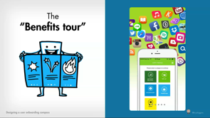
Now the first of these characters I refer to as the Benefits tour.
This comes in a couple of forms.
Sometimes it's a series of screens that we show to new users when they fist open an app that they have to swipe through. Other times it's a long scrolling webpage or maybe even a video, and these go over the high-level benefits and features of our product.
These are tempting to build because they look amazing and there's somewhat easily decoupled from our product, but the problem with relying on this one is that we're presenting all this information upfront before people have the context of our products to make decisions on and these can get pretty unwieldy to update over time as our products change and evolve.
So then still other times we might look at one of the other characters, one I call the UI pointer.
This comes in a couple of forms as well.
Sometimes it shows up as coach marks, single overlay over an interface.
It points at what all the underlying elements do or it pops up one-by-one as singular hints pointing at the interface as someone moves through a flow. Again tempting to do this to solve kind of issues you've been seeing with comprehension, but this really goes a long way in pointing out some core underlying issues with your product. Once these things get dismissed or viewed the first time, they aren't really going to be there to support people who need this sort of reminder of what your interface does and how to use it day-to-day. And then the last two characters that we sometimes employ for onboarding, these I refer to as Commitment walls.
Now this comes sometimes in the form of a sign-up screen or a requirement to make a commitment to subscribe in order to use a product.
Other times it shows up as a lengthy setup flow asking people to enable a bunch of functionality or give a lot of profile information before they can begin. The problem here is that when you ask people to make commitments upfront, they don't understand the value or the implication of those decisions so they might just bounce out of your experience. Maybe they throw in a bunch of fake information just to get past it and other times they might make poor decisions without realising the negative effects of them downstream. So that's just a selection of the common cast of characters that we sometimes jump to using when we want to solve onboarding, each have their own caveats.
While you might be able to point at one or two examples of these that have worked for short-term benefit in other products, the real reason that we can't rely on any of these for user onboarding is because none of them are onboarding on their own. User onboarding is not one feature and it's not one flow. User onboarding is instead a process that links together many events and experiences in many different ways over time to acclimate new users to our products.
Now this session will not be about giving you the one feature or pattern that will solve your onboarding experience, but it will be about giving you the tools techniques and activities that you can use to design onboarding that behaves more like a compass, a process that can take users in different situations to the same destination of success in your products, whether that's retention, engagement, or something else. Now what underpins a good onboarding compass? Three things really.
First it will be aligned around the key actions of your product's experience instead of trying to show or tell people about them upfront. It will also guide users to their next steps continuously throughout their journeys instead of stopping after a single feature or flow and it will also take a diverse approach to providing guidance so that it can suit users in different situations and thus widen the benefit of onboarding to a larger audience for you.
Now I'm gonna breakdown each of these three areas and give you some techniques and strategies for tackling each of them, and we'll start by looking at the first part of designing an onboarding compass: aligning it to key actions.
Now here is a question I've heard many variations of throughout my career.
Someone on the team will come to me and say, "Hey, Krystal, new users aren't discovering our features. "Can't we make them watch a video "or do a tutorial before they get started "to ensure they understand everything?" How many of you have heard or asked a question like this before? Yeah that's okay because it seems logical that people will get more value from our products if they just spent a little bit time upfront learning about how they work.
Sometimes the suggestion to add a video or a tutorial will even come from users themselves when they've recognised when they've been struggling in things like usability sessions.
Who are we to say no to such a reasonable sounding request? But this line of thinking rarely results in success. To help me illustrate why, I'm going to use a visual aid in the form of a video showing two dogs competing in a contest to see who can complete a course lined with distracting treats as quickly as possible. So we see the first dog go, completes it with gold stars.
No problems.
Then we see the second dog.
(audience laughing) (chuckles) (audience laughing) Okay, here we go.
We know it's gonna end now, uh, not quite. (audience laughing)
All right, we'll stop there.
Thank you for indulging me in a bit of Friday-animal-video fun, but I like this to kind of illustrate this point because when we design onboarding, we like to think that new users are really bought into the larger potential of our products and therefore will complete a video or watch or do a tutorial with dedication and focus. In reality to us it's going to seem like people will behave like that second dog.
They have many distractions and other competing priorities in their lives.
Our products don't exist in a vacuum for them. They can't be bothered to buy into the larger potential of your product or learn about its whole system in order to get their most pressing task done.
Now this concept is luckily more eloquently described as the Paradox of the Active User, first coined in the 1980s by Mary Beth Rosson and John Carroll during their time as researchers at IBM.
They were observing new users of desktop publishing software and they found that even though these users were given really great user guides and tutorials to work through, they would just jump into using this new software that they had spent money on and just get some immediate task done. They ran into lots of errors when they did this and their understanding of the product was limited by what they chose to do first, and so they weren't getting all that value of what they were paying for from the products. They deemed this a paradox because even though it was obvious that these people would get value if they invested that time upfront understanding how things worked, they couldn't design for such idealised use because it's just not how people behaved.
So when it comes to user onboarding, we need to stop trying to show or tell people about how things work upfront and instead embrace onboarding people throughout their interactions with our products. Now the way to start building a more interactive onboarding experience is to first identify those key actions in our existing experience around which onboarding should be built.
Now it's tempting to start at the beginning of the user's experience and plot out where we think they should go from there, but instead we should identify those key actions by starting at the end. This means having a really good definition of core use in your product.
Understand what is that state of a user that is sustaining your product in some way. They don't have to be experts, but they're engaged and retained, and obviously even successful for themselves, which is why they come back.
This is what's going to represent the desired destination of your onboarding experience.
Let me show you an example of a good core use definition. Let's say I work on a hypothetical product that helps people sell items.
One of my definitions of core use might be that someone needs to sell at least 10 items per week and have high ratings while they do it.
This defines somebody who's sustaining my selling platform. Now notice a few things about this core use definition: specific to my product. It's not a generic goal, like retained or engaged. It's also long-term.
It's not defining the success of our onboarding experience as something like signed up or subscribed, and it's individualised.
While you might have North star metrics to judge product health that are more aggregate, by individualising your definition of a core user, it makes it a bit easier for you to understand how any one new user might be onboarded to reach this state.
So once you have this specific, individualised, and long-term definition of core use, then you can work backwards through the path's groups of existing users that meet this definition took to get here over time to identify those key actions. You could do this, leveraging existing research and analysis that you've done, or you can do this by working through assumptions and working backwards.
Now it's always best to have a structured activity through which to synthesise your existing research or work through those assumptions.
So I'm going to share with you an activity you can run with your teams to work backwards from core use to identify these key actions. Now for this activity, you need the three basics of any easy activity: a large drawing area, whiteboard or maybe a large sheet of paper, Post-its and Sharpies, all the basics.
On a large drawing area you wanna draw three concentric circles, very large, and then two circles on the outer edges.
Your core use definition goes in that centre circle. For the rest of this activity, I'll be using that hypothetical selling product as an example.
So I'll write down on a Post-it my core use definition: sells 10 items per week, has high ratings, and I put that in the middle. Now I don't stop there.
I also want to define how people might begin in my experience because then I end up defining the two end points of onboarding.
Now there might be different situations that cause people to first come to my product, so I call those entry situations.
They're a bit more detailed than just defining entry points. They kind of bake into them the motivations behind why someone might be coming to an experience. So in my hypothetical selling product I might have one situation where people come in because they've been searching for items similar to one they want to sell and they want to kind of learn from existing items that are being sold, what they can make from them, maybe some details they need to add, so they come to my product through those search results. And then other times I might have sellers who are more serious about running a storefront and so they come to my product because they followed a referral link to our shop-building feature.
I might have many other entry situations, but I just choose a couple that represent some disparate ones so that I can work out a wide range of key actions that could bridge either of them to a core use state. Now at this point we're almost ready to work backwards from that core use definition out to those entry situations, but we need to add a little bit more detail around what core use means.
We want to make it clear to picture what a core user is doing day-to-day to sustain them in the state.
That's where defining routines comes in.
We want to define the routines that support someone being a core user.
For example, I might have several for this selling product. One example of a routine might be that someone is checking our weekly newsletter every week to be inspired on the top-selling items and figure out what they wanna sell next or they might be consistently renewing their expired items so that they always have things in inventory, therefore keeping up their sales.
For those who are running a storefront, they might be maintaining a branded shop pretty frequently, which draws in more buyers and builds that trust that then leads to higher ratings.
There might be a tonne of other routines here. It's not important that your core users do all of these routines.
In fact you might have some people who meet your core use definition only do half of them, and this is why it's important to really get some more detail which you can get through qualitative research and observational research to pull that in and get that clarity around what this means. Then once you have those routines, you can start to work backwards from each of them towards an entry situations, figure out those key actions that might bridge someone to that core use state.
So let's look at this example of the routine of maintaining a branded shop.
Well in order for someone to get to a state where they're maintaining that branded shop, I know at some point they had to customise their shop design, their shop theme.
Then looking back through research, I find out that a large majority of people who customise their shop theme actually did so by first selecting a preset theme that we provided them with, and then built and customised off the top of that. Before they got to the state of selecting a preset shop theme, they had to first sign up for a free trial of our shop-building experience, and that's what linked them in from their entry situation of getting referred to our shop-building feature. This is just one example.
There might've been other key actions from research I could pull in, but I would run the same exercise with all of the other routines and the entry situations and I'd flesh out this possible constellation of key actions.
Now this is a way to kinda put down all of your research or assumptions into one place, but then you need to take the next step, which is prioritising these.
It's probably not realistic to build onboarding around every single one of these, so there's a couple of criteria that you can think about for prioritising your key actions. Consider if a user might fail if they didn't do one of these key actions, which you can look at by doing cohort analysis perhaps and seeing if there are actions that some people did and others didn't that led to later success.
For example, my selling product, I might know that anyone who tried to create a listing from scratch instead of copying it from another person ended up abandoning those listings before they posted an item for sale, so I would put copy a listing is very important. Also consider if there are some key actions you've identified that support people coming from different entry situations.
That highlights an importance in emphasising those for all users.
And then if there are obvious links to routines, if in my product I needed somebody to sign up for our shop-building experience in order to get to a state where they could have a shop, that's going to be an obvious key action that I need to onboard folks through.
Again this exercise is really about revealing the key actions that might be on any user's path to success and it's an exercise that helps you think about further than the first-run experience and all these things might link together over time to help guide forward to a really important destination.
Now through this kind of exercise you will identify where and maybe when onboarding needs to happen, then you need to be able to apply guidance to each of those key actions that helps lead people who encounter them onto the next one. That brings us to the second part of designing an onboarding compass: guiding users to next steps.
Too often when we design onboarding, we think just a little bit is enough, the very beginning, and we just anticipate people will get to this amazing state on their own.
I love this.
As an artist as well, I love this one.
It's like we expect them to draw an owl in two steps, but really we need to help scaffold people as they move through our product.
Just a little bit upfront isn't going to be enough. Now the way that we apply scaffolding through our onboarding experience and through key actions is by first breaking down each of our key actions so that we can figure out where guidance needs to happen. We do this by creating a module of three parts: the trigger, which initiates that action, the activity, the heart of the action, then the follow-up, the thing that closes out the key action.
This are the three areas that we need to provide guidance around.
Let me show this and break this down in the context of an example with a real key action.
This example is from IFTTT: If This, Then That.
It's an Internet-of-Things app that helps you link together different services and devices using customizable programmes called Applets. Now IFTTT provides new users with a lot of premade Applets that they can use, but one of their key actions is having someone create their first Applet from scratch.
So we see that there's a trigger in which they're encouraging and guiding someone on the My Applet screen to create their first Applet.
If someone engages with this trigger, they get into the activity state where guidance walks them through the steps of creating an Applet, including selecting the service that initiates it, (mumbles) then choosing what runs as a result of that service being initiated, and this includes guiding them through subtasks like maybe enabling mobile notifications.
Because that was a bit more of an involved activity, they get a state in which they can review their selections before they commit them, and then if they decide to save, they get to the follow-up state which gives feedback about the fact this was successfully done, but also includes some guidance in the form of next steps, other Applets that they can enable and turn on related to the one that they just created. So there's always something of encouraging people to move forward.
So by breaking key actions down into a module of these three parts, we make it a bit easier to see how guidance might help people.
For example, in the trigger, guidance will need to leverage the user's surrounding or maybe preceding context in order to make the case for taking action, should illustrate the benefits of taking action and set expectations about what will happen next. That can be as simple as a clear button label. Then once you get into the activity state, guidance shifts a little bit, still should reinforce the benefits of continuing with action, but also needs to guide people through subtasks or errors they might encounter. And then once they get to the follow-up state, guidance should give feedback about what was or wasn't completed, but also it should help people understand what they can do next because that's the real power in scaffolding key actions and breaking them down in these ways is that guidance from the follow-up state of one key action can help lead people to the trigger states of any number of other key actions so that onboarding stops being this rigid linear path you need everyone to follow in one way.
It becomes something a bit more flexible and it also allows you to break up when you're working on key actions instead of having to design all of that onboarding around key actions at the same time.
Now this too can have an activity and help you think through this.
Storyboarding is a great activity to run through your key action guidance.
You can assign everyone on your team a different key action, and I have this storyboard template that you can use. I will tweet a link out to this afterwards as well, but it's at kryshiggins.com/tag/downloads, really memorable, but I will tweet that out later, but each of the three panels represents each of the three parts of the key action.
So people can sketch out or write down their ideas on what they can do to provide guidance in each, and then collaborate with their peers working on this for other actions and see how their follow-up state can link to the other folk's trigger states.
So it's just a way to think about how these things can be intertwined.
Now in this state you've identified not only where your key actions are but the guidance you might need within each key action, then you can move on to the last part of designing an onboarding compass: diversifying the approach you take to providing that guidance to help users in different situations.
Because there's many paths when it comes to user onboarding, not every user will move through an onboarding experience or through your product in the same way and so our onboarding flows need to account for that. Too often we invest in just one pattern or approach for providing guidance to new users and the issue with that is that sometimes the effectiveness of our guidance is highly situational. For example people might come to our products in an exploratory state.
Maybe they're browsing a bit.
They're going to be open to a broader amount of guidance, but then other times people will come to our products for the first time on a really laser-focused mission and needs stuff to be a bit more tailored to that specific need that they have.
Understanding that people may come to our products in anywhere along this spectrum helps us avoid pitfalls like running into things such as dual task interference, a somewhat fancy way of talking about multitasking. This is when we ignore things that we perceive to be interrupting our current task. Now Google Chrome engineers and researchers at BYU worked together a little while ago to check out the effects of dual task interference on how people read and paid attention to security dialogues.
They found that any time these dialogues interrupted a task, which ranged from watching a video, to transferring files, to navigating back from a webpage, that up to 90% of them would ignore those messages. But when those messages appear during natural pauses in tasks, when it wasn't interrupting something, then they were much more regarded and heeded. So again the timing of our guidance and how we present it to someone is very important to consider relative to the user's situation, and then there's also this concept of product novelty and its effect and perception by new users and what guidance is right.
Sometimes people will perceive our product to exist in an established state.
Maybe the interaction paradigm is well recognised or the concept isn't risky to them, but then other times it exists in a novel state. It might be perceived as risky or too new for someone to just jump in and start using it. Now The GenderMag Project has been putting together these personas to represent the different ways that people approach learning new software along a variety of facets.
One of the things that they found and accumulating a lot of research done on this over the years is that some people approach new software in a more risk-averse manner and they prefer getting a comprehensive learning and guidance about something new before they begin, whereas others approach things as tinkerers. They are okay just jumping in and making mistakes and learning that way.
So again we see that certain situational variances can affect what kind of guidance people might be receptive to. For example if you're exploring and you come to an established product as a new user, you might be looking for guidance that is lightweight and general to the current space.
Whereas if you come to that established product and you're on a focused mission, now you want that lightweight guidance to be focused on the task at hand.
Then any time you move into a novel experience where you perceive it to be riskier, you might be expecting something a bit more prominent, whether you're exploring or on that mission. Now the nice thing here is that while we recognise people might be receptive to different kinds of guidance, we do not have to understand the unique situation of every user when they come to our products in order to account for this.
Instead what we need to do here is grow a toolkit of different methods for providing guidance that we can put through our products and therefore they can hand off to each other if people just aren't in the situations that we plan them to be in.
I'll share with you four categories of guidance that you can use to grow this toolkit.
I've organised them into a pyramidal structure to indicate the relative weighting and distribution that each category should get, and it all starts with a very large weighting on and foundation of good default experiences. We need to carefully consider what the initial state of our product or service communicates to somebody seeing it for the first time. This really comes down to a strong information architecture. The way we organise content, the way we allow people to navigate through the content, the words we use, the things we prioritise, all of that goes a long way in guiding new users and it also goes a long way in continuing to guide our existing users.
That way we don't need to rely on things like that UI pointer to make up for any bad decisions we make in our overall content structure, and there's other ways that defaults help people. For example they help people whenever there's empty states. Here's an example from a medical chat assistant app and here it's asked a question.
Instead of giving me a free form text entry that I need to enter a response into, it gives me suggested responses which helps me learn the kinds of things that I can answer with and that can be responded to, so small bits of education with this default. And then other times providing sample contents can be a good way of encouraging and guiding new users. Here's an example of an email product that has dropped in a welcome email into an empty inbox for a new user to read. Not only does it show what happens when you get content, but it also provides general lightweight guidance about the whole experience so you kinda get a two-for-one with that one. Now again, information architecture, very important part of guiding new and existing users. If you wanna dig into this topic a bit more and get some practical strategies for it, I do recommend this book.
It is published by A Book Apart and written by Lisa Maria Martin.
It's called "Everyday Information Architecture." Really great book, and your team, you can probably all go through it in a week or two. Now once you have a strong foundation of defaults, then you can move into other categories such as inline guidance when we weave it into the flow of surrounding content.
Here's an example of inline guidance from Instagram. Whenever they introduce new features, like new features for their Stories, they drop a inline with the rest of the user stories. Tap on it, you get walked through and shown in context what the new features do, but it's not interrupting someone who just wants to go in there and read their daily feed, and then another example of inline guidance, this one comes from nextdoor.com, a community feed website. Instead of asking all new users to add a tonne of profile interests when they first get started, they instead defer that and put in inline prompts in their feed, allowing someone who comes to the product for the first time to figure out what their neighbourhood is talking about before they decide whether they want to go ahead and provide even more information. Now moving up the pyramid, again, we get to the third category.
This is that of reactive and on-demand guidance when we provide support in direct response to user action, whether that's implicit or explicit.
Here's one of my favourite examples of reactive guidance. This one comes from Google Drive.
Now here I've dragged files from my desktop over their web client.
We see this little reactive hint appear at the bottom of the screen, letting me know that as soon as I release those files, they will be uploaded to the folder in view. Now what's nice about this one is that it covers two situations because it helps educate users who may not have been familiar with this behaviour, but it doesn't interrupt the users who already were familiar with it, so you can basically use it any time without having to worry about which state someone is in. Other times people will explicitly request some guidance and this is where having a good, solid help content centre comes in. Now Slack, for example, has Slackbot, which you can go to at any time and ask questions and it will use that as an opportunity to deep link you into one of their support articles.
They have this robust support centre, but you can get very tailored responses for niche requests if you need to, and then finally we get to the top of this pyramid with the fourth category.
This is the category of proactive guidance, when we provide guidance in anticipation of user need.
Now this one typically comes across as more prominent because it's not being requested by somebody. We saw an example of proactive guidance with that IFTTT trigger where they were highlighting how you create your first Applet, but there's other types and approaches to proactive guidance.
This is an example of proactive guidance that when I worked on Android Wear 2.0, a smartwatch operating system, we need to help guide people through this new novel interaction paradigm that we were doing. So for new users unboxing a watch for the first time, we encourage them to take part in an interactive play-through tutorial to get them comfortable with the interaction space before they started getting into the deeper tasks of individual apps.
This was quite different than the approach we took with existing users who were updating their current watch to the new operating system. In that case, we simply suggested they take part in the same play-through tutorial, but it was then presented inline with their notification feed.
Another example of proactive guidance.
This one is from a budgeting app called Buddy. Here, right after a new user gets started, it's proactively encouraging them to add their most recent expense, and that's to set them up for success so that they land on a populated state of a home screen that doesn't require them to fill in all the details of a very hefty budget.
It's just trying to get them started by proactively suggesting they do one task. And finally whenever we think about proactive guidance, we have to remember the emails, notifications that we push out to users are considered part of this category.
So we need to make sure we're not already overwhelming our users with that content before we start dropping a lot of it into a product. This is the category you have to look out for and why it takes up kind of the smallest part of this pyramid 'cause it's far too easy for proactive guidance to fall into triggering dual task interference and so we want to make sure we're avoiding using it in too interruptive a fashion.
Now those are again the four categories you could think about when you're growing your toolkit and the real purpose for having this toolkit is again so that different types of guidance can hand off to each other so that we can support users who are in those different situations.
For example, with the budget app that we looked at, they had proactively suggested that someone add their most recent expense.
But if someone skipped out of this, they would land on the default state of the product home screen that then encouraged them to do that same action, but now presented a bit more inline with the rest of the screen.
So now we're covering two situations without a huge amount of extra work.
Now to diversify your team's toolkit, you can do a couple of activities.
If you're in the storyboarding stage of those key actions, again, you can have everybody storyboard their key action thinking about multiple situations and see if there's different kinds of guidance that would be appropriate for those user states or you might go ahead and audit your current product and figure out what you're already doing to provide guidance to your existing and new users and see how those are distributed and it will help you understand any gaps that you might need to fill or opportunities you have to reduce overweight-ing in one particular approach.
So with that we close out the three parts of designing a good onboarding compass.
First how we align it to key actions by starting with a really good definition of core use and then working backwards from that to pull out those key moments that might on the path to success, and then how we break each of those key actions down into three parts with a follow-up state that can guide people to their next steps and get into the triggers of future key actions and how we can then diversify our approach to guidance by growing a toolkit that supports our users in different situations and helps onboarding apply to the larger of our audience.
Working on these three areas, whether you choose to do it separately or all at the same time, will help you create onboarding that's more flexible for your users, but also will give you an approach to designing onboarding that's more flexible and forgiving for your team because the onboarding experience you need today just like the product that you build today is unlikely to be the one that exists a year from now because products change and over time you might find that your understanding of key actions change. Maybe you add more stuff to your product.
Maybe the importance of prioritising one falls away. Maybe you have a wider audience and you need to account for even more kinds of situations and onboarding paths.
This is why we can't approach designing onboarding like it's just a feature to be dropped in to our products sometime before launch because then we end up with this disjoint thing that's really expensive to keep up-to-date with everything else and maybe just doesn't happen at all because it's too unwieldy to fit in.
Instead our approach to designing onboarding needs to be intertwined with everyday product development. All of the activities and strategies I've given you in this session are things that you can use no matter what stage you're at. You can apply it to small parts of your product at a time or all at once.
So I hope that you find this to be exciting because what it means is that every single one of you in this room have the opportunity at any point in your development process to improve onboarding.
You don't need to wait for a separate team to do it or get investment to build one big new feature for it. It's all something that you can work on continuously over time.
So I look forward to seeing what you come up with for your onboarding compass and thank you again for having me at this wonderful first-round of this product event.
Thank you very much.
(audience clapping) (upbeat instrumental music)
Onboarding is not just a single event in the user’s experience. It is a process that links together many events, over time, to acclimate people to a new product or service. A well designed user onboarding experience will set up new users for success, adapt to changing situations, and guide them through multiple stages of their product journey. But it’s not always easy to know how to design onboarding like this. In this session, Krystal will share the mindset, strategies, and techniques that teams can use to design onboarding that behaves like a compass: an experience that guides users from different situations to the same destination of success in our products.
This talk is aimed at designers or product managers who are about to embark on designing an onboarding experience for a new or existing product, or for those redesigning an existing one.