Adapting a component library for better adoption
(funky music) - Today I wanna talk about how we're making it easier for developers to consume our component library. I'll explain how the way we build one particular component became a problem for us.
And how we solved that problem by having a better understanding of the relationship between our design system and our component library. By building abstractions which capture what something does, not what it is.
And by using the single responsibility principle to improve composability with our components. You may have noticed we've been rolling out some new products.
This is ABC Life, Amp articles, and some redesigns. The federal election website.
Just a couple of weeks ago, a brand new ABC homepage, Woo! I'm gonna indulge and go all the way down this one. These are shipped on a new front end platform, a component based architecture, built with React. At the heart of the UI for all of these products is our design language system, the DLS.
Our team is responsible for building a library of core components for use in any product.
We call this nucleus.
One of the key components designed by DSL is the content card.
Our take on the ubiquitous card UI pattern which in it's basic form is a link to an article, an image, a heading, and typically some other elements like attribution and timestamp.
Being a content organisation, almost every product has the need for some form or another of content card.
So the stakes are pretty high on this one.
When we set out to build our component library, it seemed like a reasonable proposition to include content card in our core library. There were many precedents for this.
Material design, Bootstrap, the sales force lightning design system, Shopified, Polaris and Lonely Planet.
We embraced the task of building our own card component. Which I discussed in this article on our developer blog last year.
Our card composed a number of components from within our core library.
Link, heading, icon, a responsive image component to name a few. So we're using best practise of composition, are we not? Before I get into that, I wanna take us on a bit of a tangent.
To discuss what exactly is composition and how it compares to inheritance.
Sorry, I'm not sure if that semantically marked up or not. At the 2015 Web Directions here in Sydney, I watched Eric Elliott give a talk called The Two Pillars of JavaScript.
In which he introduced me to the gorilla-banana problem of inheritance.
He shared a quote from a book called Coders At Work. The problem with object-oriented languages is they've got all this implicit environment they carry around with them.
You wanted a banana, but what you got was a gorilla holding a banana, and the entire jungle. Sometime later, I watched another explanation of composition versus inheritance.
On the YouTube channel fun fun function, the host, mpj explains that inheritance is when you design your types around what something is. While composition is when you design your types around what something does.
He illustrates this with an example of inheritance. Say you're building a system which requires dogs that bark and cats that meow.
It would seem logical to have an animal class containing their shared capabilities.
And then maybe to clean up some of this mess, you add a cleaning robot.
Things get a little out of hand and you need to take more drastic animal control action. So you add a killer robot.
Everything's going well, until your customer demands a killer robot dog, which of course is required to bark.
So now you're faced with inheriting most of the animal kingdom just to access that barking capability.
mpj sums this up by saying, "The problem with inheritance is that it encourages you to predict the future.
You build a taxonomy of objects early in your project. And you're most likely gonna make big design mistakes because humans can't predict the future, even though it feels like we can." And once you've built yourself into that inheritance taxonomy, it's really hard to get out of it.
Let's come back to our card.
The initial designs required three variants, which we named Hero, Regular and Compact.
Names which described what the component is, not what it does.
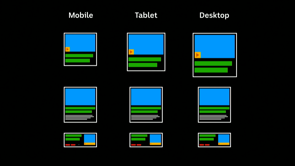
These variants needed to exist within multiple page layouts across three breakpoints.
So each card could be displayed in nine different ways. But we're using React, we've got all the power of JavaScript in our hands. We could use something like matchMedia or our own viewpoint component to handle all this business logic right? Nope, we're server rending our pages.
So we have to paint the layout to the browser with CSS. Having a janky repaint after the JS kicks in was a deal breaker.
This means these nine variations must be implemented with media queries.
It's not that many, I'm a professional.
Then more variations were introduced.
And did I mention that our composition was all wrapped up inside one component.
So all the data and configuration had to be drilled down inside this one big, hairy API.
Our component had it's fair share of props to begin with, and it wasn't just layout contributing to the complexity, all sorts of business logic was creeping it's way in. Let's look at what they became.
We had to teach our card about author links, document types, topics, meta information, recipes, dark mode, and analytics.
This was a big problem for us.
Our component had been polluted with all of this business logic and everybody was getting all of it.
A member of the React team posted a thread on Twitter, discussing the problem with edge cases increasing the API surface area of components. He starts by saying, "If your abstraction works in nine out of ten cases, it's a good abstraction. If it's insufficient in one, copy-paste and tweak it to that case, don't change the abstraction." He goes on to say, "Design systems often suffer from this too. Lots of configuration, instead of pieces that can be decomposed and used in cases where you need something different." Sound familiar? I wrote about the benefits of composition within our platform, such as adhering to best practise for screen readers by adopting our card pattern. Then along came another product wanting to build a page with a content card.
But our component wouldn't fit their designs. So they rolled their own.
How did it come to this? Our card was continuing to become bloated and complex, and we had consumers opting not to use it at all. So adoption was all or nothing.
Well actually it was just add more bloat on the thing. Was our design system wrong? Were our products stepping out of bounds? Should we mandate that our components be used? None of the above.
We had tried to predict the future, and we had coded ourselves into a corner.
We had tried to build the one card to rule them all but instead, we had built our own version of a killer robot dog.
This book on the subject defines a design system as a set of connected patterns and shared practises coherently organised to serve the purposes of a digital product.
And by comparison, a pattern library as a tool to capture, collect and share design patterns and guidelines for their usage.
The content card absolutely belongs in our design system. But we realised that our tool, the component library, does not always have a one-to-one relationship with design. Brad Frost's atomic design methodology is based on the concept that atoms are the building blocks of matter.
Analogous to ware primitives, such as buttons and inputs. So that's the obvious stuff.
He also writes that atoms can include more abstract pieces, like atoms in nature, they're fairly abstract and often not terribly useful on their own he says. Our component library has it's fair share of basic building blocks.
Link, icon, colour, heading.
But when we looked back on the way we built some of the more complex components, we were missing the abstract pieces, themselves not defined in our design system. So what were the pieces that we needed to expose for our consumers? The overall layout of the card, the position of a media icon, the specific heading styles when used in this context, and a container to put all this stuff in.
This is the difference between what the pattern is and what the component does.
We started off by looking at the layout of the card. Which is determined by the position of the image relative to the content.
The image can have three positions: top, left and right. But as you'll recall, one of our challenges was making this work across the three breakpoints. So we defined the image position property for configuring this via an object.
These mapped to CSS class names scoped to our three media queries.
To implement all this, we created our first card primitive component.
All the while ensuring the correct source order for our screen readers.
There's a bit of mobile-first logic at work here, allowing us to simplify this configuration to only that the screen sizes where it changes. We've now encapsulated this capability into a component that can be used in any context. Our component does one thing, and it does it well. This is the single responsibility principle. Continuing in this direction, we added more primitives for the other distinct capabilities.
Hover, visited and keyboard focus.
And
But are rather the abstract pieces of the larger UI pattern. They allowed developers to build whatever permutation of the card they need. By adopting all or some of these components. Let's see how this plays out in reality.
The card formerly called Hero, is now a composition including our
Adding additional text no longer requires a different name, it's simply a slightly different composition. When a product needs to add a bespoke element like a little tag above the heading, we don't need to teach it a universal component about this business logic, it's just a slightly different composition. Changing the image position is trivial, and doesn't have to fit into a complex taxonomy. Adding supplementary links like category links can be achieved without teaching our card how to avoid generating invalid mark up planes nesting links.
And positioning a media icon is now the responsibility of a different primitive.
Following our API convention for configuring this across multiple breakpoints. And this is how it all fits together.
A concept such as atomic design presents us with obvious boundaries for encapsulation. Like a button.
It's the less obvious abstractions, not defined by design which require an engineering mindset.
I've demonstrated that our content card is an example of a conceptual pattern, best served by a set of primitives which allow composing what it does, not configuring what it is.
Ideally, our primitives have a single responsibility. This allows developers to build what they need without getting tangled up in a jungle of inheritance. But when they do need to do something custom, they can still adopt most or at least some of our primitives and build the bespoke parts themselves.
Partial adoption is better than zero adoption. So now when our product developers ask for a banana, that's all they'll get, or maybe two.
Thank you.
(audience applauds) (funky music)
Developing a UI component library for a large organisation with many different products is a challenging endeavour. A good system will strike the right balance between consistency and flexibility and will afford developers efficiency and quality. These are characteristics difficult to get right up front.
At the ABC, we are continually iterating our component library to improve a key measure of success: adoption. We want teams to want to use it! This talk will discuss some of the challenges we’ve faced, how we approach trying to find the right level of component granularity and cover some illustrative examples of the changes we’ve made to get more developers of ABC digital products on board.
Tim’s team is responsible for building components for use in any ABC product.
They thought they’d done a good job and created their components according to the composition principle, not inheritance.
The gorilla/banana inheritance problem: you wanted a banana, you got a gorilla holding a banana inside an entire jungle.
Having built a classic Card component, they found as time went on that they’d tied too much to the overall Card and not the sub-components within it. That is they’d built the component according to what it is vs what it does.
Consider what a good abstraction does – eg. if it covers 9/10 cases then it’s good. You can make a new one for the 10th, it’s ok. But as the variants stacked up, their Card had been painted into a corner. It wasn’t flexible enough to cover new cases.
A big learning: design system != pattern libary.
They broke the card out into its pieces:
- container
- overall layout
- icon position
- heading style
Then they built these out with primitive components, each doing one thing well (single responsbility principle). The primitives don’t map directly to the design system, but they do map well to the technical requirements of developers consuming the library.
Variation can then be handled by composition, not by shoving endless new props into the Card component. Build what a component does, not what it is.
Even when people are doing something custom, they can use your primitives as the base. Partial adoption is still better than none at all.