Accessibility and Performance
Setting the Stage: Performance Meets Accessibility
The host introduces Marcy Sutton Todd with a personal anecdote before Marcy takes the mic and outlines the talk’s focus on the intersection of accessibility and performance. Marcy previews the agenda—definitions, real-world examples, measurable metrics, motivation, and resources—and frames the session around user‑centered web development. She signals practical takeaways, noting slides and a QR code for later reference. This opening positions the audience to see performance and accessibility as complementary forces in modern web work.
Defining Accessibility, Performance, and Their Overlap
Marcy introduces A11Y as designing and building for people across a spectrum of disabilities, then defines performance as both measurable speed and perceived responsiveness. She connects the two by reframing performance for users who may not see the screen, emphasizing the accessibility tree and subjective perception. She notes the web and tooling have evolved in the past decade and urges the audience to remove barriers as a matter of civil rights, not just optimization. This segment equips listeners with a shared vocabulary for the rest of the talk.
Marcy’s Path to Advocacy: From Target Lawsuit to Khan Academy
Marcy recounts how working on Target’s accessibility after a lawsuit sparked a “light‑bulb” shift in her practice. She describes moving from agency work to DQ, contributing to the Axe Core testing ecosystem, and connecting with practitioners and users with disabilities. Today she applies those lessons as a senior front‑end engineer on Khan Academy’s infrastructure and accessibility teams, shaping design systems, testing, and UI patterns. The story anchors her expertise and underscores the human relationships that drive accessible engineering.
Example 1: Skeleton Loaders in the Wild
Marcy explains skeleton loaders as placeholder UI that reassures users while content streams in, contrasting a spinner-only approach. She inspects Home Depot’s product page with DevTools, showing generic markup (divs/spans) in loaders and richer semantics once content arrives, and uses Chrome’s Accessibility Inspector to visualize the accessibility tree. The takeaway is that final states must expose meaningful roles and structure for screen readers, even if placeholders are visually helpful. This example ties performance techniques to accessibility outcomes during the loading phase.
Example 1 (cont.): An Accessible Loading Table at Khan Academy
At Khan Academy, Marcy’s team prototyped a chat-history table with skeletons and found ARIA live announcements fired too late on fast connections. They landed on a combination of aria-roledescription (localized) and aria-busy to convey “table, loading” to screen reader users without adding noise. A VoiceOver demo confirms the table announces rows/columns and busy state, while Marcy cautions that support varies and patterns must be tested with users. This segment shows pragmatic, testable ARIA strategies for loading states.
Example 2: Mobile Access, Locales, and Reflow-Ready Design
Marcy highlights that mobile accounts for the majority of global traffic, making responsive accessibility a first-class concern. She maps key WCAG 2.2 criteria—device orientation, input purpose, reflow, pointer gestures, label in name, and target size—to mobile-friendly design. At 400% zoom, her team redesigned the learning interface to avoid horizontal scrolling by tucking panels and clarifying flows, illustrating inclusive reflow beyond minimum compliance. The message: accessible mobile design expands reach and can elevate whole communities through better access to learning.
Example 3: Keystroke-Level Performance and Keyboard Ergonomics
Referencing the 1980s Keystroke-Level Model, Marcy suggests measuring performance by the number of keyboard actions required to complete tasks. She prompts teams to evaluate skip mechanisms, avoidance of inactive widgets, reachability of all controls, and discoverability of shortcuts, including conflicts with screen reader commands. A tourism site example reveals a cookie modal that fails to disable the background and controls that are unreachable by keyboard. This reframing centers real user effort, not just milliseconds, as a performance metric.
Live Demo: GitHub’s Keyboard Patterns Done Right
Marcy demonstrates GitHub’s accessible patterns: a visible “skip to content,” menus that don’t steal focus when closed, focus sent into the menu when opened, a deliberate focus trap, and Escape returning focus to the trigger. She explains how these mechanics reduce keystrokes and confusion while enabling automation of keyboard contracts with tools like Cypress, Jest, and Testing Library. While screen reader behavior still requires manual validation, robust keyboard support provides a solid foundation. The demo models how elegant keyboard flows can feel intuitive and fast.
From Mechanics to Measurement: WCAG Basics and What to Track
Marcy connects keyboard ergonomics to WCAG criteria including use of color, keyboard support, no unintended traps, bypass blocks, link purpose in context, and focus visible. She then pivots to practical metrics: Lighthouse’s accessibility score (with caveats) and sitewide issue aggregation. Marcy recommends starting with the free Axe browser extension and evaluates vendor tooling like Cypress Accessibility with a critical eye toward fit and cost. This segment bridges technique and measurement, helping teams prioritize what to fix first.
Measuring What Matters: SR Readiness, Rendering Flow, and Reduced Motion
Marcy proposes timing how long it takes before a screen reader can read page content, noting Facebook’s use of loading announcements and the role of the accessibility tree. She advises minimizing expensive early lifecycle operations, favoring semantic HTML/CSS, shipping default ARIA/tabindex server-side, and using Navigation Timing as a proxy while respecting privacy. Additional metrics include heading/landmark violations and page-level support for prefers-reduced-motion via CSS and matchMedia, with OS-level toggles and in-app settings. She also urges teams to count time spent on inclusive user interviews and, crucially, to act on the findings.
Why It Matters and How to Build It In: People, Debt, and the Law
Marcy argues the primary reason to prioritize accessibility is that disabled people need access, and early action avoids “access debt” that compounds with mobile neglect. She outlines EU requirements—the Web Accessibility Directive and the European Accessibility Act—and the EN 301 549 standard that maps to WCAG 2.1 AA, with movement toward WCAG 2.2. Her guidance: design accessibility in from the start, publish an honest accessibility statement, and treat it as core quality that yields more robust, testable software. She adds hands-on tactics like choosing the right semantic elements, checking ARIA support at a11ysupport.io, creating safe alternatives to motion, and automating what you can.
Resources and Next Steps: Tools, Links, and Where to Find Marcy
Marcy shares a dense resource list with a QR code and points to her Testing Accessibility course for deeper dives into topics like automation. She encourages iterative progress—fix one thing at a time—and invites attendees to connect with her online or explore learning content at Khan Academy. The segment closes with a call to “leave it better than you found it,” reinforcing the talk’s practical, action‑oriented theme. This equips the audience to continue learning long after the session.
Q&A: Awareness, Regulation, Metrics, and Overlays
In the Q&A, Marcy attributes gaps in accessible experiences to awareness and knowledge rather than tooling alone and notes legislation can unlock budget and priority. She affirms that performance signals like Navigation Timing map well to screen reader readiness when paired with clear loading states. Asked about injecting automated overlays, Marcy advises against them, explaining they often fail users, erode trust, and prevent teams from building real accessibility fluency; test with users instead and make it a native capability. The discussion circles back to the talk’s theme: accessibility and performance are mutually reinforcing when you design for people and measure what matters.
So our next speaker is Marcy Sutton Todd.
She works at Khan Academy now, but Marcy, I've been a fan of Marcy's work for a very long time.
She has been hyper focused in that accessibility space. And she's just one of those rare talents. That ability to roll up her sleeves, get her hands dirty and actually fix issues I'm really good at.
She can actually fix them. We're going in and out a little bit there, but. And she can make a topic that's very techn.
Very approachable, very interesting, very engaging.
She's also a hell of a biker. Not like a Harley biker, although maybe. No, no, no. Harley biker. Like an actual, like, cyclist, which means she's probably fitting in well. In Amsterdam, we spoke in an event one time in California where the event was like at the top of a hill. And I swear the hill's pitch was like this. And I was, you know, it was warm and I was like, I'm going to walk up there because it's going to be good conditioning. And I remember walking up to the top and being kind of sweaty and drippy and gross.
Marcy just comes rolling in on a bike. She just biked the whole thing up the hill. It was impressive work. So, yeah. If everybody could welcome Marcy to the stage, please.
Testing, testing. Okay, I can hear you.
You can hear me. Let's do this.
Hi. I'm here to talk to you about accessibility and performance, the intersection of the topic. Most of you are here for performance.
How does accessibility apply to that?
This talk is rooted in my passion for user centered web development. Something I've learned over the years is just something that means a lot to me and I hope that I instill that passion in at least some of you, hopefully all of you. Marcus. I'm Marcy Sutton.
Marcy Sutton. Todd. And I'm so thrilled to be here. Thanks for having me. Today we're going to talk about accessibility as it meets performance.
First, we need to level set with the definition of what is accessibility. We'll cover some real world performance examples where it does intersect with accessibility and performance.
We'll talk about what you can quantify, since some of accessibility really depends and it's so subjective that we want to know what metrics can we observe, what can we measure, along with all these squishier parts that are hard to quantify. I'll try to motivate you with some reasons of why you should do this among all the other things that you're juggling in your jobs and your passions. And projects.
And then I'll send you off with some resources so that you can build on this knowledge and roll up your sleeves too. You can find my slides online at bit ly a11y perfnow25 and I'll have a handy QR code for you at the end so you don't need to take all of the notes.
As I mentioned, I'm Marcy Sutton Todd. I'm a senior engineer on the front end Infrastructure team at Khan Academy. Khan Academy is a nonprofit education technology company based in California.
I live in Bellingham, Washington, pretty close to Canada.
So let's get that definition out of the way what is accessibility?
Web accessibility, or A11Y, which is a numeronym for accessibility. If you notice, there are 11 letters between the A and the Y, so it's a bit shorter. But web accessibility means that websites, tools, and technologies are designed and developed so that people with disabilities can use them, and people fit into a broad spectrum of abilities and disabilities. And really, people can have more than one disability.
And it's very different for everyone.
There are sensory disabilities that people have, including blindness, low vision, colorblindness, people who are deaf or hard of hearing or mute, or both.
People with cognitive disabilities who may have autism, adhd, vestibular disorder, traumatic brain injury, dyslexia. Physical disabilities can include cerebral palsy, multiple sclerosis, Parkinson's, Alzheimer's, so much more. And people can be born with disabilities. They can develop at any time. You could be one health incident away from having a disability. So it really applies to so many people.
Performance to set a definition for that performance means how quickly a website loads, becomes interactive, and responds to user actions. It encompasses both the objective, measurable speed of the page and the user subjective perception. That squishier part that's harder to measure.
What are they trying to do? How long does it take them to do it on your website? This intersection that I'm so curious about that I will talk about today, is where accessibility meets performance. So if we look at that same definition with a lens for accessibility, we could say it's how quickly a website loads when users can't see it, perhaps when it becomes interactive that's the same, and how quickly it responds to user actions. So there's some clear overlap here.
We could also say that it encompasses both the objective, measurable accessibility of a page and the user's subjective perception of that experience. I've been speaking and writing about this topic for about a decade, and I have a blog post on my website.
Accessibility and performance. marcysutton.com is that website, but it's evolved. We're using different tools now, different techniques. The web is more robust.
Users expectations on the web have grown more sophisticated.
And so the exact techniques that we're using to build websites now, there might be some differences.
My goal in this talk is to inspire you to create these digital spaces. No matter what tool or technology. We want to remove and minimize barriers to access things that prevent someone who can't see a screen from completing a task or doing those exploratory actions like Tammy talked about earlier. We want to create experiences that people with disabilities can use. That is the core purpose of accessibility.
And as performance minded technologists, you are in a position to do something about this. More than likely, accessibility is really about civil rights of people with disabilities. And honestly it's a form of resistance, removing barriers to discrimination. And I don't know about you, but that gets me pretty fired up every day.
But I didn't start from nowhere. I have an origin story with accessibility just like many of you. The light bulb that could never be turned off in my mind of I'm always thinking about accessibility when I'm using website, when I'm building a website, when I'm testing a website.
And my origin story began when I worked at a creative digital agency in Seattle called POP Agency. We had the US retailer Target as a client and as a front end developer. I was tasked with making accessible websites because Target had been sued by the National Federation of the Blind. I had no idea what I was getting into. I didn't even know what headings were in HTML or lists.
We didn't have very much ARIA at the time, which I'll tell you more a little about later. But I met people with disabilities on Target's QA team and I thought, wow, I can really make a difference with how I build websites and that is what I never let go of.
And I hope that that light bulb goes on for some of you today.
From there I went from building client websites at an agency.
Some of them were very short lived and I wanted to work on bigger impact projects. I went and worked on frameworks, bigger websites.
I went to a company called DQ which is an accessibility vendor in the United States. I got to work on the industry leading accessibility testing tool called Axe Core and all of its surrounding ecosystem.
I rode on a tandem bicycle with some of my friends at the CSUN conference in California for accessibility. This gentleman on the back of the tandem bicycle, Steve Sawson, he was one of those people on Target's QA team and I ended up working with him at dq. So it's really a small community and we rode tandem bikes together and had a really great time try to connect the biking and the accessibility together.
So these days what I'm doing now, I'm working as a senior front end engineer on the front end infrastructure team at Khan Academy.
As I mentioned, I do UI or user interface engineering, testing, accessibility, front end platform tooling, including Cypress and Jest and testing Library and all that geeky detail that we get into. I work on the wonderblocks design system which uses react and I'm part of Khan Academy's Accessibility team where we solve problems for accessibility and try to make the experience of learning and teaching easier, more accessible, more robust and I love it. It's great.
Some real world accessibility and performance examples that we'll touch on today include skeleton loaders, device access in any locale and and then keystroke level performance. So let's look at these examples. Skeleton loaders.
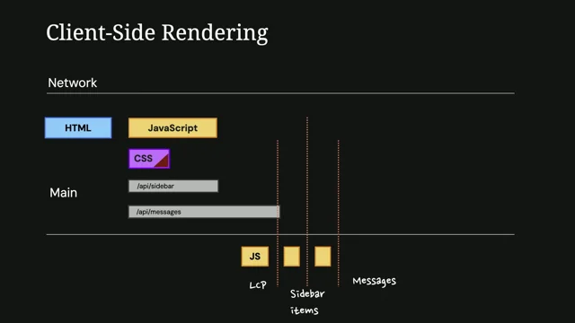
You may have seen these before and I have a graphic on the screen of an older screenshot of facebook.com with a user experience technique that uses sometimes animated, usually grayscale placeholders to represent the final layout of a page or an app while the content is loading.
While little content buckets are being fetched asynchronously to help a user think that there's a better experience coming and they're not looking at one giant spinner on the page, waiting tends to help people feel a little more relaxed about what's to come.
In putting this talk together, I went and looked at some websites that I use. I happen to be obsessing over this little kid's play playhouse on our website Home Depot in the United States, Home Depot had some skeleton loaders and I did test throttling in my developer tools to slow the page down because it was pretty fast. I wanted to see be able to see these skeleton loaders enough to take a screenshot, so I had to slow it down. But they had little buckets of the page that load in, like the price, the financing information, and if we scroll down a little bit, you can see more skeleton loaders.
They're below the fold. So in terms of user impact, there's already a lot of content on the page, so it's not a huge user barrier to have these skeleton loaders spin lower on the page. If we open our developer tools and look at the element, we can look at the structure of oh, we need another microphone. Hold please.
You know Just turn this one off. Okay, thank you.
Okay, testing. Okay, so if we open up the developer tools for this page on homedepot.com, we can see the structure of these little sub components and they are div and span elements. So very generic roles, no accessibility information.
I also have Chrome's Accessibility Inspector open in the Element Inspector, part of the dev tools. Very highly recommended tool for inspecting what information a screen reader would be able to access on a page. When those tiles pop in, when the content has been fetched and loaded, there's way richer information and this is working fine, I think, because there's other content on the page, it's not a big deal for these to pop in, it's just to show you what you can inspect for accessibility.
And what makes a good experience is in the end, ultimately, after hopefully not too long of a time, having rich marked up HTML that has information to tell a screen reader user about the structure on the page, the state of the elements.
So here we have some buttons and we're looking at the accessibility tree, which is similar to our document object model. Kind of parallel to that is what's called the accessibility tree, and that is a stripped down structure of the objects and information on a webpage that screen readers use to announce things to someone who can't see the screen.
So they did a pretty good job with this, with the markup. Give them some kudos. Here is an example from where I work at Khan Academy. We have this chat history table that we wanted to load in the visual structure of the table with a skeleton loader. But we wondered, okay, this is a pretty dominant part of the page.
Stands to reason that a screen reader user could try interacting with it before the content is loaded.
So what pattern should we follow for this bit of markup?
Here's what the table looks like once it's loaded. It has rows and columns of various tabular data and so it is marked up with an HTML table. The code for this table. We landed on this pattern after a few different experimentations and things like, should we use an ARIA live region to announce to a screen reader that this is loading? We tried that first, but it happened so quickly on most connections that by the time the screen reader announcement was made, the table had loaded. So that didn't seem like the right fit. We ended up going with some ARIA attributes, states and properties, including ARIA role description. To say, this is a table, but it's loading and it's translated, because we translate things into different languages. So we customize those strings depending on your locale. We also added on the ARIA busy state to say that this is loading True or false.
Support's not that great for ARIA Busy, but it sort of just fails silently, so it doesn't really hurt anything to include it.
There are some ARIA role states and properties that if they're if you don't have the whole pattern or you've implemented it incorrectly, they can cause harm. But for things that just are supported in some places but not others, it's what we call it's not necessarily what we call accessibility supported, but if you back it up with other things, other information, such as this ARIA role description, that combination can add something for a screen reader user to know that this table is loading.
Here's what it looks like in voiceover the screen reader on a Mac when you navigate into the table, because the user might it might take a while to load, so they're trying to see what's on the page by navigating with their screen reader. When you get into the table, it will say the rows and date rows and columns Website loading Chat history busy so we've got both the ARIA role description and the ARIA Busy truthy value coming through there.
This is something I'd like to get in front of users. So ultimately we can make some guesses, we can try Some things have hypotheses, but we want to test with people who use screen readers every day to make sure we're not adding anything confusing or outright annoying.
Because that's what happens too, especially with ARIA live regions. Watch out for those so our next big intersection of accessibility and performance includes device access in any locale.
As Harry mentioned in the last talk, there is a lot of mobile phone usage. Depending on the location, the time, and for people who are learning in countries all over the world, using a mobile device to access learning materials is pretty likely. So I personally care a lot about mobile web support and I have a stat from stat counter that in February of this year, mobile devices accounted for 62% of global web traffic compared to desktop, around 35%.
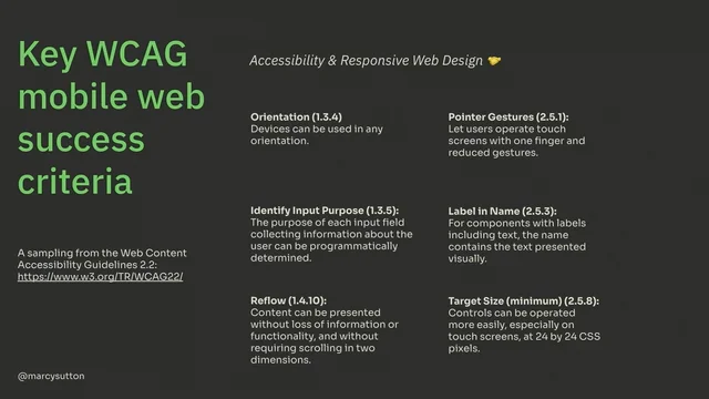
So we can't leave mobile as an afterthought. Just like we shouldn't leave accessibility for an afterthought, we should prioritize it, shift it left and improve outcomes. In our case, at Khan Academy for Learners and Teachers, there are some key Web mobile web success criteria. They're really aimed at just the web in general, but from the Web Content Accessibility Guidelines version 2.2, which is our set of guidelines that we use to measure whether we're meeting Accessibility compliance to name off a few that really paint accessibility and responsive web design as best friends forever or BFFs device orientation identifying the purpose of your inputs. Really important one, reflow, which is making sure that your desktop layout reflows into a single column without horizontal and vertical scrolling. It makes it very hard for low vision people when you don't handle reflow handling pointer gestures, label and name target size so that we don't have a fat finger problem with controls being too close together or too small. That is just a sampling of things we could apply to mobile web and accessibility.
So that big one I mentioned with reflow, if you never test it, you know, you never test mobile web and then zoom in in your browser to say 200% or 400%, you might not know that your layout is broken. Maybe it causes horizontal scrolling where you don't want or the interactions don't make sense, or some floating element like a dropdown or a modal is way off screen and you have to adapt your styles and your code to handle this different screen size.
And I was really proud of my team at Khan Academy that our learning interface, which uses a chatbot and learning exercises together for this experience, they had worked together with our design stakeholders to actually redesign it at a zoomed in interface. So at 400% rather than doing all horizontal scrolling, which is a perfectly fine way to do this, they actually tuck things away into different panels that you can turn on and off. So there's kind of like meeting the bar of handling scrolling and then you can go further and actually design for zoomed in reflowed interfaces.
And that's a good place to get to. Still good to test it with users, make sure it's clear, make sure people know how to use it.
So our goal with this is to help people with accessible technology. So thinking about connecting what we're building to the locales that we are actually supporting.
How many people are going to be using a mobile device, it really depends on what you're building. But for a lot of sites and a lot of organizations it's huge in having a good outcome.
And really if we're doing this work with mobile web and making it accessible, we can impact individuals, we can lift entire communities potentially out of poverty like for learning math and science. And all these things that we're doing with Khan academ content that means so much to me to know that I can have that kind of impact on people around the world. And we can do that by building responsibly and with accessibility in mind.
So our last kind of big bucket of accessibility and performance intersection is the one that I find really fascinating called Keystroke Level Performance. And it comes from a paper, it's older than I am from the 80s from Carnegie Mellon University called the Keystroke Level Model for User Performance Time with Interactive Systems. And really the idea here is that what if we measured performance by the number of keyboard commands it took to complete a task on a website? How hard is it for users to understand what they are supposed to be doing? And this is a really quantifiable way to measure it, but sometimes it is a bit more subjective. So I love this. Like if you tilt your head slightly, you can look at performance in a more user centered way.
And so super fascinating. So to put this in more context, how many keystrokes does it take? How many tabs? How many arrow keys? How many enter keys, escape keys? Can users, keyboard users specifically, and screen reader users, can they skip past repeated page content like headers, footers, stuff that they just really want to get past to get to the good stuff? Are users forced through any inactive widgets like menus, dialogs? Can keyboard users operate interactive controls at all? Like if you tab through a page, can you reach everything that a mouse user can do? That's the first test I do on a website. And it always without fail, tells me immediately whether a website has been built for accessibility or not.
How discoverable are the keyboard shortcuts that you insist on adding to try and help users? Can they find those shortcuts?
Can they understand them? Can they remember them?
Can a screen reader user, especially on Windows, on Jaws or nvda, can they perform that same action? Or do you have command collisions?
So you actually have to go and test, make sure, especially on Windows and mobile screen readers, that those functions are still usable. And it's a good idea to look at your site analytics, figure out which browsers people are using, and then you can sort of figure out which screen readers to pair with that.
And I'll talk about that a little more later. But inevitably when I think about this, how many keystrokes does it take? I think of the Tootsie Roll advertisements from decades ago, of how many licks does it take to get to the Tootsie Roll center of a Tootsie Pop?
The world may never know.
So here's a website that I found to sort of test this keystroke level performance and some of the common pitfalls for keyboard access. It was sort of a tourism website for Netherlands Rails traveling the Netherlands by train. Not to be confused with the National Rail website, which is actually very accessible immediately. They had a cookie modal that did not disable the background, so you get stuck behind it.
And there's also other controls on this page that are not reachable from a keyboard alone. So if you. The only thing you ever did for accessibility or the first thing you did at least because there is more. But if you tabbed through a page to see where you are and to see if you can perform those actions, you would see pretty quickly whether it's handled it or not. Another one that you could look at. And actually we're going to do a little bit of a live demo here of GitHub.com it's a very expert. So if you ship code regularly, you probably use GitHub, maybe use something else to be your code repository. This team has made a lot of strides for accessibility and they've done a lot of really cool patterns.
So we are going to test it. I have the Wonderblocks repo for the design system that I work on here and I'm going to refresh the page first just to make sure that my keyboard cursor is all the way at the top. And if I hit tab, I get to a skip to content link. So that's what we call a bypass block. It will allow users to skip past this entire header.
I can also go to a menu by hitting tab when it's closed. It doesn't force users into that menu. If I hit the return key, it will open it. It sends focus into the menu when it opens, actually lands on this close menu button.
And I can hit tab to get through this menu.
And it has a focus trap intentionally to keep me in this menu. So I can choose things without accidentally getting out of it.
From anywhere in here, I can hit the escape key. It will close that menu and place my focus back on that menu button. So it's very graceful.
They're handling it in and out. They're handling disabling the background elements.
And so that pattern of really testing keyboard access and guiding users through the part of the screen where they should be and not where they shouldn't makes all the difference for this keystroke level performance and keyboard ergonomics. It's frankly my favorite part of accessibility is this keyboard mechanics and then the screen reader access on top of that. I love it because you can do automated testing for a lot of this. If you know how these patterns should work, you can drive them with Cypress or with Jest and testing library to say this is the contract of how this component should work from the keyboard. You can't exactly do that for the screen reader, but the keyboard support, that is the basis of a lot of those interactions. You can bake into your code with automated tests, which is pretty cool. So let's go back to our slides. So a few more WCAG success criteria for you from the web Content Accessibility Guidelines. Kind of angled at the keystroke performance model include use of color. So if you have links, we want to make sure that those have underlines or bolding or something that when you're navigating as a keyboard user, you can tell where your focus is going to go.
Possibly baseline keyboard support.
That's a big one. No, keyboard trap means that you're not having unintentional keyboard traps. I think codepen's code editor is a classic one where you can't get out of it because they just never added support to get out of it. That's a bad example of a keyboard trap unless they fixed it. Bypass blocks, which we saw with GitHub skipped content link link purpose within the context. So making sure that your links have some sort of information to discern them. And it does for the baseline of link purpose, it does depend on like if it's in a paragraph or in a list item, that surrounding context can help a user understand the purpose of a link. But really what we're trying to avoid is all of your links saying, click here, learn more.
Like, learn more what? Click here for what? So if you can add more information that can tell someone who's navigating with a keyboard or a screen reader what to expect. And then lastly, in this sampling, focus visible. So making sure we have visible focus indicators when you're navigating by the keyboard.
Okay, so a lot of this is measurable. What can we quantify with accessibility? Because we like metrics, we like to measure, we like to make a business case and motivate and really bring those juicy nuggets to motivate people to do this. And sometimes numbers do really good talking.
Here's one. What is your homepage Lighthouse score for accessibility? Lighthouse uses Axe Core under the hood to evaluate your website's accessibility. It can't test everything.
There's certain parts that just can't be measured in this way.
And it's possible to build a site with a perfect Lighthouse score that is terrible to use. Just like it's possible to make a website that's compliant with the Web Content Accessibility Guidelines.
That's terrible to use. So this number doesn't tell all, but it's still somewhere to start. And there's a great article by Manuel Matusevich on building the most inaccessible site possible with a perfect Lighthouse score. Get a good chuckle out of that one.
Another one so as compared to just our homepage, what about the number of accessibility issues across your site?
If you have a dashboard or some way of aggregating the number of issues across your site, we start to get into more accessibility programs and kind of holistic things. That's what accessibility teams tend to do. And tooling has a big potential to help you with this one. I will caution that companies would love to sell you a solution for it. I have worked at those companies. I am now in the opposite side where vendors are coming to me.
Cypress Accessibility is a pretty neat tool.
We couldn't make it work for our needs, but maybe it would work for you.
It does cost money. So a really great thing to start with is manual ish testing with the Axe browser extension. You can use it for Chrome and Firefox.
It's an essential tool to get started with accessibility.
Another metric that we could potentially quantify the number of seconds until a screen reader user can read page content aloud.
And I had a screenshot earlier of Facebook's older skeleton loader. They've actually replaced that now with a full screen loading experience. Maybe it was hard to coordinate all those teams.
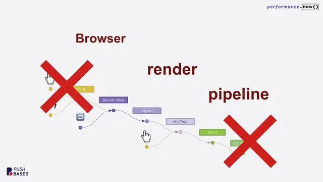
Who knows why they changed it. But this is how it looked. More recently it said Facebook website web content so they are probably using aria busy or some way to tell a user that this site is loading so that they have some way to know if they can't see the screen that it hasn't fully loaded yet. So how many seconds does it take to actually switch over to the page content? You could measure that, and some of that will depend on that accessibility tree that I mentioned. So here's a graphic from Firefox's Gecko Rendering flow. This is an older screenshot, but really the accessibility tree when it gets painted is at the same time as reflow or layout in a browser. So any expensive operations that you might be doing especially early in the life cycle of your page loads, things like changing things to display none. Like maybe you have some third party thing that you have to hide because it looks terrible using window getcomputed stuff, style element, scroll top like some of these JavaScript techniques. Try and minimize those expensive operations if you can, using browser default HTML and CSS so that you're not adding scripting just to get something to be accessible. It just works from the browser including default aria and tabindex values in your HTML rendered from the server. If you have server rendered content prioritizing accessible actions in your critical rendering path. So looking at key user flows which this is good accessibility advice anyway of what to prioritize Accept that there are privacy concerns for tracking screen readers. Screen reader users don't want to be tracked. It's like a white flag saying hey I'm disabled. People don't want that.
So you sort of have to look at the more generic events.
We do benefit from from what's called event coalescing for accessibility. So multiple events under the hood behind the scenes events are coalesced together to help performance.
Thought that was interesting. You could try the Navigation Timing API for measuring the DOM itself and know that the accessibility tree will follow.
So those are some ideas that you can take forward to look at that.
You could also count the number of heading or landmark violations for WCAG and here's a screenshot of the Axe developer tools for a test page and there's a lot of issues on this page including missing landmarks, missing an H1 heading. If you have headings out of order, it will flag those as well. And this without these your site can just be generic elements all the way down and it doesn't have any semantic meaning. So that's our goal with this one.
Do you have support for reduced motion on your website?
Sort of a yes no per page. And this graphic is moving. Imagine if you had vestibular disorder or epilepsy or something where you're navigating the web where motion makes you sick. I have a really great article in my slides about this.
From the news side of things, we can add better support for turning off motion and animations using the Prefers Reduce Motion media query in both CSS and JavaScript using the matchmedia function and that hooks into Max OS X settings under Accessibility Display Reduced motion. You can see the effect this has in your web pages once it's supported in your code by toggling this setting on and off from the system level. And it's very well supported on Mac Windows Mobile devices. It's it doesn't really hurt anything to add support even if a user is on a more obscure browser that doesn't support it. You can also add controls into your user settings to really go the extra mile. That's what we do on Khan Academy. How about the number of minutes you spent conducting inclusive user interviews for testing and the amount of time that you process those?
Takeaways to actually take in that feedback and do something about it. Did you talk to users with disabilities? What are you doing next? Sometimes this gets forgotten or we do the test and then don't follow up. So this is worth counting.
So you might be wondering, why should I do this? Hopefully you're not asking that question, but just to really drive it home. There are many reasons why you should prioritize this. The biggest one of all is that disabled people need access to. We don't want to be the person who is creating these barriers. Sometimes it's unintentional, but once you know about it, you can get started, you can do something, you can chip away, you can iterate.
And really, a lot of the accessibility work that we do for this involves easy wins. There are easy things that you can measure with the axe developer tools and go and fix them. You can remove those issues and then spend time on the more subjective kind of harder to quantify issues. But our goal is to prevent what I call access debt, which is design and engineering coming together to create accessibility issues.
Because design is a big component in this as well.
We can be code monkeys and try and fiddle with the code a little bit. But ultimately some of these challenges start in design or earlier with research and all that. So here's a question. Do you treat mobile, do you put mobile off too? Because some organizations do and it's equally painful. So if you put both of these things off, the debt that you accrue, it just makes it so costly. It is cheaper and easier to solve and build for accessibility the earlier you do it. And when you remember that it's about disabled people, which could be you, it could be a family member, it could be someone in your community now or at any time. That's a pretty good reason, and that really should be the only reason. However, here in Europe, there's also this legal situation that you might have heard about. So it really.
Accessibility isn't optional anymore. It's the law in the eu. And there are two directives that drive accessibility here in Europe, including the Web Accessibility Directive, which was for the public sector primarily. It was created back in 2016 and then more recently the European Accessibility act, or the eaa. It is aimed at products and services sold or used within the EU and it is fully effective this year in 2025. There is a technical standard here that you can use to measure whether you're meeting it or not. The EN301549 is the EU's accessibility playbook and it maps directly to WCAG version 2.1 AA. So there's single A, double A, triple A. We're usually aiming for AA.
WCAG 2.2 is emerging as an international standard and I have a link in my slides from the W3C about moving to WCAG 2.2 for the European Accessibility Act.
And I'm not a lawyer, but I know that the legal part of this is a really great way to motivate teams where you're juggling priorities and it's just not meeting the cut. Compliance might be that thing that you get through to certain stakeholders when the heart of it and the carrot of we can do good in the world.
Sometimes we need both arguments and the legal side, especially here in Europe right now, is a really good motivator. So what you should do for this is build accessibility in design it in from the beginning rather than bolt it on afterward.
Bolting it on is like trying to put chocolate chips into a cookie after it's baked. It's going to be a flop. So we can do it better and put it in the DNA. Maybe it's the salt in the cookie, actually it's structural, it's load bearing.
So the earlier we do it, the better it'll be and the more we can innovate for accessibility. Kind of a nuts and bolts thing, beyond the design and the code that really reaches people is also to publish an accessibility statement. Show your work.
You can build trust by allowing people in your audience to give you feedback, to say, hey, this is broken for me in this browser on the screen reader. That is a huge gift.
And sometimes it's hard to get legal teams to sign off because they're worried about risk. But it is part of supporting accessibility is creating a good accessibility statement. That's honest. You're not saying we're compliant, you're saying we're working on it, we're aiming for it. Get in contact with us if you find an issue, let's work together. And I think that really does build trust. Another reason simply is to build better software, like when it's more accessible.
In my opinion, it's more robust. It works from a variety of input sources, it is easily more testable. You can add automated tests and you have process around all of this. It ends up being better software. So our goal with this is to design for inclusion today and not compliance tomorrow, because that's the most painful, expensive way to do it. It's better to do it earlier and really make it part of your process. I happen to think that accessibility in design and engineering is super cool. And that's why that light bulb for me never went off was that I thought it was interesting and cool and meaningful. So you can have an impact and solve interesting engineering challenges by designing accessible affordances, making sure that you can see these buttons clearly, that you can toggle between a table view and a list view, maybe give users alternatives. You're choosing the best HTML semantics by going back to Mozilla developer network and going which element should I choose? Oh, it only has this support or oh, there's actually this whole pattern that I need to implement.
I have been doing this for 16, 17 years now and I still go back and reference those elements because there's always more to learn, there's always more to refresh your memory. Make sure you're picking the right element for the job, especially by default, as I mentioned. So you can ship less code just by using browser defaults.
The keyboard mechanics, that's my favorite part. It's interesting.
Accessibility supported ARIA scripting, so I mentioned that we used ARIA Busy, but support wasn't that great.
There's actually a website, it's kind of the can I use for accessibility called a11 ysupport IO. I reference that quite often to see how well an ARIA role state or property is supported.
And then I go test it in the screen readers that we support to make sure you can create safe alternatives to motion autoplaying videos, Parallax, some of that stuff can really trigger some migraines and really harmful things for people.
So if we enable prefers reduced motion, we can make that a lot safer.
And then you can add automated testing as I mentioned. And there's so much more.
There's just always more to dig into and solve here. That's super fun and interesting and hard sometimes, but if it was easy it wouldn't be that cool like to get into the fun bits like Harry was saying. But as I also mentioned, there's so many easy wins.
There's so many things that even if you just touch the surface, just fix the issues in the Axe dev tools and make sure you're tabbing with the keyboard. We could make the web so much better if we all did those two things. So as I promised, I have a wall of resources here so you can take a picture of the QR code to get these slides. This is just a few few of the links that I wanted to share all the way. At the bottom of this from my testing accessibility course are all of the resources from my entire. I think it's five sections and every single Link that I dug up and shared in my course are on that workshop resources page. So most of these will be on there. And there's way more detail about things like automated testing. Just, you name it, it's all on there. So my message to you is to go forth and improve access because you are in a position to do something about it. And now's the time.
There's no shame in saying, oh, I didn't know that. Oh, it took us forever to get that going. Just chip away at it. Go fix one thing at a time. I would love to fix every accessibility issue I find while I'm in the code, but sometimes it's out of scope. Get it in scope, make a plan for it. You can do this. And I really want to welcome you into the tent of accessibility, because it's cool.
So where to find me? You can find me on LinkedIn, bluesky, Instagram. My course I mentioned is testingaccessibility.com if you want to brush up on your math or anything, you can go over to khan academy.org and that's it. Leave it better than you found it. Thanks so much.
That was fantastic. Thanks, Marcy.
No shortage of questions coming in. So I love that topic.
I think for me, performance, the intersection of performance and access, has always been the most interesting and appealing part of it.
You showed the example of GitHub, right? And you're tabbing through and it's like you were talking about, it's an elegant approach, it's an elegant solution to it. It also just feels so darn intuitive, like, okay, well, this is what it's supposed to be like. So the question is, why isn't it? What do you think is the biggest gap? Is the gap, is it awareness of the issues, Is it developer ergonomics, Is it tooling?
Or is it more of a cultural thing? I'm just curious what stands in the way of that kind of being more of a default experience online?
I think it's awareness and knowledge. I meet teams who say we have the enthusiasm but not the knowledge. And so we have to build that knowledge. Which is what gets me out here speaking to everyone, is to just try and make it approachable because I think sometimes it can get overwhelming because there's just so much in an accessibility community, there's just so much that people like to add. And so I think by simplifying and really distilling it down to the most important things and just making an ergonomic experience and being laser focused on what that is, Which I think GitHub does really well. Yeah. But I do think it's rooted in a lack of awareness still in this day and age, so. Well, I'm sure the regulation, I mean, we've seen the regulation has an impact on that kind of stuff. Do you think we need. I mean, is there any sign of that kind of happening outside of the eu? I'm just thinking, like, in terms of performance, once we got the SEO carrot, all of a sudden, whoa, the performance budget's unlocked. Once the EU had the accessibility requirements, Whoa, the accessibility budgets got unlocked. Do you think? Do we need something like that to happen outside and is there progress on anything like that?
I think legislation is really important. Like, I don't always focus on the legislative side. It's more of the stick, part of the carrot and the stick. But it is really meaningful because disabled people rely on the law to, like, have the law in their pocket, to have leverage and to have a voice. So, yeah, I think the legislation really does help because it. Money is behind that. You know, it gets organizations to prioritize it and to care because they need to sell in these markets where accessibility is important.
And I've seen that across organizations I've worked in is if you're putting out, you know, proposals for projects and you're losing them because your site isn't accessible, that gets teams moving.
So, yeah, I think the legislation is super important. Now we're not going to be able to get to all of them because there was a flood of questions, as could kind of be predicted, around the idea of metrics and accessibility right now. You touched on like, navigation timing, you know, and obviously we advocate, you know, when, when it comes to perf, we advocate all the time, like, you look at your real user data because that's telling you what's really happening. And there's privacy reasons why that's a challenge in accessibility. In your experience, does navigation timing and some of the performance metrics seem to connect fairly well to things that, like, alluding. You alluded to it a little bit in the talk, but, like, oh, the accessibility tree is ready, the update ready. Like, are there. Does it map pretty well? Can we create little patterns maybe out of those metrics that kind of indicate at least, like, hey, if this is healthy, the accessibility tree situation is probably pretty healthy too.
Yes. I think there's a real parallel with your document object model being ready, like, for everyone across the board. Like, that really does affect all users. The piece that's kind of unique in the lens I'm painting is that someone might not be able to see the screen. So like, what information do we give them to know? But I think in terms of the timing, it is kind of the same effort, the same tooling that you would use to make sure that your site isn't all locked up. Trying to load a bunch of resources. I'm just adding this text based, programmatic piece of communicating the state of the page at that time. But I think if you're really working to get your your site to be faster, you will also serve screen reader users at the same time. Great.
In two words or less.
How do you. This question came in. Got to bring it up.
Automated tools that you inject in your page to make accessibility better.
Ooh, that's a spicy question. So the word we're looking for here is called an overlay. And no, I would not recommend recommend an overlay. And the problems with that are that they often don't really help users and teams don't ever build the muscles to actually design and build a website for accessibility. Like you skip that part by trying to load a third party script.
The site might be super broken and people get sued with those turned on. So it's not going to save you from being sued. In fact, it's just going to kind of erode trust. I mean, always test with users, see if it helps. But I don't think it's going to save you. And in fact it's worse because your teams are getting kind of a pass of not actually building for accessibility. So your site isn't.
It doesn't have that DNA. In fact, I don't know about you, but those widgets get in the way all the time. They cover important pieces of a screen, especially on a small viewport size.
I just want to get it out of there and just build the site with accessibility in mind so we can eliminate that piece.
So yeah, I wouldn't inject it for that purpose. Maybe if you're re platforming and that's a stopgap, but it's not your permanent solution. Makes sense.
All right, thanks, Marcy. That was more than two words. It was.
I. Fine. It's fine. It was a loose number. It was a loose count.
Thanks, Tim. Thank you.
- Cypress
- Jest
- Testing Library
- React
- ARIA attributes
- ARIA role description
- ARIA busy
- ARIA live region
- HTML table
- Chrome's Accessibility Inspector
- Accessibility tree
- VoiceOver
- ARIA role states and properties
- Web Content Accessibility Guidelines (WCAG) 2.2
- Device orientation
- Reflow
- Pointer gestures
- Label and name target size
- Keystroke Level Model
- Bypass blocks
- Focus trap
- Skip to content link
- WCAG success criteria
- Use of color
- No keyboard trap
- Link purpose within context
- Focus visible
- Lighthouse score
- Axe Core
- Axe browser extension
- Navigation Timing API
- Window.getComputedStyle
- Tabindex
- Critical rendering path
- Event coalescing
- Prefers-reduced-motion media query
- MatchMedia function
- Reduced motion settings
- Access debt
- European Accessibility Act (EAA)
- EN301549
- WCAG 2.1 AA
- Accessibility statement
- Mozilla Developer Network
- HTML semantics
- A11y support IO
- Automated testing
What if performance meant more than speed — what if it included how intuitively and equitably people can interact with your website? This session takes a practical look at how designing for accessibility contributes to more responsive, usable experiences, especially for disabled users, with ways to measure beyond load speed.