A Unified Styling Language
(upbeat electronic music) (audience clapping) - Thank you John for that intro.
That was such a great way to frame this whole discussion. So, yes as you heard my name is Mark Dalgleish. And I'm from right here in Melbourne.
Now as many of you are probably aware, I've been big in the React community in the last few years. I really jumped on that band waggon.
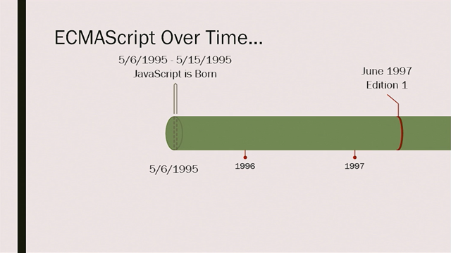
But for me I think really, really good reasons. And that's because it may surprise you to hear this but I've actually been working with the web since 1999, actually a really long time. Not as long professionally, but that's where I got my start. And I love CSS.
I was there in the early days converting table based layouts to divs and really trying to rethink how we do design on the web. I was really on the cutting edge of that stuff and I loved it, and I still love it. But really what I love now is sort of bringing these two worlds together.
I love component systems and what they allow us to do at scale.
But I still hold onto those values of progressive enhancement that are core to the web.
So I bring that into my daily work.
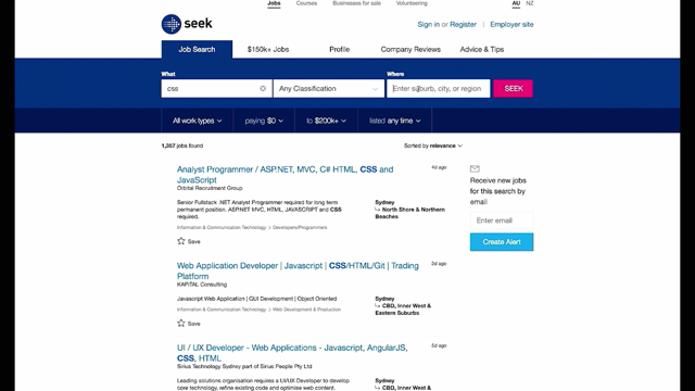
What you're looking at here is what I'm sure many of you have seen before which is the new or slightly less new, it's been out for awhile now, the core search experience at Seek.
And it's responsive now and it's out to mobile and desktop. And it's a single page app written in React and it's hitting in API, rendering in the browser and everything that you come to expect these days. But the catch is that this video when I recorded it I actually disabled JavaScript in my browser. So it uses all this cutting edge technologies but it falls back to the basics of what we expect in the web, in terms of what is a quality, stable website. Now many of you may be aware of my work with CSS modules, which is operating in this sort of modular CSS space. So you might of thought I would be here today to sell you on CSS modules, which is still what we use at Seek. But really what I'm here to talk about is the alternative which is CSS-IN-JS.
Because even though I'm not using it in my daily work, I'm very interested in the CSS-IN-JS space. And I think you should be too.
I think it's very easy to write it off for superficial reasons and I'll dig into why I think you should be interested.
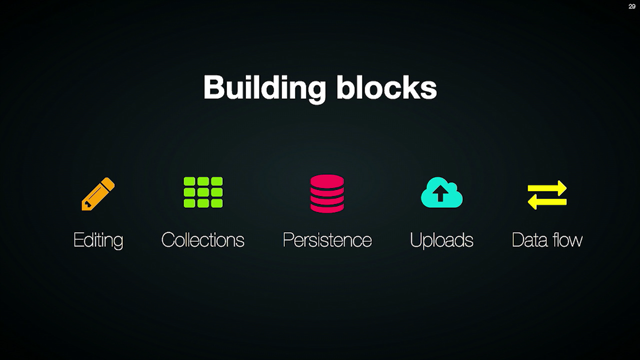
So, why, what are the reasons you would actually seriously consider working in this manner? What I'm gonna do is I'm gonna cover off kinda five key areas that I think are worth your consideration. And they're not just personal preferences.
These are things that are tangibly gonna make things easier for you.
So we're gonna look at scoped styles, critical CSS, smarter optimisations, package management and finally non-browser styling.
So to start at the top, let's look at the big one, scoped styles.
So, you know, managing CSS at scale I don't have to tell you, is really hard.
It's quite a difficult thing to pull off.
In fact, I'd say that for the longest time it was the hardest problem in front-end.
And by that I mean if you were to join any long lived front-end project, by far the thing that was hardest to understand, hardest to not break, was the CSS.
And the CSS community, people who care deeply about CSS, they knew about this problem.
We came up with a bunch of solutions.
The big one I think that kicked it off was OOCSS by Nicole Sullivan.
A bunch of other things were influenced by that. We've got SMACSS from Jonathan Snook.
And of course I think the big one that's used most in awhile that I've seen is BEM from Yandex. And all these are sort of trying to do similar things. Which is kind of forced some kind of structure on you about how you name your classes.
And it's really trying to avoid that global scope, trying to avoid issues with specificity.
Really trying to hone in on elements within the page. And this was fantastic.
BEM was something that we used actually initially on that project you saw earlier at Seek.
It started a life as a BEM project.
And it wouldn't have gotten to where it was today if it wasn't for those principles.
So I'm a big, big believer in that approach. The problem though is that it's just a convention. At any point you can choose not to write your CSS this way. People can join your team and not really know the rules. It's a hard thing to really stick to over the long term. Which is kind of strange when you think about how integral it is to making it maintainable, at all, right? So when you look at BEM more deeply in a component system, BEM blocks are essentially components, it's the same extraction. So there's really kind of a one to one mapping between your BEM blocks and your components. And when you build in components for something like React, they are defined in JavaScript.
So you've got your React component in your one JavaScript file.
And what naturally flows on from that, for a lot of people is they want to keep this styles really close to that component, if not in the same language. And that's what we're starting to see.
So, I'm going to start with a really great example from a library called Glamour by Sunil Pai, who actually now works at Facebook.
And it looks likes this, so you import this CSS function from his library.
And you pasted this object literal.
And even though it's in JavaScript, it's CSS. If you know CSS, you know how to write this. If you don't know CSS you don't know what to put in that object literal.
So your CSS skills will directly apply to this. What comes out the other end is the interesting part. It generates a unique hash of a class for you. So what it's doing is it's hashing those classes automatically to enforce scoping.
So now scoping your classes to the component, to that style sheet, is now something that you don't have to do by hand with a prefix.
It's something that is automatic every time you write it. One elephant in the room I need to call out, because some of you may be wondering about this. This is not inline styles.
A lot of the earlier experiments in the React space were generating inline styles.
This is generating real CSS, real style sheets with the full power of CSS.
So to illustrate this further I'll look at another live read, JSS by Oleg Slobodskoi.
And it looks something like this in a slightly more complex example.
So here you can see there's a few more things going on. But the key things I want to highlight is you can see there's a hover style, something you can't do in inline styles.
And there's a media query, another thing you can't do in inline styles.
And this doesn't get translated to some sort of JavaScript hack to kind of pretend to be CSS, this is real CSS that comes out the other end. So what it looks like in practise is something like this. So you've got your styles defined.
You can create a style sheet and attach it to the document like this.
And what you get is a reference to the classes. And so those classes are just properties on the object and they map to the classes that were generated for you, the hash classes. So to practise even if you're not using some fancy library you could just use inner HTML. And you have access to those classes, and here we're saying we're attaching a classes.heading to our h1. And it's as simple as that.
So here we've basically kind of automated this whole process of scoping things. It's all about scopes, CSS and components.
The component mindset is really critical to understanding where this movement is coming from.
But what you end up with is that your styles are now passed around like regular code.
They're not this special case in a different file, in a different language.
They're really, really tightly coupled to the component. Which is actually what you want in a component system. So much so that generally what you want in practise is to have some kind of binding to a UI library of choice. So we just looked at JSS, let's step up a level and look at React JSS.
And what it does is it gives you a nice little decorator that you can wrap around your component.
And you have a style sheet for each component. And then it gets a reference to those classes gets passed into the components.
So here you can see, we're rendering classes.button classes.label, and those are defined in our style sheet object.
And that's right there in the component.
So to really call it out again, the component scoping of our CSS, something that you have to meticulously do by hand, in raw CSS, now is automated for you. It's just part of the way the system works. So if component oriented styles is the direction that we're heading, can we go even higher level than this? Instead of thinking about style sheets, some people have thought about, can we think about components? And style components is a really awesome move in this direction.
I'm definitely not going to go into much detail because that's Glen's job, he's up next.
But the tale of the hour, so I can continue this journey, is that it's really about saying, instead of writing style shapes and throwing style shapes around your app that I then have to manually have to bind to a component, what if I just made the component with the styles included. And so then in practise what that means is that you're actually, instead of touching classes all over your render methods, you just use these high level design constructs.
Which is really great, particularly when you're working with designers.
So again, what we're seeing here is that the best practise from the CSS community, something that was very common, something like BEM. It's now baked into the platform, it's not opt-in when you use tools like this. Now some of you may be thinking, if you're familiar with CSS modules this is what you get from CSS modules as well, and that's true. But this sort of fundamental difference of doing in in JavaScript unlocks a bunch of other interesting things which we'll dig into now. The second one is critical CSS.
So, many of you I'm sure have seen this approach before. Really it's all about inlining styles for the current page for performance reasons. It's trying to get you to that first render as quickly as possible.
So rather than downloading the full style sheet of every possible style in your system.
Let's just send the user exactly the styles they need for this one view, alright? And that makes a lot of sense.
So it looks something like this.
In your page you've got a style tag at the top. And it's got the rule for the one thing on the page, it's obviously a very contrived page.
But it's only got a heading on the page.
So let's just only send them the heading styles. And the full style sheet that could be 100 kilobytes, let's leave that til later. So that makes a lot of sense.
There's some tools out there to try and automate that for us.
The big one is probably Critical by Addy Osmani. And it's a really fantastic tool to kinda try and automate this process.
Obviously you can't really do that by hand, you need some automated way to do it.
The challenge with it though is in the way that those systems work, they're kind of hard to maintain and hard to automate. Generally they involve speeding up a real browser and trying to figure out what's going on.
It's definitely not something you could do on every request on the server.
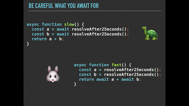
When you look at CSS-IN-JS and server rendering, it's the complete opposite.
Because server-side CSS-IN-JS actually fundamentally depends on critical CSS to even work.
And I'll show you what that means.
I think the first time I saw this in practise was a really great library called Aphrodite from Khan Academy. And their take on it looks something like this. So here we're importing this style sheet and CSS from their library.
So stylesheet.create is similar to what we've seen before. It's got heading styles of colour blue.
And then at the bottom there we're defining our heading. Now what I want you to notice here that in the class name when we're attaching styles.heading.
It's wrapped in a call to their CSS function. And what that's doing is it's giving Aphrodite hooks to understand when this is being rendered. So if you think about every time this component renders, that CSS function gets called the library knows we're about to render these styles.
So what that allows it to do is it gets to manage what styles are needed for any given render. It can manage the life cycle of adding and removing styles from the document as well.
So on the server when you're server rendering, it looks something like this.
Here we're pulling in style sheet server from Aphrodite. And we're calling stylesheetserver.renderstatic. So it's taking our whole React application, rendering it to a string and Aphrodite knows exactly what CSS was required to get that render path to succeed. So here we've got a reference to our HTML, now CSS. So in terms of your server site templating, it's as simple as this now, you have access to css.content. You just gotta put that in the style tag at the top of the page.
That's all been handled for you.
And of course React is already doing the equivalent with HTML.
We've got all that initial HTML for that view handled on the server, we just inline it and the div there with the id of whatever we need to get a hook to bring it to life on the client later.
So even though we've written everything in JavaScript and you think we've broken the web here.
It's actually the complete opposite.
We've actually built for progressive enhancement in a really clever way.
We're taking advantage of the web platform and not ignoring it.
But more importantly we're taking these best practises that are actually really difficult in the old model.
And can actually be really streamlined with these new tools.
So now critical CSS is built-in not opt-in, it's not an optional additional to your work flow, it's how it works fundamentally.
The third thing I want to cover is smarter optimisations. And this is really about how the relationship between your markup and your styles actually changes in this environment.
I'll show you what that means.
So a lot of us are trying to reduce our CSS bundle to the absolute minimum.
And that's kind of a hard thing to do, particularly with a technology like CSS.
And there's some really interesting approaches out in the wild that try to do this in a slightly more traditional way.
Atomic CSS from Yahoo is a big one.
They have this special syntax that you have to apply in your classes and then they have a tool that picks up each one of these.
So essentially what it means is you have a single class for every property.
And so you get the minimum set of styles for your whole application.
And there are some approaches like this that are a little more opinionated like Tachyons that try to be a bit more like a framework and have a strict set of classes they provide to you, rather than being free falling.
And they have their sort of naming conventions. There's a bit of learning curve with these. But it looks something like this.
And very strange at first sight, I definitely understand that.
But the way I kinda wrap my head around this, is it's basically kind of treating classes like inline styles.
Because inline styles can't do everything that CSS can do. This is kind of like a hack to kind of unlock that ability. So it works really well again in a component system. This one, I'm sure you can guess, I kind of have mixed feelings about in the sense that I really like what it's trying to achieve, and I think the end goal is really admirable. It has a big impact on the way you write and think about your CSS.
It's a really different thing and I think particularly in a team environment I'm not sure how you would manage that transition.
It's not something I've lived through, but I can see it being a challenging thing to deal with. But if you look at what we're doing with CSS-IN-JS where essentially the styles.sidebar there is a dynamic value, it's not a hard-coded string. We actually don't know what the final value's gonna be. And in practise that might just result to a single class like sidebar.
But it could just as easily be four classes or dozens of classes.
We actually don't know, we've left that up to the tooling to decide.
So, a really great example of how that can be leveraged to do really interesting things is Styletron by Ryan Tsao.
Essentially what it's doing is dynamic, zero config atomic CSS.
At it's lowest level this is not the code you write but this is the fundamental building block of Styletron. You get a unique class at the bottom there, in this case it's a.
A unique class for every combination of property value and media query.
So at a high level on the left there that's kind of more like the styles that you would write, sets of rules. But the interesting thing is that because it has control over the classes that get generated when you define a set of rules.
It can actually optimise and generate the minimum set of classes.
And when you ask for a class it actually provides you two or three or more, as many as you need.
So really what you can see there on the right is there's actually only three classes needed to satisfy all those rules on the left.
And it's dealt with by those virtual classes in the middle, ab, ac, bc, right? So, really different from what we saw with atomic CSS and Tachyons.
On the left, even though its in JavaScript, right, it's still very much the same thought process as writing normal CSS.
I'm just going to write a bunch of rules, and I get a class. When Ryan wrote a blog post about Styletron, he showed some stats around what kind of effect this has on a large code base. He ran Airbnb's CSS through a few different tools. And you can see there on the right that Styletron by using this kind of itemization was basically able to halve the size of the style sheet, on a real world sizeable set of styles.
And again this trend is continuing that because our tools are sort of operating at a higher level with a bit more power and a bit more smarts in them, they're able to bake in something like atomic CSS rather than making it an opt-in different approach to how you build things. The fourth point I want to cover, I think where it gets really interesting for me is around package management. There's a really important question I want you to think about, which is how do we share CSS with each other as a community? I don't think we really have a good answer for this. And even if you're using a package manager to ship your CSS. There's generally still some kind of manual step to kind of wire up whatever CSS assets you've downloaded into your app. There's no kind of automated module system to do this for you.
And that's because it's not coupled to a module system. As a community we haven't agreed on a package manager that understands CSS and how it integrates into your app. And because we haven't agreed on it, it's kind of flattened out to a degree what we can do in this CSS community. Because if you want to pull down a CSS dependency that also has it's own dependencies and they might have their own dependencies, right? You might have frameworks that are built on top of other lower level libraries. How does that work in the CSS world? I actually think that we've seen a similar thing happen in the JavaScript space around Bower versus NPM. Because Bower had the same problem in that it wasn't coupled to a module system.
Whereas NPM was very opinionated and to use this system you have to use this module system.
And that allowed this whole community to flourish. Where you could build lots of little things and compose larger things out of those things and ever larger things out of those.
And the module count just went up and up and up. Bower was the complete opposite, because the technology choices that were made there tended towards monolithic dependencies.
This was like j query and then a bunch of plugins, or angular and a bunch of plugins.
The tooling that we were using kind of forced us into that model, to a degree. So if you think about CSS, Sass, LESS, things like that. Where's our package manager for those technologies? And I think, for me, a real eye opening thought experiment was when I thought about the same for HTML. Where's our package manager for HTML, right? Effectively, we're already sharing HTML in JS. That's what we do today as a community.
We don't share raw HTML strings, right? We share jQuery plugins, we share backbone views, angular directives, React components.
All these things can be published to NPM and consumed very easily.
And that all just makes sense.
And we've actually become very comfortable without really thinking of it in those terms, right? But what if we shared CSS the exact same way? What if we took the exact same approach? Instead of using mixins we might have to use functions, okay, that's not too bad. And instead of using things like @extend.
Es6 and beyond is starting to get some really nice language features for dealing with objects like spreading roles into an object.
So we can start to compose and share our style rules like any other code, there's no sort of hard separation between these technologies.
A really good example of what this means in practise is a library like Polished by Max Stoiber, Nik Graf and Brian Hough.
And essentially this is the lodash of CSS-IN-JS because it's got a massive API surface, bunch of utilities. But what's cool is that these are just JavaScript. So you can use it in your CSS-IN-JS but you can use it in your HTML if you're documenting some things for designers you can reuse that code in a different context. And it's all very straightforward.
You can use the same testing tools and everything. So it just fits right into their ecosystem. And in my mind it's really about taking our work in CSS and putting it on that blue line, right? Like let's try and think more modular about how we share our CSS, and the tooling around it.
The final thing I want to cover, which is much bigger I think and we'll be talking about it for a long time, is non-browser styling.
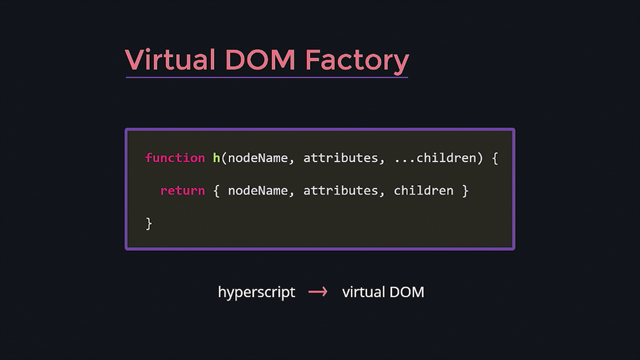
Now to go into this I'm gonna have to sort of dig into React a little bit more, but luckily we've already heard a little bit about this topic. And that's around the idea of virtual DOMs. So in React instead of directly manipulating the DOM you deal in this virtual representation of what you want to render. And that's really at the core of what unlocks this next generation of thinking in this space.
When you render in React you pull in render from react-dom. But that's kind of implying there are other renderers right? Really what's going on under the hood is that React can really target virtual whatever, doesn't have to be DOM. Could be whatever platform you're dealing with. And we've seen that in practise with things like react-native.
Where the perimeters are kind of native components for iOS and Android.
What's interesting in terms of styling in a React-native world is it ships with it's own style sheet abstraction. Which is similar to what we've already seen. Here we're creating a style sheet in JavaScript. But this runs in a native app, a real native app, not a web view, which is really interesting. But where it gets even more interesting, I think, is in terms of layout.
So here you can see we're using flexbox, right? In a native application, not in a browser.
This was enabled by some really interesting work out of Facebook called CSS-layout. And it was basically just re-implementing flexbox in JavaScript.
They've since kind of hardened it and broadened it a bit more, gave it a better name, and a cool logo and a nice colour, as you have to do. But what they said is that the focus of this library was on creating an expressive layout library, not implementing not all of CSS, which I think is really interesting. Because if you think about the history of CSS and how we've managed to deal with it. CSS at scale is all about picking a reasonable subset. And I think this is just the next generation of that approach.
So what that means is really limiting the ways in which you can layout a page to kind of the things that feasibly you could layout your whole app with flexbox and people do it, and it actually works.
Instead of having the cascade, which doesn't make sense in a native context we just go down to scope styles. What this enables is cross platform components with embedded styles that are not coupled to the browser. Really interesting approaches in this space are things like React-Native-Web by Nicolas Gallagher who works at Twitter. And basically if you're using something like web path you can just alias react-native-web and start to share components across this boundary, which is really interesting. There's a project by Leland Richardson from Airbnb called React-Primitives.
And what it's trying to do is give you a layer of shared perimeters that can target both native apps and web apps as well. So again, trying to make it so that your code is portable across that boundary. And interestingly enough, Microsoft is in this space with their fantastically named ReactXP.
Which actually in this context stands for cross platform. (audience laughs) But how can we take our components even further? Not all of us are building native apps, so is this where we switch off? I don't think so.
I actually think there's a lot more to this. And the perfect example of this is React-SketchApp by Jon Gold who's also from Airbnb.
And this is a really fantastic project that for me really opens up where we're heading as a community. So what you're looking at here is on the left it's React, it's CSS-IN-JS, but it's not targeting a browser. It's not targeting a native app.
It's targeting Sketch, it's targeting designers, it's targeting people prototyping and iterating on what we might build next.
So what this means is that we can start to share, not just across different platforms but across different disciplines, right, in our companies, in our organisations. And I think that's mind-blowing for me.
Here's another example of what it looks like in practise. Things that are really hard to do in a design tool, like responsive design. It's a piece of cake when you've got code powering it under the hood, right? And designers are really going to benefit from the ability for us to share our work back and forth across this divide. What we're looking at here is the beginning of truly cross-platform, cross-disciplinary design systems. Where our code is really portable, not just within the development sphere but throughout our whole organisation. And we're doing this because we are focusing on having cross-platform code as the source of truth. I think this is really the only way we can pull this off. And this is letting us take out CSS where it's never been before, letting us do things that we didn't even think were possible.
So to recap it was a whirlwind tour of this space. Why are we trying to do this, right? It's not just cause we don't want to learn CSS right? There's some really deep thinking behind this. We're trying to scope our styles down to the component model, so that we can scale large systems out of that that are maintainable.
We can maintain those over the long haul and we're seen that in practise.
But then we can optimise it in ways that really take advantage of the web platform.
But we can then share our work more easily through existing tooling by embracing JavaScript modules. Which means other people can compose their apps out of our work and we can build on each other's work as a community. Unifying around that single model of not just components but a single language as well.
The interesting thing I think, particularly for this crowd is we can do this without breaking progressive enhancement. If you put that right thinking in and people are doing this. And that's for me where I get to hold onto those values that I hold dear about the web itself.
Even though we're doing really amazing new things. So in practise what this is going to look like and this is sorta what we're trying to do at Seek. We're pulling in a bunch of components from the style guide. We've got our high level design language that we share with our designers.
But under the covers this is generating real CSS. And it's all handled for us by the tooling, which is a much better way to work with your designers as well. So really, what this is all about is about getting this community together around a unified styling language to enable the next generation of thinking within web development, within application development, and even in terms of how we think about design in large organisations.
And I'm really excited about this future and I hope you'll join me on that journey.
That's it for me, thank you so much.
(audience clapping) (upbeat electronic music)
In the past few years, we’ve witnessed a massive increase in the amount of CSS experimentation, with ideas like CSS Modules and — most controversially — the rise of CSS-in-JS. But does mixing our styles and logic run counter to the original ideas of CSS? Does it break progressive enhancement?
In this talk, we’ll take an empathetic look at these new approaches, how they relate to the history of CSS, and why they might possibly hold the key to the future of CSS — all from the point of view of someone who has been writing CSS since 1999.