(robotic instrumental music) - Hello hello, thank you for the lovely introduction, John. So before we get started I always like to do a little bit of a show of hands. I'm curious how many people in the audience consider themselves developers.
Alright, got little paws in the air.
How many of you are designers? Any UXers? Oh, thank you for coming.
And how many of you are some combination of all of those or any of those? Alright, well I love it.
You're my people.
Okay, so first we're gonna start with a little game.
It's my favourite game.
I like to call it app versus site.
First we're gonna start with AirBnB.
This is the AirBnB app and you see we just jump to this search form here and we're typing in things that faded in, press on that, we get this little loading animation. These fade in.
When we click on that this moves down.
Whoa, pardon, tap on that, we're moving fingers. And save filters, scrolling, scrolling.
Go on, you know you wanna.
And we got another fade.
Now the fun part is when you actually go to investigate one of those it swipes in from the side and here in this carousel when you're swiping back and forth you're swiping the images move underneath your fingers. And then there was a fadeout.
There's a lot of subtle animations going on there, right? And this site looks and feels, I mean, pardon, app, looks and feels like AirBnB.
When we go to visit their website it still feels like you're on the same property, right? The people who built these two things are adhering very strictly to a design system. But let's watch how the interface works.
Now we're selecting dates, we hit search.
There's a spinner there and then (whoosh) new page, completely new page.
This stuff chunks in, that wipes in over there and we click on that and notice as we're going through the images it just kind of plunking into place.
They're not animating, they're not moving.
When we click to actually go to one of them the page turns white, content just starts appearing in blocks.
Not a whole lot of animation happening on the website, even revealing extra content just kind of causes stuff to just poof right into the place.
Okay.
So AirBnB.com and AirBnB's app look the same but their interactions do not feel the same. AirBnB's app has more of a, has more animations going on and they're completely absent from its site, at least in that site that I recorded.
May have changed today, make no promises.
So let's try again, let's try Amazon's shopping app. This one does not actually I think align so well with Amazon.com but as we move between these three panels notice how the underline is moving.
When we click on one one of the items there's page transition.
Well that was weird.
Oh, I don't know if you caught that but you can get a page transition from the side or there's a whole fade in.
The menu will drop down from the top, useful, and then there's a fade.
So we've got some animations on the Amazon cart app but it's, they're not really as slick and smooth as AirBnB.
On the website though, as you can see, once again not really any animations.
Everything, when you click on something page turns white, everything chunks in.
There's an animation there, we got an animation on a carousel, hey, hand Amazon a cookie.
So one of the things that I'm noticing as a major difference between apps and sites these days is animation, specifically animation tied to user interactions, not just a slide carousel like the one you've been watching behind us for the whole event but animations related to human input, to moving through a series of images and oftentimes you'll see even in the best cases like AirBnb where the site and the app have great parity, at least as far as the design goes, the interaction not so much.
It's not impossible, though.
You might say well you know apps have gestures, Rachel. That's really hard on the web, that's hard. Well yeah, it's not impossible though.
Let's take a look at my favourite app.
Anyone here use Duolingo? I love it, it's my favourite way to learn new things, specifically new languages and originally I was learning Polish to go give this as a keynote in Poland and Polish is really hard but I had to refilm this many times to make sure I looked smart.
You got a little supplemental animation when we get something right.
Notice how (poof) comes up from the bottom says you're correct and then you move forward, you're sliding through, and while that happens this little bar up here is animating, progressing, showing you that you're getting it right, you can keep going.
Even the keyboard, the system level interaction here, slides up from down beneath and when you hit enter it slides down and the announcement that you got it right slides in. Check that out, really smooth looking, right? Really great underneath your fingers.
It's hard to mistake what just happened where. Now here's the site trying to use some animation.
So it looks different.
This is not just a one to one and there was a page jump from there but we're gonna go into taking one of these. Notice we've got this modal, we hit got it and it's going to close and fade out. There we go.
Now when we click one of these, boosh, click it, you're gonna go down to check and you get a little bounce down here.
It'll let you know, hey, you got it right, and notice that once again the bar up here is animating as we get closer and closer to our goal so there's parity.
Not only does it look the same but it feels the same. It's giving you the same interactions but in a different context, in a different form factor and yet it still manages to be on the ball. You can't unsee it, can you? So animations have existed on operating systems from iOS to Windows for years and it's available on your phone, it's available in apps and right now, excitingly enough, it's available to the web and that is what I have come here to talk to you about today.
I get really excited, by the way, about seeing how far I can bury the title of the talk. It's like now we're gonna get it, I wanna surprise 'em.
It's comin'.
So hello, I'm Rachel.
I work on the Edge Platform Team at Microsoft. Just recently, the past six months, and they still love it when I come out and talk to wonderful people like yourselves about the things that make me excited about the web. That would be animation.
But before I came to Microsoft I ran a web animation consulting business, not a whole lot of money in that, by the way, but I have worked on some really cool things including Salesforce's wonderful lightning design system which you probably have heard about already and I built some cool stuff with Mozilla like DevTools Challenger.
Devtoolschallenger.com is this little walkthrough that shows you how to use Firebox's animation tools and also educates you about deep sea fish and ecologies. We'll talk more about that later but in general, oh, and I've done some really cool, I've done some really cool demos using the web animation's API as well.
We'll talk more about those later.
But in general I love doing experimental things with people around the world that involve using the web in new and unusual ways. This was one of my first projects.
I collaborated with this great Russian graphic novelist to create an interactive page for her comic and this is all using HTML5's Drag and Drop API. It's pretty cool.
So you're probably thinking, wow, she draws a lot of stuff.
Where'd that come from? That's probably because before I came to the web I was a cartoonist and yes I did bring some comics with me and you can win them at the end of this talk. So start writing down your questions.
Excellent.
So, I cultivate the web animation community. You can find our newsletter at webanimationweekly.com. We've got a slack, it's a great place to go if you're looking at getting started but you're intimidated.
There are many different ways to get into this wonderful field of work and it can be a bit much to digest, give a lot of talks, write a lot and also have some courses.
But specifically today we are going to talk about some things that have been preying on my mind lately. First, how animation can help our users.
There is a reason why people keep using animations in touch devices like your phone.
It's the cognitive reason, the scientific reason. We're gonna talk about where the heck has animation been on the web all this time.
If it's so dang useful why wasn't it baked in from day one? Ho ho ho ho, we got some gossip there.
And lastly, how animation's resurfacing in the web development community is changing how the web is being designed and built today. Okay, so we're gonna get started by taking The High Road Through the Brain's GPU. We're gonna get started with science, namely, why do some, namely app designs, use animation while others don't? Scientific reasons.
But let's clarify some things.
Now when I say animation you might be thinking Mickey Mouse or I don't know, comic books or something like that but I'm gonna try to wipe your brain clean of that misgiving.
When I say animation to you today I'm talking about a visual rate of change.
Now there are many different kinds of rates of change out there for different senses. The smell, for instance, of a flower that slowly goes from smelling wonderful to smelling kind of rotten is a rate of change over time.
Animation is a visual rate of change over time. You know, we even have audio rates of change over time? The doppler effect is a rate of change of audio as it moves past you and this can be used in interfaces for humans as well. When I was, when I was visiting Warsaw I found this great stop section.
If you listen you can hear beeping.
Now notice it speeds up once the light is likely to start blinking so you know you need to get a move on.
So the regular beeps let you know it's okay to go. The sped up beeps let you know, start moving faster. So with animation we can change visual properties, not necessarily sound.
We can animate position, we can animate form, we can animate size and opacity, all kinds of things, and we can use these to indicate a change in an object's direction, in its solidity, its momentum, and then we can combine all these wonderful things to create subtle improvements in user interfaces to plus the user experience by reinforcing relationships, structure and even cause and effect.
Those are all other talks.
That's not the talk I came here to give you. This is just the quick and dirty run through. Hopefully it'll get you interested.
Operating systems and applications have had access to this for years.
Notice when I click on Twitter, pardon, tap on Twitter, we've zoomed into Twitter.
We're reinforcing its spatial relationship on the iPad by zooming into its location and as we move we're like moving forward.
Things wipe out as panes.
This comes up from where you write that keyboard area. Interesting subtle things like that.
Notice how text fields never come down from the top of the screen.
So, unfortunately the web has been limping along on jump cuts.
I'll tell you what a jump cut is, but just first this is what one looks like in a user interface.
Notice open, closed.
Open, close.
There's no in between.
This is not animating.
It's just either there or it's not.
In the meantime, this is animating.
That part has a constant rate of change.
So, what's happening there is called a jump cut and the web has been running on them for a long time and you could say that the web was lucky because users had previously been trained by an entirely different industry, film.
So in film the jump cut refers to when the camera cuts directly to a different angle or a different screen with no fade or movement. There's no fading into a new screen or to black. There's no panning.
That's when the camera moves across a field of vision, like if I were looking from one person to the next with my camera that would be a pan but this is what cutting from one person to the next looks like.
Audiences, by the way, were trained from a very early time. Directors noticed that, for instance, hang on I'm gonna start from the beginning there. Notice we have two people, one woman here and a man here, and they're having a conversation.
Now the director cuts in, jump cuts in to his face. We can see how serious he is.
Now he looks to the side and the director knows that he can jump cut to this woman's face because audiences expect that wherever the person is looking is where the next cut is going to go to.
Yes, directing is hard.
So, having actors look toward the location of the next shot with their eyes can help keep users from getting disoriented during these jump cuts and users have been pretty well-trained.
It's cause the human brain is a magical thing. When a user sees this happen.
Open, over, closed, open, closed, open.
This is a common drop down pattern, right? Watch what happens.
So what basically happens is the brain takes kind of a before picture and then an after picture and it figures something like this had to have happened in between because when something happens directly after something else we infer causation.
Clicking on that down arrow means that whatever happens next was caused by our clicking on the down arrow.
It wasn't an act of God or a blip on the screen. So somehow all that stuff had to come from your interaction and your brain interpolates that.
Now, in the world of animation we have a word for that. It's called in-betweening and in-betweening is a dead-end job.
See, when you hear those wonderful Disney animators on television talking about oh yes, animating Belle from Beauty and the Beast was so amazing. She's so beautiful and live and I just love doing her hair.
That person probably draws her key frames.
Now key frames are the important frames, well, important.
You've got the, for instance here we have a key frame of the cat walking and a key frame of cat sitting, right? But somebody has to draw all the frames in between those. That's the in-betweener.
That's a dead end job.
You never hear from the in-betweeners on these interviews. You're not gonna hear from, no one wants to hear, I stayed up for eight hours one day making sure that the cat would sit down and not look like a mess.
It's a dead end job, it's something you get interns to do, it's something juniors to do, it's something you outsource overseas, make people with more time and a lower price point do for you.
It's a dead-end job for a person who wants a career in animation.
It's a dead-end job for your brain.
This increases cognitive load.
It's busy work and it doesn't actually help people focus on the task that's at hand.
It's a disruption to their mental model for the brain to have to do this.
Now we're in the prime of our lives.
We are able to do this at the flick of our hands because we stare at computer screens all day. Our brains have shortcutted all of this for us. It's used to in-betweening for us but for other people who don't stare at computers all the time or maybe their brain is a little bit not so cool that day. For instance, I had pneumonia and using the internet was kind of horrible when I had pneumonia.
That was fun.
Maybe people who've never seen a screen before like a small child might find this sort of disruption difficult to get around.
You might hear from them something along the lines of what just happened or I don't understand. So yeah, our brain can do, our brains can do this kind of mental legwork no problem but for other people, not so much.
If there's no lag between these jump cuts we might not necessarily think there's a problem but it can still be confusing for other people. There's actually some research that supports this. Back in the early '90s there were some operating systems developers embraced the notion that we could speed up mental processing by offloading interpretation from the brain to the visual cortex.
I know they never say read your slides but this paper is so great I'm just gonna paraphrase it for a moment here. This was one of many papers that was released in the early '90s and then we heard nothing about this research for a while.
I suspect everybody got bought up and then they had to do all the research quietly internally and not share with anyone.
But the idea is that offloading interpretation of changes to the perceptual system, i.e. making something, like animating something, it allows users to continue thinking about their task domain without having to shift context to the interface domain.
So by eliminating sudden visual changes animation lesses the chances that they are surprised, distracted or otherwise confused.
I like to simplify that down to an image.
This is my favourite one.
I'd like to say that you can think of the human brain's visual cortex as sort of like their GPU.
Everybody, anybody here ever instal their own GPU? Come on, we got some gamers out here, yeah, nice, thank you.
So GPU is like how your brain, the GPU is kind of like your computer's second brain for handling graphics and GPUs are very stupid.
They handle a lot of mathematical computations. Your CPU, that handles like opening your emails and all that stuff is very smart by comparison and it handles all of the important stuff.
In the meantime, if it involves images, straight through the GPU.
This lets the rest of the brain get on with its regular work and not worry about what just happened.
Hooray, look how happy everybody is now.
So yeah, basically researchers learned that by animating the transition between two states the viewer's visual cortex would handle the change without interrupting their thought processes.
Amazing, right? Woohoo.
Nowhere is this more popular, nowhere is this more obvious than when the iPhone first came out.
Does everybody remember those videos that people would share with their kids and being like my kid's so smart, look at him he's using an iPad and there's this kid just wailing away on an iPad and yes, sliding pictures around under glass. That's really not healthy for developing brains. You give 'em some pots and pans but there's also there is totally research to support that kids should not be playing with touch screens. So yes, give them the pots and pans to play with. It may look less smart on YouTube but it's totally legit.
Anyways, side rambling aside, gestures.
What made this phone different from all other phones, and yes, there were other touch-based phones available before the iPhone, was that it tightly coupled input, human input, fingers, with animations, gestures.
You weren't like swiping and then one second later something would happen on the screen.
The screen would react to that entire gesture. It would follow you and give you feedback.
So that tight coupling between human input and reaction from the design is what made the iPhone so responsive and so easy to use for people and you heard a lot less what just happened from various users that didn't necessarily fall into our age group. Now everybody is doing it.
The feedback is pretty immediate, the UI is minimal.
We've got some buttons here, I guess in case somebody needs buttons, but this was on the back of a plane.
A lot of my examples come from the backs of plane seats. We'll see more but notice how I love that there was some designer who was like they must always have four showing at any given time.
I don't want to see the trailer, but hang on, notice like when I swipe they always line up but here if one is halfway over it jumps forward or backwards.
That was really confusing to me 'cause I had removed my finger.
Why was it still animating? I did ask for a couple of minutes there, what just happened, so it can be done badly.
But this isn't just for small touch interfaces. It made a big difference there but here's my friend and we're in Amsterdam, no no no wait, this is Barcelona, and we were in an arts installation and notice how he's using his gestures to scale and rotate and move.
I mean it's not a great frame rate but it is responding to him.
Now you might say, someone could do that without using gestures or touch.
They could put down in a field what rotation they wanted and how big they wanted it and where they wanted it on the screen but this is such a natural input.
This is way better than filling in a bunch of fields, at least for people who are able to use their hands like my friend is.
Well, hands and eyes.
So yeah, touch screen devices did exist and they didn't have a lot of animation.
Look, they even had styluses because back then people were still so hung up that every interaction with the device had to come from a single interaction from an input, a stylus that even your phone came with a stylus and notice how it's, this person is pecking away. Tap and then there's a change, something wipes. Tap, there's a change, tap, change.
Jump, cut, jump, cut.
Touch is shit without animation.
Look at this, I'm trying to zoom in and out.
Look at this, watch.
You're gonna, oh my God, we waited like a full second for that to change. It's kind of hard to realise what's going on here. I'm just trying to recenter on the mainland and those jump cuts don't make it easy to really get a feel for where I'm going.
Am I moving closer to something or am I moving to another part of the map entirely? It's hard to tell because those two states aren't animated.
So you can have touch and you can have no animation hiding that lag time or illustrating where things go. It doesn't make it good.
Even when you reduce motion for iOS as we're doing here. We're gonna go over and reduce motion, turn it off. Notice that all it does is it changes the zooming from into Twitter it changes that into a fade, into an opacity change.
It's not, it's not reducing animation.
It's reducing animacy.
What is animacy? Animacy is how alive something appears to be and it depends on which dictionary you check whether or not animacy is a real world but I picked it up from reading research papers. There's some pretty cool research out there that shows that humans are suckers for visual changes in their environment which makes sense because it meant life or death for our ancestors growing up out there on the wilds of the African Savannah where all kinds of things were trying to eat us and we were trying to eat all kinds of things, to be honest. So we found out that, pardon, various studies have shown that when something looks more alive to our eyes, moving around or in general has the characteristics of being alive, it attracts our attention a lot more.
So no wonder motion is really good at attracting attention. There are two things specifically that capture human attention: changes in colour and changes in position or motion. You know the old adage, if you want someone to notice something, make it bright and.
I'm not gonna move on till you tell me something, audience. Moving, close enough.
Make it bright and jiggly.
It's so wiggly.
It must be legit.
So we ended up with anti-design patterns like this and unfortunately, notice how you don't see these anymore? That's because people are desensitised to this. I have a theory that in another couple of decades when a whole new generation has rolled into town these are gonna come back and we'll be like oh, god damn it (sighs).
So, what's happening here? I like to think that we all have, I express this as a cone of vision.
I could talk to you about how the retina works and show you a picture of an eyeball but I'm gonna talk to you using something that you already understand.
This is a page and when a person looks at it in the immediate centre of their line of vision they're really sensitive to colour.
You've got a bunch of cells in your retina, right in the centre, that are super sensitive to colour and changes in colour.
This is what makes primates, well, so dang awesome. Only birds have three colour, actually they've got four colour, they've got UV spectrum in there, three-color perception like this and it's definitely competitive edge in the wild, however, out here in the peripheral vision we do not have quite so much, we don't have those receptors.
We are more sensitive to contrast and movement and in fact, in the very peripheral of our vision, this very edge of our retina, the cells don't even send signals back to the brain about vision, they merely send a signal back to the brain saying something moved, please move the rest of the eye over so I can get a better look at it.
Interesting, right? Vision doesn't work the way we think it is. We think we look at something and we're like, our eyes are like a camera and they're taking a picture, right? And you're seeing all the colours in the room at the same time.
Actually what's happening is your eye's moving violently around the room, collecting colour and painting the simulation in hour brain of what the room must look like and once you dive really deep into this kind of research you realise wow, I suddenly understand how people can have hallucinations and still really be convinced that what they experienced was real because what you're experiencing right now is sort of like a hallucination.
Okay, okay, that's another talk, that's another talk. Moving forward, moving forward (clears throat). So, colour here, contrast and motion here.
The user's cone of vision.
Great, so let's talk about how animacy impacts that cone of vision.
It follows that low animacy opacity would be less disruptive to things when they're right in the centre of our focus. So if you want, if someone's looking directly at something you maybe don't want to make it bounce all over the dang place.
That could be distracting.
However, if someone is looking over here and you want them to be looking over here you might want to increase its animacy by kicking in some motion so that it can still attract their attention out in their peripheral vision but you don't wanna overdo it.
For instance this is, when I went to visit my friend in New York I was walking down Broadway and I was taking all this film 'cause I was like, look at the motion design, it's beautiful, it's a love letter to After Effects. Yeah, go check out the Adobe people here.
So, I was just being a total tourist and my friend was like oh, this stuff.
Yeah, I don't even notice it anymore.
It wasn't, these ads aren't here for the New Yorkers. They're here for the tourists.
When everything vies for our attention it goes that nothing can command our attention. Motion and opacity are to animation as font sizes and weights are to typography. That is to say you don't want to go around making everything gigantic, bold, italic, underlined, blink tag, et cetera.
You want to use your animations as necessary to command attention and attract people to where they need to be looking. Oh yeah, speaking of which, before we move along, I actually have a wee book coming out in August and Australia is the first continent to know about it so shh, don't tell my publisher.
Technically I'm not allowed to tell anybody but if you to this URL I've put some goodies there for you like 20% off my courses and a little, an email notification for when the book comes out. So if you do want to hear me go off the deep end about those concepts, you'll have your chance in August.
Alright, alright, so anyway , moving on.
Shh (laughs).
You might wonder, oh gosh, Rachel, if animation's so dang great where the heck has it been on the web all this time? Surely people don't need it or we'd have it by now, right? Well, the web has been trying.
Are you ready? We're gonna go on a magical mystery tour to the past. I feel like I should have like some fairy tale music back here so I'll just do the voice. (Clears throat) Long long ago in a faraway time of 1996 Flash ruled over all the people of interaction development.
This benevolent dictator provided tools and knowledge and useful timeline interfaces and everything was good.
Three years later another animation format emerged from the open source collaborations of the W3C.
We know it as SMIL.
It is used to animate SVGs and you might have heard a little bit about it earlier. A decade later there had been no movement in web animation.
The only way to animate things on a webpage was SMIL or Flash.
Meanwhile, Safari's developers knew that the iPhone was just around the corner and their bosses said, I want our site to look as good on the web as all our apps do on the iPhone.
How might we accomplish this, the Safari developers asked themselves.
Well, the web standards committees have been doing a really bad job of figuring out a syntax for this, I mean giving it was a decade later.
So they created their own specification and put it behind the web kit vendor prefix and they dropped that on the W3C.
The W3C wasn't too proud of that.
W3C is kind of like design of standards by committee and iOS's, Safari's developers didn't quite join that committee.
So, this fact made Steve Jobs' infamous Thoughts on Flash letter possible. That was the letter where he basically told Flash to go away and to shove off.
This led to many flash developers having to leave the web development community and start their own motorcycle shops.
True stories.
So, this animation hostile community took the web to a more stateful, typographic place which was probably really good because things were gettin' kind of flashy. But in the meantime things were getting hairy. Over in camp Internet Explorer they were like, oh my God, three animation engines, seriously? 'Cause these were kind of sloppy specs.
Everyone had slightly different implementations and they were like, we're not going to implement three different animation engines until there is some normalcy, people.
We want one API that we can write all of them in. That way we all know that we're playing for the same team, we all know how the animations should behave. If you want to make any more of these crazy animation engines we can write them all on top of this.
In the meantime, such an API would allow JavaScript developers access to the browser's animation engine which would allow all kinds of shenanigans to be possible. That was a really really big API.
I should know.
I've read it many times, more times than I care to remember.
Alright, so after several years of drafting the spec authors, I'm not one of them, I take no responsibility for this, the spec authors are finally kneeling down the Edge cases and even Edge has moved to adopt it.
It is called the Web Animations API (cheers). Sweet, unfortunately Chrome opted to deprecate SMIL in this time so alright, it still underlies the two CSS animations.
That's pretty cool.
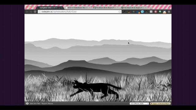
The Web Animations API is still a big deal for browsers and animation, specifically this API gives us control over syncing. This cat on the left is created using CSS animations. Notice how all of these cats are running out of time, out of sync.
When we add them over here with the Web Animations API we're able to copy and paste this cat's current time on its timeline to each of the children cats, thus making them all run in sync.
It's impossible to do with just CSS animations. Another example, the API gives us control over playback grades.
There's a decay on their speed, so Alice is tiring out so they're running slower and slower.
The animation's playback rate is decaying.
This is once again not possible if just CSS animations, and when you click them they run faster and faster.
We multiply at that rate.
This could be really useful as far as a feature for accessibility, people who might need to see slower animations to help see the relationships between inputs and outputs.
They might have an option to increase the length of animations across their system.
And seeking, for instance forward and backward, this is basically a backwards button and this is a forwards button for an animation of Alice going from really big to really small and we can play her forward or backward along it. Woo, so much fun.
If you want to learn more about the Web Animations API I highly recommend you check out the docs that I helped write over at Mozilla Developer Network. That was what I did all year last year so the demos are totally chick chick.
Edge has moved the API into the hopper partially thanks to community votes.
If you've seen any CSS features that you would like to be implemented on Edge today you should totally go over to our user voice account and give 'em a vote there.
In the meantime, Safari has also moved to adopt the API and you can find its objects shipping in their developer previews for both desktop and iOS versions.
And until then, until full adoption across Edge and Safari you will be happy to know that there is a polyfill, it's Google-maintained, but you don't actually need it for Firefox and Chrome. Lucky us.
So, animation is now officially a part of the front-end development tool chest and this has had an impact on how we design the web, our processes, everything. Pretty awesome time to love animation.
The Web Animation's API, for instance, makes browser tools like this possible.
These are Firefox's.
I'm really a big fan of Firefox's timeline tools so we're gonna select these fishies and we go over to this timeline and as we scrub back and forth we can, notice how we're scrubbing back and forth with their animation while this fish's animation continues. It allows you to inspect and manipulate those timelines. That wouldn't be possible with just CSS.
And Chrome, of course, has similar tools.
They're much prettier than Firefox's.
I'm still a big fan of Firefox's though, partially because I worked on them so.
So, let's look at numbers.
These are the percent of Chrome page loads across all channels and platforms that use the corresponding CSS property at least once. So to give you a baseline measurement.
Font is used like 40% of the time.
Transition is used only three percent less, it's used something like 37% of the time.
To put that even further into perspective, transform is used 35% of the time and animation is used 27% of the time.
Now transition is pretty important because people tend to use transitions on interactions like page wipe or a class that's added to show or hide something typically is handled by transition where animation is often used for something like a loader spinner or something decorative that just kind of plays on its own without needing a human interaction to kick it off. I think that shows that people are using animations for their utilitarian value as opposed to purely decorative value.
Alright, but not all animation in the browser's contingent upon the Web Animation's API or style sheets. Remember all those interaction developers who went off to start motorcycle shops? Well they weren't just playing around with motorcycles all that time.
They were actually building building animation libraries, and we're not just talking about DOM elements here. This is MoJs.
It's, this one is used for DOM elements but it's done with JavaScript.
That's not Flash, it's not CSS, it's JavaScript. And we also have things like Snap.svg which I believe is created and maintained by Adobe for exporting to SVG and from Illustrator and it's very cross-browser compliant.
I'm a big fan.
Alright, and then there's D3js which does visualisations with the canvas, it does work with DOM and SVG, things that might not be possible with just DOM elements though because we can use canvas.
Can you imagine how horrible it would be if each of these were an element like a div or a span? Thankfully it's all contained within a single canvas attribute, element.
And then we've got WebGL which lets us do things with 3D that we'd never dreamed possible thanks to JavaScript libraries like 3JS.
Oo, so nice.
And I'm saving the biggest for last.
It's one of the top 20 JavaScript libraries on the internet in use today, it's Green Sock. This used to be a tweening library for Flash. Everything was written in Action Script which is a sister language to JavaScript so when Green Sock's developers saw the writing on the wall they went out and immediately wrote the library in JavaScript and you can't believe that this is actually a webpage.
This isn't Flash.
I feel like it needs a sticker, I can't believe it's not Flash.
So it does DOM and SVG animation and it does normalise behaviours across browsers. You can get that great border animation effect with Green Sock in every browser, you just have to give your soul up to having a dependency.
Now it used to be that the only animation in your browser came from a third party plug-in or was scrolling. Scrolling is an animation, let's be honest, it's a pretty cool one.
Websites didn't always scroll.
But animation helps us bring affordances from reality into work.
The Watson team over at IBM has done some of the finest work in integrating branded motion into a company's style guides.
They actually all went off-site to, they went off-site to check out this super awesome archive of devices that IBM has and based so many of the different design principles on how these devices actually worked.
That was one of them, I think there are a couple of others which are escaping my mind but you should visit that URL and check them out. Motion animation can even be packaged into modular componentized microinteractions in your design systems and I highly recommend that you do include motion and animation in your design system or else you are going to have like a bajillion different values for transitions and easings and yeah, no, better to just have one.
Kind of like that problem where we all had like a bajillion different values for the same corporate blue because of the eyedropper tool.
Yeah, build animation in.
You wanna do that.
Once again, another talk.
So of course all this animation means our processes have to start changing as well. Static wire frames and Photoshop documents just cannot convey a moving medium but we have options.
For instance, storyboards.
Storyboards are used in cinema, game design, interaction development.
Why not web development, too? They were originally kicked off over at Disney studios when they were working on Snow White and needed to keep many parallel teams working on the same project at the same time but they also needed to be able to pivot really fast if something like a dance sequence had to be dropped. So basically they started with bringing in gigantic cork boards and putting out each scene onto them and then they picked the cork boards up every morning and take them over to the animators and this would happen every morning and if something got dropped the animators would get a different cork board that day. It's like they were doing Agile before it was a thing even.
So these can be very primitive.
This is kind of an informal sloppy thing I was doing when I was working on Dev Tools Challenger, or they can be really formalised.
This is the sort of thing that I would hand off to somebody I was working with so that they could remember all the different reasons why they were using animation.
Video is hard to print off and hand off at meetings, though, when storyboards can't show how an interaction really feels in real life. So when I would bring storyboard into a client after a motion design audit the first thing I heard was, oh this is great, but how does that look? Oh, I never made that mistake again.
So if a picture is worth a thousand words I like to say that videos are worth a thousand meetings, and that's what animatics are for.
This I borrowed from a friend of mine.
She's a really cool, really cool animator.
This is a storyboard essentially set to music and basically it gives you an idea of what this could look like if you in-betweened all the things.
So that's what, I love this song.
♪ Space unicorn shining in the night ♪ Alright, so the great thing about these is that they can be screen tested in front of an audience or shown to stakeholders.
You don't even need to use fancy electronic, you don't even need to use fancy software to do it. I made this using a stop motion app on my phone and Post-its on a lunch break for an idea for how a loader could look in the system. But keep in mind, animatics are not deliverables. You do not want to throw a video over the fence to a bunch of developers.
I have stayed up very late trying to reproduce an animated gif that a designer gave me and only to have them swing in the next morning and say, but Rachel, where'd the bounce go? I was like, there was a bounce? I can't, why would you, (sighs).
If only they had just given me the information I needed to reproduce it instead of, instead of relying on me to have their eyes. So studio animation and animatics, studio animation style animatics can be screen tested on an audience but the web is interactive and audience testing requires interaction.
You can't test with storyboards or videos.
You need prototypes.
Prototypes are a whole 'nother kind of workflow, let me tell you.
So InVison is one of the biggies in the industry right now. They've recently reinvested in their animation tooling. You actually have an awesome person here, Steven Fabre. I may have mispronounced his last name but he's over in Sydney and he created this tool called Easy and he immediately got bought up by InVision and has been working on some awesome things over there. So animation is an important part of a lot of prototyping lineups right now.
The great thing about InVision is it's collaborative, interactive, it's web-first, it's great for teams.
There are other options.
There are new things like Principle for Mac, which is just, well it basically is motion design for apps. It's specifically designed for apps and native first motion-specific.
It exports to video and interactive, though, which can make it super useful if that's the sort of thing that you're developing. And finally you've got massive prototyping frameworks like Framer JS.
Now does anybody here work for a company that has its own protyping department? Okay, well they exist in Silicon Valley and if that's the kind of job you want, investing in prototyping framework like Framer JS is not a bad idea.
The great thing about this is that you can spin up a lot of code, it's throwaway code.
You get trained to make this code, you'll hand it off to developers who are going to make it super-performing, but they can copy and past all the same, all the values that you're using in this to make it awesome and you can AB test your prototypes.
It's huge investment, though, in your skillset because this is not used for production work. So the web is moving, it's definitely moving. Animation isn't gonna leave anytime soon.
If there's anyone in the audience who's hoping this is a fad and it's just going away, I'm so sorry.
You should probably get into a different industry, maybe print.
The web is not print.
This machine is not a sheet of paper.
It is interactive.
It is a being of light and electrons.
We are not designing static 800 pixel-wide photos of information anymore, although I would have been very proud to have put this on my resume at one point. The web is fully interactive, it is responsive, it is immersive and it is accessible.
Humanity has never had a canvas so infinite before and what I love about this, this site, is that it was designed by one of the people in the band who used to be a Flash developer using nothing but SVG and hand-coded JavaScript. It's very beautiful and it's a good example.
You can tell you've gone off-site 'cause there's a huge page wipe there.
It's a good example of animation being used in a website. So material design showed us that animation can be as much a part of web design as it is a part of native design.
Material design applies to both the Android platform and to the web as a platform and to the appy web.
Speaking of appy web, with touch becoming more and more commonplace the distinction between native and web has begun to blur. We end up words like web app or progressive web app because web app wasn't enough.
In the future, however, we may no longer draw such lines in the sand. There may be no difference between this app and this site.
We may create experiences that are wonderful for everyone on all devices with all their senses.
Animation belongs to all of us now.
I encourage you to check out the resources above and come join the party.
Let's set the motion, let's set the web in motion together. Thank you.
(audience applause) (robotic instrumental music)