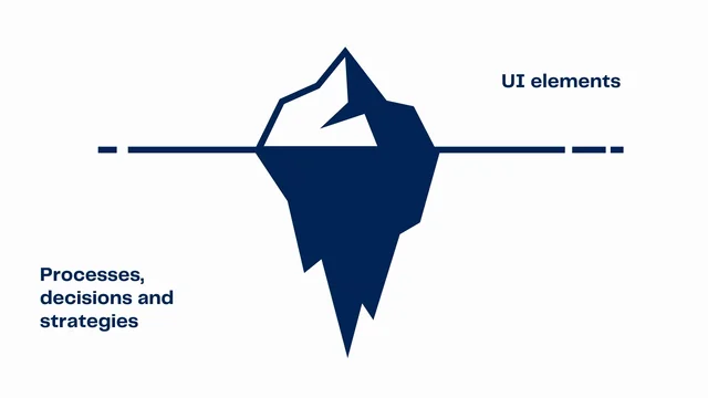
The UI component library iceberg
Introduction to Challenges with Component Libraries
Speaker Kritiketan Sharma sets the stage by contrasting his team's experience with those working on large-scale component libraries. He intends to share their journey from initiation to the navigation of challenges in creating a successful UI library. Sharma discusses the surface perception of component libraries and their deeper complexities, focusing on engineering and UX collaboration, iterative building, and metric tracking for effective implementation.
The Disconnect in Design and Development
The speaker describes a scenario where engineering teams faced challenges due to a disconnect between the design and development processes. Despite having a design system in place, it was primarily utilized by designers, leading to inconsistency in the implementation by developers. He explains the complications that arose due to micro front-end architecture and the issues stemming from code duplication and inconsistency across different teams, ultimately affecting user experience.
The Realization and Conceptualization of a Component Library
Sharma recounts the pivotal moment when his team, in collaboration with a UX lead, realized the need for a stronger connection between design systems and development implementations. This led to the conceptualization of a component library aimed at reducing code duplication and inconsistency, and offering a unified resource tied closely to design guidelines.
Building Collaboratively with a Focus on Design Tokens
The speaker emphasizes the importance of a collaborative approach between engineers and UX designers for library success. He describes the role of design tokens as a linkage between design systems and component libraries, enabling cross-referencing and consistency. He also highlights the advocacy role of designers in promoting library usage among developers.
Engineering Perspectives and Iterative Development
Sharma discusses the engineering side of library creation, noting the importance of choosing compatible frameworks and libraries. He details their iterative approach starting with a simple component—a button—to establish baselines and documentation. The iterative model facilitated agile development and ensured continuous improvement based on developer feedback.
The Significance of Metric Tracking
Sharma underscores the vital role of tracking metrics to demonstrate the library's value and facilitate its adoption. He explains how they measured adoption rates, component usage, and bug resolution to gather insights and drive improvements. These metrics helped validate the library's utility and supported arguments for wider adoption across teams.
Conclusion and Advice for Successful Library Implementation
Wrapping up, Sharma encourages teams looking to establish or enhance component libraries to focus on strong engineering and UX collaboration, develop iteratively, and rigorously track metrics. He offers this approach as a roadmap to achieving a coherent and functional library that can scale with organizational needs.
Awesome.
So I'm glad I'm going after Louis.
And if, who are the people in the room who've, who are working in a component library system that has 3000 components?
Cool.
Sweet.
Awesome.
All of you.
So if that's not the case, but you've found obviously the benefit of having a UI library, with all of that context there, I am on the flip end of the spectrum where we did go through these sort of problems.
I'm gonna take you through the story of it a bit and, and then talk about how the initiation of such a thing, as the start of the 3000 component library happens and how we navigated that for ourselves.
So for starters, component libraries, on the surface look like a bunch of prebuilt UI elements that developers can pick and place as they build out interfaces.
But in reality, there's a whole lot of processes, decisions, and strategies that go within to make it really successful.
So today we're gonna be jumping into those aspects and trying to illuminate that section beneath the surface, specifically focusing on how engineering and UX collaboration, building iteratively and tracking metrics play a pivotal role in making a library, not just functional, but also valuable.
Keep in mind, we're at the start, at the beginning of where Louis must have been in 2015, so yeah.
For starters, this talk is essentially a story of how we ended up building a component library for a client of ours, with a massive online retail platform.
Those are actual screenshots of that platform.
That's the product page, and the cart page, both of which I have worked on and are using the library.
And, I'm not, at liberty to say the name, but, whose selling pipes.
So the client found themselves in a spot a lot of organizations might relate to.
Engineering teams internally were split up into small domain specific teams, and, they had a pretty straightforward job when it came to building front ends, replicate the designs handed over by the designers.
So as you can see, there was, a top level design system, UI guidelines, in place, but they were only ever used by the designers to create set screens.
And, it was irrelevant for us on the dev side, if the design system existed or it didn't.
And that, as you can imagine, created a bit of a design disconnect between the two.
But we had a simple job.
Get the designs and make them look right.
So long as that was done and we had our design reviews, okay, it was an easy job, except it wasn't that.
So these screens were owned by teams within these smaller teams, and since we were in a micro front end architecture all of these screens were a bunch of React apps.
Love it.
And so devs internally within teams, would talk to each other.
They're, having lunches and beers together, so they were collaborating really well, and they were sharing component code in the best way possible, copying and pasting the first tenet of Louise's presentation.
But unfortunately, parts of the platform built by different teams eventually started to drift away to the point where they started to look quite different.
An example of that is this screen right here.
On the left is the ordering team and the right one built by a search team.
Pretty straightforward forms.
Some text fields and a button.
Nothing too fancy.
They look similar.
They are also similar and would pass a review, except if I were to focus on one of those text fields, I might see a slight shade difference in the blue, and that's not amazing, these sort of things.
But this is just the tip of that iceberg of deviation.
What would happen is now all the people in my team, which is the left one, the right one by the way, would copy my version.
Because that's how we're sharing code all over across to our apps, which is a bunch of them.
And then the same thing would happen to the other version, the outline to a bunch of other apps.
And just like that, we had multiple versions of such an atomic component in our code base.
And now even copying and pasting becomes a tedious task because we're all looking for the right and correct version.
And now everyone's confused.
This essentially led to two pretty broad problems.
The vertical disconnect was causing a lot of design debt to add on.
Every time a change was being made at the top level by designers.
And there was a bit of angst there.
Let's not talk about it.
The other one was, the inconsistencies internally within devs was scoring a lot of duplication.
And, all of the developers in the new room, I know, love to copy code across.
Right?
That's what we do.
And so these together, this is all internal by the way, right?
We're fighting amongst ourselves, but ultimately led to a really bad, fragmented user experience, which is people on the online platform almost felt as if they were using a bunch of apps that were working together rather than this one coherent platform.
And for a company that's doing $4 billion, it's not a great look.
And so we had a problem and we need to work it out.
So for starters, at until this point, everyone agreed that there's a problem, but design was attacking it from their end, looking at it as a design system problem.
So they rallied all of their engineers.
Sorry.
Their designers, and started informing them better about the design system so that they were speaking the same language and had a common source of truth to refer to.
At the same time, developers also were trying to do something.
I'm not sure what that was though.
It was a chance conversation with the UX lead that led to, we were venting by the way, so me and the UX lead, we were really venting.
It was a conversation, which led to first just doing that and then ultimately realizing that we have a shared goal here, a cohesive product experience.
It was quick for us to then move on to the fact that the disconnect between the design system and those screens, the fact that it was irrelevant to us was not quite sitting right.
We needed to find a way to have a bit of a strong linkage between the two if we were to solve this.
And so the idea of a competent library was afloat.
And the idea behind it was quite simple.
A component library would be a functional extension of the design system to the point where people could almost cross reference the two and feel that it is, reusable to that point.
This would also obviously tack on, the problem of having, copied code of ground because we had a central repositories, right?
Although we were coming from an inconsistency problem perspective.
Just at the stage, a tech lead, much like one's experience in the room, informed us that while you may feel this is a technical challenge, it's not.
It is a people and process problem.
And so the real secret to actually cracking a library project and making it a success is in engineering and UX collaboration, building iteratively and tracking metrics.
For the next part of this presentation, I'm gonna be talking about these three aspects and how we navigated our way through these and set ourselves up.
By no means am I saying we knew all of this at the start of when we started, but at least on the other end of the two years of the work that I've done, I can say that yes, these are the things that will be quite helpful if you want a successful library project.
So for starters, if we needed, I think Louis mentioned design tokens and we, in our experience did also find design tokens being the best way to have some sort of a strong linkage between design systems and the library itself.
This was the designer's job because they understood the design system better.
They, it's their bread and butter, that's what they're doing day in and day out, and so they helped us crack these.
Now on a ground level, these are something very simple.
So we're talking colors and text fields and things like that to pretty much use the same naming convention across the board so that people can cross reference between the two.
Once we had that going, it was easier, to talk amongst teams and to designers with that sort of a thing set up.
Apart from that, obviously designers are quality They were the ones doing the design reviews, making sure we're in check, but also engineers love engineering.
And so we found that we would gravitate towards topics of technical ability and performance, more than end user focus.
Conversations would often be monopolized by what matter to the dev.
Not so much to the end user, and this is where designers would come in.
So we had one on the panel.
Essentially we were working, we were a working group of three designers, sorry, three engineers and one designer working part-time on this.
This is a Skunk Works project at the start, by the way.
So they, we got together and, they were the ones who would bring that counterbalance for us to, to make us focus on things that matter to the end user.
So things like accessibility and responsiveness.
An example of that is this humble modal that we spent quite a lot of time talking about if to use the popover API or React portals for, and it was a designer who settled that debate by saying, let's just move on with the accessibility aspect of this rather than being stuck up on this little detail here.
We can be like that engineers sometimes.
Now one of the more underappreciated values that designers bring on board, and we might not give them credit, is the advocacy aspect of it.
Essentially, devs using a library is kind of important because you could have a great library that's not used and it's not gonna help anyone.
And so that was gonna require a bit of a cultural change because essentially we're asking until this point, devs had been independently building their components, each one of those, no matter how atomic it was.
And so we were asking them to forget all that.
Learn a new way of doing things and adding a dependency to their workflow.
A cultural change was required.
Lucky for us, the current workflow was such that designers would make those screens hand them off, and with a bit of a conversation with these developers, these handoff points became prime opportunities to advertise an evangelize library.
Designers would often just mention, Hey, you know what, there's actually components ready for that, those, half of that screen already, and would be nice if you checked that up before jumping into dev.
They almost did to the point, they almost started referring the storybook links to these components in their figma designs so that it's just easier for the devs to navigate.
And this, as you can imagine, was a big driver when in hindsight we actually asked a bunch of, developers as to why did they even start using the library.
They mentioned it would often say that it's the designer who instigated them to push it.
One of them was, "Marina was on my back", is what the usual one was.
And finally, prioritization.
I think there was a question up about how to choose what to build and when to, pick something.
Our first component was a very sweet button, and this was suggested by the designer.
They are the ones touching components first before we do.
And their reasoning was simple.
It's not technically complex to do a button, but the system we were working in had quite a lot of variety of these buttons, and just by itself, it may not have too much to work with, but when we look at that scale, and this is just.
I think 90, oh, sorry, 80% of the buttons.
There's a bunch of other variations as well.
They, the reason that a library type project could be nice and, to abstract away all of this, and we could present a united front for something as simple as a button.
So they do help quite a lot with prioritization of what to build as well.
This brings me to the humble engineer, the three of us working at it.
And for the engineers, our work was pretty cut out for us.
We're building components.
It is a library project, it is a definitely project.
But a few of the things that we focused on was, for starters, the, client was using React, which means, the framework of choice was pretty easy, except there were a few versions of React floating around.
And it meant that, that we had to choose, a version that would work between both of them.
Lucky for us 18 and 17 are together, so we chose 18 and we mo moved along.
And since we were not in a quest to reinvent the wheel, we had to pick a library that was already out there.
We were not looking to build an exhaustive list.
And that's what we did.
We went with, Adobe's React Aria.
Which is, interestingly enough, uses hooks to extend those components.
And, comes with, accessibility outta the box and it's quite flexible.
So that was pretty easy.
And as I might have already mentioned, dev focus and ease of use was of top of mind.
So it was also one of the things that we're bringing on, we were coding as well, but these are the sort of things that we were thinking of anyways.
This brings me to the second big point being.
Building iteratively.
Now, a lot of us must be already working in, agile environments, and so the iterative model is not new.
You might not love agile, by the way, but that's fine.
But there's quite a lot to borrow for from product management in this regard.
If you don't have a product manager supporting you in this sort of a thing yet.
The first release was like I mentioned, one component, the button, but it was also our opportunity to set up the project repo, the design tokens guideline, the accessibility guidelines, documentation, the whole lot.
So the first component is not just a component, but the works that go beneath the surface is just far too much.
So keep it small, keep it nice and sweet, and make sure that it's the right component that people would like to start to use with.
Once a component was ready, we would probably throw it in, throw it into a kitchen sink.
A kitchen sink is a very baseline concept.
Two React 17 and 18 apps, which were a test environment.
Once it's ready, we throw in all the variations of a component in that app and with responsiveness and all of that, just so when a dev invariably shows up and says, Hey, you know what?
Your components don't work in my React 17 app, we can at least show them the way to that kitchen sink and say, Hey, you know what, we've tried 13 different ways to do it, so maybe give it a go and then log it by, log a bug for this.
And finally, the single most valuable thing we can do to bring legitimacy and adoption to our library, to any library is track metrics.
Now it is a polarizing topic, and I've heard through the course of building one, I've heard the whole spectrum of positive comments like, oh my God, why didn't I have it already?
And, this is gonna save me so much time to on the other end of the spectrum and could be quite noisy.
But why do I need this again?
Who's gonna maintain it?
Who's gonna pay for it?
The whole lot.
And so I could sit down and have discourses with each one, other people and explain them the positive outcomes.
But, I've realized that nothing speaks positive outcomes better than data.
And so that's what we did.
We tracked everything starting with adoption rate, simple metric.
What it does is it's basically looks at the total addressable React apps.
Can you tell, I've been walking, watching a lot of Shark Tank Total addressable market, total addressable React apps, which, is essentially in our case with all of the React 17 and 18 apps that could adopt the library and was sitting at a rough 40 number.
So not quite as large as ABC, but still helps.
And, the, benchmark for adopted was quite simple.
Which is if the app has installed the package and was using at least one component, we would consider it as adopted.
Now, one component may seem quite little, but I hypothesis was simple.
One component is all it takes to get your foot in the door.
And once you have it, it seems to them that this is a trusted package.
I know we can use it and then people start to get on it much more.
We, as an example, something that pushed us quite a lot was, as you can see, the three beautiful breadcrumb navigations right here.
That was the state of the, app.
A few years ago.
I say years subjectively, so it was it a while ago.
And, Design decided enough is enough.
We need a standard way of doing things, right?
And at this stage, as you imagine, look at, look at the beautiful, restrooms right here.
Right there.
It's no one's dream job to rinse and repeat the same thing over and over again in 15 repositories.
No matter how much of a copy and pasting aficionado you may be.
And library here presented as a, safe front as a single front to get in and, get going.
And so this is one of the things that quite helped us, move along as well.
And just at this stage, I think you might be thinking.
Just one component is not enough.
I'm planning on making at least 3000, so might as well, start tracking some granular metrics.
So this here was penetration rate or component usage.
Essentially, this is a component, per component, metric, which is looking at how many times, a component is being used by itself.
This is quite similar to what, you would've seen in the last preso as well, but this is, quite, so if adoption rate is about which apps we're in.
This, metric component usage is more about which components are pulling their weight and which ones are just gathering dust on the side.
And lower numbers with this metric would, pretty much indicate that we have either there's something wrong with the component in terms of its functionality, it's design, or maybe it's just too difficult to use.
We have overloaded the props on it, or, maybe they just didn't need it and we built it, of our own free will, which is not amazing.
And lastly.
Bugs reports, bug reports and result.
Now nothing seems, says a nicely maintained library, like a healthy record and commits of bug fixes.
And so the single biggest question was, who's gonna maintain this?
And so yeah, this was our way to respond to that.
Again, pretty simple.
Starting out we would capture the number of bugs reported per component.
And then that was, that would start our process of prioritizing what to work on next in terms of maintaining it.
And then we would also record how many fixes have we been doing, and that sort of a thing.
Obviously this is not an exhaustive list.
This is just an example of what that chart looked like.
These collectively were quite handy in us getting a bit of a gauge of, what people are thinking, what we need to be working on majority, and also showcase to the stakeholders that this is in use, people like it.
Time is being saved.
Lastly, I will just wrap up by saying that if you have been hoping for uniformity across products and teams, and if you're hoping to build a competent library or you're in the process of doing it, and there's some sort of a struggle there, I would highly recommend focusing on engineering and UX collaboration.
Building iteratively in small increments and tracking metrics to ensure that you go to the moon.
Thank you.
- React apps
- React portals
- popover API
- storybook links
- React Aria
- component usage
- adoption rate
- bug reports
After duplicating enough React components, the pragmatic programmer decided to take matters into their own hands and started a React component library. What started as a noble venture is met with glares, budget constraints, maintenance challenges, and any number of other issues.
“The UI component library iceberg” takes us through the process of decision making involved in the early days of building a UI component library. We’ll consider the reasons to build your own library, and maintaining and growing one, involving metrics tracking, developer advocacy, maintenance and more.
We’ll uncover the hidden dangers like design systems, scalability challenges, and maintenance pitfalls lurking beneath the surface and provide practical strategies for steering clear of them.