Stretching the Rules
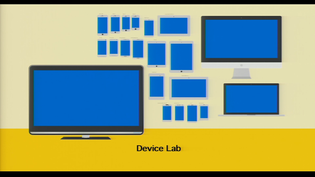
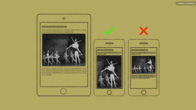
In 2010 Ethan Marcotte packaged together fluid grids, media queries and flexible images to create Responsive Web Design. Fast-forward to today and responsive design is now a project requirement coming directly from clients and stakeholders. But is the way we define (and therefore approach) responsive design holding us back? In this session we’ll explore why we should adopt a new mindset as fluid and flexible as the techniques themselves suggest.


