State of CSS
Introduction
Hui Jing Chen introduces herself and the topic of her talk, the State of CSS, at Web Directions Code. She shares her excitement about the event and discusses her work at the Interledger Foundation on a new protocol for global payments.
State of Surveys
Hui Jing considers the history and significance of the State of Surveys, starting with the State of JS survey initiated by Sacha Greif in 2016. She highlights the evolution of the surveys, the team behind them (DevoGraphics Collective), and the importance of participation as data points for web standards development.
Snapshots in Time
The conversation shifts to emphasize that these surveys are snapshots of developer perspectives and the state of the web platform at a specific time. Hui Jing encourages active participation in future surveys.
Evolution of the Survey Application
Hui Jing discusses the evolution of the survey application itself, highlighting the introduction of GraphQL for custom data queries and a new reading list functionality for users to bookmark interesting features or libraries.
Interop Initiative and Baseline
The Interop initiative, a collaboration between major browser vendors to improve web platform interoperability, is introduced. Hui Jing explains the concept of "baseline" and its role in providing clarity on browser support for web platform features.
Five Years of CSS Evolution
Hui Jing dives into the State of CSS surveys, noting there have been five editions so far. She remarks on the rapid evolution of CSS compared to just five years ago, using personal anecdotes and the shift from table-based layouts to floats and beyond.
The Vast World of CSS
The discussion emphasizes that CSS is much more than just layouts, with hundreds of properties available. Hui Jing argues that developers don't need to memorize everything, but rather maintain a general awareness and delve deeper when a specific project demands it.
Graduating Features and Making Room for New
Hui Jing explains the process of how the survey has evolved, including graduating features that have reached high usage and adding new ones based on developer usability and active browser implementations.
Content Visibility and the Rise of Containment
The discussion shifts to the content-visibility property and its connection to performance optimization. Hui Jing explains that this property, while powerful, requires a deep understanding of browser optimizations for proper usage.
Container Queries: Breaking the Flow
Container queries, a highly requested feature, are introduced. Hui Jing explains how container queries challenge the traditional flow of the web, where content reflows to its container, and containers grow based on content.
Containment as a Promise and Inline Size
The concept of containment is further explored, with Miriam Suzanne's explanation of it being a "promise" from a container. The introduction of the inline-size containment value is highlighted as a key enabler for container queries.
Container Queries in Action
Hui Jing demonstrates the practical application of container queries with a bookstore interface example. She highlights how this feature promotes code reusability and predictability in component-based architectures.
Colors in CSS
The focus shifts to color in CSS. Hui Jing expresses her love for colors and how CSS has seen a surge in color-related features. She discusses the surprising lack of awareness for the current color property and its uses.
Accent Color and Customizing Inputs
The accent-color property is introduced as a means to customize the appearance of input elements like checkboxes, radio buttons, range sliders, and progress bars.
Color Spaces: sRGB, HSL, and Beyond
Hui Jing delves into the world of color spaces, starting with the standard sRGB color space and its limitations. She introduces HSL as an alternative representation of RGB and explains its strengths and weaknesses.
CIELAB, LCH, and OKLab
The CIELAB color space, designed to approximate human vision, is introduced. Hui Jing discusses the advantages of LCH and LAB color spaces, particularly their ability to represent a wider range of colors. She explains how the OKLab color space improves upon previous models and offers a more intuitive lightness component.
Visualizing Color Spaces with Gradients
Linear gradients are used to visualize and compare different color spaces. Hui Jing showcases how color transitions differ across various models and emphasizes the improved vibrancy and accuracy of the OKLCH color space.
New Color Formats and Relative Color Syntax
Hui Jing discusses the practical applications of these new color formats and introduces the relative color syntax in CSS Color Level 5. This syntax allows developers to generate color variations directly in CSS without relying on pre-processors.
CSS Awards: The :has Selector
The :has selector is highlighted as the winner of the "most adopted feature" award in the State of CSS survey. Hui Jing explains its long-awaited arrival, the challenges in its implementation, and its significance for cleaner and more efficient component styling.
Missing from CSS: Animating to Auto
The talk addresses the desire for the ability to animate to auto values in CSS, a feature that has long been a challenge for developers. Hui Jing explains the technical hurdles involved and the potential solutions being explored.
Animating Grid Tracks: A Hidden Gem
Hui Jing highlights the lesser-known ability to animate grid rows and columns in CSS. She explains that this feature, while intended from the beginning, faced implementation delays but is now available in major browsers.
Calc Size and the Future of Animating to Auto
The discussion returns to the challenges of animating to auto. Hui Jing mentions the proposed solution of using a new math function, calc size, which can handle auto as an argument. She emphasizes that the final syntax is still under discussion.
Conclusion
Hui Jing concludes her talk by encouraging attendees to participate in future CSS surveys and consider contributing to the project. She expresses gratitude for the audience's time and attention.
Thanks, John, for that really nice introduction that my mum would be proud of.
Hello, everyone.
It's really nice to be at Web Directions Code in person again.
Like John said, the last time I was in Melbourne for this I think was back in 2018.
Yes, It's been a while, and I said this on Wednesday, and I'll say it again.
As a child of the tropics, this frigid weather is amazing.
I don't know what you're complaining about.
The tropics are frustratingly hot and humid right now.
And like John said, I work at the Interledger Foundation.
In a nutshell, we're developing a new protocol to enable an interoperable global payments network.
Now, if any of those words mean anything to you, and you'd like to find out more, Yeah, we can have a chat, or you can just talk to me about CSS.
I actually would like that more.
Shh, don't tell my employer.
But that's a segue back to what I'm actually here to talk about, which is CSS, and more specifically the state of CSS, both in general and that survey that I helped out with, last year.
So how many of us here have heard of the state of surveys?
All that?
Oh.
That's a great, that's a great amount.
For myself, only last week I realised that there are some state of surveys that are run by different organisations.
Just as well, because nobody has a monopoly on the term state of, and rightfully otherwise, I looked at the schedule, all the other speakers later today would have to have renamed their talks.
But the series which the state of CSS surveys belong to, was started back in 2016, when Sacha Greif spelled G R E I F, he was feeling confused about what to spend his time, what JavaScript technologies he ought to spend his time learning, and so he decided to crowdsource an answer via a state of JS survey.
So one thing led to another, and the project grew from a one man operation to a small team of called the DevoGraphics Collective, they have a logo and everything, and this collective of fine folks plus some other contributors, volunteers, and translators work together to allow this project to continue year after year.
Now the State of JS survey has been running annually since 2016, so it's been eight years.
And the most recent survey whose results have been released is the HTML one.
Even if you did not participate, like John mentioned, it would be really interesting to take a look at the results.
Now, Leah Verou was the key person who helped craft the HTML survey, and in her conclusion, she made this excellent point that these surveys are only a snapshot of developer perspectives.
And they reflect the state of the web platform at a specific time, and it is one of numerous data points that the folks working on web standards and browser implementations, they use these to push the web platform forward, so I do encourage all of you to participate whenever we release a new one.
The survey itself is an application that gets a lot less attention than the survey questions and answers themselves, but work is consistently done on this application to improve its features and user experience.
For example, the state of surveys from 2019 onwards had started to allow users to customise the data queries via GraphQL.
The latest versions allow you to update the charts on the app itself to reflect the new query.
What this does is it allows folks who are well versed in the ways of data analytics to explore even more insights and dive deeper into the data if they so wished.
The 2023 version also introduced this reading list functionality such that people who were going through the different surveys and then they come across, oh, I never saw this property before.
Oh, this is a new library.
Heard of it.
Interested.
Hit that bookmark, add it to your reading list, and hopefully come back to it later, together with the other 200 tabs that you have open, that you swear you will get to.
If you too are interested to contribute in any way at all, you can join us on Discord, or check out the code on GitHub.
These slides are online.
It's a, it's just a HTML mess, that's what it is.
And before we really dig into things, I want to highlight this thing called the Interop initiative which is a strong collaboration between all the major browser vendors and their friends for improving the web platform across the board.
Now, the point is to make the web platform more usable and reliable for developers like you and I, so that we can spend more time building great web experiences instead of, pulling our hair and working around browser inconsistencies.
The initiative introduced this concept of baseline.
Which seeks to provide more clarity to information about browser support for web platform features.
Now there are two stages, so a feature can be newly available when it becomes supported by all the core browsers, and then it can become widely available after 30 months has passed since the newly interoperable date.
So baseline is now part of caniuse dot com, and features that are in baseline, they will show a badge along with a year that they became available.
The state of CSS has had five editions so far.
The 2024 version will probably be out, later this year, and we did cover quite a few CSS features, impossible to cover all of them in 30 minutes, so I made some executive decisions and picked a handful to talk about today.
Now, while crafting this talk and looking over five years worth of data at once, I was reminded once again of how much faster CSS is evolving today as compared to as recently as five years ago.
I am far from someone like John who has seen most, if not all, of the web platform's evolution, but still, personally, I came in just at the tail end of table based layouts.
Similar to Ben, I, too, have an eras reference.
What can I say?
It's a great descriptor for time periods.
Now, if we talk about eras of CSS, not Taylor Swift, the early part of my career was the entirety of the floats era.
And if you look at this, we know that there will be eras to come, even if we cannot fully imagine what those might look like yet.
Now, layout is, you could say, it's the most striking part of visual design, because it encompasses the broad structure of what we see in the entirety.
But I'll have you know, CSS wasn't even meant to be used for layout back when it first became a W3C recommendation back in 96.
If you don't believe me, you can Google CSS level 1, scroll all the way down to Appendix E, the applicability and extensibility of CSS 1.
Go ahead.
Go ahead.
Go ahead.
Now, CSS is a lot more than layouts, right?
And as of last week when I checked, there are 589 distinct property names from 81 technical reports and 83 editors drafts.
Now, my personal opinion is for the average web developer, there is really no practical reason to have to know each and every one of these properties and what they do, although somebody in their inside voice would be saying like, but I do!
Good on you.
Excellent.
My take on things is, it's enough to have a, vague idea that, oh, this new thing just came out and it can be used to do this other thing, and then, go about your day.
You don't have to know exactly how the property works, all its values, any quirks, any browser bugs, until that particular instant where, you have a project or a use case, I heard of something, it might work, then you look into it.
I think this approach safeguards us from being too overwhelmed at the speed and the deluge of this new information that's coming at us all the time.
As analogies go, I have a terrible one.
I tried this on Wednesday and will try it with you people again.
I've heard of the AFL.
I learned that in Melbourne, this might be a dangerous thing to say, and this is gonna be very blasphemous.
I don't know any rules, nor teams, nor players, right?
Now my good, my friend Chris sat right here, has suggested that we should go watch a game this evening.
I have not yet decided.
But if I do decide to go, after this talk, I'm gonna sneak off to at least go Google what the rules are.
But as of right now, I'm like, shruggy, don't throw anything at me.
Now, the survey has evolved over the past five years based on external feedback as well as internal reflection.
So for the 2023 edition, it started with Sasha and myself going through the list of CSS properties from 2022 to figure out if we still wanted to keep those for the 2023 edition.
Generally, we want to observe the trends around the newer CSS features.
So take Flex, for example.
After five straight years of more than 95 percent usage numbers, we figured there wasn't that much insight to be gleaned, so we graduated it.
Now, another reason why features are graduated is to make room for new ones, because we also understand if the survey grows beyond a certain number of questions, nobody's going to finish it.
Which brought us to the next bit, right?
Which new features do we want to add?
So our criteria was the feature had to at least be usable by developers already, so anything that didn't have active implementations were not considered.
Generally, we expect the awareness of new CSS features to increase over time, right?
Usually it's the rate of increase that varies between feature.
And then at some point, properties that are more specific or are used for more narrow sets of use cases will see some sort of a plateau, because if you never encounter a scenario that needs those properties, you will never learn it, much less use it.
So that's fine.
Like blend mode, for example, which is used to determine how two colors are mixed when you overlay one above the other.
That's a rather specific use case, which is why I think the awareness and usage has been fairly stable over time.
Same goes for overscroll behavior.
This is one of the properties which allows developers to deal with the default behaviour of scroll chaining, where scrolling is propagated from one scroll container to another.
This is one of those properties where it's meant to change the default behaviour, but most of the time, that default is acceptable, so you don't really use it.
It's very, stable.
The only one property that bucked the trend last year was content visibility.
Now, this is a property that controls whether or not an element renders its contents at all.
But it's part of this, bigger concept of containment, and you can think of it as belonging to the performance optimisation category of CSS features.
However, the proper usage of such properties usually requires in depth knowledge of browser optimisations in order to achieve the intended results.
I think a good way to describe this category of CSS is that it requires the developer to be very deliberate in where and when to apply them, otherwise it could cause unnecessary overheads, or even make performance worse.
Now, the content visibility property sits in this CSS containment module level 2 specification, which is meant for the contain property.
This is used to indicate that an element's subtree is independent from the rest of the page.
This feature would allow user agents to apply more stronger optimisations during page rendering, provided contain was used properly.
But, The idea that was introduced in this specification is what helped pave the way for container queries.
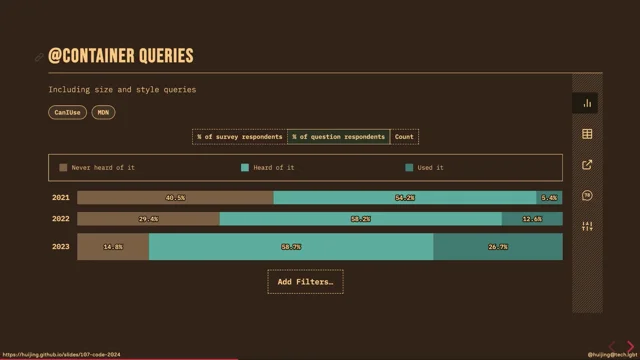
Container queries was one of those feature requests that browser implementers found particularly hard to solve.
Miriam Suzanne, who played a pivotal role in the development of the container query specification, explains it as container queries Fundamentally breaks the idea of how flow works on the web.
If you showed up at Code last year, Erin talked extensively about flow.
Now flow is this powerful concept unique to the web platform where content reflows to a container.
And containers grow based on content.
So this layout information goes in both directions, from context in, and also from content out, in this sort of a layout loop.
But then, you can't really measure something in the middle of that loop, because what, exactly, what value are you going to get?
Now David Barron of the CSS Working Group came up with a proposal that container queries, should be possible if an element has both layout containment and size containment in the axis that is being used for the query, and Miriam Suzanne describes it as, CSS containment is a promise from a container that certain things are not going to escape it.
Size containment turns off intrinsic sizing, which is where content influences the size of the box.
But this, behavior, turning it off can be dangerous.
Observe CSS is awesome.
Meme.
This is not an SVG by the way.
I thought yeah, no, it's a meme, right?
Just like I should be able to get this effect.
It took me a good five to 10, 10 minutes trying to figure out like, oh, wait, no, I need the, thing is, needs to be a box, but then no, I need it next to the o and the … like 10 minutes of my youth.
I'm just saying.
But anyway, for container queries to become a reality, the discussion turned toward containment in a single dimension.
Specifically, the inline axis, because this didn't exist in the spec at the time, so a new value had to be introduced for the contained property, and they introduced inline size.
What this does is it prevents the inline size of an element from being dependent on its contents.
From a browser implementation perspective, there was a lot of work to do to get it to work, and until last year, it wasn't clear if this was possible, but they did get it done, and it is baseline, newly available right now.
Container queries, for the size to get it to work, the recommended syntax now is you have to first define a container, right?
That container is like the context that you want to query, so you would set a container type of inline size on your container, so that this maroon thingy, this is extremely hard, I've practised this, if you can see, this is an X, got it, ah, there we go, you set the container type to inline size on the container, and you can apply any styles that you want for everything inside the container, based on what the size this container can be.
And what's cool is that the query that's used in this addContainer query, it's relative to the container's computed size.
If my container has some font size modifications, it uses that as the basis for the relative sizes rather than the root font size, which is usually like 16 pixels.
And to complete the whole suite of properties that make container queries useful, we also have something called container query units, or, CQ units.
I think I use a couple of them here.
What these these are essentially you can set things relative to the size of the container, so CQH is like CQ height.
You can do things like, CQ max, which is essentially very similar to the viewport units that we have, but in a container context.
I think this is very useful, and I've got a better demo than my, weird one.
This is a demo by Max Boch.
The ability to apply styles based on the attributes of a container rather than the entire viewport I think fit really well in the component based architecture that's fairly prevalent today, because this approach would allow you to use the same component across many different parts of not only a page, but even across pages.
So this, for example, it's a bookstore interface, really nice.
Every book component uses the same code, right?
if it's in the cart, it will look like that.
If you put it in the best sellers list, it has a different layout, put it in Featured, different layout, but the code for the book component can be kept exactly the same.
Because this approach of container queries allows the component to be I would say shared across these different contexts in a much more predictable manner, right?
I think this would present a refactoring opportunity for codebases that maybe you would rely on duplicates to achieve such an effect, or something else.
I think there's an opportunity here for code simplification.
Okay, then we're moving on to another section of the survey, which is colour, because I personally love colours, I also love CSS, therefore CSS multiplied by colour equals much fun and happiness.
A lot of colour related features shipped over the past two years, so much that we were able to have an entire category for colour.
What I was surprised by at the results was that the awareness numbers for current color, which has been supported for actually the longest time even IE had it, 30 percent of our respondents had never heard of current color and oh, interesting.
Personally, I tend to use it for things like inline SVG icons.
Because I don't know what interfaces you have to build, but the ones that I have to build usually have oh, yeah, this button, we should put an icon next to it, or like this menu item, icon look really great.
I'm like, oh, come on, I can do it, I can do it.
So what's useful is if you set the SVG color, this works for inline SVGs, by the way, if you set the color to current color, it will just take the color property of the, the container, right?
For example, these weird tumbleweed icon thingies, if we add something like a hover state, let's change the green one to, I'm not very creative at 9 in the morning, so I'm just going to say green.
Colour, green.
I cannot even spell green.
So now, the SVG will just magically adapt to the environment around it.
I like current colour.
What are these 30 percent of people?
Never mind.
Accent colour, on the other hand, is genuinely newer, and less surprising that half of our respondents never heard of it.
But basically, it allows us to change the colour of these four input elements.
That's checkbox, radio, Heh… range and progress.
Now, I know that, in general, people want, more customisability on input elements in general, but I think this is a fairly good low effort tweak that we can make use of right now.
Just change it to the main colour of your theme.
It's a small but significant change.
What it does is, oh, look, tomato coloured thingies, yeah.
And we have now come to a point in the talk where I might lose some people because we're going to gently touch on colour spaces, which is a way we organise colours in the digital world.
SRGB stands for standard red, green, blue.
And this is an RGB colour space that was created by HP and Microsoft for monitors, printers, and the web.
Now, even though there were better colour systems available at the time where all this was being specced out, RGB was deemed good enough, and so that's why colours in CSS ended up being first specified in RGB format.
Now, HSL is an alternative representation of the RGB colour model, it just utilises a different cylindrical geometry instead, and hue becomes the angular direction, saturation is along the radial.
direction and then lightness goes from top to bottom.
I dunno how informative this terrible diagram is.
It, it's, this is based on the organization and conceptualization of colors in human vision, and it was added to CSS in about 2002 from the desire to have some sort of a hue wheel system in CSS because, It's not that easy for most of us to I want a new colour, I know, I'm just going to tweak the ratio of the red to the green to the blue and then your brain magically, I can't do it, I'm sure someone can, but it's not that intuitive.
The problem with HSL is this cylindrical nature.
It doesn't account for the complexity of how our human eyes perceive maximum saturations for different colour hues.
So what we end up with is an unfortunately inaccurate lightness component when we use HSL.
If you remember my poorly drawn diagram, you will notice that blue and yellow are directly opposite each other from the hue colour wheel, and it just so happens we humans are least sensitive to blue, but we do perceive yellow as brightest.
So even though they have the same L component, blue just feels darker, right?
And also, changing the lightness on HSL seems to change the perceived hue.
It looks a little wonky as well.
So there are other colour spaces around, right?
The CIELAB colour space was defined by the International Commission on Illumination.
That's why it's called CIE.
It's probably French, whatever.
In 1976, and this particular colour space was meant to approximate human vision, and it aspires to perceptual uniformity.
Without going into the details of colour science, which I am sadly not qualified to do, the long and short of it is that LCH and LAB theoretically have unbounded chroma values and should be able to represent the entire spectrum of human vision.
The TLDR just means it's more colors, right?
But a another good thing about this color space is that the lightness component is more intuitive to humans.
The only issue with the LAB and LCH models was that there was a bug in the math that resulted in an unexpected hue shift on Chroma just for the blue, colours.
So a Swedish software engineer, Bjorn Ottesen, created the OKLab colour space to resolve the bug and improve upon the math behind the colour axes.
And it was fairly recent, actually, I think it's like 2020 thereabouts?
Now, when we modify the lightness value, this example uses the OKLCH, even between yellow and blue, the perceived lightness between the two matches a lot better than the HSL example earlier.
Now, colour spaces are three dimensional, right?
It can be tricky to visualise and imagine, but a linear gradient can offer us a look at what a slice of the colour space would look like depending on where we slice it as we move between the same start and end colours for different colour spaces.
It's pretty interesting, this particular demo is adapted from Adam Argyle's colour exploration, but you can see, how each colour space defers for all colours in between.
Generally speaking, this is the blue thing that we talked about, this looks, I don't know about you, but this looks purple to me.
So that's what the okay colour spaces improve upon.
It's all math, to be honest.
I thought this HSL one was cool.
Oh, yellow.
I did not expect that.
And then we have, basically, I think you can see that the OKLCH colour space gradients tend to look a little more vibrant, and it doesn't really have the issue of stretches or dull, for, there's a stretch of dullness or greyness between the colour stops for the sRGB models.
The long and short of it is you should have a discussion with your designer on the availability of these colour spaces, especially if the design uses a lot of gradients, because I think I did have a, I did show this to my designer, and she was quite excited to have the brighter gradients because she thought it looked much better than the, because my gradients on the website used to not match what she had in her design software, so I think this is a discussion worth having if you have a designer who cares about these things.
Now.
So what can we do with all these new color formats?
We can do a lot more as it turns out.
How many of us have used a pre-processor to generate darker or lighter colors from a main accent color?
'cause I have, yes.
It's a thing that we do.
CSS colors, level five introduces a new relative color syntax that lets us do this with just plain old CSS.
So you have to start with a color.
So that's the from colour bit, and then you can pick which colour space you want the output colour to be in.
That's the colour space bit.
And every colour space in CSS uses these three component values, right?
So the three component values can be from zero per cent to 100 per cent, or absolute number between 0 and 1, opacity is optional.
Optional, but very useful, in my opinion, because regardless of what format your original colour was in, it could be hex, usually, it's hex.
Lazy people like me, name CSS colour, 144 options are good enough for me.
You can add opacity to it.
What I used to do was I When I saw like transparent color, I would even do this.
Like I had to flatten it.
It's a, lot of weird things that I needed to do, but these days, what's, nice about this relative adjustment for opacity is the fact that the, no matter what the output, color space is, I want to do lime green.
Do you realize that all the color spaces give you the same end result?
To me, this is like a lovely bit of consistency in a shockingly inconsistent area that we have to deal with.
The syntax, the relative syntax, it destructures the color into its component parts so you can you can start playing around with, if it's OKLCH, you can play around with the lightness, you can play with the chroma, you can play with the hue, for the darker lighter thing, the lightness component which is now reliable can be used to generate an entire palette of colours based off your main accent.
And, as of today, we're fairly close to baseline newly available for this relative color syntax because it will be shipped in Firefox 128, which means it's going to be the next stable Firefox release, any minute now.
We also do an awards section at the end of each survey, just for fun and giggles.
And the feature that won most adopted feature, which is awarded to the feature with the largest year over year half used progression, is the :has selector.
Now, this :has selector sits in the Selectors Level 4 spec under the Logical Combinations section.
It's been there since 2018, but it was only added to the survey in 2022, because that's only when browsers started implementing it.
Parent selectors have been requested for years, like a lot of people knew about the has selector from jQuery, right?
jQuery shipped it really early.
Now, if I didn't lose you during the container queries explanation, this is a very similar situation where it was a huge challenge for browser implementers to implement this in the engines because of how to manage the performance implications of all this DOM traversals and anything.
I've included links in the for history in the references, but to summarise, Igalia finally made some forays into a workable prototype in 2021, and that's when things started to move forward.
And that's why so many people were aware of this, because everyone wanted it for 20 years, but we finally managed to get baseline newly available December 2023, and now that the folks from the browser side spent so much effort implementing this, they're like, stop calling it just the parent selector, it's so much more than that.
The spec calls it a relational pseudoclass, so what it does is it gives us a cleaner approach to dealing with component variants, right?
So maybe you have a product card that may or may not have an image in it.
Or, you have a menu item, may or may not have sub menus in it, or, sections that have no content in them, I don't want to render that whole section, things like that, has Selector can hit those specific variants for you.
You can select them without having to add more specialised CSS classes, because I personally have seen and also written ternary operators in my component mark up just for these specialised, just to do these things, with specialised CSS classes.
In the event you're unable to add CSS classes for whatever reason, all is not lost, depending on your context, something like this.
Where you can get away with just chaining enough pseudoclasses together, and you're like, Oh!
It works!
No CSS classes, no problem.
Because there's also a required pseudoclass these days that you can target.
So that, that annoying asterisk thing, where, the required fields on forms have, can kinda, hack your way through it with CSS, no problem.
We also asked people what they think are missing from CSS near the end of the survey.
The winner of that poll was animating to auto, because it has one, it has been one of these things that developers have had to write the functionality for, and usually, after going, some people attempt to try it in CSS, and then they go, ah, JavaScript, it is.
But more often, because more often than not, that's the most common one, animating to auto height.
And height is always tricky for browsers to figure out, because of the layout loop that I was talking about.
So we'll see things like, oh, don't animate to height, animate the max height, or you use some arbitrarily large value for max height, or, and then you just throw your hands up and let's just use JavaScript instead, why not?
As a segue, as an aside, the one feature I felt that we missed out during the survey was people's awareness of the ability to animate grid rows and grid columns.
Because Firefox shipped this in 2019.
I remember this year, because it was, when I excitedly built a code pen that made use of this feature, I'm like, oh, chess!
Grid tracks were actually meant to be animatable from the start.
But because of, browser implementation complications, everyone agreed, okay, we can defer, we ship grid first, work on this later.
And then later became 2022, when everyone else suddenly decided like, Oh, yeah, I guess we should get around to shipping there.
So it finally shipped in all the major browsers in 2022.
What this gives us is another slicker CSS only solution to the animate to height problem.
So Nelson Menez has proposed this solution in a blog post back in 2021, and the crux of the technique involves setting the grid track size here, it's the grid template row, because I want an accordion effect, you set the grid track size to zero fr when the content is hidden.
And when the content is shown, you set it to one fr, because what this allows it is that if you had more content, fr would just take care of that, extra space needed.
So this was pretty slick, and in my mind, I was like, do these developers know that you could actually hack Grid like that?
I don't know.
This is just very satisfying to keep.
Okay, let's move on.
The issue for browsers is that interpolating to or from auto as a value, there has to be some way to describe the interpolation states in between, because, when you animate something, there's a start and end, but there has to be in between states for the transition to look smooth and everything, right?
So in the CSS working group discussions, it was suggested that, oh, calc could be used for this purpose, right?
Except that currently, calc doesn't support auto as an argument.
Interested parties can go read the 177 comment thread on GitHub.
I have included the link, but the final resolution that they came up with was, we need to add this new math function that can take auto as an argument and kind of resolve this.
The final syntax has not been decided yet.
For now, Canary has used calc size.
So no guarantees that it will forever be calc size when it's stable, but essentially It allows you to animate to auto if you, plug auto into calc size, and then you say the height, so you're asking the browser to please calculate the height of auto and then use it for the transition.
Lots of interesting stuff, and, we are at time, if you want to be notified about the next CSS survey, you can sign up on the state of css dot com homepage.
Think later this year.
Surveys are very hard to run, so if you wanna help, volunteers are welcome and, yes, lots of references and, thank you, for your time and attention and not booing me off stage with my a AFL reference.
Over the past couple years, CSS has progressed at rate never seen before. Sometimes, such a deluge of features can feel overwhelming. The State of CSS surveys have been running for 5 years. Some folks see it as a knowledge quiz, to see how many features they know or use, but we want the survey to inform folks of new features that could benefit their daily work, as well as observe what trends are happening in the world of CSS.
In this talk, we’ll hear some insights from the survey as well as real world applications of CSS featured in the survey.


