More CSS Secrets
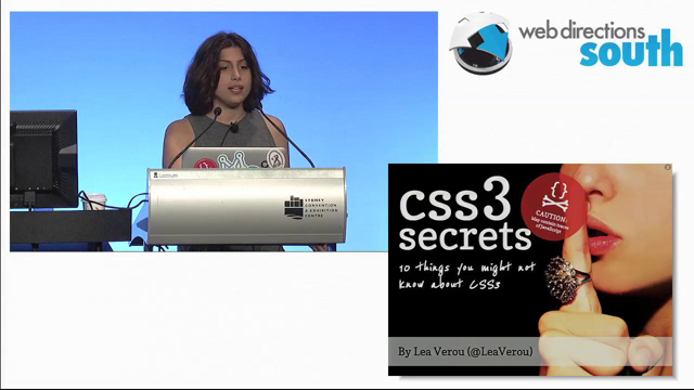
According to .net magazine, Lea’s “CSS3secrets: 10 things you may not know about CSS” was one of the 15 best talks of 2011. Web developers all over Europe loved it. This talk continues on the same path, with even juicier “secrets”. It will teach you how to take advantage of modern standards in unconventional ways to solve common web design challenges and in the process, it will open your mind to truly understanding how these new features work. After all, when you can “get” the unconventional, you will find that the conventional becomes trivial.
https://lea.verou.me/more-css-secrets
Following the 2011 “10 secrets talk” (worth reviewing) this is another ten secrets.
- shadow that gradually appears – used in Google Reader via JS but can be done with pure CSS. Background-attachment: local; … combined with multiple gradients you can make a shadow that only appears when you scroll down.
- fixed width, fluid background – using calc on a parent can remove the need to add wrapper divs for fixed width designs
- using transitions to avoid js for things like lightbox effects (also showed using a big box shadow instead of a blanket div)
- lined background that snaps to text using a linear gradient and background size. Uses background-origin:content-box so the background doesn’t move away when the padding changes. You can also use the technique to create zebra striping.
- Opposite transitions to keep a child element positioned normally while the parent is rotated or skewed etc. you can create an image slider/comparison with CSS transforms.
- Clockwise animation of an element, using keyframes and a cancelling animation to keep the element horizontal (smiley face kept upright but moving in a circle)… however it does require an extra element. Better way from Aryeh gregor uses the frame-by-frame nature of transforms to get the same effect as attaching two origins to a single element.
- Alternative to box-shadow proposed by Adobe, “filter” to use SVG filters on all elements. Gives box shadow effect on speech bubbles created with pseudo elements. Currently only in Chrome; and obviously the name “filter” is a problem for IE.
- Pseudo element set to absolute position zero all ’round and copy of background image… you can hack together a background blur effect. It’s hacky and messy and it works.
- Hyphens:auto – good but still patchy support
- frame-by-frame animation using a sprite and keyframes and steps(n) to prevent smooth transitions which aren’t giving us animation. This gives us access to alpha transparency, which animated gifs don’t do. Credit: simurai.com. IE9+
(Plug for webplatform.org – vendor neutral documentation platform, to bring together the currently-separate efforts being made by all the browser companies.)
