Modern CSS for Web Apps and UIs
Framing Modern CSS and Theme-Aware Color with color-scheme and light-dark()
Stephanie sets expectations for a “what and why” tour of modern CSS, introduces three buckets (visual, functional, delightful), and emphasizes progressive enhancement for near-term features. They then demonstrate pairing color-scheme with light-dark() to adapt components to system light/dark preferences, noting that value order sets the preferred theme. By placing light first and using light-dark() in component styles, cards and other UI parts smoothly switch palettes without duplication. This segment grounds the talk’s theme: practical, well-supported CSS that improves UX with minimal overhead.
Theming Native Controls with accent-color and Blending Hues via color-mix()
Stephanie shows how accent-color instantly themes native controls (checkbox, radio, range, progress) and pairs well with light-dark() for contrast across themes. They introduce color-mix() to blend two colors in a specified color space (HSL, OKLCH), with a visual showing how spaces affect saturation and brightness. Practical recipes include mixing in transparent for opacity, and black/white for quick darken/lighten, while cautioning that design tools may yield better tuned results. This continues the visual track by giving developers reliable, composable primitives for color systems.
Aligning Components with Subgrid and Polishing Ragged Text with text-wrap
Stephanie resolves a classic alignment problem using subgrid, letting child components share a parent’s row/column tracks so card titles line up even when text wraps. A devtools view illustrates how row tracks are shared across cards, eliminating hacks like fixed heights or truncation. They then introduce text-wrap: balance and text-wrap: pretty to improve paragraph rag and avoid orphaned words, positioning “pretty” as a safe progressive enhancement. Together, these tools refine visual rhythm and readability without brittle layout tricks.
Taming Specificity with Cascade Layers and Responsive Layouts with Container Queries
Stephanie explains how @layer establishes an author-controlled cascade order—foundation, components, utilities—so later layers reliably win even over high-specificity selectors, neatly deprioritizing framework CSS. They recommend declaring layer order in the first stylesheet and adding to layers anywhere thereafter. Next, they switch to container queries, showing a card that reflows action buttons above the title when the card’s inline size is ≤ 35ch, independent of viewport width. This segment equips teams to structure CSS predictably and make components truly context-aware.
Selecting by Relationship with :has() for Smarter CSS Logic
Stephanie demonstrates :has() as a relational selector that can target parents, siblings, or scoped descendants based on what they contain. Examples include styling article if it has an image, selecting h1 only when followed by h2, and choosing subsequent paragraphs when an h2 precedes an h3. They also show compound “and” conditions to match complex structures (e.g., first-child image plus h1 followed by h2). This opens expressive, JS-free conditional styling patterns that align with the talk’s theme of powerful, modern CSS.
Overlay Reliability with Popover and Anchor Positioning, and Styling the Native Select
Stephanie introduces the Popover API, which promotes content to the browser’s top layer so tooltips, menus, and dialogs render above any stacking context—no z-index hacks required. With a simple popovertarget attribute and a matching popover element, the UI toggles open/closed, while Anchor Positioning (in active development) precisely places popovers relative to triggers and can replace heavy JS positioning libraries. They note that popovers now implicitly anchor to their triggers and that Anchor Positioning participates in Interop 2025, signaling imminent cross-browser maturity. Rounding out functional upgrades, the Custom Select proposal (appearance: base-select and new subcomponent selectors like ::picker(select)) enables full styling of native selects as an opt‑in progressive enhancement, with graceful fallback in unsupported browsers.
Animating From Hidden: Entry Animations with @starting-style and allow-discrete
Stephanie unveils Entry Animations, finally allowing transitions from display: none using @starting-style to define initial state and transition-behavior: allow-discrete to permit discrete-to-animated changes. They emphasize ordering nuances and point to a deep-dive resource to avoid common pitfalls. A popover demo animates from hidden without JS class swaps, replacing long-standing workarounds. This advances the “delightful” theme by elevating motion while keeping CSS in the driver’s seat.
Seamless UI Changes with View Transitions (Same- and Cross-Document)
Stephanie explains View Transitions, where the browser snapshots old/new states and animates between them with CSS—reducing reliance on animation libraries. They distinguish same-document transitions (great for SPA-like flows) from cross-document transitions (animated navigations across pages), noting Firefox support is in progress via Interop 2025. Developers can override the default cross-fade using keyframes and view transition pseudo-elements, with only a tiny JS wrapper around the state change. This segment shows how to deliver polished, app-like navigations with minimal code.
Scroll-Driven Animations and Closing Recap
Stephanie introduces Scroll-Driven Animations, where scrolling acts as the timeline via animation-timeline: scroll() or view(), enabling smooth, off‑main‑thread motion. They outline two timelines—Scroll Progress (container-wide) and View Progress (per-element)—with examples like a reading progress bar and image fade/scale-in on articles, and share a resource hub for patterns. Although experimental in Chrome, the API is additive and can replace JS scroll listeners for better performance. The talk concludes with a feature recap and encouragement to explore and share these modern CSS capabilities with your team.
Yeah, as John said, modern CSS, that has kind of become a term I have been associated with for a few years now, including the domain moderncss.dev.
But today we're going to focus a lot about the 'what' and the 'how' and a little bit - or excuse me, the 'what' and the 'why' and a little bit less on how. So just some nuggets about that for those that are interested. And just to get ahead of what we're doing as well, most of the things that you'll see are very, very well supported. I will note when there's a couple of upcoming features, but I do encourage you to consider those as progressive enhancements. So let's get into it.
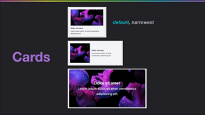
We have three areas to look at these today. The first one is visual, or those that make a visual impact, functional, where they impact architecture or behavior, and then delightful, those that are going to bring joy to the UX or DX for your projects. And just a little heads up, might want to have your camera ready. I will have some QR codes for resource links throughout. So starting with visual, let's take a look at this feature pairing of color-scheme and light-dark(). Using these two properties allows you to gracefully adapt your app and component styles to handle light and dark themes.
First, you want to define the color-scheme property with the values of light and dark. This property responds to the operating system preference for a user's device, and the order matters. So in this case, we've listed light first, which means that our app has a priority preference for a light theme, but it also will work well with a dark theme. Next, within your components, for any color related value that you're using, you can now adopt the light-dark function which accepts two values.
The first one that you provide is going to be what renders in a light theme, and the second in a dark theme.
So this enables components like this card to smoothly adapt between light and dark themes.
Developers love this feature pairing, particularly light-dark, because it has the ability to remove duplication, and possible current separation between these color theming related styles. Our next property is accent-color, which allows you to easily add color theming to native form controls, such as those seen here, which include the radio and checkbox when those are checked, the range slider, and progress meter filled portions.
And it's also very complimentary for use with color-scheme and light-dark. So in our code snippet here, we're using the light-dark function for accent-color. And this helps us ensure that we have better contrast of our preferred color within those two color schemes.
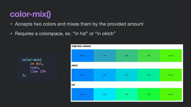
Keeping on our color theme, let's take a look at color- mix(). So color-mix() accepts two colors.
and mixes them by the provided amount. It's kind of like when you're in primary school and you were mixing two colors together, right? Figuring what that combo would be. It does require a 'colorspace', which is kind of a scary word. Stick with me.
Such as in HSL or in OKLCH.
And just as an example for this current code snippet, where we're mixing cyan and lime, where we're mixing lime in by 25%. And this expanded graphic mixes that in by increasing amounts and shows the difference between a few of the available color spaces. You can see how some are more muted and some are brighter. So put that in your notes to look up color-spaces on the web at a different time because it's too much to go into today.
Color-mix() can also be used to give color opacity.
by mixing in transparent. This is really exciting.
Might not sound exciting, but this is a feature I definitely have wanted for a long time. The color space when you're doing something like this is still required, but it's not going to be as impactful when you're mixing in transparent. So just pick one if this is your goal. You can also mix in black to darken colors and white to lighten the colors.
But just kind of be aware that these are okay in a pinch, but might not be your ideal results for which you'll possibly want an actual design editor to compute.
All right, it is time to leave color behind and consider a classic layout problem that we can resolve using 'Subgrid', a feature of CSS Grid.
Usually, subgrid is desired to fix a classic layout problem.
which is when designers want things to align visually across separate components or template areas.
Prior to subgrid being available, we had to explain to designers that this either wasn't possible or use hacks like fixed heights or truncation. But with subgrid, we can direct elements to participate in a parent's layout grid by sharing the alignment and space allotment for either rows, columns, or both.
So in this group of cards, the alignment mismatch is noticeable when that title begins to wrap. So in this case, we'd like to share row alignment across our components.
Since we're interested in that row alignment, we're going to check out the current grid layout for our card, and we can see that we have three rows for the card in this layout.
Once we have the sub-grid assignment in place, when we select the parent layout grid, we can now see how those grid rows are shared across all of our card elements. And this results in that fix for the visual alignment of those titles, even though each card is a separate component.
Another property that fixes a long-standing web design issue is 'text-wrap'. And this directs the browser to either balance lines of text to improve visual appearance or make text blocks pretty by preventing hanging words, which are sometimes called orphans.
Previously, this was only possible by inserting manual line breaks, or adjusting specific widths, and that wasn't really friendly for either responsive design or international text concerns. The difference in these values is shown through these text block examples, where the first uses 'text-wrap: balance;', and the second uses 'text-wrap: pretty;'.
Pretty is currently only available in Chrome and Edge.
However, this is one of ours that is definitely in progressive enhancement category, meaning if you apply it and it doesn't work in a user's browser, there's minimal impact and no impact to the functionality. This is just a visual improvement.
Next up, let's look at some functional features that impact CSS architecture or behavioral aspects.
This first tool is meant to improve CSS architecture.
and this is Cascade Layers or the @layer rule.
Cascade Layers gives CSS authors control over specificity of rule sets. I know, I'm getting into some scary words here. Put another way, this is the ability to direct the priority of your foundational styles versus component styles versus utilities. And a key benefit is that it enables deprioritizing third-party or framework styles in favor of your application styles without hacks around that or any headaches that can ensue. The recommended way to use @layer is to define that order in your first loaded stylesheet. And the reason for this is because layers will continue to be evaluated against that initial order. Then, throughout your style sheets that follow, you can add styles to those layers. You can do this as many times as you want.
That order does not have to match that initial order.
And the key here is that rules from later defined layers will always win over rules in earlier defined layers. And that is the superpower of cascade layers. So even classically weak specificity selectors, such as the 'focus-visible' one in the states layer I have here, will beat out styles in earlier layers, including those with more classically strong specificity, such as IDs.
One of the most exciting tools we've received to handle responsive design concerns is Container Queries. And to see why these will be helpful, here's a current card in a large and comfortable space where everything fits pretty nicely in this layout. But when it starts to squeeze, get narrower, having the action buttons in a column next to the title is at risk of causing overflow.
So we're going to employ container queries to adjust the underlying grid layout template and rearrange the action buttons and the title into a stacked layout for narrower spaces. Container Queries respond to an element's available inline space.
And these enable dynamic changes across template areas that are independent of the actual browser or device size. And that is the difference between media queries, which are responsive to the viewport size or browser width. So here's a snippet of what we'll write for the updated card styles. Based on a parent container, we'll check if the card's computed inline size is less than or equal to 35 characters. And if it is, our container query will apply and adjust the card template for the narrower view. So here's the update comparing the large card to the narrower card, where again, for the narrower card, the action buttons have been moved to stack above the title.
A few more suggestions on what container queries can do include adjusting the font size and spacing values, really anywhere.
And for those, I'd also suggest you consider using container query units, which we didn't get to look at today. So write that one down too. You can do things like flipping from an inline menu to a dropdown or changing your layout to use a background image to instead an inline image and really just any other layout mutations to help you relieve problems from overflow potential or other space-related considerations.
A selector that had folks pretty excited when it came out and was once thought by browser engineers to actually be impossible is ':has()', and we have now had it available to use since December 2023. ':has()' is also referred to as the parent selector. But that's just one of its capabilities.
It is the one demonstrated here though, which shows selecting a parent element based on the presence of some sort of selected content. So in this example, we're styling the article element if it has an image. We can also check sibling conditions.
So in this example, we're selecting the h1 only if it is followed by an h2. And we can use it with compounded selectors to select something other than the parent element, as is in this example, which looks if an h2 is followed by an h3, and if so, we're selecting the paragraphs that follow.
We can even create 'and 'conditions for identifying complex groupings. So this selector only selects the middle article because it contains an image as the first direct child and it contains an h1 followed by an h2. We honestly could spend all day looking at cool ways to use ':has()', but I hope this quick list has inspired you to check it out.
Next up is the pretty new Popover API.
This feature is cross-browser and is considered baseline newly available. But this is an HTML API.
So why am I bringing it up in a CSS talk? And to understand that, let's learn what CSS problem it helps solve.
The Popover API gives us a guaranteed way to beat any element layering order, which is by promoting its contents to a fairly new browser feature of the top layer. Promoting an element to the top layer breaks it free of any stacking context it may otherwise exist within. In other words, wherever the popover actually lives in the DOM, this top layer access guarantees it will be visible over everything else when the popover is open.
This is important because it removes the needs for hacks that were previously required to guarantee visibility of overlays, such as tooltips, dropdown menus, custom dialogs, pop-out search, teaching callouts, the list goes on.
To create a popover in the most simple HTML-only way, you first add the attribute 'popovertarget' to a button with a value that matches the ID of an element with the popover attribute.
And just like that, you have a toggleable popover.
The popover will be hidden until it is toggled open, and the default style from the browser is fixed position in the center of the viewport. So that gives us the remaining problem of positioning our popover. And to resolve that, we'll bring in Anchor Positioning, which is one of the most modernist of the CSS features.
The spec is still evolving, but partial implementations are available in Chromium and Safari technical preview, unless that changed in the last week that I pulled that.
It's also part of interop 2025, which means that browsers are actively working on either implementing or improving their implementations.
So it is coming as a guarantee. And if you're looking to use it soon, you might want to have a fallback library, but let's learn what it does.
Anchor positioned elements have their position set relative to the defined anchor element.
So in this example, the popover is anchored to the favorite button.
Anchor Positioning enables positioning any element, not just popovers, relative to another element.
And the use of anchor positioning will allow your team to remove JavaScript dependencies on heavier positioning libraries that exist on the market today. It also comes with features you expect, like repositioning based on edge detection during scroll or resize.
This demo video is from Una and it shows how directing the anchored element's position requires just this one property. There are a couple of other steps involved to create a positioning relationship, unless you're using a popover.
A more recent change is that popovers now have an implicit anchoring relationship with their trigger, so you only need this property.
Our last functionality update is for Custom Select, and it's also a work in progress. The full capabilities here are currently only in Chrome and Edge.
But Custom Select will allow you to customize the 'picker drop down, and options.
This is very solidly a progressive enhancement because it is op in. and you do this by supplying the value of base-select to the already existing appearance property. In this code example, we're checking for support of that new property value pairing, and then we're applying it to both the base-select element and also the new subcomponent of the picker. In this diagram from utilitybend, note that the '::picker(select)' selector that we added in that snippet refers to the containing box around the list of options.
The diagram also shows the additional new CSS selectors, and you can use all of these to completely restyle any part of the select elements.
So here are some customized examples from Adam Argyle, and notice the subtle animations and the ability to add icons and multiple text styles, both for the label and the options. I'm really excited about this to be fully available. And again, you can start using this today because if the browser doesn't support it, it will simply show the older select style.
Now for our last category of 'Delightful' features or those that bring joy to the user and developer experience.
Spoiler alert, they all have something to do with animation.
Entry Animations is a category of new CSS features that finally enable us to transition an element from a hidden state. Now this is a problem that I have been fighting for so long that I remember it being the first reason I reached for jQuery after I finally accepted that Flash was not the the future.
Setup for Entry Animations involves two CSS features. The first is a new @rule for @starting-style, which defines the initial state on an element before it is rendered on the page. And starting-style is required as the starting state for elements you plan to animate in from 'display: none'.
The second feature is the 'allow-discrete' keyword for the transition-behavior property, where a starting-style provides the appearance properties to transition from.
Allow-discrete is required to allow animating from 'display: none' and 'visibility: hidden'.
Now, there are several steps and bits of nuance to put it all together.
so I want to refer you to this excellent article from Zell Liew if you're interested in these features. There is specific ordering and some other details, that if you have this handy, it will prevent you from hitting your head against your desk.
So as an example of putting it all together, we can transition any element from a hidden state, as in this example for a popover. I'm using a pretty slow transition to better emphasize, and see the effect.
Again, animating from a hidden state previously required workarounds such as swapping classes in JavaScript.
So this is truly a really powerful upgrade.
View Transitions are another API that can remove JavaScript heavy animation libraries.
Currently, there is missing support in Firefox, But again, this is part of Interop 2025, so it is actively being worked on, and we should see some level of support in Firefox by the end of year. View Transitions are a way to create browser-powered seamless transitions between element visuals or states or across page navigations. There are two types, but the process for both is similar to create the transition. First, the browser takes snapshots as in actual screenshots of the old and new states. Then, behind the scenes of those snapshots, the DOM gets updated. And finally, the transition between those snapshots is powered by CSS animations.
The first View Transition Type is for 'same-document'.
This is the type to reach for when you have in-page transitions, or they're also used for what's popularly called a SPA, such as a React app.
The other type is for cross-document transitions, a little bit newer in its support. And this means creating element transitions that occur across same origin page navigations, meaning providing some animated effect when you click on page navigation, and move to a whole new page.
The default transition animation is cross-fade.
And you can customize the animation used for elements using CSS animations and view transition pseudo elements. So those are gonna be some new selectors.
So here's an example which is gonna show the use of regular CSS keyframes. Shouldn't look any different if you've used them already. and these will result in scaling down the old snapshot and scaling in the new snapshot.
So here's a preview of this type of transition in place.
Now, I do need to note there's a tiny bit of JavaScript, as in a single function, that you're just gonna wrap your JavaScript functionality that is moving through quotes or whatever you happen to be doing.
But again, grab this link, and if you wanna dig in deeper to how the browser really accomplishes all that, 'cause it's very difficult.
It took me several hours to boil it down into those bullet points.
So if you're interested in all the details and how to accomplish it, check out Bramus's 30-minute talk, which is this link here.
Okay, our last feature is Scroll-Driven Animations.
And again, here's one that's experimental only, only in Chrome at the moment, but by and large, animations are additive, so there's still ways we can use them today. Scroll-Driven Animations provide the ability to build animations triggered by scrolling. Scrolling acts as the scrubber along the animation timeline, meaning the animation will progress, pause, or reverse based on how you scroll - up, down, left, or right. And these are performance enhanced, which means - and have a boost over JavaScript libraries because they're managed off the main thread.
Again, a keyword to look up later if you're curious.
Use of scroll-driven animations allows removing resource intensive JavaScript solutions that require a scroll listener. Again, we have two types here and they have to do with the type of timeline you are needing access to. The first is 'Scroll Progress', and this is linked to the overall scroll position, whether that be the whole document or an individual scroll container on your page. And when you're using Scroll Progress, the default animation range moves from 0% at the start of that container to 100% at the end of that container. To attach an animation to scroll progress, you use the 'animation-timeline:' property with the new scroll function.
The second type is for the View Progress timeline, and this is for tracking individual elements and is linked to their own relative position within the scroll container.
So when an element crosses into view, within the scroll container, the progress starts at zero and progresses to 100% by the time the element exits from the scroll container. To attach an animation to view progress timeline, you will use the view function with the animation-timeline property. An example of a scroll progress timeline animation would be something like a reading progress indicator. whereas an example of a view progress timeline animation would be the fading and scaling in of images in a blog or article. By the way, credit for these again goes to Bramus, and you should check out much more details and examples at their resource of 'https://scroll-driven-animations.style/'.
All right, here's a recap of those features we introduced today.
This would be the time to take a picture. give you a nice handy list.
You can look up more about these features later, take them back, share them with your teams. But yeah, thanks so much for having me. Find me later to nerd out on CSS or in the next two days.
CSS has undergone a radical transformation in recent years, in response to its vital place in architecting complex web applications and interfaces.
From Cascade Layers, to new, more powerful, selectors, and sophisticated layout capabilities, catch up on what’s changed about CSS and how it’s the foundation for modern Web UIs.