Design Token Architecture
Introduction and Speaker Background
The emcee introduces the speakers, Brad and Ian, sharing a personal anecdote about their long-standing friendship and past conference experiences. The emcee highlights Brad's extensive speaking history and Ian's recent workshop, setting the stage for their talk on design tokens. This introduction provides context and builds anticipation for the upcoming presentation.
Opening Remarks and Audience Engagement
Brad and Ian begin their presentation by acknowledging the day's previous speakers and organizers, engaging the audience with applause. They share a lighthearted story about their childhood spent at an arcade, using it as a segue to introduce the topic of design tokens. This segment sets a friendly and relatable tone for the talk.
Understanding Multi-Product Organizations
Brad and Ian discuss the complexities faced by organizations with multiple digital products, such as websites and apps. They explain how design systems can streamline these products, improving speed, quality, and accessibility. The speakers illustrate this with examples from companies like Caterpillar and Marriott, highlighting the challenges of maintaining consistency across diverse digital landscapes.
Challenges of Design System Implementation
The speakers delve into the difficulties organizations face when implementing design systems, such as dealing with multiple brands and frameworks. They emphasize the importance of a unified design approach to manage various digital products effectively. Through examples, they illustrate how design systems can address these challenges, ultimately enhancing efficiency and reducing costs.
The Role of Design Tokens in Branding
Brad and Ian introduce design tokens as a solution to the inefficiencies of traditional brand style guides. They explain how design tokens provide a single source of truth for brand elements, allowing for seamless updates across digital platforms. Using Starbucks as an example, they demonstrate how design tokens can simplify brand changes, saving time and resources.
Separation of Concerns in Web Design
The speakers discuss the concept of separation of concerns, emphasizing its importance in web design. They explain how design tokens fit into this framework by separating aesthetic choices from structural components. By referencing historical examples like the CSS Zen Garden, they highlight the evolution of web design and the role of design tokens in modern development.
Design Tokens: A New Layer of Separation
Brad and Ian elaborate on the role of design tokens as a new layer of separation in web design. They explain how tokens abstract UI properties, allowing for flexible and consistent styling across platforms. The speakers emphasize the importance of collaboration between designers and developers in creating effective token systems, highlighting the need for a shared language.
Building a Design Token System
Ian walks through the process of building a design token system using tools like Figma and Style Dictionary. He explains the structure of a token system, from defining primitives to creating semantic tokens. The segment provides practical insights into aligning design and code, emphasizing the importance of consistency and collaboration in token architecture.
Implementing Themes and Dark Mode
The speakers demonstrate how to implement themes and dark mode using design tokens. They show examples of switching between light and dark modes in both web and mobile applications, highlighting the flexibility of token systems. This segment illustrates the practical benefits of design tokens in creating adaptable and accessible user interfaces.
Design Tokens Across Platforms
Brad and Ian discuss the application of design tokens across multiple frameworks and platforms. They emphasize the universality of tokens, which can be used consistently in various technologies like React Native and Swift. The speakers highlight the efficiency of a centralized token system in maintaining design consistency across diverse digital environments.
Envisioning a Global Design System
Brad proposes the idea of a global design system to address common web development challenges. He argues for a system that provides accessible, stylable components, reducing redundancy and improving web accessibility. The segment explores the potential of such a system to streamline development processes and enhance collaboration across the web community.
Conclusion and Call to Action
In closing, Brad encourages the audience to embrace change and collaborate globally to improve web design practices. He emphasizes the importance of valuing developers' time and talents, advocating for a collective effort to create more accessible and resilient web experiences. The talk concludes with an invitation to explore further resources on design tokens.
So our last speakers, one of them, Brad, I think we've been friends like 14 years, right? Since 2011 or something. We met in the States at a conference.
I've probably spoken with Brad more than anyone else at conferences, maybe Jeremy as well. And I wish as an emcee that I could have slides because then I would have a little video in there of when we spoke together at a conference in Lisbon, Portugal. And we had an extra day. So Brad and I went exploring through the old part of Lisbon and we went up to a castle.
And the video that I have is Brad going through those little turret things on the castle as if in the old days they had machine guns. But I wish I could share that with you, but unfortunately we can't. But I'm really glad that Brad's here. And his brother Ian, I just met for the first time yesterday.
And when we met, I asked him, "how did your workshop go?" And he said, "Well, it went. It went pretty good. Brad did most of the talking" and I said, "no, no, I don't believe it." So we'll see how that goea right now, Brad and Ian are here to talk to you about design tokens. Please give them a warm welcome.
[Ian Frost] Hello. [Brad Frost] Hello. Thank you.
Before we dig into things, let's give it up for all of these amazing talks today. Like, seriously amazing, amazing speakers. I know everybody's brain's full, but. yeah, thank you.
[IF] Let's give another round of applause for the organizers.
They put on a great show. [BF] Thank you, good job.
[IF] Another round of applause for the staff. [BF] Yeah.
[IF] Feeding us. [BF] Yeah.
[IF] Taking care of us. [BF] And let's have a round of silence for Stephen Hay.
You actually did it. I didn't know what to think of that. No. Stephen Hay, everybody. He's kicking ass today.
I didn't know how that was going to go.
Sorry, Stephen. Anyways, [BF] I'm Brad. [IF] And I'm Ian, Brad's younger and more handsome brother. [BF] Yep.
And we spent our childhood at the local arcade, which is called Aladdin's Castle.
I don't assume that made it over to Europe, but Chris, right, Chris Coyier, he was like, yeah, I had Aladdin's Castle. Any Skee-ball fans? [BF] Any Skee-ball? Yeah.
[IF] Mortal Kombat 2? [BF] NBA Jam?
Cruisin USA. Right. So we spent our childhood pumping tokens into these machines. And here we are standing on stage all these years later to talk about a different kind of tokens, right? We're going to be talking about design tokens today. [IF] And we were going to make a joke about how Amsterdam knows a lot about 'toke'n'. [BF] But Ian talked me out of it, so I was like, is that funny? Is that not?
it's not.., it's too on the nose.. anyways!
Websites, you know 'em?
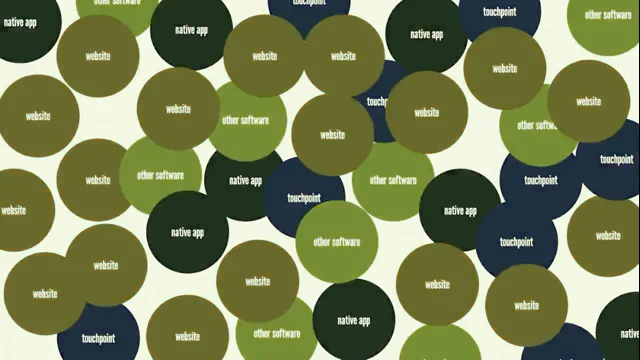
Anybody? All right, websites. Some of us have more than one website, right? We got two websites, maybe even four websites. Maybe more than four websites, right? At most organizations that we are working with these days, and we have for the last 10, 12 years, we've been working with all sorts of organizations that have a bunch of different websites, a bunch of different apps, a bunch of things that we collectively call digital products. And over the last 10-12 years, we've been working on design systems to help these organizations power their many different kinds of products and websites and apps in order to give us all of these great benefits, right?
Speed, quality, accessibility, et cetera, et cetera, et cetera.
We kind of know the deal. But the problem is this: Your organization does not look like this, right? Your digital landscape doesn't look like this, it looks more like this, right? You got a bunch of things that are all lopsided and weird and built in a bunch of different technologies. We call these the multi-all-the-things organizations, right? We got multiple products and brands and frameworks and platforms and different generations of a design language, different color modes, you got marketing websites, you got software-as-a-service applications, you got white labeling, you got campaigns, you got all sorts of stuff. And so we've had the pleasure and the privilege to work with a bunch of really big size companies... as time has gone on, they just kind of kept getting bigger, which is kind of weird. But we've worked with a lot of these different multi-all-the-things organizations, right? Most of them and most of the people here in this room are supporting multiple products. And what that means, like our friends at Caterpillar, they have cat.com, they have parts.cat.com in case you need to buy some new treads for your bulldozer. They got you covered. They got a careers page, they got all sorts of different things, right? You got multi brand experiences and organizations that power multiple brands like Marriott, they have a whole spectrum, a little class based something or other here, but you have the Ritz Carlton, the Westin, the funkier Moxy, the more affordable and approachable Courtyard. And where I met Mr. Stephen Hay was at the Gaylord Hotel. So I didn't know that that was a Marriott property there. But so all of these things, right, all these different brands are doing different things for different audiences, right? They are at different price points, they're trying to do things but there's also a lot of commonality, right? They're trying to book rooms at their places.
And then some of these brands have sub brands, right? So a company like Apple, of course, has all sorts of different brands within its big Apple umbrella. And we worked with Dotdash Meredith to help them create a portfolio of different publications. It's called verywell.com and they've since sort of spun out different sub brands that all kind of have their own unique little sort of flavors and modifications to the UI in order to differentiate verywellhealth from verywellmind from verywellfit.
And then we have different rebrands, refreshes, redesigns. So Verizon's a big telecom company in the US and they originally looked like this, and then they took a highlighter pen to it. And it happens all the time, right? And there's a different spectrum of how these things go. Sometimes it's like slight tweaks, and sometimes it's just like, burn the whole thing to the ground and start from scratch. There's also white labeling, which is a really fascinating one. We work with a company called Blend, and they make mortgage software.
So it's like applying for a mortgage, and they sell that software to a bank. Really complicated stuff. And because the people are trying to sign up for a mortgage through a bank, they need to be able to skin and sort of theme the user interface in order to make it look like it's the bank software, not this other company.
And then we have multiple product families. So here's our friends at Salesforce. And salesforce.com has all of the trappings of a good marketing website experience. You got sort of big, chunkier cards, right? You got color, you got some illustrations and some fun stuff, and that is like diametrically opposed to Salesforce software, which is just like tables and modals on top of modals and drawers and things sliding out every which way, right? So this is the kind of disparity that a company like Salesforce has to deal with. Like, how can we power these different types of product families using maybe the same design system? [IF] Then we have color modes, so things like our inverted and knockout colors. So for our dark text on our light backgrounds, that's the normal.
But if we switch that to our inverted or knockout or inverse or on dark, we have a bunch of different names for it. Now, naming is very hard, but for the light text on the dark background, we have this concept of inverted or knockout colors.
Then we have our actual dark mode or our user selectable dark mode, where you're able to go through where you're able to go through GitHub and you're able to change it to high contrast mode or dark mode or dark high contrast mode and you're able to switch those colors very easily. We wanted to make sure Adam was being honest earlier. [BF] He's a tricky one. [IF] We went in here and we changed the operating system dark mode on and it actually worked. [BF] So good job, Adam. He's a legit guy, in case you are wondering. [IF] So moving on to multi framework, right? Similar to multiple products, we'll have multiple frameworks in an organization. So we have these websites, might have a bunch of websites. Most people have more than one website. And these all are different shapes and sizes.
And these may be using Angular, React or Web Components.
They may be using Drupal or WordPress.
Really doesn't matter. [BF] AEM. [IF] It really doesn't matter from a styling standpoint. We'll get to that later. We also have multi platform, right. I know this is CSS Day, but there's more that exists outside of the Web like iOS and Android and Kiosk using old clunky software, you may have React native to cover both iOS and Android. There's a lot out there.
[BF] Yeah. So really that's like a crash course in just multi all the things. And everybody sitting here has their own unique flavor of multi all the things organization. Right.
Some of the stuff you're like, not relevant to me, don't know it. And other people are like, this is my... the bane of my existence, right. This is everything. So the real question, genuine and legit question becomes we have this just total multiplicity of different digital products to support.
Can we actually create a design system to serve those different kinds of products? Right? And this is where a lot of just like the bullshitty kind of pushback on design systems comes from. Design systems are killing creativity. Design systems make everything look the same.
And they're all like written on Medium.
There you go.
So let's explore that question though, because it is a genuine question. Can - we have all of these different things, all of these different moving parts. Can we actually make this happen? We'll use our good friend at Starbucks. I don't why... they're not my good friend, but they're a company. You all know them. You got them over here.
They've got buttons on their website, lots of different kinds of buttons. And they have brand style guides.
As you might expect, these are the old school brand books.
Here's our logo, here's our color. And historically, any web designer who's ever received that kind of brand guidance, you're like, gee, thanks for nothing. Oh, the logo. Oh, and the white space around the logo. Great, right, I'll get right on that one. Thank you for everything.
But Starbucks has websites, they have native apps, right? They have point of sale displays, they have kiosks, they have digital signage, they have all sorts of stuff, right? And so this brand style guide basically says Starbucks Green is this, right? And then everybody, everybody dutifully updates, right? To make it Starbucks Green.
So you go to starbucks.com and wouldn't you know it, there is Starbucks Green applied to their primary buttons, right? So let's say that all of a sudden Starbucks hires this hotshot new Chief Branding Officer.
They say, "green, tired old, passe, we're going purple," right? Setting aside the fact that physical stores... that's a massive effort, but you could just feel the weight of a decision like that. So they release the new hotshot brand style guide and they say, Starbucks Purple is this. And then the websites, the native apps, the digital touch points, everything goes and dutifully updates. Yeah. So there we go, right?
We just update some CSS and we get the new brand, the new result, right? This is the problem, though. Starbucks doesn't just have four little things to update. They've got tons of these things, right? And we've been a part of these efforts. To go through this process is awful.
Has anybody been through it? It is terrible.
If you haven't, if you're like, this isn't resonating, it's coming, I promise you that rebrand is coming, that redesign is coming. But the problem is that this process requires duplicating that effort again and again, right? It's disconnected.
You got this brand book, here's the guidelines, and each individual team has to go through and update all of this stuff. It's slow, it's painful, it's fraught, it's duplicative. Get it?
It's expensive, right? Like that's really what it boils down to.
This is like a multimillion dollar affair. And we've been a part of these multimillion dollars affairs a number of times, right? So, so this is not so good. So that's where design tokens come in to help. So rather than having this crusty old brand book, what we have is a design token system that basically says brand background is Starbucks Green, right? And all of the websites and apps and point of sale systems and all of those different touch points are all connected to the design token system, right? And then hotshot brand dude comes in and says, "We're doing purple now." Remap one value, right? Push out a new version, propagate that stuff out to all of these different touch points, right? Like that is the power of design tokens, right? And the cool thing is, so you get this result, but at a CSS level, nothing's changed, right?
Like it's just hooked up to the system and it will receive whatever throwing at it, right? So with design tokens, you get the single source of truth where we're saying, "here is our brand, here's our visual language, and we're defining that in one place", right? It's connected to the actual experiences that are actually pulling this stuff in and sucking it in. It's baking in the best practices for things like your brand, for accessibility, making sure that contrast is always there, and so on and so forth. Visual design, UX best practices, et cetera, et cetera. You're... you're centralizing those decisions.
It creates the separation of concerns that we're going to talk about in a little bit. It is far more efficient than manually going through playing Whack a Mole and it unlocks these really cool opportunities for these like, turnkey redesigns and stuff like that, right? Where you could wire up the system with Starbucks Green, then flip the switch on Starbucks Purple and roll that out in a lot of faster of a time and really all this translates to is saving a crap ton of money, right? This is really what we're talking about here. It is like significantly cheaper to have these systems and roll them out rather than sort of having these disconnected independent code bases and design environments.
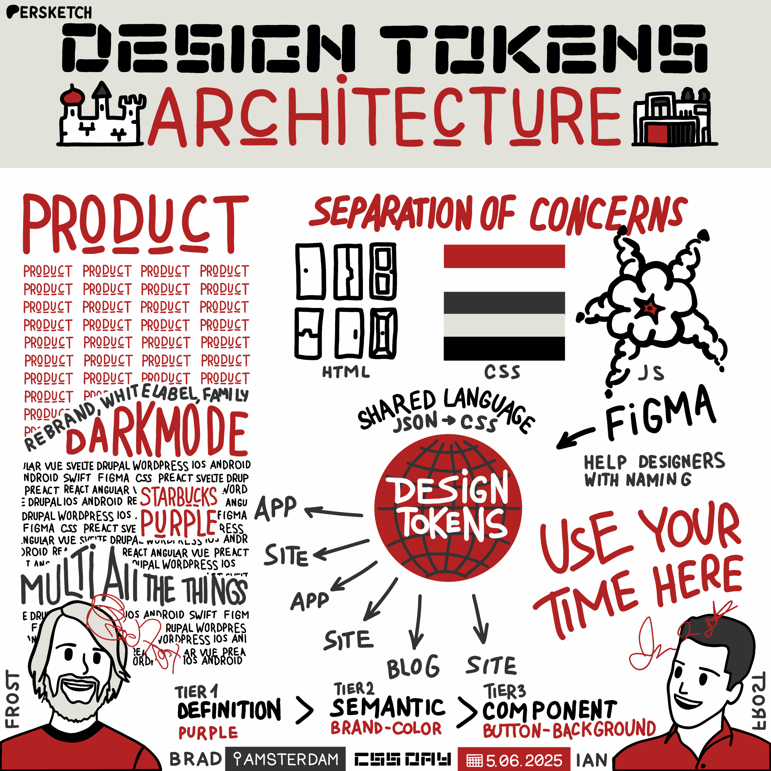
So a little side by side there, but design tokens, good. Without design tokens, not so good, in summary, right? Here's what's interesting though: separation of concerns. A lot of people, when asked earlier, "if you're old, raise your hand." So we feel like we're in pretty good company here. Separation of concerns, though, goes all the way back to the mid-70s as a computer science principle that basically says, yeah, "each part of the computer program should do one discrete thing. There should be a separation." Don't just mush it all together, which obviously, but that needed to be defined. But most of us people, especially the people raising their hands, the older ones in the room, know about separation of concerns through the three languages of the Web. HTML provides the structure, the semantic meaning of a Web page, right?
Our good friend CSS, which some of you may have heard about, it gives the style and controls the aesthetic layer. And then JavaScript of course, provides the behavior, right? You click on the accordion, it opens.
You click on the accordion again and it closes.
Let's talk about doors. If you need a door, you go to the hardware store and go back to the door aisle. Maybe things work a little differently here, but follow me. You need a door, go to the door store, back to the door aisle. What you're going to see in that door aisle is a handful of doors for sale.
Certain dimensions to pass code, to pass an inspection, certain width, height. The hinges are going to be on the right or the left.
There's a hole for where you put the doorknob. Right.
And the materials matter too. Right. Maybe it's a semi hollow door, maybe it's a solid core door. And depending on what your use case is, you pick that thing out. But there are no pink doors, there are no green doors, there are no orange doors even. Right. Well, can we still buy that door? Yes, because there's a paint aisle as well in the store. Right. So this separation of concerns, right. What color you paint that door or what hardware you put on there, right. If you want to be fancy pants and put some brass handles on your door, go for it. If you want a slick, more modern European flair, you go for the matte black, right? By the way, really good door handles in this building. Check it out.
These don't impact whether or not the door opens or closes, right? These are cosmetic, stylistic, aesthetic decisions. John, love you for many things, but invoking the CSS Zen Garden, right. Which all the way back in 2003 Created by Dave Shea, great human being. This is his Wikipedia page, him back in 2003 and he created the CSS Zen Garden, as John mentioned earlier, which was here's this exact same HTML page and what we're going to allow people to do is to submit their own badass designs built using CSS. And this was just absolutely incredible.
Like this was revolutionary. This just did such a perfect job articulating that separation of concerns and continues to to this day. So we could revisit that as we're looking at our multiplicity of buttons, right. If we were to take a button, which I'm sure your products have, right. You've encountered a button in your day and you strip that thing down to its door frame, you get a handful of properties, they're pretty common. It's either a button looking thing that under the hood is an A tag taking you to a new page. It's going to submit a form or submit an action on the page. It's going to be have an icon after the text, maybe an icon before the text.
Maybe it's an icon only button. Maybe it's a secondary or a ghost or a hollow, whatever the hell we want to call them these days, right?
Big buttons, small buttons, block level buttons that fill the width of their containers, buttons that are button tags but that look like hyperlinks, right? So these are the kinds of buttons that we are designing and building and encountering all the time, right? So Mr. Chris Coyier, sitting right here, wrote this really amazing post, like, I think one of the most important articles in recent modern Web design history, calling it The Great Divide in between this kind of separation and this evolution of the world of our field, which is we have these different people doing front end work that we're all sort of working, at least theoretically in the same realm, but we're doing things different. And in this post, and I've internalized this language and Chris hasn't heard this yet, but it's like I use it all the time. 'JavaScript dun got big', as only Chris could say it, and I use it all the time. That is what has happened over the last number of years. And we've already heard a fair amount of that today, and we're hearing how that's starting to make its way into CSS and all that great stuff, right? But so what that means though, because JavaScript done got big, this separation of concerns is not so cleanly divided between the three languages of the Web, right? Things are a lot blurrier now.
And so what this means though, is that, well, does that mean that separation of concerns is dead? No.
Motherfuckers act like you forgot about Shea.
Oh, is the audio playing? Can we get the audio or is that my fault?
Can we do it again? That's beautiful.
I haven't talked to Dave in like 10 years, so.
Love you, Dave. I'm sure he'd be fine with that.
But anyway, separation of concerns, CSS unguarded. Still great idea.
Thanks, Chris. Still great idea, even if the lines are blurrier, right? But what we need to do is we need to define a new separation of concerns, right? So what has kind of transpired over the last decade or so is that we have this more sort of structural layer, right? We have HTML, we have more structural styles, like all the stuff that Rachel was just talking about, right? Putting things side by side, like the layout, that's the equivalent of the hinges are either on the right or the left of the door frame, right? Those are important stylistic decisions that impact the functionality of a thing. And then of course, we have JavaScript that not only provides that functionality like the accordion opening and closing, but it's also the delivery vehicle for the whole thing, right? So we call that a sort of component system, right? But then over here we're able to split out those purely aesthetic paint choices and hardware choices, right? There's those purely aesthetic styles, right? And we call that a design token system.
And it's these things working together that yields the UI result that we're looking for, right? So back to our friends at Starbucks, right? We have our door frame, our button, our vanilla just base level thing, right? And then we're flowing through those more cosmetic styles into the mix, right? So this is the power of creating this new separation of concerns that says CSS has also evolved. CSS has also done got big as we've been hearing about all day from all these great speakers. It's way more powerful now. But we need to peel out those old school brand book layers into their own system.
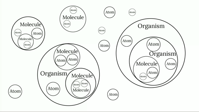
That's what design tokens are. Jina Anne, design system pioneer, she was at Salesforce and her and her team on the lightning system introduced this idea of design tokens. And when she introduced them, she introduced them as the sub atoms, the smallest pieces of our design system. They're an abstraction of our UI visual design and store style properties as variables, right? So Atomic Design 2013 is whenever I came up with that thing, and this was 2016, whenever Jina and her team at Salesforce came up with that. But had tokens been a thing, they would have been right there and included in the mix. What this does is really unlocks a lot of really powerful stuff. What we're able to do is draw this through line from all of these subatomic elements, our protons, our neutrons, our colors, our typography, our border radius values and flow those through our atomic design system components that then combine into more complex components which ultimately make their way to build actual products.
Right? And this is all a continuum. This is not a linear process. Stephen and I were talking about that earlier today. It's like people still think, let's start with the atoms. And it's no, this is a concurrent process, but this is how it all hangs together.
So what we want to do with this whole thing is create this virtuous cycle where the design system, which includes the component system and the design token system, informs and influences what products get built using those systems. And in turn, those products inform and influence what lives in our design systems. So there's a number of things that can be tokenized, right? Color and typography are the big ones, but also things like border width and shadows and things like that. And those things can be wired up and hooked up to our token system.
And this language becomes the API for our design language. Right? Like this becomes the contract, and not just between our immediate team. As time has gone on, there's like a whole bunch of things that need to pay attention to and listen to these systems, right? You're talking about QA engineers, you're talking about CMS systems, you're talking about AI, you're talking about all sorts of things as well as, of course, the human beings who are wielding all of this stuff. [IF] All right, let's go through how we actually build this.
So I'll take you into the land of Figma. I know this is CSS Day, but let's take a look at how this works. So this is from our course.
And you can see that there is a vanilla theme, strawberry theme, chocolate theme, dark chocolate theme, ice cream website. So we went with this, it felt right. So this is what that looks like in Figma.
Yeah. [BF] And Figma variables is the feature. [IF] Yeah, Figma variables.
So let's move over to code. And the basic structure of this is we have the centralized design token system, and these are usually defined in JSON so that a tool can take those and transform them into whatever format is needed with your downstream applications or your design system, whether it's websites, CSS, things like that, and native apps and so on and so forth. So this looks like this.
So we have color background default, and then we're able to kind of reference other tokens with this dot notation within JSON. So Style Dictionary is the tool - I feel like it's one of the most popular tools that is used to kind of transform these JSON files into CSS Custom Properties or other formats as well.
It's really powerful. It's really well done. So this is the output that you get when you transform that JSON file into CSS Custom Properties.
So putting these side by side now, you can see that on the left we have the Figma variables again, with your default, your subtle knockout. And you have the exact same JSON file and code on the right.
So being aligned between Figma and your JSON is very, very important with your language.
[BF] Yeah, it really does serve as this shared language, right? We talk about that with design systems all the time. But like, this is quite literally a shared language, right? It is these names that we are describing in both our design tools and in code that need to map to one another. Now here's the thing though, is that this gets really tricky and we're here to say, like, "you have to be involved in this," right? And I'm saying you meaning developers.
I'm going to assume most of us are developers here. Here's the problem though. I take you to any design team or any product team, right this second, more or less. This is what the design process has become.
Collaboration has turned into switching on a fucking toggle switch. Don't talk to me, hit the button. It's depressing, very depressing. And we have solutions for all of that. But let's put this on a timeline here, because this is this reality of this waterfall process that has taken root that's very damaging, very antithetical to good product design and development.
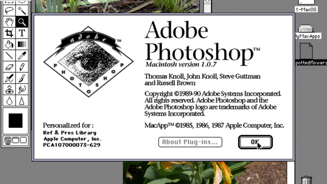
Developers have been naming variables for a very long time, right?
Meanwhile, Photoshop got layers in 94 so that designers could do layer 46, copy 13, right? And then it took a couple decades to eventually get libraries and components. And then things like Token Studio and Figma Variables landed in the summer of 2023. So the design world has been working with naming variables for design properties. Two years.
Miriam could tell you that Sass has been around for a bit longer than that, right? A lot of, well, anyone in this room, you've all been slinging Sass Variables and other things for a long time, right? So this is what we tend to see with our design counterparts is they're like, "oh, here's this thing - okay, we got to do tokens now. All right, we're in Figma Variables. We're looking at this data table. I've... what?
Please help." Right, so this is your opportunity. This is our bid to you. Like, do not accept receiving the output of whatever is coming out of Figma Variables.
You need to participate. And if that means breaking the mold and "oh, they didn't assign that Jira ticket to me," do it. Break the rules. We have to get out of this shit, right? Because you all know you can be the Sherpas. You could be the guides for your designer counterparts who have only been exposed to this for the last couple years. You can help them and we need that. I promise you things will go much, much, much, much better if these things are co-created.
So, okay, moving on. We got a token architecture.
It's a little mix and match game. This is my daughter demonstrating.
It's like, "where does the dog live? Where does the fox live? Where does the duck live?" Right? I don't know if you had magazines like that as a kid, but we had the Highlights magazine as a kid and we used to play those games all the time - it was amazing. And that's what we're doing here with this architecture is that we have this three tier token system that we have implemented in order to support all of these different brands and themes and multi-all-the-things organizations. So Tier-1 flows into Tier-2, these semantic tokens, which then flow into an optional and very discrete Tier-3 layer. We'll talk about that in a second. So let's start with Tier-1. What Tier-1 tokens are doing - also known as primitives or definitions or whatever, they define the ingredients that are available to the system, right? [IF] And in Figma, this is what it looks like. So you create the collection and then you add your simple Starbucks Green variable and you set that to the hex value that you want within your designs.
Same goes for JSON in Style Dictionary - you have your Starbucks Green JSON object and then you set that to the hex value that's set within Figma. So you kind of map things one to one. And so Tier-1 is kind of like a set of ingredients. So you have your butter, your sugar, and you're making some baked goods, great pancakes and everything here. And these are where things are kind of defined, right? Your primitives, your color palettes that you use, your border radii and other various values that are mapped specifically to the direct value, right? [BF] And so these are the things that these professional chefs have to cook with, right? This is where we see things like this. So we don't recommend publishing these things, right? That's like the equivalent of like a restaurant patron just kicking open those double doors and going back and grabbing some like corn starch and walking back out to their table. You're like, no, that's not good, right? That's where bad things happen, right? So, so this first tier is really for the people who own and operate the system. But then the second tier is where we're actually giving those ingredients jobs to do. This is where we're putting those things to work, right? So we're basically saying, "Okay, what do we want Starbucks Green to do," right? Oh, we want it to sit against this background, right? We want this color that's sitting against a dark background to sit there as well. So within Figma, you add your new variable called background-brand, and you set that and alias that to Starbucks Green.
And then within code, you set the background to that Starbucks Green as well. And then there's a third layer to this which is, I don't want to say optional because you're going to run into it with buttons, I promise you that. We've worked on a nice design system, but like whenever you're supporting multiple themes, one brand wants to have their brand color for their buttons and then the next one wants to use their digital blue and somebody else is using like a different color. So what Tier-3 tokens do is give this kind of fine grain control for more gnarly kind of situations, things like focus rings, things like form borders and things like that. But what we're doing there is we're basically giving this component level hook. But you don't want to be using these things all the time. We've worked with systems where they have like thousands upon thousands of design tokens because they're creating tokens for each and every token property. [IF] So within Figma, once again, you add your button background variable and you can set that either to Tier-1 or Tier-2 variable, and then the same goes for code. So you're setting your button background to the background brand. [BF] Yep. And so, yeah, so the majority of those... and again, those dashed lines are really just like - you're applying those, right? You're basically saying "background color" in your sort of CSS declarations, right. So like those aren't actually defined, they're just kind of wired up there. Right. But all of these things collectively become known as what's called a theme, right? And we hear theme used a lot, but this is that collection of tokens that are hanging together, these decisions that are being made and mixed and matched together in order to do that. And so your organization might have one theme, or you might have two themes for maybe your light mode and your dark mode, or maybe you have four themes for your multiple products, or maybe you have eight themes for your eight different brands that you're supporting. Or maybe... right? You get the idea, right? But at the end of the day, this system allows us to swap in the appropriate theme for the job that we are doing, right? So we wire up if we want this result. Here's our door frame button, and then we're pumping in and applying specific design tokens to that, right? We're painting the door a certain color, we're putting certain hardware on it. We can have different things and put different things on that and get different results.
That's the idea. So it's the separation between these things that allows us to operate these things differently. They operate as separate digital products, as separate libraries. But this is the formula that we found to be really, really successful for serving this multitude of different use cases.
So we're going to get into a couple just for the sake of time, but we can at least show you what dark mode and stuff looks like. [IF] Dark mode, we found that online and we're like, that's going in our slides.
We have no idea who that is, but she's got swagger.
Anyways, thank you. All right, so we have our light mode and then we want to create our dark mode, right? We want to create a darker background with lighter text on top.
So this is what it looks like in Figma, once you go through the process of duplicating mode and then kind of going through the process of making sure everything's accessible, which is all good stuff within code.
This is kind of how it looks here, where you have kind of your root.
I know. [BF] Or HTML. [IF] I know - yeah - or HTML. Don't want to upset anyone. [BF] Don't hurt us. Miriam.
[IF] And then you can override certain values. So within dark mode, you might not need your new - you likely won't need your new typography values within tokens. So you may just go through the color tokens there to kind of override those. And then we get back into our user selectable dark mode. So this is from our course and in the bottom right hand corner, we're kind of turning that on and off and switching out those tokens. And then you have your operating system dark mode. We're coming in here and adding that 'prefers-color-scheme: dark', just like Adam. And then it just changes things over. And this is React native. So this is another platform, this is mobile, and we're able to kind of switch out the different theme here from chocolate to dark chocolate or strawberry, and kind of get that working properly. And then we have multi- framework and multi-platform, as we discussed earlier.
"It's all the same, only the names have changed." [BF] Ian Frost, everybody!
[IF] Jon Bon Jovi, Design Systems Specialist, said that.
And basically what we're saying here is that it doesn't really matter what the technology is as long as you have this centralized design token system. If you go to the next. Yeah, thank you. [BF] Yep. Sorry. [IF] Well, don't make me do it again. Don't make me do it.
[BF] It's okay. It's all right. You get the idea. [IF] But basically, color, background, brand.
Color, background, brand is color, background, brand, no matter whether you're in Figma or you're in CSS or you're in React Native or Android or Swift or any of those. Right. But the big goal here is to have that centralized design token system defined somewhere. Those are transformed into these different names here. And then you could see the different types of technologies that can be used to create your styles and your tokens and your themes.
[BF] Yeah. So you know, Sass Variables, CSS Custom Properties - we're likely used to working with - both obviously have different syntaxes, but you don't need to manually duplicate those things, right? [IF] So, yeah - so as we discussed earlier, there are all of these different technologies used on the Web. You have your Angulars, your Reacts, your Vue's and everything.
And here comes the CSS fairy coming in to pump in the CSS to all of these different platforms. So the Web is all the same, only the names will change.
But anyway, so yeah, CSS can be used across the Web, but we also have these other platforms like Swift and all of what I said earlier, and this is kind of what that tokens file looks like within code. And then you can pump these into something like React Native here and we're changing that theme and that image there, and it's a simple file name switch there and you get your different themes.
[BF] Yeah. So the question becomes like, so that all makes sense. That's the architecture. We've seen it work pretty much everywhere that we've worked, but kind of coming back to this thing, we see a lot of design system teams struggle with this idea. It's like, "how the hell are we going to do all of that?" And the answer is we're not. At least not yet. What we want to do is we want to get quick wins, and you want to be in this position as quickly as humanly possible. You don't want to be grinding away for a year trying to re-platform and re-tokenize your flagship app.
You really want to get something out the door really, really quickly.
And we talked about this virtuous cycle with these systems. But what we want to do is we want to shrink it.
Right? We want to start things really small and do a pilot project, get that quick win. And then we want to do it again.
And then we want to do it again. And as you do each of these little pilot projects, your theming system becomes more robust, your components become more complete, and eventually you get to this point that you could actually power your whole organization. I like to think of this as like tools in the basement, right? It's like you don't arrive at your complete arsenal of tools at your disposal by going on a shopping spree at the hardware store. You get these tools, you acquire them when you need them, right? And then you put them with their friends whenever you're done with them, right? That's the process that we want to arrive at here. So all is good, right? You iterate over some real pilot projects, build real products using this stuff as you're getting your design token system off the ground, as you're getting your component systems off the ground, and you end up in this great place. That's all good.
End of story, happily ever after. Well, maybe, but all of us sitting here are doing the exact same thing. We're all doing the same thing.
So this is what I've been on my bullshit about for the last little bit is, wouldn't it be cool if we had a global design system that could actually take care of a lot of that hard and boring work that Cyd was talking about earlier, right? It's taking my job, but it's taking the part...
I don't want to build a badge again, right? And so some of you, the more astute among us, are saying, "well, isn't that what HTML is?" And I like to think of HTML as the kind of like low level dowel rods and screws and stuff like that of your IKEA parts.
And for the history of the Web, these are obviously critical ingredients in order to make IKEA furniture. But for the last long while, it's just been like, dump them on the living room floor here, go build your Malm. Figure it out, right? And it's like. And we were very, very, very bad at this, right? Every year the WebAIM Million comes out and it's just like the most... it's like "Things got better!
It's only 94% of the top million websites have critical accessibility errors instead of 95% last year." And this is a problem, right? And it's with really, really basic stuff like this, right? So here's our little form field.
And in order to create an accessible form field that has the appropriate semantic meaning, it takes some work, right? So here's what voiceover sounds like whenever someone navigating the Web operates with a voice: "Choose a password secure edit text. You are currently on a text field inside of web content. To enter text in this field, type." I'll play it again. What's missing? "Choose a password secure edit text.
You are currently on a text field inside of web content. To enter text in this field, type." Right?
Yeah. Okay, the helper text isn't there. That's not good, right? Blind and low vision users are already having a hard time and that's rubbing salt in the wound, right? So of course we could fix this by just creating another association between the helper text and the input. "Choose a password secure edit text.
Your password must be at least eight characters long. You are currently on a text field inside of web content. To enter text in this field, type." That's the kind of shit that we mess up billions of times all over the world every single day, right? And so where things are at right now is we have HTML and we have organization wide design systems and more like open source design systems like Material and you know, Web Awesome and the rest of them kind of trying to do this job of rounding up these best practices. But I see there being this gap in between the world of HTML and more organization specific levels. And that's where I think that a global design system can really come in handy because there's a lot that falls between the cracks here, right? So what we're talking about here is this global design system not being a part of HTML but also not being just a company rando company.com. right? Design system.
It's.. what's this thing that might live in between?
Right? That's a really fascinating question. I think that's worth exploring, right? So how might this work? What does this actually look like? Love Brecht's talk earlier because he's singing our tune right here, right? It's like we want this stuff to be controllable, accessible and stylable, right? That's what we're after. And most design systems right now ship with a default UI. Right?
Ship with a default aesthetic, right? And we're like, "No, we want the door frame. I get to choose the paint color, right. I get to put the hardware on." Right? So what does this look like?
Well, Web Components sounds like a good idea. HTML Web Components maybe. I know that Jeremy's a fan. I'll be a little spicy controversial take here. And I think that people shouldn't even be doing that now. This makes perfect sense given this current state of technology.
But I want this. I want fewer people screwing it up. I realize that this isn't as accessible and this doesn't fall back and this isn't as resilient as Jeremy might like.
But these are good conversations that we could have over beer. That's why I added this in here, so we could do that. But I want people to just be like, I just want the form field and you pass in the label and it just does the thing. Can we have that? Button groups. Remember when we couldn't say..
when we said we couldn't have container queries or what Rachel was just. ..anyways, you get the idea. How many people are building date picker or have built a date picker? Waste your fucking time on Earth. What are we doing? We have way better things to do with our time and talents on this planet.
We need more door frames. And that's what this looks like, right? It's like, what's just the basic ass door frame that gets us the things that we need. It has all the accessibility stuff wired up. It just gives us the stuff for free and by default that's what comes out of the box. And then we get to choose what colors go into it with our design token system. So we're able to sort of flow different UI styles through these things and the next team and the next organization can do that. And this is a shout out to Miriam. I really like Salmon - that's my go to web color there. So we could talk about that. You could get creative with this stuff. Or like Cyd talked about, it's okay to use Comic Sans if you're doing rainbow text.
So, you know, maybe that's it. Book a clown for your kid's birthday party, right? But it's worth saying though that it's like, well, not every door frame exactly fits. Maybe your city is ancient. I mean, it's truly stunning. It's absolutely amazing. What we're talking about here is what we're not trying to do and what's maybe different than what Brecht was talking about with Open UI's existing work streams is like, "let's get this stuff into the browser." There's actually like, "well, maybe if we're not trying to get everything into that browser level that we can sort of hit some of those really common use cases," right?
Like the door needs to open and close and it needs a spot for the door handle without necessarily needing to address some of the crazy stuff that Brecht was showing and was truly impressive.
It's like, what if your select menu was a game of Monopoly?
It's like amazing, like truly amazing stuff. But it's like, well, what is the stuff though that is just like most teams are just slogging through again, rebuilding that date picker. Just give us the meat and potatoes stuff. And the great thing, as Miriam said earlier, is that my criteria for choosing a tool is asking the question, "can I still use the base language?" I think what I'm proposing here is it's like have a global design system that takes care of all the boring shit that we're rebuilding again and again and again. And then you still have access to all of those low level right ingredients as well.
Not everything needs to make their way into HTML. Do we need a badge HTML type? Maybe, maybe not. Do we need a skeleton screen or like a skeleton component? Right, you get the idea. But back to Brecht. Open UI. So we've been kind of at this, slowly but surely, thanks to Open UI. Greg Whitworth at Salesforce has been a huge champion of this effort and he has kind of carved out a new sort of work stream within Open UI.
So just to echo Brecht, I highly recommend you get involved if this stuff's interesting to you. If you're sick of building date pickers again and again. We are at this place where it's kind of like a small but mighty group of people who are volunteering their time and we could use the help pushing the boulder up the hill. And I'm more of like a spirit animal character. So you all are clearly way more technical and more advanced than I am when it comes to Web development. So all to say, there is room for you to participate.
Just to echo so many of the other speakers, like, you matter.
Your voice, your vision, your work, your everything, your effort matters. I like to define a design system as the official story of how your organization designs and builds digital interfaces. And that's true for an organization wide design system. But what if we're talking about the world? What does it look like to bake in all of these great best practices that we've been talking about all day and we'll be hearing more about tomorrow? How can we better serve the world and make more accessible and more resilient and more high quality Web experiences for everybody?
Right? You're a lot more than a developer that could build a date picker. I promise you that. You have so much potential and I think that we need to really value ourselves, respect our time, respect our talents.
And I think that there's a really cool opportunity in this moment in time to show what real global cooperation and collaboration looks like. The world needs it. We're embedded in every industry, in every part of society, and we know in our bones more than maybe any other people on the planet what it looks like to benefit from other people's work, to contribute to something better and bigger than yourself, to ignore the country of origin of where that pull request came from, and to just make things better together.
So that's what I'd love us to do. It's hard.
It's hard. As we've talked about, like, this is like not easy stuff to do, but sometimes that work is worth doing, right? I've always closed my talks with: "when you're finished changing, you're finished." And I think that that's especially true. I think that John's message earlier, I think, really reinforced that - we have to keep pushing forward and embrace what our medium is capable of and really honor it. And for as hard as it is - to echo Brecht, it's a hell of a lot of fun, right? We're all playing with little digital Lego bricks and mapping things to each other and making pretty user interfaces.
And I think that that's really, really important to celebrate.
And I'd like us to go do that now. So if you want to learn more about design tokens, we have a course that we just wrapped up. What is it? A month ago?
[IF] Thirteen. [BF] Thirteen and a half hours.
Thirteen and a half hours of video content on tokens, sample design, token architecture in both Figma and in code, all wired up, all connected to at least give you a solid reference or a boilerplate or something to start from.
And since you all are awesome, here's a code.
CSS Code Day is awesome. You could get that for for 25% off. Tell your boss, tell your teams. [IF] if you want to follow me or hire me for any of your parties, I'm here. I am a former meteorologist. That explains the URL there. But I'm on LinkedIn and Blue Sky. [BF] Yeah, and I'm online as well. And BlueSky Linkedin, all that good stuff. Blogging at bradfrost.com and we're also about to launch a bunch of other courses and stuff like that too. So we're dusting off our old newsletter so you could sign up at bradfrost.com/newsletter. So with that, everybody, thank you so much. [IF] Thank you.
Large circle in the center of the slide containing the word "product".
Diagram showing a yellow circle containing a branching flowchart on the left, a right-pointing arrow connecting to a password creation form with the label "Choose a password" and password instruction. On the right, there is a dark-mode version of the same password input UI, outlined in yellow, indicating a styled or themed form field. The diagram visually equates the branched logic or system in the circle to the styled password input component.
Diagram showing a blue circle with branching black lines, an arrow pointing to a password input field with the text "Choose a password" and "Your password must be at least 8 characters long," and an equals sign leading to a styled form control mockup with the same text and password field.
Icons and simple illustrations representing atomic design concepts are arranged above the title. There are no charts, screenshots, or diagrams beyond these decorative symbols.
Row of graphical icons above the heading representing abstract shapes and diagrams.
- Design Tokens
- Design Systems
- Angular, React, Web Components
- Drupal, WordPress
- Separation of Concerns
- CSS Variables
- Design Token System
- Single Source of Truth
- HTML, CSS, JavaScript
- CSS Zen Garden
- The Great Divide
- Component System
- Atomic Design
- Design Token Properties
- Style Dictionary
- CSS Custom Properties
- Tier 1 Tokens
- Tier 2 Tokens
- Tier 3 Tokens
- Dark Mode
- React Native
- Global Design System
- HTML Web Components
- Open UI